
"His means of death, his obscure funeral -
No trophy, sword nor hatchment o'er his bones"
said by Laertes in "Hamlet" (Act 4, Scene 5) by William Shakespeare
For the layman the sight of hatchments hanging inside a church, on the wall of the nave or on inner east face of the west tower, is something of a puzzle. They are heraldic, like the commonly seen royal coats of arms, and like them are painted on a square board that is placed point upwards. But whose coats of arms do they show and why are they found in churches?
"Hatchment" is an Anglicization of the French, "achievement", and therein lies the clue to what they are. Medieval noblemen had their armour, weapons and heraldic colours displayed in church on their tomb during their funeral. In later centuries this was formalised in the custom of the family coat of arms being painted on a square board that was hung, lozenge-wise over the main entrance to the family home during the period of mourning. After the funeral the board, now called a hatchment, was often moved to the church and displayed there on a longer-term basis. Some of these have survived and adorn our churches still.
By the eighteenth century many conventions had grown up around hatchments. For example, if the wife lived on after the passing of her husband then the sinister side of the background (left from the point of view of someone holding it like a shield but right as we view it) would be painted white (see top example above), with the reverse (dexter side) indicating that the husband was the survivor. The status of women as unmarried or married was marked by the former's arms being decorated by gold cord and the latter with a golden, winged, cherub head. The last of a family line was indicated by a skull and cross bones painted under the coat of arms. It's regrettable that names and dates were never put on hatchments (though they are on royal coats of arms) and that considerable detective work has been necessary to work out who it is that they commemorate.
The parish church of St Wulfram in Grantham, Lincolnshire has six fine hatchments and two royal coats of arms (one dated 1586, the other some time before 1701). In recent years these have been grouped for display purposes and they make a fine sight spot-lit against the stone of the ancient walls.
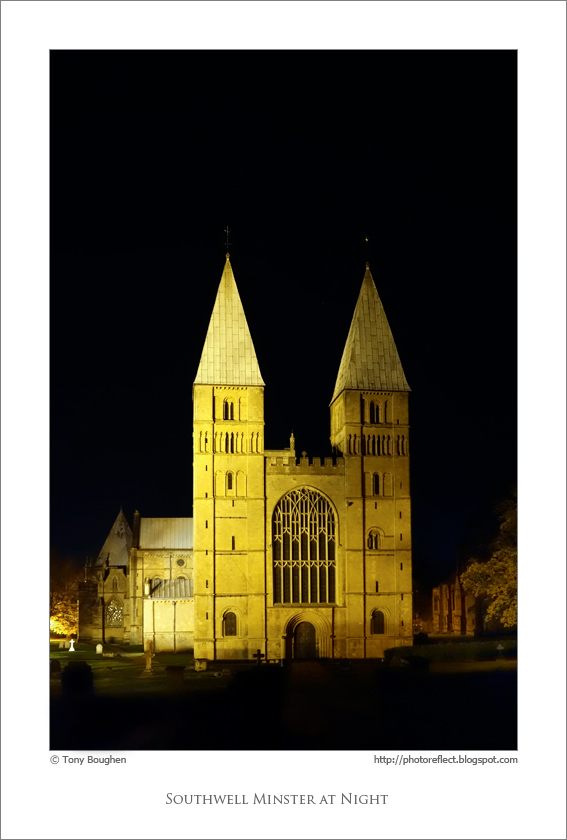
photograph and text © Tony Boughen
Camera: Sony RX100
Mode: Aperture Priority
Focal Length: 12.3mm (33mm - 35mm equiv.)
F No: f5
Shutter Speed: 1/40 sec
ISO: 3200
Exposure Compensation: -1.0 EV
Image Stabilisation: On


,-Royal-Victoria-Docks,-London.jpg)
,-Royal-Victoria-Docks,-London.jpg)


