click photo to enlarge
I grew up in a valley on one side of which were, nearby, high, rugged hills and on the other lower hills with a more distant prospect. As a child I called the very tops of the higher side of the valley the "skyline" and summits of the most distant part of lower hills the "horizon". Nobody told me to make this kind of distinction - it simply seemed natural that the skyline was near and clearly above you whereas the horizon was the distant point where earth and sky appear to meet. I still feel that is a reasonable viewpoint.
Perhaps it was growing up in a valley that gave me an interest in the horizon - observing its peculiarities, noting how it changed as I moved, wondering what was beyond it. Quite a few of my photographs feature the horizon (or skyline) and in some, as is the case with today's photograph, most of the detail is clustered there. What I like about scenes and photographs like this one is the way that man's massive achievements - cooling towers, cranes, chimneys, ferries become as nothing when seen against a great river and the vastness of the sky.
photograph and text © Tony Boughen
Photo Title: River Humber Seen From Hull Pier
Camera: Olympus E-M10
Mode: Aperture Priority
Focal Length: 42mm (84mm - 35mm equiv.)
F No: f8
Shutter Speed: 1/320 sec
ISO:200
Exposure Compensation: 0 EV
Image Stabilisation: On
Showing posts with label sky. Show all posts
Wednesday, August 03, 2016
Monday, February 01, 2016
Humber Bridge and a soft sky
click photo to enlarge
I have a liking for what I call "soft skies". These are cloud-covered skies with only a small amount of contrast and strong detail. Not the featureless stratus that is just unbroken grey. I mean those skies where the individual clouds are not strongly delineated but are either "smeared" across the sky or are merge into one another like a bed of feathers. I featured one of the latter skies several years ago above a collection of small boats drawn up on the beach at Aldeburgh in Suffolk. Today's photograph, taken on one of our frequent, family-related trips over the Humber Bridge, has the former kind of "smeared" softness.
I've always maintained that a sky can make or break a landscape photograph and I take a great interest in what the day offers by way of cloud cover and the type of cloud. There are several photographs on this blog of the Humber Bridge, including a number from this location - Barton Haven. Each one has a different sky, and each sky lends the photograph a large part of its "mood".
photograph and text © Tony Boughen
Photo Title: Humber Bridge Seen From Barton Haven, Lincolnshire
Camera: Olympus E-M10
Mode: Aperture Priority
Focal Length: 14mm (28mm - 35mm equiv.)
F No: f4
Shutter Speed: 1/1600 sec
ISO:200
Exposure Compensation: -0.3 EV
Image Stabilisation: On
I have a liking for what I call "soft skies". These are cloud-covered skies with only a small amount of contrast and strong detail. Not the featureless stratus that is just unbroken grey. I mean those skies where the individual clouds are not strongly delineated but are either "smeared" across the sky or are merge into one another like a bed of feathers. I featured one of the latter skies several years ago above a collection of small boats drawn up on the beach at Aldeburgh in Suffolk. Today's photograph, taken on one of our frequent, family-related trips over the Humber Bridge, has the former kind of "smeared" softness.
I've always maintained that a sky can make or break a landscape photograph and I take a great interest in what the day offers by way of cloud cover and the type of cloud. There are several photographs on this blog of the Humber Bridge, including a number from this location - Barton Haven. Each one has a different sky, and each sky lends the photograph a large part of its "mood".
photograph and text © Tony Boughen
Photo Title: Humber Bridge Seen From Barton Haven, Lincolnshire
Camera: Olympus E-M10
Mode: Aperture Priority
Focal Length: 14mm (28mm - 35mm equiv.)
F No: f4
Shutter Speed: 1/1600 sec
ISO:200
Exposure Compensation: -0.3 EV
Image Stabilisation: On
Saturday, January 23, 2016
Another Fenland sunrise
click photo to enlarge
I grew up among the hills, mountains and valleys of the Yorkshire Dales. In recent years, since we moved to the flat Lincolnshire Fens, when I reveal the place of my childhood I frequently get asked whether I miss the uplands. And the answer I give is "Yes and no". Yes, because unlike many of my contemporaries, I enjoyed the landscape, settlements, communities, wildlife etc. No, because I got fed up with the rain that falls steadily across many, many days rather than in large amounts with long spells of drier weather between. No too, because I like to experience living in different localities for reasonable lengths of time, something I've done during my life, and the Fens is different from anywhere else I've lived.
When people ask me about the Fenland landscape, at some point I start eulogising the skies. Lincolnshire is famed for its "big skies", and I take great pleasure in the changing displays that are always taking place above my head. In the depths of winter I particularly relish the sunrises that I see when I open our bedroom curtains. I posted a shot of one a while ago, and here is another from a couple of days ago. The intense colours filled the sky for only four or five minutes and then they slowly quietened down as the sun climbed fully above the horizon. And, though I've seen such sunrises many times, each time is as thrilling as the first time, and I can't resist photographing it.
photograph and text © Tony Boughen
Photograph Title: A Fenland Village Sunrise
Camera: Olympus E-M10
Mode: Aperture Priority
Focal Length: 20mm (40mm - 35mm equiv.)
F No: f4.3
Shutter Speed: 1/60 sec
ISO:200
Exposure Compensation: -0.3EV
Image Stabilisation: On
I grew up among the hills, mountains and valleys of the Yorkshire Dales. In recent years, since we moved to the flat Lincolnshire Fens, when I reveal the place of my childhood I frequently get asked whether I miss the uplands. And the answer I give is "Yes and no". Yes, because unlike many of my contemporaries, I enjoyed the landscape, settlements, communities, wildlife etc. No, because I got fed up with the rain that falls steadily across many, many days rather than in large amounts with long spells of drier weather between. No too, because I like to experience living in different localities for reasonable lengths of time, something I've done during my life, and the Fens is different from anywhere else I've lived.
When people ask me about the Fenland landscape, at some point I start eulogising the skies. Lincolnshire is famed for its "big skies", and I take great pleasure in the changing displays that are always taking place above my head. In the depths of winter I particularly relish the sunrises that I see when I open our bedroom curtains. I posted a shot of one a while ago, and here is another from a couple of days ago. The intense colours filled the sky for only four or five minutes and then they slowly quietened down as the sun climbed fully above the horizon. And, though I've seen such sunrises many times, each time is as thrilling as the first time, and I can't resist photographing it.
photograph and text © Tony Boughen
Photograph Title: A Fenland Village Sunrise
Camera: Olympus E-M10
Mode: Aperture Priority
Focal Length: 20mm (40mm - 35mm equiv.)
F No: f4.3
Shutter Speed: 1/60 sec
ISO:200
Exposure Compensation: -0.3EV
Image Stabilisation: On
Sunday, November 29, 2015
Rose-coloured clouds
click photo to enlarge
"What is the good of your stars and trees, your sunrise and the wind, if they do not enter into our daily lives."
E. M. Forster (1879-1970), English novelist
Some people find it hard to look forward to retiring from work because for them it signifies the beginning of the end of their lives, something they don't want reminding about. It can be just that if you let it, if you are one of the many people for whom the three stages of life are childhood and education, work, and lastly retirement. However, retirement can also be seen as a distinct, fulfilling, exciting time, one where each day offers experiences and opportunities that work in particular, often reduced to brief episodes, but more usually denied.
The quotation by E. M. Forster (above) is one that I like because it emphasises the importance and beauty of everyday experiences, phenomena that are too often overlooked because they are common. Moreover, the things that he itemises are those that work can relegate to the infrequent and the snatched, to the periphery of life. Retirement can, if you so wish it, bring them (and many other everyday pleasures) back to the centre of your existence and the joys that they offer can be life enriching.
In my working life I rose quite early and returned home quite late; I had long days. Getting up in the morning I would often speed through ablutions and breakfast and be gone. There was no time to do what I do daily in retirement: namely, open the curtains and look at the day and reflect on how I might fill it. Or admire the frosted grass, the autumnal leaves, the light fall of snow or the rose-coloured clouds of a fine sunrise. The sky in today's photograph appeared for only five or so minutes before I sat down for breakfast. Had I been working I probably wouldn't have noticed it. But, in retirement I got my camera and took a few shots of the beautiful sight.
photograph and text © Tony Boughen
Camera: Olympus E-M10
Mode: Aperture Priority
Focal Length: 22mm (44mm - 35mm equiv.)
F No: f4.5
Shutter Speed: 1/80 sec
ISO:200
Exposure Compensation: -0.3EV
Image Stabilisation: On
"What is the good of your stars and trees, your sunrise and the wind, if they do not enter into our daily lives."
E. M. Forster (1879-1970), English novelist
Some people find it hard to look forward to retiring from work because for them it signifies the beginning of the end of their lives, something they don't want reminding about. It can be just that if you let it, if you are one of the many people for whom the three stages of life are childhood and education, work, and lastly retirement. However, retirement can also be seen as a distinct, fulfilling, exciting time, one where each day offers experiences and opportunities that work in particular, often reduced to brief episodes, but more usually denied.
The quotation by E. M. Forster (above) is one that I like because it emphasises the importance and beauty of everyday experiences, phenomena that are too often overlooked because they are common. Moreover, the things that he itemises are those that work can relegate to the infrequent and the snatched, to the periphery of life. Retirement can, if you so wish it, bring them (and many other everyday pleasures) back to the centre of your existence and the joys that they offer can be life enriching.
In my working life I rose quite early and returned home quite late; I had long days. Getting up in the morning I would often speed through ablutions and breakfast and be gone. There was no time to do what I do daily in retirement: namely, open the curtains and look at the day and reflect on how I might fill it. Or admire the frosted grass, the autumnal leaves, the light fall of snow or the rose-coloured clouds of a fine sunrise. The sky in today's photograph appeared for only five or so minutes before I sat down for breakfast. Had I been working I probably wouldn't have noticed it. But, in retirement I got my camera and took a few shots of the beautiful sight.
photograph and text © Tony Boughen
Camera: Olympus E-M10
Mode: Aperture Priority
Focal Length: 22mm (44mm - 35mm equiv.)
F No: f4.5
Shutter Speed: 1/80 sec
ISO:200
Exposure Compensation: -0.3EV
Image Stabilisation: On
Labels:
clouds,
E. M. Forster,
Fens,
retirement,
sky,
sunrise,
trees,
winter,
work
Wednesday, November 18, 2015
Selling the weather
click photo to enlarge
Over three years ago in a post called, "Banish weather forecasters" I lamented a number of recent efforts to "sex up" the weather forecasts that we receive in the UK. Since that time our weather forecasting has gone into overdrive with additional measures to capture the attention of the public, politicians, the press, advertisers and weather forecasting rivals. For example, we now have regular "severe weather warnings" even though we live in temperate latitudes where our climate is marked by an absence of extremes. If fog is predicted the forecast is plastered with yellow warning triangles bearing black exclamation marks to draw our attention to the coming event; this despite the fact that fogs occur every autumn, also at other times of year, and is obvious to all as soon as you step out of your front door. The same warnings accompany strong winds, heavy rain, frost etc, none of which are unusual occurrences in our islands.
The most recent gimmick to get us to give more attention to the weather forecast is the naming of storms to "raise awareness of severe weather". This device, borrowed from parts of the world that name hurricanes etc, serves little useful purpose. For everyone who is heedless of the weather that it manages to alert, there are more who are unnecessarily alarmed by the screaming headlines and warnings of dire peril that invariably follow such an announcement. Today's photograph shows the fine clouds of the sunset before the arrival of storm "Barney" (surely too cuddly a name for a potentially destructive force), the second named event of the autumn. It was suggested it may bring gusts of wind up to 80 mph "in places", though looking at the detail of the forecast, in most areas they will be substantially less strong, something that will escape the notice of many. I suppose I shouldn't get worked up about this kind of headline grabbing. It is, after all, a characteristic of all the media today. Can it be long before "listicles" are a regular feature of the weather forecast?
photograph and text © Tony Boughen
Camera: Sony RX100
Mode: Aperture Priority
Focal Length: 10.8mm (28mm - 35mm equiv.) cropped
F No: f5.6
Shutter Speed: 1/400
ISO: 125
Exposure Compensation: 0 EV
Image Stabilisation: On
Over three years ago in a post called, "Banish weather forecasters" I lamented a number of recent efforts to "sex up" the weather forecasts that we receive in the UK. Since that time our weather forecasting has gone into overdrive with additional measures to capture the attention of the public, politicians, the press, advertisers and weather forecasting rivals. For example, we now have regular "severe weather warnings" even though we live in temperate latitudes where our climate is marked by an absence of extremes. If fog is predicted the forecast is plastered with yellow warning triangles bearing black exclamation marks to draw our attention to the coming event; this despite the fact that fogs occur every autumn, also at other times of year, and is obvious to all as soon as you step out of your front door. The same warnings accompany strong winds, heavy rain, frost etc, none of which are unusual occurrences in our islands.
The most recent gimmick to get us to give more attention to the weather forecast is the naming of storms to "raise awareness of severe weather". This device, borrowed from parts of the world that name hurricanes etc, serves little useful purpose. For everyone who is heedless of the weather that it manages to alert, there are more who are unnecessarily alarmed by the screaming headlines and warnings of dire peril that invariably follow such an announcement. Today's photograph shows the fine clouds of the sunset before the arrival of storm "Barney" (surely too cuddly a name for a potentially destructive force), the second named event of the autumn. It was suggested it may bring gusts of wind up to 80 mph "in places", though looking at the detail of the forecast, in most areas they will be substantially less strong, something that will escape the notice of many. I suppose I shouldn't get worked up about this kind of headline grabbing. It is, after all, a characteristic of all the media today. Can it be long before "listicles" are a regular feature of the weather forecast?
photograph and text © Tony Boughen
Camera: Sony RX100
Mode: Aperture Priority
Focal Length: 10.8mm (28mm - 35mm equiv.) cropped
F No: f5.6
Shutter Speed: 1/400
ISO: 125
Exposure Compensation: 0 EV
Image Stabilisation: On
Labels:
cabbages,
Fens,
Lincolnshire,
sky,
storms,
sunset,
weather forecasters
Wednesday, January 28, 2015
A River Humber skyline
click photo to enlarge
In the 1970s I moved from a relatively small settlement in the upland area of the Yorkshire Dales to the Yorkshire city of over a quarter of a million people called Kingston upon Hull. I was a country boy who, unlike most of my contemporaries, enjoyed living in the country, and I found, to my surprise, that I also liked living in a city. I relished the anonymity, enjoyed the visible history, and my photographic eye fed on the ever changing images that were daily before me.
Hull is a port built on a river and alongside a large estuary. It is a flat area, the nearest hills being the Yorkshire and Lincolnshire Wolds several miles away. One of the new things I discovered in my new home was that flat landscapes have beautiful and impressive skies that are ever changing and that make a fine substitute for hills. I also realised that just like hills and mountains, big skies have the capacity to make man, his works and habitations seem insignificant.
On a recent visit to Hull I was reminded of this when I took today's photograph. I was standing on the pier of the long-gone Humber ferry that juts out into the River Humber. Looking over the water downstream I could see on the skyline the ships, cranes, chimneys, cooling towers etc of the city's port and petrochemical site silhouetted against a sliver of pale yellow sky below dark, brooding clouds. Having walked and cycled near these industrial structures I was aware of their imposing size yet here, in this context they looked quite insignificant.
photograph and text © Tony Boughen
Camera: Nikon D5300
Mode: Aperture Priority
Focal Length: 75mm (112mm - 35mm equiv.)
F No: f7.1 Shutter Speed: 1/125 sec
ISO:110
Exposure Compensation: -0.33 EV
Image Stabilisation: On
In the 1970s I moved from a relatively small settlement in the upland area of the Yorkshire Dales to the Yorkshire city of over a quarter of a million people called Kingston upon Hull. I was a country boy who, unlike most of my contemporaries, enjoyed living in the country, and I found, to my surprise, that I also liked living in a city. I relished the anonymity, enjoyed the visible history, and my photographic eye fed on the ever changing images that were daily before me.
Hull is a port built on a river and alongside a large estuary. It is a flat area, the nearest hills being the Yorkshire and Lincolnshire Wolds several miles away. One of the new things I discovered in my new home was that flat landscapes have beautiful and impressive skies that are ever changing and that make a fine substitute for hills. I also realised that just like hills and mountains, big skies have the capacity to make man, his works and habitations seem insignificant.
On a recent visit to Hull I was reminded of this when I took today's photograph. I was standing on the pier of the long-gone Humber ferry that juts out into the River Humber. Looking over the water downstream I could see on the skyline the ships, cranes, chimneys, cooling towers etc of the city's port and petrochemical site silhouetted against a sliver of pale yellow sky below dark, brooding clouds. Having walked and cycled near these industrial structures I was aware of their imposing size yet here, in this context they looked quite insignificant.
photograph and text © Tony Boughen
Camera: Nikon D5300
Mode: Aperture Priority
Focal Length: 75mm (112mm - 35mm equiv.)
F No: f7.1 Shutter Speed: 1/125 sec
ISO:110
Exposure Compensation: -0.33 EV
Image Stabilisation: On
Labels:
docks,
horizon,
Kingston upon Hull,
River Humber,
silhouette,
sky
Thursday, December 18, 2014
Maud Foster windmill - again
click photo to enlarge
Today's post is my fourth featuring what I have described as my favourite windmill - the Maud Foster Mill at Boston, Lincolnshire. It's the third taken from approximately the same spot - a bridge over the Maud foster Drain. And, given the way it looks in this photograph you may wonder what all the fuss is about. If so, admire its full beauty and interest in this shot.
I took today's photograph during a morning shopping expedition into Boston. The weather was slightly overcast but the forecasters had promised sun and cloud, a combination I like for compositions in flat regions where a big area of sky is often unavoidable in a landscape shot. When I framed this photograph the cloud was starting to break up and some blue sky was peeping through. Its reflection on the surface of the large, canal-like drain was quite striking. So I made that the real subject of my shot with the windmill an eye-catcher point of focus at the top of the frame. Its a photograph that makes use of the windmill without showing it off in any way.
photograph and text © Tony Boughen
Camera: Sony RX100
Mode: Aperture Priority
Focal Length: 14.2mm (38mm - 35mm equiv.)
F No: f5
Shutter Speed: 1/250
ISO: 125
Exposure Compensation: -0.3 EV
Image Stabilisation: On
Today's post is my fourth featuring what I have described as my favourite windmill - the Maud Foster Mill at Boston, Lincolnshire. It's the third taken from approximately the same spot - a bridge over the Maud foster Drain. And, given the way it looks in this photograph you may wonder what all the fuss is about. If so, admire its full beauty and interest in this shot.
I took today's photograph during a morning shopping expedition into Boston. The weather was slightly overcast but the forecasters had promised sun and cloud, a combination I like for compositions in flat regions where a big area of sky is often unavoidable in a landscape shot. When I framed this photograph the cloud was starting to break up and some blue sky was peeping through. Its reflection on the surface of the large, canal-like drain was quite striking. So I made that the real subject of my shot with the windmill an eye-catcher point of focus at the top of the frame. Its a photograph that makes use of the windmill without showing it off in any way.
photograph and text © Tony Boughen
Camera: Sony RX100
Mode: Aperture Priority
Focal Length: 14.2mm (38mm - 35mm equiv.)
F No: f5
Shutter Speed: 1/250
ISO: 125
Exposure Compensation: -0.3 EV
Image Stabilisation: On
Labels:
Boston,
composition,
Lincolnshire,
Maud Foster Drain,
Maud Foster windmill,
reflection,
sky,
windmill
Sunday, November 16, 2014
Glass curtain wall reflections
click photo to enlarge
It's almost become a reflex action, a tic that I can't stop. I pass a tall office block or other large building with a glass curtain wall and I begin to search its reflections. I'm looking for either an interesting mirroring of the street, people, trees and other buildings; or I'm searching for the airy, almost diaphanous lightness that often arises between the plane of the wall and the sky beyond. There's something that fascinates me about the way the regular grid of slender glazing bars seems to lay across the sky like the rectilinear web of a robotic spider, and how it abruptly ends as it wraps around the corner of the building.
I've photographed glass curtain walls many times over the years and quite a few of the shots have made it onto the blog. Probably my favourite is one that was, like the shot above, taken in London; though this time in the early evening so featuring incandescent clouds. And though it may look like the example in todays's post features the same building, it doesn't.
photograph and text © Tony Boughen
Camera: Nikon D5300
Mode: Aperture Priority
Focal Length: 112mm (168mm - 35mm equiv.)
F No: f8
Shutter Speed: 1/1600 sec
ISO:100
Exposure Compensation: -0.33 EV
Image Stabilisation: On
It's almost become a reflex action, a tic that I can't stop. I pass a tall office block or other large building with a glass curtain wall and I begin to search its reflections. I'm looking for either an interesting mirroring of the street, people, trees and other buildings; or I'm searching for the airy, almost diaphanous lightness that often arises between the plane of the wall and the sky beyond. There's something that fascinates me about the way the regular grid of slender glazing bars seems to lay across the sky like the rectilinear web of a robotic spider, and how it abruptly ends as it wraps around the corner of the building.
I've photographed glass curtain walls many times over the years and quite a few of the shots have made it onto the blog. Probably my favourite is one that was, like the shot above, taken in London; though this time in the early evening so featuring incandescent clouds. And though it may look like the example in todays's post features the same building, it doesn't.
photograph and text © Tony Boughen
Camera: Nikon D5300
Mode: Aperture Priority
Focal Length: 112mm (168mm - 35mm equiv.)
F No: f8
Shutter Speed: 1/1600 sec
ISO:100
Exposure Compensation: -0.33 EV
Image Stabilisation: On
Labels:
curtain wall,
glass,
London,
offices,
reflections,
sky
Monday, August 18, 2014
Land versus sky
click photo to enlarge
When I was starting out in photography over four decades ago I remember reading a number of "rules" - the dos and donts of good picture making. As I progressed and matured I came to see them as guides rather than rules and each as something that could be ignored if the circumstances warranted it. One such rule concerned the balance between land and sky. Never, it was said, have the horizon in the middle of your photograph giving equal weight to sky and land because if you do the viewer will not know where you wish to place your interest and emphasis - or words to that effect. It's not a bad piece of advice, and there is some truth in the guidance. However, there have been times when I have done just that because my compositional judgement said it was the best solution.
An extension of this rule was that you should split your composition 1/3 to 2/3. If the land was to be 2/3 then the sky would be 1/3 and vice versa. Again, it isn't a bad rule because it often looks "right". However, there are times when it looks wrong. These days I compose largely intuitively but every now and then I pause and think about the land/sky split and what the proportions should be. In the shot above the enormity and the interest of the Lincolnshire sky was accentuated by making it more than 1/3 of the composition. Moreover, the spire of Walcot church (see previous post), a structure that is big when you are nearby, is reduced to its proper insignificance when seen in the context of a broad landscape.
photograph and text © Tony Boughen
Camera: Nikon D5300
Mode: Aperture Priority
Focal Length: 38mm (57mm - 35mm equiv.)
F No: f8
Shutter Speed: 1/1000 sec
ISO:100
Exposure Compensation: 0 EV
Image Stabilisation: On
When I was starting out in photography over four decades ago I remember reading a number of "rules" - the dos and donts of good picture making. As I progressed and matured I came to see them as guides rather than rules and each as something that could be ignored if the circumstances warranted it. One such rule concerned the balance between land and sky. Never, it was said, have the horizon in the middle of your photograph giving equal weight to sky and land because if you do the viewer will not know where you wish to place your interest and emphasis - or words to that effect. It's not a bad piece of advice, and there is some truth in the guidance. However, there have been times when I have done just that because my compositional judgement said it was the best solution.
An extension of this rule was that you should split your composition 1/3 to 2/3. If the land was to be 2/3 then the sky would be 1/3 and vice versa. Again, it isn't a bad rule because it often looks "right". However, there are times when it looks wrong. These days I compose largely intuitively but every now and then I pause and think about the land/sky split and what the proportions should be. In the shot above the enormity and the interest of the Lincolnshire sky was accentuated by making it more than 1/3 of the composition. Moreover, the spire of Walcot church (see previous post), a structure that is big when you are nearby, is reduced to its proper insignificance when seen in the context of a broad landscape.
photograph and text © Tony Boughen
Camera: Nikon D5300
Mode: Aperture Priority
Focal Length: 38mm (57mm - 35mm equiv.)
F No: f8
Shutter Speed: 1/1000 sec
ISO:100
Exposure Compensation: 0 EV
Image Stabilisation: On
Labels:
balance,
composition,
landscape,
Lincolnshire,
sky,
Walcot
Saturday, December 14, 2013
Otherworldly photographic colours
click photo to enlarge
I was looking at some competition-winning photographs online recently. Those judged the best were chosen by the popular vote of the particular online community. As I went from category to category - landscape, still-life, travel, etc - a recurring thought kept popping into my head: "Which planet were these shots taken on?" The reason for my query? The colours of many of those selected were so heavily saturated, so unnatural looking, so "otherworldly" that they were unbelievable as images of planet Earth.
This penchant for bright, deep, fantasy colours has, I think, grown with the rise of digital. Sometimes it's down to the preference of the photographer. On other occasions "vivid", "saturated" or some other synonym is the default setting of the camera, chosen by the manufacturers in preference to "natural" or "standard", because the they know these stronger colours will appeal to buyers. Deeper colours can also be a deliberate or perhaps even an unwitting manipulation of the saturation slider by the photographer who makes that choice because they feel that's how "good" photographs now look or how they must look in order to win photographic competitions. Then there's the influence of HDR, Instagram and all the other "effects" that are so easily applied digitally. Well, I wish it would stop. I wish that photographic colours would look more like they do in life.
However, there are three more reasons why saturated colours abound. Two causes are hard to deal with and the other should be left alone. The first is the inability of camera sensors to accurately record all colours in all situations. Colour film couldn't do it and neither can digital. If you want total accuracy you've sometimes got to adjust the hues the camera records to a closer approximation of what your eye saw. And that's not always easy. Then there's the fact that monitors are frequently not colour calibrated. Consequently there is often a mis-match between the way the colours of a particular photograph are seen on different computers and devices. Finally, there's the fact that sometimes, in some lights, the natural colours of the world are saturated in a way that makes them look unreal. A few weeks ago I pointed out a pasture to my wife that was so intensely green it looked like it had been spray painted. It probably had been sprayed, but with fertiliser and herbicides. Then, more recently we saw dozens of small clouds at sunset that were a vibrant salmon pink against a glowing cyan blue sky. On this occasion I actually said to my wife, "A photograph of this sky would look like it had been heavily manipulated in Photoshop." Where otherworldly, unusual colours occur naturally there's nothing that needs doing to change the photograph. Today's shot has something of these qualities because the colours look unreal or manipulated. I took it near the River Thames in London, and it's as it came out of the camera, the colours fairly close to what we saw in what was the second best London sunset I've ever seen. For the very best London sunset of the past few decades, one that was widely acknowledged as such, see my photograph here. Note - I did use a graduated neutral density filter for this shot.
photograph and text © Tony Boughen
Camera: Sony RX100
Mode: Aperture Priority
Focal Length: crop of 37.1mm (100mm - 35mm equiv.)
F No: f5
Shutter Speed: 1/100 sec
ISO: 125
Exposure Compensation: 0 EV
Image Stabilisation: On
I was looking at some competition-winning photographs online recently. Those judged the best were chosen by the popular vote of the particular online community. As I went from category to category - landscape, still-life, travel, etc - a recurring thought kept popping into my head: "Which planet were these shots taken on?" The reason for my query? The colours of many of those selected were so heavily saturated, so unnatural looking, so "otherworldly" that they were unbelievable as images of planet Earth.
This penchant for bright, deep, fantasy colours has, I think, grown with the rise of digital. Sometimes it's down to the preference of the photographer. On other occasions "vivid", "saturated" or some other synonym is the default setting of the camera, chosen by the manufacturers in preference to "natural" or "standard", because the they know these stronger colours will appeal to buyers. Deeper colours can also be a deliberate or perhaps even an unwitting manipulation of the saturation slider by the photographer who makes that choice because they feel that's how "good" photographs now look or how they must look in order to win photographic competitions. Then there's the influence of HDR, Instagram and all the other "effects" that are so easily applied digitally. Well, I wish it would stop. I wish that photographic colours would look more like they do in life.
However, there are three more reasons why saturated colours abound. Two causes are hard to deal with and the other should be left alone. The first is the inability of camera sensors to accurately record all colours in all situations. Colour film couldn't do it and neither can digital. If you want total accuracy you've sometimes got to adjust the hues the camera records to a closer approximation of what your eye saw. And that's not always easy. Then there's the fact that monitors are frequently not colour calibrated. Consequently there is often a mis-match between the way the colours of a particular photograph are seen on different computers and devices. Finally, there's the fact that sometimes, in some lights, the natural colours of the world are saturated in a way that makes them look unreal. A few weeks ago I pointed out a pasture to my wife that was so intensely green it looked like it had been spray painted. It probably had been sprayed, but with fertiliser and herbicides. Then, more recently we saw dozens of small clouds at sunset that were a vibrant salmon pink against a glowing cyan blue sky. On this occasion I actually said to my wife, "A photograph of this sky would look like it had been heavily manipulated in Photoshop." Where otherworldly, unusual colours occur naturally there's nothing that needs doing to change the photograph. Today's shot has something of these qualities because the colours look unreal or manipulated. I took it near the River Thames in London, and it's as it came out of the camera, the colours fairly close to what we saw in what was the second best London sunset I've ever seen. For the very best London sunset of the past few decades, one that was widely acknowledged as such, see my photograph here. Note - I did use a graduated neutral density filter for this shot.
photograph and text © Tony Boughen
Camera: Sony RX100
Mode: Aperture Priority
Focal Length: crop of 37.1mm (100mm - 35mm equiv.)
F No: f5
Shutter Speed: 1/100 sec
ISO: 125
Exposure Compensation: 0 EV
Image Stabilisation: On
Labels:
airliner,
colour,
colour saturation,
London,
photography,
sky,
sunset
Tuesday, May 21, 2013
Double the value
click photo to enlarge
In one of my early posts - in March 2006 as it happens - I extolled the advantages of a west-facing coast. I happened to live near the west-facing Fylde coast at the time and during my years in Lancashire I frequently photographed during the evening by the sea. Such a coast has a singular advantage at this time of day because, if the sun goes down and produces a blazing sunset, one with fiery skies of red, orange and yellow, the reflection on the sea below doubles the magical effect. I now live in Lincolnshire, a county with a coast that faces east and my nearest west facing coast is round on the other side of The Wash in Norfolk, in the area of Hunstanton. In fact, that is the only piece of coast in the east of east of England that faces west (a good quiz question there I think).
Fortunately the sea is not the only reflective surface that doubles the value of a sunset: ponds, lakes and rivers do as well. So too do the glass curtain walls of modern high-rise buildings. This particular sunset shows the same glass wall that features in today's photograph. It is in Southwark, London. On the day in question it wasn't evening as I passed but early morning and looking up I saw that the sky was being reflected in a rather fine manner. Such reflections regularly attract my eye and feature fairly strongly in this blog. I wonder if the extra value that they add to the subject they reflect appeals to my Yorkshire upbringing?
photograph and text © Tony Boughen
Camera: Sony RX100
Mode: Aperture Priority
Focal Length: 10.4mm (28mm - 35mm equiv.)
F No: f6.3
Shutter Speed: 1/500
ISO: 125
Exposure Compensation: -0.3 EV
Image Stabilisation: On
In one of my early posts - in March 2006 as it happens - I extolled the advantages of a west-facing coast. I happened to live near the west-facing Fylde coast at the time and during my years in Lancashire I frequently photographed during the evening by the sea. Such a coast has a singular advantage at this time of day because, if the sun goes down and produces a blazing sunset, one with fiery skies of red, orange and yellow, the reflection on the sea below doubles the magical effect. I now live in Lincolnshire, a county with a coast that faces east and my nearest west facing coast is round on the other side of The Wash in Norfolk, in the area of Hunstanton. In fact, that is the only piece of coast in the east of east of England that faces west (a good quiz question there I think).
Fortunately the sea is not the only reflective surface that doubles the value of a sunset: ponds, lakes and rivers do as well. So too do the glass curtain walls of modern high-rise buildings. This particular sunset shows the same glass wall that features in today's photograph. It is in Southwark, London. On the day in question it wasn't evening as I passed but early morning and looking up I saw that the sky was being reflected in a rather fine manner. Such reflections regularly attract my eye and feature fairly strongly in this blog. I wonder if the extra value that they add to the subject they reflect appeals to my Yorkshire upbringing?
photograph and text © Tony Boughen
Camera: Sony RX100
Mode: Aperture Priority
Focal Length: 10.4mm (28mm - 35mm equiv.)
F No: f6.3
Shutter Speed: 1/500
ISO: 125
Exposure Compensation: -0.3 EV
Image Stabilisation: On
Labels:
clouds,
curtain wall,
glass,
London,
reflection,
sky,
Southwark,
sunset
Wednesday, December 26, 2012
Photographic decisions
click photo to enlarge
Every time we take a photograph we make decisions. If we assume that we've already decided the nature of the subject then the first one concerns what part of our field of view we will use as the composition or whether we will we use it all. Having decided that we have to consider what we want to say through the photograph - what it's about. Is it representational reportage where the subject is all important and we are saying, "look at this", to the viewer? Is the way we show the subject, the viewpoint we adopt, the way we use light, composition, colour etc. important, so that the image us as much about the photographers vision as it is the subject, and we are inviting the viewer to look at the subject in our particular way? Or is there an intention to introduce an element of abstraction, to make the viewer wonder what they are looking at and why the image was conceived in that way? There are other decisions to be made, of course, but these three interest me because I deliberately exploit them all at various times in my photography.
Today's photograph falls into the last of these three categories. I took it one evening in London as I looked up at the darkening sky with its pink-tinged clouds and their reflection on the glass of the office buildings. I wanted to make a photograph with very little in it, that concentrated on just a few elements arranged in a simple composition. Moreover, I was keen to produce an image where the component parts would be appreciated for their intrinsic graphic qualities rather than because they were part of the recognisable, real world. The shot I came up with is divided into two halves by a diagonal line, sky and clouds on one side, glass, glazing bars and cladding on the other. It contrasts softness and irregularity with hardness and regular linearity, the colours o the sky and their reflections uniting the two halves, with an element of abstraction to complete the mix.
photograph and text © Tony Boughen
Camera: LX3
Mode: Aperture Priority
Focal Length: 12.8mm (60mm - 35mm equiv.)
F No: 2.8
Shutter Speed: 1/125
ISO: 400
Exposure Compensation: 0 EV
Image Stabilisation: On
Every time we take a photograph we make decisions. If we assume that we've already decided the nature of the subject then the first one concerns what part of our field of view we will use as the composition or whether we will we use it all. Having decided that we have to consider what we want to say through the photograph - what it's about. Is it representational reportage where the subject is all important and we are saying, "look at this", to the viewer? Is the way we show the subject, the viewpoint we adopt, the way we use light, composition, colour etc. important, so that the image us as much about the photographers vision as it is the subject, and we are inviting the viewer to look at the subject in our particular way? Or is there an intention to introduce an element of abstraction, to make the viewer wonder what they are looking at and why the image was conceived in that way? There are other decisions to be made, of course, but these three interest me because I deliberately exploit them all at various times in my photography.
Today's photograph falls into the last of these three categories. I took it one evening in London as I looked up at the darkening sky with its pink-tinged clouds and their reflection on the glass of the office buildings. I wanted to make a photograph with very little in it, that concentrated on just a few elements arranged in a simple composition. Moreover, I was keen to produce an image where the component parts would be appreciated for their intrinsic graphic qualities rather than because they were part of the recognisable, real world. The shot I came up with is divided into two halves by a diagonal line, sky and clouds on one side, glass, glazing bars and cladding on the other. It contrasts softness and irregularity with hardness and regular linearity, the colours o the sky and their reflections uniting the two halves, with an element of abstraction to complete the mix.
photograph and text © Tony Boughen
Camera: LX3
Mode: Aperture Priority
Focal Length: 12.8mm (60mm - 35mm equiv.)
F No: 2.8
Shutter Speed: 1/125
ISO: 400
Exposure Compensation: 0 EV
Image Stabilisation: On
Labels:
architecture,
clouds,
composition,
evening,
London,
offices,
photography,
semi-abstract,
sky
Friday, July 06, 2012
Simple pleasures
click photo to enlarge
Simple pleasures are always, without exception, the best pleasures. Watching your children's first encounters with what we take for granted
is an experience that's hard to beat. I remember my first-born sitting in
his pushchair and laughing uncontrollably at a donkey, the first he'd ever seen, that put its head
through a fence to look at him. Simpler still, isn't a cool glass of water on a hot day a drink unsurpassed by any man-made mixture? Or what about the view at the end of a strenuous climb to the summit of a mountain? Isn't it just the perfect reward for your effort?And then there's clouds. I take almost daily pleasure in looking at clouds. Formations that I've seen countless times still attract my eye and instill the same awe that I must have felt the first time I saw them. New and different takes on common configurations also draw my attention. The other evening I was out and about looking for a few "lines in the landscape" to add to my collection. The tracks left by farm vehicles as they traverse crops have a fascination for me, and when I saw the examples in the photograph above I was pleased to see the clouds overhead. Those straight flicks of cirrus looked like they were painted on to the blue sky with a lightly laden brush. The effect of the wide angle lens at 17mm was to make them converge towards a vanishing point and introduced a linear quality that echoed the lines below. It was enough to make me take a shot that gives the sky more emphasis than the land below.
photograph and text © Tony Boughen
Camera: Canon
Mode: Aperture Priority
Focal Length: 17mm
F No: f7.1
Shutter Speed: 1/250 sec
ISO: 100
Exposure Compensation: 0 EV
Image Stabilisation: On
Labels:
Aunsby,
clouds,
fields,
landscape,
Lincolnshire,
sky,
tractor lines,
wheat
Friday, June 17, 2011
In praise of clouds
click photo to enlarge
I sometimes feel sorry for people who are condemned to live their lives in a place where the sky is invariably unbroken blue and clouds are infrequent visitors. I'm not usually of this state of mind in, say, February when a dense blanket of stratus covers the land and the only variation from day to day is wondering whether I'll wake up to fog or to mist. But for much of the year, when clouds cause the skies to change daily, from morning to afternoon, even hour to hour, then I'm glad I live where we have this life-enriching beauty and I don't rise to the same, all-pervasive, boring blue.I was thinking about this when I was looking across the Thames during my recent stay in London. This view of the city from the balcony changes with the time of day, the weather, and particularly the type of clouds that drift across the metropolis. I've photographed it a number of times, and on each occasion it hasn't been the buildings that have prompted me (though they add significant interest), but rather the quality of the sky. In fact, what the clouds have offered has often been the main point of my image.
The sky in today's photograph was part of one of the dry spells between a succession of squally showers that were crossing London. The sun kept fighting to make its presence felt, but on this day the clouds and the rain were definitely in the ascendant. "Turbulent" was the best word I could find to describe the clouds, and their magnificent disorder above the man-made order below seemed a good enough reason for a photograph.
photograph and text (c) T. Boughen
Camera: Canon
Mode: Aperture Priority
Focal Length: 105mm
F No: f8
Shutter Speed: 1/500
ISO: 100
Exposure Compensation: -1.0 EV
Image Stabilisation: On
Labels:
City of London,
clouds,
London,
River Thames,
sky
Wednesday, June 23, 2010
A quandary
click photo to enlarge
I was standing in a Worcestershire orchard on a recent afternoon when my youngest son arrived in his car, parked next to me, and presented me with the image of today's photograph. His car is dark blue, the sky was blue, and the sun had just slipped behind one of the plentiful white clouds. The reflection that started on the car's bonnet near to my feet, extended up to the wiper blades, then was repeated on the windscreen, was very arresting and almost stood up and demanded to be snapped. I immediately knew the image would work in colour but also wondered about black and white, so, breaking a habit of my digital lifetime I took two shots, one colour and one in monochrome.However, when I came to process the images the colour shot was clearly a better composition, so I binned the black and white shot and did a conversion on the colour image. The resulting photographs are shown above. I've posted two because I'm not sure which I prefer: the impact of colour or the more abstract looking black and white where the bonnet and windscreen are more homogeneous.
N.B. This post should have the title, "A quandary and a puzzle" because I have NO IDEA why the colour image doesn't offer an enlarged version when clicked.
photograph and text (c) T. Boughen
Camera: Lumix LX3
Mode: Aperture Priority
Focal Length: 5.1mm (24mm/35mm equiv.)
F No: f4
Shutter Speed: 1/1000
ISO: 80
Exposure Compensation: -1.0 EV
Image Stabilisation: On
Labels:
black and white,
car,
colour,
reflection,
sky
Tuesday, June 22, 2010
Yew hedges, dioramas and blue skies
click photo to enlarge
I'm sure the curators would disagree, but I think quite a few museums have lost their way when it comes to displaying their contents. Increasingly I find buildings where the displays are pared down in a minimalist way, the "educational" is promoted very heavily, and there seems to be an emphasis on style rather than exhibits.
The Victorians got a lot right with their approach: pile in as much as you can, label everything, add a few panels to give background information and an overview, and leave the rest to the visitor. One of my favourite London collections is the Sir John Soane Museum. It holds the artefacts amassed by the neo-classical architect, and though it was put together just before the Victorian period, it follows their approach to display.
In my youth I visited York reasonably regularly, and in that city the Yorkshire Museum was a magnet for me because of its collection of stuffed birds. Courtesy of Victorian "collectors" (whose methods of shoot and stuff I deplored) I got to see many species that I would otherwise never have set eyes on. Not only extinct birds such as the Great Auk, but also the extreme rarities that pass your way only occasionally or never. These were usually presented singly or in groups in glass cases. There seemed to be room after room of such exhibits, broken up with the odd diorama showing a bird, such as the black grouse, against a painted backdrop of its habitat, with a few plants and rocks scattered about. In fact, that was my introduction to the word "diorama", and its a word I only occasionally came across in subsequent years. Today, in museums, the diorama as a method of presentation seems to be viewed as old hat.
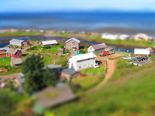
However, the word has made a comeback courtesy of photography. By a trick of lenses and software, people have devised a way of giving a real scene the appearance of a diorama. By adding foreground and background blur the impression of a shallow depth of field such as is found in close-up photography is achieved. This tricks the brain into, on first viewing, seeing the photograph as a set with models: see examples here and here. I understand that the Olympus PEN range of cameras have the facility to create these built into them as an effect. The only question I have is, "Why?" I can see that it's a trick that is easily done, but what is its purpose? I can't think of a use to which I would put it, so its reason is lost on me.
What has my photograph of the top of a yew hedge* against a blue sky with white clouds got to do with dioramas? Well, it occurred to me that the photograph could be mistaken for a view of the jungle-covered hills of somewhere such as New Guinea. Which would make the image something akin to a "reverse photographic diorama"!
* See another of my images of a yew hedge cut in this traditional manner here.
Camera: Olympus E510
Mode: Aperture Priority
Focal Length: 28mm (56mm/35mm equiv.)
F No: f5.6
Shutter Speed: 1/1000
ISO: 100
Exposure Compensation: -0.7 EV
Image Stabilisation: On
I'm sure the curators would disagree, but I think quite a few museums have lost their way when it comes to displaying their contents. Increasingly I find buildings where the displays are pared down in a minimalist way, the "educational" is promoted very heavily, and there seems to be an emphasis on style rather than exhibits.
The Victorians got a lot right with their approach: pile in as much as you can, label everything, add a few panels to give background information and an overview, and leave the rest to the visitor. One of my favourite London collections is the Sir John Soane Museum. It holds the artefacts amassed by the neo-classical architect, and though it was put together just before the Victorian period, it follows their approach to display.
In my youth I visited York reasonably regularly, and in that city the Yorkshire Museum was a magnet for me because of its collection of stuffed birds. Courtesy of Victorian "collectors" (whose methods of shoot and stuff I deplored) I got to see many species that I would otherwise never have set eyes on. Not only extinct birds such as the Great Auk, but also the extreme rarities that pass your way only occasionally or never. These were usually presented singly or in groups in glass cases. There seemed to be room after room of such exhibits, broken up with the odd diorama showing a bird, such as the black grouse, against a painted backdrop of its habitat, with a few plants and rocks scattered about. In fact, that was my introduction to the word "diorama", and its a word I only occasionally came across in subsequent years. Today, in museums, the diorama as a method of presentation seems to be viewed as old hat.
However, the word has made a comeback courtesy of photography. By a trick of lenses and software, people have devised a way of giving a real scene the appearance of a diorama. By adding foreground and background blur the impression of a shallow depth of field such as is found in close-up photography is achieved. This tricks the brain into, on first viewing, seeing the photograph as a set with models: see examples here and here. I understand that the Olympus PEN range of cameras have the facility to create these built into them as an effect. The only question I have is, "Why?" I can see that it's a trick that is easily done, but what is its purpose? I can't think of a use to which I would put it, so its reason is lost on me.
What has my photograph of the top of a yew hedge* against a blue sky with white clouds got to do with dioramas? Well, it occurred to me that the photograph could be mistaken for a view of the jungle-covered hills of somewhere such as New Guinea. Which would make the image something akin to a "reverse photographic diorama"!
* See another of my images of a yew hedge cut in this traditional manner here.
photograph and text (c) T. Boughen
Camera: Olympus E510
Mode: Aperture Priority
Focal Length: 28mm (56mm/35mm equiv.)
F No: f5.6
Shutter Speed: 1/1000
ISO: 100
Exposure Compensation: -0.7 EV
Image Stabilisation: On
Friday, October 09, 2009
I should coco
click photo to enlargeThere may be good reasons for calling a Mexican restaurant Coco, but none immediately spring to mind. I came across this one as I was gathering images in Peterborough. It was at the tapered end of a block of buildings with a road at each side. As I looked up at the stainless steel logo and text reflecting the sky, and took in a second reflection on some glass below, the phrase, "I should coco" came to me. And, with that thought echoing around my head I took my photograph and departed.
"I should coco" is one of those sayings that I'd occasionally heard, but didn't really understand. I recalled it being the title of a pop album, but couldn't remember by which band. I had the impression that when used in a piece of prose it meant something like, "Yeah, right!" uttered in an ironic way. So, as you do, I Googled the phrase, and came up with the name of Supergrass as the band. Then I alighted on a fascinating website called World Wide Words, and found a whole entry on the phrase. It seems that it started life in London in the 1930s, gained in popularity in the 1950s, and was originally spelled, "I should cocoa!". Its meaning is something approximating to "Not on your life!" or "No way!", though the author of the piece, Michael Quinion, suggests that it was originally rhyming slang for, "I should say so!" He further speculates that its spelling changed due to the popularity of Coco the Clown. I was glad to have stumbled upon his website and immediately bookmarked it.
Anyway, back to the photograph. I'm not a fan of brown bricks, especially when they are pointed with matching mortar, so the overall presentation of this building didn't appeal to me. However, the gleaming, stainless steel signs and glass reflecting the sky and clouds did. They made, I think, a reasonably interesting shot. Whether they would work quite as well when the blue sky was obliterated by a dense blanket of stratus is quite another matter!
photograph & text (c) T. Boughen
Camera: Lumix LX3
Mode: Aperture Priority
Focal Length: 7.4mm (35mm/35mm equiv.)
F No: f5
Shutter Speed: 1/800
ISO: 80
Exposure Compensation: -0.66 EV
Image Stabilisation: On
Labels:
language,
Peterborough,
reflection,
sign,
sky
Thursday, October 01, 2009
Illusions
click photo to enlargeI like a good, confusing, photographic illusion. I don't mean the staged sort that shows a man holding the Great Pyramid above his head, or a small (but actually distant) person apparently diving into someone's mouth. No, I mean those "found" images that either show something that looks to be one thing, but is in fact another, or those that confuse us to the point where we can't understand what it is that we are looking at.
I've taken a few examples of this kind of photograph in the past including a fire escape staircase, a giant mirror ball, a theatre's sign, a reflection in a well, a piece of bark, and a bicycle stand. The other day, in Peterborough, I took another one. As I was passing a heavily glazed office block that I've photographed before, I was taken by the reflection of the sky and clouds in the tinted glass of the walls/windows. Approaching the building it appeared as if the clouds were floating from above my head into and out of the walls of glass. So I pointed my camera upwards and tried to capture this illusion. I had to wait a short time until the actual and the reflected clouds seemed to be making the transition, then I pressed my shutter. What I hadn't banked on was that the final image, at first glance, when it appeared on my computer screen, would look like the perfectly still water of an inviting swimming pool into which - if it really existed - I'd be tempted to jump.
photograph & text (c) T. Boughen
Camera: Lumix LX3
Mode: Aperture Priority
Focal Length: 5.1mm (24mm/35mm equiv.)
F No: f3.2
Shutter Speed: 1/400
ISO: 80
Exposure Compensation: -0.66 EV
Image Stabilisation: On
Labels:
illusion,
office blocks,
Peterborough,
reflections,
sky
Friday, July 17, 2009
Recipe for the apocalypse
click photo to enlargeHere's my recipe for a photograph of an apocalyptic sky in the style of the English Romantic painter, John Martin (1789-1854).
Ingredients
One grimy bird bath
A stormy sky, ideally featuring both sun and thunder
One tree
Method
Prepare your bird bath by leaving it exposed to the elements for a few years. Fill it with tap water when it dries out, otherwise let the rain do its job. When the bird bath grows a patina of orange lichen try and scrape it off. Please note, you won't succeed in this task, but that doesn't matter since the remaining patches distort the everyday colours reflected in the water in a preternatural way.
On a day when thunder is rumbling around, the broken clouds are of various shades of white and grey, and the sun is making intermittent appearances, crouch down with your camera fitted with a macro lens and try and get a focus lock on the clouds reflected in the bird bath. If the autofocus keeps finding the surface of the water, or the orange patches of lichen just below the surface, either switch to manual focus or wait for the sharp edge of a cloud to appear against the brightness of the sun: the latter usually produces an autofocus lock, and also stirs the colours up nicely, adding pinks, oranges, purples, etc. In order to anchor the image in the real world, as opposed to creating a shot that is entirely from the dream world of a deranged imagination, make sure your position allows you to include part of the reflected tree. Then press the shutter.
Serving
You can either take the shot as it comes, or post-process to taste. I like to increase the contrast very slightly to enhance the image's "end of the world" feel.
There will be some people who'll tell you that a photograph secured in this way looks contrived, unreal, "out of this world.", and must be the product of post-processing tricks. Take such remarks as compliments rather than the slurs that are intended, then show them the original RAW file. The close correspondence between the two will help them to understand that our world holds an infinity of weird and wonderful images that can be captured directly, without any need to resort to Photoshoppery.
photograph & text (c) T. Boughen
Camera: Olympus E510
Mode: Aperture Priority
Focal Length: 35mm macro, (70mm/35mm equiv.)
F No: f6.3
Shutter Speed: 1/400
ISO: 100
Exposure Compensation: 0 EV
Image Stabilisation: On
Labels:
apocalypse,
bird bath,
humour,
John Martin,
recipe,
reflection,
sky,
storm
Wednesday, February 04, 2009
Using the sky
click photo to enlargeThe other week I gave a talk about garden and flower photography to the local garden club. During the course of the presentation I talked about whether or not to include sky in shots of gardens. My view was that, in general, better photographs of gardens result from compositions that exclude the sky unless including it adds something positive to the image. So, I said, I favoured a blue sky broken by clouds, or a sky with interesting clouds, but I would strive to eliminate from my photographs, or at least minimise, flat, grey stratus, or a boring, clear blue sky.
In a country that is known for its clouds, where the changeable weather is a favourite topic of conversation, and where many choose their holidays on the basis of how clear and blue the sky is, that last phrase bit to be a little controversial, and so it proved. So I was careful to make it clear that I was only disparaging flawless azure in photographic terms - for other purposes I recognised that it had its uses.
Much the same might be said of whether or not to include the sky in a landscape photograph. I think it's true that for the landscape photographer an interesting arrangement of clouds can be the difference between an average image and a good one. In fact, it's no exaggeration to say that a beautiful sky can be the star of a landscape photograph, and what appears below can be merely the supporting cast. An image like today's illustrates that point quite well. It isn't a wonderful shot, but what good qualities it does possess rely heavily on the colours, patterns and tones of the sky: the silhouettes of the wind turbines, the electricity pylons and wires are the nominal (and necessary) subjects, but are secondary to what is happening above.
Regular visitors to the blog will note another image where the sun has been deliberately included (see here).
photograph & text (c) T. Boughen
Camera: Olympus E510
Mode: Aperture Priority
Focal Length: 14mm (28mm/35mm equiv.)
F No: f7.1
Shutter Speed: 1/2000
ISO: 100
Exposure Compensation: 0 EV
Image Stabilisation: On
Labels:
amateur photography,
electricity pylons,
sky,
sun,
wind turbines
Subscribe to:
Posts (Atom)