Tuesday, July 28, 2015

Benefaction board

click photo to enlarge
Until the advent of the Poor Law Act of 1832, legislation that set in motion Unions and then workhouses of the kind seen at Southwell, the support of the poor was organised at the parish level and involved charity, bequests and benefactions made by groups and individuals. Many churches still display old benefaction boards that describe the money, rents, land etc that was given to produce an income to be spent supporting the poor. Often these benefactions were very precise in what they stipulated should be done with the money, and the fact that they were publicly displayed in church made the terms of the gift widely known and less open to abuse.

The example shown above is displayed in the church of St Peter at Barton upon Humber in Lincolnshire. It appears to date from the eighteenth century and is more ornate than many, but is quite typical in terms of what the benefactor stipulates. Though the spelling isn't quite standardised, abbreviations abound, and initial "s" can be confused with "f", it is still quite easy to read. I hope you enjoy doing so.

photograph and text © Tony Boughen

Camera: Olympus E-M10
Mode: Aperture Priority
Focal Length: 45mm (90mm - 35mm equiv.)
F No: f5
Shutter Speed: 1/100 sec
ISO:1000
Exposure Compensation: -0.33 EV
Image Stabilisation: On

Thursday, July 23, 2015

Poppies and contre jour

click photo to enlarge
Light through petals is a beautiful sight. During the summer months I frequently make use of the low sun of morning and evening as it slants across our gardens, lighting up the petals of the flowers. A those times of day there are also pools of deep shadow and the combination of illuminated flowers and shade makes a striking contrast.

However, there is one problem with photographing contre jour flowers - the best effect is seen from behind the blooms because the flower heads are always turned to face the strongest source of light. Consequently, if you are a purist about such things (and I don't think I am) then every photograph of this kind has an unsatisfactory element to it.

Today's shot illustrates this up to a point. To achieve the striking red points that make this photograph work I had to be in a position where all the flower heads were facing away from me. In fact, it matters less in this example because the flowers are working as points of colour in a larger composition rather than being the sole subject. I took the photograph on an evening walk as we passed a field of oilseed rape.

photograph and text © Tony Boughen

Camera: Olympus E-M10
Mode: Aperture Priority
Focal Length: 36mm (72mm - 35mm equiv.)
F No: f5.6
Shutter Speed: 1/1250 sec
ISO:200
Exposure Compensation: -0.3 EV
Image Stabilisation: On

Sunday, July 19, 2015

Southwell Workhouse, Nottinghamshire

click photo to enlarge
A small magazine that I edit recently carried an article written by a man who was sent to the workhouse in Boston, Lincolnshire, at the age of 6 years old, following the death of his parents. What made the episode even more heart-rending was the fact that he went to live there with his younger brother but his siblings were looked after by relatives. It was an experience that the writer detested, circumstances from which he tried to escape, and a place he was glad to see the back of when he was old enough to leave.

I thought about this man's story as we walked down the path in today's photograph, through well-tended vegetable patches, towards the large workhouse building, one of a group that constituted, from 1834, the Southwell Poor Law Union Workhouse. It was our second visit to a building that was erected in 1824 for 158 poor people of all ages who could not, mainly through age or infirmity, support themselves. Most "inmates" were elderly but some were of working age and there were children too. From the outset a great stigma attached to being sent to the workhouse. People who were subjected to its spartan regime felt failures, and whilst there were those who went willingly because the alternative was homelessness, hunger and death, there were many who went reluctantly and looked forward to the time when they would be able to leave.

To my twentieth and  twenty-first century eyes the building looks forbidding, having all the welcoming character of a factory or a prison. Passing into the outdoor exercise yards, where inmates were segregated by age and sex, the penal comparison becomes stronger. Walking up and down the stairs from sparsely furnished room to sparsely furnished room - all very much the same - and down into the depths where food was prepared, the feeling of a prison was further reinforced.

The building is in the care of the National Trust, one of the buildings they have bought and opened to the public that is not a former country house. Perhaps, as I said to my wife, an antidote to the excess of their multiple mansions.

photograph and text © Tony Boughen

Camera: Olympus E-M10
Mode: Aperture Priority
Focal Length: 12mm (24mm - 35mm equiv.)
F No: f5.6
Shutter Speed: 1/1250 sec
ISO:200
Exposure Compensation: -0.3 EV
Image Stabilisation: On

Friday, July 17, 2015

Fourteenth century door, Southwell

click photo to enlarge
In medieval Gothic architecture an arch that is convex below and convex above and sweeps up to a sharp, tapered point is very characteristic of the fourteenth century. Such a form became fashionable at that time and appeared in window tracery, tomb canopies, blind tracery, door surrounds, wooden doors and much else. It is called the "ogee" arch and such an arch is described as "ogival". Another term used to describe this "S" shaped moulding is "cyma recta".

We visited Southwell Minster in Nottinghamshire recently. It is a relatively small major church, cathedral-like, and is mainly of the twelfth century (Norman period) and thirteenth century (Early English period). As we entered the building through the north porch I stopped to admire the wooden doors through which we were about to pass. They were so clearly fourteenth century, very sculptural, and so well lit that I had to photograph them. The sinuous moulding that decorated the surface had ogee forms at the top and bottom of each cell indicating its date. However, that pattern, very like a net pulled taut, also suggested the fourteenth century. It too has a specific name: architectural historians call it reticulated (meaning net-like) tracery. Within each shape I could make out the worn forms of quatrefoils, four-leafed shapes also much used in Gothic architecture.

It was clear that the door had survived because of the shelter from the weather that the large, vaulted porch provided. However, the wear of everyday use over a period of seven hundred years was evident in the worn mouldings, splits, knocks and gouges. Sometimes on such doors the metal-work is also original, frequently worn very thin through long use. Many of the large headed nails looked as though they dated from the time of the door's construction. But, the door handle, though rusted and marked, hadn't the wear of centuries and it is probably a Victorian replacement.

photograph and text © Tony Boughen

Camera: Olympus E-M10
Mode: Aperture Priority
Focal Length: 12mm (24mm - 35mm equiv.)
F No: f5.6
Shutter Speed: 1/15 sec
ISO:2000
Exposure Compensation: -0.33 EV
Image Stabilisation: On

Wednesday, July 15, 2015

Belton boat house

click photo to enlarge
I've long felt that the UK's country houses are largely stuffed with expensive tat, objects that serve no purpose other than to provide something on which the wealthy owners can spend their excess of money. Truly, shopping as a leisure activity didn't begin in in the malls of the second half of the twentieth century, but much earlier, on the Grand Tour and in the workshops of painters, wallpaper manufacturers, and craftsmen who decided that there was a living to be made parting the wealthy from their cash by selling them elaborate and ornate versions  of everyday articles, or specially created objects whose sole purpose was to be collected.

The last of the photographs I am showing from our visit to Belton House near Grantham, Lincolnshire, is a view of the boat house. This small building sits at the edge of a man-made lake that is surrounded by trees. Like much else at Belton it is more than it needs to be. However, it makes a nice eyecatcher in its location and doesn't quite scream "money" in the same way that the house does, even though it was designed by the notable architect, Anthony Salvin, in 1838-9 and is in the style of a Swiss chalet with fish-scale tiled roof and walls of basket-weave pargetting.

photo and text © Tony Boughen

Camera: Olympus E-M10
Mode: Aperture Priority
Focal Length: 42mm (84mm - 35mm equiv.)
F No: f8
Shutter Speed: 1/125 sec
ISO:200
Exposure Compensation: -0.3 EV
Image Stabilisation: On

Monday, July 13, 2015

Enough is as good as a feast

click photo to enlarge
The purpose of our recent visit to Belton House, a National Trust property near Grantham in Lincolnshire, was to see the interior. On our first visit in January only the grounds were open to visitors.

As we wandered from room to room, taking in painting after painting, tapestries, elaborate furniture, ornate plasterwork, collections of objets d'art, hand-painted wallpaper, row upon row of books and the rest, I quickly felt sated and the title of today's blog post came to mind. The fact is, there was simply a superfluity of everything, and everything dripped opulence. I found myself wondering how many thousands of people had spent their lives in penury, scraping a living, hungry, dying before their time, so that the cosseted residents of this stately pile could agonise over whether to buy a Meissen figurine or one from Limoges, whether it was to be a Gobelins tapestry or one from a less prestigious source, or if walnut burr might look better than figured mahogany on the new console table.

I took a few interior photographs but was happier when we were outside once more. The gardens didn't induce the same state of mind and I took a couple of photographs of a statue that looked like Ceres, but without the stalks of wheat in her container. She was standing in some gravel surrounded by lavender in the Dutch Garden at the north side of the house. As it happens, today's title could also apply to the two photographs that I'm showing. I prefer the simpler shot over the wider angle view, even though it is a product of the foreshortening of my lens and not an image that occurs to the naked eye. On reflection, my feelings about this house may have been partly  influenced by the fact that in recent weeks we had visited two other National Trust properties that were on a smaller, more human scale. We are shortly going to see, for the second time, Southwell Workhouse. That should be a contrast!

photograph and text © Tony Boughen

Photo 1
Camera: Olympus E-M10
Mode: Aperture Priority
Focal Length: 150mm (300mm - 35mm equiv.)
F No: f7.1
Shutter Speed: 1/500 sec
ISO:200
Exposure Compensation: -1.0 EV
Image Stabilisation: On

Saturday, July 11, 2015

Belton House revisited

click photo to enlarge

I first visited Belton House, near Grantham, Lincolnshire, in January on a cold, bright day when the shadows were long, the grass was frosted and the man-made lakes were almost completely frozen over. I posted a couple of photographs from that visit, one that showed the distant north elevation of the house in black and white, and one of the deer park tree guards. The other day we returned for a second visit with a view to having a look inside the building.

Before we did that I managed to get a second shot of the exterior, this time the south elevation that looks across the deer park. The trees with their guards helped to frame the building and the fleeting sun that periodically appeared from behind well-figured clouds cast patches of light across the scene that gave it more interest than the flood-lighting of the sun on a south facade can achieve unaided. What is depicted in the photograph is James Wyatt's 1777-8 veneer of warm, honey-coloured Ancaster stone over a seventeenth century structure. It occurred to me as I examined this facade that it looks better from a distance where its massing impresses: when you are closer to the building the detailing is insufficient to keep your interest.

photograph and text © Tony Boughen

Camera: Olympus E-M10
Mode: Aperture Priority
Focal Length: 14mm (28mm - 35mm equiv.)
F No: f5.6
Shutter Speed: 1/1000 sec
ISO:200
Exposure Compensation: -0.33 EV
Image Stabilisation: On

Thursday, July 09, 2015

Burne Jones and Biblical names

click photo to enlarge
As a child I attended a Church of England primary school, the only primary school in the place where I grew up. Consequently I came to know more Bible stories than if I had gone to a non-denominational school. Like many children I responded to these stories as a mixture of history and myth because some of the things that happened in them seemed highly unlikely. I also came to know the names of many Biblical characters and was fascinated by some of the more unusual names that I remember to this day.

The three men depicted in this stained glass by the Arts and Crafts artist, Edward Burne-Jones, have names that were odder than most. They are Shadrach, Meshach and Abednego, characters in a story about the prophet Daniel, who were thrown into a fiery furnace on the orders of Nebuchadnezzar, King of Babylon and were saved by God, an act that much impressed the king. This glass, in the west window of the church at Middleton Cheney, Northamptonshire, is the best of a particularly fine suite of glass made by William Morris' firm for the building between 1864 and 1870. The contraposto stance of the figures, the faces, the deep, rich colours and the semi-abstract depiction of the flames are all characteristic of Burne Jones, and the quality of the glass is typical of the Morris firm at its best.

photograph and text © Tony Boughen

Camera: Olympus E-M10
Mode: Aperture Priority
Focal Length: 16mm (32mm - 35mm equiv.)
F No: f5.4
Shutter Speed: 1/80 sec
ISO:1250
Exposure Compensation: -0.33 EV
Image Stabilisation: On

Tuesday, July 07, 2015

Four Thirds macro on OMD E-M10

click photo to enlarge
When I used Olympus Four Thirds cameras I recall people being a bit sniffy about that manufacturer's 35mm f3.5 Macro lens. The consensus was that the Olympus Four Thirds 50mm f2 was better. At three times the price perhaps it should have been. However, what people often seemed to forget is that there are not many poor dedicated macro lenses and the 35mm f3.5 isn't in any way a poor lens. In recent years I used the Canon 100mm f2.8 L IS Macro, a lens that is universally regarded as one of the sharpest lenses available, and the fact is I was pushed to see a great difference between it and my Olympus lens except in the "creaminess" of the bokeh: in that regard the Canon excelled.

When it came to putting together a set of lenses to use with my new OMD E-M10 (what a clunky name!) I considered the Olympus Micro Four Thirds 60mm f2.8 Macro. However, I thought it might be useful to see how the old 35mm macro performed first. So, I bought a £25 Chinese-made adapter, with auto-focus connectors, so that I could use it with the new camera. It appears to be well-made and works as advertised but is slow (as expected) to auto-focus, and "hunts" (also as expected) too much. It would be a lot better, I'm sure, on an OMD E-M1. But, using the E-M10's manual mode with magnifier it works extremely well. And in fact, when I used the Canon in recent years, I usually used it in manual mode.

I did a little flower photography to test the combination and while snapping one of my favourite flowers, a California poppy, this hover fly settled on it. The slightly cropped shot above is the best example I secured that demonstrates the resolving power of the lens/camera combination. And it was wide-open and hand-held!

photograph and text © Tony Boughen

Camera: Olympus E-M10
Mode: Aperture Priority
Focal Length: 35mm Macro (70mm - 35mm equiv.)
F No: f3.5
Shutter Speed: 1/320 sec
ISO:200
Exposure Compensation: 0 EV
Image Stabilisation: On

Sunday, July 05, 2015

A new camera system

click photo to enlarge
I've had several emails recently from sharp-eyed readers who have noticed that many of my recent photographs have been taken with an Olympus OMD E-M10. The fact is, I've sold most of my Canon "full-frame" equipment and invested some of the returns in Micro Four Thirds (MFT). I enjoyed the Canon camera and lenses but I never really came to terms with their weight. Had I been younger it might have been different. But, as someone who shot with an Olympus OM1 for about thirty years, and then eventually settled on Four Thirds cameras and lenses, it was perhaps inevitable that I would succumb and seek out something smaller.

I was very unhappy when Olympus pulled the plug on Four Thirds - everything about that system appealed to me. And, having been left high and dry with only vague promises about future compatibility of old Four Thirds lenses with future Micro Four Thirds cameras, I went to a different manufacturer for my gear. But, now I've taken the plunge, albeit in a smallish way with an OMD model at the end of its product cycle and therefore quite good value. I'll buy another, higher end, body in the fullness of time, one with both phase and contrast detect sensors that will fully utilise my Four Thirds lenses. But, for now, I'm happy enough with the E-M10 body and a selection of MFT lenses, though I must make some adjustments to make it choose lower shutter speeds. I'm also using a third party adapter with my Four Thirds 35mm macro lens, something that works quite well. The Sony RX100 will continue as the camera I always carry when photography isn't uppermost in my mind. That just leaves the question of my Nikon D5300 and the 14-150 lens. Will that still have a place in my armoury, or is that on its way out too? Time will tell.

Today's photograph is a shot taken with the E-M10 and the 9-18mm (18mm-36mm in 35mm terms) wide angle zoom, a lens I am particularly enjoying. It shows the interior of the medieval church of St Botolph in Boston, Lincolnshire. The fine Victorian font is by Pugin - not the famous A.W.N. but his gifted, prolific, though less well-known son, E.W.

photograph and text © Tony Boughen

Camera: Olympus E-M10
Mode: Aperture Priority
Focal Length: 16mm (32mm - 35mm equiv.)
F No: f5.4
Shutter Speed: 1/80 sec
ISO:1250
Exposure Compensation: -0.33 EV
Image Stabilisation: On

Friday, July 03, 2015

Pantries, larders and disappearing words

click photo to enlarge
When I was young the words "pantry" and "larder" were often heard. My parents used both of them, interchangeably, and I knew they signified a small room adjoining the kitchen where food was stored. Only when I was older, and picked up a little French, did I realise the derivation of the words - the pantry was originally the room where bread was stored, and the larder was the store for meat, probably initially, bacon. However, houses gradually stopped being built with this specialised room-cum-cupboard, complete with stone or concrete shelf, and food storage passed to a group of small cupboards in a fitted kitchen. Today, in the UK, we are at the point where pantry and larder are no longer everyday terms.

I was reflecting on this recently when visiting an old house in the care of the National Trust at Canon's Ashby in Northamptonshire. I'd entered a low, basement-level room that had been set out to show how it was originally a food store. I pondered whether it was a pantry or a larder and concluded that it was neither, being too large for such a humble designation. It was presumably chosen as a food store for its cool, cave-like qualities, a place where food suitably stored would have an extended life in the lower temperatures it offered.

The National Trust had set it up quite nicely with a good selection of jars and pancheons. There were even hares and pheasants (presumably stuffed) hanging from joists, and if you look carefully you'll see a couple of rats (also stuffed). The light and subdued colours of the room were very appealing and I came away with a couple of shots that I quite liked, of which this is one.

photograph and text © Tony Boughen

Camera: Olympus E-M10
Mode: Aperture Priority
Focal Length: 14mm (28mm - 35mm equiv.)
F No: f3.5
Shutter Speed: 1/30 sec
ISO:6400
Exposure Compensation: -0.33 EV
Image Stabilisation: On

Monday, June 29, 2015

Tenacious ivy

click photo to enlarge
Ivy is a plant I admire, one whose ecological value is apparent to me, a species without which the world would probably be a poorer place. And yet I can't bring myself to like it. The plant's tenacity, the way it comes back after being the recipient of axe, clippers, poison and much else, is awe inspiring. The way it manages to flourish in the most unpromising niche in woodland, waste land, the urban jungle and even the most manicured of gardens is, in its way, admirable. But still I don't like it.

I think my antipathy stems from the fact that sometimes it is just too successful. Not content with growing up the side of a tree it too often expands and tries to cover the whole of it, disfiguring the living giant with a mound of glossy greenery. In churchyards, it spreads horizontally and vertically, taking the sharp edges off everything as it throws a mat of leaves on gravestones, monuments, seats, trees and anything else that gets in its way. Once started it becomes a tide that can only be stopped by the most concerted effort. On buildings, what at first appears attractive soon turns to intrusive and even after removal it leaves unattractive marks where its stems have grown. I have sympathy with those who cut the stems at ground level and cause the green growth to slowly die, turn brown and eventually fall away.

On a recent walk I came across a tree with a trunk completely covered in ivy stems - not an inch of bark could be seen. Glossy leaves were flourishing in the canopy above but the trunk looked like it was wrapped in writhing snakes. With the exception, that is, of a couple of leaves that had made an optimistic appearance in the deep shade of the woodland floor.

photograph and text © Tony Boughen

Camera: Olympus E-M10
Mode: Aperture Priority
Focal Length: 35mm (70mm - 35mm equiv.)
F No: f5.6
Shutter Speed: 1/60 sec
ISO:3200
Exposure Compensation: -0.33 EV
Image Stabilisation: On

Saturday, June 27, 2015

Road signs, footpaths and barley

click photo to enlarge
We were heading for the south of Northamptonshire to do a little walking and the signs were not good. In fact, the signs themselves were fine, but the trees had grown so that half of each one by the side of most major roads could not be read. Northamptonshire County Council or the Highways Agency or whoever is responsible for making sure road signs can be clearly seen hadn't been cutting the trees back and so, a couple of times, we went astray.

Had I thought more deeply about this I'd have realised that this was a taste of things to come, and in fact, the signs were definitely bad. The realisation that Northampton isn't "walking country" hit us after we'd ventured only a couple of hundred yards into some fields on a footpath. The council's waymarks were old, inaccurately placed to indicate the direction of the route, frequently missing, and invariably so faded that any information they once held was no longer legible. Those faults dogged us for several hours as we tried to follow paths marked on the Ordnance Survey map. The fact that many routes showed no sign of anyone having walked them before us didn't help. Occasionally we could see that a solitary walker had passed the way we were going, but such signs were rare.

I can't account for what we discovered in this part of the country. Yes, it is farmland, but it is varied, hilly, wooded, and visually and historically interesting: a more attractive area in which to walk than some that we know that are better waymarked and more frequented. Today's photograph shows my wife, map in hand walking up a hill one evening through ripening barley. This path was unusual in that other people had walked it, but all too common in that the farmer didn't appear to have cut the way of the path - walkers had trampled down the line of the route. Reflecting as we walked, I could only surmise that the absence of walkers is due to the fact that in many people's minds walking can only be undertaken in recognised "walking areas" - the Lake District, the Yorkshire Dales, Dartmoor, the Peak District etc when in fact it is a pleasurable, informative and photographically rewarding undertaking almost anywhere in Britain.

photograph and text © Tony Boughen

Camera: Olympus E-M10
Mode: Aperture Priority
Focal Length: 14mm (28mm - 35mm equiv.)
F No: f5.6
Shutter Speed: 1/1000 sec
ISO:200
Exposure Compensation: -0.33 EV
Image Stabilisation: On

Thursday, June 25, 2015

Popular house names

click photo to enlarge
In 1988 the Halifax Building Society concluded from a study of its computer database of 15 million investors that the most common house name in Britain was "The Bungalow" with 4,485 properties carrying this very boring designation. In second place was the equally uninspiring, "The Cottage", with 4,049 references, and third was the slightly more colourful, "Rose Cottage", with 2,936 properties given that name.

Tradition weighs heavy in the name that houses are given, and once given they tend to linger. I have the complete list of the 150 or so most frequently used names, and I have to say that I must have seen most of them at one time or another and none are surprising. Such names tend to be descriptive in one way or another. "The School House" is fourth in the list and always refers to a house that was formerly the abode of a teacher or headteacher when such jobs came with living accommodation."The Vicarage" (in 12th place) is a name that arose in similar circumstances though that name usually implies that the local cleric still uses it as his (or her) home, with "The Old Vicarage" usually indicating a former vicar's residence, often sold because it was too large and too expensive for the church to maintain. Trees abound in house names - "The Hawthorns", "Oak Dene", "Beech House", "Conifers" and "Holly Cottage" are just a few arboreal names found in the list. The building's location is another favoured hook on which to hang a name - "Windy Ridge", "Brookfield", "The Mount", "Fair View" and "Corner Cottage" are examples.

Today's photograph could well be from a "Rose Cottage" because properties with that name frequently feature a climbing rose near the main entrance, around a window or on a sunny wall. However, it is a second photograph from my visit to Lower Brockhampton Manor House in Herefordshire. You can see the rose on the left of the main building in my photograph of the other day.

photograph and text © Tony Boughen

Camera: Olympus E-M10
Mode: Aperture Priority
Focal Length: 30mm (60mm - 35mm equiv.)
F No: f5.6
Shutter Speed: 1/80 sec
ISO:200
Exposure Compensation: -0.33 EV
Image Stabilisation: On

Tuesday, June 23, 2015

A photographic truism

click photo to enlarge
It's a truism that it's possible to take a good photograph of a bad subject. In fact, as I've said elsewhere in this blog, many of the best photographs work despite, not because of, their subject matter. Certainly there are those who disagree with this proposition, maintaining that the subject is of paramount importance in all photographs. It's my belief that, whilst this is true where photography serves a wider need, in those instances where the photograph itself is the only goal, where it serves only itself, the subject matters less than everything else about the image.

Today's photograph, to an extent, illustrates this point in an oblique way. Firstly let me state that I don't consider it a particularly good shot. However, it does illustrate a subject (the "Rock Around the Fleet" art installation) that, in an earlier blog post, I described as WYSIATI: I don't think it amounts to much. So why did I photograph it again and post it here? Well, the colours are what drew me to take this shot - the green of the reflective water, the blue of the sky and the buff stonework, brown brick and orange pantiles of the old buildings. But all of that wouldn't have prompted this photograph without those quirky points of day-glow pink introduced by the "art installation". So, it was the colours that caused this photograph, including the lurid hues of a weak art installation. Here, the subject doesn't really matter but its colours do.

photograph and text © Tony Boughen

Camera: Olympus E-M10
Mode: Aperture Priority
Focal Length: 18mm (36mm - 35mm equiv.)
F No: f5.6
Shutter Speed: 1/2000 sec
ISO:200
Exposure Compensation: -0.33 EV
Image Stabilisation: On

Sunday, June 21, 2015

Ferns, fanatics and abstruse names

click photo to enlarge
It's common to find jobs and professions using technical and abstruse language to exclude the lay person and as an attempt to increase the mystique, status and hence income associated with their activity. It's a subject I've touched on before on this blog. What I don't understand, however, is why hobbyists also fall victim to this malady.

I suppose there are some who seek to maintain a level of exclusivity, or wish to elevate their past-time into something grander than it might appear. But it's also true that hobbyists join together in clubs and societies, and that many of these struggle to achieve the numbers required to make them vibrant and effective. Obscure names don't help with this. Why, for example, do some people call themselves campanologists rather than bell-ringers (which others are quite happy to use)? What benefit arises from the more obscure name? Or what about the numismatists and philatelists? What's wrong with coin and stamp collectors that they need to label themselves with names that many will not connect with their  hobby? And then there are the pteridologists of the British Pteridological Society. "What and who?" I hear you say. Or perhaps not, because today's photograph is a heavy clue to what pteridology might involve. It is, of course, the study of ferns. Quite why the English word needs to be supplanted by a word of Greek origin in the name of this society I'm not sure but it's a common feature of many such groups.

Today's photograph shows a fern, and I'm sure that any British pteridologists could give it its proper name. I can't. I simply photographed it for the way the light was falling on its very regular fronds and how I thought it might look when converted to black and white.

photograph and text © Tony Boughen

Camera: Olympus E-M10
Mode: Aperture Priority
Focal Length: 45mm (90mm - 35mm equiv.)
F No: f1.8
Shutter Speed: 1/2500 sec
ISO:200
Exposure Compensation: 0 EV
Image Stabilisation: On

Friday, June 19, 2015

Back street shop front

click photo to enlarge
The British character is traditionally supposed to be low key, reserved, eschewing ostentation and brashness. There is an element of truth in this view. However, there have always been plenty of exceptions to this rule, and the internationalisation of many aspects of life have introduced more "showy" elements into British culture.

When I first crossed the waters that separate our island from the rest of the world one of the first things I noticed was how much more intrusive advertising could be in some European countries. Large cut out letters forming names on top of buildings were commonplace in Greece and France but very rare in Britain. Store fronts often had names on that stretched right across the facade where in Britain they were usually more modest. Roadside adverts were more noticeable even given the lower population density. But, things change, ideas are imported, and Britain now exhibits more of these kinds of features despite having planning regulations that seek to control them. I came across this example in Hull recently. The shop's location off a main thoroughfare clearly prompted the owner to come up with this large, eye-catching advertisement that could be seen by anyone glancing down the side-street. And, despite the colours having begun to fade, it worked, hence my photograph!

photograph and text © Tony Boughen

Camera: Olympus E-M10
Mode: Aperture Priority
Focal Length: 14mm (28mm - 35mm equiv.)
F No: f5.6
Shutter Speed: 1/1000 sec
ISO:200
Exposure Compensation: -0.33 EV
Image Stabilisation: On

Tuesday, June 16, 2015

Photographic and architectural contrasts

click photo to enlarge
It would be hard to find a greater architectural and photographic contrast than is exhibited in the last post and that of today. A large, angular, urban, twenty-first century health centre made of concrete and steel is just about as distant as you can get from a late 1300s, timber-framed, rural manor house with a later fifteenth century gatehouse and moat.

The photographic treatment adds to the contrast. Black and white, I think, suits the modern building. However, when I idly looked at a monochrome version of the shot above it simply confirmed my opinion that I had to stick with colour despite the "chocolate box" character that it gives to the subject. I recently commented on how, when you visit a place for the first and perhaps only time, you have to accept the weather and light that prevails. Here it was shortly after 10.00am on a June morning with scarcely any cloud in sight when we came upon Lower Brockhampton manor house in Herefordshire. Consequently the light was bright and sharp and the colours vibrant. This house is a subject I'd like to tackle on a slightly misty autumn morning with some brightness and cloud. Or perhaps a bright, late spring evening when clouds pick up a yellow tint from the low sun. As it was the strong white of the paint over the timber-framed walls had to be controlled by under-exposure, and a bit of post-processing was required to get the whole scene back to the brightness levels that my eye saw.

photograph and text © Tony Boughen

Camera: Olympus E-M10
Mode: Aperture Priority
Focal Length: 9mm (18mm - 35mm equiv.)
F No: f5.6 Shutter Speed: 1/1600 sec
ISO:200
Exposure Compensation: -0.33 EV
Image Stabilisation: On

Sunday, June 14, 2015

Architecture in black and white

click photo to enlarge
My earliest "serious" photography at the start of the 1970s involved a Russian Zenit E 35mm camera with a 58mm f2 lens and lots of rolls of Ilford FP4 film. It was a fairly basic setup but all that was needed to get an understanding of the basic principles of good exposure and composition. Later I added a couple of lenses, then moved to an Olympus OM-1n, and after a year or two began my own film processing and printing, again, in black and white. At this time colour prints were the favoured means of printing, but I went with black and white and slides (transparencies). At around the time our first child was born I started using colour film.

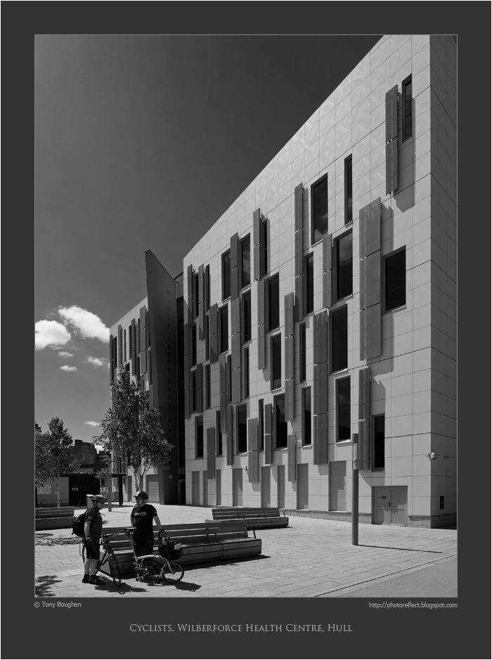
During those years, and since, architecture has been one of the subjects at which I have most often pointed my camera. Moreover, architecture has been the subject through which I have most frequently reverted to black and white. There's something about the sharp edges and details of buildings, as well as their three-dimensionality, that makes them ideal subjects for presenting in monochrome. Today's photograph is of the Wilberforce Health Centre, Hull, a 2011 building by HLM Architects. The colours of the building are off-white and grey with highlights of dark red, quite eye-catching. However, the contrasts of the colours alongside the shadows produced by a bright June day suggested to me that the building might look well with a black and white treatment. I think it does, especially with the digital equivalent of a yellow filter that darkens the sky and gives the building greater emphasis.

Incidentally, you may wonder what has happened to the rightmost cyclist's bicycle - it appears to be missing a wheel. In fact it's a small-wheel folding bike produced by the British manufacturer, Brompton and it's yet to be unfolded.

photograph and text © Tony Boughen

Camera: Olympus E-M10
Mode: Aperture Priority
Focal Length: 9mm (18mm - 35mm equiv.)
F No: f5.6 Shutter Speed: 1/1600 sec
ISO:200
Exposure Compensation: -0.33 EV
Image Stabilisation: On

Friday, June 12, 2015

Return to Prince Street, Hull

click photo to enlarge
Like many photographers, when I find a subject that appeals to me I try to secure the best photograph of it that I possibly can. However, if you have only a single occasion on which to get your shot, then you have to put up with the light, weather, season and other circumstances that prevail at the time. Consequently the end result can be disappointing because you don't achieve the possibilities that you can see in the subject.

But, where the subject is one that you can photograph with reasonable frequency the opportunity exists to improve on your earlier efforts. If you look through this blog you will find several photographs where this has been my motivation. The Humber Bridge is one such example in this blog - see here for the deep rich colours of winter, here for a dull, damp winter view, and here for a contre jour shot with people for scale. Today's post is another example of a trying to get a better shot of a subject.

I first photographed Prince Street in Hull in the 1970s and 1980s. The view from the Market Place through the archway to the curving line of three-storey, multicoloured, terraced houses of the 1770s is quite appealing. I'd more recently tried again with the subject at the end of November 2012. On that last occasion the flat lighting and the line of rubbish bins waiting to be emptied detracted from the shot. The weather on our recent visit was much more promising, and as we walked through this part of the Old Town I tried again and produced a shot that I like much better. The contrast between the deep shadows of the arch and trees with the bright, sunlit buildings works very nicely, and the silhouette of the wall-mounted street light adds a welcome detail.

photograph and text © Tony Boughen

Camera: Olympus E-M10
Mode: Aperture Priority
Focal Length: 28mm (56mm - 35mm equiv.)
F No: f5.6 Shutter Speed: 1/2000 sec
ISO:200
Exposure Compensation: -0.33 EV
Image Stabilisation: On

Wednesday, June 10, 2015

Art Deco shops

click photo to enlarge
I've written elsewhere in this blog about how, in Britain, the architecture of the 1920s and 1930s was very conservative, noting but not, in the main embracing, the forward-looking developments of Europe and the United States.

This often manifested itself in a style that is sometimes called "stripped classical" with recognisably Greek,  Roman or Renaissance-derived columns, entablatures etc pared down to plainer, un-archaeological forms; a reluctant nod to Modernism. The style known as Art Deco and its synonyms or variants, Moderne and Jazz Moderne and Streamline Modern, also used classical forms in this way, but more enthusiastically and with the introduction of newer and different elements. British cinemas of the 1930s frequently adopted this style, as did quite a few factories and even power stations. On the high street Marks and Spencer's architects used white stone with classical, streamline and even Central American motifs in an attempt to show their modernity. The men's clothing store that was found in most large towns and cities - Burton - also adopted this approach.

On our recent visit to Hull I photographed the main windows of the curved facade of the Burton store at the top of Whitefriargate. This building dates from 1935 and is the work of the store's architect, Harry Wilson. It is faced in a veneer of black marble slabs with tall, narrow window bands featuring attenuated glazing bars. The central windows are given a "classical" emphasis with a pair of pilasters. However, the capitals are, if we are to compare them with anything, stripped down Egyptian! The balconies have iron-work featuring curved bars, not unlike those on the step ventilators of the Art Deco doorway of Hull railway station's hotel. The colour of the paintwork is gold, making the building stand out even more from its much more staid neighbours.

photograph and text © Tony Boughen

Camera: Olympus E-M10
Mode: Aperture Priority
Focal Length: 23mm (46mm - 35mm equiv.)
F No: f5.6 Shutter Speed: 1/500 sec
ISO:200
Exposure Compensation: -0.33 EV
Image Stabilisation: On

Monday, June 08, 2015

Hull, UK City of Culture 2017

click photo to enlarge
For part of the 1970s and 1980s I lived in the city of Hull, or to give it its Sunday name, Kingston upon Hull. Before I went to there I knew little about the place other than that it was a large, Yorkshire port on the east coast of England. What I discovered was that it is a fascinating place with a long and interesting history, an appearance that is substantially different from many English cities. I also came to understand that it has a bad press from people who have never been there and only know of it from reading the opinions of other people who have never been there for more than a day.

Consequently, when it was first announced that Hull was to be the UK's 2017 "City of Culture" I thought, "Good, it has plenty of culture and can wear the accolade well." Of course, no amount of exposure to its galleries, theatres, concert venues, architecture,  etc will overcome the opinion of some who will continue to know the city through the saying, "From Hull, Hell and Halifax, Lord deliver us", and through its passion for sport, particularly rugby league. When I moved to Hull it was rugby league that dominated, and despite the town's soccer team ascending to the Premiership (and being relegated from it this year), that remains the case.

Today's photograph risks confirming that stereoype because its focal point is someone in a Hull Kingston Rovers rugby league shirt. Incidentally Hull KR are the rugby team of east Hull, and Hull FC the equivalent of west Hull. Here the wearer of this welcome bright red note for my photograph is returning with his companion from west to east. They are ascending the new Scale Lane swing footbridge over the River Hull, the waterway that bisects the city from north to south and separates east from west.

photograph and text © Tony Boughen

Camera: Olympus E-M10
Mode: Aperture Priority
Focal Length: 28mm (17mm - 34mm equiv.)
F No: f5.6 Shutter Speed: 1/2000 sec
ISO:200
Exposure Compensation: -0.33 EV
Image Stabilisation: On

Friday, June 05, 2015

Newly painted old buoys

click photo to enlarge
The day I took this photograph, in early June, was the first day of this year when I felt that I risked sunburn by staying outside for a couple of hours. So, on went the sun lotion and the cap. We have had bright, warm days earlier in the year, but generally speaking the weather has been cooler and cloudier than usual - at least that's my perception.

This reduction in the amount of sun and heat may well be the reason why recently I've selected bright coloured objects for my photography, such as these newly painted buoys on the riverside at King's Lynn in Norfolk. They had been placed there at the end of their useful lives as objects of visual and local interest, and the town council, with an eye to tourists and tidiness, had applied generous coats of appropriately coloured paint. In the morning light they positively glowed, and each colour picked up a slight reflection of its neighbour's hue. Buoys, fair and foul, are a feature of the riverside in King's Lynn. The buoy maintenance ship, "St Edmund" is based there by a location that specialises in buoy repair and painting.

photograph and text © Tony Boughen

Camera: Olympus E-M10
Mode: Aperture Priority
Focal Length: 28mm (56mm - 35mm equiv.)
F No: f7.1
Shutter Speed: 1/250 sec
ISO:200
Exposure Compensation: -0.33 EV
Image Stabilisation: On

Monday, June 01, 2015

An old Lincolnshire cottage

click photo to enlarge
When this cottage was built, probably at some time in the eighteenth century, it would have been judged to be modern in style and construction and to exhibit vernacular and regional characteristics. Today it would be seen by many as quaint, "olde worlde", traditional and desirable.

I'm guessing that it is eighteenth century because of the chimney arrangement. Smaller stacks positioned on the gable ends became popular during the 1700s, replacing the single, larger, centrally-placed chimney with fireplaces at each side that were favoured in the 1600s. Of course, some older buildings were modernised in the eighteenth century by having the newer arrangement replace the older, but I don't think this has happened here. Also pointing to the eighteenth century is the symmetrical facade, the "catslide" roof at the back and the pitch of the main roof. If the latter had been steeper I'd have suspected an earlier date and a roof originally of thatch. On this cottage I'm thinking that clay pantiles were the original roof covering, just as they are today. From the slight "hump" in the ridge I imagine that the original roof timbers still feature strongly. In Lincolnshire many domestic buildings from the 1500s and 1600s had walls constructed of "mud and stud". Sometimes a building of this date features this method of building. Here however, I suspect that render has been applied over brickwork - but I could be wrong. The sloping dormers are also very characteristic of this part of England, though the sides are often rendered rather than tile hung as is the case here.

I was prompted to photograph this building, not for any distinctive or distinguished architectural or historical features - it is quite ordinary (though attractive) for its period. Rather, it was the early evening light, the tree shadows and the combination of colours that drew my eye.

photograph and text © Tony Boughen

Camera: Olympus E-M10
Mode: Aperture Priority
Focal Length: 21mm (42mm - 35mm equiv.)
F No: f5.6
Shutter Speed: 1/1000 sec
ISO:200
Exposure Compensation: 0 EV
Image Stabilisation: On

Saturday, May 30, 2015

Organ pipes and case

click photo to enlarge
In September 2009 I took a photograph of an organist at the console of the instrument in the church of St Wulfram in Grantham, Lincolnshire. She sat in the warm glow of a light before no less than four keyboards, dozens of stops, a mirror and her music. Above her head, in wood, hinting at the splendours even higher, is Gothic-style fretwork, two gilded shields and a line of text in Latin - Laudate eum in chordis et organo - "Praise him with strings and pipes", a quotation from Psalm 150 in the Bible.

On my recent visit I concentrated my attention above the console, on the pipes and the magnificent case that Sir Walter Tapper RA designed for the instrument in 1902. This woodwork, combined with the re-gilding of 1972 makes a most impressive sight. The lighting and the painted wood ceiling give this area of the church a rich and opulent feel. We had a cup of tea and some cake in the church's cafe, but unfortunately on this occasion there was no organ recital taking place, something that we have enjoyed on a previous visit.

photograph and text © Tony Boughen

Camera: Olympus E-M10
Mode: Aperture Priority
Focal Length: 14mm (28mm - 35mm equiv.)
F No: f5.6
Shutter Speed: 1/8 sec
ISO:1600
Exposure Compensation: -0.33 EV
Image Stabilisation: On

Thursday, May 28, 2015

Death and slate

click photo to enlarge
I was reading a piece recently wherein a writer was arguing that all mankind's actions are motivated, in some way or other, by the knowledge that we will all die. That this characteristic, one that distinguishes us from all other living beings, lies behind all that we do. Every action, no matter how important or trivial seeks to divert us from the thought of death, convince ourselves that we can transcend death, or prompts us to leave a record of ourselves that will last beyond the act of dying. I paraphrase rather crudely, but that was the gist of it.

That article came to mind when I was checking up on the progress of the repair of the spire at St Wulfram, Grantham. The usual entrance through the west door is not available due to scaffolding and a temporary path leads round to a door on the south side. This takes you through an area of the graveyard that surrounds the church where slate memorials predominate. Green Swithland slate, purple-tinged slate, grey slate and slate with a hint of blue can all be seen. Oolitic limestone is also present, but it is slate that catches the eye. The gravestones made of this material date from around 1760 through to the second half of the nineteenth century. And, the fact that they are made of slate means that they can still be easily read, the incisions almost as sharp as the day they were cut two hundred and fifty years ago. I've said elsewhere in this blog, and I'll repeat it again: if you want a tangible memorial to tell the world of your existence then it's hard to do better than a piece of inscribed slate placed somewhere that will not be disturbed.

photograph and text © Tony Boughen

Camera: Olympus E-M10
Mode: Aperture Priority
Focal Length: 116mm (232mm - 35mm equiv.)
F No: f5.6
Shutter Speed: 1/250 sec
ISO:200
Exposure Compensation: -0.33 EV
Image Stabilisation: On
Tuesday, May 26, 2015

It's rhododendron time

click photo to enlarge
It's the end of May and the rhododendrons at Woodhall Spa in Lincolnshire are beginning to display at their best, their large, opulent, very un-English blooms drawing admiring glances from all who pass by. I admire them too. But, having lived in North West England, and having experienced the rhododendron-choked woods of the Forest of Bowland, I also admire the way that the rhododendrons in this Lincolnshire location are periodically controlled, cut back and cleared from areas.

I was reading recently that the horizontal growth and spread of a single rhododendron ponticum can cover 100 square metres. The Victorian landowners, who planted them as cover for their game-birds and as exotic and beautiful additions to their woods and country house grounds, didn't realise the environmental headache they were bequeathing to future generations. These rapidly growing plants quickly spread, denying native plants their space. They have few natural enemies - insects don't like them and rarely damage them, birds are scarce around them for lack of insects, and mammals don't eat their leathery, poisonous leaves. The few rogue sheep or cattle that do usually become sick and often die. In an area of lowland heath such as Woodhall Spa they are particularly problematic because silver birch, a short-lived tree, is common. Consequently when such a tree dies its space is quickly taken and new trees cannot grow up through the rhododendrons due to the lack of light at low levels. If the shrub didn't have such eye-catching flowers rhododendrons would surely have been cleared from woods years ago.

I searched long and hard for this specimen for my photograph. I was looking for a flower in the dark recess of a bush with strong contrast between the light, bright bloom and the darker leaves and shadows. I also wanted a flower with a fairly regular, radiating "ruff" (as I call the ring of leaves). A slight, dark vignette has been added to my shot to emphasise the natural contrast.

photograph and text © Tony Boughen

Camera: Olympus E-M10
Mode: Aperture Priority
Focal Length: 96mm (192mm - 35mm equiv.)
F No: f4.9
Shutter Speed: 1/250 sec
ISO:500
Exposure Compensation: -0.33 EV
Image Stabilisation: On

Saturday, May 23, 2015

Eagles, doves and aquilegias

click photo to enlarge
Sitting in an audience at a lecture about gardening the other evening I heard the speaker describe, aquilegias as "promiscuous". He wasn't, of course, referring to their morals, but to their habit of freely seeding and hybridising, producing offspring of many colours and tints.

I really prefer the name columbines for this plant. However, when talking to other gardeners about it you usually have to add "I mean aquilegias", and so I've come to use the Latin name. This derives from aquila meaning eagle and comes from the shape of the flower petals which were thought to resemble that bird's claw. Columbine comes from the Latin columba, meaning dove. This name is based on the resemblance of the hanging flower head to five doves with their bills touching at the top. It's interesting to note that the two most popular names for this plant relate to the polar opposites of the bird world, the war-like eagle and the peaceful dove. It doesn't end there, of course, because a common, colloquial English name for the plant is "Granny's Bonnet". But that's not something I'm going to delve into.

May is the month for this plant in England and I recently took the opportunity to photograph some of the examples that flower in our garden. When I came to look at my results on the computer I particularly liked the out of focus areas and decided to enhancing these with a blurred, lightened vignette. It's not my usual style but I'm not entirely displeased by the outcome.

photograph and text © Tony Boughen

Camera: Olympus E-M10
Mode: Aperture Priority
Focal Length: 66mm (132mm - 35mm equiv.)
F No: f5.6
Shutter Speed: 1/125 sec
ISO:800
Exposure Compensation: -0.33 EV
Image Stabilisation: On

Wednesday, May 20, 2015

Antiques down the ages

click photo to enlarge
There was a time when we regularly visited auctions and took an interest in the windows of antique shops. We were younger then, starting out in life, and the prospect of a bargain buy of an old piece of furniture to add to our home was something that appealed to us. In fact, we still have several of those purchases today including a lacquered and painted bamboo table, a chest of drawers, and some jade elephants. We retain them because they have served us well down the decades

I was reflecting on antiques the other day when we were in the Lincolnshire town of Horncastle. This is a place that has specialised in antique shops - it has many. Did antiques, I wondered, appeal to us more because we were younger? Did the age and character of the pieces offer us something that contemporary pieces didn't (apart from, usually, a better price)? In recent decades I believe that antiques have generally become less desirable than they were. They are not something I would go out of my way to buy today. But then, I have all the furniture I need, and am likely to need, so from our perspective that is certainly a difference from our younger years.

But, even though I'm not in the market for antiques, old habits die hard and I still have an occasional look at them through shop windows, on pavements, in yards, or wherever else they are displayed. Today's photograph shows a collection of pieces in a narrow yard at the side of a Horncastle antique shop. This section of the jumble of pots, statues, tiles, plants etc made a pleasing composition, and sepia with a vignette seemed a good way to present the shot.

photograph and text © Tony Boughen

Camera: Nikon D5300
Mode: Aperture Priority
Focal Length: 52mm (78mm - 35mm equiv.)
F No: f8
Shutter Speed: 1/250 sec
ISO:100
Exposure Compensation: -0.33 EV
Image Stabilisation: On

Monday, May 18, 2015

St Pancras station train shed

click photo to enlarge
It's a testament to the engineering skills, vision and achievement of the Victorians that so much of the infrastructure that they created still serves us today. Our large towns and cities, for example, still depend to a very great extent on the sewers that they constructed, and the essence of the railway system is almost wholly a creation of the nineteenth century.

I was reminded of this the other day when I walked through the arch under St Pancras Hotel in London and stepped onto the platform where the Eurostar trains were were lined up. What caught my eye wasn't the sleek elegance of the shiny locomotives and their carriages, but the enormous, soaring, single-span arch of the engine shed. This structure was the work of the engineer, William Henry Barlow (1812-1902) assisted by Rowland Mason Ordish (1824-1886). It is slightly pointed, creates a space just over 245 feet (75 metres) wide, and was the largest such building in the world at the time it was erected in 1868. The materials used were wrought iron, timber and glass. Each of the 24 main ribs are six feet deep and are created from a lattice-work of metal that lends the whole structure a light, almost insubstantial appearance. That it continues in service today is a testament to its strength and the skill of those who designed and built it. In the fifteenth year of the twenty first century we are used to being impressed by large, new, exciting structures - earlier in the day I had been looking at 1 St Mary Axe (the "Gherkin") and the new Broadgate development - and it's good, I think, that the buildings that awed the Victorians are still capable of inspiring that feeling in us today.

photograph and text © Tony Boughen

Camera: Sony RX100
Mode: Aperture Priority
Focal Length: 10.4mm (28mm - 35mm equiv.)
F No: f5.6
Shutter Speed: 1/125
ISO: 125
Exposure Compensation:  -0.3 EV
Image Stabilisation: On

Saturday, May 16, 2015

Beach Hut No.33

click photo to enlarge
Prior to my recent visit to the town I had only been to Mablethorpe in Lincolnshire once. That was several years ago, on a cold, dull spring day, as we passed through on our way elsewhere. Maybe the circumstances coloured my judgement somewhat but I wasn't impressed. My second visit was on a sunny, reasonably warm day, and though I wouldn't describe myself as wildly enthusiastic about what I saw, it wasn't quite the dire place that I remembered.

Mablethorpe is a small, brash seaside town with a modest promenade, fine sandy beach and several dashes of glitz. Oh, and caravans by the acre and beach huts a-plenty. I don't mind a bit of British seaside fun, though I do tend to prefer such places in the winter. From a photographic point of view, however, they provide a welcome contrast to the rural and more sedate places where I often find myself with my camera. Bright colours, surface sheen and jollity aren't bad subjects for the wandering photographer.

The beach huts at Mablethorpe stood out on our sunny day, many of them freshly painted for the coming season. Some were clearly municipally owned and quite uniform, others were privately owned with many bearing the stamp of the owner's individuality - quirky colour schemes, slogans, odd names, cartoon characters etc. And, it must be said, quite a few of the beach huts had seen better days and really needed some TLC..

Today's photograph shows part of one of the municipally owned huts in two-tone blue. Red blue and green were the favoured colours for these huts and each sported a large identification number. In one area they stood along the sea wall like the remaining teeth in a mouth full of extractions, the concrete base of a disappeared hut marking each cavity. I liked the diagonal shape that the sun placed on the verticals and horizontals of this example and the way it turned two shades of blue into four.

photograph and text © Tony Boughen

Camera: Nikon D5300
Mode: Aperture Priority
Focal Length: 50mm (75mm - 35mm equiv.)
F No: f8
Shutter Speed: 1/400 sec
ISO:100
Exposure Compensation: -0.33 EV
Image Stabilisation: On

Thursday, May 14, 2015

Alvingham watermill


click photo to enlarge
There has been a watermill at Alvingham, near Louth, Lincolnshire, since the 1100s. The brick house and the lower storey of the present mill (the white painted building) dates from the 1770s. The latter was extended upwards in about 1820 when the machinery was replaced. Alvingham watermill worked on a commercial basis until the 1960s, and the mill we see today has been carefully restored to working condition.

An 11 foot (3.35m) iron breast shot wheel power two pairs of overdriven Peak stones. The water supplying the power comes from the nearby River Lud. It passes under the Louth Navigation (a canal of 1767) in a 60 feet long brick tunnel that is 5 feet (1.5m) in diameter and returns to the river in another tunnel under the canal.

I took my photograph from a bridge at the end of the mill pond that carries a road to a farmyard. The clear May sunlight, on a day that was colder than it looks, sharply delineated the mill and its surroundings and gave every colour a strong boost.

photograph and text © Tony Boughen

Camera: Nikon D5300
Mode: Aperture Priority
Focal Length: 18mm (27mm - 35mm equiv.)
F No: f9
Shutter Speed: 1/400 sec
ISO:100
Exposure Compensation: -0.33 EV
Image Stabilisation: On

Tuesday, May 12, 2015

Art Deco doorway

click photo to enlarge
English architecture of the 1930s was relatively unadventurous compared with that which was being built in continental Europe and the United States. The only buildings that can stand with the modernist structures across the water were built either by emigres fleeing the turmoil of pre-war Europe e.g. , the De La Warr Pavilion of Erich Mendelsshon and Serge Chermayeff, or by the small group of British architects e.g.Wells Coates, Maxwell Fry and Owen Williams, who were influenced by their continental and U.S. colleagues. The majority of English architects in the 1930s built very traditionally and acknowledged modern trends mainly by the application of decorative elements such as metal window frames with horizontal glazing bars, inappropriate flat roofs, or "Moderne" features using stripped down decorative elements, often drawn from classical precedents. A very few architects embraced the decorative tics of Art Deco, a style that had more success in the decorative arts than in architecture.

The other day, on one of our visits to Hull, we visited the Paragon railway station hotel (now the Royal Hotel, formerly the Royal Station Hotel), a fine stone building of 1849 by the architect G. T. Andrews. This is one of the few central Hull buildings that largely escaped the devastating bombing that the city suffered in WW2. A serious fire in 1990 saw careful rebuilding and consequently today we can admire its composition, carving and imposing facade. We can also enjoy the Art Deco doorway that was added to the entrance from the station concourse in the 1930s. This very theatrical entry has a rounded arch that echoes those of the older building. However, it is simplified, involves white glass illuminated from inside, and has decorative "curls" at the bottom. A glazed "overdoor" is also in very simply composed stained glass. The classical setting is acknowledged by the royal coat of arms that surmounts the doorway, and by the discreet brackets at the top left and right. Decorative metalwork can be seen in the ventilators in the centre of the steps. The whole composition feels like something lifted out of a 1930s cinema, or an American city, and in this context inserts a welcome note of gaiety that all too few people seem to notice.

photograph and text © Tony Boughen

Camera: Nikon D5300
Mode: Aperture Priority
Focal Length: 48mm (72mm - 35mm equiv.)
F No: f8
Shutter Speed: 1/80 sec
ISO:125 Exposure Compensation: -0.33 EV
Image Stabilisation: On

Sunday, May 10, 2015

Spring in the woods

click photo to enlarge
We recently walked from Woodhall Spa to the tiny hamlet of Martin (see church in previous post) and back, a distance of about 9 miles. Quite a lot of our footpaths took us through trees. Lincolnshire isn't a county known for its woodland but it has more than the popular image suggests, and in places trees are really quite plentiful.

At this time of year the leaf canopy isn't fully developed. Consequently quite a bit of light still makes its way to the woodland floor. Bluebells and ramsons use this brief period as an opportunity to grow and flower. On our walk it was wood anemones that were taking advantage of the brightness: in places it looked like a light fall of large snowflakes had descended in the night. We heard chiff chaffs and a cuckoo, their distinctive calls further emphasising that spring is the season and winter is past.

Towards the start of our walk I photographed a subject that I'd photographed (and posted before). The track that goes through the woods that form part of the National Golf Centre, with its three courses, is a public footpath. This landscape is what is usually known as lowland heath. Silver birches and oaks are common in the woods and flashes of yellow gorse can be seen all year round. Here, however, the folly of the Victorians is also very evident because in several places the woodland is choked by rhododendrons. These will be spectacular when they are in full flower in a couple of weeks time but for the rest of the year they will be a dense mass of glossy greenery. But in the area of my photograph it is the slender silver birches that predominate making the woodland light, bright and almost cheery.

photograph and text © Tony Boughen

Camera: Nikon D5300
Mode: Aperture Priority
Focal Length: 18mm (27mm - 35mm equiv.)
F No: f7.1
Shutter Speed: 1/125 sec
ISO:100
Exposure Compensation: -0.33 EV
Image Stabilisation: On