Showing posts with label East Yorkshire. Show all posts

Friday, June 19, 2015

Back street shop front

click photo to enlarge
The British character is traditionally supposed to be low key, reserved, eschewing ostentation and brashness. There is an element of truth in this view. However, there have always been plenty of exceptions to this rule, and the internationalisation of many aspects of life have introduced more "showy" elements into British culture.

When I first crossed the waters that separate our island from the rest of the world one of the first things I noticed was how much more intrusive advertising could be in some European countries. Large cut out letters forming names on top of buildings were commonplace in Greece and France but very rare in Britain. Store fronts often had names on that stretched right across the facade where in Britain they were usually more modest. Roadside adverts were more noticeable even given the lower population density. But, things change, ideas are imported, and Britain now exhibits more of these kinds of features despite having planning regulations that seek to control them. I came across this example in Hull recently. The shop's location off a main thoroughfare clearly prompted the owner to come up with this large, eye-catching advertisement that could be seen by anyone glancing down the side-street. And, despite the colours having begun to fade, it worked, hence my photograph!

photograph and text © Tony Boughen

Camera: Olympus E-M10
Mode: Aperture Priority
Focal Length: 14mm (28mm - 35mm equiv.)
F No: f5.6
Shutter Speed: 1/1000 sec
ISO:200
Exposure Compensation: -0.33 EV
Image Stabilisation: On

Sunday, June 14, 2015

Architecture in black and white

click photo to enlarge
My earliest "serious" photography at the start of the 1970s involved a Russian Zenit E 35mm camera with a 58mm f2 lens and lots of rolls of Ilford FP4 film. It was a fairly basic setup but all that was needed to get an understanding of the basic principles of good exposure and composition. Later I added a couple of lenses, then moved to an Olympus OM-1n, and after a year or two began my own film processing and printing, again, in black and white. At this time colour prints were the favoured means of printing, but I went with black and white and slides (transparencies). At around the time our first child was born I started using colour film.

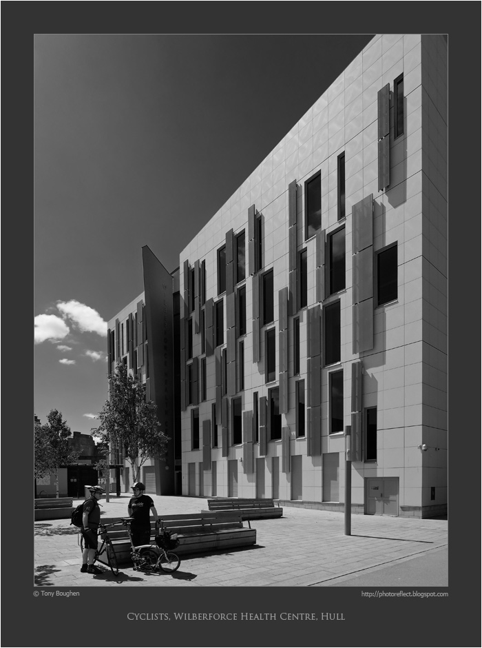
During those years, and since, architecture has been one of the subjects at which I have most often pointed my camera. Moreover, architecture has been the subject through which I have most frequently reverted to black and white. There's something about the sharp edges and details of buildings, as well as their three-dimensionality, that makes them ideal subjects for presenting in monochrome. Today's photograph is of the Wilberforce Health Centre, Hull, a 2011 building by HLM Architects. The colours of the building are off-white and grey with highlights of dark red, quite eye-catching. However, the contrasts of the colours alongside the shadows produced by a bright June day suggested to me that the building might look well with a black and white treatment. I think it does, especially with the digital equivalent of a yellow filter that darkens the sky and gives the building greater emphasis.

Incidentally, you may wonder what has happened to the rightmost cyclist's bicycle - it appears to be missing a wheel. In fact it's a small-wheel folding bike produced by the British manufacturer, Brompton and it's yet to be unfolded.

photograph and text © Tony Boughen

Camera: Olympus E-M10
Mode: Aperture Priority
Focal Length: 9mm (18mm - 35mm equiv.)
F No: f5.6 Shutter Speed: 1/1600 sec
ISO:200
Exposure Compensation: -0.33 EV
Image Stabilisation: On

Friday, June 12, 2015

Return to Prince Street, Hull

click photo to enlarge
Like many photographers, when I find a subject that appeals to me I try to secure the best photograph of it that I possibly can. However, if you have only a single occasion on which to get your shot, then you have to put up with the light, weather, season and other circumstances that prevail at the time. Consequently the end result can be disappointing because you don't achieve the possibilities that you can see in the subject.

But, where the subject is one that you can photograph with reasonable frequency the opportunity exists to improve on your earlier efforts. If you look through this blog you will find several photographs where this has been my motivation. The Humber Bridge is one such example in this blog - see here for the deep rich colours of winter, here for a dull, damp winter view, and here for a contre jour shot with people for scale. Today's post is another example of a trying to get a better shot of a subject.

I first photographed Prince Street in Hull in the 1970s and 1980s. The view from the Market Place through the archway to the curving line of three-storey, multicoloured, terraced houses of the 1770s is quite appealing. I'd more recently tried again with the subject at the end of November 2012. On that last occasion the flat lighting and the line of rubbish bins waiting to be emptied detracted from the shot. The weather on our recent visit was much more promising, and as we walked through this part of the Old Town I tried again and produced a shot that I like much better. The contrast between the deep shadows of the arch and trees with the bright, sunlit buildings works very nicely, and the silhouette of the wall-mounted street light adds a welcome detail.

photograph and text © Tony Boughen

Camera: Olympus E-M10
Mode: Aperture Priority
Focal Length: 28mm (56mm - 35mm equiv.)
F No: f5.6 Shutter Speed: 1/2000 sec
ISO:200
Exposure Compensation: -0.33 EV
Image Stabilisation: On

Wednesday, June 10, 2015

Art Deco shops

click photo to enlarge
I've written elsewhere in this blog about how, in Britain, the architecture of the 1920s and 1930s was very conservative, noting but not, in the main embracing, the forward-looking developments of Europe and the United States.

This often manifested itself in a style that is sometimes called "stripped classical" with recognisably Greek,  Roman or Renaissance-derived columns, entablatures etc pared down to plainer, un-archaeological forms; a reluctant nod to Modernism. The style known as Art Deco and its synonyms or variants, Moderne and Jazz Moderne and Streamline Modern, also used classical forms in this way, but more enthusiastically and with the introduction of newer and different elements. British cinemas of the 1930s frequently adopted this style, as did quite a few factories and even power stations. On the high street Marks and Spencer's architects used white stone with classical, streamline and even Central American motifs in an attempt to show their modernity. The men's clothing store that was found in most large towns and cities - Burton - also adopted this approach.

On our recent visit to Hull I photographed the main windows of the curved facade of the Burton store at the top of Whitefriargate. This building dates from 1935 and is the work of the store's architect, Harry Wilson. It is faced in a veneer of black marble slabs with tall, narrow window bands featuring attenuated glazing bars. The central windows are given a "classical" emphasis with a pair of pilasters. However, the capitals are, if we are to compare them with anything, stripped down Egyptian! The balconies have iron-work featuring curved bars, not unlike those on the step ventilators of the Art Deco doorway of Hull railway station's hotel. The colour of the paintwork is gold, making the building stand out even more from its much more staid neighbours.

photograph and text © Tony Boughen

Camera: Olympus E-M10
Mode: Aperture Priority
Focal Length: 23mm (46mm - 35mm equiv.)
F No: f5.6 Shutter Speed: 1/500 sec
ISO:200
Exposure Compensation: -0.33 EV
Image Stabilisation: On

Friday, December 26, 2014

The bridge over the Humber

click photo to enlarge
Today's photograph shows what was once the longest single span suspension bridge in the world, the Humber Bridge. It crosses the River Humber linking Lincolnshire on the south bank with East Yorkshire on the north. A few decades ago I lived in East Yorkshire not many miles from where the bridge would be built. I was familiar with the politics behind the decision to construct it, the enormous cost, and the way that the toll charges were insufficient to prevent the price of the bridge (including interest charges) from constantly rising. And yet, I welcomed the bridge as a structure that would link two areas that were otherwise only connected by a ferry (the "Lincoln Castle" paddle steamer) or a sixty or so miles journey by road or rail.

At the time (the 1980s) I had an interest in the bridge's construction and in the technological solutions that were deployed by this wonderful feat of engineering. I took part in the agitation for a free footpath and cycle route to be incorporated which, I'm glad to say, was conceded. Today, I still get a thrill when I see the tall towers, the slender-looking (though actually quite large) cables, and the arc of the deck as it gracefully spans the water. It has always looked a relatively insubstantial structure to perform the task that it does. And yet, it continues to function as intended, regular maintenance ensuring that it is rarely closed.

It makes a good photographic subject and I've taken quite a few shots as we've paused after one of our fairly regular crossings. Different light, different weather, changing seasons and a number of possible viewpoints, as well as the ability to walk across it, all make that job easier than it is with many such structures. Today's shot was taken in the afternoon in December light that has that yellow tinge from the sun being low in the sky.

photograph and text © Tony Boughen

Camera: Sony RX100
Mode: Aperture Priority
Focal Length: 11.8mm (32mm - 35mm equiv.)
F No: f5
Shutter Speed: 1/250
ISO: 125
Exposure Compensation:  -0.3 EV
Image Stabilisation: On

Wednesday, April 10, 2013

Skidby windmill and goggi geeha!

click photo to enlarge
Ever since I first lived on the eastern side of our island I've had an interest in windmills. These buildings (or are they machines?) are distinctive, picturesque, fascinating in their technology and intricacies, and often quite beautiful. The first windmill that I had any sort of familiarity with was the one at Skidby in East Yorkshire. When I lived in that part of the world I often walked or cycled in the vicinity of the distinctive four-sailer on its hill-top site. Its black tower and white ogee cap and sails were a useful landmark as we made our way round the lanes and field paths of the Yorkshire Wolds near Hull.

I've been back to Skidby windmill since we left that part of the country, and I posted a photograph of it in 2006. We visited it again a while ago and had a look round the small museum-cum-visitor centre that has been established in the surrounding buildings and the lower floor of the mill. Unfortunately, on the day we called in we were unable to climb to the other floors. However, that didn't matter because only a few days earlier we'd been up and down the ladders of Sibsey Trader Mill (also a windmill) near Boston. We'd gone there so that my grand-daughter could see the home of "Baby Jake". When my children were small I knew about most of the TV programmes they watched, the characters, the story lines, etc. But now, at my great age, I am ignorant of such things so I had to be enlightened about this epic of toddlers' TV. I won't bore you with the details - this link summarises the show and this one will tell you much more than you will ever want to know. Suffice to say that a modified version of the windmill at Sibsey serves as the home of the baby, his brothers, sisters and his parents, and so is an obvious place of pilgrimage if you are a fan of "Baby Jake" and almost two years old.

This six-sailer is a fine example of the tower mill. It's a relatively late example too, being built in 1877. It gets its name from the Trader (or west Fen) Drain that it overlooks. It worked by wind until 1953 when it was abandoned. The structure was saved in 1970 and restored in 1981. It is now in the care of English Heritage. I took a few photographs on my recent visit though none so good as this one that I posted in 2011.

Goggi geeha to one and all!

photograph and text © Tony Boughen

Camera: Canon
Mode: Aperture Priority
Focal Length: 24mm
F No: f7.1
Shutter Speed: 1/400 sec
ISO: 100
Exposure Compensation:  -0.33 EV
Image Stabilisation: On

Monday, May 28, 2012

Bridlington harbour, Britain and the sea

click photo to enlarge
According to the Ordnance Survey the farthest point from the sea in Great Britain is near the farm of Church Flatts outside the village of Coton in the Elms in Derbyshire. From that location to the nearest sea - at Fosdyke Wash, south of Boston in Lincolnshire - is 70 miles (113 km). That information tells you that for the people of our island a trip to the coast is a relatively easy proposition. Nonetheless, people being people, quite a few go there rarely, if at all.

I grew up in the Yorkshire Dales, an area of valleys, hills and mountains. The nearest sea to me at that time was about 30 miles distant, and I loved to go there. I liked the sea so much that later in life I spent fifteen years living by a tidal estuary with the North Sea only 16 miles away and twenty years living a mile from another tidal estuary a mere two miles from the Irish Sea. During those decades I spent a lot of time by the sea, enjoying the light, the open space, the air, the sights of the coast and offshore, and revelled in its ever changing quality. Today a trip to the nearest sea is about 11 miles. However, that location is the saltmarsh edge of The Wash, and whilst this is fine for bird watching and has potential for photography, it isn't the kind of coast I've known and came to enjoy. I once again have to travel about 30 miles for that experience. Consequently, when I recently went to Sewerby in East Yorkshire I took the opportunity to spend an hour or two in nearby Bridlington with its working harbour.

Boats attract photographers like ripe fruit attracts flies, and I wasn't the only person that day pointing their camera at the many and varied boats tied up there. The foreground of today's shot shows a few small, probably pleasure or hobby boats tied up on the landward side of the harbour. The centre now has pontoon jetties for yachts and launches, but the seaward side of the harbour, in the lee of the curving harbour wall, the inshore fishing vessels and landing facilities can still be found, looking much as I first saw them forty or so years ago.

photograph and text (c) T. Boughen

Camera: Canon
Mode: Aperture Priority
Focal Length: 17mm
F No: f8
Shutter Speed: 1/500
ISO: 100
Exposure Compensation:  -0.33 EV
Image Stabilisation: On

Wednesday, May 23, 2012

Daisies, likes and dislikes

click photo to enlarge
I've never liked the ornamental "pincushion" version of the common daisy, Bellis perennis. It always seemed very artificial looking with its flattened pom-pom head and often lurid colour. What I didn't realise, however, was that the way many gardeners use the plant contributed significantly to my antipathy. Those straight rows in lawn edge borders, with either the daisy alone or alternated with alyssum, lobelia or some other low growing, contrasting flower, seemed so forced.

What opened my eyes to the potential of this flower was a recent visit to Sewerby Hall near Bridlington. This former country house on the clifftops overlooking Bridlington Bay and the North Sea is now a visitor attraction run by East Yorkshire Council. The house holds museum-type exhibitions and period-furnished rooms, and the gardens, many that date from the time when the building was a private residence, are very well laid out and maintained. In the walled garden  - probably a former kitchen garden - I came across a few large beds of the pincushion daisies and I was so impressed by what I saw that I photographed the best examples. The most striking was the mixed planting of of red daisies with blue forget-me-nots. This combination was eye-catchingly vibrant, not to say dazzling, certainly photogenic, though probably too much "in your face" for my tastes. However, a bed of pink daisies with forget-me-nots had quiet, understated, elegant, pastel qualities that I admired much more.

You're perhaps thinking that a section of our garden might be given over to something like this. But probably not. We tend to favour pockets of annuals among perennials and shrubs rather than complete beds of annuals or biennials that have to be replaced en masse part way through the season. However, the sight of these lovely flowers paired up with forget-me-nots has changed my opinion of this kind of daisy and we could well find a use for it in the future.

photograph and text (c) T. Boughen

Photo 1
Camera: Canon
Mode: Aperture Priority
Focal Length: 55mm
F No: f8
Shutter Speed: 1/100
ISO: 100
Exposure Compensation:  0 EV
Image Stabilisation: On

Thursday, May 17, 2012

Old church doors

click photo to enlarge
Today's photograph is another of my recently scanned slides from 1986. It shows the remarkable south door of the church of St Helen at Stillingfleet, East Yorkshire. The semi-circular headed doorway in which it sits dates from c.1160. It has the characteristic ornament of chevron, beakhead, scallop etc. that is frequently found in Late Norman architecture. The door itself is thought to be contemporary with this period. Even though it has suffered the ravages of time - see the inserted pieces at the bottom replacing rotted wood - and, despite some of the ironwork missing, what is left surely cannot be from a later period.

The first thing that catches the eye is the very Nordic looking boat with its great steering oar/rudder. At the top left are two figures, and a further one can be seen at top right. The big hinges have large "C" shaped embellishments with dragon-like heads that bring to mind the sort of head one sees in stone on Norman doorways and in illustrations on illuminated manuscripts. The single foliate boss was probably one of two, three or more. Then there is the band of interlaced metal that helps to tie the boards of the door together. It looks like the hinges may have had a lattice-work of metal inside the "C" shapes. Who knows what else there was? When I took my photograph in 1986 the old door was still hanging in its original position and fulfilling its purpose as the main door connecting the outside and inside of the church. The last time I visited Stillingfleet, several years ago a new door was in its place and the ancient door had been moved inside to preserve it. It is a remarkable survivor.

The smaller photograph shows the north door of the church at Swineshead, Lincolnshire, taken on my recent visit. This is also the only door ever to have hung in its doorway. The reticulated tracery at the top of the door shows that it is contemporary with the architecture around it. Like many larger church doors it has a smaller door embedded within it. The large door would have been opened on ceremonial occasions with the smaller door serving everyday use and helping to minimise the effects of the cold north wind.

Somewhere in my collection of slides I have photographs of other old church doors including the fine example at Skipwith, also in East Yorkshire. Other Lincolnshire examples I've posted in this blog include the door at St Andrew, Sempringham (here and here) and the door at Pickworth.

photographs and text (c) T. Boughen

Photo 1
Camera: Olympus OM1n
Mode: Aperture Priority
Focal Length: 50mm
F No: N/A
Shutter Speed: N/A
ISO: 100
Exposure Compensation:  N/A
Image Stabilisation: N/A

Tuesday, March 13, 2012

Inshore fishing, Hornsea

click photos to enlarge
The inshore fishing industry of England's Holderness coast, an expanse that stretches from Flamborough Head in the north to Spurn Point in the south, has changed out of all recognition down the centuries. In the middle ages the summer fishing was centred on herrings, but by the eighteenth century it was a selection of whitefish - cod, haddock, ling, skate and halibut - that were hunted using lines baited with shellfish. Herring continued to be caught, and were sold salted, or were smoked to produce kippers. Crab and lobsters also formed part of the regular catches by the small boats that went out from the coast's towns and villages.

However, the development of larger, powered trawlers meant that by the twentieth century over-fishing had so reduced the whitefish stocks of the North Sea that a change of emphasis was necessary, and today the small inshore fleet specialises mainly in brown crabs and lobsters, with a very few flatfish and cod being caught. And small the fleet is, the number of boats/men/pots being as follows: Bridlington 42/97/33,750, Hornsea 7/14/4,440, Tunstall 2/4/250, Withernsea 9/18/4,850, Easington 2/4/1,100, Spurn Point 1/2/500.

On my recent brief visit I saw the reltively new compound and buildings at Hornsea where the seven inshore boats are based, and watched as one was recovered from the sea by its tractor. I grabbed a few quick photographs of these developments that had grown up since the time, twenty five years and more ago, when I regularly visited this coast. Looking at the crew bringing their boat in on a bright and relatively warm March day, the prospect of fishing the coastal fringe of the North Sea appears to have its attractions, but on a cold, grey, gale-swept January day I'm sure it would be decidedly less alluring.

photograph and text (c) T. Boughen

Photo 1
Camera: Canon
Mode: Aperture Priority
Focal Length: 105mm
F No: f7.1
Shutter Speed: 1/500 sec
ISO: 100
Exposure Compensation:  -0.33 EV
Image Stabilisation: On

Monday, March 12, 2012

Hornsea beach tracks

click photo to enlarge
It occurred to me the other day that during my life I've flip-flopped from one side of the country to the other. I was born in Westmorland (now Cumbria) and raised in the western Yorkshire Dales, moved to the city of Hull for a while, then went back to north-west England for many years, and latterly re-located to Lincolnshire. During all but my early life I was a keen photographer, never specialising in anything in particular, but rather dipping my toe into many of the recognised genres. I suppose that architecture, landscape and natural history have figured large in my output, and of course, down the years I've shot many thousands of family snaps.

In the past decade, as I've spent more time with my camera, I've deliberately selected a few specific subjects and begun building collections of images. Examples of this include spiral staircases, motion blur, and the subject of today's photograph, tracks in the landscape. Lincolnshire's man-made landscape is the place where I began to notice these man-made intrusions, and where the sinuous, sometimes semi-abstract quality, that they impart first impacted on me.

Wheatfields and barley fields offer good opportunities for this kind of photography. The former sometimes provide intriguing examples that appear to have no beginning. But pasture can have good tracks too, and land freshly prepared for a salad crop offered one of the craziest examples I've come across. I've also photographed these tracks on sandy beaches where they temporarily hold a record of cleaning vehicles or the launching of boats. Today's photograph is an example of the latter that I took on a recent visit to Hornsea in East Yorkshire. This seaside resort on a long, sandy coastline, has a small fishing fleet that specialises in brown crabs and lobsters. The boats are launched and brought in by tractor, and this recovery offered an opportunity to add another shot to my "tracks" collection.

photograph and text (c) T. Boughen

Camera: Canon
Mode: Aperture Priority
Focal Length: 24mm
F No: f7.1
Shutter Speed: 1/640 sec
ISO: 100
Exposure Compensation:  -0.33 EV
Image Stabilisation: On

Tuesday, March 06, 2012

Misery, mercy and misericords

click photos to enlarge
I spent enough of my career standing addressing people to know that there are times when, no matter how enthused you are, no matter how attentive your audience is, after a while all you want to do is park your posterior on a chair. Your back and legs start to complain, you walk up and down a little, gesticulate to emphasise a point, but the compulsion to take the weight off your legs persists. However, it's just not done to speak to an audience from a sitting position. It's all well and good for a comedian to do so, or for a night club singer to give a bit of patter from a bar stool between songs, but it's out of order for the rest of us. What is needed, of course, is a modern misericord.

The choristers and clergy of the medieval church had sturdy benches, stalls and seats, but they were required to stand for much of the service. These were often long, so they too experienced the discomfort of prolonged standing. Fortunately an insightful and compassionate person, perhaps a carpenter or a monk, invented the misericord. This small jutting shelf on the underside of a flipped up, hinged seat provides enough support to get the relief that comes from sitting, while appearing to be in a standing position. The photograph of the choir stalls shows the seats in the flipped up position for use when standing. The word misericord comes from the Old French and means compassion, pity or mercy. It's a clever invention.

Today's photographs show some of the twenty eight misericords in the church of St Mary at Beverley, East Yorkshire. They date from around 1425-1450, and each one displays characteristic carving that acts as a bracket to support the shallow seat that is the misericord. The main subjects for these pieces of folk art were sometimes from the Bible, but were more often folk tales, myths, historical or everyday subjects, animals, plants, heraldry or creatures from the medieval bestiaries. They also have scrolls of carving coming out of the left and right of the misericord, a very common feature. This is decorative and and shows subjects such as birds, flowers, leaves, a green man's head, shields etc. The carving often exhibits a charming naivety, and these pieces of wood sculpture, more so than other sculpture in churches, often escaped the Puritans' and iconoclasts' destructive hammers.

The misericods at St Mary's are in two sets in choir stalls on the north and south sides of the chancel facing each other. The subjects I've photographed are as follows:
The Ape Doctor
To the medieval mind the ape and the monkey were animals with human desires but lacking human restraint. Consequently they became symbols of greed, self-indulgence, cunning and lust. Here the doctor of the day is portrayed as a greedy ape, offering up what may be a urine flask to the rich man brandishing a valuable coin, and ignoring the poor Christian (with a cross) who can only offer a pittance for his services.
Knight and Wyverns
This could be mistaken for a depiction of England's patron saint, St George. However, the knight is attacking one of two wyverns (a dragon with only two legs), rather than the usual four-legged dragon.
The Preaching Fox
It was a widely held view that the clergy were self-serving and rapacious, and they are often depicted in medieval sculptures as wily foxes preaching to geese. Here the fox is in a pulpit with clergy to left and right and apes below, all reading from scrolls.
The Clever Daughter
The Clever Daughter was a popular tale in the medieval period. A king set the daughter of a courtier a problem to test her wisdom. She had to go to the king not on foot or riding, not clothed or unclothed, and she had to bring a gift that was not a gift. She came on a goat but with one foot on the ground, she was covered in a fishing net, and she placed a rabbit at the king's feet which immediately fled. Her actions met all the king's demands and he promptly married the Clever Daughter. On the misericord the king is inthe centre, the Clever Daughter is on the right, and the figure on the left slaying a lion is probably Richard I (the Lionheart).
Knight and Boar
A hunting scene. A man stabs a boar with his lance and reaches for his dagger to administer the coup de grâce.

photograph and text (c) T. Boughen

Photo 1
Camera: Canon
Mode: Aperture Priority
Focal Length: 55mm
F No: f7.1
Shutter Speed: 1/13 sec
ISO: 3200
Exposure Compensation:  0 EV
Image Stabilisation: On

Monday, August 15, 2011

Look up, but look down too

click photo to enlarge
It's a natural reaction, when approaching a medieval cathedral, minster or abbey, to look up. The architecture, indeed the main premise of such a building is to inspire that reaction in people: to make the passer-by admire the soaring towers, the pinnacles, the buttresses etc but, more importantly, to gaze heavenward. Identical intentions attach to the interior of these great churches, though here the iconography is more explicit and a visitor can be in no doubt of the message that is being broadcast.

In truth there are precious few surfaces of a cathedral that are not enlisted in the proclamation of the faith. From the "unnecessarily" ornate carving of capitals, windows, roof bosses etc, the celebration of Biblical figures in carving, stained glass and other materials and the heavy use of symbolism, to the beautiful carved and painted scripts that proclaim their messages, the building is a vehicle for the religion that erected it.

But, whilst it is natural to look up in a church, fewer people look down at the floor beneath their feet. Yet here too beauty and the message can be found. Some of our churches still have the original stone paving that replaced the rushes and compressed earth of the first religious buildings. Others retain medieval tiles impressed with geometric shapes, foliate crosses, leaves and other patterns, including the elaborate letter "M" signifying Mary or Madonna. Marble paving of the eighteenth century can also be seen: I posted a photograph of a trompe l'oeil example in the choir of Beverley Minster, East Yorkshire, earlier this year. The great restorations of the nineteenth century have left a wonderful legacy of floor tiles. Many of these take their lead from the medieval styles and colours but original designs abound too. This photograph of the area around the font of the church at Swineshead, Lincolnshire, shows very characteristic Victorian tilework. And then there are examples that are difficult to date because stylistic clues are few.

Today's photograph is such a tile scheme, also at Beverley Minster. Is it eighteenth or nineteenth century, or does it date from some time in the twentieth? Whenever it was made it works well. The eight pointed star is centred under the crossing tower, and the complexity of the pattern lessens as it spreads into the transepts. The design is strong, with contrast, but the colours are relatively muted, and it works with the surroundings. My photograph shows visitors in characteristic pose, faces turned upwards to the glories overhead. I wonder if they also looked down at the lesser, but also interesting, beauties beneath their feet.

photograph and text (c) T. Boughen

Camera: Canon
Mode: Aperture Priority
Focal Length: 29mm
F No: f7.1
Shutter Speed: 1/25
ISO: 1600
Exposure Compensation:  -1.0
Image Stabilisation: On

Tuesday, July 12, 2011

St Augustine, Skirlaugh, East Yorkshire

click photo to enlarge
Is it possible to become a billionaire by ethical means? When I look at many who have achieved this dubious distinction I think the answer is that it's somewhat unusual. Many Russian oligarchs achieved their vast wealth by exploiting political and social chaos to transfer money and resources from the public sector to themselves. More than a few manufacturers, newspaper magnates, etc. in other parts of the world secured their fortunes through striving to become monopolies and through other predatory practices. Such people tend to shelter behind the amoral, non-ethical shield of "the market" to explain and justify their success. The donation of some of their fabulous wealth to charities or to deserving causes too often looks like an attempt to clean up their images or to salve their consciences.

What then of Skirlaugh church? It is, in John Betjeman's words, "a lavish Perpendicular church replete with parapets, pinnacles and buttresses...". Pevsner calls it, "...perfect because built not only lavishly but also quickly and to one plan." It is relatively small, certainly is lavish - I particularly like the pierced battlements of the tower - and incorporates the fifteenth century development of a nave and chancel in one with no structural divisions. When I lived in Kingston upon Hull I often stopped by this perfect little church and admired its college chapel-like appearance.

St Augustine was built in 1401-5 by Walter Skirlaw. He was bishop of Lichfield, then Wells and finally, from 1388, Durham. As his name suggests Skirlaugh was his native village though he was actually born in nearby Swine. It was during his bishopric at Durham that he gave the money for the building of the church, and it was completed a year before his death in 1406. Walter Skirlaw built a number of bridges in the Durham diocese, the chapter house at Howden, and contributed funds for the construction of York Minster's central tower. He was also responsible for much work at Durham Cathedral including the building of its cloisters. Much of this is what we might expect of a bishop of Durham. But what about the church at Skirlaugh? Was the construction of a fine church in his home village a proper use of the finances that he controlled, or was it, perhaps, a nepotistic display by the local boy made good?

I visited Skirlaugh church at a time when a prince of the press, phone hacking, the "News of the World" newspaper, and all the associated shenanigans were headlines in the press. Perhaps it was the despicable display of money, influence and power in that ongoing saga that made me wonder if this church was a result of a medieval equivalent involving a prince of the church. That's one of the problems with societies that allow people to accumulate such great wealth and power - they often exercise it in ways that undermine democracy and support themselves, and in so doing make us suspicious of what can be perfectly ordinary transactions.

Incidentally, the photograph of the church interior clearly shows the lack of differentiation between the nave and the chancel, something that is not too common in English churches. The shot also shows a recent development that is becoming increasingly common: the pews at the back of the church have been removed to make a space for a weekly coffee morning and other small social events.

photographs and text (c) T. Boughen

Photo 1
Camera: Canon
Mode: Aperture Priority
Focal Length: 28mm
F No: f6.3
Shutter Speed: 1/800
ISO: 100
Exposure Compensation:  -0.67 EV
Image Stabilisation: On

Monday, July 11, 2011

Dark skies and photography

click photo to enlarge
After a very dry, sunny spring and early summer, with plenty of warm weather - at least in my part of the world - things have changed and we've had quite a bit of welcome rain. At the time of writing this blog post thunder is booming around us and heavy showers are queuing up to drench the fields and gardens. All this is very welcome to someone who likes to cultivate his patch, and the result of the precipitation can be seen in the increased growth rate of the grass on the lawns, the blooming of the annual and perennial flowers, the heavy crops of strawberries and raspberries that we've gathered in, and the bountiful lushness of the vegetable garden. But it's not just the gardener in me that has been pleased by the rain and changeable skies, my photographic side has welcomed them too.

On a recent day in the East Yorkshire countryside sunshine fought for supremacy with fleeting showers and dark skies. The result of the conflict was a draw, but for me personally it was, as they say these days, a "win-win" situation, with the sky with sun and clouds lending itself to photographic compositions just as much as as the dark, glowering skies. The main photograph, showing the beach at Hornsea with a groyne and the high water groyne marker, would have been less of an image without the black clouds that were above my head and heading out over the sea. They change the tonal values and the mood of the photograph. Interestingly no rain fell from them onto our heads, but rain was around, and distant showers can be seen on the horizon.

On one of the days of my recent visit to London the sky was behaving in a similar way, and it gave me an opportunity to get a different kind of shot of Canary Wharf. The grey blanket above subdued the colours and brightness of the gleaming towers, and perhaps more clearly reflected the mood that much of the financial community has experienced over the past few years. By the way, on this occasion we did get caught in a light shower and had to beat a hasty retreat for cover.

photograph and text (c) T. Boughen

Photo 1
Camera: Canon
Mode: Aperture Priority
Focal Length: 28mm
F No: f6.3
Shutter Speed: 1/1000
ISO: 100
Exposure Compensation: -0.33 EV
Image Stabilisation: On

Friday, July 08, 2011

Living sculpture

click photo to enlarge
As I was walking down the promenade in Hornsea, East Yorkshire, my eyes fell upon the public art and street furniture that the council had commissioned to beautify the area. Most notable was the semi-abstract relief sculpture above a small pool featuring birds and the town's name. I also admired the long, narrow garden that had been assembled with walls of granite, short sections of "groynes", undulating grass, shingle, beach flowers and shrubs. The promenade railings in the style of an ocean liner's with a hardwood hand-rail, inclined uprights and lines of stainless steel cable between struck the right note by the sea. And the black, bird sculptures that topped the large, ornamental street lights were a nice detail. What a pity, I thought, about the concrete, tarmac and brick desert that had been created near the leisure centre.

As I made my way back up the promenade to rejoin my companions I looked up at the street lights and did a "double take". The bird sculptures that I'd admired were turning their heads to follow my passage: they were in fact real birds - rooks! Raising my camera I took a few shots of the living statues and carried on my way. After I'd walked a few yards I turned and looked back at them. It was obvious that two of the birds were rooks, but what about the third one? I had no binoculars so I resolved to identify it by studying my photographs when I put them on the computer.

Viewing the bird at 100% reveals that it is clearly an immature rook, a product of this year's nesting season. The reason it looks very odd, and made me wonder whether or not it was a carrion crow, is the shape of its beak.  Half of the upper mandible is broken off. Despite this handicap the bird appeared to be foraging successfully with its parents and managing to cope. I hope it continues to do so.

photograph and text (c) T. Boughen

Camera: Canon
Mode: Aperture Priority
Focal Length: 300mm
F No: f6.3
Shutter Speed: 1/640
ISO: 100
Exposure Compensation:  0 EV
Image Stabilisation: On

Thursday, July 07, 2011

No cycling

click photo to enlarge
Several years ago I was cycling with my wife along the along the promenade at Llandudno in North Wales when we were stopped and told that cycling was not allowed. The official who spoke to us was unable to give a reason for the prohibition but was keen to point to the purpose-made signs forbidding the activity. In preparing this blog post I did a quick search to find out whether the town's policy was still in force and I found this photograph on Geograph taken in 2010. The caption struck a chord with me: it included this remark, " ...The prom at Llandudno is so wide you could take tanks down it without getting in anybody's way..." So, I guess, for reasons that must be incomprehensible to most people, cycling is still banned.

At the time we tried to ride there we lived not too far from Blackpool, Lancashire, where we had been used to cycling freely on well-marked lanes next to paths designated for pedestrians. It wasn't perfect, and cyclists and pedestrians sometimes got in each other's way, usually through ignoring the demarcation. However, there weren't, to my knowledge any serious problems and the many miles of the coast that it opened up to people on foot and on bicycles were well used and enjoyed. People's quality of life was enhanced by this simple, inexpensive measure.

But, a recent visit to the small seaside town of Hornsea in East Yorkshire reminded me that, despite efforts by cyclists, health promoters, government and others, not all local councils have got the message that people on bicycles can co-exist alongside pedestrians and it is in the community at large's interest that steps are taken to encourage it. Mind you, if the council responsible for Hornsea promenade had been more enlightened I wouldn't have got my photograph of the bright red "No Cycling" sign against the blues and browns of the distant sky and sea!

I usually allow my computer software to automatically remove the slight vignetting that my 70-300mm lens produces at maximum zoom. On this occasion, however, I quite liked what it added to the photograph so I let it remain.

photograph and text (c) T. Boughen

Camera: Canon
Mode: Aperture Priority
Focal Length: 300mm
F No: f6.3
Shutter Speed: 1/640
ISO: 100
Exposure Compensation:  0 EV
Image Stabilisation: On

Tuesday, April 26, 2011

Regimental colours

click photo to enlarge
In a south aisle in Beverley Minster hang flags of the East Yorkshire Regiment (The Duke of York's Own). How old are they? Some must be many decades old, others much more ancient. Time is slowly decaying their woven cloth and fading their bright colours. Yet still they record the campaigns of this illustrious local regiment - Oudenarde, Malplaquet, Louisberg, Quebec, Ramilles, and others - names from history books, battles fought by local men recruited from towns such as Beverley, Driffield, Bridlington, Hedon and the city of Hull.

Many of our larger churches have such flags, often as in the case above, of regiments long gone in British Army amalgamations, the banners, and associated plaques and memorials remembering their deeds and their local connections. I suppose it's not only the religious aspect of remembrance that makes such a setting seem appropriate for these artefacts: the timeless character of a minster, a cathedral or a big medieval parish church must also promise a location that will endure and ensure that the sacrifice and achievements of these soldiers will not be forgotten.

I photographed these flags on a day when the glow of the sun was penetrating the darkness of the building, making the stained glass and old stone glow, and illuminating the tattered remnants hanging from their poles.

photograph and text (c) T. Boughen

Camera: Canon
Mode: Aperture Priority
Focal Length: 60mm
F No: f7.1
Shutter Speed: 1/60
ISO: 3200
Exposure Compensation: 0 EV
Image Stabilisation: On
Monday, April 18, 2011

Deceiving the eye

click photos to enlarge
The main photograph in today's entry shows the floor in the choir at Beverley Minster, East Yorkshire. In the smaller image you can see the floor in context*. The three-dimensional effect was achieved by the early eighteenth century restorers using four different colours of marble set in such a way that they suggest cubes. It is hard to imagine anything more different from the small, symmetrically patterned floor tiles that medieval builders favoured for such locations, and which came back into favour during the Victorian period. Yet, one of the marks of the styles in our great churches is that each generation tended to employ that which was fashionable at the time, and the eighteenth century loved this kind of thing.

The Arts and Crafts Movement of the second half of the nineteenth century abhorred such illusionism. They felt that flat surfaces should not be made to appear three-dimensional, that such trickery wasn't being true to either the surface or the materials. I was thinking about this as I photographed the floor, and also when I pointed my camera upwards at the underside of the crossing tower. It's something of a paradox, I thought, that from this point of view the vaulting looks very flat, linear, a touch Rococco even, and the perfectly flat floor looks like it is constructed of angular cubes. Of course, when you position yourself to one side of the crossing, as I did for my earlier photograph, the ceilings' curves, ribs and soaring arches reveal the architecture to be very sculptural. Similarly, a walk down the choir soon reveals the "blockiness" to be smooth, shiny and flawless, a tribute to the workmanship and chosen materials of three hundred years ago.

*Note: choir is used in the architectural sense to mean the place where the choir would sit and services were sung.

photograph and text (c) T. Boughen

Main photo
Camera: Canon
Mode: Aperture Priority
Focal Length: 28mm
F No: f7.1
Shutter Speed: 1/30
ISO: 2500
Exposure Compensation:  0 EV
Image Stabilisation: On

Monday, April 04, 2011

Films, paint and stone

click photo to enlarge
I was re-reading Oliver Rackham's fine book, "The History of the Countryside" the other evening when I came across an aside that registered more strongly with me than it had done the first time I saw it. Talking about the scope of his book in a chapter entitled "Animals and plants: Extinctions and new arrivals", he observes that "The history of cultivated plants and domestic animals is generally well known*.... The asterisk refers to a footnote which says, "But not to producers of historical films: they do not allow Charles I to fly in a plane, but they do let him ride among Corsican pine plantations or Frisian (sic) cattle."

The same could be said of the medieval architecture we see in films of that period. The interiors of churches, cathedrals and castles are invariably shown as they appear today: cut and pointed stone, carved stone, but barely a hint of paint. In fact, the use of paint in such buildings was widespread. Columns, capitals, window and door surrounds, vaulting and many other surfaces were covered with, in the case of ecclesiastical buildings, illustrations of Biblical characters and episodes, or exuberant decoration. Much of this was removed during the centuries following the Reformation, and the Victorians completed the job, at least until people such as William Morris proclaimed "Enough!" During the nineteenth century a number of churches were painted in the medieval manner, but those receiving "the full works" are few and far between. The church of St Michael, Garton on the Wolds, East Yorkshire, is one such example that I've photographed. One of the best original examples at Kempley, Gloucestershire, will the subject of an upcoming post.

I was thinking about this last week as I looked up at the crossing inside Beverley Minster, East Yorkshire. I was trying to imagine what the building would have looked like with painted capitals etc. The bands and rings of dark Purbeck marble of the thirteenth and fourteenth century stonework adds an element of colour, as does the painted vaulting, but other than that it is pretty much devoid of surface decoration. I rather think that I wouldn't like it to be painted, having become used to the unadorned stone!

Anyone who is a regular visitor to this blog will know of my liking for vaulting, and will have seen several examples. Each time I take such a photograph I search for a new approach. This time I stood under the arch between the nave and the crossing and let the receding verticals of the massive compound piers take my eyes upwards.

photograph and text (c) T. Boughen

Camera: Canon
Mode: Aperture Priority
Focal Length: 17mm
F No: f7.1
Shutter Speed: 1/15
ISO: 640
Exposure Compensation:  -0.67 EV
Image Stabilisation: N/A