Sunday, August 31, 2014

Towers of the winds

click photo to enlarge
Many years ago I visited Athens to look at the architecture of Classical (and later) Greece. One of the many buildings that I viewed was the Tower of the Winds, a 12 metre tall octagonal structure in the Roman agora, that was built in the period between 50BC and 200BC. It features the eight deities associated with wind and has a sundial on each of its faces. It was, essentially, a clock tower.

The other day I was standing in a public space at Canary Wharf in London where there are several clocks indicating time at different locations. We were debating where to sit to eat the lunch that we were carrying. That question was important because, though the sun was shining and the temperature was generally quite pleasant, it was windy and we knew that sitting in the wind would soon result in us feeling cold and uncomfortable. However, it was difficult to find such a place because the tall towers that dominate the location cause the wind to swirl in many directions. We eventually settled on a bench in a well planted area by some water features.

As I ate my sandwich I recalled an article I read recently about a tall tower in Leeds that caused the wind to increase in speed at its base to the point where it often knocked people off their feet, and caused a death when a lorry blew onto a pedestrian. The piece described how structures were being erected at ground level as baffles to reduce the wind velocity. It occurred to me that Canary Wharf's towers were "towers of the wind" too: the gusts definitely seemed to be stronger among them that in the open space by the river. But, the people who work there seemed to know the best places to sit at lunchtime and enjoy food and a break, so I took the opportunity to photograph the be-suited people enjoying their moments of mid-day leisure.

photograph and text © Tony Boughen

Camera: Nikon D5300
Mode: Aperture Priority
Focal Length: 140mm (210mm - 35mm equiv.)
F No: f8
Shutter Speed: 1/500 sec
ISO:100
Exposure Compensation: -0.33 EV
Image Stabilisation: On

Thursday, August 28, 2014

Where do all the straw bales go?

click photo to enlarge
There was a time, not so many decades ago, when some English farmers burned the straw on the fields after getting in the cereal crop. This environmentally damaging solution to what to do with the left-overs from harvest has long since been banished to history. The fact that it caused dangerous driving conditions on nearby roads was at least as strong an argument as that concerning greenhouse gases. The loss of nutrients provided by the burnt straw notwithstanding, few lament the demise of burning in the fields.

And yet, burning does actually remain one of the ways that straw is used. Over the past couple of years a straw-burning power station has been built and opened near Sleaford, Lincolnshire. There the bales are converted into electricity with considerably fewer environmental consequences than direct burning (though inevitably with some repercussions), and local farmers have an outlet for their "waste". I'd be interested to know the ranges of use to which straw is put today. Animal bedding remains, of course, and some houses (very few actually) have been built using the rectangular bales as wall insulation. A couple of years ago I spoke to a farmer who was selling bales to the Ministry of Defence to use for demolishing some disused fortified buildings by fire! Straw board is still made and used and a proportion of straw is ploughed back into the soil. However, I see veritable mountains of bales dotted around Lincolnshire of which very few look older than a year. One of my tasks this autumn must be to answer this question - "Where do all the straw bales go?"

photograph and text © Tony Boughen

Camera: Nikon D5300
Mode: Aperture Priority
Focal Length: 45mm (67mm - 35mm equiv.)
F No: f8
Shutter Speed: 1/800 sec
ISO:100
Exposure Compensation: -0.33 EV
Image Stabilisation: On

Tuesday, August 26, 2014

Old and new cultivation

click photo to enlarge
Only a few minutes before I took today's photograph we walked across a pasture that showed clear evidence of medieval cultivation. The surface of the field undulated due to centuries of ploughing using oxen and horses. Generations of ploughmen had gone up and down each selion (a strip in a furlong, which themselves were aggregated into large open fields) in the same direction each season. As a result the ploughshare had made each selion into a long, straight, low bank that curved to the left at each end where the plough was turned. Our passage across the field rose and fell as we went over each ridge and furrow.

The contrast between this traditional method of cultivation, one that prevailed for over a thousand years, with the sight that greeted us as we crossed a recently harvested wheat field, could not have been greater. A single man in a large tractor pulled a machine that was preparing the land and sowing the next crop at the same time. He would accomplish in a few hours that which formerly took many men and animals weeks to achieve. The driver gave us a wave as passed by - such work today is a solitary undertaking - and as we went on our way back to Folkingham I reflected on the way today's cultivation contrasted with not only the distant past but what happened for much of the twentieth century.

Nowadays, as I understand it, there are essentially 5 approaches to preparing a wheat field with the next crop:
1 Conventional ploughing - plough the straw in deep, cultivate the seed bed, then drill and finally spread fertiliser
2 Shallow cultivation - plough the straw in deep, drill and fertilise in one pass
3 Minimal tillage - till the straw in shallow with cultivator, drill and fertilise in one pass
4 Shallow tillage - turn straw over in the surface soil, drill and fertilise in one pass in this layer
5 Direct drilling - no soil tillage, simply drill and fertilise in one pass leaving the straw on the surface.

However, I'm no expert, so watching the man and machines at work I was unsure which method of 3-5 was being used. I think it's 3 (minimal tillage) but I'm happy to be corrected.

photograph and text © Tony Boughen

Camera: Nikon D5300
Mode: Aperture Priority
Focal Length: 105mm (157mm - 35mm equiv.)
F No: f8
Shutter Speed: 1/400 sec
ISO:100
Exposure Compensation: 0 EV
Image Stabilisation: On

Monday, August 18, 2014

Land versus sky

click photo to enlarge
When I was starting out in photography over four decades ago I remember reading a number of "rules" - the dos and donts of good picture making. As I progressed and matured I came to see them as guides rather than rules and each as something that could be ignored if the circumstances warranted it. One such rule concerned the balance between land and sky. Never, it was said, have the horizon in the middle of your photograph giving equal weight to sky and land because if you do the viewer will not know where you wish to place your interest and emphasis - or words to that effect. It's not a bad piece of advice, and there is some truth in the guidance. However, there have been times when I have done just that because my compositional judgement said it was the best solution.

An extension of this rule was that you should split your composition 1/3 to 2/3. If the land was to be 2/3 then the sky would be 1/3 and vice versa. Again, it isn't a bad rule because it often looks "right". However, there are times when it looks wrong. These days I compose largely intuitively but every now and then I pause and think about the land/sky split and what the proportions should be. In the shot above the enormity and the interest of the Lincolnshire sky was accentuated by making it more than 1/3 of the composition. Moreover, the spire of Walcot church (see previous post), a structure that is big when you are nearby, is reduced to its proper insignificance when seen in the context of a broad landscape.

photograph and text © Tony Boughen

Camera: Nikon D5300
Mode: Aperture Priority
Focal Length: 38mm (57mm - 35mm equiv.)
F No: f8
Shutter Speed: 1/1000 sec
ISO:100
Exposure Compensation: 0 EV
Image Stabilisation: On

Saturday, August 16, 2014

Walcot church revisited

click photo to enlarge
The church of St Nicholas at Walcot, Lincolnshire, is a favourite of mine. Its exterior leaves something to be desired aesthetically - the tower and spire are too tall for the nave and chancel, the entasis on the former looks a little odd and its broaches are unusually long. But, despite these shortcomings it is interesting and it makes for a prominent landmark in the locality.

However, when it comes to the interior it is a different story. Here the restorers did what was necessary and little more with the result that the medieval work hasn't been altered too much and the Victorian additions don't overpower it. Some would say it looks a little neglected but I welcome the absence of well-meaning tidying, polishing, renovating and prettifying. I like the oddities inside too, particularly the way old capitals were reused as column bases. I don't mind the absence of elaborate memorials and paintwork. And I welcome the "knocked about a bit" look of the pews. It's a rural church serving a small collection of farms and houses, and its sparse interior reflects the small population that services it.

On a recent walk I photographed a distant view of the church among the red tiled houses and agricultural buildings. When we went in to the church I took a view of the nave and chancel. As I took both of these photographs I had in mind two previous shots I've posted of the same subjects and it was with a view to comparison that I took the second set. Different seasons, different weather and different light have produced different shots. I prefer the earlier pair I think, so next time we are passing my aim will be to take photographs that better them.

photographs and text © Tony Boughen

Photo 1
Camera: Nikon D5300
Mode: Aperture Priority
Focal Length: 18mm (27mm - 35mm equiv.)
F No: f8
Shutter Speed: 1/30 sec
ISO:1600
Exposure Compensation: -0.33 EV
Image Stabilisation: On

Monday, August 11, 2014

Unexpected photographic subjects

click photo to enlarge
A camera of one sort or another is with me wherever I go. Too many lost shots have taught me the lesson that, when you don't have a camera a great shot will inevitably present itself. Or at least it will be great in your memory as are so many missed opportunities. Consequently, on a recent short walk around the Lincolnshire fields and lanes near where we live I carried a camera, this despite the fact that it was August, the sun was high in the sky, and the chances of a shot were slight. And, my caution paid off. I didn't get a great shot, but I got a couple that I didn't expect of a subject I had never considered.

Stacked by the edge of a field were large rolls of thermal netting, the sort that is put over young brassicas in March in order to raise the temperature two or three degrees, give the plants a quick start and the farmer an earlier crop and therefore a better price. The ends of a couple of rolls were spilling down the stack, their stains and folds making a gauze-like, diaphanous texture that I knew would be quite appealing when a section was isolated in the viewfinder frame. Mercifully the end of the rolls next to the footpath were in the shade rather than the searing sunlight so I had no hard contrast to deal with. I made a several exposures, trying to come up with a composition that offered a little interest in terms of shape, line and colour. These two are my best efforts; not great shots but images with soft, quiet interest, delicate textures and subtle colours. And all the better, from my point of view, in being an unusual subject captured on a day of low expectations.

photograph and text © Tony Boughen

Photo 1
Camera: Nikon D5300
Mode: Aperture Priority
Focal Length: 42mm (63mm - 35mm equiv.)
F No: f8
Shutter Speed: 1/250 sec
ISO:100
Exposure Compensation: 0 EV
Image Stabilisation: On

Saturday, August 09, 2014

Two Spalding warehouse conversions

click photo to enlarge
In the UK finding new uses for old industrial or commercial buildings often results in them being converted into living accommodation. From power stations to old agricultural barns, fire stations to tea warehouses, apartments of varying sizes and prices are very often the first choice for a redundant building. It's not always the case; I've seen churches that became recording studios and cafes, a police station that became a restaurant, and more than one corn exchange transformed into a theatre. However, on a relatively small island with an ever growing population, housing of one form or another will often take precedence over any other use for a surplus building.

The other day we were walking around Spalding, Lincolnshire. The weather was sunny and the light clear and sharp. It was a good opportunity to photograph buildings. When I came to review my collection of shots I was prompted to reflect on the images of two Georgian warehouses that have been re-purposed (as modern parlance has it). One is barely recognisable as a structure from the eighteenth century, so complete have been its successive makeovers. Gone are the warm bricks to be replaced by painted render that is moulded to resemble ashlar blocks. The central hatches have been converted to windows and the hoist has gone too. In 1947 a main entrance with a hint of "Moderne" about it was created. It is now, I believe,either apartments or offices, with the name, White House Chambers.

The second example was formerly a warehouse belonging to the company of F. Long, but is now multiple apartments. It is a later conversion and has retained much more of its original character. Look at this building and you can immediately see its past. The original brickwork with its imperfections has not been too heavily modified. The rows of windows remain, as do the central hatches, but they are less integrated into the facade than in my other example. No attempt has been made to disguise the anchor plates of the tie rods that brace the building against lateral bowing; in fact they have been made into features. And, the pantiles of the roof, though probably not original, are characteristic of the period of the building unlike the concrete tiles of the other warehouse.

It seems to me that the way these warehouses have been converted exemplify two of the main approaches to such a task: treat the original building as a shell to be updated and made serviceable without any particular regard for its past, or retain the character of the original while doing sufficient to achieve its new purpose. Thankfully, today, the latter approach is more usual.

photograph and text © Tony Boughen

Camera: Nikon D5300
Mode: Aperture Priority
Focal Length: 66mm (99mm - 35mm equiv.)
F No: f8
Shutter Speed: 1/125 sec
ISO:100
Exposure Compensation: 0.33 EV
Image Stabilisation: On

Thursday, August 07, 2014

The transformational power of flowers

click photo to enlarge
Every gardener knows the transformational power of flowers. Grow a clematis, a rose or a wisteria against a dull old wall and, for the duration of the flowering of the plant, the mundane becomes beautiful. When our pots of red/orange pelargoniums, that we place to the left and right of our garages and a dark green shed, burst into flower these utilitarian buildings become more interesting and more noteworthy. The Royal Horticultural Society's "Britain in Bloom" competition is all about improving the appearance of settlements large and small by the planting of flowers.

On our recent visit to Brigg, Lincolnshire, we had a welcome and enjoyable cup of coffee at a cafe. The main area of the premises was well-presented under a glazed roof with several potted plants, palms and climbers. The "overflow" or outside area had less to offer, located as it was in a wide passage-way with block paving and rendered walls. However, this somewhat dreary location was lifted and made much pleasanter by the wall-mounted planters filled with multi-coloured petunias. My photographer's eye particularly enjoyed the contrast of the bright flowers and the plain, grey background and white furniture, the near monochrome quality of the latter making the colours of the former seem more intense than nature intended.

photograph and text © Tony Boughen

Camera: Nikon D5300
Mode: Aperture Priority
Focal Length: 30mm (45mm - 35mm equiv.)
F No: f8
Shutter Speed: 1/50 sec
ISO:110
Exposure Compensation: 0.33 EV
Image Stabilisation: On

Tuesday, August 05, 2014

Brigg Fair

click photo to enlarge
"It was on the fifth of August, the weather fine and fair,
Unto Brigg Fair I did repair, for love I was inclined..."
from the folk song, Brigg Fair (traditional)

One of my favourite pieces of music is Brigg Fair: An English Rhapsody by the English composer, Frederick Delius (1862-1934). It is an orchestral piece based on the Lincolnshire folk song that Percy Grainger heard (and recorded) from Joseph Taylor, a Lincolnshire singer. Grainger introduced the piece to Delius who turned it into a work that remains one of his best loved compositions.

As luck would have it we passed through Brigg yesterday, the fourth of August, and with the words of the song in mind we looked around for evidence of the fair. There was nothing that suggested it was on apart from a group of travellers with their horses and caravans. I took today's photograph of a man as he exercised his trotting horse on a street near a large car park. I guessed that this gathering might have had something to do with the fair, but since there was nothing else to indicate the it I resolved to find out more when we got home.

It seems that the fair is held on the first Saturday of August. That was the second of the month this year and so we had missed it. Apparently it is something of a social event and gathering of travellers for horse trading in much the same way that happens at Appleby in Westmorland. The fair has a long history - over 800 years - and today it is less formal and smaller than it would have been when Joseph Taylor was singing in the local musical festival. Next year, perhaps, we'll go on the right day.

photograph and text © Tony Boughen

Camera: Nikon D5300
Mode: Aperture Priority
Focal Length: 116mm (174mm - 35mm equiv.)
F No: f9
Shutter Speed: 1/200 sec
ISO:280
Exposure Compensation: 0 EV
Image Stabilisation: On

Sunday, August 03, 2014

Museum names and obfuscation

click photo to enlarge
You'd think that one of the primary aims in giving a building a name would be to supply part of a unique address, to identify it to people passing and searching for it, and to indicate its purpose. The latter is not always required but in certain instances it is. There's little point in giving a town hall any other name other than the words town hall preceded by the placename: to do anything else would cause confusion and waste people's time. Similarly with art galleries. Yet in their naming the sound principle just described in relation to town halls is often ignored. What would you expect to see at the Wallace Collection in London? A collection of what? It happens to be fine and decorative arts, but you wouldn't know that from its name.

A public building in Lincoln has a similarly confusing name. It styles itself simply, "The Collection". Perhaps those naming it were influenced by the London example I just mentioned. Yet in Lincoln The Collection is a museum. There seems to be something of an acknowledgement that people won't necessarily guess what the building is about because some of its printed literature describes it as The Collection Museum. But, of course, a museum is a collection, so this awkward construction has built in redundancy: it is somewhat tautological. It seems to me that it is a confusion that should have been seen and then avoided. What is wrong with the name, Lincoln Museum?

We're back, it seems, to yesterday's theme of daft names. And like that post we are discussing a building that is better than the average for the city of Lincoln, despite its unfortunate name. I like the way that stone (is it artificial?) has been used in strongly horizontal lines with randomly disposed holes. I enjoy too the way one enters into a relatively dark foyer then passes into a beautifully lit "Orientation Hall" before entering the main exhibition spaces. The materials of wall, roof and floor have been well chosen and well put together. The exterior is also attractive, its avowedly modern lines fitting in well with the older buildings on its hillside site.

photograph and text © Tony Boughen

Camera: Nikon D5300
Mode: Aperture Priority
Focal Length: 18mm (27mm - 35mm equiv.)
F No: f8
Shutter Speed: 1/60 sec
ISO:100
Exposure Compensation: 0 EV
Image Stabilisation: On

Friday, August 01, 2014

Daft brand names

click photo to enlarge
Wagamama, the British chain of Japanese restaurants cum noodle bars, must be in the top ten daftest brand names in the country alongside the likes of Fat Face, Everything Everywhere (EE) and C'eed. I suppose whoever thought it up considered it memorable, funny, distinctive etc. For me it's the kind of name that puts me off setting foot in the place -  in the same way that the restaurant chain called EAT., a company that insists on a full stop at the end of its single-word name, always sounds to me like a barked order that I feel duty-bound to ignore.

We were in Lincoln recently. It's not far from where we live, a historic city with a fine cathedral. Yet, we go there only once a year. I'm not keen  on the place. It seems to me to have the relationship with Lincolnshire that London has with the UK - it draws far more than its fair share of investment and sucks the life out of its hinterland. Add to that the truly awful redevelopment of the area around the Brayford Pool with its execrable university buildings, toy-town hotels and throw-away flats piled on the water's edge, the fact that the cathedral charges for entry, and the paucity of good, modern architecture, and you'll perhaps understand my feeling that one visit a year is quite sufficient.

But, the Wagamama restaurant built out over the water of the Pool is better than most of the buildings in that locality. The emphasis on horizontals and shallow pitches in its design is refreshing, as is the elegant use of materials. I'm not a great fan of hardwood slats as a wall finish; they soon discolour and stain in our wet climate. However, here they work well with the steel cladding and glass. I particularly like the dash of bold colour that accompanies the blacks, greys and browns. The red painted steel panel, with its large and small holes that covers the air-conditioning units is a nice contrast against the muted colours and I made it the subject of one of the semi-abstract, detail photographs that I took of the building.

photograph and text © Tony Boughen

Camera: Nikon D5300
Mode: Aperture Priority
Focal Length: 66mm (99mm - 35mm equiv.)
F No: f8
Shutter Speed: 1/125 sec
ISO:100
Exposure Compensation: 0.33 EV
Image Stabilisation: On

Tuesday, July 29, 2014

Photographing water reflections

click photo to enlarge
"It looks like it's swimming in paint", said my wife, when she saw this photograph on the screen of my computer. And so it does. Yet, when I took this shot of the cygnet (not far off adulthood) on the canalised stretch of the River Witham in the centre of Lincoln, my eye saw little of these striking colours and patterns. The wildly distorted lines of the river-bank buildings and the blue sky were lost in the flickering sheen of the water's surface. However, the photographic experience that I've gathered down the years told me that the camera would present the water in a way that made a bold, colourful, semi-abstract backdrop for the swimming bird.

In the past I've photographed reflected branches, clouds, tree trunks and even steel fences. The way that the shutter freezes movement that the eye doesn't see, or echoes the tangible intangibly, is something that I like, and I make a point of looking for good water reflections whenever I'm out and about with the camera.

photograph and text © Tony Boughen

Camera: Nikon D5300
Mode: Aperture Priority
Focal Length: 66mm (99mm - 35mm equiv.)
F No: f8
Shutter Speed: 1/125 sec
ISO:100
Exposure Compensation: 0.33 EV
Image Stabilisation: On

Saturday, July 26, 2014

The Odeon's classical origins

click photo to enlarge

Cycling along the promenade at Great Yarmouth, Norfolk, a few years ago, I passed a building called the Hippodrome. I assumed it was a theatre of the early 1900s, but I was wrong. It was built in 1903, but as the permanent home of a circus. Today it is used in a way much more akin to a traditional theatre featuring shows, etc as well as a circus. The theatre was reasonably well-named because the original hippodromes were ancient Greek stadia for horse and chariot racing, a building type adopted by the Romans who extended their use (as circuses) to animal spectaculars, historic re-enactments etc. The British and American hippodrome theatres of the early 1900s also featured animal spectaculars but eventually became theatres for variety artistes, and after their day passed, the buildings often served as cinemas.

Cinemas themselves sometimes adopted classical names too. In London and Dublin there are Adelphi cinemas: Adelphi is Greek for "brothers". However, the most commonly found classically-inspired cinema name is undoubtedly the Odeon. The original buildings of this name were found in Athens, Sparta and other ancient Greek city states. Their purpose was to accommodate musical competitions, poetry readings and the like. In the late eighteenth century the name was resurrected for a famous Parisian theatre where, in 1784, the play, "The Marriage of Figaro" was premiered. When cinema came along Odeon was frequently the name of choice in Europe and the United States. Today it is so closely associated with the movies that its origins in antiquity are all but forgotten.

Today's semi-abstract photograph shows a detail of the foyer ceiling of Lincoln's modern Odeon cinema, a building of the twenty first century. With its swooping curves and blue neon tube detailing the ceiling seeks to combine with shiny stainless steel detailing and glossy escalators to inject glamour into the cinema-going experience.

photograph and text © Tony Boughen

Camera: Nikon D5300
Mode: Aperture Priority
Focal Length: 30mm (45mm - 35mm equiv.)
F No: f8
Shutter Speed: 1/50 sec
ISO:500
Exposure Compensation: 0 EV
Image Stabilisation: On

Thursday, July 24, 2014

Hydrangea arborescens "Annabelle"


click photo to enlarge
The same flower photographed under different lighting conditions can produce photographs with quite different qualities. The other day I was photographing Hydrangea arborescens "Annabelle", the most popular cultivar of the Smooth Hydrangea of eastern North America, a variety that is quite hardy and valued because of its large white blooms. It grows in semi-shade in our garden near a large willow tree and at this time of year it gets intermittent direct sunlight.

My shots were taken with a 100mm macro lens and the camera was mounted on a tripod. The main photograph was taken when the sun was out but the bloom was in shade. Here the bright but diffuse light was above and the shade from the tree helped to reveal the detail of each petal. The smaller photograph has the camera lower down, shooting upwards, with the light behind the petals. A sheet of white vinyl gives the white background and reflects a bit of light onto the subject. The aperture on that shot is f4 against the f16 of the main photograph and the shallower depth of field adds to the "dreamier" quality that it exhibits, something that I think complements the brightness.

photograph and text © Tony Boughen

Photo 1
Camera: Canon
Mode: Aperture Priority
Focal Length: 100mm macro
F No: f16
Shutter Speed: 0.8 sec
ISO: 100
Exposure Compensation:  -0.33 EV
Image Stabilisation: Off

Tuesday, July 22, 2014

Tewkesbury Abbey stylistic juxtapositions

click photo to enlarge
I've heard it argued that Gothic architecture i.e. the medieval style that features pointed arches, was the first stone-built style of Northern Europe. During the so-called "Battle of the Styles" in the nineteenth century, when the design of large public buildings in Britain was often decided in competition, Gothic was frequently chosen because it was seen as a native style in contrast to the Classical style which was deemed, rightly, to be Mediterranean in origin.

The Romanesque style with its rounded arches, that preceded Gothic, can be viewed as a debased version of classical architecture, though that is not the whole story by any means; the timber building traditions of the Anglo-Saxons and the decorative sculpture of the Norse peoples are two stylistic threads that are also very evident. Something that I always found interesting was that the Romanesque style merged into Gothic rather than becoming a purer version of the styles of Ancient Greece and Rome. That had to to wait until the Renaissance.

Today's photograph shows part of the nave and more distant crossing and chancel at Tewkesbury Abbey in Gloucestershire. What always strikes me when I enter this building is the contrast between the plain, solid columns and rounded arches of Romanesque period, surmounted by the lighter, ornate vaulting of the later Gothic period. It is not uncommon in many English cathedrals, but at Tewkesbury the dissonance the pairing produces seems more pronounced than elsewhere.

photograph and text © Tony Boughen

Camera: Nikon D5300
Mode: Aperture Priority
Focal Length: 18mm (27mm - 35mm equiv.)
F No: f5.6
Shutter Speed: 1/30 sec
ISO:2000
Exposure Compensation: 0 EV
Image Stabilisation: On

Sunday, July 20, 2014

Reflecting on broad beans

click photo to enlarge
As I stood podding broad beans the other day I reflected that the reward for the tedium of the activity is the shiny perfection of the individual seeds as they multiply in the dish, along with the prospect of eating this simple but wholesome food, both freshly picked and, during the coming months, from the freezer. There are those who are somewhat disdainful of this "peasant food" and others who are insistent that after they are podded the skin of each bean must be removed. Those are not views that I share. In fact, the broad bean is a favourite of mine, one that I relish eating in the summer months, with its skin intact. That they are easy to grow, crop heavily, add nitrogen to the soil, and look appealing would be reason enough to grow them. However, I like the taste and texture when raw and cooked, and that's why we've grown them for forty or so years.

"Broad bean" is the English name for Vicia faba, but elsewhere "fava bean" is common. In Britain the plant is grown for human consumption. A smaller variety, usually called the field bean, is grown for animal feed. It's interesting to note that this inexpensive food of the common people gave its name to the Fabian Society, the organisation that created Britain's Labour Party. The Fabian Society called itself after the Fabii of ancient Rome, a family that Plinius said derived their name from the humble bean of today's reflection.

Whether it's the satisfaction that comes from growing your own food or the pristine nature of freshly picked produce, I often feel motivated to record it on camera. The other day it was broad beans of the varieties, "Bunyard's Exhibition" and "Red Epicure", but over the years I've photographed mixed vegetables, sweet peppers, plums, bay leaves, strawberries, and much else.

photograph and text © Tony Boughen

Camera: Canon
Mode: Aperture Priority
Focal Length: 100mm macro
F No: f16
Shutter Speed: 0.8 sec
ISO: 100
Exposure Compensation:  -0.33 EV
Image Stabilisation: Off

Friday, July 18, 2014

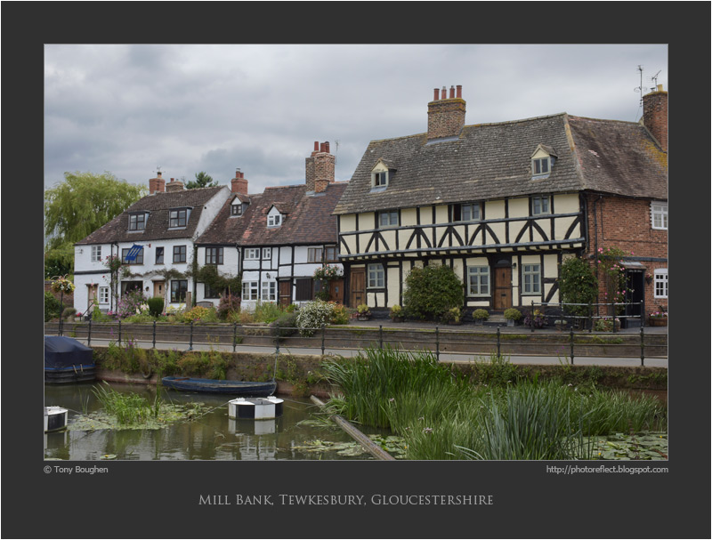
Mill Bank, Tewkesbury

click photo to enlarge
It was an overcast day when we stopped off at Tewkesbury, Gloucestershire, on our way to Herefordshire. We walked around the abbey, the town and by the riverside, and in the course of our perambulation I took this photograph of these houses, raised above the water near the weir and the Abbey Mill. It's a picturesque row that to many people shouts out "Merrie England". The warm, orange brick, painted render, plain tile roofs, heavy chimney stacks, timber-framing with jettied first floor, and the pleasing individuality of the houses, each determinedly different from its neighbour, make a picturesque and pleasing scene. They are the sort of houses that many would wish to live in, residences with history, presence and character.

However, all is not quite so "chocolate box" quaint or jigsaw perfect as it seems. Living in houses by the rivers that flow through Tewkesbury requires a certain fortitude because flooding is no stranger to the town. In recent years there have been times when the area around the abbey has appeared to be an island or a peninsula in a large, irregular lake, and at the fringes of the island, and beyond, houses have their feet and sometimes their knees in water. Yet, despite this inconvenience and disruption, a feature that afflicts the area periodically, and has done for centuries, people still vie to buy the old houses that grace the streets. And consequently they continue to make a fine sight for visitors such as me and my camera.

photograph and text © Tony Boughen

Camera: Nikon D5300
Mode: Aperture Priority
Focal Length: 30mm (99mm - 45mm equiv.)
F No: f8
Shutter Speed: 1/250 sec
ISO:100
Exposure Compensation: 0 EV
Image Stabilisation: On

Wednesday, July 16, 2014

Death, dignity and helium

click photo to enlarge
The popularity of releasing helium filled balloons and watching them float away into the wild blue yonder shows no signs of abating. It's now reasonably widely known that the earth's supply of helium is finite and dwindling (despite it being the universe's second most common element), and that more pressing uses for the gas exist e.g. in medical MRI scanners, welding and industrial leak detection. And yet, every year races involving hundreds of helium balloons are organised, often to support a charity, and millions of party balloons are inflated with the gas. It may be that mankind, one day, finds a substitute for helium, but until then many scientists advocate a more responsible husbanding of this important resource.

A while ago I came upon a shiny, red helium balloon that had attached itself to the metal fence that surrounds an electricity substation. It had clearly been snagged for some time because it was abraded and beginning to fade, the metallic coating showing grey beneath the paint. On the side facing me (upside down) I could read the word "dignity". Behind the balloon was a yellow warning sign, one of the many placed on the fence at regular intervals, warning of "Danger of Death": not unreasonable considering the high voltage apparatus inside. As I gazed on the fluttering balloon it occurred to me that this happenstance juxtaposition had put "death" with "dignity" in close proximity and that the three primary colours - red, blue and yellow - were also part of the photographic composition that was forming in my mind. So, reflecting that a "death with dignity" is something we all wish for when the end finally comes, I took my shot and continued on my way.

photograph and text © Tony Boughen

Camera: Sony RX100
Mode: Aperture Priority
Focal Length: 20.9mm (56mm - 35mm equiv.)
F No: f5.6
Shutter Speed: 1/800 sec
ISO:125
Exposure Compensation: -0.3 EV
Image Stabilisation: On

Monday, July 14, 2014

Time-worn stone steps

click photo to enlarge
There are few things that indicate the passage of time better than worn steps. To gaze upon stone (or even wooden) steps that have been eroded into concavity by the repeated passage of hundreds, or more likely thousands of feet, is to experience a tangible understanding of years becoming decades and decades becoming centuries.

On my first visit to Wells Cathedral many years ago I made a point of having a look at the chapter house's stone stairway. I knew this from an architectural photograph by the English photographer, Frederick Henry Evans (1853-1943). The undulations in these stairs made by myriad feet add to the beauty of the shot and give it a quality that it would otherwise lack. The "sea of steps" makes you think of the people who have walked up and down them.

I've photographed steps regularly during my life though never with the success achieved by Evans in his shot. On one occasion, however, I took a shot of steel steps, but with added son's added feet and deliberate blur, and result became one of my favourite images. On our recent visit to Bolsover Castle I tried this subject again but this time without blur and  with time-worn steps. The result doesn't please me as much as my earlier shot with feet but I think it's not entirely without interest.

photograph and text © Tony Boughen

Camera: Nikon D5300
Mode: Aperture Priority
Focal Length: 32mm (48mm - 35mm equiv.)
F No: f8
Shutter Speed: 1/30 sec
ISO:6400
Exposure Compensation: 0 EV
Image Stabilisation: On

Saturday, July 12, 2014

Ornamental yarrow

click photo to enlarge
The native Yarrow (Achillea millefolium), familiar from roadside verges and meadows in England, has several names. Milfoil means "thousand leaves" as does its Latin specific name. It was also known as Yarroway, Staunch Weed (for its capacity to staunch or stop bleeding), and Poor Man's Pepper (for its bitter and pungent taste). The Anglo-Saxons used it for these purposes but also for divination and as a charm against illness or bad luck.

Yarrow can be easily overlooked by the casual observer, following as it does, the Cow Parsley and Sweet Cicely, and surrounded by other white flowered umbellifers such as Fool's Parsley and Wild Angelica. However, its flat flower heads, once identified, are easy to spot and give it a delicacy that its similar brethren lack. It is usually white, but sometimes plants have a pink or brown tinge.

The other day I photographed a cultivated, ornamental variety of Yarrow that I initially thought was Achillea "Fire King" or "Coral Beauty". But it turned out to be one I'd not seen before, "Achillea "Feuerland". Its colour, not perfectly represented in my photograph, is red/orange. The characteristic that I particularly liked was the clustering of different, subtle shades produced by flower heads of different ages - again, not seen in my image as I saw it with my eye. This variety is one I'll look out for when we are shopping for plants.

photograph and text © Tony Boughen

Camera: Canon 5D2
Mode: Aperture Priority
Focal Length: 80mm
F No: f8
Shutter Speed: 1/320
ISO: 100
Exposure Compensation:  -0.67 EV
Image Stabilisation: On