click photo to enlarge
The seasons impose a regular routine on the gardener. Three seasons of lawn cutting with a peak in mid-summer is something with which most English gardeners are familiar. The autumn tidy of vegetable plot and borders is another. And so too is the dead heading of flowers.
The casual gardener doesn't always appreciate the power and purpose of dead heading, neglects to do it, and consequently has a poorer display of blooms. What dead heading achieves is interference with the biological imperative to reproduce. The pelargoniums (also known as geraniums in England) in the photograph above produce seed from the flower heads and if they are left to do so put all their effort into that task. However, if the flower heads are removed as they fade and before they begin to produce the seed, then they will grow more flower heads in an effort to compensate for their loss. Consequently the gardener's display will be all the better for this little bit of work.
The summer months see me, bucket in hand, doing the round of the flowers, dead heading and putting my collection in the compost. But, prior to disposing of them, I often take a snap or two of the fading beauty before it enters the biological cycle.
photograph and text © Tony Boughen
Photo Title: Pelargonium and Begonia Dead Heads
Camera: Olympus E-M10
Mode: Aperture Priority
Focal Length: 25mm (50mm - 35mm equiv.)
F No: f2.8
Shutter Speed: 1/160 sec
ISO:200
Exposure Compensation: -0.3 EV
Image Stabilisation: On
Showing posts with label flowers. Show all posts
Sunday, August 07, 2016
Saturday, July 23, 2016
Flags, Upton-upon-Severn
click photo to enlarge
We popped into Upton-upon Severn in Worcestershire recently and found the small, riverside town had been taken over by flags and flowers. The flags, I suppose, were still flying in honour of Queen Elizabeth's 90th birthday - at least the dominance of the Union flag and a flag with the royal coat of arms suggested that was the case. Anyone who has kept up with this blog will know that I'm not a royalist so it is conceivable that some other day or date of royal significance has occurred but passed me by.
The flowers were mainly - as far as I could see - in the vicinity of the streets by the River Severn, though they were in significant numbers elsewhere too as the photo above shows. Volunteers were setting out large tubs of begonias and other brightly coloured blooms. I noticed a poster proclaiming that the town was a Britain in Bloom 2016 Finalist so I imagine that they were preparing for the arrival of some of the judges.
The combination of flags and flowers certainly made the town much more colourful than the brick and plaster of the old buildings usually achieve alone and for this architecture enthusiast they made it difficult to capture the photographs that I had in mind. However, the flags and people on this street made for a shot that gives a flavour of a small English town displaying both its patriotism and its pride.
photograph and text © Tony Boughen
Photo Title: Flags, Upton-upon-Severn, Worcestershire
Camera: Olympus E-M10
Mode: Aperture Priority
Focal Length: 36mm (72mm - 35mm equiv.) crop
F No: f7.1
Shutter Speed: 1/800 sec
ISO:200
Exposure Compensation: -0.3 EV
Image Stabilisation: On
We popped into Upton-upon Severn in Worcestershire recently and found the small, riverside town had been taken over by flags and flowers. The flags, I suppose, were still flying in honour of Queen Elizabeth's 90th birthday - at least the dominance of the Union flag and a flag with the royal coat of arms suggested that was the case. Anyone who has kept up with this blog will know that I'm not a royalist so it is conceivable that some other day or date of royal significance has occurred but passed me by.
The flowers were mainly - as far as I could see - in the vicinity of the streets by the River Severn, though they were in significant numbers elsewhere too as the photo above shows. Volunteers were setting out large tubs of begonias and other brightly coloured blooms. I noticed a poster proclaiming that the town was a Britain in Bloom 2016 Finalist so I imagine that they were preparing for the arrival of some of the judges.
The combination of flags and flowers certainly made the town much more colourful than the brick and plaster of the old buildings usually achieve alone and for this architecture enthusiast they made it difficult to capture the photographs that I had in mind. However, the flags and people on this street made for a shot that gives a flavour of a small English town displaying both its patriotism and its pride.
photograph and text © Tony Boughen
Photo Title: Flags, Upton-upon-Severn, Worcestershire
Camera: Olympus E-M10
Mode: Aperture Priority
Focal Length: 36mm (72mm - 35mm equiv.) crop
F No: f7.1
Shutter Speed: 1/800 sec
ISO:200
Exposure Compensation: -0.3 EV
Image Stabilisation: On
Labels:
flags,
flowers,
street,
Upton-upon-Severn,
Worcestershire
Friday, June 03, 2016
Pelargoniums and arches
click photo to enlarge
Even though the weather was heavily overcast and dull, and despite the fact that the pelargoniums were only starting rather than in full flower, it was inevitable that I would take this photograph. Why? Well, we favour this flower, in red, in our garden for the great effect that it has for such a small outlay, and the fact that it flowers for a long period and can withstand dry conditions. It brightens up our garages, the garden shed, outside our greenhouse and some of the borders. My favourite colour is a red/orange that isn't easy to find, and failing that I like a deep, strong red.
These examples are in some framing arches that are each side of a fountain at Belton House, near Grantham, in Lincolnshire. The plants go well with the old, lichen-encrusted stone, and even though the terracotta pots sit slightly awkwardly in the scalloped brackets, they brightened up a drab, unseasonally cold afternoon during our visit with some of our family.
photograph and text © Tony Boughen
Photo Title: Pelargoniums and Arxches, Belton House, Lincolnshire
Camera: Olympus E-M10
Mode: Aperture Priority
Focal Length: 49mm (98mm - 35mm equiv.) crop
F No: f6.3
Shutter Speed: 1/125 sec
ISO:250
Exposure Compensation: -0.3 EV
Image Stabilisation: On
Even though the weather was heavily overcast and dull, and despite the fact that the pelargoniums were only starting rather than in full flower, it was inevitable that I would take this photograph. Why? Well, we favour this flower, in red, in our garden for the great effect that it has for such a small outlay, and the fact that it flowers for a long period and can withstand dry conditions. It brightens up our garages, the garden shed, outside our greenhouse and some of the borders. My favourite colour is a red/orange that isn't easy to find, and failing that I like a deep, strong red.
These examples are in some framing arches that are each side of a fountain at Belton House, near Grantham, in Lincolnshire. The plants go well with the old, lichen-encrusted stone, and even though the terracotta pots sit slightly awkwardly in the scalloped brackets, they brightened up a drab, unseasonally cold afternoon during our visit with some of our family.
photograph and text © Tony Boughen
Photo Title: Pelargoniums and Arxches, Belton House, Lincolnshire
Camera: Olympus E-M10
Mode: Aperture Priority
Focal Length: 49mm (98mm - 35mm equiv.) crop
F No: f6.3
Shutter Speed: 1/125 sec
ISO:250
Exposure Compensation: -0.3 EV
Image Stabilisation: On
Labels:
Belton House,
flowers,
Lincolnshire,
Pelargonium
Thursday, May 26, 2016
Allotment poppies (correction - Ranunculus)
click photo to enlarge
The allotment is slowly disappearing from England's cities, towns and villages. These community gardens were originally conceived as pieces of land that could be rented from the local authority, for a nominal fee, on which people could grow food to supplement their income. Over the years, as incomes rose they became places where people grew food crops, flowers, sometimes crops for sale, more by way of a hobby than out of any kind of deep necessity.
With that change came the realisation that the standard sized allotment (c. 250 square metres) was too large for modern needs and so many were reduced in size. A decline in interest in renting an allotment some areas, coupled with a shortage of land for housing and other uses resulted in many allotments being sold off. Today the take-up of allotments varies considerably from place to place with some thriving and others moribund.
The village where I live has allotments and the other evening, as the sun was getting low in the sky, we walked through them. A group of ornamentalpoppies ranunculus sown by one allotment holder were in full flower and caught our eye illuminated as they were by the strong light. They looked a fine sight among the rows of beans, potatoes and brassicas, a splash of vivid colour among the greenery.
photograph and text © Tony Boughen
Photo Title: Allotment Poppies (correction, Ranunculus)
Camera: Olympus E-M10
Mode: Aperture Priority
Focal Length: 150mm (300mm - 35mm equiv.) crop
F No: f5.6
Shutter Speed: 1/400 sec
ISO:200
Exposure Compensation: -0.3 EV
Image Stabilisation: On
The allotment is slowly disappearing from England's cities, towns and villages. These community gardens were originally conceived as pieces of land that could be rented from the local authority, for a nominal fee, on which people could grow food to supplement their income. Over the years, as incomes rose they became places where people grew food crops, flowers, sometimes crops for sale, more by way of a hobby than out of any kind of deep necessity.
With that change came the realisation that the standard sized allotment (c. 250 square metres) was too large for modern needs and so many were reduced in size. A decline in interest in renting an allotment some areas, coupled with a shortage of land for housing and other uses resulted in many allotments being sold off. Today the take-up of allotments varies considerably from place to place with some thriving and others moribund.
The village where I live has allotments and the other evening, as the sun was getting low in the sky, we walked through them. A group of ornamental
photograph and text © Tony Boughen
Photo Title: Allotment Poppies (correction, Ranunculus)
Camera: Olympus E-M10
Mode: Aperture Priority
Focal Length: 150mm (300mm - 35mm equiv.) crop
F No: f5.6
Shutter Speed: 1/400 sec
ISO:200
Exposure Compensation: -0.3 EV
Image Stabilisation: On
Labels:
allotments,
flowers,
poppies,
Ranunculus
Sunday, May 08, 2016
Wayward flowers
click photo to enlarge
"The best laid schemes o' mice an' men
Gang aft agley"
Robert Burns (1759-1796), Scottish poet and lyricist
Many people will recognise the lines of Rabbie Burns quoted above. They come from his poem, "To a mouse, on turning her up in her nest with the plough", though it is common today for the second line to be replaced with the more modern, "Go often askew". But how many, I wonder, recall what follows these words? The lines continue thus: "An' lea'e us nought but grief an' pain, For promis'd joy!" Read in its fullness Burns' words will strike a chord with many - we have all planned something with great care and the expectation of a favourable outcome, only to be thwarted and disappointed when it all goes wrong.
I thought of these words the other day when I was casting round the garden for a few photographs of our flowering bulbs. In the main we prefer to group like with like so that each variety of flower shows itself off to full effect. However, as I moved from flower bed to flower bed a noticed a couple of bulbs that had, as they say "made their own arrangements". Or perhaps a bird, mole or squirrel had helped them out and moved a bulb to a different location. The first was a couple of tulips among the bluebells a real contrast of deep red against the softer blue of the smaller flowers. The second was a narcissus among the tulips. I recall these being planted in groups alongside each other, but now they seem to be starting to intermingle.
I'm not, despite Burns' words, disappointed by this disruption of our "best laid scheme". It seems to me that sometimes our plans go wrong with positive consequences, and something that has "gang...agley" can offer, unexpectedly, a "promis'd joy" that was unforeseen.
photograph and text © Tony Boughen
Photo 1
Photo Title: Tulips Among The Bluebells
Camera: Olympus E-M10
Mode: Aperture Priority
Focal Length: 150mm (300mm - 35mm equiv.) crop
F No: f5.6
Shutter Speed: 1/800 sec
ISO:200
Exposure Compensation: -0.3 EV
Image Stabilisation: On
"The best laid schemes o' mice an' men
Gang aft agley"
Robert Burns (1759-1796), Scottish poet and lyricist
Many people will recognise the lines of Rabbie Burns quoted above. They come from his poem, "To a mouse, on turning her up in her nest with the plough", though it is common today for the second line to be replaced with the more modern, "Go often askew". But how many, I wonder, recall what follows these words? The lines continue thus: "An' lea'e us nought but grief an' pain, For promis'd joy!" Read in its fullness Burns' words will strike a chord with many - we have all planned something with great care and the expectation of a favourable outcome, only to be thwarted and disappointed when it all goes wrong.
I thought of these words the other day when I was casting round the garden for a few photographs of our flowering bulbs. In the main we prefer to group like with like so that each variety of flower shows itself off to full effect. However, as I moved from flower bed to flower bed a noticed a couple of bulbs that had, as they say "made their own arrangements". Or perhaps a bird, mole or squirrel had helped them out and moved a bulb to a different location. The first was a couple of tulips among the bluebells a real contrast of deep red against the softer blue of the smaller flowers. The second was a narcissus among the tulips. I recall these being planted in groups alongside each other, but now they seem to be starting to intermingle.I'm not, despite Burns' words, disappointed by this disruption of our "best laid scheme". It seems to me that sometimes our plans go wrong with positive consequences, and something that has "gang...agley" can offer, unexpectedly, a "promis'd joy" that was unforeseen.
photograph and text © Tony Boughen
Photo 1
Photo Title: Tulips Among The Bluebells
Camera: Olympus E-M10
Mode: Aperture Priority
Focal Length: 150mm (300mm - 35mm equiv.) crop
F No: f5.6
Shutter Speed: 1/800 sec
ISO:200
Exposure Compensation: -0.3 EV
Image Stabilisation: On
Labels:
bluebell,
flowers,
Robert Burns,
tulip
Wednesday, April 20, 2016
Magnolia blossom
click photo to enlarge
Magnolia blossom has the power to delight or disappoint. It appears to be one of those plants that is on the edge of its range in the UK because a cold, wet spring results in short-lived blossom that is marked with brown stains. The sight of the large blooms disfigured in this way is particularly woeful because they are potentially one of the most showy early blossoms, and all we see in these circumstances is a hint of what might have been.
The spring of this year in my part of the world seems to have been better suited to magnolias than most because our tree seems to have been in flower for a couple of weeks and has some time yet to go. There have been a few frosts during the time it has been in bloom but they haven't been particularly sharp, and the rain hasn't been especially heavy or persistent. Consequently the blooms have looked magnificent, and though they have acquired some brown staining it isn't as prevalent or strong as it can be.
When I came to photograph the blossom I took some shots against the blue sky because it goes well with the white tinged with pink of the petals. However, as I worked my way around the tree I found that I could frame some low blooms with the darkness of the shadows of a conifer hedge. I much preferred that as a backdrop for the petals. I also liked how it emphasised the branches better than did the sky blue.
photograph and text © Tony Boughen
Photo Title: Magnolia blossom
Camera: Olympus E-M10
Mode: Aperture Priority
Focal Length: 120mm (240mm - 35mm equiv.) crop
F No: f5.6
Shutter Speed: 1/250 sec
ISO:250
Exposure Compensation: 0 EV
Image Stabilisation: On
Magnolia blossom has the power to delight or disappoint. It appears to be one of those plants that is on the edge of its range in the UK because a cold, wet spring results in short-lived blossom that is marked with brown stains. The sight of the large blooms disfigured in this way is particularly woeful because they are potentially one of the most showy early blossoms, and all we see in these circumstances is a hint of what might have been.
The spring of this year in my part of the world seems to have been better suited to magnolias than most because our tree seems to have been in flower for a couple of weeks and has some time yet to go. There have been a few frosts during the time it has been in bloom but they haven't been particularly sharp, and the rain hasn't been especially heavy or persistent. Consequently the blooms have looked magnificent, and though they have acquired some brown staining it isn't as prevalent or strong as it can be.
When I came to photograph the blossom I took some shots against the blue sky because it goes well with the white tinged with pink of the petals. However, as I worked my way around the tree I found that I could frame some low blooms with the darkness of the shadows of a conifer hedge. I much preferred that as a backdrop for the petals. I also liked how it emphasised the branches better than did the sky blue.
photograph and text © Tony Boughen
Photo Title: Magnolia blossom
Camera: Olympus E-M10
Mode: Aperture Priority
Focal Length: 120mm (240mm - 35mm equiv.) crop
F No: f5.6
Shutter Speed: 1/250 sec
ISO:250
Exposure Compensation: 0 EV
Image Stabilisation: On
Monday, May 04, 2015
Spalding tulips under trees
click photo to enlarge
I have a particular liking for tulips. I haven't counted, but I think they will be the most frequently depicted flower on this blog. The Lincolnshire town of Spalding, and the area around it, has a long association with this flower. For many decades it has been grown in the locality both for the blooms and the bulbs, both of which are grown to be sold.
The now defunct Spalding Flower Parade featured hundreds of thousand of tulip blooms on imaginatively designed floats, and the event drew many people to the town to witness the spectacle. The other day we were in Spalding and had a look at Springfields Gardens, the area that sits alongside the purpose-built shopping centre and which makes shopping there bearable (for me anyway)!
We came across sunlit flower beds that featured a great variety of tulips and smaller numbers of other spring bulbs. This didn't surprise us. What did amaze us, however, was the sight that greeted us when we walked through the adjacent area of woodland. Large drifts of tulips had been planted there and were showing off beautifully in the dappled sunlight. It was most unusual to find this variety of flower growing in this kind of location, but it worked wonderfully well and I wondered why it wasn't done more often. The plants had managed to grow and bloom because they reached maturity before the leaf canopy was fully open and had begun restricting the amount of light that reached the ground beneath the branches - in much the same way that wild bluebells and ramsons manage to flower in this kind of setting.
photograph and text © Tony Boughen
Photo 1
Camera: Canon 5D2
Mode: Aperture Priority
Focal Length: 105mm
F No: f4
Shutter Speed: 1/320 sec
ISO:100
Exposure Compensation: -0.33 EV
Image Stabilisation: On
I have a particular liking for tulips. I haven't counted, but I think they will be the most frequently depicted flower on this blog. The Lincolnshire town of Spalding, and the area around it, has a long association with this flower. For many decades it has been grown in the locality both for the blooms and the bulbs, both of which are grown to be sold.
The now defunct Spalding Flower Parade featured hundreds of thousand of tulip blooms on imaginatively designed floats, and the event drew many people to the town to witness the spectacle. The other day we were in Spalding and had a look at Springfields Gardens, the area that sits alongside the purpose-built shopping centre and which makes shopping there bearable (for me anyway)!
We came across sunlit flower beds that featured a great variety of tulips and smaller numbers of other spring bulbs. This didn't surprise us. What did amaze us, however, was the sight that greeted us when we walked through the adjacent area of woodland. Large drifts of tulips had been planted there and were showing off beautifully in the dappled sunlight. It was most unusual to find this variety of flower growing in this kind of location, but it worked wonderfully well and I wondered why it wasn't done more often. The plants had managed to grow and bloom because they reached maturity before the leaf canopy was fully open and had begun restricting the amount of light that reached the ground beneath the branches - in much the same way that wild bluebells and ramsons manage to flower in this kind of setting.
photograph and text © Tony Boughen
Photo 1
Camera: Canon 5D2
Mode: Aperture Priority
Focal Length: 105mm
F No: f4
Shutter Speed: 1/320 sec
ISO:100
Exposure Compensation: -0.33 EV
Image Stabilisation: On
Labels:
flowers,
Lincolnshire,
Spalding,
spring,
Springfields Festival Gardens,
trees,
tulip
Thursday, August 07, 2014
The transformational power of flowers
click photo to enlarge
Every gardener knows the transformational power of flowers. Grow a clematis, a rose or a wisteria against a dull old wall and, for the duration of the flowering of the plant, the mundane becomes beautiful. When our pots of red/orange pelargoniums, that we place to the left and right of our garages and a dark green shed, burst into flower these utilitarian buildings become more interesting and more noteworthy. The Royal Horticultural Society's "Britain in Bloom" competition is all about improving the appearance of settlements large and small by the planting of flowers.
On our recent visit to Brigg, Lincolnshire, we had a welcome and enjoyable cup of coffee at a cafe. The main area of the premises was well-presented under a glazed roof with several potted plants, palms and climbers. The "overflow" or outside area had less to offer, located as it was in a wide passage-way with block paving and rendered walls. However, this somewhat dreary location was lifted and made much pleasanter by the wall-mounted planters filled with multi-coloured petunias. My photographer's eye particularly enjoyed the contrast of the bright flowers and the plain, grey background and white furniture, the near monochrome quality of the latter making the colours of the former seem more intense than nature intended.
photograph and text © Tony Boughen
Camera: Nikon D5300
Mode: Aperture Priority
Focal Length: 30mm (45mm - 35mm equiv.)
F No: f8
Shutter Speed: 1/50 sec
ISO:110
Exposure Compensation: 0.33 EV
Image Stabilisation: On
Every gardener knows the transformational power of flowers. Grow a clematis, a rose or a wisteria against a dull old wall and, for the duration of the flowering of the plant, the mundane becomes beautiful. When our pots of red/orange pelargoniums, that we place to the left and right of our garages and a dark green shed, burst into flower these utilitarian buildings become more interesting and more noteworthy. The Royal Horticultural Society's "Britain in Bloom" competition is all about improving the appearance of settlements large and small by the planting of flowers.
On our recent visit to Brigg, Lincolnshire, we had a welcome and enjoyable cup of coffee at a cafe. The main area of the premises was well-presented under a glazed roof with several potted plants, palms and climbers. The "overflow" or outside area had less to offer, located as it was in a wide passage-way with block paving and rendered walls. However, this somewhat dreary location was lifted and made much pleasanter by the wall-mounted planters filled with multi-coloured petunias. My photographer's eye particularly enjoyed the contrast of the bright flowers and the plain, grey background and white furniture, the near monochrome quality of the latter making the colours of the former seem more intense than nature intended.
photograph and text © Tony Boughen
Camera: Nikon D5300
Mode: Aperture Priority
Focal Length: 30mm (45mm - 35mm equiv.)
F No: f8
Shutter Speed: 1/50 sec
ISO:110
Exposure Compensation: 0.33 EV
Image Stabilisation: On
Friday, May 30, 2014
Flowers in the window
click photo to enlarge
A large, mixed bunch of flowers displayed alongside other vessels and objects, such as these that I saw in the window of a house in Ledbury, Herefordshire, always reminds me of the Dutch school of flower painting that flourished in the seventeenth century. Here, however, the slender Georgian glazing bars and the small panes of glass added, to my mind, a touch of nineteenth century Dickens.
© Tony Boughen
Camera: Sony RX100
Mode: Aperture Priority
Focal Length: 14.9mm (40mm - 35mm equiv.)
F No: f6.3
Shutter Speed: 1/320 sec
ISO:125
Exposure Compensation: -0.7 EV
Image Stabilisation: On
A large, mixed bunch of flowers displayed alongside other vessels and objects, such as these that I saw in the window of a house in Ledbury, Herefordshire, always reminds me of the Dutch school of flower painting that flourished in the seventeenth century. Here, however, the slender Georgian glazing bars and the small panes of glass added, to my mind, a touch of nineteenth century Dickens.
© Tony Boughen
Camera: Sony RX100
Mode: Aperture Priority
Focal Length: 14.9mm (40mm - 35mm equiv.)
F No: f6.3
Shutter Speed: 1/320 sec
ISO:125
Exposure Compensation: -0.7 EV
Image Stabilisation: On
Labels:
flowers,
Herefordshire,
Ledbury,
window
Thursday, October 03, 2013
Nature, flowers and colours
click photo to enlarge
I remember reading, a long time ago, the assertion that colours in nature never clash. I have the feeling that it was a well-known artist who was being quoted. I've searched for the source of those words but, despite seeing the sentiment expressed by others, I've never managed to come up with any sort of attribution.
When I first read the statement I had my doubts about the truth of it. Surely, I thought, pink and yellow always look wrong together. I feel the same about purple and orange. And yet as time has gone by I've recognised that there is some truth in the saying; or, should I say, that it leans more towards being true than being false. The fact is that every now and then I test the statement by looking at unlikely colour flower combinations. What I find is that my preconceptions that colours inevitably clash wherever they occur are confounded more often than they are confirmed. I know that testing the truth of a statement by measuring it against the opinion of a single person who, like everyone else, has idiosyncratic views on colour combinations, isn't a terribly scientific way to come to a proper conclusion, but what's a man to do?
A while ago I took a photograph of poppies next to lavender that inadvertently supported the statement and overturned my dislike of purple next to orange, and in the accompanying post I discussed some of the issues I'm returning to today. The other day my wife asked me to photograph a vase of flowers that she had received as a birthday bouquet. This consisted of yellow sunflowers, pink gerbera and purple gladioli, a colour combination that perhaps spoke of the fact that the bunch was chosen with the help of my two year old grand-daughter. Do the colours clash? Interestingly I find that they appear to do so in my photograph, but less so in life. Work that one out if you can?
photograph and text © Tony Boughen
Photo 1
Camera: Sony RX100
Mode: Aperture Priority
Focal Length: 10.4mm (28mm - 35mm equiv.)
F No: f7.1
Shutter Speed: 1/400
ISO: 125
Exposure Compensation: -0.3 EV
Image Stabilisation: On
I remember reading, a long time ago, the assertion that colours in nature never clash. I have the feeling that it was a well-known artist who was being quoted. I've searched for the source of those words but, despite seeing the sentiment expressed by others, I've never managed to come up with any sort of attribution.
When I first read the statement I had my doubts about the truth of it. Surely, I thought, pink and yellow always look wrong together. I feel the same about purple and orange. And yet as time has gone by I've recognised that there is some truth in the saying; or, should I say, that it leans more towards being true than being false. The fact is that every now and then I test the statement by looking at unlikely colour flower combinations. What I find is that my preconceptions that colours inevitably clash wherever they occur are confounded more often than they are confirmed. I know that testing the truth of a statement by measuring it against the opinion of a single person who, like everyone else, has idiosyncratic views on colour combinations, isn't a terribly scientific way to come to a proper conclusion, but what's a man to do?
A while ago I took a photograph of poppies next to lavender that inadvertently supported the statement and overturned my dislike of purple next to orange, and in the accompanying post I discussed some of the issues I'm returning to today. The other day my wife asked me to photograph a vase of flowers that she had received as a birthday bouquet. This consisted of yellow sunflowers, pink gerbera and purple gladioli, a colour combination that perhaps spoke of the fact that the bunch was chosen with the help of my two year old grand-daughter. Do the colours clash? Interestingly I find that they appear to do so in my photograph, but less so in life. Work that one out if you can?
photograph and text © Tony Boughen
Photo 1
Camera: Sony RX100
Mode: Aperture Priority
Focal Length: 10.4mm (28mm - 35mm equiv.)
F No: f7.1
Shutter Speed: 1/400
ISO: 125
Exposure Compensation: -0.3 EV
Image Stabilisation: On
Monday, September 09, 2013
Perennial rudbeckia
click photo to enlarge
After the last two posts I feel the need for colour, and what can be more colourful than the bright yellow petals of perennial rudbeckia against the deep blue of an early autumn sky? In our garden we have a few clumps of these striking and long-lasting flowers. They are a variety of coneflower, one of four genera (including Echinacea) of the Asteraceae family, and are especially useful in bringing strong, bright colour to the garden after the flowers of high summer have faded.
My usual view of these blooms is against the leafy backdrop of the borders in which they reside. So, their yellow sits alongside green. However, for this photograph I made the conscious decision to get down low with the camera - in fact I held it at arms length inside the clump - and photograph upwards to place their colour and the shape of the flower heads against the plain blue of the sky. In the RGB colour model wheel blue and yellow are opposite each other. This makes them complementary colours. A feature of such pairs is that when they are placed next to one another the effect is to increase each colour's visual intensity. As the evenings begin to draw in and the first misty mornings remind us that summer is waning, photographing vibrant colours of this sort is my way of hanging on to something of the departing warmth and sun.
photograph and text © Tony Boughen
Camera: Sony RX100
Mode: Aperture Priority
Focal Length: 10.4mm (28mm - 35mm equiv.)
F No: f5.6
Shutter Speed: 1/500
ISO: 125
Exposure Compensation: 0 EV
Image Stabilisation: On
After the last two posts I feel the need for colour, and what can be more colourful than the bright yellow petals of perennial rudbeckia against the deep blue of an early autumn sky? In our garden we have a few clumps of these striking and long-lasting flowers. They are a variety of coneflower, one of four genera (including Echinacea) of the Asteraceae family, and are especially useful in bringing strong, bright colour to the garden after the flowers of high summer have faded.
My usual view of these blooms is against the leafy backdrop of the borders in which they reside. So, their yellow sits alongside green. However, for this photograph I made the conscious decision to get down low with the camera - in fact I held it at arms length inside the clump - and photograph upwards to place their colour and the shape of the flower heads against the plain blue of the sky. In the RGB colour model wheel blue and yellow are opposite each other. This makes them complementary colours. A feature of such pairs is that when they are placed next to one another the effect is to increase each colour's visual intensity. As the evenings begin to draw in and the first misty mornings remind us that summer is waning, photographing vibrant colours of this sort is my way of hanging on to something of the departing warmth and sun.
photograph and text © Tony Boughen
Camera: Sony RX100
Mode: Aperture Priority
Focal Length: 10.4mm (28mm - 35mm equiv.)
F No: f5.6
Shutter Speed: 1/500
ISO: 125
Exposure Compensation: 0 EV
Image Stabilisation: On
Labels:
blue,
complementary colours,
flowers,
low viewpoint,
perennial,
Rudbeckia,
yellow
Saturday, July 20, 2013
Hotels and ratings signs
click photo to enlarge
There was a time in my life when I walked, cycled and used public transport exclusively. One of my aims was to to avoid car ownership and the environmental destructiveness that is inherent in that form of transport. However, for various reasons, including the birth of a second son and the deliberate vandalising of British Rail by the Thatcher governments, I bought a car and it is now my main means of transport. However, I still cycle and I remain a member of the Cyclists' Touring Club (CTC) for the insurance it offers, the interesting magazine it publishes and to help the foremost body in Britain that supports the cyclist and the cause of cycling. I was briefly a member of the Automobile Association (AA) when membership came as part of the package with a car that I bought. However, I let that lapse because the organisation that claims to be the main voice for motorists in Britain kept making statements in support of motoring for which it had no mandate from its members and which were diametrically opposed to my beliefs.
Both of these organisations produced ratings signs to be fixed to the exterior of hotels, B&Bs etc. In the case of the CTC the winged wheel logo, often made of cast iron or enamel, began to be used from 1887 and denoted an establishment that offered good accommodation and service to cyclists. These early plaques can still be seen on some buildings as can its modern equivalent, a small sticker designed to be fixed to a window. Compared with the CTC the AA was a relative latecomer in the rating and recommending of hotels etc, having begun to award its plaques with 1 to 5 stars only from 1912. The AA continues to be a major player in the inspection and judging of the standards of accommodation, continuing to award stars and offer establishments ways of advertising its rating. However, as with the CTC, quite a few hotels still display an old AA sign that must have been awarded decades ago. I imagine there is some kind of stipulation that these must reflect a current rating - or perhaps not.
I was wondering about this latter point recently as I photographed just such a sign - an illuminated variant - on the main facade of the Feathers Hotel in Ledbury, Herefordshire. It must date from before 1966 because in that year the AA changed to a sans serif font for its initials and signage. The deep yellow and black of the sign, along with Union flags, window boxes and hanging baskets, gave colour to the black and white of the ancient, timber-framed building, and offered a collection of details that seemed to have the makings of a photograph, so I pointed my camera at it and pressed the shutter.
photograph and text © Tony Boughen
Camera: Sony RX100
Mode: Aperture Priority
Focal Length: 37.1mm (100mm - 35mm equiv.)
F No: f5.6
Shutter Speed: 1/1000
ISO: 125
Exposure Compensation: -0.7 EV
Image Stabilisation: On
There was a time in my life when I walked, cycled and used public transport exclusively. One of my aims was to to avoid car ownership and the environmental destructiveness that is inherent in that form of transport. However, for various reasons, including the birth of a second son and the deliberate vandalising of British Rail by the Thatcher governments, I bought a car and it is now my main means of transport. However, I still cycle and I remain a member of the Cyclists' Touring Club (CTC) for the insurance it offers, the interesting magazine it publishes and to help the foremost body in Britain that supports the cyclist and the cause of cycling. I was briefly a member of the Automobile Association (AA) when membership came as part of the package with a car that I bought. However, I let that lapse because the organisation that claims to be the main voice for motorists in Britain kept making statements in support of motoring for which it had no mandate from its members and which were diametrically opposed to my beliefs.
Both of these organisations produced ratings signs to be fixed to the exterior of hotels, B&Bs etc. In the case of the CTC the winged wheel logo, often made of cast iron or enamel, began to be used from 1887 and denoted an establishment that offered good accommodation and service to cyclists. These early plaques can still be seen on some buildings as can its modern equivalent, a small sticker designed to be fixed to a window. Compared with the CTC the AA was a relative latecomer in the rating and recommending of hotels etc, having begun to award its plaques with 1 to 5 stars only from 1912. The AA continues to be a major player in the inspection and judging of the standards of accommodation, continuing to award stars and offer establishments ways of advertising its rating. However, as with the CTC, quite a few hotels still display an old AA sign that must have been awarded decades ago. I imagine there is some kind of stipulation that these must reflect a current rating - or perhaps not.
I was wondering about this latter point recently as I photographed just such a sign - an illuminated variant - on the main facade of the Feathers Hotel in Ledbury, Herefordshire. It must date from before 1966 because in that year the AA changed to a sans serif font for its initials and signage. The deep yellow and black of the sign, along with Union flags, window boxes and hanging baskets, gave colour to the black and white of the ancient, timber-framed building, and offered a collection of details that seemed to have the makings of a photograph, so I pointed my camera at it and pressed the shutter.
photograph and text © Tony Boughen
Camera: Sony RX100
Mode: Aperture Priority
Focal Length: 37.1mm (100mm - 35mm equiv.)
F No: f5.6
Shutter Speed: 1/1000
ISO: 125
Exposure Compensation: -0.7 EV
Image Stabilisation: On
Labels:
AA,
Automobile Association,
CTC,
Cyclists,
Feathers Hotel,
flowers,
hanging basket,
Herefordshire,
Ledbury,
ratings
Saturday, July 06, 2013
Wayward red poppies
click photo to enlarge
The flowers that, I think, feature most on this blog are the tulip and the poppy. I haven't actually counted the number of occurrences of each type but my feeling is that these two will predominate. That isn't surprising because they are two of my favourite flowers and we have many examples of each in our garden.
In some ways the tulip and the poppy are similar: both feature large and small varieties; both have single, large, striking blooms held high on a stem; both tend to flower in clusters; and both are very eye-catching. However, there are differences. Where the tulip is prim, tidy, firmly upright, everything properly in place, the poppy is much more wayward. Often they straggle, the stems bend and dip, the petals flop about and flutter in the breeze, and some varieties produce a tangled accumulation of foliage and blooms. Given those contrasting characteristics it's perhaps surprising that I like both plants. But I do, and it is the root of this antithesis - the somewhat bedraggled versus the orderly - that appeals to me. I think there is a place for both these qualities in a garden.
Today's photograph was taken contre jour in the morning when the sun was still comparatively low. The way it emphasised the tissue paper-like translucence of the petals and edged the stems with highlighted hairs appealed to me. I took a few shots of the subject but this one, with the dark shadow of a shed behind, seemed to emphasise these attractive qualities best.
photograph and text © Tony Boughen
Camera: Canon
Mode: Aperture Priority
Focal Length: 300mm
F No: f5.6
Shutter Speed: 1/250 sec
ISO: 160
Exposure Compensation: -0.3 EV
Image Stabilisation: On
The flowers that, I think, feature most on this blog are the tulip and the poppy. I haven't actually counted the number of occurrences of each type but my feeling is that these two will predominate. That isn't surprising because they are two of my favourite flowers and we have many examples of each in our garden.
In some ways the tulip and the poppy are similar: both feature large and small varieties; both have single, large, striking blooms held high on a stem; both tend to flower in clusters; and both are very eye-catching. However, there are differences. Where the tulip is prim, tidy, firmly upright, everything properly in place, the poppy is much more wayward. Often they straggle, the stems bend and dip, the petals flop about and flutter in the breeze, and some varieties produce a tangled accumulation of foliage and blooms. Given those contrasting characteristics it's perhaps surprising that I like both plants. But I do, and it is the root of this antithesis - the somewhat bedraggled versus the orderly - that appeals to me. I think there is a place for both these qualities in a garden.
Today's photograph was taken contre jour in the morning when the sun was still comparatively low. The way it emphasised the tissue paper-like translucence of the petals and edged the stems with highlighted hairs appealed to me. I took a few shots of the subject but this one, with the dark shadow of a shed behind, seemed to emphasise these attractive qualities best.
photograph and text © Tony Boughen
Camera: Canon
Mode: Aperture Priority
Focal Length: 300mm
F No: f5.6
Shutter Speed: 1/250 sec
ISO: 160
Exposure Compensation: -0.3 EV
Image Stabilisation: On
Labels:
contre jour,
flowers,
poppy,
red
Sunday, May 12, 2013
Fading tulips
click photo to enlarge
There is a great temptation in photography to shoot beautiful subjects when they are at their most appealing. Landscapes, women, babies, cars, sunsets, you name the subject and you'll find numerous photographs showing them at their best. The light, the sky, the pose, the backdrop, every detail will be in place to show the subject off off to dazzling effect.
It's even more so with flowers. In fact, though it's reasonably easy to find, say, good landscapes where the weather is grim and conventional beauty has been discarded in favour of the stern beauty of nature in the raw, just try and find a flower photograph with blooms past their best and I guarantee you'll struggle.
Painters have long known the different kind of beauty that can be seen in fading flowers, a muted attractiveness that is hinted at or remembered rather than displayed openly before your eyes. It was this effect that I sought when I photographed the tulips shown in today's photograph. But, it hasn't quite worked out as I wanted. Why? Well, if you are unfamiliar with what tulips look like at the peak of their perfection you might think that the flowers in this blue glass vase are just rather fine blooms that natural spread their petals in this rather attractive way. The fact the flowers are fading, are past their best, are naturally shedding their petals and are soon to be just stems isn't necessarily obvious, and even if it is, there remains a beauty that isn't particularly tinged with a feeling of imminent demise: there is still plenty of deep colour in the petals and little sense of the faded beauty that I sought to capture. So, I've kept the flowers and I'll try again when their petals develop brown edges and their decline looks a bit more terminal!

Addendum:Here are the same tulips two days later (Fading Tulips 2), the petals rather more wrinkled and curled,the colours more muted, a hint of brownness about them, but still not everything I envisaged. Having reflected further on the matter I've concluded that I chose the wrong colour tulips for this exercise. It would have been much better to use dark red or dark purple. In fact, any colour with less brilliance than yellow would have suited my purposes. A lesson learned. Perhaps next time...
Addendum 2:
A final shot (Fading Tulips 3), three days after the first one, and one day after the second. Still not quite there. It's definitely the basic colours of the tulip that's wrong for the photograph I'm seeking.
photograph and text © Tony Boughen
Camera: Canon
Mode: Aperture Priority
Focal Length: 100mm macro
F No: f11
Shutter Speed: 1/4 sec
ISO: 100
Exposure Compensation: -1.33 EV
Image Stabilisation: Off
There is a great temptation in photography to shoot beautiful subjects when they are at their most appealing. Landscapes, women, babies, cars, sunsets, you name the subject and you'll find numerous photographs showing them at their best. The light, the sky, the pose, the backdrop, every detail will be in place to show the subject off off to dazzling effect.
It's even more so with flowers. In fact, though it's reasonably easy to find, say, good landscapes where the weather is grim and conventional beauty has been discarded in favour of the stern beauty of nature in the raw, just try and find a flower photograph with blooms past their best and I guarantee you'll struggle.
Painters have long known the different kind of beauty that can be seen in fading flowers, a muted attractiveness that is hinted at or remembered rather than displayed openly before your eyes. It was this effect that I sought when I photographed the tulips shown in today's photograph. But, it hasn't quite worked out as I wanted. Why? Well, if you are unfamiliar with what tulips look like at the peak of their perfection you might think that the flowers in this blue glass vase are just rather fine blooms that natural spread their petals in this rather attractive way. The fact the flowers are fading, are past their best, are naturally shedding their petals and are soon to be just stems isn't necessarily obvious, and even if it is, there remains a beauty that isn't particularly tinged with a feeling of imminent demise: there is still plenty of deep colour in the petals and little sense of the faded beauty that I sought to capture. So, I've kept the flowers and I'll try again when their petals develop brown edges and their decline looks a bit more terminal!

Addendum:Here are the same tulips two days later (Fading Tulips 2), the petals rather more wrinkled and curled,the colours more muted, a hint of brownness about them, but still not everything I envisaged. Having reflected further on the matter I've concluded that I chose the wrong colour tulips for this exercise. It would have been much better to use dark red or dark purple. In fact, any colour with less brilliance than yellow would have suited my purposes. A lesson learned. Perhaps next time...
Addendum 2:
A final shot (Fading Tulips 3), three days after the first one, and one day after the second. Still not quite there. It's definitely the basic colours of the tulip that's wrong for the photograph I'm seeking.
photograph and text © Tony Boughen
Camera: Canon
Mode: Aperture Priority
Focal Length: 100mm macro
F No: f11
Shutter Speed: 1/4 sec
ISO: 100
Exposure Compensation: -1.33 EV
Image Stabilisation: Off
Labels:
dead flowers,
faded,
flowers,
tulips,
vase
Friday, April 19, 2013
Pink and black
Pink always seems to me to be the right colour for carnations (Dianthus) because their colloquial name is "pinks". These flowers come in a range of colours yet pink, to my eye, is just the right colour to go with the blue-tinged green of the stalks, thin leaves and buds.
I think I've said elsewhere in this blog that pink is a colour that I never especially liked but, as I've aged, it has grown on me. It's a colour that cries out to be paired with another colour. I like to see it with turquoise or grey though I'm not fond of the popular pairing with red or purple. When I came to take this photograph of some pink carnations in a vase in our hall I opted for a black background. Pink and black are often put together quite successfully. In this instance it allows the relatively muted colour to display an intensity that it loses when other colours are paired with it, and makes the most of the outline of the blooms. The trouble is that that pink and black have a particular association in my mind, one that I can't shift. Such things are very powerful and can prevent one seeing something for what it is. For example, I can't see the colour mint green alongside brown without thinking of a dessert (pudding) that we had in primary school - chocolate sponge with mint flavoured (and coloured) sauce.
So what association pops into my head when I see pink and black. Nothing less than Bassett's Liquorice Allsorts, a sweet of my childhood, still available today, though one I haven't tasted for decades!
photograph and text © Tony Boughen
Camera: Canon
Mode: Aperture Priority
Focal Length: 100mm macro
F No: f2.8
Shutter Speed: 1/80 sec
ISO: 100
Exposure Compensation: -0.33 EV
Image Stabilisation: Off
Labels:
carnations,
colour associations,
flowers,
liquorice allsorts,
macro,
natural light,
pink
Monday, April 08, 2013
Over-exposure, memory and cyclamen
click photo to enlarge
I use a computer diary to keep track of what I'm doing and when. I also use Windows' built in "sticky notes" that mimic "post-it" notes for lists and "to do" items. By and large these two aids supplemented by my wife's calendar and diary mean that we have most things covered. That's not to say that events and activities don't, very occasionally, get missed: we are only human!
What I'm not good at - actually, I'm hopeless at - is keeping track of photographic approaches that I mean to use more. Things such as motion blur, my "lines in the landscape" project (see recent post), photographing from very low viewpoints, over-exposing appropriate subjects, and much else. I really need to establish a way to make sure I shoot in these ways at least once a week. What happens at the moment is that, out of nowhere in particular, a little light bulb occasionally comes on in my head and I think - "try this one with some positive EV".
That happened recently when I was photographing the cyclamen that we grow in our garden room and in the front porch. I've tried a few approaches to photographing the plants and I've been reasonably happy with my shots. However, I haven't yet produced the "Wow" shot that I think must be possible with these very showy blooms. But, looking through the viewfinder at some pink specimens of the plant the lightbulb glowed once more saying "try an overexposed shot", so I dialled in +1.0 EV. I liked it! When I reviewed the shots on the computer I increased the effect a little more. The combination of over-exposure and the macro lens wide open at f2.8 has produced a "dreamy" look that appeals to me. It's not my usual style, and it isn't the elusive "Wow" shot, but I like the water-colour, wet look of it and it's something I'll try again.
photograph and text © Tony Boughen
Camera: Canon
Mode: Aperture Priority
Focal Length: 100mm macro
F No: f2.8
Shutter Speed: 1/80 sec
ISO: 125
Exposure Compensation: +1.0 EV
Image Stabilisation: On
I use a computer diary to keep track of what I'm doing and when. I also use Windows' built in "sticky notes" that mimic "post-it" notes for lists and "to do" items. By and large these two aids supplemented by my wife's calendar and diary mean that we have most things covered. That's not to say that events and activities don't, very occasionally, get missed: we are only human!
What I'm not good at - actually, I'm hopeless at - is keeping track of photographic approaches that I mean to use more. Things such as motion blur, my "lines in the landscape" project (see recent post), photographing from very low viewpoints, over-exposing appropriate subjects, and much else. I really need to establish a way to make sure I shoot in these ways at least once a week. What happens at the moment is that, out of nowhere in particular, a little light bulb occasionally comes on in my head and I think - "try this one with some positive EV".
That happened recently when I was photographing the cyclamen that we grow in our garden room and in the front porch. I've tried a few approaches to photographing the plants and I've been reasonably happy with my shots. However, I haven't yet produced the "Wow" shot that I think must be possible with these very showy blooms. But, looking through the viewfinder at some pink specimens of the plant the lightbulb glowed once more saying "try an overexposed shot", so I dialled in +1.0 EV. I liked it! When I reviewed the shots on the computer I increased the effect a little more. The combination of over-exposure and the macro lens wide open at f2.8 has produced a "dreamy" look that appeals to me. It's not my usual style, and it isn't the elusive "Wow" shot, but I like the water-colour, wet look of it and it's something I'll try again.
photograph and text © Tony Boughen
Camera: Canon
Mode: Aperture Priority
Focal Length: 100mm macro
F No: f2.8
Shutter Speed: 1/80 sec
ISO: 125
Exposure Compensation: +1.0 EV
Image Stabilisation: On
Labels:
cyclamen,
dreamy,
flowers,
over-exposed,
pink
Thursday, August 09, 2012
Back yard or back garden?
click photo to enlarge
"England and America are two countries separated by a common language".George Bernard Shaw (1856-1950), Irish playwright, critic and activist
The above quotation has been attributed, with subtle variations, to many people including Winston Churchill and Oscar Wilde. However, it seems more likely that Shaw originated it. The point of the quotation being, of course, that although English is spoken in the United States and the United Kingdom, there are slight variations in usage, spelling and pronunciation that render it subtly different and make it obvious from which side of the Atlantic the speaker (or writer) hails.
One such linguistic nonconformity is apparent in the words "back yard". In the UK it generally refers to the small area immediately behind an urban or suburban house, that is the property of that house, that is usually enclosed and which has a wholly or predominantly hard surface. In the United States the words are used to mean any open space behind a house that forms part of the house's property. The UK uses the words "back garden" to describe a mainly lawned or planted area behind the house. In the United States this distinction, as far as I know (please tell me if I'm wrong), is not observed: whether paved, gravelled, grassed or planted, or a combination of any or all of these, it remains the back yard. Does it matter? Not really, because in each country the meaning is understood. Such things merely serve as cultural signifiers and are a small and welcome difference in a world that is slowly gravitating towards uniformity.
Today's photograph shows a back yard in Aldeburgh, Suffolk. The narrow strip behind the blue painted terraced house may once have been a back garden with a path to the rear door. Today it is block-paved with raised beds made of brick, and so has become what I would call a back yard though some may insist it is still a back garden. Regardless of nomenclature the multi-coloured flowers against the painted walls looked bright and cheery in the morning sunshine and so I photographed them.
photograph and text © Tony Boughen
Camera: Canon
Mode: Aperture Priority
Focal Length: 58mm
F No: f11
Shutter Speed: 1/250 sec
ISO: 100
Exposure Compensation: -0.33 EV
Image Stabilisation: On
Saturday, August 04, 2012
Looking and seeing No. 2
click photo to enlarge
In 2008 I wrote a blog post called "Looking and Seeing" in which I briefly attempted to articulate something of the distinction between those two words. It's a topic I find interesting and I want to return to it today.When people ask me what my interests are my stock response is "everything". That's not true, of course: no one can or should be interested in everything. However, it's easier to say that than to recite an extremely long list of subjects, and it succinctly makes the point that in learning and education I have always valued width over depth (or narrow-mindedness as I have been known to call it). The reason for this is that I long ago realised that I rejoice in what I see, that the visual is very important to me, and that my life is immeasurably enriched by looking, and by thinking about what I see.
It took me many years to appreciate that a walk down a street or a stroll in the countryside can be a source of interest, pleasure and education for some and an empty experience for others. That where some see, for example, fragments of our past that interlock to create meaning, planned vistas that invite our judgement on their success or otherwise, modelled forms with colour, shape and line, wildlife characteristic (or not) of a location, or landforms that reveal something of the genesis and use of the locality down the ages, others see urban or rural monotony, a place "like any other" that is "boring". Those widely differing experiences sum up another difference between looking and seeing. A person sees only when their eyes work in tandem with a brain that is inquisitive and knowledgeable, that is open to sensation as well as enquiry. Otherwise they just look and they see very little.
I've neglected my blogging of late. PhotoReflect has been on autopilot while I have been enjoying my family and some time away in Suffolk. The other day, walking along the beach at Aldeburgh, my eye was drawn to the small fragment of the landscape in my photograph above. It wasn't the crab pots (or are they lobster pots?) themselves, a fairly hackneyed photographic subject, but the juxtaposition of the three strong colours - red/brown, blue and yellow (plus the black of the shed). I've always enjoyed combinations of these colours in this range, and it was that alone that prompted me to take my shot. Photography is a great aid to seeing rather than just looking, and I find that many of my images, as well as those of photographers whose work I like, stem from this facility.
photograph and text © Tony Boughen
Camera: Canon
Mode: Aperture Priority
Focal Length: 82mm
F No: f11
Shutter Speed: 1/100 sec
ISO: 160
Exposure Compensation: -0.33 EV
Image Stabilisation: On
Wednesday, June 13, 2012
A profusion of poppies
click photo to enlargeThat we find a crystal or a poppy beautiful means that we are less alone, that we are more deeply inserted into existence than the course of a single life would lead us to believe.
John Berger (1926- ), English art critic, novelist, painter, poet
A saying in our family can sometimes be heard when we pass a house that is surrounded by nothing but lawns, with perhaps just the odd conifer to break the monotony. "All grass and no flowers" we say, re-working the title of Mike Harding's humorous, satirical play of 1980, "Fur Coat and No Knickers". We are not alone, I think, in seeing a flowerless garden as a missed opportunity, an aberration that makes one think about the state of mind of the owner. Does the person who lives there actively dislike flowers, I sometimes wonder, or do they think that grass gives them the least amount of gardening work? If it's the latter then they are wrong because there are plenty of shrubbery plantings that can be devised requiring less maintenance than the equivalent area of grass. If it's the former, then perhaps all that is implied in John Berger's thought, quoted above, comes into play. For it's surely the case that flowers are one of the finest natural beauties of the world. En masse or individually, cultivated or wild, they charm our eye, lift our spirits and inspire us. Painters have long known this, and some photographers too.
I came across Berger's words in a gardening book I was reading recently, and I thought of it again as I watched our poppies taking turns to come into flower. The assortment that we now have, a mix that has arisen accidentally rather than by design, ensures that bold points of colour are a key feature of June in our garden. From the big and blousy red and mauve oriental poppies to the delicate, yellow Welsh poppies or the bold orange and yellow California variety, poppies are a flower that make their presence felt. Subtlety and reserve are not the qualities that we associate with them. Even when the individual blooms last for only a day as do the paper-thin orange variety I posted a while ago, like a fanatical army hurled against the foe the poppies send wave after wave of replacements to take the place of the fallen.
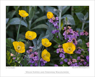
Our California poppies self-seed in a border at the edge of an area of trees and shrubs. The leaf canopy above makes them incline towards the light, and I caught them as they were all turned in the same direction. I photographed the big orange oriental poppy, not because it's my favourite, though many prefer it over others. Rather, it was the contrast of the rather malign looking black/purple centre next to the bright petals: a pairing I have always found attractive at a distance but slightly disconcerting when up close. We have Welsh poppies a-plenty at the moment, but this group were growing in the shade in my neighbour's garden, and I quite liked them next to the mauve of the perennial wallflowers.
photograph and text © T. Boughen
Photo 1
Camera: Canon
Mode: Aperture Priority
Focal Length: 100mm macro
F No: f7.1
Shutter Speed: 1/100 sec
ISO: 100
Exposure Compensation: -0.33 EV
Image Stabilisation: On
Saturday, June 02, 2012
Orange and purple
click photo to enlarge
Orange and purple don't rank high in the colours that I like. I prefer orange over purple, but I'll take green, red, blue and violet over either of them. When I see the two colours I think of the 1970s, a decade when they seemed to rise in prominence and find uses in the most unlikely places. I recall seeing houses and shops with their exterior woodwork painted a deep purple; not very many admittedly, but it only takes a few to catch your eye and cause you to wonder about the aesthetic sensibilities of the owners of those premises. Then there were the bright orange walls in rooms - not every wall, just one or two to contrast with the more muted colours elsewhere. Clothes often featured the two colours as well, usually to the detriment of those wearing them. A few years ago the seventies came back into fashion and orange, more than purple, re-surfaced as a colour of choice. In this latter-day reprise it was often paired with strong lime green. I remember seeing the combination used for plastic kitchen implements. The very thought of them makes me shudder.It has been said that as far as putting one colour next to another goes you have to be careful except in one very particular circumstance. Flowers, many believe, go together whatever the colours. I think there's some truth in that statement. Perhaps it's the omnipresent green of the leaves acting like a flux, binding one hue to another. In our garden we have a fine show of French lavender (Lavandula stoechas). We've grown a variety of annuals and perennials next to it without much thought for the colour combination, and we have not been disappointed by the display that has resulted. Last year we were given some poppy seeds that produce orange flowers in profusion, day after day, even though each bloom lasts for only a single day. When I saw the first flowers appearing against the blue green foliage and purple flowers of the lavender I wondered how it would look. But, despite my feelings about each individual colour I like the combination. So much so that I took this photograph.
photograph and text (c) T. Boughen
Camera: Canon
Mode: Aperture Priority
Focal Length: 191mm
F No: f7.1
Shutter Speed: 1/200
ISO: 100
Exposure Compensation: -0.33 EV
Image Stabilisation: On
Labels:
colour combinations,
fashion,
favourite colours,
flowers,
French lavender,
orange,
poppy,
purple
Subscribe to:
Posts (Atom)


.jpg)


