click photo to enlarge
On our recent visit to London we saw a lot of Santas. At first it was just one or two of the sort seen annually at this time of year, dressed up, out for a drink with friends, wearing as a minimum a basic red and white hat. However, these Santas, and the groups of eight to ten we saw subsequently had made more effort. Hat, jacket and trousers were worn by all with some adding a broad black belt or a home made one of tinsel. True, most of these outfits had that skimped look suggesting an origin in a Chinese factory and a price that left change out of a ten pound note. But, nonetheless they exhibited more than the usual attempt to emulate the dress sense of the man in red.
It was when we turned the corner to where the west portico of St Paul's Cathedral towers over the street that we realised there was something of a greater magnitude going on than a few friends on an outing or a themed office party taking place. There must have been three or four hundred Santas thronging the plaza, police in attendance, listening the the multitude of St Nicholas's giving enthusiastic, if discordant, renditions of well known carols. Only later, when I got home did I discover that we had inadvertently stumbled upon London Santacon 2016, a flash-mob style meeting advertised over the internet for people to congregate in London dressed as Father Christmas. The aim of the event was to provide a "non-profit, non-political, non-religious and non-sensical Christmas parade". It seemed to be quite good humoured, harmless and colourful. However, I wasn't tempted to join in this year or any year for that matter.
photograph and text © Tony Boughen
Photo Title: Revellers, London Santacon 2016
Camera: Sony RX100
Mode: Aperture Priority
Focal Length: 10.4mm (28mm - 35mm equiv.)
F No: f4
Shutter Speed: 1/30
ISO: 2000
Exposure Compensation: -0.7 EV
Image Stabilisation: On
Showing posts with label London. Show all posts
Friday, December 16, 2016
Wednesday, December 14, 2016
A rainy London scene
click photo to enlarge
Maybe it's the photographer in me, but I quite like London in the rain. Certainly the photographs that ensue don't look anything like the tourism shots that are used to promote the city: those glow with sun and blue skies and only tell part of the story. The fact is Britain has a temperate maritime climate that features regular wind and rain that comes in from the Atlantic. And with that rain is the inevitable cloud. So a photograph such as today's is not untypical of the kind of image that a visit to London can produce. Lest I be accused of frightening away potential visitors it needs to be said that the weather changes frequently and quickly, so rain is a temporary inconvenience (or charm).
My photograph shows the most recent version of the London double-decker bus pulling away from a bus stop, a black taxi exiting the frame on the right, people under umbrellas,and a backdrop of part of St Paul's cathedral, Christopher Wren's magnum opus. What I like about shots such as this is the lights, the darkness contrasted with them and the pools of illumination that they provide, the shine of rain on tarmac, and the deep colours. A similar photograph taken a few years ago, but featuring modern architecture, still serves as the desktop photograph on my laptop, a testament to my predilection.
photograph and text © Tony Boughen
Photo Title: Rainy London near St Paul's Cathedral
Camera: Sony RX100
Mode: Aperture Priority
Focal Length: 12.9mm (35mm - 35mm equiv.)
F No: f4
Shutter Speed: 1/40
ISO: 1250
Exposure Compensation: -0.7 EV
Image Stabilisation: On
Maybe it's the photographer in me, but I quite like London in the rain. Certainly the photographs that ensue don't look anything like the tourism shots that are used to promote the city: those glow with sun and blue skies and only tell part of the story. The fact is Britain has a temperate maritime climate that features regular wind and rain that comes in from the Atlantic. And with that rain is the inevitable cloud. So a photograph such as today's is not untypical of the kind of image that a visit to London can produce. Lest I be accused of frightening away potential visitors it needs to be said that the weather changes frequently and quickly, so rain is a temporary inconvenience (or charm).
My photograph shows the most recent version of the London double-decker bus pulling away from a bus stop, a black taxi exiting the frame on the right, people under umbrellas,and a backdrop of part of St Paul's cathedral, Christopher Wren's magnum opus. What I like about shots such as this is the lights, the darkness contrasted with them and the pools of illumination that they provide, the shine of rain on tarmac, and the deep colours. A similar photograph taken a few years ago, but featuring modern architecture, still serves as the desktop photograph on my laptop, a testament to my predilection.
photograph and text © Tony Boughen
Photo Title: Rainy London near St Paul's Cathedral
Camera: Sony RX100
Mode: Aperture Priority
Focal Length: 12.9mm (35mm - 35mm equiv.)
F No: f4
Shutter Speed: 1/40
ISO: 1250
Exposure Compensation: -0.7 EV
Image Stabilisation: On
Labels:
double-decker bus,
London,
rain,
St Paul's Cathedral
Sunday, December 11, 2016
Thoroughfares and short cuts
click photo to enlarge
On a recent day in London we spent a lot of time on the highways and by-ways of the central and north central area of the city. Highway as its name implies means "main way" or route, and a by-way is a route other than the highway i.e. a side road or a less frequented, subsidiary route. We were using the main roads to get to smaller roads and passages to see some of the less obvious architecture of London, and some of the placenames and relics of former times. The terms thoroughfare and short-cut seemed more appropriate to describe what were doing because in the hierarchy of roads, Fleet Street was as big as we got and St Swithin's Lane the smallest. "Thoroughfare" today often implies a main road because its derivation is from the word "through" and "passage", in the sense of a route that is open and unhindered. And taking short-cuts down narrow lanes was what we were doing quite frequently.
The line of many of the routes in London would be familiar to medieval city dwellers because the properties that line them are still there in some instances and have been respected by later buildings in others. St Swithin's Lane, connecting Cannon Street with King William Street, is a case in point. However, that medieval person would wonder where the old church of St Swithin that bordered the lane has gone. The answer is that the medieval building was burned down in the Great Fire of London in 1666, rebuilt in the Renaissance style by Christopher Wren, and that this building was badly damaged by bombing in the second world war, and its remains were cleared from the site in 1962. Today the buildings along the lane date from the nineteenth, twentieth and twenty-first centuries.
Our evening walk between Tube stations took us down this modern short-cut, brollies up to counter the heavier rain, our passage lit by light spilling from brightly illuminated, empty offices.
photograph and text © Tony Boughen
Photo Title: Evening, St Swithin's Lane, London
Camera: Sony RX100
Mode: Aperture Priority
Focal Length: 10.4mm (28mm - 35mm equiv.)
F No: f4
Shutter Speed: 1/30
ISO: 5000
Exposure Compensation: -0.3 EV
Image Stabilisation: On
On a recent day in London we spent a lot of time on the highways and by-ways of the central and north central area of the city. Highway as its name implies means "main way" or route, and a by-way is a route other than the highway i.e. a side road or a less frequented, subsidiary route. We were using the main roads to get to smaller roads and passages to see some of the less obvious architecture of London, and some of the placenames and relics of former times. The terms thoroughfare and short-cut seemed more appropriate to describe what were doing because in the hierarchy of roads, Fleet Street was as big as we got and St Swithin's Lane the smallest. "Thoroughfare" today often implies a main road because its derivation is from the word "through" and "passage", in the sense of a route that is open and unhindered. And taking short-cuts down narrow lanes was what we were doing quite frequently.
The line of many of the routes in London would be familiar to medieval city dwellers because the properties that line them are still there in some instances and have been respected by later buildings in others. St Swithin's Lane, connecting Cannon Street with King William Street, is a case in point. However, that medieval person would wonder where the old church of St Swithin that bordered the lane has gone. The answer is that the medieval building was burned down in the Great Fire of London in 1666, rebuilt in the Renaissance style by Christopher Wren, and that this building was badly damaged by bombing in the second world war, and its remains were cleared from the site in 1962. Today the buildings along the lane date from the nineteenth, twentieth and twenty-first centuries.
Our evening walk between Tube stations took us down this modern short-cut, brollies up to counter the heavier rain, our passage lit by light spilling from brightly illuminated, empty offices.
photograph and text © Tony Boughen
Photo Title: Evening, St Swithin's Lane, London
Camera: Sony RX100
Mode: Aperture Priority
Focal Length: 10.4mm (28mm - 35mm equiv.)
F No: f4
Shutter Speed: 1/30
ISO: 5000
Exposure Compensation: -0.3 EV
Image Stabilisation: On
Labels:
evening,
London,
night,
placenames,
rain,
St Swithin's Lane
Monday, November 14, 2016
Wisbech's London plane tree
click photo to enlarge
More than half of central London's trees are the London plane (Platanus x acerifolia), a hybrid of the oriental plane and the American plane. The first of these trees was planted over three hundred years ago and the oldest are massive, providing not only the beauty of their leaves and bark, but also shade on hot summer days and fascinating silhouettes in winter. Some of the examples in Berkeley Square (where the nightingale sang) were planted in the 1720s and have very asymmetrical outlines with large, low hanging boughs.
Walking through the main park in the Cambridgeshire town of Wisbech recently I stopped under a large plane tree that I first noted several years ago. On the ground below the canopy were many brown leaves, the first to fall from the tree this autumn, but up above there were still plenty of green leaves clinging on and many hanging fruit balls. This tree has a large, low bough - you can see it on the right of the photograph, and in taking my wide-angle photograph I made sure to include it. The main trunk has lost its attractive pattern of old and new patches of bark, but you can still see this on the low bough. The bright sun piercing the foliage, and blue sky behind, make my photograph look like it was taken in spring. But this is an autumn sight and a fine one too.
photograph and text © Tony Boughen
Photo Title: London Plane Tree, Wisbech, Cambridgeshire
Camera: Olympus E-M10
Mode: Aperture Priority
Focal Length: 9mm (18mm - 35mm equiv.)
F No: f7.1
Shutter Speed: 1/60 sec
ISO:200
Exposure Compensation: -0.3 EV
Image Stabilisation: On
More than half of central London's trees are the London plane (Platanus x acerifolia), a hybrid of the oriental plane and the American plane. The first of these trees was planted over three hundred years ago and the oldest are massive, providing not only the beauty of their leaves and bark, but also shade on hot summer days and fascinating silhouettes in winter. Some of the examples in Berkeley Square (where the nightingale sang) were planted in the 1720s and have very asymmetrical outlines with large, low hanging boughs.
Walking through the main park in the Cambridgeshire town of Wisbech recently I stopped under a large plane tree that I first noted several years ago. On the ground below the canopy were many brown leaves, the first to fall from the tree this autumn, but up above there were still plenty of green leaves clinging on and many hanging fruit balls. This tree has a large, low bough - you can see it on the right of the photograph, and in taking my wide-angle photograph I made sure to include it. The main trunk has lost its attractive pattern of old and new patches of bark, but you can still see this on the low bough. The bright sun piercing the foliage, and blue sky behind, make my photograph look like it was taken in spring. But this is an autumn sight and a fine one too.
photograph and text © Tony Boughen
Photo Title: London Plane Tree, Wisbech, Cambridgeshire
Camera: Olympus E-M10
Mode: Aperture Priority
Focal Length: 9mm (18mm - 35mm equiv.)
F No: f7.1
Shutter Speed: 1/60 sec
ISO:200
Exposure Compensation: -0.3 EV
Image Stabilisation: On
Labels:
autumn,
Cambridgeshire,
London,
plane tree,
Wisbech
Tuesday, October 11, 2016
Nelson, a national hero
click photo to enlarge
There are heroes and then there are national heroes. In saying that I am using the term in its traditional sense of people who demonstrate bravery by putting themselves in harms way in the service of their country. Foot soldiers, sailors and airmen who are at the sharp end of conflicts are often recognised for acts above and beyond the call of duty - they are heroes. National heroes are usually figures of higher rank, leaders rather than one of the "ranks", and sometimes, though not always expose themselves to the same dangers as their subordinates.
One of Britain's national heroes who most certainly put himself in harms way was Horatio Nelson. The fact is, everyone who served on a man of war in the Napoleonic period was subject to the same dangers from rifle shot, cannon ball, grapeshot, fire and the multitude of flying wooden splinters. Nelson, from his time as a junior sailor until his demise on HMS Victory at the Battle of Trafalgar suffered injuries of a lesser or greater extent. His elevation to national hero recognised his personal bravery as well as his tactical skill in defeating the navies of his government's enemies.
Consequently, Nelson is one of our country's most celebrated national heroes with many statues across the land, streets named after him, public houses too, and even a town. On a recent walk in Greenwich I came across a sculpture of the admiral to add to the many that already adorn our capital. It is in the square of the newly opened Greenwich Centre and is made of, or so it appears, Core-Ten steel. I must confess that initially I couldn't work out that it represented a person, but once I'd identified the face the rest fell into place.
photograph and text © Tony Boughen
Photo Title: Admiral Nelson, The Greenwich Centre, London
Camera: Olympus E-M10
Mode: Aperture Priority
Focal Length: 90mm (180mm - 35mm equiv.)
F No: f5.5
Shutter Speed: 1/20 sec
ISO:250
Exposure Compensation: -0.3EV
There are heroes and then there are national heroes. In saying that I am using the term in its traditional sense of people who demonstrate bravery by putting themselves in harms way in the service of their country. Foot soldiers, sailors and airmen who are at the sharp end of conflicts are often recognised for acts above and beyond the call of duty - they are heroes. National heroes are usually figures of higher rank, leaders rather than one of the "ranks", and sometimes, though not always expose themselves to the same dangers as their subordinates.
One of Britain's national heroes who most certainly put himself in harms way was Horatio Nelson. The fact is, everyone who served on a man of war in the Napoleonic period was subject to the same dangers from rifle shot, cannon ball, grapeshot, fire and the multitude of flying wooden splinters. Nelson, from his time as a junior sailor until his demise on HMS Victory at the Battle of Trafalgar suffered injuries of a lesser or greater extent. His elevation to national hero recognised his personal bravery as well as his tactical skill in defeating the navies of his government's enemies.
Consequently, Nelson is one of our country's most celebrated national heroes with many statues across the land, streets named after him, public houses too, and even a town. On a recent walk in Greenwich I came across a sculpture of the admiral to add to the many that already adorn our capital. It is in the square of the newly opened Greenwich Centre and is made of, or so it appears, Core-Ten steel. I must confess that initially I couldn't work out that it represented a person, but once I'd identified the face the rest fell into place.
photograph and text © Tony Boughen
Photo Title: Admiral Nelson, The Greenwich Centre, London
Camera: Olympus E-M10
Mode: Aperture Priority
Focal Length: 90mm (180mm - 35mm equiv.)
F No: f5.5
Shutter Speed: 1/20 sec
ISO:250
Exposure Compensation: -0.3EV
Labels:
Admiral Nelson,
Core-Ten,
hero,
London,
statue,
The Greenwich Centre
Wednesday, October 05, 2016
The Erechtheum and St Pancras
click photo to enlarge
Many years ago we had a holiday based in Athens. Being interested in architecture I was keen to see the fount of the classical style and we spent many happy days clambering over the ancient ruins that litter that city. Two of the sites that particularly impressed me were the Erechtheum and the Temple of Athena Nike on the Acropolis. I was interested in the Erechtheum for the Caryatids, female figures that take the place of columns in that particular building, because I knew the most famous English copy of this feature. Several years earlier, in one of my first forays into London I had walked the length of Euston Road and passed what in architectural circles is known as St Pancras New Church (to distinguish it from the nearby older St Pancras). Here a raised room (tribune) has a row of Caryatids, less weathered versions of those to be seen in Athens.
New is a relative term in this instance. New St Pancras is a Greek Revival church built in 1819-22 by William and Henry William Inwood. Looking at the London caryatids recently I pondered the great imponderable once more: why did anyone think that the classical style of architecture - particularly that of ancient Greece - was appropriate for for a church of the Christian religion. One can almost understand the Romanesque style being used for churches: after all it post-dates the rise of Christianity. The Roman style overlaps with the beginning of the Christian era. But the ancient Greek civilization pre-dates Christianity by thousands of years, is one that worshipped multiple gods, and seems singularly inappropriate as a model for Christian architecture. But try telling that to Christopher Wren!
photograph and text © Tony Boughen
Photo Title: Caryatids, St Pancras New Church, London
Camera: Olympus E-M10
Mode: Aperture Priority
Focal Length: 20mm (40mm - 35mm equiv.)
F No: f5.6
Shutter Speed: 1/60 sec
ISO:200
Exposure Compensation: -0.3 EV
Image Stabilisation: On
Many years ago we had a holiday based in Athens. Being interested in architecture I was keen to see the fount of the classical style and we spent many happy days clambering over the ancient ruins that litter that city. Two of the sites that particularly impressed me were the Erechtheum and the Temple of Athena Nike on the Acropolis. I was interested in the Erechtheum for the Caryatids, female figures that take the place of columns in that particular building, because I knew the most famous English copy of this feature. Several years earlier, in one of my first forays into London I had walked the length of Euston Road and passed what in architectural circles is known as St Pancras New Church (to distinguish it from the nearby older St Pancras). Here a raised room (tribune) has a row of Caryatids, less weathered versions of those to be seen in Athens.
New is a relative term in this instance. New St Pancras is a Greek Revival church built in 1819-22 by William and Henry William Inwood. Looking at the London caryatids recently I pondered the great imponderable once more: why did anyone think that the classical style of architecture - particularly that of ancient Greece - was appropriate for for a church of the Christian religion. One can almost understand the Romanesque style being used for churches: after all it post-dates the rise of Christianity. The Roman style overlaps with the beginning of the Christian era. But the ancient Greek civilization pre-dates Christianity by thousands of years, is one that worshipped multiple gods, and seems singularly inappropriate as a model for Christian architecture. But try telling that to Christopher Wren!
photograph and text © Tony Boughen
Photo Title: Caryatids, St Pancras New Church, London
Camera: Olympus E-M10
Mode: Aperture Priority
Focal Length: 20mm (40mm - 35mm equiv.)
F No: f5.6
Shutter Speed: 1/60 sec
ISO:200
Exposure Compensation: -0.3 EV
Image Stabilisation: On
Sunday, September 18, 2016
A sign of different times
click photo to enlarge
One of the photographic themes that has arisen down the years on this blog is public signs. I have enjoyed quite a few that I've seen as I've travelled the country, some perplexing, some intentionally humorous, some unintentionally humorous and others engagingly redolent of the age in which they were made. Today's example that I photographed in Borough Market, Southwark, London falls into the latter category.
The sign itself dates from 1908 and may be original or a copy of an original. The case that holds it is probably original. What I like about this sign is the interesting use of language and punctuation. How odd, for example, that the words "Borough Market Trust" and "Notice" have a full stop after them. This is something that is being done consciously occasionally today by companies such as EAT., but in the main those full stops would be thought superfluous now. It's interesting too that "Beadles" were employed to maintain security in the market and that the police were not deemed sufficient in this regard. I like too, "Loiterers or other suspicious characters", descriptions that we wouldn't use today. It reminds me of the "lurkers" that populate the alley ways of London in Conan Doyle's Sherlock Holmes stories. For more of my photographs of signs follow this link.
photograph and text © Tony Boughen
Photo Title: Notice, Borough Market, Southwark
Camera: Olympus E-M10
Mode: Aperture Priority
Focal Length: 39mm (78mm - 35mm equiv.)
F No: f5.6
Shutter Speed: 1/80 sec
ISO:2500
Exposure Compensation: -0.3EV
One of the photographic themes that has arisen down the years on this blog is public signs. I have enjoyed quite a few that I've seen as I've travelled the country, some perplexing, some intentionally humorous, some unintentionally humorous and others engagingly redolent of the age in which they were made. Today's example that I photographed in Borough Market, Southwark, London falls into the latter category.
The sign itself dates from 1908 and may be original or a copy of an original. The case that holds it is probably original. What I like about this sign is the interesting use of language and punctuation. How odd, for example, that the words "Borough Market Trust" and "Notice" have a full stop after them. This is something that is being done consciously occasionally today by companies such as EAT., but in the main those full stops would be thought superfluous now. It's interesting too that "Beadles" were employed to maintain security in the market and that the police were not deemed sufficient in this regard. I like too, "Loiterers or other suspicious characters", descriptions that we wouldn't use today. It reminds me of the "lurkers" that populate the alley ways of London in Conan Doyle's Sherlock Holmes stories. For more of my photographs of signs follow this link.
photograph and text © Tony Boughen
Photo Title: Notice, Borough Market, Southwark
Camera: Olympus E-M10
Mode: Aperture Priority
Focal Length: 39mm (78mm - 35mm equiv.)
F No: f5.6
Shutter Speed: 1/80 sec
ISO:2500
Exposure Compensation: -0.3EV
Labels:
Borough Market,
language,
London,
punctuation,
sign,
Southwark
Friday, September 16, 2016
The Mudlark
click photo to enlarge
I've done my share of mudlarking as this post of 2010 explains.
The usual definition of a mudlark is someone, often a child, who in Victorian times scavenged the muddy fringes of the River Thames in London in search of anything of value that could be sold for cash. The pub sign in Southwark, London, near the river, that is the subject of today's photograph alludes to these "valuables" in the grubby hand and items shown in the bordering circle.
The Oxford English Dictionary (OED) shows that mudlark has not always carried the meaning that it usually has today. The first entry from 1785 defines the word as slang for a hog, and we can see how that might transfer to Thames-side foragers. The next entry dating from 1796-1800 describes a mudlark as someone who prowls around ships in the mud, receiving plundered goods from them which they sold. Again the connection is apparent. The 1801 definition most closely matches today's understanding of the term. However, there are others. Apparently in the nineteenth century the Royal Engineers were sometimes so called. This must have been due to their often muddy work being equated with the urchins who searched the Thames mud.
I was quite pleased to see this elaborate, original and obviously quite expensive sign advertising the pub. All too often today the traditional pub sign is being replaced by a cheaply printed glossy advert, or the old design is replaced by a "tasteful" often almost monochrome updated version.
photograph and text © Tony Boughen
Photo Title: Pub Sign, The Mudlark, Southwark
Camera: Olympus E-M10
Mode: Aperture Priority
Focal Length: 150mm (300mm - 35mm equiv.)
F No: f6.3
Shutter Speed: 1/320 sec
ISO:640
Exposure Compensation: -0.3EV
I've done my share of mudlarking as this post of 2010 explains.
The usual definition of a mudlark is someone, often a child, who in Victorian times scavenged the muddy fringes of the River Thames in London in search of anything of value that could be sold for cash. The pub sign in Southwark, London, near the river, that is the subject of today's photograph alludes to these "valuables" in the grubby hand and items shown in the bordering circle.
The Oxford English Dictionary (OED) shows that mudlark has not always carried the meaning that it usually has today. The first entry from 1785 defines the word as slang for a hog, and we can see how that might transfer to Thames-side foragers. The next entry dating from 1796-1800 describes a mudlark as someone who prowls around ships in the mud, receiving plundered goods from them which they sold. Again the connection is apparent. The 1801 definition most closely matches today's understanding of the term. However, there are others. Apparently in the nineteenth century the Royal Engineers were sometimes so called. This must have been due to their often muddy work being equated with the urchins who searched the Thames mud.
I was quite pleased to see this elaborate, original and obviously quite expensive sign advertising the pub. All too often today the traditional pub sign is being replaced by a cheaply printed glossy advert, or the old design is replaced by a "tasteful" often almost monochrome updated version.
photograph and text © Tony Boughen
Photo Title: Pub Sign, The Mudlark, Southwark
Camera: Olympus E-M10
Mode: Aperture Priority
Focal Length: 150mm (300mm - 35mm equiv.)
F No: f6.3
Shutter Speed: 1/320 sec
ISO:640
Exposure Compensation: -0.3EV
Friday, August 26, 2016
Number 63
click photo to enlarge
Peter Cook, one of the founders the 1960s British architectural group, Archigram, has in his 80s, laid into some of the current generation of architects. He is particularly scathing of the King's Cross development in London, and is reported to have described some of the work as resembling biscuits, and the architects who build in this fashion as "the biscuit boys". The past twenty years, he maintains has been characterised by a dearth of interesting, adventurous architecture, and he is said to dislike the greater use of brick that is now evident (something I have found interesting). Cook's praise is given to practitioners, such as Zaha Hadid, who embody the characteristics that he has advocated for much of his life.
I reflected on what he had to say recently as I looked at a new London building that I thought was very biscuit-like. The building is on Clerkenwell Road, on a corner site that it wraps around. It has deep blue tinted windows that contrast with the facade's light coloured, brick-like strips that are laid with mortar. Something more akin to artisanal biscuits would be hard to find. But I like the building for the choice of these materials, for the fine detail of its surface and for some of the subtleties that are visible as you pass by. One such is the way the number of the building has been has been built into the brickwork - to my mind it manages to look both crude and sophisticated at the same time.
As I took my shot I also reflected on the fact that numbers are starting to become a theme in my photographs and perhaps one that I should develop further. See, for example my blog posts Number 9 and Number 5.
photograph and text © Tony Boughen
Photo Title: Number in Bricks, Clerkenwell Road, London
Camera: Olympus E-M10
Mode: Aperture Priority
Focal Length: 31mm (62mm - 35mm equiv.)
F No: f6.3
Shutter Speed: 1/640 sec
ISO:200
Exposure Compensation: -0.3 EV
Image Stabilisation: On
Peter Cook, one of the founders the 1960s British architectural group, Archigram, has in his 80s, laid into some of the current generation of architects. He is particularly scathing of the King's Cross development in London, and is reported to have described some of the work as resembling biscuits, and the architects who build in this fashion as "the biscuit boys". The past twenty years, he maintains has been characterised by a dearth of interesting, adventurous architecture, and he is said to dislike the greater use of brick that is now evident (something I have found interesting). Cook's praise is given to practitioners, such as Zaha Hadid, who embody the characteristics that he has advocated for much of his life.
I reflected on what he had to say recently as I looked at a new London building that I thought was very biscuit-like. The building is on Clerkenwell Road, on a corner site that it wraps around. It has deep blue tinted windows that contrast with the facade's light coloured, brick-like strips that are laid with mortar. Something more akin to artisanal biscuits would be hard to find. But I like the building for the choice of these materials, for the fine detail of its surface and for some of the subtleties that are visible as you pass by. One such is the way the number of the building has been has been built into the brickwork - to my mind it manages to look both crude and sophisticated at the same time.As I took my shot I also reflected on the fact that numbers are starting to become a theme in my photographs and perhaps one that I should develop further. See, for example my blog posts Number 9 and Number 5.
photograph and text © Tony Boughen
Photo Title: Number in Bricks, Clerkenwell Road, London
Camera: Olympus E-M10
Mode: Aperture Priority
Focal Length: 31mm (62mm - 35mm equiv.)
F No: f6.3
Shutter Speed: 1/640 sec
ISO:200
Exposure Compensation: -0.3 EV
Image Stabilisation: On
Labels:
architecture,
bricks,
Clerkenwell Road,
London,
number 63
Saturday, August 13, 2016
Red crane question
click photo to enlarge
A while ago I was on the street in Shoreditch, London, at 6.58 a.m. taking today's photograph. The EXIF details of this image show that to be the time. I have to say that it is not usual to find me taking photographs at that time of day, but it does occasionally happen.
What prompted the photograph was the angles in the composition, the crystal clear light that delineated the new (and terrible) hotel,the bright red crane next to it, and the backdrop of an azure sky. I liked the juxtaposition of the crane and its shadow with building, and the red on blue adds a blast of colour that compensates for the mushroom tones of the hotel's cladding.
As we waited for our rendezvous the crane driver came along to start his day working on the site below his machine. His first task was to climb the ladders inside the column of the crane to his cab at the top. This he did in a very slow and deliberate way, lunch bag over his shoulder, waiting for a couple of minutes at each stage, presumably getting his breath back. During the ten minutes or so that we watched he ascended about half way to his workplace. And, as we watched him climb, this question popped into my head - is there a toilet at the top of such a crane? If there isn't it's long way down and back up again to achieve relief! I recently consulted the all-knowing WWW in search of the answer and was surprised by what I discovered. Apparently built in toilets are rare. Climbing down and back up does happen. A bucket is often used. So too is an empty milk bottle. And someone has designed a "toilet-in-a-bag" for crane drivers who are caught short. So, not only is the job of such a crane driver lonely, it also lacks a workplace essential that most other people take for granted.
photograph and text © Tony Boughen
Photo Title: M by Montcalm Hotel and Red Crane, London
Camera: Olympus E-M10
Mode: Aperture Priority
Focal Length: 17mm (34mm - 35mm equiv.)
F No: f4.1
Shutter Speed: 1/2000 sec
ISO:200
Exposure Compensation: 0 EV
Image Stabilisation: On
A while ago I was on the street in Shoreditch, London, at 6.58 a.m. taking today's photograph. The EXIF details of this image show that to be the time. I have to say that it is not usual to find me taking photographs at that time of day, but it does occasionally happen.
What prompted the photograph was the angles in the composition, the crystal clear light that delineated the new (and terrible) hotel,the bright red crane next to it, and the backdrop of an azure sky. I liked the juxtaposition of the crane and its shadow with building, and the red on blue adds a blast of colour that compensates for the mushroom tones of the hotel's cladding.
As we waited for our rendezvous the crane driver came along to start his day working on the site below his machine. His first task was to climb the ladders inside the column of the crane to his cab at the top. This he did in a very slow and deliberate way, lunch bag over his shoulder, waiting for a couple of minutes at each stage, presumably getting his breath back. During the ten minutes or so that we watched he ascended about half way to his workplace. And, as we watched him climb, this question popped into my head - is there a toilet at the top of such a crane? If there isn't it's long way down and back up again to achieve relief! I recently consulted the all-knowing WWW in search of the answer and was surprised by what I discovered. Apparently built in toilets are rare. Climbing down and back up does happen. A bucket is often used. So too is an empty milk bottle. And someone has designed a "toilet-in-a-bag" for crane drivers who are caught short. So, not only is the job of such a crane driver lonely, it also lacks a workplace essential that most other people take for granted.
photograph and text © Tony Boughen
Photo Title: M by Montcalm Hotel and Red Crane, London
Camera: Olympus E-M10
Mode: Aperture Priority
Focal Length: 17mm (34mm - 35mm equiv.)
F No: f4.1
Shutter Speed: 1/2000 sec
ISO:200
Exposure Compensation: 0 EV
Image Stabilisation: On
Labels:
crane,
hotel,
London,
Shoreditch,
toilet
Thursday, August 11, 2016
Watery reflections, Canary Wharf
click photo to enlarge
We were in London's Canary Wharf at about 7.30am recently, Our reason for being there wasn't photographic but family-related. However, with a little time on our hands, I was photographing buildings and people in the clear, sharp, morning light. My photographic assistant, a.k.a my wife, knowing my liking for semi-abstract subjects, pointed out these patterns in some of the remaining water of one of the former docks. The reflections in the moving surface of the water were made by a building with a facade with very finely detailed fenestration. I took several shots of the subject but liked this one best showing the contrast between the building reflection and a section of water that mirrors only the blue of the sky.
photograph and text © Tony Boughen
Photo Title: Reflected Building and Sky, Canary Wharf, London
Camera: Olympus E-M10
Mode: Aperture Priority
Focal Length: 70mm (140mm - 35mm equiv.)
F No: f5.5
Shutter Speed: 1/60 sec
ISO:400
Exposure Compensation: 0 EV
Image Stabilisation: On
We were in London's Canary Wharf at about 7.30am recently, Our reason for being there wasn't photographic but family-related. However, with a little time on our hands, I was photographing buildings and people in the clear, sharp, morning light. My photographic assistant, a.k.a my wife, knowing my liking for semi-abstract subjects, pointed out these patterns in some of the remaining water of one of the former docks. The reflections in the moving surface of the water were made by a building with a facade with very finely detailed fenestration. I took several shots of the subject but liked this one best showing the contrast between the building reflection and a section of water that mirrors only the blue of the sky.
photograph and text © Tony Boughen
Photo Title: Reflected Building and Sky, Canary Wharf, London
Camera: Olympus E-M10
Mode: Aperture Priority
Focal Length: 70mm (140mm - 35mm equiv.)
F No: f5.5
Shutter Speed: 1/60 sec
ISO:400
Exposure Compensation: 0 EV
Image Stabilisation: On
Labels:
Canary Wharf,
docks,
London,
reflections,
semi-abstract,
water
Saturday, July 16, 2016
Neighbours of 1902 and 1970
click photo to enlarge
A mere sixty eight years separates the completion of the two buildings shown in today's photograph yet it might be centuries and they might be from different planets. However, both are on Euston Road in London.
On the left is the London County Council (LCC)Fire Brigade Station of 1902, built with flats above the two-bay engine house. It is the work of an in-house architect of the LCC, H. F. T. Cooper. The materials are red brick, Portland stone and slate on the roofs. Yellow stock bricks are used in the basement. The style is Arts and Crafts and it is notably asymmetrical.
The building on the right, now called Evergreen House, was conceived in 1965 and completed in 1970.It is built of steel and glass in the International Style, one of many towers across the world that owe a massive debt to Mies van der Rohe.
There are those who abhor such juxtapositions, usually favouring one style over the other, and wishing that there was greater consonance between adjacent buildings. I can see the place for that kind of planning. However, I can also see the visual delight in seeing the contrast of two completely different styles side-by-side. And as a photographer I revel in it as this blog frequently testifies. See here, here and here for example.
photograph and text © Tony Boughen
Photo Title: 1902 LCC Fire Brigade Station and 1970 Evergreen House, Euston Road, London
Camera: Olympus E-M10
Mode: Aperture Priority
Focal Length: 54mm (108mm - 35mm equiv.) crop
F No: f5.6
Shutter Speed: 1/320 sec
ISO:200
Exposure Compensation: -0.3 EV
Image Stabilisation: On
A mere sixty eight years separates the completion of the two buildings shown in today's photograph yet it might be centuries and they might be from different planets. However, both are on Euston Road in London.
On the left is the London County Council (LCC)Fire Brigade Station of 1902, built with flats above the two-bay engine house. It is the work of an in-house architect of the LCC, H. F. T. Cooper. The materials are red brick, Portland stone and slate on the roofs. Yellow stock bricks are used in the basement. The style is Arts and Crafts and it is notably asymmetrical.
The building on the right, now called Evergreen House, was conceived in 1965 and completed in 1970.It is built of steel and glass in the International Style, one of many towers across the world that owe a massive debt to Mies van der Rohe.
There are those who abhor such juxtapositions, usually favouring one style over the other, and wishing that there was greater consonance between adjacent buildings. I can see the place for that kind of planning. However, I can also see the visual delight in seeing the contrast of two completely different styles side-by-side. And as a photographer I revel in it as this blog frequently testifies. See here, here and here for example.
photograph and text © Tony Boughen
Photo Title: 1902 LCC Fire Brigade Station and 1970 Evergreen House, Euston Road, London
Camera: Olympus E-M10
Mode: Aperture Priority
Focal Length: 54mm (108mm - 35mm equiv.) crop
F No: f5.6
Shutter Speed: 1/320 sec
ISO:200
Exposure Compensation: -0.3 EV
Image Stabilisation: On
Wednesday, July 06, 2016
Staircase, The Hub, Regent's Park
click photo to enlarge
Wherever I go I come across Hubs. By that I mean buildings that have been given that name, presumably to, in some way, describe how they are the focal point of one kind of activity or another. In recent years I've been to Hubs in Lancashire, Yorkshire, Lincolnshire and London, and I know of others. Some have been training venues, one was a gallery, one a medical facility, another an educational establishment. Clearly this name has attractions for organisations but one can't help but wonder how much confusion is caused by its popularity. Most recently I visited a Hub that was a new building built into a mound, topped by a cafe, that serves as the focal point of a number of sports facilities in Regent's Park, London.
This particular Hub was a quite utilitarian building, designed of materials that could cope with muddy, sweaty, athletic people who were using the lockers, toilets, cafe etc. Fortunately the architects had an eye that went beyond utility and the building incorporated a particularly interesting central staircase that connected the ground level (actually below ground level) with the cafe at the top of the mound. Glass, steel, concrete and plywood combined with the well-lit top of the building to create sinuous lines between the two floors - an attractive subject for a photograph.
photograph and text © Tony Boughen
Photo Title: Staircase, The Hub, Regent's Park, London
Camera: Olympus E-M10
Mode: Aperture Priority
Focal Length: 15mm (30mm - 35mm equiv.) crop
F No: f5.6
Shutter Speed: 1/60 sec
ISO:200
Exposure Compensation: -0.3 EV
Image Stabilisation: On
Wherever I go I come across Hubs. By that I mean buildings that have been given that name, presumably to, in some way, describe how they are the focal point of one kind of activity or another. In recent years I've been to Hubs in Lancashire, Yorkshire, Lincolnshire and London, and I know of others. Some have been training venues, one was a gallery, one a medical facility, another an educational establishment. Clearly this name has attractions for organisations but one can't help but wonder how much confusion is caused by its popularity. Most recently I visited a Hub that was a new building built into a mound, topped by a cafe, that serves as the focal point of a number of sports facilities in Regent's Park, London.
This particular Hub was a quite utilitarian building, designed of materials that could cope with muddy, sweaty, athletic people who were using the lockers, toilets, cafe etc. Fortunately the architects had an eye that went beyond utility and the building incorporated a particularly interesting central staircase that connected the ground level (actually below ground level) with the cafe at the top of the mound. Glass, steel, concrete and plywood combined with the well-lit top of the building to create sinuous lines between the two floors - an attractive subject for a photograph.
photograph and text © Tony Boughen
Photo Title: Staircase, The Hub, Regent's Park, London
Camera: Olympus E-M10
Mode: Aperture Priority
Focal Length: 15mm (30mm - 35mm equiv.) crop
F No: f5.6
Shutter Speed: 1/60 sec
ISO:200
Exposure Compensation: -0.3 EV
Image Stabilisation: On
Labels:
architecture,
London,
Regent's Park,
staircase,
The Hub
Thursday, June 23, 2016
Hackney graffiti
click photo to enlarge
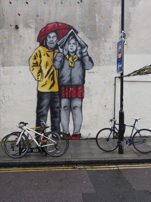
Over the years I've mellowed a little with regard to graffiti. I still dislike "tags" and the graffiti that is piled up one surface on top of another as spraycan-equipped passers-by superimpose their graphic on top of that of earlier "artists". However, I am better disposed towards the considered piece that seeks to add something of beauty, interest or humour to the street-scene.
We came upon today's example in Hackney, London. It isn't particularly accomplished drawing and doesn't seek to make any obvious point, but I like the restricted pallette, it brightened up a street corner and it caused me to wonder why the raindrops were multi-coloured. The piece also causes something of an optical illusion due to the figures being much larger than life-size. This has the effect, at first glance, of making the bicycles appear to be under-sized or children's bikes. As Isay, nothing profound, but nothing offensive either, and on a wet day the subject resonated..
photograph and text © Tony Boughen
Over the years I've mellowed a little with regard to graffiti. I still dislike "tags" and the graffiti that is piled up one surface on top of another as spraycan-equipped passers-by superimpose their graphic on top of that of earlier "artists". However, I am better disposed towards the considered piece that seeks to add something of beauty, interest or humour to the street-scene.
We came upon today's example in Hackney, London. It isn't particularly accomplished drawing and doesn't seek to make any obvious point, but I like the restricted pallette, it brightened up a street corner and it caused me to wonder why the raindrops were multi-coloured. The piece also causes something of an optical illusion due to the figures being much larger than life-size. This has the effect, at first glance, of making the bicycles appear to be under-sized or children's bikes. As Isay, nothing profound, but nothing offensive either, and on a wet day the subject resonated..
photograph and text © Tony Boughen
Photo Title: Graffiti, Hackney
Mode: Aperture Priority
Focal Length: 22mm (44mm - 35mm equiv.) crop
F No: f7.1
Shutter Speed: 1/160 sec
ISO:200
Exposure Compensation: -0.3 EV
Image Stabilisation: On
Mode: Aperture Priority
Focal Length: 22mm (44mm - 35mm equiv.) crop
F No: f7.1
Shutter Speed: 1/160 sec
ISO:200
Exposure Compensation: -0.3 EV
Image Stabilisation: On
Tuesday, June 21, 2016
Café cutlery, Broadway Market, London
click photo to enlarge
As its name suggests Broadway Market is a market street that has grown up on an old drove route, a track or road on which cattle and other animals would be driven into London to slaughter houses and markets. Such roads are characterised by broadness due to the quantity of animals that would be involved and the fact that a broad way gave a better chance of the route being passable because the animals and other travellers were not all concentrated in a narrow way and could choose the better ground for their passage.Today this street in Hackney hosts a mainly food market that fills the street and the shops on either side have a high proportion of eating establishments.
We stopped off at one on a recent visit to London and secured this photograph of cutlery. On a rainy but warm day we were eating inside with the whole of the side of the restaurant thrown open to the pavement. My son noticed the containers of knives, forks, etc ready and waiting for customers and he suggested the shot.
photograph and text © Tony Boughen
Photo Title: Café Cutlery, Broadway Market, London
Camera: Olympus E-M10
Mode: Aperture Priority
Focal Length: 60mm (120mm - 35mm equiv.) crop
F No: f5.5
Shutter Speed: 1/125 sec
ISO:1250
Exposure Compensation: -0.3 EV
Image Stabilisation: On
As its name suggests Broadway Market is a market street that has grown up on an old drove route, a track or road on which cattle and other animals would be driven into London to slaughter houses and markets. Such roads are characterised by broadness due to the quantity of animals that would be involved and the fact that a broad way gave a better chance of the route being passable because the animals and other travellers were not all concentrated in a narrow way and could choose the better ground for their passage.Today this street in Hackney hosts a mainly food market that fills the street and the shops on either side have a high proportion of eating establishments.
We stopped off at one on a recent visit to London and secured this photograph of cutlery. On a rainy but warm day we were eating inside with the whole of the side of the restaurant thrown open to the pavement. My son noticed the containers of knives, forks, etc ready and waiting for customers and he suggested the shot.
photograph and text © Tony Boughen
Photo Title: Café Cutlery, Broadway Market, London
Camera: Olympus E-M10
Mode: Aperture Priority
Focal Length: 60mm (120mm - 35mm equiv.) crop
F No: f5.5
Shutter Speed: 1/125 sec
ISO:1250
Exposure Compensation: -0.3 EV
Image Stabilisation: On
Labels:
Broadway Market,
cutlery,
Hackney,
London
Friday, June 17, 2016
The north face of the O2
click photo to enlarge
The O2 Dome entertainment complex on the Greenwich peninsula in London was initially known as the Millennium Dome since it was built to celebrate and coincide with the year 2000. It was initially seen as something of a vanity project of the politicians who supported its construction, was reviled by many Londoners as the wrong building in the wrong place, and seen by the regions as yet another enormous sum spent on the capital at the expense of the provinces. However, over time it has come to have something of a purpose as a large arena for music concerts and other events, and the subsidiary buildings and subsequent construction nearby have made it seem less of a stranded white elephant. The scale of the building and the method of construction has ensured it is a visible structure that people look at and visit.
I was recently looking at the dome from near the Isle of Dogs on the north bank of the Thames. We were exploring a part of London by the river with which we are not very familiar. I took a few shots from the arts centre that is Trinity Buoy Wharf and while doing so saw some people undertaking the walk on the roof of the dome. I've seen people doing this before. However, on this occasion, from this vantage point, I got a very good impression of the size of the dome as the ant-like people carefully made their way down the structure. They appear to have been clipped on to the wire alongside which they were making their way - a wise precaution on a wet and intermittently windy day.
photograph and text © Tony Boughen
Photo Title: Walking On the O2 Dome, London Camera: Olympus E-M10
Mode: Aperture Priority
Focal Length: 150mm (300mm - 35mm equiv.) crop
F No: f6.3
Shutter Speed: 1/500 sec
ISO:200
Exposure Compensation: 0 EV
Image Stabilisation: On
The O2 Dome entertainment complex on the Greenwich peninsula in London was initially known as the Millennium Dome since it was built to celebrate and coincide with the year 2000. It was initially seen as something of a vanity project of the politicians who supported its construction, was reviled by many Londoners as the wrong building in the wrong place, and seen by the regions as yet another enormous sum spent on the capital at the expense of the provinces. However, over time it has come to have something of a purpose as a large arena for music concerts and other events, and the subsidiary buildings and subsequent construction nearby have made it seem less of a stranded white elephant. The scale of the building and the method of construction has ensured it is a visible structure that people look at and visit.
I was recently looking at the dome from near the Isle of Dogs on the north bank of the Thames. We were exploring a part of London by the river with which we are not very familiar. I took a few shots from the arts centre that is Trinity Buoy Wharf and while doing so saw some people undertaking the walk on the roof of the dome. I've seen people doing this before. However, on this occasion, from this vantage point, I got a very good impression of the size of the dome as the ant-like people carefully made their way down the structure. They appear to have been clipped on to the wire alongside which they were making their way - a wise precaution on a wet and intermittently windy day.
photograph and text © Tony Boughen
Photo Title: Walking On the O2 Dome, London Camera: Olympus E-M10
Mode: Aperture Priority
Focal Length: 150mm (300mm - 35mm equiv.) crop
F No: f6.3
Shutter Speed: 1/500 sec
ISO:200
Exposure Compensation: 0 EV
Image Stabilisation: On
Labels:
Greenwich,
London,
Millennium Dome,
O2,
scale
Monday, June 13, 2016
K2 and K6 red telephone boxes
click photo to enlarge
One of the poor decisions of the 1980s was that made by the newly privatised BT (British Telecom) to introduce a new design of telephone box (sometimes called a kiosk). The original designs were so well-liked by British people, and had become one of the symbols of the UK to non-natives, that any new design was bound to provoke a negative reaction. And so it proved. The sleek KX100 design, though it was undoubtedly cheaper to make, maintain and clean, was much reviled and vandalised. Such is the consequence of knowing the price of everything and the value of nothing.
We didn't know it in the 1980s, but the life of the telephone box was limited; the rise of the mobile phone has by now made them all but redundant. However, such is the affection that they engender, that many councils bought redundant boxes for a nominal fee, retained them in their original locations, and turned them to new uses such as information points and free "swap libraries". British Telecom kept some in strategic locations as phone boxes for heritage reasons. The other day we came upon a few in Smithfield Market in London.
The pair in the photograph above are two of the most common designs. On the left is a K2. There were 1,700 examples made of which just over 200 are still in place. This was the first type to be painted red. It was designed for the General Post Office (GPO) by Giles Gilbert Scott in 1924. The first examples were installed in 1926 and in 1935 it was phased out to be replaced by the K6, which is the model on the right. This was also the work of Scott. He designed it in 1935, the first example was introduced in 1936, and production finally ended in 1968. A grand total of 60,000 were manufactured of which 10,700 remain. It wasn't the novelty of finding some telephone boxes with phones still in them that prompted my photograph so much as the strident colours in the background of the "GPO red" paintwork. For more information about Britain's telephone boxes this site is a great resource.
photograph and text © Tony Boughen
Photo Title: K2 and K6 Telephone Boxes, Smithfield Market, London
Camera: Olympus E-M10
Mode: Aperture Priority
Focal Length: 16mm (32mm - 35mm equiv.) crop
F No: f6.3
Shutter Speed: 1/60 sec
ISO:1600
Exposure Compensation: 0 EV
Image Stabilisation: On
One of the poor decisions of the 1980s was that made by the newly privatised BT (British Telecom) to introduce a new design of telephone box (sometimes called a kiosk). The original designs were so well-liked by British people, and had become one of the symbols of the UK to non-natives, that any new design was bound to provoke a negative reaction. And so it proved. The sleek KX100 design, though it was undoubtedly cheaper to make, maintain and clean, was much reviled and vandalised. Such is the consequence of knowing the price of everything and the value of nothing.
We didn't know it in the 1980s, but the life of the telephone box was limited; the rise of the mobile phone has by now made them all but redundant. However, such is the affection that they engender, that many councils bought redundant boxes for a nominal fee, retained them in their original locations, and turned them to new uses such as information points and free "swap libraries". British Telecom kept some in strategic locations as phone boxes for heritage reasons. The other day we came upon a few in Smithfield Market in London.
The pair in the photograph above are two of the most common designs. On the left is a K2. There were 1,700 examples made of which just over 200 are still in place. This was the first type to be painted red. It was designed for the General Post Office (GPO) by Giles Gilbert Scott in 1924. The first examples were installed in 1926 and in 1935 it was phased out to be replaced by the K6, which is the model on the right. This was also the work of Scott. He designed it in 1935, the first example was introduced in 1936, and production finally ended in 1968. A grand total of 60,000 were manufactured of which 10,700 remain. It wasn't the novelty of finding some telephone boxes with phones still in them that prompted my photograph so much as the strident colours in the background of the "GPO red" paintwork. For more information about Britain's telephone boxes this site is a great resource.
photograph and text © Tony Boughen
Photo Title: K2 and K6 Telephone Boxes, Smithfield Market, London
Camera: Olympus E-M10
Mode: Aperture Priority
Focal Length: 16mm (32mm - 35mm equiv.) crop
F No: f6.3
Shutter Speed: 1/60 sec
ISO:1600
Exposure Compensation: 0 EV
Image Stabilisation: On
Labels:
K2,
K6,
London,
Smithfield Market,
telephone box
Tuesday, May 03, 2016
Painted building facade, King's Cross
click photo to enlarge
The UK is pretty reticent when it comes to painting the outside of buildings. Traditionally render has been painted, usually white or cream though sometimes branching out into drab pink, blood red, a shade or two of green, and sometimes blue or yellow. In recent years quite a few new housing developments have been built that make use of colour. There are regions, often highland areas, where farms and isolated houses in the countryside are sometimes painted white to make them more visible. However, the place where colour is most readily accepted on the exterior of a building is the seaside town. Here terraces are frequently colour-washed one or many colours. Blue and white - nautical colours - are favoured, but others can be seen too.
During the last quarter of the twentieth century painted facades with a humorous or artistic intention, sometimes like graffiti writ large, began to proliferate. I have mixed feelings about such buildings. Sometimes they are fun, but too often they are eyesores, a garish flash of colour that detracts from the locality rather than adding to it. Frequently the intention is to prolong the life of a run-down structure, though the fading paint soon contributes to the air of dereliction. The example in today's photograph is near King's Cross railway station in London. The paintwork doesn't acknowledge the building at all, but treats it as a flat canvas with shapes and lines continuing across windows and pilasters as though they didn't exist. This distinguishes it from most such work. It's the sort of treatment that I feel I should dislike but I don't, and I can't quite put my finger on what it is that appeals to me. Perhaps it's because, in its location, it isn't so garish that it demands to be looked at. But more than that, the combination of colours and the strong diagonals are very much to my taste.
photograph and text © Tony Boughen
Photo Title: Painted Building, King's Cross, London
Camera: Olympus E-M10
Mode: Aperture Priority
Focal Length: 90mm (180mm - 35mm equiv.) crop
F No: f5.5
Shutter Speed: 1/200 sec
ISO:320
Exposure Compensation: -0.3 EV
Image Stabilisation: On
The UK is pretty reticent when it comes to painting the outside of buildings. Traditionally render has been painted, usually white or cream though sometimes branching out into drab pink, blood red, a shade or two of green, and sometimes blue or yellow. In recent years quite a few new housing developments have been built that make use of colour. There are regions, often highland areas, where farms and isolated houses in the countryside are sometimes painted white to make them more visible. However, the place where colour is most readily accepted on the exterior of a building is the seaside town. Here terraces are frequently colour-washed one or many colours. Blue and white - nautical colours - are favoured, but others can be seen too.
During the last quarter of the twentieth century painted facades with a humorous or artistic intention, sometimes like graffiti writ large, began to proliferate. I have mixed feelings about such buildings. Sometimes they are fun, but too often they are eyesores, a garish flash of colour that detracts from the locality rather than adding to it. Frequently the intention is to prolong the life of a run-down structure, though the fading paint soon contributes to the air of dereliction. The example in today's photograph is near King's Cross railway station in London. The paintwork doesn't acknowledge the building at all, but treats it as a flat canvas with shapes and lines continuing across windows and pilasters as though they didn't exist. This distinguishes it from most such work. It's the sort of treatment that I feel I should dislike but I don't, and I can't quite put my finger on what it is that appeals to me. Perhaps it's because, in its location, it isn't so garish that it demands to be looked at. But more than that, the combination of colours and the strong diagonals are very much to my taste.
photograph and text © Tony Boughen
Photo Title: Painted Building, King's Cross, London
Camera: Olympus E-M10
Mode: Aperture Priority
Focal Length: 90mm (180mm - 35mm equiv.) crop
F No: f5.5
Shutter Speed: 1/200 sec
ISO:320
Exposure Compensation: -0.3 EV
Image Stabilisation: On
Labels:
facade,
graffiti,
King's Cross,
London,
wall painting
Saturday, April 16, 2016
Beautifying hoardings
click photo to enlarge
There must be money to be made from supplying beautified hoardings. Wherever I go I come across boards and fences surrounding building sites that have been elevated by artwork of one kind or another. It wasn't always so. In the past such structures were usually unadorned plywood, chipboard or somesuch material, frequently showing the scuffs, cracks and splinters of re-use. Now, however, developers often use their perimeter fence to provide advertisements or a visual experience for passers-by. I've seen graffiti artists employed to liven them up, photographs linked with the locality displayed on them, abstract paintwork designed to catch the eye etc. On a recent visit to London we came across this example near King's Cross railway station - simplified climbing plants spray painted onto the hoarding providing a leafy backdrop to the bicycle parking stands. It was a simple expedient to brighten up what otherwise would have been an eye-sore in a rapidly improving area.
photograph and text © Tony Boughen
Photo Title: Painted Hoardings and Bicycles, King's Cross, London
Camera: Olympus E-M10
Mode: Aperture Priority
Focal Length: 17mm (34mm - 35mm equiv.) crop
F No: f3.5
Shutter Speed: 1/80 sec
ISO:2500
Exposure Compensation: -0.3 EV
Image Stabilisation: On
There must be money to be made from supplying beautified hoardings. Wherever I go I come across boards and fences surrounding building sites that have been elevated by artwork of one kind or another. It wasn't always so. In the past such structures were usually unadorned plywood, chipboard or somesuch material, frequently showing the scuffs, cracks and splinters of re-use. Now, however, developers often use their perimeter fence to provide advertisements or a visual experience for passers-by. I've seen graffiti artists employed to liven them up, photographs linked with the locality displayed on them, abstract paintwork designed to catch the eye etc. On a recent visit to London we came across this example near King's Cross railway station - simplified climbing plants spray painted onto the hoarding providing a leafy backdrop to the bicycle parking stands. It was a simple expedient to brighten up what otherwise would have been an eye-sore in a rapidly improving area.
photograph and text © Tony Boughen
Photo Title: Painted Hoardings and Bicycles, King's Cross, London
Camera: Olympus E-M10
Mode: Aperture Priority
Focal Length: 17mm (34mm - 35mm equiv.) crop
F No: f3.5
Shutter Speed: 1/80 sec
ISO:2500
Exposure Compensation: -0.3 EV
Image Stabilisation: On
Labels:
bicycle,
bicycle stand,
hoarding,
King's Cross,
London
Thursday, April 14, 2016
Novelty in architecture
click photo to enlarge
Architecture is no less subject to the search for novelty than any other art, craft or commercial undertaking. Novelty catches the eye of the public and, frequently, the money of the buyer. It can be the entirely legitimate result of new ideas, improved technology etc. But it can also be a deliberate application to an object with the sole purpose of realising a sale, a veneer laid over something that is otherwise unexceptional. To be fair, novelty can enrich the public sphere regardless of its motivation. However, where a form doesn't spring from an underlying need or function too often it fails.
I passed some new flats in Stoke Newington in London recently. The overall form was commonplace - a large block with a grid of windows, some floor to ceiling glass walls, and glazed stairwells. The main feature that distinguished it from other blocks of flats was the decorative treatment of the solid walls. These were painted lemon yellow and overlaid with strips of galvanised mesh arranged in a lattice-work pattern. The metalwork had no purpose that I could deduce except decoration. My first thought on seeing it was, will each of the points where it is fixed to the wall develop a water stain below? This was followed by the thought that the painters will really struggle when it needs painting again. I've commented elsewhere on this blog about the unforeseen consequences of decorative treatments on new architecture. Perhaps an algorithm could be built into architectural software that would identify locations with the potential to develop stains. Perhaps it already exists.
photograph and text © Tony Boughen
Photo Title: Elevation Detail, Newington Court, Stoke Newington, London
Camera: Olympus E-M10
Mode: Aperture Priority
Focal Length: 39mm (78mm - 35mm equiv.) crop
F No: f5.3
Shutter Speed: 1/200 sec
ISO:200
Exposure Compensation: 0 EV
Image Stabilisation: On
Architecture is no less subject to the search for novelty than any other art, craft or commercial undertaking. Novelty catches the eye of the public and, frequently, the money of the buyer. It can be the entirely legitimate result of new ideas, improved technology etc. But it can also be a deliberate application to an object with the sole purpose of realising a sale, a veneer laid over something that is otherwise unexceptional. To be fair, novelty can enrich the public sphere regardless of its motivation. However, where a form doesn't spring from an underlying need or function too often it fails.
I passed some new flats in Stoke Newington in London recently. The overall form was commonplace - a large block with a grid of windows, some floor to ceiling glass walls, and glazed stairwells. The main feature that distinguished it from other blocks of flats was the decorative treatment of the solid walls. These were painted lemon yellow and overlaid with strips of galvanised mesh arranged in a lattice-work pattern. The metalwork had no purpose that I could deduce except decoration. My first thought on seeing it was, will each of the points where it is fixed to the wall develop a water stain below? This was followed by the thought that the painters will really struggle when it needs painting again. I've commented elsewhere on this blog about the unforeseen consequences of decorative treatments on new architecture. Perhaps an algorithm could be built into architectural software that would identify locations with the potential to develop stains. Perhaps it already exists.
photograph and text © Tony Boughen
Photo Title: Elevation Detail, Newington Court, Stoke Newington, London
Camera: Olympus E-M10
Mode: Aperture Priority
Focal Length: 39mm (78mm - 35mm equiv.) crop
F No: f5.3
Shutter Speed: 1/200 sec
ISO:200
Exposure Compensation: 0 EV
Image Stabilisation: On
Labels:
architecture,
decorations,
London,
modern,
novelty,
Stoke Newington
Subscribe to:
Posts (Atom)


