click photo to enlarge
Many years ago we had a holiday based in Athens. Being interested in architecture I was keen to see the fount of the classical style and we spent many happy days clambering over the ancient ruins that litter that city. Two of the sites that particularly impressed me were the Erechtheum and the Temple of Athena Nike on the Acropolis. I was interested in the Erechtheum for the Caryatids, female figures that take the place of columns in that particular building, because I knew the most famous English copy of this feature. Several years earlier, in one of my first forays into London I had walked the length of Euston Road and passed what in architectural circles is known as St Pancras New Church (to distinguish it from the nearby older St Pancras). Here a raised room (tribune) has a row of Caryatids, less weathered versions of those to be seen in Athens.
New is a relative term in this instance. New St Pancras is a Greek Revival church built in 1819-22 by William and Henry William Inwood. Looking at the London caryatids recently I pondered the great imponderable once more: why did anyone think that the classical style of architecture - particularly that of ancient Greece - was appropriate for for a church of the Christian religion. One can almost understand the Romanesque style being used for churches: after all it post-dates the rise of Christianity. The Roman style overlaps with the beginning of the Christian era. But the ancient Greek civilization pre-dates Christianity by thousands of years, is one that worshipped multiple gods, and seems singularly inappropriate as a model for Christian architecture. But try telling that to Christopher Wren!
photograph and text © Tony Boughen
Photo Title: Caryatids, St Pancras New Church, London
Camera: Olympus E-M10
Mode: Aperture Priority
Focal Length: 20mm (40mm - 35mm equiv.)
F No: f5.6
Shutter Speed: 1/60 sec
ISO:200
Exposure Compensation: -0.3 EV
Image Stabilisation: On
Showing posts with label black and white. Show all posts
Wednesday, October 05, 2016
Saturday, September 10, 2016
Enforced phone photography - b & w
click photo to enlarge
My smartphone camera isn't the best for photographing people - especially fast moving children. However, it deals reasonably well with static subjects such as architecture. The qualification to the last statement is - if it is well lit. Today's photograph shows the concrete staircase in the Switch Room, Tate Modern's £260 million extension with three gallery levels. The exterior, with its angular brick walls, window slits, great views and fascinating lighting at night is becoming well known - especially to the inhabitants of the new, glass-walled residential towers nearby who resent having spent up to £19 million for a flat only to find gallery visitors peering into their rooms.
The interior features quite a lot of new raw concrete that extends from the old raw concrete that was laid down when the building was a power station. The most arresting feature is the spiral staircase shown in today's photograph. This wasn't a particularly well lit subject and the resulting image had quite a bit of noise. But, that noise was quite amenable to cleaning up and so I thought I'd find out what the resulting image looked like when converted to black and white. Not too bad is my answer.
photograph and text © Tony Boughen
Photo Title: Staircase, Switch House, Tate Modern, London
Smartphone photograph
My smartphone camera isn't the best for photographing people - especially fast moving children. However, it deals reasonably well with static subjects such as architecture. The qualification to the last statement is - if it is well lit. Today's photograph shows the concrete staircase in the Switch Room, Tate Modern's £260 million extension with three gallery levels. The exterior, with its angular brick walls, window slits, great views and fascinating lighting at night is becoming well known - especially to the inhabitants of the new, glass-walled residential towers nearby who resent having spent up to £19 million for a flat only to find gallery visitors peering into their rooms.
The interior features quite a lot of new raw concrete that extends from the old raw concrete that was laid down when the building was a power station. The most arresting feature is the spiral staircase shown in today's photograph. This wasn't a particularly well lit subject and the resulting image had quite a bit of noise. But, that noise was quite amenable to cleaning up and so I thought I'd find out what the resulting image looked like when converted to black and white. Not too bad is my answer.
photograph and text © Tony Boughen
Photo Title: Staircase, Switch House, Tate Modern, London
Smartphone photograph
Monday, July 25, 2016
St Pancras Hotel, London
George Gilbert Scott was one of the most prolific and able of Britain's Victorian architects. He came from an architectural dynasty and is sometimes referred to as "the middle Scott" to distinguish him from his similarly named father and son. In the 1860s he had many projects underway including three of national importance - the Foreign Office, the Albert Memorial and St Pancras railway station and hotel. Scott's office trained many architects who went on to achieve fame in their own right but he kept close control of all that passed through the firm, and ensured that the high standards that characterised his work was maintained.
St Pancras railway station on Euston Road was the London terminus for the Midland Railway. Scott's Gothic-based design incorporated the engine sheds and platforms (the latter designed by William Henry Barlow) as well as the rooms needed for the station and the Midland Hotel that fronted the building. The functional engine sheds and the elaborate Gothic brickwork, towers and spires admirably convey the Victorian fascination with and ambivalence about buildings as art as well as the allure of new technology and engineering. My photograph shows a large part of the main elevation facing Euston road, but doesn't include the curved wing out of view on the left of the frame.
I've tried for a photograph of this elevation before but haven't produced anything that satisfies me. On a recent visit I decided that the ornate lamp post might be a suitable "anchor" for an asymmetrical composition, and so it proved.
photograph and text © Tony Boughen
Photo Title: St Pancras Hotel, London
Camera: Olympus E-M10
Mode: Aperture Priority
Focal Length: 15mm (108mm - 30mm equiv.)
F No: f5
Shutter Speed: 1/320 sec
ISO:200
Exposure Compensation: -0.3 EV
Image Stabilisation: On
Thursday, June 30, 2016
Love in a mist and the Meike MK320 flash
click photo to enlarge
There's something about the Love in a mist (Nigella damascena), sometimes known as simply Nigella, that makes me want to photograph it. I think it's the fact that it is quite different from most garden flowers. The flower head is fairly orthodox except for the prominent centre. The leaves are exceptionally thin and spiky and when seen in a group of many flowers give the misty appearance that prompted one of its common names.
The example in today's photograph has a blue flower and is the variant "Miss Jekyll". However, you can't see that because another feature of this flower is that it makes me want to photograph it in black and white. Against a black background the spikes become very prominent and give the plant a more threatening appearance than it actually possesses. The plant's seed pod is nothing short of remarkable and could easily be used by a sci fi film-maker as the basis for some alien life form. I made one of these the subject of a photograph in 2013 (also in black and white).
I took today's photograph with a 60mm macro lens and a newly acquired flash - the Meike Speedlite MK320, a small M43 compatible flash that performs much better and has more features and options than its cost of just over £50 might suggest. The guide number is 32, fine for my requirements - plant photography, family portraiture and indoor architectural detail shots. The fact that it comes supplied with a diffuser, a stand for off-camera triggering (the EM-10 works with it), has a metal foot (the plastic one on my Olympus flash soon broke!), three built-in LEDs, and it can be charged with a USB cable if you use rechargeable batteries, will I hope, encourage me to do more flash photography than hitherto. Time will tell.
photograph and text © Tony Boughen
Photo Title: Nigella Flower
Mode: Manual
Focal Length: 60mm macro (120mm - 35mm equiv.)
F No: f5.6
Shutter Speed: 1/125 sec
ISO:200
Exposure Compensation: -0.3 EV
Image Stabilisation: On
There's something about the Love in a mist (Nigella damascena), sometimes known as simply Nigella, that makes me want to photograph it. I think it's the fact that it is quite different from most garden flowers. The flower head is fairly orthodox except for the prominent centre. The leaves are exceptionally thin and spiky and when seen in a group of many flowers give the misty appearance that prompted one of its common names.
The example in today's photograph has a blue flower and is the variant "Miss Jekyll". However, you can't see that because another feature of this flower is that it makes me want to photograph it in black and white. Against a black background the spikes become very prominent and give the plant a more threatening appearance than it actually possesses. The plant's seed pod is nothing short of remarkable and could easily be used by a sci fi film-maker as the basis for some alien life form. I made one of these the subject of a photograph in 2013 (also in black and white).
I took today's photograph with a 60mm macro lens and a newly acquired flash - the Meike Speedlite MK320, a small M43 compatible flash that performs much better and has more features and options than its cost of just over £50 might suggest. The guide number is 32, fine for my requirements - plant photography, family portraiture and indoor architectural detail shots. The fact that it comes supplied with a diffuser, a stand for off-camera triggering (the EM-10 works with it), has a metal foot (the plastic one on my Olympus flash soon broke!), three built-in LEDs, and it can be charged with a USB cable if you use rechargeable batteries, will I hope, encourage me to do more flash photography than hitherto. Time will tell.
photograph and text © Tony Boughen
Photo Title: Nigella Flower
Mode: Manual
Focal Length: 60mm macro (120mm - 35mm equiv.)
F No: f5.6
Shutter Speed: 1/125 sec
ISO:200
Exposure Compensation: -0.3 EV
Image Stabilisation: On
Labels:
black and white,
flash,
Love-in-a-Mist,
Meike MK320,
Nigella damascena
Tuesday, April 05, 2016
Tables and chairs
click photo to enlarge
Of all the objects that man designs possibly the most frequently attempted by people who are not trained designers are tables and chairs. These staples of the interior seem to attract the home DIYer, architects, artists and others as well as those qualified in design. Frequently, as I have mentioned elsewhere in this blog, the motivation is appearance rather than utility because tables and chairs make such a strong impact on interior design. And all too often the pieces that look the best perform the worst when it comes to using them for their intended purpose. Tables and chairs that combine great appearance with excellent functional attributes are the mark of a good designer, whether amateur or professional.
Today's photograph shows some tables and chairs that I saw outside a restaurant/cafe near King's Cross and St Pancras railway stations in London the other day. Looking down the line of white table tops I was reminded of the circular ripples that appear on still water when you skim a flat stone across it. The other thing I noticed was that, apart from the colour white, the tables and chairs had no obvious connection: they don't appear to be designed to go with each other. In fact they didn't look too bad together, and even the brown leather seat pads weren't too dissonant, offering a warmer note to the black and white. In fact, the contrasty aesthetic was a factor that prompted me to take the shot, and I knew as I pressed the shutter that I would be converting it to black and white.
photograph and text © Tony Boughen
Photo Title: Cafe Tables and Chairs, King's Cross, London
Camera: Olympus E-M10
Mode: Aperture Priority
Focal Length: 15mm (30mm - 35mm equiv.)
F No: f5.2
Shutter Speed: 1/250 sec
ISO:200
Exposure Compensation: -0.3 EV
Image Stabilisation: On
Of all the objects that man designs possibly the most frequently attempted by people who are not trained designers are tables and chairs. These staples of the interior seem to attract the home DIYer, architects, artists and others as well as those qualified in design. Frequently, as I have mentioned elsewhere in this blog, the motivation is appearance rather than utility because tables and chairs make such a strong impact on interior design. And all too often the pieces that look the best perform the worst when it comes to using them for their intended purpose. Tables and chairs that combine great appearance with excellent functional attributes are the mark of a good designer, whether amateur or professional.
Today's photograph shows some tables and chairs that I saw outside a restaurant/cafe near King's Cross and St Pancras railway stations in London the other day. Looking down the line of white table tops I was reminded of the circular ripples that appear on still water when you skim a flat stone across it. The other thing I noticed was that, apart from the colour white, the tables and chairs had no obvious connection: they don't appear to be designed to go with each other. In fact they didn't look too bad together, and even the brown leather seat pads weren't too dissonant, offering a warmer note to the black and white. In fact, the contrasty aesthetic was a factor that prompted me to take the shot, and I knew as I pressed the shutter that I would be converting it to black and white.
photograph and text © Tony Boughen
Photo Title: Cafe Tables and Chairs, King's Cross, London
Camera: Olympus E-M10
Mode: Aperture Priority
Focal Length: 15mm (30mm - 35mm equiv.)
F No: f5.2
Shutter Speed: 1/250 sec
ISO:200
Exposure Compensation: -0.3 EV
Image Stabilisation: On
Labels:
black and white,
cafe,
chairs,
design,
King's Cross,
London,
table
Saturday, February 20, 2016
Workhouse and silos
click photo to enlarge
Today's photograph was taken three years ago. I came across it twice recently - once in a presentation I was giving about architecture and again when I was searching for the original of another photograph. Seeing it once more reminded me how odd it is. It also prompted the thought that it would make a reasonable blog post.
The first oddity in this photograph is the style the architect (a young George Gilbert Scott in 1837) chose for the facade buildings of a workhouse for the poor and homeless. Why, you have to wonder, did he think that the heavily symmetrical, classically-influenced, style of a country house (in miniature with a triumphal arch in the centre) was suitable. On reflection it is, perhaps, better than using a cotton mill as your inspiration as seems to have happened at Southwell. Quite a bit of money was spent on the facade and its administrative rooms and offices. Behind this range were the tall, plain, brick-built dormitories etc of the workhouse inmates. These are long gone, replaced in the most insensitive and peculiar way by this overpowering run of industrial silos - the second oddity in the photograph.
photograph and text © Tony Boughen
Photo Title: Former Workhouse and Silos, Boston, Lincolnshire
Camera: Canon 5D Mk2
Mode: Aperture Priority
Focal Length: 24mm
F No: f7.1
Shutter Speed: 1/100 sec
ISO:100
Exposure Compensation: -0.67 EV
Image Stabilisation: On
Today's photograph was taken three years ago. I came across it twice recently - once in a presentation I was giving about architecture and again when I was searching for the original of another photograph. Seeing it once more reminded me how odd it is. It also prompted the thought that it would make a reasonable blog post.
The first oddity in this photograph is the style the architect (a young George Gilbert Scott in 1837) chose for the facade buildings of a workhouse for the poor and homeless. Why, you have to wonder, did he think that the heavily symmetrical, classically-influenced, style of a country house (in miniature with a triumphal arch in the centre) was suitable. On reflection it is, perhaps, better than using a cotton mill as your inspiration as seems to have happened at Southwell. Quite a bit of money was spent on the facade and its administrative rooms and offices. Behind this range were the tall, plain, brick-built dormitories etc of the workhouse inmates. These are long gone, replaced in the most insensitive and peculiar way by this overpowering run of industrial silos - the second oddity in the photograph.
photograph and text © Tony Boughen
Photo Title: Former Workhouse and Silos, Boston, Lincolnshire
Camera: Canon 5D Mk2
Mode: Aperture Priority
Focal Length: 24mm
F No: f7.1
Shutter Speed: 1/100 sec
ISO:100
Exposure Compensation: -0.67 EV
Image Stabilisation: On
Labels:
architecture,
black and white,
Boston,
Lincolnshire,
silo,
workhouse
Sunday, February 14, 2016
Pollarded willows
click photo to enlarge
In the middle of the Lincolnshire town of Bourne is a large, grassed open space with some stretches of water, trees and bushes. It looks like a municipal park and it is - the war memorial is sited there as is a children's playground, benches and tarmac paths. However, there are also a couple of quite old, stone-built buildings - an early C18 farmhouse and barn - and, at the edge of the area a building that was once a working water mill fed by a stream. There are also odd undulations that hint at what was formerly here and accounts for such a large area being undeveloped.
The mounds mark the site of an eleventh century motte and bailey castle that appears to have had two large enclosures. Some of the remaining areas of water must have fed defensive moats. However, the motte has gone and it is hard to discern the parts of the Norman site that must have been built to control the area after the Conquest. Recreational use has led to the planting of plentiful willows, the water-side sites being ideal for this species. However, willows in parks can present problems - they weren't called "crack willows" for nothing - and many have been pollarded to control their spread and remove high, heavy boughs that were seen as potential dangers.
Todays' photograph shows some of these pollarded willows reflected in one of the stretches of water. Immediately after they have been cut such willows look rather ungainly compared with their elegant uncut neighbours. But, as the boughs thicken and the the shape returns they look much better. These, I thought, looked somewhat sinister reflected in the water with a broken sky above.
photograph and text © Tony Boughen
Photo Title: Pollarded Willows, Bourne, Lincolnshire
Camera: Olympus E-M10
Mode: Aperture Priority
Focal Length: 25mm (50mm - 35mm equiv.)
F No: f5
Shutter Speed: 1/1000 sec
ISO:200
Exposure Compensation: -0.3 EV
Image Stabilisation: On
In the middle of the Lincolnshire town of Bourne is a large, grassed open space with some stretches of water, trees and bushes. It looks like a municipal park and it is - the war memorial is sited there as is a children's playground, benches and tarmac paths. However, there are also a couple of quite old, stone-built buildings - an early C18 farmhouse and barn - and, at the edge of the area a building that was once a working water mill fed by a stream. There are also odd undulations that hint at what was formerly here and accounts for such a large area being undeveloped.
The mounds mark the site of an eleventh century motte and bailey castle that appears to have had two large enclosures. Some of the remaining areas of water must have fed defensive moats. However, the motte has gone and it is hard to discern the parts of the Norman site that must have been built to control the area after the Conquest. Recreational use has led to the planting of plentiful willows, the water-side sites being ideal for this species. However, willows in parks can present problems - they weren't called "crack willows" for nothing - and many have been pollarded to control their spread and remove high, heavy boughs that were seen as potential dangers.
Todays' photograph shows some of these pollarded willows reflected in one of the stretches of water. Immediately after they have been cut such willows look rather ungainly compared with their elegant uncut neighbours. But, as the boughs thicken and the the shape returns they look much better. These, I thought, looked somewhat sinister reflected in the water with a broken sky above.
photograph and text © Tony Boughen
Photo Title: Pollarded Willows, Bourne, Lincolnshire
Camera: Olympus E-M10
Mode: Aperture Priority
Focal Length: 25mm (50mm - 35mm equiv.)
F No: f5
Shutter Speed: 1/1000 sec
ISO:200
Exposure Compensation: -0.3 EV
Image Stabilisation: On
Labels:
black and white,
Bourne,
Lincolnshire,
park,
pollarding,
pond,
reflection,
willow
Friday, February 12, 2016
Earworms and couplings
click photo to enlarge
Earworms are terrible things. I mean, of course, the snippet of a tune that keeps playing itself over and over in your head to the point where it drives you to distraction. I recently had the Sammy Cahn and Jimmy Van Heusen song, "Love and Marriage", on replay in my head. It's a song I positively dislike, one I remember from my early childhood when it was popular through Frank Sinatra's recording. "Love and marriage", Frank repeatedly tells us, "goes together like a horse and carriage", and what's more, "you can't have one without the other." That was never true when the song was current and it's even less so today.
But, it is true that there are many instances where "you can't have one without the other." One example is the coupling of trees and shrubs with twentieth century rectilinear architecture. Architects' drawings and builders constructions alike are incomplete without the waywardness of branches and leaves as a counterpoint to the rigid verticals and horizontals of windows, doors, roof lines, storey separators etc. I took today's photograph in the city of Peterborough. The exterior of these offices consists of the same concrete panel with its centrally placed window repeated across every facade. Nearby, to offer contrast and soften the hard lines, are large trees. So, I decided to co-operate with the architects and incorporate the two in my photographic composition.
photograph and text © Tony Boughen
Photo Title: Concrete Offices and Branches, Peterborough
Camera: Olympus E-M10
Mode: Aperture Priority
Focal Length: 80mm (160mm - 35mm equiv.)
F No: f7.1
Shutter Speed: 1/500 sec
ISO:200
Exposure Compensation: -0.3 EV
Image Stabilisation: On
Earworms are terrible things. I mean, of course, the snippet of a tune that keeps playing itself over and over in your head to the point where it drives you to distraction. I recently had the Sammy Cahn and Jimmy Van Heusen song, "Love and Marriage", on replay in my head. It's a song I positively dislike, one I remember from my early childhood when it was popular through Frank Sinatra's recording. "Love and marriage", Frank repeatedly tells us, "goes together like a horse and carriage", and what's more, "you can't have one without the other." That was never true when the song was current and it's even less so today.
But, it is true that there are many instances where "you can't have one without the other." One example is the coupling of trees and shrubs with twentieth century rectilinear architecture. Architects' drawings and builders constructions alike are incomplete without the waywardness of branches and leaves as a counterpoint to the rigid verticals and horizontals of windows, doors, roof lines, storey separators etc. I took today's photograph in the city of Peterborough. The exterior of these offices consists of the same concrete panel with its centrally placed window repeated across every facade. Nearby, to offer contrast and soften the hard lines, are large trees. So, I decided to co-operate with the architects and incorporate the two in my photographic composition.
photograph and text © Tony Boughen
Photo Title: Concrete Offices and Branches, Peterborough
Camera: Olympus E-M10
Mode: Aperture Priority
Focal Length: 80mm (160mm - 35mm equiv.)
F No: f7.1
Shutter Speed: 1/500 sec
ISO:200
Exposure Compensation: -0.3 EV
Image Stabilisation: On
Labels:
architecture,
black and white,
branches,
concrete,
offices,
Peterborough
Sunday, February 07, 2016
Fan vaulting, Peterborough Cathedral
click photo to enlarge
On a recent visit to Peterborough we made a brief visit to the cathedral. I've said elsewhere in this blog that it is one of the most overlooked and least well-known of our major medieval cathedrals, a building of exceptional architecture that deserves to be much more widely recognised.
One of Peterborough's glories is the fan-vaulting of the retrochoir that is every bit as good as the more celebrated example at Gloucester. I've photographed and written about Peterborough's on more than one occasion on this blog, so I won't repeat myself here. On our recent visit the fall of the light and the visitors reminded me of the etchings and woodcuts of cathedral views popular in publications of the late eighteenth and early nineteenth centuries. These frequently show small, relatively insignificant people dwarfed by the enormous columns and arches. This effect is heightened by naves empty of seating, something that is seen only occasionally today. However, the retrochoir is usually seat-free, and though it is a smaller space with a lower roof, the visitors here reminded me of those early illustrations. It took a few shots, a few changes of position and a wait for people to populate the scene before I got the image I wanted.
photograph and text © Tony Boughen
Photo Title: Fan Vaulting, Peterborough Cathedral
Camera: Olympus E-M10
Mode: Aperture Priority
Focal Length: 9mm (18mm - 35mm equiv.)
F No: f5.6
Shutter Speed: 1/80 sec
ISO:500
Exposure Compensation: -0.3 EV
Image Stabilisation: On
On a recent visit to Peterborough we made a brief visit to the cathedral. I've said elsewhere in this blog that it is one of the most overlooked and least well-known of our major medieval cathedrals, a building of exceptional architecture that deserves to be much more widely recognised.
One of Peterborough's glories is the fan-vaulting of the retrochoir that is every bit as good as the more celebrated example at Gloucester. I've photographed and written about Peterborough's on more than one occasion on this blog, so I won't repeat myself here. On our recent visit the fall of the light and the visitors reminded me of the etchings and woodcuts of cathedral views popular in publications of the late eighteenth and early nineteenth centuries. These frequently show small, relatively insignificant people dwarfed by the enormous columns and arches. This effect is heightened by naves empty of seating, something that is seen only occasionally today. However, the retrochoir is usually seat-free, and though it is a smaller space with a lower roof, the visitors here reminded me of those early illustrations. It took a few shots, a few changes of position and a wait for people to populate the scene before I got the image I wanted.
photograph and text © Tony Boughen
Photo Title: Fan Vaulting, Peterborough Cathedral
Camera: Olympus E-M10
Mode: Aperture Priority
Focal Length: 9mm (18mm - 35mm equiv.)
F No: f5.6
Shutter Speed: 1/80 sec
ISO:500
Exposure Compensation: -0.3 EV
Image Stabilisation: On
Wednesday, February 03, 2016
Bicycles and pedestrians contre jour
click photo to enlarge
One of the advantages of winter sun (in the northern hemisphere) is that it is relatively low in the sky. Consequently contre jour silhouettes and deep, elongated shadows are available during the day and not just early and late as at other times of year.
I saw these bicycles in a pedestrianised street in Peterborough when shopping the other day and liked the bold shapes they made. After I'd taken my shots I seemed to remember photographing bicycles against the light in similar circumstances before. A quick search of the blog turned up the image and proved my memory still works reasonably well despite my advancing years. The main differences between the shots is that I used a much wider angle on the earlier photograph and above I used a longer focal length to minimise the elements I wanted in the composition.
photograph and text © Tony Boughen
Photo Title: Bicycles and Pedestrians, Peterborough
Camera: Olympus E-M10
Mode: Aperture Priority
Focal Length: 56mm (112mm - 35mm equiv.)
F No: f6.3
Shutter Speed: 1/500 sec
ISO:200
Exposure Compensation: -0.3 EV
Image Stabilisation: On
One of the advantages of winter sun (in the northern hemisphere) is that it is relatively low in the sky. Consequently contre jour silhouettes and deep, elongated shadows are available during the day and not just early and late as at other times of year.
I saw these bicycles in a pedestrianised street in Peterborough when shopping the other day and liked the bold shapes they made. After I'd taken my shots I seemed to remember photographing bicycles against the light in similar circumstances before. A quick search of the blog turned up the image and proved my memory still works reasonably well despite my advancing years. The main differences between the shots is that I used a much wider angle on the earlier photograph and above I used a longer focal length to minimise the elements I wanted in the composition.
photograph and text © Tony Boughen
Photo Title: Bicycles and Pedestrians, Peterborough
Camera: Olympus E-M10
Mode: Aperture Priority
Focal Length: 56mm (112mm - 35mm equiv.)
F No: f6.3
Shutter Speed: 1/500 sec
ISO:200
Exposure Compensation: -0.3 EV
Image Stabilisation: On
Labels:
bicycle,
black and white,
contre jour,
pedestrian,
shadows,
silhouettes
Sunday, January 03, 2016
Flats by the Regent's Canal, London
click photo to enlarge
Britain once styled itself a "nation of house owners". This was by way of contrast with other European countries where flat (apartment) dwelling was much more common. It was always something of an overstatement, because major UK cities, in particular, always had a lot of flats, and so too did some large towns. However, there was some truth to it. But, no longer. The increasing cost of housing, the rapidly growing population, the tendency for people to live in smaller family units (or singly), and the pressure on spare land on our relatively small island have produced a real change in the past thirty or forty years. Flats have sprung up everywhere.
Even small towns have flats now, and large cities have ever increasing numbers, either newly built or converted from commercial, business or industrial premises. Nowhere is this more noticeable than in London. Today's photograph shows some of the balconies on a block of flats built on land by the Regent's Canal in Islington, London. They are unexceptional as flats go. What prompted my photograph was the way that each balcony, in some small way, appeared to tell something of the owner. I was interested in what the owners had chosen to put there out of either desire or necessity - table and chairs, bicycle, pot plants, barbecue, washing, nothing.
photograph and text © Tony Boughen
Photo Title: Flats by the Regent's Canal, Islington, London
Camera: Olympus E-M10
Mode: Aperture Priority
Focal Length: 52mm (104mm - 35mm equiv.)
F No: f5.5
Shutter Speed: 1/125 sec
ISO:400
Exposure Compensation: -0.3 EV
Image Stabilisation: On
Britain once styled itself a "nation of house owners". This was by way of contrast with other European countries where flat (apartment) dwelling was much more common. It was always something of an overstatement, because major UK cities, in particular, always had a lot of flats, and so too did some large towns. However, there was some truth to it. But, no longer. The increasing cost of housing, the rapidly growing population, the tendency for people to live in smaller family units (or singly), and the pressure on spare land on our relatively small island have produced a real change in the past thirty or forty years. Flats have sprung up everywhere.
Even small towns have flats now, and large cities have ever increasing numbers, either newly built or converted from commercial, business or industrial premises. Nowhere is this more noticeable than in London. Today's photograph shows some of the balconies on a block of flats built on land by the Regent's Canal in Islington, London. They are unexceptional as flats go. What prompted my photograph was the way that each balcony, in some small way, appeared to tell something of the owner. I was interested in what the owners had chosen to put there out of either desire or necessity - table and chairs, bicycle, pot plants, barbecue, washing, nothing.
photograph and text © Tony Boughen
Photo Title: Flats by the Regent's Canal, Islington, London
Camera: Olympus E-M10
Mode: Aperture Priority
Focal Length: 52mm (104mm - 35mm equiv.)
F No: f5.5
Shutter Speed: 1/125 sec
ISO:400
Exposure Compensation: -0.3 EV
Image Stabilisation: On
Labels:
apartments,
balcony,
black and white,
flats,
housing
Tuesday, December 08, 2015
Fisheye King's Cross
click photo to enlarge
In the 1970s and up to the mid-1980s we travelled from our home to London fairly regularly. Living on the east side of the country we were able to make use of the East Coast mainline. Consequently our London terminus station was King's Cross. The main buildings at this station were designed by Lewis Cubitt and are a marvel of direct, honest, Victorian brick work, with the main facade expressing the interior in much the way that the west facade of a cathedral tells you what to expect inside. Over the years the various owners and operators of Kings Cross did their best to disfigure the main facade with corporate branding and other excrescences. However, in 2014 the whole station was given a makeover that sympathetically restored the famous face of the building and imaginatively added to the interior.
For many years, when I've needed to visit the capital we've driven there. However, on our most recent visit we decided to go by train. That gave me the two-fold pleasure of seeing something of the refurbishment of King's Cross, because once again we'd be using the East Coast mainline, and also it would give me an opportunity to try out my newly acquired Samyang 7.5mm fisheye lens. I was in two minds about buying this lens. On the one hand I enjoy wide-angle and I quite like the distortion that a fisheye lens can confer on a subjects. But on the other hand I recognise that for many it is a specialist, little used lens and might prove so for me.
My first reasonable effort with the lens is shown above. It doesn't really make use of the lens in the way I ultimately hope to, but it does show something of an area of the station that has been given a glazed roof supported by very striking net-like lattice steel tube.
photograph anf text © Tony Boughen
Camera: Olympus E-M10
Mode: Aperture Priority
Focal Length: 7.5mm fisheye
Shutter Speed: 1/125 sec
ISO:500
Exposure Compensation: -0.3EV
Image Stabilisation: On
In the 1970s and up to the mid-1980s we travelled from our home to London fairly regularly. Living on the east side of the country we were able to make use of the East Coast mainline. Consequently our London terminus station was King's Cross. The main buildings at this station were designed by Lewis Cubitt and are a marvel of direct, honest, Victorian brick work, with the main facade expressing the interior in much the way that the west facade of a cathedral tells you what to expect inside. Over the years the various owners and operators of Kings Cross did their best to disfigure the main facade with corporate branding and other excrescences. However, in 2014 the whole station was given a makeover that sympathetically restored the famous face of the building and imaginatively added to the interior.
For many years, when I've needed to visit the capital we've driven there. However, on our most recent visit we decided to go by train. That gave me the two-fold pleasure of seeing something of the refurbishment of King's Cross, because once again we'd be using the East Coast mainline, and also it would give me an opportunity to try out my newly acquired Samyang 7.5mm fisheye lens. I was in two minds about buying this lens. On the one hand I enjoy wide-angle and I quite like the distortion that a fisheye lens can confer on a subjects. But on the other hand I recognise that for many it is a specialist, little used lens and might prove so for me.
My first reasonable effort with the lens is shown above. It doesn't really make use of the lens in the way I ultimately hope to, but it does show something of an area of the station that has been given a glazed roof supported by very striking net-like lattice steel tube.
photograph anf text © Tony Boughen
Camera: Olympus E-M10
Mode: Aperture Priority
Focal Length: 7.5mm fisheye
Shutter Speed: 1/125 sec
ISO:500
Exposure Compensation: -0.3EV
Image Stabilisation: On
Labels:
architecture,
black and white,
fisheye lens,
King's Cross,
London,
railway station
Sunday, September 27, 2015
Scaffolding
click photo to enlarge
The first photograph I ever took of scaffolding is probably the best I've taken of this subject. It appears on PhotoQuoto, a minimalist blog that I started when paid work got a bit too hectic for the fuller posts of PhotoReflect. It shows workmen maintaining a roller-coaster ride in the Lancashire resort of Blackpool.
Ever since that time I've looked out for more examples of this subject and you might wonder why. The fact is, I like the way that the apparently haphazard (though actually carefully and rationally constructed) tracery of steelwork transforms a building. I particularly like it when the complication of lines is doubled by shadows produced by the sun - it sometimes looks like angular scribble laid across the building's surface.
The example in today's photograph shows scaffolding on the main elevation of the old Court House in Horncastle, Lincolnshire. This building has, for many years, been used as offices for various local authority organisations. I read recently that it was scheduled to be turned into flats and perhaps that is the reason for the scaffolding in my photograph. It's good that this prominent building built in 1865 by C. Reeves in the Italianate style, will continue to serve the town.
I converted the colour photograph to black and white and increased the contrast to emphasise the lines of the both the scaffolding and the building.
photograph and text © Tony Boughen
Camera: Olympus E-M10
Mode: Aperture Priority
Focal Length: 18mm (36mm - 35mm equiv.)
F No: f5.6
Shutter Speed: 1/1250 sec
ISO:200
Exposure Compensation: 0
Image Stabilisation: On
The first photograph I ever took of scaffolding is probably the best I've taken of this subject. It appears on PhotoQuoto, a minimalist blog that I started when paid work got a bit too hectic for the fuller posts of PhotoReflect. It shows workmen maintaining a roller-coaster ride in the Lancashire resort of Blackpool.
Ever since that time I've looked out for more examples of this subject and you might wonder why. The fact is, I like the way that the apparently haphazard (though actually carefully and rationally constructed) tracery of steelwork transforms a building. I particularly like it when the complication of lines is doubled by shadows produced by the sun - it sometimes looks like angular scribble laid across the building's surface.
The example in today's photograph shows scaffolding on the main elevation of the old Court House in Horncastle, Lincolnshire. This building has, for many years, been used as offices for various local authority organisations. I read recently that it was scheduled to be turned into flats and perhaps that is the reason for the scaffolding in my photograph. It's good that this prominent building built in 1865 by C. Reeves in the Italianate style, will continue to serve the town.
I converted the colour photograph to black and white and increased the contrast to emphasise the lines of the both the scaffolding and the building.
photograph and text © Tony Boughen
Camera: Olympus E-M10
Mode: Aperture Priority
Focal Length: 18mm (36mm - 35mm equiv.)
F No: f5.6
Shutter Speed: 1/1250 sec
ISO:200
Exposure Compensation: 0
Image Stabilisation: On
Labels:
architecture,
black and white,
Horncastle,
Lincolnshire,
scaffolding
Tuesday, September 01, 2015
Blues and the chapel pianist
click photo to enlarge
I think it was 1969 when I bought "King of the Delta Blues Singers" by Robert Johnson, a collection of acoustic blues recorded in the 1930s. And it was probably two years later, in 1971, that I bought the newly issued "King of the Delta Blues Singers Vol. II". These were 33rpm L.P.s with paintings of Robert Johnson on the front. The first album showed him from above. The second had an illustration of him playing his guitar in front of a microphone that was positioned in the corner of the living room of a house. Comprehensive cover notes (of a kind that died with the advent of the CD) said that, despite his wonderful song-writing ability and great guitar playing, he was incurably shy and reticent about recording and would only perform without making eye contact with anyone.
I was reminded of this illustration recently when we visited Wimpole Hall in Cambridgeshire. This stately home is in the care of the National Trust and features, among many splendours, a private chapel with interesting trompe l'oeil paintings. When we visited it we were entertained by a pianist who was sitting at his instrument facing the wall at one end of the chapel. I don't think he suffered from the performance terrors that afflicted Robert Johnson because between pieces he was chatting to visitors. However, it did look odd and it appeared somewhat unkind that he should be so positioned. Perhaps it was his choice to avoid the distractions of the steady stream of visitors.
photograph and text © Tony Boughen
Camera: Olympus E-M10
Mode: Aperture Priority
Focal Length: 14mm (28mm - 35mm equiv.)
F No: f4.9
Shutter Speed: 1/40 sec
ISO:6400
Exposure Compensation: 0 EV
Image Stabilisation: On
I think it was 1969 when I bought "King of the Delta Blues Singers" by Robert Johnson, a collection of acoustic blues recorded in the 1930s. And it was probably two years later, in 1971, that I bought the newly issued "King of the Delta Blues Singers Vol. II". These were 33rpm L.P.s with paintings of Robert Johnson on the front. The first album showed him from above. The second had an illustration of him playing his guitar in front of a microphone that was positioned in the corner of the living room of a house. Comprehensive cover notes (of a kind that died with the advent of the CD) said that, despite his wonderful song-writing ability and great guitar playing, he was incurably shy and reticent about recording and would only perform without making eye contact with anyone.
I was reminded of this illustration recently when we visited Wimpole Hall in Cambridgeshire. This stately home is in the care of the National Trust and features, among many splendours, a private chapel with interesting trompe l'oeil paintings. When we visited it we were entertained by a pianist who was sitting at his instrument facing the wall at one end of the chapel. I don't think he suffered from the performance terrors that afflicted Robert Johnson because between pieces he was chatting to visitors. However, it did look odd and it appeared somewhat unkind that he should be so positioned. Perhaps it was his choice to avoid the distractions of the steady stream of visitors.
photograph and text © Tony Boughen
Camera: Olympus E-M10
Mode: Aperture Priority
Focal Length: 14mm (28mm - 35mm equiv.)
F No: f4.9
Shutter Speed: 1/40 sec
ISO:6400
Exposure Compensation: 0 EV
Image Stabilisation: On
Labels:
black and white,
blues,
Cambridgeshire,
chapel,
pianist,
Robert Johnson,
Wimpole Hall
Sunday, August 02, 2015
Not better, just different
click photo to enlarge
There are two basic approaches to starting a business - offer something that hasn't been offered before, or do something that is already on offer, but do it better. Those two stratagems also apply to photography it seems. There are many photographers who crave novelty in their subjects, needing to shoot that which they have never shot before. And others - I include myself in this group - do a lot of photography that involves re-shooting a subject in different light, weather, time of year etc. In recent years I've taken quite a few shots of the Humber Bridge because I've driven over it and lingered around it every couple of months. The different circumstances have been enough to produce shots that offer diverse interest.
Today's photograph is about the sixth shot I have taken of the Old Guildhall in Peterborough but only the second I've posted on this blog; four I judged to be not good enough. The weather of today's shot contrast markedly with the first shot I posted though the season is the same, and I like it less. But, it offers something that pleases me, particularly in black and white with the application of the digital equivalent of a yellow filter.
photograph and text © Tony Boughen
Camera: Olympus E-M10
Mode: Aperture Priority
Focal Length: 14mm (28mm - 35mm equiv.)
F No: f5.6
Shutter Speed: 1/1600 sec
ISO:200
Exposure Compensation: -0.3 EV
Image Stabilisation: On
There are two basic approaches to starting a business - offer something that hasn't been offered before, or do something that is already on offer, but do it better. Those two stratagems also apply to photography it seems. There are many photographers who crave novelty in their subjects, needing to shoot that which they have never shot before. And others - I include myself in this group - do a lot of photography that involves re-shooting a subject in different light, weather, time of year etc. In recent years I've taken quite a few shots of the Humber Bridge because I've driven over it and lingered around it every couple of months. The different circumstances have been enough to produce shots that offer diverse interest.
Today's photograph is about the sixth shot I have taken of the Old Guildhall in Peterborough but only the second I've posted on this blog; four I judged to be not good enough. The weather of today's shot contrast markedly with the first shot I posted though the season is the same, and I like it less. But, it offers something that pleases me, particularly in black and white with the application of the digital equivalent of a yellow filter.
photograph and text © Tony Boughen
Camera: Olympus E-M10
Mode: Aperture Priority
Focal Length: 14mm (28mm - 35mm equiv.)
F No: f5.6
Shutter Speed: 1/1600 sec
ISO:200
Exposure Compensation: -0.3 EV
Image Stabilisation: On
Labels:
black and white,
fountains,
Guildhall,
market place,
Peterborough
Friday, July 31, 2015
Photographing the commonplace
click photo to enlarge
Many enthusiast photographers, possibly the majority, spend a lot of time searching out extraordinary subjects for their camera, engaging in holidays and travel with photographic subjects in mind, studying the places and objects photographed by others, and even buying books and visiting websites that list the most photogenic locations for photography. By and large, that's not my way. Though I take my photography quite seriously, it more often than not comes about as a by product of another activity engaged in with my wife, be it walking, travelling, shopping, gardening etc. And, as I've said elsewhere in this blog, my photographic goal is not extraordinary subjects (though I'll photograph these if I come upon them) but an attempt at extraordinary photographs of ordinary subjects.
Photographing the commonplace and securing a good image of it is a very difficult thing to do, and if my experience is anything to go by, produces more failures than successes. But, when it happens, it is extremely satisfying because of the way the photograph reveals beauty and new interest in something so familiar. Seeing such subjects requires you to train your eye to notice them because, by their very nature, the commonplace is easily overlooked. What I find is that, for a while, my eye becomes attuned to seeking out these photographs and then, unaccountably, that facility declines for a period. I've been in a fallow spell for some time. However, the other day I saw this image (above) on the table next to me and, though I make no claim that it is extraordinary, I hope it's a sign of my return to this way of seeing.
photograph and text © Tony Boughen
Camera: Olympus E-M10
Mode: Aperture Priority
Focal Length: 45mm (90mm - 35mm equiv.)
F No: f5.6
Shutter Speed: 1/640 sec
ISO:200
Exposure Compensation: 0 EV
Image Stabilisation: On
Many enthusiast photographers, possibly the majority, spend a lot of time searching out extraordinary subjects for their camera, engaging in holidays and travel with photographic subjects in mind, studying the places and objects photographed by others, and even buying books and visiting websites that list the most photogenic locations for photography. By and large, that's not my way. Though I take my photography quite seriously, it more often than not comes about as a by product of another activity engaged in with my wife, be it walking, travelling, shopping, gardening etc. And, as I've said elsewhere in this blog, my photographic goal is not extraordinary subjects (though I'll photograph these if I come upon them) but an attempt at extraordinary photographs of ordinary subjects.
Photographing the commonplace and securing a good image of it is a very difficult thing to do, and if my experience is anything to go by, produces more failures than successes. But, when it happens, it is extremely satisfying because of the way the photograph reveals beauty and new interest in something so familiar. Seeing such subjects requires you to train your eye to notice them because, by their very nature, the commonplace is easily overlooked. What I find is that, for a while, my eye becomes attuned to seeking out these photographs and then, unaccountably, that facility declines for a period. I've been in a fallow spell for some time. However, the other day I saw this image (above) on the table next to me and, though I make no claim that it is extraordinary, I hope it's a sign of my return to this way of seeing.
photograph and text © Tony Boughen
Camera: Olympus E-M10
Mode: Aperture Priority
Focal Length: 45mm (90mm - 35mm equiv.)
F No: f5.6
Shutter Speed: 1/640 sec
ISO:200
Exposure Compensation: 0 EV
Image Stabilisation: On
Sunday, June 21, 2015
Ferns, fanatics and abstruse names
It's common to find jobs and professions using technical and abstruse language to exclude the lay person and as an attempt to increase the mystique, status and hence income associated with their activity. It's a subject I've touched on before on this blog. What I don't understand, however, is why hobbyists also fall victim to this malady.
I suppose there are some who seek to maintain a level of exclusivity, or wish to elevate their past-time into something grander than it might appear. But it's also true that hobbyists join together in clubs and societies, and that many of these struggle to achieve the numbers required to make them vibrant and effective. Obscure names don't help with this. Why, for example, do some people call themselves campanologists rather than bell-ringers (which others are quite happy to use)? What benefit arises from the more obscure name? Or what about the numismatists and philatelists? What's wrong with coin and stamp collectors that they need to label themselves with names that many will not connect with their hobby? And then there are the pteridologists of the British Pteridological Society. "What and who?" I hear you say. Or perhaps not, because today's photograph is a heavy clue to what pteridology might involve. It is, of course, the study of ferns. Quite why the English word needs to be supplanted by a word of Greek origin in the name of this society I'm not sure but it's a common feature of many such groups.
Today's photograph shows a fern, and I'm sure that any British pteridologists could give it its proper name. I can't. I simply photographed it for the way the light was falling on its very regular fronds and how I thought it might look when converted to black and white.
photograph and text © Tony Boughen
Camera: Olympus E-M10
Mode: Aperture Priority
Focal Length: 45mm (90mm - 35mm equiv.)
F No: f1.8
Shutter Speed: 1/2500 sec
ISO:200
Exposure Compensation: 0 EV
Image Stabilisation: On
Labels:
black and white,
ferns,
pteridology
Sunday, June 14, 2015
Architecture in black and white
click photo to enlarge
My earliest "serious" photography at the start of the 1970s involved a Russian Zenit E 35mm camera with a 58mm f2 lens and lots of rolls of Ilford FP4 film. It was a fairly basic setup but all that was needed to get an understanding of the basic principles of good exposure and composition. Later I added a couple of lenses, then moved to an Olympus OM-1n, and after a year or two began my own film processing and printing, again, in black and white. At this time colour prints were the favoured means of printing, but I went with black and white and slides (transparencies). At around the time our first child was born I started using colour film.
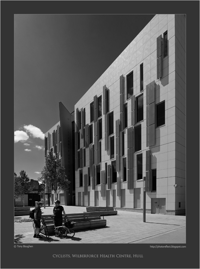
During those years, and since, architecture has been one of the subjects at which I have most often pointed my camera. Moreover, architecture has been the subject through which I have most frequently reverted to black and white. There's something about the sharp edges and details of buildings, as well as their three-dimensionality, that makes them ideal subjects for presenting in monochrome. Today's photograph is of the Wilberforce Health Centre, Hull, a 2011 building by HLM Architects. The colours of the building are off-white and grey with highlights of dark red, quite eye-catching. However, the contrasts of the colours alongside the shadows produced by a bright June day suggested to me that the building might look well with a black and white treatment. I think it does, especially with the digital equivalent of a yellow filter that darkens the sky and gives the building greater emphasis.
Incidentally, you may wonder what has happened to the rightmost cyclist's bicycle - it appears to be missing a wheel. In fact it's a small-wheel folding bike produced by the British manufacturer, Brompton and it's yet to be unfolded.
photograph and text © Tony Boughen
Camera: Olympus E-M10
Mode: Aperture Priority
Focal Length: 9mm (18mm - 35mm equiv.)
F No: f5.6 Shutter Speed: 1/1600 sec
ISO:200
Exposure Compensation: -0.33 EV
Image Stabilisation: On
My earliest "serious" photography at the start of the 1970s involved a Russian Zenit E 35mm camera with a 58mm f2 lens and lots of rolls of Ilford FP4 film. It was a fairly basic setup but all that was needed to get an understanding of the basic principles of good exposure and composition. Later I added a couple of lenses, then moved to an Olympus OM-1n, and after a year or two began my own film processing and printing, again, in black and white. At this time colour prints were the favoured means of printing, but I went with black and white and slides (transparencies). At around the time our first child was born I started using colour film.
During those years, and since, architecture has been one of the subjects at which I have most often pointed my camera. Moreover, architecture has been the subject through which I have most frequently reverted to black and white. There's something about the sharp edges and details of buildings, as well as their three-dimensionality, that makes them ideal subjects for presenting in monochrome. Today's photograph is of the Wilberforce Health Centre, Hull, a 2011 building by HLM Architects. The colours of the building are off-white and grey with highlights of dark red, quite eye-catching. However, the contrasts of the colours alongside the shadows produced by a bright June day suggested to me that the building might look well with a black and white treatment. I think it does, especially with the digital equivalent of a yellow filter that darkens the sky and gives the building greater emphasis.
Incidentally, you may wonder what has happened to the rightmost cyclist's bicycle - it appears to be missing a wheel. In fact it's a small-wheel folding bike produced by the British manufacturer, Brompton and it's yet to be unfolded.
photograph and text © Tony Boughen
Camera: Olympus E-M10
Mode: Aperture Priority
Focal Length: 9mm (18mm - 35mm equiv.)
F No: f5.6 Shutter Speed: 1/1600 sec
ISO:200
Exposure Compensation: -0.33 EV
Image Stabilisation: On
Wednesday, May 06, 2015
The Albemarle Music Centre, Hull
click photo to enlarge
Sandwiched between the prominent St Stephen Centre shopping area and the Hull Truck Theatre Company building, and forming part of the regeneration of this part of Hull, is the Albemarle Music Centre. This striking building, erected in 2007, is the music hub for the city's school children. It provides a base for the specialist staff who teach music across Hull's schools as well as practice and performance spaces for young musicians and visiting music groups. Part of the building is a 164 seat auditorium that can accommodate a full symphony orchestra. This space can seat a further 80 when smaller ensembles perform. The large (purple) cone shape forms part of this concert hall.
The building is the work of Holder Mathias Architects, a firm with a wide practice that includes the neighbouring shopping centre. The Albermarle Music Centre is a nice contrast with the adjoining sites and, through the prominent rounded shape, tips its hat, it seems to me, to Le Corbusier. The only aspect of the project that concerns me is the material of the dark purple cone-like shape. It is rough textured and already has a green growth in the shady areas. It will require regular cleaning and maintenance.
When I took my photograph I had thought that the colour of the cone would be the feature I'd highlight. However, black and white, to my mind, is a treatment that often suits architecture. In this instance I liked the way it describes the form of the building so I chose it over my initial preference.
photograph and text © Tony Boughen
Camera: Nikon D5300
Mode: Aperture Priority
Focal Length: 18mm (27mm - 35mm equiv.)
F No: f8
Shutter Speed: 1/320 sec
ISO:100
Exposure Compensation: -0.33 EV
Image Stabilisation: On
Sandwiched between the prominent St Stephen Centre shopping area and the Hull Truck Theatre Company building, and forming part of the regeneration of this part of Hull, is the Albemarle Music Centre. This striking building, erected in 2007, is the music hub for the city's school children. It provides a base for the specialist staff who teach music across Hull's schools as well as practice and performance spaces for young musicians and visiting music groups. Part of the building is a 164 seat auditorium that can accommodate a full symphony orchestra. This space can seat a further 80 when smaller ensembles perform. The large (purple) cone shape forms part of this concert hall.
The building is the work of Holder Mathias Architects, a firm with a wide practice that includes the neighbouring shopping centre. The Albermarle Music Centre is a nice contrast with the adjoining sites and, through the prominent rounded shape, tips its hat, it seems to me, to Le Corbusier. The only aspect of the project that concerns me is the material of the dark purple cone-like shape. It is rough textured and already has a green growth in the shady areas. It will require regular cleaning and maintenance.
When I took my photograph I had thought that the colour of the cone would be the feature I'd highlight. However, black and white, to my mind, is a treatment that often suits architecture. In this instance I liked the way it describes the form of the building so I chose it over my initial preference.
photograph and text © Tony Boughen
Camera: Nikon D5300
Mode: Aperture Priority
Focal Length: 18mm (27mm - 35mm equiv.)
F No: f8
Shutter Speed: 1/320 sec
ISO:100
Exposure Compensation: -0.33 EV
Image Stabilisation: On
Labels:
Albemarle Music Centre,
architecture,
black and white,
Hull,
modern,
Yorkshire
Friday, January 23, 2015
Belton House
click photo to enlarge
I recently went to Belton House for the first time. This large country house is now in the care of the National Trust and is open to the public. However, it being a Monday in January only the gardens and grounds were open so we didn't get to see the inside. On returning home I read a little about the building and was surprised by what I found.
Nikolaus Pevsner describes Belton as "perhaps the most satisfying among the later C17 houses in England". I can only think that he is referring to the interiors because the exterior is decidedly eighteenth century in style and fact, the whole having been given, as Pevsner says, "the facelift of 1777-8 by James Wyatt". The neat stonework and layout of the south front can only be described, to my mind, as ordinary. And the fact that the north front is very similar, a couple of details notwithstanding, doesn't help. The "H" plan hints at the seventeenth century underpinnings, but to the casual observer the building wears an eighteenth century face interesting only for its lack of interest.
For much of our visit the sun lit the south front like a floodlight, good for showing off the warm stone, but bad for modelling the architecture. This view of the facade that overlooks the formal gardens appealed more with its surface patina due to the reduced light. I particularly liked the way the building sits in its carefully planned surroundings. As I took today's distant view of that elevation I had an idea that it would make a good candidate for conversion to black and white: the smooth, frosty grass, silhouetted trees, and the building's chimneyed and towered shape under a lightly figured sky all suggested it, and I'm quite pleased with the outcome.
photograph and text © Tony Boughen
Camera: Nikon D5300
Mode: Aperture Priority
Focal Length: 22mm (33mm - 35mm equiv.)
F No: f8
Shutter Speed: 1/320 sec
ISO:100
Exposure Compensation: -0.33 EV
Image Stabilisation: On
I recently went to Belton House for the first time. This large country house is now in the care of the National Trust and is open to the public. However, it being a Monday in January only the gardens and grounds were open so we didn't get to see the inside. On returning home I read a little about the building and was surprised by what I found.
Nikolaus Pevsner describes Belton as "perhaps the most satisfying among the later C17 houses in England". I can only think that he is referring to the interiors because the exterior is decidedly eighteenth century in style and fact, the whole having been given, as Pevsner says, "the facelift of 1777-8 by James Wyatt". The neat stonework and layout of the south front can only be described, to my mind, as ordinary. And the fact that the north front is very similar, a couple of details notwithstanding, doesn't help. The "H" plan hints at the seventeenth century underpinnings, but to the casual observer the building wears an eighteenth century face interesting only for its lack of interest.
For much of our visit the sun lit the south front like a floodlight, good for showing off the warm stone, but bad for modelling the architecture. This view of the facade that overlooks the formal gardens appealed more with its surface patina due to the reduced light. I particularly liked the way the building sits in its carefully planned surroundings. As I took today's distant view of that elevation I had an idea that it would make a good candidate for conversion to black and white: the smooth, frosty grass, silhouetted trees, and the building's chimneyed and towered shape under a lightly figured sky all suggested it, and I'm quite pleased with the outcome.
photograph and text © Tony Boughen
Camera: Nikon D5300
Mode: Aperture Priority
Focal Length: 22mm (33mm - 35mm equiv.)
F No: f8
Shutter Speed: 1/320 sec
ISO:100
Exposure Compensation: -0.33 EV
Image Stabilisation: On
Labels:
Belton House,
black and white,
country house,
Lincolnshire
Subscribe to:
Posts (Atom)


