click photo to enlarge
Lanes, like footpaths, B roads, A roads and motorways etc fulfil a simple purpose - they connect places. However, a distinguishing feature of lanes is that they rarely do so in the most efficient manner. This is because they are often of great age, and some of the places that the lane originally linked no longer exist. Or, the farming carried out in the area through which the lane passes is no longer the same.
The lane in today's photograph is a small affair that links two bigger lanes. This lane rises across a hillside where pasture gives way to scattered trees, rock outcrops, rough grazing and woods. It passes close by an isolated cottage that must once have been the home of a gamekeeper. And perhaps therein lies one of the main reasons for its existence. I'm sure that once it was well marked and maintained. Today it is part footpath, part lane, in some places without an edge, elsewhere with millstone grit drystone walls and trees marking its course. The photograph shows a section with a wall on the right and the remains of a hawthorn hedge on the left. A large beech tree is also a feature, and the lane appears to be wide enough to accommodate a horse-drawn cart.
I took the photograph to record the line of hawthorn, but also for the yellow of the early morning light. The beech had lost some of its leaves, but the hawthorn were still clinging on to theirs, the unseasonally warm weather perhaps making them think that summer was still here.
photograph and text © Tony Boughen
Camera: Olympus E-M10
Mode: Aperture Priority
Focal Length: 29mm (58mm - 35mm equiv.)
F No: f7.1
Shutter Speed: 1/60 sec
ISO:200
Exposure Compensation: -0.3
Image Stabilisation: On
Wednesday, October 07, 2015
Monday, October 05, 2015
Reflecting on silhouettes
click photo to enlarge
One of my early blog posts had the title, The eponymous silhouette, and reflected on how the finance minister of Louis XV, Etienne de Silhouette (1709-1767) spent much of his retirement with paper and scissors making that to which others gave his name. The piece accompanied a photograph of my wife and some small trees in silhouette form in front of a view across a stretch of water in the Lake District. In those early years I posted quite a few photographs featuring silhouettes, often including my wife, but also of gulls, street lights, ducks and much else. Silhouettes in images are very strong forms with heightened impact. Shapes that are of little consequence when brightly lit assume much greater significance and become more attractive as a photographic subject when seen in silhouette, no matter how mundane the subject might usually appear to be.
Consequently, on a recent walk in the Yorkshire Dales near Langcliffe, the sight of the silhouettes of trees and a couple of gates with a distant valley and mountain beyond, immediately drew my eye. I took a shot of the subject and then, realising how much stronger the image would be with a person in silhouette too, I asked my wife to step into the shot.
photograph and text © Tony Boughen
Camera: Olympus E-M10
Mode: Aperture Priority
Focal Length: 42mm (84mm - 35mm equiv.)
F No: f7.1
Shutter Speed: 1/500 sec
ISO:200
Exposure Compensation: 0
Image Stabilisation: On
One of my early blog posts had the title, The eponymous silhouette, and reflected on how the finance minister of Louis XV, Etienne de Silhouette (1709-1767) spent much of his retirement with paper and scissors making that to which others gave his name. The piece accompanied a photograph of my wife and some small trees in silhouette form in front of a view across a stretch of water in the Lake District. In those early years I posted quite a few photographs featuring silhouettes, often including my wife, but also of gulls, street lights, ducks and much else. Silhouettes in images are very strong forms with heightened impact. Shapes that are of little consequence when brightly lit assume much greater significance and become more attractive as a photographic subject when seen in silhouette, no matter how mundane the subject might usually appear to be.
Consequently, on a recent walk in the Yorkshire Dales near Langcliffe, the sight of the silhouettes of trees and a couple of gates with a distant valley and mountain beyond, immediately drew my eye. I took a shot of the subject and then, realising how much stronger the image would be with a person in silhouette too, I asked my wife to step into the shot.
photograph and text © Tony Boughen
Camera: Olympus E-M10
Mode: Aperture Priority
Focal Length: 42mm (84mm - 35mm equiv.)
F No: f7.1
Shutter Speed: 1/500 sec
ISO:200
Exposure Compensation: 0
Image Stabilisation: On
Labels:
Ingleborough,
Langcliffe,
Ribble valley,
silhouette,
Yorkshire Dales
Saturday, October 03, 2015
Changing corporate faces
click photo to enlarge
Whole industries are devoted to the design and implementation of corporate images. Everything from the font, logo, mission statement, colours and more are carefully constructed, tested with focus groups, modified on the basis of feedback and rolled out to what the company fondly believes is a waiting world. I'm sure some take an interest in such things, and I have to say that, up to a point, I do. But, most people, in my experience, care little about them.
However, it doesn't matter whether or not you consciously think about the corporate face a company projects because, through repeated advertising, the public gradually absorbs the information the company requires. There can be few people in the UK who don't know that the Co-operative now uses light green as its main corporate colour, and quite a few of those will remember that it was preceded by a distinctive turquoise. Familiarity with a company's corporate image doesn't breed contempt so much as indifference, and yet despite that it still does its work.When I studied today's photograph I wondered what prompted the "refresh" of the Co-op's image, and when I first came to realise that it had changed. All I remember is that I eventually came to notice the transformation. My other thought concerned Total's logo and colours - when did it change from three oblique strokes in red, blue and orange into the swirly ball shown above, and why had I not noticed in this instance? I put it down to the relative rarity of Total petrol stations compared with their competitors and the fact that as far as fuel for my car goes, like most people, I'm price-sensitive rather than brand-sensitive.
I came upon this petrol station as we walked through Settle in the Yorkshire Dales one evening. It was nestled in its own pool of light, one of the brightest points in this part of a quite dark market town.
photograph and text © Tony Boughen
Camera: Olympus E-M10
Mode: Aperture Priority
Focal Length: 12mm (24mm - 35mm equiv.)
F No: f2.8
Shutter Speed: 1/125 sec
ISO:6400
Exposure Compensation: -0.7 EV
Image Stabilisation: On
Whole industries are devoted to the design and implementation of corporate images. Everything from the font, logo, mission statement, colours and more are carefully constructed, tested with focus groups, modified on the basis of feedback and rolled out to what the company fondly believes is a waiting world. I'm sure some take an interest in such things, and I have to say that, up to a point, I do. But, most people, in my experience, care little about them.
However, it doesn't matter whether or not you consciously think about the corporate face a company projects because, through repeated advertising, the public gradually absorbs the information the company requires. There can be few people in the UK who don't know that the Co-operative now uses light green as its main corporate colour, and quite a few of those will remember that it was preceded by a distinctive turquoise. Familiarity with a company's corporate image doesn't breed contempt so much as indifference, and yet despite that it still does its work.When I studied today's photograph I wondered what prompted the "refresh" of the Co-op's image, and when I first came to realise that it had changed. All I remember is that I eventually came to notice the transformation. My other thought concerned Total's logo and colours - when did it change from three oblique strokes in red, blue and orange into the swirly ball shown above, and why had I not noticed in this instance? I put it down to the relative rarity of Total petrol stations compared with their competitors and the fact that as far as fuel for my car goes, like most people, I'm price-sensitive rather than brand-sensitive.
I came upon this petrol station as we walked through Settle in the Yorkshire Dales one evening. It was nestled in its own pool of light, one of the brightest points in this part of a quite dark market town.
photograph and text © Tony Boughen
Camera: Olympus E-M10
Mode: Aperture Priority
Focal Length: 12mm (24mm - 35mm equiv.)
F No: f2.8
Shutter Speed: 1/125 sec
ISO:6400
Exposure Compensation: -0.7 EV
Image Stabilisation: On
Labels:
corporate image,
night,
North Yorkshire,
petrol station,
Settle
Tuesday, September 29, 2015
Light on the river
click photo to enlarge
I find September light very alluring. It retains (almost) the brightness of July and August, but combines it with the deeper shadows of an autmn month. In the evening it has a yellower tint than in the summer months. All this is, of course, a result of the sun being lower in the sky, and explains my preference for spring and autumn as the best months (in the UK at least) for photography.
Today's photograph illustrates the above. I took the shot from a bridge over the River Bain in the Lincolnshire town of Horncastle. It's not much of a river, neither particularly deep nor wide. However, the town is built at the confluence of two rivers and the combined flow after periods of particularly heavy rain has, in the past, resulted in quite serious flooding in the lower lying built-up areas.On the day of my photograph the flow was unremarkable. But, lit by a the golden light of September, and combined with the silhouettes of overhanging leaves, the reflection of the sky and foliage, and the ripples on its surface, it caught my eye and I took this semi-abstract photograph. I call it that because the image is as much about the colours, tones and textures as it is the nominal subject.
photograph and text © Tony Boughen
Camera: Olympus E-M10
Mode: Aperture Priority
Focal Length: 150mm (300mm - 35mm equiv.)
F No: f8
Shutter Speed: 1/1250 sec
ISO:200
Exposure Compensation: -0.7
Image Stabilisation: On
I find September light very alluring. It retains (almost) the brightness of July and August, but combines it with the deeper shadows of an autmn month. In the evening it has a yellower tint than in the summer months. All this is, of course, a result of the sun being lower in the sky, and explains my preference for spring and autumn as the best months (in the UK at least) for photography.
Today's photograph illustrates the above. I took the shot from a bridge over the River Bain in the Lincolnshire town of Horncastle. It's not much of a river, neither particularly deep nor wide. However, the town is built at the confluence of two rivers and the combined flow after periods of particularly heavy rain has, in the past, resulted in quite serious flooding in the lower lying built-up areas.On the day of my photograph the flow was unremarkable. But, lit by a the golden light of September, and combined with the silhouettes of overhanging leaves, the reflection of the sky and foliage, and the ripples on its surface, it caught my eye and I took this semi-abstract photograph. I call it that because the image is as much about the colours, tones and textures as it is the nominal subject.
photograph and text © Tony Boughen
Camera: Olympus E-M10
Mode: Aperture Priority
Focal Length: 150mm (300mm - 35mm equiv.)
F No: f8
Shutter Speed: 1/1250 sec
ISO:200
Exposure Compensation: -0.7
Image Stabilisation: On
Labels:
Horncastle,
light,
Lincolnshire,
River Bain,
semi-abstract,
September
Sunday, September 27, 2015
Scaffolding
click photo to enlarge
The first photograph I ever took of scaffolding is probably the best I've taken of this subject. It appears on PhotoQuoto, a minimalist blog that I started when paid work got a bit too hectic for the fuller posts of PhotoReflect. It shows workmen maintaining a roller-coaster ride in the Lancashire resort of Blackpool.
Ever since that time I've looked out for more examples of this subject and you might wonder why. The fact is, I like the way that the apparently haphazard (though actually carefully and rationally constructed) tracery of steelwork transforms a building. I particularly like it when the complication of lines is doubled by shadows produced by the sun - it sometimes looks like angular scribble laid across the building's surface.
The example in today's photograph shows scaffolding on the main elevation of the old Court House in Horncastle, Lincolnshire. This building has, for many years, been used as offices for various local authority organisations. I read recently that it was scheduled to be turned into flats and perhaps that is the reason for the scaffolding in my photograph. It's good that this prominent building built in 1865 by C. Reeves in the Italianate style, will continue to serve the town.
I converted the colour photograph to black and white and increased the contrast to emphasise the lines of the both the scaffolding and the building.
photograph and text © Tony Boughen
Camera: Olympus E-M10
Mode: Aperture Priority
Focal Length: 18mm (36mm - 35mm equiv.)
F No: f5.6
Shutter Speed: 1/1250 sec
ISO:200
Exposure Compensation: 0
Image Stabilisation: On
The first photograph I ever took of scaffolding is probably the best I've taken of this subject. It appears on PhotoQuoto, a minimalist blog that I started when paid work got a bit too hectic for the fuller posts of PhotoReflect. It shows workmen maintaining a roller-coaster ride in the Lancashire resort of Blackpool.
Ever since that time I've looked out for more examples of this subject and you might wonder why. The fact is, I like the way that the apparently haphazard (though actually carefully and rationally constructed) tracery of steelwork transforms a building. I particularly like it when the complication of lines is doubled by shadows produced by the sun - it sometimes looks like angular scribble laid across the building's surface.
The example in today's photograph shows scaffolding on the main elevation of the old Court House in Horncastle, Lincolnshire. This building has, for many years, been used as offices for various local authority organisations. I read recently that it was scheduled to be turned into flats and perhaps that is the reason for the scaffolding in my photograph. It's good that this prominent building built in 1865 by C. Reeves in the Italianate style, will continue to serve the town.
I converted the colour photograph to black and white and increased the contrast to emphasise the lines of the both the scaffolding and the building.
photograph and text © Tony Boughen
Camera: Olympus E-M10
Mode: Aperture Priority
Focal Length: 18mm (36mm - 35mm equiv.)
F No: f5.6
Shutter Speed: 1/1250 sec
ISO:200
Exposure Compensation: 0
Image Stabilisation: On
Labels:
architecture,
black and white,
Horncastle,
Lincolnshire,
scaffolding
Thursday, September 24, 2015
A Fenland rainbow
click photo to enlarge
I had to use the search facility of this blog to establish that this is the first photograph of a rainbow that I have posted. The fact is I've taken quite a few photographs of this phenomenon but never secured any that I considered good enough to display. But, on a recent evening walk round the village, at the end of a day that had started to brighten after hours of steady drizzle, this one appeared. It wasn't a complete rainbow - it quickly fades to nothing beyond the left edge of the frame - but it was bright and against an interesting sky, so I took a few shots of it.
A rainbow is a marvellous, if unlikely, meteorological phenomenon, something that invariably provokes a response from people when they observe one. It's small wonder that the Vikings saw it as a bridge between earth and Asgard (the place where their gods lived).Or that the leprechaun's pot of gold is supposed to be hidden at a point below the end of it. Mankind has spun so many good stories around the rainbow that it almost seems churlish to repeat that it is simply the refraction and reflection of light in water droplets, something that was first conjectured over a thousand years ago and more scientifically explained by the likes of Roger Bacon and Descartes.
photograph and text © Tony Boughen
Camera: Sony RX100
Mode: Aperture Priority
Focal Length: 10.4mm (28mm - 35mm equiv.)
F No: f4
Shutter Speed: 1/500
ISO: 125
Exposure Compensation: -0.3 EV
Image Stabilisation: On
I had to use the search facility of this blog to establish that this is the first photograph of a rainbow that I have posted. The fact is I've taken quite a few photographs of this phenomenon but never secured any that I considered good enough to display. But, on a recent evening walk round the village, at the end of a day that had started to brighten after hours of steady drizzle, this one appeared. It wasn't a complete rainbow - it quickly fades to nothing beyond the left edge of the frame - but it was bright and against an interesting sky, so I took a few shots of it.
A rainbow is a marvellous, if unlikely, meteorological phenomenon, something that invariably provokes a response from people when they observe one. It's small wonder that the Vikings saw it as a bridge between earth and Asgard (the place where their gods lived).Or that the leprechaun's pot of gold is supposed to be hidden at a point below the end of it. Mankind has spun so many good stories around the rainbow that it almost seems churlish to repeat that it is simply the refraction and reflection of light in water droplets, something that was first conjectured over a thousand years ago and more scientifically explained by the likes of Roger Bacon and Descartes.
photograph and text © Tony Boughen
Camera: Sony RX100
Mode: Aperture Priority
Focal Length: 10.4mm (28mm - 35mm equiv.)
F No: f4
Shutter Speed: 1/500
ISO: 125
Exposure Compensation: -0.3 EV
Image Stabilisation: On
Labels:
evening,
Fens,
Lincolnshire,
rainbow
Tuesday, September 22, 2015
Destroying the past
click photo to enlarge
The destruction of the past is perhaps the greatest of all crimes.
Simone Weil (1909-1943) French philosopher, Christian mystic and political activist
Despite having great sympathy with Simone Weil's statement I don't find it difficult to think of a worse crime than destroying the past. However, to remove evidence of mankind's past is, undoubtedly, a particularly destructive thing to do. Our sense of the present is greatly informed by our knowledge of the past, and to lose one is to impair the other. The past - in printed or image form, in memories and in buildings and artefacts - is all that we have to remember those who came before us. To rub them out is to extinguish people, and that is always wrong, whether they are living or dead.
If we confine ourselves to buildings we find that Isis are not the first group to wilfully and deliberately destroy ancient structures for their own ends. The Taliban did it in Afghanistan and in 1942 the Luftwaffe did it in their so-called Baedecker Raids on Britain, a response they said, to the switch to area bombing by the RAF. However, it is not always warring factions that are most responsible for the destruction of the past. All too frequently it is simple neglect or misplaced planning and "progress". In the 1960s and 1970s many ancient buildings that today would have been preserved, adapted and turned to new uses, were swept away in the name of progress. It took the destruction of the Euston Arch to galvanise people against the vandalism that was taking place and begin to bring to an end the loss that was taking place.
Tattershall Castle (above) was one of the buildings in the forefront of early building preservation legislation. In 1910, in a ruinous state, it was bought by Lord Curzon and sensitively restored. It had been destined to be dismantled and parts sold abroad. His experience with this building prompted Lord Curzon to press for some laws to protect old buildings resulting in the Ancient Monuments Consolidation and Amendment Act of 1913. As a direct consequence of his actions we can still experience something of this ancient building - as the mother and daughter are doing in today's photograph.
photograph and text © Tony Boughen
Camera: Olympus E-M10
Mode: Aperture Priority
Focal Length: 12mm (24mm - 35mm equiv.)
F No: f2.8
Shutter Speed: 1/320 sec
ISO:200
Exposure Compensation: -0.3 EV
Image Stabilisation: On
The destruction of the past is perhaps the greatest of all crimes.
Simone Weil (1909-1943) French philosopher, Christian mystic and political activist
Despite having great sympathy with Simone Weil's statement I don't find it difficult to think of a worse crime than destroying the past. However, to remove evidence of mankind's past is, undoubtedly, a particularly destructive thing to do. Our sense of the present is greatly informed by our knowledge of the past, and to lose one is to impair the other. The past - in printed or image form, in memories and in buildings and artefacts - is all that we have to remember those who came before us. To rub them out is to extinguish people, and that is always wrong, whether they are living or dead.
If we confine ourselves to buildings we find that Isis are not the first group to wilfully and deliberately destroy ancient structures for their own ends. The Taliban did it in Afghanistan and in 1942 the Luftwaffe did it in their so-called Baedecker Raids on Britain, a response they said, to the switch to area bombing by the RAF. However, it is not always warring factions that are most responsible for the destruction of the past. All too frequently it is simple neglect or misplaced planning and "progress". In the 1960s and 1970s many ancient buildings that today would have been preserved, adapted and turned to new uses, were swept away in the name of progress. It took the destruction of the Euston Arch to galvanise people against the vandalism that was taking place and begin to bring to an end the loss that was taking place.
Tattershall Castle (above) was one of the buildings in the forefront of early building preservation legislation. In 1910, in a ruinous state, it was bought by Lord Curzon and sensitively restored. It had been destined to be dismantled and parts sold abroad. His experience with this building prompted Lord Curzon to press for some laws to protect old buildings resulting in the Ancient Monuments Consolidation and Amendment Act of 1913. As a direct consequence of his actions we can still experience something of this ancient building - as the mother and daughter are doing in today's photograph.
photograph and text © Tony Boughen
Camera: Olympus E-M10
Mode: Aperture Priority
Focal Length: 12mm (24mm - 35mm equiv.)
F No: f2.8
Shutter Speed: 1/320 sec
ISO:200
Exposure Compensation: -0.3 EV
Image Stabilisation: On
Labels:
Lincolnshire,
restoration,
stained glass,
Tattershall Castle,
tourists,
visitors,
window
Sunday, September 20, 2015
Old graffiti
click photo to enlarge
On March 12th 1848 I. Burton and H. King of Wisbech in Cambridgeshire were standing on a staircase of Tattershall Castle in Lincolnshire, presumably with a hammer and chisel or some other implements, carving their names in the stone handrail built into the wall. We know this because the heavily incised graffiti is still there for all to read. It is, I suppose, an immortality of sorts. They had probably been inspired by L. C. Howy (?) who had done the same thing in 1779, and perhaps by others from the eighteenth and nineteenth centuries.
At the time this brick and stone castle was in a ruinous state, open to the weather and to any passing tourist, antiquarian or vandal. Many of the latter left their mark and most of them can be read today. One of the characteristics of graffiti today is that if it isn't quickly removed it soon attracts more. That was also true in the past.
We saw this particular piece of graffiti on a visit to the castle. However, it wasn't the first old graffiti that we'd seen that day. Before we arrived at Tattershall we had stopped off at Haltham and noted the names and dates left on the stone surround of the church's south door by vandals of the seventeenth, eighteenth and nineteenth centuries. There was much less, to be sure, but it was there nonetheless. Even in the supposedly God-fearing seventeenth century there were people who thought little of leaving their name or initials on the fabric of a church, clearly unworried by the thought of any retribution that might follow their desecration.
photographs and text © Tony Boughen
Photo 1
Camera: Olympus E-M10
Mode: Aperture Priority
Focal Length: 12mm (24mm - 35mm equiv.)
F No: f2.8
Shutter Speed: 1/125 sec
ISO:3200
Exposure Compensation: -0.3 EV
Image Stabilisation: On
On March 12th 1848 I. Burton and H. King of Wisbech in Cambridgeshire were standing on a staircase of Tattershall Castle in Lincolnshire, presumably with a hammer and chisel or some other implements, carving their names in the stone handrail built into the wall. We know this because the heavily incised graffiti is still there for all to read. It is, I suppose, an immortality of sorts. They had probably been inspired by L. C. Howy (?) who had done the same thing in 1779, and perhaps by others from the eighteenth and nineteenth centuries.
At the time this brick and stone castle was in a ruinous state, open to the weather and to any passing tourist, antiquarian or vandal. Many of the latter left their mark and most of them can be read today. One of the characteristics of graffiti today is that if it isn't quickly removed it soon attracts more. That was also true in the past.
We saw this particular piece of graffiti on a visit to the castle. However, it wasn't the first old graffiti that we'd seen that day. Before we arrived at Tattershall we had stopped off at Haltham and noted the names and dates left on the stone surround of the church's south door by vandals of the seventeenth, eighteenth and nineteenth centuries. There was much less, to be sure, but it was there nonetheless. Even in the supposedly God-fearing seventeenth century there were people who thought little of leaving their name or initials on the fabric of a church, clearly unworried by the thought of any retribution that might follow their desecration.
photographs and text © Tony Boughen
Photo 1
Camera: Olympus E-M10
Mode: Aperture Priority
Focal Length: 12mm (24mm - 35mm equiv.)
F No: f2.8
Shutter Speed: 1/125 sec
ISO:3200
Exposure Compensation: -0.3 EV
Image Stabilisation: On
Labels:
graffiti,
Lincolnshire,
Tattershall Castle
Wednesday, September 16, 2015
Another Kitchen Sink shot
click photo to enlarge
In a blog post several years ago I announced to the world that I was a Kitchen Sink photographer. It was a title I conferred on myself after the creation of my greasy baking tray photograph, and once I'd done so I immediately cited some earlier photographs as examples of this genre, including a piece that I consider one of my better attempts at humour.
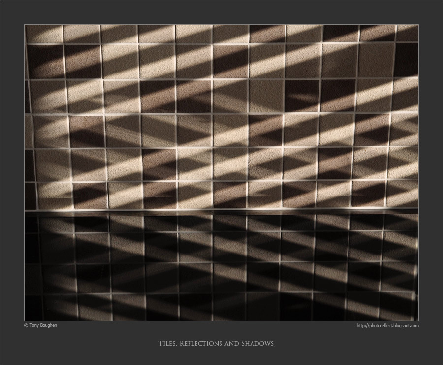
A couple of days ago I added to my collection. This time, however, it did not include grease, chili or soap suds. The low sun of a mid-September morn was slanting through the kitchen's Venetian blinds and casting shadows across our shiny induction hob and the tiles on the wall behind it. This happy coming together of two of my photographic favourites - shadows and reflections - combined with another structure that appears regularly in my photography - a regular grid of rectangles - was like photographic catnip to me and I took the semi-abstract shot above. It won't be a subject or style that appeals to everyone but it pleases me.
photograph and text © Tony Boughen
Camera: Olympus E-M10
Mode: Aperture Priority
Focal Length: 45mm (90mm - 35mm equiv.)
F No: f6.3
Shutter Speed: 1/100 sec
ISO:250
Exposure Compensation: -0.7 EV
Image Stabilisation: On
In a blog post several years ago I announced to the world that I was a Kitchen Sink photographer. It was a title I conferred on myself after the creation of my greasy baking tray photograph, and once I'd done so I immediately cited some earlier photographs as examples of this genre, including a piece that I consider one of my better attempts at humour.
A couple of days ago I added to my collection. This time, however, it did not include grease, chili or soap suds. The low sun of a mid-September morn was slanting through the kitchen's Venetian blinds and casting shadows across our shiny induction hob and the tiles on the wall behind it. This happy coming together of two of my photographic favourites - shadows and reflections - combined with another structure that appears regularly in my photography - a regular grid of rectangles - was like photographic catnip to me and I took the semi-abstract shot above. It won't be a subject or style that appeals to everyone but it pleases me.
photograph and text © Tony Boughen
Camera: Olympus E-M10
Mode: Aperture Priority
Focal Length: 45mm (90mm - 35mm equiv.)
F No: f6.3
Shutter Speed: 1/100 sec
ISO:250
Exposure Compensation: -0.7 EV
Image Stabilisation: On
Labels:
kitchen sink photography,
reflections,
semi-abstract,
shadows,
tiles
Monday, September 14, 2015
Larder, Gainsborough Old Hall
click photo to enlarge
The modern surname, Spencer, is thought to come from the old French Despencer, Despenser or Dispenser, the name of a knight who may have supported William 1 in his conquest of England. This name may derive from the act of dispensing after the manner of a steward, or refer to the larder itself. Within a couple of centuries "spence" or "spens" had come to mean a food store or the surname of one who had the responsibility for such a place, in Northern England and Scotland.
That word was largely replaced by larder and pantry, the food stores for meat and bread, in England. Today those words are, in turn, falling out of use, and the much more general "cupboard" or "food cupboard" (or perhaps freezer and refrigerator) have taken their place. However, in my travels this year, during my visits to several old country houses owned by the National Trust and English heritage, the older words that were commonly used in my childhood returned to my current vocabulary as I have come across several reconstructed larders. These old store rooms have been "provisioned" with representations of some of the foodstuffs they would originally have held. In July I posted a photograph of a larder at Canons Ashby, Northamptonshire. Today I offer an example from Gainsborough Old Hall, Lincolnshire. This large, partly timber-framed town house has particularly large and fine kitchens and associated rooms dating from the 1400s. I particularly liked the evocative, dimly lit larder and the (stuffed) game and representations of prepared meat on the slab.
photograph and text © Tony Boughen
Camera: Olympus E-M10
Mode: Aperture Priority
Focal Length: 12mm (24mm - 35mm equiv.)
F No: f2.4
Shutter Speed: 1/80 sec
ISO:6400
Exposure Compensation: -0.3 EV
Image Stabilisation: On
The modern surname, Spencer, is thought to come from the old French Despencer, Despenser or Dispenser, the name of a knight who may have supported William 1 in his conquest of England. This name may derive from the act of dispensing after the manner of a steward, or refer to the larder itself. Within a couple of centuries "spence" or "spens" had come to mean a food store or the surname of one who had the responsibility for such a place, in Northern England and Scotland.
That word was largely replaced by larder and pantry, the food stores for meat and bread, in England. Today those words are, in turn, falling out of use, and the much more general "cupboard" or "food cupboard" (or perhaps freezer and refrigerator) have taken their place. However, in my travels this year, during my visits to several old country houses owned by the National Trust and English heritage, the older words that were commonly used in my childhood returned to my current vocabulary as I have come across several reconstructed larders. These old store rooms have been "provisioned" with representations of some of the foodstuffs they would originally have held. In July I posted a photograph of a larder at Canons Ashby, Northamptonshire. Today I offer an example from Gainsborough Old Hall, Lincolnshire. This large, partly timber-framed town house has particularly large and fine kitchens and associated rooms dating from the 1400s. I particularly liked the evocative, dimly lit larder and the (stuffed) game and representations of prepared meat on the slab.
photograph and text © Tony Boughen
Camera: Olympus E-M10
Mode: Aperture Priority
Focal Length: 12mm (24mm - 35mm equiv.)
F No: f2.4
Shutter Speed: 1/80 sec
ISO:6400
Exposure Compensation: -0.3 EV
Image Stabilisation: On
Labels:
Gainsborough Old Hall,
larder,
Lincolnshire,
reconstruction
Saturday, September 12, 2015
Swallows, barns and Mobius
click photo to enlarge
The re-naming of certain species of British birds is something that will take a long time to gain widespread acceptance - if ever it does attain that position. Certainly, as far as I'm concerned, a wheatear will not be called a northern wheatear, a jackdaw will never be a western jackdaw and a jay won't be a Eurasian jay. I can certainly understand why ornithologists, drawing on recent genetic discoveries, see the need to differentiate birds with greater precision. But, that doesn't mean that the common names won't continue in use, nor I think, do bird experts expect otherwise. My father called what is today referred to as the northern lapwing, the tewit, a country name that he grew up with. I shall continue to call it the lapwing as I have done all my life. And I will never bring myself to call a swallow a barn swallow.
On a recent visit to Gainsborough we came across a street sculpture in mirror-finished stainless steel that depicted a Mobius strip (ring) of swallows. The piece was called "Endless Summer", a title that caused me to groan. It wasn't the greatest example of recent public sculpture that I've seen but the shiny finish lifted it above the other examples that we came across in the town. I was sufficiently interested in the way the polished metal reflected the surroundings and imparted changing colours to take this detail of part of the ring of birds. Real swallows were still about when I took my shot, skimming the nearby River Trent and circling above the fields across the water. In a few weeks they'll be gone but their metal counterparts will still be here, reflecting the greyer days of autumn and winter.
photograph and text © Tony Boughen
Camera: Olympus E-M10
Mode: Aperture Priority
Focal Length: 54mm (108mm - 35mm equiv.)
F No: f5.6
Shutter Speed: 1/1250 sec
ISO:200
Exposure Compensation: 0
Image Stabilisation: On
The re-naming of certain species of British birds is something that will take a long time to gain widespread acceptance - if ever it does attain that position. Certainly, as far as I'm concerned, a wheatear will not be called a northern wheatear, a jackdaw will never be a western jackdaw and a jay won't be a Eurasian jay. I can certainly understand why ornithologists, drawing on recent genetic discoveries, see the need to differentiate birds with greater precision. But, that doesn't mean that the common names won't continue in use, nor I think, do bird experts expect otherwise. My father called what is today referred to as the northern lapwing, the tewit, a country name that he grew up with. I shall continue to call it the lapwing as I have done all my life. And I will never bring myself to call a swallow a barn swallow.
On a recent visit to Gainsborough we came across a street sculpture in mirror-finished stainless steel that depicted a Mobius strip (ring) of swallows. The piece was called "Endless Summer", a title that caused me to groan. It wasn't the greatest example of recent public sculpture that I've seen but the shiny finish lifted it above the other examples that we came across in the town. I was sufficiently interested in the way the polished metal reflected the surroundings and imparted changing colours to take this detail of part of the ring of birds. Real swallows were still about when I took my shot, skimming the nearby River Trent and circling above the fields across the water. In a few weeks they'll be gone but their metal counterparts will still be here, reflecting the greyer days of autumn and winter.
photograph and text © Tony Boughen
Camera: Olympus E-M10
Mode: Aperture Priority
Focal Length: 54mm (108mm - 35mm equiv.)
F No: f5.6
Shutter Speed: 1/1250 sec
ISO:200
Exposure Compensation: 0
Image Stabilisation: On
Labels:
bird names,
Gainsborough,
Lincolnshire,
Mobius strip,
public sculpture,
swallow
Wednesday, September 09, 2015
British Camp, Malvern Hills
Many years ago I came across a second-hand copy of "The Relative Hills of Britain" by Alan Dawson. The premise of this fairly slim volume is simple but interesting. It lists all of our island's hills that are high relative to the surrounding land - the qualification for inclusion in the book is that there must be a drop of 150 metres (492 feet) or more on all sides of the summit. Britain doesn't have particularly high mountains - Ben Nevis at 4,409 feet (1,344 metres) is the tallest. Nonetheless, there are many British so-called "walking enthusiasts" who consider it beneath them to climb anything below 2,000 feet (610 metres), the height at which a hill becomes a mountain. What this book helpfully does is list the "relative hills" on a regional basis and directs the attention of walkers to many "lesser" peaks that are significant and worth climbing.
I was reminded of this on a recent visit to Herefordshire as we walked up Black Hill, Pinnacle Hill and Jubilee Hill, three of the "saw tooth" peaks of the Malvern Hills, a low range that features in its pages. As we did so we looked back at Herefordshire Beacon, another of the "teeth", that is topped by the Iron Age hill fort called British Camp. The September sun was picking out the detail of the earthworks, paths and a couple of people on the grass-clad summit above the tree-line. We have walked to the top of the Beacon a couple of times and I've posted photographs I've taken from the top. On this occasion we were looking for different views over the surrounding countryside and more distant prospects of the ancient earthworks.
photograph and text © Tony Boughen
Camera: Olympus E-M10
Mode: Aperture Priority
Focal Length: 150mm (300mm - 35mm equiv.)
F No: f5.6
Shutter Speed: 1/1000 sec
ISO:200
Exposure Compensation: 0
Image Stabilisation: On
Labels:
British Camp,
Herefordshire,
Herefordshire Beacon,
hill fort,
hills,
Iron Age,
Malverns
Saturday, September 05, 2015
Lichfield Cathedral is number 2...
click photo to enlarge
... in terms of popularity on this blog. On a few occasions I have reviewed my hit counter and noted, in particular, the most popular posts and photographs, and the countries that produce the most hits. Ever since I first did this my blog post showing the nave of Lichfield Cathedral in Staffordshire has been second in popularity. By a large margin, I must say, from the third most popular, and considerably behind the number one post. I don't propose to list all these again, but I do still wonder what makes Lichfield's cathedral a relative magnet for visitors.
This particular English cathedral is a bit of an oddity in that its two west towers have tall spires, as does its crossing tower: cathedrals with three big spires are very unusual in England. It's also true to say that Lichfield isn't one of the "big" cathedrals in terms of size, popularity, architectural beauty and significance, or visitor numbers. It lags well behind the likes of Canterbury, Westminster, Lincoln, York, Durham etc. And maybe that accounts for it. Perhaps, on the world wide web, Lichfield has fewer photographs and articles than many other cathedrals and therefore the ones that do exist attract relatively more hits.
This photograph of the nave taken on my recent visit is from a slightly different position compared with my earlier effort. And this time I looked very carefully before I pressed the shutter and checked that there wasn't a box in the foreground! I took my shot with a 16:9 aspect ratio in mind to remove some of the nearest seats and give greater emphasis to the repeated verticals of the columns, piers and arches.
photograph and text © Tony Boughen
Camera: Olympus E-M10
Mode: Aperture Priority
Focal Length: 12mm (24mm - 35mm equiv.)
F No: f3.2
Shutter Speed: 1/100 sec
ISO:3200
Exposure Compensation: -0.3 EV
Image Stabilisation: On
... in terms of popularity on this blog. On a few occasions I have reviewed my hit counter and noted, in particular, the most popular posts and photographs, and the countries that produce the most hits. Ever since I first did this my blog post showing the nave of Lichfield Cathedral in Staffordshire has been second in popularity. By a large margin, I must say, from the third most popular, and considerably behind the number one post. I don't propose to list all these again, but I do still wonder what makes Lichfield's cathedral a relative magnet for visitors.
This particular English cathedral is a bit of an oddity in that its two west towers have tall spires, as does its crossing tower: cathedrals with three big spires are very unusual in England. It's also true to say that Lichfield isn't one of the "big" cathedrals in terms of size, popularity, architectural beauty and significance, or visitor numbers. It lags well behind the likes of Canterbury, Westminster, Lincoln, York, Durham etc. And maybe that accounts for it. Perhaps, on the world wide web, Lichfield has fewer photographs and articles than many other cathedrals and therefore the ones that do exist attract relatively more hits.
This photograph of the nave taken on my recent visit is from a slightly different position compared with my earlier effort. And this time I looked very carefully before I pressed the shutter and checked that there wasn't a box in the foreground! I took my shot with a 16:9 aspect ratio in mind to remove some of the nearest seats and give greater emphasis to the repeated verticals of the columns, piers and arches.
photograph and text © Tony Boughen
Camera: Olympus E-M10
Mode: Aperture Priority
Focal Length: 12mm (24mm - 35mm equiv.)
F No: f3.2
Shutter Speed: 1/100 sec
ISO:3200
Exposure Compensation: -0.3 EV
Image Stabilisation: On
Thursday, September 03, 2015
Walkie Not Talkie
click photo to enlarge
I've never been a fan of the telephone. There's something about talking to a disembodied voice that doesn't appeal to me. Moreover, I spent too much time speaking to people on the phone during my working life. That's not to say I don't appreciate their utility, and of course, I do use phones. With that in mind you might think that the rise of the smartphone would be something I'd welcome because it offers communication without the necessity for speaking. In fact, I wonder if these days such devices aren't more used for texting (SMS), email, social media communication etc, than simply speaking to people. But the fact is, though I recognise their multiple uses, and though I use my wife's smartphone, I haven't succumbed to one myself because I have enough computers of one kind or another and the idea of having one to use on a regular basis when I'm out and about is simply too much to contemplate.
I sometimes wonder what smartphone users would do if they had their device surgically removed. What would they do with their hands, their eyes, their ears and their brains? Would they have to look about them, make their own entertainment, fret because they don't know what their friends and acquaintances are doing, organise their time and social interactions better because there was no phone to make last-minute adjustments? I do wonder whether smartphones will turn us into lobster people who carry massive smartphones as evolution causes us to develop massively over-sized thumbs from countless keypresses.
I recognise that my relative antipathy to smartphones isn't widely held. On reflection it probably comes from the deep enjoyment I get from looking at our world, finding out about it and reflecting on what I see. A smartphone would get in the way of that - and it would encourage me to use an inferior camera!
photograph and text © Tony Boughen
Camera: Olympus E-M10
Mode: Aperture Priority
Focal Length: 63mm (126mm - 35mm equiv.)
F No: f6.3
Shutter Speed: 1/400 sec
ISO:200
Exposure Compensation: 0
Image Stabilisation: On
I've never been a fan of the telephone. There's something about talking to a disembodied voice that doesn't appeal to me. Moreover, I spent too much time speaking to people on the phone during my working life. That's not to say I don't appreciate their utility, and of course, I do use phones. With that in mind you might think that the rise of the smartphone would be something I'd welcome because it offers communication without the necessity for speaking. In fact, I wonder if these days such devices aren't more used for texting (SMS), email, social media communication etc, than simply speaking to people. But the fact is, though I recognise their multiple uses, and though I use my wife's smartphone, I haven't succumbed to one myself because I have enough computers of one kind or another and the idea of having one to use on a regular basis when I'm out and about is simply too much to contemplate.
I sometimes wonder what smartphone users would do if they had their device surgically removed. What would they do with their hands, their eyes, their ears and their brains? Would they have to look about them, make their own entertainment, fret because they don't know what their friends and acquaintances are doing, organise their time and social interactions better because there was no phone to make last-minute adjustments? I do wonder whether smartphones will turn us into lobster people who carry massive smartphones as evolution causes us to develop massively over-sized thumbs from countless keypresses.
I recognise that my relative antipathy to smartphones isn't widely held. On reflection it probably comes from the deep enjoyment I get from looking at our world, finding out about it and reflecting on what I see. A smartphone would get in the way of that - and it would encourage me to use an inferior camera!
photograph and text © Tony Boughen
Camera: Olympus E-M10
Mode: Aperture Priority
Focal Length: 63mm (126mm - 35mm equiv.)
F No: f6.3
Shutter Speed: 1/400 sec
ISO:200
Exposure Compensation: 0
Image Stabilisation: On
Labels:
footbridge,
Lincolnshire,
Sleaford,
smartphone,
technology,
telephone
Tuesday, September 01, 2015
Blues and the chapel pianist
click photo to enlarge
I think it was 1969 when I bought "King of the Delta Blues Singers" by Robert Johnson, a collection of acoustic blues recorded in the 1930s. And it was probably two years later, in 1971, that I bought the newly issued "King of the Delta Blues Singers Vol. II". These were 33rpm L.P.s with paintings of Robert Johnson on the front. The first album showed him from above. The second had an illustration of him playing his guitar in front of a microphone that was positioned in the corner of the living room of a house. Comprehensive cover notes (of a kind that died with the advent of the CD) said that, despite his wonderful song-writing ability and great guitar playing, he was incurably shy and reticent about recording and would only perform without making eye contact with anyone.
I was reminded of this illustration recently when we visited Wimpole Hall in Cambridgeshire. This stately home is in the care of the National Trust and features, among many splendours, a private chapel with interesting trompe l'oeil paintings. When we visited it we were entertained by a pianist who was sitting at his instrument facing the wall at one end of the chapel. I don't think he suffered from the performance terrors that afflicted Robert Johnson because between pieces he was chatting to visitors. However, it did look odd and it appeared somewhat unkind that he should be so positioned. Perhaps it was his choice to avoid the distractions of the steady stream of visitors.
photograph and text © Tony Boughen
Camera: Olympus E-M10
Mode: Aperture Priority
Focal Length: 14mm (28mm - 35mm equiv.)
F No: f4.9
Shutter Speed: 1/40 sec
ISO:6400
Exposure Compensation: 0 EV
Image Stabilisation: On
I think it was 1969 when I bought "King of the Delta Blues Singers" by Robert Johnson, a collection of acoustic blues recorded in the 1930s. And it was probably two years later, in 1971, that I bought the newly issued "King of the Delta Blues Singers Vol. II". These were 33rpm L.P.s with paintings of Robert Johnson on the front. The first album showed him from above. The second had an illustration of him playing his guitar in front of a microphone that was positioned in the corner of the living room of a house. Comprehensive cover notes (of a kind that died with the advent of the CD) said that, despite his wonderful song-writing ability and great guitar playing, he was incurably shy and reticent about recording and would only perform without making eye contact with anyone.
I was reminded of this illustration recently when we visited Wimpole Hall in Cambridgeshire. This stately home is in the care of the National Trust and features, among many splendours, a private chapel with interesting trompe l'oeil paintings. When we visited it we were entertained by a pianist who was sitting at his instrument facing the wall at one end of the chapel. I don't think he suffered from the performance terrors that afflicted Robert Johnson because between pieces he was chatting to visitors. However, it did look odd and it appeared somewhat unkind that he should be so positioned. Perhaps it was his choice to avoid the distractions of the steady stream of visitors.
photograph and text © Tony Boughen
Camera: Olympus E-M10
Mode: Aperture Priority
Focal Length: 14mm (28mm - 35mm equiv.)
F No: f4.9
Shutter Speed: 1/40 sec
ISO:6400
Exposure Compensation: 0 EV
Image Stabilisation: On
Labels:
black and white,
blues,
Cambridgeshire,
chapel,
pianist,
Robert Johnson,
Wimpole Hall
Sunday, August 30, 2015
Hinges and old doors
click photo to enlarge
Today's photograph shows a detail of the priest's door on the exterior of the chancel of the church of St Andrew at Heckington, Lincolnshire.
The solid oak and the rusted, ornate metal work appear to date from a Victorian restoration, perhaps that done by Charles Kirk in 1867. Readers of this blog will know that in Lincolnshire (and many other parts of Britain) church doors are often considerably older - examples from the fifteenth century are relatively common and those from three or four centuries earlier are still to be found.
Many people imagine that the large, intricate scroll-work of the hinges of such doors are purely ornamental. But, as with the tracery, buttresses moulding, pinnacles etc of Gothic churches the seemingly decorative is fundamentally structural. In the case of the doors there are stiles and rails that fix the pieces of wood together. However, the scrollwork of the hinges provides additional fixing and hence strength to the structure while at the same time beautifying the door. If I were to hazard a guess I'd say that this metalwork has rarely, if ever, been painted. It looks none the worse for it!
photograph and text © Tony Boughen
Camera: Sony RX100
Mode: Aperture Priority
Focal Length: 10.4mm (28mm - 35mm equiv.)
F No: f4.5
Shutter Speed: 1/100 sec
ISO:125
Exposure Compensation: 0 EV
Image Stabilisation: On
Today's photograph shows a detail of the priest's door on the exterior of the chancel of the church of St Andrew at Heckington, Lincolnshire.
The solid oak and the rusted, ornate metal work appear to date from a Victorian restoration, perhaps that done by Charles Kirk in 1867. Readers of this blog will know that in Lincolnshire (and many other parts of Britain) church doors are often considerably older - examples from the fifteenth century are relatively common and those from three or four centuries earlier are still to be found.
Many people imagine that the large, intricate scroll-work of the hinges of such doors are purely ornamental. But, as with the tracery, buttresses moulding, pinnacles etc of Gothic churches the seemingly decorative is fundamentally structural. In the case of the doors there are stiles and rails that fix the pieces of wood together. However, the scrollwork of the hinges provides additional fixing and hence strength to the structure while at the same time beautifying the door. If I were to hazard a guess I'd say that this metalwork has rarely, if ever, been painted. It looks none the worse for it!
photograph and text © Tony Boughen
Camera: Sony RX100
Mode: Aperture Priority
Focal Length: 10.4mm (28mm - 35mm equiv.)
F No: f4.5
Shutter Speed: 1/100 sec
ISO:125
Exposure Compensation: 0 EV
Image Stabilisation: On
Friday, August 28, 2015
Eye-scorching colour
click photo to enlarge
Living in the countryside I am surrounded by natural, largely muted colour - the greens and browns of grass and leaves, the dark earth, the bricks, tiles and stone of village and farm buildings. It's true that points of strong colour intrude in the form of flowers, large agricultural vehicles, and most of all the blue of the sky. But it's also true to say that I don't regularly experience the layers of in-your-face, man-made colours so often found in the city. And there are times when I crave them.
So, I was pleased to visit an exhibition of creative textiles by Michael Brennand-Woods at the National Centre for Craft and Design at Sleaford, Lincolnshire, and discover that many of the pieces on display offered eye-scorching colour. As I've mentioned before, it's not unusual for me to come away from NCCD exhibitions feeling disappointed. But, as I've also noted there are occasions when I enjoy an encounter with a kind of craft (or art) that I don't usually seek out, and I depart from the show visually and creatively stimulated. Such was my experience on a recent visit where I saw textiles on the theme of "Seeds of Memory". I can't say that I engaged with the works on the terms that they were offered to me, and the impenetrable, jargon-ridden, art-speak made me despair, as it always does. But I got a lot from the experience on my own terms and that was enough for me. Other visitors who, like us, seem to have popped in for a break from shopping, appeared to appreciate the exhibition too.
During my visit I reflected on whether or not these pieces would work outside the gallery, in a home or an office for example, and decided they would. I often think otherwise about NCCD exhibits because many benefit from the light, shadows and space in which they are displayed, qualities that don't easily transfer to smaller settings.
photograph and text © Tony Boughen
Camera: Olympus E-M10
Mode: Aperture Priority
Focal Length: 45mm (90mm - 35mm equiv.)
F No: f6.3
Shutter Speed: 1/100 sec
ISO:4000
Exposure Compensation: 0 EV
Image Stabilisation: On
Living in the countryside I am surrounded by natural, largely muted colour - the greens and browns of grass and leaves, the dark earth, the bricks, tiles and stone of village and farm buildings. It's true that points of strong colour intrude in the form of flowers, large agricultural vehicles, and most of all the blue of the sky. But it's also true to say that I don't regularly experience the layers of in-your-face, man-made colours so often found in the city. And there are times when I crave them.
So, I was pleased to visit an exhibition of creative textiles by Michael Brennand-Woods at the National Centre for Craft and Design at Sleaford, Lincolnshire, and discover that many of the pieces on display offered eye-scorching colour. As I've mentioned before, it's not unusual for me to come away from NCCD exhibitions feeling disappointed. But, as I've also noted there are occasions when I enjoy an encounter with a kind of craft (or art) that I don't usually seek out, and I depart from the show visually and creatively stimulated. Such was my experience on a recent visit where I saw textiles on the theme of "Seeds of Memory". I can't say that I engaged with the works on the terms that they were offered to me, and the impenetrable, jargon-ridden, art-speak made me despair, as it always does. But I got a lot from the experience on my own terms and that was enough for me. Other visitors who, like us, seem to have popped in for a break from shopping, appeared to appreciate the exhibition too.
During my visit I reflected on whether or not these pieces would work outside the gallery, in a home or an office for example, and decided they would. I often think otherwise about NCCD exhibits because many benefit from the light, shadows and space in which they are displayed, qualities that don't easily transfer to smaller settings.
photograph and text © Tony Boughen
Camera: Olympus E-M10
Mode: Aperture Priority
Focal Length: 45mm (90mm - 35mm equiv.)
F No: f6.3
Shutter Speed: 1/100 sec
ISO:4000
Exposure Compensation: 0 EV
Image Stabilisation: On
Wednesday, August 26, 2015
Under the bridge
click photo to enlarge
It is a children's story that I blame for my fascination with bridges; specifically, "The Three Billy Goats Gruff". When I first heard about them going "trip-trap, trip-trap over the rickety bridge" I began to look at bridges in a new light, as structures with a mysterious underneath as well as a very useful top. The small town where I was raised has a rocky river passing through it so footbridges and road bridges, old and new were well-known to me. I never saw any trolls beneath them but I discovered that the water under a bridge was a good place to spot trout, and the underside of the bridge itself frequently held nooks and crannies where dippers would sometimes build their nests.
This interest in bridges has been life-long and this blog contains many photographs of these interesting structures. Today's photograph shows the underside of a bridge on the River Witham at Boston, Lincolnshire. It is old, rarely used, and supported by both steel and timber, though the latter, as you can see, is somewhat the worse for wear. I liked the bold, semi-abstract shapes that the dark structure and its reflection made against the water - it reminded me of the paintings of Franz Kline.
photograph and text © Tony Boughen
Camera: Olympus E-M10
Mode: Aperture Priority
Focal Length: 63mm (126mm - 35mm equiv.)
F No: f5.5
Shutter Speed: 1/640 sec
ISO:200
Exposure Compensation: 0
Image Stabilisation: On
It is a children's story that I blame for my fascination with bridges; specifically, "The Three Billy Goats Gruff". When I first heard about them going "trip-trap, trip-trap over the rickety bridge" I began to look at bridges in a new light, as structures with a mysterious underneath as well as a very useful top. The small town where I was raised has a rocky river passing through it so footbridges and road bridges, old and new were well-known to me. I never saw any trolls beneath them but I discovered that the water under a bridge was a good place to spot trout, and the underside of the bridge itself frequently held nooks and crannies where dippers would sometimes build their nests.
This interest in bridges has been life-long and this blog contains many photographs of these interesting structures. Today's photograph shows the underside of a bridge on the River Witham at Boston, Lincolnshire. It is old, rarely used, and supported by both steel and timber, though the latter, as you can see, is somewhat the worse for wear. I liked the bold, semi-abstract shapes that the dark structure and its reflection made against the water - it reminded me of the paintings of Franz Kline.
photograph and text © Tony Boughen
Camera: Olympus E-M10
Mode: Aperture Priority
Focal Length: 63mm (126mm - 35mm equiv.)
F No: f5.5
Shutter Speed: 1/640 sec
ISO:200
Exposure Compensation: 0
Image Stabilisation: On
Labels:
Boston,
bridge,
Lincolnshire,
reflection,
River Witham,
semi-abstract,
water
Monday, August 24, 2015
Spinning wool
click photo to enlarge
There are children today who, if you tell them that milk comes from cows, will look at you incredulously, thinking that you are playing some kind of practical joke on them. The same children find it hard to believe that the bread they are eating is made from the seeds of a cultivated grass. As for the notion that the jumper they are wearing was once, in rather more basic form, worn by a sheep - well, suggest that and your sanity will be questioned. If you find this hard to believe, let me assure you I have met such children. They are not widespread, but they do exist, and for two reasons. Firstly, their parents haven't told them about such things either through traditional stories or in the normal course of their early lives. And secondly, because modern life increasingly distances us from the source of our food and drink, the clothes we wear and much else.
Before I took today's photograph I was explaining the process of weaving - insofar as I understand it - to my grand-daughter as we watched the sheep fleece pass through the spinner's hands onto the spinning wheel and thence to the bobbin. What fascinated her most was the way the steady up and down foot movement of the spinner on the treadle was, via rods, cranks and wheels converted into very fast rotary movement, and how the mass of wool was drawn into a single strand. It intrigued me too and I was glad that here was someone carrying on this tradition and demonstrating it for all to see.
photograph and text © Tony Boughen
Camera: Olympus E-M10
Mode: Aperture Priority
Focal Length: 80mm (160mm - 35mm equiv.)
F No: f5.5
Shutter Speed: 1/200 sec
ISO:250
Exposure Compensation: 0
Image Stabilisation: On
There are children today who, if you tell them that milk comes from cows, will look at you incredulously, thinking that you are playing some kind of practical joke on them. The same children find it hard to believe that the bread they are eating is made from the seeds of a cultivated grass. As for the notion that the jumper they are wearing was once, in rather more basic form, worn by a sheep - well, suggest that and your sanity will be questioned. If you find this hard to believe, let me assure you I have met such children. They are not widespread, but they do exist, and for two reasons. Firstly, their parents haven't told them about such things either through traditional stories or in the normal course of their early lives. And secondly, because modern life increasingly distances us from the source of our food and drink, the clothes we wear and much else.
Before I took today's photograph I was explaining the process of weaving - insofar as I understand it - to my grand-daughter as we watched the sheep fleece pass through the spinner's hands onto the spinning wheel and thence to the bobbin. What fascinated her most was the way the steady up and down foot movement of the spinner on the treadle was, via rods, cranks and wheels converted into very fast rotary movement, and how the mass of wool was drawn into a single strand. It intrigued me too and I was glad that here was someone carrying on this tradition and demonstrating it for all to see.
photograph and text © Tony Boughen
Camera: Olympus E-M10
Mode: Aperture Priority
Focal Length: 80mm (160mm - 35mm equiv.)
F No: f5.5
Shutter Speed: 1/200 sec
ISO:250
Exposure Compensation: 0
Image Stabilisation: On
Labels:
Cambridgeshire,
spinning wheel,
tradition,
Wimpole Hall,
wool
Wednesday, August 19, 2015
Photographic aspect ratios
click photo to enlarge
The world wide web, it seems to me, has increased the amount of confrontation and stridency in photography. Now, don't get me wrong, I'm not suggesting that this outweighs the co-operation and learning that the online world confers on our hobby and profession. However, the early years of my forty odd with camera in hand certainly didn't feature the vituperation I regularly see today. Photography is not alone in this of course, and it's possibly the opportunity to adopt extreme postures and language anonymously that encourages the outpourings of bile.
To stick with photography, I continue to be amazed about the subjects on which people have unwavering views that they broadcast and defend with boorish language. Brand loyalty, sensor size, fixed lenses versus zoom, black and white versus colour, the list is endless when it comes to the subjects that some photographers can get exercised about. I've even seen people vociferously arguing the merits of one aspect ratio over another. Now when it comes to this subject I play the field. I'll use 4:3, 3:2, 16:9 and 1:1 as the subject requires. Sometimes I'll select the aspect ration before taking the shot, often I'll take it with the largest capture possible but with a different aspect ratio in mind, and frequently I'll crop post-capture. And the idea that one or another is intrinsically "best" or "better" than another seems to me absurd: all are possible, so choose the most appropriate. I've even been known - whisper it quietly - to choose a non-standard aspect ratio where it seemed to fit the subject better.
Today's photograph was one that I shot at 4:3 thinking that it might work well at 16:9. That turned out to be the case and is in fact the best aspect ratio for this image. It shows some of the inshore fishing boats on the River Witham at Boston, Lincolnshire, with in the distance, the tall tower of the medieval church of St Botolph.
photograph and text © Tony Boughen
Camera: Olympus E-M10
Mode: Aperture Priority
Focal Length: 34mm (68mm - 35mm equiv.)
F No: f5.6
Shutter Speed: 1/1600 sec
ISO:200
Exposure Compensation: -0.3
Image Stabilisation: On
The world wide web, it seems to me, has increased the amount of confrontation and stridency in photography. Now, don't get me wrong, I'm not suggesting that this outweighs the co-operation and learning that the online world confers on our hobby and profession. However, the early years of my forty odd with camera in hand certainly didn't feature the vituperation I regularly see today. Photography is not alone in this of course, and it's possibly the opportunity to adopt extreme postures and language anonymously that encourages the outpourings of bile.
To stick with photography, I continue to be amazed about the subjects on which people have unwavering views that they broadcast and defend with boorish language. Brand loyalty, sensor size, fixed lenses versus zoom, black and white versus colour, the list is endless when it comes to the subjects that some photographers can get exercised about. I've even seen people vociferously arguing the merits of one aspect ratio over another. Now when it comes to this subject I play the field. I'll use 4:3, 3:2, 16:9 and 1:1 as the subject requires. Sometimes I'll select the aspect ration before taking the shot, often I'll take it with the largest capture possible but with a different aspect ratio in mind, and frequently I'll crop post-capture. And the idea that one or another is intrinsically "best" or "better" than another seems to me absurd: all are possible, so choose the most appropriate. I've even been known - whisper it quietly - to choose a non-standard aspect ratio where it seemed to fit the subject better.
Today's photograph was one that I shot at 4:3 thinking that it might work well at 16:9. That turned out to be the case and is in fact the best aspect ratio for this image. It shows some of the inshore fishing boats on the River Witham at Boston, Lincolnshire, with in the distance, the tall tower of the medieval church of St Botolph.
photograph and text © Tony Boughen
Camera: Olympus E-M10
Mode: Aperture Priority
Focal Length: 34mm (68mm - 35mm equiv.)
F No: f5.6
Shutter Speed: 1/1600 sec
ISO:200
Exposure Compensation: -0.3
Image Stabilisation: On
Labels:
aspect ratios,
Boston,
brand names,
fishing boat,
inshore,
internet,
Lincolnshire,
photography,
River Witham
Subscribe to:
Posts (Atom)