Showing posts with label public sculpture. Show all posts

Saturday, September 12, 2015

Swallows, barns and Mobius

click photo to enlarge
The re-naming of certain species of British birds is something that will take a long time to gain widespread acceptance - if ever it does attain that position. Certainly, as far as I'm concerned, a wheatear will not be called a northern wheatear, a jackdaw will never be a western jackdaw and a jay won't be a Eurasian jay. I can certainly understand why ornithologists, drawing on recent genetic discoveries, see the need to differentiate birds with greater precision. But, that doesn't mean that the common names won't continue in use, nor I think, do bird experts expect otherwise. My father called what is today referred to as the northern lapwing, the tewit, a country name that he grew up with. I shall continue to call it the lapwing as I have done all my life. And I will never bring myself to call a swallow a barn swallow.

On a recent visit to Gainsborough we came across a street sculpture in mirror-finished stainless steel that depicted a Mobius strip (ring) of swallows. The piece was called "Endless Summer", a title that caused me to groan. It wasn't the greatest example of recent public sculpture that I've seen but the shiny finish lifted it above the other examples that we came across in the town. I was sufficiently interested in the way the polished metal reflected the surroundings and imparted changing colours to take this detail of part of the ring of birds. Real swallows were still about when I took my shot, skimming the nearby River Trent and circling above the fields across the water. In a few weeks they'll be gone but their metal counterparts will still be here, reflecting the greyer days of autumn and winter.

photograph and text © Tony Boughen

Camera: Olympus E-M10
Mode: Aperture Priority
Focal Length: 54mm (108mm - 35mm equiv.)
F No: f5.6
Shutter Speed: 1/1250 sec
ISO:200
Exposure Compensation: 0
Image Stabilisation: On

Friday, July 26, 2013

Boston, public sculpture and vinyl

click photo to enlarge
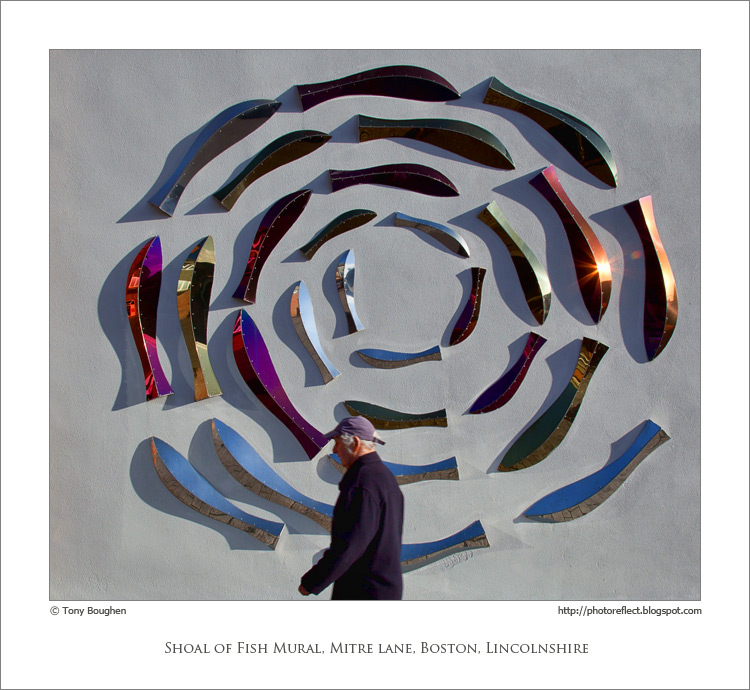
Not until I'd brought this photograph up on my computer did I notice that this "circular" shoal of fish is actually a spiral. That reminded me of the quiz question beloved of children of the vinyl records generation: "Question - How many grooves are there on a record? Answer - Two; one on the A side and one on the B side". The success (or otherwise) of this question (for the information of those of the compact disc and mp3 generations) depends on you knowing that each side of such a record appears to have hundreds of concentric circles but both hold just a single, tightly packed spiral.

As public murals go this one doesn't, for me, have any outstanding qualities. However, it does add a bit of colour and interest to an otherwise quite dour corner of Boston, Lincolnshire, and that's often reason enough for the existence of such a piece. Unusually, I haven't been able to find any information about this work: for example, its title or the name of the artist. I imagine that the subject refers to Boston's past as a port of deep-sea trawlers and its current status as the home of a small inshore fleet. It is one of the relatively few pieces of public sculpture in the town. For reasons unknown to me Boston has fewer such pieces than many other towns of its size. I find that surprising since I can think of a number of Lincolnshire villages that are home to several themed sculptures. The present period with an economic climate that emphasises belt-tightening probably isn't the best time for the commissioning of such works, but if there is a town that would benefit from a few public pieces to enliven its streets then it's Boston.

Incidentally, the keen photographers among you may be wondering why I chose f11 for this shot since it resulted in the passer-by being slightly blurred. The answer is simple: operator error!

photograph and text © Tony Boughen

Camera: Canon
Mode: Aperture Priority
Focal Length: 24mm
F No: f11
Shutter Speed: 1/160 sec
ISO: 100
Exposure Compensation: -0.33 EV
Image Stabilisation: On

Tuesday, February 12, 2013

Posing, fashion and photography

click photo to enlarge
Fashion photography  too often isn't. By that I mean it is photography, but it isn't about fashion. This branch of photography seem to attract those who see it as an opportunity to create "art", and so they produce images that do everything except show off the clothing that is being promoted. Thus, models adopt contorted poses, or are photographed in harsh or dim light, or are placed in locations that overwhelm or hide the main subject, or - well I think you'll have seen what I mean.

And even when a straight forward shot of a model is taken from face-on the photographers seem to crave an awkward element such as the feet in a strange position, the eyes deliberately closed, the hand raised to shield the face etc. Or the model is asked to adopt what I think of as the "gormless pose". I think you'll have seen this one too. It involves the model standing upright,  staring straight at the camera, mouth dropped open, no hint of emotion evident, arms hanging limply with the back of the hands turned forwards. I suppose it's a reaction against the poses of the middle of the twentieth century where models sat in the sunlight, relaxed, on scooters, on garden seats, or leaning nonchalantly against a tree, all the while beaming their best smile. On balance I think I prefer the latter! There was a time when fashion photographers managed to create art (of a sort) that also showed off the fashions being sold - Norman Parkinson frequently managed it producing wonderful images. These days many aim for one or other of these goals but few achieve both.

Today's photograph shows a wall of windows at the London Tower Bridge Hilton next to More London. It's an interesting wall  for the way colour is used. Standing on a thick wooden trunk nearby is a wooden sculpture of a woman (there's also a man nearby, out of shot). She is one of the "Couple", a commissioned work by the German artist, Stephan Balkenhol, completed in 2003. It was only after I'd seen the woman a couple of times that I realised her "wooden" pose reminded me of the "gormless" poses favoured by some fashion photographers. Now, it has to be said that this lady really can't help but look wooden: even if she was contorted like an Olympic gymnast she'd still be completely wooden. But why do we have to suffer it in the living models in the Sunday supplements? Incidentally, on past experience you may have expected me to say something about the quality of the sculpture. I see them as WYSIATI (what you see is all there is) pieces, so there's not much to add, and I certain won't be describing them as totemic or poles.

photograph and text © Tony Boughen

Camera: Canon
Mode: Aperture Priority
Focal Length: 85mm
F No: f7.1
Shutter Speed: 1/100
ISO: 125
Exposure Compensation:  -0.67 EV
Image Stabilisation: On

Friday, July 08, 2011

Living sculpture

click photo to enlarge
As I was walking down the promenade in Hornsea, East Yorkshire, my eyes fell upon the public art and street furniture that the council had commissioned to beautify the area. Most notable was the semi-abstract relief sculpture above a small pool featuring birds and the town's name. I also admired the long, narrow garden that had been assembled with walls of granite, short sections of "groynes", undulating grass, shingle, beach flowers and shrubs. The promenade railings in the style of an ocean liner's with a hardwood hand-rail, inclined uprights and lines of stainless steel cable between struck the right note by the sea. And the black, bird sculptures that topped the large, ornamental street lights were a nice detail. What a pity, I thought, about the concrete, tarmac and brick desert that had been created near the leisure centre.

As I made my way back up the promenade to rejoin my companions I looked up at the street lights and did a "double take". The bird sculptures that I'd admired were turning their heads to follow my passage: they were in fact real birds - rooks! Raising my camera I took a few shots of the living statues and carried on my way. After I'd walked a few yards I turned and looked back at them. It was obvious that two of the birds were rooks, but what about the third one? I had no binoculars so I resolved to identify it by studying my photographs when I put them on the computer.

Viewing the bird at 100% reveals that it is clearly an immature rook, a product of this year's nesting season. The reason it looks very odd, and made me wonder whether or not it was a carrion crow, is the shape of its beak.  Half of the upper mandible is broken off. Despite this handicap the bird appeared to be foraging successfully with its parents and managing to cope. I hope it continues to do so.

photograph and text (c) T. Boughen

Camera: Canon
Mode: Aperture Priority
Focal Length: 300mm
F No: f6.3
Shutter Speed: 1/640
ISO: 100
Exposure Compensation:  0 EV
Image Stabilisation: On

Saturday, January 30, 2010

Sleaford sculpture, ancient and modern

click photo to enlarge
Is durability a quality that we require in public sculpture? There are arguments for and against that proposition. If the sculpture is mediocre or bad we might wish for it to be momentary, the sort of thing that soon falls apart and is taken away. If it's high quality and durable we will usually be pleased for it to remain, though if it's good but poorly made we may well find ourselves balking at the cost of restoration. Another consideration is that tastes change over time, and what is lauded when new might be castigated a hundred years later. My view is that sculpture should be made to last: that a society should accept the good, the bad and the indifferent that is bequeathed to us by each generation. Why? Well, such sculpture offers not only an aesthetic experience and a piece of public art, but it is a memorial of past taste, and a small slice of history: as such it offers us something useful even when we don't like it.

I was reflecting on this the other day as I stood in the main street at Sleaford, Lincolnshire. Next to me were some railings-cum-sculpture, and nearby was a prominent Victorian monument that parts the traffic on this busy thoroughfare. I've said elsewhere that public furniture and fixings that try to be artistic and utilitarian at the same time rarely succeed in either function. And that's the case, in my opinion, with the Richard Bett's ship/fishes/wyvern that form the railings of the small garden at this location. This "Sleaford Pride" sculpture of 2001 uses imagery associated with the town, but is too obviously a tricked up barrier, and the sculpture part I find too slight. The Handley Memorial, a Victorian re-working of the Eleanor Cross idea, dates from 1850. The overall design is William Boyle's, and the sculpture of Henry Handley M.P. is by John Thomas. It is a well-made but fairly unexceptional example of a Victorian memorial to a noteworthy man. It has lasted for 110 years so far, and looks like it has a century or two in it still, so it is certainly durable. The modern sculpture is positively new-born by comparison, and even though it is made of steel, is unlikely to have a comparably long future ahead of it.

Standing near these two examples of the sculptor's art I tried to incorporate both in a single shot. The best image I managed is this one with the wyvern's head looking like it is about to take a bite out of the old stone monument.

photograph & text (c) T. Boughen

Camera: Lumix LX3
Mode: Aperture Priority
Focal Length: 8.8mm (41mm/35mm equiv.)
F No: f4
Shutter Speed: 1/640
ISO: 80
Exposure Compensation: -0.66 EV
Image Stabilisation: On

Saturday, December 05, 2009

Andre Preview and comedy writing

click photo to enlarge
In an idle moment the other evening - and I haven't had many of those recently - when multi-channel TV offered nothing that appealed to me, I turned to YouTube and found myself watching a few old clips of Morecambe and Wise. I am of the generation that saw this British comedy duo transfer from live variety theatres and end of the pier shows to television, and witnessed their creative peak in the 1970s when one of their Christmas Shows garnered 28 million viewers.

At the time I was both impressed and highly entertained by the style of Eric and Ernie. They were a double act in the vaudevillian sense, with Eric the tall "daft" one, and Ernie the short more "serious" one, though equally daft if he could only see it: the concept owed a lot to Laurel and Hardy. The comic timing, mannerisms, delivery, ongoing jokes, interaction with guest stars, and the slightly anarchic humour that occasionally broke through the "working class lads made good" feel of the show, ensured it had a very wide appeal. What I never thought particularly deeply about at the time was the writing. This was largely the product of one man, Eddie Braben, and today I find that fact quite remarkable. We're used to comedy shows being written by teams of people - Monty Python surely couldn't have existed without the fertile imaginations of each individual being driven to a higher plane by interaction with each other. So to see great line after great line, new idea after new idea, appearing each season, year after year, from the pen of a single writer is, yes, remarkable.

Reviewing this image taken in Canary Wharf, London, a few weeks ago I kept thinking about what the lady in the brown coat might be saying to the lady in the black coat. But a suitably comedic line wouldn't come. The best I could manage are: "Do you think the baby will have his mother's or his father's looks?" and "My money's on the baby's head being an octahedron!" (that one's for the mathematicians out there.) Not ROFLMAO (I think that's right) material is it?

In my small way I have written a few "humorous" pieces for PhotoReflect. My best three are perhaps: Primordial soup and chilli, IMO UN wasted money, and The cows take a bow. Putting those small snippets together didn't come easily, so I can imagine just how hard it would be to come up with several 45 minute episodes or a full hour of Chrismas entertainment in the way Eddie Braben did for Morecambe and Wise. How much easier it would be with someone to bounce ideas off.

Most British people of "a certain age" will be familiar with Morecambe and Wise, and many more will know of their most famous sketch that features the conductor, Andre Previn. But for those who have never seen it, here's a link.


photograph & text (c) T. Boughen

Camera: Olympus E510
Mode: Aperture Priority
Focal Length: 150mm (300mm/35mm equiv.)
F No: f6.3
Shutter Speed: 1/160
ISO: 100
Exposure Compensation: -0.3 EV
Image Stabilisation: On

Tuesday, October 06, 2009

Re-visiting photographic subjects

click photo to enlarge
I while ago I posted a piece about the value of re-visiting photographic subjects, and talked about the variables that can come into play if you snap something the second (or third, or more) time around. When I visited photographic forums more than I do now (which is very rarely), I found that there were some photographers who knew and appreciated this, and others who seemed to see it as a failure of sorts if they weren't making images of new subjects in new ways. The fact is, it's impossibe to take the same photograph twice (even if we wanted to), and what we are doing is capturing a variation. If we do the job well, that variation will be as good as the previous effort(s) or better. I'm now in my third year of living in Lincolnshire and I find myself (as I did when I lived in the north-west of England) shooting variations on images I've taken before. I'm doing it with buildings, landscapes, flowers, and more.

Today's photograph of a sculpture-cum-seating-cum audio/visual installation called "The Sampler" at The Hub, Sleaford, is a case in point. In September 2008 I photographed it from a balcony at the top of the building. A couple of months ago I photographed it from ground level, at a time when it was in the process of being repainted. Yesterday I noticed the paint job had been completed, and was different from the original, so I thought I'd try another, slightly wider-angle shot, from above. As I began shooting I decided that the inclusion of people improved the image, and I composed variations with them at various points relative to the main, colourful shapes. Then, as I concentrated on my work, a thought occured to me. The repainting had introduced blue and orange as new colours, dispensed with yellow, increased the amount of red, and reduced the quantity of black. I don't know if the designer agreed to the new colour scheme - I doubt it - but I do think it isn't as effective as the original. Smaller amounts of strong colour worked much better when placed with black, and the whole effect is now more garish. Perhaps this is a photographic subject I won't be re-visiting again!

photograph & text (c) T.Boughen

Camera: Lumix LX3
Mode: Aperture Priority
Focal Length: 11mm (52mm/35mm equiv.)
F No: f3.2
Shutter Speed: 1/500
ISO: 80
Exposure Compensation: 0 EV
Image Stabilisation: On

Saturday, August 01, 2009

Through the square window

click photo to enlarge
When they were small my children sometimes watched the BBC TV programme for pre-school children called "Play School." This featured songs, games, short films, etc, all within a structure that was repeated in each programme and thus became familiar to its target audience (and their parents). One device was where the presenter invited the viewers to see what was through one of three windows, which were round, square and arched.

I was reminded of this long-gone programme as I framed shots that included the square "window" of this structure in today's photograph. It is called, "The Sampler", and is a sculpture-cum-seating-cum-part-time-audio-visual device outside The Hub, Britain's National Centre for Craft and Design, at Sleaford, Lincolnshire. The design, by Catherine Bohme and Andreas Lange, has arms that come off a central pole. These have metal seats, tables and canopies fixed to them, and one has this "window" or frame which can have a screen fixed inside it. The arms can be rotated around the central pole because the are partly supported by wheels. Presumably this serves the double purpose of varying the sculpture and allowing for the position of the sun when projecting images on to the screen. When it was first erected the seats and canopies were painted red or yellow. On my recent visit they were battleship grey. I hope this is an undercoat awaiting the final original, brighter colours, because it takes something away from the design.

In fact, "The Sampler" isn't a particularly great piece, sitting outside the converted and extended warehouse that constitutes the Centre. However, it does offer interesting shapes when seen from the viewing gallery at the top of the building. I've photographed it, and commented on it, before - see here - and the other day I thought I'd try for a contextual shot of it using the square "window" as a prominent feature in the composition.

photograph & text (c) T. Boughen

Camera: Olympus E510
Mode: Aperture Priority
Focal Length: 11mm (22mm/35mm equiv.)
F No: f6.3
Shutter Speed: 1/640 seconds
ISO: 100
Exposure Compensation: -0.3 EV
Image Stabilisation: On

Friday, January 16, 2009

Sculpture as perch

click photo to enlarge
Whenever I visit Whitby in North Yorkshire I trudge up the steps of West Cliff, to the statue of Captain Cook at the summit, and gaze across the harbour at St Mary's Church and the Abbey. Then I turn and look at the figure of Cook himself and remember that there has NEVER, EVER been an occasion that I done this without there being a herring gull sitting on his head undermining the dignity of his pose, his fine clothes and his serious countenance, making him look absolutely ridiculous, not to say risible!

On my forays into Boston, Lincolnshire, I frequently stop and look up from the Market Place at the tower of St Botolph's church. On these occasions my gaze passes the statue of Herbert Ingram, a Swineshead man, founder of the Illustrated London News and Member of Parliament for Boston. I invariably find that he too is topped by either a black-headed gull or a pigeon that is intent on turning his hair white. In the recent past I've photographed three sculptures with birds on them, two in Southport (the other here) and one in Rotherhithe, London. I used to fondly imagine that gulls perched on statues of people to get their own back for the hard time we give them. However, finding birds standing on bird statues rather scotches that theory.

Today's photograph shows both black-headed gulls and feral pigeons making use of the handy perches provided by the outstretched bodies of Stephen Broadbent's 2002 sculpture in Lincoln, entitled "Empowerment". Despite the fact that the two figures of the piece reach out to one another across the River Witham I'm guessing that neither the sculptor nor those who commissioned it thought too much about its usefulness to the local avian population. I think this sculpture is better than many, but it's not one that especially grabs me. I do, however, dislike its title: it sounds like its been dreamed up by a council committee that lives for the latest jargon. However, the birds of this part of Lincoln love the sculpture. On one occasion I counted almost thirty crammed onto its "perching points". I'm not particularly keen on the supports for the two figures in this sculpture, but I quite like the two almost touching figures, so I made them (along with their feathered friends) the subject of my photograph.

photograph & text (c) T. Boughen

Camera: Olympus E510
Mode: Aperture Priority
Focal Length: 40mm (80mm/35mm equiv.)
F No: f7.1
Shutter Speed: 1/800
ISO: 100
Exposure Compensation: -0.7 EV
Image Stabilisation: On

Wednesday, December 17, 2008

Sculpture for our times

click photo to enlarge
The global recession and the decline in the UK's finances is likely to put paid to the plans for further gargantuan public sculptures. It's a brave (or foolhardy) government or local authority that lets itself be seen spending millions on big lumps of metal whilst people are selling the family silver to keep a roof over their heads or put food on the table. And on the whole I think I'll be pleased to see a halt called to these sculptures.

In May the newspapers were full of pictures and articles about the five short-listed sculptures for a proposed "Angel of the South" at Ebbsfleet, Kent. Developers decided that this rail terminal that is to be developed into a New Town needed to be put on the map, and a massive sculpture taller than the Statue of Liberty was the way to do it. The short-listed candidates were a steel latticework, a giant white horse 33X life size, 5 stacked cubes with a laser beam shining up at the sky, an artificial earth mount topped with a cast of the inside of a Victorian house, and a concrete disc and detached wing forming a sort of amphitheatre. In October the list was shortened to the first three, and the winner will be announced in January. Or not? Apparently the horse is the favourite because chalk white horses, made on hillsides by cutting off the turf, are "English" (this one is three-dimensional), and Kent's symbol is a rampant white horse (this one's just standing there looking bored). I hope sense and financial prudence will scotch the whole thing. I have nothing against public sculpture, and have on more than one occasion, in this blog, described it as a public good. But I prefer pieces that impress themselves on you through their art, not force themselves on you by their size.

Walking past a parked disc harrow the other day I took this shot of part of the machine that was folded into the vertical position. As I looked at it on my computer, and particularly when I converted it to black and white, it occurred to me that the stacked, scalloped discs would make a good sculpture at very little cost. Perhaps if the Ebbsfleet developers ditch the white horse and re-canvas for a cheaper option I'll enter the competition. After all, what could be more appropriate for the County of Kent, "The Garden of England", than an agricultural machine!

photograph & text (c) T. Boughen

Camera: Olympus E510
Mode: Aperture Priority
Focal Length: 70mm (140mm/35mm equiv.)
F No: f7.1
Shutter Speed: 1/250
ISO: 100
Exposure Compensation: -0.7 EV
Image Stabilisation: On

Wednesday, October 29, 2008

Commemorating George Vancouver

click photo to enlarge
The last decades of the twentieth century saw a revival of public sculpture in Britain. Local government and private developers sought to enhance public spaces by commissioning abstract and figurative pieces that gave a focus and interest to their immediate surroundings. It's not an exaggeration to say that it became something of an obsession, and moved from straightforward sculpture as the Victorians would have understood it to include the sculptural embellishment of ordinary street furniture.

Allegorical figures, birds, "environmental" pieces, seating, garden sculpture, panorama information boards, and more were erected in the years around the turn of the millennium. So too were some sculptures of people. However, unlike the Victorians we fought shy of commemorating the living (or even recently deceased), and seemed to concentrate on "filling in the gaps" i.e. erecting statues of some of those who were overlooked in past centuries. This, combined with a desire to celebrate and emphasise the individuality of smaller towns, led to explorers finding some favour in Lincolnshire, with Sir John Franklin (1786-1847) in Spilsby and Matthew Flinders (1774-1814) in Donington. Norfolk ("Nelson's County" as its boundary boards style it) also chose to commemorate an explorer. The King's Lynn resident, George Vancouver (1757-1798) was a Royal Navy captain responsible for exploring and mapping much of the coast of British Columbia, Alaska, Washington and Oregon, and after whom a number of North American locations are named.

Today's photograph shows his statue near the Customs House (built 1683) in King's Lynn. I suppose this image could be described as my attempt at a "tourist brochure" shot, embracing as it does the statue, building, anchors, chains, and cobbles of the dock surround. However, there's probably not enough blue in the sky, and those intruding cars certainly need physically or digitally removing before it could be considered fit for that purpose!

photograph & text (c) T. Boughen

Camera: Olympus E510
Mode: Aperture Priority
Focal Length: 12mm (24mm/35mm equiv.)
F No: f13.
Shutter Speed: 1/200
ISO: 100
Exposure Compensation: -0.7 EV
Image Stabilisation: On

Saturday, September 27, 2008

Pity the poor posterior

click photo to enlarge
Public seating is becoming a recurring theme in my images. I've captured a curved (seemingly never-ending) bench, a seat that rotates to keep the occupants out of the wind, and an example made of curls and swirls. All these structures have two features in common - they are interesting to look at (and therefore to photograph), and they're pretty awful to sit on. Today's photograph shows a further example that shares these qualities.

The seating, known as "The Sampler", is outside "The Hub", Britain's National Centre for Craft and Design, at Sleaford, Lincolnshire. The red and yellow seats are painted metal discs on short poles - no backrest, cold to the touch, and not made with the human anatomy in mind. The large black structure has a big, central, parasol-like, metal disc on a pole, with a couple arms that extend from it (some are out of shot), with circular black seats and tables(?) that are mounted on wheels. A big open square shape that can be fitted with a screen(!) is also part of the ensemble. The structure was originally designed to rotate so that anyone who is foolish (or desperate) enough to sit on it could experience a different view should they so wish. However, it has now been fixed in place after boisterous local youths found it an exciting attraction. Perhaps they had read the views of a local spokesman who said “the piece is designed to be exciting and dynamic, and we hope it will become a focus for social as well as creative activity.”

There are many problems with this structure: the Arts Council funded price of £18,000 for a start; its design that manages to make something flimsy out of unyielding metal; the likelihood that it will never to be used with a screen and projected images; but most of all the fact that the designer created a structure that is best experienced not as you sit in comfort upon it, but as you gaze down at it from the balcony at the top of The Hub! The multiple black circles with the red and yellow highlights and the buff curve make a Miro-esque composition that must have looked great on his or her drawing board. However, one can only wish that as much thought had gone into its purpose as a place of repose as went into its function as a piece of eye-catching, multi-purpose street sculpture. It is clearly a form of public seating that follows the modern trend of trying to combine sculpture with a place to sit, and like other examples of the genre, sculpture has taken precedence over the provision of seating, with uncomfortable consequences for the public's posteriors!

photograph & text (c) T. Boughen

Camera: Olympus E510
Mode: Aperture Priority
Focal Length: 40mm (80mm/35mm equiv.)
F No: f7.1
Shutter Speed: 1/160
ISO: 100
Exposure Compensation: -0.3 EV
Image Stabilisation: On

Tuesday, May 06, 2008

Curls and curves

click photo to enlarge
I was reading the other week about back pain. I'm a tall man, and like many tall people I experience back pain periodically. I used to think it was due to the increased leverage that is associated with height. However, the writer of the article blamed it on the western penchant for sitting on chairs. She maintained that people from cultures where sitting on the floor is the norm suffer less back pain. She also observed that most chairs seemed to have been conceived with little regard for the human anatomy! That reminded me of a quotation I used a while ago by the influential twentieth century German-American architect, Mies van der Rohe (1886-1969) : "A chair is a very difficult object. A skyscraper is almost easier. That is why Chippendale is famous."

Today I came upon a modern public bench in the centre of Heckington, Lincolnshire. Like many such benches in the UK it offered seating and a sculptural/artistic experience. And, in common with many other modern public benches, it was useless for sitting on! I imagine that it was commissioned by elected representatives or local government officers, and was designed by someone who saw the "public sculpture" part of the brief as more important than the "comfort for the public's backsides" section. So, it was interesting to look at, a good subject for a passing photographer, and a hopeless bench to rest on for all except those of a masochistic tendency. I've often wondered why, after centuries of refining the design and achieving the goal on many occasions, it's still possible to buy a teapot that doesn't pour properly. The same thought applies to benches. I've sat on many very comfortable designs, so why are we still creating examples that are uncomfortable? I suppose the answer is that where any artefact is designed to fulfil two purposes simultaneously, one becomes subservient to the other, and consequently the design often fails. Still, I mustn't complain - it offered me an interesting shot with curves and curls that the day's sun multiplied very nicely! The effect of the shadows reminded me of the ripples from multiple pebbles thrown into a pond.

photograph & text (c) T. Boughen

Camera: Olympus E510
Mode: Aperture Priority
Focal Length: 11mm macro (22mm/35mm equiv.)
F No: f8
Shutter Speed: 1/250
ISO: 100
Exposure Compensation: -0.7 EV
Image Stabilisation: Off