Thursday, May 26, 2016

Allotment poppies (correction - Ranunculus)

click photo to enlarge
The allotment is slowly disappearing from England's cities, towns and villages. These community gardens were originally conceived as pieces of land that could be rented from the local authority, for a nominal fee, on which people could grow food to supplement their income. Over the years, as incomes rose they became places where people grew food crops, flowers, sometimes crops for sale, more by way of a hobby than out of any kind of deep necessity.

With that change came the realisation that the standard sized allotment (c. 250 square metres) was too large for modern needs and so many were reduced in size. A decline in interest in renting an allotment some areas, coupled with a shortage of land for housing and other uses resulted in many allotments being sold off. Today the take-up of allotments varies considerably from place to place with some thriving and others moribund.

The village where I live has allotments and the other evening, as the sun was getting low in the sky, we walked through them. A group of ornamental poppies ranunculus sown by one allotment holder were in full flower and caught our eye illuminated as they were by the strong light. They looked a fine sight among the rows of beans, potatoes and brassicas, a splash of vivid colour among the greenery.

photograph and text © Tony Boughen

Photo Title: Allotment Poppies (correction, Ranunculus)
Camera: Olympus E-M10
Mode: Aperture Priority
Focal Length: 150mm (300mm - 35mm equiv.) crop
F No: f5.6
Shutter Speed: 1/400 sec
ISO:200
Exposure Compensation: -0.3 EV
Image Stabilisation: On

Tuesday, May 24, 2016

Shallow focus flowers

click photo to enlarge
I can remember the first photograph that I took where I deliberately sought an out of focus background.  It was of the engraved metal head a processional cross in a church. The camera I was using was the Russian-made Zenit E with its "kit lens" of the day (though that phrase hadn't been invented then), a Helios 58mm f2. Needless to say I took the shot with the lens wide open at maximum aperture from a fairly close distance. I've been reading about the methods that cameras use to overcome shallow depth of field when close to the subject (as in macro photography). Most involve the merging of multiple shots each taken in a different plane of focus. Very clever and very useful if you want everything in focus as some kinds of photography do.

My photography, by and large, involves taking shots where I want a large depth of field but in situations where it isn't difficult to achieve by stopping down; for example when shooting architecture. When it comes to macro photography I rarely want everything to be in focus because this is a discipline in which I like to produce soft, out of focus effects.

Today's photographs are details from a bunch of flowers in a vase in our living room. I could have taken both shots with much greater depth of field, but the dreamy effect of the out of focus areas appealed to me more. The depth of field of the chrysanthemum shot is minimal, with the sharp edges of a couple of petals betraying where the point of focus rested.

photograph and text © Tony Boughen

Photo 1 Title: Lily Stigma and Anthers
Camera: Olympus E-M10
Mode: Manual
Focal Length: 35mm Macro (70mm - 35mm equiv.) crop
F No: f3.5
Shutter Speed: 1/250 sec
ISO:200
Exposure Compensation: 0 EV
Image Stabilisation: Off

Sunday, May 22, 2016

Raindrops in sunlight

click photo to enlarge
Recently overnight rain was followed by a sunny morning and the glistening foliage of the garden encouraged me to put my old 35mm 3.5 Four Thirds macro lens on its adapter and mount it on the camera. However, even as I walked around searching for a subject the warmth of the sun was visibly drying out the leaves. Consequently I headed for one of our our patches of Lady's Mantle (Alchemilla mollis), a plant that I had been meaning to avoid.

Alchemilla is the obvious choice for any photographer wanting to capture raindrops on foliage. The minute hairs of the leaves cause rain to form into myriad drops of varying sizes. However, I'd taken photographs of the attractively shaped leaves on a number of occasions and I wanted to try a different plant. But the sun's effects elsewhere forced me back to the Alchemilla. So, rather than concentrating on the leaves I searched out the drops themselves. This photograph shows them clustered on the ends of a group of leaves that had yet to fully open. I liked it for the contrast of the dark, shady background against which I could place some drops. The only thing I don't like about the shot is that it has something of the look of a studio photograph taken with flash. I recognise that not everyone shares my antipathy to such things, but for those who do I can assure you that this was taken in natural light, in the garden solely with the aid of a tripod.

photograph and text © Tony Boughen

Photo Title: Raindrops on Lady's Mantle Leaves
Camera: Olympus E-M10
Mode: Manual
Focal Length: 35mm Macro (70mm - 35mm equiv.) crop
F No: f11
Shutter Speed: 1/80 sec
ISO:250
Exposure Compensation: 0 EV
Image Stabilisation: On

Friday, May 20, 2016

Judas Tree, Thoresby College, King's Lynn

click photo to enlarge
Thoresby College in King's Lynn, Norfolk, was built in the early 1500s as the accommodation for thirteen chantry priest of the Trinity Guild of King's Lynn. The job of the priests was to pray in St Margaret's, St Nicholas' and St James for the King, the kingdom, the Aldermen, brethren and benefactors of the Guild. After the Reformation the the College lost its religious purpose and became a secular building serving as a house, a warehouse and a school among other things. In 1963 it underwent extensive work to preserve the building in very much the form that had developed down the centuries. Part of it became a Youth Hostel and other parts were used for offices and housing.

The photograph shows the lawned courtyard at the centre of the quadrangle of buildings. In particular it displays the Judas Tree in full flower. This species (Cersis siliquastrum) is so named because it is reputed to be the tree from which Judas Iscariot hanged himself. This example must be quite old and well-liked because its branches are being supported by steel posts to prevent them breaking off.

photograph and text © Tony Boughen

Photo Title: Judas Tree, Thoresby College, King's Lynn, Norfolk
Camera: Olympus E-M10
Mode: Aperture Priority
Focal Length: 9mm (18mm - 35mm equiv.) crop
F No: f4
Shutter Speed: 1/1000 sec
ISO:200
Exposure Compensation: -0.3 EV
Image Stabilisation: On

Wednesday, May 18, 2016

Forget-me-not

click photo to enlarge
I remember being told a story in primary school about how the forget-me-not (Myosotis) got its name. God - or a god, perhaps classical, I don't recall - was naming all the plants when a small one that he had overlooked called out to him, "forget me not", with which that became the name that he bestowed on it. I've also read that in the middle ages women wore the flower as a mark of steadfast love. However, I often think the flower should be called "cannot-forget-me" because the fact is, once you have this flower in your garden, unless you are obsessively tidy, you have the plant for ever after.

The forget-me-not spreads its thousands of tiny seeds by dropping them, and by its pods attaching to clothing, cats, birds, in fact anything that brushes it when passing by. In our garden it is in full bloom in a number of locations, its blueness vying with the bluebells, another flower that spreads easily and quickly. My photograph shows one of the tiny groups of flowers on its stem, the yellow centre contrasting nicely with the blue petals. For all that it is invasive it is reasonably easy to control, and I have yet to find a person who doesn't have a soft spot for this diminutive flower.

photograph and text © Tony Boughen

Photo Title: Forget-Me-Not Flowers
Camera: Olympus E-M10
Mode: Manual
Focal Length: 35mm Macro (70mm - 35mm equiv.) crop
F No: f5.6
Shutter Speed: 1/320 sec
ISO:200
Exposure Compensation: 0 EV
Image Stabilisation: On

Monday, May 16, 2016

Reproducing heucheras

click photo to enlarge
The first garden plant that I ever saw with a label saying that it must not be reproduced by the gardener because the variety was patented was a heuchera. It was probably a cultivar from the United States, a country where patent law frequently seems to be seen as an opportunity for lawyers and others to make money without doing anything useful. If you want to know more about that search for "patent troll" to find a definition of that term and numerous articles about the subject.

We like heucheras, their leaves are extremely attractive. They thrive in shade and semi-shade, and with quite a few trees in our garden planting sites favouring this plant are not difficult to find. What I find interesting about the patenting of heucheras is they reproduce themselves abundantly without the gardener having to do anything, so I do wonder how (and why) patents on cultivars are registered and enforced. We don't have any patented heucheras - the prices are too high and our interest in the plant is quite casual, not obsessive. But we do have varieties with leaves that are red, orange, brown, purple, green, glossy and striped. They are looking good at the moment and sending up spikes covered in very small flowers. On a trawl round the garden for a photograph or two I took this shot of one of the flower spikes with the macro lens and a shallow depth of field. I liked the dreamy effect and the soft colours merging into one another.

Looking at these flowers I am reminded that they will produce thousands of tiny seeds that will fall around the parent plant and blow onto our gravel, quite a few of which will turn into miniature heucheras that are completely ignorant of patents.

photograph and text © Tony Boughen

Photo Title: Heuchera Flower Spike
Camera: Olympus E-M10
Mode: Manual
Focal Length: 35mm (70mm - 35mm equiv.) crop
F No: f3.5
Shutter Speed: 1/640 sec
ISO:200
Exposure Compensation: 0 EV
Image Stabilisation: On

Saturday, May 14, 2016

Weathering steel, Cor-Ten and the IBCC

click photo to enlarge
It's interesting how company trade marks can come to be generic descriptions, for example, Hoover for vacuum cleaner, Tannoy for loud speaker and Biro for ball-point pen. A current example in the making of this phenomenon is Cor-Ten to describe weathering steel. For quite a while now sculptures and other exterior structures have been made of this kind of steel that weathers to produce a rusted and rustic looking exterior that then serves as a protection. In the UK the sculpture called "Angel of the North" was one of the first widely-known examples making use of weathering steel.

On our recent visit to the International Bomber Command Centre (IBCC) in Lincoln we admired not only the commemorative walls erected in this material, but also the "spire" that identifies the location from afar. The height of this hollow, spike-like structure is 31.09 metres (102 feet), the length of the wingspan of the Avro Lancaster bomber that was the mainstay of Bomber Command during WW2. Its width at the base is 16 feet, the width of the Lancaster's wing. This too is made of weathering steel and will be the focal point of the Centre for decades to come.

The whole site is currently under construction. During our guided tour I took today's photograph from inside the spire looking upwards.

photograph and text © Tony Boughen

Photo Title: Memorial Spire, International Bomber Command Centre, Lincoln
Camera: Olympus E-M10
Mode: Aperture Priority
Focal Length: 17mm (34mm - 35mm equiv.) crop
F No: f5
Shutter Speed: 1/80 sec
ISO:1000
Exposure Compensation: 0 EV
Image Stabilisation: On

Tuesday, May 10, 2016

Purple-edged white carnation

click photo to enlarge
My current macro lens is a Four Thirds (not Micro Four Thirds) 35mm 3.5 model that I used when I shot with Four Thirds cameras. I hung on to it because I thought it would transfer reasonably well to the new bodies with an adapter. And it does. It's a simple lens, like most macro lenses, and its very sharp, again, like most macro lenses! The adapter I have is an inexpensive, but not cheap, Chinese model and it works very well.

When I was taking a few photographs in the garden recently I spotted it in the lens drawer and thought it was time I used it again. However, the flower that turned out best was in a vase in the house - a purple-edged white (or light pink) carnation. I've said elsewhere that the tulip is one of the flowers I've photographed most, but the carnation must be in second (or maybe third - those poppies!) place. This one appealed to me as much for the soft daylight and reflected light in which it was bathed. It was penetrating the inner recesses of the bloom and gave a nicely semi-abstract, drawn look to the two dimensional image.

photograph and text © Tony Boughen

Photo Title: Purple-Edged White Carnation
Camera: Olympus E-M10
Mode: Aperture Priority
Focal Length: 35mm (70mm - 35mm equiv.) crop
F No: f5
Shutter Speed: 1/80 sec
ISO:200
Exposure Compensation: -0.7 EV
Image Stabilisation: On

Sunday, May 08, 2016

Wayward flowers

click photo to enlarge
"The best laid schemes o' mice an' men
Gang aft agley"
Robert Burns (1759-1796), Scottish poet and lyricist

Many people will recognise the lines of Rabbie Burns quoted above. They come from his poem, "To a mouse, on turning her up in her nest with the plough", though it is common today for the second line to be replaced with the more modern, "Go often askew". But how many, I wonder, recall what follows these words? The lines continue thus: "An' lea'e us nought but grief an' pain, For promis'd joy!" Read in its fullness Burns' words will strike a chord with many - we have all planned something with great care and the expectation of a favourable outcome, only to be thwarted and disappointed when it all goes wrong.

I thought of these words the other day when I was casting round the garden for a few photographs of our flowering bulbs. In the main we prefer to group like with like so that each variety of flower shows itself off to full effect. However, as I moved from flower bed to flower bed a noticed a couple of bulbs that had, as they say "made their own arrangements". Or perhaps a bird, mole or squirrel had helped them out and moved a bulb to a different location. The first was a couple of tulips among the bluebells a real contrast of deep red against the softer blue of the smaller flowers. The second was a narcissus among the tulips. I recall these being planted in groups alongside each other, but now they seem to be starting to intermingle.

I'm not, despite Burns' words, disappointed by this disruption of our "best laid scheme". It seems to me that sometimes our plans go wrong with positive consequences, and something that has "gang...agley" can offer, unexpectedly, a "promis'd joy" that was unforeseen.

photograph and text © Tony Boughen

Photo 1
Photo Title: Tulips Among The Bluebells
Camera: Olympus E-M10
Mode: Aperture Priority
Focal Length: 150mm (300mm - 35mm equiv.) crop
F No: f5.6
Shutter Speed: 1/800 sec
ISO:200
Exposure Compensation: -0.3 EV
Image Stabilisation: On

Thursday, May 05, 2016

International Bomber Command Centre, Lincoln

click photo to enlarge
We recently accompanied a couple of friends to the International Bomber Command Centre (IBCC) in Lincoln. This is a memorial to the men and women of Bomber Command who, during WW2, served in the RAF, often flying from airfields in Lincolnshire. The IBCC is currently under construction so we had to wear high-visibility vests and undertake a guided tour of the site and the completed sections of the memorial.

To date that includes a tall "spire" made of Cor-Ten steel and a series of commemorative walls surrounding the spire and made of the same material, These list the names of the 26,296 men of sixty nations who lost their lives serving in Bomber Command. It also includes a Lincolnshire Garden that has trees arranged to represent the relative location of the Bomber Command airfields of the county. The whole site is at the top of a hill that overlooks the city of Lincoln and which has a fine view of the medieval cathedral.

My photograph shows part of one of the steel memorial walls. People - perhaps relatives of those commemorated - had pushed British Legion poppies into some of the names. Over the next few years the project will be completed, but at present active fund raising is taking place. This includes a minimum of four guided tours of the site each month. We were pleased to experience one of these and to be able to make a donation.

photograph and text © Tony Boughen

Photo Title: Memorial Wall, International Bomber Command Centre, Lincoln
Camera: Olympus E-M10
Mode: Aperture Priority
Focal Length: 17mm (34mm - 35mm equiv.) crop
F No: f5.5
Shutter Speed: 1/500 sec
ISO:200
Exposure Compensation: -0.3 EV
Image Stabilisation: On

Tuesday, May 03, 2016

Painted building facade, King's Cross

click photo to enlarge
The UK is pretty reticent when it comes to painting the outside of buildings. Traditionally render has been painted, usually white or cream though sometimes branching out into drab pink, blood red, a shade or two of green, and sometimes blue or yellow. In recent years quite a few new housing developments have been built that make use of colour. There are regions, often highland areas, where farms and isolated houses in the countryside are sometimes painted white to make them more visible. However, the place where colour is most readily accepted on the exterior of a building is the seaside town. Here terraces are frequently colour-washed one or many colours. Blue and white - nautical colours - are favoured, but others can be seen too.

During the last quarter of the twentieth century painted facades with a humorous or artistic intention, sometimes like graffiti writ large, began to proliferate. I have mixed feelings about such buildings. Sometimes they are fun, but too often they are eyesores, a garish flash of colour that detracts from the locality rather than adding to it. Frequently the intention is to prolong the life of a run-down structure, though the fading paint soon contributes to the air of dereliction. The example in today's photograph is near King's Cross railway station in London. The paintwork doesn't acknowledge the building at all, but treats it as a flat canvas with shapes and lines continuing across windows and pilasters as though they didn't exist. This distinguishes it from most such work. It's the sort of treatment that I feel I should dislike but I don't, and I can't quite put my finger on what it is that appeals to me. Perhaps it's because, in its location, it isn't so garish that it demands to be looked at. But more than that, the combination of colours and the strong diagonals are very much to my taste.

photograph and text © Tony Boughen

Photo Title: Painted Building, King's Cross, London
Camera: Olympus E-M10
Mode: Aperture Priority
Focal Length: 90mm (180mm - 35mm equiv.) crop
F No: f5.5
Shutter Speed: 1/200 sec
ISO:320
Exposure Compensation: -0.3 EV
Image Stabilisation: On

Sunday, May 01, 2016

Ropsley's slate gravestones

click photo to enlarge
Quite a few types of stone are used in the gravestones of Lincolnshire churchyards. The twentieth century shows the greatest variety. From that period I regularly see limestones, sandstone, granite and other common stones. There is also a myriad of coloured, imported (and native) marble. The nineteenth century has most of these stones too, but in the early years, roughly equating to the late Georgian/Regency period, oolitic limestone is very common. This local stone is also widely found in gravestones of the eighteenth century. However, during the last quarter of the eighteenth century and the first twenty or thirty years of the nineteenth century, slate became very popular.

This slate that is dark grey, or with a purple tinge, or (most attractively in my view) a greenish hue, was often sourced from quarries in nearby Leicestershire, particularly in the vicinity of Swithland. It is a material that takes detailed, engraved carving very well, and monumental masons and sculptors delighted in embellishing the stone with putti, swags, swirls, cartouches and florid script. It is also a material that is strong in thinner slabs, and consequently was cheaper to transport. As I've observed elsewhere in the blog, the carving on many slate gravestones is as sharp today as it was when it was cut over two hundred years ago.

The other day I was photographing Ropsley church. This building, of Romanesque and medieval date, stands on a rise among a small forest of slate gravestones. As I took my images I reflected on the tidiness of the churchyard; the neatly mown grass, the absence of weeds, the fact that unlike many churchyards the grass was cut up to the base of each grave and weedkiller was nowhere in evidence. Was it the case, I wondered, that the precision and neatness of the slate gravestones encouraged the overall neatness of the graveyard itself?

photograph and text © Tony Boughen

Photo Title: Ropsley Church, Lincolnshire
Camera: Olympus E-M10
Mode: Aperture Priority
Focal Length: 12mm (24mm - 35mm equiv.) crop
F No: f7.1
Shutter Speed: 1/800 sec
ISO:200
Exposure Compensation: 0 EV
Image Stabilisation: On

Friday, April 29, 2016

Fairs ancient and modern

click photo to enlarge
Many of the fairs that take place across the country have their origins in medieval fairs held on "holy days" (holidays). One of the largest to be held annually is the Nottingham Goose Fair. This is thought to have started around 1284 under a charter granted for a fair in the city by Edward 1. Its name arises from the large numbers of geese that were walked to Nottingham from locations in Lincolnshire to be sold at the fair. Inevitably other trades and suppliers set up stalls and sold their wares at the Goose Fair, and entertainers joined in too, also keen to take advantage of the large number of people who congregated in the city for the eight days of the event.

Like most such fairs the one at Nottingham was truncated (to three days) and in time became an event that largely offered entertainment of one kind or another. Today "amusements" (roundabouts, helter-skelters, sideshows, stalls, etc) predominate in what are essentially funfairs. During my lifetime the fairs that I have known best have been the small event that visits Settle in the Yorkshire Dales and the very large fair held annually in Hull that was first held in 1278. Today's photograph was taken at the Boston May Fair in the town of Boston in Lincolnshire. It shows the outside of a large amusement that includes a covered helter-skelter tube. This fair is held in the town's market place where it is reputed to have been staged annually since at least 1152.

photograph and text © Tony Boughen

Camera: Sony RX100
Mode: Aperture Priority
Focal Length: 10.4mm (28mm - 35mm equiv.)
F No: f4
Shutter Speed: 1/320
ISO: 125
Exposure Compensation:  -0.3 EV
Image Stabilisation: On

Monday, April 25, 2016

Miniature traction engine

click photo to enlarge
Each year, in recent years, I've helped some friends with a model engineering and hobby show. My part in the proceedings is based around photography. The event gives me the opportunity to photograph static and moving subjects - usually models of one kind or another - with specific aims in mind. It is a utilitarian kind of photography quite different from my day-to-day work which is entirely based on my interests and whims, and in which I have no one to please but myself. What I appreciate about my annual exercise is the discipline that is needed to produce the photographs that are required. And, it makes me realise how lucky I am to be able to photograph what I want rather than what someone else wants: I'd be a very poor professional photographer.

Today's photograph shows a miniature steam-powered traction engine, a vehicle based on large agricultural machines that were used from the latter part of the nineteenth century through to about the time of the Second World War. They were essentially a moveable source of mechanical power used to power threshing machines, balers, elevators etc. Some large farms would own such a machine, others would use the services of a contractor who might hire out several. These miniature models are sometimes bought from a supplier, ready-made. However, very often they are "scratch-built" i.e. entirely built from by their owner from engineering drawings. My photograph shows the lead vehicle of about a dozen such machines undertaking a "road run" through Springfield Gardens, Spalding in Lincolnshire.

photograph and text © Tony Boughen

Photo Title: Miniature Traction Engine, Springfield Gardens, Spalding, Lincs
Camera: Olympus E-M10
Mode: Aperture Priority
Focal Length: 14mm (28mm - 35mm equiv.) crop
F No: f4
Shutter Speed: 1/500 sec
ISO:200
Exposure Compensation: -0.3 EV
Image Stabilisation: On

Wednesday, April 20, 2016

Magnolia blossom

click photo to enlarge
Magnolia blossom has the power to delight or disappoint. It appears to be one of those plants that is on the edge of its range in the UK because a cold, wet spring results in short-lived blossom that is marked with brown stains. The sight of the large blooms disfigured in this way is particularly woeful because they are potentially one of the most showy early blossoms, and all we see in these circumstances is a hint of what might have been.

The spring of this year in my part of the world seems to have been better suited to magnolias than most because our tree seems to have been in flower for a couple of weeks and has some time yet to go. There have been a few frosts during the time it has been in bloom but they haven't been particularly sharp, and the rain hasn't been especially heavy or persistent. Consequently the blooms have looked magnificent, and though they have acquired some brown staining it isn't as prevalent or strong as it can be.

When I came to photograph the blossom I took some shots against the blue sky because it goes well with the white tinged with pink of the petals. However, as I worked my way around the tree I found that I could frame some low blooms with the darkness of the shadows of a conifer hedge. I much preferred that as a backdrop for the petals. I also liked how it emphasised the branches better than did the sky blue.

photograph and text © Tony Boughen

Photo Title: Magnolia blossom
Camera: Olympus E-M10
Mode: Aperture Priority
Focal Length: 120mm (240mm - 35mm equiv.) crop
F No: f5.6
Shutter Speed: 1/250 sec
ISO:250
Exposure Compensation: 0 EV
Image Stabilisation: On

Monday, April 18, 2016

Lincolnshire potato ridges

click photo to enlarge
Lincolnshire is predominantly an agricultural county with arable farming dominating most areas and particularly the Fens. Where the soil is silt, potatoes are particularly favoured. In April the fields teem with vehicles preparing the soil, planting the seed potatoes and banking up the earth in ridges so perfectly formed that newcomers to the district often marvel at them. Their perfection is the result of machinery that is specifically designed for the work and it is not unusual to see as few as three or four men driving the vehicles that quickly prepare and plant multiple tens of acres in a day.

We came upon the potato ridges in today's photograph as we were walking near the Fenland village of Bicker. They retained most of their sharp edges and perfect curves despite the rain of the past few days and the wet snow of that morning. A couple of dog walkers added the possibility of human interest and scale to the photograph so I waited until they reached the top left of the frame before I pressed the shutter.

photograph and text © Tony Boughen

Photo Title: Potato Ridges near Bicker, Lincolnshire
Camera: Olympus E-M10
Mode: Aperture Priority
Focal Length: 150mm (300mm - 35mm equiv.) crop
F No: f5.6
Shutter Speed: 1/1000 sec
ISO:200
Exposure Compensation: 0 EV
Image Stabilisation: On

Saturday, April 16, 2016

Beautifying hoardings

click photo to enlarge
There must be money to be made from supplying beautified hoardings. Wherever I go I come across boards and fences surrounding building sites that have been elevated by artwork of one kind or another. It wasn't always so. In the past such structures were usually unadorned plywood, chipboard or somesuch material, frequently showing the scuffs, cracks and splinters of re-use. Now, however, developers often use their perimeter fence to provide advertisements or a visual experience for passers-by. I've seen graffiti artists employed to liven them up, photographs linked with the locality displayed on them, abstract paintwork designed to catch the eye etc. On a recent visit to London we came across this example near King's Cross railway station - simplified climbing plants spray painted onto the hoarding providing a leafy backdrop to the bicycle parking stands. It was a simple expedient to brighten up what otherwise would have been an eye-sore in a rapidly improving area.

photograph and text © Tony Boughen

Photo Title: Painted Hoardings and Bicycles, King's Cross, London
Camera: Olympus E-M10
Mode: Aperture Priority
Focal Length: 17mm (34mm - 35mm equiv.) crop
F No: f3.5
Shutter Speed: 1/80 sec
ISO:2500
Exposure Compensation: -0.3 EV
Image Stabilisation: On

Thursday, April 14, 2016

Novelty in architecture

click photo to enlarge
Architecture is no less subject to the search for novelty than any other art, craft or commercial undertaking. Novelty catches the eye of the public and, frequently, the money of the buyer. It can be the entirely legitimate result of new ideas, improved technology etc. But it can also be a deliberate application to an object with the sole purpose of realising a sale, a veneer laid over something that is otherwise unexceptional. To be fair, novelty can enrich the public sphere regardless of its motivation. However, where a form doesn't spring from an underlying need or function too often it fails.

I passed some new flats in Stoke Newington in London recently. The overall form was commonplace - a large block with a grid of windows, some floor to ceiling glass walls, and glazed stairwells. The main feature that distinguished it from other blocks of flats was the decorative treatment of the solid walls. These were painted lemon yellow and overlaid with strips of galvanised mesh arranged in a lattice-work pattern. The metalwork had no purpose that I could deduce except decoration. My first thought on seeing it was, will each of the points where it is fixed to the wall develop a water stain below? This was followed by the thought that the painters will really struggle when it needs painting again. I've commented elsewhere on this blog about the unforeseen consequences of decorative treatments on new architecture. Perhaps an algorithm could be built into architectural software that would identify locations with the potential to develop stains. Perhaps it already exists.

photograph and text © Tony Boughen

Photo Title: Elevation Detail, Newington Court, Stoke Newington, London
Camera: Olympus E-M10
Mode: Aperture Priority
Focal Length: 39mm (78mm - 35mm equiv.) crop
F No: f5.3
Shutter Speed: 1/200 sec
ISO:200
Exposure Compensation: 0 EV
Image Stabilisation: On

Tuesday, April 12, 2016

Boston under leaden skies

click photo to enlarge
A recent walk around Boston, Lincolnshire with my camera coincided with leaden skies and drizzle. But, as someone who believes that there is no such thing as bad weather for photography, we persevered. Today's photograph was taken from the bridge by the Grand Sluice, the point at which the tidal waters of the River Witham are prevented from extending inland. The key feature of the shot is the tall tower of St Botolph piercing the sky and reflecting in the water as it has done for the past several hundred years

This medieval structure - the tallest parish church tower in the country that isn't a spire - looms over the centre of Boston much as it always must have done. No other buildings in the town can compete with its height except for the tall slab that is the Pilgrim Hospital, and that is sufficiently far away that the two can only be seen together from a great distance. It is a a great shame that more of our country's big medieval churches don't enjoy the physical prominence that they once did and that often they are dwarfed by towers of varying quality that have been erected with little thought for their venerable neighbours.

The dark sky and low light levels gave my photograph a quite monochrome appearance, with even the green of the grass, that had been spurred on by recent sun and warmth, not managing to pierce the drabness of the day. It also obscured the details along the river banks that allow the photograph to be dated, and were it not for the "bowstring" bridge in the centre distance, the shot could conceivably been taken any year in the last one hundred and fifty.

photograph and text © Tony Boughen

Photo Title: St Botolph and the River Witham seen from the Grand Sluice Bridge, Boston
Camera: Olympus E-M10
Mode: Aperture Priority
Focal Length: 14mm (28mm - 35mm equiv.)
F No: f6.3
Shutter Speed: 1/640 sec
ISO:200
Exposure Compensation: -0.3 EV
Image Stabilisation: On

Saturday, April 09, 2016

St Pancras before the rain

click photo to enlarge
Today's photograph was taken from in front of King's Cross railway station in London: in fact, from the space in the foreground of yesterday's photograph. We were waiting for a train to take us home and I'd noticed that a stormy sky was gathering above this part of London. Opportunities of that sort are to be seized and so I walked around looking for a shot or two. I missed the zig-zag of lightning that flashed near the clock tower but did get this image of the dark grey clouds as they gathered above the buildings. In the photograph you can see the side of the St Pancras Hotel and on the right of it the glazed train sheds.

One of the things I like about a big city is the pools of light that make evening photography so appealing. It's something that isn't found in a country village and I always relish a visit to London that gives me opportunities to be out and about when the daylight is fading.

photograph and text © Tony Boughen

Photo Title: A Gathering Storm, St Pancras Hotel, London
Camera: Olympus E-M10
Mode: Aperture Priority
Focal Length: 17mm (34mm - 35mm equiv.)
F No: f2.8
Shutter Speed: 1/80 sec
ISO:400
Exposure Compensation: -0.7 EV
Image Stabilisation: On

Thursday, April 07, 2016

Railway stations and cathedrals

click photo to enlarge
The invention of the railways in the nineteenth necessitated the design of a new kind of building - the railway station. In large cities these needed to be large buildings to accommodate the multiple lines, platforms, offices, buffets, waiting rooms etc that were required to cater for the thousands of people who would pass through daily. Moreover, the stations had to protect the users from the weather whilst at the same time allowing sufficient space for the smoke from steam-powered engines to dissipate without inconveniencing people.

Large, glazed train sheds came into being in response to these demands and immediately created a problem for the engineers and architects: what form should the building take that fronts these sheds? Usually a stone or brick facade in one of the established historical styles was erected that contained a main entrance and the necessary offices with, often, a hotel. In London the terminus for the Midland Railway, St Pancras (opened 1868), typifies on the largest scale, this approach. However, the nearby King's Cross railway station (opened 1852) took a radically different approach. Here, George Turnbull and Lewis Cubitt came up with a more utilitarian design in stock brick that won many admirers for its bold simplicity. The large main arches that front the two arched roofs of the Arrival and Departure Halls echo how the big arches of medieval cathedral facades signify the nave and flanking aisles within. The symmetry of the station facade with its central clock tower is still a thrilling sight, and one I enjoy each time I go into and out of London by train.

photograph and text © Tony Boughen

Photo Title: King's Cross Railway Station, London
Camera: Olympus E-M10
Mode: Aperture Priority
Focal Length: 17mm (34mm - 35mm equiv.)
F No: f2.8
Shutter Speed: 1/60 sec
ISO:1000
Exposure Compensation: -0.7 EV
Image Stabilisation: On

Tuesday, April 05, 2016

Tables and chairs

click photo to enlarge
Of all the objects that man designs possibly the most frequently attempted by people who are not trained designers are tables and chairs. These staples of the interior seem to attract the home DIYer, architects, artists and others as well as those qualified in design. Frequently, as I have mentioned elsewhere in this blog, the motivation is appearance rather than utility because tables and chairs make such a strong impact on interior design. And all too often the pieces that look the best perform the worst when it comes to using them for their intended purpose. Tables and chairs that combine great appearance with excellent functional attributes are the mark of a good designer, whether amateur or professional.

Today's photograph shows some tables and chairs that I saw outside a restaurant/cafe near King's Cross and St Pancras railway stations in London the other day. Looking down the line of white table tops I was reminded of the circular ripples that appear on still water when you skim a flat stone across it. The other thing I noticed was that, apart from the colour white, the tables and chairs had no obvious connection: they don't appear to be designed to go with each other. In fact they didn't look too bad together, and even the brown leather seat pads weren't too dissonant, offering a warmer note to the black and white. In fact, the contrasty aesthetic was a factor that prompted me to take the shot, and I knew as I pressed the shutter that I would be converting it to black and white.

photograph and text © Tony Boughen

Photo Title: Cafe Tables and Chairs, King's Cross, London
Camera: Olympus E-M10
Mode: Aperture Priority
Focal Length: 15mm (30mm - 35mm equiv.)
F No: f5.2
Shutter Speed: 1/250 sec
ISO:200
Exposure Compensation: -0.3 EV
Image Stabilisation: On

Sunday, April 03, 2016

The strainer arch

click photo to enlarge
When I first visited Wells Cathedral in Somerset many, many years ago I knew there were two things that I particularly wanted to see. The first was the worn stairs to the Chapter House, the subject of a famous 1903 photograph entitled "Sea of Steps" by the British photographer, Frederick H. Evans (1853-1943). His platinotype image appealed to me because of its purely photographic qualities but also because the subject was an aspect of church architecture, an interest of mine then that continues to this day.

The other thing I searched out that day was the famous strainer arches under the crossing tower. These were inserted as bracing in the arches to the nave and transepts (the choir arch is braced by a screen) by William Joy in 1338. The existing, orthodox arches had begun to show signs of stress after the tower had been heightened, and the "St Andrew's cross" strainer arches were the solution Joy came up with the alleviate the problem. They worked. However, opinion on the aesthetic merits of Joy's arches was divided and remains so. Some see them as an awkward intrusion while others think them an elegant answer that enlivens the interior. I like them and think they are an interesting and beautiful addition to the cathedral.

When I moved to Lincolnshire I came upon a smaller scale copy of the Wells arches in the church of St Denys in Sleaford. Here a strainer arch clearly derived from the Somerset example was inserted at the west end of the north aisle in 1853. Apparently it solves a problem with the original arch that was exhibiting movement due to the weight of the west tower. Though not on the scale of the Wells examples, and introducing a note of asymmetry to the west end of the church, Sleaford's arch is not without its utilitarian beauty.

photograph and text © Tony Boughen

Photo Title: Strainer Arch, St Denys, Sleaford, Lincolnshire
Camera: Olympus E-M10
Mode: Aperture Priority
Focal Length: 17mm (34mm - 35mm equiv.)
F No: f3.2
Shutter Speed: 1/80 sec
ISO:2500
Exposure Compensation: 0 EV
Image Stabilisation: On

Friday, April 01, 2016

The point of focus

click photo to enlarge
Walking by the River Slea in Sleaford, Lincolnshire, the other day I stopped when my wife took a phone call. As she chatted I cast my eye about to see if any photographic subjects offered themselves up to my camera. The freshly growing water weed below the water's surface was making lovely shapes, but it didn't translate into a photograph because it lacked the movement that made the vegetation so appealing. Newly hatched mallard chicks whizzed hither and thither like miniature speed boats, but they didn't look like photographic fodder - too fast, too random in direction. Then my eye was caught (not for the first time) by the public seating nearby. It was metal, had words worked into the backrest and the bench seat was perforated with holes. Underneath were bright yellow celandines glowing in the spring sunshine.

I took two photographs of this subject, each with a different point of focus. What I liked about the result was the way they differed and yet offered something of interest, and the colour combination of the blue seat and the green and yellow of the grass and celandines. As some readers will know I have a jaundiced view of much that passes for contemporary public seating because it too often puts the ability to withstand vandalism well-ahead of any attempt to provide a comfortable perch for a passing posterior. One of the things my photographs show - I think - is that even the most unpromising, inflexible subject is capable of providing something out of which we can fashion a photograph.

photograph and text © Tony Boughen


Photo Title: Bench Seat With Celandines Below
Camera: Olympus E-M10
Mode: Aperture Priority
Focal Length: 150mm (300mm - 35mm equiv.) crop
F No: f5.6
Shutter Speed: 1/250 sec
ISO:400
Exposure Compensation: 0 EV
Image Stabilisation: On

Wednesday, March 30, 2016

Charing Cross escalators

click photo to enlarge
If anyone were to look for favourite formal characteristics in my photographs - compositional themes rather than subjects - I think (hope) they would notice, strong shapes, shadows, reflections and both simple compositions and complex, even confusing, compositions.

Five years ago I came upon a location in London that indulges all those predilections. Charing Cross railway station has escalators that take pedestrian down from the bridge level or up to it from the station below. They are the work of a notable firm of British architects who re-developed the whole station - Terry Farrell and Partners. The big circles, mirror walls reflecting the passing travellers, and the diagonals of the ever-running escalators drew my camera recently for the second time. A late afternoon on a dull day gave more shadow and artificial light to the scene than did the better light of my earlier shot.

photograph and text © Tony Boughen
Photo Title: Charing Cross Station Escalators, London
Camera: Olympus E-M10
Mode: Aperture Priority
Focal Length: 16mm (32mm - 35mm equiv.)
F No: f4.1
Shutter Speed: 1/80 sec
ISO:1600
Exposure Compensation: -0.3 EV
Image Stabilisation: On

Saturday, March 26, 2016

Carbuncles and silly names

click photo to enlarge
The right-most of the two new buildings in today's photograph was a 2015 nominee for the Carbuncle Cup,an architectural prize awarded by the UK's "Building Design" magazine to "the ugliest building in the United Kingdom completed in the last 12 months." It didn't win, and wasn't even short-listed, because last year it faced severe competition. The winner was, in my opinion, the ugliest building erected in the UK so far this century, and probably in the past fifty years - Rafael Vinoly's 20 Fenchurch Street, also known as "The Walkie Talkie".

If there was a prize for the silliest name for a building then the angular monstrosity shown in today's post would surely have won. It is a hotel in the Shoreditch/Hoxton area of London, near "silicon roundabout" and is called, M by Montcalm Hotel. Why do I dislike this building? Well, it defaces the area in which it stands by acknowledging nothing around it, not even the banal new block next door, an essay in what looks like 1930s Moderne-cum-very stripped classical, that matches it for height. The hotel's sharp points, sloping windows and decorative cladding all seem designed to grab the eye, provoke reaction, say "look at me", and nothing else. The absence of right angles in the elevations seems to be worn like a badge of pride, a feature designed to make passers-by feel that either they or the building is falling over. It's a cheap trick that lacks reason, one that quickly becomes tiresome and provokes a "so what" response.

photograph and text © Tony Boughen

Photo Title: M by Montcalm Hotel, Shoreditch, London
Camera: Olympus E-M10
Mode: Aperture Priority
Focal Length: 22mm (44mm - 35mm equiv.) crop
F No: f6.3
Shutter Speed: 1/640 sec
ISO:200
Exposure Compensation: -0.3 EV
Image Stabilisation: On

Thursday, March 24, 2016

Lighting the diagrid roof

click photo to enlarge
One the many areas in which architecture progressed in the twentieth century, and continues to do so in the twenty-first, is lighting. Architects have always built with an eye to light - either the sun to model the building and its details, or artificial light from flame or electricity to illuminate and give atmosphere in the darkness. New technology such as neon, fluorescent tubes, lasers, LEDs etc have widened the role of lighting and today it fulfils all its original roles and some newer ones too. Here are two examples of cinemas using lighting, one in a  traditional way, the other in a much more modern manner.

Today's photograph of the evening lighting of the interior of King's Cross railway station's diagrid roof (see the previous post) is nothing too innovative, but is very effective.

photograph and text © Tony Boughen

Photo Title: Lighting of Diagrid Roof, King's Cross, London
Camera: Olympus E-M10
Mode: Aperture Priority
Focal Length: 42mm (84mm - 35mm equiv.) crop
F No: f5.4
Shutter Speed: 1/100 sec
ISO:640
Exposure Compensation: -0.3 EV
Image Stabilisation: On

Tuesday, March 22, 2016

Diagrid roof, King's Cross, London

click photo to enlarge
The new Western Concourse at King's Cross railway station in London has a striking diagrid roof.It was designed by the architects, John McAsland and Partners in association with the engineers, Arup. The word diagrid comes from "diagonal grid" and describes a construction method that uses diagonal components very efficiently and economically - steel wall supports and roofs can be constructed that use twenty per cent less materials than would a more conventional steel frame.

The Russian engineer/designer/architect, Vladimir Shukhov (1853-1939, who built in the Constructivist style, is credited with the invention of this method of building. Examples can be seen in most major cities today. In London the "Gherkin" (30 St Mary Axe) and the Queen Elizabeth II Great Court at the British Museum feature the system.

Today's photograph was taken in an attempt to improve on an earlier photograph that I took of the King's Cross roof. On this occasion I used a wide angle lens rather than a fish-eye, but stayed with black and white rather than colour.

photograph and text © Tony Boughen

Photo Title: Diagrid Roof, King's Cross, London
Camera: Olympus E-M10
Mode: Aperture Priority
Focal Length: 12mm (24mm - 35mm equiv.) crop
F No: f2.8
Shutter Speed: 1/160 sec
ISO:200
Exposure Compensation: -0.3 EV
Image Stabilisation: On

Sunday, March 20, 2016

Reflecting on stainless steel

click photo to enlarge
No buildings last forever, though some such as Stonehenge, the Sumerian ziggurats, the Pyramids, and the temples of ancient Greece are probably enduring for longer than their builders imagined. There are a number of features that help to make a building last a long time including peace, reverence for the past, and the materials of which it is constructed. War destroys buildings more effectively than anything else, though in Britain the cultural vandalism of national and local politicians in the name of "improvement" runs it a close second. Understanding the importance of the past results in selected old buildings having a long life, though which are chosen for life-support is somewhat arbitrary, and varies with the period in time.

Building materials used to be more important than they are today when buildings are often expected to stand for less than a century, and sometimes only a few decades. Consequently the materials chosen are frequently transient, and where they have the capacity to be long-lived they frequently don't fulfil their potential. In recent years I have despaired of the fashion in Britain for hardwood cladding, a finish that stains badly and warps in our damp climate, that will rot and rarely looks well on a city building. Stainless steel, a material that should last a long time, is one that I have increasing doubts about. It initially looks sleek but requires cleaning because, despite its name it does mark and stain, and isn't always cleaned as often as is required. The Lloyds building in the City of London was completed thirty years ago and still looks fine due to regular maintenance, but it gets much of its force from its complex shape. Will 5 Broadgate (above), a new London building that gets a lot of its power from its contrast of flawless surface with sharply drawn lines, as well as its silky sheen, disappoint in thirty, forty or fifty years when it is dull and stained?

photograph and text © Tony Boughen

Photo Title: 5 Broadgate, London
Camera: Olympus E-M10
Mode: Aperture Priority
Focal Length: 14mm (28mm - 35mm equiv.) crop
F No: f5.6
Shutter Speed: 1/400 sec
ISO:200
Exposure Compensation: -0.3 EV
Image Stabilisation: On

Friday, March 18, 2016

A Ledbury view

click photo to enlarge
The market town of Ledbury in Herefordshire is a place I visit fairly frequently, and over the past few years I've collected quite a few photographs of the place, only a few of which please me. This one was taken in early March on a cold, cloudy day. It attempts to encapsulate the town in a single photograph. That's isn't something that is easy to do, and my image doesn't do it to my satisfaction. However, as a streetscape it isn't a complete failure, with visual interest across the frame.

The photograph shows the main street where it widens to accommodate the weekly market. It shows the unwelcome intrusion of cars and the shoppers and tourists attracted to the visually appealing independent shops that flank the route. The black and white, timber-framed structure is the Market House, the town's most prominent building. It was begun after 1617 and completed after 1655. Herefordshire is an area where timber-framed buildings dating from the 1400s through to the 1700s are relatively common, and Ledbury has several such of which this is the most prominent. The first storey rooms are raised on posts of local Spanish chestnut and the space below was designed to give market traders some shelter. It is still used for its original purpose today.

The other prominent building on the left of the photograph is the Barrett Browning Memorial Institute and Clock Tower. It dates from 1892-6 and is the work of the Brightwen Binyon. Pevsner doesn't pull his punches, describing it as "really terrible", observing that though it acknowledges the local timber-framing it does not harmonise with it. He's right that it isn't a great building but it is a tall, visual punctuation at this part of the town.

photograph and text © Tony Boughen

Photo Title: Market House, Ledbury, Herefordshire
Camera: Olympus E-M10
Mode: Aperture Priority
Focal Length: 18mm (36mm - 35mm equiv.)
F No: f4.2
Shutter Speed: 1/1000 sec
ISO:200
Exposure Compensation: -0.3 EV
Image Stabilisation: On

Wednesday, March 16, 2016

Tall things and The Shard

click photo to enlarge
It was wind turbines that first prompted the realisation that tall things - I mean very tall things - look tallest when seen from afar. There's a wind farm not too far from where I live, and, though I know that the ground to blade tip height is 100m regardless of where I'm standing, they still appear to be bigger when I'm two miles distant, and bigger still when I'm 5 or more miles away. It must be something to do with the fact that at those sorts of distances the real difference between a house or a tree and the turbine is always clear. However, when I'm closer a nearby tree looks relatively tall when viewed with a distant turbine.

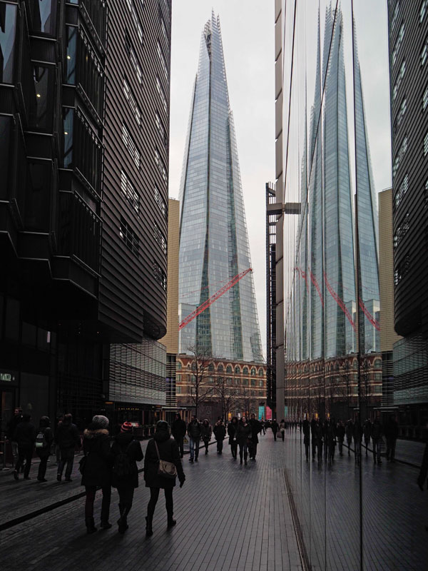
The same is true of the the Shard, currently the tallest building in London. When seen from my car on the M11 where it passes over the hills north of London the Shard appears to tower over most of the tall buildings of the city, its distinctive, pointed shape catching the eye. However, from within the city its relative height seems less - at least to my eye. With the Shard I think there is another factor at work: the tapering shape makes it less massive in fact and in appearance when you are nearby. I photographed this building at reasonably regular intervals as it was being built, and took a few shots from the location of today's image (the ludicrously named More London). This recent shot was prompted by the silhouettes of people in the canyon-like cleft that frames the Shard, and also the bright red crane stretched across it. Building in London never stops and a recent news article pointed out that there are currently 436 tall buildings (over 20 storeys) in the pipeline for the capital of which 233 have planning approval.

photograph and text © Tony Boughen

Photo Title:  The Shard Seen From More London, London
Camera: Olympus E-M10
Mode: Aperture Priority
Focal Length: 14mm (28mm - 35mm equiv.)
F No: f5.6
Shutter Speed: 1/250 sec
ISO:200
Exposure Compensation: -0.3 EV
Image Stabilisation: On

Sunday, March 13, 2016

Vespa GTS 300

click photo to enlarge
My interest in scooters began and ended with one that I used to push along with my foot, up and down the hills of my home-town as an eight year old. Even today, if someone says "scooter" I think of the child's plaything rather than the chrome, curves and pop-pop-pop of the sub-motorcycle (or is the step above the bicycle?)

Scooters of the lightweight, folding variety, with skateboard-size wheels, have enjoyed a popularity with children and youths for a number of years. These modern incarnations of the type I knew (in those days by manufacturers such as Triang - today by myriad companies) look like fun. Which is more than I can say about the motorised scooter of today's photograph. I'm sure many would disagree with me on this point, seeing style, convenience and relatively inexpensive transport that can be used wearing work clothes rather than leathers.

So why, you may be wondering, am I photographing something in which I have little interest. The answer lies in the colours, the tactile qualities of the shiny metal, and the way its curves are framed by the yellow, angular lines of the car park. Without its surroundings I wouldn't have photographed this scooter, nor would I have given it a slight vignette to emphasise it in its setting.

photograph and text © Tony Boughen

Photo Title: Vespa GTS 300
Camera: Olympus E-M10
Mode: Aperture Priority
Focal Length: 45mm (90mm - 35mm equiv.)
F No: f5.6
Shutter Speed: 1/320 sec
ISO:200
Exposure Compensation: -0.3 EV
Image Stabilisation: On

Tuesday, March 08, 2016

Photographing staircases

click photo to enlarge
Photographers seem drawn to photographing staircases in the way that painters paint bowls of fruit, and perhaps for similar reasons - it is a very three-dimensional subject depicted in two dimensions. Architects put a lot of work into staircases and over the centuries have come up with many variations, some ornate, others utilitarian. The wrongly named spiral staircase (they are almost always helicoidal) must take the prize for the most photographed design, and I've taken my share of examples of both elaborate and simple construction.

Any staircase that involves a change of direction (called in this instance a "return") gives a photographer a strong set of lines and a visual route through an image, and this must lie at the centre of its attraction as a subject. Handrails, balusters, newel posts, wall stringers, lighting etc add further elements though the most important is often people using the staircase. Today's example was taken in a relatively dark staircase at Tate Modern in London. Here I liked the contrast of the flat dark areas and the subtly shaded lighter areas as well as the line created by the lighting under the handrail and the fact that the colour palette is nearly all in the area of browns and beiges.

photograph and text © Tony Boughen

Photo Title: Staircase, Tate Modern, London
Camera: Olympus E-M10
Mode: Aperture Priority
Focal Length: 14mm (28mm - 35mm equiv.)
F No: f5.6
Shutter Speed: 1/30 sec
ISO:6400
Exposure Compensation: -0.3 EV
Image Stabilisation: On

Sunday, March 06, 2016

Chromorama, 5 Broadgate, London

click photo to enlarge
In a recent post I remarked how architects who build sharp, angular buildings frequently seek the soft, wayward, natural counterpoint of trees and shrubs. The architectural firm of MAKE and its leader Ken Shuttleworth seem of that persuasion. Today's photograph shows the building at 5 Broadgate, London, with its rigidly etched verticals and horizontals broken by the scribble of the branches of a nearby tree.

But this photograph also shows the other accompaniment that is today the de rigeur addition to expensive offices - sculpture. The Broadgate website describes this piece, "Chromorama" by the London-based artist, David Batchelor, as "totemic" - which it isn't. That word means the mark, badge or totem of a tribe, and by extension a group. Unless the brightly coloured matchbox-like shapes (that illuminate at night) represent bundles of money, then I don't see it being totemic. I think they mean "like a totem pole", and certainly that image came to my mind the instant I saw it. As a piece of sculpture I don't care greatly for Chromorama. But, as a loud burst of colour in a space overwhelmingly steel grey with blue glass highlights, it is a welcome presence.

photograph and text © Tony Boughen

Photo Title: Chromorama, 5 Broadgate, London
Camera: Olympus E-M10
Mode: Aperture Priority
Focal Length: 20mm (40mm - 35mm equiv.)
F No: f5.6
Shutter Speed: 1/320 sec
ISO:200
Exposure Compensation: -0.3 EV
Image Stabilisation: On

Friday, March 04, 2016

Number 5

click photo to enlarge
About seven years ago I took a photograph in which the most important element was a small number 9, and so that became the title of the accompanying written "reflection" which was about the track of that title on the "White Album" by the Beatles.

No such strong association leaps to mind when I consider the number 5, though I am reminded of reading that the Roman "V" (five) comes from the shape made by the hand with four fingers together and the thumb separate. In fact what is prompted by this massive number 5 on the wall of 5 Broadgate, a massive new tower that will hold six UBS trading floors in London, is the thought of how dystopian it looks. It dwarfs people, appears to be the product of a machine rather than humans, and imposes itself on passers-by in a way that few such numbers do. The whole building is clad in the same stainless steel panels, sharp angular shapes and windows breaking the perfection of the surface. It will be interesting to see how perfect it looks after several years of English weather.The building is an enormous "lump" that overall is a poor contribution to the locality but which has some interesting details that drew my camera.

I took a quick shot of a passer-by to give scale to the enormous number. Unfortunately I framed it badly and the feet of the person got chopped off. We waited for someone else to come along but, after a few minutes no one had come along and so I asked my wife to walk by.

photograph and text © Tony Boughen

Photo Title: 5 Broadgate, London
Camera: Olympus E-M10
Mode: Aperture Priority
Focal Length: 29mm (58mm - 35mm equiv.)
F No: f5.6
Shutter Speed: 1/100 sec
ISO:200
Exposure Compensation: -0.3 EV
Image Stabilisation: On

Wednesday, March 02, 2016

Chairs, posteriors and primary colours

click photo to enlarge
What are the chances that anyone who buys and sets up cafe chairs that are red, blue and yellow will choose a centre-piece for each table that isn't green? Very slim I'd say because those four colours (sometimes its three of them) are presented to us as a group so often they seem to be a natural combination. I've done no research on this matter, but it seems to me that this wasn't the case until the revolution in art, printing and design of the early twentieth century. Before that time colours were often more subdued, or where bright were used sparingly as highlights, or were more subtle. Today the colours are almost mandatory in children's toys and are frequently seen in graphic design, architecture, packaging, even beach huts - and much else.

Consequently it came as no surprise to find a cafe in Old Spitalfields Market in London where the owner had chosen red, blue and yellow chairs, or that the table decoration was a pot of green leaves. Nor was it surprising that the designer of the chairs had taken little account of the human form in his choice of shape and materials. However, none of that dissuaded me from thinking that the scene might produce an interesting photograph.

photograph and text © Tony Boughen

Photo Title: Market Cafe Chairs, London
Camera: Olympus E-M10
Mode: Aperture Priority
Focal Length: 47mm (94mm - 35mm equiv.)
F No: f5.6
Shutter Speed: 1/100 sec
ISO:1250
Exposure Compensation: -0.3 EV
Image Stabilisation: On