Friday, April 25, 2014

Landscapes - with or without people?

click photo to enlarge
Very little early landscape painting, for example that of ancient Greece or China, showed only natural features. It was much more usual for such work to, somewhere, often in a fairly insignificant way, include buildings or a human figure. As the genre developed down the centuries the place of people in landscape paintings persisted. Artists knew that the inclusion of a figure changed the meaning of the work, gave scale to the depiction and offered a powerful focal point. The fact is, if the human form is present in a work the eye finds it extremely quickly. Only in the work of later painters, and in photographic landscapes, is it common to find work where no human figure is present.

When it comes to landscape photography I often like to include a person somewhere. Frequently I choose the foreground to give the eye a starting point. But I also see the value of a person in the middle-ground or background for establishing a sense of scale. When I was photographing this stand of cedars in the arboretum at Eastnor castle, Herefordshire, I deliberately took one shot without people and one with people to illustrate just that point.

Cedars are not native to Britain. These examples were planted by Victorian collectors and they are widely regarded as the best group and some of the biggest specimens on these islands. For that reason alone I can justify the inclusion of people for the purpose of scale. When you view the photograph without figures it's hard to appreciate the width and height of those big tree trunks.

photograph and text © Tony Boughen

Photo 1
Camera: Nikon D5300
Mode: Aperture Priority
Focal Length: 42mm (63mm - 35mm equiv.)
F No: f7.1
Shutter Speed: 1/60 sec
ISO:250
Exposure Compensation: 0 EV
Image Stabilisation: On

Wednesday, April 23, 2014

Same lane, different lighting

click photo to enlarge
One of my regular visits to Lebury in Herefordshire coincided with a bout of minor illness and so my photographic foraging in the area wasn't as productive as it sometimes can be. However, my morning walk to collect my newspaper took me, as it always does, past the entry to Church Lane. So, when I'd collected my "Guardian" I went the few yards back on my route to take some photographs.

Anyone remembering my photographs of this narrow, pedestrians-only, lane that I took in February of this year might wonder what else there is to glean from the location. However, I've always believed that light, time of day, season and weather can make sufficient difference for anywhere to be worth photographing on several occasions. Here, I first took a shot that was compositionally as close as I could get it to the main photograph from my earlier attempt. Then I went back down to the entrance to the lane and took the view from the bollards up to the distant church spire. Late April's early morning light, combined with the position of the sun just to the right of straight ahead, made all the difference. So too did the dynamic range of the Nikon which I'm finding to be pretty good.

photograph and text © Tony Boughen

Photo 1
Camera: Nikon D5300
Mode: Aperture Priority
Focal Length: 27mm (40mm - 35mm equiv.)
F No: f7.1
Shutter Speed: 1/200 sec
ISO:100
Exposure Compensation: 0 EV
Image Stabilisation: On

Sunday, April 20, 2014

Is grey the new magnolia?

click photo to enlarge
I ask the question posed in the title not because I'm some sort of fashion sage or guru, or an arbiter of taste, or an expert on interior or urban design. No, what prompts my question is an article that I read in The Guardian entitled, "From Apple products to DIY and fashion: how grey became the colour of the decade."The author of the piece describes the colour as embodying "the spirit of the post-boom era", hard-wearing and practical. She goes on to note its presence, even ascendance, in clothing fashions, interior walls and on doors, in upholstery, sports wear, nail varnish, office and domestic equipment and much else. It is seen to be smart, elegant, neutral and a good complement to other colours.

I have noticed a slight resurgence in the use of grey but not the all-conquering shift suggested in the article. Perhap I'm not persuaded by her argument, in part, because we used it on some internal wall in the mid-1970s, and I've noticed it being used reasonably regularly since that time. But, I have seen the "tide of green paint" (particularly the sage variety) that I blogged about a while ago watered down by shades of grey that are used in similar circumstances by the same demographic. And I've seen and enjoyed its use in architecture, particularly on facades (see above). But, as for choosing grey because it fits the "spirit of the post-boom era": well, that's a stretch too far for me. It makes as much sense to suggest that it's part of the search for the new magnolia, a need for a change in the backdrop of living rooms, a colour against which other points of colour display well. Black, white, cream and grey serve this purpose especially well. This well-known among the photographic fraternity. Card mounts around photographs often feature one of these colours. Photographers who use Photoshop or one of its equivalents also appreciate the value of a mid to dark grey background against which to display digital images. In fact, why do you think I chose the colours I did for this blog!?

photograph and text © Tony Boughen

Camera: Sony RX100
Mode: Aperture Priority
Focal Length: 28.5mm (77mm - 35mm equiv.)
F No: f5
Shutter Speed: 1/1250 sec
ISO:125
Exposure Compensation: -0.3 EV
Image Stabilisation: On

Friday, April 18, 2014

Out to pasture

click photo to enlarge
In my working life I had an interesting but demanding job that made ever more claims upon my time as I progressed up the hierarchy. Consequently, when I decided I would retire one of the major attractions of ceasing regular, paid work was that all that time would be returned to me to do with as I pleased. And so it proved. I've never been a person who has been unable to fill their time, I've never complained of being bored, and I've always had things to do. Retirement gave me the opportunity to pursue my interests, things that formerly I'd dipped in and out of or had neglected.

However, to my surprise I found that complete release from the pressures associated with paid work didn't quite suit me. The fact is I like having to deliver within a specified  time-frame and having a full and busy life. Consequently I have expanded what one of my sons calls the "community activism" side of my life because it offers me those pressures that I missed. But, one of the lessons you learn in life is that upsides often have, somewhere or other, downsides. In this instance the downside is the reduction in time available to devote to photography and this blog in particular. In the past circumstance has caused me to cease posting or reduce my frequency, and I've reached that point again. I'm not stopping, but I won't be maintaining my alternate days schedule.

I chose the title of today's post to fit in with what I have to say in the post, not that I particularly feel "out to pasture", but that is one of the ways that retirement is sometimes characterised. I saw these horses as I drove past them. I walked back to get these photographs showing them fringed by light from the lowish sun.

photograph and text © Tony Boughen

Camera: Nikon D5300
Mode: Aperture Priority
Focal Length: 38mm (57mm - 35mm equiv.)
F No: f8
Shutter Speed: 1/320 sec
ISO:100
Exposure Compensation: 0 EV
Image Stabilisation: On

Tuesday, April 15, 2014

Photographing St Botolph

click photo to enlarge
A shopping expedition to Boston, Lincolnshire, when the day's appearance said spring, but the air temperature and wind said the end of winter, found me, not for the first time, pointing my compact camera at the tower of the medieval parish church of St Botolph. And what a tower it is. Many towns and cities are defined and remembered by a noteworthy building and as far as Boston goes this is the one. As I've mentioned elsewhere it is also known by the nickname, "The Stump". Its tower is an oddity of Gothic architecture. The medieval masons started building upwards and just kept on going. When you look at the layers that are piled one on the other it appears that a spire may have been contemplated at one point but then they rejected that conventional topping to the tower. Up and up it went until finally they decided to top it with a pierced, octagonal lantern.

Since that time "The Stump"
has been synonymous with the town, a beacon for ships approaching the port and a marker for weary travellers crossing the flat Fenland hinterland. When you walk around the town the tower rises above the roof tops allowing you to orientate yourself. Only when you go into the market place or nearby across the River Witham do the nave and chancel, themselves almost of cathedral scale but small relative to the tower, make an appearance. The classic photograph of St Botolph is from the town bridge. The appearance of a new "bow-string" design footbridge has changed that view somewhat and on my recent visit to the town I took a shot of the bridge and the tower, though not from the town bridge. Another photograph that suggested itself to me was the tower rising from the blossom of a cherry tree that grows in the lawned precinct immediately adjoining the church. However, the shot I took on Church Street, a location where I've photographed before, is the one I like best. It has the name of a pub - The Britannia - and a couple of promotional union flags, in the foreground, with the tower beyond. I liked the contrast of the bright red with the distant stonework.

photograph and text © Tony Boughen


Camera: Sony RX100
Mode: Aperture Priority
Focal Length: 28.5mm (77mm - 35mm equiv.)
F No: f5
Shutter Speed: 1/1250 sec
ISO:125
Exposure Compensation: -0.3 EV
Image Stabilisation: On

Sunday, April 13, 2014

Establishment graffiti

click photo to enlarge
The meaning of the word "graffito" has become modified in the past fifty or so years. During the first half of the twentieth century it had two meanings. The Oxford English Dictionary quotes this as the definitions first recorded in 1851:  "A drawing or writing scratched on a wall or other surface; a scribbling on an ancient wall, as those at Pompeii and Rome. Also, a method of decoration in which designs are produced by scratches through a superficial layer of plaster, glazing, etc., revealing a ground of different colour". The latter applied mainly to pottery.

However, the newer meaning, with a citation of use dating back to a Chicago newspaper in 1967 is: "Words or images marked (illegally) in a public place, esp. using aerosol paint." At that time the singular tended to drop out of use and the plural now tended to serve for all references. The key word in the newer definition is "illegal". From that time onwards the illegality of the growing amount of graffiti, particularly when "tagging" arose, became one of its defining features and was what turned most people against it. Graffiti became "underground" and anti-establishment.

But, the establishment has a long record of absorbing anti-establishment movements and making them mainstream. From the Beat poets to punk rock businesses have seen such trends as new ways to make money. It has happened with graffiti too. Works by graffiti artists now appear in galleries. Public spaces, such as the skate-boarders meeting place on London's South Bank, are made available and a blind eye is turned to spray painting. And, as today's photograph shows, advertising has appropriated graffiti-style illustration now that it is no longer solely associated with urban grime and illegality. This example is part of a wall in a passage in St Neots, Cambridgeshire, that leads to a printing business's establishment.

My view on graffiti has changed with the prevailing tide. I still abhor illegally daubed tags and even well-done painting if it is done without the owner's permission. But I can see interest and innovation in some of the graffiti that I come across and I have been motivated to photograph it - see here and here.

photograph and text © Tony Boughen

Camera: Canon 5DMk2
Mode: Aperture Priority
Focal Length: 24mm
F No: f7.1
Shutter Speed: 1/25
ISO: 320
Exposure Compensation:  0 EV
Image Stabilisation: On

Friday, April 11, 2014

Viola "Magnifico"

click photo to enlarge
"There is material enough in a single flower for the ornament of a score of cathedrals."
John Ruskin (1819-1900), art critic, social thinker and writer, from "The Stones of Venice" (1851)

We are used to flowers because they are all around us - in the countryside, in urban wasteland, in our gardens, parks, streets, shops, houses - everywhere. We look at them often. But do we see them? There are those that say there is no distinction between the two words, "looking" and "seeing". I think there is, and five or so years ago I tried to articulate that difference in a blog post called, "Looking and seeing".

The quotation at the top of this post has always interested me. What was Ruskin trying to get at with these words? I've always thought that he had two main points in mind. Firstly, perhaps, there's a veiled criticism of the fecundity of building ornament of his time: too many sources of inspiration where one or few would serve better. That architects should extract more from less when searching for ornamental design. Then, more importantly, is the suggestion that people should train themselves to look more closely - to see better - so that the richness of objects and the possibilities within them become more apparent.

Looking at today's photographs of the flower, Viola "Magnifico", I was reminded of Ruskin's words. It's true that you can see a multitude of points of interest in a single bloom. Here I like the colour combinations and the way each bleeds into its neighbour. The symmetry of the petal arrangement, their deckle edges and the striking markings of the centre of each bloom are also eye-catching. Then I like the way the flowers look like they have been designed by someone with wet water-colour paper and a heavily laden brush. And finally there is how the distant blooms and the leaves merge in the blur to enhance that suggestion that this is a painting and not a photograph.

photograph and text © Tony Boughen

Camera: Canon 5DMk2
Mode: Aperture Priority
Focal Length: 100mm Macro
F No: f4
Shutter Speed: 1/250
ISO: 100
Exposure Compensation:  0
Image Stabilisation: On

Wednesday, April 09, 2014

Old farm silos and the Nikon D5300

click photo to enlarge
For the past few years my photography has involved the use of a Canon 5D Mk2 and a Sony RX100. The Canon I chose for its reliability and versatility and it has given me that, courtesy of a very capable body and four high quality lenses. However, it's heavy. And I'm not getting any younger. Hence, I bought the Sony for its mixture of compact form and pretty good quality to use as the "always with me" camera, the one to be taken when we're shopping or out and about without photography specifically in mind. I also thought it would be useful when we do long walks or visit cities such as London. For the latter purpose it is excellent; it's unobtrusive and the 28-100mm (35mm equiv.) focal length lens suits my photography fine in the streets and parks of the city. However, when it comes to walking in the countryside of, say, the Yorkshire Dales or the Lincolnshire Wolds, on the Fens or even by the sea, its maximum focal length has proved somewhat limiting.

Consequently, at the end of last year I bought what I thought would be a reasonably small and light,  "in-between" camera with a versatile lens - the Panasonic G6 with the 14-140mm (28-280mm 35mm equiv.) lens. I got it at a good price and began to use it. Within a couple of days I realised this was not the camera for me. Why? Well, at quite commonly used focal lengths and shutter speeds it would not produce sharp images when using the mechanical shutter. It has an electronic shutter too and that always produced sharp images but at the cost of restricted usability. The problem was "shutter shock", an issue that has affected a number of mirrorless cameras. It is caused by the way a camera without a flip-up mirror cocks the shutter and introduces vibrations just before the shutter fires and makes the exposure. This seems to be a particular issue with this specific body and lens, though my letter to Panasonic resulted in no acknowledgement of the issue; this despite the fact that quite a number of photographers have reported the same problem. The fact that the body was so small and designed with quite a few buttons that I kept inadvertently hitting was also a problem, but one I would have persevered with. Blurred shots I wouldn't countenance, and so the camera was returned to the seller.

My response to this was to buy a Nikon D5300 with the 18-140mm lens (27-210mm 35mm equiv.). The size of this camera is approximately the same as the Olympus E510, the camera that I've had most pleasure out of in the past ten years. It's heavier than the Panasonic (and much heavier than the Sony), but quite a bit lighter than the Canon. You might wonder why an enthusiast wouldn't choose the Nikon D7100 or a mid-priced Canon to make use of my existing lenses. The answer is - weight, and a curiosity to try another brand. Moreover, I intend to restrict this camera to one lens only, so if I had chosen a Canon I'd still have to buy a lighter EF-S lens and so there would be no real saving.

Today's photograph is an example of the output of the Nikon. I'm quite happy with the camera which, incidentally, seems to have the same sensor as all Nikon's newer APS-C DSLRs regardless of price.

photograph and text © Tony Boughen

Camera: Nikon D5300
Mode: Aperture Priority
Focal Length: 38mm (57mm - 35mm equiv.)
F No: f8
Shutter Speed: 1/320 sec
ISO:100
Exposure Compensation: 0 EV
Image Stabilisation: On

Monday, April 07, 2014

Cutty Sark and the Carbuncle Cup

click photo to enlarge
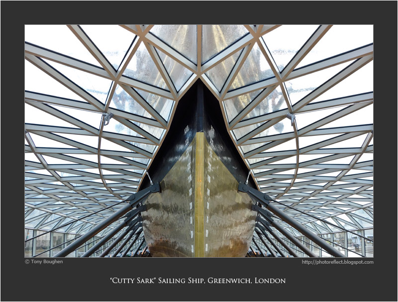
Two years ago the Cutty Sark visitor centre opened to the public. It was built following a fire in 2007 that seriously damaged the old sailing ship. The Cutty Sark is one of the best known and loved of Britain's nineteenth century sailing ships. It was built by Scott & Linton on the Clyde in 1869, one of the last tea clippers to be built and one of the fastest too. The opening of the Suez Canal and the advent of steam ships meant that the work for which it was built soon ended and the carrying of wool from Australia became her main task.

The new visitor centre tells the story of the venerable vessel and is designed to do it in a way that is more commodious for the paying customers. Before the fire the ship rested in a dry dock. However Grimshaw Architects were tasked with making a centre that included more under-cover areas. The answer they came up with is ingenious but not universally liked. A wrap-around latticework of glass and metal forming a wall, roof and entrance, combined with steel supports that raise the ship off the floor of the dry dock, allow the area beneath the ship to become a large indoor space with exhibitions, offices and a cafe. Lifts and stairs allow access to different levels of the dock and ship. The inside and deck of the ship is open to the public in the same way that it always was.

Clearly there are benefits to the display of the ship by having the new covered space. However, there is one very big disadvantage that critics have seized on and that is that the ship as a whole cannot be seen in one view - the top and bottom can only be viewed separately. This prevents the beautiful, sleek lines of the Cutty Sark from being seen, and it is this, as much as anything else that has provoked an intense dislike of the new facilities. In fact, so widespread is the disapproval of the visitor centre - it has been likened to a bus shelter! - that it was the recipient of the Carbuncle Cup in 2012. This award, made by the magazine, "Building Design", is for the "the ugliest building in the United Kingdom completed in the last 12 months". I think the building has serious drawbacks but I'm not entirely sure it deserved such disapprobation. Why? Well, the space created beneath ship is quite spectacular, and though it doesn't make up for the loss of a complete view of the ship, is enough I think to disqualify the project from consideration for UK architecture's "unaward".

photograph and text © Tony Boughen

Photo 1
Camera: Sony RX100
Mode: Aperture Priority
Focal Length: 10.4mm (28mm - 35mm equiv.)
F No: f6.3
Shutter Speed: 1/30 sec
ISO:640
Exposure Compensation: -0.3 EV
Image Stabilisation: On

Saturday, April 05, 2014

Photographic trickery

click photo to enlarge
Trickery has been a part of photography ever since the invention of the medium, and certainly entertained the Victorians. In twentieth century England the Cottingley Fairies became a celebrated example of the art. In fact, the five photographs that cousins Elsie Wright and Frances Griffiths took in 1917 were so good that they convinced many that the "the little people" were real and not a product of the story teller's art. The author of "Sherlock Holmes", Arthur Conan Doyle, a confirmed spiritualist, saw them as a genuine example of a psychic phenomenon. Not until the 1983 did the cousins admit that they had faked the photographs.

Today the "selfie" is all conquering, but there was a time when people experimented making illusionistic photographs. A person in the foreground positioned and standing so that they appeared to be holding up a bridge or the moon, people adopting the "Harry Worth" position at the corner of a shop window, and car hub caps tossed in air to be passed off as flying saucers, were all popular subjects.

On a recent walk on the Lincolnshire Wolds I saw a sight that I just had to photograph for the illusion that it suggested. Looking across some fields and trees I saw what appeared to be a rocket shortly after blast-off, rising out of a massive cloud of smoke of its own making. What I was seeing in reality was the top of the Belmont TV transmission mast, a slender structure 1,154 feet (351 metres) tall, firmly braced by cables, from which the signal to my TV (and the TVs of many others!) is broadcast. It was sticking up out of one of the banks of mist and cloud that periodically blanked then revealed the sun as we set off on our walk. Looking at the "rocket" I recalled that the date was 1st April.

photograph and text © Tony Boughen

Camera: Nikon D5300
Mode: Aperture Priority
Focal Length: 52mm (78mm - 35mm equiv.)
F No: f8
Shutter Speed: 1/400 sec
ISO:100
Exposure Compensation: 0 EV
Image Stabilisation: On

Thursday, April 03, 2014

Changing tastes and flowering currants

click photo to enlarge
It's interesting how, as you journey through life, your tastes change. Not all of them, of course, but enough for you to notice that what was once loathed is now loved, and vice versa - what couldn't be countenanced now can. I became aware of a couple of examples of my changing tastes recently. The first was when I was talking to my two year old grand-daughter. She was eating her evening meal, a dish that included cucumber. As she chomped away I told her something that, with hindsight, was probably best left unsaid. I mentioned that I didn't like cucumber; that when I was younger I did like it, but now it was something I avoided. Given that she is trying many foods for the first time and putting her off particular types is inadvisable it would have been better if I'd said nothing. Fortunately, however, she was having none of it and told me in no uncertain terms, and repeatedly, that "cucumber is nice". Apparently she later quizzed her mother with great incredulity about my dislike of this lovely food. Clearly her grandfather was mad. But, the fact is, as I've aged I've gone off cucumber.

The opposite is true of flowering currant (Ribes sanguineum). Like many people I wasn't keen on the strong and distinctive smell of this early flowering shrub. Nor did I appreciate the colour combination of pink petals and green leaves. But, in recent years I've grown to appreciate the plant. I enjoy the contribution that it makes to the garden in early spring, both visually and in terms of its scent. In fact, the other day one of our bushes looked so magnificent that I took a couple of photographs of it in all its splendour. The example I post is the shot I liked best.

The interesting question is why tastes change in this way. I have no clear answer, except I do wonder if those initial likes and dislikes were ever firmly founded. Whether my liking of cucumber and dislike of flowering currant was nothing more than youthful postures adopted for the flimsiest of reasons - because I'd heard someone else express a liking or dislike.

photograph and text © Tony Boughen

Camera: Canon 5DMk2
Mode: Aperture Priority
Focal Length: 100mm Macro
F No: f4
Shutter Speed: 1/160
ISO: 100
Exposure Compensation:  0
Image Stabilisation: On

Tuesday, April 01, 2014

Jogging, urban and rural

click photo to enlarge
An east wind meant the weather was warm but misty on our monthly trip over the Humber Bridge to East Yorkshire to see an elderly family member. Consequently we didn't stray too far from our route on the way back, deciding to take a stroll to the centre of the large suspension bridge both for exercise and as a photo gathering opportunity. However, the mist was too dense for anything startling by way of landscapes so I turned my attention to people enjoying the spring warmth on the bridge footpath. I snapped a few cyclists and people looking through the pay-per-view telescope. Then this jogger in his day-glow orange top appeared. I photographed him coming towards us and after he'd passed by. The latter shot is the best one in terms of composition and colour, the bright, eye-searing vest contrasting nicely with the muted tones of the bridge superstructure.

I was pleased to see this jogger here, not only for selfish, photographic reasons, but because jogging in urban or man-made surroundings seems to me so much better than in the countryside or on hills and mountains. Many won't agree - in fact, will strongly disagree - with that sentiment. My view is that, on a relatively small, densely populated island such as ours, we should venture into such areas in a sensitive manner - walking is best (though see my thoughts on this too!!) - rather than insensitively by jogging. I've seen too many upland footpaths, bridleways and lanes carved up by joggers (and mountain bikers, motorbikes and 4X4s) to believe that such intrusions have little or no adverse impact. When I'm in London joggers are ever-present in daylight hours on the Thames-side paths and roads. Their presence on these routes, it seems to me, gives those involved all the physical and mental benefits that they seek without the collateral damage that is inflicted on upland and countryside land and wildlife by those who take their energetic exercise in such places.

photograph and text © Tony Boughen

Camera: Nikon D5300
Mode: Aperture Priority
Focal Length: 120mm (180mm - 35mm equiv.)
F No: f8
Shutter Speed: 1/200 sec
ISO:100
Exposure Compensation: 0 EV
Image Stabilisation: On

Sunday, March 30, 2014

Redundant churches

click photo to enlarge
What should happen to a church when it is no longer required for the purpose for which it was built? In general people like to see a community use for the building continuing. If it is of particular historic or architectural significance, or simply very old, then The Churches Conservation Trust can sometimes step in and keep the fabric in reasonable condition and ensure it remains open to visitors. In rural areas where alternate uses are unlikely this is a favoured option. But in towns and cities, especially with less distinguished churches, often of the Victorian era, a range of options become available. I've seen churches turned into community centres, cafes for charities, public museums, art galleries and concert venues. Local people feel fairly comfortable with a church being used for this kind of purpose. However, I've also seen them used commercially as antique shops, recording studios, carpet showrooms, and the premises of an electrical contractor. Such uses generally find less favour though are often deemed better than demolition.

The church of St Michael in Stamford, Lincolnshire, was declared redundant in 1974. Because of its prime location on the High Street, the town's main shopping street, in 1982 it suffered the indignity of having a row of shops inserted in the street-facing elevation. Large, plate glass windows and doors were punched in the walls between the buttresses, each leading into boxes that were created filling the width of the church. Pevsner describes it as "an unsympathetic use and an appalling conversion" but recognises that it "has preserved the shell of the building almost intact." And there is the dichotomy. If the main shell remains and the building continues to look, more or less, like a church, a commercial use, with its obvious drawbacks, is often the only solution.

All that being said, you will understand why my photograph doesn't show the side of the church but concentrates on the east elevation and the west tower. St Michael is very typical of its date, 1835-6. The architect chose the Early English style of English Gothic but uses the details in a quite unhistorical way. Ten years later, after Pugin's influence had spread, this building would have looked much more authentic. As it is, the tower pinnacles are typically too tall, the blank arcades, trefoils and lancets are used slightly differently from what was common in the thirteenth century, and the ashlar is too smooth. However, that latter inconsistency does make for razor-sharp shadows on a clear spring day and it was that feature that prompted my photograph.

photograph and text © Tony Boughen

Camera: Nikon D5300
Mode: Aperture Priority
Focal Length: 45mm (67mm - 35mm equiv.)
F No: f8
Shutter Speed: 1/500 sec
ISO:100
Exposure Compensation: -0.3 EV
Image Stabilisation: On

Friday, March 28, 2014

Wind turbine repairs

click photo to enlarge
There's nothing secluded or furtive about the generation of electricity by wind turbines. Not only are the windmills themselves very tall, white, often in groups and consequently visible for miles, they also move and so the eye can't help but notice them. And it's those eye-catching qualities that, in the main, cause them to be unpopular. I say "in the main" because there is a significant minority who like them not only for what they do - the generation of "greener" energy - but also for what they are. Such people see beauty, elegance and the future in these tall machines.

However, one characteristic of all machines, be they traditional or leading edge, is their capacity to fail, to break down and to require repair and maintenance. You can often see individual turbines completely still, looking like a sullen schoolboy who hasn't been allowed to join the game, facing a completely different direction from that of its companions. These are frequently accompanied by a white van parked at the base and an open door in the column signifying the presence of an engineer. Given the conspicuousness of wind turbines it follows that when any work is being done on them, it is obvious for all to see, and not just in the form of the van. I posted a photograph last year of workmen abseiling down the blades of a turbine as they went about their repair work

The other day we saw across the fields a large crane next to a turbine and immediately knew it was receiving care and attention. On the following day I went to see what was going on and heard that a gearbox had been replaced. The crane that is capable of reaching the hub of one of these monsters was moving objects about on the ground in preparation for more work so I wasn't able to photograph it at its full height. But, I did get a distant shot of it at work. I also took a photograph of  a couple of men busy on the nacelle. As I drove home I reflected that repairing wind turbines isn't the sort of work I'd like to be involved in. The views must be great but the wind, the rain and not least the height and precariousness of your workplace are not to be envied.

photograph and text © Tony Boughen

Photo 1
Camera: Nikon D5300
Mode: Aperture Priority
Focal Length: 140mm (210mm - 35mm equiv.) (heavy crop)
F No: f8
Shutter Speed: 1/500 sec
ISO:100
Exposure Compensation: 0 EV
Image Stabilisation: On

Wednesday, March 26, 2014

Gibbs surrounds

click photo to enlarge
It is said that examples of rusticated walls - where the joints between stone blocks are cut back and emphasised - can be found in Roman architecture. If that is the case then they aren't too common. However, in Renaissance architecture rustication of this sort, rustication applied to columns, window surrounds, quoins etc are commonplace. The word "rustication" derives from the same root as "rustic" and means rough and rural, or unsophisticated. In Italian and European Renaissance architecture in general, as well as the nineteenth and twentieth century revivals of the style, it is frequently seen applied to the ground floor of a building with the first floor (piano nobile) and above invariably faced with smoother ashlar.

Renaissance architects delighted in applying new variations of rustication to buildings. English Georgian architects used it prolifically too. Today's photograph shows a doorway and some windows of 67 High Street St Martin's in Stamford, Lincolnshire, one of a pair of very similar houses dating from around 1740. Here the rustication is in block form and applied to the architraves on either side of the door and windows and to the key-stoned lintels. In England this treatment is often termed a "Gibbs surround" after the architect, James Gibbs (1682-1754), who popularised the style here.

We arrived in Stamford a little earlier in the day than is usually the case, and the lower sun combined with a clear, blue sky showed the crisp shadows created by the rustication off to great effect. As I framed my shot I reflected that  decorative elements raised above the mass of the smooth stonework of the wall, that were designed to work well with sharp Mediterranean light, worked equally well in the light of a cold, clear English spring.

photograph and text © Tony Boughen

Camera: Nikon D5300
Mode: Aperture Priority
Focal Length: 32mm (48mm - 35mm equiv.)
F No: f8
Shutter Speed: 1/200 sec
ISO:100
Exposure Compensation: -0.3 EV
Image Stabilisation: On

Monday, March 24, 2014

Bad habits and serendipity

click photo to enlarge
One of my bad habits when I was working was occasionally eating my lunch at my desk. As bad habits go it's not particularly awful but it did have an unfortunate consequence. My computer keyboard, over time, became sticky and a little grubby from the unintentional spray of juice from my oranges. Now that I am retired I never eat at my desk, I'm almost always at a dining table, and my keyboard remains free of food liquids and solids. However, since my retirement tablet computers have made an appearance and unfortunately I've developed a different bad habit - often reading my tablet as I eat my lunch.

Recently, as I was indulging my predilection, an arc of juice from my orange traced a path through the air and landed on the screen. And, before I wiped it off, I noticed how each drop of juice acted as a convex lens on the pixels and picture displayed beneath it. I made a mental note to reproduce that effect with water and a dropper to see if I could make an interesting photograph of this serendipitous phenomenon. The other day I had a go and, interestingly serendipity extended the range of images that I took from the experiment.

The effect I was initially looking for is exemplified best in the photograph labelled number 2. The grid of pixels is warped by the droplets of water in the way that I saw with the juice from my orange. An interesting additional feature is a bubble in the centre droplet. But, as is often the way, as I moved the camera and re-focused the macro lens, I got a quite different and unexpected view of the droplets. The photograph labelled number 1 was taken from a lower angle with the circle of my light above. I was puzzled by the tripling in the image of each droplet but then realised it must be due to the layers in the screen each reflecting the water slightly differently. A similar effect can be seen in the main photograph (labelled number 3) and here serendipity has intervened once more because this shot is taken with no screen illumination, the power-saving feature having turned it off.

As I looked at my collection of photographs I reflected that they weren't earth shattering but they did have a certain fascination, and that it once again it derived from the macro lens showing what the unaided eye doesn't normally notice or see.


photograph and text © Tony Boughen

Photo 1
Camera: Canon 5DMk2
Mode: Aperture Priority
Focal Length: 100mm Macro
F No: f8
Shutter Speed: 1/80
ISO: 3200
Exposure Compensation:  0
Image Stabilisation: On

Saturday, March 22, 2014

Imperial measures

click photo to enlarge
When I was in primary school (age 5 to 11 years old) every exercise book we used had useful information on the back. This included a list of most of the common Imperial units of measurement. Talking to people I've discovered that this was common to most areas of the country and accounts for the fact that 1,760 and 5,280 are significant numbers for people "of a certain age" (they are the number of yards and feet in a mile). Ask anyone of this era the name for a distance of 22 yards (the length of a cricket pitch) and they will immediately rattle back, "a chain". If you are fortunate they will go on to bore you with the fact that a chain is one tenth of a furlong (itself 220 yards), the latter is one eighth of a mile, and furthermore its name derives from the distance a team of oxen would plough (a furrow long) before resting, then turning and ploughing back again. However, if you press them, most will confess scant knowledge of the rod, pole and perch, measures that were archaic or specialised by the time of the mid-twentieth century but, nonetheless appeared on the backs of those exercise books.

A unit that will most definitely be recalled is the hundredweight (112 pounds, with 20 to the ton). It was an important measure at the time, continued after the metric system was introduced in the 1970s, and is still sometimes used today. The abbreviation is easy to decipher with the "c" standing for the Roman 100. What was never made clear to me is why the extra 12 pounds is involved. In fact, it's only in recent years that I realised it is 8 stones (a stone being 14 pounds). The Oxford English Dictionary (OED) notes that over the years the hundredweight has varied between 100 and 112 pounds. The former is sometimes called the "short hundredweight" and is favoured in the United States whilst the higher figure reflects British Imperial measure and has been called the "long hundredweight".

I came across the hundredweight (cwt) when I photographed an old brass warning sign (above) that was for sale on a stall selling railway memorabilia. Fifty cwt is two and a half tons so perhaps the electric safety lift in question was designed to carry more than people - or maybe a lot of very big people! Old signs are full of character, often much less clear than modern signs, but so much more durable.

photograph and text © Tony Boughen

Camera: Sony RX100
Mode: Aperture Priority
Focal Length: 23mm (62mm - 35mm equiv.)
F No: f3.5
Shutter Speed: 1/80 sec
ISO:1600
Exposure Compensation: 0 EV
Image Stabilisation: On

Thursday, March 20, 2014

Piranesi and the London Underground

click photo to enlarge
London's "Tube", more properly known as the Underground, is an interesting place for the photographer because it is a metro system that has developed over such a long period of time and therefore offers subjects old and new. In fact, it includes the world's first underground line that was developed by the Metropolitan Railway and opened as long ago as 1863. The Underground is a system that, despite having 270 stations and 250 miles of track, is still being extended and consequently has a number of sleek, modern stations to contrast with the older structures of the nineteenth and twentieth centuries.

The other week I used a couple of these recent stations - Canada Water and Canary Wharf - both examples of what I call the "stainless steel" stations. I think of them in those terms because they feature large quantities of stainless steel alongside the inevitable concrete. However, modern and gleaming though they undoubtedly are, I also cannot help but think of them as "Piranesian". That word is an adjective especially familiar to students of the history of art and architecture. It derives from the name of Giovanni Battista Piranesi (1720-1778), an Italian etcher and engraver born near Venice. He started out as an illustrator of contemporary views, moving on to studies of the remains of ancient Rome that he drew with an obvious delight in old stonework and the contrast of Mediterranean light and shade.

However, it a series of sixteen drawings from his imagination for which posterity remembers Piranesi, works that fired the imagination of the Romantic movement and inspired a number of architects. These showed the interiors of imaginary prisons, "Carceri d'Invenzione". In high contrast he depicted gigantic stone vaults, stairs, machines, ladders, chains and ropes and crawling about these fantastic, cavernous interiors, tiny people, dwarfed by their surroundings. Looking at today's black and white photograph of the exit hall and escalators at Canary Wharf underground station you can perhaps understand how Foster + Partners' work conjures up in my mind this inspirational draughtsman's imaginings.

photograph and text © Tony Boughen

Camera: Sony RX100
Mode: Aperture Priority
Focal Length: 10.4mm (28mm - 35mm equiv.)
F No: f5.6
Shutter Speed: 1/80 sec
ISO: 125
Exposure Compensation: -0.3 EV
Image Stabilisation: On
Tuesday, March 18, 2014

Inequality

click photo to enlarge
Benjamin Disraeli (1804-1881), a man who was on two occasions the prime minister of Great Britain, once said, "There are three types of lies - lies, damned lies and statistics". One of the implications of his remark is that statistics are not only frequently untrue, but are often deliberately used falsely. And yet, statistics can be very revealing because they can quantify, and therefore clarify, that which may be hidden or obscured. When they do this the revelation that they uncover can be startling.

Yesterday my newspaper reported a statistic that not only brought me up short, but made me feel extremely uncomfortable: in fact, made me feel ashamed to be part of our society. The charity, Oxfam*, has calculated that the total wealth of the five richest British families exceeds that of the poorest 20% of the population. In other words this, handful of rich people have more money and assets than the least well-off 12.6 million Britons. Could the starkness of that contrast, the iniquity of that inequality, the shame that it brings to every politician and law maker, and to every individual voter, be made without the force of that statistic? I would encourage anyone who reads that statistic and is as appalled by it as I am, to at the very least, remember it when elections come along; to cast their vote for the party that pledges to reduce inequality; to vote for those who will ensure the rich pay a greater share of their wealth to achieve that goal; and only endorse those determined that the poor and less well-off will receive a larger share of the national income.

I was recently in Canary Wharf. Along with the City of London (the financial district not the greater metropolitan area) this is one of the two centres of finance in the UK. It exudes wealth. From the up-market eateries to the private security guards, manicured gardens and spotless streets it speaks of money. What better to represent today's post than the gleaming steel and glistening glass of two of the many banks to be found there.

* In January 2014 Oxfam also reported that the 85 richest people in the world had more wealth and assets than the poorest half of the world's population!

photograph and text © Tony Boughen

Camera: Sony RX100
Mode: Aperture Priority
Focal Length: 10.4mm (28mm - 35mm equiv.)
F No: f5.6
Shutter Speed: 1/400 sec
ISO:125
Exposure Compensation: -0.3 EV
Image Stabilisation: On

Sunday, March 16, 2014

Tattershall church, Lincolnshire

click photo to enlarge
Stand at the top of the keep of Tattershall Castle, look east-north-east, and you will see below you, a couple of hundred yards away, standing stately beyond the moat, the medieval Collegiate Church of Holy Trinity. This 186 feet long building, made of Ancaster stone, was begun twenty or so years after the keep of the castle and must have been completed before 1500. It is a fine example of the style of medieval English Gothic architecture known as Perpendicular, a form that, after the austere elegance of Early English and the exuberance of Decorated, even at the distance at which I've photographed it, comes across as rigid, repetitive and mechanical.

Today this church stands out among Lincolnshire churches of this area in being very light inside. Perpendicular churches often are because of their large, panelled windows, but here the absence of stained glass increases the brightness. It wasn't always so. Every window once shone with their jewel-like colours.However, in the mid-eighteenth century much of it was taken to the church of St Martin, in Stamford, to Burghley House (also near Stamford) and to Warwick castle. It can still be seen in each of those locations. At Tattershall there are re-assembled medieval fragments in the east window, including many full scenes. I may show some of these in a future post because some are extraordinarily interesting.

The other feature that the church is known for is bats. The flying mammals have a particular liking for the building and the congregation do their best to worship alongside the diminutive residents. There are over 500 soprano pipistrelle bats, about 120 Daubenton's bats, and sundry brown long-eared bats, Natterer's bats, common pipistrelles and Nathusius' pipistrelles. Such a large number of bats (that by law cannot be removed) produce quite a mess and one consequence is that the excellent commemorative brasses have to remain covered to prevent damage.

photograph and text © Tony Boughen

Camera: Nikon D5300
Mode: Aperture Priority
Focal Length: 26mm (39mm - 35mm equiv.)
F No: f8
Shutter Speed: 1/250 sec
ISO:100
Exposure Compensation: -0.3 EV
Image Stabilisation: On

Friday, March 14, 2014

Motion blur London nightime skyline

click photo to enlarge
Too many photographers, it seems to me, obsess about how sharp their camera/lens combination is. This is particularly prevalent among those new to photography. The fact is, very few photographs are ever judged deficient because they are not sharp enough. Sharpness is not usually one of the primary requisites for a good image. There are exceptions - macro photography and some kinds of landscape photography, for example, need sharpness to reveal the detail that contributes a lot to the final image. But most genres don't require the knife-edge sharpness that is too often thought desirable.

There's certainly a case to be made for the painterly effects produced by older lenses that exhibit a little softness. They can be useful for portraits, landscapes, flowers and many other subjects. There's also much to be said for blur caused by deliberately defocusing the subject. And then there's motion blur. I have a collection of photographs that I've put together where I've deliberately set a slow shutter speed to blur the subject (see these boots, this river and these reflected trees for example. I also have some where I've purposely moved my hands having set a slow shutter so that the image is traced across the frame. This effect can even occur serendipitously by accident.

Today's photograph is an example of the latter (purposeful) technique where I deliberately moved my hands from left right and up and down as I took the shot. It was taken at the same time as the smaller photograph on this recent post. I had an idea of what the camera might produce but only an idea - one is never entirely sure. What I didn't imagine was that it would produce such sharp motion blur!

photograph and text © Tony Boughen

Camera: Sony RX100
Mode: Aperture Priority
Focal Length: 37.1mm (100mm - 35mm equiv.)
F No: f4.9
Shutter Speed: 1.6 sec
ISO:400
Exposure Compensation: -0.3 EV
Image Stabilisation: On

Wednesday, March 12, 2014

Bright sparks and electric fences

click photo to enlarge
Is it just me that thinks its more than a little strange to protect people from the dangers of electricity by threatening to electrocute them? That's what National Grid does by erecting electric fences round their sub-stations to prevent people entering them and subjecting themselves to the danger of electric shock. I wonder which bright spark thought up that one!?

I was pondering this incongruity recently as I stood outside a Fenland sub-station with its enclosing spear-tipped palisade fence and inner electric fence, searching for a few semi-abstract photographs. I've gleaned a couple from this place before and I've learnt, over the years, that a location doesn't give up all its potential images at the first, second or even third visit. Locations change with the weather, time of day and season. People change too, with mood, recent experience, camera and focal length availability, and many other factors. These can combine and lead to a realisation that a photograph exists where before there appeared to be none. The semi-abstract nature of today's composition appealed to me. The lines of wire, circular tighteners, upright steel support and the yellow plastic (is it a warning to those inside?) against the flawless blue sky made a composition that I hadn't noticed on previous visits. The simple, subtle  and delicate arrangement must have previously been lost to my sight among all the pylons, transformers, insulators and the like.

The observant among you may have noticed that this photograph was taken with a camera that hasn't featured in this blog before. More about that soon.

photograph and text © Tony Boughen

Photo 1
Camera: Nikon D5300
Mode: Aperture Priority
Focal Length: 75mm (112mm - 35mm equiv.)
F No: f8
Shutter Speed: 1/500 sec
ISO:100
Exposure Compensation: -0.3 EV
Image Stabilisation: On

Monday, March 10, 2014

Canary Wharf at night

click photo to enlarge
This isn't the first night time photograph I've taken of the financial district of London called Canary Wharf. And it probably won't be the last. However, if you live in the Lincolnshire countryside, where the brightest light around is probably a security light on the side of a farm, then the opportunity to photograph night views with plenty of lights is one not to be missed.

There was a time when I used a tripod quite regularly, particularly when I photographed more interior church architecture than I do now. These days I reserve that kind of camera support for macro photography. I've always thought one of the best developments in camera technology in recent years has been image stabilisation (or vibration control or whatever term your manufacturer uses). A close second has been the improvement in the high ISO abilities of sensors. Put those two together and the tripod is no longer quite the necessity that it was. Even a pocket camera with a relatively small 1 inch sensor like the Sony RX100 is capable of producing pretty good images after the last light of the day has disappeared.

I had the ISO on Auto for today's shot and it chose ISO 5000 to keep the shutter speed up to 1/60 second, a necessarily high speed given the focal length was 56mm (35mm equivalent). Nonetheless, old habits die hard and I rested the camera on a handy lifebelt point for my photograph and I braced it firmly. The result is a shot that I wouldn't have thought of taking this way with this kind of camera only five years ago, and it's one that is, I think, technically pretty good.

photograph and text © Tony Boughen

Camera: Sony RX100
Mode: Aperture Priority
Focal Length: 20.6mm (56mm - 35mm equiv.)
F No: f3.5
Shutter Speed: 1/60 sec
ISO:5000
Exposure Compensation: -0.3 EV
Image Stabilisation: On

Saturday, March 08, 2014

London balcony views

click photo to enlarge
My current reading includes "21st Century London: The New Architecture" by Kenneth Powell. This interesting book, published in 2011, surveys over 150 notable buildings erected in the first decade of this century and includes a few that were under construction or planned at the time of publication. Two things immediately leap off the page at the reader; firstly the sheer number and quality of new buildings that went up in that short period of time, and secondly, the enormous amount of money that has been spent in London either building, extending or refurbishing major buildings. For example, the Royal Festival Hall refurbishment was costed at £50 million but eventually cost £110 million! The new Wembley Stadium also came in massively over its estimate at £352 million. The relatively minor Roundhouse refurbishment cost £19 million. In fact most of the projects listed in the book cost multiple millions or in excess of one hundred million pounds. The biggest outlay by far is the £16 billion currently being spent on Crossrail, the new rail links that go under the centre of the city. Sums of this magnitude dwarf the spending in other cities across the UK.

Whenever I've visited London over the past twelve years I've enjoyed this view of the centre of London from my son's balcony. And during that time the view has been constantly evolving with new, bigger and more striking buildings taking the place of older structures. Looking over the Thames at the skyline recently I took this evening photograph and noted the number of cranes and the almost completed "Cheese Grater" (left of centre) and the "Walkie Talkie" (near left edge of frame). There is more to come as the pace of change in London in recent years shows no sign of slowing down, unlike elsewhere in the country. One might wish that a significant portion of the largesse showered on our capital could be diverted to the regional cities and towns. But I can't see that happening any day soon.

Out of interest I include a shot taken from the same place later in the day.

photograph and text © Tony Boughen

Photo 1
Camera: Sony RX100
Mode: Aperture Priority
Focal Length: 31.2mm (84mm - 35mm equiv.)
F No: f6.3
Shutter Speed: 1/160 sec
ISO:125
Exposure Compensation: -0.3 EV
Image Stabilisation: On

Thursday, March 06, 2014

Canada Water balconies

click photo to enlarge
There's nothing like the perspective that age brings to make you realise that you're not so different from everyone else. Take balconies. What do you think of when the word is mentioned?  With me it's Romeo and Juliet. And guess what? That's the association that most people make. It's when you get past that first pairing that the differences start to appear. I'd have to say that next, for me, the association is with dictators, perhaps Mussolini, and then it's the Pope.

Interestingly those three associations are all Italian. And equally interestingly, the English word derives from the Italian, "balcone". One of my sons lives in a London flat with two balconies. The largest is traditional, projecting out past the walls of the room and supported on brackets. The other is a "Juliet" balcony, the name given to a floor to ceiling window or doors in an uper exterior wall that has a barrier or rail across it to prevent anyone falling out. This type, of course, gets its name from Shakespeare's play and character though, in fact, the playwright never mentions a balcony of any sort, only a window.

Today's offering shows a detail of some London balconies we saw recently on flats near Canada Water in Southwark, London. We walked past them the other day on the way to the nearby Underground station and their undulations, much more pronounced when seen from below, attracted my eye. The wave-like forms, the sheen of the glass, the touch of red and the deep shadows appealed to me and prompted my photograph.

photograph and text © Tony Boughen

Camera: Sony RX100
Mode: Aperture Priority
Focal Length: 14.4mm (39mm - 35mm equiv.)
F No: f5.6
Shutter Speed: 1/400 sec
ISO:125
Exposure Compensation: -0.3 EV
Image Stabilisation: On

Tuesday, March 04, 2014

Where's its face?

click photo to enlarge
One of the delightful things about children is that you never know what they might say next. What can seem to be evidence of a grasshopper mind or a struggle to understand is more often than not simply an indication that children's thought isn't constrained by the same wide range of experiences that often limit adult thinking.

My wife tells a story of the dawning realisation by a small boy who knew her that my surname is the same as hers. After repeating both our names - "Mr Boughen, Mrs Boughen" a few times to fully establish the connection he said, "Do you live in the same house?" As my wife replied in the affirmative she wondered just where his mind would go next. But what he came up with was nowhere near what she thought he might say. "Does it have a chimney?" he enquired.


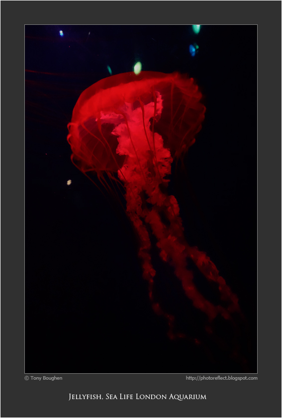
During our recent couple of days out and about in London with our granddaughter we visited the Sea Life London Aquarium. She'd been there when she was younger and had been quite scared of the sharks. On this occasion, however, she was fascinated by everything she saw and we spent a couple of hours slowly moving through the building marvelling at the variety of life on display. When we came to a tank that held some jellyfish we paused to watch them swim about by pulsating their bodies. We'd answered a lot of questions up to that point but I wasn't prepared for the one that these jellyfish prompted. "Where's its face?" she asked. A perfectly reasonable question from a child whose experience of animal life up to that point has been largely with those that have eyes and mouths. But not the easiest question for a grandfather to answer in a way that a two year old can understand.

I took quite a few photographs of the creatures in the aquarium. However, low light levels, fast moving fish and a relatively small sensor camera don't make for photographic 100% success. Quite a few shots had motion blur or other shortcomings. But the jellyfish came out rather better (as did the crocodiles, terrapins and slower moving fish). These examples were in a tank with lighting that cycled through a variety of colours. The main photograph is best of the crop for the lighting and the composition. I include the other two for contrast.

photograph and text © Tony Boughen

Photo 1
Camera: Sony RX100
Mode: Aperture Priority
Focal Length: 10.4mm (28mm - 35mm equiv.)
F No: f5
Shutter Speed: 1/30 sec
ISO:2500
Exposure Compensation: -0.3 EV
Image Stabilisation: On

Sunday, March 02, 2014

Model 3107 Series 7

click photo to enlarge
It's interesting to remember that sitting on something purpose-made for our posterior and back is a relatively recent phenomenon - certainly in terms of the period of time that people have lived in purpose-built houses. I've no doubt that when men lived in caves, at the end of a day's hunting and foraging, as family groups settled down by a warm fire, there was a rush for the most comfortable ledge, rock or log on which to sit or recline. And yet, as far as western society goes, even as late as the seventeenth and eighteenth centuries most people continued to make do with either nothing on which to sit, or a flat, backless wooden bench, chairs being the preserve of the well-to-do. So it's perhaps not surprising that since that time the chair has become one of the most frequently designed and re-designed pieces of furniture.The fact that chairs, and the way we sit on them, are also seen as the main cause of back problems in western society may also be a reason for the amount of attention that designers lavish on the humble chair: get it right and customers will beat a path to your door. Or so you'd think.

We've just spent a couple of days looking after our two year old granddaughter in London, allowing me to combine family duty with a little big-city photography. On a coffee break in a cafe at the Royal Festival Hall I noticed this group of empty chairs near a small stage area. I have a passing interest in chair design and immediately recognised them as Model 3107 Series 7 by the Danish designer and architect, Arne Jacobsen (1902-1971). Now you might be thinking that remembering the model number of something designed in 1955 counts as  more than a "passing interest", but the fact is this particular line has been reproduced more than any other and so is very familiar to students of the chair. I remember reading somewhere that in excess of seven million have been manufactured. I also recall that Jacobsen said he got the idea for the design from a chair by Charles and Ray Eames, thus underlining the fact that to make a completely original chair is exceptionally difficult given all the precedents and the need to accommodate the human body. The Model 3107 is a simple, elegant, dining-height design. However, in my experience it isn't the most comfortable of chairs for extended periods unless you carry your own padding in the form of a cushion or a generous posterior. Consequently it's probably the ideal chair for a restaurant where the management wants a quick turnover of customers.

I was drawn to this shot by the variations on a theme that is very evident in the arrangement. Inevitably, when you see a collection such as this you consider which one you like best. For me it's the dark, polished wood version.

photograph and text © Tony Boughen

Camera: Sony RX100
Mode: Aperture Priority
Focal Length: 10.4mm (28mm - 35mm equiv.)
F No: f3.5 Shutter
Speed: 1/30 sec
ISO:800
Exposure Compensation: -0.3 EV
Image Stabilisation: On