Monday, August 19, 2013

Views from Cromer pier

click photo to enlarge
Victorian and Edwardian recreational piers make great photographic subjects. They stretch out from the shore into the sea, a wooden deck with pavilions, theatres, shops, shelters and railings, supported by a forest of cast iron or steel legs and cross bracing. Ornate metalwork, fanciful roof outlines, flagpoles and other excrescences make for lively shapes against sea and sky. People flock to them seeking the experience of being at sea without setting foot in a precarious boat or sickness inducing ship. Fishermen seek them out for the opportunity they offer to easily cast into deep water. Yes, piers offer the photographer subjects a-plenty.

However, piers offer more than a subject. The photographer at the coast, casting around for a vantage point from which to take shots of land,  the sea or the beach, can do a lot worse than position himself on a pier. I've been fortunate to have lived in the vicinity of piers for a large part of my life and I've frequently taken the opportunity of standing on one in search of a striking or unusual composition. The other day I was in Cromer, Norfolk, doing just that and I came away with a couple of views of the shore that please me. Both were taken fairly early on a Sunday morning before most holidaymakers were stirring. Both feature Cromer's medieval church with its tall tower, described by Pevsner as, "at 160 feet, by far the tallest of any Norfolk parish church." And both show the zig-zag sloping path that takes the pedestrian down to the pier entrance from the viewpoint in front of the Hotel de Paris (1895-6). But, only the smaller photograph shows the pier itself, a structure of 1900-1. It is currently undergoing a refurbishment and has "clutter" on its decking so I kept the amount in the frame to just enough for a strong leading line to the church and hotel. The main photograph, though the colour is not as interesting as in the smaller shot, has a composition that I like better, with the groynes, sea-wall, church tower and line of buildings combining asymmetrically to good effect.

If you want to see what the pier looks like in totality these views taken a couple of years ago tell the tale.

photographs and text © Tony Boughen

Photo 1
Camera: Canon
Mode: Aperture Priority
Focal Length: 40mm
F No: f7.1
Shutter Speed: 1/500 sec
ISO: 100
Exposure Compensation: -0.33 EV
Image Stabilisation: On

Saturday, August 17, 2013

Obsolescence, repairs and tractors

click photo to enlarge
My web browser bookmarks include a folder marked DIY. It lists sites and web pages that I've found useful when it comes to fixing things or undertaking jobs around the house.With a bit of internet help I've managed to repair the cooker, heating radiators, the car, computers, plumbing, a camera and much more. To be able to do such things gives one a sense of satisfaction, saves money and does something for the environment by extending the life of objects.

However, during my lifetime the number things that are repairable has seemed to become ever fewer. Obsolescence appears to be built into more and more products. Items are made difficult or impossible to open without breaking something, spare parts are unavailable or deliberately expensive, non-standard screws or worse still, glue, are used to fix components together, and records show that often the same component lasts the same limited life-span in a particular product - usually a month or two after the expiry of the warranty! It really looks like some manufacturers construct products to fail after a relatively short time, and make them irreparable by the user or even a technician, in the expectation that it will result in another sale. This marketing ploy is additional to the regular "product-upgrade" cycles whereby the latest and greatest additional features are drip-fed into new models on an annual (or more frequent) basis.

A website I sometimes use for repair advice is iFixit. It ranges fairly widely in its coverage, but is particularly useful for electronics. The staff frequently do what are called "teardowns", i.e. the opening up of new products to see how they are made. Then they pass judgement on their potential for repair. Recently the website published a list of ten electronic devices that are almost impossible to repair. A model of the Apple MacBook Laptop with Retina Display was judged worst in this regard. There were five other Apple product in the list (and two Nikon DSLR cameras). Interestingly their ten easiest to repair electronic devices, published earlier, also included an Apple product.

The sight of this old Fordson Major tractor triggered this line of thought. It's a model from when? The 1960s? I don't know exactly, but it's a good few decades old and still giving service in the harshest of environments: sand and salt water are a recipe for mechanical problems. It is used to haul a crab boat into and out of the sea and its basic, rugged construction, the availability of parts, and the opportunity to improvise or make them where they are unavailable (check out the seat and radiator grille!) means it still works after all these years. I like products that are user-serviceable and user-repairable: they are good for the individual and good for wider society. It would be great if more manufacturers took this into account when they designed their products.

photograph and text © Tony Boughen

Camera: Canon
Mode: Aperture Priority
Focal Length: 24mm
F No: f7.1
Shutter Speed: 1/320 sec
ISO: 100
Exposure Compensation: 0 EV
Image Stabilisation: On

Thursday, August 15, 2013

Who shot the photographer?

click photo to enlarge
I was reflecting on the word "shoot" the other day. In particular I was wondering how long it had been an English synonym for "take photographs". A quick look at the Oxford English Dictionary (OED) shows the earliest recorded use of "shoot" in the sense of "a discharge of arrows, bullets etc" being 1534 though in Old English an example is quoted from the early poem, The Battle of Maldon (993). As I worked my way down the list of meanings of the word - there are seven main definitions with many subsidiary ones - I tried to guess the date in the 1800s when it might have been transferred to photography. I was well wide of the mark (to use a shooting analogy). The first use that the OED cites is from Anthony's Photographic Bulletin of 1890 and around that date the word "shot" also starts to be used to describe the resulting image itself.

From our twenty first century perspective it might seem unsurprising that the act of taking a photograph should be described thus. After all, as with a gun (or bow) one takes deliberate aim at a target (or subject) and uses ones finger to release a mechanism at a precise moment to achieve the desired outcome. But, when I reconsidered what seemed the relatively late date of 1890, it occurred to me that perhaps the analogy wasn't quite as obvious as we think. After all, the shooting of a gun or arrow often results in a death or injury whereas a shot made with a camera merely fixes a moment in time on paper (or a screen). The former is frequently violent and negative; the latter usually harmless and positive. No, I thought, shooting isn't a word that transfers to photography as naturally as I first thought.

My reflection was prompted by the fact that a few days ago I was being repeatedly shot - by a camera. We were spending some time on the north Norfolk coast at Cromer and the shooter was my wife. Throughout our married life, as our photograph albums testify, I've done most of the family photography and my wife has taken shots mainly to ensure that I appear in the albums periodically. However, on our recent break she made a conscious effort to try and take a few more photographs of me. The result was I kept noticing that as I was taking my photographs I was also being shot. It was relatively painless as I'm a fairly co-operative subject. I've posted two of her shots today. Regular readers may find them a welcome relief from my obscured self-portraits! Incidentally, the rucksack isn't full of photographic equipment. I try to keep the gear and weight to a minimum when I'm out and about. It had only the 70-300mm lens to complement the 24-105mm on the camera. The rest of the weight was essentials for a morning at the coast on a day when a strong breeze was lessening the effects of bright sunshine.

photographs / text © K. Boughen / T. Boughen

Photo 1
Camera: Sony RX100
Mode: Aperture Priority
Focal Length: 37.1mm (100mm - 35mm equiv.)
F No: f7.1
Shutter Speed: 1/640
ISO: 125
Exposure Compensation:  -0.3 EV
Image Stabilisation: On

Tuesday, August 13, 2013

Peacocks beautiful, proud and noisy

click photo to enlarge
The Indian Peafowl, the male of which is commonly known as the peacock, is one of the avian world's most brightly coloured members. The electric blue of its body and the iridescent blues and greens of the "eyes" of its tail are very striking. The peacock's shape and the details of its tail have been used in art and design down the centuries, in Europe particularly during the period of Art Nouveau. Moreover, though it is native to India, its popularity is such that it can now be found in virtually every country of the world, often in parks and gardens as well as zoos. In Britain it is frequently found strutting around stately homes or clamouring for attention in collections of birds in wildlife parks. People frequently cite it as their favourite bird or name it the most beautiful of birds.

I can see good qualities in the peacock but it wouldn't feature in even my top 50 favourite birds. I don't think I'm alone in not sharing the general liking of the species, though the naysayers and doubters are very much a minority. If you are someone who wonders why anyone could find fault with this magnificent bird consider this: the word "peacock" can be used as a term of disapprobation, often applied to over-dressed men indulging in what the Oxford English Dictionary (OED) calls "vainglorious display". Such a development surely suggests that some see these qualities in the bird and feel it is useful to purloin the word for that purpose. Whether it's fair to anthropomorphise in this way I leave to you to decide, but clearly not everyone is persuaded by the peacock's magnificent tail and the eye-catching colour.

However, people often acquire likes and dislikes through circumstances peculiar to themselves; that is to say, for reasons that are unlikely to be shared by someone else. So it is with me. Many years ago my wife and I were cycling along a quiet country lane past a farm. Suddenly our ears were unexpectedly assaulted by the piercing cry of a bird only a few feet away that was standing on a wall, at the same height as our heads. It was, of course, a peacock, one we hadn't noticed because of the low hanging branches of the trees. We nearly jumped out of our saddles, such was the explosive force of the unexpected call. Ever since that day I have associated peacocks and their distinctive call with that heart-stopping moment. It is responsible for my enduring negative opinion of the bird.

photograph and text © Tony Boughen

Camera: Canon
Mode: Aperture Priority
Focal Length: 300mm
F No: f7.1
Shutter Speed: 1/300 sec
ISO: 800
Exposure Compensation: -0.33 EV
Image Stabilisation: On

Sunday, August 11, 2013

Bonby church - a different view

click photo to enlarge
Today's photograph was taken on the same day as my other black and white shot of Bonby church that I posted recently. It shows the the north side of the building and illustrates something I've discussed elsewhere in this blog, namely how medieval churches were enlarged by adding aisles.

The outline of arcade arches on the nave wall above shows that there was once an aisle attached to the building. It was probably required to accommodate a growing congregation. It may have been added to the original, small aisleless church by knocking out arch-shaped openings in the nave wall and replacing the remaining supporting walling with columns. Of course, when the aisle was added the windows had to be re-positioned (or new ones made) for the new aisle wall that was now farther from the middle of the nave. Sometimes the wall that was turned into an arcade was increased in height and windows were cut through the new, higher section, to shine light into the centre of the church. This solution involved raising the height of the nave roof. I don't know precisely why and how Bonby's aisle was fitted to the original church but it's very clear that at a later date it either became an expensive luxury that a decline in the size of the congregation rendered superfluous; or it fell down; or it became unsafe and was pulled down. Whatever the reason, every expense was spared in restoring the original nave wall. The arches and columns were left in place and simply filled with masonry. I wouldn't be surprised if the aisle windows were re-used too. The architectural effect is inelegant but interesting.

In fact, that description suits the whole of this side of the building. Just look at the chimney and the white lean-to extension - it looks like part of a cottage has been stuck on the side of the church! But, as I said on my earlier post about the church, these rustic qualities are ones that I find quite attractive. On my previous visits to this church I'd never been able to get inside; it was always locked. On our recent visit the door was open and we had a look round. Truth be told it's not a very attractive interior; the remains of the arcade is the most interesting feature. The visitors' book dates back to the 1960s, and as my wife glanced through it she noted that entries in that decade and subsequently were not very numerous: presumably an indication that the building was rarely open. Perhaps we were fortunate to find it unlocked, or maybe it was because we visited on a Sunday.

photograph and text © Tony Boughen

Camera: Canon
Mode: Aperture Priority
Focal Length: 32mm
F No: f7.1
Shutter Speed: 1/250 sec
ISO: 100
Exposure Compensation: -1.00 EV
Image Stabilisation: On

Friday, August 09, 2013

The accommodating Comma

click photo to enlarge
The Big Butterfly Count is currently underway in  the UK. This year it is running from 20th July to 11th August. An annual event organised by Butterfly Conservation, it enlists volunteers to count the species and number of butterflies on a bright or sunny day, in any location, over a period of 15 minutes. Results are collected and collated and help to give a picture of the relative health of the country's butterfly populations.

I recently consulted last year's results to find out the status of the Comma that I'd been photographing, at my wife's request, in our garden. Last year's wet summer produced somewhat atypical results with the Meadow Brown the runaway winner in terms of numbers. The commonest butterflies in my garden this year are (with last year's placings in brackets) Small White (4), Large White (5), Peacock (16), Red Admiral (11) and Small Tortoiseshell (10). However, we see several more including the Brimstone, Wall, Painted Lady and others. The Comma also turns up now and again. Last year it was the 12th commonest species nationwide.

The Comma is named after the small white comma-like mark on the underside of its wings. It's an attractive butterfly with its orange and black markings and ragged edged wings. A characteristic that endears it to me as a photographer is the fact that it scares much less easily than, say, Peacocks and Red Admirals, when the camera lens approaches it. I took today's shot with a 100mm macro lens that had a hood mounted on the end of it. The butterfly tolerated the edge of the hood a matter of 10 centimetres or less from it, and that when the camera was mounted on a bright silver tripod. A very accommodating butterfly in that respect.

Less accommodating in its choice of flowers however. A bright orange Comma butterfly on a pink and orange Coneflower (Echinacea) with green leaves in the background makes for an eye-watering colour combination. They would become my number one butterfly in all respects if they'd feed on one of our dusky blue flowers so I could compose photographs with colours more to my liking!

photograph and text © Tony Boughen

Photo 1
Camera: Canon
Mode: Aperture Priority
Focal Length: 100mm macro
F No: f7.1
Shutter Speed: 1/80 sec
ISO: 200
Exposure Compensation:  0 EV
Image Stabilisation: Off

Wednesday, August 07, 2013

Bonby church 27 years later

click photo to enlarge
Anyone with an interest in English church architecture will be familiar with the main gazetteers and guides that document these buildings. All will know of the county volumes of the "Buildings of England" series by Nikolaus Pevsner (and others). Many will be familiar with John Betjeman's original or updated "Guide to English Parish Churches". And most will have an acquaintance with Simon Jenkins' "England's Thousand Best Churches". I have all these books and I list them here in order of preference, best first.

They all have their own take on listing and describing churches. Pevsner is completist and academic, Betjeman is brief, quirky and selective and Jenkins is more opinionated, historical, florid and his book has a more contentious title. Whose thousand best? Not mine, though he has many I would include. So how do I differ from Jenkins? Well, I have a liking for churches that have been knocked about a bit, that show their age, the ravages of time and the mark of successive builders. I can appreciate as much as the next man the big, richly ornamented, Grade 1 Listed, beautifully kept show-piece church. But, I can also appreciate the tumble-down, humble structure that needs a bit of maintenance, that can be found, with difficulty, surrounded by trees, at the end of a country lane: the sort of building that seems to grow out of the ground rather than look like it's been dropped in, scrubbed and polished, from on high.

Today's photograph shows a church that I liked the first time I saw it some time in the 1970s. It's a building that wouldn't even get on the long-list for Jenkins' best. St Andrew in the village of Bonby, Lincolnshire, is a mixture of work from the 1100s, 1200s and 1800s. The original stone has been replaced and reinforced by brick, and much of it shows its age. It must have always been a work in progress as people enlarged the church, made it smaller, renewed bits that fell down, patched walls, moved windows and blocked up doorways. After taking today's main photograph I searched out a shot of the church taken from a similar viewpoint that I remembered scanning from a slide last year. The original was taken in 1986 using an Olympus OM1n and a 135mm lens. I wanted to see if there had been any changes during the intervening 27 years. One jumped out at me immediately. The bottom two thirds of the east wall that was looking rough in 1986 is now rendered and painted white. But apart from that it was much the same low, squat, rustic building. Even the same dark red paint continues to be used on the drainpipes, gutters and door. I did notice one further difference: the churchyard grass is being kept a bit shorter!

photograph and text © Tony Boughen

Camera: Canon
Mode: Aperture Priority
Focal Length: 35mm
F No: f7.1
Shutter Speed: 1/250 sec
ISO: 100
Exposure Compensation: -1.0 EV
Image Stabilisation: On

Monday, August 05, 2013

Volutes

click photo to enlarge
I first encountered the word "volute" when studying architectural history, in particular the Greek Ionic Order that is recognised by the large volutes that make up most of the ornamentation of the capital. The Corinthian and the Composite Orders have them too, on a lesser scale, but it is the Ionic that presents the architectural volute in all its beauty. In fact, the word "volute" comes from the Latin for "scroll", and looking at the spiral shape in the Ionic capital one can see how it might have derived from a parchment scroll seen end on.

Biologists use the word to describe the spiral shell of gastropods, in particular the genus Voluta. Violins and other stringed instruments often have a decorative volute at the top of the fingerboard near the tuning pegs, though this is also called a scroll. Guitar builders use "volute" to describe a thickening of the neck near the nut where one end of the truss rod is found, but this is an odd use of the word that doesn't respect its origins.

Today's photograph shows the wooden handrail of a Georgian staircase that terminates in a volute. It's not unusual to see a handrail of this period with a "turnout" whereby the straight line of the rail ends with a curve of approximately a quarter of a circle. However, if the client has money and pretensions then the architect can indulge himself with a volute, adding if he wants to go a step further, an ornamental finial on the centre. In the example above the expansion of the rail into a large, circular full-stop manages to be both elaborate and simple: perhaps elegant is the best word to describe it. As I processed this photograph, one that I took in the former Stamford Hotel in Stamford, Lincolnshire, it occurred to me that it might be a suitable candidate for a blue/sepia split-toning treatment. For more examples of this photographic treatment, one of that dates back to the days of chemical processing, see this promenade, this customer service centre or this House of Correction. For a view of the rest of this staircase see this post.

photograph and text © Tony Boughen

Camera: Sony RX100
Mode: Aperture Priority
Focal Length: 14.8mm (40mm - 35mm equiv.)
F No: f5.6
Shutter Speed: 1/25
ISO: 1600
Exposure Compensation:  -0.33 EV
Image Stabilisation: On

Saturday, August 03, 2013

Old Triumph Mayflower

click photo to enlarge
I don't know much about cars, care even less, but I do know a wreck when I see one. And, as wrecks go, decaying and decrepit cars make interesting photographic subjects. The vehicle in today's post is one that I've passed a few times without taking a photograph. However, a couple of days ago the light seemed better, the vegetation was hanging down nicely against the darkness of its resting place, and I got out my compact camera and took a quick snap. The person I was walking with identified it for me as a Triumph Mayflower. It was a shape that I recognised from the 1950s but I'd have thought it was one of the Riley/Wolseley look-alikes.

A quick scan of the internet tells me that this particular model of car was manufactured from 1949-1953 by Triumph in both the UK and Australia,  shortly after they'd been taken over by the Standard Motor Company. Apparently it was an attempt to build a small car with an up-market appeal, hence the traditional"sit-up-and-beg" styling and what were called at the time the "razor-edge" lines of the coachwork. It can't have been a great success because four years in production isn't very long and only 35,000 were manufactured. In fact, the only Triumphs I really remember from my childhood and youth were the Triumph Herald, the Vitesse, Spitfire the TR Series sports cars and the Stag - all later than the Mayflower, and many of them redolent of the "swinging sixties". I imagine this Mayflower has been bought as a restoration project. I wish its owner many happy hours sourcing wing mirrors, bumper over-riders etc and much satisfying, fulfilling work of rejuvenation.

photograph and text © Tony Boughen

Camera: Sony RX100
Mode: Aperture Priority
Focal Length: 32.2mm (87mm - 35mm equiv.)
F No: f4.5
Shutter Speed: 1/100
ISO: 320
Exposure Compensation:  -0.3 EV
Image Stabilisation: On

Thursday, August 01, 2013

Mundane photographic subjects

click photo to enlarge
Some of my best photographs feature the most mundane subjects. This comes as no surprise to me because, having an interest in art and painting, I long ago observed that the same is true of many works that I like. What it does mean, however, is that it isn't especially easy to find such subjects because you don't usually plan for them in the way that you might for a landscape, portrait, architecture or other branches of photography. What often happens is that during the course of doing something entirely unrelated to photography, you notice a composition or item that looks like it might make a shot and you point your camera at it. Such an approach relies on you having a camera with you at the time and that's where a pocketable compact camera is so valuable.

Today's photograph was taken while we were gathering blackcurrants at the house of some friends. Many people in rural communities swap and share garden produce when they have a glut that is beyond their capacity to eat, store, preserve or freeze. It's a sociable and sensible thing to do. Having filled a couple of containers we were sitting at a textured glass table below a green parasol enjoying a soft drink when this composition caught my eye. Glasses and bottles have been the stock in trade of painters of still life for centuries, and the simple qualities of form, colour, shape, reflection and transparency that these objects presented to me had something of a painting about them. Perhaps it was the way the tinted, textured, opaque glass of the table top looked like it was composed of brush strokes. Or maybe it was the way the same surface turned the clouds into what looked like painted representations of clouds rather than reflections. Whatever the reason, I took my shot and I'm happy to say its modest, unaffected qualities please me more than most of the images I've posted on the blog in recent months.

photograph and text © Tony Boughen

Camera: Sony RX100
Mode: Aperture Priority
Focal Length: 21.5mm (58mm - 35mm equiv.)
F No: f5.6
Shutter Speed: 1/250
ISO: 125
Exposure Compensation:  -0.7 EV
Image Stabilisation: On

Tuesday, July 30, 2013

Glacial erratics and Samson's Toe

click photo to enlarge
One of the pleasures of growing up in the Yorkshire Dales was that school geography lessons sometimes referred to physical features that you already knew or that you could easily visit. The cliffs, gorges, tarn, sink holes, lead mines, clints and grykes etc of the area around Malham were cited as archetypes in the text books we used. So to be able to walk to the area from my home and examine these at first hand was a wonderful thing. The interesting rock strata of the Yoredale Series was clearly visible in the sharp, stepped profiles of Penyghent and Ingleborough, both ever-present on the horizon. The nearby classic fault line marked by the cliff along the edge of Giggleswick Scar was equally famous. And the much photographed Norber boulder field, with its glacial erratics of dark gritstone perched on the light grey native limestone, was but an energetic walk or an easy cycle ride away. It was through my exposure to the latter that I came to recognise other, less prominent, erratics scattered around the limestone hills where I lived.

The examples I was most familiar with were scattered across the area known as Attermire. These dark coloured lumps of rock were like ugly ducklings against the white of the Carboniferous limestone. Moreover, even though I knew that great sheets of ice, tens or hundreds of feet thick had transported them from places where they were the native rock and then, as the ice melted, deposited them on top of the entirely different rock of the Craven area of Yorkshire, it was still difficult to imagine such a process in action.

I recently photographed a glacial erratic that I never saw when I lived in the Dales. That's not because it was too distant from my home: in fact it's quite near. The fact is I'd never before walked the footpath that takes you past it. I learned that it had a name too. It's called "Samson's Toe" for reasons that are, I think, fairly obvious. I'm only aware of one other erratic (at least it's usually described as one) that has a name and that is the Great Stone of Fourstones near High Bentham. This enormous lump of rock with steps cut into it is better known to historians than geographers because it has long served as a boundary marker.

photograph and text © Tony Boughen

Camera: Sony RX100
Mode: Aperture Priority
Focal Length: 21.1mm (57mm - 35mm equiv.)
F No: f5.6
Shutter Speed: 1/320
ISO: 125
Exposure Compensation:  -0.3 EV
Image Stabilisation: On

Sunday, July 28, 2013

Arms, armour and weekend warriors

click photo to enlarge
I've never given a great deal of thought to where people who stage military re-enactments get their props from but during my recent visit to a medieval fayre in Tewkesbury I remedied that deficiency. Why? Well, there was not one but several tents selling all manner of clothing, domestic objects, armour and weaponry for the would-be knight, page, damsel, archer, pikeman, etc. Need a pair of authentic medieval-style shoes? Multiple vendors could supply any size that was wanted. How about a quilted jacket to wear under your armour plate? Name your colour (though red and blue seemed favoured). What about plate armour? Everything from a full suit to all the individual components - breastplate, greave, hemet, gauntlet, you name it - was on offer. The impecunious would-be knight could buy his suit a piece at a time! Battle axes, maces, pikes, swords, daggers, long bows and cross bows without which no self-respecting medieval warrior could feel properly attired were available in invasion-sized quantities. Clearly, unknown to me, there is a thriving cottage industry beavering away, right across Europe from the accents I heard, supplying the wherewithall of weekend warriors.

Looking closely at the weaponry it was obvious that it wasn't made to the fighting standard required in, say, the Wars of the Roses or by Henry V's troops at Agincourt. However, it looked sufficiently durable and sharp; more than capable of doing significant damage if not wielded with care. I took several photographs of the wares being offered and show a few here. The armadillo-like gauntlets particularly caught my eye. They looked like they were holding on to their display shelf and might, at any moment, flex their fingers, get up and scurry off.


photographs and text © Tony Boughen

Photo 1
Camera: Sony RX100
Mode: Aperture Priority
Focal Length: 22.7mm (61mm - 35mm equiv.)
F No: f8
Shutter Speed: 1/400
ISO: 125
Exposure Compensation:  -1.0 EV
Image Stabilisation: On

Friday, July 26, 2013

Boston, public sculpture and vinyl

click photo to enlarge
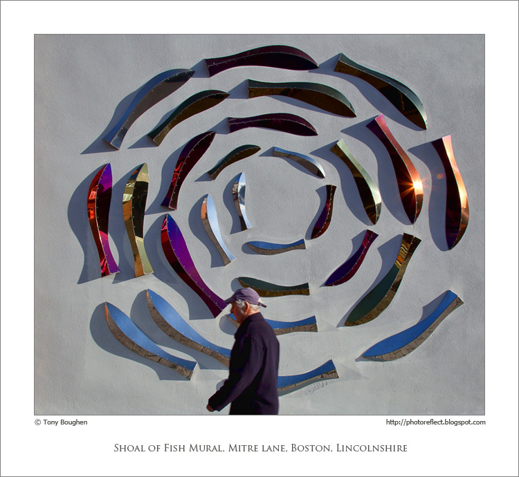
Not until I'd brought this photograph up on my computer did I notice that this "circular" shoal of fish is actually a spiral. That reminded me of the quiz question beloved of children of the vinyl records generation: "Question - How many grooves are there on a record? Answer - Two; one on the A side and one on the B side". The success (or otherwise) of this question (for the information of those of the compact disc and mp3 generations) depends on you knowing that each side of such a record appears to have hundreds of concentric circles but both hold just a single, tightly packed spiral.

As public murals go this one doesn't, for me, have any outstanding qualities. However, it does add a bit of colour and interest to an otherwise quite dour corner of Boston, Lincolnshire, and that's often reason enough for the existence of such a piece. Unusually, I haven't been able to find any information about this work: for example, its title or the name of the artist. I imagine that the subject refers to Boston's past as a port of deep-sea trawlers and its current status as the home of a small inshore fleet. It is one of the relatively few pieces of public sculpture in the town. For reasons unknown to me Boston has fewer such pieces than many other towns of its size. I find that surprising since I can think of a number of Lincolnshire villages that are home to several themed sculptures. The present period with an economic climate that emphasises belt-tightening probably isn't the best time for the commissioning of such works, but if there is a town that would benefit from a few public pieces to enliven its streets then it's Boston.

Incidentally, the keen photographers among you may be wondering why I chose f11 for this shot since it resulted in the passer-by being slightly blurred. The answer is simple: operator error!

photograph and text © Tony Boughen

Camera: Canon
Mode: Aperture Priority
Focal Length: 24mm
F No: f11
Shutter Speed: 1/160 sec
ISO: 100
Exposure Compensation: -0.33 EV
Image Stabilisation: On

Wednesday, July 24, 2013

A good year for poppies?

click photo to enlarge
One of the good things about the internet is that it's quite easy to find someone who thinks like you do. One of the bad things about the internet is that it's quite easy to find someone who thinks like you do. Consequently, creating an organisation or movement for beneficent change and progress is easier than ever before. But, mobilising a group of people who share the same bigotry, hatred and intolerance is not difficult either. In fact, such is the breadth of opinions to be found expressed on websites, blogs, forums, social media etc, it is possible to find written support for just about any proposition you care to make, no matter how extreme, ludicrous or unhinged it may seem to most people. The days of misunderstood youth or paranoid misanthropes languishing in the conviction that no one feels the same as they do must surely be long gone: a quick search will quickly throw up fellow loners who share their misery and delusions.

On a lighter note, the internet is also a place where you can take soundings. I tried this the other day in connection with my impression that 2013 has been a particularly good year for poppies in the United Kingdom. Sure enough, I found several pieces written by individuals who expressed the same thought. So I'm right. Or am I? Just because, out of the millions of people who have looked at poppies in the fields, roadsides and gardens of our country, a handful have expressed the same opinion as me doesn't mean we are correct. Perhaps the silent majority who haven't expressed a view publicly feel the number of poppies is no more, or maybe fewer, than usual. As a means of arriving at a reliable judgement simply looking for people with similar views is not a very sound method. Helpful though it undoubtedly can be, the internet has the capacity to very easily reinforce wrong thinking.

Today's photograph was taken in my garden. I posted a shot of "wayward" poppies earlier this month. I see the contre jour image above as one that shows them growing more typically.

photograph and text © Tony Boughen

Camera: Canon
Mode: Aperture Priority
Focal Length: 168mm
F No: f5
Shutter Speed: 1/320 sec
ISO: 100
Exposure Compensation: -0.33 EV
Image Stabilisation: On

Monday, July 22, 2013

Morris dancers of Mordor?

click photo to enlarge
Morris dancers seem to be like buses: you don't see a troupe for ages then along they come in a bunch, one after the other. At least that's how it's been with us in recent years. After a long period when we saw none of these traditional English dancers, lately we've seen them everywhere. I don't think it's to do with a sudden surge in the popularity of this old style of dancing so much as the places and events that we've happened to visit.

When we were in Herefordshire recently our son suggested we go to a "medieval fayre" that was taking place over a weekend at Tewkesbury. It sounded like somewhere I might gather a few photographs. So, in temperatures approaching 30 degrees Celsius, we set off. I've never attended such an event before so I had only a hazy idea of what to expect. There were jugglers, people in medieval garb, musicians playing old instruments and singing gentle folk songs, various olde worlde games, stalls with appropriate food and clothing, weapons and armour for sale and many more "new age" style offerings. All reasonably predictable with the exception of the new-old military equipment (of which more later).

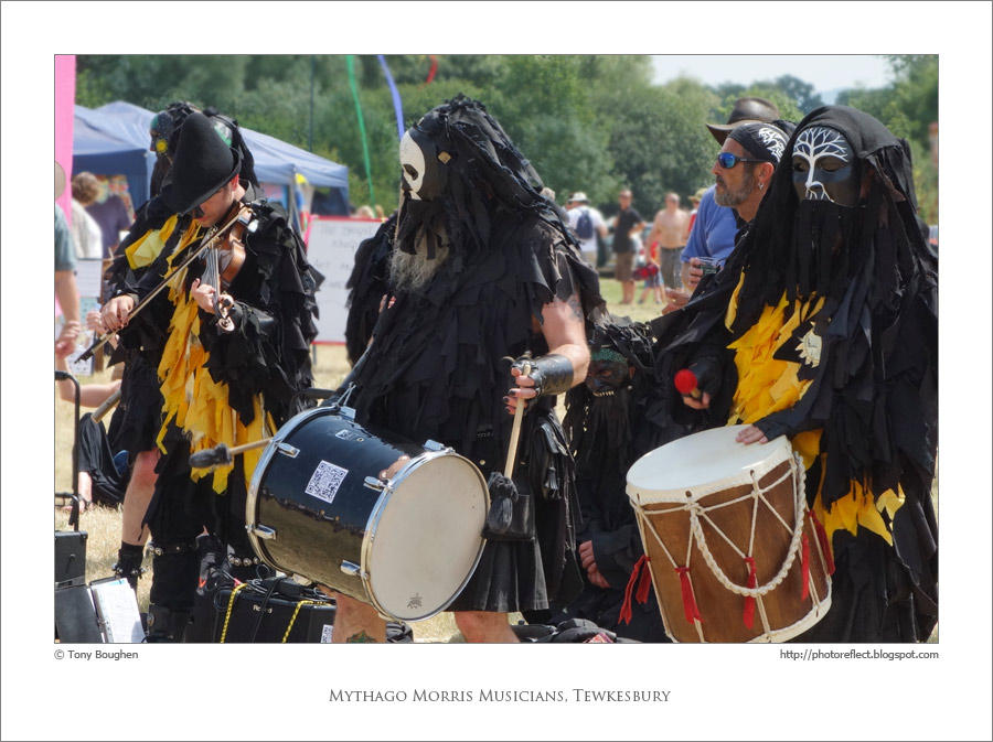
As we walked among the tents and pavilions, from the distant edge of the site came the sound of thundering drums and electric instruments playing music in a style that I can only describe as "heavy folk-rock"; imagine Fairport Convention meets Black Sabbath. As we got closer I noticed dancers clad in what appeared to be black rags, ghoulish masks and Goth boots. Then it struck me that what I was seeing and hearing was clearly the morris dancers of Mordor, a troupe more usually associated with Sauron's hordes, perhaps entertainers of the orc armies having a day off at Tewkesbury. It's usual for English morris dancers to wear neat white shirts or blouses, jackets, waiscoats, orthodox hats, feathers, neckerchiefs, ribbons and bells, and the often black and white theme to be enlivened by plentiful dashes of primary colours: see examples here and here. The contrast with the dancers shown above couldn't be more stark. Those providing the music were equally "different". The usual array of acoustic instruments was augmented by a recorder, an electric bass, amplified acoustic guitar and a number of assorted, large drums. The whole effect was decidedly rhythm heavy. I loved it! Though it was hard to see through the masks I got the impression that this morris attracted a wider age range with more younger members than is usual. I could see why. As the morris men (and women) took a break from their exertions my wife went to ask who they were and was given their card. They styled themselves Mythago Morris and hailed from the village of Ashurst, West Sussex, not too far from Brighton. In fact, nowhere near Mordor!

I took my photographs in what can only be described as difficult conditions - the sun high in the sky, the grass turned brown and light coloured against which I sought to capture detail of the the dancers' black costumes. It took a few shots and some post-processing to extract these fairly ordinary record shots.

photograph and text © Tony Boughen

Photo 1
Camera: Sony RX100Mode: Aperture Priority
Focal Length: 22.7mm (61mm - 35mm equiv.)
F No: f8
Shutter Speed: 1/400
ISO: 125
Exposure Compensation:  -1.0 EV
Image Stabilisation: On

Saturday, July 20, 2013

Hotels and ratings signs

click photo to enlarge
There was a time in my life when I walked, cycled and used public transport exclusively. One of my aims was to to avoid car ownership and the environmental destructiveness that is inherent in that form of transport. However, for various reasons, including the birth of a second son and the deliberate vandalising of British Rail by the Thatcher governments, I bought a car and it is now my main means of transport. However, I still cycle and I remain a member of the Cyclists' Touring Club (CTC) for the insurance it offers, the interesting magazine it publishes and to help the foremost body in Britain that supports the cyclist and the cause of cycling. I was briefly a member of the Automobile Association (AA) when membership came as part of the package with a car that I bought. However, I let that lapse because the organisation that claims to be the main voice for motorists in Britain kept making statements in support of motoring for which it had no mandate from its members and which were diametrically opposed to my beliefs.

Both of these organisations produced ratings signs to be fixed to the exterior of hotels, B&Bs etc. In the case of the CTC the winged wheel logo, often made of cast iron or enamel, began to be used from 1887 and denoted an establishment that offered good accommodation and service to cyclists. These early plaques can still be seen on some buildings as can its modern equivalent, a small sticker designed to be fixed to a window. Compared with the CTC the AA was a relative latecomer in the rating and recommending of hotels etc, having begun to award its plaques with 1 to 5 stars only from 1912. The AA continues to be a major player in the inspection and judging of the standards of accommodation, continuing to award stars and offer establishments ways of advertising its rating. However, as with the CTC, quite a few hotels still display an old AA sign that must have been awarded decades ago. I imagine there is some kind of stipulation that these must reflect a current rating - or perhaps not.

I was wondering about this latter point recently as I photographed just such a sign - an illuminated variant -  on the main facade of the Feathers Hotel in Ledbury, Herefordshire. It must date from before 1966 because in that year the AA changed to a sans serif font for its initials and signage. The deep yellow and black of the sign, along with Union flags, window boxes and hanging baskets, gave colour to the black and white of the ancient, timber-framed building, and offered a collection of details that seemed to have the makings of a photograph, so I pointed my camera at it and pressed the shutter.

photograph and text © Tony Boughen

Camera: Sony RX100
Mode: Aperture Priority
Focal Length: 37.1mm (100mm - 35mm equiv.)
F No: f5.6
Shutter Speed: 1/1000
ISO: 125
Exposure Compensation:  -0.7 EV
Image Stabilisation: On

Thursday, July 18, 2013

Froth, waterfalls and wild swimming

click photo to enlarge
Recently, as our walk took us past the waterfall that is Scaleber Force near Settle, I took a few shots of Stockdale Beck as it cascaded down the rock face. Strong sunlight didn't help when it came to getting the sort of shot I wanted, and the small offering today is the best of the very few photographs that I took. I'd gone down the sides of the ravine alone and my wife stayed at the top on a handily sited bench. While she was there a van stopped on the nearby road and some people came to ask her if she knew of anywhere nearby for "wild swimming". She mentioned Stainforth Force and they said that was their next destination.

When she recounted that conversation I was transported back to my childhood swimming in the River Ribble at Settle. We never called it wild swimming then; it was just swimming plain and simple. Since there was no purpose-built covered pool in the small market town (there is now) many local children, myself included, taught themselves to swim in the rock pools and deeper stretches of the river. We had a number of favourite spots. Probably the most popular for younger children was the stretch between the weir and the stone-built road bridge. Older kids preferred the longer, uninterrupted and more secluded stretch above the weir, downstream from Shed Mill which was called "six foot" in reference to its alleged depth at this point. A third location that attracted younger children was the deeper area of water below Queen's Rock near King's Mill.

As chance would have it we later walked past this stretch of rapids that marks the point where one of the Craven Faults crosses the river. Looking down from the footbridge I noticed an accumulation of froth - probably natural though perhaps partly man-made - and I seized the opportunity for my second photograph of this subject. My first shot, which I posted on the blog, was taken at the previously mentioned Stainforth Force. The example at Queen's Rock attracted me for the way that the rocks interacted with the froth to make a pattern quite different from the one in my earlier shot.

None of the areas I mention above where I used to swim would be suitable for the "wild" swimmers of today. On the other hand, I'm not so sure the dark and deep waters of Stainforth Force are either.

photograph and text © Tony Boughen

Camera: Sony RX100
Mode: Aperture Priority
Focal Length: 23.8mm (64mm - 35mm equiv.)
F No: f5.6
Shutter Speed: 1/1250
ISO: 125
Exposure Compensation:  -0.3 EV
Image Stabilisation: On

Tuesday, July 16, 2013

Highland cattle calves

click photo to enlarge
I like to think that I take an interest in most things, and, with the exception of TV, celebrity and "social meeja" culture, I'm sure I do, knowing a little about a lot. But inevitably, if your net is cast wide in this way, the sum total of your knowledge about some subjects is only sufficient to fill the back of the proverbial postage stamp.

I was thinking about this recently when my mind settled on what I know about cattle. Being brought up in the Yorkshire Dales my early knowledge about farm animals inevitably centred on sheep. However, dairy and beef cattle were reasonably common in the valleys and on the valley sides, so Friesians, Holsteins, Herefords, Jerseys, Anguses etc were quite familiar to me as a child. But, over the years, I've noticed a change in the distribution and variety of cattle across the country. The Limousin breed is now massively popular everywhere and is inter-bred with other varieties. In Lincolnshire the Lincoln Reds have always survived but are currently, so I'm told, enjoying something of a renaissance. In the Dales unusual types are now more commonly seen, especially the hardy upland breeds introduced for conservation reasons. I've noticed Blue Greys and Belted Galloways and there seems to have been quite an increase in Highland Cattle (which I've also seen in Lincolnshire). The latter breed is also deemed suitable for hilly and mountainous areas for environmental reasons, managing on poorer fare than most other cattle, but its spread in lowland areas too must be due to demand for the beef it produces.

Today's photograph of two Highland Cattle calves was taken on the hills above Settle in the Dales. I'm not generally a photographer of "cute" subjects but this one, I think, qualifies for that title, as most young animals do. The cute quotient is turned up a notch by the way they are standing side by side, seeming to pose for the camera. A nearly three year old boy, looking at this shot on the screen of my camera, identified the calves as dogs. It's easy to understand his confusion. Since we are talking about knowledge I'll end with a recent addition to my fairly meagre total concerning cattle: a herd of Highland Cattle is more properly described as a "fold". Who would have thought it?

photograph and text © Tony Boughen

Camera: Sony RX100
Mode: Aperture Priority
Focal Length: 37.1mm (100mm - 35mm equiv.)
F No: f5.6
Shutter Speed: 1/800
ISO: 125
Exposure Compensation:  -0.3 EV
Image Stabilisation: On

Sunday, July 14, 2013

Gaillardia and cornflower

click photo to enlarge
One of the trees at the front of our house is a large, fairly old, crab apple. When we bought the house we looked at this tree and despaired at the treatment  (and lack of treatment) that it had received. As a youngster it appears to have been badly pruned causing a tangled knot of branches to erupt from the top of a relatively short trunk. It looks like neglect was the next course of treatment it suffered resulting in each of these branches shooting up and outwards like an exploding firework. But, the somewhat ugly-duckling appearance notwithstanding, the tree has promise. It is much used by birds, looks magnificent when it is in blossom, and produces a fine crop of crab apples in autumn that are much appreciated by the same birds. Consequently we instigated a programme of pruning to bring it to a better shape. We've raised the canopy a little each year, cut out some of the interlocking branches and restricted its spread. It is slowly improving.

However, it sits in the centre of a smallish flower bed which, from May onwards, the crab apple's spreading leaves make quite dark. Early flowers such as daffodils, tulips and even bluebells manage fine but perennials and annuals find the location more of a problem. Our recent solution is to treat it as a bed for left-overs, foundlings and self-seeded flowers. The resulting mix is a riot of leggy colour that a neighbour says brings a smile to her face every time she passes through our gate. I've photographed these flowers recently and found that my best shots come when I wait until the blooms are illuminated by the low, evening sun that gets below the tree's branches. This strong light produces bright colours, deep shadows and edging halos.

Today's main photographs show a small part of the planting and the main image showcases the complementary colours of the gaillardia and the cornflower. The observant will also notice some lemon yellow snapdragons and deep red poppies in there too. The smaller photograph is a contre jour shot of a section of the flowers showing the jumbled mixture of varieties and colours.

photograph and text © Tony Boughen

Photo 1
Camera: Canon
Mode: Aperture Priority
Focal Length: 300mm
F No: f5.6
Shutter Speed: 1/250 sec
ISO: 320
Exposure Compensation: -0.67 EV
Image Stabilisation: On

Friday, July 12, 2013

Take two

click photo to enlarge
I'm not averse to taking shots of the same subject at different times to try and get a better image. In fact, it's part of what I think a photographer should do. You learn far more from doing this than by searching for a new subject for every exposure. In this blog I've done it with several churches including Quadring, Bicker, and Sleaford, though I've done it less with landscapes. However, on my recent visit to Settle, North Yorkshire, I tried to take a shot from the same place that I'd stood to take one last October.

The precise location I chose last year was in Watery Lane to the south of the town. It was early in the morning and mist was being burned off by the low sun but still lingered and obscured the nearby hills. I chose as the main focal points of my contre jour composition two gates that presented eye-catching, dark silhouettes. The shot is one of my best landscapes from 2012. Passing those gates at the end of June I tried to compose the same shot but in conditions of quite different weather and lighting. Of course, when you are working from memory you're very unlikely to stand in precisely the same place or to set the focal length of a zoom lens the same as in the first shot. And so it proved here.

I quite like the result of the second photograph. It clearly doesn't have the same impact as the first but what it does illustrate is how important lighting can be in securing an eye-catching photograph. Not only is the contrast and drama enhanced by the sun in the first shot, the mist and the indistinct shapes of the trees establish a particular mood. The photograph above lacks those qualities but is better in terms of reportage about the Yorkshire Dales landscape.

photograph and text © Tony Boughen

Camera: Sony RX100
Mode: Aperture Priority
Focal Length: 12.3mm (33mm - 35mm equiv.)
F No: f5.6
Shutter Speed: 1/640
ISO: 125
Exposure Compensation:  -0.3 EV
Image Stabilisation: On

Wednesday, July 10, 2013

Cameras tell lies

click photo to enlarge
Doesn't this Fenland scene look calm, idyllic and bountiful? I think so. The luxuriant wheat is flawless, even the tractor's oval of tracks so orderly that it barely mars the perfection of the growing crop. A solitary wind turbine, a piece of modern technology both reviled and admired, stands pristine over the fields, slowly turning and making its small (2MW) contribution to the nation's energy needs. Above, the unblemished sky adds to the feeling of everything in its place and all being well under heaven. What a lie!

I took today's photograph from the steps of another wind turbine, its electrical hum and the steady swish of its blades slicing the air, loud in my ears. Another eleven turbines and an electrical sub-station, all off to the right and behind me added to the controlled clamour, while behind and to the left lines of electrical pylons marched across similar fields like rows of giants holding hands. The evening scene and the appearance of the countryside in this particular location  was eminently open to manipulation and, with my selective viewpoint, I exploited the opportunity.

In fact, that's what photographers do all the time: they choose a small part of their field of view and try to ensure that it contains only those things that help to tell the story enclosed in their image. And the truth is, as often as not, that photographic image - that people assume is entirely representational - ends up being as much fiction as fact!

photograph and text © Tony Boughen

Camera: Sony RX100
Mode: Aperture Priority
Focal Length: 15.5mm (42mm - 35mm equiv.)
F No: f5.6
Shutter Speed: 1/250
ISO: 125
Exposure Compensation:  -0.3 EV
Image Stabilisation: On

Monday, July 08, 2013

Meadows and the Yorkshire Dales

click photo to enlarge
There are few areas of Britain with a landscape that isn't heavily modified by man or that still exhibits climax vegetation. And, whilst most people know that this is true of lowland, agricultural areas with their improved fields, hedges and obvious drainage, rather fewer appreciate that it is also the case in most upland regions too.

This is as true of the Yorkshire Dales as it is of the Lake District, Dartmoor or the North York Moors. On my recent visit to the Dales, standing above Langcliffe, overlooking the Ribble valley, the limestone above Stainforth and the distant peak of Ingleborough, I made a mental effort to imagine what the mountains, hills and valleys would look like without the past few thousand years of man's influence. Gone would be the drystone walls that characterise the limestone and gritstone areas. Gone too most of the closely cropped grass that sheep produce. The fields of the valley-sides and much of the moorland would have large areas of scrub and trees with only summits and exposed or wet areas clear. Valley bottoms would be thick with trees and streams and rivers wouldn't be confined to single channels by excavation, bank reinforcement and levees. The variety of plant and animal life would be much greater too. A few areas of the Dales - and other upland and lowland areas too - retain ancient characteristics. However, we shouldn't forget that the landscape that people admire, and which is protected by statute in the form of National Park status is, for the most part, man-made.

Some of those artificial features are, it has to be said, very attractive. Take meadows. These are entirely the product of farming, of the need to produce a grass crop that can be stored and used to feed animals during the winter months. When I lived in this area I enjoyed watching and occasionally helping with the hay harvest. I appreciated too the way that flowers - buttercups, vetch, clover, cowslips, scabious and more -  populated the hay meadows before the grass was cut. In the last quarter of the twentieth century silage supplemented and replaced hay on many farms. However, hay fields never disappeared entirely though their flowers frequently did as maximising the crop led to the application of nitrogen and other chemicals. Today I get the impression that with a greater awareness and the subsidies available for "environmental" farming, that hay has made something of a comeback. Not just hay, but deliberately planted wildflower meadows such as this one at Lower Winskill where farming and environmental education exist side-by-side.

photograph and text © Tony Boughen

Photo 1
Camera: Sony RX100
Mode: Aperture Priority
Focal Length: 18.5mm (50mm - 35mm equiv.)
F No: f5.6
Shutter Speed: 1/640
ISO: 125
Exposure Compensation:  -0.7 EV
Image Stabilisation: On

Saturday, July 06, 2013

Wayward red poppies

click photo to enlarge
The flowers that, I think, feature most on this blog are the tulip and the poppy. I haven't actually counted the number of occurrences of each type but my feeling is that these two will predominate. That isn't surprising because they are two of my favourite flowers and we have many examples of each in our garden.

In some ways the tulip and the poppy are similar: both feature large and small varieties; both have single, large, striking blooms held high on a stem; both tend to flower in clusters; and both are very eye-catching. However, there are differences. Where the tulip is prim, tidy, firmly upright, everything properly in place, the poppy is much more wayward. Often they straggle, the stems bend and dip, the petals flop about and flutter in the breeze, and some varieties produce a tangled accumulation of foliage and blooms. Given those contrasting characteristics it's perhaps surprising that I like both plants. But I do, and it is the root of this antithesis - the somewhat bedraggled versus the orderly - that appeals to me. I think there is a place for both these qualities in a garden.

Today's photograph was taken contre jour in the morning when the sun was still comparatively low. The way it emphasised the tissue paper-like translucence of the petals and edged the stems with highlighted hairs appealed to me. I took a few shots of the subject but this one, with the dark shadow of a shed behind, seemed to emphasise these attractive qualities best.

photograph and text © Tony Boughen

Camera: Canon
Mode: Aperture Priority
Focal Length: 300mm
F No: f5.6
Shutter Speed: 1/250 sec
ISO: 160
Exposure Compensation: -0.3 EV
Image Stabilisation: On

Thursday, July 04, 2013

Barns in the landscape

click photo to enlarge
Barns are a class of building that has had a longer life than many. Where buildings such as castles, windmills, oast houses or forges have usually dropped out of use or been converted to other roles, barns long continued to offer their original purpose to farmers. It's true that today many contain tractors rather than hay, wheat or barley, but the basic enclosed, dry and secure space that a barn offers has been an enduring need on most farms. This must account, in part, for the survival of the great monastic barns such as that built around 1300 by the Cistercians at Great Coxwell in Oxfordshire or the Knights Templars' barns of the 1200s at Cressing Temple in Essex. I say "in part" because these buildings are a cut above the utilitarian, having an almost architectural quality, and that will also hve influenced their retention.

I was considering this recently as I walked passed a small barn near Settle in North Yorkshire. I've known this stone building - and the many barns like it in the area - since childhood. I've watched some continue to be used for agricultural purposes, seen others converted into houses of questionable design and despaired as yet more have been allowed to slowly crumble and fall down. The field barns of the Yorkshire Dales are usually smaller than those found near the farms. Often they had a hay loft and space for cattle below, but generally had a number of uses. They frequently have names: this one is called Far Thornber Barn and you can see another photograph of it here. I stopped and photographed the barn once more and as I did so my attention was caught by the shaft of sunlight that was shining down inside its entrance arch. There was clearly a hole in the roof and I could see some of its ridge stones were missing. On past experience, particularly that of the nearby Fish Copy Barn, the roof will collapse in a few years unless it is renovated. That would be a shame because, though it isn't a particularly grand or unique barn, it does have a modest charm and is a welcome and characteristic addition to the local landscape. Looking back at my photograph of the same barn taken in 2011 I notice that the roof damage was there then though I hadn't noticed it.

Fearing I may not see it in quite this condition again I took several shots of the building in its setting. For this photograph, the best of the crop, I placed the barn to the right of my composition so that the place of my upbringing, the market town of Settle, with the distant peak of Penyghent on the horizon, filled the left.

photograph and text © Tony Boughen

Camera: Sony RX100
Mode: Aperture Priority
Focal Length: 28.8mm (78mm - 35mm equiv.)
F No: f5
Shutter Speed: 1/800
ISO: 125
Exposure Compensation:  -0.3 EV
Image Stabilisation: On

Tuesday, July 02, 2013

New uses for old parkland

click photo to enlarge
Recently, after spending several days in the Yorkshire Dales, we stopped off on the way home at Brodsworth Hall near Doncaster. We have visited this English Heritage-owned country house before but never in summer and we thought that a stroll round the formal gardens with its fine statues, and a second look inside the Victorian mansion would be a pleasant break from driving, with good opportunities for photography. How wrong we were.

What had escaped our notice was that the period of our visit coincided with a fortnight during which a film was being shot at the property. Consequently large vans, cars, catering trucks, lighting rigs and the rest littered the exterior of the building. Photographs of the house were next to impossible as were shots of the garden with the house as the backdrop. To make matters worse the cold spring had resulted in much of the colour that we might expect to see in the gardens at this time of year being absent. Green with the odd dash of blue and a few sporadic patches of other hues was the best on offer. It was very disappointing. We are members of English Heritage so we paid no extra entry fee. What surprised me, however, was that there was still a charge (albeit reduced) for entry to the gardens for non-members. It seemed a bit much given the disruption.

But all was not lost. As we left by the main drive we passed a field that had been sown with oilseed rape and that now had a fine flush of poppies too. Looking across the crops it was obvious from the splendid trees dotted about the field that it had originally been the parkland pasture that surrounded the country house. The trees looked odd rising out of the sea of rape and poppies, no trunks visible, like a regatta of yachts on a calm swell. It looked like the best photographic opportunity of the afternoon so I pulled into a passing place and took the shot shown above.

And the film? Apparently it was "The Thirteenth Tale", a dramatisation of a Gothic novel by Diane Setterfield, starring Sophie Turner and Vanessa Redgrave, that will be shown on BBC2 TV as part of its Christmas offering in December 2013.

photograph and text © Tony Boughen

Camera: Sony RX100
Mode: Aperture Priority
Focal Length: 13.1mm (35mm - 35mm equiv.)
F No: f5.6
Shutter Speed: 1/200
ISO: 125
Exposure Compensation:  -0.7 EV
Image Stabilisation: On

Monday, July 01, 2013

Spas, bottled water and the Iceni

click photo to enlarge
The word "spa", meaning a resort that has grown up around a source of naturally occurring mineral waters, derives from an early example of such a place, namely the town of Spa in Belgium. Spas grew in popularity over the centuries until, during the 1700s (and ever since) the well-heeled flocked to such places to "take the waters" either by drinking them, bathing in them or both. I've visited many spas in Europe and the United Kingdom and found they mostly share a group of similar characteristics: up-market hotels, well-tended public gardens, a higher than average number of better off and elderly people, and a well-signposted "source" of their noted mineral water that invariably tastes foul. It struck me the other day that whilst such places still attract visitors, "taking the waters" is less popular than formerly and that the reason for this may well be the ready availability of bottled mineral water from every corner of the globe.

I've written elsewhere in this blog about my incredulity concerning the rise in the popularity of bottled mineral water during the second half of the twentieth century. It always seemed to me that the non-existent powers that people attributed to spa waters in the past transferred to the bottled equivalent and gullible people became hooked. When fashion and social cachet were added to the product producers found that they could charge ridiculous prices for a product that was no better (and usually worse) than the water that is almost free from the domestic tap. More recently pseudo-medical language has been employed to sell this over-priced liquid. We are now encouraged to drink the stuff to "re-hydrate" ourselves rather than because we are thirsty. The transport of tons of water around the world to satisfy this craving remains, of course, completely indefensible.

All that being said, I was pleased to see a new-to-me brand of bottled water in a chiller cabinet the other day. Why, you might wonder? Well, I'd rather that bottled water completely disappeared as a must-have purchase, but if it is to exist then domestically produced varieties have a more acceptable environmental footprint. And with the name "Iceni" and the letters "GB" prominently placed this was clearly a local product - the Iceni were a tribe of Eastern England living in the North Norfolk/Cambridgeshire/South Lincolnshire area at the time of the Roman invasion of Britain - and the water comes from near Duxford in Cambridgeshire.

The colours and lighting of the bottles in the chiller cabinet appealed to me, as was clearly the designers' intention!

photograph and text © Tony Boughen

Camera: Sony RX100
Mode: Aperture Priority
Focal Length: 19.3mm (52mm - 35mm equiv.)
F No: f5.6
Shutter Speed: 1/60
ISO: 800
Exposure Compensation:  -0.3 EV
Image Stabilisation: On