click photo to enlarge
Today's photograph is a variation on one posted a couple of days ago. This time I wanted more emphasis on the eye and my reflection. Hence, no passers-by and a different point of focus. I also quite like to include text in a photograph where the opportunity presents itself, and this example seems more than a little appropriate.
photograph and text © Tony Boughen
Camera: Nikon D5300
Mode: Aperture Priority
Focal Length: 90mm (135mm - 35mm equiv.) - cropped to 4:3 ratio
F No: f8
Shutter Speed: 1/160 sec
ISO:125
Exposure Compensation: -0.33 EV
Image Stabilisation: On
Showing posts with label Stamford. Show all posts
Saturday, March 07, 2015
Tuesday, March 03, 2015
Loose end photography
click photo to enlarge
I'm an impatient patient. During my recent bout of illness I found myself unable to settle to any task, frustrated by this, and willing my body to recover. But, of course, these things have to take their course, and no amount of imagining or fortitude or stubbornness will return a person to health until the body is ready. However, I do find that when I'm well enough to get out and about my mind is engaged by matters other than my unwellness and this is all to the good - hence yesterday's photograph - and today's.
The image above came about, as some of mine do, when I was standing about at a loose end. My wife was visiting a couple of shops on Stamford's main shopping street and I'd elected to wander about in the vicinity looking for a few shots. But, I saw not a one. As I waited - for longer than I thought would be the case - I saw an advertisement in an optician's window for "free retinal photography"; a check on the health of the eye as part of the usual optical measurement. I positioned myself so that I was reflected in the window and took several shots making use of my own reflection, the eye in the advert, and passersby. I produced a couple of shots I like. This is one of them. I may post the other if my supply of new images doesn't increase fairly soon.
photograph and text © Tony Boughen
Camera: Nikon D5300
Mode: Aperture Priority
Focal Length: 130mm (195mm - 35mm equiv.) - cropped to 4:3 ratio
F No: f8
Shutter Speed: 1/200 sec
ISO:140
Exposure Compensation: -0.33 EV
Image Stabilisation: On
I'm an impatient patient. During my recent bout of illness I found myself unable to settle to any task, frustrated by this, and willing my body to recover. But, of course, these things have to take their course, and no amount of imagining or fortitude or stubbornness will return a person to health until the body is ready. However, I do find that when I'm well enough to get out and about my mind is engaged by matters other than my unwellness and this is all to the good - hence yesterday's photograph - and today's.
The image above came about, as some of mine do, when I was standing about at a loose end. My wife was visiting a couple of shops on Stamford's main shopping street and I'd elected to wander about in the vicinity looking for a few shots. But, I saw not a one. As I waited - for longer than I thought would be the case - I saw an advertisement in an optician's window for "free retinal photography"; a check on the health of the eye as part of the usual optical measurement. I positioned myself so that I was reflected in the window and took several shots making use of my own reflection, the eye in the advert, and passersby. I produced a couple of shots I like. This is one of them. I may post the other if my supply of new images doesn't increase fairly soon.
photograph and text © Tony Boughen
Camera: Nikon D5300
Mode: Aperture Priority
Focal Length: 130mm (195mm - 35mm equiv.) - cropped to 4:3 ratio
F No: f8
Shutter Speed: 1/200 sec
ISO:140
Exposure Compensation: -0.33 EV
Image Stabilisation: On
Labels:
eye,
Lincolnshire,
reflection,
self-portrait,
Stamford,
window
Thursday, January 15, 2015
Landscapes and aspect ratios
click photo to enlarge
After thirty odd years of shooting 35mm film with an aspect ratio of 3:2 I shot with Four Thirds cameras for a few years. These had an aspect ratio of 4:3. To my surprise I found I preferred it to 3:2, particularly for portrait format shots. When you turn a 3:2 camera so that the long side is vertical it seems to me that the aspect ratio doesn't work so well as when it is horizontal (landscape format) - it's simply too tall. There are a few subjects that benefit from a taller shape (and a very few where 16:9 is best) but not too many. I definitely preferred 4:3 in those circumstances. For landscapes, streetscapes and general photography 3:2 was, by and large, fine, but not better than 4:3 and sometimes too long.
Since I've returned to 3:2 with Canon, Nikon and Sony, the three makes I use now, I've generally shot 3:2 and where I've particularly felt it looked wrong (in horizontal or portrait format), I've cropped to 4:3. Today's photograph is a case in point. When I composed the shot I knew I wanted the verticals of the two medieval churches in the shot. However, I also wanted the full width of the street. On a wet day with an overcast sky 3:2 left too much boring grey cloud in the top half of the photograph. Consequently, I shot at 3:2 knowing I would crop to 4:3. Those of you who know the Sony RX100 might wonder why I didn't dive into the menu and set the camera to 4:3. The fact is I find it easier to stick with the same aspect ratio (3:2 is native and the highest resolution) across all the cameras to benefit from a consistent view and maximum pixel dimensions. To do otherwise would be for me, just too confusing, too tedious, and would deny me the best image where 3:2 is the ratio I want.
On the other hand, if Sony had done what Panasonic did with the LX3 (and other LX models), a camera that I owned until it died, and had put the aspect ratios round the lens barrel selected by a click stop switch, then I just might have set 4:3 before shooting.
photograph and text © Tony Boughen
Camera: Sony RX100
Mode: Aperture Priority
Focal Length: 20mm (54mm - 35mm equiv.)
F No: f4.5
Shutter Speed: 1/100
ISO: 125
Exposure Compensation: - EV
Image Stabilisation: On
After thirty odd years of shooting 35mm film with an aspect ratio of 3:2 I shot with Four Thirds cameras for a few years. These had an aspect ratio of 4:3. To my surprise I found I preferred it to 3:2, particularly for portrait format shots. When you turn a 3:2 camera so that the long side is vertical it seems to me that the aspect ratio doesn't work so well as when it is horizontal (landscape format) - it's simply too tall. There are a few subjects that benefit from a taller shape (and a very few where 16:9 is best) but not too many. I definitely preferred 4:3 in those circumstances. For landscapes, streetscapes and general photography 3:2 was, by and large, fine, but not better than 4:3 and sometimes too long.
Since I've returned to 3:2 with Canon, Nikon and Sony, the three makes I use now, I've generally shot 3:2 and where I've particularly felt it looked wrong (in horizontal or portrait format), I've cropped to 4:3. Today's photograph is a case in point. When I composed the shot I knew I wanted the verticals of the two medieval churches in the shot. However, I also wanted the full width of the street. On a wet day with an overcast sky 3:2 left too much boring grey cloud in the top half of the photograph. Consequently, I shot at 3:2 knowing I would crop to 4:3. Those of you who know the Sony RX100 might wonder why I didn't dive into the menu and set the camera to 4:3. The fact is I find it easier to stick with the same aspect ratio (3:2 is native and the highest resolution) across all the cameras to benefit from a consistent view and maximum pixel dimensions. To do otherwise would be for me, just too confusing, too tedious, and would deny me the best image where 3:2 is the ratio I want.
On the other hand, if Sony had done what Panasonic did with the LX3 (and other LX models), a camera that I owned until it died, and had put the aspect ratios round the lens barrel selected by a click stop switch, then I just might have set 4:3 before shooting.
photograph and text © Tony Boughen
Camera: Sony RX100
Mode: Aperture Priority
Focal Length: 20mm (54mm - 35mm equiv.)
F No: f4.5
Shutter Speed: 1/100
ISO: 125
Exposure Compensation: - EV
Image Stabilisation: On
Labels:
architecture,
aspect ratio,
Barn Hill,
church,
Georgian,
Lincolnshire,
medieval,
rain,
spires,
Stamford
Sunday, March 30, 2014
Redundant churches
click photo to enlarge
What should happen to a church when it is no longer required for the purpose for which it was built? In general people like to see a community use for the building continuing. If it is of particular historic or architectural significance, or simply very old, then The Churches Conservation Trust can sometimes step in and keep the fabric in reasonable condition and ensure it remains open to visitors. In rural areas where alternate uses are unlikely this is a favoured option. But in towns and cities, especially with less distinguished churches, often of the Victorian era, a range of options become available. I've seen churches turned into community centres, cafes for charities, public museums, art galleries and concert venues. Local people feel fairly comfortable with a church being used for this kind of purpose. However, I've also seen them used commercially as antique shops, recording studios, carpet showrooms, and the premises of an electrical contractor. Such uses generally find less favour though are often deemed better than demolition.
The church of St Michael in Stamford, Lincolnshire, was declared redundant in 1974. Because of its prime location on the High Street, the town's main shopping street, in 1982 it suffered the indignity of having a row of shops inserted in the street-facing elevation. Large, plate glass windows and doors were punched in the walls between the buttresses, each leading into boxes that were created filling the width of the church. Pevsner describes it as "an unsympathetic use and an appalling conversion" but recognises that it "has preserved the shell of the building almost intact." And there is the dichotomy. If the main shell remains and the building continues to look, more or less, like a church, a commercial use, with its obvious drawbacks, is often the only solution.
All that being said, you will understand why my photograph doesn't show the side of the church but concentrates on the east elevation and the west tower. St Michael is very typical of its date, 1835-6. The architect chose the Early English style of English Gothic but uses the details in a quite unhistorical way. Ten years later, after Pugin's influence had spread, this building would have looked much more authentic. As it is, the tower pinnacles are typically too tall, the blank arcades, trefoils and lancets are used slightly differently from what was common in the thirteenth century, and the ashlar is too smooth. However, that latter inconsistency does make for razor-sharp shadows on a clear spring day and it was that feature that prompted my photograph.
photograph and text © Tony Boughen
Camera: Nikon D5300
Mode: Aperture Priority
Focal Length: 45mm (67mm - 35mm equiv.)
F No: f8
Shutter Speed: 1/500 sec
ISO:100
Exposure Compensation: -0.3 EV
Image Stabilisation: On
What should happen to a church when it is no longer required for the purpose for which it was built? In general people like to see a community use for the building continuing. If it is of particular historic or architectural significance, or simply very old, then The Churches Conservation Trust can sometimes step in and keep the fabric in reasonable condition and ensure it remains open to visitors. In rural areas where alternate uses are unlikely this is a favoured option. But in towns and cities, especially with less distinguished churches, often of the Victorian era, a range of options become available. I've seen churches turned into community centres, cafes for charities, public museums, art galleries and concert venues. Local people feel fairly comfortable with a church being used for this kind of purpose. However, I've also seen them used commercially as antique shops, recording studios, carpet showrooms, and the premises of an electrical contractor. Such uses generally find less favour though are often deemed better than demolition.
The church of St Michael in Stamford, Lincolnshire, was declared redundant in 1974. Because of its prime location on the High Street, the town's main shopping street, in 1982 it suffered the indignity of having a row of shops inserted in the street-facing elevation. Large, plate glass windows and doors were punched in the walls between the buttresses, each leading into boxes that were created filling the width of the church. Pevsner describes it as "an unsympathetic use and an appalling conversion" but recognises that it "has preserved the shell of the building almost intact." And there is the dichotomy. If the main shell remains and the building continues to look, more or less, like a church, a commercial use, with its obvious drawbacks, is often the only solution.
All that being said, you will understand why my photograph doesn't show the side of the church but concentrates on the east elevation and the west tower. St Michael is very typical of its date, 1835-6. The architect chose the Early English style of English Gothic but uses the details in a quite unhistorical way. Ten years later, after Pugin's influence had spread, this building would have looked much more authentic. As it is, the tower pinnacles are typically too tall, the blank arcades, trefoils and lancets are used slightly differently from what was common in the thirteenth century, and the ashlar is too smooth. However, that latter inconsistency does make for razor-sharp shadows on a clear spring day and it was that feature that prompted my photograph.
photograph and text © Tony Boughen
Camera: Nikon D5300
Mode: Aperture Priority
Focal Length: 45mm (67mm - 35mm equiv.)
F No: f8
Shutter Speed: 1/500 sec
ISO:100
Exposure Compensation: -0.3 EV
Image Stabilisation: On
Wednesday, March 26, 2014
Gibbs surrounds
click photo to enlarge
It is said that examples of rusticated walls - where the joints between stone blocks are cut back and emphasised - can be found in Roman architecture. If that is the case then they aren't too common. However, in Renaissance architecture rustication of this sort, rustication applied to columns, window surrounds, quoins etc are commonplace. The word "rustication" derives from the same root as "rustic" and means rough and rural, or unsophisticated. In Italian and European Renaissance architecture in general, as well as the nineteenth and twentieth century revivals of the style, it is frequently seen applied to the ground floor of a building with the first floor (piano nobile) and above invariably faced with smoother ashlar.
Renaissance architects delighted in applying new variations of rustication to buildings. English Georgian architects used it prolifically too. Today's photograph shows a doorway and some windows of 67 High Street St Martin's in Stamford, Lincolnshire, one of a pair of very similar houses dating from around 1740. Here the rustication is in block form and applied to the architraves on either side of the door and windows and to the key-stoned lintels. In England this treatment is often termed a "Gibbs surround" after the architect, James Gibbs (1682-1754), who popularised the style here.
We arrived in Stamford a little earlier in the day than is usually the case, and the lower sun combined with a clear, blue sky showed the crisp shadows created by the rustication off to great effect. As I framed my shot I reflected that decorative elements raised above the mass of the smooth stonework of the wall, that were designed to work well with sharp Mediterranean light, worked equally well in the light of a cold, clear English spring.
photograph and text © Tony Boughen
Camera: Nikon D5300
Mode: Aperture Priority
Focal Length: 32mm (48mm - 35mm equiv.)
F No: f8
Shutter Speed: 1/200 sec
ISO:100
Exposure Compensation: -0.3 EV
Image Stabilisation: On
It is said that examples of rusticated walls - where the joints between stone blocks are cut back and emphasised - can be found in Roman architecture. If that is the case then they aren't too common. However, in Renaissance architecture rustication of this sort, rustication applied to columns, window surrounds, quoins etc are commonplace. The word "rustication" derives from the same root as "rustic" and means rough and rural, or unsophisticated. In Italian and European Renaissance architecture in general, as well as the nineteenth and twentieth century revivals of the style, it is frequently seen applied to the ground floor of a building with the first floor (piano nobile) and above invariably faced with smoother ashlar.
Renaissance architects delighted in applying new variations of rustication to buildings. English Georgian architects used it prolifically too. Today's photograph shows a doorway and some windows of 67 High Street St Martin's in Stamford, Lincolnshire, one of a pair of very similar houses dating from around 1740. Here the rustication is in block form and applied to the architraves on either side of the door and windows and to the key-stoned lintels. In England this treatment is often termed a "Gibbs surround" after the architect, James Gibbs (1682-1754), who popularised the style here.
We arrived in Stamford a little earlier in the day than is usually the case, and the lower sun combined with a clear, blue sky showed the crisp shadows created by the rustication off to great effect. As I framed my shot I reflected that decorative elements raised above the mass of the smooth stonework of the wall, that were designed to work well with sharp Mediterranean light, worked equally well in the light of a cold, clear English spring.
photograph and text © Tony Boughen
Camera: Nikon D5300
Mode: Aperture Priority
Focal Length: 32mm (48mm - 35mm equiv.)
F No: f8
Shutter Speed: 1/200 sec
ISO:100
Exposure Compensation: -0.3 EV
Image Stabilisation: On
Friday, November 08, 2013
Fruits, vegetables and names
click photo to enlarge
A shopping trip to Stamford found us in the market buying buying a couple of items. Whilst my wife made the purchases I headed over to a stall selling fruit and vegetables, attracted by the bright colours and the arrangement of the produce in stainless steel bowls.
As I looked at what was for sale I was somewhat envious of the flawless quality of each item. Though we have grown items of produce that equal the standard on display, we do end up with quite a few less than perfect pieces. I comforted myself with the thought that such perfection comes at a price, often in terms of taste, and commonly with regard to the environment. "Give me spots on my apples but leave me the birds and the bees, please", as Joni Mitchell put it. Moreover, the distorted and deformed examples that we grow and happily eat never make it to the market stall but are separated out to be used in sauces and prepared foods.
A further thought came to my mind as I looked at the peppers and aubergines (and potatoes) shown in the photograph. Though they are undoubtedly fruit, biologically speaking, they are often - at least in the UK - regarded as vegetables (and called such) because of the way they are used with savoury rather than sweet dishes. Moreover, we are somewhat confused in these islands by the English name(s) that we call the sweet Capsicum annuum. Most commonly they are peppers. However, that causes misunderstanding because chili peppers are often called by this name too. Capsicum was used more commonly in the past but seems to have fallen out of use. That name was specific and gave rise, as far as I know, to no misunderstanding. Sweet pepper is also commonly used, probably as a deliberate attempt to prevent the confusion with chili peppers noted above. It's not one of the most problematic linguistic quandaries, but precision in names is helpful and it would be convenient if we settled on one explicit name and used it to the exclusion of all others. However, in a country that perversely uses both the metric and the imperial system for measurement, I'm afraid there's absolutely no chance of that!
photograph and text © Tony Boughen
Camera: Sony RX100
Mode: Aperture Priority
Focal Length: 14.2mm (38mm - 35mm equiv.)
F No: f5
Shutter Speed: 1/100 sec
ISO: 125
Exposure Compensation: 0 EV
Image Stabilisation: On
A shopping trip to Stamford found us in the market buying buying a couple of items. Whilst my wife made the purchases I headed over to a stall selling fruit and vegetables, attracted by the bright colours and the arrangement of the produce in stainless steel bowls.
As I looked at what was for sale I was somewhat envious of the flawless quality of each item. Though we have grown items of produce that equal the standard on display, we do end up with quite a few less than perfect pieces. I comforted myself with the thought that such perfection comes at a price, often in terms of taste, and commonly with regard to the environment. "Give me spots on my apples but leave me the birds and the bees, please", as Joni Mitchell put it. Moreover, the distorted and deformed examples that we grow and happily eat never make it to the market stall but are separated out to be used in sauces and prepared foods.
A further thought came to my mind as I looked at the peppers and aubergines (and potatoes) shown in the photograph. Though they are undoubtedly fruit, biologically speaking, they are often - at least in the UK - regarded as vegetables (and called such) because of the way they are used with savoury rather than sweet dishes. Moreover, we are somewhat confused in these islands by the English name(s) that we call the sweet Capsicum annuum. Most commonly they are peppers. However, that causes misunderstanding because chili peppers are often called by this name too. Capsicum was used more commonly in the past but seems to have fallen out of use. That name was specific and gave rise, as far as I know, to no misunderstanding. Sweet pepper is also commonly used, probably as a deliberate attempt to prevent the confusion with chili peppers noted above. It's not one of the most problematic linguistic quandaries, but precision in names is helpful and it would be convenient if we settled on one explicit name and used it to the exclusion of all others. However, in a country that perversely uses both the metric and the imperial system for measurement, I'm afraid there's absolutely no chance of that!
photograph and text © Tony Boughen
Camera: Sony RX100
Mode: Aperture Priority
Focal Length: 14.2mm (38mm - 35mm equiv.)
F No: f5
Shutter Speed: 1/100 sec
ISO: 125
Exposure Compensation: 0 EV
Image Stabilisation: On
Labels:
aubergines,
fruit,
Lincolnshire,
market,
names,
Stamford,
sweet peppers,
vegetables
Monday, August 05, 2013
Volutes
click photo to enlarge
I first encountered the word "volute" when studying architectural history, in particular the Greek Ionic Order that is recognised by the large volutes that make up most of the ornamentation of the capital. The Corinthian and the Composite Orders have them too, on a lesser scale, but it is the Ionic that presents the architectural volute in all its beauty. In fact, the word "volute" comes from the Latin for "scroll", and looking at the spiral shape in the Ionic capital one can see how it might have derived from a parchment scroll seen end on.
Biologists use the word to describe the spiral shell of gastropods, in particular the genus Voluta. Violins and other stringed instruments often have a decorative volute at the top of the fingerboard near the tuning pegs, though this is also called a scroll. Guitar builders use "volute" to describe a thickening of the neck near the nut where one end of the truss rod is found, but this is an odd use of the word that doesn't respect its origins.
Today's photograph shows the wooden handrail of a Georgian staircase that terminates in a volute. It's not unusual to see a handrail of this period with a "turnout" whereby the straight line of the rail ends with a curve of approximately a quarter of a circle. However, if the client has money and pretensions then the architect can indulge himself with a volute, adding if he wants to go a step further, an ornamental finial on the centre. In the example above the expansion of the rail into a large, circular full-stop manages to be both elaborate and simple: perhaps elegant is the best word to describe it. As I processed this photograph, one that I took in the former Stamford Hotel in Stamford, Lincolnshire, it occurred to me that it might be a suitable candidate for a blue/sepia split-toning treatment. For more examples of this photographic treatment, one of that dates back to the days of chemical processing, see this promenade, this customer service centre or this House of Correction. For a view of the rest of this staircase see this post.
photograph and text © Tony Boughen
Camera: Sony RX100
Mode: Aperture Priority
Focal Length: 14.8mm (40mm - 35mm equiv.)
F No: f5.6
Shutter Speed: 1/25
ISO: 1600
Exposure Compensation: -0.33 EV
Image Stabilisation: On
I first encountered the word "volute" when studying architectural history, in particular the Greek Ionic Order that is recognised by the large volutes that make up most of the ornamentation of the capital. The Corinthian and the Composite Orders have them too, on a lesser scale, but it is the Ionic that presents the architectural volute in all its beauty. In fact, the word "volute" comes from the Latin for "scroll", and looking at the spiral shape in the Ionic capital one can see how it might have derived from a parchment scroll seen end on.
Biologists use the word to describe the spiral shell of gastropods, in particular the genus Voluta. Violins and other stringed instruments often have a decorative volute at the top of the fingerboard near the tuning pegs, though this is also called a scroll. Guitar builders use "volute" to describe a thickening of the neck near the nut where one end of the truss rod is found, but this is an odd use of the word that doesn't respect its origins.
Today's photograph shows the wooden handrail of a Georgian staircase that terminates in a volute. It's not unusual to see a handrail of this period with a "turnout" whereby the straight line of the rail ends with a curve of approximately a quarter of a circle. However, if the client has money and pretensions then the architect can indulge himself with a volute, adding if he wants to go a step further, an ornamental finial on the centre. In the example above the expansion of the rail into a large, circular full-stop manages to be both elaborate and simple: perhaps elegant is the best word to describe it. As I processed this photograph, one that I took in the former Stamford Hotel in Stamford, Lincolnshire, it occurred to me that it might be a suitable candidate for a blue/sepia split-toning treatment. For more examples of this photographic treatment, one of that dates back to the days of chemical processing, see this promenade, this customer service centre or this House of Correction. For a view of the rest of this staircase see this post.
photograph and text © Tony Boughen
Camera: Sony RX100
Mode: Aperture Priority
Focal Length: 14.8mm (40mm - 35mm equiv.)
F No: f5.6
Shutter Speed: 1/25
ISO: 1600
Exposure Compensation: -0.33 EV
Image Stabilisation: On
Labels:
Georgian,
handrail,
Lincolnshire,
split-toning,
stairs,
Stamford,
volute
Monday, May 27, 2013
Two memorials
click photo to enlarge
Recently I posted a photograph of a gravestone that I described as "ordinary". Probably the most interesting aspect of the memorial was the four lines of verse it carries. The writer of these clearly had no time for those tombs whose unctuous prose, through flattery, exaggeration and embellishment, with no regard for humility, proclaim to the world at great length how the deceased embodied every virtue and was held in the highest regard by all who knew him.
I was reminded of this memorial the other day when I was in the church of St Martin in Stamford, Lincolnshire. This building houses the Burghley Chapel with several tombs of the Cecil family of nearby Burghley House. It also holds several memorials to lesser mortals who did not, reach the exalted heights of, for example, Chancellor to Queen Elizabeth I (William Cecil d.1598) or hold the title of Earl of Exeter.
One of these humbler memorials stands out from the others for three reasons: it appears to be ceramic, an unusual material for a memorial; it was erected by friends of the deceased rather than his family; and the tribute it pays is couched in an unusual manner.I have no idea who Thomas Cooper Goodrich was but he was evidently liked by his friends who survived him. Apart from the fact that he excelled at cricket (I assume it means this - I suppose he could have been spectacularly bad!) the tribute dwells on only the very particular personal qualities that endeared him to those who commissioned the memorial. There is no portrait, no list of public achievements, nothing about his standing in wider society, and no hint that what is said isn't any more than the firm belief of those that penned the words.
Contrast that with the overblown memorial to John Cecil, the fifth Earl of Exeter. The laudatory remarks are in Latin on the side of a copy of a Roman sarcophagus. The Earl and his wife recline in a manner that exudes the easy comfort of the rich and powerful and they look past those who view their tomb, not deigning to meet their gaze. They wear classical rather than contemporary clothes to suggest that they are people whose influence extends beyond their own time. Flanking the tomb are life-size figures of Victory and Art. These mourners are there to emphasise the fact that these are people of significance, learning (see also the books on which his elbow rests) and stature. Behind is a framing obelisk that reaches high into the chapel. A tomb of this sort, sending these kind of messages to posterity, was fashionable at the time and de rigeur for someone of John Cecil's standing. He cannot have known that future generations would see it as both bombastic and slightly silly - just look at those giant furry feet supporting the sarcophagus!
photograph and text © Tony Boughen
Photo 1
Camera: Sony RX100
Mode: Aperture Priority
Focal Length: 13.3mm (36mm - 35mm equiv.)
F No: f8
Shutter Speed: 1/40
ISO: 2500
Exposure Compensation: -0.7 EV
Image Stabilisation: On
Recently I posted a photograph of a gravestone that I described as "ordinary". Probably the most interesting aspect of the memorial was the four lines of verse it carries. The writer of these clearly had no time for those tombs whose unctuous prose, through flattery, exaggeration and embellishment, with no regard for humility, proclaim to the world at great length how the deceased embodied every virtue and was held in the highest regard by all who knew him.
I was reminded of this memorial the other day when I was in the church of St Martin in Stamford, Lincolnshire. This building houses the Burghley Chapel with several tombs of the Cecil family of nearby Burghley House. It also holds several memorials to lesser mortals who did not, reach the exalted heights of, for example, Chancellor to Queen Elizabeth I (William Cecil d.1598) or hold the title of Earl of Exeter.
One of these humbler memorials stands out from the others for three reasons: it appears to be ceramic, an unusual material for a memorial; it was erected by friends of the deceased rather than his family; and the tribute it pays is couched in an unusual manner.I have no idea who Thomas Cooper Goodrich was but he was evidently liked by his friends who survived him. Apart from the fact that he excelled at cricket (I assume it means this - I suppose he could have been spectacularly bad!) the tribute dwells on only the very particular personal qualities that endeared him to those who commissioned the memorial. There is no portrait, no list of public achievements, nothing about his standing in wider society, and no hint that what is said isn't any more than the firm belief of those that penned the words.
Contrast that with the overblown memorial to John Cecil, the fifth Earl of Exeter. The laudatory remarks are in Latin on the side of a copy of a Roman sarcophagus. The Earl and his wife recline in a manner that exudes the easy comfort of the rich and powerful and they look past those who view their tomb, not deigning to meet their gaze. They wear classical rather than contemporary clothes to suggest that they are people whose influence extends beyond their own time. Flanking the tomb are life-size figures of Victory and Art. These mourners are there to emphasise the fact that these are people of significance, learning (see also the books on which his elbow rests) and stature. Behind is a framing obelisk that reaches high into the chapel. A tomb of this sort, sending these kind of messages to posterity, was fashionable at the time and de rigeur for someone of John Cecil's standing. He cannot have known that future generations would see it as both bombastic and slightly silly - just look at those giant furry feet supporting the sarcophagus!
photograph and text © Tony Boughen
Photo 1
Camera: Sony RX100
Mode: Aperture Priority
Focal Length: 13.3mm (36mm - 35mm equiv.)
F No: f8
Shutter Speed: 1/40
ISO: 2500
Exposure Compensation: -0.7 EV
Image Stabilisation: On
Labels:
Burghley,
Cecil,
church,
inscription,
Lincolnshire,
memorial,
St Martin,
Stamford,
tomb
Saturday, May 25, 2013
Slow down, you move too fast
click photo to enlarge
It is said that the genesis of the Slow Movement was the journalist, Carlo Petrini's protest against the opening of a McDonald's café (they are not restaurants whatever the company may think) near the Spanish Steps, Rome, in 1986. I recall reading about this in the press at the time. What I didn't know is that it led to the Slow Food Movement that sought to promote the virtues of locally-sourced produce, cooked traditionally and eaten socially, over the ubiquitous fast-food chains with their industrialised, homogenised products. Out of the central belief that people and societies need to slow down and give more time to preparing and eating better food came the the idea that the application of "slowness" to other areas of life would be very beneficial. Guttorm Fløistad wrote a useful summation of the idea underpinning Slow: "The only thing for certain is that everything changes. The rate of change increases. If you want to hang on you better speed up. That is the message of today. It could however be useful to remind everyone that our basic needs never change. The need to be seen and appreciated! It is the need to belong. The need for nearness and care, and for a little love! This is given only through slowness in human relations. In order to master changes, we have to recover slowness, reflection and togetherness. There we will find real renewal."
Over the years I became aware of the Slow Movement and how it was being applied to areas such as travel, design, fashion and architecture. It influenced me in my decision to forgo the acquisition of a smartphone and is part of the reason that I don't "do" social media. However, more recently it was the publicity in 2008 surrounding the publication of Carl Honoré's book, "Under Pressure: Rescuing Our Children from the Culture Of Hyper-Parenting", that brought Slow to the forefront of my mind. I recognised, through my involvement in education, the way in which many children were being shepherded, directed and cosseted virtually every waking hour, how they had little time that they organised and directed for themselves, and how parents felt failures if they didn't provide a wide range of weekend and after-school activities for their offspring. This kind of parenting remains all too common today with the result that young children, who should be exploring and enjoying what the world offers at their own pace, are subjected to the intense lifestyle and pressures that adults suffer.
I don't know where the adult and child in the photograph were going or what they were doing but they appeared to be in a hurry. Perhaps they had a bus to catch. However, the way they were purposefully striding out, eyes seemingly set on some future event, caused me to reflect on the Slow Movement and how we would all benefit if its precepts were more widely adopted.
Incidentally the stone-built Georgian houses in this corner of Stamford, Lincolnshire, have stood up well to what the past couple of hundred years have thrown at them. They were built on sound principles with an eye to the future and will doubtless grace the town for a few more centuries yet.
photograph and text © Tony Boughen
Camera: Sony RX100
Mode: Aperture Priority
Focal Length: 25.9mm (70mm - 35mm equiv.)
F No: f7.1
Shutter Speed: 1/320
ISO: 125
Exposure Compensation: -0.3 EV
Image Stabilisation: On
Thursday, January 03, 2013
Browne's Hospital, Stamford
click photo to enlarge
The first hospitals in England were built and run by monks and priests and were more like dwellings erected and reserved for the poor - almshouses - than the places of healing that we think of today. St Cross in Winchester, Hampshire, founded c.1136, is a good example of this type.What Nikolaus Pevsner describes as "one of the best medieval hospitals in England" can be found in Stamford, Lincolnshire.
Browne's Hospital was founded and built in 1475-6 by the wealthy wool merchant, William Browne (d.1489) to provide accommodation for ten poor men and two poor women. It consisted of four ranges erected around a courtyard. The hospital (also sometimes known as the Bedehouse) was managed by a warden and confrater*, both of whom were secular (i.e. not monastic) priests. Remarkably, the building continues to be the home of 12 residents, though now there are more women than men, and it is managed not by priests but by a board of governors and the trustees of a charity associated with the foundation.
Today the south range and part of the west cloister range remain from the medieval building. In 1870 the architect, James Fowler, restored the original work and built new and larger ranges to replace those on the north and east sides that were lost. These are very picturesque and include a south-west turret. The original porch was rebuilt in 1808 (see photograph) in a slightly different position to allow a passage to connect the outside with the cloister. The south range is built on a terrace above the street (and market) and contains a full height chapel, audit room, anteroom, conftraters' room and a dormitory. This old part of the building is noted for its stained glass, chapel stalls, misericords, almsbox etc. The stained glass in the entrance passage window (main photograph) is restored from small fragments and complete shields, the latter displaying the arms of the Browne family.
My photographs are drawn from a collection taken on several of my visits to Stamford. The south range is quite a difficult subject to present well because of the way it is above and parallel to the street. For different reasons the quadrangle is also a tricky photographic subject, especially in winter. Here it is the deep shadows that present the challenge. However, the building has several fine details - including the porch and windows - that lend themselves rather better to photography. For more of my photographs of almshouses see this overshadowed example in Bermondsey, London and this miniature, but magnificent, example in Ribchester, Lancashire.
* "a member of a brotherhood" (OED)
photograph and text © Tony Boughen
Photo1
Camera: Canon
Mode: Aperture Priority
Focal Length: 17mm
F No: f7.1
Shutter Speed: 1/400
ISO: 100
Exposure Compensation: -1.33 EV
Image Stabilisation: N/A
The first hospitals in England were built and run by monks and priests and were more like dwellings erected and reserved for the poor - almshouses - than the places of healing that we think of today. St Cross in Winchester, Hampshire, founded c.1136, is a good example of this type.What Nikolaus Pevsner describes as "one of the best medieval hospitals in England" can be found in Stamford, Lincolnshire.
Browne's Hospital was founded and built in 1475-6 by the wealthy wool merchant, William Browne (d.1489) to provide accommodation for ten poor men and two poor women. It consisted of four ranges erected around a courtyard. The hospital (also sometimes known as the Bedehouse) was managed by a warden and confrater*, both of whom were secular (i.e. not monastic) priests. Remarkably, the building continues to be the home of 12 residents, though now there are more women than men, and it is managed not by priests but by a board of governors and the trustees of a charity associated with the foundation.
Today the south range and part of the west cloister range remain from the medieval building. In 1870 the architect, James Fowler, restored the original work and built new and larger ranges to replace those on the north and east sides that were lost. These are very picturesque and include a south-west turret. The original porch was rebuilt in 1808 (see photograph) in a slightly different position to allow a passage to connect the outside with the cloister. The south range is built on a terrace above the street (and market) and contains a full height chapel, audit room, anteroom, conftraters' room and a dormitory. This old part of the building is noted for its stained glass, chapel stalls, misericords, almsbox etc. The stained glass in the entrance passage window (main photograph) is restored from small fragments and complete shields, the latter displaying the arms of the Browne family.My photographs are drawn from a collection taken on several of my visits to Stamford. The south range is quite a difficult subject to present well because of the way it is above and parallel to the street. For different reasons the quadrangle is also a tricky photographic subject, especially in winter. Here it is the deep shadows that present the challenge. However, the building has several fine details - including the porch and windows - that lend themselves rather better to photography. For more of my photographs of almshouses see this overshadowed example in Bermondsey, London and this miniature, but magnificent, example in Ribchester, Lancashire.
* "a member of a brotherhood" (OED)
photograph and text © Tony Boughen
Photo1
Camera: Canon
Mode: Aperture Priority
Focal Length: 17mm
F No: f7.1
Shutter Speed: 1/400
ISO: 100
Exposure Compensation: -1.33 EV
Image Stabilisation: N/A
Labels:
almshouses,
Browne's Hospital,
Lincolnshire,
stained glass,
Stamford
Monday, July 30, 2012
Saturated greenery
click photo to enlarge
A run of days with blue skies, temperatures in the upper 20s Celsius, and a high sun during the main part of the day, all characteristic of July in eastern England, almost made me wish for the uncharacteristic, overcast, wet and changeable weather that marked much of spring and the first part of summer this year. Almost, but not quite. Family duties and other activities have forced me to draw upon a photograph from a couple of weeks ago for today's post. Such has been the very limited amount of time I've been able to devote to photography recently.My shot shows a view of the River Welland in Stamford, Lincolnshire. I took it from the Town Bridge looking west (upstream). The area of grass beyond the piece of exposed shore and the weeping willow is the start of the Town Meadows, an area of park-like open space in the middle of Stamford. On the left is the rear elevation of Lord Burghley's Hospital, almshouses founded in 1597 on the site of the medieval hospital of St John the Baptist and St Thomas the Martyr (founded 1170-80), by the lord of that name. Some twelfth century work remains visible here but most of what can be seen is of the seventeenth and nineteenth centuries.
I took this photograph because it seemed to sum up the weather of early July - cloudy skies, churned up rivers with heavy flows of water, and saturation. Not, in this case, we Britons, dripping under our damp clouds; rather the saturated greens of the grass and trees which at this time of year are usually showing a great deal more of summer's parched yellows and browns.
photograph and text (c) T. Boughen
Camera: Canon
Mode: Aperture Priority
Focal Length: 24mm
F No: f8
Shutter Speed: 1/40 sec
ISO: 100
Exposure Compensation: -0.33 EV
Image Stabilisation: On
Labels:
almshouses,
Lincolnshire,
reflections,
River Welland,
Stamford
Tuesday, July 10, 2012
Cobblestones
click photo to enlarge
"You don't know what you've got 'til it's gone", as Joni Mitchell put it in her song, "Big Yellow Taxi". That's certainly true of cobblestones and setts (they are different but are popularly the same). In my youth there were many more cobbled roads to be seen. However, the needs of motor vehicles and their occupants resulted in many such roads and paths being taken up and replaced with smooth tarmac, others simply buried under the newer material. This was a gain for the posteriors of drivers and passengers, and doubtless improved the longevity of car suspensions, but there was a loss to the sense of place when this long-lasting surface disappeared. Eventually people realised what they had done and started to re-instate the popular cobblestones and setts.As I moved around the country I came to realise that there were regional differences in the materials used as cobbles or for cobble-like road surfaces. Seaside towns often had sea-worn pebbles laid in the eighteenth or nineteenth centuries. In the Yorkshire Dales river-worn beck (stream) stones were commonly seen. Retangularly cut granite setts were used in Scotland, some northern towns and elsewhere if the heavy material could be cost-effectively imported. South coast towns often favoured flint nodules. When I lived in the Yorkshire city of Kingston upon Hull the High Street was paved with pitch-impregnated wooden setts.
Today many towns have uncovered their buried cobbles and setts and re-laid them. Some have put down new roads, paths and squares using local materials. However, many more have sought the durability and character of setts (in particular) by laying modern, concrete substitutes. These have the advantage of being cheaper whilst giving something of the appearance of the traditional road surface. Moreover, being flatter they make vehicular and pedestrian passage smoother. The disadvantage is that they rarely match original setts made of local materials, and they bring uniformity where regional difference would be preferable. It must be said, though, that they are a welcome break from the monotony of tarmac. Today's example shows some "new setts" in Stamford, Lincolnshire. I have to say that they look fine in this location. So much so that I took this "mouse's-eye view" of them with the backdrop of some of the town's old buildings.
photograph and text © Tony Boughen
Camera: Canon
Mode: Aperture Priority
Focal Length: 17mm
F No: f8
Shutter Speed: 1/320 sec
ISO: 100
Exposure Compensation: -0.67 EV
Image Stabilisation: On
Labels:
cobblestones,
Lincolnshire,
setts,
Stamford
Sunday, April 29, 2012
The general public and photography
click photo to enlarge
I've never been challenged or queried very much when taking photographs in public places. It has happened, but it has never led to the sort of significant incident that makes headlines. The police, private security guards and others are regularly reported exceeding their authority and interfering with the rights that photographers have to pursue their hobby and profession, and we must all strongly uphold our freedom to photograph in public places in the face of this kind of officiousness. But, what we must not forget is that most people, especially members of the public, are usually very helpful as far as photography goes. For example, people often wait until I've taken my shot before walking in front of me. Others are very generous, telling me about locations where I can get a good photograph. Of course, some people do make a detour to stay out of my shot, not to help me, but because they don't want to be captured on my image, and there's no problem with that. I usually find this happens in smaller places - towns, villages, the countryside - where photography is not an everyday occurrence. In cities and spots frequented by tourists, places where camera-wielding people are common, the locals tend to ignore you much more readily.The other day I experienced a further example of the goodwill that is often afforded to photographers. I was sizing up a shot down Barn Hill in Stamford, Lincolnshire, when a man stepped out of a building to my left and was about to set off down into the town centre. "Am I going to be in your way?", he said, pausing for a moment. I told him he wouldn't be and he carried on, saying over his shoulder, "I suppose you can always Photoshop me out." I replied, "No, you'll be good foreground interest for me", at which he smiled and strode off, hands behind his back carrying his briefcase.
I've posted two shots of this particular Stamford street before (see here and here), a place with a fine selection of interesting buildings. On our recent visit we managed to dodge the rain and the sun made fleeting appearances. For this photograph, however, it had gone, but the sky had sufficient interest, the light was bright, and I managed to get a shot that I like; one that is all the better for the co-operative figure in the yellow jacket in the foreground.
photograph and text (c) T. Boughen
Camera: Canon
Mode: Aperture Priority
Focal Length: 35mm
F No: f7.1
Shutter Speed: 1/320 sec
ISO: 100
Exposure Compensation: -0.67 EV
Image Stabilisation: On
Labels:
Barn Hill,
Lincolnshire,
people,
photography,
photography and terrorism,
Stamford,
street
Friday, April 27, 2012
Pubs, hotels and vanishing customers
click photo to enlarge
Anyone who lives in England or who visits on a regular basis can't help but notice the decline of the English pub. At the end of last year they were closing at a rate of 25 per week as large pub operators and privately-run businesses decided there was over-capacity and that many establishments were unprofitable and never going to be able to produce a profit. A combination of cheaper alcohol from supermarkets, the ban on smoking in buildings open to the public, the tightening of everyone's belt following the banking crash and the increased competition for discretionary spending has resulted in many closures over the past few years. Boarded up buildings can be seen in villages, towns and cities across the country. This is nothing new of course. A hundred and more years ago even the smallest English village had a pub, and often not one but two, three or more. That was a time when beer was safer to drink than"Adam's ale" i.e. water. Most of these didn't survive the changing circumstances of the twentieth century. What is different about today's closures is the scale and the short period of time over which they are happening.The down-turn in the fortunes of the pub has been mirrored, perhaps to a lesser extent, by hotels. The rise of mass foreign holidays in the 1960s on the back of increasing incomes and cheaper air fares made a big dent in the custom that English hotels received, and over subsequent decades this only increased. So this sector of the "hospitality industry" has suffered too. The recent economic downturn has offered some relief with more people indulging in "staycations", and the swapping of a stay in a country hotel, travel lodge or seaside resort for a fortnight in Spain, the Dominican Republic or Thailand. But hotels also have a long history of closures, with many buildings being unable to adapt (or be adapted) to modern needs and standards. I wonder if that was the fate of the Stamford Hotel in Stamford, Lincolnshire. This large building, begun in 1810 and completed fifteen or twenty years later after a period of inactivity, looks more like a Georgian Assembly Rooms with its giant order of Corinthian columns in antis. Its scale looks incongruous on narrow St Mary's Street and today it is subdivided and occupied by a number of small businesses. Looking at this Francis Frith postcard it appears that it was still functioning as a hotel in 1922. When did it stop trading I wonder? On a recent day in Stamford I passed through the building, taking this photograph of its fine cantilevered stone staircase that is lit by windows and a glass-topped lantern above.
photograph and text (c) T. Boughen
Camera: Canon
Mode: Aperture Priority
Focal Length: 17mm
F No: f7.1
Shutter Speed: 1/50 sec
ISO: 100
Exposure Compensation: -1.0 EV
Image Stabilisation: On
Labels:
closures,
hotel,
Lincolnshire,
pub,
public house,
staircase,
Stamford,
Stamford Hotel
Monday, January 30, 2012
The appeal of Regency buildings
In English architectural history there is a short period between the Georgian and Victorian ages, the Regency, that is longer than the period from 1811-1820 when the Prince Regent ruled in place of his unfit father, George III. In terms of building style it is usually thought of as spanning the years from about 1800 until around 1830. The characteristics of the fashionable buildings of those years owes more to Georgian architecture than the Victorian that followed but clearly differs and is very easily spotted once your eye has learnt what to look for.
"Elegant" is the word that, for me, best describes Regency buildings, especially town houses. They have a spare, stripped, light look where fine details contrast with smooth, blank (often light coloured) areas. Doors and windows that are round-topped are common, and often these are set into a larger, recessed round-topped blank arch. Shutters were fashionable and still remain on many buildings. Balconies with delicate iron-work railings can often be seen at first-floor windows. The Georgian tradition of the size of window indicating the importance of the rooms behind continues, and the top of the buildings are usually "closed" with smaller windows. Flat columnar pilasters frequently divide or frame building facades, though the simplified "capitals" that surmount them would be as foreign to a Georgian architect as they would be to one from ancient Greece or Rome. Tall, shallow, bow-fronted bays are a fairly sure sign of a Regency building, as are strongly projecting eaves on long brackets. There is a great emphasis on the main facade at the expense of the back of the building, though that is a feature of most Georgian and Victorian town houses too.
Many of these characteristics can be seen in Rutland Terrace in Stamford, Lincolnshire (above and yesterday's post), and those that don't can be found in the buildings of this period elsewhere in the town. My criticisms in the previous post of the builders' changes across the whole facade during the years in which they built the terrace notwithstanding, I do like much that is on offer here. There are certainly many worse solutions to relatively high density urban living.
photograph and text (c) T. Boughen
Photo 1
Camera: Canon
Mode: Aperture Priority
Focal Length: 120mm
F No: f7.1
Shutter Speed: 1/125 sec
ISO: 100
Exposure Compensation: -0.67 EV
Image Stabilisation: On
Labels:
balcony,
Lincolnshire,
Regency architecture,
Rutland Terrace,
Stamford,
windows
Sunday, January 29, 2012
Speculators and Rutland Terrace
The danger, as I see it, is that the pursuit of profit leads the speculator to produce housing that is sub-standard in materials and design, and aesthetically banal or just downright bad. It's not difficult to find examples that display one or more, and sometimes all, of these features. In fact, the Royal Institute of British Architects (RIBA) last year called much new UK housing "shameful shoebox homes" because they are simply too small for people to live in comfortably, and lack the space to hold both people and the furnishings and possessions that are common today. That's not to say that all housing is bad, there is plenty that is well-built, commodious and looks good. However, too much is none of these things. When you look back at the history of housing you find that speculative building often resulted in this mix of good and bad, with bad being far too common. New, low-cost, privately built housing was so bad in the early years of the twentieth century that in 1919 parliament passed the Housing, Town Planning, &c. Act, a provision of which required local authorities to build housing. This they did, usually to a higher standard than the private sector, showing what could and should be achieved with limited funds.
I was reflecting on this when I was photographing Rutland Terrace in Stamford, Lincolnshire, recently. This row of twenty houses was speculatively built for a relatively wealthy clientele between 1829 and 1831, during the period that architectural historians refer to as the Regency. (In architecture the period extends to the onset of Queen Victoria's reign). What struck me was that the builder(s) started at the east and created a white stucco facade with a balcony at each first floor window, then built a middle section faced in Ancaster stone with a tall, covered balcony, and finally completed the western end also in stone, but with balconies that spanned the first floor windows of each property. In other words within architectural constraints - type and size of doors and windows, overall size etc - they deliberately introduced difference in the long facade. Was it whim or the following of fashion that caused this change? Whatever the reason it makes for a rather odd appearance, and is a departure from the usual co-ordinated, overall design of such terraces. In fact, it reminded me of the way builders today often construct the same house design across a site but differentiate one from the other by the colour of bricks or the shade of roof tile that they use.
photograph and text (c) T. Boughen
Camera: Canon
Mode: Aperture Priority
Focal Length: 60mm
F No: f7.1
Shutter Speed: 1/1250 sec
ISO: 100
Exposure Compensation: -1.33 EV
Image Stabilisation: On
Tuesday, May 24, 2011
Views with spires
click photo to enlarge
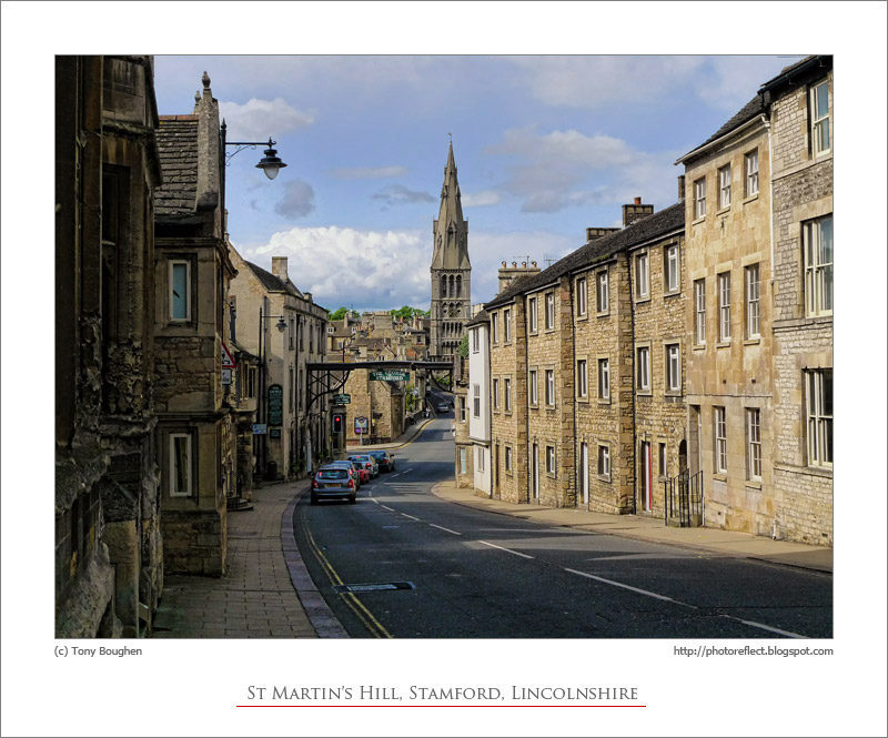
If churches had never required tall bell towers that could ring the call to service across a wide area then the builders of our cities, towns and villages would have had to come up with a tall structure to give settlements the vertical accent that we find so visually satisfying. Later centuries did, of course, have such structures. In the UK the nineteenth century brought slender mill chimneys, gas holders, the clock towers of town halls, etc. But, to my mind, none of these match the aesthetic satisfaction that a well-proportioned spire or tower offers when seen projecting above a ragged roof-line.The stone-built Lincolnshire town of Stamford has several churches that break its skyline, some of them medieval. Despite the fact that many of the secular buildings are Georgian and Victorian, from several points around the town, especially the fields by the river and St Martin's hill, it is still possible to see the kind of view that A.W.N. Pugin praised and extolled in Contrasts (1836), and which must at one time have characterised many English towns.
Today's photograph was taken looking down St Martin's hill from a point quite near the old church of the same name. The honey-coloured stone of the buildings that date mainly from the C17 to C19 frame a view of the C13 church of St Mary, its broach spire piercing a blue sky flecked with clouds. This image is another plucked from my "rejects and overlooked" collection. It was taken a year ago this month.
photograph and text (c) T. Boughen
Camera: Lumix LX3
Mode: Aperture Priority
Focal Length: 12.8mm (60mm/35mm equiv.)
F No: f5.6
Shutter Speed: 1/1000
ISO:125
Exposure Compensation: -0.66 EV
Image Stabilisation: On
Labels:
broach spire,
Lincolnshire,
St Mary,
Stamford
Friday, May 20, 2011
Reviewing the rejects
click photo to enlarge
Every now and then I look through my folders of RAW files and give further consideration to those photographs that didn't make it into the blog the first time around. About 85% of the shots that I post come from a first selection. However, the remaining 15% are images that for some reason or other I rejected on the first pass, but which with hindsight seem to make the grade. Very occasionally an overlooked photograph makes me think, "Why on earth didn't I post that one!" That's the case with today's, an image I took a year ago at St Mary's Place in Stamford, Lincolnshire.My preferred method of selection involves choosing an image for posting, preparing it, then living with for a few days to see if my initial favourable impression is retained when I've looked at it many times. Usually my first judgement is confirmed, though sometimes I decide that I was wrong, the shot doesn't pass the test, and it is rejected. But, occasionally when I'm shooting a lot I post several from my haul and before I've exhausted all the "keepers" I've moved on to the next batch that I've shot. I think that was the case with this image: I moved on to newer photographs and this one got overlooked and left behind.
I like this photograph for the composition, the raking light that gives a sharp edge to the eighteenth century architecture, the deep shadows, the turbulent sky, and the three shoppers turning the corner that give the picture scale. It looks pretty good in colour with its honey-coloured stone and the greys, whites and blues in the sky, and that prompted my usual anguish about which version to post. However, the black and white shot seemed to have greater impact so that's the one I'm showing
photograph and text (c) T. Boughen
Camera: Lumix LX3
Mode: Aperture Priority
Focal Length: 5.1mm (24mm/35mm equiv.)
F No: f5 Shutter Speed: 1/1000
ISO: 80
Exposure Compensation: -0.66 EV
Image Stabilisation: On
Saturday, February 26, 2011
Barn Hill, Stamford
click photo to enlarge
Take down the television aerials and burglar alarm boxes, mask the electric door-bells, and you need to do very little else to produce a street where you could film the latest Jane Austen adaptation. Barn Hill in Stamford, Lincolnshire is one of those places that film producers and directors value for the way it has changed so little down the centuries. When I looked at this view my eye saw no building that appeared to be of a later date than the first quarter of the nineteenth century. However, knowing that provincial houses often lagged metropolitan styles by a decade or three, I decided to consult a database of listed buildings to see if my judgement was accurate.The nearest house on the right with a ground floor and first floor bay is C17 and mid-C18. The house with the green door is similar, though the porch and ground floor bay is thought to be mid-C19 (bah!). The house with the pedimented door and arches over the windows to the left used to be two houses but is now one, and dates from the C17 and late-C18. The next house with the two-storey bow and the open-work Chinoiserie porch is quite a bit earlier than I thought: I'd have said 1810, but apparently it is mid-C18. On the left is a fine, obviously C18 town house, with one of the rainwater heads giving its age away - 1740. The two church spires are, of course medieval. In 1087 Stamford had four churches: by the end of the Middle Ages it had fourteen of which five remain complete, and two in fragments.
I've photographed Barn Hill before. That image was taken from near the building with the Chinoiserie porch. Scouting for film locations is a branch of film production that Google Street View must have made so much easier. With that thought in mind, click here to explore the length of Barn Hill for yourself.
photograph and text (c) T. Boughen
Camera: Canon
Mode: Aperture Priority
Focal Length: 24mm
F No: f7.1
Shutter Speed: 1/250
ISO: 100
Exposure Compensation: -0.67 EV
Image Stabilisation: On
Labels:
Barn Hill,
Lincolnshire,
Stamford,
street
Tuesday, December 23, 2008
The Acme Vehicle Eraser
click photo to enlargeIf you're a photographer you're always finding stuff getting in your way. If it's not pesky pedestrians sauntering across your scene it's repulsive refuse bins violating your view. Photographing in town or country you frequently find wires, antennae, aerials and poles wending their way through the vista. My particular aversion is vapour trails (contrails to some). Their white scribble, scrawled across the sky scar many of my landscapes and only rarely do I find that they contribute to the composition. Anyway, enough of this alliterative abuse of people and inanimate objects, because there is, apparently, a more convenient answer to the removal of at least one of these intrusions than the painstaking processes currently available: a piece of software promises the painless removal of wires.
The other day I came across an advert for a program called Wire Pilot, a Photoshop plugin that makes the digital removal of telephone and electrical wires - in fact any thin object - an easier task. You might think, given the diatribe above, that I immediately went online and ordered my copy. But no. Wires are relatively easy to remove should you wish to do so. In fact, what I did do was look at the Wire Pilot website to see if they sold a software removal solution for the object that is a bigger pain than pedestrians, bins, wires and vapour trails combined. I mean of course, the car (that's "auto" if you say "contrail"!) and its associated wheeled accomplices, the van, the lorry, etc. Alas, I was disappointed. The "Acme Vehicle Eraser" is yet to be developed. But, when it is, my money will be joyfully despatched with great haste.
I have been known to say that I don't mind vehicles in a shot; that they give an image a sense of the period in which it was taken, and that today's photographic intrusions are tomorrow's historic vehicles over which future viewers will pore with interest. I do believe that. But not all the time! On other occasions, as when I was photographing this view of Barn Hill at Stamford, Lincolnshire, with its houses of every century from the sixteenth to the nineteenth, I want to sweep away the vehicles and reveal the history that they obscure. In the absence of any power to physically do that, the ability to remove them using software would be handy. Now I appreciate that there are certain minor technical difficulties in what I am proposing, but they're surely not insurmountable at the start of the 21st century, a time of Large Hadron Colliders, space missions to distant planets, and mp3 players the size of your fingernail. However, on deeper reflection, perhaps I'm searching for a solution to a problem that will soon disappear anyway. The current economic problems and the dwindling oil supplies may well be the magic wands that make those cars disappear without the need for expensive software!
photograph & text (c) T. Boughen
Camera: Olympus E510
Mode: Aperture Priority
Focal Length: 18mm (36mm/35mm equiv.)
F No: f6.3
Shutter Speed: 1/400
ISO: 100
Exposure Compensation: -1.3 EV
Image Stabilisation: On
Subscribe to:
Posts (Atom)