Showing posts with label Blackpool. Show all posts

Monday, February 08, 2010

Reflecting on mirror balls

click photo to enlarge
In a small sea-front garden, off the Tower Esplanade, in the Lincolnshire resort of Skegness is a diminutive pavilion with a ridged, blue hexagonal roof. At the apex of the roof is a spike, on top of which is a mirror ball. As mirror balls go it's a respectable size. As seaside, promenade mirror balls go, especially compared with the 20 feet (6m) diameter of Blackpool's (the largest in the world), it is fairly insignificant.

However, as I passed it the other day I thought I'd try a shot similar to the one I'd taken in 2006 of the whopper at Blackpool. The resulting photograph of some of the thousands of tiny mirrors on part of the sphere has an abstractish, pixellated quality that pleases me. At the top of the image is the blue sky with an aircraft's ragged, wind-blown vapour trail. On the horizon are the varied and colourful buildings of Skegness's promenade. Below them is the green of the lawns and the grey/brown of the paths in the small garden where the pavilion is located. The very bottom of the shot shows a segment of the ridged, blue roof.

One of the virtues of visiting a glitzy seaside resort such as Skegness is that even in winter a photographer can guarantee to go home with a memory card packed with shots exhibiting the sort of vibrant colours that you can only usually get in the other three seasons of the year.

photograph & text (c) T. Boughen

Camera: Olympus E510
Mode: Aperture Priority
Focal Length: 150mm (300mm/35mm equiv.)
F No: f6.3
Shutter Speed: 1/320
ISO: 100
Exposure Compensation: -0.3 EV
Image Stabilisation: On

Saturday, November 28, 2009

On the beach

click photo to enlarge
A while ago I was talking with some friends about the sort future that was held out to mankind in the 1950s. We could all remember looking forward to shorter working hours, greater leisure, longer life-spans, limitless energy, automation, flying cars, interplanetary settlement and travel, the conquest of disease, and consumer goods and food a-plenty. Some of this future has certainly come true for those of us fortunate to live in the "developed" world, but much has not, and the time of plenty that was foretold is beginning to increasingly look like a transient period.

But memories are selective. Because what my friends and I had all forgotten - or perhaps repressed - was the other 1950s vision of the future that was no future at all. During that decade the possibility - likelihood even - of nuclear war was an ever-present subject in the newspapers, on television and in the cinema: the idea that the nuclear-armed nations of the world would destroy not only each other, but the rest of mankind, kept re-appearing. Novelists took up the theme too. Only after I'd given the title to today's photograph did I realise that it is also the title of the bleakest "post apocalypse" novel of the 1950s. "On the Beach" was written by the British-born Australian writer, Nevil Shute, in 1957. It imagines a group of people in Australia waiting for the radiation of the nuclear wars of the northern hemisphere to be carried on the wind to where they are waiting. When I read it in the late 1960s it seemed a grim, but not impossible, vision of the future. In the 1950s it must have appeared all too plausible.

So, if you want an antidote to the unrelenting Christmas jollities that will soon descend upon us you could do worse than dig out a copy of this novel, or find a DVD of the film. However, if the prospect of time spent reading or watching is just too much for your busy schedule Wikipedia can oblige with a helpful synopsis. Happy reading! :-)

The photograph above dates from early 2007, before my re-location to Lincolnshire. It shows the beach at Cleveleys, Lancashire, with Blackpool in the distance. I was reviewing my shots from that year recently, and I thought this was one worth posting for the brave dog walkers, the litter of gulls, and the nice way the spray and haze gives a blue cast to the scene and makes the distant Tower and cliffs almost disappear.

photograph & text (c) T. Boughen

Camera: Olympus E500
Mode: Aperture Priority
Focal Length: 118mm (236mm/35mm equiv.)
F No: f7.1
Shutter Speed: 1/1250
ISO: 100
Exposure Compensation: -0.7 EV
Image Stabilisation: On

Wednesday, February 18, 2009

Incendiary bicycles?

click photo to enlarge
A few decades ago, in my teenage years, I was cycling down a long, steep and winding hill above Langcliffe in the Yorkshire Dales. As the drystone walls and sheep flashed by the smell of burning impinged on my consciousness. Glancing briefly around I could see neither burning man nor flaming beast, but looking down I saw smoke coming from my brake blocks. I suspect I had bought the cheapest available, and they didn't appear to be up to the job. When I stopped, got off and inspected the source of the heat and smoke, I could see that a burnt residue had been smeared around my wheel rims by the friction of rubber on metal. I think I can honestly say that is the only time I have ever considered a bicycle to be anything remotely resembling a fire hazard.

And I suppose that's why I found this sign fixed to a seaside pier in Blackpool, Lancashire, very puzzling, not to say quite bizarre. I tried to imagine the kind of bicycles that the author of the missive might have in mind. I could see that if the clowns from the Blackpool Tower Circus left their car on the pier it might well explode with a flash of flame and a puff of smoke - clowns' cars often do that. But their bicycles? Never! And anyway, most of them have only one wheel so if that was what the sign-writer had in mind he should have prohibited unicycles too! To this day that sign is probably the oddest that I've been motivated to photograph, and the whole point of it, including the spurious "health and safety" justification, puzzles me still.

I came across this image as I was transferring files to my new hard drive after my recent misfortune. It makes a good companion for the image I posted a couple of weeks ago. If you're not keen on this sort of shot, hard luck, I found a third example that will appear soon!

photograph & text (c) T. Boughen

Camera: Olympus E500
Mode: Aperture Priority
Focal Length: 48mm (96mm/35mm equiv.)
F No: f6.3
Shutter Speed: 1/125
ISO: 100
Exposure Compensation: 0 EV
Image Stabilisation: N/A

Wednesday, December 03, 2008

Looking for beauty

click photo to enlarge
Visitors to photography forums will have heard people bemoaning the fact that the area in which they live isn't photogenic, and that they have to travel miles to get good images. It's hard to have sympathy with this view, or the mindset of someone who wants to take photographs of conventionally beautiful places, but is unwilling to recognise, or look for, the different kind of beauty that will undoubtedly exist where they live.

When I lived in Lancashire I regularly walked along both banks of the River Wyre where it widens into an estuary that flows into the Irish Sea at Fleetwood. It's a flat location that, on one side, has the debris of 150 years spread along its banks - the rotting hulks of wooden ships, old sea walls and their newer replacements, industrial sites that have closed, the wrecked remains of a once thriving fishing industry, newer chemical manufacturing plants and a municipal dump. The other side is more rural, with saltmarsh, pastures, cereal fields, a golf course and nature reserve. As I walked the area I found plenty of subjects at which I could point my camera. Many weren't beautiful in the usual sense, but did offer a harder sort of attractiveness, as well as undoubted fascination. In this sometimes bleak area I usually got my best landscape shots when there was an interesting sky. A photography lesson that it took me a while to learn is that just as a sunset can make any subject look wonderful, a sky with cloud and light can add drama, beauty and contrast to the most unpromising scene, even an expanse of cold, flat winter water and a factory with a tall chimney.

This contre jour shot looking upstream from Knott End uses the factory on the left as balance for the sun on the right. The distant blocks of flats and Blackpool Tower add a few more details to the flat horizon.

photograph & text (c) T. Boughen

Camera: Olympus E510
Mode: Aperture Priority
Focal Length: 62mm (124mm/35mm equiv.)
F No: f8
Shutter Speed: 1/1000
ISO: 100
Exposure Compensation: -2.0 EV
Image Stabilisation: On

Friday, March 09, 2007

No, no to retro!

click photo to enlarge
The success of the "new" Mini has been trumpeted in the press in recent days. It seems to be selling very well and production is to be increased. Commentators like it and, apparently, so do the car-buying public. I don't! My view of this car is the same as my thinking on the "new" VW Beetle - they are shams: pale imitations of the vehicles that they are designed to echo, and based on a corrupt design principle.

Alec Issigonis, the designer of the original Mini had a clear brief to make a small, mass-produced, inexpensive vehicle. He succeeded by being innovatory. The new car had to fit in a space 10 feet X 4 feet X 4 feet, the passenger cell had to be at least 6 feet long, and it had to use an existing engine. The designers came up with a monocoque shell, mounted the engine transversely, and gave it front-wheel drive. The wheels at each corner conferred great stability and handling, and the firm ride came from the use of rubber cones instead of conventional springs. Other innovations like welded seams, sliding windows and external hinges kept the cost down and contributed to a quirky and appealing aesthetic. Despite its cost being initially more than was intended people wanted to buy it, and it became a great success. By contrast the "new" Mini simply apes the appearance and details of the old car, and uses the same bog standard designs found on every new car. Retro and copyist styling of this sort shows lazy, bankrupt thinking. It's like building a mock-Georgian house in the twenty-first century. Why would you do it? People should build for now. They should create designs of their own time and push forward, not look back!

What, you're probably thinking, has this got to do with a shelter on the Blackpool's North Shore - all pediments, cartouches and ornate iron brackets. Well, new shelters have been built on the South Shore that completely disregard old designs of this sort. And, further up the coast new, modern shelters are appearing as part of Cleveleys' new sea-defences. No one thought for a moment to create shelters that looked like, or drew their inspiration from examples such as the one in the photograph. This shelter is of its time, is not without distinction, but certainly isn't of today. Car designers need to take note!

I took this shot on cold sunny day when the biting wind made a cliff-top walk a challenge rather than a pleasure. But that didn't stop the determined, two of whom I included in my image. I placed the shelter very slightly off centre to balance the people, and post-processed in contrasty black and white to emphasise the strong forms. The photograph was taken with a medium zoom lens at 36mm (35mm equivalent) with the camera set to Aperture Priority (f7.1 at 1/320 second), ISO 100, with -1.3EV.
photograph & text (c) T. Boughen

Saturday, January 27, 2007

Blackpool semi-abstract

click photo to enlarge
What's the difference between represent- ational art and abstract art? Well, most people would say that abstract art doesn't depict objects that you can see in the natural world, whereas representational art does. That gets somewhere near the heart of the matter. However, many artists have a problem with the term "abstract", and prefer "non-figurative" or non-representational" to describe their work.

That being the case, how are we to describe, say, Cubism - the early twentieth century style of Picasso and Braque. Their images included people with compound faces seen from multiple points of view, guitars that are unlike real guitars, and shapes and colours that intersect with recognisable objects, but which are like nothing found in the natural world. Interestingly, these paintings were, at the time, and for many years after, described as "abstract art". Today however, with the experience of decades of completely non-figurative art, we would no longer use that term. "Semi-abstract" is now sometimes used as a description of art that uses a mixture of figurative and non-figurative components, or that uses figurative components in a way that emphasises, say, their pattern, colour or shape. And, what applies to fine art painting also applies to photography.

I was thinking about this when I was deciding how to categorise this image that I took on Blackpool's South Promenade. It features the "fish-tail" of the vane that revolves a seat to ensure that the users are always turned away from the wind; the 235 feet high summit of "The Big One" roller coaster; some odd clouds that were originally vapour trails; and a deep blue sky. The image doesn't seek to tell you anything about each of these components - it is semi-abstract. Instead you are invited to take pleasure (if it is there to be found!) in the odd juxtaposition of these strong, strange shapes, and the combination of intense and subtle colours. Oh, and (if you haven't read the description above) to wonder what on earth these things are! To capture this image I used a wide zoom lens at 28mm (35mm equivalent), with the camera on Aperture Priority (f8 at 1/500 second), with the ISO at 100 and -1.0EV.
photograph & text (c) T. Boughen

Friday, January 26, 2007

Slower days

click photo to enlarge
When I was a child Sundays were different. People rose later than on Saturday or on a weekday. The streets were quieter on Sundays, not just because there were fewer private cars, but because people used them less on that day. The pace of life was more leisurely. Odd jobs would be done, a grand Sunday lunch (dinner in the North of England) would be cooked, families would sometimes have a walk together, the car would be cleaned. And yes, the bells would ring and some people would go to church. It sounds idyllic doesn't it. I don't think it was quite as wonderful as my pen portrait suggests, but Sunday was, undeniably, a different sort of day.

Then came Sunday trading. Shops were allowed to open between the hours of 10.00am and 4.00pm.. This was accompanied by protestations from church groups, trade unions representing shop workers, and others. But, there seemed to be a desire to shop on Sundays, and so the day became much more like Saturday. Most have welcomed the change. I haven't! I really liked the different, slower, more relaxed quality that Sunday brought. The contrast of this day appealed to me. Going out early in the morning and finding the streets empty and quiet was a real pleasure. It was an opportunity to slow down, take more time over things, and look more closely at my surroundings. But today, for most, that kind of Sunday is either a distant memory, or something that has never been known. I say for most, because something of that Sunday quality can be found at a seaside resort on a cold, winter, weekday morning. There are no holiday makers, seasonal shops are boarded up, and the promenade is quiet apart from the call of gulls. It's an opportunity to view the place in a more relaxed way, without the bustle of people intent on enjoyment, a way that I remember doing all those years ago.

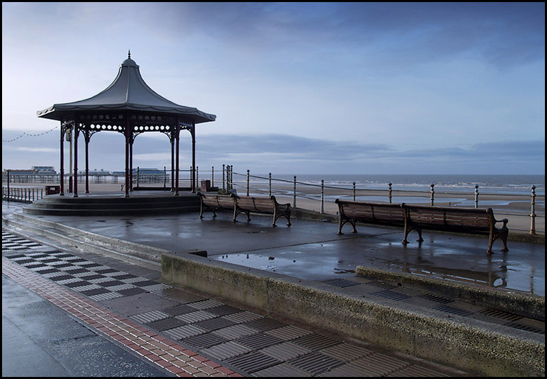
I took this photograph of the bandstand on Blackpool promenade on just such a morning. The cold, blue light of the low sun, the reflections off the wet surfaces, and the empty benches was an appealing sight to me. I composed the shot with the bandstand to the left, and the lines of the steps, benches and railings leading to it. I used a zoom lens at 34mm (35mm equivalent), with the camera set to Aperture Priority (f8 at 1/200 second), 100 ISO, and -0.3EV.
photograph & text (c) T. Boughen

Thursday, January 25, 2007

Flying the flag

click photo to enlarge
An observant visitor to the UK is likely to notice the relatively small number of Union flags that are flown. Compared with, say, France or the United States, our flag is all but invisible. Every now and then UK writers comment on this, and periodically politicians and nationalists try to stimulate the flying of more flags. But without much success.

Why is this? It's probably something to do with the United Kingdom being a collective of four separate countries, each with its own distinctive history, language and culture. In Scotland the cross of St Andrew seems to be flown more than formerly, perhaps reflecting its growing nationalism, whilst in Wales that country's flag flies fairly widely. Northern Ireland goes its own way, and tends to display three flags - the Union flag, the flag of Northern Ireland, and the tricolour of the Irish Repubic - depending on political persuasion! And England is simple confused. It's forgivable that people from other countries confuse the Union flag with the flag of England, but it's unfortunate when native English people do the same. Many do fly the cross of St George, but it's done with markedly less fervour than the people of the other constituent countries of the UK fly theirs.

So, when a Union flag is flown it tends to be noticed. This flag on the 1930s Casino building on Blackpool's promenade grabbed my attention immediately, and I decided to make it the focal point of an image. I have photographed the architect Joseph Emberton's Modernist masterpiece before, but this time I decided to be selective and show some of its white reinforced concrete curves against the deep blue of the January sky, enlivened by the red of the decrative wheel and that high flying flag. A zoom lens at 48mm (35mm equivalent) was used, with the camera set to Aperture Priority (f8 at 1/400 second), with the ISO at 100 and -0.7EV.
photograph & text (c) T. Boughen