Wednesday, January 26, 2011

Looking up No. 2

click photo to enlarge
"Looking Up" was the title of a blog post that I made in May 2008 featuring the same subject as today's entry - the underside of the tower, together with the ceilings of the nave, chancel and transepts of Peterborough Cathedral. As part of my workout that aims to make me familiar with my new camera's strengths, weaknesses and peculiarities, I've been photographing a range of subjects, some that I've shot before, using different lenses, apertures, shutter speeds, ISOs and EV settings. This shot is with my unstabilized 17-40mm lens, and the shutter speed of 1/10 second is about the limit of what I can successfully hand-hold. Viewed at 100% this shot is pretty sharp. Of course, the ISO of 3200 is what makes the image possible. You might wonder why I didn't open the lens up, but I find that some corner softness appears at its maximum of f4. This isn't too much of a problem with, say, a landscape, but with the straight, sharp lines of architecture - even the several hundred years old variety - it can be noticeable.

The centre of today's image shows the timber lierne vault on the underside of the central (crossing) tower of the cathedral. The other ceilings are also timber. This is not unusual with the wide spans of a Romanesque building of the twelfth century. The ability to throw stone vaulting over such a distance hadn't been developed at that time, though it was used in the narrow aisles here. The hierarchy of decoration that can be seen in the four main ceilings reflects the relative importance of each  part of the cathedral. Thus, the painted, closely coffered ceiling, with decorative bosses, flanked by vaulted coving over the chancel (on the right), that dates from the fifteenth century, emphasises the liturgical centre of the church, the place where the clergy worked, and the location of the high altar. The painted nave roof with its elongated diamonds each with a central figure - kings, queens, saints, fantastic animals etc - dates from about 1220. Pevsner calls it "a precious survival". This is over the part of the church devoted to the laity. The other two ceilings that roof the transepts are also original, and though the wood is again laid in diamonds, it is not painted, and they are definitely subsidiary to the main two.

I often think that photographs of this subject, taken from directly below with symmetry, have something of the look of a kaleidoscope image, and this one is no exception. For more views of vaulting and the underside of towers see these photographs from Louth and Ludlow, Morton, Brant Broughton, Pershore, Boston, Norwich, and Ely.

photograph and text (c) T. Boughen

Camera: Canon
Mode: Aperture Priority
Focal Length: 17mm
F No: 7.1
Shutter Speed: 1/10
ISO: 3200
Exposure Compensation: -0.33 EV
Image Stabilisation: N/A

Tuesday, January 25, 2011

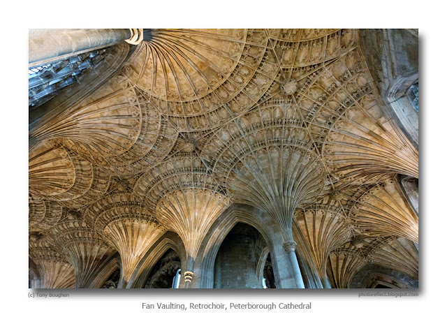
Cathedrals and a fan vault

click photo to enlarge
The cathedral that I was most familiar with in my younger years was York Minster. From my position of ignorance, I took it as the yardstick against which I measured others. As I came to realise in later years, this was very unfair. Its importance as the seat of one of England's two archbishoprics, its enormous size and wealth, and the setting among the medieval walls, churches, and streets of York, gave it an advantage that few could match. It was only after I moved to the East Riding of Yorkshire, became interested in church architecture, and travelled around England looking at other cathedrals that I realised this. But by then, my eye had been trained and my understanding enlarged, and the subtleties that I began to see in other buildings became as important as York's imposing magnificence.

If, today, I were to list the cathedrals (and I include minsters under that heading) that I like best, then I would have to say that my absolute favourite is the often overlooked Beverly Minster in the East Riding for its superb details but also for the uniformity of the nave. This was partly brought about by the conscious decision of medieval builders to carry on with an "outdated" style for the sake of continuity, a practice also followed at Westminster Abbey. Then I would list Durham and Lincoln for the high quality of their details from all periods, but especially for their high and very visible sites that show them off to great advantage, and yes, York for its majesty and the white stone that makes it look, in certain lights like a great ocean liner. Finally I would add Peterborough, a cathedral with which I wasn't very familiar until relatively recently, but one which displays the grandeur of the Norman to perfection in its nave, and has new interest and beauty to be discovered with each visit.

Peterborough also has, in its retrochoir, some lovely fan vaulting dating from around 1500. Today's photograph of part of it was shot as an experiment with my relatively new camera. The 17-40mm lens that I used is not stabilised, so in order to achieve a realistic shutter speed the image was taken at 3200 ISO, a rating that a few years ago would have been unwise, and in the days of film virtually unthinkable. However, this combination handled the job quite well without recourse to a tripod. For  another shot of this vaulting, taken in better light with an Olympus DSLR at 800 ISO, see here.

photograph and text (c) T. Boughen

Camera: Canon
Mode: Aperture Priority
Focal Length: 17mm
F No: 7.1
Shutter Speed: 1/20
ISO: 3200
Exposure Compensation: -0.33 EV
Image Stabilisation: N/A

Monday, January 24, 2011

Farmland near Folkingham

click photo to enlarge
The other day I was reading a news article about the recent DEFRA report, "Wild Bird Populations in the UK". The state of a country's birds is a useful general indicator of the state of its wildlife across the board, and the data in this report doesn't make good reading. It compares today with the the position in the 1970s, and while there are some some encouraging things to note, such as the sustained increase in seabird populations, the species of other habitats, with some exceptions have generally declined, often markedly.

Water and wetland birds are a mixed picture - those that inhabit lakes, ponds and slow rivers have increased, but the birds of wet grassland and fast flowing rivers are down. Wintering wildfowl and waders are above the numbers seen in the 1970s, but have fallen from a 1990s peak. Many woodland birds, such as the wood warbler, tree pipit, lesser spotted woodpecker, song thrush, tawny owl are much less common. A few species including the great spotted woodpecker, blackcap, nuthatch, green woodpecker and long-tailed tit have increased in abundance. However, it is farmland birds that have declined in the greatest numbers. The grey partridge, starling, turtle dove, corn bunting, tree sparrow and yellow wagtail are down by over 70%, though a few, such as the wood pigeon, jackdaw and greenfinch, have increased by around 50%.

The probable cause of the decline in farmland birds is the intensification of agriculture, increased drainage, the removal of trees, bushes and hedgerows, and the conversion of scrub and "rough" land to pasture or arable. The changing weather and climate has probably added to the loss. During a recent walk over an area of low Lincolnshire hills given over to arable, pasture and small woods the loss described in the report was palpable. I saw a buzzard, a few kestrels, rooks and jackdaws, a single group of about 50 lapwing, a few gulls, starlings, house sparrows, fieldfare and redwing, some robins, a few chaffinch, some red-legged partridge, pheasants and 3 skylarks. I could list many species that I'd expect to see but didn't, birds such as the yellow hammer, sparrow hawk (though that has become more abundant), grey partridge, jay, linnets, redpoll, mistle thrush and meadow pipit. Interestingly much of Lincolnshire farmland is subject to stewardship schemes of one sort or another designed to conserve and promote wildlife whilst allowing efficient food production. The major bird conservation organisations make the point that, though the decline in bird populations is severe, we do know how to manage farmland to reverse the trend. Perhaps a starting point should be reviewing the terms and scope of those stewardship schemes.

Today's photograph was taken late in the afternoon in the area of Lincolnshire where we walked, near the village of Folkingham. Sterile areas of winter wheat dominate the shot, but a few trees, bushes, closely cropped hedges and an area of pasture can also be seen: not very conducive to thriving bird populations. But, the raking yellow light of the low sun as it shone through a gap in the clouds did transform the scene for my photograph, and made the foreground contrast nicely with the village that was still in shade.

photograph and text (c) T. Boughen

Camera: Canon
Mode: Aperture Priority
Focal Length: 175mm
F No: 7.1
Shutter Speed: 1/160
ISO: 160
Exposure Compensation: -0.33 EV
Image Stabilisation: On 

Saturday, January 22, 2011

The Fens

click photo to enlarge
The Fenlands of Eastern England is a flat, low-lying region of about 1500 square miles in the counties of Lincolnshire, Norfolk, Cambridgeshire and a small area of Suffolk. It includes a large amount of land that has been reclaimed from marshes and the coast. The Fens contain half of the Grade 1 farmland of England - the most productive of our agricultural land. More than a third of vegetables grown in the open are cultivated in this area. It also produces a large cereal crop, and retains small herds of sheep and cattle, animals that were formerly much more numerous in this part of the country, and which, in the case of sheep, accounted for its prosperity during the medieval period.

It is said that in the Fens three-quarters of the the landscape is sky. It is certainly true that big skies are a feature of the area, and photographers who take pictures in this region soon learn to use them to their advantage. In a talk about photography that I gave recently I said that Fenland photographers usually tilt their cameras down or up, and rarely have them level. A level camera tends to produce a shot that splits the composition roughly equally between earth and sky, a distribution that is, I think, the least visually satisfying of the possibilities. When photographing in the Fens I often consciously choose either two-thirds sky or two-thirds land, deliberately giving emphasis to one or the other. Sometimes I give an even greater fraction to the sky.

Today's photograph does the latter. On the January day that I took this shot the sky was largely overcast but with subtle hues and shading. A low, late afternoon sun was illuminating the fields and the distant wind farm, making the white turbines stand out against the dark sky. They provided the main subject that I needed to compose an image that included the lone tree, distant farms, frost-hammered vegetables and that big sky.

photograph and text (c) T. Boughen

Camera: Canon
Mode: Aperture Priority
Focal Length: 70mm
F No: 7.1
Shutter Speed: 1/100
ISO: 100
Exposure Compensation: -0.67 EV
Image Stabilisation: On 

Friday, January 21, 2011

Winter colour and photography

click photo to enlarge
Last night I attended a talk about how to increase the amount of colour in your garden in winter. This is a challenge to all gardeners in the UK. Green and brown are easy to achieve, but the rest have to be planned. The speaker took us through four sources of plant colour - berries/fruit, leaves, bark and blooms. Quite a few of the examples he showed are present in our garden but some were new to me and he gave us a few ideas for planting. This morning, a cold and clear day, we went for a walk that took in three churches: Folkingham, Walcot and Pickworth. As we trudged over the low hills, along frosty footpaths that took us through pastures, winter wheat and vegetables, I looked about me and saw that, the blue of the sky excepted, green and brown were the dominant colours of the winter countryside too. The brown did shade into buff and almost yellow in places, and the orange bricks and pantiles of the farms and cottages added a high note here and there. But, wherever I looked it was mainly green and brown.

I took my photographs of Folkingham's pinnacled tower and the broach spires of Walcot and Pickworth. I also cast about for a few landscape shots. But, I wasn't very satisfied with much of my output largely because of the unremitting blue of the sky, its plainness relieved only by the odd vapour trail here and there. Moreover, the shadows that the sun produced were deep and dark, making the images very contrasty. So, this afternoon, as broken cloud rolled in, I went out again with my camera and took in the churches again, this time producing shots that I'm happier with. The late afternoon light, partly filtered by cloud, and with a yellow tinge, deepened the colours of everything and allowed the shadow details to be better seen.

Pickworth is one of my favourite nearby medieval churches, but it's a building that I haven't managed to photograph especially well. Today's image is the best so far - though I'm sure I can improve on it.

For a photograph of Pickworth church's fine old south door and some graffiti, see here.

photograph and text (c) T. Boughen

Camera: Canon
Mode: Aperture Priority
Focal Length: 17mm
F No: 7.1
Shutter Speed: 1/125
ISO: 100
Exposure Compensation: -0.33 EV
Image Stabilisation: N/A

Thursday, January 20, 2011

Crossover craziness

click photo to enlarge
When it comes to the leading edge (or even the bleeding edge) of automotive development I'm clueless. But, I do consider myself to be observant, so if a trend develops it does eventually register on my consciousness. Which brings me to the "crossover" vehicle. For a while I've noticed cars appearing on our roads that are neither one thing or another: not a 3-box saloon, not quite a 2-box hatchback, and with elements of an urban 4X4 (a concept that still mystifies me): in fact, something of a mixture of the styling of the last two. I mean vehicles such as the Ford Kuga, Mitsubishi ASX, Peugeot 3008, Nissan Qashqai (or is it CashCow?), and the one whose advert caught my eye on the back of my morning newspaper, the second-generation Kia Sportage. The latter, by the way, describes itself as an "urban crossover" that "gives you the confidence to be a bit more adventurous". To support that statement it is shown on a traffic-free rural A-road carrying two unicycles on its roof-rack. How I laughed at the wit of the advertising agency that came up with that one.

Apparently, if my reading about this class of vehicle is correct, all crossovers are urban in essence and they may or may not have four-wheel drive suitable for "light off-road usage" (presumably parking on the pavement or cutting up the roadside verges), so quite how an urban crossover such as Kia's vehicle differs from a bog-standard crossover I can't begin to guess. But then perhaps I'm searching for a meaning and purpose that doesn't exist beyond marketing to the gullible. However, I did discover that some manufacturers prioritise "sportiness" over "ruggedness", and others do the opposite, so perhaps there's a nuance to the Sportage that escapes my untutored eye. That may also explain my puzzlement about the BMW X6, a vehicle that I described as "suffering from a personality disorder" in a 2009 blog post. Finally, I read that the "crossover" vehicle "has strong appeal to ageing baby boomers", which makes me part of the target demographic! Well, I won't be buying one because such a vehicle undermines three key design principles that I hold dear. Firstly, a product that purports to do two or more things invariably does them worse than products designed for a single purpose. Secondly, a product that relies on nonsensical advertising to find its market is likely to be nonsense, and thus to be avoided. And thirdly, I don't buy a product that is ridiculous unless ridiculousness is its intended purpose!

There is very little connection between crossover vehicles and today's photograph, but if, in the manner of a DJ segueing between tracks, I were to make one it would relate to the footwear I selected for our walk in the woods at Woodhall Spa in Lincolnshire. However, you'll be pleased to know that I'm not going to bore you further with that. Instead I'll say that the side of this corrugated metal shed appealed to me for two reasons - the pattern of shadows and the mixture of colours and textures, though I can see that, like a crossover vehicle, it won't be everyone's cup of tea.

photograph and text (c) T. Boughen

Camera: Canon
Mode: Aperture Priority
Focal Length: 37mm
F No: 7.1
Shutter Speed: 1/50
ISO: 320
Exposure Compensation: 0 EV
Image Stabilisation: On

Wednesday, January 19, 2011

Tattershall Castle, Lincolnshire

click photo to enlarge
Tattershall Castle was built by Ralph Cromwell in 1434-5 and was completed around 1450. Ralph held the title of Lord Comwell, was a Privy Councillor, and from 1433 to 1443 was Lord High Treasurer of England under Henry VI. His castle replaced an earlier structure dating from 1231 that was built by Sir Robert de Tateshall. The bases of two of this building's towers can still be seen.

Tattershall Castle was originally a much more extensive structure than we see today. As well as the remaining imposing keep and tall guardhouse it had an outer moat, outer bailey, inner moat, inner bailey, stables, gatehouse and kitchens. The area of the baileys and the moat ditches remain today, but little can be seen of the other buildings. There are not many brick castles in England - stone was much preferred - and people have speculated whether, towards the close of the castle building period, in an age of canon, the keep was designed for defence or simply to impress. Whatever the reason, and given Cromwell's unpopularity it was probably both, 700,000 bricks were used on the structure, with dressed stone reserved for window and door surrounds and certain other constructional and decorative details. Despite the expense and care taken in building the castle it didn't have a very long life, falling into disrepair soon after Cromwell's death. That we can see it today is largely due to Lord Curzon who responded to public dismay at the state of the castle by buying it in 1911 and restoring it. On Curzon's death Tattershall passed into the ownership of the National Trust who continue to maintain it today.

I took my photograph on a clear January morning. The castle was closed to the public, but this view was available by looking over a hedge on the track that leads to the adjacent Holy Trinity church, a building also funded by Ralph Cromwell.

photograph and text (c) T. Boughen

Camera: Canon
Mode: Aperture Priority
Focal Length: 32mm
F No: 7.1 Shutter Speed: 1/100
ISO: 100
Exposure Compensation: 0 EV
Image Stabilisation: On 

Monday, January 17, 2011

Earrings and bokeh

click photo to enlarge
My first SLR, bought around 1972 was a 35mm Zenith E with a 58mm f2 lens, a Russian-made camera, all an impecunious student could afford. But, compared with the pocket camera that I had been using up to that point, it offered me so much more. The low-light abilities were streets ahead of cheaper cameras, and the shallow depth of field that the lens allowed opened up greater creative possibilities.When I bought a 135mm lens I felt that most of the subjects I wanted to photograph were within my grasp.

In those days I favoured black and white, and in time did quite a bit of my own printing. When it came to portraits I really made use to the out-of-focus capabilities of the camera and its lenses. At that time the word "bokeh" to describe this blur wasn't used in English-speaking photographic circles. In fact, I didn't hear it until about ten years ago, though I read that it was first used outside Japan several years earlier. This ability to blur the background is one of the things that anyone transferring from a digital compact camera with a small sensor to a DSLR with a larger sensor notices and appreciates. Some people make the transition simply to achieve this quality that they have seen and want to emulate. But the fact is many small sensor cameras are capable of producing out-of-focus blur (or bokeh). Models with wide or normal focal length lenses can often do it when set to macro, and so-called "bridge" cameras with their very long telephotos can do it at longer focal lengths  as well as in macro mode.

Today's photograph is a case in point. It was taken using my LX3 in macro mode with the lens at its widest (24mm/35mm equiv.) very close to the subject. The f2 lens and the 43 sq.mm sensor produce an extremely shallow depth of field in these circumstances, which for some subjects produces interesting and pleasing effects. My image shows a pair of my wife's earrings. They are made from the "eyes" of a couple of moulted peacock tail  feathers with beads fixed to the barbs. I placed them on a sheet of black vinyl for the photograph, and was pleased by the detail the lens revealed and the pleasant bokeh, particularly in the curves of beads of the more distant of the two earrings.

photograph and text (c) T. Boughen

Camera: Lumix LX3
Mode: Aperture Priority
Focal Length: 5.1mm (24mm/35mm equiv.)
F No: f2
Shutter Speed: 1/30
ISO: 160
Exposure Compensation: -0.66 EV
Image Stabilisation: On

Friday, January 14, 2011

Sepia, Sutcliffe and boats

click photo to enlarge
Every now and then I come over all Frank Meadow Sutcliffe. I blame this affliction on the book of his photographs that I was given on leaving a job many years ago. The most recent occasion when I was struck by the condition was as we walked by The Haven. This is the tidal section section of the River Witham below the Grand Sluice, that serves as both a mooring place and quay for pleasure boats and fishing vessels, and links with the dock of the Port of Boston. The usual varied selection of craft were tied up along the winding waterway, and as the river was low, a selection of ancient, rotting hulks, stained green and brown with weed and mud, were also visible. It was the latter that made me think of the great Whitby photographer, because the shape and style of some of them reminded me of the craft that fill the photographs he took of that town's harbour. Some of them may even have plied the coastal waters during his lifetime.

Among the well-kept yachts and utilitarian inshore fishing boats I saw a few of, what I call, "hobby boats". By that I mean craft that are past their best and have been bought by an enthusiast as a "project". Such vessels can often be identified by their paintwork (colourful), name (fanciful), lettering (amateurish), the slabs of marine ply that replace original timber, and the clutter of tools and other bits and pieces that litter the deck. I first became acquainted with such craft when I lived in Lancashire. The River Wyre and Skippool Creek near Poulton le Fylde had a few dozen such boats. The biggest was called "Good Hope". My wife and I called it "No Hope" because the speed of renovation never kept pace with the speed of decay.

The little group of craft in today's photograph look like hobby boats. Interestingly most of them are not Boston registrations, but are from nearby King's Lynn. Their styles and arrangement brought Sutcliffe to mind and I took my photograph. Later, back at the computer, I compared a sepia treatment with both colour and black and white versions and decided I preferred it. Sepia tone is often used in photography today to suggest the past, but I think it has merit of itself. The warm cast that it gives to an image is different from the colder tones of black and white and lends a different feel to a photograph.

photograph and text (c) T. Boughen

Camera: Canon
Mode: Aperture Priority
Focal Length: 84mm
F No: 10
Shutter Speed: 1/80
ISO: 1000
Exposure Compensation: -0.67 EV
Image Stabilisation: On

Thursday, January 13, 2011

A Sherlock Holmes approach to photography

click photo to enlarge
I have a rule of thumb for finding photographs that is loosely based on Sherlock Holmes' advice to Dr Watson for finding the solution to a crime: "When you have eliminated the impossible", the great detective said, "whatever remains, however improbable, must be the truth." My version goes like this: "When you have photographed the obvious, whatever remains, however unpromising, must be source of your next images." With that thought in mind, on a damp afternoon, the sky a solid blanket of grey, I ventured with my wife down a few lanes and back alleys of Boston, Lincolnshire that I hadn't explored before.

Half way through our meandering walk we turned a corner and came upon a brick building that had been painted an eye-assaulting blue/purple. My first thought centred on how anyone could commit such a crime. But when I walked into the narrow alley at the side of the building I realised how and why - it was a club, and the whole purpose was to catch the eye. Well, it did more than catch my eye: it poked it sharply and provoked tears. The area is one of mainly Georgian and Victorian buildings, and the stridently painted club was like an abscess on its face. Then I spotted the trumpet player. Now I'm no fan of this sort of wall painting, but in this context, and given the desecration that had already taken place with the cans of blue/purple paint, the sight of the trumpet player was quite welcome: he lifted the building and my spirits. So I took his photograph and reflected for a moment or two on the wisdom of Sherlock Holmes.

photograph and text (c) T. Boughen

Camera: Canon
Mode: Aperture Priority
Focal Length: 40mm
F No: 10
Shutter Speed: 1/40
ISO: 1200
Exposure Compensation: -0.3 EV
Image Stabilisation: On  

Wednesday, January 12, 2011

Pollarding

click photo to enlarge
I've just arranged for a large willow tree to be trimmed. It stands next to the stream at the edge of my garden, and is somewhere near as big as a willow gets. The decision to have some weight cut from its top wasn't taken lightly, but it seemed to be a better course of action than letting the wind break off boughs or, worse still, topple the whole tree. The contractor estimated that it was last trimmed ten to twelve years ago -  a mark of how quickly a willow will regenerate itself. The term he used was "pollarding", though the cutting we agreed is less drastic than what I envisage when I think of that term.

Pollarding in its true form is the regular cutting of a tree eight to twelve feet above ground level so that it grows again and produces successive crops of wood. This self-renewing power of trees was harnessed for centuries by woodsmen, and most trees were managed by either coppicing or pollarding. In coppicing, a technique that was applied to ash, wych elm and many other species, the tree was cut down and the stump (called the "stool") was allowed to send out shoots that grew into poles that were cropped every nine or ten years. Where animals grazed among the trees pollarding was favoured. The permanent trunk (called the "bolling") sprouted new growth above the height that they could reach. Because it is more labour intensive than coppicing it was favoured in woodland pastures and non-woodland areas, but not for the interiors of woods. Willow, poplar and several other types of tree were regular recipients of pollarding.

My photograph shows a row of pollarded poplars that form part of the boundary to a vegetable packing site. Presumably they were planted to screen the premises, and were cut because they were deemed to be too tall. I came upon them on a dark, heavily overcast afternoon. My image has been converted to black and white then given a slight sepia cast.

photograph and text (c) T. Boughen

Camera: Canon
Mode: Aperture Priority
Focal Length: 24mm
F No: 7.1
Shutter Speed: 1/80
ISO: 100
Exposure Compensation: 0 EV
Image Stabilisation: On

Tuesday, January 11, 2011

The seaside in winter

click photo to enlarge
"Heaven, as conventionally conceived, is a place so inane, so dull, so useless, so miserable, that nobody has ever ventured to describe a whole day in heaven, though plenty of people have described a day at the seaside."
George Bernard Shaw (1856-1950), Irish playwright, essayist and critic

People will have their own opinions about Shaw's view of a day in heaven, but a majority would probably think his description of it perfectly matches a day at the seaside in winter: particularly at a town that specialises in "entertainment". These are places that are either loved or hated. The English middle classes tend to look down their noses at the likes of Blackpool, Margate, Weston-super-Mare, Cleethorpes or Skegness, seeing them as places of cheap thrills and meretricious tat, glitzy facades with no substance. There is some truth in that, but it's certainly not the whole story, and this kind of seaside resort, even in winter, can be a place of deep interest.

My first impressions of the Lincolnshire seaside town of Skegness weren't good. Its beach is flat and relatively uninteresting, the architecture is of the expected kind, but bland, without the showy excess and originality that enlivens many resorts. The pier, a feature of the English seaside that I love, is so short it rarely has water beneath it, lacks interesting ornamentation, and seems to be closed for most of the year. And the funfair is compact, ordinary, and without the spectacular rides found elsewhere. And yet, after a couple of visits, I started to look at what the town had, rather than what was missing, and in doing so found details, buildings and scenes at which I was happy to point my camera.

Today's image was taken on an early January afternoon as the low sun was about to be replaced by dark, looming clouds. The orange light of winter deepened the red of the sand, and intensified the colours of the amusement park rides against the deep grey sky. I took a close shot of the wheel and roller coaster, and then looked for a wider view. But, there was no foreground interest, and so I decided to use my own shadow. That produced the photograph that I liked best, perhaps because its starkness complemented the scene that was empty of the summer bustle and noise of holidaymakers enjoying themselves.

photograph and text (c) T. Boughen

Camera: Canon
Mode: Aperture Priority
Focal Length: 35mm
F No: 7.1
Shutter Speed: 1/320
ISO: 100
Exposure Compensation: 0 EV
Image Stabilisation: On

Monday, January 10, 2011

Bile, vitriol and politics

click photo to enlarge
A lot of the comment that I have read in the U.K. and U.S. press surrounding the recent shooting of an American Congress woman and her supporters has concentrated on the language that now pervades political discourse in that country, and the way in which, following the rise of the "Tea Party", it has become increasingly aggressive, vitriolic and abusive. Too often honest disagreement has, apparently, been replaced by hate, and the metaphors and imagery used in "debate" are frequently militaristic, violent or intimidatory. Opponents are to be "eradicated" rather than beaten in the polls. Sarah Palin's phrase, "Don't retreat, reload", and the use on her website of what appear to the cross-hairs of a rifle's telescopic sight aimed at political constituencies have been especially singled out for condemnation. One can only deplore this degeneration of politics into vicious, verbal brawling. When it spawns actual violence it needs vigorous, considered action and one hopes that the response of the American people and politicians will be more than a temporary moderation of the flow of invective. From a British perspective, we do not want this kind of savagery to descend on us - we have quite enough problems with our politics already.

What has received less comment in connection with the recent events is the link between the increasing prevalence of vitriolic language in politics and the rise of the internet as a speedy and often anonymous medium of communication and dissemination. For many years I have been concerned about the readiness of people to verbally abuse others on forums and message boards from the safety of an anonymous "handle". This even spread into phototography forums, arenas that aren't the obvious place for vituperation, to the extent that I now rarely visit them. The internet also provides the capacity for widely spread, like-minded individuals to organise, and spread their influence, again often anonymously. This is positive and fine when it involves, say, genealogy, but less so when it helps those who think the state is an enemy to be attacked by all means possible. It's probably true that "talk radio" and the so-called "shock jocks" got there first in this regard, but for me the internet has exacerbated the trend considerably.

What has this to do with a photograph of Tower Bridge, London, reflected in a window of the Assembly building. Not a great deal. Though I suppose I could say that this fractured and warped view of the world is analagous to the distorted view of some of the people discussed above - but I won't!

photograph and text (c) T. Boughen

Camera: Canon
Mode: Aperture Priority
Focal Length: 35mm
F No: 6.3
Shutter Speed: 1/400
ISO: 100
Exposure Compensation: 0 EV
Image Stabilisation: On

Sunday, January 09, 2011

Foul buoys

click photo to enlarge
Purfleet Quay in King's Lynn, Norfolk, usually has several buoys resting on it and the buoy maintenance boat, "St Edmund", moored alongside. Often it is the buoys used for marking the port and starboard limits of navigable channels that are in the process of being re-painted red and green. On my most recent visit (and on the one before that) there was also yellow buoy that had the word "FOUL" painted on its side. Not being an especially nautical person I needed to do a bit of research to discover that in UK waters a yellow buoy is a "Special Mark" that can indicate a number of things as disparate as a fish farm, a speed limit, or a potential hazard. That being the case, I imagine that the word "foul" in this instance indicates either a foul bottom where anchorage is difficult, or a hidden obstruction that might foul an anchor. Of course, it could be something quite different.

Over the past few years I've taken a number of photographs of the buoys at this location. Some of my images show details, and others give a wider perspective. This time I decided to try and make something of the carefully painted warning word on the yellow buoy, but also retain some of the red and green of those that were adjacent.

photograph and text (c) T. Boughen

Camera: Canon
Mode: Aperture Priority
Focal Length: 58mm
F No: 6.3
Shutter Speed: 1/80
ISO: 100
Exposure Compensation: 0 EV
Image Stabilisation: On

Friday, January 07, 2011

A black and white argument

click photo to enlarge
I've often thought that black and white photography is to colour photography as drawing, ink wash, etching etc is to painting. Not so much in the sense that it is inferior (as some believe), but because in printed form it pre-dates colour. Today, now that colour photography is widespread,  black and white continues only where lower cost or "artistic" reasons demand it. In the field of art photography, of course, black and white is a conscious choice, frequently the preferred medium of a practitioner, and is usually printed to the very highest standards. However, the man in the street frequently sees it as a lesser medium, a fragment of reality from which something has been deliberately witheld.

It's not my place to convince anyone of the fine qualities that black and white photography offers, though if I were to do so I'd begin, not with examples of noted practitioners such as Bill Brandt or Alfred Steiglitz, but with the work of John Bryan and Wilfred Shingleton. Most photographers are perhaps scratching their heads at these names: cinematographers are more likely to have heard of them. Bryan and Shingleton won the 1947 Academy Award (Oscar) for Best Art Direction - Set Direction, Black and White, for their masterful work on the 1946 film of Charles Dickens' Great Expectations directed by David Lean. I watched this film (for the third or fourth time) over the Christmas period, and as I did so I marvelled again at the striking use of monochrome; at the drama, beauty, style and atmosphere that it brought to the production. As an opening argument for the virtues of monochrome photography it is hard to beat. It is also the best film version of this dark tale. If you haven't seen it then do so!

Over the past few weeks I've slipped into black and white a little more than usual. I've always liked the medium, have processed my own prints from film, and continued using it in the years when colour printing gained the ascendancy in the UK. Winter has always seemed to me to be a good time for black and white images. Today's photograph of an Ipswich registered fishing boat near the quayside at King's Lynn, Norfolk, cried out for the treatment because of how it made so much more of the boat's silhouette against the light expanse of water and sky.

photograph and text (c) T. Boughen

Camera: Canon
Mode: Aperture Priority
Focal Length: 45mm
F No: 6.3
Shutter Speed: 1/160
ISO: 100
Exposure Compensation: 0 EV
Image Stabilisation: On

Thursday, January 06, 2011

Fascinating hexagons

click photo to enlarge
Ask a person in the street to name something that involves regular hexagons and they'll almost certainly come up with either the honeycomb or the snowflake. The reason why bees make their cells using this shape is thought to be the fact that it uses the least material for a given volume. It's the hexagon's ability to tessellate perfectly that is the key to our fascination with the shape. Squares and triangles have this property too (as do many other less common shapes), but they don't do it with the same interesting elegance.

Honeycombs and snowflakes aren't the only naturally occuring hexagons. Basalt columns exhibit this quality, as does the crystal beryl, the turtle's carapace and even a north polar cloud system on Saturn. Man has made use of the tessellation properties of the hexagon in things as diverse as floor tiles, patchwork quilts, glass window blocks, paving and house plans. It is also the shape used for the "Seabee" concrete blocks used to make the honeycomb sea-walls found on low-lying coasts subject to erosion. Placed as a revetment over gravel or stone they work by the holes absorbing the force of the waves. They are one of the more expensive methods of protecting a coast, but have been found effective when used judiciously. The examples in today's photograph are part of a length at Skegness, Lincolnshire. I chose a section where steps cut through the Seabees and I composed this semi-abstract image.

photograph and text (c) T. Boughen

Camera: Canon
Mode: Aperture Priority
Focal Length: 45mm
F No: 6.3
Shutter Speed: 1/100
ISO: 100
Exposure Compensation: 0 EV
Image Stabilisation: On

Wednesday, January 05, 2011

Reflecting on church towers

click photos to enlarge
When I first saw the church of St Peter and St Paul at Wigtoft in Lincolnshire, I thought, "Ah, a Kentish tower." What is it about the tower that makes me think of the ragstone, flint and clunch churches of Kent? It's that stair turret that climbs the south-west corner of the tower from ground level and finishes as a crenellated projection above the tower top. This kind of turret is not exclusive to Kent, but that county does have a fondness for them that has caught not only my eye, but that of a few architectural historians.

Church towers come in many shapes and sizes. The two most common variants in England are the square tower that is often, though not always, crenellated, and the tower surmounted by a spire. Both of these forms seem to me to be visually satisfying shapes. I particularly like the broach style where a stone spire is placed on a tower leaving no space for parapet or crenellations. The round towers of Norfolk are interesting departures from the norm that I find often work quite well in a naive, rustic way. Some of the domes and cupolas that top eighteenth century towers are also welcome additions. However, a tower with a single, small turret of the sort seen here at Wigtoft, as well as in Kent, and reasonably commonly elsewhere throughout the country, always looks awkward to my eye, especially when it accompanies a spire. It's as though the builders couldn't make up their minds and decided to have the lot - tower, spire and turret - not appreciating that the two topmost projections compete for attention rather than complement each other, with over-elaborate fussiness being the end result.

Not everyone will agree with me on this, and there are those who will see the asymmetry that the turret introduces as romantic by form and association. I will concede that it can give a sort of "fairy tale" quality to a tower, though to my mind it is more Disney than Grimm. The Victorians liked these turrets and sometimes added them when they were undertaking a restoration. Wigtoft's turret may be original, but its stonework suggests that it could be a later addition. Did the turrets have an ecclesiastical or lay purpose? I don't know, though it is hard to imagine any benefits coming from a vantage point that is a mere six feet or so higher on a tower that would have been easily the tallest building in most towns and villages.

 I photographed the south side of Wigtoft church in the spring of 2010, but from a slightly different angle. And, for those who like such things, here is the original colour version of today's image. The remants of the morning's light fall of snow can be more easily seen in it.


photograph and text (c) T. Boughen

Camera: Canon
Mode: Aperture Priority
Focal Length: 28mm
F No: 6.3
Shutter Speed: 1/250
ISO: 100
Exposure Compensation: 0 EV
Image Stabilisation: On

Tuesday, January 04, 2011

Does practice make perfect?

click photo to enlarge
"Travel broadens the mind" people say, and everyone agrees without a moment's hesitation. It can, but often it doesn't: it all depends on the mind. Moreover, tourism shouldn't be confused with travel. "Practice makes perfect", is another of those sayings that elicits widespread agreement. You only have to include it in your sentence to find heads going up and down, sagely, like so many nodding donkeys. And yet, if my life's experience is anything to go by, you're just as likely to come upon someone who regularly repeats a task without any discernible improvement in performance as you are the person who exhibits advancement in their chosen activity.

It seems to me that with some activities many of us achieve a level that we deem to be "good enough", and don't improve further. I recognise this in quite a few of my DIY skills. Take paper-hanging and painting. I've done this activity (with my wife) on and off for more than thirty years. The end result today is better than when I started out, but I don't think it's any improvement over the standard I achieved fifteen or twenty years ago. I'm happy enough with the outcome and don't aspire to any kind of perfection. I could probably say the same, with one or two qualifications, about my guitar playing, though here I do have the desire to improve! The fact is, practice alone is not enough to achieve improvement. For that to happen there has to be the application of rigorous thought, reflection and the careful assessment of one's performance. In a lot of practice, including that involving the hobby and profession of photography, the thinking, reflecting and assessing quite often seems spasmodic or completely absent, and frequently plays second fiddle to carrying out the activity at the already achieved level. For many people practice involves working on areas of weaknesses, and there's nothing wrong with that so long as you don't let your strengths atrophy. No, practice alone isn't necessarily the road to improvement.

The two people in today's photograph, gazing out to sea from the beach at Skegness, Lincolnshire, though they don't look it, are in fact practicing. They are members of the Royal National Lifeboat Institution, and they have just used the tractor and trailer to launch the inshore lifeboat carrying their colleagues on an exercise. Their line of work requires regular practice, and may involve more of it than actual life-saving. Over the years I've taken a few photographs of this organisation at work in activities as varied as doing the Sunday wash and, yes, practising for the real thing.

photograph and text (c) T. Boughen

Camera: Canon
Mode: Aperture Priority
Focal Length: 300mm
F No: 7.1
Shutter Speed: 1/250
ISO: 200
Exposure Compensation: 0 EV
Image Stabilisation: On

Monday, January 03, 2011

A flight of fancy

click photo to enlarge
Picture, if you will, a Royal Navy aircraft carrier of World War Two vintage, say HMS Illustrious, on active service sailing a choppy sea, her deck crowded with Seafires just returned from a mission. A lone aircraft appears out of the mist and spray, engine faltering, wings shot up. The pilot says he hasn't enough fuel for a second pass, one of his wheels won't go down, and he's coming in to land. Cue action stations. It's a scene that is, give or take a few details (it could be Lancaster bombers, Flying Fortresses (on land) or U.S. Corsairs) a staple of many films based on the 1939-45 conflict. And it is a scene that I was reminded of when I came to process this photograph of a lone gull on final approach, trying to find a landing space on a packed footbridge hand-rail.

As it happened, this black-headed gull did have enough fuel to go round again, and by the time it had done so several birds had taken off, wary of my too close approach, so it made a safe landing towards the end of the rail. Looking closely at my shot on the computer screen I noticed that a couple of the birds are ringed and there are two common gull interlopers among their black-headed brethren.

photograph and text (c) T. Boughen

Camera: Canon
Mode: Aperture Priority
Focal Length: 300mm
F No: 5.6
Shutter Speed: 1/320
ISO: 320
Exposure Compensation: 0 EV
Image Stabilisation: On

Saturday, January 01, 2011

Feeling Good

click photo to enlarge
"It's a new dawn,
It's a new day,
It's a new life
For me
And I'm feeling good."
from "Feeling Good" by Nina Simone (song written by Anthony Newley and Leslie Bricusse)

If I were to nominate a song to take the place of Auld Lang Syne as the one to herald in the new year then it would surely be Nina Simone's version of Feeling Good, the song written by the English writers, Anthony Newley and Leslie Bricusse, for the 1965 musical The Roar of the Greasepaint - The Smell of the Crowd. It's not for any Janus-like qualities that the song possesses, but rather for how it looks forward and celebrates life. As I mentioned in a recent blog post this is the sort of feeling I have when Christmas is out of the way, the lull leading up to the new year is passed, and January is upon us. So perhaps rather than being sung at midnight, as 31st December tips over into January 1st, it would be sung upon rising, as a greeting to the first daylight of the first day of the new year.

Of course, were Auld Lang Syne to be given the boot and replaced by Feeling Good, a law would have to be passed banning all recordings of the song other than Nina's (that would surely be a blessing!), and people would have to brush up on their scat singing to deliver the approved version with suitable feel and authenticity.

Today's photograph, the first of 2011, was taken on the last day of 2010. Driving along a main road I pulled over to capture this image of three trees briefly revealed in the swirling mist and fog. They were standing along the edge of a field of winter wheat that was rising from the ground despite its weeks under snow and ice.

photograph and text (c) T. Boughen

Camera: Canon
Mode: Aperture Priority
Focal Length: 141mm
F No: 6.3
Shutter Speed: 1/160
ISO: 400
Exposure Compensation: 0 EV
Image Stabilisation: On