Monday, August 31, 2009

Chat and scribble

click photo to enlarge
Can you make a worthwhile photograph when you're having a conversation with someone? Many portrait photographers would argue that talking to your subject is the best way to secure such an image. But, that specific genre aside, isn't it the case that you have to give all your attention to the creativity and technicalities of photography, and that talking about an entirely unrelated subject just gets in the way of making an image?

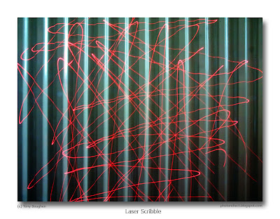
Yesterday I was sitting at my desk talking to a visiting family member when the conversation turned to London architecture and the new buildings I might like to see on my next visit. A laser pointer of the sort used with a digital projector came to hand and I began idly pointing it at the central heating radiator as I spoke. Moving it over the corrugated surface it occurred to me that it could make light trails in a photograph, similar to those made by firework "sparklers". So, without a break in the conversation I set up the tripod and camera - fortunately my visitor knew me well enough to think nothing of this - and took a few shots with the lens stopped right down to decrease the shutter speed.

The resulting image had a colour shift and a little flare due to the very long exposure. However, those things are of little consequence with the semi-abstract composition that I had in mind. I increased the contrast in processing to reveal the true colour of the laser light, which also had the effect of darkening the colour of the radiator. The final outcome is the image you see above. It isn't the greatest photograph I've ever made, but I like the colour combination, the "scribble" effect, and the random line overlaying the regularly spaced verticals. Reviewing the shot objectively I suppose the answer to my opening question is, "No." However, on the basis of this photograph I do think you can make an interesting image when you're chatting to someone. Incidentally, by the end of the conversation and image making I'd got a reasonable idea of the new buildings I might like to see on my next London trip.

photograph & text (c) T. Boughen

Camera: Olympus E510
Mode: Aperture Priority
Focal Length: 14mm (28mm/35mm equiv.)
F No: f22
Shutter Speed: 10 sec
ISO: 100
Exposure Compensation: -0.7 EV
Image Stabilisation: On

Saturday, August 29, 2009

750th post

click photos to enlarge
I just noticed that yesterday's post was a small milestone - the 750th PhotoReflect post. Add the 60 posts under the PhotoQuoto heading and that makes 810 posts since December 2005. All of which begs the question, "How many more posts will I make?" Recently I've had the feeling that I may be drawing to a conclusion with the present format, or that perhaps I need a new direction. Well, we'll see.

Today's pair of photographs show a couple of contrasting buildings with slightly different photographic approaches. The first is a piece of Victorian showmanship from 1856 by the Lincoln architects, Bellamy & Hardy. Corn Exchanges in England are often wilfully odd and awkward looking buildings that take enormous liberties with the Classical vocabulary. Hull's is relatively sedate in comparison with many, and, its original purpose long past, is now part of a museum. For this image I stood in the narrow High Street, positioned myself at the centre of the building, pointed the camera up, and took this symmetrical shot which echoes the symmetry of the structure.

The second photograph is a detail of the corner of the north facade of Grimsthorpe Castle, Lincolnshire, a work of the 1720s by Sir John Vanbrugh. It is also a strictly symmetrical design, and in my earlier photograph of a detail of the centre of the building I acknowledged this. However, in this image I was looking for balanced asymmetry, and so placed the pair of heavy columns slightly off-centre (though with one in the centre anchoring the composition), and included the angular cornice-line and sky, as well as the differing windows, as elements of imbalance.

Perhaps it's because of my interest in painting, architecture and architectural drawing (see yesterday's post), but representing buildings with strongly converging verticals doesn't come naturally to me. It's always seemed to me to be a convention exclusive to photography - which I suppose it is! When I'm photographing architecture I find myself aiming for shots that keep the verticals properly upright, and only after I've done that do I look for shots of this sort.

photograph & text (c) T. Boughen

Image 1 (Image 2)
Camera: Olympus E510
Mode: Aperture Priority
Focal Length: 16mm (11) (32mm (22mm)/35mm equiv.)
F No: f7.1 (5.6)
Shutter Speed: 1/320 (1/500)
ISO: 100
Exposure Compensation: -0.7 (-1.3) EV
Image Stabilisation: On

Friday, August 28, 2009

Tree shadows and architectural drawings

click photo to enlarge
The library of books that my wife and I possess is fairly wide ranging, reflecting our diverse interests. One category, however, is significantly larger than the rest, namely the history of architecture. And, within that genre are a few books that concentrate on an aspect of architectural history that fascinates me - architectural drawing. I find the preparatory sketches, elevations, perspective views, etc. that accompanied the design of buildings always interesting and often very beautiful. From the early notebook drawings of Reims, Laon or Cambrai by Villard d'Honnecourt, through the Renaissance detail and drama of Borromini and Boullee, the C19 washes of Elmes, Viollet-Le-Duc and Voysey, to the C20 pencilwork of Aalto and the pen and ink of Venturi, architects have produced work that compares with much that is found hanging in a gallery. But, in the last twenty years, as the computer has increasingly usurped the pencil, the output of drawings of this kind has declined substantially. It's true that in the hands of gifted architects the computer has produced striking, even artistic, drawings. But they lack the qualities, if not the quality, of work produced directly by hand.

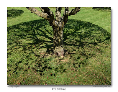
The conventions of modern architectural drawing came to mind yesterday when I was in a garden. At one end is a stand of medlar (Mespilus) trees that produce a fruit that isn't widely eaten today. On my first visit to the garden a couple of weeks ago it was noticeable that some of them were distressed and losing their leaves, whilst others were flourishing. Yesterday the sickly trees were largely bare, and in the strong sunlight, on recently cut grass, their nets of branches were throwing quite sharp circular shadows that reflected the strongly rounded pruning that they had received. Those shadows immediately put me in mind of the 2D deciduous tree symbol used on some computer-drawn architectural and locational plans - a circle with irregular lines radiating from the centre. So, I tried to use these in a composition. Initially I converted the colour to black and white in order to emphasise the qualities I liked. But then the shadows around the trunk made it blend with those on the ground, and I reverted to colour to keep an element of separation.

photograph & text (c) T. Boughen

Camera: Olympus E510
Mode: Aperture Priority
Focal Length: 11mm (22mm/35mm equiv.)
F No: f5.6
Shutter Speed: 1/320
ISO: 100
Exposure Compensation: -0.3 EV
Image Stabilisation: On

Wednesday, August 26, 2009

River Welland landscape

click photo to enlarge
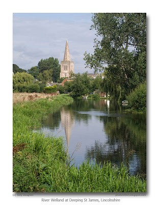
On a recent walk at Deeping St James I passed the point on the bank of the River Welland where I'd taken a photograph on the last day of February. So, in the interests of comparison I took another shot, though this time in portrait format, from what I thought was the same point. When I came to compare the images it proved to be near the place where I'd stood before, but not precisely the same spot.

Anyone with an interest in English landscape painting will understand the appeal of a composition such as this and the earlier one. It has most of the component parts that Constable, Girtin, Cotman, Turner, Cozens and the rest arranged in countless drawings, sketches and finished works. There is the nominal subject of an old church, its spire piercing the sky. Then there is the river wending its way towards it, offering a line to take our eye through the composition. This line is echoed by the river banks, one side light, the other darker, depending on how the sun falls. A reflection of the church in the river is not something that always appears in such paintings, but here it adds to the mid-ground interest. And finally there is the trees - clumps of leaves and arching branches, their softness contrasting with the sharpness of the stone building.

There are, however, two things my image doesn't have in order to properly conform to this artistic genre. The first is a dramatic sky laden with billowing clouds of the kind so beloved by this group of painters. But, as I'm not one for pasting in skies from other photographs, here I've happily taken what nature offered, knowing that my photograph can be seen as both a record and a picture. The second thing that's missing is the animals or people that give scale and another area of focus to so many of these paintings. Often a few cows at the water's edge provide this, though sometimes it's a peasant leaning on a gate, or perhaps accompanying a horse and cart. Unfortunately, in Lincolnshire in 2009, cows have given way to cabbages, and bucolic peasants are difficult to find, so for my next photograph at this location I'll have to see about persuading my wife to fulfill this role. If I take along a few suitably rustic props, say a pitchfork, a smock, and a straw hat, who knows what could be achieved...

photograph & text (c) T. Boughen

Camera: Olympus E510
Mode: Aperture Priority
Focal Length: 64mm (128mm/35mm equiv.)
F No: f10
Shutter Speed: 1/200
ISO: 100
Exposure Compensation: -0.3 EV
Image Stabilisation: On

Tuesday, August 25, 2009

Graduated filters

click photo to enlarge
During my rummaging in my photographic equipment (see yesterday's post) I came across a collection of filters that I no longer use much. There were various Hoya skylight filters that had been bought to protect lenses with filter sizes that I no longer own; red, orange, yellow and green filters for black and white work; a couple of polarizing filters, one of which gets occasional use; and a Cokin filter holder with a few adapters so that it can be used on a variety of lenses. To complement this there were several square, plastic filters to fit in it. These included neutral density and graduated filters, and must date from about twenty five years ago. Maybe it's time to move them on!

When I was photographing a semi-abstract that involved angles the blue/orange graduated filter came to mind, and, though it felt like stepping into my photographic past, I fitted it to the lens for a couple of shots. It nearly did what I wanted, but, rotate the holder as I might, I couldn't distribute the colours in what I considered to be the best way. Consequently I processed my shot using a digital equivalent of a blue/orange graduated filter and got precisely the effect I desired. And perhaps that's why my collection of filters has languished, largely unused, since I started using a digital camera. The requirement for filters remains, but their implementation can be done much more conveniently and effectively using a computer. I'm aware that there are those who would strongly disagree with this statement, but as someone who used glass (and plastic) filters regularly (though not heavily) for many years, I know which I prefer.

Today's image shows the filtered shot I took. It's a composition that is based on a stack of glass placemats, each of which has a built-in pocket for a photograph, making them customisable. They were bought for me as a present. Now there's an idea for Christmas for the photographer in your life!

photograph & text (c) T. Boughen

Camera: Olympus E510
Mode: Aperture Priority
Focal Length: 35 macro (70mm/35mm equiv.)
F No: f6.3
Shutter Speed: 1/50
ISO: 100
Exposure Compensation: -0.7 EV
Image Stabilisation: On
Monday, August 24, 2009

Sigma achromatic macro lens

click photo to enlarge
When I set myself up with my first Olympus DSLR a few years ago I bought a screw-on close-up lens; the sort that mounts on the filter thread of a fixed or zoom lens. I'd used such things in my days with the OM1n, valuing the ability to always have the macro facility to hand without the weight penalty (or cost) that a dedicated macro lens brings. The lens I bought (from Ebay for £8.00) was the Sigma Achromatic Macro Lens. It has a 58mm thread, allowing it to be mounted on the standard Zuiko kit lenses. As I understand it the Sigma is a two-element design (similar, if not identical, to the Canon 250D Macro close-up lens that retails for about seven times the price), and of much better optical quality than cheap +1 to +4 dioptre screw-on close-up lenses. My experience of the lens is nothing but good, though I have used it much less since I acquired the Zuiko 35mm f3.5 Macro lens.

Today, as I was rummaging about in my photographic equipment I came across the lens and thought I'd give it a work-out with the Zuiko 14-42 f3.5-5.6 kit lens. I shot a few flower close-ups that I'm pleased with, then noticed a number of greenbottles on the sedum flowers that are just beginning to open. I first became acquainted with the greenbottle, a handsome looking but unsavoury character, when I photographed one a few years ago with my new, at that time, 35mm macro lens. The shot I got today has received no processing other than sharpening for the web, and is a slight crop of the original frame. I've compared this image with my earlier greenbottle photograph, and have to say that only by close pixel peeping is it possible to distinguish the better quality of the Zuiko macro. My recommendation for anyone who wants to try macro photography without the expense of a new lens, or who wants to do macro and travel light, is to buy one of these achromatic macro lenses to fit on your standard lens. You won't regret it.

photograph & text (c) T. Boughen

Camera: Olympus E510
Mode: Aperture Priority
Focal Length: 42mm (84mm/35mm equiv.)
F No: f5.6
Shutter Speed: 1/125
ISO: 200
Exposure Compensation: 0 EV
Image Stabilisation: On
Supplementary lens: Sigma Achromatic Macro

Sunday, August 23, 2009

Harvest done, swifts gone

click photo to enlarge
Towards the end of my third summer living on Lincolnshire's Fens may be a little early in terms of formulating theories about the region, but one did occur to me yesterday.

I've been watching the cereal harvest come to its end. Over the past few weeks wheat and barley fields have been falling to the combine harvesters, and already quite a few have been turned by the plough. Here and there the odd field is still being cut, but with less urgency than earlier, giving the tractor drivers who haul away the grain the chance to get out of their cabs and have a chat, as in my photograph above. The summers of 2007 and 2008 were much wetter than this year, and the harvest continued well into September, with machines kept off the sodden ground until it had dried. Cereals were left standing to enable them to get as dry as possible, and when they were harvested the grain sheds thundered to the sound of the electric dryers.

However, this year Eastern England has experienced much more typical weather with light but regular rainfall and fine weather. As the harvest winds down at the end of August I've been watching the skies trying to note when I see the last of the swifts (Apus apus). This interesting, fast-flying bird arrives in the UK in May and leaves at the end of August. It is a species that spends almost all its life on the wing, even eating and sleeping as it flies. Its stay in our country is long enough to raise a brood in its nest under eaves and in church towers, the only time it spends on terra firma. So what is my theory, you may be wondering? Well, perhaps it's the case that, in this part of the world, in a typical year, the end of the harvest and the departure of the swifts coincide. Not an earth shattering theory, I'll grant you, but one that I'll test each year. Incidentally, after two "swift-free" days I saw a lone bird yesterday when I took this photograph.

Note 1: The church on the extreme left of the horizon is St Mary, Swineshead, that features in yesterday's post.
Note 2: Today the wheat field opposite my house was cut and I saw one swift.

photograph & text (c) T. Boughen

Camera: Olympus E510
Mode: Aperture Priority
Focal Length: 40mm (80mm/35mm equiv.)
F No: f6.3
Shutter Speed: 1/500
ISO: 100
Exposure Compensation: -0.3 EV
Image Stabilisation: On

Saturday, August 22, 2009

The sound of England

click photos to enlarge
If there is a single sound that characterises England it has to be that of church bells sounding out across the roofs, trees and gardens of our villages and towns. The methods of ringing church bells that developed in these islands is different from elsewhere. Rather than try to express the intricacies of the two variations in my own imprecise prose, here are much better descriptions from Wikipedia. The first of today's photographs, taken this morning when I ascended the tower of St Mary at Swineshead, shows the bells in their cradles in the bell chamber, and will illustrate some of the points made below.

Change Ringing
In England the bells in church towers are generally hung for full circle ringing: every bell swings through a complete circle (actually a little more than 360 degrees) each time it sounds. Between strokes, it sits poised 'upside-down', with the mouth pointed upwards; pulling on a rope connected to the bell swings it down and its own momentum swings it back up again on the other side.

These rings of bells have relatively few bells, compared with a carillon; six or eight-bell towers are common, with the largest rings in numbering up to sixteen bells. The bells are usually tuned to fall in a diatonic scale without chromatic notes; they are traditionally numbered from the top downwards so that the highest bell (called the treble) is numbered 1 and the lowest bell (the tenor) has the highest number; it is usually the tonic note of the bells' scale.

To swing the heavy bells requires a ringer for each bell. Furthermore, the great inertias involved mean that the ringers have only a limited ability to retard or accelerate their bells' cycle. Along with the relatively limited palette of notes available, the upshot is that such rings of bells do not easily lend themselves to ringing melodies.

Instead, a system of change ringing evolved, probably early in the seventeenth century, which centres on mathematical permutations. The ringers begin with rounds, which is simply ringing down the scale in order. (On six bells this would be 123456.) The ringing then proceeds in a series of rows or changes, each of which is some permutation of rounds (for example 214356) where no bell changes by more than one position from the preceding row.

In call change ringing, one of the ringers (known as the conductor) calls out to tell the other ringers how to vary their order from row to row. Some ringers practice call changes exclusively; but for others, the essence of change ringing is method ringing.

Method Ringing
In method or scientific ringing each ringer has memorized a pattern describing his or her bell's course from row to row; taken together, these patterns (along with only occasional calls made by a conductor) form an algorithm which cycles through the various available permutations.

Serious ringing always starts and ends with rounds; and it must always be true — each row must be unique, never repeated. A performance of a few hundred rows or so is called a touch; approximately five thousand rows make a peal (which takes about three hours to ring). A performance of all the possible permutations possible on a set of bells is called an extent; with nn! possible permutations. Since 7!=5040, an extent on seven bells is a peal; 8!=40,320 and an extent on eight bells has only been accomplished once, taking nearly nineteen hours.

Ringing in English belltowers become a popular hobby in the late 17th century, in the Restoration era; the scientific approach which led to modern method ringing can be traced to two books of that era, Tintinnalogia or the Art of Ringing (published in 1668 by Richard Duckworth and Fabian Stedman) and Campanalogia (also by Stedman; first released 1677). Today change ringing remains most popular in England but is practiced worldwide; over four thousand peals are rung each year.

St Mary's has eight bells in the key of F. They were cast by Thomas Osborn of Downham Market in 1794. I stopped off for this photograph as we accompanied our guide up to the corona that tops the tower and rings the base of the spire (where the second photograph was taken). For more views of Swineshead church see this collection of earlier blog posts (scroll down page when it appears).

photographs & text (c) T. Boughen

Photo 1 (Photo2)
Camera: Olympus E510
Mode: Aperture Priority
Focal Length: 11mm (22mm/35mm equiv.) (ditto)
F No: f3.2 (4.5)
Shutter Speed: 1/20 (1/1600)
ISO: 400 (100)
Exposure Compensation: 0 (-0.3) EV
Image Stabilisation: On (ditto)

Friday, August 21, 2009

Plates of meat

click photo to enlarge
The extremities of the human body, as Leonardo da Vinci's "Vitruvian Man" clearly shows, are the head, hands and feet. When an artist wants to show something of the character of a person it is usually the face that he or she chooses to portray. Leonardo's "Self-Portrait"or his "Study of Five Characters" are good examples of this kind of image. Through their expression, and by the lines that time etches on a person's face we can see (or imagine we can see) something of the underlying singularity of the individual.

Many painters and photographers choose to include hands in their portraits, believing that they too reveal something that lies below the surface of the person. A painting such as Egon Schiels' "Self-Portrait with Hands on Chest" clearly includes the hands in order to say something more about the person that is depicted. The famous photographic portrait of the English painter, Aubrey Beardsley, is as much about his hands and their very long fingers, as it is about the profile of his face. Of course, in all these kinds of paintings and photographs we as viewers don't necessarily see that which the artist intended. However, we do see something, and the hands definitely add to that something.

So what about the third of our bodily extremities - our feet? There are far fewer paintings and photographs of feet than there are of heads and hands, or heads with hands. It's not difficult to see why the latter pairing is rarely to be found: it requires the suppleness of a contortionist to get them in close proximity. But how about feet themselves: why are there so few images of them? Possibly because they aren't very attractive. But that of itself isn't a compelling reason. Maybe it's because they are more often hidden away under socks and shoes. And yet feet are full of character and vary enormously between individuals. Today's photograph is my small contribution to increasing the number of photographs of feet! I noticed my battered pair as I was standing in the kitchen on a warm evening. The under-pelmet lighting was throwing interesting shadows around them so I pointed my camera down and took this shot of my "plates of meat" (Cockney rhyming slang for feet).

photograph & text (c) T. Boughen

Camera: Olympus E510
Mode: Aperture Priority
Focal Length: 20mm (40mm/35mm equiv.)
F No: f3.5
Shutter Speed: 1/8
ISO: 800
Exposure Compensation: -0.3 EV
Image Stabilisation: On

Thursday, August 20, 2009

Too many guitars

click photos to enlarge
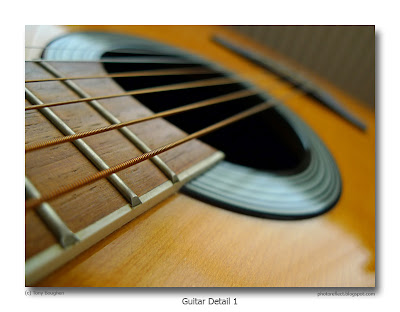
As I was sitting picking at one of my guitars I decided it was time they featured in a photograph or two. The filtered light through my study's vertical blinds was throwing repeated lines on the polished sound board so I tried for a shot that included those lines as well as the lines of the six strings. But, whilst it was easy to see and imagine the shot as I sat there idly working through my musical repertoire, it proved much more difficult with the camera to my eye.

I found that the shot I wanted couldn't be composed with the lenses at my disposal. Everything was fine if I wanted all the reflected blinds - a big, light rectangle - but as soon as I tried to isolate part of the reflection along with the sound hole and the strings the reflection lost its sheen and the composition its force. So I decided to try for two shots with shallow depths of field that included the sound hole and strings, one from the fingerboard end, and the other from the bridge. I'm reasonably pleased with the outcomes.

By the way, what is it that makes men end up with more guitars than they need? I have the Yamaha classical guitar that I bought when I first began to learn the instrument, an Epiphone steel-strung folk guitar that I got to replace a second-hand one that I bought then sold, an Ovation electro-acoustic guitar with a moulded fibreglass bowl-back, my son's cast-off electric guitar that I was given after we'd bought him a Gibson Les Paul Studio, and a bass guitar (a copy of the Fender Precision Bass). I really shouldn't have kept most of the guitars I've accumulated during my life and need to think about getting rid of a couple and reducing the clutter.

photographs & text (c) T. Boughen

Camera: Olympus E510
Mode: Aperture Priority
Focal Length: 14mm, (28mm/35mm equiv.)
F No: f3.5
Shutter Speed: 1/20
ISO: 100
Exposure Compensation: -0.3 EV
Image Stabilisation: On

Wednesday, August 19, 2009

The Institute, Deeping St James

click photo to enlarge
As I passed this Victorian building on Church Street, at Deeping St James in Lincolnshire, two thoughts crossed my mind. The first was, "That's an interesting way of dressing up a facade." The second concerned the wire that stretches from the top left to the centre, then drops down to disappear into a hole above the doorway. It occurred to me that it had been positioned with all the sensitivity of a tattoo on the end of a person's nose.

I photographed the building, known as "The Institute", mainly because of the unusual yellow brickwork designs that form both the quoins to the left and right, and the surrounds for the tall windows and the door. However, once I'd got my photograph onto the computer, had corrected the converging verticals, and began to study the facade, a lot more details caught my eye, and quite a few questions came to mind. For example, why did the builder or architect place a large piece of stone at the bottom left and bottom right corners? Why did he use stone for the sills of the three windows rather than wrapping the brickwork surrounds underneath? Why does his design for the "shoulders" of the door surround differ from those of the windows? Why is the band of yellow brickwork that crosses the facade at the level of the window sills flush with the wall and hence barely visible?

The building's style borrows from that of a church or chapel (tall and pointed openings), and from classical precedents (the brick plinth, quoins and hints of "Gibbs surrounds" in the work around the windows and doorway). It is Classical too in its severe symmetry: note that even the bootscrapers are doubled up, one on each side of the door, lest the building become even slightly unbalanced. The use, almost exclusively, of brick, and the vernacular touch of a dog-tooth corbel just below the eaves, betrays its provincial origins, lower cost, and lower status. Despite its relatively elaborate decoration it is still quite a utilitarian building. I haven't been able to find out much about its origins. Was it always an Institute? Was it a non-conformist chapel originally? Whatever its past, its present includes housing the Parish Council of Deeping St James, and offering more than a little interest and intrigue to passers-by who care to stop and stare.

photograph & text (c) T. Boughen

Camera: Olympus E510
Mode: Aperture Priority
Focal Length: 11mm (22mm/35mm equiv.)
F No: f6.3
Shutter Speed: 1/640
ISO: 100
Exposure Compensation: -0.3 EV
Image Stabilisation: On

Tuesday, August 18, 2009

Deeping Gate Bridge

click photo to enlarge
In my working past I sometimes used to talk to groups of children about the importance of good manners. To illustrate my point I would often use the analogy of bicycle maintenance, observing that the purpose of oiling a bike chain is to lubricate it such that the links engage with the sprockets smoothly, with minimal friction. So, I would continue, good manners are like that oil, and enable people to get along better by reducing the friction between them. I think those who were keen cyclists might have understood my point, but probably the rest reflected that it was their father who maintained their bicycle and wondered what the old duffer at the front was on about.

The subject of today's photograph, the Deeping Gate Bridge at Deeping St James, Lincolnshire, would not work without good manners. A stone-built, three-arched structure, it was constructed in 1651 to cross the River Welland in both directions, a function it carries out to this day. However, when it was erected the traffic that used it would have been pedestrians, horses, farm animals, carts and carriages. Today's traffic is mainly a regular flow of any motor vehicles that will fit on its single track roadway, but also a regular sprinkling of walkers and cyclists. Passage over the bridge is not regulated by lights, so courtesy is required of the drivers to ensure that traffic keeps flowing. And flow it does, not with the calm serenity of the river below, but in spurts and gushes, first from one side, then the other, as drivers reciprocally give way to each other. Pedestrians crossing the bridge have triangular refuges at the top of each of the cut-waters, which accounts for these being not only on the upstream side, where they are necessary to divide the flow around the piers, but also on the downstream side (shown above).

During a recent longish walk by the River Welland, the bridge, its clear reflection, and the general setting with the C19 pub, thatched houses, trees and waterside plants all suggested a photograph. Had the ducks and swans further upstream been in the water nearby I could have composed using the full frame, but in their absence I took the shot knowing I was going to crop the bottom of the image.*

* Sometimes the first posting of my blog entries contains mangled prose, as the last paragraph of this one did today. However, my proof reader (aka my wife) invariably spots my lapses into gibberish, draws it to my attention, and a quick edit soon puts things right (or at least better).

photographs & text (c) T. Boughen

Camera: Olympus E510
Mode: Aperture Priority
Focal Length: 14mm (28mm/35mm equiv.)
F No: f6.3
Shutter Speed: 1/500
ISO: 100
Exposure Compensation: -0.7 EV
Image Stabilisation: On
Monday, August 17, 2009

Bees, rudbeckia and buying cheap

click photos to enlarge
An executive decision was taken in the Boughen household the other day. When it comes to buying flower seeds next year we are going to ignore the specialist suppliers and their higher priced, exclusive ranges endorsed by famous gardeners, and stick to the cheap and cheerful varieties. In truth we've never bought many "special" flower seeds, but this year they've proved a disaster, either featuring blooms that are not the colour advertised, producing far fewer plants than is reasonable from the number of seeds in the packet, or simply failing completely. We have not been happy!

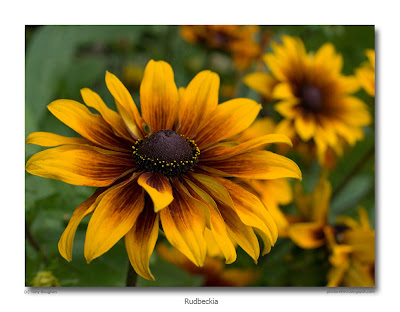
In contrast, the inexpensive flower seeds that we bought have been very successful, doing exactly what it says on the packet, and filling the areas of our borders reserved for annuals with banks of colour. The rudbeckia, in particular, have been magnificent. A packet of seeds that cost a few pence, containing a mixture of different varieties in the colour range brown/orange/yellow has drawn me and my camera on a number of occasions. They did so again a few days ago when the wind had dropped, the sky was bright (but not sunny), and the blooms were at their glowing best.

I took several shots of the flower heads, of which the second image is probably the best. It uses a composition that I'm fond of, namely filling most of the frame with a single head (off centre), and making sure the remainder of the image has out-of-focus heads. However, once again the presence of bees led me to come away from my task with another image of the busy little workers, because as soon as I lined up a shot, as often as not one landed on the flower and began collecting pollen. This particular bee interested me because it looked like it was wearing a fur coat that was getting a good dusting of the yellow stuff. I'm aware that there are a number of different kinds of bees that venture into gardens: some I recognise, but this one I didn't.

photographs & text (c) T. Boughen

Camera: Olympus E510
Mode: Aperture Priority
Focal Length: 35 macro (70mm/35mm equiv.)
F No: f5.6
Shutter Speed: 1/100 (400)
ISO: 400
Exposure Compensation: 0 EV
Image Stabilisation: On

Sunday, August 16, 2009

Plastic wrapping and facelifts

click photo to enlarge
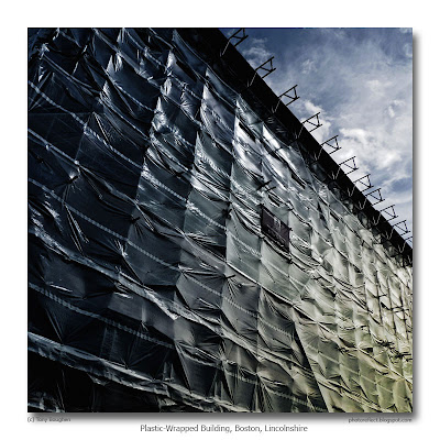
What could be behind this slightly dramatic looking plastic wrapping? Is it a modern office block under construction, all gleaming glass and shiny steel, a testament to opulence, affluence and the worship of money? Perhaps what is underneath is of little consequence, and it's the shrink-wrap itself that is important because it's an artwork by those artful charlatans, Christo and Jean-Claude. But no, as you've probably guessed, it's a building under renovation. But which building? Here is an official description in the dry but precise prose of English Heritage's National Monuments Record.

"BOSTON TF3243SE HIGH STREET 716-1/14/63 (East side) 27/05/49 Nos.118A, 120 AND 122 GV II* Includes: 118A, 120 AND 112 HIGH STREET OXFORD STREET. Banker's house, now flats. c1770, added to late C18, early C19, altered late C19 and C20. Red brick in Flemish bond, slate roofs, ashlar dressings, red brick ridge and valley stacks. EXTERIOR: centre house of 3 storeys, with 5 bays, the 3 centre bays slightly advanced and pedimented. Plinth, 1st floor platt band, dentilled cornice, cartouche and rococo scrolls to pediment, balustraded parapet. Plain sashes with cambered heads and fluted keystones, arranged 2:1:2. Central 6-panel doors with radiating fanlight, panelled reveals, set in Ionic stone doorcase, pedimented with scrolled keystone and egg-and-dart surround. To left a late C18 canted bay of 2 storeys, with dentilled cornice at original height has been raised later to match the other side. Plain sash to both faces, fluted keystones, centre one with acanthus leaf scroll. 1st floor windows have been heightened, front one is blocked. To right an early C19 canted bay of 2 storeys with a single plain sash to each canted face matching the left one. 3 similar windows above. The return to Oxford Street has a 2-panel C19 door with plain overlight and pilastered doorcase with dentilled flat hood on scrolled acanthus brackets. Rear is faced in ashlar, painted, with sill bands, dentilled cornice to plain parapet, plain sashes and later inserted modern fenestration. INTERIOR: although much altered retains some full height panelling and panelled doors. HISTORY: the house was the C18 and C19 home of the Claypon family of Garfitts and Claypon Bank of Boston."

Yes, it's a large eighteenth century town house on the old High Street at Boston, Lincolnshire; one that had fallen on hard times that is currently in the process of being restored. Its status as a Grade II* listed building means it is an important structure for architectural, historical and locational reasons. When the work is completed I'll see if I can get a photograph of its new, post-facelift visage.

photograph & text (c) T. Boughen

Camera: Olympus E510
Mode: Aperture Priority
Focal Length: 40mm (80mm/35mm equiv.)
F No: f4.8
Shutter Speed: 1/1250
ISO: 100
Exposure Compensation: -0.3 EV
Image Stabilisation: On

Saturday, August 15, 2009

Spherical objects and propaganda

click photo to enlarge
The UK press is currently full of reports of the lies that U.S. right-wing politicians, fanatics and apologists for the American health-care industry are propagating about our National Health Service (NHS), as they seek to derail President Obama's very modest proposals for reform.

Many Britons, looking at the T.V. adverts and written comments that have spewed out of the propaganda machines have laughed out loud at the lurid fabrications, falsehoods and misrepresentations that are being peddled as fact. Others have become angry that a cherished institution that most people feel does an excellent job should be traduced in this way. However, the ire of British supporters of the NHS has been raised most by the utterances of one of our own MEPs, Daniel Hannan, a man the "Guardian" newspaper describes as a "darling of the U.S. right", who has been happy to appear on TV talking down the NHS and agreeing with those who oppose Obama's proposals. The leader of Conservatives, the party that Hannan represents, has described this man as "eccentric" and unrepresentative of their views about Britain's health care system, but that hasn't stooped him from seeking the cameras or prevented his American bed-fellows from using him as evidence that "socialised" medicine is awful.

My experience of the NHS has been good. It's not a perfect system, none is, but by most indicators it provides efficient and effective health care that is (in the main) free to all, and entirely free to those on low incomes. The concern in Britain is that U.S.-style private health care is seeking a greater foothold here, because, and this hasn't be mentioned much by the American critics, for those who want something different, private medical care can be bought in the UK too. That it provides only a small part of the total provision says much about the quality of the free offering that is paid for through taxation.

However, I will concede that sometimes when you live with a system all your life you don't see it in quite the way that an outsider does. Today's newspaper carries an article by an American professor who has worked in Britain for a number of years and has experience of the NHS for himself and his family. He identifies a benefit of "socialised medicine" that had never occurred to me because I take it for granted. In a supportive statement about his dealings with the NHS he says, "Perhaps it is the absence of fear of becoming ill that is the most important aspect of the system."

What has today's photograph of a door at Grimsthorpe Castle, Lincolnshire, to do with the self-serving anti-NHS propaganda of the American right? Well, both depend for their effect on spherical objects!

photograph & text (c) T. Boughen

Camera: Olympus E510
Mode: Aperture Priority
Focal Length: 86mm (172mm/35mm equiv.)
F No: f4.8
Shutter Speed: 1/640
ISO: 200
Exposure Compensation: -0.3 EV
Image Stabilisation: On

Friday, August 14, 2009

Crash, Bang, Bloom!

click photo to enlarge
The Royal Horticultural Society (RHS) organises an annual competition for communities and organisations under the title "Britain in Bloom". Regional organisations do the spadework (pun intended) of collecting entries, organising judging and making awards. Regional winners go forward to national finals. The purpose behind the event is to provide a greater incentive for people to use flowers to beautify where they live and work.

The other day I was in the village of Donington in Lincolnshire, a place that always enters the East Midlands competition, and I was admiring the flowers on display. Wall and hanging baskets full of bright blooms adorned railings, houses, shops, and public spaces. The flower beds in the park looked stunning, as did the area around the statue of the village's famous son, Matthew Flinders (who discovered and mapped parts of Australia). In fact the whole village must have looked marvellous for the visit of the judges at the end of July.

One particular display - featured in today's photograph - especially caught my eye. The Fire & Rescue Service building often has a wrecked car parked in a recess outside. These cars, which are changed periodically, are vehicles that have been involved in road traffic accidents. They are a graphic reminder to all who pass, placed there by those who attend these scenes of carnage, to take care when driving on the local roads. Clearly one of the flower organisers, rather than seeing the car as an eye-sore that might detract from the displays that were being erected, saw it as an opportunity. It had been laden with flowers - on the roof, in the engine bay, nearby on the ground, even inside (the windows slightly open forming a greenhouse of sorts), and looked great. I particularly liked the spiky plant on the engine that reminded me of the jets of water that sometimes spurt out of cars after a violent impact.

photograph & text (c) T. Boughen

Camera: Olympus E510
Mode: Aperture Priority
Focal Length: 12mm (24mm/35mm equiv.)
F No: f6.3
Shutter Speed: 1/600
ISO: 100
Exposure Compensation: -0.3 EV
Image Stabilisation: On

Thursday, August 13, 2009

Parterres

click photo to enlarge
The "parterre", a formal garden device employing low hedges, often of box (Buxus sempervirens), in elaborate patterns enclosing contrasting shrubs and flowers, originated in France. It was developed from the "compartimens" where herbs were grown in patterns that enclosed other plants. Claude Mollet (c.1564-c.1649), a gardener to three French kings, was influential in popularising parterres proper through the royal gardens at St Germain-en-Laye and Fontainbleau in the years around 1600. Andre Le Notre (1613-1700), gardener to Louis XIV developed them still further at Versailles, Fontainbleau and Saint Cloud. The French examples were on a grand scale, and often formed part of a much larger formal, ordered, symmetrical scheme.

In England parterres became very popular after the Restoration, though they were usually employed on a smaller scale than across the Channel. Influential gardeners such as George London (1681-1714) and Henry Wise (1653-1738) promoted them amongst their clientele. With the accession of William and Mary in 1688 the formalities of Dutch gardens were introduced, and parterres were produced that were ever more elaborate. However, by the 1720s the informal English landscape garden had begun to establish itself and the ideas of France and Holland came to be seen as old-fashioned.

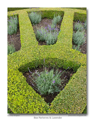
But, parterres never completely disappeared from English gardens, and remained in use in the gardens nearest stately homes of the aristocracy, even when the landscape garden was taking over further away from the house. Today, when gardeners strive to re-create the schemes of the seventeenth and eighteenth centuries, parterres often make a come back. Today's photograph shows a corner of an elaborate group of box parterres at Grimsthorpe Castle, Lincolnshire. The radial shape is replicated in each of the four corners of one section, with "S" shapes and more angular lines filling the centre. Small trees, shrubs and a statue enliven the composition. The lavender planting in these compartments looks relatively recent, and will doubtless be encouraged to almost fill the shapes. My idea with this photograph was to extract an element of abstraction from the parterre, and also use this interesting part of the planting to summarize the whole.

photograph & text (c) T. Boughen

Camera: Olympus E510
Mode: Aperture Priority
Focal Length: 14mm (28mm/35mm equiv.)
F No: f6.3
Shutter Speed: 1/40
ISO: 100
Exposure Compensation: 0 EV
Image Stabilisation: On

Wednesday, August 12, 2009

Repetition and symmetry

click photo to enlarge
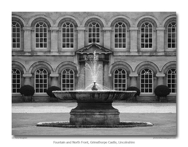
Repetition and symmetry are key characteristics of classical achitecture. The Greeks and Romans who were responsible for this style created an architecture that emphasised man's intellect, and his dominance and control of nature. It was these two devices that allowed their buildings to stand apart from the "messy" natural world. The idea of taking the same form and repeating it across a facade, as here on the ground floor and first floor of the north front of Grimsthorpe Castle, Lincolnshire, began with the repeated columns of Hellenic temple porticos and spread into the serried arches of Roman architecture, most notably in the Colosseum. Renaissance architects both copied the ideas of the ancients and elaborated upon them.

Gothic architecture, however, especially in its Victorian incarnations, had more time for asymmetry. In the position of entrances and towers, for example, and also in the arrangement of floor plans, they frequently proclaimed the virtue of a more practical and studied irregularity. When they sought "balance" in a building it would sometimes be achieved by the careful disposition of different forms, rather than by multiples of the same form on either side of a line of symmetry. However, Gothic and other "Romantic" styles of architecture continued to value the virtues of repetition and even symmetry, as the Perpendicular Style of the fifteenth century, and nineteenth century industrial architecture in England frequently testifies.

It's interesting to speculate whether the repetition of forms in building came about for aesthetic reasons or for convenience of manufacture and construction. We are, of course, unlikely to know the answer to that question, but the designers and workmen of ancient civilizations must have found it easier to replicate and erect several columns that were identical, or move supporting wooden formwork between arches that were all the same size and circumference. Those advantages were certainly not lost on the Victorians who often made and assembled windows and ornament off-site. This is an aspect of classical architecture that I've never seen discussed anywhere, but which occurred to me as I was photographing this facade. The drawings for the design shown here date from 1722, making it one of the last works by Sir John Vanbrugh who died in 1726. Nicholas Hawksmoor may have completed his structure. It's inconceivable that the main entrance of this elevation would be placed anywhere but the centre, and the fountain could only ever be placed in line with it. Even the gardeners, when positioning their planters of topiarised box obeyed its imposing symmetry and repetition, so I decided that I must do that too, in my photograph.

photograph & text (c) T. Boughen

Camera: Olympus E510
Mode: Aperture Priority
Focal Length: 86mm (172mm/35mm equiv.)
F No: f4.8
Shutter Speed: 1/640
ISO: 200
Exposure Compensation: -0.3 EV
Image Stabilisation: On

Tuesday, August 11, 2009

Wheat, wires and Large Whites

click photo to enlarge
Over the summer I've gradually got the impression that this year is a good one for butterflies. So, I did a bit of online research and ended up at the website of Butterfly Conservation. Here I read this by their Surveys Manager, Richard Fox: "The picture for native British butterflies remains mixed. Numbers appear to be up on the previous two summers, which were extremely wet and dire for butterflies. This summer has been better so far, in spite of the recent showers. If the wet summers had continued some endangered species such as the Heath Fritillary were vulnerable to extinction. The good news is the Heath Fritillary appears to have rallied and is having a good year. But numbers overall are still well down on a decade ago." So it seems that 2009 is a better year relatively speaking.

As I write my lavender is besieged by Large Whites, Painted Ladies, Peacocks, Common Walls and Small Tortoiseshells. The Painted Ladies have been particularly noticeable this year, but I was amazed to read that this migratory species may be represented by 1 billion specimens in the UK at the moment! The other species that have been much more numerous are the Small and Large Whites. Our cabbages have been receiving their eggs (soon to be caterpillars) despite us offering the compensating attractions of buddleia and lavender.

On a visit to Sempringham church (click link then scroll down for links) the other day I noticed an opportunity to add to my collection of images of tractor tracks (click link then scroll down for links). The additional interest offered by these particular tracks, in a field of very ripe wheat, was the telegraph pole and wires that stretched across the sky. As I stood, considering my shot, listening to the crackle of the ripe seed heads, I noticed Large White butterflies crossing the field. I quickly composed this shot that includes one of them on the right, hoping that it was sufficiently near to be recognisable for what it was.

photograph & text (c) T. Boughen

Camera: Olympus E510
Mode: Aperture Priority
Focal Length: 16mm (32mm/35mm equiv.)
F No: f6.3
Shutter Speed: 1/1250
ISO: 100
Exposure Compensation: -1.0 EV
Image Stabilisation: On

Monday, August 10, 2009

Grimsthorpe Castle, Lincolnshire

click photo to enlarge
Quite a few visitors to Britain are surprised by some of the castles they see. If they go to Bodiam in Sussex, and survey its squat drum towers, solid walls, machicolated defensive entrance, battlements, moat, etc, then they see the epitome of medieval might in a building that offers everything that the word "castle" means to the average person. Conway, Chepstow, Beaumaris, Harlech and many more offer a similar experience. It's not these buildings that mystify people, however, it's the castles that are barely distinguishable from country houses (stately homes) that are the problem.

The fact is, that castles gradually evolved from strongholds with a very real military purpose - either defence or oppression - into large, comfortable, ostentatious houses, which retained the title of "castle" often because of the aristocracy's emotional attachment to buildings that both looked and sounded impressive. The increasing power of the monarch, the greater stability of Britain, and the widespread use of gunpowder brought an end to the building of castles in the medieval period. Those castles that were erected later had the trappings of their forebears, but would have been of limited value in any fighting involving a well-armed foe. An example is Tattershall Castle in Lincolnshire. Made of brick, with stone details, it would have impressed the local population, kept peasants with pitchforks at bay, but would have soon succumbed to cannon.

Many castles were converted into large dwellings when their initial purpose disappeared. Today's photograph shows a case in point. From the north Grimsthorpe Castle in Lincolnshire, is a typical, grand, Baroque country house displaying architecture in the classical style by Sir John Vanbrugh and Nicholas Hawksmoor. From the south it is a much more domestic-looking building of the sixteenth century with pitched roofs, gables, projecting bays, domestic windows in wood and stone, and not a sign of fortifications. Except, that is, for the towers at each end of the elevation. The one at the left (like the two on the north front) is a much later addition designed to increase the resemblance of the building to a castle. The one on the right of the photograph is the original tower from the castle that was built here in the 1200s by Gilbert de Gant, and is known as King John's Tower, its age betrayed on the exterior by the pronounced batter (slope) at the base of its walls.

I took my shot with the overhanging trees and their shadows framing the elevation, and used the gravel path to add a leading line and a little more foreground interest.

photograph & text (c) T. Boughen

Camera: Olympus E510
Mode: Aperture Priority
Focal Length: 16mm (32mm/35mm equiv.)
F No: f6.3
Shutter Speed: 1/1250
ISO: 100
Exposure Compensation: -1.0 EV
Image Stabilisation: On

Sunday, August 09, 2009

Home-grown produce and flashguns

click photo to enlarge
I own three flashguns but I've never liked using flash. Every now and then I used a T20 with my Olympus OM1n, usually for family snaps, but occasionally for church interiors. I have an old Nissin 360TW that has both a small fixed flash and a large moveable head. I used that on the OM1n too, and on a couple of other film and digital cameras that I've owned, for portraits, architecture and more creative images. And finally, a few years ago I was given an Olympus FL-36. I suppose for some that might seem an embarrassment of riches as far as flashguns go, and you might be wondering why I have that number despite my protestation that I don't like flash.

The truth is, I think I should be able to take advantage of the possibilities that flash offers. The fact is I don't, in fact can't; and for two reasons. Firstly I'm not very keen on, in fact I'm hypersensitive to, noticeable flash effects. The shadows that a flashgun can produce spoil many images for me, as do the unnatural highlights. Bird photography is particularly susceptible to the latter, and can make a shot look very artificial. It's something you see less of with the better high ISO performance of cameras, but it's still around. The second reason I don't like them follows on from the first: because I'm not keen on the effects I don't use them often enough to improve my technique. I recognise that some photographs aren't possible without flash, and I used them for that reason in the past. And, if you trawl the photographs on thos blog, you'll find examples - often still life images - where I've worked at improving my handling of flash. But, by and large, I prefer natural light.

The other evening I turned on the lights in my kitchen and a beam shone into the adjoining utility room and illuminated some vegetables and fruit that we'd picked from the garden. A photograph suggested itself so I got a reading lamp and a flashgun. I took several shots with both, and found I preferred those lit by the reading lamp. It was more directional, with deep shadows and contrasting highlights, more Caravaggioesque, and so I prepared a shot for posting on the blog. The following day I looked more closely at the flash shots I'd taken, all of which had the light bounced off a piece of white corruflute. Closer inspection showed them to be more subtly lit, with more detail, better colour accuracy, and more attractive. Most importantly, they didn't look like they'd been lit by flash. I processed one of them, increasing the contrast a touch, and I have to say I'm very pleased with it. It is, of course, no longer Caravaggioesque, but is more of the Dutch school; perhaps van Beijerenesque. Which is quite appropriate really since I now live in the area of Lincolnshire known as Holland!

photograph & text (c) T. Boughen

Camera: Olympus E510
Mode: Aperture Priority
Focal Length: 35mm macro, (70mm/35mm equiv.)
F No: f6.3
Shutter Speed: 1/80
ISO: 100
Exposure Compensation: 0 EV
Image Stabilisation: On
Flash: Olympus FL-36

Saturday, August 08, 2009

Search me!

click photo to enlarge
The ability to search the internet effectively is a useful skill, yet, if my experience is anything to go by, there are a lot of people who haven't got beyond the most basic level. One of the interesting features of my "hit counter" (SiteMeter at the bottom of this page) is that it shows me the search engines and the search words that brought individuals to PhotoReflect. In recent weeks I've started to notice Microsoft's Bing making an appearance. Google, of course, has been the most commonly used search engine, followed by Yahoo, with all the others as "also rans."

Why do I say that many people don't use these sophisticated search engines well? An example will illustrate the point to best effect. Yesterday someone, somewhere in the UK, entered the words "fylde hag" into Bing. That brought them to a page of Bing search results - http://www.bing.com/search?q=fylde%20hag&first=11&FORM=PERE - with at the top a PhotoReflect reference to the sought after term. The person followed this link to the start of a page of posts from May 2006 - http://photoreflect.blogspot.com/2006_05_01_archive.html . At this point that person appears to have looked at what was visible on screen and gone no further to find what they wanted. In fact they must have gone elsewhere because their stay on PhotoReflect was recorded as less than one second. So, despite having gone to a link with information about their search terms they appear not to have had the skills to find it. He (or she) didn't scroll down to the fifth post on the page: that would have found it. They didn't enter the search term in the Blogger search box: that would have found it. Nor did they use their browser's facility to search the page Bing had sent them to: that would have found it too. You might think that this is a case where someone had gathered as much information as they needed and couldn't be bothered to search further for what they thought would duplicate information they already had. Perhaps. The trouble is, I see evidence of this kind of poor searching most days, often several times! I remember, as a student, being taught how to search libraries and archives using card indices, microfiche and so on. Today these courses must have expanded to include the internet. Perhaps the poor search skills that I highlight shows there's a need for a basic course for the layperson.

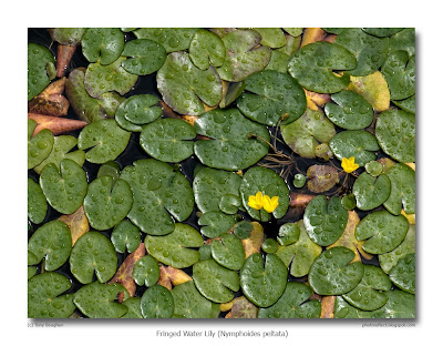
All this, of course, has absolutely nothing to do with my photograph of Fringed Water Lilies (Nymphoides peltata) that I photographed on the Maud Foster Drain at Boston, Lincolnshire. Except for the fact that I'd always thought they were Yellow Water Lilies (Nuphar lutea), until an internet search put me right.

By the way, if you're wondering who or what the "Fylde hag" is or was, this post - Do you believe in magic - tells the tale.

photograph & text (c) T. Boughen

Camera: Olympus E510
Mode: Aperture Priority
Focal Length: 35mm macro, (70mm/35mm equiv.)
F No: f6.3
Shutter Speed: 1/2
ISO: 100
Exposure Compensation: -2.3 EV
Image Stabilisation: On

Friday, August 07, 2009

Watercarriers for Mesopotamia

click photo to enlarge
The story of how the word "tank" to describe the armoured fighting vehicle came to be used is an interesting one.

During the First World War the British Admiralty Landships Committee was charged with developing a fighting vehicle that could cross the mud and trenches of the modern battlefield. The members turned to a number of designers and companies to help them in their task. One firm that was approached was the agricultural machinery manufacturers, William Foster & Co of Lincoln. Foster's began life as a mill owner in 1846, but soon expanded into milling machinery and threshing machines. It opened its Wellington iron foundry in 1856 and went on to make traction engines and steam tractors. In the First World War it made large Daimler-Foster tractors and trailers for hauling howitzers, so it was natural that the Commitee saw it as the possible developer of a new fighting vehicle.

William Tritton (the chairman of Foster's) and Walter Gordon Wilson worked together in 1915 to develop the first "landship", named "Little Willie" after its co-designer. When the Lincoln factory came to produce the first batch of the new armoured vehicles there was a great need for secrecy so that the impact of their deployment could maximized. Consequently, the workforce were told that they were engaged in making "Watercarriers for Mesopotamia" (modern day Iraq)! This mouthful was soon shortened by those working on the machines, so the story goes, to "tanks", and the name stuck. Fosters went on to make hundreds of tanks for the British Army, with examples also going to the allies, including the United States and Canada. In recognition of the pioneering work in designing and making the first examples of this important military weapon the company incorporated it into the design of their nameplate that adorned the vehicles they manufactured.

I came across the example in today's photograph at a Lincolnshire gathering of traction engines. Unless one knows the story of William Foster & Co of Lincoln, the inclusion of a military tank on an agricultural vehicle maker's nameplate looks decidedly incongruous. But once you do know the reason it seems entirely natural!

photograph & text (c) T. Boughen

Camera: Olympus E510
Mode: Aperture Priority
Focal Length: 64mm (128mm/35mm equiv.)
F No: f7.1
Shutter Speed: 1/160
ISO: 400
Exposure Compensation: -1.0 EV
Image Stabilisation: On

Thursday, August 06, 2009

Old tools and toffee hammers

click photo to enlarge
Sweets, candy, confectionery, goodies - call them what you will - loom large in the eyes of children, though perhaps less so today as parents take on board the strictures about healthy eating. However, in the 1950s, after the deprivations of the war years, bob-bons, aniseed balls, sherbet dips, lucky bags, kali and the rest mopped up a chunk of the meagre pocket money that constituted our weekly allowance.

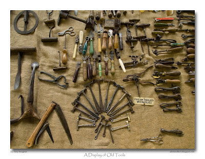
One of the sweets on offer was the slabs (or pieces) of hard, brown, sugary toffee, often wrapped in grease-proof paper printed with the manufacturer's name. I wasn't much of a fan of toffee, preferring to spend my money elsewhere. But, if offered a piece I'd often accept, then suck it until it became a swallowable sliver. Set against the other sweets of that decade toffee seemed very old fashioned, especially when dispensed by the shop-keeper from a large slab that had to be broken up with a special hammer. On a visit to a Lincolnshire country fete a while ago I came across a man displaying his collection of old tools. As I scanned the implements, recognising some, but being baffled by the purpose of others, my eye lighted on some old toffee hammers arranged in the shape of a fan. When I looked closely I noticed that many had the toffee maker's name on the handle. As I read them the memory of those childhood forays to the sweet shop came back to me. There was Mackintosh's, a Halifax firm that went on to join forces with Rowntree. Blue Bird and Walkers I remembered too. But Sharps, College, Williams's, Fillery's, and Battis (?) I don't recall. Interestingly there wasn't a hammer marked with McCowan's, makers of what seemed to be the most widely available toffee, the "Highland" brand that had packaging illustrated with a highland cow.

I had a chat with the owner of the tools and he enlightened me about the purpose of some of them, but I'm ashamed to say I've forgotten much of what he told me. However, to the right of the toffee hammers are can-openers made to look like fish, or with cow heads, presumably reflecting the contents of the cans they most frequently opened, and above is a selection of corkscrews.

photograph & text (c) T. Boughen

Camera: Olympus E510
Mode: Aperture Priority
Focal Length: 11mm (22mm/35mm equiv.)
F No: f7.1
Shutter Speed: 1/15
ISO: 400
Exposure Compensation: -0.7 EV
Image Stabilisation: On

Wednesday, August 05, 2009

The birds and the bees

click photo to enlarge
Think of the word "habitat" in the context of the UK and you picture either Terence Conran's furnishing store or the manifold wild places, the mountain tops, moorland, forests and woods, meadows, sea cliffs, lakes, saltmarsh, chalk downs, farmland, and so on. What doesn't immediately spring to mind are the suburban gardens, so lovingly tended by their owners, that ring our cities and large towns. Yet, in terms of our bird population, this is one of the most important and productive habitats of these islands. Many of the birds that are declining on farmland due to the intensification of agriculture are finding a home there, as are birds that previously lived in woodland and its fringes. Whilst it is true that some species such as the house sparrow and starling are declining, even in towns and cities, the green woodpecker, dunnock, long-tailed tits, carrion crow and sparrow hawk are typical of those increasing in numbers because of the richness of these urban oases.

Today comes the news that suburban gardeners may also be the people who slow, halt or reverse the downturn in our bee population. The varroa mite caused a decline of 30% in the national honey bee population last year, and this year the percentage drop looks to be in the high teens or low twenties. However, there has been a big increase in the number of suburban gardeners buying hives in order to make honey. They account for most of the recent 3,000 increase in the membership of the British Beekeepers' Association which now stands at 14,500. A new, plastic beehive, and the promotion of the hobby by its manufacturer, has also played its part. Who knows, if this trend continues, perhaps that most colourful of birds, the bee-eater (Merops apiaster) will start to make more than its presnt handful of appearances in our country!

Today's photograph shows one of the many bees that are currently buzzing around my lavender. As I got closer than usual to take my photograph I was surprised to see the variety in the appearance of the bees in my garden, and made a mental note to find out more about this interesting insect.

photograph & text (c) T. Boughen

Camera: Olympus E510
Mode: Aperture Priority
Focal Length: 150mm (300mm/35mm equiv.)
F No: f6.3
Shutter Speed: 1/250
ISO: 400
Exposure Compensation: -0.7 EV
Image Stabilisation: On

Tuesday, August 04, 2009

Photographers' shadows and Goldwynisms

click photo to enlarge
The Polish-born American film producer, Samuel Goldwyn (1879-1974), became almost as famous for his "Goldwynisms" as for his work in the cinema. His often surreal mixture of muddle and malapropisms are numerous, frequently memorable, and often hilarious. There is debate over the provenance of all the examples attributed to him, but many, if not most are are likely to be original. Those who knew him suggest that they arose because English wasn't his first language, because his thoughts often came faster than his ability to put them into words, and because he had a sharp sense of humour. When you read them you do feel that the first "Goldwynisms" were probably solecisms, but that the later ones may have been the product of a man enjoying his reputation for verbal infelicities. Whatever the truth, here are some that I particularly enjoy:
  • "A verbal contract isn't worth the paper it's written on."
  • "Every director bites the hand that lays the golden egg."
  • "Anyone who would go to a psychiatrist should have his head examined."
  • "Give me a couple of years and I'll make that actress an overnight success."
  • "I don't think anyone should write his autobiography until after he's dead."
  • "In two words: im-possible."
  • "Our comedies are not to be laughed at."
  • "The next time I send a damn fool for something I'll go myself."
  • "Why did you name him Sam? Every Tom, Dick and Harry is named Sam!"
  • "They stayed away in droves."
  • "You fail to overlook the crucial point."
Reading that last one it occurs to me that perhaps "Goldwynism" is a disease that infected, among others, George Bush II.

You may be wondering what the connection is between the quotations above and my photograph of the shadow of me standing on the steps at the base of a Lincolnshire wind turbine. Well, one of the things you learn when you are starting out in photography, then learn to judiciously ignore as you become more experienced, is to never let your own shadow intrude into your image. It occurred to me, as I reviewed my shot, that Sam Goldwyn's most famous "ism" - "Include me out" - sums this rule up quite nicely!

photograph & text (c) T. Boughen

Camera: Olympus E510
Mode: Aperture Priority
Focal Length: 12mm (24mm/35mm equiv.)
F No: f8
Shutter Speed: 1/1250
ISO: 100
Exposure Compensation: 0 EV
Image Stabilisation: On

Monday, August 03, 2009

Photographing flowers

click photo to enlarge
Any photographer who enjoys their garden inevitably ends up pointing their camera at it. Some enjoy capturing the entirety, or large parts, of their plot, showing off the structure of the planting and the seasonal changes that take place. Others home in on details, isolating groups of flowers or leaves, individual blooms, or other garden-associated subjects (i.e. things other than plants). I tend towards the latter approach.

The challenge with photographing flowers is to produce something interesting or new. Interesting is easier of course, though what interests one person may well be of no interest to another. When shooting flowers there are many variations and permutations - group or individual bloom, macro of flower, include leaves or not, angle, lighting, weather, etc. But coming up with something new on a subject that has been photographed many, many times is nearly impossible. One of the few occasions when I feel I've come anywhere near originality is in my image of some geranium (pelargonium) leaves.

We removed some potentillas from a border a while ago because they were aged shrubs, well past their best, producing few flowers. To fill the space until a more permanent solution was possible my wife planted a selection of annuals, including a packet of mixed rudbeckia. I took one of these striking blooms that are now in flower and tried to come up with a different kind of photograph of this familiar plant. Above is the best of the shots I took. I was aiming for a cropped, square image with the centre of the flower and a quarter of the petals centred top left, but the uncropped original seemed to have a better balance of flower to black space.

photograph & text (c) T. Boughen

Camera: Olympus E510
Mode: Aperture Priority
Focal Length: 35mm macro, (70mm/35mm equiv.)
F No: f8
Shutter Speed: 1/4
ISO: 100
Exposure Compensation: 0 EV
Image Stabilisation: On

Sunday, August 02, 2009

Harvest evening

click photo to enlarge
One of the things that photography does very well is document the past. Yet, inevitably, when the photographs were taken that recorded the world of the past, it was the present. In fact, it's probably true to say that most photographs that we use today to see what the past was like weren't taken with that purpose in mind. The exceptions to this rule include the work of documentary photographers such as recently deceased Jimmy Forsyth (1913-2009) who chronicled a disappearing kind of working class life in North-East England, and also the work of specialists associated with heritage organisations who document buildings, transport, artefacts, etc.

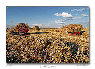
I must say that I've only rarely taken photographs with a view to recording something for posterity, yet I suppose that quite a few of my images could be used in that way. However, two years ago, at the beginning of August, I took the photograph shown above. I took it because it was unusual in showing a method of collecting and transporting straw that seemed to have died out. As I write this piece the combine harvesters are rolling over the Fenland wheat fields, gathering up the seed, depositing the straw in neat lines, and other machines are coming along and converting those rows into multiple, squat, cylindrical bales. That has been the way for many years now, and yet here were these trailers piled up with straw that, for all I know, could have been loaded with pitchforks. It was like a scene from fifty years ago. Swap the wheels for ones with wooden spokes and rims wrapped with steel, and it could be a scene from a hundred years ago. Why this reversion to times past, I thought? Had the baling machine broken down? Was someone shooting a movie that was set in the 1950s? I'll never know, but what I do know is that if this image only existed as a print it would be impossible to date it with any accuracy. As a digital file, of course, it carries its birth certificate wherever it goes!

photograph & text (c) T. Boughen

Camera: Olympus E510
Mode: Aperture Priority
Focal Length: 11mm (22mm/35mm equiv.)
F No: f7.1
Shutter Speed: 1/400
ISO: 100
Exposure Compensation: -0.7 EV
Image Stabilisation: On