Saturday, June 10, 2006

Translucence

click photo to enlarge
The first glass was made by the Phoenicians. It was translucent, and had a blue-green hue due to iron impurities in the sand. The first window glass dates from 1st century BC Egypt, and it too was translucent. Not until the eleventh century AD, in Germany, was the technique perfected for making flatter, thinner glass by forming a cylinder from a blown sphere, then cutting it and flattening it out. This had better transparency, but still didn't achieve the perfect clarity that was sought. In the early nineteenth century window glass was made commercially using a development of the cylinder method, and was closer to the standard we know today. Then during the early twentieth century machinery was used for the first time, and it made completely flat and clear glass. But here's the irony; once the centuries-long search for a quality of glass that transmitted light perfectly - that behaved as though it wasn't there - had been achieved, manufacturers set about developing countless types of translucent glass!

We use translucent glass - it's also called frosted or patterned - where we need light but also privacy. In most houses it is commonly found in the bathroom! There is a tendency today to choose glass with representational patterns - leaves are popular. However, I prefer non-representational designs, and, being a traditional sort of person, stick with the variety known as Large Flemish.

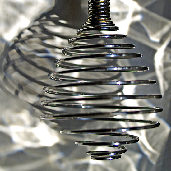
The photograph above shows the head of a hand whisk on a window sill, lit by the refraction patterns thrown by Large Flemish glass when the sun is shining through it. This pattern has been appearing each afternoon at this particular window, and I wanted to include the smoke-like shading in the background of a photograph. Here I placed the whisk slightly to the right of the frame so that it threw its own interesting shadow to the left, and took the photograph using a macro lens. The only post processing is a some increase in contrast and saturation.
photograph & text (c) T. Boughen

Friday, June 09, 2006

Improving architecture

click photo to enlarge
The architectural standard of most new housing in the UK is low. For years the major housebuilders have thrown up basically the same buildings, tricked out with a veneer plundered from whichever historical period is fashionable - near where I live "1930s domestic" with tile hanging, half-timbering, bay windows and all, is currently springing up - a pastiche of a retro style! Sadly, it was ever thus, because, let's face it, much of what was built in the past was not good architecture. The same can be said of most commercial and industrial buildings. And yet, good examples of architecture in all building types have been built and continue to be built, though in regrettably small numbers.

It may just be my impression, but it seems to me that the standard of commercial and industrial buildings is, overall, higher than that of private dwellings. Perhaps it's because most of them, at some point in their gestation, have had a qualified architect involved! That being the case, it's unfortunate that some of these good buildings are never seen by the public because they are hidden away on industrial estates, or in areas zoned for commercial development. One of the opportunities that a future low energy use society should grasp is to integrate our homes with the buildings in which we work, to a much greater extent than is currently the case. The average Briton travels 16 miles to his or her place of work. Any steps to reduce the cost, pollution and waste of time and resources involved in these journeys can only be welcomed. A by-product of such a change is that we would get to see and appreciate some of these well-designed buildings. And, who knows, the embarrassing juxtaposition of their good design and the dross of new private housing might spur our house builders to produce a better product!

The image above shows the back of an office building on a technology park. All sides of this building offer visual interest, and here, at the back, the architect has achieved it by the simple expedient of a spiral staircase placed in the centre. This has both a utilitarian and an aesthetic purpose, and proved an interesting subject for a photograph. The evening sun was illuminating the building like a floodlight, and the dark blue staircase and its shadow were making an interesting, if slightly confusing (even Escher-like), pattern. This oblique shot showed it to best effect, and the conversion to black and white emphasised it further.
photograph & text (c) T. Boughen

Thursday, June 08, 2006

Swimming

click photo to enlarge


"I was much further out than you thought,
And not waving but drowning."
from "Not waving but drowning" by Stevie Smith (1902-1971), English poet

Question: How can you reduce the risk of death by drowning?
Before I answer that question let's consider swimming. There are many good reasons for learning this skill. It's a pleasant pastime that can be enjoyed in purpose-built pools, rivers, the sea, in fact anywhere that offers a safe stretch of water. Swimming is also good for the body, offering exercise to many muscle groups and the heart, and is good for increasing the individual's stamina. It can be either a solitary, exercise-driven pursuit, or a social occasion built around organised games or plain old water-based fun. And then there's the final reason that's usually advanced for learning to swim - it can save your life.

It's that final justification, which is one used by education authorities, swimming organisations and safety groups, that troubles me. I'm not sure that the evidence supports, what on the face of it, looks like a perfectly rational argument. Is it true that if you know how to swim you are less likely to drown? Well no, because most people who drown (I'm taking out infants and toddlers here) are people who can swim and who have deliberately gone into the water! It's a minority who drown by accidentally falling into water. And those who carelessly fall in and save themselves using their swimming skills are also a minority who may well have increased their chances of drowning by taking greater risks near water. It's a fact that those who can't swim tend to have a greater respect (or fear) of the water, and so put themselves in danger less than swimmers do. This isn't an argument that I've seen advanced by anyone, and some organisations have a vested interest in not doing so, but it appears to me to be worthy of serious consideration. So, my answer to the question "how can you reduce the risk of death by drowning", apart from going to live in the middle of the Sahara, seems to be - DON'T learn to swim!

The photograph above is a detail of a sculpture, "Water Wings" by Bruce Williams, on the south promenade at Blackpool, Lancashire. It is a photograph of a child swimming with flotation arm bands, and it has been modified in the style used in printed publications. The artist has imprinted this on a large flat sheet of metal, and then cut out the "white" parts of the print. The rest of the sculpture, which is large - the size of an advertising hoarding - shows rippled water.
photograph & text (c) T. Boughen

Wednesday, June 07, 2006

Wall to wall coverage

click photo to enlarge
It may have escaped your notice, especially if you've been living on Mars or in the United States, but there's a soccer tournament starting soon. If you're not a big fan of "the beautiful game" then you might like to consider taking a holiday in either of these places for a few weeks. Because, let's face it, that's the only way you're going to avoid the wall to wall TV coverage that's about to be unleashed on most of the planet when the World Cup starts this weekend.

The Fleetwood Arms pub in Fleetwood, Lancashire, has it's own wall to wall coverage already in the form of England flags and other football paraphernalia. This patriotic and fanatical display is designed to attract donations to a charity that suppports the local children's hospice. It's also a bit of in-your-face advertising for the pub itself. For the benefit of the uninitiated, the elongated, inflatable, red, white and blue figure with Crouch on its chest is an affectionate tribute to England's 6 feet 7 inch striker, Peter Crouch. The only other face to appear on these walls is that of someone called David Beckham, whoever he is!
photograph & text (c) T. Boughen

Tuesday, June 06, 2006

Menai Bridge, North Wales

click photo to enlarge
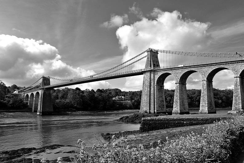
This handsome bridge over the Menai Straits between North Wales and the island of Anglesey is widely agreed to be the world's first large modern suspension bridge. It was designed by the great self-taught architect and civil engineer, Thomas Telford (1757-1834), a man who built canals, aqueducts, bridges, churches, prisons and roads. Telford's work on improving the highways of Britain was so remarkable that his friend, the Poet Laureate Robert Southey, nicknamed him "The Colossus of Roads!"

Work started on the Menai Bridge in 1819 and it was opened, to great public acclaim, in 1826. The construction of this bridge, along with Telford's work on the road system, reduced the journey time from London to the Anglesey port of Holyhead from 36 hours to 27 hours. Telford's brief had been to bridge the narrow Strait with a structure that would allow a 100 feet tall ship to pass under at high tide. His design used concrete, stone, iron, and 16 chain cables supporting the 550 foot span. The original deck involved wooden timbers, but in 1893 this was replaced with steel. In 1938 the iron chains, which had been soaked in linseed oil to prolong their life, were replaced by steel. I don't know if Telford was asked to design a bridge that combined utility with elegance, but that's what he did, and into that difficult to achieve mix he added longevity. The impact of the beautiful new bridge was such that the village of Porthaethwy near the Anglesey end changed its name to Menai Bridge!

This photograph was taken from the Bangor (North Wales) side of the Strait in the morning light. I used a wide angle lens stopped down to give a greater depth of field, and underexposed to keep the sky detail. In software I corrected the converging verticals, increased the brightness of the land and water, converted the colour image to black and white, and overlaid it all with a software version of my favourite red filter.
photograph & text (c) T. Boughen

Monday, June 05, 2006

South Stack Lighthouse, Anglesey

click photo to enlarge
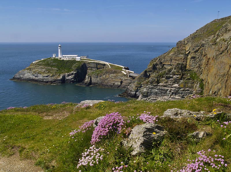
Who would be a lighthouse keeper? On a clear, calm and sunny June day, with sea pinks lighting up the cliffs, and the white painted lighthouse standing proud and tall over a blue sea, the job seems to have its attractions. But, sitting in a basket suspended from a hemp cable, in a January gale, above a boiling sea, as you make the 100 feet crossing over to the lighthouse? Well, then the job wouldn't seem quite so appealing! And that was the original means of access to South Stack island until 1828 when a suspension bridge was built.

South Stack Rock is at the westernmost tip of the island of Anglesey, Wales. One hundred feet of turbulent sea and strong currents separate it from Holyhead Island. Its position among the rugged granite cliffs of this coast meant that it was identified as a suitable location for a lighthouse as early as 1665. However, it was not until 1809 that the present 91 feet tall building was completed to the design of Daniel Alexander. The light is visible for 28 miles and is a beacon for ships on the Liverpool-Holyhead-Dublin route.

The first lights at South Stack were oil lamps. In 1909 an incandescent mantle lamp was installed, and these continued until 1938 when the light converted to electric power. The last lighthouse keeper stood down in 1984, and today the light and fog signals are remotely controlled from Trinity House's control centre 270 miles away at Harwich. Interestingly, the present 1000w halogen bulb is magnified to 1,370,000 candela by the original array of rotating glass prisms, and the whole light still floats in a bath of mercury.

South Stack is probably the most attractively sited lighthouse in Wales, and a magnet to any passing photographer whatever the weather. It can be reached by a new bridge (just visible in the photograph) erected in 1997, and is open to the public. I was fortunate to be there on a beautiful day when the cliffs were alive with nesting seabirds and wild flowers, and the lighthouse was the perfect destination of a perfect walk. The natural beauty of the location made composing and securing a satisfactory photograph the very easy matter of putting the lighthouse to the left of the frame, the clumps of flowers to the right, and ensuring that I had enough depth of field.
photograph & text (c) T. Boughen

Sunday, June 04, 2006

A slightly surreal moment

click photo to enlarge
Regular viewers of this blog will know that I'm not a photographer of people. My subjects are varied, and sometimes include people, but rarely are they the point of the image. It's not that I've got anything against people; in fact some of my best friends are people! But, when they do creep into my photographs they are usually incidental, for scale, for compositional balance, or for additional visual interest. Where they form the focal point of an image it's usually because a focal point is needed and people are useful in that way! And so it is with this photograph.

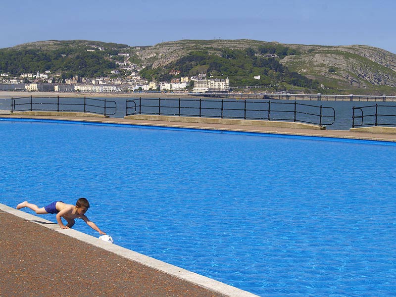
It shows a shimmering blue paddling pool on a bright June day on the promenade at Llandudno in Wales. As I walked with my wife past this empty pool I was struck by the almost surreal quality it presented next to the darker sea of the bay, the distant buildings, and the limestone headland of the Great Orme. It was like a piece of the Mediterranean had been plonked down next to the Irish Sea! I knew I wanted to capture this oddness, but I also knew that my composition needed a person in the foreground. There were few about. Then a small boy ran down the far side of the pool and threw his ball into the water. As the wind blew it across the pool, and he ran round to meet it at my side, I felt a shot would be possible. To increase the surreal effect that I was looking for I decided to try and put him at the edge of the frame. I expected him to jump in the water and retrieve the ball, but instead he carefully put one foot in and reached for it, lifting his other leg off the ground as he did so. At that slightly surreal moment I pressed the shutter.

I've considered the things I could do with this image. Conversion to black and white works quite well, and different coloured software filters accentuate different parts of the shot. But it also makes the physically distant background less compositionally distant. Various crops produce shots with different qualities. However, I present the photograph in colour, in its entirety, with no post processing, looking slightly surreal, because that's how I originally conceived it. It may just be the way I do things, but I often find that if I take five shots of a scene, I usually end up preferring the first one!
photograph & text (c) T. Boughen

Saturday, June 03, 2006

Spiral vertigo

click photo to enlarge
Two reasons motivate the constuction of a spiral staircase - utility and beauty. And even where the prime reason is utility, the form of the spiral produces beauty whether it is wanted or not!

In medieval churches and castles spiral staircases were constructed to allow vertical passage in confined spaces, so we find them mainly in towers. In military buildings they also had the advantage of being easily defended, and here the spiral was made clockwise to allow the defender (with his back to the stairs) the effective use of his sword hand, whilst denying this convenience to the attacker. Renaissance and later architecture made extensive use of these staircases for the beauty of the form, and often put them where conventional stairs and landings would have been suitable. Wherever they are built, the question that arises is, do we hang the stairs from the centre column, from the outer wall, or from both? In the photograph above, taken looking down South Stack Lighthouse, off Holyhead Island, Wales, the stairs are cantilevered from the outer wall. The central column is a conduit for services, and if it has a structural purpose it will be in connection with the weight of the light.

I took this shot, hand-held, from near the top of the lighthouse. A safety light below the lantern floor is causing the warm yellow tint on the nearer stairs and walls: daylight illuminates the lower stairs. To my mind the effect of distance gives the spiral an almost organic quality, bringing to mind ammonites, the tendril of a climbing plant, or a butterfly's proboscis. A wide angle lens was used to include as much of the spiral as possible, and I used a contrast mask in the post processing to bring out more of the details.

Query: Surely "spiral" staircase is a misnomer - isn't this three dimensional shape a helix?
photograph & text (c) T. Boughen

Monday, May 29, 2006

Best of PhotoReflect

click photo to enlarge
GO TO BEST OF PHOTOREFLECT GALLERY

If you've visited my photoblog since it creaked into life last December you'll know that I have the self-imposed task of posting a photograph and an accompanying piece of prose every day, short holidays excepted. Each piece of writing is sparked in one way or another by the image, and, as with the images themselves, I've ranged over a wide variety of subjects. Plainly, given that I'm neither a journalist nor a professional photographer, the quality of both the writing and the images varies quite a bit! However, I am pleased with some of what I've produced, and the task has been of value to me personally, developing both my writing and my photography. Through my daily postings I've received helpful criticism, advice, support and goodwill from many people, and I'd like to take this opportunity to thank them for taking the time and trouble to comment on what I'm doing. Your involvement has added considerably to my enjoyment in creating this blog!

All the photographs in the blog are taken using an Olympus E300 DSLR and Olympus Zuiko Digital (ZD) lenses. The one I've used most is the ZD 14-45mm 3.5-5.6 (28-90mm in 35mm terms), known as "the kit lens". I've also used the ZD 40-150mm 3.5-4.5 (80-300mm in 35mm terms) which is also a "kit lens" in Olympus's camera plus two lens offering. Recently I've acquired the ZD 35mm 3.5 macro (70mm in 35 mm terms) and it has been used for some shots. One shot (the pink carnation) uses a screw-on Sigma Achromatic Macro lens on the short zoom. I've been a long time Olympus user, buying an OM1 (MD version) SLR in 1974, and using it for 25 years without a single problem, so staying with Olympus in the digital age seemed an obvious choice.

My aim from the outset has been to keep the daily posts going until September, and I am continuing with this goal. However, I thought that now, about half way through the project, was a good time to pause and reflect on the photographs I've produced. And so, today's posting offers this gallery of what I think are the best shots to feature on the blog. There are 77 images.

I've put it together with JAlbum, the well-known free web photo album generator, created by David Ekholm. My album uses the default skin, but there are dozens to choose from. Making the album was amazingly easy, and this is a piece of software I'm happy to have found. I've not shown exif information because not all my resizes retained it. I have, however, used the best quality settings in JAlbum, but not the largest size, so some jaggies creep in. I may see if different settings improve on this when I add some more shots. By the way, don't click Order - it appears by default, but I haven't enabled anything connected with it!

photograph & text (c) T. Boughen

Sunday, May 28, 2006

Good enough isn't bad

click photo to enlarge
When I was younger one of my faults was to aim for perfect- ion in every- thing I did. The perfect photo- graph, the perfect drawing, the perfect piece of work in my job, etc. Many will say that isn't a fault, it's a good quality, and the best art, architecture, writing, work - the best anything - is produced by people who are driven in this way. I'm not so sure. I've come to believe, and to know, that many "great" works were not achieved by people striving for perfection. Often their creators worked hard, achieved something that was "good enough", and then moved on. It was others who decided that their work was exceptional. I am now something of a devotee of the "good enough" cult, producing work that is no worse than formerly, and, I'm happier for it.

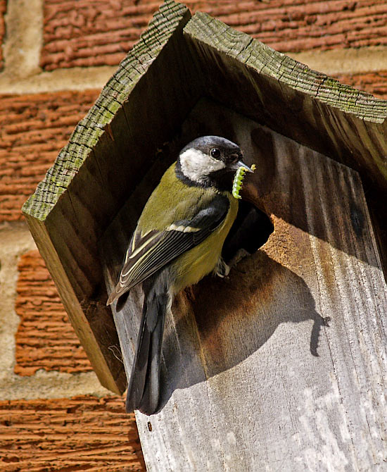
A few years ago I fixed a wooden nestbox to the side of my house, and another one to a tree near the stream at the bottom of my garden. One windy winter day the tree-mounted box blew down and floated away never to be seen again. However, during its very first spring a pair of blue tits made their home in the box on the house. The birds provided me with the pleasure of watching their comings and goings, and the day the youngsters, one by one, left the nest, was a joy to experience. It was good to think that I had played a small part in their success.

However, for the next few years the box wasn't used, although an altogether superior box put up by my neighbour was! Then, last year some great tits investigated my nestbox. They could barely squeeze through the small hole, and they tried to enlarge it. The box is made of plywood so they eventually gave up and went elsewhere. A few weeks ago they looked again, pecking at the hole once more. This time I decided to help them out by taking the box down and making the hole bigger. When I put it back up I can't have tightened the screw enough because the box shifted from vertical in the wind. I noticed it was hanging wrongly, but didn't get round to doing anything about it. However, despite this, the leaning box proved "good enough" for the great tits because they are now busy raising their family, happy in their slightly askew new home.

My photograph shows one of the pair about to feed the nestlings with a succulent caterpillar. I used a zoom at 300mm (35 mm equivalent), and cropped the shot. The photograph was taken hand-held at 1/800 second at f6.3, ISO 200. The busyness of the birds meant I had to take sixteen shots before I got one I was happy with, and, as a record of this little drama, I think it's "good enough"! You may disagree!!
photograph & text (c) T. Boughen

Saturday, May 27, 2006

Reading a church

click photo to enlarge
My interest in church architecture takes me to many different kinds of churches in widely varying locations across the United Kingdom. Wherever I go there is often an interesting puzzle to unravel, particularly when the church is an ancient one, worked on (and worked over) down the centuries. The church of St Helen at Kirkland, Lancashire * is one such example.

The shape of the churchyard is the first thing that strikes a visitor, since its nearly circular shape suggests that the church may have been built on a pre-existing pagan site. Vicars of St Helen's are known from 1190 onwards, but the oldest surviving architecture is some "stiff leaf" capitals in the north chancel arcade, which indicates 1220-1230. The rest of the building shows, through the styles of the various peices of architecture, how it was built and changed over the years. So, the circular columns of the north nave arcade are of a similar date to those of the chancel, but the octagonal capitals of the south arcade show it to be later - perhaps 1300. The chancel arch chamfering and the cusping of some windows indicate the fourteenth century, but the panel tracery of the east window and the wooden chancel stalls are later fifteenth century work. The south chancel chapel is probably the one that was endowed by Roger de Brockholes in 1490, and would have been a chantry where a priest was paid to pray for the donor's soul in perpetuity. The west tower dates from this time too (though the spirelet is Victorian), and the inverted "V" of the old roof line can be seen on its west face. Inside the church are black-letter wall paintings of the seventeenth century, and at the east end is a small two-storey stone vestry with a chimney, added in 1590, and probably brought piece by piece from a disused building - perhaps Cockersand Abbey. The highest windows of the nave, simple pointed lancets in the clerestory, were added in 1811 when the church was made taller. All this work demonstrates the ongoing commitment of this small rural community to the building that would have been central to its life for centuries.

This photograph was taken on an overcast afternoon from the edge of the churchyard. I framed the church with the trees and the rows of gravestones to introduce some contrast, and converted it to black and white adding a little more contrast during processing.

* the link above is to my Lancashire Churches, church architecture website
photograph & text (c) T. Boughen

Friday, May 26, 2006

The perfect strawberry

click photo to enlarge
This little flower will, strong winds and wild birds permitting, turn into a small strawberry about the size of the nail on your little finger. And the taste of that small strawberry will be beyond compare! It's an alpine strawberry that grows in my garden, both where I want it, and self-seeding where it fancies. The plant isn't far removed from the wild strawberries that grow in the woods and hedgerows near where I live.

The other day a young colleague was eating the largest strawberries I've ever seen in my life - they were massive, each requiring three or four bites to finish it off. I asked her what they tasted like, and she replied that they didn't have much taste at all. That was an interesting response because it showed that her sense of taste and discrimination was still intact. The fruit must have been intensively grown in some foreign field, air-freighted into the UK, and rushed by refrigerated lorry to the supermarket to be sold as quickly as possible. For what? So that people would be attracted by the size, the producer, shipper and retailer would make some money, and the customer would be disappointed by the taste.

But, many will be delighted by them, for the simple reason that they have never been offered anything better. Despite the increased popularity of organic produce, appearance is still all in food, and the biggest, brightest, most blemish-free is often the shopper's choice, even if it it tastes like corrugated cardboard. It's ironic, isn't it, that at a time when many in the west need to be eating less, size, rather than quality, is still being used to attract the buyer.

I used a macro lens to take the photograph of this small flower which is about 15mm in diameter. The shallow depth of field separated it from the background of serrated leaves, and shows both its simple cinquefoil beauty and all that is necessary to produce a great tasting strawberry.
photograph & text (c) T. Boughen

Thursday, May 25, 2006

Do you believe in magic?

click photo to enlarge
Do you believe in magic? Does western society believe in magic? Before you answer no, and say that it's something that died out with the Enlightenment and the rise of science, consider this. Millions of people spend money on expensive, scientific sounding tubes of gunk and smear it on their faces believing that it will make them appear younger. If that doesn't imply a belief in magic what does? Or how about this? Most modern newspapers and magazines carry columns entitled "Your Stars", or something similar, and the astrological advice they carry is, incredibly, widely read and acted upon.

So, what has this got to do with a photograph of the church of St Anne's, Woodplumpton, Lancashire? Well, it includes the grave of a witch! Can you work out which one it is? It's actually the big rock in the lower right of the frame, and it marks the final resting place of Meg Shelton, the "Fylde Hag", who died in the late seventeenth century. She was reputed to be able to change herself into different shapes. A farmer caught her stealing grain after jabbing his pitchfork into the sacks - the one that screamed quickly turned itself back into Meg! She is said to have died when she was crushed against a wall by a barrel. Meg was buried in the churchyard, upside down in a vertical position, so that if she used her magic to dig her way out she'd be digging downwards. And just to make sure she was gone forever they placed this large rock on top of the hole!

I imagine that this poor woman, like the ten Pendle Witches who were hanged at Lancaster Castle in 1612, was the victim of persecution because she was different from her neighbours in some noticeable way. It would be nice to think that belief in magic, and persecution on the grounds of difference, were no longer part of our world. But they endure, often unrecognised for the ancient and outdated concepts that they are.

I took this photograph for the architectural interest of the west end of the church, but post it here for the sociological interest of this ancient grave.
photograph & text (c) T. Boughen

Wednesday, May 24, 2006

Lowland pleasures

click photo to enlarge
"Rest is not idleness, and to lie sometimes on the grass under the trees on a summer's day, listening to the murmur of water, or watching the clouds float across the sky, is by no means a waste of time", John Lubbock, English biologist and politician (1834-1913)

There are those in England who say that the English lowlands are boring. I used to be one of those people! Having been brought up in the hills and mountains of north-west England I had become accustomed to the landscape, to the wild summits, the greener valleys, outcropping rocks, dour farmsteads and stone-built villages. So, when I moved to the lowlands of eastern England I was surprised by how quickly I came to appreciate the different beauty that it represented. The brick-built houses with their orange pantile roofs, the oolitic limestone churches, the hedgerows and seasonal field patterns, all impressed me. However, what struck me most forcibly was the beauty of those big skies. Only when I had experienced them by living below them did I realise why the painter John Constable was driven to repeatedly paint skyscapes, and why he never felt the need to travel beyond the confines of these islands.

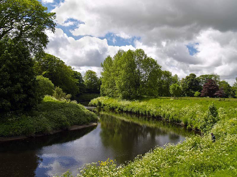
In many ways, the clouds (and the trees) are the mountains of the lowlands. In that setting they exhibit a similar grandeur. There are times of year when these insubstantial forms seem solid, massive, almost overwhelming in the way they impose themselves upon you. This photograph does, I hope, show something of that. It is a view of the River Wyre near the village of St Michael's-on-Wyre on the Fylde Plain in Lancashire. The scene has no single main subject, but rather is a representation of green and vigorous nature in late May. The flower-flecked river banks, lush grass and thrusting trees frame the river and its reflections, and over it all is a covering sky of massed clouds. Though this is the lowlands, the figure of the solitary fisherman is easy to overlook. Can you see him?

This photograph was taken in the late morning, and I composed the shot so the river and line of trees would take the eye throught the frame. My photographs usually have a clear subject or focus, but here I simply wanted to capture one of the the backgrounds that make lowland England a pleasant place to be, and to allow that to speak for itself. Oh, and about that fisherman - I didn't spot him until after I'd taken the photograph!
photograph & text (c) T. Boughen

Tuesday, May 23, 2006

North Euston Hotel, Fleetwood

click photo to enlarge
Some years ago I spoke at a planning inquiry into a new court building where I heard the architect say that no building needed to have a back that was obviously a back, and that all the faces of a building could be of the same high quality. Wouldn't our built environment be improved if that was so! In the past that wasn't the case, and unfortunately it's often not so now. What's more, the back of that particular architect's court proved to be significantly poorer than the main elevation!

The North Euston Hotel, Fleetwood, was built in 1841 by Peter Hesketh-Fleetwood and his architect, Decimus Burton. In terms of the exterior it has a great front, and the rest is terrible! Its plan is essentially like the letter "C", with the curved, dressed stone facade following the arc of the promenade as it turns into the mouth of the River Wyre. The centre of the building, not visible in this photograph, has a flat section with the main entrance under a columned porte-cochere. Two further entrances are placed to the left and right of the front. The hotel's name arises from the time of building, when Fleetwood was the farthest north that the railways extended on the west coast, and travellers for Scotland embarked onto a ship here, having travelled by rail from Euston station in London. This status as a jumping off point lasted but a few years, and when the railway was extended northwards, the building struggled to find customers. For a period it was taken over by the army, but fortunately it found its original use again, and it continues to this day as the port's premier hotel.

I took this shot to show the interesting shape of the North Euston, and to illustrate the contrast between the well-finished front, and the utilitarian side. I used a wide angle (28mm equivalent) lens. The main post processing is the correction of converging verticals.
photograph & text (c) T. Boughen

Monday, May 22, 2006

Evening light at the pier

click photo to enlarge
A seaside pier is designed to combine all the fun of the fair with the feeling of being on a large ship. Blackpool's North Pier, one of three that project from the town into the Irish Sea, does that exceptionally well. On a calm, sunny day the effect is serene and full of light. In winter the wind and crashing waves give an entirely different experience. And all this without a hint of seasickness!

The North Pier, designed by Eugenius (what a great name!) Birch, was opened in 1863, and is the oldest, as well as the most old-fashioned of the three piers. It has the customary long, exposed walk (1,405 feet) to the end, though there is a little train for those who want to ride. At the landward end are the usual amusements, a showbar, shops, cafe, etc. Four small pavilions with exotic looking ogee caps, act as visual punctuations along the decking. They house little shops, and add Victorian distinction to the overall outline. The end of the pier has a 1500 seat theatre, enclosed seating area and bandstand, a genuine Venetian carousel, and a few other attractions. This is in strong contrast to the Central and South piers which are absolutely packed with amusements, multiple large and small rides, eating places, etc.

I've taken photographs of this pier in the bright summer sun, when it's packed with holiday makers. This one, however, was taken on a May evening after a day of prolonged heavy rain. The pier had closed for the day, and probably had precious few visitors anyway. This brief glimpse of the sun through the storm clouds made a dramatic backdrop for the outline of the pier and the calm sea. I positioned myself so that the brightness of the sea on the left was balanced by the detail of the closer parts of the pier on the right, and I ensured that enough sky was included to show the range of colour that the evening light offered.
photograph & text (c) T. Boughen

Sunday, May 21, 2006

Strange effects

click photo to enlarge
A while ago I heard an interesting BBC Radio programme about "the lotus effect". It seems that in the 1970s Wilhelm Barthlott of the University of Bonn wondered why the leaves of the lotus plant stayed clean, and how dirty water just slipped off them. He examined the leaf surface with a scanning electron microscope and found that at a microscopic level the surface was very bumpy. Further, that each bump had bumps, and that those bumps had bumps, etc. Consequently, drops of water and grime stayed roughly spherical on the surface of the leaf, resting on air as well as the tops of bumps, and, with little consequent friction, readily slid off. This is counter-intuitive, because we would expect that water would most easily slide off a smooth surface!

In subsequent years Barthlott developed a surface coating to mimic the effect of the lotus leaf, realising that it had commercial applications. Industrialists were slow to see the value of the invention so Barthlott designed a special spoon. He used it to attract the attention of the sceptical, dipping it into a jar of honey, and watching their amazement as the honey slid off it, leaving the spoon clean. A plate was also made. When honey was placed on it, the sticky substance behaved very much like mercury! In 1994 a patent was granted, and products are now being made that use the invention, including surgical instruments, glass and paint coatings, and roof tiles. Other products that need to stay clean are doubtless in the pipeline.

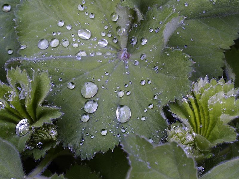
I was reminded of this when I was photographing the leaves of Lady's Mantle (Alchemilla mollis) in my garden. One of the attractive features of this plant is the way that, after rain, individual beads of water gather on the surface of the leaves. The way they stay there makes it seem like an "anti-lotus effect" is at work! I don't know why this happens, but I suspect it has something to do with the hairs on the leaves. I used a macro lens to take my shot, and stayed far enough back to capture both the drops of rain, the shapes of the open and opening leaves, and the shadows between the leaves.
photograph & text (c) T. Boughen

Saturday, May 20, 2006

Selection and abstraction

click photo to enlarge
Photography is, in the main, a subtractive art. The viewfinder is capable of showing everything before us, and our job is to make sure that it either shows, or gives emphasis to, that which we want to be the main point of the photograph. So that means eliminating the unneccesary. We usually do this by selecting lenses with different fields of view (or using a zoom lens), or by choosing our position, and hence point of view, very carefully.

However, sometimes we want to reduce the information in the composition to the point where an element of abstraction creeps into the photograph. The resulting image will usually include recognisable objects, but the way in which those objects are arranged will be part of the point of the final image. That was what I attempted in this photograph.

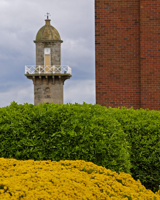
The "subject" of the photograph is the Lower Lighthouse at Fleetwood, Lancashire. But the image also includes sky, the side wall of the North Euston Hotel, yellow ornamental flowers and green bushes (both in front of the Wyre Magistrates Court building). So, the composition comprises five elements, four of which are essentially big patches of colour, and one (the lighthouse) that is more complex, and the point of focus.

This "simple" image was quite hard to set up, and needed a long focal length lens to compress the elements into one view. I'd have been happier with it if the lighthouse had been in sharper focus, but I think the final outcome has something to commend it. It's a shot that I'll take again and seek to improve.
photograph & text (c) T. Boughen

Friday, May 19, 2006

Langford Church, Oxfordshire

click photo to enlarge
The Saxon period in British architectural history is usually defined as the time between about 600 and the arrival of the Normans in 1066. In European terms both the Saxon and subsequent Norman style of building are Romanesque, and it's helpful to remember that, since Norman ideas penetrated England before the invasion, and Saxon builders continued to work afterwards. This makes churches built in the eleventh century hard to categorise as Saxon or Norman, as here at St Matthew, Langford in Oxfordshire.

Romanesque architecture, as its name rather implies, is usually characterised by rounded arches. In churches these appear mainly in doors, windows, nave arcades, and decoration. That being the case, the pointed windows and door in the chancel are clearly later, and are in fact Gothic of the 1200s. In this photograph it's the tower that is Saxon, or possibly Norman, but built by Saxon masons. The corner pilaster strips with stepped capitals are a strong clue for the earlier style, as are the twin arched bell-openings with roll-moulding and leaves. The corbel table at the top of the tower is from about 1200. In fact the tower's whole style and profile looks quite Italianate. Other Saxon evidence includes a relief of the crucifixion, and a large (headless) Christ triumphant reset in the wall of the south porch, and visible in this photograph. For further information about Saxon architecture go to my church architecture website here.

I took this shot as an overview of an interesting building. It was a dull, overcast day, but fortunately the trees and the foreground detail of the leaning gravestones in shadow were there to give effective framing and contrast. I might have wished for broken clouds, but sometimes you've got to put up with what the day offers. Consequently I've converted this shot to black and white to minimise the drabness of the sky.
photograph & text (c) T. Boughen

Thursday, May 18, 2006

Hiding behind the shades

click photo to enlarge
I'm worried about Bono! And not just Bono, but Yoko Ono, Naomi Campbell, Joan Collins, and all those other celebrities who wear dark glasses all the time. At some point they're going to have to undergo a pretty complex procedure when they have them surgically removed, and whilst their wallets can probably stand it, can their egos? Some pretty deep counselling is going to be required when they are finally forced to come to terms with their real selves!

So what is it that makes people wear dark glasses regardless of whether they are inside or outside, whether it's sun or rain? I guess it's the influence of style icons and kings of "cool" like Miles Davis and Bob Dylan: people who took to shades like Ozzy Osbourne takes to tattoos. But let's face it, it's just not possible for today's dark glasses gang to compete with the "cool" of someone who invented playing with his back to the audience (Miles), or who could mumble songs instead of singing them, and still sell millions of records( Dylan)!

In fact, I think there is something else at work here besides a desire for the title of "cool". It's my theory that these dark glasses are an exterior manifestation of an interior insecurity. Yes, really! Bono's presence on the world stage as well as the musical stage, and Naomi's catwalk and newspaper strutting, is simply their way of trying to overcome their latent retiring natures! Far from being the vocal extroverts we imagine, who love to accompany presidents and popes, they are really shrinking violets, reluctantly thrust into the public eye, and the dark glasses are their way of hiding from the world! A good theory or what?

I took this photograph of me, reflected in a colleague's mirror sunglasses, as she left work recently. In the interests of workplace harmony I must stress that this lady only wears her sunglasses when the sun shines, and that none of my concerns about the physical and emotional well-being of permanent wearers applies to her! And she's the epitomy of cool! I used a macro lens to secure the picture, and reduced the recommended exposure to counteract the effect of the lighter skin.
photograph & text (c) T. Boughen

Wednesday, May 17, 2006

A drink that costs the earth

click photo to enlarge
I could never have been an entrepr-
eneur or a venture capitalist. If someone came to me and said, "Hey, I've got this great idea. We could put water in a plastic bottle, sell it for more than the price of petrol, maybe, 5,000 to 10,000 times the cost of tap water, and people won't be able to get enough of it!" Well, I'd laugh them out of the door. I'd consider the idea utterly preposterous! But, that's what happens, and I just can't understand it.

People say, "Ah, but it's spring water with minerals, it's better than tap water, and it's a lifestyle accessory!" Rubbish! It's water, H2O! Often it's not as pure as tap water, usually it's indistinguishable in terms of taste, and its beneficial effect is identical. Coca Cola gave the game away in the UK when they tried to sell their version of bottled water, Dasani. It turned out to be from a tap in a factory in Slough!

But the problem only starts with price and equivalence. There's the environmental cost of moving bottles of water around the world. In 2004 Finland shipped 1.4 million bottles to Saudi Arabia! Market forces mean European countries swap lorry loads of water every day as consumers express their preference for French or German or British. The 1.5 million barrels of oil required annually for the bottles that hold water in the U.S. could power 100,000 cars for a year, and 86% of those bottles become garbage or litter. Whichever way you look at it bottled water costs too much.

"OK", I hear you say, "have you never bought a bottle of water?" Of course I have, when I've run out of the tap water I'm carrying, or if I've needed a drink when I'm out and about. I'm not saying that it shouldn't exist, or that there's no legitimate demand, but is there any real need, in places where pure water is readily on tap, to buy shrink-wraps of multiple 2 litre bottles a couple of times a week? Whilst we may be able to afford it in terms of cash, can we really afford the true cost?

My photograph above shows one of the ubiquitous bottles. It was on a window sill at my place of work, with a small orange ball next to it. The late evening light made it catch my eye. I moved the ball to increase its effect, then used a macro lens to emphasise the horizontal pattern and the way the plastic deformed the colour.
photograph & text (c) T. Boughen

Tuesday, May 16, 2006

Stinking onions

click photo to enlarge
If you go down to the woods today you'd better hold your nose. Why? Because it's the time of year when the "stinking onions" are in flower. Well, that's what I called them when I was a child, charging through the undergrowth in the damp woods of the Yorkshire Dales. Every May, following fast on the heels of the bluebells, and usually overlapping them, the luxuriant leaves of what I later came to know as ramsons (Allium ursinum), produce hosts of white, star-like flowers, which carpet the woodland floor, accompanied by the strong smell of onions.

At first the smell of ramsons is off-putting, but in time it grows on you. I've come to associate it with a time when the woods look their best, like this one above, near Knott End, Lancashire, and so I look forward to catching the pungent scent hanging on the air. The other name for this distinctive plant is, appropriately, "wild garlic", since it belongs to the Lily family which also includes the onion, garlic, chives and leeks. The flowers and leaves can be eaten as salad items, or as a garnish in sandwiches, whilst the bulb is best picked in the second half of the year, and has a mild flavour. Cooking any part of the plant significantly diminishes the flavour.

I took this photograph on an overcast day, just as the promised rain began to fall. The bright white of the ramsons, the azure of the bluebells, and the fresh green of the sycamore and beech leaves combined to make an attractive scene. Two of the thin, light-starved trees on either side of a long disused path in this small, overgrown wood, made a suitable middle-ground focus, and the yellow filtered light beyond differentiated the background.
photograph & text (c) T. Boughen

Monday, May 15, 2006

Poppies and happiness

click photo to enlarge
According to some social and economic researchers, western society reached a peak of happiness and well-being in 1976, and, despite rising living standards and increasing life-spans, it's been downhill since then. When you ask people what they want from life a common answer is "to be happy". However, when you ask individuals what would make them happy you get myriad replies. For many it's having lots of money, for some being thinner, whilst others would be happy if they were famous. Yet if you look at those who embody all three of those qualities - you'll have your own list - they don't seem to be any happier than the average person.

Some people think that happiness comes from a life of constant leisure: they crave the time to do nothing. Yet idleness soon palls because most people need to fill their hours with something more than sitting in the sun. And there, I think, is the one real clue to how to achieve happiness. Happiness comes from doing things - it's a by-product, if you like, of activity: it isn't, and we wouldn't want it to be, an end in itself. If we do seek happiness as an end in itself, it could easily be achieved through drugs or chemical means. However, that would bring the mindlessly passive state that Aldous Huxley described in his novel, Brave New World. So, it seems that if we have good relationships, care for our families, find work of value, strive to learn, make contributions to our society, in other words do those things that mean we live our lives well, happiness will find us, without us searching for it. And megabucks, body shape and fame won't enter in to it!

These poppy seed heads set off that train of thought which I'd been thinking about after reading an article in A.C. Grayling's book, "The Meaning of Things: Applying Philosophy to Life". Too often today poppies are mentioned in connection with drugs and the state of mind they produce, rather than as beautiful flowers. I took this photograph with a macro lens after placing a piece of dark card behind the seed heads. The lighting is natural, and the only post processing is an increase in contrast and sharpness.
photograph & text (c) T. Boughen

Sunday, May 14, 2006

Goliath's teeth

click photo to enlarge
The thin layer of soil beneath our feet is vital to human existence. About 90% of our food, livestock feed, fibre and fuel derive from it. More than that, it affects the landscape we live in, is vital in our water supply, provides us with minerals, and holds the record of much of our past. It's a sobering thought that it takes between 2,000 and 10,000 years for a full soil profile - one that can be used for agriculture - to develop. This is roughly comparable with the historical (as opposed to archaeological) record of man. And given that fact it's vital that we value our soil, because if it's lost or damaged, it can't easily or quickly be replaced.

When mankind first saw the benefits of settling down and tilling the soil, the world's population was small, land was plentiful, and agricultural methods were inefficient. However, in the past 300 years land has begun to be used much more intensively, as the "agricultural revolution" which began in the eighteenth century, developed and spread across the world. Today soil faces many threats. In Germany about 120 hectares a day were lost in 1997 due to surface sealing (building etc.). In Russia 57% of agricultural land is subject to strong erosion. Acidification is widespread in Europe, and the extent of localised pollution of the soil by industry is becoming increasingly understood. Throughout the world farmers are having to recognise the degradation that comes from intensive use and the application of chemicals.

The photograph shows a detail of an agricultural roller called "Goliath" by its manufacturer. It's an appropriate name since, when towed by a tractor, it can do the work that formerly took many men much longer. The reduction in the farm workforce, the increase in farm sizes, and rampant mechanisation, have all worked to distance people from the soil, and this has further contributed to its degradation. I noticed this roller as I walked along a footpath past a farm, and was attracted by the pattern of the rings of saw-like teeth, the pitted surface and the rust spots. I chose a diagonal view to introduce a note of instability to the composition.
photograph & text (c) T. Boughen

Saturday, May 13, 2006

Confusing reflections

click photo to enlarge
Reflections are confusing aren't they? When you look in the mirror the face that stares back at you is not quite the face that everyone else sees. That's because faces are rarely symmetrical, and the mirror reverses features with which we have become familiar. My wife tells me that in the mirror my face looks "lop-sided"! So does hers, but I'm too much of a gentleman to mention such a thing!

Similarly, in the mirror our left hand appears to be our right hand, and writing gets confusingly flipped. I've never understood the way that some emergency vehicles have their name written on the bonnet so that it can be read correctly in the rear-view mirror of the car in front. If that is necessary for the driver to realise that the big brightly coloured vehicle behind with the deafening siren is a fire engine, won't the writing just confuse all the other drivers on the road, and don't they need it the correct way round so they know its a fire engine too?

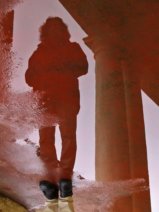
And what about reflections in puddles? They usually turn other people upside down, though if you're Narcissus looking into a pool you get yourself the right way up. The photograph above shows my wife reflected in a puddle next to a column. The ground around has red tarmac, and the effect of this is to make the image look very bloody. I took this photograph the right way up of course. However, when I flipped it through 180 degrees I liked the disconcerting effect that it has on the viewer's perceptions. The picture looks "right" until you see the feet. By showing the photograph like this I feel, in some small way, to be getting my own back on these confusing reflections! Now, having got that off my chest, I think I'll go and lie down!!
photograph & text (c) T. Boughen

Friday, May 12, 2006

The graffiti of ages

click photo to enlarge
Fed up of the graffiti in your town? Think it's one of the curses of modern life? Well spare a thought for Sir Edmund and Lady de Thorp - they've suffered as much as most!

Sir Edmund was laid to rest in Ashwellthorpe church, Norfolk, in 1417 after being killed in the siege of Louviers Castle in Normandy on one of Henry V's campaigns. Poor old Sir Edmund's family gave him the most up to date alabaster tomb with an effigy of him in his finest armour, heraldic devices around the base, and a place for his wife alongside him. They must have seen it as a fitting memorial to a man of substance; "a thing of beauty", "a joy forever", as Keats was to later put it.

And it is. The carving is beautifully detailed, recording the costumes of a time long gone. It's a fascinating historical record, and something that helps us to mentally span the ages between now and the early fifteenth century. But then there's the graffiti all over the tomb! Dates from the eighteenth and nineteenth centuries are clearly legible, and multiple large initials and names with serifs look to be of a similar age. On Sir John's breastplate there are a few lines of cursive script, hardly readable now, and on the side of his headgear someone has obviously used a pair of compasses to inscribe a circle enclosing petals! The least sensitive malefactor has hacked initials across the forehead of Lady de Thorp. Who were these people and why did they do it? It can't just have been disgruntled choirboys at a loose end after Sunday service. There is a point of view that says this graffiti is an interesting historical record in itself. It is. However, that shouldn't blind us to the fact that unwanted graffiti is destructive whenever it's perpetrated, and that here it is a sacrilege too.

I was able to take this photograph without the customary tripod because a bright day combined with large windows bathed the tomb in light. Ironically, this drew my attention to the graffiti more than the usual dark church and dimly lit chapel would have done!
photograph & text (c) T. Boughen

Thursday, May 11, 2006

Gothic imaginings

click photo to enlarge
What does the word "Gothic" suggest to the twenty first century? For many it will conjure up images of ghosts, darkness, gloom, towers and vampires, prompted by films such as Ken Russell's "Gothic", TV shows like "American Gothic", and various spooky novels. These are modern developments of ideas first explored in the Gothic novel, a genre exemplified by books like Horace Walpole's "The Castle of Otranto", Mary Shelley's "Frankenstein", and Poe's "The Tell-Tale Heart". Younger people may associate the word with a fashion/life style, known as "Goth", characterised by white faces, black make-up, black hair, black clothing, and a penchant for a particular flavour of guitar-driven music!

The word itself comes from the 2nd century A.D. East Germanic tribe known as the Goths. In the sixteenth century the Italian architect and art historian, Giorgio Varasari, coined the word to mean "barbaric" when speaking of medieval architecture, contrasting its qualities unfavourably with those of classical and Renaissance buildings. However, by the eighteenth century, buildings like Horace Walpole's house, "Strawberry Hill", and William Beckford's Fonthill Abbey, were being built using the forms and decoration of medieval architecture, and the term Gothic was becoming one of approbation. The new enthusiasm for Gothic architecture was associated with a liking for the picturesque. In time Gothic architecture was further developed by the Romantic movement with its focus on melancholy. The nationalist movements of northern Europe, and the English church (influenced by A.W.N. Pugin's writings), took and developed Gothic architecture further, and by the later nineteenth century architects had taken the style to a height that often matches that of the medieval precursors.

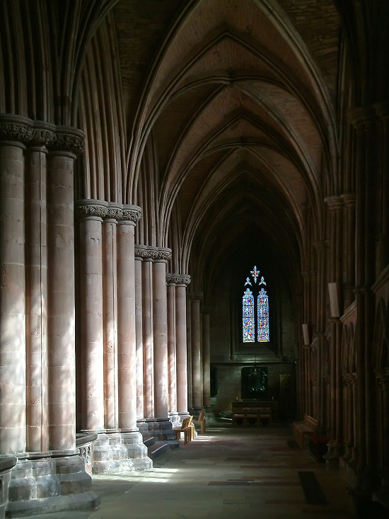
The photograph above shows original Gothic architecture of the thirteenth and fourteenth centuries in Carlisle Cathedral, Cumbria. When I saw the composition it was the range of tones, the vertical shapes, and the eye-catching window in deep shade at the end of the vista that appealed. I underexposed the shot to ensure that the sunlit highlights and the detail of the stained glass weren't lost, then brought up the shadow detail a little when I processed the image.The clustered columns, stone vaulting, deep shadows and filtered light of the south aisle represents many of the qualities that makes the Gothic appeal to the Romantic imagination.
photograph & text (c) T. Boughen

Wednesday, May 10, 2006

Street lights

click photo to enlarge
When, as a child, I moved from a country dwelling, into a small market town, it was the street lights that fasc-
inated me most. And not just because they turned night into almost day. The green, ornate, cast iron lamp standards had a cylindrical scalloped base, a tapering shaft that changed into a top bracket shaped like a question mark, and a light with a hood resembling pointed petals. But, best of all was the short horizontal bar sticking out just below the lamp. This was presumably a relic of the days when lamps were gas-powered, and a ladder was used to reach and light them. We children liked the design because you could swing on the bar! The day these street lights were changed for modern pre-cast concrete models, which later got orange sodium bulbs, was one of deep, deep regret.

In the years that followed, standardisation seems to have been adopted across many parts of the country. Galvanised steel and concrete became the materials of choice, and spare, utilitarian forms, were favoured. However, it wasn't long before planners tired of these, particularly in conservation areas, and other, more ornate designs came into use. Today it's gratifying to see that local councils regard even large street lighting as something that can bring distinction to a road. In Blackpool, Lancashire, the South Promenade has large, shiny steel "C" shaped lights, and in nearby St Annes, the ornate lights on the main street are part of a suite of street furniture - shelters, seating and art work - designed to enhance the area.

The lights in the photograph are at Fleetwood, Lancashire, and are clearly designed to look "modern". They are a fairly unexceptional design, spherical for no good reason other than appearance, and look too tall in their location. However, the height brings advantages for the local gulls which use them as convenient and safe perches! I took the shot of this young gull streamlining its body to avoid being blown off the curved surface with a 300mm (35mm equivalent) lens. The diagonal view filled the frame better, allowed the gull to be placed in a key position, and left enough blue sky to give the feeling of space that the bird must experience as it looks down from its near, yet safely remote perch.
photograph & text (c) T. Boughen
Tuesday, May 09, 2006

Cherry blossom rain

click photo to enlarge
Ornamental planting in public places can be (excuse the pun) a thorny issue. The motivation is usually to either beautify the locality, to create habitat, for screening purposes, to suppress noise, or to reduce the maintenance required for a piece of land. More enlightened local councils plant a thoughtful disposition of native and ornamental species, thinking carefully about each locality, and their good work brings pleasure to us all. However, occasionally things get silly.

Driving through Lancashire in recent weeks I've found too many roadside verges with miles of thin lines of daffodils where parish councils appear to have gone berserk with bulbs. In recent times I've seen bushes grubbed up, and trees chopped down on traffic roundabouts apparently to improve drivers' sight lines. In my immediate locality the council's chosen horticultural contractors fall on their spring work with the sensitivity of a rapacious barbarian horde, pruning with petrol-powered trimmers, shaping the flowering currants just as the flower buds appear. Yet, elsewhere, they do good work, planting waste ground with trees fitted with nest and bat boxes, and maintaining impressive floral displays. Perhaps local councils just can't win, caught between the constraints of cost, health and safety, the environmental imperative, and the widespread public desire for "pretty planting".

My photograph shows a flowering cherry - definitely "pretty planting". The classic shot of this species shows the pink blossom, sunlit, against a blue sky. I thought I'd try for something different, and went for the saturated colours of a branch, itself saturated by a May shower, raindrops and all. The shades of green, the brown tones of the leaves and branch, and the pink of the blossom, are not colours that we normally think complement one another. But, one of the wonderful things about the colours of nature is that you can put virtually any of them together, and they somehow seem just right!
photograph & text (c) T. Boughen
Monday, May 08, 2006

Beautiful or not?

click photo to enlarge
If we know anything about James McNeill Whistler (1834-1903), it's usually his mother! Many will recognise his painting, "Arrangement in Grey and Black: Portrait of the Painter's Mother". If we don't know that image, then we may recall both John Ruskin's accusation on seeing Whistler's "Nocturne in Black and Gold: The Falling Rocket" - that the artist was "flinging a pot of paint in the public's face" - and the court case that followed these intemperate remarks. Whatever your views on Whistler's art, and I'm an admirer, no one could accuse him of being conventional!

What then are we to make of this stained glass window at Orton church in Cumbria? It is not by Whistler, but by his second wife. Born Beatrice (Beatrix) Philip, she was the daughter of a sculptor, and married Whistler in 1888, two years after the death of her first husband, the architect E. W. Godwin. Beatrice had worked in the workshop of her father, and studied with Godwin, producing furniture designs, decorative panels and designs for wallpaper and tiles. She painted in oils, modelled for Whistler, and did further design work, in jewellery and stained glass, including this design for Campbell Smith & Co., commemorating the death of an eight year old girl.

So, what about this window. The Centre for Whistler Studies at the University of Glasgow describes it as "beautiful". I'd call it storybook, twee, fey, and saccharine! It's not the subject matter, or the composition that are the problem: they're fine. It's everything else! The treatment of the commemoration, in my opinion, lacks dignity. The angels are badly drawn, attenuated and, with their ears poking out of their hair, elfin. This makes them worldly in an irreligious way, and consequently inappropriate. And what about their wings? They seem to have been borrowed from larger beings, and are just silly! There is no gravitas to the treatment of these figures. At the top of the window the sky is abstracted in a way that, apart from the colour, has little relationship to the rest of the design. Perhaps the best parts are the flowers and the commemorative script. One wonders how Beatrice Whistler got this commission, and why it is admired.

Why then did I set up my tripod, carefully meter a mid-tone, photograph it, and post process it to even out the brightness across the image? Because I have an interest in church architecture and stained glass, and, in the canon of English glass this piece is odd! Interestingly, it was only some months after taking this photograph that I found out the designer's name.
photograph & text (c) T. Boughen
Sunday, May 07, 2006

Bluebell woods

click photos to enlarge
"Or littering far the fields of May
Lady-smocks a-bleaching lay,
And like a skylit water stood
The bluebells in the azured wood."
from "A Shropshire Lad" by A.E. Housman (1859-1936)

One of the pleasures of spring in Britain is the sight of a "bluebell wood". Here are two examples at Barnacre and Calder Vale, Lancashire. In April and May the wild hyacinth, Hyacinthoides non-scripta, commonly called the bluebell, carpets many deciduous woodlands before the trees' leaf canopy is fully developed. The clustered, fragrant, bell-shaped flowers and the accompanying pointed, glossy leaves are held in high regard by the English in particular, who sometimes name it as the national flower.

The bluebell is also found in hedgerows, with bracken on the uplands, on cliffs, and in gardens. Its popularity has led to cultivation: mauve and white examples can be found in gardens, and sometimes as "escapes". The Latin non-scripta part of the bluebell's name is to distinguish it from the classical hyacinth. In Scotland the July-October flowering harebell, Campanula rotundifolia, is known as the bluebell.

Britain as a whole holds between 25% and 49% of the world population of Hyacinthoides non-scripta, and the plant is identified as one of conservation concern. The 1981 Wildlife and Countryside Act protects the wild plants and bulbs of this species. Unfortunately this has not prevented the selfish and unscrupulous from digging them up, offering them for sale, and denying people one of the natural joys of spring.

The photographs above are intended to capture something of the beauty of a bluebell wood - the water-like effect of the densely packed flower-heads, the way the azure colour contrasts with the fresh light green of the trees, and the dappled effect of the sunlight.
photographs & text (c) T. Boughen

Saturday, May 06, 2006

Blind Venetians

click photo to enlarge
"Venetian blinds - they're life savers aren't they. Without them it'd be curtains for everybody!" from 1001 Bad Jokes for Kids

There are some misguided souls who think that Venetian blinds arrived in Venice in the eighteenth century from the east, became popular there, spread through western Europe and thence to the United States, where in 1841 John Hampson of New Orleans patented the device for maintaining the angle of the slats, and thus increased their popularity. Wrong!

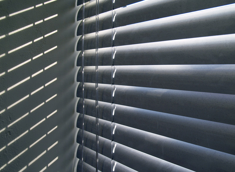
The fact is that Venetian blinds were invented for two quite different reasons. The first was to supply a never ending stream of very bad jokes, particularly suitable for schoolboys. One example is shown above, another is, "How do you make a Venetian blind? Poke his eyes out with a pencil". The quality of these jokes scrapes the bottom out of any barrel they are placed in, so it's just as well that the second reason for the invention of these blinds is a little more elevated. It is so that in film noir the heroine can carefully separate the slats with her fingers and see the man she thought to be upright and true, engaged in nefarious trickery, whilst at the same time allowing the director a wonderful shot of only her eyes surrounded by the horizontal shading of the blinds.

The rather grubby blinds in my photograph were closed, and keeping out the late afternoon sun, when I saw them. I probably wouldn't have thought of a shot had it not been for the accompanying pattern of sunlight they were creating on the nearby wall, and the odd, diffused effect where the ends of the slats meet that wall. The attraction of any Venetian blinds is the gently graduated shadows on each slat, and here they lead the eye to the corner where the patterned wall takes over.
photograph & text (c) T. Boughen

Friday, May 05, 2006

A glimpse of a church

click photo to enlarge
"Among the changing months, May stands confessed,
The sweetest, and in fairest colours dressed" James Thomson (1700-1748), Scottish poet

Fresh green grass, new translucent leaves, the verges scattered with dandelions, bluebells glowing in the shade, hawthorns covered in drifts of blossom, and all lit by a bright sun in a clear blue sky scuffed with soft white clouds. Is there any month that can compare with May?

Freshness and promise are the things that May offers. Anything seems possible in this best of all months. Everything that catches the eye is new: nothing is jaded, and a walk in the May sunshine positively lifts the spirit. We photographers relish all that the month offers, and delight in pointing our cameras at the bright world before us.

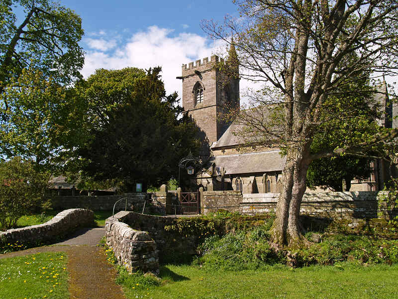
The photograph above shows the fine sight of the church of St Lawrence in the village of Crosby Ravensworth, Cumbria, on a morning in early May. The oldest part of the building, the crossing, dates from about 1190-1200, with the remainder of various ages from the thirteenth century through to the chancel added in the nineteenth century. It is a fairly typical English village church, built over a long period by succeeding generations. However, its location is particularly lovely, with a hump-back bridge over a small stream leading to the churchyard gate with its arch and light. Ancient trees surround the building, including the usual dark yews.

My photograph tries to capture something of the setting and appeal of this charming church. It's hard to show much of the building, so my composition positions the bridge to the left, the tower in the centre, and a dominant tree to the right. Not an original shot, but one that the pleasures of a May morning demands that you take!
photograph & text (c) T. Boughen

Thursday, May 04, 2006

A field in the Fylde

click photo to enlarge
The Fylde is the flat West Lancashire coastal plain between the River Lune in the north and the River Ribble in the south. The first known reference to the word appears in the year 1246 and is written "Filde". It is an Old English variant (from a Germanic root) of "feld" meaning open country suitable for cultivation, which gave us the word "field". So, you could say this photograph is of a field in the field!

Formerly an area of mainly scrub, wetland, saltmarsh, and sand dunes, the Fylde was gradually drained, settled and brought into agricultural production. In the nineteenth century it began to produce substantial quantities of grain and vegetables for urban centres, and it continues to be an important area for these crops. This low lying land has always been swept by the prevailing westerly winds blowing off the Irish Sea, and from the late eighteenth century onwards windmills were erected for milling and drainage. This led to the name "Windmill Land" being used to describe the area.

I came across this newly-prepared field, in one of the slightly rolling areas of the Fylde, on a sunny day after early morning rain. The corrugated soil was emphasising the undulations quite well, and the moisture-laden clouds were disappearing over the horizon, giving the scene a slightly surreal, deserted, otherworldly feel. The shot I opted for is a conventional split of one third land, two thirds sky, with minimal post processing.
photograph & text (c) T. Boughen
Wednesday, May 03, 2006

Claw hammers and flutes

click photo to enlarge
I can vividly remember the first time I saw a claw hammer being used properly. I was in my teens, and a friend and I were struggling, using pliers to pull nails out of a piece of wood. Seeing our travails, my friend's father said, "Here, have a go with with this!" Then he quickly used his claw hammer to effortlessly remove three nails, and passed it to me. I slid the tapered slot of the claw under the nail head, and when I felt it jam, rotated the hammer head using the handle as a lever. Watching the nail being drawn easily from the wood in a smooth curve was deeply satisfying. That experience put two thoughts into my mind that have never gone away: namely that mankind has an infinite capacity for invention and improvement, and, that people who can come up with designs like the claw hammer are worthy of the title "genius".

A little while ago I borrowed a flute to see if I could play it. I can read music reasonably well, and play a few instruments - badly, but with enjoyment! However, whether it's my age or my lack of skill, I was easily defeated by the flute. Just getting a sound out of it was hard enough. And all those keys! Give me the penny whistle any day - only six holes. Or a recorder - at least it has a fipple so sounds are easy to make. When I spoke to an accomplished flautist he told me about the development of the flute from the keyless wooden instrument to the present day nickel-silver concert model, Boehm fingering and all. It seems that, as with the claw hammer, this musical tool has been subject to evolution and improvement (though on a grander scale), and has arrived at its present form in order to meet the demands that composers place on it. To one who plays it well the mouthpiece and the myriad keys make it a model of ergonomics - another case of form following function.

But, whilst I've given up trying to play the flute, its construction is interesting, and so I have been motivated to try to get a photograph out it. I tried shots against a white background and against light wood, but eventually settled on this dark wood. Its richness provides a better foil for the highlights of the shiny metal. I used a macro lens to focus on a small part of the instrument, placed diagonally for interest, and filled the frame with those infernal keys!
photograph & text (c) T. Boughen

Tuesday, May 02, 2006

What to do about graveyards?

click photo to enlarge
What can we do about graveyards in Britain? In recent years, in many places, there isn't enough space to bury everyone who wants it, and who can afford it (remember, dying isn't cheap!) One solution, adopted in some cemeteries, both here and abroad, is to exhume the bones of the long dead, place them in a charnel house or other location that is more space-efficient, and use the plots so recovered for the newly dead. Another strategy is to cremate, then bury the ashes. This takes up much less space. In some places the ashes are in one of many repositories in a wall: a sort of mini-skyscraper of the deceased!

Graveyards that are full are a different problem, because they require fairly labour-intensive maintenance. I have seen sheep employed to keep the grass down. This strikes me as particularly apposite around a Christian church! Elsewhere, men (it usually is men) with strimmers, scythes and mowers, cut the grass periodically. Or, in some churchyards, most of the gravestones are moved to the perimeter, leaving essentially a lawn with a few tombs here and there. This makes grass-cutting easy. It also gets round the alleged danger of unstable stones falling on visitors, a health and safety concern that has exercised church councils in recent years. However, by far the best solution, and one adopted in a fair number of places, is to reduce the area subject to maintenance, and let part of the graveyard run wild. This strategy requires minimal management, attracts wildlife, preserves the tombs, and creates romantic vistas like the one in my photograph from Glassonby in Cumbria. Here the rhododendrons and brambles are growing around the gravestones in a very attractive way.

I couldn't decide whether to present this photograph in colour or in black and white. Both seemed acceptable, but the colour version has more depth, and shows the flowers to better effect. And, whilst the red sandstone colour of the tomb is not to everyone's taste, it is unusual, and is characteristic of certain areas of north-west England, so that is the one I chose.
photograph & text (c) T. Boughen

Monday, May 01, 2006

A cream carnation

click photo to enlarge
My introduction to the word "carnation" came at a quite young age. In the austere years of the 1950s Sunday tea (I'm from the north of England, so to all you effete southerners that's dinner!) was sometimes tinned salmon and salad concluded with tinned fruit topped with Carnation evaporated milk. For me the "afters" was the highlight of the meal.

I can still picture the tin with the word "Carnation" on a red background, the letter "C" enlarged to enclose the following "a". The product is, apparently, still sold, but I have no desire to re-live this particular part of my childhood. Times and tastes have moved on!

In one of my earlier posts I showed a photograph of a pink carnation taken through a standard digital zoom with a screw-on achromatic macro lens attached. When I noticed some cream carnations in the house the other day I thought I'd try a similar shot, but this time with a 35mm dedicated macro lens. I can't say that there's a massive difference, but the dedicated lens is probably sharper, is capable of greater depth of field, and does allow a bigger range of distances from which the shot can be taken. What I liked about this shot, taken in shade, is the way the petals have picked up colours from the surroundings, and introduced depth and coldness to the edges of the image.
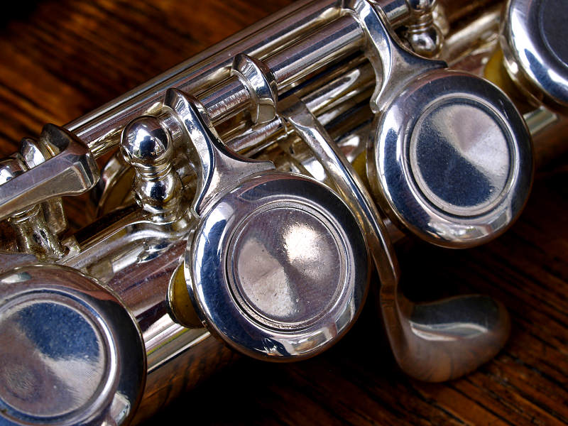
photograph and text (c) T. Boughen