Showing posts with label tulips. Show all posts

Sunday, May 12, 2013

Fading tulips

click photo to enlarge
There is a great temptation in photography to shoot beautiful subjects when they are at their most appealing. Landscapes, women, babies, cars, sunsets, you name the subject and you'll find  numerous photographs showing them at their best. The light, the sky, the pose, the backdrop, every detail will be in place to show the subject off off to dazzling effect.

It's even more so with flowers. In fact, though it's reasonably easy to find, say, good landscapes where the weather is grim and conventional beauty has been discarded in favour of the stern beauty of nature in the raw, just try and find a flower photograph with blooms past their best and I guarantee you'll struggle.

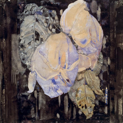
Painters have long known the different kind of beauty that can be seen in fading flowers, a muted attractiveness that is hinted at or remembered rather than displayed openly before your eyes. It was this effect that I sought when I photographed the tulips shown in today's photograph. But, it hasn't quite worked out as I wanted. Why? Well, if you are unfamiliar with what tulips look like at the peak of their perfection you might think that the flowers in this blue glass vase are just rather fine blooms that natural spread their petals in this rather attractive way. The fact the flowers are fading, are past their best, are naturally shedding their petals and are soon to be just stems isn't necessarily obvious, and even if it is, there remains a beauty that isn't particularly tinged with a feeling of imminent demise: there is still plenty of deep colour in the petals and little sense of the faded beauty that I sought to capture. So, I've kept the flowers and I'll try again when their petals develop brown edges and their decline looks a bit more terminal!


Addendum:Here are the same tulips two days later (Fading Tulips 2), the petals rather more wrinkled and curled,the colours more muted, a hint of brownness about them, but still not everything I envisaged. Having reflected further on the matter I've concluded that I chose the wrong colour tulips for this exercise. It would have been much better to use dark red or dark purple. In fact, any colour with less brilliance than yellow would have suited my purposes. A lesson learned. Perhaps next time...

Addendum 2:
A final shot (Fading Tulips 3), three days after the first one, and one day after the second. Still not quite there. It's definitely the basic colours of the tulip that's wrong for the photograph I'm seeking.

photograph and text © Tony Boughen

Camera: Canon
Mode: Aperture Priority
Focal Length: 100mm macro
F No: f11
Shutter Speed: 1/4 sec
ISO: 100
Exposure Compensation:  -1.33 EV
Image Stabilisation: Off

Friday, May 25, 2012

Garden photography in dull weather

click photo to enlarge
It's well known that in the UK the main topic of conversation isn't the state of the economy, the royal family, politics, the achievements of a football team or the goings on in whatever happens to be the favourite soap opera of the day. Not one of these matters of great importance do people dwell on overly long, rather it's the everyday subject of - the weather. In a country such as ours where latitude, the Gulf Stream, the surrounding sea and the proximity of a large land mass - "the continent" - produce a temperate climate with plentiful cloud and, often though not always, several kinds of weather in a single day, the weather is always going to be more of a talking point than it would be in a Mediterranean region, the centre of a continent, or almost anywhere else. And when the changeable weather pattern departs from its normal fluctuations and produces a period of unseasonally low temperatures, persistent cloud cover and very regular precipitation, as it has this spring, then you can be sure that the regular chatter about the weather becomes a grumbling storm of comment, cogitation and complaint.

I've found that this spring's weather has definitely impinged on my photography. Dull days, with little shadow and low contrast give what is often called "flat lighting", something that is often difficult to work with. I say "often" because it seems that this kind of weather also affects your memory. I know full well that there are circumstances and subjects that respond well to overcast skies, but occasionally I forget, and fail to search them out and take advantage of them. I described some of the positives of this kind of light a couple of years ago when I posted a photograph of boats on the shingle beach at Aldeburgh, Suffolk. On my recent trip to Herefordshire I came upon another such subject that worked well on a dull day. It was in Hampton Court Gardens near Leominster. The bright splash of red of the tulips in front of the attractive, timber and brick pavilion, provided the burst of colour that was needed for this overcast scene of greens, greys, brick and dark water. The saturated colours, the absence of contrasting highlights and shadows, and the lack of modelling that the latter two qualities confer, lend a character and mood to the subject that I like.

photograph and text (c) T. Boughen

Camera: Canon
Mode: Aperture Priority
Focal Length: 65mm
F No: f8
Shutter Speed: 1/60
ISO: 160
Exposure Compensation:  0 EV
Image Stabilisation: On

Monday, April 30, 2012

Tulips, viewpoints and black and white

click photo to enlarge
The red and yellow tulips in our garden look better than ever this year. I put that down to the much higher than usual rainfall that we've experienced during April, precipitation that began straight after drought conditions and restrictions were announced. In fact, thus far, as many wits have noted, this drought is the wettest drought on record! But drought or deluge, the tulips have liked it, though they haven't been so keen on the accompanying winds.

I photograph these flowers every year, and the low viewpoint I adopted with this shot is one I've tried before. I've shot them from directly above too, as well as from the side. Flowers are co-operative photographic subjects. In fact, the only two conditions that stop me photographing them at my convenience are wind and insect infestations, and even those circumstances are capable of producing interesting images. But the truth is, because we are so familiar with flowers, they do benefit from a variety of approaches to sustain the viewer's interest.

Periodically I like to try a black and white conversion of a flower photograph. It seems counter-intuitive that a subject that leans so heavily on colour can be improved in any way by being shown in black and white. However, some flowers display an entirely different character when seen this way, as this rose (and this one) demonstrate. So too with the tulips above. In colour the red and yellow combine with the blue of the sky to make three primary colours that impact strongly on the eye. The patches of colour that are the flower heads catch the eye first and give the viewer a lift: the shot has an upbeat feel to it, proclaiming "spring has sprung!" However, in black and white the eye tends to range across the whole of the image with the flower heads assuming less immediate importance. The mood of the shot is very different too, more subdued, even a touch sombre. The flowers look like they might have been photographed in bright moonlight, and the shadows of the knife-like leaves assume a greater importance. The texture of the petals and their subtle shading eventually draw the eye and give a quieter, subtler viewing experience than they exhibit in colour. I have a preference for one photograph over the other, but I think both, in their own way, have something to offer.

photographs and text (c) T. Boughen

Photo 1
Camera: Canon
Mode: Aperture Priority
Focal Length: 26mm
F No: f16
Shutter Speed: 1/160 sec
ISO: 100
Exposure Compensation:  -1.0 EV
Image Stabilisation: On

Wednesday, April 11, 2012

Tulips, contrast and shadows

click photo to enlarge
My DSLR, a Canon 5DMk2, is set to record images in the RAW format. I do this to give me the greatest flexibility when it comes to processing my photographs and to allow me a better chance of recovering from a poor exposure. My compact camera, a Panasonic Lumix LX3, despite the fact that it can record in RAW, is always set to the best quality JPEG because I take more snapshots with it. Despite that, it has produced some images that bear comparison with any done by my more capable camera (see here, here, here and here for example, or see them all here). I know that if I shot exclusively in JPEG on both cameras my shots wouldn't be enormously poorer for it, but I would find that I couldn't achieve the quality that I required from some exposures because of the restricted ability to post process this format.

In my pre-digital days I never did any post processing of colour negative or colour reversal film, though I did develop slides. I did use a range of filters on my lenses which is processing of sorts. However, with black and white I certainly experimented with chemicals, developing times, and with dodging and burning under the enlarger. I was always fond of fairly contrasty black and white images, and slides tended to have that quality anyway, so deep blacks against strong whites featured in quite a few of my prints. Nowadays I tend to favour the greater dynamic range  and more natural contrast that is possible with digital, though every now and again I like to take a left turn and produce a very contrasty image with deepened shadows.

Today's offering is a case in point. These dark red tulips grow in the shade of a crab apple tree in my garden, and I caught them on a still, cloudy evening, just as the light was starting to tail off. The unprocessed shot is reasonably well exposed with quite a good range of tones. What prompted me to increase the contrast was the dark, shadowy background in the top half of the shot. The red petals were positively glowing against this, and I thought it was an effect that I'd like to enhance across the whole frame. So, with a tweak of the Tone Curve and a few other fiddles here and there I produced this contrasty shot. I quite like it, but it may be a step too far for some

Addendum:
The sale of Instagram for $1 billion brought to my attention something that hitherto I didn't know, namely that people who take photographs on cameras increasingly apply pre-determined effects to their pictures. This has happened for many years in the world of digital photography where the result has been to make photographs look increasingly similar. Apparently that is happening with camera phones too as the mass application of the most popular effects reduces the difference between individual images. I'm not against photographic manipulation, but I do think that doing it yourself by consciously adjusting the basic parameters is more likely to retain any individuality your shot had, whereas applying a ready-made effect inevitably puts it alongside all the others that have had the same done to them.

photograph and text (c) T. Boughen

Camera: Canon
Mode: Aperture Priority
Focal Length: 100mm macro
F No: f2.8
Shutter Speed: 1/160 sec
ISO: 100
Exposure Compensation:  0 EV
Image Stabilisation: On

Monday, February 21, 2011

Wilted tulips and vanitas


click photo to enlarge
In a post the other day I lamented the attitude of some towards flower photography, and suggested that painters had long recognised what many photographers have never grasped: that flowers can be a great vehicle for grappling with the basic elements of composition, representation and symbolism - colour, light and shade, tone, line, mood, etc.

Masters of this approach to flower painting (and to the still-life in general) were the artists of the Dutch and Flemish schools. In the last quarter of the sixteenth century the still-life attained the status of a recognised genre in the Netherlands, and in the subsequent two centuries, through painters such as Ambrosius Bosschaert (1573-1621), Hans Bollongier, and Rachel Ruysch (1664-1750)  its popularity spread throughout this region of Northern Europe.

One particular branch of Dutch and Flemish flower painting were the works known as vanitas pictures. Their purpose was to remind the viewer of the meaninglessness and impermanence of earthly life, and the certainty of decay and death. A vanitas painting might include a variety of flowers that were past their best, decaying, curling and dropping petals, perhaps some bitter fruit such as lemons, a few transitory butterflies, and to make the point more forcibly, a human or animal skull. It has been suggested that these works served as a coded substitute for Protestants who rejected the paintings and iconography inspired by the Roman Catholic church. Regardless of their true purpose they are works that invite the viewer's eye to linger on them, to search out the details, and to think about the artist's intention in assembling the disparate parts.

My photograph of a vase of tulips that are past their best, green leaves and stems yellowing, blooms opening, distorted and dropping petals, is a poor substitue for one of the paintings discussed above. But perhaps it does show what painters have long known - that flowers offer interest and character not only in the fullness of their beauty, but also as they deteriorate, discolour and decay.

photograph and text (c) T. Boughen

Camera: Canon
Mode: Aperture Priority
Focal Length: 100mm
F No: f11
Shutter Speed: 3.2 sec
ISO: 100
Exposure Compensation: -0.33 EV
Image Stabilisation: Off

Thursday, February 10, 2011

Psychedelic tulips

click photo to enlarge
On my frequent visits to churches to look at the architecture and history I often come across flowers.When a church is prepared for a wedding the nave aisle and various other places are decorated with floral arrangements. Harvest festival, Christmas and Easter are other times when the building is beautified with flowers. Then there are the church flower festivals that feature inventive displays, often on a theme, over a period of a week or so. But, these special occasions apart, flowers are invariably present in a church in smaller quantities every week of the year. These are usually supplied by parishioners, and arranged by volunteers on a "flower rota". The font cover or base, niches, the pulpit, tombs, and especially the sanctuary are the common places for such arrangements, but window sills are also places where they are frequently found.

Today's photograph shows a bunch of tulips in an earthenware jar on a church window sill. My attention was drawn to it because February sunlight was streaming through the stained glass, colouring the ancient stone and transforming the colours of the flowers and leaves. Red blooms were tinged with blue and green, and the yellow/green of the flower stalks took on a darker hue bathed in the strongly coloured light . The word that came to my mind was "psychedelic", and I thought of the album covers, posters and graphic design of the late 1960s as I looked through the viewfnder and took my photograph.

photograph and text (c) T. Boughen

Camera: Canon
Mode: Aperture Priority
Focal Length: 45mm
F No: f6.3
Shutter Speed: 1/50
ISO: 250
Exposure Compensation: -1.0 EV
Image Stabilisation: On

Tuesday, May 04, 2010

Wide angle tulips

click photo to enlarge
Last week, with a group of people, I visited a number of Lincolnshire churches. One of those on our intinerary was St Mary at Long Sutton. This marvellous medieval building is known by architectural historians for its lovely, almost detached tower that has one of the earliest well-preserved lead spires in the country, as well as its fine Norman, three-tier nave arcades. People who don't have an interest in eccesiastical architecture are more likely to know St Mary's for the fine flower festival displays that fill the church every year at this time, and for its beautiful collection of tulips that grace the churchyard.

It was in connection with flowers rather than architecture that I made my visit the other day. I'd been to Long Sutton last year for the first time, and on that occasion took my DSLR, a collection of lenses, and shot the building as well as the flowers: regular viewers of the blog may remember this image. However, this time I decided to restrict myself to the compact LX3, and work within its limitations: today's photographs are the two best images to result from my endeavours.

This year I caught the tulips in pretty much perfect condition, with drifts of different colours and varieties positively glowing under the trees' canopy of freshly opened green leaves. Anyone who looks at the camera details that I include with the photographs that are posted may have noticed that when it comes to the LX3 I use it at the widest point of its zoom (24mm/35mm equiv.) much more often than at any other setting. That is the case with both of today's images. In fact, I do wonder whether I'd be happiest with a compact that had a wide fixed focus lens such as Olympus and Panasonic are offering in Micro Four Thirds because it seems to suit me down to the ground.

photograph & text (c) T. Boughen

Photo 1 (Photo 2)
Camera: Lumix LX3
Mode: Aperture Priority
Focal Length: 5.1mm (24mm/35mm equiv.)
F No: f2.8
Shutter Speed: 1/200 (1/250)
ISO: 80
Exposure Compensation: -0.66 EV
Image Stabilisation: On

Thursday, April 22, 2010

Is perfection overrated?

click photo to enlarge
Surfing the net a few days ago I came across a photographer's tips for taking good photographs of flowers. The very first sentence explained that to take a fine flower photograph you first had to find flawless flowers. That pulled me up short (and not only because of the alliteration!). If he'd said that to take photographs of the sort that are wanted by greeting card manufacturers, calendar designers, seed companies, etc, you must select perfect flowers, then I wouldn't have had a problem: these commercial concerns have a need for images of unblemished blooms that show no signs of age, disease or malformation. But, to assert that imperfect flowers cannot be the subject of a good photograph is nonsense.

Even a cursory knowledge of the history of painting reveals the deliberate and widespread use of flawed blooms by painters for the attractive, melancholic and symbolic qualities that they place before the viewer. And where the still life paintings of the seventeenth and subsequent centuries went in this regard, so too, in the past 160 years have many photographers. A while ago I posted such an image, showing a vase of hydrangeas that were well past their "best", but whose faded qualities attracted my meagre skills.

However, I have a feeling that today's photograph may well have been the sort that the photographer had in mind. It is about as close to perfect as I am able to get in terms of the blooms and the composition. These immaculate red tulips were in a churchyard, and I decided to use a long focal length to achieve sharp flowers at the centre of the shot, with those in front and behind out of focus. It's the sort of trick that photographers use to give a shot depth, and to focus the viewer's attention on a particular part of a composition. Oh, and you perhaps won't be surprised to find that we've selected this image for a few of our home-made birthday cards this year!

photograph & text (c) T. Boughen

Camera: Olympus E510
Mode: Aperture Priority
Focal Length: 150mm (300mm/35mm equiv.)
F No: f7.1
Shutter Speed: 1/250
ISO: 100
Exposure Compensation: -0.3 EV
Image Stabilisation: On

Friday, May 08, 2009

Blood red tulips

click photo to enlarge
I've photographed more tulips this year than ever before. Perhaps it's been a good year for tulips. Maybe I've got an increased liking for the flower. Or is that they best satisfy my spring lust for the deep, glowing colours that have been absent over the winter months? Whatever the reason, I've processed 14 photographs of tulips out of the c.50 shots that I've taken. For me that's a very high conversion rate.

I reckon that I process about 10-20% of my RAW images. I discard about 50% of what I shoot, and I keep the RAW files of the other 30-40% in the unprocessed state because I judge them to be good enough to keep "just in case". I don't know how this compares with other amateur photographers. I've always imagined that I take fewer images and convert more than the average snapper, but that's just a feeling, and isn't based on an objective survey.

This is another of the images from the churchyard at Long Sutton in Lincolnshire. A cluster of red tulips had been planted adjacent to some white ones. I positioned myself so that I was shooting into the sun and could capture the lovely effect of the light coming though those blood red petals. I left a band of the white ones along the top of the frame to add contrast and to intensify the colour of the blooms below.

photograph & text (c) T. Boughen

Camera: Olympus E510
Mode: Aperture Priority
Focal Length: 19mm (150mm/300mm equiv.)
F No: f7.1
Shutter Speed: 1/250 seconds
ISO: 100
Exposure Compensation: -0.7 EV
Image Stabilisation: On

Saturday, May 02, 2009

Flowers and churches

click photo to enlarge
Visit any English church, at any time of year, and you are likely to see displays of flowers. In the building the sills of ancient windows will have a vase of garden or bought blooms. The font at the west end of the south aisle may have a larger display at its foot, and at other strategic points, particularly the chancel and sanctuary, flowers will feature, especially lilies. The popularity of this variety in churches stems from its long use in Christian iconography as a symbol of beauty and purity. As the seasons change so do the church flowers, and when flowers are in short supply during the winter months, leaves and berries often take their place.

Weddings, harvest festival and Christmas are times when a church receives greater quantities of floral decoration. However, for the sheer number of flowers no period of the year compares with the time of the Flower Festival. I've just spent a couple of days visiting flower festivals at my local churches, and have been impressed and delighted by the displays that parishioners have put on. Many were themed displays around religious and secular subjects: "Jesus is...", "London Streets" and "Famous Lincolnshire People" were three of the topics chosen this year. I took a number of photographs, and I may post any that look good enough for reproduction. Whilst I made my tour I also looked at the churchyard displays of flowers and secured a number of images that please me. Churchyards flowers fall into two camps - those that are placed by a particular grave as a tribute, and those planted with the purpose of beautifying the area around the church. Of all the displays I saw recently none could compare with the tulips around the ancient church of St Mary at Long Sutton. The Fenland area of Lincolnshire is where most of the UK-raised bulbs are grown, and Long Sutton seemed to have examples of many of the wide variety that are produced.

This image shows a wonderful, colourful confusion of varieties under the dappled light of the trees.

photograph & text(c) T. Boughen

Camera: Olympus E510
Mode: Aperture Priority
Focal Length: 19mm (150mm/300mm equiv.)
F No: f7.1
Shutter Speed: 1/250 seconds
ISO: 100
Exposure Compensation: -0.7 EV
Image Stabilisation: On

Friday, April 24, 2009

Tulips and unwritten rules

click photo to enlarge
The tulips are in full flower at the moment, and in my garden that means bright patches of red and yellow. My self-imposed challenge over the past few days has been to come up with a different image of these much-photographed blooms. Anyone who has photographed flowers more than casually will know that this is a difficult task.

The variations that you can try are fairly limited - in or out of focus (or elements of both), distant or near, macro, from above or below, in garden or vase, colour or black and white, multiple flower heads or one, in bud, in full bloom or dying, in sun or shade, wide angle or narrower field of view. There may be a few other approaches, but not many.

I've tried pretty much all of those ways and posted quite a few variations, but over the past few days I wasn't coming up with anything especially different. However, there is an unwritten rule of photography that says, "If you can't find what you're looking for, stop looking, then you might see it." And that's what happened.

I drove through my gates quite late in the day as the sun was fairly low in the sky, and saw the light illuminating a patch of red and yellow tulips that were growing under a crab apple tree at the front of the house. Opening leaves and blossom on the branches were starting to throw some shade on the flowers below. The sunlight was striking the blooms from the side after being filtered by a large willow and some conifers. The contrast between the deep shadows and spotlit petals was striking, and the tulips appeared to glow. This is the picture I got. It's not outstanding, but it does differ from my previous attempts, and it's not an approach I've seen used before.

photograph & text (c) T. Boughen

Camera: Olympus E510
Mode: Aperture Priority
Focal Length: 90mm (180mm/35mm equiv.)
F No: f7.1
Shutter Speed: 1/200 seconds
ISO: 100
Exposure Compensation: -0.3 EV
Image Stabilisation: On

Wednesday, April 15, 2009

Tulips and painters

click photo to enlarge
I've always liked tulips. As a child I found their distinctive, pointed buds that opened into big, bright, goblet-shaped flowers holding large stamens and anthers, fascinating, and quite different from most of the other flowers that I saw.

As I got older I began to notice that many painters were enchanted by the flower too, some depicting it in its bold, strong upright form, and others in its more languid, drooping, "past its best" condition. The English painter, David Hockney (1937- ), frequently includes the flowers in interiors and portraits. A particular favourite of mine is his portrait of his parents that has a vase of tulips on a green cabinet. In a different style is his lithograph, "Pretty Tulips", where the flowers are drooping down towards the surface of a glass table. The Scottish architect, Charles Rennie Mackintosh (1868-1928), turned to painting in later life, and did some very individual watercolours of flowers, including tulips. His "Yellow Tulips" (c.1922-24) shows the curve of the flowers against an angular, modern-looking backdrop, with their leaves characteristically flopping over the edge of the blue vase that holds them. Seventeenth century Dutch and Flemish painters frequently included tulips in their "bouquet paintings", often giving them prominent positions, especially if they had petals marked attractively by a tulip virus. "Flowers in a Glass Vase" by Ambrosius Bosschaert the Elder (1573-1621) exemplifies this style of painting.

Last year I took a few photographs of my tulips, both in situ, and in a vase. The other day, as the blooms started to show in the garden I thought I'd try for a shot that showed off the thrusting vitality of these flowers as they each seek their share of the space and light above them. A "letterbox crop" seemed to concentrate on and show off these characteristics better than the full-frame shot, so that is how I present the image.

photograph & text (c) T. Boughen

Camera: Olympus E510
Mode: Aperture Priority
Focal Length: 35mm macro (70mm/35mm equiv.)
F No: f5
Shutter Speed: 1/160
ISO: 100
Exposure Compensation: -0.3 EV
Image Stabilisation: On

Tuesday, April 22, 2008

Sunshine of Your Love

click photo to enlarge
When it comes to Eric Clapton I'm one of those who feel that he peaked in the four albums he made with Jack Bruce and Ginger Baker in the band, Cream. In my view very little of his earlier work with John Mayall or the Yardbirds, or his subsequent solo and guest work, approaches the sublime qualities found in songs like "White Room", "Strange Brew", "Sitting on Top of the World", or "Badge". Maybe I'm influenced by the total sound of that band, that comprised the very individual driving bass of Bruce, the virtuoso drumming of Baker, and Pete Brown's lyrics, as well as that stinging guitar of Eric Clapton. There are those who feel that there still isn't a better rock and blues guitarist, and I certainly admire the man's technical virtuosity. But for me, there is no longer the excitement, sound, and sheer "rightness" in his playing. Maybe it needs songs of the calibre of "Sunshine of Your Love" to make that happen again, and they don't come along very often.

That particular song came into my mind yesterday as I was out in the garden. Last year, I moved to a new house. I'd only been here a few weeks when I started to notice a male blackbird that sang a phrase identical to the first five notes of "Sunshine of Your Love". Really! I know it sounds unlikely but it's true! It was in the wrong key, but there was no mistaking it. When I pointed it out to my wife she recognised it immediately. Now I don't know if this bird was a Cream fan, or whether it had been listening at the window as someone played "Disraeli Gears", but it continued with the same riff for several weeks as we sat in the sun, pruned the shrubs or picked the fruit. Then I heard it no more. Maybe, I thought, a cat that's a fan of Jimmy Page's Led Zeppelin period got it. But probably the breeding season ended and the need or desire to sing passed. Well, the other day, as I was taking photographs of tulips in the garden I thought I heard it again. In fact I'm sure I did. Now, every time I go out into the garden I listen, hoping that the avian version of "It's getting near dawn..." will spiral down to me from the top of the cherry tree!

Today's photograph is one of the shots I took when I heard that "blast from the past". I placed my camera low down and took a shot upwards, towards the sun. I knew I'd get the tulips and the trees, and I wanted the sun as well, but it was a shot in hope rather than expectation. However, the composition, colour and sunburst came out better than I expected, so I post the result here today.

photograph & text (c) T. Boughen

Camera: Olympus E510
Mode: Aperture Priority
Focal Length: 18mm (36mm/35mm equiv.)
F No: f16
Shutter Speed: 1/640
ISO: 100
Exposure Compensation: 0 EV
Image Stabilisation: Off