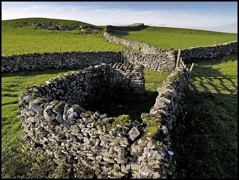
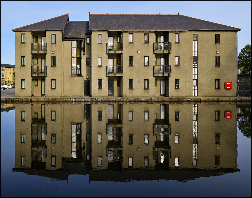
 click photo to enlarge
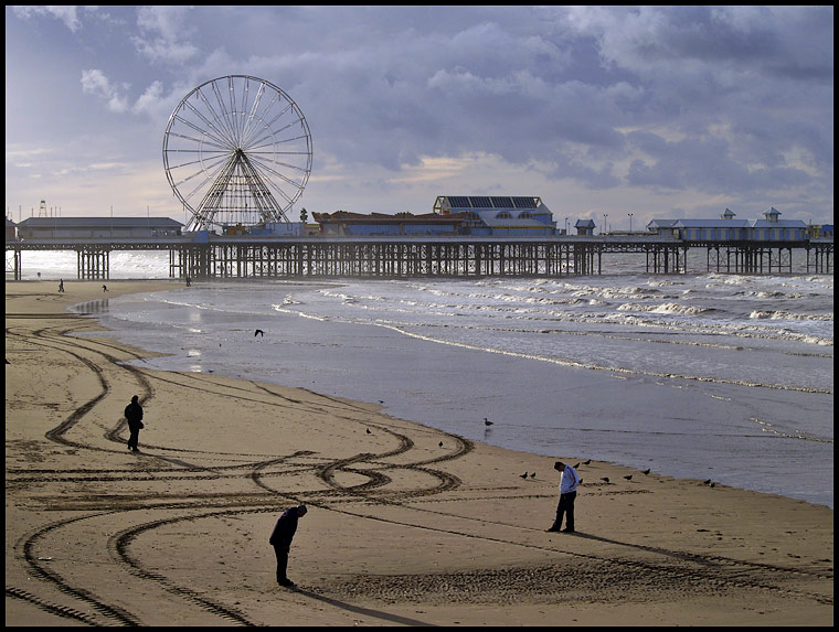
So, that being the case the remedy is both simple - eat less and better, and get more exercise - and complex, because there are significant pressures militating against this happening. The answer to the problem lies with how we raise our children. Parents need to set an example by walking and cycling more. If they do, our children will follow their example. Our governments need to make these activities safer and easier. Parents need to choose, eat, and serve up food that is less processed, and to discourage "grazing" and the eating of junk. Food suppliers need to stop advertising and selling crap! And, importantly, these changes need to be built into our everyday lives, not tacked on now and then as guilty afterthoughts. Will it happen? Probably, but the pessimist in me says later rather than sooner!
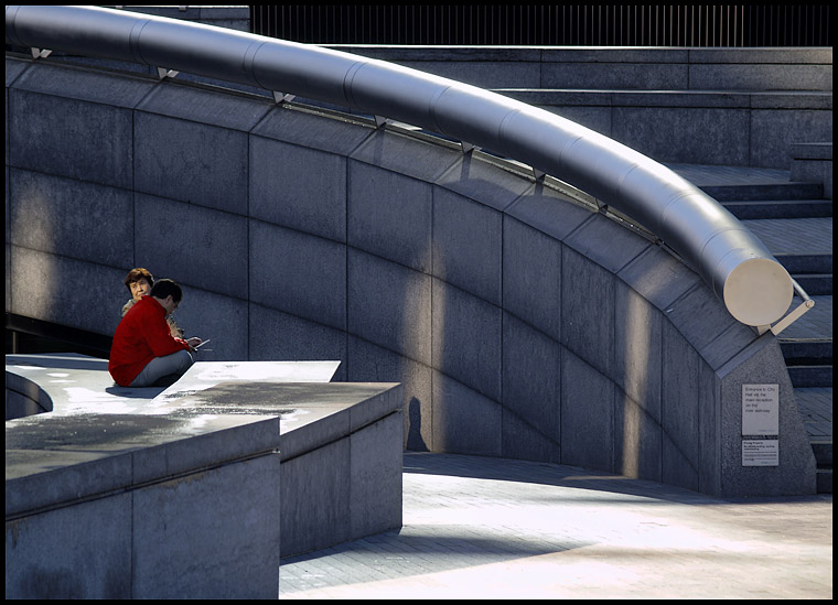
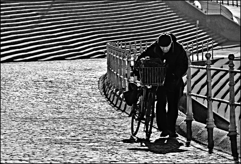
Many people think that a walk by the sea can only be enjoyed when the sky is blue and the sun is shining. However, the couple in my photography knew that high winds and changeable weather are no bar to enjoying exercise. Sadly they were virtually alone in their pleasure. I took this shot looking down on the deserted promenade, and broke the photographic rules by filling the centre of the shot with nothing, putting the main point of interest near the top, and the other interest around the edge of the frame. My lens was, once again, a long zoom at 300mm (35mm equivalent), with the camera set to ISO 200, Aperture Priority (f5.6 at 1/1000 sec) with -0.3 EV.
photograph & text (c) T. Boughen


