Tuesday, January 31, 2006

The poor man's Photoshop

click photo to enlarge
"Elephant's bum or tulip", said the glazier who came to repair my broken window. Now I'm used to tradesmen and the professions using jargon. I know that it's sometimes done for reasons of technical precision. But often it's part of a deliberate attempt to exclude the public and promote an aura of expertise. Practitioners in the law and medicine are past masters at these obfuscatory arts, and plumbers aren't far behind! However, the twinkle in my glazier's eye suggested that he was about to share his secret with me, rather than simply put me in the dark. I was curious to know more!

The glass he was replacing was obscure glass - designed to let in light without revealing what is inside the room. The variety was known as "Large Flemish", and his question was intended to elicit whether I wanted the pattern one way up, or the other! Look at the central shape in the glass in the photograph - that's "elephant's bum" - from the resemblance to that creature's posterior. Now imagine the shape inverted - that's "tulip"! Simple, graphic, memorable. And splendidly silly!

All this was brought to mind when I took a photograph of a book I saw behind an open door glazed with "Large Flemish" glass. The image on the book was pleasingly distorted, and the colours mixed together in a manner that reminded me of Gaugin. I took several shots, and the one above is the best of the bunch. Photoshop? Who needs it? Here's the poor man's substitute!

photograph & text (c) T. Boughen

Monday, January 30, 2006

A church, plain and simple

click photo to enlarge
This undistinguished church in an overlooked corner of England makes a fine sight on a winter's afternoon. Built in 1764, Old All Saints, Becconsall, Lancashire, is a simple Georgian brick box, only two bays long with arched windows. The east wall has a simple "Venetian" window comprising an arched light with flanking rectangular lights. On the roof is a bellcote, small and hardly decorated, and on the west wall a crude Victorian porch has been stuck over the west door. Inside is a single room with a west gallery.

There are architecturally more interesting Georgian churches to be found in England. However, Becconsall's plainness is part of its appeal. That, and the colour of the bricks in this setting. Those of us who have an interest in English churches tend to enthuse over the medieval buildings, and have strong opinions either for or against those erected by the Victorians. Many are lukewarm about Georgian churches, and it's hard to understand why. Yes, they sometimes use classical ornament in a clumsy way, and it's true that the interiors do not have the darkness and mystery of earlier and later churches. But, they are often very well proportioned, and use brick wonderfully well. It's true to say that a Georgian building, built down to a price, will invariably be more satisfying than low cost churches of other periods!

Visitors to England often remark on how well the country's churches sit in the landscape - they seem made for each other. When I look at Becconsall church among its greensward and gravestones, backed by ivy-clad trees and a cold winter sky, I can only say "Amen" to that.
photograph & text (c) T. Boughen

Sunday, January 29, 2006

A splash of colour

click photo to enlarge
Out with the old and in with the new! Over the past several months a new RNLI building has slowly appeared on the promenade at Fleetwood, Lancashire. I have no doubt that one was needed, but was it this one! The recent lifeboat buildings on the Irish Sea Coast - at Blackpool, Morecambe, and St Annes, all have the virtue of individuality. Fleetwood's doesn't. It's an uninspiring structure that will doubtless make the lifeboat crew's life easier, but adds nothing of architectural distinction to the promenade - it could be any old company's building.

Worse than that, the construction of the new building meant the destruction of the old ones. Now I make no great claims for these as architecture - they were simple boxes with corrugated iron roofs. No, their contribution to the promenade was colour! The three buildings were painted dark blue and had red roofs. Best of all they were situated next to an old cafe (now disused) that is painted buttercup yellow! The ensemble added a note of unexpected gaiety to the area. Now all that remains is the cafe building.

My photograph shows the cafe wall, the colour made deeper by the early morning winter light. Alongside are stone steps, worn in their centres by the passage of countless feet over countless years. A battered handrail throws its shadow on to the wall. The clear blue sky completes the composition. I chose this section of the building because of the combination of shapes, colours and textures. And to record this unusual building before, like its former neighbours, it passes into history.
photograph & text (c) T. Boughen

Saturday, January 28, 2006

Winter light and shadows

click photo to enlarge
Unpainted, smoothly finished timber seems to be one of the "signatures" of modern buildings in the first years of twenty-first century Britain. On flats, offices, and "retail outlets" this material is increasingly seen. It is on the way to becoming as common as the blue metal entrance portico was in the 1990s!

This example of the "untreated wood look" is on a cafe at St Annes in Lancashire. The perky little structure is one of a pair of buildings - the other is a large lifeboat station - that face each other across a small boating lake on the sea front. Built in 2003 by Poynton, Bradbury, Winter, Cole (Architects), the cafe is a small reflection of the principal building, sharing similar roof lines, windows, railings, etc. Both the cafe and lifeboat house are good additions to the location.

I photographed the smaller building on a winter afternoon when the sun was low, and sharp, deep shadows were being thrown. The contrast of these with the lustre of the wood and the gleaming brightness of the metal and wire railings is what drew my attention. The cafe was closing, and the stacked chairs and the lonely tub of water for passing dogs added to the out of season feel. I chose this viewpoint to capture these elements and because the dominant lines seemed to lead to both the sharp, jutting point of the roof, and the blue sky with its shadowed clouds.
photograph & text (c) T. Boughen

Friday, January 27, 2006

What's in a name?

click photo to enlarge
"Why are all fire engines called Dennis?" That used to be the start of a terrible schoolboy joke a number of years ago. The picture above provides the answer. The firm of John Dennis, coachbuilders, of Guildford in Surrey, have for many years supplied the country's fire and rescue services, as well as airports and the armed services, with a range of specialist vehicles. This nameplate is on a fire engine of the 1950s. I photographed it at Fleetwood's "Tram Sunday", an annual event that features not only trams, but a variety of veteran and vintage vehicles.

What appealed to me about the Dennis name here was its symmetry and the combination of colours - the deep red, polished chrome and matte black. But, if the lettering hadn't been so well designed, I probably wouldn't have taken the photograph. Lettering and logos have always been important to businesses. However, today they are seen as absolutely vital to the success of a company. The design of the Dennis logo has moved on from this configuration. They, like many firms, see a need to regularly update a design and thereby the company's image, through tweaking the original concept. Sometimes, in design terms, this is for the better, and sometimes it isn't.

The serpentine curls of the flourishes in this incarnation of the Dennis name echo heraldic and calligraphic devices, but there is also something of the Art Nouveau about it too. Interestingly, flourishes have been the vogue in many logos in recent years. Unfortunately, they have often been used as casual underlines and flicks, and they can appear, at best, half-hearted. The example above is stylistically characteristic of its period, and by contrast with many of today's designs, exudes great confidence. It is splendid piece of work.
photograph & text (c) T. Boughen

Thursday, January 26, 2006

In memoriam

click photo to enlarge
What should be on a war memorial? Names? Dates? Soldiers? Most memorials in Britain were erected in the early 1920s - the years soon after the end of the First World War. Almost all include the dates of that war, the names of local men (and occasionally women) who died in the conflict, and a military figure (or figures) in stone or bronze.The treatment of the figures varies. Sometimes a soldier leans on an upturned rifle. On other memorials an infantryman cradles his wounded comrade. Often the figure is a symbolic warrior of no particular war, service or time. Rarely is the enemy depicted, and rarely are the figures engaged in the act of fighting. One can see why, after the carnage and sorrow of a World War, that the tone is subdued, thoughtful and principally commemorative.

However, The Waggoners' War Memorial (1919) at Sledmere, East Yorkshire, departs from these conventions with a vengeance. On the faces of the cylindrical centrepiece the sculptor, Carlo Magnoni, illustrates the setting up of the one thousand strong Waggoners' Reserve, their enlistment, their journey to war, and their action against an enemy shown as beastly in the extreme. The German soldiers are depicted as a grimacing, inhuman foe, dragging women by the hair and torching buildings. Perhaps the different tone is due to the comparatively early date of the memorial, or to the massive impact of the loss of men on a small rural community. Or perhaps it was the wish of the landowner, Sir Tatton Sykes, who was the employer of the men, the instigator of the Waggoners' Reserve, and the patron of the memorial. Whatever the reason, we cannot deny the skill of the artist and the passion of the representation. And we must accept that this memorial represents the feelings of many who experienced that dreadful war. But perhaps we can question the appropriateness of the sentiments on display, and wonder why this memorial is so different from the others.

My photograph shows one of the four faces of the memorial.

photograph & text (c) T. Boughen

Tuesday, January 24, 2006

Shopping arcadia?

click photo to enlarge

What do you think of malls - giant malls? Do you love them or hate them? Millions must like them, but I loathe them. Dark thoughts descend on me when I enter one! Is it the acres of cars around them and the sham architecture? Or the excess of everything within? Maybe it's the inhuman scale of the buildings, the constant state of brightness in the circulation areas, and the tacky themes that are used to differentiate centres and sections within them. Probably it's a combination of all these things.

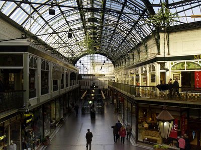
The Leyland Arcade, Southport, shown above, which opened in 1898, all glass, cast iron, mahogany, stained glass and plaster reliefs, is one of the prototypes of the modern mall. From the humble beginnings of small arcades like this the super-malls of Manchester's Trafford Centre, or Sheffield's Meadow Hall developed. Yet, despite this lineage, when I enter a Victorian arcade I'm invariably delighted by the experience. Why is this? I guess it's partly to do with scale - they are much smaller in area, the shops are smaller, and you can get round most in a short time. The style and materials used - modern for their day, and built to last - are also factors. But it's also to do with the light. They are top-lit by natural light, and so the quality of it varies according to the season and the time of day. Consequently the visual experience is much more rewarding. Arcades are usually part of a wider shopping area, and complement it with the qualities they offer. Modern super-malls replace the high street and traditional shopping areas, and that is another reason to dislike them.

My photograph is taken from a balcony in the arcade. I chose this location so I could include the two shopping levels and the handsome cast iron and glass roof. The early morning winter light meant some indoor lights were turned on, adding to the scene, and I waited for some foreground figures to appear silhouetted against the polished floor to give interest to this part of the picture. It's possible to find architecturally better arcades than this one in Southport, but what this photograph demonstrates to me is that even a run-of-the-mill example has qualities that make it a pleasure. Can the same be said about modern malls?

photograph & text (c) T. Boughen

Monday, January 23, 2006

Tricky cyclist

click photo to enlarge
Suppose you're the star of the local skateboard and BMX park. Suppose you can leap into the air, rotate through three hundred and sixty degrees, and return whence you came. Suppose you can whizz up a banana-shaped ramp, loop-the-loop and land on a mirror image ramp, then casually free-wheel onto a raised platform to the acclaim of watching friends and fans. If you can do all that, what challenge is there left in life?

Well, you could pedal like hell, hurtle into the air and zip over the top of a flagpole with a large ball fixed on it.

And the only way you could top that - absolutely the only way - is to do it again with a sea-gull perched on your bum! Like this guy did. Near the pier in Southport. And I'm pleased to say I snapped him in his moment of triumph!
photograph & text(c) T. Boughen

Sunday, January 22, 2006

On top of the world

click to enlarge photo
So, there I am walking on the Shropshire hills above Church Stretton. It's winter, there's a wind sharp enough to cut your face, but the sun is shining and the world looks great. I've just watched some ravens flying upside down - bird watchers call it "rolling". The fields below the moorland are dotted with sheep and the hedges are dividing up the landscape like pastry on a lattice tart. The camera has a card almost full of shots and I say to my wife, "Can you take one of me walking along the ridge with the view beyond?" So I give her the camera, she takes the shot, and down we go, back to where we are staying.

Later, when I look at the shot on the computer, I decide I really like it. For two reasons. Firstly the composition is good with me slightly left of centre, walking into the frame. The eye goes to the dark figure, then out into the landscape and the distant pyramidal hill of The Wrekin. The colours are good too: I like the contrast between the bright greens and browns nearby and the bluer tones of the more distant landscape. But the sky is sensational. When we were walking we could see the mass of cloud moving in from the left, casting deep shadow over the lowlands as it came. That cloud and the rain it promised caused us to head for home. In the photograph it looks like a big dark hand reaching down. And that brings me to the second reason I like the photograph. It's a bit like a metaphor of the human condition. You might think everything is great, that you are living on the sunlit uplands of life, but watch out because something is bound to come along and spoil your day!

photograph & text (c) T. Boughen

Saturday, January 21, 2006

Forward to the past


click photo to enlarge
Back to the future? No - forward to the past! That seems to be the current trend in energy generation. Throughout Britain more and more windmills are appearing: singly, in groups and in large "farms". A cluster of giant, three bladed turbines have just appeared offshore in Morecambe Bay. Wind energy, it seems, is the future. But in some parts of the country it was also the past.

The flat lands of the Fylde plain in West Lancashire was once known as "Windmill Land". The farmers and landowners of the eighteenth and nineteenth century harnessed the west wind driving in off the Irish Sea by building a multitude of windmills across the region. They were mainly used for milling grain, and many continued in use into the early twentieth century. Some of these fine structures can still be seen, lovingly preserved, standing tall, watching their high tech children appearing around them.The photograph shows Marsh Mill at Thornton, a brick tower mill built for Bold Fleetwood-Hesketh in 1794. It is now a visitor centre, with exhibitions that tell about its life.

Windmills are best photographed either in the context of the landscape or by selecting a part of the building. Marsh Mill, though the best preserved of Lancashire windmills, has not been fortunate in terms of its surroundings - a shopping "village", and streets. So, I focused on the upper parts, deciding that clear evening light and shadows would add to the visual interest. Windmills are unique structures whose form is determined by their function - they are a combination of building and machine that is highly photogenic. And that's true regardless of whether they were built in 1794 or today.

photograph & text (c) T. Boughen

Friday, January 20, 2006

A star of stars

click photo to enlarge
It is the English way to "take down a peg or two" - to "bring down to earth" - that (or those) which other nations might exalt. Thus Norman Foster's stunning new Swiss Re building in London is familiarly known as "The Gherkin" (see blog post of January 14th), Prime Minister Margaret Thatcher was generally called "Maggie", and the great British institution of Marks & Spencer is commonly referred to as "Marks & Sparks". So, what name could possibly be applied to the 272 feet high, fifteenth century tower of the church of St Botolph in Boston, Lincolnshire: an elaborate and daring structure with a lantern-like open-work top, set in a flat area of fen, arable farmland and river. Well, for centuries this medieval masterpiece has been known as "The Stump"!

I have visited this church on a number of occasions, and, like any tall building, I have found it hard to photograph in its entirety. However, good medieval churches - and this one is outstanding - offer details and vistas a-plenty to the eye that looks. My photograph shows the lierne-vault which forms the ceiling of the underside of the tower. It is an elaborate and exquisite arrrangement of ribs and bosses formed into four stars which, together, make a larger star. The purpose of this attractive pattern is principally structural. However, the medieval builders capitalised on its beauty with their carving, and made this inaccessible surface many feet above the congregation's head a tribute to the glory of God.

On the occasion I took this photograph I didn't have my tripod with me, so I lay on my back with the camera clamped firmly to my face, and increased the exposure to ensure illumination of the vaulting. I tried to get the picture as symmetrical as I could to complement the symmetry of the main subject. When I look at the beauty of the ribs, bosses and windows in this tower I do have some concerns about our national trait that allows such beauty to be referred to as "The Stump".
photograph & text (c) T. Boughen

Thursday, January 19, 2006

To Photoshop or not?

click photo to enlarge
To Photoshop or not to Photoshop, that is the question. The photograph above I mean. It's the stick. And I just can't make up my mind.

I like the surreal qualities of this photograph that I took in late autumn at Abbeystead Reservoir in the Forest of Bowland, Lancashire. The background is all Gainsborough and the foreground is a bit Dali. You look at the misty sky, the distant hills, the orange trees, the green grass, the chimneys nestled on the lakeshore, the reflections in the water and think, fine - so far, so conventional. Then you look at that rim of water where the reservoir overflows and falls down to a stream and think - that looks weird! But then you notice the stick, drawn to the falling water, but not able to slip over the edge. And you think about the way it breaks the perfect line of the rim. Photoshop it out of existence! That's the next thought. Get rid of it. But I can't.

I'm a bit of a purist and a traditionalist. I don't like to add or subtract objects from photographs. To me doing something like that seems like mixing painting with photography. Now I realise that many people find that entirely unobjectionable. But not me.

Then I considered the stick for a bit longer, and decided that it was an imperfection that added to the appeal of the photograph. In my mind it's like the false mole that women stuck to their faces in the eighteenth century - a blemish that makes the surroundings, by comparison, much better. The stick stays.
photograph & text (c) T. Boughen

Wednesday, January 18, 2006

Anything can be extraordinary

click photo to enlarge
"In the right light, at the right time, everything is extraordinary". These words, by the contemporary American director and writer, Aaron Rose, neatly sum up a feeling I have about the importance of looking carefully, and repeatedly, at everyday things in your everyday environment. Photographers often produce their best work by photographing things and places that they know well - and the light, and the time of day and year, are very significant in achieving this.

However, many people seem to assume that they must search for novel locations and objects. Look at people's photograph collections and notice how the majority of images are taken when on holiday. Observe too how many try to spend every holiday in a different location so that they can find something that is extraordinary to photograph. Instead, perhaps, we should be trying to find the extraordinary photograph of the ordinary place.

I have walked and cycled along this seawall at Rossall, Lancashire, many times. Then one day last summer I determined to photograph it. The stark concrete wall is not, at first glance, the most photogenic structure. However, I set myself the task, and came up with half a dozen shots that I am pleased with. This is the best of the crop, taken from the beach, with the sun at an angle that throws the massing into bold relief. It is a shot that wouldn't work without the shadows. They help to explain the construction, and highlight the sinuous line of the curved wall that throws back the waves. Converting it to black and white has emphasised the extraordinary qualities of this ordinary seawall.
photograph & text (c) T. Boughen

Tuesday, January 17, 2006

Remember the Millennium?

click to enlarge photo
Was it midnight, 31st December 1999, or was it the same time in 2000? I mean the time when we tipped from the last millennium to the present one. The mathematicians amongst us, and possibly the pedants too, opted for the latter. Most of us went for the former because, even if technically wrong, it just felt right.

That was one discussion around the millennium. The other was, "How are we going to mark it?" In most communities and many organisations there was a desire to leave a permanent reminder that we were alive at this rare moment in time. In Britain every city, town and village had a committee that grappled with this most contentious of issues. A new clock in the town market place? A new village sign - marked with 2000, or more cryptically, MM? Perhaps a millennium green - a public space for all to use in perpetuity? Better yet, a massive dome on some derelict land in London! All these and more were commissioned, some adding a modest benefit to the community, others conferring a more dubious legacy. A clutch of communities opted for millennium bridges. Lancaster was one such city.

The strikingly conceived footbridge shown in my photograph above spans the River Lune. It is an uncompromisingly modern and adventurous design by the firm of Whitbybird, in an area with many historic and significant buildings. And it's none the worse for that! The lightness and audacity of the design are a joy to behold. Two decks meet at the twin tall pylons and a single sinuous deck arcs over the river receiving support from cables and a single column on the way. My photograph only partly illustrates the bridge's exceptional qualities because I was as interested to capture the light and reflections as I was the structure. The early morning winter light was throwing deep shadows, and the state of the tide meant the river was fairly tranquil with an interesting wave texture. So I tried to do a bit of both. For the sake of engineering maybe I needed to include more of the bridge. To make a better photograph I perhaps needed less of it. My two interests collided in this photograph, and this is what I ended up with!
photograph & text (c) T. Boughen

Monday, January 16, 2006

Simply red

click photo to enlarge
Red means different things to different people. To the Chinese it can signify good luck, and is much used in the marriage ceremony. Many European and Asian Socialist parties have used the colour to represent their cause. Today, in Western societies it is often associated with danger (fire engines), debt (in the red), stop (red light), medicine (Red Cross, Red Crescent), anger (red face) and love (heart). No doubt you can think of more associations. Most of us think of it as a strong, definite colour, and we usually have strong definite views about whether we like it or not.

Red flowers are very popular, partly for associational reasons. The most widely bought flowers on Valentine's Day must be red roses. Poinsettias are seen more at Christmas partly because of the association of red with that festival. However, some of the popularity of red flowers must be attributable to the combination of red blooms and green foliage. These two colours are opposites on the colour wheel - "complementary colours" as the scientists say. The effect of pairing such colours is to increase the apparent vibrancy of each - reds look redder and greens look greener. The butcher knows this, often using green trimmings to make his meat look fresher and more succulent!

When I came to photograph these carnations the colour I wanted to get right was the white background. I knew that the colours of the red petals and green stems would speak for themselves if they had a sympathetic setting. The outlines of the stalks and flower heads would also be emphasised and add interest to the image with a white background. A piece of foamboard behind and a piece below did the trick. I chose a diagonal composition to give movement to the photograph, but also because it looks natural. I don't photograph flowers often, and though there is something of the greeting card about the shot, I'm fairly pleased with the outcome.
photograph & text (c) T. Boughen

Sunday, January 15, 2006

Public sculpture - a public good

click to enlarge photo
Public sculpture in Britain has seen a renaissance in recent years, and a good thing too. A well-wrought piece can brighten our day, make us think, and enhance the location. The last quarter of the twentieth century saw works appearing in growing numbers as towns and cities sought to use sculpture to attract attention and define their character. Probably the best known work to come out of this period is Antony Gormley's "Angel of the North" (1998). The appearance of this massive figure at Gateshead caused a further burst of activity which continues today with ever larger, more exotic pieces filling squares, precincts, parks and riversides up and down the country.

These cormorants at Morecambe, Lancashire, are part of the refurbishment of the promenade area and Stone Jetty that began in 1994. This work, known as the Tern Project, sought to improve the town's sea defences, revitalise its shopping and leisure facilities, and strengthen the town's identity. Birds are the main hook on which this project hangs. Morecambe Bay is known for its seabirds and waders, and has been designated a RAMSAR (Wetland of International Importance) site. The town's location made a bird theme the obvious choice. Lapwings, gulls, waders, coot, falcons, and other species can be seen all along the sea front. Some are literal interpretations, others have a greater degree of abstraction.

I have photographed these cormorants, by Brian Fell and Gordon Young, a few times. Previously I have had a sea or pier background. On this occasion I decided to use the deep blue of the winter sky as the backdrop, and to emphasise the deep shadows from the low sun. So I positioned myself quite low down. The arrangement of the birds allows a number of good compositions, but this time I went for asymmetry, leaving a lot of sky at the top left.
photograph & text (c) T. Boughen

Saturday, January 14, 2006

The Gherkin

click photo to enlarge
30 St Mary Axe? The Swiss Re building? No, to Londoners it is known as "The Gherkin". Only two years after its completion Norman Foster's tower in the heart of the City has won the affection of the locals and the admiration of tourists. The magazine "Conde Nast Traveller" has called it one of the seven wonders of the modern world. Now that is probably going a bit far! But, in its short life it has certainly become widely noticed and admired, and a much filmed and photographed part of the London skyline.

I have mixed feelings about the structure. Let me say straight away that it has more than just the "Wow" factor that is, in my judgement, the only quality of some recent "landmark" buildings such as Gateshead's "Sage". It has an elegant shape which one would think suitable for a tall (590 feet) building. The colour is beautiful during the day, fantastic at twilight when the dying sun picks it out, and wonderful at night when the lights are on. I like the texture of the surface too. But, I do wonder about the spiral banding. Will the simplicity of the concept soon pall, like the catchy hook of a top ten record? Perhaps. However, I suppose my biggest concern is about the thing that I and others find so alluring - the shape. I cannot see the rationale for it. In that sense it is a classical building: the interior space is made to fit the pre-determined exterior form. Many people will have no problem with that. I prefer the interior space to be the prime consideration, and to see the architect's skill deployed in marrying that to an exterior that adds beauty and interest to its location.

My photograph is one of a number I took a few months ago. Many of them show parts of the building surrounded by lower angular offices. It's certainly difficult to get a shot that explains the whole of the building. Of those that I took, this is the best. The Gothic church tower is St Andrew Undershaft, a building of c.1530. Its cream and weathered stone contrasts sharply with the curves of its new neighbour. The juxtaposition of the top of each building is a useful symbol of the old co-existing with the new that typifies twenty-first century London.

So, do I like the building? Am I glad to see it on the City skyline? On balance yes. If that sounds a less than ringing endorsement, it's probably because it is often hard to judge the worth of a building and the contribution it makes to the urban landscape until the passage of several years. Ask me again in 2020!
photograph & text (c) T. Boughen

Friday, January 13, 2006

A chance photograph

click photograph to enlarge
Markets attract photographers like buddleia attracts butterflies, and it's easy to see why. If you like to photograph people there they are in tightly packed groups, intent on a bargain and oblivious of the lens. If you like colour it's everywhere - in the fruit, the vegetables, the pots and pans, at every turn, on every stall. If you like contrasts, the shade of the canopies and the shafts of sunlight provide it, peopled with the old and the young.

This photograph is one of a series that I took at the Saturday Market in Beverley, East Yorkshire. Most of the shots I made were at ground level. Serendipity brought about this bird's-eye view of the market, when I went into a store to look at some clothes and got a view over the square from an upstairs window. The first thing that struck me as I looked out was the curving lines of stalls. It was immediately obvious that I could use it compositionally. The view I selected has a focus of interest in the people at the bottom left, with the curve of the stalls taking the eye through the market, past the eighteenth century market cross (with the columns) to the tower of the medieval church of St Mary at the top right. I was pleased with the balanced asymmetry to the photograph.

Beverley has many brick and pantiled buildings of the eighteenth and nineteenth century and here their warm colours contrast with the strident stripes of the stalls. My other photographs capture the stalls, cross, and people. They are the images I expected to get. However, this photograph, that I got by chance, is the one I prefer.
photograph & text (c) T. Boughen

Thursday, January 12, 2006

The cows take a bow

click to enlarge photo
Last summer, as I walked along a footpath through the fields near Knott End, Lancashire, I came upon the British Friesian Formation Dance Troupe. They were practising for their latest production, "Moolin Rouge", to be performed later that month on the stage of the Marine Hall, Fleetwood. I managed to catch three of the dancers as they hoofed their way through "The Isosceles Trot", a nifty little number in which the participants pirouette and shuffle whilst maintaining the shape of a triangle which has two sides of equal length! My photograph captures them at the end of the routine which features a symmetrical arrangement with the trio facing forward, stage left, and stage right.

In the background you can see a member of the troupe sulking after being replaced for forgetting to wear her costume of fetching blue ankle bracelet, and modish yellow earring.

I'll bet you didn't know that Lancashire cows were so artistically inclined - or so petulant!
photograph & text (c) T. Boughen

Wednesday, January 11, 2006

The Fleetwood Pharos

click photo to enlarge
Decimus Burton (1800-1881), as his name suggests, was his parents' 10th born child! Despite his lowly family position he grew up to become a successful and prolific English architect. His work can be found in London at Regent's Park, Kew Gardens, London Zoo and elsewhere, as well as in the provinces in places like St Leonard's-on-Sea and Tunbridge Wells. However, he was given his greatest commission when Peter Hesketh asked him to design the new port and resort of Fleetwood, Lancashire. Although their vision was not fully realised - the money ran out - Burton did bequeath a radial street plan with terraced housing, and a number of fine individual buildings. These include the North Euston Hotel, Queen's Terrace, Lower Lighthouse and the lighthouse shown in the photograph above, the Pharos.

Lighthouses are popular subjects for photographers. The locations -headlands, rocky islands, windswept remote beaches, etc - are often photogenic places, and the towering building casting its safe and welcome light seaward appeals to the romantic in us all. But because they are so frequently photographed it's hard to find a new approach.

This lighthouse at Fleetwood lacks the poetic location - it stands among the streets of the town. However the red sandstone structure with its grand detailing make for a fine sight on a bright day. It was on such a day that I decided to photograph it, and it took me some time to come up with a different perspective. I was fairly clear that such a strong vertical shape could not be central unless there was strong asymmetry elsewhere in the scene. As I looked through the viewfinder and lamented the lack of clouds I saw the tram wires appearing to converge near the top of the lighthouse. It was then a small matter to offset the top of the Pharos to the right, and ensure the wires led the viewer's eyes towards it whilst adding interest to the remaining space. My image isn't the classic lighthouse photograph, but its simplicity pleases me.
photograph & text (c) T. Boughen

Tuesday, January 10, 2006

Winter light by the seaside

click photo to enlarge
You either love or you hate a seaside resort in winter. I love it. In fact, in many ways I prefer resorts in winter to other times of year. It's probably the emptiness of the promenade, the boarded up amusement arcades, the echoes of long gone holiday makers, the seediness and tattiness that in summer is masked by a lick of paint and throngs of people. The Lancashire seaside resort of Blackpool has all that and more.

This view includes the dominant Blackpool Tower, a variation on the idea and design of the Eiffel Tower. It was completed in 1894. From its base, which is wrapped in a building with a circus between the Tower's four legs, to the tip of the flagpole at the top, is 518 feet. Central Pier with its big wheel can also be seen, and in the far distance is one of the tallest rollercoasters in the world "The Big One".

The evening light of this photograph seems to complement the out-of-season feeling that permeates the town in mid-winter. And it's probably not too fanciful to say that the bleakness of the exposed beach does the same. The location from which I took this image - on North Pier - is one of the best for photographing the Tower. Low tide is the best time too. The pools of water give greater visual interest to the bottom right of the picture than the sea usually manages, and the lines they form take the eye through the view more effectively than does the sea wall.

Blackpool's golden days were in the first half of the twentieth century when the hotels and beaches were packed with holidaymakers. I think, on balance, I prefer these golden days in the winter twilight.
photograph & text (c) T. Boughen

Monday, January 09, 2006

A message from the dead

click photo to enlarge
What message does the driver of a BMW or a Mercedes want to give to the world. I value good engineering? Reliability and safety are important to me? I think German design is the best? Or is it "I have a superior position in life, and this car shows it"? Certainly the latter seems to be the subtext in much "upmarket" car advertising. And perhaps we shouldn't be surprised. Throughout history the well-heeled have always found ways of displaying their wealth and status, and artists, designers, tradesmen and companies have all found assisting the rich in this goal to be a good way of making a living.

The photograph above was taken in the Kyrle Chapel in the church of St Bartholomew at Much Marcle, Herefordshire. It shows the carved effigies on the tomb of Sir John Kyrle and his wife. Sir John had clear views about where he wanted his eternal rest to be, and it was not going to be in the graveyard! He wanted a position that better reflected his status in the community. So, in 1628 he appropriated the north chapel of the church for his family's use, and upon his death in 1650, he was laid to rest in this black and white marble tomb chest. The carving of the figures is exquisite, with the majority of the sculptor's focus not on capturing the likeness or essence of the couple as people, but on depicting the richness of the clothing and jewellery. In so doing the sculptor has helped the couple say to all who view the tomb, "We were people of importance and wealth."

When I photographed this tomb I used natural lighting and a tripod. That is my preferred method in churches even though such buildings are often very dimly lit. Romanesque buildings with their small, high windows are usually the darkest, and here flash, carefully used, can be helpful. But Gothic churches (particularly those of the Perpendicular period) are usually sufficiently bright. Renaissance churches often have the best natural lighting, and in Victorian structures the brightness varies in proportion to the amount of stained glass. Given this constraint, and the fact that a good depth of field is often required, camera exposures can be quite long. Despite the experts' advice about locking the mirror up to prevent vibrations due to its movement, I rarely do, and I haven't found it an issue. When photographing tombs the temptation is to try to capture the whole composition. However, better photographs result from being selective. Here I chose those parts which are typically thought the most important in portrait photography - the face and hands.
photograph & text (c) T. Boughen

Sunday, January 08, 2006

Are you a lark or an owl?

click photo to enlarge
Are you a lark or an owl? When the first light of day filters through the curtains do you jump out of bed ready to make the most of the morning? Or do you pull the covers over your face to banish the brightness, and try for another hour's sleep? Do you get up early, anxious to use the freshness of the new day, or do you get up later, and come into your own when the sun has gone down? I'm definitely a morning person and I think I've worked out why.

I see each day as full of potential. In the early morning the day seems laid out before me like a blank piece of paper, ready to have written on it anything I care to write. And, when I get up my energy levels are at their highest, so I'm raring to go. But there's one more thing about the morning that gets me out of bed, and that's the quality of the light. In the morning it seems so much sharper, cleaner, fresher, and shadows are often crisp and deeper. Great for photography.

This picture, of a farm lane near Settle, North Yorkshire, was taken on a frosty early January morning, and it was the light that drew me. The slightly yellowy-orange tint of the low sun was highlighting the lichen on the drystone walls. Long shadows were being thrown in the lane and across the fields, and in the shade the frost and grass had a blueness about it. This strongly directional morning light was bringing qualities to the scene that can only be found at that time of day and year. I liked the strong compositional lines of the lane taking the eye through the foreground to the farm, and then the line of trees inviting a rightward gaze down the slope and out over the valley below. In truth, it's hard to take bad photographs on mornings like this.

There is a downside to being a lark however. After lunch, when the afternoon gets underway energy levels drop and less gets done. And in the evening, when owl friends are at their perkiest trying to engage you in stimulating conversation I'm yawning and glancing at the beckoning stairs to bed!
photograph & text (c) T. Boughen

Saturday, January 07, 2006

A British icon

click photo to enlarge
"They know the price of everything and the value of nothing". That saying was certainly true of the managers of the UK telephone provider, British Telecom (now BT), following its privatisation in the 1980s. It led them to destroy a British icon, and replace it with tat.

In 1935 the architect, Gilbert Scott, designed the K6 telephone box. It was the first standardised metal and glass model to be used throughout the country. Virtually everywhere it was painted bright red to be easily seen. The box was well proportioned, had square glass panes on three sides, an elegantly curved roof above, and was tough. It became, along with Bobbies, the Routemaster bus and black taxis, a symbol of Britain. Towns and cities had red telephone boxes spread strategically through them: mostly singly, occasionally in pairs, and outside main post offices in scarlet rows like a rank of guardsmen.

But in the 1980s and 1990s the significance of this iconic structure meant nothing compared with the bottom line. The new KX100 design was promoted as a replacement. It was cheaper to build (flat slabs of glass) and clean (open at the bottom). Its shape (a functional cuboid), its colour scheme (puce), and its decorative silhouette of a figure blowing a trumpet (why?) simply could not compare with Scott's masterpiece. It became universally reviled. But the bean counters, like their political mistress who had set them free - Margaret Thatcher - weren't for turning. The old boxes were scrapped or sold off as antiques (sometimes for shower cubicles)! Local councils were given the opportunity to retain their K6 as long as they took over the maintenance. Some did so with diligence. Others kept them, but neglected to clean, repair or paint them. You can see examples of these faded (now pink) boxes dotted about the country.

The photograph above, of the green at North Newbald, East Yorkshire, shows the contribution that the old telephone box made to a village. The flash of red stands stands out and contrasts with the backdrop in - I think - a pleasing way. Rapid growth in mobile phone use may have done for the boxes even if corporate vandalism had not got there first. However, in recent years many K6 boxes have been "listed": that is given protection by planning law against removal or change, in the way that buildings can be. Clearly the historic and aesthetic qualitities of the remaining boxes are now recognised. Which reminds me of another saying "you don't know what you've got 'til it's gone"!
photograph & text (c) T. Boughen

Friday, January 06, 2006

A troubled bridge over water

click photo to enlarge
£354,000,000. That is the amount still to pay for the twenty five year old bridge shown above. When the Humber Bridge was built in 1981, it cost £98,000,000. Interest charges, insufficient traffic, and tolls set at an uneconomic level have led to the massive sum that is owed today.

But if you visit the Humber Bridge you feel prepared, just for a while, to cast the economics aside and marvel at the scale, elegance and audacity of the structure. For nineteen years after it first opened the bridge held the record for the longest single span in the world. And when you look at that span you feel that it goes - whoosh - arcing effortlessly over to the other side of the river. In that apparent lack of effort lies the engineers' skill, and that's the thing I wanted to capture in my photograph. But that's not so easy. If you try and photograph the bridge from the side, or even obliquely you have to get way, way back. Then you lose definition and some of the sense of size. So I thought I'd get in close.

There's an interesting shot to be taken from between the twin uprights looking across the river with the underside of the deck tapering into the distance. However, I felt that including people would help to stress the scale of the bridge, and this is the shot I came up with. I'm happy with it because the strong diagonals, the disappearing deck, and diminutive towers almost almost a mile away help to capture that "whoosh" feeling!
photograph & text (c) T. Boughen

Thursday, January 05, 2006

The best is often over our heads

"Nothing that was worthy in the past departs", said Thomas Carlyle (1795-1891), Scottish historian and essayist. As far as the architecture of our towns and cities goes he was dead wrong! Take a walk down any high street, anywhere in Britain, and if you are interested in architecture or just like the variety of the urban scene, all you can do is weep. Virtually everywhere you see the same shops. All with the same corporate fascias. All designed to maximize selling space. All inserted with no regard for the building of which they are a part. The original structure is just swept aside. The same is true of seaside resorts: most seafront hotels seem to have a single storey "sun lounge", or some such excrescence, tacked on the front with all the sensitivity of bull bars on a Bugatti!

But there is a way to see something of what the original builders and architects intended. Walk along looking upwards. Now I realise that this may involve you in some uncomfortable meetings with bollards. Furthermore, you are likely to engage in close acquaintance with the presents that dogs leave on the pavement. But believe me, it's all worth it! By looking at the first storey and above you are likely to see original work that hasn't been messed about with too much.

The subject of the photograph had escaped my notice for years because, when passing this particular Blackpool hotel, I never followed my own advice. And then, the other day, I did. What a revelation - I saw the best bit of an otherwise uninspiring building. When I pointed the camera at it the zoom lens immediately concentrated my attention on the red of the sandstone and bricks. I could see the elegant iron work throwing shadows, and the blue sky reflected from the windows giving a perfect contrast. Even the whiteness of the plastic window frames added to the effect! It was a simple matter to decide that repetition was the theme to go for, compose the image and press the shutter.

So, next time you're passing Connecticut Braised Dodo, or any national chain, look up. What you see above the fascia might surprise and delight you - even more than what's on offer below!
photograph & text (c) T. Boughen

Wednesday, January 04, 2006

A stroll in the park

In his poem, "Leisure", W.H. Davies writes, "What is this life if, full of care, We have no time to stand and stare?" What indeed? One of the great Victorian contributions to our towns and cities - public parks - gave the common man a place to stand and stare, or play football, or stroll and chat, or do a thousand other things, all in a green and open space.

This park, at Greenwich, is one of London's eight Royal Parks. It is 183 acres (73 hectares) in extent and is located on a hilltop with views across the Thames to Docklands and the City. Uniquely it includes a number of major historic buildings including the Royal Naval College, National Maritime Museum, Queen's House, and the Old Royal Observatory. The latter (built by Wren, and shown at the top of the photograph) has the prime meridian - zero degrees longitude - going through it. It houses a wonderful collection of telescopes showing their development through the centuries. Some of these are still in their original location and able to be used.

This photograph is unusual for me in that it shows lots of people! For some photographers people are the whole point. I've never really seen it that way. Sometimes I use people as scale, or to balance a composition, or to give a focus to a scene. But often I wait until the last person has walked out of the viewfinder before pressing the shutter! My family have pointed out that I'm the only person ever to take a photograph at the top of the Puy de Dome in France that doesn't include a single person!

My reason for this shot was to capture the park on an unseasonally warm spring day, and record the goings on. The scene reminded me of a genre of Victorian paintings that show parks and streets thronged with people - the sort that Tissot or Seurat might have done. It was taken very quickly, with only an intuitive thought about composition, and the desire to include a little of the fast disappearing blue sky! And, despite all the people, I'm really pleased with it!
photograph & text (c) T. Boughen

Tuesday, January 03, 2006

The point of interest

If I had a panorama photograph of the location from which I took this image it would show the point where the River Wyre enters the Irish Sea, the town of Fleetwood with its lighthouses, people, and a big ferry tied up at the quay. Up the river would be many small boats bobbing on the rising tide. A white painted cottage and a further row of cottages would be seen lining the shore to my left. And near them, a golf course, club house and car park. A scene of relative quiet, yet tremendously active and colourful. Oh, and you'd see these four men launching their boat from the Knott End slipway near a Coastguard station.

Why, out of all the possible photographs that I could have made, did I make this one? Well, that's the beauty of photography isn't it? It trains your eye to to look at the sum of parts that make the whole: to be selective, and to see compositions within compositions. What I saw here was a point of human interest made visually interesting by virtue of being surrounded by (virtually) visual nothingness - if you see what I mean! The eye is drawn to the central silhouette because there is little competing interest. Apart from the vehicle, boat and men, only the upright of the light, the distant hill of Black Combe, and the slipway make assertive contributions. The blue of sea and sky are the undemonstrative backdrop to the scene. Sometimes, it's true, "less is more".
photograph & text (c) T. Boughen

Monday, January 02, 2006

Photographers' illness diagnosed!

In "The Wind in the Willows" the author, Kenneth Grahame, has the Water Rat say, "Believe me, my young friend, there is nothing - absolutely nothing - half so much worth doing as simply messing about in boats." This is an opinion shared by a large number of people. And an equally large number of people think such folk must be mad!

Wherever you have travel around Britain, anywhere there is an inlet, river, lake or reservoir, you find boats. Every spruced up coastal town and city has to have a new marina, and amost as soon as they are built they are filled with boats. So clearly the pastime must have something to commend it in addition to seasickness, wind, spray, and cold!

That being said, many photographers, be they land lubbers or water babies, seem drawn to boats like moths to flames. Even if the thought of sailing down the river, or over the seven seas, is anathema to them, a photographer will invariably point his camera at boats - particularly yachts. Is it because if you want to photograph water you need a point of interest? Perhaps. Is it because yachts, in particular, have a distinct beauty derived from the consonance of form and function? Probably. Is it because they are surrounded by a quality of light and reflections that are hard to find elsewhere. Certainly.

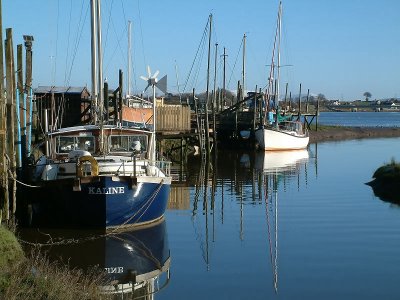
This photograph of boats on Skippool Creek, near Poulton le Fylde in Lancashire is not the greatest photograph I've taken, yet it does have some qualities. When I looked through the viewfinder I managed to get a balanced yet asymmentrical composition with a line of interest leading from the nearest boat through to the distant houses and bridge. Maybe it needs a bit more of the right bank of the creek. However, I'm fairly pleased with the outcome. The more interesting question is why did I snap these boats in the first place? The answer is probably obvious - that sharp, clear, riverside light and the reflections drew me into it. Probably the contrast of horizontals and verticals did too. So, even though the idea of messing about on the water holds no charms for me, it seems I'm not immune from the photographer's fixation with boats. Perhaps we need a name for this condition. Any suggestions?
photograph & text (c) T. Boughen

Sunday, January 01, 2006

Reflections on the old and the new

Bernard Levin, the English journalist and critic, was a man of decided views. In 1983, writing in "The Times", he asked, "What has happened to architecture since the second world war that the only passers-by who can contemplate it without pain are those equipped with a white stick and a dog?"

This is a not uncommon viewpoint. Many people are more comfortable with those buildings that evolved out of, or incorporate references to, one historical style or another. In England speculative builders of domestic housing spend whole careers tripping from Neo-Geogian, to Tudor, to Victorian , to whatever is the next whim or fancy. The "big bang" of twentieth century modernism disorientated people as far as architecture goes, and many have still to recover.

I'm a fan of good architecture wherever I find it and of whatever age. And yes, there is modern architecture that I like a lot. Having said that, this building in Kingston upon Hull has little to recommend it. It has offices above, shops and offices below, and, as I recall, a multi-storey car park tacked on for good measure. I remember it being built when I lived in the city in the 1970s and 1980s. I thought then, and I think now, that it wasn't good enough to sit next to Holy Trinity, England's largest (by area) parish church. This building is a medieval marvel of solidity and grace which also happens to incorporate some of the oldest medieval bricks in Britain.

And yet. And yet. The architect of the new building did have the foresight and grace to put reflective glass opposite the east end of the church. And each time I've passed I've looked at both the real thing and its reflection. So thank you for that. The day I took this photograph someone inside was too hot. The window they opened added a necessary break in the rhythm of the facade and improved my shot. Thank you too, whoever you are!
photographs and text (c) T. Boughen