The result of work by the German mathematician, Dietrich Braess, the paradox states that "adding extra capacity to a network, when the moving entities selfishly choose their route, can in some cases reduce overall performance. This is because the equilibrium of such a system is not necessarily optimal." When you apply that to road transport and the provision of ever more roads to meet increasing demand the significance of this becomes apparent: building your way out of congestion won't always work! And that fact is significant for cyclists. We need more people using bicycles - for the sake of the environment, health and road congestion. However, the major factor in people choosing not to cycle is the number and speed of motor vehicles. In the UK lip-service is paid to the needs of cyclists. They receive disconnected edge of road "lanes", a few off-road paths, and the odd painted box in front of other vehicles at traffic lights. That's about it. What's needed is a bold assertion of the place and rights of cyclists on all roads. That can only be achieved by reducing the space allocated to other vehicles, and, as Braess's paradox (2) points out, that doesn't necessarily mean that the motorist will suffer. The source of my enlightenment, which doesn't apply this thinking to cycling, was this interesting article in today's "Guardian" newspaper.
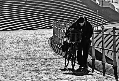
I've looked at this Blackpool location a number of times as a place for a photograph. The cobbles and steps/seating provide an interesting abstract background. However, a shot has never presented itself when the light has been right. Late yesterday afternoon it did! This cyclist was probably using the steeper route here rather than the easier nearby road for the reasons I mention above. I used a long zoom at 210mm (35mm equivalent), and adjusted the metering and speed to keep the contre jour glare down, and to achieve a silhouette. I placed the cyclist on the right to include the curving line of the roadway and the strong lines of the steps. The increased contrast black and white shot seemed the best way to present the image, but for anyone who is interested, the colour version is here.
photograph & text (c) T. Boughen
