Pages

Wednesday, August 31, 2011

Shop windows

click photo to enlarge
You can tell a lot about a society from its shop windows. Some of what they reveal is very straightforward - the products, fashions, food, events etc that are peculiar to the place. But shop windows are also very good at revealing the desires, attitudes, aspirations and insecurities of a culture. For every window display that simply lays out a set of products with price labels attached there is another that is constructed in such a way as to invite a sought-after group of buyers into the premises, and at the same time say to another group that this isn't the place for them.

You know the sort of establishments I mean: designer clothes shops with minimalist displays of contorted models that do everything but show off the clothes for sale, ladies' hairdressers with photographs of women that look like they've been cropped with garden shears and had their hair smeared with a tub of lard, or restaurants with very spare looking interiors featuring lots of leather and wood, the signs and menus with acres of space and small sans serif headings usually featuring no capital letters. Then there are the places that almost disguise the nature of the service that they offer, presumably working on the premise that their prospective customers know what they sell without it being advertised to the world, and those who don't are not the customers they want.

I was thinking about this recently when I was in London. I passed a few "indeterminate" shop fronts, and plenty that made a virtue of being explicit. "MARKS & SPENCER SIMPLY FOOD" (in the reflection above) is unambiguous and I find it unobjectionable. Which is more than I can say for the nearby shop that is called EAT.. That's no typo, by the way: the shop really does have a full stop after its single word name. In a city with a multitude of eateries at all price points that name and its silly full stop would be enough to make this potential customer choose elsewhere to buy his food.

photograph and text (c) T. Boughen

Camera: Lumix LX3
Mode: Aperture Priority
Focal Length: 12.1mm (57mm/35mm equiv.)
F No: f2.8
Shutter Speed: 1/15
ISO:800
Exposure Compensation: 0 EV
Image Stabilisation: On

Tuesday, August 30, 2011

London riverscape and National Trails

click photo to enlarge
My walk from Rotherhithe into the centre of London follows a section of a route called the Thames Path. This is a 184 miles long National Trail that follows the river from its source in the Cotswolds, through the heart of London, to the Thames Barrier at Greenwich. Though that title sounds rather impressive, the section that I use is simply a collection of riverside paths, public footpaths and roads that are collectively waymarked with this grand title.

I've always enjoyed walking, and have walked in many parts of Britain. Yet, perhaps surprisingly, I have an aversion to the whole concept of "National Trails" and long-distance footpaths. I first gave voice to it in the 1960s when I lived in the Yorkshire Dales and saw what the creation of the Pennine Way was doing to the country through which it runs: in particular the way that the track up the "nose" of Penyghent grew from a narrow path to a disfiguring scar 50 yards wide, visible for miles, that ultimately required boarding and steps to stabilise it. The creation of other such trails across sections of the country have done nothing to change my view of these footpaths. I've seen similar erosion associated with the creation of the long distance path along the length of Hadrian's Wall, and find it deplorable.

But it's not just the environmental damage that the designation of National Trails brings that I find objectionable, there are two other major problems. Firstly, they encourage endurance and competitive walking in the countryside. In a small, heavily populated island like Britain, where open country is a precious resource, people should be encouraged to walk in our natural areas and farmland with a much wider focus than the selfish sense of achievement that comes from completing a route. There are those who will say that this is possible, even on such a trail, to which I answer: talk to those who walk them! Secondly, the focus on these long-distance trails inevitably reduces the much more valuable work that needs to be done to maintain and, importantly, extend our historic network of footpaths and bridleways, a task which, if done properly, enriches the lives of many more people by giving access to local walking. And, if that were not sufficient reason for disliking the idea and execution of National Trails, there is the commercialisation of the concept that is evident in the opening sentence of the National Trails website: "We welcome innovative approaches from all sectors of business and are keen to explore opportunities for joint ventures with the private sector to develop new products and services." I cringe when I read such language in connection with countryside access.

Today's photograph, taken from the Thames Path, gives some context to my earlier photographs of The Shard.

photograph and text (c) T. Boughen

Mode: Aperture Priority
Focal Length: 58mm
F No: f7.1
Shutter Speed: 1/320
ISO: 100
Exposure Compensation:  0 EV
Image Stabilisation: On
Filter: Graduated ND8

Monday, August 29, 2011

Shard update

click photos to enlarge
On my recent visit to London I took a few more shots of The Shard, the tall, tapering, glass splinter-like tower that is rising above London on the south bank of the Thames. I usually manage to get photographs of the building from my Rotherhithe balcony and from the More London district of the South Bank, and I did so again. However, during our visit we also needed to visit the hospitals next door to The Shard and so I was able to get a shot looking up at the rapidly growing structure.

Two red lifts were scuttling up and down their ladder-like track that is fixed to the side of the building, transporting men and materials to wherever they were needed. As I gazed up at the gleaming building it struck me that a tapering tower not only is lighter in terms of mass than the usual cuboid, it looks much lighter and doesn't dominate the area as a more conventional shape would.
The observant visitor will notice, in the bottom right of the frame of the main image, the wire mesh cladding of the combined heat and power unit that is the subject of yesterday's blog post, and above it the grim, stained concrete of the hospital tower. Incidentally, the photograph of The Shard taken from Rotherhithe dates from the same evening as the wonderful sunset photograph that I posted a couple of days ago. And, further to that marvellous sight, the Daily Telegraph newspaper noted the sunset as one of the best in London in recent years and featured a photograph of it on their website.


photographs and text (c) T. Boughen

Camera: Canon
Mode: Aperture Priority
Focal Length: 24mm
F No: f7.1
Shutter Speed: 1/500
ISO: 100
Exposure Compensation:  -0.33 EV
Image Stabilisation: On

Sunday, August 28, 2011

Bustiers, basques and CHP Units

click photo to enlarge
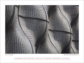
Is it a basque a la Madonna or perhaps a bustier modelled by Lady Gaga? The sensuous curves would certainly suggest the latter, though there probably aren't sufficiently sharp points for it to be the former. Could it be a new kind of lobster pot or the magnified surface of exotic tropical seed-pods. But no, as the title tells, it's some architectural (and artistic) cladding that envelops a building housing one of two new combined heat and power (CHP) units at Guy's and St Thomas' Hospitals, London.

When I first saw this wall of undulating metal mesh I couldn't imagine its purpose. It looks very incongruous at the base of the grim concrete tower that forms part of the two hospitals. However, there is a chance that it will soon fit into the urban scene a little better because, due no doubt to its location next to The Shard, the hospital is shortly having something of a makeover. Perhaps then it will be more of a piece with the rest of the site rather than looking like an alien excrescence on a giant multi-storey car park.

But, regardless of its current rather odd presence, the rippling metal wall certainly has an interesting structure and texture, and the angled light as I passed by suggested it might make an interesting photograph too.

photograph and text (c) T. Boughen

Camera: Canon
Mode: Aperture Priority
Focal Length: 300mm
F No: f7.1
Shutter Speed: 1/100
ISO: 100
Exposure Compensation:  0 EV
Image Stabilisation: On

Friday, August 26, 2011

A fiery London sunset

click photo to enlarge
Sometimes the colours and beauty of a sunset are quite overwhelming. Such was the case on a recent evening when I happened to look out of my balcony in London. I'm used to getting great views and interesting shots from this location when I stay in the city. And I've seen and photographed quite a few good sunsets. But I was unprepared for the colours and the definition of the scene that greeted me when I went to see which boat I could hear passing by. That happened to be nothing more than one of the Thames Clippers catamarans that regularly race up and down the Thames in their role as water buses, and on this occasion its engine sound had fooled me because it was going much slower than usual: perhaps it was finished for the night. I made a quick bee-line for my camera and started firing off shots intent on capturing the sight.

The ND8 graduated neutral density filter happened to be on the camera so my first few shots (of which this is one) were modified by that. However, apart from it darkening of the upper sky, possibly emphasising the blues a touch and giving more faithful delineation of the cloud, the image is what came out of the camera and involves no post processing. I don't recall seeing a better sunset than this one for a couple of decades, if at all. The people in some neighbouring flats were equally impressed because they too were out on their balconies with cameras. I took some photographs without the filter too, but this one, with the foregound interest of the passing boat, is the one I like best.

For an idea of what this section of the Thames from this vantage point looks like during the day see here and here.

photograph and text (c) T. Boughen

Camera: Canon
Mode: Aperture Priority
Focal Length: 45mm
F No: f7.1
Shutter Speed: 1/50
ISO: 800
Exposure Compensation:  -0.67 EV
Image Stabilisation: O
Filter: Graduated ND8

Thursday, August 25, 2011

Getting the best photograph

click photo to enlarge
One of the joys of digital photography is the ease and lack of extra expense involved in taking multiple shots of the same subject with the intention of securing the best possible image. Today's photograph, like yesterday's, is one of six that I took the other day of clouds reflected in the glass curtain wall of some London offices.

Here are the main advantages that I see in taking more than one shot of your subject. Firstly, if conditions dictate a low shutter speed that is hand-held, multiple exposures increase the chance of you getting a shot that is sharp. Secondly, you can experiment with the composition by either zooming, changing your position, adjusting the elements that you include in the frame, changing the depth of field etc. Thirdly, you can adjust your camera settings to, for example, control highlights or modify colour saturation. Fourthly, through taking more than one exposure of a subject you inevitably think more about it and that often results in a better outcome. There is a downside with multiple exposures (and indeed the general ease of digital) and that is the amount of storage space required for images if you don't ruthlessly cull the "duds". But, that notwithstanding, multiple exposures make a lot of sense.

However, here's the paradox. When I take multiple shots of the same subject I usually find - about nine times out of ten - that my first shot is the best! Is this because I'm an instinctive or intuitive photographer rather than one who thinks long and hard about each shot? Perhaps. And if that's the case why do I still take multiple shots? Well the answer lies in those approximate statistics: every now and again the first shot isn't the one I prefer, or something went wrong with it, and then I'm very grateful for the "duplicates".

From the above you'll gather that I like yesterday's shot over this one. But, I've been taking photographs long enough to know that many people will prefer the one above.

photograph and text (c) T. Boughen

Camera: Lumix LX3
Mode: Aperture Priority
Focal Length: 12.8mm (60mm/35mm equiv.)
F No: f2.8
Shutter Speed: 1/125
ISO:125
Exposure Compensation: 0 EV
Image Stabilisation: On

Wednesday, August 24, 2011

Curtain walls and coincidences

click photo to enlarge
It would be great to believe that the modern world had done with the concept of "good luck", that the superstitious attitude that leads people to waste money on lotteries and other gambling would have gone the way of belief in fairies and the efficacy of a daily dose of castor oil. But no, people queue up to give away money they can often ill afford to lose in the hope - sometimes expectation - of becoming a millionaire.

But the fact is, despite the Enlightenment, despite the rise of modern mathematics and science and despite universal education, many people have only a hazy grasp of concepts such as chance, probablity and coincidence, and frequently fall back on the superstitious beliefs of centuries ago. If only I stick with the same set of numbers, some say, I'm bound to win the lottery one day, while another group are equally convinced of their belief that changing the numbers is a better way to beat the odds. A much smaller group realise that the odds are the same each time you play your numbers, whatever the numbers are. Similarly, many people will accept that the probability of two people sharing the same birthday is 100% when there are 366 people in a room (excluding February 29th birthdays), but will dispute the fact that there is a 99% probablity when there are only 57 people. (For further information on this probability theory paradox see here).

My most recent blog post was about my liking for using glass curtain wall grids in photographs. What a strange coincidence then, that on my next photographic outing (that happened to be in London), I should return with just such an image, a semi-abstract example taken around sunset. Not really. I like the subject, I'd been thinking about it recently, and I was in a city with a multitude of glass boxes, so the fact that I should take such a shot is not at all unlikely: it's simply the sort of coincidence that occurs regularly throughout our lives.

photograph and text (c) T. Boughen

Camera: Lumix LX3
Mode: Aperture Priority
Focal Length: 10.2mm (48mm/35mm equiv.)
F No: f2.6
Shutter Speed: 1/80
ISO:125
Exposure Compensation: 0 EV
Image Stabilisation: On
Monday, August 22, 2011

Grids and reflections

click photo to enlarge
What I consider to be one of my better photographs shows a regular grid of glazing bars holding tinted glass that is reflecting a blue sky and clouds. Glass curtain walls have a certain fascination for me. I appreciate that they are not everyone's cup of tea, but the regularity of the rectangles contrasting with the irregularity of the reflections is someting that I find attractive. This photograph that I took at Canary Wharf, London perfectly exemplifies the appeal to me.

Such reflections, however, are often combined with a glimpse of the interior of the building and when that happens it is the complexity that I like; the difficulty discerning just what it is that I'm looking at definitely has its attraction. I've posted images of this kind of effect before too, as in this example at Imperial College, London. I took a further photograph in this vein on a recent visit to King's Lynn, Norfolk. The side of the town's municipal offices are glazed and as I passed by I saw a modern building, the pretty lead spire of the medieval church of St Nicholas, and a tree reflected in it. But the reflection was not perfect and through the glass I could see the zig-zag of stairs connecting the floors with people going up and down them. Its a shot that I find pleasingly confusing.

photograph and text (c) T. Boughen

Camera: Canon
Mode: Aperture Priority
Focal Length: 70mm
F No: f7.1
Shutter Speed: 1/80
ISO: 125
Exposure Compensation:  0 EV
Image Stabilisation: On

Friday, August 19, 2011

Bewildering headlines

click photo to enlarge
I consider myself to be reasonably well informed. I get the "Guardian" newspaper daily, read news websites, watch some television (though not a lot), listen to some radio, buy and read books, and discuss many topics with family, friends and acquaintances. But, for all that there are many parts of modern life in which I can claim little or no knowledge. Television, celebrity and sport are three such areas. Consequently I can be completely puzzled by a headline such as this one that I saw on the BBC News website: "Abercrombie alarm at Jersey Shore".

To have any hope of decoding it I would have needed to know two salient facts: that Abercrombie and Fitch sell clothes (I thought it was one of the big three global credit rating agencies) and that "Jersey Shore" is a so-called "reality" TV programme about "rowdy, hard-partying" and "loud" young Americans. If I had known those particulars I wouldn't have read the article. As it was, my interest was piqued by the indecipherable quality of the headline and what I gleaned made me, firstly, laugh out loud, and then slap my forehead in despair. Apparently Mike "The Situation" Sorrentino (one of the men featured in this programme) wears clothing made by Abercrombie and Fitch and they want him to stop doing so. You might wonder why they don't want the exposure that he presumably gives to their brand. The article revealed all in a quote from the company: "We are deeply concerned that Mr Sorrentino's association with our brand could cause significant damage to our image...We understand that the show is for entertainment purposes, but believe this association is contrary to the aspirational nature of our brand, and may be distressing to many of our fans." If you find that incredible (I find the idea of a clothing company having "distressed fans" simultaneously preposterous and wonderful), it gets worse. It seems that Abercrombie and Fitch have offered Mr Sorrentino, and the TV company producing the show, a sum of money to wear another clothing brand.

The thoughts that this set racing through my mind came thick and fast. Would it be O.K. for him to wear any other brand, or would Abercrombie and Fitch specify which one? A competitor perhaps? Is causing distress by wearing clothing an actionable offence? Are there out-of-work-actors and newsworthy reprobates already combing the stores for "aspirational" brands intending to have themselves photographed, then inform the manufacturers, and commit to wearing something else on receipt of a payment? Moreover, isn't an aspirational brand - even one "rooted in East Coast traditions and Ivy League heritage" and "the essence of privilege and casual luxury" - a product that is bought by people with a poor self-image, limited self-confidence, debatable intelligence - or all three - and isn't it therefore, by definition, the sort of clothing that should be avoided because it advertises this to the world and in so doing says the opposite of what you intend? Or am I over-thinking the matter of aspirational clothing? If that is remotely possible!

All of which has little or nothing to do with this composition featuring people and a mural at the Design Museum, London. For a different shot at this location (with a different mural) see here.

photograph and text (c) T. Boughen

Camera: Canon
Mode: Aperture Priority
Focal Length: 47mm
F No: f8
Shutter Speed: 1/200
ISO: 100
Exposure Compensation:  -0.67 EV
Image Stabilisation: On

Wednesday, August 17, 2011

Semi-detached blogging

click photo to enlarge
People are incidental subjects in most of the photographs on this blog, yet lately they are the main subject filling the memory cards of my cameras. Not since I was a parent of young children has this been the case. So what has brought about this change, and why are there still few shots posted that feature a person? Well, the fact is that our first grandchild appeared a few months ago and, understandably, I've found her to be a compelling photographic subject, albeit not one that I will post on PhotoReflect.

It also accounts for the semi-detached nature of my recent blogging. I've fitted in photographs and the associated prose in between travelling, fulfilling the job description of grandfather, and undertaking the essential everyday tasks that just don't go away. Which is my way of explaining and apologising for the lack of replies to people's comments, and for the nature of my recent output. The fact is my mind, attention and efforts  have often been directed to other areas of my life. You can tell that this is so because when I'm busy I often turn to my garden for a shot or two, as with today's image of a hoverfly on one of my favourite showy flowers, the gaillardia.

photograph and text (c) T. Boughen

Camera: Canon
Mode: Aperture Priority
Focal Length: 100mm
F No: f5.6
Shutter Speed: 1/80
ISO: 125
Exposure Compensation:  0
Image Stabilisation: On

Monday, August 15, 2011

Look up, but look down too

click photo to enlarge
It's a natural reaction, when approaching a medieval cathedral, minster or abbey, to look up. The architecture, indeed the main premise of such a building is to inspire that reaction in people: to make the passer-by admire the soaring towers, the pinnacles, the buttresses etc but, more importantly, to gaze heavenward. Identical intentions attach to the interior of these great churches, though here the iconography is more explicit and a visitor can be in no doubt of the message that is being broadcast.

In truth there are precious few surfaces of a cathedral that are not enlisted in the proclamation of the faith. From the "unnecessarily" ornate carving of capitals, windows, roof bosses etc, the celebration of Biblical figures in carving, stained glass and other materials and the heavy use of symbolism, to the beautiful carved and painted scripts that proclaim their messages, the building is a vehicle for the religion that erected it.

But, whilst it is natural to look up in a church, fewer people look down at the floor beneath their feet. Yet here too beauty and the message can be found. Some of our churches still have the original stone paving that replaced the rushes and compressed earth of the first religious buildings. Others retain medieval tiles impressed with geometric shapes, foliate crosses, leaves and other patterns, including the elaborate letter "M" signifying Mary or Madonna. Marble paving of the eighteenth century can also be seen: I posted a photograph of a trompe l'oeil example in the choir of Beverley Minster, East Yorkshire, earlier this year. The great restorations of the nineteenth century have left a wonderful legacy of floor tiles. Many of these take their lead from the medieval styles and colours but original designs abound too. This photograph of the area around the font of the church at Swineshead, Lincolnshire, shows very characteristic Victorian tilework. And then there are examples that are difficult to date because stylistic clues are few.

Today's photograph is such a tile scheme, also at Beverley Minster. Is it eighteenth or nineteenth century, or does it date from some time in the twentieth? Whenever it was made it works well. The eight pointed star is centred under the crossing tower, and the complexity of the pattern lessens as it spreads into the transepts. The design is strong, with contrast, but the colours are relatively muted, and it works with the surroundings. My photograph shows visitors in characteristic pose, faces turned upwards to the glories overhead. I wonder if they also looked down at the lesser, but also interesting, beauties beneath their feet.

photograph and text (c) T. Boughen

Camera: Canon
Mode: Aperture Priority
Focal Length: 29mm
F No: f7.1
Shutter Speed: 1/25
ISO: 1600
Exposure Compensation:  -1.0
Image Stabilisation: On

Friday, August 12, 2011

The poor man's fish-eye lens

click photo to enlarge
Skimming through this year's PhotoReflect images it occurred to me that I haven't posted any reflected self-portraits recently. So, in a bid to catch up with my self-imposed task, I took one recently in St James, the church at Castle Acre, Norfolk.

It shows yours truly reflected in the base of a large candle holder that was placed on the octagonal steps on which the font can also be found at the west end of the building. Behind me can be seen the Victorian tiled floor, the wooden pews, the nave arcades of the C14 and C15 and the distant chancel arch and east window. In recent years candle holders of this sort have become quite a common sight. They usually involve a tall, turned, wooden column (this one has a brass base) with a big, brass cup at the top in which is placed a very large white or cream candle. Often these have symbols or writing on them, usually in red.

Over the years I've seen a number of fashions and ideas circulate around churches. Many have set up play areas for young children at the back. I've seen small lending libraries too, as well as kitchens, small "cafe" areas and exhibitions about the history of the building and parish. At the east end of the church many congregations have brought the altar forward from under the eastmost chancel window to a point slightly west of the chancel arch: a development that meets the needs of the smaller congregations of today as well as the desire to make the people feel more a part of the service. The large candles have become an item of church furnishing that has grown in popularity. They are often near the font, perhaps having a symbolic connection with the entry into membership of the church that baptism confers.

I've shot reflected self-portraits in the ball at the base of ancient church chandeliers and achieved a similar "fish-eye" effect to that which the candle holder has given. In fact, I quite like this spherical distortion. However, I've never been able to justify buying a fish-eye lens. They are fairly expensive, and I have the feeling that it is a lens whose single effect would soon pall and it would quickly be put in a cupboard or sold. On the whole I'm happy enough using the "poor man's fisheye lens" when the right curved surface presents itself.

photograph and text (c) T. Boughen

Camera: Canon
Mode: Aperture Priority
Focal Length: 40mm
F No: f7.1
Shutter Speed: 1/40
ISO: 3200
Exposure Compensation:  -0.33
Image Stabilisation: On

Wednesday, August 10, 2011

OM right-angle finder on Canon

click photo to enlarge
My sons have frequently told us that we keep things too long. I guess that's an age thing, and their children will doubtless say the same to them. But, one of the virtues of making things last a long time, and hanging on to some things that look like they might have a use in the future, is that it can save you some of your hard-earned money. Today's blog post is an example of this.

Mounted on my Canon 5D Mk2 is a right-angle finder - the sort of thing that has, for some, been supplanted by the hinged live-view screen. An optical finder of the sort shown above allows you to look down when lining up a shot in front of you. In fact, the finder rotates through 360 degrees so, in theory, it can be used in other positions too. This is particularly convenient when shooting from a very low position - for example, when taking macro shots or simply looking to achieve a low viewpoint. It can save you getting the front of your body wet and muddy or can make viewing possible without bodily contortions and strain. Canon make a right-angle finder for which they charge the absurd price of c.£170. Less expensive versions by independent suppliers are available in the £35-£50 range.

When I've been looking through my old photographic equipment that I used with my Olympus OM1n film SLR I've always passed over this Ohnar finder. It's not that it's very cheap and nasty or anything: it has a black anodized metal body, 6 element optics, a coated mirror and a +/- 2 diopter eyepiece. Because it is designed to fit an Olympus (OM) eyepiece coupling shoe I've always felt that it clearly couldn't fit on a Canon DSLR. Well it wouldn't, would it? Well, yes it would, as I found when I tried it. The fit isn't perfect - there's a little left and right play - but it's not so much because I can turn the camera upside down and the finder doesn't fall off. Best of all, and what I didn't expect, I can see all of the camera's viewfinder.

So, I've pressed it into use and it should make my macro photography a little easier. There's just one thing: the finder flips the image horizontally. That's not a big deal, however, and I got used to it thirty or so years ago, so I guess I will again!

photograph and text (c) T. Boughen

Camera: Lumix LX3
Mode: Aperture Priority
Focal Length: 10.2mm (48mm/35mm equiv.)
F No: f2.6
Shutter Speed: 1/50
ISO:400
Exposure Compensation: -0.66 EV
Image Stabilisation: On

Sunday, August 07, 2011

Alien invaders and birds of prey

click photo to enlarge
I didn't realise, until the other day, that of all the alien wildlife invaders in the UK the worst of the worst was the so-called "killer shrimp" (Dikerogammerus villosus), a native of the Ponto-Caspian region of Europe, that is killing off our native shrimps and small fish. The BBC website carried a report by the UK's Environment Agency that listed (in the way that people do today) the "top ten" alien invaders. The list reads (starting with the worst) "killler shrimp", water primrose, floating pennywort, American signal crayfish, topmouth gudgeon, giant hogweed, Japanese knotweed, Himalayan balsam, and parrot's feather. What this list said to me is what a good medium water is when it comes to the spread of exotic plants and animals. The murky depths make it so much more difficult to detect the arrival and initial spread of an introduced species, to the point that when it does become apparent to scientists and lay people who spend time in and on water, it has reached a situation where containment or eradication is difficult, if  not impossible.

But, native wildlife has a remarkable propensity for holding on even under the strongest pressure as our red squirrels have shown in their fight against the onslaught of the introducd grey variety. Our birds of prey have been among the most oppressed species. Here it has been man that has caused their decline as landowners tried to rear ever larger numbers of gamebirds and farmers tried to kill off insects and plants that harmed their crops. But, with wider public pressure and awareness, legislation and scientific management, what appeared to be a hopeless situation has been turned around. Not for all species, of course - hen harriers are still being persecuted and numbers have fallen again after something of an increase - but for many. I read a while ago that the common buzzard has usurped the kestrel as the most numerous British bird of prey. They're certainly fairly frequent sightings in most parts of the country where formerly they were unusual.

One evening when I was photographing the strongly silhouetted shapes of these electricity pylons near a Fenland substation I became aware of a softer, "natural" shape among the sharp angles of the metalwork. Binoculars reveealed it to be a Common Buzzard (Buteo buteo) surveying the island of waste land below the steel "trees". Even in this instensively cultivated part of England the buzzard flourishes. Can you spot this one?

photograph and text (c) T. Boughen

Camera: Canon
Mode: Aperture Priority
Focal Length: 300mm
F No: f5.6
Shutter Speed: 1/500
ISO: 100
Exposure Compensation:  -0.67 EV
Image Stabilisation: On

Friday, August 05, 2011

The lime tree avenue

click photo to enlarge

A title or caption to a photograph works very much like the title of a poem - it influences the way you see what follows. A photograph I took in Swineshead, Lincolnshire, illustrates this quite well. The old brick building with the pointed door and shadows from nearby trees looks interesting. However, with the title, "The Gravedigger's Door", it takes on an entirely different character. You wonder what's behind the door, your mind begins to wander into darker places, and the shadows, perhaps, take on the appearance of fingers!

Today's photograph shows an elderly lady walking her dog along a fine lime tree avenue at Long Sutton, Lincolnshire. The character of the image is fairly neutral. However, if I tell you that the gates at the end of the avenue open on to the cemetery a different mood may well start to pervade the shot. The age of the person can become more significant, and there is the temptation to to fabricate little storylines in your head. Why is she alone? Is she going to visit a grave? Whose grave?

Of course none of this may have been in the mind of the person who took the shot because any appreciation or reaction to an image is a consequence of what the photographer offers and what the viewer brings. In fact, I took the shot, very quickly, solely for the composition down the path with its rows of trees. The figure added foreground interest and by being off-centre broke the symmetry quite well.

photograph and text (c) T. Boughen

Camera: Canon
Mode: Aperture Priority
Focal Length: 90mm
F No: f7.1
Shutter Speed: 1/80
ISO: 1250
Exposure Compensation:  0 EV
Image Stabilisation: On 

Wednesday, August 03, 2011

Revealed - the death of the word "announced"

click photo to enlarge
I can reveal today that the word, "announced", is officially dead. Procedures have been put in place to expunge it from the dictionary and it will never more be seen again. No one knows when the word last appeared, but searches through newspapers have failed to turn up any recent examples. The usurper of this venerable word is, however, to be seen everywhere, especially in newspapers and on the web. Which word you may be asking, has taken the place of "announced"? I am able to reveal that the usurper is the word, "revealed". Having decided that "announced" is too boring - a straightforward, accurately descriptive word with no hint of mystery, no implication of journalistic enquiry, no impact - the purveyors of the printed word have toiled long and hard to replace it with "revealed". The headline that was seen as crowning the triumph of "revealed" appeared on the BBC News website on 2nd August 2011 and read, "London 2012 Olympic Park neighbourhood names revealed."

There is of course the possibility that a man dressed in evening-wear with a magic wand in one hand dramatically plucked a white cloth off a table to uncover a hidden list of these much sought after names. In which case "revealed" would have been used in the old and proper sense and the announcement of the final expiry of "announced" is premature. Or, perhaps the Olympic committee may have been trying to keep the names of the Olympic Park neighbourhoods from the public for reasons best known to themselves - they could, for example, be as ridiculous as the Olympic 2012 logo - and journalists could have been probing long and hard to bring them to light. In that case too there would have been no usurping of "announced", and revealed would have been perfectly appropriate.

But no, apparently the chief executive of Olympic Park Legacy Company (yes, such a person and organisation does exist) and the Communities Minister (on a day off from destroying what is left of the UK's communities) announced (sorry, "revealed") the names to the summoned representatives of the press. Asked why headlines would say "revealed" instead of "announced" a man from the BBC replied, "because it's sexier and it makes it look like we've done some real journalism to uncover a story."

All of which has nothing to do with today's semi-abstract photograph taken a few months ago. If, by any chance, you're wondering what on earth this blog post is going on about take note of just how many times the word "revealed" is used in a headline where "announced" makes much more sense.

photograph and text (c) T. Boughen

Camera: Lumix LX3
Mode: Aperture Priority
Focal Length: 5.1mm (24mm/35mm equiv.)
F No: f2
Shutter Speed: 1/60
ISO:80
Exposure Compensation: -0.33 EV
Image Stabilisation: On

Tuesday, August 02, 2011

The manicured countryside

click photo to enlarge
I frequently walk and cycle on a track across some fields near where I live. The crops at each side of the path vary: often it's wheat, sometimes it's beet and occasionally it's brassicas of one kind or another. Because this is the Lincolnshire Fens the land is intensively farmed and areas of uncultivated land are few. There is a nearby stream that has reeds growing alongside it, but apart from that, for much of the route, the track itself provides the only place where wild plants thrive. Each year I've delighted in the lesser bindweed, dog daisies, chamomile, cornflowers and many other species that grow at the edges of this route that is used not only by walkers but horse riders, cyclists and agricultural vehicles. In an area such as the Fens even a small patch of wild land is a magnet for mammals, birds, and insects. Along this track the wildlife I commonly at various times of year includes see partridges, skylarks, reed buntings, yellowhammers, snipe, little egrets, wheatear, goldfinches, linnets, sedge warblers, yellow wagtails, hares, stoats, and various butterflies and insects. The other day I stood on it and watched a hobby circling above me: buzzards, sparrowhawks and kestrels are not uncommon and I've even seen a passing red kite.

So, you can imagine my disappointment and anger when, a couple of months ago, I went along the track and found that a tractor with a grass cutter had mown everything on and alongside it, almost up to the edge of the crops in the adjacent fields. It seemed a completely pointless thing to do. The crops are sprayed with herbicide and pesticide on a predetermined regime, so any seeds or insects going into them from the track have little if any chance of thriving. But, of course, all the wild plants were cut down and the number that completed their life cycle was drastically reduced, limiting not only their viability ut also the seeds available for local birds. Moreover, the beauty of the route was destroyed. I suppose to a certain kind of farmer it looked "neater". However, it's hard to keep nature down and the plants started to grow again. But recently it was all cut down again in the same way! Utter madness!

It occurs to me that acts of this sort are often quite mindless, and are frequently a result of either boredom (there are times when even farmers are at a loose end) or a desire for tidiness that borders on the obsessive. Not all farmers are this way inclined: many now farm with a keen regard for wildlife as well as their profit margin, and don't manicure every acre. In my part of the world many take advantage of agricultural subsidies intended to promote biodiversity, and leave strips uncultivated. But, there are still farmers who see nature as a competitor rather than a necessary and valuable part of the landscape and are determined to either obliterate it or keep it under very tight control.

Today's photograph, that prompted today's "reflection", shows "weeds" i.e. wild flowers, growing along the edge of a wheat field in Norfolk.

photograph and text (c) T. Boughen

Camera: Canon
Mode: Aperture Priority
Focal Length: 45mm
F No: f7.1
Shutter Speed: 1/80
ISO: 100
Exposure Compensation:  -0.33 EV
Image Stabilisation: On 

Monday, August 01, 2011

Castle Rising, time and photography

click photo to enlarge
There are those among my family, friends and acquaintances who think that I spend a lot of time on photography. Compared with a casual snapper I do. And, given that I'm retired, I suppose I spend more time taking pictures than the average enthusiast. But in some respects I still feel that the time I devote to photography is insufficient. Let me explain with respect to a recent example.

A couple of weeks ago I was travelling through Norfolk on my way to spend a few days near Wells next the Sea when I passed Castle Rising. This Norfolk village is a place I've visited once before to see its church. On this occasion, however, we'd decided to break our journey at that point to have a look at the Norman castle remains, some of the best of their kind in the country. The time of day (mid-morning) and the weather (sunny with areas of small clouds) was pretty good for photographing architecture - shadows help to delineate and describe the structure and sky interest is always welcome. I knew I'd take some details but I also decided to try and get a shot of the keep in its bailey. The first one I took is the main photograph at the top of the post. It's a shot showing the structure from the earth bank near the entrance gateway and has a few things to commend it - the asymmetry of the main subject, the path leading from the "empty" side of the shot, the angle of the building to the viewer with the side in shadow giving a strongly three-dimensional character, the balance of the main elements and the colours across the frame. But, the sun was slightly filtered by an area of cloud at the time, and the shot is consequently a bit "flat".


With an eye on that passing area of cloud we went to have a second look at Castle Rising church and a wander through a couple of village streets. The second and third shot were therefore taken a little later when the sun was stronger. I took one shot of the keep from ground level but the angle of the sun relative to my position wasn't the best so the areas of shadow are few. However, the simplicity of the shot - grass, building, sky - has a certain appeal. It was probably the absence of shadow in this photograph that caused me to take the next one from beyond the arch of the entrance gateway tower. Framing of this sort can be overworked, but here I'm fairly happy with it in terms of the dramatic strength of overall image. The downside of this position for photographing the keep is that you are face on to a single wall and consequently the image tells you less about its structure.

And that's where I come back to time and the amount I spend photographing. Most of my shots are taken on the hoof. By that I mean we are either walking, cycling or driving, and the purpose of our time when I grab my images is only partly photography. Were I to devote more time to photography I'd plan the best angles for a shot of this building, keep an eye on the weather, and return with a specific shot in mind, repeatedly if necessary until I secured it. If photography was my source of income that's what I'd have to do. I'm very glad it isn't.

photograph and text (c) T. Boughen

Photo 1
Camera: Canon
Mode: Aperture Priority
Focal Length: 24mm
F No: f6.3
Shutter Speed: 1/640
ISO: 100
Exposure Compensation:  -0.33 EV
Image Stabilisation: On