Sunday, December 31, 2006

Fit for purpose

click photo to enlarge
"Fit for purpose" is a management-speak phrase that has been used a lot in the UK over the past year. In May the Home Secretary, John Reid, used it when, remarkably, he described his department of government, the Home Office, as "not fit for purpose". Local government appears to think of little else, and even has a number of "Fit for Purpose Assessment Forms"!

Now normally I'm against silly perversions of English like "thinking outside the box" or "the elephant in the room"; phrases that originate in management seminars and spread like a malignant fungus into the everyday language of professionals, sometimes even infecting the layman. However, I'm glad that "fit for purpose" appeared, because it re-established a valuable meaning of the word "fit". For several decades "fit" has meant physically fit. And, by association, sloppy thinkers have connected it with being thin. The idea that someone who is thin is "fit" is nonsense. So too is calling someone who can run twenty six miles "fit". Such a person is fit if he's a marathon runner, but they're definitely not fit if weight-lifting is their sport! No, the word "fit" must be linked to purpose to be used in any meaningful sense, hence my approval of a piece of jargon that I would normally deplore.

I was thinking about these things as I photographed this corkscrew. The lustre of the alloy, and the interesting shapes made me think it a suitable subject. Its design is wonderfully efficient - a most definite example of "fit for purpose"! Or is it over-engineered to appeal to someone who wants to spend a bit more money on this essential implement? Perhaps! Whatever conclusion we may come to on that, it is a visually interesting object. For my image I arranged the corkscrew against a black background in a diagonal across the frame, and included most of the graphically interesting parts. I used a TTL flashgun bounced off a reflector to catch the smooth finish of the alloy and model the metalwork. The image was taken using a 70mm (35mm equivalent) macro lens. The camera was set to Aperture Priority (f18 at 1/80 sec) with the camera at 100 ISO with -0.7EV.
photograph & text (c) T. Boughen

Saturday, December 30, 2006

Groynes and geography

click photo to enlarge
It's a common boast by so-called "self-made" men and women that in achieving fame and riches they used nothing of what they were taught at school. These fatuous claims, if they were true, would say a lot about the intellectual poverty of their lives, and the low quality (in the midst of superfluous quantity) of their daily existence. But such claims are never true. Just as we carry the imprint of our parents through our lives, so too do we, daily, lean on that which we learnt at school.

Most people would agree that English and Mathematics are the subjects that we make most use of on a regular basis. The interesting question is which subject would come third in terms of its contribution to our daily lives. The answer to that will, of course, vary according to the individual and their particular job and interests. But, I think a strong case can be made for geography. This subject gives us an understanding of how our physical, political and social environment came to be, how significant parts of it work, and how to navigate it. Anyone who has studied the aspects of cartography, geology, geomorphology, sociology, economics and the myriad other areas that comprise a good geographical education is able to enjoy the world more, and has a richer experience wherever they find themselves. So, I was shocked to hear, a few years ago of the subject becoming optional in English schools after the age of fourteen. I pity children who do not experience the joy and challenge that the subject involves, and the loss to their future lives that their paucity of geographical learning will bring.

What has this to do with a photograph of groynes (groins in US-English) on the beach at Cleveleys, Lancashire? Well, I can't see groynes without re-living the fascination of learning from my geography teacher about longshore drift - the lateral movement of sand and pebbles that groynes are designed to arrest! These particular groynes have lost their linking pieces of wood, and will stop very little, but I thought that, together with their shadows they constituted a structure that would make a graphic photograph, moreso in black and white. I used a zoom lens at 124mm (35mm equivalent). The camera was set to Aperture Priority (f6.3 at 1/250 sec), with the ISO at 100, and -0.3EV. The shot was cropped slightly to make the groynes fill the frame better, and contrast was increased.
photograph & text (c) T. Boughen

Friday, December 29, 2006

Enjoying the green

click photo to enlarge
The village green has graced England's villages for about 1500 years, and, whilst they are under threat by developers and the demand for car parking space, about 3,650 still survive in one form or another. Often including a pond, perhaps a few trees, and frequently overlooked by a pub or two, these grassed areas were, and still are, used for sports, pastimes, meetings, fairs, and other individual and communal activities.

Many were "commons", that is to say, owned by the community, though some belonged to the lord of the manor. Today they are often looked after by the local authority. Greens are more commonly found in the south and east of the country. Hertfordshire has more than one hundred, and, with the counties of Bedfordshire, Berkshire, Buckinghamshire, Essex, Middlesex and Surrey, accounts for about a third of all village greens. The shape and size of greens varies. Many are triangular, bounded by roads. Durham's are most often rectangular. Large greens can cover more than 100 acres, but most are much smaller. Yet, even tiny greens such as that in Upper Settle, North Yorkshire can boast a "Jubilee Tree" (Victoria's), or perhaps a maypole, as at Long Preston (also North Yorkshire).

Lytham Green at Lytham, Lancashire is unusual in a number of respects: it was a gift to the community by the Clifton family, it is next to the sea, and it has a very elongated shape following the shoreline. This well-used open space hosts regular events like Lytham Club Day and the annual visit of the fair. However, it principally serves as an area for pleasurable recreation - walking, cycling, flying kites, playing football, etc. Long may it continue to do so! My photograph shows people enjoying the Green, and features its two most significant buildings - a large, white windmill of 1805, and the former lifeboat house of 1863 - both now museums. I used a long zoom lens at 268mm (35mm equivalent), with the camera at Aperture Priority (f10 at 1/125 sec - quite why I didn't change this I don't know!), the ISO at 100, and -0.3EV.
photograph & text (c) T. Boughen

Thursday, December 28, 2006

No cuttlefish harmed!

click photo to enlarge
This photograph is not sepia-tone. It shows the colours as they came out of the camera, and the brown hue is entirely natural. Well, as "natural" as any colours can be that are recorded by the sensor of a digital camera.

The original sepia-tone, as seen in countless late nineteenth century portraits of Victorians, came about through the desire to make photographs less prone to fading. Interestingly, 2006 was the year when modern printer pigments surpassed the longevity of traditional, silver-based printing. Images can now be made that will resist fading, it is calculated, for 200 years. The introduction of the original sepia colour in the 1880s followed the discovery that adding dye from the common cuttlefish (Sepia officinalis) to a positive print increased the durability of the photograph. This worked by converting any remaining metallic silver to a more resistant sulphide. The consequent brownish cast was, depending on your point of view, a pleasant or an unfortunate consequence of this technological advance. Quite why some contre jour photographs taken with modern cameras produce this sepia-like effect I don't know. What I can tell you is that no cuttlefish were harmed in the production of this image!

I took this photograph on Blackpool's North Promenade on a fairly recent sunny afternoon. The light was emphasising the curve of the tram tracks as they straightened up and disappeared into the distant vanishing point of the Tower. Shapes, particularly the tram poles, the overhead booms, and the receding blocks of the nearby wall, made strong silhouettes in the contre jour light, and increased the focus on that distant point. But, foreground interest was needed, so I asked my wife to walk ahead! I used a zoom lens at 92mm with the camera at Aperture Priority (f6.3 at 1/1250), ISO 100, with -0.3EV. The post processing mainly involved increasing the contrast.
photograph & text (c) T. Boughen

Wednesday, December 27, 2006

RNLI Hovercraft

click photo to enlarge
It's remarkable that the main inshore and offshore rescue service of a rich country like the UK should be in the hands of a voluntary organisation with charitable status. But, the Royal National Lifeboat Institution (RNLI) began its life in 1824, a time when many services were in the hands of the private sector or charities, so perhaps the real surprise is that it has remained independent of government for all these years! It is undoubtedly the vital work and selfless committment of its organisers and lifeboat crews that are responsible for this, and for making the RNLI one of the most loved and best supported voluntary organisations in the UK.

In 2006, still funded largely by donations from the public, and costing about £330,000 per day, the RNLI maintains 332 lifeboats based at 233 lifeboat stations. An additional 6 hovercraft were introduced from 2002, located in areas where tidal mud flats make rescue by conventional craft difficult or impossible. Only two lifeboat stations (Spurn Point, Yorkshire and Waterloo Pier, London), have full-time crews: the others are manned almost exclusively by volunteers. In 2005, often alone, but sometimes in co-operation with HM Coastguard and military Air-Sea Rescue, RNLI craft launched 8,273 times and rescued 8,104 people.

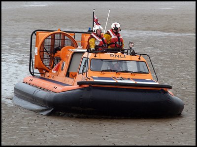
My photographs show a visit by the Morecambe RNLI Station hovercraft, "The Hurley Flyer", to Fleetwood and Knott End. This small, 30 knot, twin diesel craft is manufactured by the UK company, Griffon Hovercraft, and is designated model 470TD. The vessel entered the River Wyre accompanying the Fleetwood lifeboat, then left the water to rendezvous with its transporter vehicle, before crossing the river and berthing at the Fleetwood RNLI station. The main photograph shows the hovercraft crossing the exposed sand at Knott End. The smaller photographs show the vehicle on the river and on the exposed mud. All the images were taken with a long zoom lens with the ISO at 200 to compensate for the heavily overcast day.
photograph & text (c) T. Boughen

Sunday, December 24, 2006

Merry Xmas x2

click photo to enlarge
In recent years the US-inspired "Happy Holidays" has been used by some as a way of passing on best wishes at this time of year without using the religion-specific "Merry Christmas". This new construction seems pointless to me: in the UK the words "Season's Greetings" has long performed this task admirably, and is often used by those of no religion as the mid-winter salutation of choice.

Periodically those of a Christian persuasion have fulminated against the substitution of "Merry Xmas" for "Merry Christmas". The former is seen as a modern, ad-man's corruption of a traditional spelling, and church-goers often reject it for taking the "Christ" out of "Christmas". Now, whilst it's true that some may use Xmas as a non-religious greeting, and others for its brevity, or even for design considerations, the abbreviation is a construction of very long standing that has been used by Christians for centuries. It derives from the early Christian conflation of the Greek "chi" (X) and "rho" (R) to represent Christ's name. In the fifteenth century, Gutenberg used Xmas when setting the first movable type, and its use crops up regularly between that time and the present day. Religious conspiracy theorists are wrong if they think it is modern society's way of secularising Christmas.

My photograph shows the cappuccinos that my wife and I were given recently when we stopped at a cafe during a break in an afternoon walk. The chocolate had been sprinkled through a metal template to spell the greeting on the top of the drink. And so, in this season of goodwill, I use this photograph to pass on my best wishes to you for a "Merry Xmas" multiplied by two! Or, if you prefer, "Merry Christmas", "Season's Greetings", and "Happy Holidays" to everyone!
photograph & text (c) T. Boughen

Saturday, December 23, 2006

A carefree time?

click photo to enlarge
Have you noticed how childhood is ending sooner but adulthood is starting later? I'd noticed the first of these trends, but a journalist drew my attention to the second. In recent years I've come across little girls of nine or ten years old who think and dress like teenagers, and scorn the idea of playing with "toys". Boys are not immune from this trend, though they seem to trail the girls by a couple of years. By the same token, there seems to be an increasing number of men who are thirty five going on eighteen! They are living the lifestyle of people half their age, and, what's worse, thinking like them too. It's my feeling that this elongation of youth at the older end affects women less: perhaps it's the responsibilities of motherhood that explain that difference.

There are reasons connected with diet and the earlier onset of puberty that go some way to explaining why children have teenage values earlier. But it wouldn't be happening to the same extent if there weren't societal forces - advertising, popular culture, increasing work hours - entering the equation too. Having spent the last thirty odd years as an educator I've been able to see these changes at first hand, and I have to say that they trouble me. Some would argue that I'm being starry-eyed, harking back to a view of childhood that existed for only a short period in rich countries in the twentieth century. Maybe. But if a period of carefree innocence and joy is possible in a child's life (and I know it's only a dream for some children) what is to be gained by shortening it? As for the later arrival of adulthood, well, I need to think more on that. You may say what's wrong with being young at heart, and I say "nothing - it's to be commended", but you surely need to worry if your mind stops developing and you become a thirty five year old Peter Pan!

The sight of these kids climbing on some pier remains at St Anne's, Lancashire, prompted these thoughts. They were making their own entertainment, and enjoying some of the freedom of youth. Like many piers, the one at St Anne's, built in 1865, suffered from fires. These shortened its length from 914 feet to 600 feet. This decaying structure with its twin tapering iron columns, surmounted by spheres, is all that remains of the seaward tip. I took the photograph in the late afternoon using a long zoom lens at 300mm (35mm equivalent). The camera was set to Aperture Priority (f6.3 at 1/800 sec), with the ISO at 100, and the EV at -0.7.
photograph & text (c) T. Boughen

Friday, December 22, 2006

A view of Mars

click photo to enlarge
Why isn't the whole world wearing all-in-one suits, driving flying cars, and eating gloop from a tube - the sort of liquidised mush that contains everything required to sustain a healthy person? I ask because that is the kind of future that, in the late 1950s and early 1960s, I thought we all faced! Admittedly this vision was gleaned from children's comics, but I'm sure it wasn't too far removed from the predictions of more academic seers and sages.

The accelerating pace of change that the western world experienced after the end of WW2 caused us all to look forwards, into the future, and outwards, into space. Children in the UK gobbled up the stories of Dan Dare, the "World's No. One Space Hero", in the "Eagle" comic. His flights through the solar system, encounters with aliens, and particularly his fantastic spaceships, illustrated by Frank Hampson and subsequent artists, created a future that the young mind could believe to be possible. Our picture of what other planets looked like was formed by what telescopes could see, what scientists could deduce, and what the imagination could invent. My childhood picture of Mars had the famous "canals" surrounded by the decaying buildings of a long-dead civilization, slowly rusting away into the russet dust of the red planet. Those imaginings have since been shattered by satellite images, and the film and stills sent back to earth by remotely controlled vehicles.

However, when I processed this photograph, taken below the Central Pier, Blackpool, I found that I had created an image from my childhood mind! There is the red, sandy surface of Mars, there too the water of a "canal", and the rusting skeleton of a strange building casts its shadows across the empty landscape. Well, perhaps only in my minds eye, and the gulls do slightly spoil the illusion (or is it delusion)! I took this shot for the red cast of the late afternoon colours, the reflections, the shadows and the interesting silhouettes of the pier's supports. I used a wide zoom lens at 24mm (35mm equivalent), the camera set to Aperture Priority (f6.3 at 1/400 sec), with the ISO at 100, and the EV at -1.7.
photograph & text (c) T. Boughen

Thursday, December 21, 2006

Surrealistic seagull

click photo to enlarge
I've never been a big fan of the Surrealist painters and I sometimes wonder why. I like the quirky, the individual, the mould- breakers, and consequently aspects of Dada appeal to me, though I can't forgive how they paved the way for many of the modern day charlatan-artists. But when it comes to Surrealism proper, say Dali or Tanguy, well, they leave me cold. I do confess to a sneaking regard for the idiosyncratic landscapes of de Chirico who influenced the Surrealists, and was often claimed as one of their own, but in general the so-called "dreaming reality" of their imagery, the otherworldliness and the slick paintwork evokes no other emotion in me than slight disgust.

Perhaps, like the artists associated with Art Nouveau, they tried too hard to be different. Maybe their work can only be read in one particular way, and I don't buy what they offer. Whatever my reasons, I realise that there are plenty of people who are fascinated by Surrealism. The man in the street, asked to name a twentieth century painter, is as likely to come up with Dali's name as anyone else's.

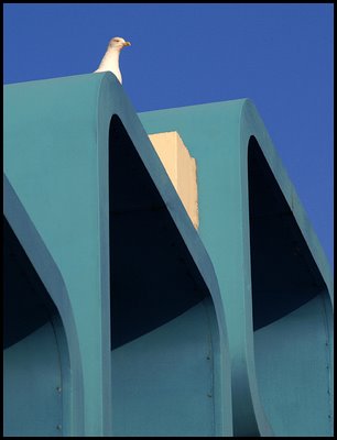
This photograph of a gull peering over the open-work shapes that decorate the top of the "Palace" night club on the promenade at Blackpool, Lancashire, isn't Surreal in any true sense of the word. But it is a bit odd, and that oddness set off today's train of thought. I noticed the bird against the sky, and saw how the shadows of the rounded squares seemed to point out its presence. The colours were unusual too, and so I used a long zoom lens at 300mm (35mm equivalent) to select those parts that made what I think is a good composition. The camera was, as is usual with me, set to Aperture Priority (f6.3 at 1/400 sec), fast enough to hand-hold. On this bright December day the ISO was 100, and the EV was -0.3.
photograph & text (c) T. Boughen

Wednesday, December 20, 2006

Aagh! Another sunset!

click photo to enlarge
If there is a subject that few photographers, amateur or professional, can resist pointing their camera at, it's a sunset. Even photographers of many years standing, whose archives runneth over with sunsets, can't stop themselves taking just one more!

But photographers are only falling for the same things that seduced painters for centuries, and attracted cinematographers and film directors in more recent times. Anyone involved with graphic arts is interested in colour, particularly tints, and sunsets provide plenty of those in reds, oranges, yellows, purples even. Such people also love contrast, and sunsets often incorporate shadows, silhouettes and reflections, all providing the striking shapes that make an image sing. And finally, the suggestion of mood is central to many artistic endeavours, and here too, a sunset does that wonderfully well. You want splendour and magnificence - use a sunset! A sense of closure? The sunset will give it better than just about any other device. What's more, it will even do it in black and white. So, I make only a slight apology for posting my third (or is it fourth) sunset out of about two hundred and fify images. However, I can't promise it will be the last!

This sunset shows Blackpool's North Pier silhouetted against the light as the sun heads down into the Irish Sea. I placed the twin pavilions in the centre of the shot and balanced the off-centre sun with some attractive pools that the ebbing tide had left on the beach to the right. The image was taken with a wide zoom lens at 22mm (35mm equivalent), the camera set to Aperture Priority (f6.3 at 1/1600 sec), with the ISO at 100, and -1.0EV.
photograph & text (c) T. Boughen

Tuesday, December 19, 2006

Faults, terraces and pattern-making

click photo to enlarge
A number of fault lines cut through the landscape around the market town of Settle in the Yorkshire Dales. Broadly speaking they produce millstone grit to the south and west of the settlement, and carboniferous limestone to the north east. Other rocks complicate this pattern, but the casual observer will note only this main change in the type of stone.

The difference is most evident in rock outcrops and, particularly, field walls. The millstone grit walls are made of dark stone laid down in the sea, and feature prominent, and obviously water-worn, quartz pebbles. The limestone walls are constructed of much lighter grey stone made of the bodies of microscopic fossilized sea creatures, though sometimes larger shells and corals can be distinguished. Limestone is the preferred stone for farm buildings because, though it is softer and less durable, it often comes in flat pieces, and where it doesn't can be shaped this way more readily. So, barns like the one in the photograph are often made of limestone even though the nearby stone, which was used for the walls, is millstone grit!

I took this photograph as a semi-abstract composition that relies on the barn as the "eye-catcher"amongst the lines of the walls and terraced hillside. I had always believed the latter to be the remains of west facing terraces made by medieval farmers to maximize the sloping land above the wetter lower land. They may be just that. On the other hand they could simply be reflecting the underlying geology, or, they may be evidence of soil "creep" down the hillside. Whatever the origin, I felt they helped to make an interesting arrangement. The photograph was taken with a long zoom lens at 216mm (35mm equivalent) rested on a convenient wall. The camera was set to Aperture Priority (f6.3 at 1/100 sec), ISO 100, with -0.3 EV.
photograph & text (c) T. Boughen

Monday, December 18, 2006

Walls and neighbours

click photo to enlarge
"Something there is that doesn't love a wall", Robert Frost (1874-1963), US poet

Robert Frost was right when he penned this line for his poem "Mending Wall". His father's words in the same poem, that "Good fences make good neighbours", is a view to which many would subscribe. But Frost's poem is not about walls as such, rather it is about the barriers that we erect between ourselves, and the need for those barriers to be taken down if we are to establish proper relationships.

What would he have made, I wonder, of these drystone walls threaded across the undulating ground of the Yorkshire Dales, walls that are widely admired, loved even! Many of them were built following the Enclosure Acts to delimit each farmer's property, but also to subdivide the holding into manageable areas for grazing sheep and cattle. Interestingly, many of the elongated fields, and individual farms, stretch from the edge of the River Ribble (just out of shot below the lowest trees) up to the exposed summits of the lower hills with their outcropping rock, cliffs and scree. This shape is deliberate, and ensures that each farmer has a share of the good "bottom land" near the river (the best pasture), the mid-range land that responds to improvement by clearing and fertiliser, and the exposed higher ground with its rough grazing, suitable only for foraging sheep.

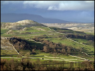
It was these drystone walls, lines across the landscape that look like they have been drawn with a child's unsteady hand, that prompted my photograph. It shows the west side of the valley of the Ribble between the hamlets of Stackhouse and Knight Stainforth. The prominent limestone knoll, the seeming destination of the longest wall line, is Smearsett Scar, beyond are the cliffs above Wharfe, and the high peak of Ingleborough is the tallest summit, its head invisible in its wreath of cloud. I took the shot from below Blua Crags above the market town of Settle, using a long zoom lens at 300mm (35mm equivalent) rested on a drystone wall. The camera was set to Aperture Priority (f6.3 at 1/200 sec), with the ISO at 100 and EV set at -0.3.
photograph & text (c) T. Boughen

Sunday, December 17, 2006

Going back

click photo to enlarge
What's thought can't be unthought, what's said can't be unsaid, and what's done can't be undone: in life there is no going back. Yet go back we do, thinking that we can find the past. But we never can. All we find are the triggers of memories.

This landscape - Warrendale Knotts and Attermire Scar - in the Craven uplands of Yorkshire, triggers my memory like few other places. Year after year I have returned to this place, yet, with one or two exceptions, it is always my childhood memories that are provoked as I smell the wild thyme, hear the curlew's lonely cry, and study the fossilised coral in the drystone walls. The crags, screes, caves and cliffs of these distinctive hills were my childhood playground. Over this land, with friends or alone, I carried my bow and arrow, built dens, fought the foe, and wondered if, somewhere in an undiscovered cave amongst these rocky outcrops, a stone age man and his family still lived, shunning contact with our modern world. With age comes knowledge and expanding horizons: the childhood magic that these hills held for me became overlaid with historical and geological knowledge, and I gained a different appreciation of their beauty. I will continue to walk these hills as long as my legs will let me, and I hope to still enjoy them as an adult, and as a child!

My photograph was taken towards the end of a sunny walk with the clouds starting to build. As I pointed the camera I wished we'd been there a little earlier to benefit from the full sun. But, when I reviewed the images at home I was glad for the shafts of light, the heavy clouds, and the saturated colours. I used part of a near outcrop of rock and the end of a wall as foreground interest and an opening through which to view the rugged vista. On this occasion I used a short zoom lens at 40mm (35mm equivalent), with the camera set to Aperture Priority (f6.3 at 1/200) sec, ISO 100, with -0.3EV.
photograph & text (c) T. Boughen

Saturday, December 16, 2006

Death by neglect or makeover

click photo to enlarge
Maybe I feel the way I do because I remember them as they were. On the other hand it may be my age, and the onset of that cantankerous period that affects many! Whatever the reason, I'm getting angry about what's happening to barns!

Too many barns in the Yorkshire Dales are falling down or being converted into houses. Neither of these outcomes is acceptable because of the major contribution that these buildings make to this unique landscape. I remember the top barn in the photograph as it was forty years ago. It was used by the farm, and its stone roof and walls were a joy to behold. The arched "porch" entrance with its datestone gave the building an architectural feel. This was a building that spoke volumes about the pride of its creators. Now it is neglected, roofless, full of weeds and saplings, a pitiful sight. Its location means it has escaped the other graveyard route for old barns - being turned into a twee rural residence. On the day I took this photograph I passed a barn that had undergone an "olde worlde cum modern" conversion. Large wood-framed picture windows, non-traditional rusticated stonework, gleaming silver central heating chimney, cobbled courtyard, new-old "lantern-style" streetlight - the very image of its owners' misconception of the past, but with all mod cons. There was a time when planners tried to rein in these crass conversions. No more it seems. As for barns that are becoming piles of rubble, on what are farmers spending the billions in subsidies that they receive each year? Quad bikes and Land Rovers?

My photograph was taken with a long zoom lens at 208mm (35mm equivalent). I was attracted by the slanting early morning light, and the shadows made by the two barns and the surrounding network of millstone grit walls. The camera was set to Aperture Priority (f5.6 at 1/200 sec) with the ISO at 100, and -0.7EV.
photograph & text (c) T. Boughen

Friday, December 15, 2006

Off to roost

click photo to enlarge
Winter is a great time for watching birds. The trees are bare, and birds are much more visible in woodlands and gardens. Winter migrants have taken the place of summer visitors, and a number of resident birds have their populations swollen by an influx of continental birds fleeing the colder weather. Moreover, even the least interested in our feathered friends cannot fail to notice that in winter many bird species go around in very big flocks.

Each evening large, dipping and swirling clouds of starlings fly over my house. These flocks, many thousands strong, are made up of smaller groups that have spent the day foraging over fields and woods, gardens and villages. They are heading for a large roost on a seaside pier where up to thirty thousand congregate nightly. These small birds keep low on their evening flight, but higher up are gulls, also heading for their favoured nightime roost. Some prefer a freshwater lake, others congregate in particular fields, whilst many prefer a coastal sandbank or island. Surveys have shown that about two and a half million gulls cluster in roosts across Britain each night.

If I walk down to the seashore in winter great swarms of knot, looking like swirls of smoke, can be seen flying offshore as the tides drive them from one feeding place to another. And on the edge of the water, looking, at a distance, like dark stranded weed, stand multitudes of oystercatchers and turnstones. To see these birds take to the air, twisting and turning together as one, perhaps startled by a peregrine as it dives into the panicked flock, is a wonderful sight. So, why do birds gather in this way? Well, experts tell us that it's partly to more effectively find food, partly to pass on species characteristics to younger birds, but also for protection from predators - many eyes have a better chance of seeing the enemy early, before it is upon them! Whatever the reasons, these winter displays make a marvellous spectacle for those who care to look.

My photograph shows gulls heading for a roost as the sun sets over the roofs of Fleetwood, Lancashire. The full image didn't have enough detail across the frame to tie the composition together, so I've cropped a vertical section from it. I took the shot without a tripod, but with the camera firmly pressed against an upright post. I used a long zoom lens at 300mm (35mm equivalent), with the camera set to Aperture Priority (f6.3 at 1/160 sec), ISO 100 with 0EV.
photograph & text (c) T. Boughen

Thursday, December 14, 2006

Made to last?

click photo to enlarge
"It's better to burn out, than to fade away", Neil Young (1945- ), Canadian-born musician

Neil Young's not fading away, but still enjoying life and making good music that people want to hear. And the surviving members of The Who, who sang "hope I die before I get old", continue to do what they do best, and now positively revel in their longevity.

It seems that the idea of living fast and dying young is less celebrated than it was, though there will always be those who recklessly follow that path. No, today it is "things" that we don't want to last. Our society, at a time when the environmental cost of a short product life is becoming very evident, is still hooked on "buy-use-dispose-replace". Furthermore, our industrial skills are now such that we can easily make products cheaply that will last a lifetime. However, even when we've bought potentially long-lasting articles we still cast them aside and replace them with new ones, just for the sake of fashion. I was recently hearing about "must have" kitchen work-tops made of granite being torn out and used as building rubble, and being replaced by the next "must have" surface. Buying a product quarried from the earth that can last a lifetime, using it for a few years, then replacing it with the latest craze is unforgivable - it should be a criminal act! The same applies to stainless steel kitchenware. The cutlery, pans and other utensils made of this durable material are, apparently, replaced with broadly the same frequency as plastic and aluminium. It seems absolutely pointless to buy and use an enduring material like stainless steel if you don't take advantage of all its qualities.

My photograph shows two stainless steel utensils that, in view of what I've written above, had better last a lifetime! The smooth, gleaming, pierced metal, with those regularly spaced holes seemed a suitable subject for an "abstractish" macro shot. I arranged them in an overlapping, balanced composition, maximising shine, shadows and reflections, and gave the shot a slight green cast. I used a 70mm (35mm equivalent) macro lens set to Aperture Priority (f18 at 1/80), with the ISO at 100, and the EV at -1.0.
photograph & text (c) T. Boughen

Wednesday, December 13, 2006

Products and aphorisms

click photo to enlarge
"You get what you pay for" is a common aphorism to which the majority of people would subscribe, and like most sayings of its kind, it embodies some truth. However, like many other pieces of homespun wisdom there are times when it is very wide of the mark.

Anyone buying a gas fire, a vacuum cleaner, or a set of wine glasses, might reasonably expect that paying more money would result in a purchase that is better designed, has greater reliability, lasts longer, and functions at a higher level than a cheaper product. In the fairly recent past I've bought all those items. The fire was expensive, stylish in a "hole in the wall sort of way", and gives good heat. But the high-tech method of ignition is ineffective, and there is no back-up system for when it refuses to work as designed. A cheaper fire would undoubtedly have been more reliable. My vacuum cleaner is a Dyson, and for all its its design awards has fundamental flaws. Not only is the styling "kiddy-lurid", the cord is low quality: it cracked, shorted, and melted the plastic! The extending tube is flimsy, has also broken, and is expensive to replace. Repairing the on/off switch that failed required me to crack part of the casing open because screws barely feature in its construction. This expensive machine will have a relatively short lifespan despite my surgery. Finally, the other day I bought two packs of 4 "cafe style" wine glasses for 89p a pack. They have an elegant, classic design, and are a pleasure to use. My cut-glass crystal wine glasses which must have cost ten or twenty times as much, look no better (I would say worse), are too tall, hence not sufficiently stable, and sit on a shelf gathering dust!

A dull day found me photographing my newly acquired glasses, trying to get a "different" composition out of them. My image shows part of two, one upside down, in what I hope is an asymmetrical but balanced composition. I used a 70mm (35mm equivalent) macro lens and a dedicated flash bounced off a piece of white fibreboard. The camera was set to Aperture Priority (f18 at 1/80 sec), ISO 100 and -0.3EV. I did extensive post processing, and turned the slight blue cast deeper by manipulation of Curves.
photograph & text (c) T. Boughen

Tuesday, December 12, 2006

Photographic Tip Number 127

click photo to enlarge
There is no shortage of advice available these days for the fledgling photographer. Books aimed at the new- to-digital -photography abound. Internet sites offer guidance, and kind-hearted folks on photography forums will give freely of their time to tell you how to improve your images.

Many of the pearls of wisdom are old chestnuts (mixed metaphor intended), but to the beginner these can be downright baffling. "Shoot with the sun behind you", you're told, and in the next breath you're advised to "be careful not to get your shadow in the shot". Well, you think, the best way to implement the second piece of advice is to ignore the first! As you progress in the hobby you come across more "advanced" thinking and theories. "Remember the rule of thirds and position your subject at an intersection." When you've worked out that this has nothing to do with "street photography", you discover the superiority of asymmetrical composition over all other types. And then there's "blown highlights". Now to the man in the street this suggests fashion photography with blond streaks. But no, you discover that it's all to do with underexposing a shot to prevent the brightest parts becoming pure white - which you discover has no colour!

The problem with all this advice is it never includes any really useful snippets. For example, at no point in my photographic education did anyone tell me that if you saw a lovely, gnarled tree that you could stand under and photograph as a silhouette against the sky, you should first check whether or not it contains birds. Nor was I told that in the game that birds play where points are awarded for "spotting" people and cars, a white car gets a mere 1 point, a red car gets 5 points, a pedestrian is worth 20 points, but a photographer warrants - wait for it - a massive 100 points! If they had I wouldn't have pointed my expensive camera and even more expensive lens upwards at this tree without first checking for avifauna. But that's what I did. And they "spotted" me good!

So, this very ordinary tree silhouette is posted not for its photographic merit, but as an example of the sort of illustration that could accompany "Photographic Tip Number 127 - Always check for birds before pointing your camera up into a tree".
photograph & text (c) T. Boughen

Monday, December 11, 2006

Nautical knowledge

click photo to enlarge
As I watched these two yachts sail out of the mouth of the River Wyre into the Irish Sea on a cold, calm December day, I quietly reflected that I know next to nothing about modern boats. However, I thought, I can keep up my end of the conversation in a discussion about eighteenth and nineteenth century warships and merchantmen! From "first rates" to "sixth rates", frigates to sloops, xebecs to luggers and polacres, I'm familiar with them all through the writing of Patrick O'Brian.

The twenty novels (warning - plots revealed later in link) describing the adventures of Captain Jack Aubrey and his ship's surgeon (and intelligence agent), Dr Stephen Maturin, are a wonderful combination of high adventure, political and personal intrigue, naval warfare, science and natural history. For me that's a compelling combination, and I've read the complete collection twice in the past ten years. I'm not usually a fan of the "historical novel", but these books are as different from a typical example of that genre as Beethoven is from Britney Spears. One leaves these stories having been both entertained and informed: these are literate books, and the intelligence of the author shines through every page. An incidental pleasure of reading the novels is to discover just how many of the phrases that we use in everyday life - "the bitter end", "no great shakes", "show his true colours", "square meal", to name but a few - have a naval or nautical lineage. The 2003 film, "Master & Commander: The Far Side of the World", starring Russell Crowe, is a good film and an introduction to the world the novels describe. But it isn't a patch on the books! If you want a few months of deep enjoyment, search them out.

A photograph of distant yachts on a flat sea doesn't offer much visual interest, so I filled the right of the frame with the silhouette of the end of Fleetwood Pier. This acts as a pointer, a frame, and a compositional balance for the yachts, and its reflection adds interest to the water. Fortunately there were a couple of points of colour on the yacht to give accents to this blue and dark brown scene. I used a long zoom lens at 184mm (35mm equivalent), with the camera set to Aperture Priority (f6.3 at 1/500 sec), with the ISO at 100, and -0.3EV.
photograph & text (c) T. Boughen
Sunday, December 10, 2006

SatNav? Nah!

click photo to enlarge
I've had a few brief conversations over the past year where people have tried to convince me that satellite navigation (SatNav) for cars is desirable, essential even. My response has been that if I were a taxi driver or drove a delivery van, then I would find the device very useful, but for the average person it's technological overkill for the cartographically challenged. That's not something that SatNav owners or would-be owners want to hear, hence the brief nature of the exchanges!

I visit a lot of churches following my interest in the history of architecture. I rarely have the address or co-ordinates of the church, so SatNav wouldn't be a great help. However, I always know the village, town or area of the city in which the building is located. Over the years I've got so that I can sniff out a church pretty well, so I'll share some of my search tips with you.

If the church is in a village or small town look for the tower early: it's often the tallest building, but much harder to see when you're among the houses. Look out also for tall trees: a settlement's biggest trees are often in the churchyard. Be aware too of yew trees which often screen a church from view. Head for the centre of the village or small town: the church is usually the oldest building around which everything else grew up. In lowland areas it's often on a rise in a village, above the land that, in the past, was liable to flood, so head uphill. If it's not there, look for a market place; the church is frequently adjacent. Once you're among the buildings of a settlement, street signs are the best indicator. Look for Church Street, Church Gate, St Whatever's Road, or any name suggesting an ecclesiastical building. And, whilst you're looking, enjoy what serendipity brings. It's much easier to do that without an insistent robotic voice telling you where to turn next!

My photograph shows the tower of St Helen's, Churchtown, Lancashire, alongside its tall, churchyard beech trees. The fine, buttressed, medieval tower competes for vertical ascendancy with the trees. It wins in term of solidity, but the trees have surpassed it for height! I used a wide zoom lens at 22mm (35mm equivalent) to achieve the unusual composition. The camera was set to Aperture Priority mode (f6.3 at 1/320 sec), ISO 100, with -1.7EV.
photograph & text (c) T. Boughen
Saturday, December 09, 2006

Insurance and risk

click photo to enlarge
An envelope flopped through my letterbox yesterday. On the cover it said, "Important - insurance policy enclosed. Do not throw away". Resisting the temptation to screw it up and put it straight in the bin, I opened it and found that my water company had sent me a document that required only my signature (and money of course) for me to be protected against "water supply pipe emergencies". Call me careless if you will, but I've never, in all my adult life, had insurance against such an eventuality. What's more, I've never had a water supply pipe emergency! And, I imagine that if there was a strong likelihood of me having such an emergency, then the company certainly wouldn't be offering me insurance!

It sometimes seems to me that western society is obsessed with eliminating all risk. People insure their houses, cars, holidays, pets, appliances, even their teeth: virtually anything can be insured. And yet, at the same time, "adventurous", risky activities and sports, such as bungee jumping, white water rafting, parachuting, car racing, and even kite boarding, are becoming ever more popular. The adrenalin rush that these activities give seems to be a required antidote, for some people, for the absence of "real" adrenalin stimulators such as chasing and killing your dinner, or escaping from marauding invaders. And I suppose that risky activities that give excitement, without impinging on the enjoyment of others, are to be encouraged. They are certainly a better way of getting a "buzz" than beating up teenagers or mugging old ladies.

I took this shot yesterday on the beach at St Annes, Lancashire, when I was photographing sand dunes. The kite boarder was racing up and down in the surf by the edge of the sea. I've never taken such a shot before - I usually favour static subjects! However, this proved to be one of only a few, because shortly after I'd taken it I was chased off the beach by a heavy rain storm! I used a long zoom lens at 136mm (35mm equivalent), with the camera set to Aperture Priority (f5.6 at 1/640 sec), and the ISO at 100, with -0.3EV. The distance between the kite canopy and the rider meant that these were very small elements in every shot. On this image I've cropped heavily to give these elements greater prominence, and I've done quite a bit of work on the contrast and colour.
photograph & text (c) T. Boughen

Friday, December 08, 2006

A bigger splash

click photo to enlarge
All waves are not equal. Some are bigger than others. Everyone knows about the tsunami, a wave triggered by an undersea earthquake. But fewer are aware of the "rogue" or "freak" wave that can suddenly appear and sink even the largest ship.

Such waves are legendary, but until recently scientists dismissed such reports, counting them alongside stories of mermaids and sea monsters. Now, however, there is ample evidence of their existence from photographs and radar satellites, It is common for mid-ocean storms to have waves 7m high, and exceptional waves reaching 15m. However, ships and oil platforms have now measured "rogues" twice this height - up to 30m. A ship encountering the trough preceding a rogue wave can expect to be hit by a wall of water bearing down with a force of 100 tonnes/sq m. Marine architects routinely construct ships to withstand 15-20 tonnes/sq m. In an encounter with the same rogue wave in the South Atlantic in 2004 the "Bremen" and the "Caledonian Star" had their bridge windows 30m above the sea smashed, and lost all power and instruments. The unexplained loss of many ships is now felt to be the consequence of meeting one of these giants.

The wave in my photograph is not a rogue - they are creatures of the deep sea. But it was an unexpectedly large one. The couple on the promenade had been lulled into a false sense of security by the smaller waves that had been breaking at a lower level. You can guess what happened next! The concave sea wall tried to turn the wave back, but the strong onshore wind had other ideas! They were too slow to get out of the way, and got soaked. I took my photograph from a higher part of the promenade, shooting against the light with a long zoom lens at 86mm (35mm equivalent). The camera was set to Aperture Priority (f6.3 at 1/4,000 sec), ISO 200, with -1.7EV.
photograph & text (c) T. Boughen

Thursday, December 07, 2006

The allure of the sea

click photo to enlarge
Water is seductive! And that allure is what causes many people to drown. In recent days England's west coast has experienced strong, onshore winds, combined with daytime high tides. These have driven the sea higher up the shore than is usual, to the very edge of the paths that people usually walk in safety.

Crashing waves and sparkling, blown spray, illuminated by winter sun is a magnificent sight, and the palpable power of the turbulent water is exhilarating. It causes some people to stand too close and to be plucked into the water by the unexpected wave that is bigger than its companions. Once it has a person in its grasp a stormy sea is reluctant to give them up. Every year the sea claims victims along the Fylde Coast. Sometimes they are holiday makers who are simply reckless in rough weather, but frequently they are young men whose judgement has been clouded by alcohol. When one of them goes into the water a second often follows in a brave but foolhardy attempt at rescue. Invariably the sea claims two victims on those days.

My photograph shows the high tide running up to the top of a slipway near the promenade at Fleetwood, Lancashire. This area is usually well above the water, but on this particular morning it was a slippery, treacherous place. A strong wind had blown a vegetable bag away from someone who was collecting pebbles, and it became stuck on the handrail. My eye seems to light upon a patch of strong colour against a subdued background, to the point where it has become a "signature" image (see here, here and here). I couldn't resist this one, and composed a shot with the rail as a strong leading diagonal, the red bag as the foreground subject, and the sea the more distant interest. I used a long zoom lens at 114mm (35mm equivalent) with the camera set to Aperture Priority (f6.3 at 1/320 sec). The ISO was 100, and -0.3 EV was set. As I always do, I shot in RAW and converted the file to JPG.
photograph & text (c) T. Boughen

Wednesday, December 06, 2006

Things ancient & modern

click photo to enlarge
It's an interesting exercise to go through a house and identify which items would have been present, albeit in a different form, five hundred years ago.

Chairs? Only the well-to-do would have had them: stools and benches would have been more widespread. Tables? Yes, in some houses. Beds? Not for the masses! Plates - maybe, but platters for many. Knives? Yes. Forks? Not necessarily. Pictures? Only if you had enough money left over after buying the essentials and more obvious luxuries. Light? Usually candles, tallow lamps, firelight, or the light of day, depending on income.

The rate at which western society acquired material possessions started to accelerate in the C18, picked up speed in the C19, and in the second half of the C20 was unprecedented. How much longer it can carry on, and at what point we decide we have "enough" (if we ever do) is a moot point. However, at various times in this breakneck rush to amass "things", people have wanted to hold on to what they remember from the past. For example, in the early C21 you can buy telephones mimicking the design of the late C19, candles are popular items in homes even though electricity is everywhere, and hand-made cards are as popular as they were in the Victorian era. Furthermore, in churches you can still see C18 chandeliers like the one in my first photograph, whilst down the road a church can display a C21 electrolier (second photograph), aping the design of two hundred and fifty years earlier.

My photographs were taken in two very different churches, one quite ancient, and the other relatively new, dating from 1842. I used zoom lenses for both shots, and tried to shoot from directly below the lights. I raised the ISO to 400, and hand held the camera in both cases. Both shots are square crops from larger images, and present unusual views of objects that would be instantly recognised from another angle.
photograph & text (c) T. Boughen

Tuesday, December 05, 2006

Dabbling with flowers

click photo to enlarge
I'm interested in everything and specialise in nothing. Consequently I tend to be a dabbler - and I'm happy to be one. Perhaps that's why I ended up with a career in education! During my life I've had a few interests that I've taken to a deeper level and continued for many years, notably the history of architecture, photography, and the graphic arts. I play some musical instruments, not very well, but doing so gives me pleasure. I've continued with that hobby for many years, and I made use of music regularly in my day job. But, I've found that I can't help taking an interest in whatever comes my way, be it astronomy, politics, lierature, history, science - everything. I'm convinced my life has been richer for having wide interests rather than a narrow focus.

When it comes to photography, my approach to the hobby pretty much mirrors my approach to life. I don't specialise, and I point my camera at most things - though portaits and people don't tend to figure much! There's probably a strongish "graphic" thread in my images, but I don't pursue that style exclusively. However, every now and then I wish I could do certain types of photograph better. I have that feeling at the moment about flower photography, and consequently I'm going to try and get some better shots from this subject.

There are often carnations in my house, and this photograph is my attempt to get a decent shot from a bunch of them. I've done individual heads before, and been quite pleased with the result (here and here), but groups are, for me, harder. So, this time I paid more attention to the background colour, the arrangement of the blooms, and the lighting. I'm reasonably happy with the outcome, but not entirely satisfied, and I haven't worked out why yet! I used a 70mm (35mm equivalent) macro lens to take the photograph, with the camera at 100ISO, set to Aperture Priority (f16 at 1/2.5 sec) with -0.3EV. I bounced a dedicated flash set to TTL metering from a large piece of foam board above the flowers.
photograph & text (c) T. Boughen
Monday, December 04, 2006

Teasels

click photo to enlarge
The teasel (Dipsacus fullonum) is a locally common plant in the UK. A tall, handsome biennial, with a prickly hollow stem, it can grow up to five or six feet high. In July and August the large purple flower heads are highly visible, but not as prominent as in the autumn and winter, when the dried, prickly heads have turned brown.

The name teasel derives from the Anglo-Saxon "taesl", meaning to pluck or pull. And this is a clue to the former use of this interesting plant. The dried flower heads were, for centuries, employed in the "teasing" of cloth. That is to say, the prickly hooks raised the nap of the fabric (particularly wool) by being drawn over the material. The heads were fixed in bundles on a "teasel gig" and the operative would use this to brush the surface. When, during the C18 and C19, mills became mechanised, teasel heads were fixed to the machinery and continued to do their essential work. Metal combs took their place in the C20. However, many insisted that the natural hooks of the teasel did the job better, because if they snagged they broke off, rather than ripping the material as was often the case with the new combs. Today it is only small scale craftspeople who continue to tease their material with Dipsacus fullonum.

I took my photograph in a nature reserve, a place where teasels are encouraged to thrive because of the food the heads offer wild birds, finches in particular, through the winter. In a dry, flat area of land next to a shallow lake, hundreds of heads were swaying in the wind. Against the light, the radiating, velcro-like hooks, gave each head a halo. I selected a diagonal composition of heads and stalks and used a long zoom lens at 200mm (35mm equivalent) to isolate them from the surroundings. The camera was set to 100 ISO, Aperture Priority (f7.1 at 1/250 sec) with -1.0EV.
photograph & text (c) T. Boughen

Sunday, December 03, 2006

History in stone

click photo to enlarge
In England the church is usually the oldest building in a village. If we exclude those churches that re-used Roman bricks and stones, the most ancient examples have walls and sculpture dating back to around 700AD. However, these are exceptions, and Saxon (C10) and Norman (C11) architecture is the oldest commonly found.

Of course, a church built during those remote days has almost always been extended and improved in subsequent centuries. Frequently a north aisle, or sometimes north and south aisles, have been added to accommodate an increasing population. This usually meant inserting columns between the nave and the extensions. Often the height of the wall above the columns was increased and windows inserted to return light into the nave. When lead became cheaper and more widely used as a roofing material, the pitch of the nave roof was often lowered, leaving evidence of this in the form of a pointed drip-mould on the east face of the tower. The tower itself would usually be increased in height and decoration. Most of these changes would have taken place in the C14, C15 and C16, and the architectural style of the additions usually betray their date.

In the C18 and C19 a south porch and further extensive work was frequently undertaken. And, throughout the life of the building the villagers would be laid to rest in the churchyard, or if they were "well-to-do", in the church itself, their tombs chronicling the changing fashions of the times. Consequently the village church is a repository of English architectural and social history, without equal, and as such, deserves our care.

Most of what I have discussed above applies to the church of St Michael in the village of St Michael's-on-Wyre, Lancashire, shown in the photograph above. Its leaning walls and rough-hewn stonework have survived many passing generations, changes in liturgy, and upstart architectural styles. It stands as both a historic monument and a book of the past, as well as a continuing focus for the faithful of the village. I took my photograph on a sunny December morning, using a wide zoom lens at 24mm (35mm equivalent) to include the foreground "table tomb", the churchyard, and the southeast view of the building. The camera was set to Aperture Priority (f13 at 1/100 sec), ISO 100, -1.3 EV (to keep the cloud detail).
photograph & text (c) T. Boughen

Saturday, December 02, 2006

Pernicious pylons

click photo to enlarge
I hate pylons! They are a blot on the landscape almost without comparison. Every piece of our green and pleasant land that they cross is disfigured by their presence. And every grim industrial landscape is taken down a further notch by these eyesores. Wherever I see them they remind me of giant, skeleton, folded, paper-cut people, holding hands, as they stride over uplands and lowlands, farms and fields; an unstoppable army spreading out from their power station bases.

Pylons were first introduced in the UK in the 1920s and 1930s. At the time people protested about their construction, deploring the defacement of the countryside. But others welcomed them because they brought electricity to areas that had hitherto been denied this modern amenity. Today, I'm sure, many people simply don't notice them. However I do, and I frequently mentally subtract their presence from a view to remind myself what we've lost. When, in the late 1990s, the government was casting around for something to commemorate the new millennium, my suggestion was to spend a couple of billion pounds replacing as many pylons as possible with buried cables. Instead we got a fantastically expensive and useless Dome at Greenwich!

The other evening I drove under a line of these metal monsters and stopped to take some shots against the light. A farmer asked me why I was photographing pylons - I think he thought I was a bit odd! When I explained what I liked about the strong, multiple shapes against the light he became more expansive, and told me that kestrels regularly build a nest on the lowest arm of one of them. The graphic qualities of the stacked, receding structures is (I hate to admit!) visually interesting, and that's what drew me into the photographs. I liked how, through the lens, the steel and wires looked like a delicate technical diagram, and I decided to make that the theme of a few of my images. For my shots I used a long zoom lens at 300mm (35mm equivalent), with the camera at 100 ISO, Aperture Priority (f6.3, 1/4,000 sec), with -1.0EV.
photograph & text (c) T. Boughen
Friday, December 01, 2006

Swamp creatures and canals

click photo to enlarge
Yesterday I was hijacked! Or, to be more specific, my browser was hijacked. Some swamp creature had devised a piece of software that was able to by-pass three firewalls and an up-to-date anti-virus program. The effect was that every time I selected a website from my bookmarks list, I was re-directed to a "search" site of the hijacker's choosing. Now you have to possess a certain intelligence to devise such a piece of code. But you display a woeful lack of understanding of the human-kind if you believe that, after you have installed this on a machine against someone's wishes, they are then going to use your search site!

Consequently, after spending a couple of hours doing all the obvious things, I ran a Linux Live CD, searched the web for any reference to this particular hijack software, and got a couple of pointers to potential answers. It turned out that it was a fairly simple routine that directed the browser at specific DNS addresses. All I had to do was over-ride the settings and ask the browser to set the DNS automatically. Now, if you're yawning at the mind-numbing dullness and complexity of all this, and yearning for the simplicities of life, you have my sympathies. So do I. In fact, whenever I walk by the Lancaster Canal I wonder what it might be like to live on a narrow-boat, slowly moving through the country, mooring for the night where I fancy, without the encumbrances of house, garden car, etc. Then the limitations of that ostensibly simple lifestyle force themselves to the forefront of my mind, and I recognise that for me, walking the canal is quite enough!

This photograph was taken near the end of a day at Garstang, Lancashire. I framed a mooring bathed in the yellow light early evening of by shooting from below a bridge with a medium zoom at 36mm (35mm equivalent), the camera set to Aperture Priority (f6.3 at 1/125 sec), and the EV at -1.7.
photograph & text (c) T. Boughen

Wednesday, November 29, 2006

Walking and health

click photo to enlarge
There is a lot of concern in the UK, the US, and some other countries about the increasing body weight of children. Having worked for thirty odd years in education I can attest to the fact that children are not only slightly taller than they used to be, but many are carrying a lot more weight. It isn't hard to work out why. Children are eating more, and more of what they're eating is calorie-packed. And, they're not as physically active as they used to be. Parental concerns about "dangers", the wide availability of cars, a greater variety of entertainment that involves sitting (often in front of a screen), have all impacted on how much exercise children experience.

So, that being the case the remedy is both simple - eat less and better, and get more exercise - and complex, because there are significant pressures militating against this happening. The answer to the problem lies with how we raise our children. Parents need to set an example by walking and cycling more. If they do, our children will follow their example. Our governments need to make these activities safer and easier. Parents need to choose, eat, and serve up food that is less processed, and to discourage "grazing" and the eating of junk. Food suppliers need to stop advertising and selling crap! And, importantly, these changes need to be built into our everyday lives, not tacked on now and then as guilty afterthoughts. Will it happen? Probably, but the pessimist in me says later rather than sooner!

Many people think that a walk by the sea can only be enjoyed when the sky is blue and the sun is shining. However, the couple in my photography knew that high winds and changeable weather are no bar to enjoying exercise. Sadly they were virtually alone in their pleasure. I took this shot looking down on the deserted promenade, and broke the photographic rules by filling the centre of the shot with nothing, putting the main point of interest near the top, and the other interest around the edge of the frame. My lens was, once again, a long zoom at 300mm (35mm equivalent), with the camera set to ISO 200, Aperture Priority (f5.6 at 1/1000 sec) with -0.3 EV.
photograph & text (c) T. Boughen

Tuesday, November 28, 2006

Radial renewal

click photo to enlarge
There is a British disease that, for all I know, afflicts other countries. It has a rapid onset in which the victim's appearance is immediately and painfully ravaged. This trauma is then followed by a wonderful change: the sufferer appears transformed, looks rejuvenated, as though imbued with new life. Unfortunately, this period doesn't last as long as the sufferer would like, and usually a slow and gentle decline sets in. The good news, however, is that low-cost regular treatment can maintain that initial improvement.

The disease is known as small-scale urban renewal! It comes about when a local authority decides that an area is looking scruffy and needs a "make-over". A pot of money is found, ideas are formulated, workmen go in and tear up the local fabric, replacing it with prettier, tidier features. Then the whole project is left to slowly succumb to the everyday knocks that a bustling community delivers to its outside spaces. What rarely seems to feature in these schemes is a budget to allow the maintenance of the new fabric. The idea that spending a little on a regular basis to preclude having to rip everything out and start again a few years down the line rarely seems to figure in anyone's thinking.

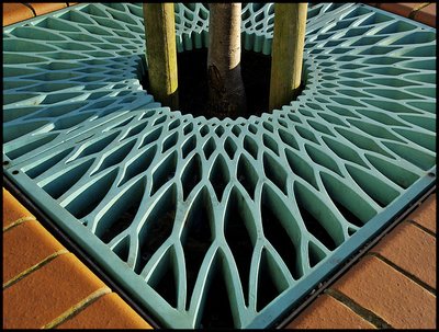
The main shopping street in the town of Fleetwood, Lancashire, had such a make-over a few years ago. New lamps, seating, bins, paving and trees were installed. The whole suite of street furniture was obviously "designed" and colour co-ordinated. It was an undoubted improvement of the area. But the signs of lack of ongoing maintenance are beginning to show, and that's a real shame, not only for the area, but also for the way in which the effectiveness of the initial spending is reduced in value. My photograph shows a decorative metal grid on top of a brick planter that holds a tree and its supports. This is standing up well to the ravages of time. The colour of the grid had clearly been designed to work with the bricks, and I decided to select part of the feature for a symmetrical photograph. I used a wide zoom lens at 44mm (35mm equivalent), with the camera at 100 ISO, Aperture Priority (1/250 sec, f5.6), and EV at -0.7.
photograph & text (c) T. Boughen

Monday, November 27, 2006

The Eyecatcher

click photo to enlarge
The English tradition in landscape gardening grew out of eighteenth century Romanticism. Forsaking the formal garden ideas of the French and Dutch, with their neat geometrical parterres, the English took the paintings and ideas of seventeenth century artists like Claude Lorrain and Nicholas Poussin, and turned them into reality. The grounds of country houses were effectively moulded to look like sublime paintings!

However, the paintings that these wealthy people admired, whilst sometimes based on actual landscapes, were often either augmented by imaginary additions, or entirely the product of the artist's mind. Consequently when designers like Lancelot "Capability" Brown and Humphrey Repton came to create these desired landscapes, they had to add not only lakes, streams, and trees, but also rock outcrops and romantic "eyecatchers". Popular eyecatchers included a columned and domed "temple", a ruined turret on a rocky prominence, a bridge, a statue (perhaps a stag or a nymph) on an elaborate pedestal, or an ornamental cottage (which might also house the gamekeeper). This idea of a focal point in a landscape was carried through into nineteenth and early twentieth century century park design, where bandstands, fountains, sculpture, and pavilions often served as visual punctuations.

The Mount Pavilion, at Fleetwood is just such an eyecatcher, located at the summit of a small park overlooking the sea. Its elaborate design, clock, and columned verandahs, as well as its prominent site, all draw the eye - and they draw the photographer too! My shot was taken on a November afternoon, against the light. The bare silhouetted trees, the building's complex shape and the wispy clouds in the blue sky all pointed to a photograph, but a figure was needed. I rejected a solitary walker - not enough interest. But then a cyclist appeared, giving the necessary focus and detail that the right of the image required. I used a wide zoom lens at 44mm (35mm equivalent), with the camera at ISO 100, Aperture Priority (f9) at 1/320 second, and the EV at -0.7. The high contrast black and white conversion gives greater emphasis to the shapes on that windy hilltop.
photograph & text (c) T. Boughen

Sunday, November 26, 2006

A sign of winter

click photo to enlarge
In my mind the seasons of the year are broadly laid out as follows: Spring (March, April, May), Summer (June, July, August), Autumn (September, October, November), Winter (December, January, February). But of course the seasonal changes never quite happen this neatly. Spring often doesn't seem to get going until nearer April, and winter frequently arrives in November!

So, it's handy to have a visual marker to show when one season turns into another. The removal of the seats on the big wheel on the Central Pier at Blackpool, Lancashire, is just such an indicator. The "summer" season at this seaside resort is extended through autumn to the beginning of November by the renowned seven miles of lighting displays known as "The Illuminations". After about the 5th November leisure-based businesses and shops begin to close down until the following spring. And in my mind, when the big wheel is stripped so that it can better handle the storms that roar in off the Irish Sea, I know that winter has arrived. I can reliably inform you that winter began a couple of days ago!

I took this photograph on a changeable Saturday morning. The intermittent sun had brought a few walkers to the sea front, and the beach cleaning machine had recently finished its work, leaving swirling tracks across the sand that were already being erased by the incoming tide. A couple of men were standing, looking down at the sand, striking poses that reminded me of the enigmatic, meticulously set shots of a Michaelangelo Antonioni film. The combination of all these elements suggested a photograph, and I used a long zoom at 80mm (35mm equivalent), with the aperture set at f5.6. At ISO 200 with EV at 0.3 this gave 1/1600 sec exposure, which was a bit generous, even given the strong wind. But it produced an against-the-light shot that both pleases me, and reminds me that winter is now here.
photograph & text (c) T. Boughen

Saturday, November 25, 2006

Form and function

click photo to enlarge
Study of the history of architecture leads me to believe that the design of the best buildings is usually closely linked to their function. This fairly widely held view is often supported by the mis-quoting of the Chicago architect, Louis Sullivan, who (almost) said "form follows function". I am not so dogmatic as to believe that it is always so - there are exceptions that prove the rule! However, buildings that are designed principally to present an imposing face to the world, often have insufficient regard for their primary purpose of enclosing useful space. That's a problem that I have with a number of the so called "iconic" buildings that architects are producing today.

When I have discussed this issue in the past, and it's usually when I've said I'm not mad about Frank Gehry's work, people have said to me, "In that case, how is that you admire medieval church architecture, one of the most highly decorated styles in history." The fact is that Gothic architecture is a classic example of forms coming about in response to architectural demands. Pointed arches can span wider voids than rounded arches, and distribute roof loading more effectively - that's what prompted their invention. Towers are high so bells can be heard at distance. Buttresses with weighty ornamental pinnacles on top counteract the outward thrust of roofs and vaulting. Window tracery allows the use of smaller pieces of expensive glass and give structural support. String courses, drip moulding and gargoyles prevent water from running down the walls of the building. Most of what we see in a Gothic building that is a direct response to an architectural need.

The little building in my photograph - the Morecambe & Heysham Yacht Club race office - is a further example of that desirable trait. The office is raised to give a clear view of the yachts as they race off-shore. So too is the adjoining viewing platform. The stairs are necessary for access. The whole structure is light, so wood and corrugated metal are appropriate materials. A simple and effective building where a visually satisfying form derives from its function. I took my image with a wide zoom lens at 30mm (35mm equivalent), the camera set to Aperture Priority (f6.3 at 1/640 sec), at ISO 100 with -0.3EV. The wide angle allowed me to compose a shot that shows the pleasing back and forth of lines within the structure. A relatively high contrast black and white conversion emphasises these qualities.
photograph & text (c) T. Boughen

Friday, November 24, 2006

Heritage or ephemera?

click photo to enlarge
The question of what to preserve from our built heritage provokes as much argument as agreement. In the UK, government organisations like English Heritage and charities such as The National Trust are influential in deciding what remains from our past. So too are interest groups like The Victorian Society, or The Twentieth Century Society. However, when it comes to preserving individual buildings it sometimes seems that everyone wants a say.

The most famous (or infamous) piece of architecture in Gateshead is a reinforced concrete car park built in 1964. It came to prominence for two reasons. Firstly, many architects and engineers thought it a good example of the architecture of the period, and secondly, it featured prominently in the 1971 gangster film, "Get Carter", starring Michael Caine. When, in 2001, the demolition of the car park was proposed as part of a re-development of that area of the town, opposing camps vociferously argued the merits and demerits of the case. That argument continues to this day, and the car park still stands!

Some people want to preserve seaside amusement arcades. The author Nick Laister has been a tireless campaigner on their behalf. This year he has written a book about what was Britain's largest such arcade, "Joyland", at Bridlington. Partly this is a story documenting the arcade's foundation by a Sheffield glove seller, its phenomenal growth and transformation with the times, but also it aims to illustrate the part that amusement arcades have played in Britain's social history. I wish him well, but I fear the arguments about his passion will be polarised just like those surrounding that infamous car park. What do you think? Are arcades heritage or ephemera?

The facade of the "Lucky Star" amusement arcade in my photograph above is certainly the brightest and fanciest that Blackpool can offer. A strident cacophony in red, blue and yellow, it shouts what it is to every passer-by. I photographed it out of season, selected a part of the frontage, and waited for a person to walk to the left of the frame to provide a visual counter-weight to the large star on the right. I used a zoom lens at 56mm (35mm equivalent) at ISO 200, f5.6 (Aperture Priority) at 1/250. My standard "under-exposure" of -0.3 EV was set, and colours were rebalanced and given a bit of "punch" when I developed the RAW file. P.S. what were the chances of the first person to pass this multi-coloured building being dressed completely in black!
photograph & text (c) T. Boughen