Tuesday, October 31, 2006

Blue glass, with clouds

click photo to enlarge
The Crystal Palace, built in London to house the 1851 Great Exhibition, was the first really big general purpose building with external walls of glass (Burton and Turner's Palm House, Kew, London, pre-dated it by three years, but was essentially a large hot-house for plants). And, whilst the Crystal Palace and its imitators were basically iron frames with glass infill, the appearance of lightness despite the great bulk of the building, must have been a revelation to architects as well as the public.

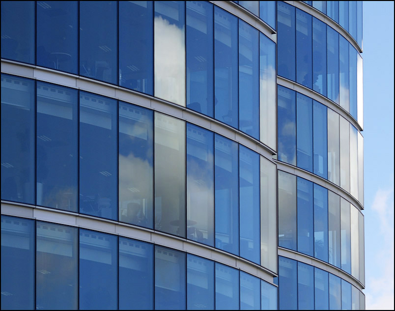
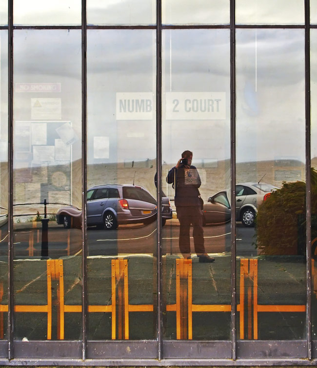
There had been earlier buildings which emphasised glass in their exterior elevations. "Hardwick Hall, more glass than wall", was the saying about a notable Elizabethan (built 1590-97) country house in Derbyshire. However, it was not until the "curtain wall" hung from a steel or concrete frame took off, following the example of the Bauhaus building at Dessau in Germany, that the seemingly impossible trick of a big building with glass walls became feasible. The rest, as they say, is history. After the second world war glass-faced buildings gradually increased in number until today they are found in every industrial or commercial centre.

My photograph shows a detail of one of the new glass-walled office blocks that have appeared near the new (also glass-walled) London City Hall on the south bank of the Thames. In fact, this location seems to have become a touch sterile due to the preponderance of glass (and grey paving and walls). The redevelopment hasn't been fully completed, so I'll reserve my final judgement, but the present site is crying out for more planting. I took this shot because of the ethereal effect of the tinted glass reflecting the blue sky and clouds. I used a long focal length zoom and selected a section of the curved buildings, emphasising the repeated lines of the grey horizontal beams. Post processing involved a slight increase in contrast and sharpening. Incidentally, it's interesting how the restrained elegance of the exterior contrasts with the human clutter seen through the glass!
photograph & text (c) T. Boughen

Monday, October 30, 2006

Bridge 98

click photo to enlarge
With the opening of the Lune Aqueduct in Lancaster in 1797 the 42.5 mile Lancaster Canal was completed. Barges could now make the journey from the industrial town of Preston to Tewtitfield near Kendal. Unusually among English canals, the Lancaster Canal needs no locks to negotiate changes of level: the only locks a user needs to encounter are on leaving the main stretch for either the Glasson branch, that allows access to the River Lune and the sea, or the new River Ribble connection to the Leeds-Liverpool Canal south of Preston.

The canal provides a beautiful path, mainly through open countryside, for walkers as well as those afloat. Only one city - Lancaster - and only two towns - Garstang and Carnforth - are met with on its route through North Lancashire, though villages, hamlets and farms abound. The canal is a living repository of structures from the Industrial Revolution, many of them listed as being of historical interest and importance. These include the aqueducts over the River Wyre and River Lune, mileposts, and about 120 bridges (mainly stone-built). Interestingly, the first barges to use the canal were horse-drawn and a number of bridges have purpose-made cross-over steps to allow the horse to cross the canal when the tow-path changed sides, without stopping pulling! One such barge of 1833, the iron-hulled "Water Witch" with a length of 76 feet and a beam of 6 feet, was pulled by two horses that were changed every four or five miles. It took 10 hours to go from near Kendal to Preston. Later barges were steam powered, and today diesel-powered pleasure craft are the almost exclusive users of the route.

My photograph shows bridge number 98 (all the bridges are numbered), in Lancaster. Here the canal has become a desirable location for water-side housing, including recently-built flats for university students. The afternoon sun was giving a perfect reflection of the bridge, broken only by the ducks eager to see if the passers-by had any bread for them! I waited until the walker's reflection was in the water and framed by the oval of the bridge and its image, then pressed the shutter. A long focal length zoom lens allowed me to concentrate on this fairly symmetrical composition, and I converted the resulting image to black and white to emphasise the reflection.
photograph & text (c) T. Boughen

Sunday, October 29, 2006

Two views of autumn

click photo to enlarge
"There is a harmony in autumn,
And a lustre in its sky.
Which through the summer is not heard or seen,
As if it could not be, as if it had not been!" by Percy Bysshe Shelley (1792-1822), English poet

There are two views of autumn: the unwelcome beginning of an end, or a cherished phase in an endless cycle. If you live for the brightness and warmth of summer and the sun, then you are likely to belong to the first camp. If, however, you delight in the changes that each season brings, then you view autumn as a time to be anticipated and enjoyed, and see it as a welcome chapter in the year.

But, it has to be said that living in the city can dull your appreciation of the change from summer to autumn. You notice, of course, the drop in temperature, the shorter, duller days, the leaves and flowers becoming distressed, changing colour and disappearing, and the onset of misty mornings. It's the subtler changes that the city dweller can miss. Things like the departure of the swallows and wheatears, the arrival of fieldfares, redwings, grey geese, and the increasing numbers of resident species - blackbirds, starlings and pied wagtails for example. Living in the city you don't see the changes to the arable fields as crops are harvested and winter wheat starts to clothe the dark earth with bright green, or the redistribution of sheep and cattle as they foresake the fields that become too wet in the colder months. Manicured parks and gardens often lack the fungi that flourish in autumn, and the wet, dank smell of mouldering vegetation is frequently absent from urban areas.

I was brought up in a rural area and took many of these things for granted. When I lived in a city I missed them. I came to realise that strenuous efforts must be made by individuals and public authorities to ensure that the natural world is cultivated and protected in urban settings. Where this happens individuals have a better understanding and appreciation of nature and their place in it.

The first of the photographs above was taken near where I live. The trees' leaves - here beech - were changing colour and falling to cover the woodland floor in orange/brown. The tip of this elegant curved branch seemed a good subject to represent rural autumn. The second shot was taken in London, and shows a container-grown tree (silver birch?) on the roof garden of a penthouse flat by the Thames. Its leaves were also changing to reflect the season, and doubtless bringing enjoyment to its owner and all who could see it. Both shots were taken with a long zoom - the first to throw the background out of focus, and the second to reach the tree!
photographs & text (c) T. Boughen

Saturday, October 28, 2006

Autumn at Eltham Palace

click photo to enlarge
Eltham Palace in the London borough of Greenwich, originally a moated manor house owned by Anthony Beck, Bishop of Durham, was bought by Edward II in 1305. Extensive building under royal ownership turned it into one of England's most impressive palaces. Today it is the least well known, a pocket of greenery and history in a bustling residential area, easily missed by the tourist intent on seeing London's more famous attractions.

In the 1400s Henry IV built sets of rooms for himself and his queen on the west side of the building and also the North Stone Bridge across the moat. In the 1470s Edward IV added the Great Hall as a place for the royal court to dine, and the future Henry VIII spent much of his childhood at the palace. When he became king Henry further extended and improved Eltham, as did Elizabeth I who mainly used it for guests visiting the court. However, by 1609 it was reported to be in bad repair. Charles I was the last monarch to stay at Eltham, and in 1648, in the Civil War, Parliamentary troops stationed there did much damage. The remains were sold to Colonel Nathaniel Rich who demolished many of the buildings. By the 1700s the Great Hall was being used as a barn, and what was left of the palace as farm buildings: a sad come down for what had been one of the foremost residences in the England.

A public campaign in 1828 stopped further demolition at Eltham, and in 1894 and 1911 the Great Hall's walls, hammerbeam roof and tracery were made good. The final saving of Eltham came about, controversially, in 1933 when private owners leased the building from the Crown and built a large modern house adjoining the Great Hall, and incorporating it. The new building's exterior was in a restrained classical style, but the interior was aggressively modern Art Deco. Incendiary bombs caused some damage in 1940, and the Army became the tenants until 1992. However, in 1984 English Heritage took over management of the site, and it remains in their care today. A visit to see the juxtaposition of the medieval and the twentieth century, and particularly the wonderfully restored 1930s rooms, is well worthwhile.

My photographs are two views of Eltham on a sunny October day. The first shows a dry section of the moat with the house (completed in 1936) beyond. The second shows the North Stone Bridge dating from the 1400s. I waited for people to be framed by the bridge arch in the second shot - the composition seemed to need a better focus. However, the first photograph, with the wooden bridge leading the eye to the house spoke for itself. Post processing involved bringing a little more detail out of the shadows.
photographs & text (c) T. Boughen

Friday, October 27, 2006

Phones and fishermen

click photo to enlarge
The mobile (cell) phone has, it seems to me, two main uses. Firstly, it is a means of giving information to a distant person. Secondly, it is a method of social communication: a way of chatting. The first use was presumably what the inventors had in mind. But, during the relatively short life of this piece of technology, the second use has come to dominate the traffic between phones. For many people the ability to be in almost constant communication with a person - or many people - is now indispensable.

I don't know about you, but I think for some "texting" and calling seems to be obsessional, even compulsive! People whose phones are left at home or broken often display the anxiety and searching looks of the addict in need of a fix. It's interesting that young people, who have grown up with these devices, use them in ways that older people don't. The organising of their meetings and social lives are not tightly planned, but evolve as messages flow between friends: arrangements take on a fluidity that someone of my age finds disconcerting. And now I read that some teenagers feel desolate and foresaken if they don't have the same incoming stream of messages as their friends! This infatuation with the mobile phone makes me wonder whether we are losing the appreciation of the solitary periods in our days and lives. Many confuse the word "solitary" with "lonely". However, whilst the latter is the unwelcome absence of friends and acquaintances, the former can be a chosen and welcome state: one that allows for peace, quiet reflection and concentration. Just like fishing!

I'm no fisherman, but it seems to me that even if you pursue this hobby with a friend (as in my shot above), it remains a pleasantly solitary pastime, with plenty of time to be alone with just your own thoughts. I took this photograph on Coniston Water in England's Lake District on a misty October morning. A 400mm (35mm equivalent) lens, hand held, nicely "stacked" the receding tones of the headlands and distant hills. The figures of the fisherman, though insignificant in size, are big enough to give a necessary focus to the shot. Blank sky and water has been cropped to concentrate on the interest of the graduated shoreline. Incidentally, this photograph isn't sharp - the result of using a long lens without a tripod on a dull morning. But, frankly, I don't think with a subject like this, that matters! For another blurred image go to one of my early posts!
photograph & text (c) T. Boughen

Thursday, October 26, 2006

Photography and painting

click photograph to enlarge
A few days ago I was in the Tate Gallery, London, looking, again, at the collection of paintings by J. M. W. Turner (1775-1851). As I moved from image to image and room to room I confirmed in my mind what I had felt for some time: namely, the paintings that I like best are his preparatory sketches and his later, freer works where the texture and luminosity of the paint are as important as the structure of the work. And, that the actual subject matters not at all.

That train of thought set another one going. Do I feel this way because I have drawn and painted, and have felt what it is to translate arm and hand movement to paper and canvas? And if that's so, do people who haven't done this feel the same about works that emphasise the movement of the artist's hand? In my younger days, when I was studying the history of art, I had a particular liking for the work of the American painter, Franz Kline (1910-1962). He was associated with the Abstract Expressionist group, whose members included Jackson Pollock. And, because his paintings are bold, spontaneous, and focus on the stroke of the brush as much (or more than) the subject, like Pollock, he attracted the label of "action painter". What appealed to me about his work was the boldness of his images (often done in black and white), the texture of the paint, and the fact that you could see the motion of his hand in his paintings.

When I looked at my photograph of a fence extending into the edge of Derwent Water in the English Lake District, it put me in mind of Kline's paintings. Let me be clear that I make no great claims for this photograph as art! However, it does rely on bold, black and white contrast, texture and simplicity. Who knows, perhaps the photograph was subconsciously prompted, in part, by my liking for Kline's work. I used a zoom lens at 200mm to focus on a section of the fence and its reflections, and was pleased that the early morning light and wind gave an interesting rippled texture to the water. The shot is in colour - in this instance, conversion to black and white seemed pointless!
photograph & text (c) T. Boughen

Wednesday, October 25, 2006

Big wheels

click photo to enlarge
When the London Eye, the big wheel that sits on the south bank of the Thames in central London, was first proposed I was one of those who thought it a bad idea. It seemed to me to be bringing something of the fun-fair to the centre of our capital city, and I guessed I felt it was somehow inappropriate: that the justaposition of the wheel and the existing architecture wouldn't work. I was wrong. I don't say that London's wheel sits easily in its present location, but I have to admit that it isn't the glaring "eye-sore" (pun intended) that I imagined. And the view from it is wonderful!

One can have no such worries about a big wheel in a place like Blackpool; a town predicated on glitzy fun is just where you expect to see one. The largest, at the moment, is sited on the Central Pier and is 108 feet high. The biggest that Blackpool ever saw was opened in 1896, as the Winter Gardens' rival for the Tower which had been completed in 1894. It was 214 feet high, rotated once every 15 minutes, and cost 6d (2.5p) for a ride. This was substantially cheaper than its London rival of the time (yes, even then London had the biggest and best) which cost either one or two shillings depending on the seating.

My photograph shows the shadow of the Central Pier wheel thrown across the sand on an October afternoon as the sun was disappearing and dark clouds threatened. The beach was still proving an attraction for hardier souls, and even the donkeys found some customers, but most have glanced at the sky and decided that indoors is going to be the best place within the next half hour. I used a wide angle zoom lens to capture the scene, placing the shadow to the right to balance the tower to the left. The contrast in my black and white conversion has been increased a little to emphasise the dramatic effect.
photograph & text (c) T. Boughen

Tuesday, October 24, 2006

Complex identities

click photo to enlarge
For much of the second half of the twentieth century the BBC 1 TV channel in the UK used a globe as its station identity. In various incarnations, often elegantly designed and rotating, it appeared between programmes to remind viewers which channel they were watching. In 1997 however, this theme was extended and short films showing aerial views of parts of the United Kingdom were introduced. Each of these clips featured a spherical red and yellow balloon, coloured like a globe, floating across the scene. These charming mini-films with the ever-present balloon were very popular, and, as the geographical location was often changed, they never became boring.

But, it seems a fact of life that the creative minds that work in television can't leave a good idea alone. They always want to change it, extend it, make it "better". BBC TV moved on from the globe to tedious little films of dancers dressed in red, and other channels picked up the idea of film clips as station "idents". Most notorious is the current Channel 4 ident which develops its original, also very popular, logo - a CGI "4" that comes apart and re-assembles. Now they show us interminable clips of landscapes and cities with hedges, electricity pylons, blocks of flats etc that slowly coalesce into the shape of the number 4 whilst the audience yells, "Oh come on, hurry up and make that wretched number won't you!"

So, when I looked at my photograph of No 1 London Bridge Road, a modern office block with chunks cut out of it and pierced by a large hole, it was most unfortunate that it reminded me of one of those odious Channel 4 "idents". I took the shot from below, looking up through the "hole" that acts as a light well, using a wide zoom lens at 34mm (35mm equivalent). The contrast between the solidity of the cladding and the lightness of the glazing, along with the complexity of the structure were all appealing to the photographer in me, even if the association took the edge off my liking of the photograph!
photograph & text (c) T. Boughen

Monday, October 23, 2006

Space to breathe

click photo to enlarge
The Victorians were the first to really understand the value of public spaces. Perhaps it was the unpreced- ented expansion of cities that forced this idea on them, and they realised the need for "green lungs", places for the masses to stroll, play, relax, or simply experience the liberating feeling of being out in the open rather than in the claustrophobia of urban streets. Whatever the motivation for their philanthropy and civic mindedness, the parks and gardens that they created still form the bulk of the green spaces in many of our cities.

Prior to the creation of parks outdoor public areas were largely restricted to streets and squares, market places and any remaining "commons". However, those cities with rivers running through them often had a further area for recreation, namely the river banks. In recent years I have visited London more frequently, and staying in a location overlooking the Thames has made me understand its importance, not just as a transport artery, but as a place for recreation and somewhere to experience that most precious of commodities in a capital city - space. The simple existence of an area uninterrupted by buildings, even if it is relatively inaccessible water, does Londoners a power of psychological good. Those who live overlooking the river recognise this. I wonder if others do?

The South Bank of the Thames has become much more accessible in recent years, and this photograph illustrates the use that cyclists and walkers make of this "linear park". I took the shot contre jour using a zoom lens at 110mm (35mm equivalent). The aperture was f9, and the brightness of the light that caused the silhouette effect pushed the shutter speed to 1/1000 second even dialling in -1.3 EV. The cyclists had just finished taking their photographs and were about to go on their way. The composition of the couple and their bicycles, framed by the railings, light and tree, with the backdrop of the Thames and the Houses of Parliament, was too good to miss. The black and white treatment seemed right, and post processing involved retrieving a little more detail from the distant architecture.
photograph & text (c) T. Boughen

Thursday, October 19, 2006

Pastel shades

click photo to enlarge
I was interested (though not very) to read that this season's fashion colour - grey - has been a flop with the buying public. The fashion commentators (now there's a job whose passing no sensible person could regret) concluded that grey clothes looks great - even "sophisticated" - on fashion models, but not so good on normal folk like you and me. Now I'm no fan of fashion, but every now and again I notice when the clothes worn in the street and offered for sale in the stores change. This realisation usually dawns when I find it hard to buy the sludge coloured clothes that I favour.

Once upon a time I thought I didn't like pastel colours. It was probably because I associated them with certain fashions during my youth. At one point older women seemed to wear nothing but pastel shades, usually in some weird fabric like Crimplene. Then the men started to get in on the act and awful pastel coloured shirts, sometimes with white collars, did the rounds. It was probably at that point that I envied the dress sense of Anglican clergymen. Every morning they would get up and and think, "Mmmm, what colour shall I wear today - ah, I know, black and grey!" Now, however, I realise that there is nothing wrong with pastel colours as long as they are in the right place and not draped around my own or anyone else's body! After all what is a pastel shade but a strong colour watered down with a lot of white.

This row of Victorian workers' houses in Cockermouth, Cumbria, suits the pastel shades that their owners have dressed it in. No doubt they started life painted white or cream, or more likely the colour of the cement render. But the narrow, dark street in this damp corner of England is cheered by the juxtaposition of these light colours and the contrasting details around the windows and doors. Pastel undoubtedly works here. I took this shot with no help from the large van that parked in front of me as I used a long focal length to compress the houses and include a representative selection of colours!
photograph & text (c) T. Boughen

Wednesday, October 18, 2006

The eponymous silhouette

click photo to enlarge
What a wonderful, and sometimes terrible, tribute is the eponym! It outlasts transitory fame and fortune and allows a person's name to represent more than him/herself, and in some cases to become a common noun or even a verb.

Circus performers and dancers would stand naked without the example of Jules Leotard. Deprived of James Watt's watt what would scientists do? Or lorry drivers without Rudolph Diesel's engine? How would we describe temperature without Anders Celsius and Gabriel Fahrenheit? With a lot less confusion I hear you say! Charles Boycott, however, wouldn't be too pleased to find his name in common use, and many would wish that Henry Shrapnel had kept his invention to himself.

If you think all this a little "Kafkaesque" as an introduction to a silhouette photograph of my wife standing on the shore of Derwent Water in the English Lake District, then let me tell you that the word "silhouette" is an eponym too, and that fact prompted this piece! Louis XV's finance minister, one Etienne de Silhouette (1709-1767), became known during his retirement for cutting paper silhouettes of people, animals and objects. In the days before photography this practice, using a bright light source and black paper, was a simple and popular way of recording a likeness.

I had no such intention when I composed the image here - I was thinking of Japanes art rather than the French Renaissance. The early morning shadows and the fretwork outlines of the trees offered a delicate frieze and an interesting frame for the sunlit lake and mountains. The addition of a human figure was essential, giving the composition a necessary focus: the image would be much less without it. I made the camera expose for the background, and the foreground came out pretty much as you see it. A touch of masking and curves increased the contrast and brightness of the glimpsed vista. One thing that I would do differently, if I took the shot again, is to ensure that the summit of the central peak could be seen!
photograph & text (c) T. Boughen

Tuesday, October 17, 2006

On the beach

click photo to enlarge
Teacher: You haven't even started your painting - that paper's completely white.
School boy: I've finished it sir - it's a polar bear in a snow storm.
from "1001 Jokes for Kids"

In 1918 the Russian artist, Kasimir Malevich (1878-1935), working in the style he termed Suprematism, painted a piece called "White on White". The painting was square, had a white background showing the texture of the paint, and superimposed on this was a slightly smaller edged square painted a different tint of white, that was rotated through about 30 degrees. This was a development of his painting "Black Square" of 1915 which was - you've guessed it - a black square. Malevich, like earlier artists such as Turner, and later ones like Mondrian emphasised feeling over the registration of a visual phenomenon. They taught us to see the value in canvas space and the significance of "a little" surrounded by "nothing". Laszlo Moholy-Nagy's (1895-1946) paintings, photographs and photograms frequently depend on this quality, and many subsequent artists and photographers have mined the theme to the extent that it has become if not a cliche, then a standard composition upon which to essay a variation.

The photograph above is one of my attempts at this approach. It includes sand, sea, gulls and people. That description makes it sound like a crowded scene, and compared with some "minimalist" photographs it is. Here I used a zoom lens at 44mm (35 mm equivalent) and took the shot looking down on the beach from a pier. I placed the people at the top left, and balanced them with the gulls and darker sea at the bottom right. Despite the small size of the figures, the fact that they are people, and that they are separated from the rest of the details, and are the darkest component of the image, means that they are able to give sufficient "balance" to the overall picture. Black and white with the contrast turned up a bit seemed to suit the shot better than the colour of the original, though given that it is almost contre jour there was very little colour to start with!
photograph & text (c) T. Boughen

Monday, October 16, 2006

The Derwent Water ferry

click photo to enlarge
For some people there is no better prospect than the opportunity to live where the air is warm and the skies are blue virtually all year round. For such folk places like the South of France, Mediterranean Spain, California or Florida are the locations of choice. And yet there are others who positively revel in a climate with distinct seasons. I am one of those people.

In Britain the different times of year bring different pleasures. The warmth and lushness of summer seems all the better for the preamble that is spring, and that season itself is one that lifts the spirit as new life bursts forth in the lengthening days. The attractions of winter are the sharp frosts, keen bright days, and yes, the snow. And autumn's allure rests in the changes that the landscape undergoes as flowers die, leaves fall, and trees reveal their branches. As a photographer I find July and August, with the high sun and clear blue skies, the least appealing time of the year! For me spring and autumn offer the most. This photograph of the Derwent Water ferry in England's Lake District typifies what I mean. The sun on this October morning is causing the cloud to break and lift, revealing the Lakeland fells in all their beauty. The ferry, one of two that circumnavigate the lake, carrying hill walkers and tourists, is an interesting foreground subject that is secondary to that magnificent autumn sky. There are those who moan about the rain that falls on our islands. And yes, it can get in the way. But a great sky like this is one of the benefits of that regular precipitation.

I used a zoom lens at 80mm (35mm equivalent), and dialled in -0.7 EV to ensure that I didn't lose the subleties of the sky through overexposure. An aperture of f6.3 gave me a speed of 1/800 sec at 100 ISO, so I didn't need to track the ferry to keep it reasonably sharp. Post processing brought the colours and contrast back to where they were on the day.
photograph & text (c) T. Boughen

Thursday, July 13, 2006

Normal service will be resumed...

... at some future date. Probably! I'm taking a break from posting for a while. Work, and a few other issues prompt me to stop for now. Thanks for looking.

Wednesday, July 12, 2006

Low-cost architecture

click photo to enlarge
It must be extremely satisfying to make good, low-cost architecture out of simple materials. It must also be very difficult! Given a large amount of money, a great location and an interesting brief, most architects should be able to come up with a structure that meets the client's requirements and contributes something significant to the site: Frank Gehry, Zaha Hadid and Richard Rogers do it all the time! But, a nailed-down brief, a tight budget, and an undistinguished setting make the job much more of a challenge.

In the UK, particularly in the period from the 1950s through to the 1980s, public sector architects worked in this way, and produced some of the best buildings of those years. Critics will say that they produced some of the worst too, citing grim high-rise flats, windy council estates and drab concrete multi-storey car parks. And yes, the output was not of uniformly high quality. But, buildings like Rookwood Infant School, Eastleigh (1981) or the public library at Great Missenden, Buckinghamshire (1970), despite the constraints noted above, match the best that the private sector produced at this time. The photograph above shows the north elevation of a children's nursery in Fleetwood, Lancashire. It was built by Lancashire County Council's architect's department in the mid-1970s, and it exemplifies some of the qualities that I admire. The building is faced with brick, areas of dark timber cladding, has mainly floor to ceiling glazing, and is capped by a monopitch roof. The strength of its design comes from the careful attention to proportion, the outlining of shapes, the contrast of surfaces, and the way the main forms visually and actually interlock. These combine to give it an integrity that is a pleasure to see.

My photograph shows some of the basic underlying forms of the building, and benefits particularly from the nice detail of the curved wall that hides and encloses the bins and also borders the adjoining primary school playground. I used this sweep of brick in my composition to take the eye, from the left, through to the window line in the main wall, and then along and up to the apex of the dark roof. The painted lines on the playground helped the image by echoing some of the angles above, and by adding visual interest to the lower right. Despite this elevation, naturally, being in shadow, the shapes and tones collectively produced a photograph that pleases me.
photograph & text (c) T. Boughen

Tuesday, July 11, 2006

Consumer not very durables

click photo to enlarge
"Consumer durable - a product such as an automobile or an appliance whose life expectancy is at least three years", from Global Investor: Glossary

How long should an iPod last? Recently the newspapers have carried articles about unhappy consumers whose players have died after a few months, and, even though many are pleased with Apple's replacements policy, some have started to question the likely lifespan of these must-have products, and factored it into their buying decisions.

Apparently the typical life span of a television is 10 years, for a microwave oven it's 7 years, for a computer, 5 years, and a mobile phone only 4 years. I find that last one hard to believe: many people I know seem to replace them yearly, though people like me who use their son's cast-offs probably help to explain the longer figure! There are those who think that these relatively short lifespans are good, because it brings newer, better specified products, and keeps people in employment. However, many think that the earth can't sustain the true cost of the rate at which we buy, use and replace "stuff". A product's obsolescence comes about for four basic reasons: it's irreparable, the cost of repair is uneconomic, new products have improved features, and people's desire for new and fashionable products. All of these reasons are areas where manufacturers and consumers could do something to increase product lifespans. Items can be made that are easier to repair, either by the user or a tradesman. Modular design can be encouraged so that products can be upgraded, rather than replaced, to allow the owner to take advantage of improvements. And buyers can stop being fashion-slaves and see products as tools that do a job rather than lifestyle accessories that reflect their socio-economic status. This won't happen quickly, but there are small signs that it may happen in response to re-use and recycling legislation, the growing ecological awareness of consumers, and the ageing population who have a greater expectation that their consumer durables will be durable!

The folding chairs in the photograph wouldn't I suppose, count as consumer durables. However, they are 66 years old and still in use: that's a long life for a folding chair. It comes about because these are well-made from materials (wood and steel) that can be fixed. They are brought out for use by the audience on sporting occasions at the school where I photographed them. Furniture can last a long time if it is well-made. I have a chaise longue that has been in daily use since I bought it in 1974. It has been recovered half a dozen times by me. It must have begun its life in about 1890! I took the photograph above because I liked the ripple-like, undulating patterns made by the tops of the rows of the stacked chairs. The dynamic quality that comes from the diagonal composition made this the best of the series of shots that I took using a 70mm (35 mm equivalent) macro lens that happened to be on the camera at the time.
photographs & text (c) T. Boughen

Monday, July 10, 2006

Greenbottle lifestyle

click photo to enlarge
"Time flies like an arrow, fruit flies like a banana", Groucho Marx (1890-1977), US comedian

Greenbottles (Lucilia caesar) are engaging little chaps. An iridescent green blow-fly 8-15mm long, they are never happier than when they are laying eggs on the putrid flesh of a dead sheep or a road-kill rabbit. Unless that is they are watching their larval offspring chewing their way through the festering open sore of a cow or goat. As a break from these engrossing pastimes they spend many happy hours feeding on piles of steaming dung! Oh, and now and then they drink nectar from lovely flowers like this white marguerite (Chrysanthemum frutescens).

But it's not all highlife eating and drinking for the greenbottle! Oh no, some of the more adventurous larvae go around inflicting asthma and rhinoconjunctivitis on humans who sell them as fish bait. And they really love the outdoor life, rarely venturing into houses, happy in whatever weather their home countries in Europe and Asia can throw at them. They can even be seen on walls enjoying the sunshine in the depths of winter! Life for the greenbottle seems to consist of pleasure upon pleasure. And, though we may turn up our noses in disgust at such a lifestyle, it is in fact a benefit to us all. The French naturalist, Jean-Henri Fabre (1823-1915) , speaking of the offspring of the greenbottle observed, "... the maggot is a power in this world. To give back to life with all speed, the remains of that which has lived, it macerates and condenses corpses, distilling them into an essence wherewith the earth, the plant's foster mother, may be nourished and enriched."

I think this is the first insect photograph that I've posted - they're not something I usually shoot. It was the metallic green of the this particular fly that caused me to photograph it before the bees that were also around these marguerites. I used a hand-held macro lens at 200 ISO, a high shutter speed, and consequently a relatively shallow depth of field, and stayed sufficiently far back to include the radiating petals which lead towards the greenbottle as it probed for nectar in the centre of the flower. Post processing included lightening the fly to reveal more detail.
photograph & text (c) T. Boughen

Sunday, July 09, 2006

Photographer in court

click photo to enlarge


Have you ever taken a photograph on the London Underground? Yes? Well I hope you had the necessary permit, otherwise you were breaking the law! How about shots in Trafalgar Square or any of the royal parks? Fine, but don't try and sell any copies, because if you do you'll break the byelaws! And those shots of Canary Wharf or the Lloyds building - make sure you're on public property when you press the shutter, or you may be asked by men in uniform to wipe your memory card.

There used to be a feeling that photographers could photograph anything they liked. That was never the case - the owners of private property have always had the right to restrict or ban photography on their land. But would you imagine that "private" included National Trust properties, and should it? In their (not our) stately homes and castles you can take photographs for private use, but you can't use them commercially or in publications. This is to protect their copyright and the income the Trust gets from licencing images. Fair enough you might think, until you remember that public money and tax breaks form part of the National Trust's income. However, if you were to take the photograph from a public right of way (but not a permitted path), it would seem you can use the image as you wish! And how about images of people? Some celebrities have copyrighted their image to profit from it and to control usage. Many UK schools forbid parents taking still or video images of pupil performances due to fears about paedophiles. So what about photographs of people in the street, incidental to the main subject, or as the main subject? It seems to be OK to take such shots for private use, but clearly a model release is necessary for commercial purposes. Counter-terrorism legislation and heightened police awareness has increased the suspicion of photographers, particularly in major cities. The right to take images is being restricted more than formerly, and case law is slowly codifying what photographers can and cannot do. If you don't want to be the one who tests the existing case law then this freely downloadable document (pdf), "Photographers' Rights in the UK" by Linda Macpherson, is the minimum essential reading. An equivalent document for the USA is available here, and for Australia here. These are useful things to carry to use in your argument with the overzealous who try to restrict your rights!

I thought about these issues when I took a photograph of myself, reflected in the windows of the Wyre Magistrates Court at Fleetwood, Lancashire, on a dull and windy day. I hadn't noticed the faintly visible sign inside saying "Number 2 Court"! The glazing grid, the yellow/brown of the chairs, and the distorted reflected cars, sea, sky and yours truly made an interesting shot on which to hang some thoughts about the legal complexities that photographers face today.
photograph & text (c) T. Boughen

Saturday, July 08, 2006

The wonder of wildlife

click photo to enlarge
When the BBC makes programmes like "Life on Earth" or "The Living Planet" it sees itself as fulfilling its public service remit, particularly the requirement to educate and entertain. Few people would disagree that these big budget, natural history series do both of these things admirably. But do they?

People watch the programmes in large numbers, both in Britain - I've watched them myself - and in other countries where they are sold, so clearly they do entertain. But what does the audience remember of what it sees, and how is their understanding of the natural world enlarged? One of my concerns is that the impact of the images presented - killer whales snatching seals off the beach, dolphins herding shimmering shoals of fish, polar bears trekking across ice floes in driving snow - is so overwhelming that any deeper understanding is lost to the power of the pictures. As the presenter skips from desert to deepest jungle, from Patagonia to the Pacific atolls, the narrative thread that underpins the programme is lost as we stare in wonder at the visual feast that expert naturalist/film-makers put before us. And I wonder if, after watching all this, the general public is disappointed, even dismissive of, the wildlife in their small part of the world, and the way it appears to them when they look at it.

Young children, thankfully, experience awe and wonder at the tiniest creatures that come their way. The other day I was watching some seven year olds looking at pond life, and shared their delight as they found dozens of tiny frogs. I took this photograph of one of these common amphibians on the hand of a child. I used a macro lens to get in quite close, but stayed far enough back to show the contrast in size between fingers and frog. As they talked excitedly to each other about the creatures they found, I couldn't help but reflect that this experience would stay with them a long time, and influence their appreciation of the animals around them, much more than watching glossy wildlife TV.
photographs & text (c) T. Boughen

Friday, July 07, 2006

Nymphaea alba

click photo to enlarge
"See, dear, what thy lover brings;
'Tis the flower with the white wings.
Buoyed upon the quiet stream
In the spring it lay adream." from With a Water-Lily, Hendrik Ibsen (1828-1906), Norwegian playwright

The beauty of the water lily (Nymphaea family) has long been recognised, probably because it is one of the largest flowers that blooms on the surface of ponds, streams and rivers. Its beauty has caused it to achieve a special status in many cultures.

The ancient Egyptians gave particular prominence to two species of water lily (N. caerulia and N. lotus), the latter also known as the lotus flower. In their architecture the flower was used as inspiration for the capital of a widely used column, and both flowers appear regularly in painting and carving. It continues to be the national flower of that country. Bangladesh gives the flower a similar prominence, featuring it on the national insignia and medals. Hinduism and Buddhism hold the flower to be sacred, and a pink blossomed variety is frequently used in religious art.

The most common species of water lily found in Britain (and much of Europe) is N. alba, shown above. Claude Monet (1840-1926) is widely known for his impressionistic paintings of this variety that grew (and still grows) in his garden at Giverny in France. Other artists who have been inspired by the flower include the poets, Ted Hughes, Rainer Maria Rilke, and the playwright Ibsen. Most painters and writers have celebrated its beauty, but others have written about the tension surrounding a loveliness that has its birth in murky depths.

I was fortunate to be able to reach over the water to capture my image of a water lily, and consequently I made the
subject the flower alone. The deep yellow, anemone-like centre, and the radial overlapping white petals are familiar enough. However, it was early evening when I took the photograph, and the low sun was making attractive shadows and textures within the petal, and also showing a warm hint of pink towards the base of the bud. This gave a quality I hadn't noticed before. I used a macro lens for the shot, and did a little post-processing to darken the surrounding water.
photograph & text (c) T. Boughen