Thursday, July 13, 2006
Normal service will be resumed...
... at some future date. Probably! I'm taking a break from posting for a while. Work, and a few other issues prompt me to stop for now. Thanks for looking.


Wednesday, July 12, 2006
Low-cost architecture
 click photo to enlarge
In the UK, particularly in the period from the 1950s through to the 1980s, public sector architects worked in this way, and produced some of the best buildings of those years. Critics will say that they produced some of the worst too, citing grim high-rise flats, windy council estates and drab concrete multi-storey car parks. And yes, the output was not of uniformly high quality. But, buildings like Rookwood Infant School, Eastleigh (1981) or the public library at Great Missenden, Buckinghamshire (1970), despite the constraints noted above, match the best that the private sector produced at this time. The photograph above shows the north elevation of a children's nursery in Fleetwood, Lancashire. It was built by Lancashire County Council's architect's department in the mid-1970s, and it exemplifies some of the qualities that I admire. The building is faced with brick, areas of dark timber cladding, has mainly floor to ceiling glazing, and is capped by a monopitch roof. The strength of its design comes from the careful attention to proportion, the outlining of shapes, the contrast of surfaces, and the way the main forms visually and actually interlock. These combine to give it an integrity that is a pleasure to see.
My photograph shows some of the basic underlying forms of the building, and benefits particularly from the nice detail of the curved wall that hides and encloses the bins and also borders the adjoining primary school playground. I used this sweep of brick in my composition to take the eye, from the left, through to the window line in the main wall, and then along and up to the apex of the dark roof. The painted lines on the playground helped the image by echoing some of the angles above, and by adding visual interest to the lower right. Despite this elevation, naturally, being in shadow, the shapes and tones collectively produced a photograph that pleases me.
photograph & text (c) T. Boughen
Tuesday, July 11, 2006
Consumer not very durables
 click photo to enlarge
How long should an iPod last? Recently the newspapers have carried articles about unhappy consumers whose players have died after a few months, and, even though many are pleased with Apple's replacements policy, some have started to question the likely lifespan of these must-have products, and factored it into their buying decisions.
Apparently the typical life span of a television is 10 years, for a microwave oven it's 7 years, for a computer, 5 years, and a mobile phone only 4 years. I find that last one hard to believe: many people I know seem to replace them yearly, though people like me who use their son's cast-offs probably help to explain the longer figure! There are those who think that these relatively short lifespans are good, because it brings newer, better specified products, and keeps people in employment. However, many think that the earth can't sustain the true cost of the rate at which we buy, use and replace "stuff". A product's obsolescence comes about for four basic reasons: it's irreparable, the cost of repair is uneconomic, new products have improved features, and people's desire for new and fashionable products. All of these reasons are areas where manufacturers and consumers could do something to increase product lifespans. Items can be made that are easier to repair, either by the user or a tradesman. Modular design can be encouraged so that products can be upgraded, rather than replaced, to allow the owner to take advantage of improvements. And buyers can stop being fashion-slaves and see products as tools that do a job rather than lifestyle accessories that reflect their socio-economic status. This won't happen quickly, but there are small signs that it may happen in response to re-use and recycling legislation, the growing ecological awareness of consumers, and the ageing population who have a greater expectation that their consumer durables will be durable!
The folding chairs in the photograph wouldn't I suppose, count as consumer durables. However, they are 66 years old and still in use: that's a long life for a folding chair. It comes about because these are well-made from materials (wood and steel) that can be fixed. They are brought out for use by the audience on sporting occasions at the school where I photographed them. Furniture can last a long time if it is well-made. I have a chaise longue that has been in daily use since I bought it in 1974. It has been recovered half a dozen times by me. It must have begun its life in about 1890! I took the photograph above because I liked the ripple-like, undulating patterns made by the tops of the rows of the stacked chairs. The dynamic quality that comes from the diagonal composition made this the best of the series of shots that I took using a 70mm (35 mm equivalent) macro lens that happened to be on the camera at the time.
photographs & text (c) T. Boughen
Monday, July 10, 2006
Greenbottle lifestyle
 click photo to enlarge
Greenbottles (Lucilia caesar) are engaging little chaps. An iridescent green blow-fly 8-15mm long, they are never happier than when they are laying eggs on the putrid flesh of a dead sheep or a road-kill rabbit. Unless that is they are watching their larval offspring chewing their way through the festering open sore of a cow or goat. As a break from these engrossing pastimes they spend many happy hours feeding on piles of steaming dung! Oh, and now and then they drink nectar from lovely flowers like this white marguerite (Chrysanthemum frutescens).
But it's not all highlife eating and drinking for the greenbottle! Oh no, some of the more adventurous larvae go around inflicting asthma and rhinoconjunctivitis on humans who sell them as fish bait. And they really love the outdoor life, rarely venturing into houses, happy in whatever weather their home countries in Europe and Asia can throw at them. They can even be seen on walls enjoying the sunshine in the depths of winter! Life for the greenbottle seems to consist of pleasure upon pleasure. And, though we may turn up our noses in disgust at such a lifestyle, it is in fact a benefit to us all. The French naturalist, Jean-Henri Fabre (1823-1915) , speaking of the offspring of the greenbottle observed, "... the maggot is a power in this world. To give back to life with all speed, the remains of that which has lived, it macerates and condenses corpses, distilling them into an essence wherewith the earth, the plant's foster mother, may be nourished and enriched."
I think this is the first insect photograph that I've posted - they're not something I usually shoot. It was the metallic green of the this particular fly that caused me to photograph it before the bees that were also around these marguerites. I used a hand-held macro lens at 200 ISO, a high shutter speed, and consequently a relatively shallow depth of field, and stayed sufficiently far back to include the radiating petals which lead towards the greenbottle as it probed for nectar in the centre of the flower. Post processing included lightening the fly to reveal more detail.
photograph & text (c) T. Boughen
Sunday, July 09, 2006
Photographer in court
 click photo to enlarge
Have you ever taken a photograph on the London Underground? Yes? Well I hope you had the necessary permit, otherwise you were breaking the law! How about shots in Trafalgar Square or any of the royal parks? Fine, but don't try and sell any copies, because if you do you'll break the byelaws! And those shots of Canary Wharf or the Lloyds building - make sure you're on public property when you press the shutter, or you may be asked by men in uniform to wipe your memory card.
There used to be a feeling that photographers could photograph anything they liked. That was never the case - the owners of private property have always had the right to restrict or ban photography on their land. But would you imagine that "private" included National Trust properties, and should it? In their (not our) stately homes and castles you can take photographs for private use, but you can't use them commercially or in publications. This is to protect their copyright and the income the Trust gets from licencing images. Fair enough you might think, until you remember that public money and tax breaks form part of the National Trust's income. However, if you were to take the photograph from a public right of way (but not a permitted path), it would seem you can use the image as you wish! And how about images of people? Some celebrities have copyrighted their image to profit from it and to control usage. Many UK schools forbid parents taking still or video images of pupil performances due to fears about paedophiles. So what about photographs of people in the street, incidental to the main subject, or as the main subject? It seems to be OK to take such shots for private use, but clearly a model release is necessary for commercial purposes. Counter-terrorism legislation and heightened police awareness has increased the suspicion of photographers, particularly in major cities. The right to take images is being restricted more than formerly, and case law is slowly codifying what photographers can and cannot do. If you don't want to be the one who tests the existing case law then this freely downloadable document (pdf), "Photographers' Rights in the UK" by Linda Macpherson, is the minimum essential reading. An equivalent document for the USA is available here, and for Australia here. These are useful things to carry to use in your argument with the overzealous who try to restrict your rights!
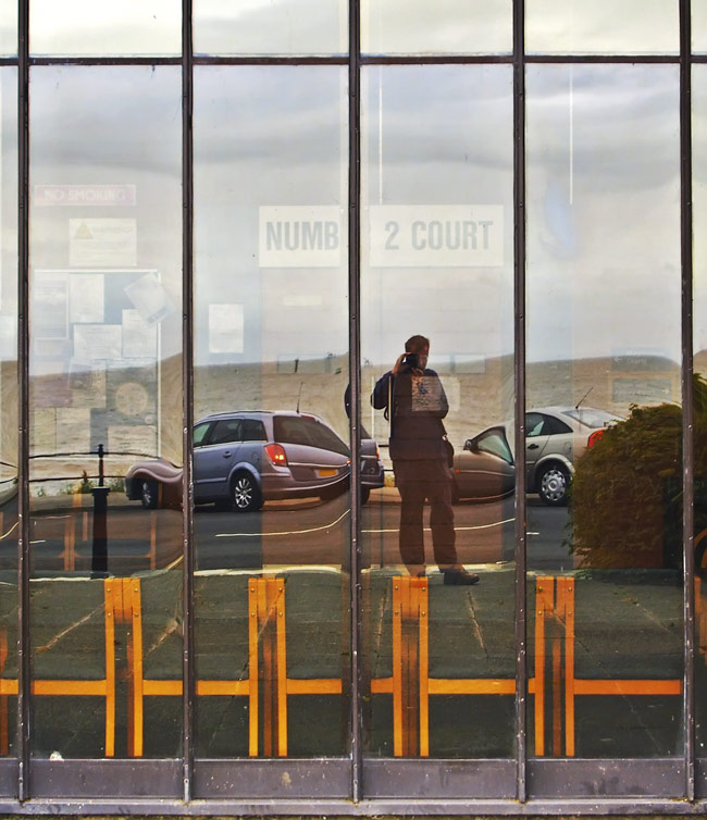
I thought about these issues when I took a photograph of myself, reflected in the windows of the Wyre Magistrates Court at Fleetwood, Lancashire, on a dull and windy day. I hadn't noticed the faintly visible sign inside saying "Number 2 Court"! The glazing grid, the yellow/brown of the chairs, and the distorted reflected cars, sea, sky and yours truly made an interesting shot on which to hang some thoughts about the legal complexities that photographers face today.
photograph & text (c) T. Boughen
Saturday, July 08, 2006
The wonder of wildlife
 click photo to enlarge
People watch the programmes in large numbers, both in Britain - I've watched them myself - and in other countries where they are sold, so clearly they do entertain. But what does the audience remember of what it sees, and how is their understanding of the natural world enlarged? One of my concerns is that the impact of the images presented - killer whales snatching seals off the beach, dolphins herding shimmering shoals of fish, polar bears trekking across ice floes in driving snow - is so overwhelming that any deeper understanding is lost to the power of the pictures. As the presenter skips from desert to deepest jungle, from Patagonia to the Pacific atolls, the narrative thread that underpins the programme is lost as we stare in wonder at the visual feast that expert naturalist/film-makers put before us. And I wonder if, after watching all this, the general public is disappointed, even dismissive of, the wildlife in their small part of the world, and the way it appears to them when they look at it.
Young children, thankfully, experience awe and wonder at the tiniest creatures that come their way. The other day I was watching some seven year olds looking at pond life, and shared their delight as they found dozens of tiny frogs. I took this photograph of one of these common amphibians on the hand of a child. I used a macro lens to get in quite close, but stayed far enough back to show the contrast in size between fingers and frog. As they talked excitedly to each other about the creatures they found, I couldn't help but reflect that this experience would stay with them a long time, and influence their appreciation of the animals around them, much more than watching glossy wildlife TV.
photographs & text (c) T. Boughen
Friday, July 07, 2006
Nymphaea alba
 click photo to enlarge
'Tis the flower with the white wings.
Buoyed upon the quiet stream
In the spring it lay adream." from With a Water-Lily, Hendrik Ibsen (1828-1906), Norwegian playwright
The beauty of the water lily (Nymphaea family) has long been recognised, probably because it is one of the largest flowers that blooms on the surface of ponds, streams and rivers. Its beauty has caused it to achieve a special status in many cultures.
The ancient Egyptians gave particular prominence to two species of water lily (N. caerulia and N. lotus), the latter also known as the lotus flower. In their architecture the flower was used as inspiration for the capital of a widely used column, and both flowers appear regularly in painting and carving. It continues to be the national flower of that country. Bangladesh gives the flower a similar prominence, featuring it on the national insignia and medals. Hinduism and Buddhism hold the flower to be sacred, and a pink blossomed variety is frequently used in religious art.
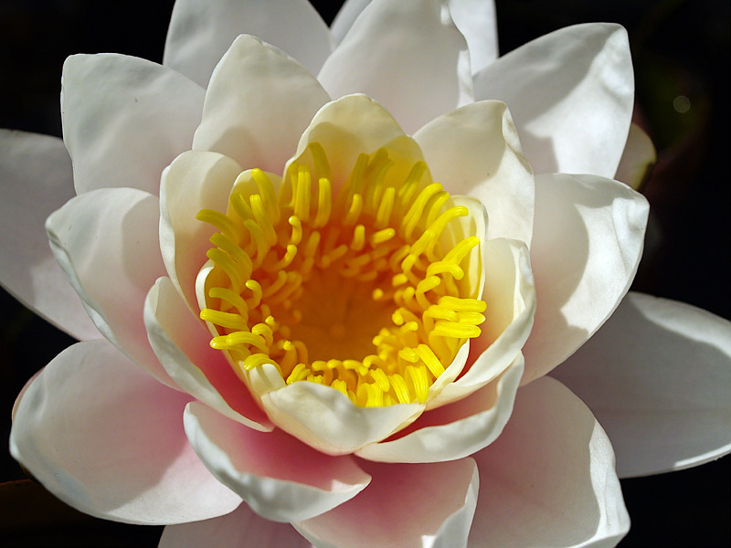
The most common species of water lily found in Britain (and much of Europe) is N. alba, shown above. Claude Monet (1840-1926) is widely known for his impressionistic paintings of this variety that grew (and still grows) in his garden at Giverny in France. Other artists who have been inspired by the flower include the poets, Ted Hughes, Rainer Maria Rilke, and the playwright Ibsen. Most painters and writers have celebrated its beauty, but others have written about the tension surrounding a loveliness that has its birth in murky depths.
I was fortunate to be able to reach over the water to capture my image of a water lily, and consequently I made the subject the flower alone. The deep yellow, anemone-like centre, and the radial overlapping white petals are familiar enough. However, it was early evening when I took the photograph, and the low sun was making attractive shadows and textures within the petal, and also showing a warm hint of pink towards the base of the bud. This gave a quality I hadn't noticed before. I used a macro lens for the shot, and did a little post-processing to darken the surrounding water.
photograph & text (c) T. Boughen
Thursday, July 06, 2006
Miniature magnificence
 click photo to enlarge
These almshouses at Stydd, near Ribchester, Lancashire, were built in 1728. They came about as a result of the will of John Shireburne of Stoneyhurst. This stipulated that, on his death, he wanted to found and build "a good almshouse on his estate at Stydd for 5 poor persons to live separately therein." Roman Catholic widows and spinsters were particularly to be favoured as potential residents. The building is now managed by a housing association, though until recently the terms of the original will were closely followed. So, why were John Shireburn's wishes translated into such an imposing, albeit on a small scale, building? Was it to reflect the status of the giver? Or perhaps the taste of the executors is what we see? Was it to add to the beautification of the location or the donor's estate? Perhaps it was guilt - the givers wanted to offer the poor something that they had enjoyed in life! Whatever the reason, these particular almshouses, and such buildings elsewhere, are often quite decorative. Which is odd, since plainer architecture would presumably release money for additional dwellings. The architectural historian, Nikolaus Pevsner described the building as "very curious and very engaging", and it is an odd mix of the grand and the prosaic in such a small building. However, these qualities combined with its rural location must have made it a pleasant place to live for the successive inhabitants of the last 278 years.
I'm very interested in the history of architecture, and so I like photographing buildings. This early morning shot of the building is designed to show the almshouse in all its miniature magnificence, so I took it from the front to emphasise the classically-inspired symmetry, the splendid pediment, arches, columns and stairs, and the contrast of the stone and brick. I included a little of the surrounding greenery, and didn't mind the trees' shadows since they hint at its rural setting.
photograph & text (c) T. Boughen
Wednesday, July 05, 2006
Architecture and colour
 click photo to enlarge
The building in question is on the promenade at Blackpool, Lancashire, and is a converted 1930s "solarium". It has been changed from its original purpose as a place for people to sit in bright, leafy surroundings on dull or wet days, to a centre that showcases and promotes sustainable technology. It is called the "Solaris Centre", and is designed to be a "zero energy building" that generates more energy than it uses. Two wind turbines provide 6Kw each, and 60 sq m of solar cells can add another 18Kw in favourable conditions. Rainwater is used for toilet flushing, and other technologies help to keep energy use to a minimum. Exhibitions, a cafe and conference facilities complete the building.
My photograph shows a small part of the back of the building - a new corridor and roof light - that overlooks a planted area. I composed the picture to show the architecture in its setting, and because of the interesting combination of colours and textures. The purple flowers provide a useful foil against which the glazed grid of the building can be shown. But, the shot would not have occurred to me without the rectangles of blue, the orange walls with the solar cell shadows, and the yellow of the warning sign all being attractively grouped together. As a photograph to represent the building it's not very good because it doesn't show the characteristic features that the public usually see. But as an image in itself, or as one of a group to illustrate the building, I think it has some merit. I present the shot as it came out of the camera, with the only adjustment being the correction of the slightly converging verticals.
photograph & text (c) T. Boughen
Tuesday, July 04, 2006
Abstract illusion
 click photo to enlarge
I got that feeling the other day when taking the photograph I offer above. It wasn't the same feeling that I had when taking the shots noted earlier. This time it was principally surprise that I felt because the image I had recorded was so very hard to decipher! Part of it was clearly out of focus, and part of it was as sharp as could be. It was hard to work out what was near to the camera and what was most distant. I showed it to my wife and she couldn't work out what it was. "Is there a lot of rust in the image? Are there shadows?", she asked. Can you see what I photographed?
In fact, the shot shows a section of the seat of a curved, slatted, stainless steel bench. The brown stripes in the photograph are the out of focus concrete below the seat, and other stripes are the metal slats. The shadow of the back of the seat falls across the seat slats which themselves vary in colour according to the amount and angle of the light falling on them. I used a short zoom, to take the shot, and gave it a symmetry that only the shadows broke. A great shot - no. But an interesting illusion - yes, I think so.
photograph & text (c) T. Boughen
Monday, July 03, 2006
Linguistic gymnastics
 click photo to enlarge
A recent email set me thinking about English words and the pleasure that is to be had from them. Ours is a mongrel language principally derived from German, Latin and French, with significant contributions from several other languages. There are 380 million native speakers, many more who have it as a second language, and it has become the de facto international language that everyone wants to learn.
Fluency and competency in any language is usually tested by oral and written examination. However, I've come up with a new test of proficiency in English. It is entirely oral, and the measure of competence is determined by how much you smile, laugh or roll about on the floor at the following "new definitions" of words, and the extent to which you can explain the humour in them! Many are from the BBC Radio 4 spoof panel game, "I'm Sorry I Haven't A Clue", and others are by anonymous authors who have extended the idea. Take the test now:
- psychopath - crazy paving
- decease - to stop stopping
- pallisade - what the Queen drinks
- sentiment - the perfume he intended to buy
- mistake - winner of a butchers' beauty competition
- gross mistake - unlikely winner of a butchers' beauty competition
- Hamlet - a baby pig
- stalemate - your spouse
- champagne - malingering
- servile - a nasty knight
- MacAdam - the first Scotsman
- stucco - a hitherto unknown Marx Brother
- gripe - what Australians make wine from
- testicle - an exploratory tickle
You might be wondering what all this has to do with a photograph of the conference centre stairway at Whalley Abbey, Lancashire. The answer is, not a lot! Except that the carved stone pine-cones on top of the stone newels are known by the architectural term, finials, a word that, for no good reason I can explain, makes me smile! I used a wide-angle lens, and a vertical composition for this shot. I liked the composition because the bright sunlight on the lower steps seemed to attract the eye, and from there the zig-zag of the stairs took the viewer through to the dark Victorian porch at top of the picture.
photograph & text (c) T. Boughen
Sunday, July 02, 2006
Will the music stop?
 click photo to enlarge
The British brass band usually comprises cornets, flugelhorns, tenor horns, baritones, euphoniums, trombones, tubas and percussion. Most of the instruments play from the treble clef (with the exception of the bass trombone and percussion). This palette of instruments and way of playing is uniquely British, and ensures that parts can be covered when instruments are missing. Most brass bands originated at a place of work, an organisation or a town or village. Britain's best known brass ensemble, the Black Dyke Mills Band, started life as the band of Black Dyke Mills (a textile mill), at Queensbury, Bradford, in 1816. The Brighouse and Rastrick Brass Band started up in 1881 in Calderdale, Yorkshire, and the Grimethorpe Colliery Band began in 1917 as a recreational activity for the miners of that particular Yorkshire coal pit. In Victorian times many towns and villages had a band that would play on the bandstand in the local park on Sundays, and at the church or town hall at other times. Such bands continue, in very much smaller numbers, today. Each year there are fewer. Sadly, most bandstands that were built for their performances now host music only occasionally, and standing in one you can faintly hear the ghosts of players past, filling the air with their characteristic music.
This bandstand on the central promenade at Blackpool, Lancashire, is usually filled with skateboarders who have made it their home. The steps and the paved open spaces all around offer interest and challenge for the young people, and the canopy provides shelter from the weather. I took this photograph at 9.00a.m. on a bright Sunday morning, when the skateboarders were still in bed and the promenade was only slowly coming to life. I was attracted by the interesting shape of the structure. However, the emptiness also appealed - it seemed to underline the lack of purpose that these bandstands have today. I placed the main shape to the left of the frame, to give the railings on the right a place in the composition. Black and white seemed both appropriate for the subject, and to accentuate the interesting shape.
photograph & text (c) T. Boughen
Saturday, July 01, 2006
Black and white in colour
 click photo to enlarge
The photograph shows a small part of Samlesbury Hall. Along with Rufford Old Hall it is one of the most northerly of the big timber-framed houses. It was begun in 1330, though little from that period remains. The hall itself was built around 1500 and the large wing at right angles to the hall, in about 1540. Various owners added to Samlesbury in the seventeenth and eighteenth centuries, and a major restoration took place in 1835. Although the main structure comprises large posts, crucks and beams of oak, the infill is largely wattle and plaster. Moreover, stone and brick is used in a number of important places, most noticeably in the footings of the walls and in the chimneys. Some say that the characteristic black painted wood and white painted infill is a Victorian invention, and it's true that many such buildings do have untreated oak. But, whoever is responsible, it certainly gives these buildings an appearance that is both striking and pleasing.
I took this shot in the morning when the shadows were still deep. I decided to focus on a part of the building to show the wall pattern to good effect. In my composition I placed the door to the left of the image, and the bay to the right, with some leaves from an overhanging horse chestnut above. Together with the closely cropped lawn they frame the quite unusual quatrefoil patterns of this part of the building. The fact that these are in the shade doesn't matter because of the very strong contrast that is characteristic of these buildings.
photograph & text (c) T. Boughen
Friday, June 30, 2006
Images, reality and the picturesque
 click photo to enlarge
When we describe a view as "picturesque", meaning "like a picture", we are using a word coined in the C17 and widely used in the C18. Landscape designers like Lancelot "Capability" Brown (1716-1783) remodelled the parks of country houses so that they looked like the imagined Romantic landscapes in paintings by artists like Salvator Rosa (1615-1673) and Claude Lorraine (c.16oo-1682). Humphrey Repton (1752-1818) took this idea further, often "composing" his landscaping projects like a painter, preparing an artistic foreground with formal planting, a middleground with large trees, pasture and perhaps cattle and a new ruin, and a background that looked "wild in character." William Gilpin (1724-1804) took the idea of the picturesque further, defining it as "that kind of beauty which is agreeable in a picture". He wrote and illustrated his ideas on what a picturesque view should contain in terms of subject, texture, composition, viewpoint, and acknowledged that whilst an actual landscape may have the appropriate qualities it could always be improved by the artist! So, this confusion of reality and the image, and cross-fertilisation between the two has quite a long history.
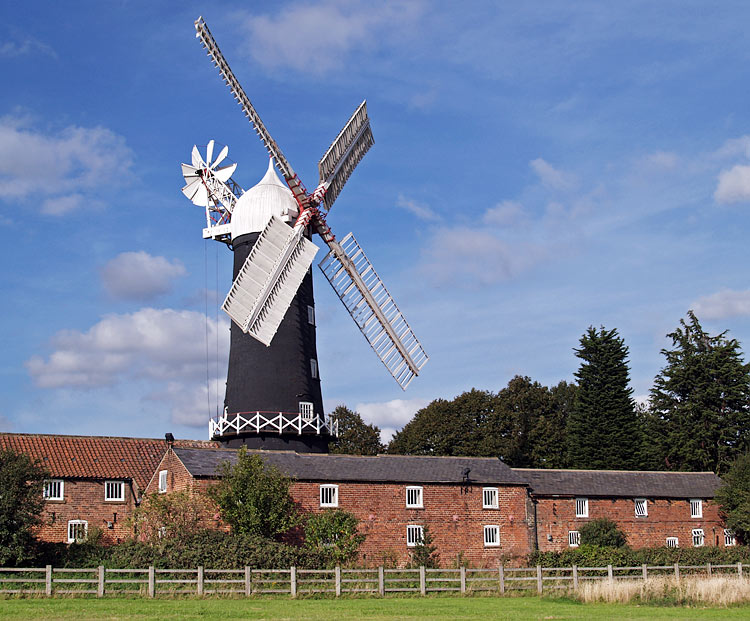
Today the meaning of "picturesque" is much as it has always been. Churches, windmills, castles, ruins, landscapes, seascapes, and so on, if treated with a composition that derives from painting, usually qualify for the term. Skidby Mill, East Yorkshire, an attractive, still working tower windmill (and museum) built in 1821, certainly does. Its elegant ogee-shaped cap, the curved taper of the tower, and the striking black and white of the paintwork are very appealing. My shot shows it towering over the associated agricultural buildings, looking out over the fields of the Wolds, its upright form slightly off-centre, achieving some compositional balance through the darker trees on the right. John Ruskin in "The Seven Lamps of Architecture" (1849) noted that signs of age are pleasing to men. Picturesque paintings and photographs rely on this fact, and buildings like Skidby Mill are much photographed for that very reason.
photograph & text (c) T. Boughen
Thursday, June 29, 2006
Countries, flags and confusion
 click photo to enlarge
any was asked recently why he was carry-
ing a Swiss flag! At the last England match a loudspeaker announcement welcomed "United Kingdom" fans. This prompted a lot of excitable responses which can be politely summarised as "excuse me, we are England fans!" It's not surprising that people elsewhere get confused about the names and countries of the British Isles - so do many of its inhabitants! So, in the interests of peace, harmony and international goodwill here is my attempt at elucidation.
The British Isles is a geographical term describing the group of islands off the coast of mainland Europe. It includes the Republic of Ireland and the United Kingdom. The United Kingdom (UK), properly called the United Kingdom of Great Britain and Northern Ireland, is a political union that includes England, Scotland, Wales and Northern Ireland. Great Britain describes England, Scotland and Wales (but not Northern Ireland). The Republic of Ireland is an independent sovereign state that is not part of the United Kingdom (though its territory was until the early twentieth century). Pretty clear really isn't it!! Now, about the flags! England's flag is a white rectangle with a red cross of St George (as above). Scotland's flag is dark blue with a white saltire (diagonal) cross of St Andrew. Wales' flag is a rectangle split horizontally into green and white, with a red dragon superimposed. Northern Ireland's flag is like the flag of England, but with a white star at the intersection of the cross, on which is a red hand, and above which is a crown. The Republic of Ireland's flag is a green, white and orange vertical tricolour. The Union flag which is used to represent the UK is the familiar three coloured flag with vertical and diagonal crosses in red, white and blue. Now, if you've got all that, and you can be excused if your head is spinning, the only other important fact to remember is that there is no love lost between these nations on the soccer pitch. Furthermore, you confuse these countries to the natives at your own risk!
The amount of England flags being flown during the World Cup is quite staggering. There are a number of jokes doing the rounds about those that display them. However, there is an unintended, serious, and very positive benefit. The English flag has, in the past, seemed to have been appropriated by English nationalists of an extreme right wing persuasion. If the current display gets rid of that association, and returns the flag to the people as a whole, it will be a good thing. My photograph above shows one of the millions (?) being flown from cars, and some of the many on display on houses.
photograph & text (c) T. Boughen
Wednesday, June 28, 2006
A "chocolate box" scene
 click photo to enlarge
But then art (and photography) are like that. The most critically feted work is rarely beautiful in the conventional sense, and the works most widely appreciated by the general public, which often do embody conventional beauty, are rarely those most lauded by the cognoscenti. I have the feeling that this is a trend that intensified in the twentieth century, for reasons that require deconstructing by a social scientist rather than an art critic.
So, today I present a photograph which, depending on your taste, is either pretty, beautiful, "a chocolate box scene", a "postcard", or worthy of little consideration because it has no "edge"! It shows a scene on the Lancaster Canal near Forton, Lancashire. The boat is a modern "narrow boat", a cut-down version of an older type made specifically for the narrow industrial canals of Britain. As a picture it says little more than "this is a very pleasant place", and "canal boating looks like fun". The composition is simple, with the canal's diagonal leading the eye through the boat to the bridge, with other textures, colours and forms adding visual interest. If boxes of chocolates still had pictures on their lids I think this shot might find its place!
photograph & text (c) T. Boughen
Tuesday, June 27, 2006
Motors and sails
 click photo to enlarge
Now jet skis are a different story. They don't seem to get the bad press that motorcycles do, and that surprises me. Essentially recreational motorcycles of the water, they are, in my experience, frequently driven badly, and noisily, without regard for water birds or other water users. The wide open space of the lake, sea or river seems to encourage recklessness. I imagine the ability to do flashy manouevres without consequence is part of their appeal! But there is a price to pay because they disturb the peace, scare the wildlife, and fit in very badly with other water-borne transport, especially that which is wind-powered. And periodically the riders kill themselves or kill or injure others. Consequently, when I saw jet-ski training taking place on part of the beach where people often learn about yachting I had mixed feelings. I hoped it would promote responsible riding, but I feared it would generate an increase in numbers! I wondered too, how they would get on with the yacht and dinghy sailing that takes place in the same area, and whether some kind of zoning needs to happen in the interests of safety and harmony.
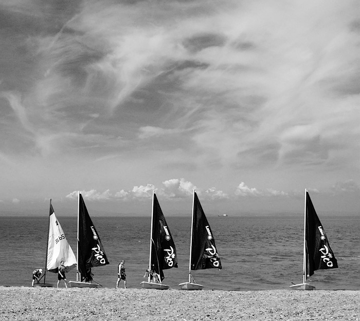
My photograph above shows sail training on a warm summer day at Fleetwood, Lancashire. The tide was in, the wind was light, and the sun was shining through diaphanous clouds, making the whole experience look very pleasant. I decided to put the boats and the beach at the bottom of the picture, and to include a lot of the soft sky. When I looked at how the shot would be as a black and white image, I was pleased by the way the red filter emphasised not only the clouds (as I expected), but also the light blue sails of four dinghies. The much darker tone they assumed gave the shot a very different, contrasty quality, with more "punch", and that's how I present it.
photograph & text (c) T. Boughen
Monday, June 26, 2006
Jet-age gloss
 click photo to enlarge
The advertising slogan for the 1955 Cadillac "Eldorado" Brougham was "styled in the mode of jet aircraft". It was! The bumpers had twin projections that looked like aircraft nosecones. Down the side was a narrow chrome line that flicked down at the passenger door and continued back, just like the paintwork lines on a commercial transport plane. And at the back were twin fins, about a foot high, below which were more bulbous projections that echoed the exhausts of a jet engine. The long, low lines suggested speed, efficiency and modernity, but it was just an opulent veneer. All the major manufacturers worked variations on this style, and it took Ford's disaster, from 1958 onwards, with "Edsel", an upmarket range that offered two sizes - big and bigger - and the loss of $250,000,000 development money, for the whole market to slowly realise they were going nowhere with this styling. In this hiatus, aided by recession, European and Japanese manufacturers got their first toe-hold in the American market. Today, in the United States and across the world, cars are generally better than they were at fulfilling their primary transport function. However, the status/aspirational part of car design remains incredibly important to manufacturers and a source of fascination and humour (The Simpsons' "Canyonero" said it all) to the critical eye.
I took a photograph of the fin and tail-light cluster on this 1959 Cadillac convertible because it perfectly sums up the extravagant detailing of 1950s American cars. These lights look like military jet exhausts after the pilot has turned on the after-burners and the spears of flame are projecting from the back of the aircraft! It's the sort of styling that you think should never have happened, but part of you is glad that it did. The vehicle was part of a large display of mainly cars and buses on Blackpool's south promenade, and alongside it were several other 1950s cars of American vintage. I used a short zoom lens to capture the shot, deliberately underexposing to avoid "blowing" the highlights in the chrome, then bringing the colour back in post processing.
photographs & text (c) T. Boughen
Sunday, June 25, 2006
Buggies and brollies
 click photo to enlarge
Now, in fairness I have to say I pinched this idea from Land Rover. A few years ago I saw a Land Rover baby buggy. It was military green, of course, and the wheels looked like they'd negotiate any swamp or desert you cared to tackle. On the side was the distinctive Land Rover logo. But since then, no other manufacturer, to my knowledge, has taken up this challenge. I'm sure a bit of venture capital could set up a factory turning out baby buggies that were styled to match a range of cars. There could be racing red Ferrari buggies with a cute rampant horse and a rear spoiler. Or how about sleek black BMW buggies with the propeller logo in the centre of each wheel, and a dark tinted plastic rainhood. And surely Jeep could match Land Rover by having a buggy with both roof and bull bars and a spare wheel on the back! There must be millions of potential buyers out there, including Toyota drivers who want to go up market by owning a Lamborghini baby buggy with gull-wing sides! If you would like to invest in this venture please send me lots of money in plain brown envelopes.
This flight of fancy popped into my head as I photographed, from beneath an umbrella, during a rain shower at Lytham, Lancashire. The afternoon had been dark and cloudy but most people seemed to have been caught without wet-weather protection. However, this couple and their child in the buggy were ready for the rain. I photographed them as they hurried back to their car, forming silhouettes against the sky and sea, an effect that I increased in post processing.
photograph & text (c) T. Boughen
Saturday, June 24, 2006
Art attack!

 click photo to enlarge
The first, in the entrance hall, comprised an "installation" - a video screen showing a loop of about 30 square feet of water with waves. It had a soundtrack of intermittent moans, groans and sighs. At least I assumed the sounds were connected with the moving images. They may have been associated with a model (sculpture?), standing facing into a corner. This was covered in an approximation of clothing, had two feet and legs, no arms, and a torso that tapered into something like an elephant's trunk. Neither work offered a scintilla of intellectual or aesthetic interest, so I moved into the first gallery. Here was an exhibition of black and white photographs by John Gay, taken in Blackpool in 1949. They included interesting portraiture and documentary shots of the post-war British seaside, and I lingered a while, enjoying the way the photographer presented the personalities he found on the beach. The next gallery appeared almost empty! And it was, apart from the sound of bird song coming from a few speakers. On a short column was a stack of paper. These explained that the bird song was the art work! It was entitled "Birds Sing in Response to a Distant Calamity"! The paper had the "cast in order of appearance" - twenty one birds, starting with the chaffinch and ending with the corn bunting. A waste of a gallery. On to the next. This had several large photographs taken in a garden: the sort of photographs that you might achieve by pressing the shutter by accident! The word "banal" would be too much praise for these photographs. And so upstairs to where there was a moderately diverting display of paintings and artefacts about the history of Blackpool. The best piece on display in the whole gallery was there - an architectural water-colour of a 1920s open air pool and buildings, now long gone.
As I descended the stairs I noticed a light cluster that I'd missed on the way up. It comprised eight orange and yellow glass shades, each of which looked like it was melting. Ironically they offered more interest to me than virtually any of the art on offer that day. Certainly more than the drab portrait of a woman, attributed to Millais, hanging on the stairs nearby. Seeing a reflection of these lights in the glass of the portrait I decided to make my own art work. I offer it to posterity, and call it "A Doodle about the Present Calamity that is Contemporary Art."
photograph & text (c) T. Boughen
Subscribe to:
Posts (Atom)