Friday, June 30, 2006

Images, reality and the picturesque

click photo to enlarge
When an observer, overwhelmed by the beauty of a sunset, says "Its just like a picture!", we know that we live in a culture that puts images before words. The twentieth century saw an explosion in the number of images, particularly through photographs and film, and this has impacted on how we see reality. People can find themselves measuring their reality by comparing it to an image, and whilst this may be understandable, it can also be dangerous. I won't get into girls becoming anorexic to be like the "supermodels" they want to be, or the affluent lifestyles promoted by manufacturers and television that people see as a reality to which they must aspire. I'll leave that for another time. Instead I've got a few thoughts on earlier attempts to make reality like the image.

When we describe a view as "picturesque", meaning "like a picture", we are using a word coined in the C17 and widely used in the C18. Landscape designers like Lancelot "Capability" Brown (1716-1783) remodelled the parks of country houses so that they looked like the imagined Romantic landscapes in paintings by artists like Salvator Rosa (1615-1673) and Claude Lorraine (c.16oo-1682). Humphrey Repton (1752-1818) took this idea further, often "composing" his landscaping projects like a painter, preparing an artistic foreground with formal planting, a middleground with large trees, pasture and perhaps cattle and a new ruin, and a background that looked "wild in character." William Gilpin (1724-1804) took the idea of the picturesque further, defining it as "that kind of beauty which is agreeable in a picture". He wrote and illustrated his ideas on what a picturesque view should contain in terms of subject, texture, composition, viewpoint, and acknowledged that whilst an actual landscape may have the appropriate qualities it could always be improved by the artist! So, this confusion of reality and the image, and cross-fertilisation between the two has quite a long history.

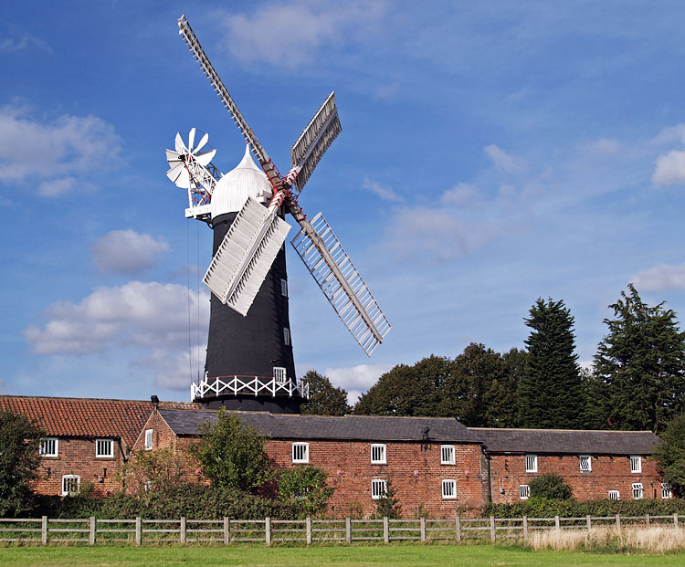
Today the meaning of "picturesque" is much as it has always been. Churches, windmills, castles, ruins, landscapes, seascapes, and so on, if treated with a composition that derives from painting, usually qualify for the term. Skidby Mill, East Yorkshire, an attractive, still working tower windmill (and museum) built in 1821, certainly does. Its elegant ogee-shaped cap, the curved taper of the tower, and the striking black and white of the paintwork are very appealing. My shot shows it towering over the associated agricultural buildings, looking out over the fields of the Wolds, its upright form slightly off-centre, achieving some compositional balance through the darker trees on the right. John Ruskin in "The Seven Lamps of Architecture" (1849) noted that signs of age are pleasing to men. Picturesque paintings and photographs rely on this fact, and buildings like Skidby Mill are much photographed for that very reason.
photograph & text (c) T. Boughen

Thursday, June 29, 2006

Countries, flags and confusion

click photo to enlarge
An England football (soccer) fan in Germ-
any was asked recently why he was carry-
ing a Swiss flag! At the last England match a loudspeaker announcement welcomed "United Kingdom" fans. This prompted a lot of excitable responses which can be politely summarised as "excuse me, we are England fans!" It's not surprising that people elsewhere get confused about the names and countries of the British Isles - so do many of its inhabitants! So, in the interests of peace, harmony and international goodwill here is my attempt at elucidation.

The British Isles is a geographical term describing the group of islands off the coast of mainland Europe. It includes the Republic of Ireland and the United Kingdom. The United Kingdom (UK), properly called the United Kingdom of Great Britain and Northern Ireland, is a political union that includes England, Scotland, Wales and Northern Ireland. Great Britain describes England, Scotland and Wales (but not Northern Ireland). The Republic of Ireland is an independent sovereign state that is not part of the United Kingdom (though its territory was until the early twentieth century). Pretty clear really isn't it!! Now, about the flags! England's flag is a white rectangle with a red cross of St George (as above). Scotland's flag is dark blue with a white saltire (diagonal) cross of St Andrew. Wales' flag is a rectangle split horizontally into green and white, with a red dragon superimposed. Northern Ireland's flag is like the flag of England, but with a white star at the intersection of the cross, on which is a red hand, and above which is a crown. The Republic of Ireland's flag is a green, white and orange vertical tricolour. The Union flag which is used to represent the UK is the familiar three coloured flag with vertical and diagonal crosses in red, white and blue. Now, if you've got all that, and you can be excused if your head is spinning, the only other important fact to remember is that there is no love lost between these nations on the soccer pitch. Furthermore, you confuse these countries to the natives at your own risk!

The amount of England flags being flown during the World Cup is quite staggering. There are a number of jokes doing the rounds about those that display them. However, there is an unintended, serious, and very positive benefit. The English flag has, in the past, seemed to have been appropriated by English nationalists of an extreme right wing persuasion. If the current display gets rid of that association, and returns the flag to the people as a whole, it will be a good thing. My photograph above shows one of the millions (?) being flown from cars, and some of the many on display on houses.
photograph & text (c) T. Boughen

Wednesday, June 28, 2006

A "chocolate box" scene

click photo to enlarge
When I was young the very worst comment anyone could make about a painting or photograph was that it was a "chocolate box scene". That phrase isn't used today, except by people of a "certain age", largely because the object on which it is based is no longer found. In 1950s and 1960s Britain chocolates for the mass market often came in a box with a lid that featured a widely-loved painting, or a photographic scene. The first I remember seeing had a George Stubbs painting of horses. I also recall John Constable's "Haywain", Monet's "Poppy Field", and Turner's "Fighting Temeraire" getting this treatment. It struck me as a young teenager, and it strikes me now, that this dismissive phrase was grossly unfair. Sometimes work that is widely popular deserves to be so because it embodies excellent qualities - as these paintings do. And sometimes the qualities that give a piece popular appeal are shallow or sentimental. However, popularity alone is not a reason to dismiss a work. Regrettably, this is often what seems to happen.

But then art (and photography) are like that. The most critically feted work is rarely beautiful in the conventional sense, and the works most widely appreciated by the general public, which often do embody conventional beauty, are rarely those most lauded by the cognoscenti. I have the feeling that this is a trend that intensified in the twentieth century, for reasons that require deconstructing by a social scientist rather than an art critic.

So, today I present a photograph which, depending on your taste, is either pretty, beautiful, "a chocolate box scene", a "postcard", or worthy of little consideration because it has no "edge"! It shows a scene on the Lancaster Canal near Forton, Lancashire. The boat is a modern "narrow boat", a cut-down version of an older type made specifically for the narrow industrial canals of Britain. As a picture it says little more than "this is a very pleasant place", and "canal boating looks like fun". The composition is simple, with the canal's diagonal leading the eye through the boat to the bridge, with other textures, colours and forms adding visual interest. If boxes of chocolates still had pictures on their lids I think this shot might find its place!
photograph & text (c) T. Boughen

Tuesday, June 27, 2006

Motors and sails

click photo to enlarge
Many people have no time for motorcycles or their riders. I'm not one of those people. I see motorcycles as a pretty efficient form of transport, ideally suited to carrying one or two people quickly over medium and longish distances. What I do have a problem with is motorcyclists who tune and ride their bikes so they are needlessly noisy, and those who ride in an aggressive and illegal way. I use a pedal cycle and it pains me to see cyclists riding without regard for common courtesy or the law because it gives all cyclists a bad name. I imagine that's how the many responsible motorcyclists must feel about their high speed compatriots.

Now jet skis are a different story. They don't seem to get the bad press that motorcycles do, and that surprises me. Essentially recreational motorcycles of the water, they are, in my experience, frequently driven badly, and noisily, without regard for water birds or other water users. The wide open space of the lake, sea or river seems to encourage recklessness. I imagine the ability to do flashy manouevres without consequence is part of their appeal! But there is a price to pay because they disturb the peace, scare the wildlife, and fit in very badly with other water-borne transport, especially that which is wind-powered. And periodically the riders kill themselves or kill or injure others. Consequently, when I saw jet-ski training taking place on part of the beach where people often learn about yachting I had mixed feelings. I hoped it would promote responsible riding, but I feared it would generate an increase in numbers! I wondered too, how they would get on with the yacht and dinghy sailing that takes place in the same area, and whether some kind of zoning needs to happen in the interests of safety and harmony.

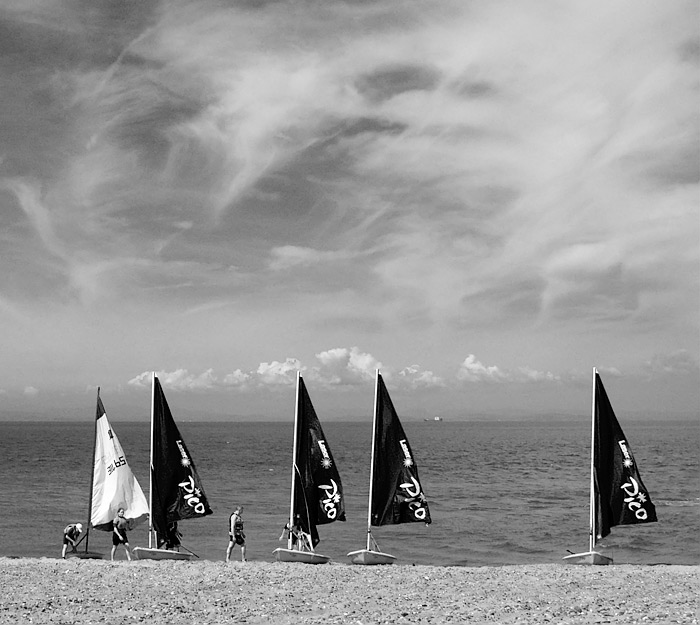
My photograph above shows sail training on a warm summer day at Fleetwood, Lancashire. The tide was in, the wind was light, and the sun was shining through diaphanous clouds, making the whole experience look very pleasant. I decided to put the boats and the beach at the bottom of the picture, and to include a lot of the soft sky. When I looked at how the shot would be as a black and white image, I was pleased by the way the red filter emphasised not only the clouds (as I expected), but also the light blue sails of four dinghies. The much darker tone they assumed gave the shot a very different, contrasty quality, with more "punch", and that's how I present it.
photograph & text (c) T. Boughen

Monday, June 26, 2006

Jet-age gloss

click photo to enlarge
I find car styling fascinating - at times bizarre! When you consider what American cars looked like in the 1950s you have to wonder whether people lost the plot - a bit like we did in the 1980s with padded shoulders and rolled-up jacket sleeves! That post-war decade was a time when the range of car styling narrowed, and, despite valiant efforts by Raymond Loewy at Studebaker, and the attempt by Nash with their "Metropolitan" to introduce "compact" cars, the public wanted vehicles that looked like aircraft, and that's what they got. The cars that the public bought met their social and aesthetic aspirations in full, but their transport requirements were seriously neglected!

The advertising slogan for the 1955 Cadillac "Eldorado" Brougham was "styled in the mode of jet aircraft". It was! The bumpers had twin projections that looked like aircraft nosecones. Down the side was a narrow chrome line that flicked down at the passenger door and continued back, just like the paintwork lines on a commercial transport plane. And at the back were twin fins, about a foot high, below which were more bulbous projections that echoed the exhausts of a jet engine. The long, low lines suggested speed, efficiency and modernity, but it was just an opulent veneer. All the major manufacturers worked variations on this style, and it took Ford's disaster, from 1958 onwards, with "Edsel", an upmarket range that offered two sizes - big and bigger - and the loss of $250,000,000 development money, for the whole market to slowly realise they were going nowhere with this styling. In this hiatus, aided by recession, European and Japanese manufacturers got their first toe-hold in the American market. Today, in the United States and across the world, cars are generally better than they were at fulfilling their primary transport function. However, the status/aspirational part of car design remains incredibly important to manufacturers and a source of fascination and humour (The Simpsons' "Canyonero" said it all) to the critical eye.

I took a photograph of the fin and tail-light cluster on this 1959 Cadillac convertible because it perfectly sums up the extravagant detailing of 1950s American cars. These lights look like military jet exhausts after the pilot has turned on the after-burners and the spears of flame are projecting from the back of the aircraft! It's the sort of styling that you think should never have happened, but part of you is glad that it did. The vehicle was part of a large display of mainly cars and buses on Blackpool's south promenade, and alongside it were several other 1950s cars of American vintage. I used a short zoom lens to capture the shot, deliberately underexposing to avoid "blowing" the highlights in the chrome, then bringing the colour back in post processing.
photographs & text (c) T. Boughen

Sunday, June 25, 2006

Buggies and brollies

click photo to enlarge
I've got a business proposition that I think is a winner. We've all seen how the design of the baby buggy has changed over the years. Gone are the steel-sided, large, spoked-wheel, upholstered monsters of yesteryear, and in their place we have a wide range of fashionable vehicles. You can have 8, 4 or 3 wheels, baby facing forwards or backwards, seating for 1 or 2 (and probably 3), made of plastic, alloy and nylon, and all will ingeniously fold into the size of a matchbox - well, maybe a shoebox. But, and here is my sure-fire winning idea, none of them match your car!

Now, in fairness I have to say I pinched this idea from Land Rover. A few years ago I saw a Land Rover baby buggy. It was military green, of course, and the wheels looked like they'd negotiate any swamp or desert you cared to tackle. On the side was the distinctive Land Rover logo. But since then, no other manufacturer, to my knowledge, has taken up this challenge. I'm sure a bit of venture capital could set up a factory turning out baby buggies that were styled to match a range of cars. There could be racing red Ferrari buggies with a cute rampant horse and a rear spoiler. Or how about sleek black BMW buggies with the propeller logo in the centre of each wheel, and a dark tinted plastic rainhood. And surely Jeep could match Land Rover by having a buggy with both roof and bull bars and a spare wheel on the back! There must be millions of potential buyers out there, including Toyota drivers who want to go up market by owning a Lamborghini baby buggy with gull-wing sides! If you would like to invest in this venture please send me lots of money in plain brown envelopes.

This flight of fancy popped into my head as I photographed, from beneath an umbrella, during a rain shower at Lytham, Lancashire. The afternoon had been dark and cloudy but most people seemed to have been caught without wet-weather protection. However, this couple and their child in the buggy were ready for the rain. I photographed them as they hurried back to their car, forming silhouettes against the sky and sea, an effect that I increased in post processing.
photograph & text (c) T. Boughen

Saturday, June 24, 2006

Art attack!

click photo to enlarge
An overcast day with showers found me in the Grundy Art Gallery, Blackpool. This small venue is known for its collection of Victorian and Modern British painting, and my hope was that these works would lift the metaphorical clouds that had descended on me caused by the day's stratus. But no! The permanent collection had been hidden away, and mainly contemporary works were on show instead. Oh joy!

The first, in the entrance hall, comprised an "installation" - a video screen showing a loop of about 30 square feet of water with waves. It had a soundtrack of intermittent moans, groans and sighs. At least I assumed the sounds were connected with the moving images. They may have been associated with a model (sculpture?), standing facing into a corner. This was covered in an approximation of clothing, had two feet and legs, no arms, and a torso that tapered into something like an elephant's trunk. Neither work offered a scintilla of intellectual or aesthetic interest, so I moved into the first gallery. Here was an exhibition of black and white photographs by John Gay, taken in Blackpool in 1949. They included interesting portraiture and documentary shots of the post-war British seaside, and I lingered a while, enjoying the way the photographer presented the personalities he found on the beach. The next gallery appeared almost empty! And it was, apart from the sound of bird song coming from a few speakers. On a short column was a stack of paper. These explained that the bird song was the art work! It was entitled "Birds Sing in Response to a Distant Calamity"! The paper had the "cast in order of appearance" - twenty one birds, starting with the chaffinch and ending with the corn bunting. A waste of a gallery. On to the next. This had several large photographs taken in a garden: the sort of photographs that you might achieve by pressing the shutter by accident! The word "banal" would be too much praise for these photographs. And so upstairs to where there was a moderately diverting display of paintings and artefacts about the history of Blackpool. The best piece on display in the whole gallery was there - an architectural water-colour of a 1920s open air pool and buildings, now long gone.

As I descended the stairs I noticed a light cluster that I'd missed on the way up. It comprised eight orange and yellow glass shades, each of which looked like it was melting. Ironically they offered more interest to me than virtually any of the art on offer that day. Certainly more than the drab portrait of a woman, attributed to Millais, hanging on the stairs nearby. Seeing a reflection of these lights in the glass of the portrait I decided to make my own art work. I offer it to posterity, and call it "A Doodle about the Present Calamity that is Contemporary Art."
photograph & text (c) T. Boughen

Thursday, June 22, 2006

A spiral to nowhere

click photo to enlarge
What does white painted concrete and a deep blue sky say to you? The Mediterr-
anean? California? England? The first two probably, the latter never! And yet the leaders of the International Style in architecture of the 1920s and 1930s - people like Charles-Edouard Jeanneret (Le Corbusier) , Rudolf Schindler and Walter Gropius - all expected their design solutions to be indifferent to climate and location, and suitable for all countries. They built and promoted a style that paid no dues to historical precedent or local traditions. Steel, white painted concrete, long window strips and flat roofs characterized their buildings. They saw them as rational "machines for living" that eschewed ornament, that used materials honestly, never pretending they were something else, and in which "form followed function". Such structures were built widely in France, Germany, the United States and elsewhere. In Britain only a few architects took up the modernist banner. Most used the style as something to plunder for motifs that could be grafted on to more traditional buildings.

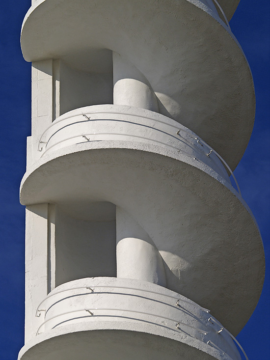
And maybe that was right. A damp, cloudy country such as ours presents something of a challenge to a flat roof, steel-reinforced concrete and white paint! However, one British architect who did work in this style was Joseph Emberton (1889-1956). In his best known building, the Royal Corinthian Yacht Club (1931), Burnham on Crouch, he deployed the full range of the International Style to great effect. At Blackpool Pleasure Beach, a large funfair, he built in this style again, to best effect in the Casino (1935-39). This striking white building combines serious modernity and whimsy. The curved walls and low window bands wrap the building round the corner of the fairground site in a very sleek way. But, sticking up from the front, is a slim spiral staircase to nowhere! It is topped by a light and a flag, and is simply a piece of fun that accompanies the equally humorous, red and black, ship's funnel.

I took this shot of a part of the spiral staircase shortly after it had been repainted. The drill-like form was being shown to good effect by the morning light, giving it a Mediterranean appearance - one of the few days on which that would be achieved! I used a zoom lens, focussing on a section of the spiral to display the sensuous curves that one wouldn't imagine possible in concrete.
photograph & text (c) T. Boughen

Wednesday, June 21, 2006

Junius

click photo to enlarge
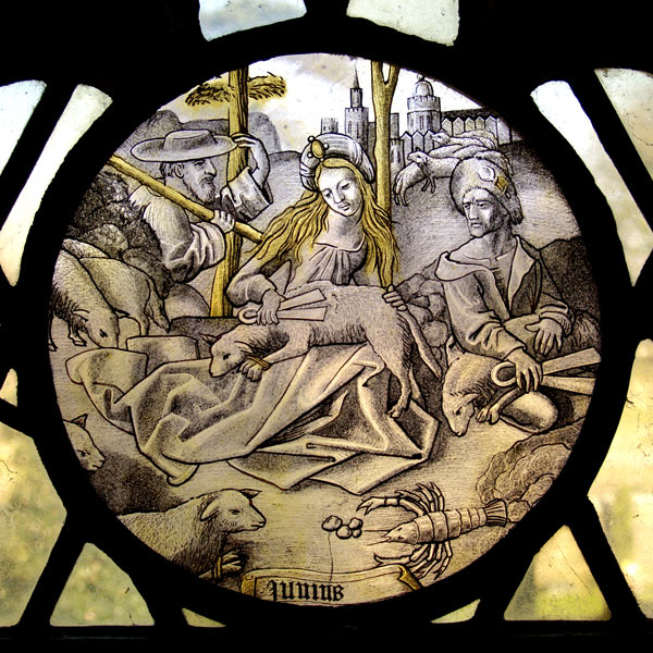
What does the month of June signify to Britain in 2006? The World Cup? Wimbledon? Barbecues on warm evenings? And if you had to summarize the month in an image, what would you include? This piece of stained glass in the church of St Michael at St Michael's-on-Wyre, Lancashire, attempts to do just that, not for Britain in the twenty-first century, but for Flanders in the 1500s.

At the bottom of the circular piece, known as a roundel, is the name of the month in Latin, "Junius". Nearby is what looks like a crayfish, but is probably meant to be a crab representing the astrological sign, Cancer (the Crab) which runs from June 21st to July 22nd. Then we have the main subject - a couple engaged in the act of shearing sheep with their sprung steel clippers, and a passerby, or fellow worker, with what looks like bundled fleeces on a pole. This is not the usual medieval association for June - hay making is more common. Perhaps the artist felt the need to break the mould here! Flanders in the sixteenth century was a recognised source of high quality and innovative stained glass which was exported all over Europe, and Flemish glaziers set up workshops in a number of cities, including London. Artists like Lucas van Leyden and Marten de Vos designed religious and secular scenes for roundels, often showing Renaissance influences. Glaziers turned them into glass, using silver to achieve the characteristic glowing yellow highlights. This roundel was probably bought as one of a set of twelve representing each of the months. The secular subject suggests it may originally have been bought for a private house and subsequently donated to the church.

As a record of an ancient piece of stained glass, this isn't a very good photograph! I have another version which serves that purpose. It was taken looking up at the roundel, with a white sky background, then stretched in the computer to bring it back to circular. My intention here was to give the glass a bit of context by including the out of focus churchyard, and to show that the piece is in situ, continuing to be a pleasure for worshippers and visitors, as it has been down the centuries.
photograph & text (c) T. Boughen

Tuesday, June 20, 2006

Fashion, style and design

click photo to enlarge
I don't like fashion, I'm interested in style, and I really like design. That statement is intended to point out the useful distinction between those three words, which are often used interchangeably. Further, it sums up my feelings about the three concepts that the words embody. Fashion, to me, is the changing of the construction and appearance of something for no good reason other than to deliberately make the current model outdated and to stimulate the purchase of a new model. Style (and styling) on the other hand is more about shaping something with an aesthetic purpose in mind. And design, in my book, is creating something in a way that, to the designer, seems the best and most efficient manner. Now I'm sure that's not precisely what it says in the dictionary, and it's true that there is overlap between the three concepts. However, they are not synonyms, and we lose sight of something important if we treat them as such.

I think fashion, whether in clothing, decor, or anything else, is almost always a negative force. It's driven by money and is massively wasteful. Depending on how you look at it, it can be either socially divisive or cohesive. In my book it's predominantly the former. Styling can be used in this negative way too, but where it is used well, it can lift a product above the mundane. Good design, of course, always does this, and a perfect coming together of form and function is a joy to behold - think about the Supermarine Spitfire, Michel Thonet's B-27 cafe chair, or the Olympus OM1 camera.

When I took this photograph the thing that struck me most forcibly was the colour of the wall - orange! This colour was very popular for walls in the late 1960s and early 1970s, and now I notice it making a come back. That's a problem with fashions - they come and go, and when they are not "in fashion" people are afraid to use them. The uplighter, however, is a piece of classic design, never out of manufacture since at least the early twentieth century. This image was captured in the Solaris Centre, Blackpool, a building dedicated to environmental sustainability. Appropriately enough, therefore, the pattern of shadows is made by an array of solar cells built into a sloping corridor roof. I liked the colour, shapes and shadows in this asymmetrical composition, and particularly the diagonal line cutting through it, making two interlocking wedges.
photograph & text (c) T. Boughen

Monday, June 19, 2006

Sleeping under the pier

click photo to enlarge
Of all the common birds, the starling has, perhaps, the most unflattering Latin name - Sturnus vulgaris. The genus name, Sturnus, denotes starling, and the species name, vulgaris, is Latin for common. And, whilst the starling is most definitely a common British bird, there are many who think it is common in the vulgar sense of that word too!

It's a characteristic of people that we take the familiar for granted. Things we see every day are not looked at with the probing eye that we reserve for the new or the unusual. It seems to be that way with the starling. Its iridescent plumage and bright spots or "stars" are overlooked by most people. They see only the predatory flocks of "dull" coloured birds, muscling in on any food that's going, chattering raucously and marching about like they owned the place. Yes, the common starling is somewhere near the bottom of the average person's bird hierarchy.

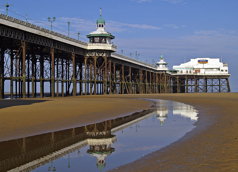
So, what has this to do with a photograph of Blackpool's North Pier. Well, outside the breeding season the supporting metalwork of the underside of this pier provides a nightime roost for up to 30,000 starlings! Each evening clouds of birds descend on the structure and settle down for the night on the cold metal spars. And each morning, in foraging groups, they set off for the fields and gardens of the Fylde to search for the day's food. One can only imagine how bleary-eyed they must be after a night of high tide and rough seas! I took this photograph on an early June morning, when most starlings had been up and busy for hours. A wide angle lens allowed me to make the white painted theatre the focal point to which the pier structure directed the eye. I adjusted my position so that the curve of the channel of water left by the receding tide leads the eye to the near pavilion, and took advantage of the reflections to add interest to the foreground of the shot.
photograph & text (c) T. Boughen

Sunday, June 18, 2006

Out of this world

click photo to enlarge
I think I can say, with some degree of certainty, that, unless I'm abducted by aliens, I'll never go into space! Wrong nationality, wrong education, wrong job and wrong age. And yet, I'd love to leave this planet for a short time, if only to fully experience the feeling you must get that our world is but a small dot in the infinity of the universe. However, space travel isn't the only way to approach this feeling. I remember first getting that awareness many years ago when I decided to turn my bird watcher's telescope on the night sky.

With Norton's Star Atlas by my side I spent many happy winter evenings finding my way round the stars, planets and galaxies. I began with Orion and moved out to Cassiopeia, Ursa Major, the Pole Star and the rest of the constellations of the northern sky. I found Jupiter and saw its red spot and four of its moons, and was thrilled to see Saturn's rings tilted at an angle. Over the next several months I carefully tracked down the other planets, and was particularly struck by the early morning crescent of Venus. Then it was on to the Messier objects, the fuzzy (in my telescope) galaxies, globular clusters and nebulae that were mapped and numbered by the French astronomer, Charles Messier, in 1774. Though my telescope only had an objective lens of 60mm and a magnification ranging from 15X up to 60X, it proved, along with my binoculars, good enough to help me get a basic understanding of the night sky. And with that understanding came the feeling of the vastness of space, and the cosmic insignificance of our earth.

The "otherworldly" quality of this image prompted that train of thought - it could be a view from a future space station, looking down at clouds over the ocean. In fact, the main subject is merely a part of a very large mirror ball on the promenade at Blackpool, Lancashire. I've taken several photographs of this art work, including this previous blog entry, but the structure so invites the camera that I rarely pass it without adding another shot to my collection. Different light and different skies give different effects. The sharp mosaic reflections of the promenade and the deep blue and white of the early morning sky promped this shot. Post processing was restricted to the application of Auto Levels which gave added "punch" to the colours.
photograph & text (c) T. Boughen

Saturday, June 17, 2006

Who'd be a cyclist?

click photo to enlarge
There is a tension between cyclists and motorists that needs to be resolved. Cyclists feel threatened, and often are threatened, by the close proximity of fast moving vehicles. Many feel the need to ride defensively, and sometimes illegally, to increase their safety. Motorists feel frustrated at having to share the carriageway with less expensive, slower moving vehicles which have the temerity to overtake them in congested areas, and don't even pay for the road or have to take a test! And yet, it's in both parties' interests to accommodate each other. Every cyclist on the road frees up road space and parking for motorists - and makes the oil last longer! Many motorists are also cyclists, and many want to be cyclists, so courtesy and acceptance would be beneficial. But, the tensions continue.

I cycle and drive, and I know it takes not just physical effort, but a strong committment, to do the former. The transport system in the UK is geared up for motorists, and being a cyclist is hard work. From roundabouts whose design doesn't acknowledge cyclists, to cycle "tracks" and "paths" that inexplicably and suddenly stop, to the lack of proper parking, it seems that in our country, tokenism at best, is all the cyclist deserves. There are cities that offer the two-wheeled traveller a much better deal - York and Peterborough spring to mind. But, outside the enlightened metropolitan areas we cyclists have to be grateful for the crumbs of spending that drop from the motorists' plate.

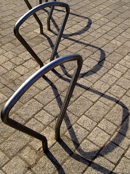
These cycle parking stands in Blackpool reminded me of bottle openers, but despite that are much better than the cycle parking of old - a concrete slab with a groove in it, guaranteed to buckle your wheel! I used a wide angle lens and isolated the stands from the background, concentrating on showing them, with their shadows, against the blockwork paving. When I looked at the image on the computer the strong shadows accompanying the hooped shapes, seemed to have an inter-woven "wibbly wobbly" effect, reminiscent of a child's first zig-zag excursion on two wheels!
photograph & text (c) T. Boughen

Friday, June 16, 2006

Fleetwood panorama

click photo to enlarge
When, in 1837, Decimus Burton planned the town of Fleetwood in Lancashire with his patron, Peter Hesketh-Fleetwood, they thought big. But, their bird's-eye view drawing of how the town was to be, with its radial plan, eye-catching buildings, parks, churches and vistas was only partly realised. The money ran out, and with it the dream of an imposing resort in the style of the south of England's Brighton or St Leonard's. What was left was a mixture of the grand and the prosaic. But, though the boulevards and mansions weren't realised, the desired prosperity did eventually come, courtesy of the fishing industry. Today the fishing has declined, and Fleetwood is no longer a prosperous town. However, it remains a place of visual interest and distinct character, in a great location, with a unique history.

This view shows two of Burton's most distinctive buildings - the Lower Lighthouse (1840) with its covered seating on four sides, and the large, curving, North Euston Hotel (1841). Both are imposing stone buildings, giving an impression of dignified grandeur to any sea-borne visitor entering the docks up the mouth of the River Wyre. The third building in this panorama is Blackpool & The Fylde College's Radar Station (1964-5), designed by Lancashire County Council's principal architect at the time, Roger Booth. This delightful curved building stands on steel legs in the sand next to the promenade, its top bristling with electronic navigation equipment used for the training of nautical students. What would Burton have thought of this quirky addition to his refined group. I like to think that he would have appreciated its utility and whimsy, and would have noted its curve as an affectionate nod to the curve of his more imposing hotel.

The early morning light gave some useful moulding to this group of buildings, and I used a wide angle lens to capture them. The final image was cropped to more readily match the elongated nature of the subject. Looking at the scene in this way makes me think that a "stitched" panorama would be a suitable treatment of this view, and it's one to which I may return.
photograph & text (c) T. Boughen
Thursday, June 15, 2006

The virtue of simplicity


click photo to enlarge
The primary purpose of any home is to provide sufficient and efficient living space, and protection from the elements. A secondary purpose is to offer a pleasing form to the inhabitants and passers-by. Many buildings provide one or the other of these, but significantly fewer offer both.

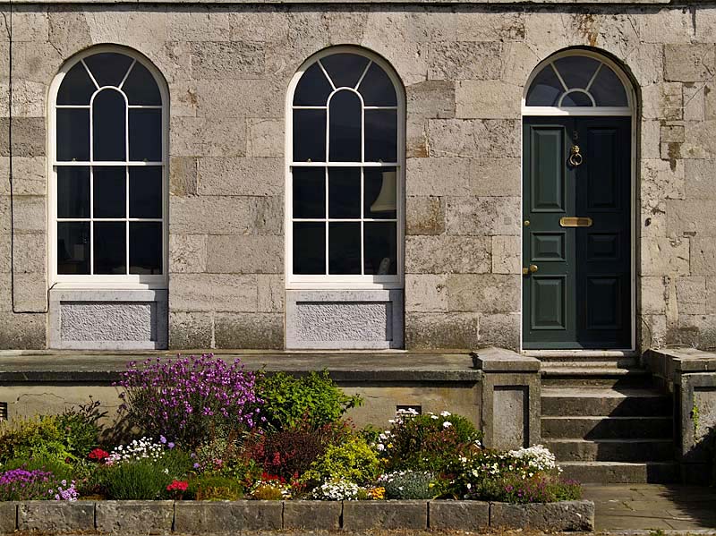
This photograph shows part of Victoria Terrace, Beaumaris, on the island of Anglesey. It is the work of the architect Joseph Aloysius Hansom (1803-1882), whose buildings include Birmingham Town Hall and the stunning church of St Walburga, Preston. Hansom is, perhaps, better known as the inventor of the immensely successful Hansom Cab, a two wheeled design with a single horse and a "cabbie" placed at the back; a design that packed Victorian cities in the Britain, Europe and the United States.

This stone-built terrace, erected in 1832, looks out over the Menai Strait. Though it's called a terrace, it certainly doesn't look like one. In appearance it resembles a large Palladian country house, having a central pentastyle portico with attached columns at first and second floor level, and plainer wings. The overall form suggests a single grand building, but the doors along the ground floor show that it is subdivided into many dwellings. This is an idea that was introduced into England by John Wood the Elder in Queen Square, Bath in 1735. How does this building function in terms of living space? I don't know, but I suspect that it leaves something to be desired! What is clear from the photograph, however, is that it offers a very pleasing elevation to the public that graces the sea-front of this small town.

Through my photograph I wanted to show the pleasing simplicity of the ground floor doors and windows, the lovely texture of the stonework, and the minimal but wonderfully effective detail of the garden and steps. This building demonstrates the importance of proportion, repetition and the relationships between forms in architecture - qualities that are often lacking in much current domestic housing. I used a zoom lens at 90mm (35mm equivalent) to capture this image, and present it as it came out of the camera.
photograph & text (c) T. Boughen

Wednesday, June 14, 2006

Knowledge and understanding

click photo to enlarge
I've spent most of my adult life work-
ing in educa-
tion, so I have a comm-
ittment to learn-
ing, and a passionate belief in its power to enrich our lives. However, I sometimes wonder whether it's the case that the more we know the less we understand!

Take, for example, crime. There is general agreement based on authoritative data that, in the UK, most types of crime have been falling in recent years. However, the public perception is that crime is increasing, and fear of crime is greater than formerly. Why is this? It seems to me that it's a failure of understanding, and that the mass media and politicians are responsible for this. The newspapers, keen to sell copy, give great prominence to sensational, crime-related stories, and build their own, allegedly public service, but actally self-serving "campaigns" around individual human tragedies. Television news works to a similar agenda. Politicians, anxious not to be characterised as "soft on crime", and consequently electorally vulnerable, introduce knee-jerk legislation and tougher sentences, and each political party tries to trump the others by showing how they'll deal more severely with criminals. Is it any wonder that the long-suffering public misses the fact that there is less crime than there used to be, not more?

The photograph above shows an "anti-climb spinner" on a school. It is designed to stop vandalism and theft from this public building, and is evidence of another failure of understanding. Those who damage and steal from the state's schools fail to appreciate that the monetary cost of their criminality is met by the general population including themselves, and those who suffer are the children of people they know! It was the "positive-negative", abstract pattern of this composition that appealed to my phototgraphic sensibilities, and I liked the way the line of the roof separated the actual spinner from its shadow, as well as the blue/grey/cream colour bands.
photograph & text (c) T. Boughen

Tuesday, June 13, 2006

Affection and protection

click photo to enlarge
"You can look, but don't even think about touching!" That's what this mute swan (probably a male or "cob") seemed to be saying as I pointed my camera towards him and his following cygnets. Like any good father he was giving his offspring affection and protection as they foraged for food on the canal. And, like any vulnerable infants, the cygnets dutifully kept close to their parent, taking their lead from his actions, learning what is safe and what can't be trusted.

The mute swan (Cygnus olor) is one of seven species of swan found worldwide. It is also the largest British bird, and one of the largest flying birds. In Britain the species is again numerous after a period of significant decline, during the second half of the twentieth century, caused by lead poisoning from the weights used by fishermen. Interestingly, the domestication of the mute swan, and its use in medieval times as food, probably saved the bird from extinction in our country. In the distant past herds had to be marked with an owner's mark, and any unmarked birds became the property of the Crown. Swans became known as "Royal birds" for this reason. Marking is still carried out on the Thames, and at Abbotsbury in Dorset, where the colony of mute swans has existed for 600 years.

It was hard NOT to take a photograph of this delightful little group! The small, fluffy, dowdiness of the chicks, compared with the large, white, regal parent, all outlined against the dark water made a good contrast. I used a zoom lens at 300mm (35mm equivalent) and pressed the shutter as the adult turned to make one of its frequent checks on what I was doing.
photograph & text (c) T. Boughen

Monday, June 12, 2006

Verdant June

click photo to enlarge
"June is bustin' out all over,
All over the meadow and the hill!
Buds 're bustin' outta bushes
And the rompin' river pushes
Ev'ry little wheel that wheels beside
the mill!"
lyrics by Oscar Hammerstein (1895-1960), from "Carousel"

The film version of the Broadway musical, "Carousel", was my first introduction to cinema. I must have been around 6 years old, and I distinctly remember thinking that watching it was like dreaming! I couldn't understand the plot, but the images and the music made a big impression on me. But not this song. Have you ever listened to the words - they're gibberish! Oscar Hammerstein wrote some great lyrics, many of which were clever and witty, but these are not among them. However, his general observation IS correct. The month of June does seem to "bust out all over", and it certainly felt like it was the other day as we walked along the canal near Glasson, Lancashire.

As we followed the tow path from Glasson Dock to its junction with the Lancaster Canal there was a palpable feeling of nature growing at full throttle. The hedgerows were becoming tangles of green as each bush and shrub fought for its place in the light. Yellow flag, water lilies and rushes were expanding at the edges of the canal, starting to narrow the waterway. On the water swans shepherded their cygnets, coots dabbled in the weed, and under the dark overhanging bushes the sharp calls of moorhens warned their chicks of our passage. The heat of the day made the cool shade of each bridge over the canal a welcome relief.

Conventional photographic advice is to avoid shooting at midday due to the flatness of the light. The photograph above was taken just before noon! Mindful of this I used the shade of the trees and bridge to introduce some contrast. The composition relies on the figure of my wife being placed at a focal point created by the arch of the bridge and the dusty track. Increased emphasis is put on her by being placed against the smooth light background of the canal. I used a wide angle lens to ensure I had all these elements in the scene. It's not a great photograph, by any means, but I think it is a pleasant snapshot reminder of an pleasant walk in verdant June.
photograph & text (c) T. Boughen

Sunday, June 11, 2006

Sea defences and longevity

click photo to enlarge
From September I shall become a gentleman of leisure. Let me immediately dispel any false notions of what that might imply by saying that I'm taking early retirement! The time that will be mine, once I've finished with the day job, is what I relish most of all. However, the decision to retire has, unexpectedly, made me consider more deeply my own mortality, and particularly my likely longevity!

It's human nature to periodically consider how long you're likely to live, and to think about your own future. I remember, at the age of 10, working out how old I would be in the year 2000. Now I find myself calculating how much longer I'm likely to last! It's the prospect of retirement that has, unexpectedly, brought this thought to the forefront of my mind. I suppose the everyday concerns of raising a family, and pursuing a demanding career have previously pushed such thinking into the background.

These observations were again in my head whilst I was taking the photograph above. It shows the renewal of the sea-wall at Cleveleys, Lancashire. The old concrete sea defences dated from the 1930s. They are being replaced by large sections of steps, like the one on the lorry trailer, which are carefully swung into place and locked together using the ingenious sockets and studs moulded into the concrete. Seeing this made me wonder about the envisaged longevity of the original defences. I imagine the engineers thought they would survive more than 70 years. How long will these new ones endure? Who knows, but they will surely outlast me!

The photograph was taken on a clear and sultry evening, after work had stopped, with the sun heading down into the western sea. The bright, new smoothness of the concrete appealed to me, and the position of the very large crane seemed an obvious focal point on which the lines of the steps could converge. I included the nearby lorry in a key section of the frame, for the additional visual interest, because its load explains the construction, and because it is another pointer to the distant crane. A 28mm (35 mm equivalent) lens was used, and I converted the shot to black and white with a fairly high level of contrast.
photograph & text (c) T. Boughen
Saturday, June 10, 2006

Translucence

click photo to enlarge
The first glass was made by the Phoenicians. It was translucent, and had a blue-green hue due to iron impurities in the sand. The first window glass dates from 1st century BC Egypt, and it too was translucent. Not until the eleventh century AD, in Germany, was the technique perfected for making flatter, thinner glass by forming a cylinder from a blown sphere, then cutting it and flattening it out. This had better transparency, but still didn't achieve the perfect clarity that was sought. In the early nineteenth century window glass was made commercially using a development of the cylinder method, and was closer to the standard we know today. Then during the early twentieth century machinery was used for the first time, and it made completely flat and clear glass. But here's the irony; once the centuries-long search for a quality of glass that transmitted light perfectly - that behaved as though it wasn't there - had been achieved, manufacturers set about developing countless types of translucent glass!

We use translucent glass - it's also called frosted or patterned - where we need light but also privacy. In most houses it is commonly found in the bathroom! There is a tendency today to choose glass with representational patterns - leaves are popular. However, I prefer non-representational designs, and, being a traditional sort of person, stick with the variety known as Large Flemish.

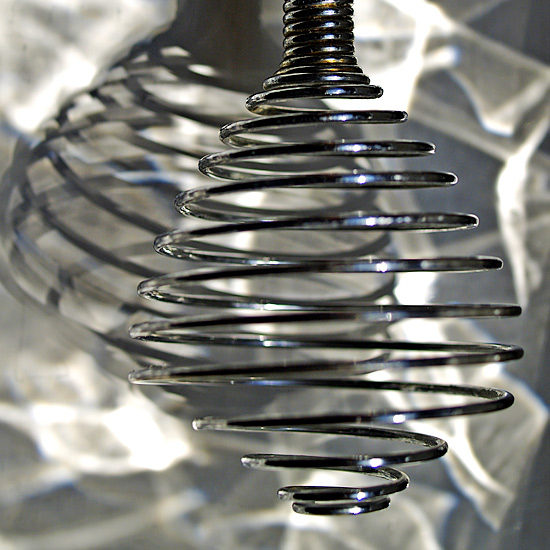
The photograph above shows the head of a hand whisk on a window sill, lit by the refraction patterns thrown by Large Flemish glass when the sun is shining through it. This pattern has been appearing each afternoon at this particular window, and I wanted to include the smoke-like shading in the background of a photograph. Here I placed the whisk slightly to the right of the frame so that it threw its own interesting shadow to the left, and took the photograph using a macro lens. The only post processing is a some increase in contrast and saturation.
photograph & text (c) T. Boughen