Sunday, April 30, 2006

Oriel Chambers, Liverpool

click image to enlarge
Liverpool is to be the European Capital of Culture in 2008. The European Union confers this title on different locations each year, with cities actively vying to achieve the accolade. Past recipients include obvious locations like Athens, Madrid and Paris, but also less obvious choices such as Glasgow, Weimar and Graz. Many cities have used the award as a focus for growth and regeneration, and Liverpool is taking this route.

The claims of Liverpool to the title are firmly founded, and its built environment and musical legacy are only two of the areas where the city excels. In terms of buildings, many will know Scott's massive red sandstone Anglican Cathedral and Gibberd's modern Roman Catholic Cathedral. The trio of Pierhead buildings - the "Three Graces" of the Royal Liver Building, the Cunard Building and the former Mersey Docks and Harbour Board building - will also be well-known. On the St George's plateau is the magnificent neo-classical St George's Hall, and a group of other large civic buildings. All these are familiar enough. But how many, outside the circles of architectural historians, know of one of the most interesting of Liverpool's buildings - Oriel Chambers?

Built in 1864 by the architect Peter Ellis (1804-1884) the building illustrates how, in the words of Henry Russell-Hitchcock, "the Chicago skyscraper of the nineties seems almost to have come to premature birth in Liverpool in the sixties." If one ignores the Gothic detailing and looks at the building between the first floor and the attic storey Oriel Chambers seems to prefigure one of the key characteristics of the Modern Movement. The all-over grid of oriel windows with minimal iron glazing bars and very little masonry between them is an early version of the "curtain wall", and is underpinned by a steel frame. In the courtyard of the building this is left partly exposed, as was to become the twentieth century way. Interestingly, the Chicago architect, John Wellborn Root, was in Liverpool (avoiding the Civil War) at the time Oriel Chambers was being constructed. Was this building an influence on his subsequent work? Perhaps. However, in Britain Ellis's forward looking structure was described as "a great abortion" and "an agglomeration of great glass bubbles", and whilst some were influenced by the ideas incorporated in the building, it is as a rogue precursor of what was to come that the building is remembered today.

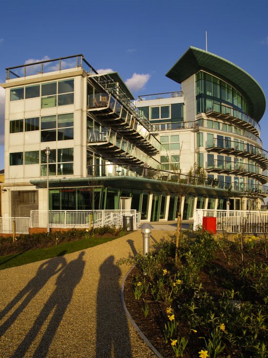
Architectural photographs often benefit from having a raking light throwing shadows to better describe the form. In this shot that light meant the right of the building was too dark, so I have digitally "dodged" that area to bring up some detail. Converging verticals can add drama, but here I reduced the effect to emphasise the building's rectinear grid.
photograph & text (c) T. Boughen

Saturday, April 29, 2006

Shadows - marvellous and mischievous

click photo to enlarge
The other day I was watching a little boy with his support worker. They were sitting on the ground playing with a ball. When the ball rolled away the boy ignored it because he had caught sight of the shadow of his head and upper body. He reached out to touch his shadow, and, of course, it changed and moved. His support worker noticed this and put out her hand, spread her fingers and waggled them. The boy reached for the shadow hand and it became superimposed on his own. He then looked up at the real hand and down again at the shadow hand. The boy had Down Syndrome, and consequently the relationship between the two hands was not as apparent to him as was to me and his assistant. But, in his actions, you could sense his attempt to understand the correlation between the real hand and its doppelganger.

The actions of that small child opened my eyes to two things. Firstly, how we take for granted our understanding of our world, and secondly, how easily we forget what a marvellous phenomenon the shadow is, and how it greatly enriches our visual experience.

I took this photograph of the head of a battered violin in the late afternoon so that its shadow could be an important part of the image. I placed it on the smoothest, whitest paper I could find, and metered the shot off the violin so that the resulting image would have something of a "high key", slightly overexposed effect. To emphasise this I converted the colour image to black and white, and then, to take it up a further notch, I used the software equivalent of a red filter. The final effect is close to what I wanted. However, the shadow that an object will throw is sometimes difficult to predict. And, effectively pricking my feelings about the seriouness of my photograph, someone who saw this one said it looked like a cartoon 1950s Rocker, with a quiff, blowing bubblegum!
photograph & text (c) T. Boughen

Friday, April 28, 2006

A work of artfulness

click photo to enlarge
I have had a deep interest in art for most of my life. I've looked at it, studied it, tried to understand it, got enormous pleasure from it, and I have a go at it myself. Consequently I am uncomfort- able writing what follows because it makes me sound like a Philistine who shoots his mouth off from a position of ignorance. But, since it's what I believe, here goes.

It seems to me that much of what passes for contemporary art, particularly that which has been feted under the "Britart" name, is worth very little. It is shallow, gimmicky and trite, producing works to catch the public eye and promote the celebrity status of the "artist". The grasshopper minds of the likes of Damien Hirst and Tracey Emin produce work that not only has no depth, it has no challenge either. What you see is all there is. Rarely do these artists develop themes: their aim seems to be to outdo each other in "outrageousness" or "difference", but for no reason other than novelty. These people are artful, but not artists.

The work above is by one of Britain's most famous contemporary artists, and is currently the most talked about piece of art in the country. It is Rachel Whiteread's "Embankment", at Tate Modern in London, and it fills the former turbine hall. The work comprises thousands of plastic casts of boxes in various piles that the visitor can walk around. It's apparently "an exploration of the universal quality of the box", which in piles "invites parallels with the museum as a keeper of collective memory"! The charitable, might say it's interesting to walk round, and unusual to look at. But, would the artist's apparent intention be clear to anyone if it hadn't been stated? And what does it really offer apart from piles of plastic boxes? Would the art work be any the less if the piles were smaller or arranged differently? And if not, what does that say about the value of the original conception.

My wide angle photograph from above is designed to show the scale of the work and its substance (or lack of it). The public are expected to walk through it, and my shot shows children playing hide and seek! I imagine many industrial warehouses might offer a similar experience. However there the boxes would be arranged more conveniently!
photograph & text (c) T. Boughen

Thursday, April 27, 2006

The world's most elaborate bench?

click photo to enlarge
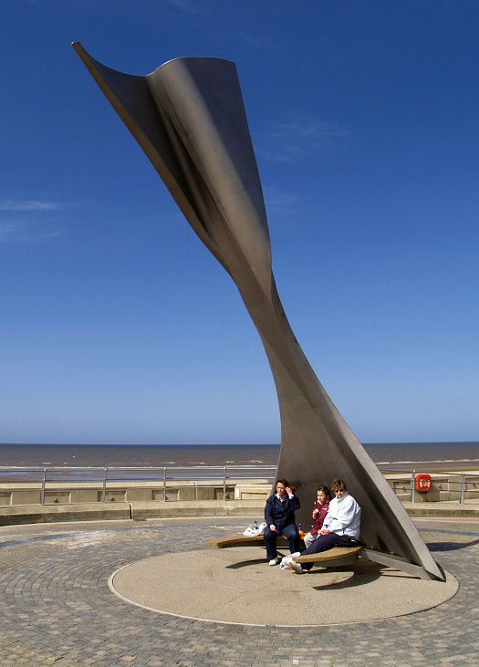
Is this the world's most elaborate public bench? It has recently been installed on the South Promenade at Blackpool, Lancashire, and is part seat, part art installation, and entirely wind free!

Designed by the architect Ian McChesney, the 26 feet (8m) high stainless steel structure is mounted on a circular rotating base, has a curved wooden bench at the bottom, and a graceful top inspired by a whale's tail. This superstructure is designed to catch the wind and rotate the installation so that the occupants of the seat are always sheltered from it! The engineers, Atelier One, are to build more of the seats along this section of the sea front where they will complement the growing number of art works.

The general public have mixed feelings about this approach to public art in the town, and the cost involved, but I unequivocally applaud it. Not every piece works for me, but many do, and all add visual interest to the new concrete sea-wall and walk-ways. It's great to see public spaces enlivened by the work of artists, and it's positively uplifting to walk among these creations and admire the ingenuity and inspiration, as well as the civic pride, that brought them about.

The bench is quite hard to represent properly in one photograph, so I include two of the several that I took. One, taken with a long focal length lens shows something of the general context, and the other - a wide angle shot - shows the immediate surroundings. Together they better explain the shape, particularly that remarkable top. Incidentally, the distant tall shape with the curled top is a sculpture called the "High Tide Organ", which makes musical sounds, varying in volume and complexity, caused by the air pressure created by the incoming tide!
photographs & text (c) T. Boughen

Wednesday, April 26, 2006

Blind abstraction

click photo to enlarge
The camera lets us see the world in a different way. A viewfinder's rectangle of light focuses our attention on whatever it is pointed at, and, if we care to, we can acquire new insights into our surroundings through it: the mundane can become marvellous.

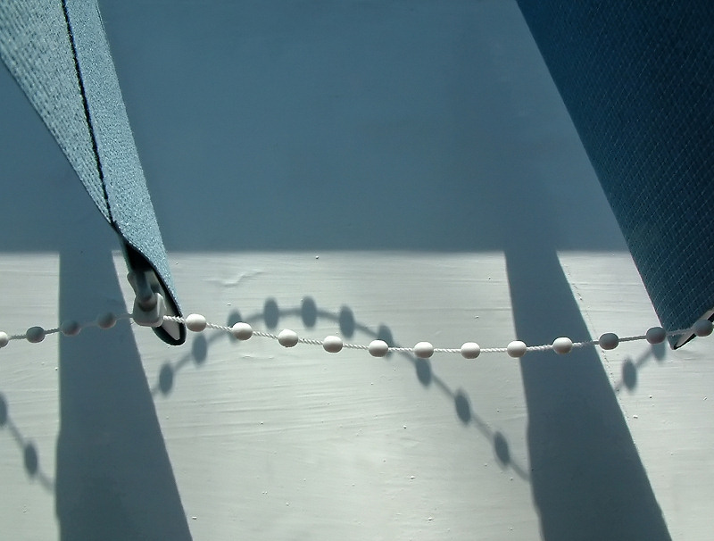
The other day I set myself the task of getting a photograph out of a set of vertical blinds. I had done this once before here, but finding a second shot from this limited subject matter is challenging. Maybe it's analogous to the well known "second album" predicament that afflicts many bands - the best ideas are invariably used up first! However, I think self-set problems of this sort are helpful to any enthusiastic amateur photographer, because it encourages us to think and see more deeply.

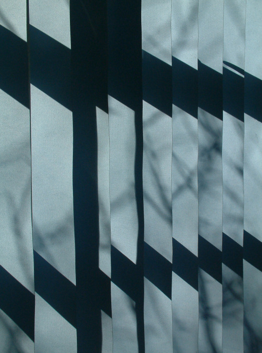
The shot I came up with works (for me) because of the limited range of colours and the shadows. However it is the beaded string that is the eye-catcher. Consequently my main concern was to incorporate all the available tones in a balanced composition that featured the string and its shadow. So, I included slats and their shadows to left and right, and enough of the window sill to include both sunlit and shadowed parts, and I made them split the image horizontally. The final composition is fairly symmetrical, with beaded string and its shadow introducing contrary elements. I'm reasonably satisfied with the shot. I think it works best if you forget what it is, and see it as just a collection of abstract forms. Then, I think, it has something of a painterly feel to it.

This isn't a natural way of working, nor does it produce images that have a wide appeal: in fact some will think this is a nothing sort of a shot. But, I do think the process has merit, and I commend it to anyone who wants to break the habit of taking photographs of the same type of thing over and over again. Now, how can I get a third shot out of these blinds?!!
photograph & text (c) T. Boughen

Tuesday, April 25, 2006

LUKW - A DUKW!

click photo to enlarge
In a race between these two water chariots which would you put your money on? In the background is the "Sun Clipper", a 25 knot, 138 seat, "ultra-low wash" commuter boat of the Thames Clippers fleet: in the foreground an adapted ex-military amphibious DUKW transport of WW2 design, capable of 50mph on the road and 6mph in water. So, I guess on water we back the clipper, but on land the DUKW definitely has it!

A number of tourist locations, principally in the US, but also in England and elswhere, use these old amphibians. It must be for the novelty value of driving into water, having a gentle cruise, then trundling back on to dry land. Hovercrafts are often used in the same way for similar reasons. However, as I've watched the DUKWs of London Ducktours chugging up and down the Thames I've often wondered if there isn't another motivation that attracts the punters. Namely the thrill of travelling in such a precarious fashion. Perhaps all the passengers are fairground ride enthusiasts looking for a different kind of buzz: the fascination of will it sink or won't it!

I took a few shots of this vintage vehicle. All had the bright yellow of the amphibian against the almost monochrome background. But, I preferred this one, with the illuminating shaft of sunlight on the utilitarian outline of the DUKW, and the contrast it makes with the sharp, lean lines of the modern boat. The visual juxtaposition, ironically, shows utility in the background and fun in the foreground. Sixty years ago the DUKW was the embodiment of utility!
photograph & text (c) T. Boughen

Monday, April 24, 2006

Gravestones and mortality

click photo to enlarge
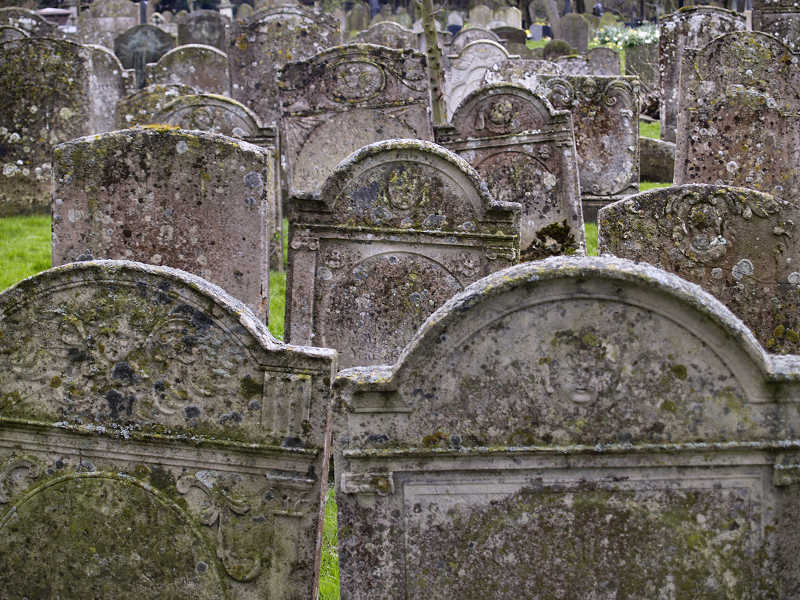
There's nothing like a walk in a graveyard to remind you of your own mortality! As you pass through the ranks of stone the shapes catch your eye first: plain rectanglular slabs, graves with curved and pointed tops, some with elegant pediments, and, dotted about, table tombs, crosses, weeping angels and multi-columned creations commemorating Victorian worthies.

Then the names jump out at you - some no longer used, but dimly remembered from religious education lessons: Obadiah, Jesse, Isaiah, Emmanuel. The ages at death draw your attention, particularly those of the young and the long-lived, but most of all those of your own age! And under the names and ages, often a phrase, a Bible quotation, or a piece of verse, sometimes touching, though more often doggerel. "Departed this life", "Fallen asleep", "Gone before" are common enough. But occasionally one comes across words written for the individual, as on an infant's grave at Lynton, Devon: "Opened my eyes, took a peep, Didn't like it, went to sleep".

The gravestones above are on the south side of the church of St Mary at Long Sutton, Lincolnshire, and date from the eighteenth century. They are lichen encrusted, and the soft stone is gently crumbling. But, through this patina of ages one can still see the classical cherubs and garlands, the relief panels and Ionic columns, and here and there a name to be deciphered. Carved skulls, sometimes with crossed bones, remind us that these people were more familiar with death than we are, knew its cruelty and necessity, and didn't hide it away.

I took this photograph on a dull, overcast day, impressed by the texture of the stones and the way the ragged rows mutely represented the long-dead townspeople. A little increase in contrast was necessary to bring out the detail, and I compressed the rows to emphasize the number of gravestones (unusual for this date) and the undulating patterns caused by settlement over the centuries.
photograph & text (c) T. Boughen
Sunday, April 23, 2006

Styling and money pits

click photo to enlarge
"Car: a wheeled motor-vehicle, usually propelled by an internal combustion engine". So says the dictionary. But to many people, particularly men, they are so much more. An obsession, a reflection or extension of personality, a status symbol, an object of beauty, a lifetime hobby, a money-pit: I'm sure you can add to this list. Oh, and for some people they are a form of transport!

Now, neither my best friends nor my worst enemies would describe me as a "petrol-head". I'm one of those people who see cars as a regrettable means of getting from A to B. What tipped me into buying a car was the arrival of a second child and unfortunate experiences on British Rail due to the depredations of the Thatcher years. Up to that point bicycles and public transport had served my needs. Now I use a car daily, and choose my model based principally on economy and reliability: I drive a Honda!

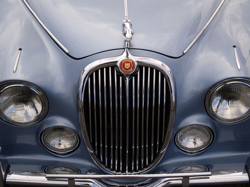
At this point, given my attitude to cars, you might be thinking, why the picture of the front end of an old Jaguar? Well, I've always been interested in design, and to a lesser extent, style (though I've no interest in fashion), and cars are the recipients of more styling than virtually any other manufactured object. Inevitably, with that amount of attention, some cars are going to have great styling, and sculptural qualities that can be appreciated in their own right. As I walked down a line of veteran and vintage vehicles on display in St Annes, Lancashire, I stopped at this Jaguar and admired the sensuous styling of the bonnet, radiator, light clusters and bumper. "Sculptural" is the only word to describe this delightful ensemble, and so I took my photograph of the best bit of the car.

For those who need to know, I believe this to be a Jaguar "S Type" 3.4 litre, manufactured between 1963 and 1968. If I'm wrong please correct me.
photograph & text (c) T. Boughen
Saturday, April 22, 2006

Traditional beach huts

click photo to enlarge
At one point, in the 1970s and 1980s, it seemed as though beach huts would disappear from the British seaside. The fashion for foreign holidays meant that demand declined, maintenance was skimped, and many huts were either demolished or sold to private buyers. But, like many relics that manage to hang on after their time has passed, people have started to value them, and their fortunes have revived. It seems that many still want to rent a hut as a little base for their seaside days: somewhere to shelter from the showers, change for bathing, cook and eat a simple meal, and to sit outside to soak up the sun.

The styles and number of huts varies across the country. Those at Southwold in Suffolk are, perhaps, the most attractive, with their gable ends, gated verandahs and individual colours. The oldest, dating from around 1900, are almost certainly to be found at Wells-next-the-Sea, Norfolk. Bournemouth has the greatest individual concentration - approximately 1500 in total - with about 500 still owned by the local council. The newest are probably the seven, rather grand, architect-designed huts at Hornsea, East Yorkshire, completed in 2003.

So, what is distinctive about these beach huts at Mablethorpe in Lincolnshire. Well, they aren't the most attractive, but, like all the others they are wooden, next to the sea, and brightly painted. However, what distinguishes the 103 huts here is their level of equipment! Each has four deck chairs, a table, crockery, a sink and tap, and an electric kettle! And all for about £8.00 a day (reductions for a week)! If the British seaside holiday is to compete against foreign vacations based on cheap flights, then a distinctive experience needs to be offered. These huts, though cheap and cheerful, are a small part of what makes our seaside different.

This section of Mablethorpe's beach huts almost demanded a shot which emphasised the repetition of forms, so I used a long telephoto lens. I chose to make the colour split one third/two thirds, and include the orange painted promenade light as a bright highpoint to which the eye is directed. The small patch of yellow, repaired woodwork gave some necessary visual weight to the right side of the image.
photograph & text (c) T. Boughen

Tuesday, April 18, 2006

The attraction of railway stations

click photo to enlarge
The architects of the nineteenth century rail system had nothing on which to base their new constructions. So, they plundered the styles - Classical, Gothic, Tudor, Deuxieme Empire and the rest - and blended it with the utilitarian forms that were necessary to meet the needs of the travelling public. For me the appeal of railway architecture lies in this wonderful mixture of style and utility.

Anyone who has alighted from a train at York station, and gazed up at William Peachey's curving train shed of 1871 cannot fail to be impressed by the size, style and brilliance of what was constructed. And if you've looked at the ironwork on London's Blackfriars Bridge, advertising the London, Chatham and Dover Railway, you're bound to acknowledge the way the engineers and architects built things to last. I still remember my first vist to London in the 1960s, walking out of King's Cross station, and turning round to see Lewis Cubitt's facade perfectly expressing the canopies behind. Despite it being made of stock brick in 1852, I thought then, and I still think now, that it looks very modern.

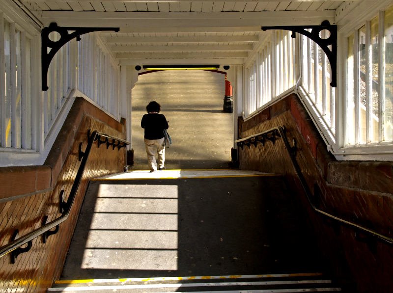
The stations in small towns have their charms too. Often companies used a similar style along particular lines. Invariably they built canopies, waiting rooms, and ticket offices, all constructed with care, and often looking as good now as the day they were finished. And this despite the neglect of recent years where private profit has replaced public service. The photograph above shows the covered steps leading down to the platforms at Poulton le Fylde station in Lancashire. The concrete steps, glazed brick wall, sturdy handrail and wooden superstructure with iron brackets, built by the London, Midland and Scottish Railway, are still giving excellent service to passengers today.

I took this shot for the architecture, the interesting framing it provides, and way the light was falling on the stairs, leading the eye to the figure who has almost reached the platform. I hadn't articulated it before I wrote this piece, but the filtered light and shade, and the strong and distinctive shapes found in stations, are what appeals to the photographer in me.
photograph & text (c) T. Boughen
Monday, April 17, 2006

Windsor Castle - before the storm

click photo to enlarge
Five minutes after I took this photograph of Windsor Castle under a dark grey, threatening sky, I was inside a pub with my companions watching the rain and hail bouncing off the road outside. The day had started bright and warm, but, with not even a hint of a warning from the weather forecasters, a front swept across the south-east of England, depositing April snow on Kent and spoiling my day out in Windsor!

Being a person of republican tendencies I'd like to see a storm over Windsor as a metaphor for British sentiment regarding the royal family. Unfortunately it isn't. Whilst minor royals, and some of the immediate family routinely get bad press, the Queen sails on into her eightieth year, and the fifty third year of her reign, as unassailable as ever. It seems that longevity in royalty deepens public affection. Our two best loved and remembered queens are Elizabeth I and Victoria, both of whom had long reigns: Elizabeth II seems set to repeat their achievement.

I hadn't set out with the intention of photographing Windsor Castle from the start of the Long Walk. However, the light from that menacing sky deepened the colour saturation of the scene, and made the Castle look like a cardboard cutout. Now anyone of a republican persuasion is going to see the metaphor in that, and so I took the shot! The odd lighting, the symmetry of the building and foreground, and the two scarlet spots of the guardsmen's jackets make for an interesting image, even if, unfortunately, there is no deeper resonance to it!
photograph & text (c) T. Boughen
Sunday, April 16, 2006

Humpty Dumpty Rules!

click photo to enlarge
"When I use a word," Humpty Dumpty said, in a rather scornful tone, "it means just what I choose it to mean, neither more nor less."
from Through the Looking Glass by Lewis Carroll

Have you noticed how many words have lost their meaning, or at least gained a new meaning that has nothing to do with what they originally meant? Take the word "next". Pretty straightforward you'd think. The commonest meaning is "immediately following, as in time, order or sequence." But no. To people working in television it means, "in 5 minutes time after this batch of adverts, and a trailer for a forthcoming programme, and an interminable animated station logo, and a further advert from the programme sponsor!" So, when the TV continuity person tells you that the programme you're waiting for is "coming up next", you know you've got time to relieve yourself, make a cup of coffee, and read "War and Peace", before you finally settle down for your evening's viewing!

Or what about the word "village". It clearly means "a rural settlement, between a hamlet and a town in size". So why, quite near where I live, is there a large new building - a health centre with doctors' surgeries, a pharmacist, dentists, etc. - describing itself in letters three feet tall as a "Health Village"? A single building as a village? Any self-respecting real village has a green, a church, a shop, quite a few houses and a village idiot. Mmmm, I wonder who thought up the name "Health Village?

And how about "boutique". For someone of my age it means a small clothes shop selling current fashions a la Mary Quant. The dictionary widens that definition to a small shop or business selling specialized products. That being the case, what on earth is a "boutique hotel"? When you book in are you offered a new outfit to complement the decor of your room? Do you have to shuffle past rails of clothes to get your place in the dining room? What goes on in such an establishment that differentiates it from a plain vanilla hotel? I can't imagine.

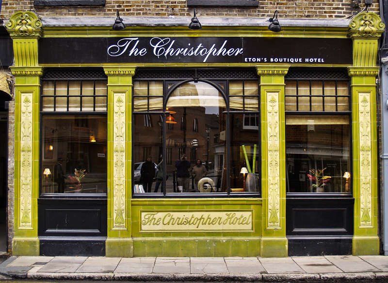
I only noticed this particular appellation, written in small print on the black fascia, after I'd taken my photograph of this hotel frontage. What had attracted my attention was the splendid green and cream Art Nouveau tilework panels set in a fairly traditional shop front, and I thought it worthy of a shot. Late C19/early C20 survivals of this sort are lost each year, so it's always wise to record such things. Careful observers will also note the photographer (with family in tow) reflected in the window!

Note
After I wrote this Bill Turner did some spadework for me and looked up the definition of a boutique hotel. Thanks Bill. As I suspected, it's semi-literate marketing-speak. The word "boutique" has been appropriated for no good reason other than someone's ignorance and laziness. Other words abound that could have been used. Humpty Dumpty Rules , OK!
photograph & text (c) T. Boughen

Saturday, April 15, 2006

Columns and shadows

click photo to enlarge
There can be few architectural motifs that have been as widely adopted, over such a period of time, as the classical orders of architecture. From the earliest sturdy Greek Doric of the seventh century BC, though the Ionic with its volutes and fluting, to the acanthus leaf capitals of the Corinthian, the columns, capitals and associated entablatures have been at the forefront of much Western architecture for the past two and a half thousand years.

Sometimes the two additional orders devised by Roman architects (the Composite ) and by C16 Italy (the Tuscan ), are used. During the Byzantine period debased versions with exaggerated entasis and fanciful capitals bearing only a passing resemblance to their progenitors continued the love affair wth the orders. And the inventive columns of Gothic architecture clearly owe much to the Ionic and Corinthian styles. However, since the rediscovery of classical learning in the Renaissance, right through to the early twentieth century, the Classical orders of architecture, in a pure or slightly modified form, have been widely used in architecture. And, even since the rise of Modernism, the orders, or knowing references and allusions to them, keep creeping into buildings.

Why is this? Partly it's to do with the authority of Greek and Roman architecture as seen by subsequent centuries, both as the fount of much that followed, and also as a symbol of power, supremacy and learning. But it's also to do with the defined and refined vocabulary of forms and proportions that produce satisfying architecture.

The photograph above shows the base of the giant Corinthian columns on the east side of St George's Hall, Liverpool. Designed by the twenty five year old Harvey Lonsdale Elmes around 1840, this structure is widely acknowledged as one of the finest Neo-Classical buildings in the world. My photograph tries to capture the way the fluting of each column and the moulding of the bases throw beautiful shadows, giving solidity and definition to the structure, just as was intended by the original Greek designers. The strong April sunshine is throwing more shadows across the portico, giving an interesting pattern, and adding to the effect of sublime and permanent order.

All architectural definitions are from "Wikipedia".
photograph & text (c) T. Boughen
Friday, April 14, 2006

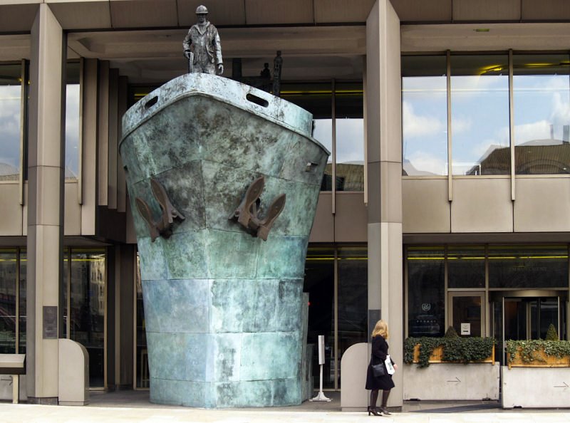
IMO UN wasted money

click photo to enlarge
I imagine the conversation went something like this.

Chairman: "The International Maritime Organisation, the IMO, is one of the smallest of the United Nations' organisations with only 300 staff. We need to raise our public presence, particularly here at our London headquarters. Our building is modern and by the Thames, but it doesn't really advertise us. Gentlemen, I'd like to hear your suggestions as to how we might raise our profile!"

Member 1: "Well chairman, I'd like to suggest that we have lots of ships in our downstairs windows. People like to look at ships, and we'd pick up the passing trade."

Chairman: "Whilst I agree that ships should feature prominently in our branding, I'm afraid the gentleman's suggestion could make us look like a toy shop. We might attract entirely the wrong sort, including children."

Member 2: "Well, how about having one big ship. I know someone with a few oil tankers going spare."

Chairman: "An excellent thought, but the size of your friend's ships might present a problem. Does he have anything smaller?"

Member 3: "How about the bow of a ship projecting through our entrance. Surely we know someone with a ship we can chop up and use."

Chairman: "We're getting somewhere now gentlemen. However, rather than use a real ship's bow, let us consider commissioning a sculptor to make an artistic representation - a universal symbol of maritime commerce, if you will. The combination of a ship and art will elevate our project and make a positive statement about our organisation."

Member 4: "An excellent suggestion chairman. To quote that venerable mariner, Captain Jean-Luc Picard, 'Make it so!'"

Dissenting voice from the back: "Bloody stupid idea. It'll make us look like we've been rear-ended by a drunken sailor!"
photograph & text (c) T. Boughen

Thursday, April 13, 2006

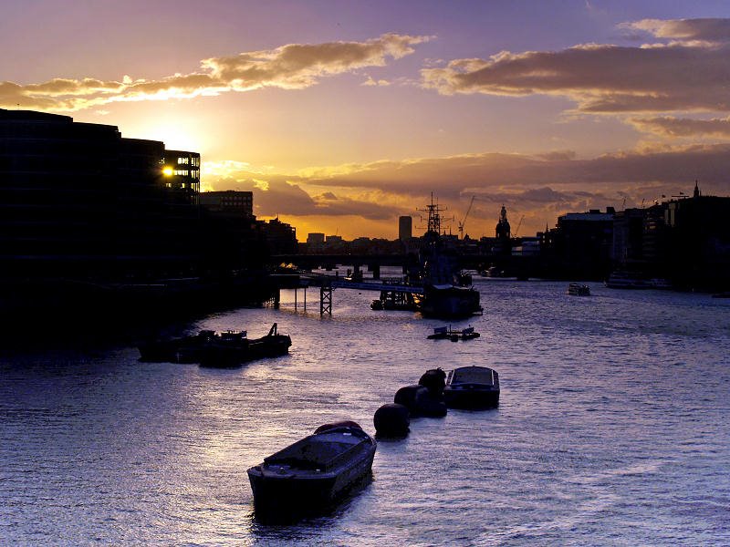
The Thames from Tower Bridge

click photo to enlarge
The evening that I took this photograph of the Thames from Tower Bridge I was thinking about the following day's visit to the Tate Gallery, or Tate Britain as it now styles itself. We were going to see an exhibition called "Gothic Nightmares", which featured the paintings of, amongst others, Henry Fuseli and William Blake. Now a little Fuseli isn't a bad thing (though a lot is), and Blake's original genius is always stimulating. However, it wasn't these artists that I was thinking about: it was Joseph Mallord William Turner.

Joseph (or J.M.W.) Turner (1775-1851) is widely regarded as the finest painter that England has produced. Principally, though not exclusively, a landscape artist working in the Romantic style, he is seen as someone who laid the foundations for Impressionism. However, that accolade detracts from his particular genius, which, in his most developed style, involved using oil paint in the manner of a water colourist - "painting with light". Works such as "Interior at Petworth", "Rain, Steam and Speed" or "Venice Quay" show scenes, as if glimpsed through half-closed eyes, with the forms indistinctly outlined through shimmering light. Tate Britain holds the largest collection of his paintings, including those that he bequeathed to the nation, and I made sure I saw some on my visit.

Turner painted a number of Thames scenes, though never this view, since Tower Bridge was built forty years after his death. But, as I stood looking at the sunset glow, the brightly-edged clouds, and the light reflected on the river, it was Turner's work that came to mind. I composed this shot so that the sun was behind a building and so not too overpowering. I also made sure that the silhouettes of the barges against the cold blue of the Thames gave some foreground interest and led the eye into the composition. The outlines of the City, that glorious sky, and thoughts of Turner did the rest.
photograph & text (c) T. Boughen
Wednesday, April 12, 2006

The striped man

click photo to enlarge
The other day, whilst walking along the South Bank in London, I came upon more "living statues" in one place than I've ever seen before. Amongst other represen-
tations there was a jolly pirate, a monochrome frontiersman, a golden Eastern mystic/warrior, what looked like a terracotta alchemist, and this striped man.

Being a living statue is an interesting occupation! It has its origins in the eighteenth century. Rich landowners would pay people to dress up as Pan, Cupid, or some other well-known figure, and they would have to strike poses at various places, particularly when the host was entertaining guests. Often they would be dressed and made-up to simulate stone or metal. Peter Greenaway's marvellous film, "The Draughtsman's Contract", illustrates this well. In the nineteenth century this art form could be seen at fairs and circuses.

Today living statues are a fairly common street entertainment, particularly found in city centres and tourist areas, alongside jugglers, fire-eaters, mime artists, and the like. The attraction for the spectator is in admiring the skill of the deception, and in looking for movement - with the best performers only the eyes move! Children love them, and enjoy the delicious fright they get when the statue finally comes to life! But what's the attraction for the performer? Fun and income? Probably. Earning money by doing literally nothing? Could be! I suppose it's a job to be done and enjoyed for a while, before moving on to something else, though I don't see much opportunity for career progression in this line of work! Hang on - earning money by doing literally nothing? They could become politicians!

I took a few shots of this particularly striking living statue. In this one I tried to emphasise the entertainment angle by positioning myself so that the background photographer was standing on the statue's hand. It nearly worked! However, the reason I chose the striped man over the other characters was for the odd effect of the black and white figure against the colour of the background. It makes an agreeably disconcerting image.
photograph & text (c) T. Boughen

Tuesday, April 11, 2006

Broken rhythms

click photo to enlarge
The man-made world is full of repeated forms. Look around and you'll see them where you are now. Perhaps it's a set of bookshelves, a stack of plates, a radiator grille, or the Venetian blinds on your window. Look outside and repetition will be there too in fences, gable ends, railway tracks, and rows of windows and doors. The rhythms that these repeated forms create are often attractive. However, they are frequently more appealing when something interferes with that rhythm; so much so that this device has become a photographic convention. A favourite photograph of mine shows nothing but a receding row of columns in Athens, with my wife stood between two of them breaking the rhythm of the uprights.

And its not just man-made objects. A memorable photograph that I recall seeing shows Muslim men at prayer. All are kneeling and bent over, with the exception of a small boy who is sitting up and looking round. Another example of this format that sticks in my memory is of English Guardsmen in their red uniforms and bearskin hats, in rank upon rank at a ceremonial occasion in London. Their perfect rows are broken by one soldier who has fainted and is laid prone, ignored by all around him!

So, on my photographic outings, when I see examples of this effect, I am sure to point my camera at it. Here is just such an instance. These flats in Southwark, London, have a concave wall covered in shiny purple/blue tiles. The windows are in rows, and the balconies in diagonal groups. What made this shot for me was the orange towel hanging out to dry. Here it jumps out at the viewer because it breaks the rhythm of the architecture, and adds a powerful spot of complementary colour to the image. The photograph would be so much the poorer for its absence.
photograph & text (c) T. Boughen
Monday, April 10, 2006

What's in a name?

click photo to enlarge
The naming conventions of countries show interesting differences. In the United States small communities sometimes style themselves "City", and avenues and streets are often simply numbered . In France and Italy (and elsewhere) streets can be found that are named after significant dates. These conventions are rarely or never found in Britain, but we too have our peculiarities.

The commonest street names in Britain are High Street (i.e. the main street) and Church Street (for obvious reasons).Towns and villages have regional characteristics dating back to the language of the early settlers of the area. Roman-derived placenames often end in "cester" or "caster" after a Roman fort or castle. So, Lancaster is named after the Roman castle (or fort) next to the River Lune. The modified spelling is a result of corruption over the ages. Saxon settlements can be identified by a number of suffixes including "ton". The town of Skipton in North Yorkshire is literally "sheep town". Ninth century Scandinavian invaders brought their own language, and this was assimilated into the language. The word "kirk", meaning church, is commonly found in Scotland and Northern England. My birthplace, Kirkby Lonsdale, means "church by the valley of the River Lune". Individual areas of cities and towns often pick up their name from a pre-existing ancient name. For example the area known as Anchorsholme in Cleveleys, Lancashire, derives from a family name (nothing to do with a ship's anchor), and a low rise, in the centre of wet land i.e. an island or "holme".

In the nineteenth and twentieth centuries the massive growth of towns led to planners and developers naming groups of streets after, for example, poets (Chaucer Road), rivers (Severn Street), country houses (Blenheim Street), etc. The photograph above shows an example of insensitive English naming - it is Waterloo Station in London, the starting point in England for the Eurostar trains that travel through the Channel Tunnel to the Gare du Nord in Paris. I don't think it was triumphalism that caused this station to be chosen as the terminus. However, it was that sentiment that named it in the first place. It's probably as well that there are moves afoot to relocate Eurostar to St Pancras. Now there's another story!

This shot shows the part of a railway station that always interests me the most - the roof. But the horizontal bustle of the platform and the sweeping metalwork above combine, I think, to make a picture that neatly summarizes the attraction of stations - not matter what they are called!
photograph & text (c) T. Boughen
Sunday, April 09, 2006

Improving photographs

click photo to enlarge
Does the enthusiastic amateur photographer - the person who wants to do a bit more than take family and holiday snaps - read books these days? It's been pointed out on the photography forums that asking basic questions on the internet seems, for many, to have replaced reading the camera manual. But, in many of the shots I see posted on forums, there is a similar lack of understanding about the fundmaental elements that make a good photograph. A short article like this is not the place for a basic primer in photography, so I'll restrict myself to a few thoughts that have come to mind as I've looked at some people's work.

Less is more. Many shots include too much information, and therefore convey very little. Two pieces of advice that invariably improve a photograph are: get closer, and be selective. From what I see, the simplest thing that most people wanting to improve their photographs can do is halve the distance between the camera and the subject! The next is to forget trying to include all of a subject, be it a ship, a beach, the view from a high building, or whatever, and select a part of what you see. This part should be visually interesting and expressive of the whole.

Decide what your photograph is about. One of the commonest holiday snaps has a distant person against a scenic background.These record a person at a place, but rarely work as photographs. So, decide whether you are photographing a person or a place, and give emphasis to one or the other - don't try and make one photograph do two jobs because it usually ends up doing both badly.

The light is everything - use it. The standard advice used to be to take photographs with the sun behind you. Better advice is to have the light to the left or right of your subject to model it better by giving shadows. The other problem with light behind you is that it throws the photographer's shadow into the image in evening shots. So, today's post is one that emphasises that rules are made to be broken! This block of flats by the River Thames in London has my wife's, my son's and my own shadow at the bottom left, with the sun illuminating the scene like a floodlight. It isn't the greatest shot ever, but I think it works despite (and in the case of the shadows, because of) these faux pas.
photograph & text (c) T. Boughen

Saturday, April 08, 2006

The shrimper

click photo to enlarge
Food fanatics will trawl resaurants, travel the earth, and spend whatever it takes to satisfy their epicurean tastes. But often such people, whilst being familiar with the produce of far-flung shores, know little of their local foods.

Anyone living in the vicinity of Morecambe Bay should have tried the small brown shrimps that can be found there. I remember, as a child, travelling from the Yorkshire Dales to Morecambe on steam trains pulled by "Black 5s", and buying portions of this delicacy from promenade vendors. They were delicious. What I didn't know at the time was how they were caught.

The original method, and the one still favoured by individuals who fancy a few shrimps, or who sell to friends and family, involves a "push-net" like the one shown in the photograph above. This is pushed through the shallows, scraping up the shrimps and sand. The sand washes through the holes of the net back into the sea, and the larger pieces - shrimps, crabs, pebbles, etc, are funnelled into a net container at the end. This is emptied and the catch sorted, with the additional use of a circular sieve, if necessary. As the catching of these shrimps became more commercially attractive larger versions of the push-net were fixed to carts with horses pulling them through the water. The catch was sent to various markets throughout England. Today, tractors with nets on swinging arms are used in the shallow waters of the Bay. This catch is often peeled at Flookburgh and then sent to a factory at Ulverston for processing. They are sold as Morecambe Bay Potted Shrimps. Look out for them!

I took this photograph of a shrimper at Fleetwood on the edge of the Bay. He was at work with a colleague, often up to their waists in the sea, methodically harvesting their catch. The bright yellow of the waterproof gives a modern visual "bite" to this shot of someone still plying an ancient craft.
photograph & text (c) T. Boughen