Friday, June 29, 2012

Raindrops on the window

click photo to enlarge
It has rained at some point on most days for the past three months. You might be wondering what's so unusual about that - after all it is the British Isles. But the fact is, the eastern side of England is relatively dry. Spring is often so, and summer too. Consequently I expect to be able to go about my business without wondering what to wear on my body and feet. This year, thus far, that hasn't proved possible. Most of the rain has been steady, regular and not too heavy, but in sufficent quantity for the water companies to lift the drought restrictions that resulted from particularly low rainfall over the past couple of years. Yesterday, however, we had torrential summer downpours accompanied by crashing thunder and jagged lightning. The rain couldn't easily penetrate the saturated ground and formed large puddles and pools on the roads and on the gravel of my drive.

As it happens I'd been waiting for a heavy downpour accompanied by wind because we'd recently cleaned our windows and wiped them over with a liquid that is part detergent, part anti-static agent. I believe it used to be advertised as incorporating "nano-technology"! The advantage of this addition to the traditional clean is that water beads and runs off the glass very readily, grime doesn't build up as easily, and window-cleaning can be infrequent without any detriment to the clarity of the glass. A further advantage is that it causes the raindrops to collect in a very photogenic way, and I'm not one to pass up a photographic subject with those qualities.

So, as the rain lashed down you could find me with the macro lens on my camera, examining the raindrops on the windows from inside each room, looking for good collections to photograph. Here are the best two. The varying sizes of the water drops gives the shots a three dimensional character. They remind me of an asteroid belt comprised of shards and blobs of glass.

photographs and text © Tony Boughen

Camera: Canon
Mode: Aperture Priority
Focal Length: 100mm macro
F No: f7.1
Shutter Speed: 1/100 sec
ISO: 320
Exposure Compensation:  0 EV
Image Stabilisation: On

Thursday, June 28, 2012

1500th PhotoReflect blog post

click photo to enlarge
The other day, looking at Blogger Dashboard, the place from where I begin each new offering, I noticed that the post count had reached 1,498. It's a wonder that I spotted the approach of the milestone of 1,500 posts because 1,000 sailed by unseen. What, I wondered, could I present on this auspicious occasion? The answer came to me in a flash - multiple raspberries!

Not, I hasten to add, the sort produced by sticking your tongue a short way out and vibrating it noisily with your bottom lip. I'm not SO rude. No, the first real picking of the season's fruit had appeared from our garden, and I thought they could be the subject. As I write the raspberries in my photograph have been eaten with a little sugar and a generous dollop of crème fraîche, and my mind is set on covering the strawberries to protect them from the birds because the first few are starting to show faint blushes of red. There's something satisfying about producing and eating food that you grow yourself, a satisfaction that is only increased when it can be turned into the subject matter for a photograph. Carefully arranging some of these unco-operative raspberries into concentric circles I reflected that I'd be a hopeless food photographer. I simply haven't got the patience for it. But, it seems, I do have staying power.

At the time I began this blog in December 2005 I had no idea that I'd still be doing it six and a half years later. I didn't envisage producing more than 1,500 photographs, still less that number of written "reflections". So I suppose, yes, I must have staying power. It's either that or a mixture of madness and monomania! The other thought that I had as the raspberries rolled in every direction but the one I wanted was this: as long as PhotoReflect continues to provide me with a little regular entertainment, interest, challenge - call it what you will - and offers an outlet for my photography, I'll carry on presenting my idiosyncratic thoughts and images from my small corner of the world.

photograph and text © Tony Boughen

Camera: Canon
Mode: Aperture Priority
Focal Length: 100mm macro
F No: f10
Shutter Speed: 1/5 sec
ISO: 100
Exposure Compensation:  0 EV
Image Stabilisation: On

Wednesday, June 27, 2012

Sepia, vignettes and the human touch

click photo to enlarge
Photography changes; it always has. Digital and colour are now dominant where film and black and white once reigned. Today images are most commonly viewed on screens but paper prints held sway for most of photography's history. People have always been the main subject matter. However, I have the feeling that a wider range of subject is now evident, though with the human form still ascendant.

Then there are the styles within pictures. Callotype, tintype, hand-colouring and much else fell away (except for the odd enthusiast) as straightforward, automated chemical processes for first black and white, then colour, appeared. But the ease, flexibility and immediacy of digital has allowed the qualities of the old styles to re-appear. I've always had a soft spot for sepia toned photographs. I see them as black and white with a warm edge. Similarly, the vignette has alway appealed to me for the concentration that it gives to the subject and the contrast that it can inject into what might otherwise be a flat scene. Of course, because these effects are perceived as "old" any modern use tends to give a patina of age to a shot. I wish it didn't, and perhaps if such effects were used more they would become simply common additions to the photographer's armoury, but sans the associations of history.

The other day I went into one of our bedrooms and, under the effect of partly closed curtains and morning light, the blinkers fell away. I saw afresh what I'd seen many, many times before. So I took a photograph of the edge of the bed, the bedside chest and my wife's sandals. I sepia toned it and added to the natural, curtain-induced vignette, some all-round vignetting, and then sat back and looked at my work. It was fine as far as it went, but it didn't go quite far enough. I felt it needed a dissonant note adding to the mix. So I added a human one in the form of my hand and arm, a little something to make the viewer, or at least one who hasn't read this explanation, wonder about the picture.

photograph and text © Tony Boughen

Camera: Canon
Mode: Aperture Priority
Focal Length: 32mm
F No: f7.1
Shutter Speed: 1/5
ISO: 100
Exposure Compensation:  -0.33 EV
Image Stabilisation: On

Sunday, June 24, 2012

The Old House, Hereford

click photo to enlarge
The remains of the past that we see around us are there through either design, chance or a mixture of both these factors. Archaeologists tell us that humans have always revered ancestors and their artefacts, and much of what remains from earlier centuries has been kept for this reason. Visit an English town and you may see a medieval market cross, or the remains of one, something that long ago shed its purpose, but that succeeding generations have maintained because it is a comforting presence, a mark of the continuity of the settlement. Churches, castles, houses and other buildings usually survive because they are still able to fulfil their original purpose, but also because people like the reminder of the past that they embody through their materials, style and shape. However, looking at some buildings you wonder why they alone survived when so many similar structures didn't. I recently visited a building in Hereford and discovered why only a single house remains from what was once a notable town-centre terrace.

The Old House bears the date 1621, probably the year of its completion. It is a timber-framed building of the kind popular for more than two hundred years. It may have been associated with the butcher's trade because the coat of arms of the Butcher's Guild (including crossed pole axes used for slaughter) are mounted over the door in the south porch. That suggestion is strengthened by the fact that it was once part of a street called Butcher's Row. A painting of 1815 by David Cox shows it in its original context. I don't know what motivated him to paint this subject but it may have been the threat posed to the medieval buildings and the town's street plan by Hereford's "Paving, Repairing, Cleaning and Lighting Commissioners" who were anxious to modernise the centre and reduce the fire risk caused by old, decrepit, wooden buildings and narrow streets. They undertook their work from about 1810 to 1854 using coercion and compulsory purchase orders to buy and remove old buildings. By the late 1830s only two people held out against the Commissioners - the owners of the Market Hall and The Old House. In 1862 the Market Hall was demolished leaving The Old House isolated but surviving. Thereafter it housed a number of businesses including a saddler, china shop, fish shop, grocer, and two banks. In 1928 Lloyds Bank, the owners, gave the house to the City of Hereford who turned it into a museum in 1929. It has served this purpose ever since.

photographs and text © Tony Boughen

Camera: Canon
Mode: Aperture Priority
Focal Length: 24mm
F No: f8
Shutter Speed: 1/160 sec
ISO: 100
Exposure Compensation:  -0.67 EV
Image Stabilisation: On

Saturday, June 23, 2012

D.O.F. and O.O.F.

click photo to enlarge
There seems to be some confusion surrounding the word "acronym". It is widely believed to be the use of consecutive initials. I've seen BBC and RSA so described. However, these are initialisms, "a group of initial letters used as an abbreviation for a name or expression, each letter or part being pronounced separately" (OED). An acronym is, "a word formed from the initial letters of other words" (OED). So, CIA isn't one because those three letters don't make a proper and pronounceable word, but AIDS certainly is (acquired immune deficiency syndrome). Confusion arises when we come to words such as radar (radio detection and ranging).  Isn't "radar", we might legitimately ask, almost but not quite an acronym, because it's an instance where the OED rule doesn't fully work? The fact is, that in the attempt to clearly define categories of words we've gone part way down the road to complete clarity by introducing ever more esoteric groupings, but have lost the value of a basic rule, not quite covered every eventuality, and sown more than a small degree of confusion. As this article shows.

Photography, like many other areas of special interest, is plagued by initialisms, acronyms and other kinds of abbreviations, to the extent that when I'm reading an article I sometimes feel the need for a glossary alongside me. It gets worse if you frequent photography forums because there you come up against all of this, but overlaid with examples of text-speak. One that has arisen in recent years is dof, DOF or D.O.F., meaning depth of field. (Whether we should continue to use full stops to indicate abbreviations or dispense with them, in the modern manner, is another subject for another day!) I think this has come about as people who have known only digital photography have moved from the once ubiquitous small sensor digicams to cameras with Four Thirds, APS-C and 35mm sensors. The depth of field of a small sensor is very big so oof (or OOF or O.O.F.), that is to say out of focus areas (also now called bokeh), are more difficult to achieve. With such cameras, if you want lens blur, you tend to have to either get very close to the subject or use a long telephoto. Larger sensors can achieve it in these ways too, but also by increasing the aperture. A consequence of all this is that shallow DOF shots have become very popular, so have large aperture lenses, and the value of a deep DOF - one of the challenges we sometimes struggled to achieve in the days of 35mm and larger film cameras - is currently less valued.

I was reflecting on this as I used my macro lens to take this very shallow depth of field shot of our oriental lilies. I photographed our white ones last year. This year we have red/brown and pink blooms as well as white. Out of the few shots I took this one intrigued me because the OOF areas resemble a liquid - perhaps pea soup - out of which the stigma and anthers are barely projecting.

photograph and text © Tony Boughen

Camera: Canon
Mode: Aperture Priority
Focal Length: 100mm macro
F No: f2.8
Shutter Speed: 1/80 sec
ISO: 125
Exposure Compensation:  +0.33 EV
Image Stabilisation: On

Thursday, June 21, 2012

Shodfriars Hall, Boston

click photo to enlarge
The Dominican Order of nuns and friars was founded in the early 1200s in France by St Dominic. It quickly crossed the Channel to England, becoming established in Oxford in 1221 and spread widely into many of the major towns thereafter. Here they became known as the Blackfriars after the black cloak that was worn over a white habit, and to distinguish members from the Whitefriars (often the Carmelites) and the Greyfriars (e.g. the Franciscans). However, they were also referred to as the Preaching Friars because both preaching and conversion were strong features of their work. A further name for the Blackfriars, much used in England, a country that specialises in conferring humorous names on the mighty, was the Shodfriars. This name arose because they used footwear, unlike the Greyfriars for example, and so they were always shod.

It is the latter name for the Dominicans that attaches to Shodfriars Hall, the black and white, timber-framed building of c.1400, in Boston, Lincolnshire. It was one of a group of buildings in a part of the town associated with the Blackfriars. Interestingly, the Hall itself may have been built as "The Golden Hows", "the principal mansion of the guilds". For many years the building was thought to be Victorian, so thorough was the restoration by John Oldrid Scott in 1874. However, even a cursory inspection reveals large parts of the exterior and interior structure to be original. It seems that people didn't look beyond the pierced barge boards, symmetrical timber-work, simplified pargeting and obviously new timbers, all of which recall Victorian Tudor of the sort that can be seen across the country, but particularly in Chester. Incidentally, the Gothic-style Victorian building with the crow-step gables, tall chimneys and steeply pitched roof behind and adjoining Shodfriars Hall is a former theatre. For those who are interested in such things it is where Arthur Towle (later famous as Old Mother Riley) made his first stage appearance.

On a recent trip into Boston I had meant to photograph the main facade. However, parked vehicles prevented that so I took a detail shot of the pargeted plasterwork with its Tudor roses and surrounding dark wood. Later I managed to get today's main shot from the tall tower of the church of St Botolph (The Stump) at the other end of the market place.

photograph and text © Tony Boughen

Photo 1
Camera: Canon
Mode: Aperture Priority
Focal Length: 161mm macro
F No: f7.1
Shutter Speed: 1/400 sec
ISO: 100
Exposure Compensation:  -0.67 EV
Image Stabilisation: On

Wednesday, June 20, 2012

Politics, ripples and reflections

click photo to enlarge
The present British coalition government is the most inept that I have known in my lifetime, a period lest I forget, that includes the woeful Conservative government led by John Major. Today we are governed by people who have the best education that money can buy but promote policies that display little evidence of commonplace, basic intelligence, an elite drawn almost exclusively from the rich, with a background of public (i.e. private) schools and Oxbridge, a majority of whom are millionaires. They exhibit a dearth of experience of the people they govern, have an air that suggests they think they are born to rule, and manifest few deep political beliefs or understanding beyond a "private sector good, public sector bad", "the market knows best" dogma.

In the two years they have been in power the coalition has made, at the last count, 29 policy U-turns, converted a modest recovery into a double-dip recession, mis-read the steps necessary to stimulate the economy, made the poor shoulder the the cost of the economic mistakes of the rich, and actively promoted legislation that has increased inequality. Moreover, their policies have reversed the reduction in child poverty achieved by the previous government. Following the inverse Damascene conversion of the Work and Pensions Secretary, Ian Duncan-Smith, they now assert that there is no link between poverty and low wages, that it results from either a conscious choice, fecklessness, or is the consequence of too generous state benefits! Today I read that Duncan-Smith's Centre for Social Justice admits that in arriving at these conclusions it "missed in-work poverty" i.e. didn't take account of the fact that 62% of children living in poverty (under the current definition, that the government wants to change!) are in families where one or more parent is working. What kind of society is it that is unable to pay someone a living wage for a full week's work? Inept doesn't begin to describe people who don't notice this and can't appreciate its consequences.

It seems to me that one of the problems of politics today is that too many politicians are responding to the dominance of consumerism, one of the areas of people's lives over which individuals think they have real control. So, instead of offering us, for example, a national education system, organised, standardised and quality controlled across the country, politicians seek to give us a selection of school types, managed by different bodies, in quasi-competition with each other. In recent years they have imposed this consumerist/market ethic on virtually every public institution, from the utilities of gas, electric, water and telephones to aspects of defence and the civil service. The result has been baleful. Now they want the individual's contract with the health service to resemble buying a can of baked beans - "Would you like Tesco, Sainsburys, Asda or Morrisons to replace your hip sir?" The motivation behind all this is to remove community enterprise and provision and replace it with market-driven, self-serving individuality, to make every social transaction financial, to bring to fruition Margaret Thatcher's pernicious claim that there is no such thing as society. What we must never forget is that when that moment is achieved every government we elect will look like today's, our lives will be ruled by financial transactions, and the inequalities within our society will have returned to Victorian levels.

Isn't it odd what thoughts can be prompted by staring at the colours, reflections and ripples in the water of Lincolnshire's South Forty Foot drain?

photograph and text © Tony Boughen

Camera: Canon
Mode: Aperture Priority
Focal Length: 42mm
F No: f7.1
Shutter Speed: 1/640
ISO: 100
Exposure Compensation:  -1.00 EV
Image Stabilisation: On

Monday, June 18, 2012

Ringing chambers, platforms and floors

click photo to enlarge
English church bell ringing of the most common variety, usually known as change ringing, began in the 1600s with one of the earliest ringing societies, the Lincoln Cathedral Guild, dating from 1612. English church bells usually number 6 or 8, though there may be be fewer or more, and are located in the bell chamber at the top of the tower. They are not struck by hammers, but have an internal clapper that strikes the bell when it is rotated by a rope attached to a wheel. Below the bell chamber there is sometimes a room known as the sound chamber. The bell ropes pass through this room, which often holds the church clock mechanism, to a ringing chamber below. Bell ringers stand in the ringing chamber to pull the ropes that sound the bells. A very long distance between the bell and the person ringing is usually avoided because the ropes stretch making control more difficult. Where the church has a west tower there are often floors dividing the chambers described above. Crossing towers, however, are frequently vaulted, though some west towers are too. Where this is the case then bells are often rung from ground level with long bell ropes, but another solution is to install a ringing platform.

Today's main photograph shows one of the most hair-raising locations for bell ringing anywhere in the country. In Pershore Abbey, Worcestershire, a platform has been constructed 72 feet above the floor of the tower. To get to their places the ringers have to climb two stone spiral staircases, pass along a walkway through the roof, then negotiate a narrow passage and finally descend an iron "cage staircase" above the void below. The latter can be seen to the right of the bottom arm of the cross in the photograph. The central square is the suspended timber ringing platform where the campanologists do their work.


The photograph of the bottom of the tower of All Saints church at Holbeach, Lincolnshire, shows a different approach to the construction of a ringing platform. Here a more substantial structure  has been constructed, supported from the floor, and doubling as the roof of a small café at the base of the tower. The fact that the tower is not too tall has made this solution possible. The etched glass doors and windows add interest to the conception. The loss of the view of the west window is regrettable but inevitable.

Today's third photograph shows what happens in a tall church tower when no ringing chamber or platform is available. The bell ropes (also called the "pull") of Croyland Abbey, Lincolnshire, are thought to be the longest in England. Apparently four sets of rope guides are necessary to keep them in the required places. Interestingly, Croyland Abbey had one of England's early tuned peals. In the early tenth century Abbot Turketyl had a great bell cast. It was named "Guthlac", after St Guthlac, the abbey's founder. Abbot Egelric (975-984) had six more made to complete the tuned peal. These were named Bartholomew, Beccelm, Turketyl, Tatwin, Pega and Bega. This YouTube video clip shows the bells of Croyland Abbey being rung.

photograph and text © Tony Boughen

Photo 1
Camera: Lumix LX3
Mode: Intelligent Auto
Focal Length: 5.1mm (24mm/35mm equiv.)
F No: f2
Shutter Speed: 1/30
ISO: 320
Exposure Compensation: -0.66 EV
Image Stabilisation: On

Sunday, June 17, 2012

Wet café chairs, apps and art filters

click photo to enlarge
I don't watch many of the TV programmes that people who know me expect me to see. The reason is that I'm prepared to devote only a very limited time to television. So, by the time I've watched, over the course of week, a couple of films, a couple of old, made-for-TV comedy shows, and one or two other programmes, I'm done. With that amount of viewing I've used up the time I'm willing to give to television, and good or bad, I won't watch more. To do so would deprive me of the time I want to give to my other interests and pursuits.

For the same reason I'm currently unwilling to join the majority of the population of Britain in owning a smartphone. It's not that I'm a Luddite, or that I don't think they have some uses above those offered by a traditional mobile phone: they do (though fewer than many would have us believe). The fact is I spend quite a chunk of my week at a computer screen and extending this further via the tiny display of a smart phone would - you've got it - "deprive me of the time I want to give to my other interests and pursuits". However, I'm enough of a realist to accept that the way mobile communications are going the day may come when I will need (rather than want) one.

There is one thing about smart phones that I do rather like, and that is the greater capabilities of the built-in cameras. They are not yet as good as even a basic compact camera, but for some purposes they are good enough. Moreover, currently appearing on the market is the Nokia Pureview 808 with a 41 megapixel camera outputting 2/3, 5 and 8 megapixel images, incorporating a useful zoom facility, offering the opportunity to achieve bokeh, and the capacity to record HD 1080p video. These are the sort of specifications that enthusiast photographers will find appealing. The images that I've seen look very good indeed.

Of course, there is a downside to smartphone cameras and that lies in the "apps", especially the "Instagram" variety that offer "effects" that people find irresistible. I came across this article on PetaPixel recently - "Iconic Photos "re-taken with Instagram" - and concluded that such effects, by and large, represent a pretty good method of ruining a shot whilst at the same instantly consigning it to a big subset of other smartphone shots. All of which brings me to my wet café chairs. After converting from colour to black and white I applied digital versions of traditional processing effects - increasing contrast, burning and dodging. In other words it was hand-crafted, insofar as that is possible with a computer! So why do I think it looks like a commercial pin-hole or Holga effect? It seems that digital camera "art filters" and smartphone "apps" that include both these options are starting to impinge on our consciousness and affect how we see photographs.

photograph and text © Tony Boughen

Camera: Canon
Mode: Aperture Priority
Focal Length: 99mm
F No: f7.1
Shutter Speed: 1/100
ISO: 100
Exposure Compensation:  -0.67 EV
Image Stabilisation: On

Friday, June 15, 2012

Come into the garden Maud

click photo to enlarge
The other day, with a group of friends and neighbours, we visited Harrington Hall in Lincolnshire. This fine country house with six acres of gardens is known for two contrasting reasons. Firstly, in 1991, whilst undergoing renovation, it suffered a devastating fire that caused damage to much of the interior and destroyed the roofs. The building we see today is a careful restoration that still retains parts built by the Copledyke family in the reign of Elizabeth I, the work done from 1673 by Vincent Amcotts, and the extensions of the eighteenth century and later. However, all this has been supplemented by walls, floors, panelling, ceilings etc that are either newly made in the style of the originals, or combine new work with what could be salvaged from the old.

The second well-known reason that people have heard of Harrington Hall is its Tennyson connection. Alfred Tennyson (1809-1892), who later became a Lord and the Poet Laureate, was born at the nearby village of Somersby where his father was the rector. It is said that in 1832, at the age of 23, Tennyson met the Baring family who lived at Harrington Hall, and became infatuated by their daughter, Rosa. His later poem ,"Come into the garden Maud" (1855)*, with its theme of an idealistic young man's love for the girl of a wealthy family, is thought to reflect that early episode in his life. The story goes that Tennyson's "High Hall Garden" is based on Harrington's extensive gardens and that the Viewing Terrace (from where my main photograph was taken) features in the poem. There is nothing conclusive linking the location and poem, but all circumstantial evidence, including poems later in life to "Rose" and a shared garden ("Rose, on this terrace fifty years ago, When I was in my June, you in your May..."), suggest that the reference is to his experiences at Harrington.

*  In 1857 Michael Balfe added music to "Come into the garden Maud". In consequence Tennyson's words (slightly modified) became better known through the song than the poem.

photograph and text © Tony Boughen

Photo 1
Camera: Canon
Mode: Aperture Priority
Focal Length: 28mm macro
F No: f7.1
Shutter Speed: 1/500 sec
ISO: 100
Exposure Compensation:  -0.33 EV
Image Stabilisation: On

Thursday, June 14, 2012

Two eye-opening statistics

click photo to enlarge
Newspapers and the internet throw statistics at us all the time. A good number or a summary encapsulated in a figure is a powerful tool for grabbing your audience. But you have to be careful. Sometimes the statistics are a product of a journalist's innumeracy, are often simplified, extrapolated or taken out context from more complex data, rendering them inaccurate at best or fictitious at worse. So, it is with caution and an element of scepticism that I present two statistics that I came across recently. The first, on initial inspection, seems to have nothing to do with photography - but it does. The second is directly photography related.

In a recent Guardian newspaper article about data storage I read the following:
"DatacentreDynamics' research also reveals that British datacentres consume 6.4 gigawatts of power annually – enough to power 6m homes – and that is set to increase by 6.7% over the next year."
That is an awful lot of electricity, even allowing for the fact that a significant proportion of the data stored here is for overseas users. It also clearly underlines that cloud computing and electronic data are not quite the no-cost or even low-cost option, that we sometimes think. I used to be sure that photographs viewed on screens and stored on servers, and that blogs such as this one that exist away from the computer on which they are written, used less physical resources than prints and paper. But do they? Perhaps. Perhaps not.

The second statistic that brought me up short was reported on the website, "Visual News", and is a graphic that purports to be "A Snapshot of the Photography Industry". It documents the rise of the phone camera, the consequent decline of the point and shoot camera, the dominance of sites such as Facebook and much else. It also includes the following:
"Today we snap as many photos every two minutes as humanity as a whole did in the 1800s."
In other words it takes us 120 seconds to accumulate the number of photographs that were amassed in the 100 years between 1800 and 1900. Which prompted me to think that the first statistic about energy use for data storage could well be accurate! It also made me consider whether ever higher pixel counts on cameras should be opposed on environmental grounds, something that hadn't occurred to me before. All of which has little to do with today's photograph, taken on an overcast day, of boats on the river at Ely, Cambridgeshire. Except these two further thoughts. Firstly, this shot represents yet another addition to the total data stored across the world. And secondly, I wonder how much electricity this one image uses in a year and at what cost?

photograph and text © Tony Boughen

Camera: Canon
Mode: Aperture Priority
Focal Length: 28mm
F No: f5.6
Shutter Speed: 1/200
ISO: 100
Exposure Compensation:  -0.33 EV
Image Stabilisation: On

Wednesday, June 13, 2012

A profusion of poppies

click photo to enlarge
That we find a crystal or a poppy beautiful means that we are less alone, that we are more deeply inserted into existence than the course of a single life would lead us to believe.
John Berger (1926- ), English art critic, novelist, painter, poet

A saying in our family can sometimes be heard when we pass a house that is surrounded by nothing but lawns, with perhaps just the odd conifer to break the monotony. "All grass and no flowers" we say, re-working the title of Mike Harding's humorous, satirical play of 1980, "Fur Coat and No Knickers". We are not alone, I think, in seeing a flowerless garden as a missed opportunity, an aberration that makes one think about the state of mind of the owner. Does the person who lives there actively dislike flowers, I sometimes wonder, or do they think that grass gives them the least amount of gardening work? If it's the latter then they are wrong because there are plenty of shrubbery plantings that can be devised requiring less maintenance than the equivalent area of grass. If it's the former, then perhaps all that is implied in John Berger's thought, quoted above, comes into play. For it's surely the case that flowers are one of the finest natural beauties of the world. En masse or individually, cultivated or wild, they charm our eye, lift our spirits and inspire us. Painters have long known this, and some photographers too.

I came across Berger's words in a gardening book I was reading recently, and I thought of it again as I watched our poppies taking turns to come into flower. The assortment that we now have, a mix that has arisen accidentally rather than by design, ensures that bold points of colour are a key feature of June in our garden. From the big and blousy red and mauve oriental poppies to the delicate, yellow Welsh poppies or the bold orange and yellow California variety, poppies are a flower that make their presence felt. Subtlety and reserve are not the qualities that we associate with them. Even when the individual blooms last for only a day as do the paper-thin orange variety I posted a while ago, like a fanatical army hurled against the foe the poppies send wave after wave of replacements to take the place of the fallen.

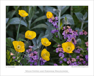
Our California poppies self-seed in a border at the edge of an area of trees and shrubs. The leaf canopy above makes them incline towards the light, and I caught them as they were all turned in the same direction. I photographed the big orange oriental poppy, not because it's my favourite, though many prefer it over others. Rather, it was the contrast of the rather malign looking black/purple centre next to the bright petals: a pairing I have always found attractive at a distance but slightly disconcerting when up close. We have Welsh poppies a-plenty at the moment, but this group were growing in the shade in my neighbour's garden, and I quite liked them next to the mauve of the perennial wallflowers.

photograph and text © T. Boughen

Photo 1
Camera: Canon
Mode: Aperture Priority
Focal Length: 100mm macro
F No: f7.1
Shutter Speed: 1/100 sec
ISO: 100
Exposure Compensation:  -0.33 EV
Image Stabilisation: On 


Monday, June 11, 2012

Banish weather forecasters

click photo to enlarge
In the UK, over the years, the profile of the TV weather forecaster has risen to the point where they are now seen as familiar figures with names and "personalities". Their exposure to the public now goes well beyond telling us about the weather and exchanging a few cheery banalities with the news presenters when their spot has ended. Some undertake public engagements, others feature in newspaper and magazine articles. Their dress, utterances, private lives and more are presented to the public by the media with the assumption that we will be interested. How has this change come about?

There seems to be, on the part of television in particular, a desire to make the weather forecast more exciting, more interesting, something to stay tuned for rather than a respite from regular programming when the audience might go off and make a cup of tea. The presenters themselves have been complicit in this. The problem with it is not just the flim-flam associated with the cult of personality: more importantly the weather forecasts are regularly skewed as a consequence. So, wet weather is presented as "bad", hot sunny weather as "good" or to use the favoured description of one male BBC presenter, "glorious". Of course, quite a few sectors of society (farmers, ice cream sales people, gardeners, etc) will not share this point of view but they seem of little consequence. Continuing "bad weather" is often reported with relish to the point where the forecaster appears to adopt the guise of a Jeremiah. Then there's the technology; the swooping camera, the animated symbols, and the specific forecast for whatever is the current newsworthy sports event. If the weather is stable (or in the presenter's eyes, "boring") the forecast is often livened up by a report about extreme weather somewhere else in the world. Why we need to know about Indonesian typhoons, mid-western tornadoes, droughts in Australia, or flooding in Bangladesh during the UK weather forecast just because the presenter needs to "sex it up" a bit, I really don't know. My answer is to banish the presenters, to have a simple voice-over connected to a visual presentation of the current weather and the weather that is anticipated for the next twenty four hours. That way we might get a little more sanity in the forecast and people might take notice of it rather than the wide-eyed, enthusiastic, over-gesticulating presenter.

Today we went to Peterborough to do a little shopping. The weather forecast was accurate I'm happy to report and we had the anticipated rain. I hope tomorrow the dry weather that was promised materialises because I have some hedges to trim. The subject of today's photograph is the Old Guildhall of 1671 in the Market Place at Peterborough. It is flanked by the church of St John the Baptist which was rebuilt in 1402-7 from the material of the old church and the nave of the now no longer extant, St Thomas. I used the medieval Outer Gate of the cathedral precinct as shelter from the rain as I took my photograph of the damp scene.

photograph and text © Tony Boughen

Camera: Canon
Mode: Aperture Priority
Focal Length: 84mm
F No: f7.1
Shutter Speed: 1/100
ISO: 200
Exposure Compensation:  -0.33 EV
Image Stabilisation: On

Sunday, June 10, 2012

Prior's Doorway, Ely Cathedral

click photo to enlarge
Our great churches offer much to delight the eye and mind, more than can be taken in during a single visit, and often contain much that can lie unnoticed even after several visits. On our most recent trip to Ely Cathedral my wife came upon the Prior's doorway. How we had not seen this wonderful example of the Norman sculptor's art before I can't explain, but I'm glad we eventually stumbled upon it.

The doorway dates from the mid-1100s, a time when sculpture exhibited a marvellous mix of linearity, naivety, vigour, drama and stylisation. Doorways, fonts, column capitals and crosses of the twelfth century are an interesting mixture of Byzantine influenced Romanesque with strong elements of Celtic and Norse influence. This example at Ely is busier than most, the columns in particular showing a clear link with the scrollwork, wreaths and knots of the carving and illuminated manuscripts of earlier centuries. Hidden among the swirling lines are medallions, single figures, groups, perhaps labours of the months, zodiac signs and much else. The capitals are similarly carved. An unusual addition is the two corbels in the form of heads that seem to stare at visitors who pass through the portal.

However, interesting though the columns are - and the arches that carry on the decorative themes over the top of the doorway - it is the filled in semi-circle below the arch that draws the eye. This is intentional, and the location above the lintel of a doorway and below the arch, a space known by the architectural term of the "tympanum", was often exploited in this way during the twelfth century. In the Prior's doorway tympanum the sculptors have carved the commonly found subject of the seated Christ (here beardless), one hand raised in a sign of power or blessing, the other holding an open Bible. He sits in a pointed oval shape known as a vesica and is flanked by angels whose bodies are contorted in (possibly) flight or awe, but also to make them fit the semi-circular frame. The treatment of the figure sculpture and clothing is flat and stylised in the way often seen in early two-dimensional frescoes, painted icons and mosaics, characteristics shared with the font at Eardisley, Herefordshire, a subject that I blogged about in 2009.

photograph and text © Tony Boughen

Photo 1
Camera: Canon
Mode: Aperture Priority
Focal Length: 70mm
F No: f4.5
Shutter Speed: 1/80
ISO: 2500
Exposure Compensation:  -0.33 EV
Image Stabilisation: On

Friday, June 08, 2012

The year's first water lily

click photo to enlarge
It's a truism believed by many photographers (and ignored or disbelieved by even more) that your best photographs are usually shots of subjects with which you are deeply familiar. Many respected photographers specialise in places, subjects or genres and are acclaimed for their work within their self-imposed limits. I tend to be a generalist in all areas of my life, including photography. However, I do deliberately take many photographs of my immediate locality and know from years of experience that this is a rewarding and creative approach to picture making. Only by walking familiar routes repeatedly at different times of day and year, in different kinds of weather, do you see all the potential photographs that surround you.

My garden pond and the annual cycle of growth, maturity and decay displayed by its water lilies is a subject that I return to several times a year. As I've said elsewhere, I especially like the photographs that I've taken in spring and autumn over those when the beautiful yellow and white flowers are blooming. But that's not to say that I don't take shots of them. This year I watched the first leaves appear, then the stalks and buds emerge under water and slowly extend until they broke through into the air. The first bloom opened properly on June 4th and I took a few shots of it.

The main photograph is the obvious image of this subject showing the characteristic flower in its watery context. However, I'd earlier taken the morning shot against the light, after rain, before the petals were fully open. I think I prefer this one. For completeness I've included a photograph taken only three weeks earlier on May 14th when buds and blooms were nowhere to be seen, and the leaves had the characteristic brown that they exhibit when they are newly appeared.

photograph and text © T. Boughen

Photo 1
Camera: Canon
Mode: Aperture Priority
Focal Length: 228mm
F No: f7.1
Shutter Speed: 1/250
ISO: 125
Exposure Compensation:  -0.33 EV
Image Stabilisation: On

Thursday, June 07, 2012

Form, function and the SR-71

click photo to enlarge
"Modern machines are built on purely functional lines, with the purpose of achieving a given performance with the most economical - which means the most perfect - means. The more consciously and methodically this aim is pursued, the more practically and functionally the construction of the machine will be conceived and the more satisfying will be its aesthetic effect - and no wonder, for the more clearly will the beholder appreciate the intentions of those who conceived and created the machine."
from Kurt Ewald, "The Beauty of Machines" (1925-6) translated and quoted in "Form and Function: A Source Book for the History of Architecture and Design 1890-1939"

Walking round the American Air Museum at the Imperial War Museum, Duxford, I started to photograph the stiletto form of the Lockheed SR-71 "Blackbird". This strategic reconnaissance aircraft was designed in the early 1960s and saw service from 1966 until 1998. Its purpose was to fly very high and very fast to secure photographs and other data about actual and potential enemies. The SR-71 still holds a number of speed records including the "recognised course record", New York to London time of 1 hour 54 minutes and 56.4 seconds. The average speed here (including slowing for re-fuelling) was Mach 2.68 (2,040 mph) and the maximum speed is likely to have been in the region of Mach 3.2 (2,435mph). Speed by itself is not enough for a strategic reconnaissance aircraft; stealth is also a required attribute, so the design of the SR-71 features early ventures into that area of aircraft design and construction, the need to avoid being recognised by radar partly contributing to its unusual curved shape and, particularly, the "chines" that give it the flattened elliptical appearance from the front.

During my photography, and in discussion with my companions, I reflected on how the shape of the aircraft looks like a logical consequence of the design brief and the technology available to the engineers of the time: an example of, to use the short-hand phrase, "form following function". And that mis-quotation of the architect, Louis Sullivan, triggered a memory of a similar observation that I read many years ago from the 1920s, a period when architects and designers, especially those associated with the Bauhaus in Germany, were much absorbed with the link between the form of objects and their function. With a bit of digging in my library I found it (quoted above).

The interesting and strong silhouette of the aircraft, something that I wanted to stress in my photograph, wasn't shown to its best in the colour version of this shot. The floor, airfield grass and sky detracted from these qualities. Consequently I converted it to a black and white image which I think works better.

photograph and text © Tony Boughen

Camera: Canon
Mode: Aperture Priority
Focal Length:36mm
F No: f7.1
Shutter Speed: 1/10
ISO: 100
Exposure Compensation:  -0.33 EV
Image Stabilisation: On

Wednesday, June 06, 2012

Secrets, lies and Lancasters

click photo to enlarge
Scanning the very truncated TV listing for today in my newspaper, more in hope than expectation I have to say, I was struck by the titles of three documentary programmes. The first was called "The Secret History Of Our Streets" (about things on, above and below streets), the second, "The Secret Life Of Ice" (about glaciation), and the third, "The Secrets of Scott's Hut" (about the explorer's wooden hut in Antarctica). All of them purport to be "revealing" secrets to the viewer. Except of course they're not, and they know it. The word "secret" in the context of TV and book titles has been flogged to death in recent years. It is used as bait to subliminally suggest that the offering is in some way divulging that which has been hidden, or is new, or to imply that this is not yet another re-hash of a familiar subject. Except of course it invariably is. I think I'll be reading my book again tonight.

A UK TV channel called Yesterday is the biggest culprit as far as overworking the tired concept of TV programmes that reveal secrets. It manages to broadcast multiple series about the Second World War that show the same film footage, the same narratives, the same topics, all re-worked from an angle, the most common of which is the revelation of that which has hitherto been "secret". What it hasn't yet come up with, as far as I know, is "The Secret of the Avro Lancaster" or The Secret of the Supermarine Spitfire". It can only be a matter of time.

I recently visited the aircraft collection of the Imperial War Museum at Duxford, Cambridgeshire. I've photographed there before and never found it especially easy to come away with a shot that I liked. This time, however, despite the fact that I was with several members of my family, I got a few. Today's shows Britain's main heavy bomber of the Second World War, the Avro Lancaster, revealed for all to see - no secrets whatsoever. It took quite a bit of post processing to tease this shot out of a fairly contrasty original, and it's probably technically my best effort at this venue. Incidentally, as a contrast with my complaint above, I quite like the way that this museum has retained the original name of the founding Imperial War Museum in London. When it was founded there was no disingenuous attempt to call it an Air Museum, a Defence Museum, or to toy with any other verbal equivocation. It contains mainly military aircraft and their weapons and the name recognises these have been and are weapons of war.

photograph and text © T. Boughen

Camera: Canon
Mode: Aperture Priority
Focal Length:17mm
F No: f7.1
Shutter Speed: 1/15
ISO: 1000
Exposure Compensation:  -0.33 EV
Image Stabilisation: On

Monday, June 04, 2012

Aural and visual restoratives

click photo to enlarge
Music is a well-known pick-me-up. In fact, it's so good at lifting the spirits and setting you up for the day it's a wonder that doctors don't hand out mp3s or CDs rather than drugs for mild depressive symptoms. These could be sequences of music designed to shift the listener's mood from despair to elation in easy stages. A course of treatment might start with, for example, the melancholy music of George Butterworth's "Banks of Green Willow", followed by the more uplifting "English Folk Song Suite" by Ralph Vaughan Williams, and conclude with "Jupiter, the Bringer of Jollity" from Gustav Holst's, "The Planets" suite. If it didn't alleviate the malaise at least it might widen the range of music the patient was exposed to and complement any further treatment! Or not.

Of course, not everyone is moved by music in this way. Some people respond to visual stimuli rather than the aural. Others, such as me, aren't fussy - sight, sound, smell, taste, touch, can all have the required effect. One of the visual uplifters that brightens my day - and in my mind marks the onset of summer - is the sight of a group of Leucanthemum vulgare swaying in the sun. These beautiful wild flowers go under many names. I call them dog daisies but others know them as oxeye daisies, marguerite, moon daisy or some other appellation. I've no idea why these very common flowers should have this effect on me. The combination of white and yellow isn't one that particularly appeals and the shape of the flowers couldn't be described as unique or even unusual. Perhaps the reason lies buried in my childhood because it's one of the earliest wild flowers that I came to know by name.

I came across the group shown above below a hedge by a roadside. I liked the way the sunlight gave shade and a lit area in the background against which I could position the bright, flawless blooms.

photograph and text (c) T. Boughen

Camera: Canon
Mode: Aperture Priority
Focal Length: 175mm
F No: f7.1
Shutter Speed: 1/1250
ISO: 100
Exposure Compensation:  -2.0 EV
Image Stabilisation: On

Sunday, June 03, 2012

Diamond Jubilee Street Party

click photo to enlarge - warning: unusually large image (1MB+)
On a return journey from Ely we called in on a selection of small Cambridgeshire towns to see if we could find a few more Diamond Jubilee shop window displays to photograph. All the places we visited had made an effort, but the displays in Chatteris stood head and shoulders above the rest. The guiding hand of the local Rotary Club had resulted in virtually all such premises having flags, bunting, pictures or specially staged displays. Moreover, it involved a competition and certificates for the best displays. Today's main photograph and some of the subsidiaries are of the prize winning window at the premises of a shop that sells doll's houses and associated wares. The owner had set up an elaborate, miniature street party that stretched across the front of the main window, an arrangement that was full of interest, detail and humour.

My main photograph shows the centre of the display. If you click it you'll find that it is much larger than usual so that you can enjoy the scene in all its glory. Look out for the two plate cameras on tripods with their bulb shutter releases, the Co-operative Wholesale Society (CWS) tin of "Coronation Biscuits" (and the Huntley Palmer biscuits), the fact that the collar number of every policeman is the same (illegal!), the "Road Closed" sign with sticks in wellies, and the bearded curmudgeon (no relation!) sat in the cafe with his back to the whole affair. A nice touch, shown in one of my smaller photographs, is the old, pipe smoking man and his dog watching the 1953 coronation of Elizabeth II on an early, black and white television in a wooden cabinet.

Other photographs from Chatteris show a florist's shop with a cardboard state coach in the window and a charity shop with a representation of a Buckingham Palace balcony featuring photo-masks of prominent members of the royal family. I've also included a picture framing business' window from Ely that includes a further variation on Keep Calm And Carry On.


photographs and text (c) T. Boughen

Photo 1
Camera: Canon
Mode: Aperture Priority
Focal Length: 55mm
F No: f7.1
Shutter Speed: 1/80
ISO: 100
Exposure Compensation:  -0.33 EV
Image Stabilisation: On

Saturday, June 02, 2012

Orange and purple

click photo to enlarge
Orange and purple don't rank high in the colours that I like. I prefer orange over purple, but I'll take green, red, blue and violet over either of them. When I see the two colours I think of the 1970s, a decade when they seemed to rise in prominence and find uses in the most unlikely places. I recall seeing houses and shops with their exterior woodwork painted a deep purple; not very many admittedly, but it only takes a few to catch your eye and cause you to wonder about the aesthetic sensibilities of the owners of those premises. Then there were the bright orange walls in rooms - not every wall, just one or two to contrast with the more muted colours elsewhere. Clothes often featured the two colours as well, usually to the detriment of those wearing them. A few years ago the seventies came back into fashion and orange, more than purple, re-surfaced as a colour of choice. In this latter-day reprise it was often paired with strong lime green. I remember seeing the combination used for plastic kitchen implements. The very thought of them makes me shudder.

It has been said that as far as putting one colour next to another goes you have to be careful except in one very particular circumstance. Flowers, many believe, go together whatever the colours. I think there's some truth in that statement. Perhaps it's the omnipresent green of the leaves acting like a flux, binding one hue to another. In our garden we have a fine show of French lavender (Lavandula stoechas). We've grown a variety of annuals and perennials next to it without much thought for the colour combination, and we have not been disappointed by the display that has resulted. Last year we were given some poppy seeds that produce orange flowers in profusion, day after day, even though each bloom lasts for only a single day. When I saw the first flowers appearing against the blue green foliage and purple flowers of the lavender I wondered how it would look. But, despite my feelings about each individual colour I like the combination. So much so that I took this photograph.

photograph and text (c) T. Boughen

Camera: Canon
Mode: Aperture Priority
Focal Length: 191mm
F No: f7.1
Shutter Speed: 1/200
ISO: 100
Exposure Compensation:  -0.33 EV
Image Stabilisation: On

Friday, June 01, 2012

Sundays aren't what they were

click photo to enlarge
Lazy Sunday afternoon,
I've got no mind to worry,
Close my eyes and drift away.
from Lazy Sunday Afternoon (1968) by the British band, the Small Faces

When, in my teens, I heard this popular song by the Small Faces, a single that reached number 2 in the UK charts and was a track on their early "concept"album, "Ogden's Nut Gone Flake", Sundays were very different from today.

In those increasingly remote times buying and selling on Sunday was illegal except for certain products and certain premises as detailed in the Shops Act 1950. This proscription on Sunday trading was of long standing, was sanctioned by the churches and the trade unions, and had the support of many of the public. It made Sunday a quiet day. Roads had fewer cars, pavements fewer people, the pace of the day was slower than that of the other six days. However, parks were busier, as were other places of leisure because, unable to spend their time buying, people gave more time to relaxation. Scenes such as the one in today's photograph were commonplace on Sundays, and though they are not unknown today, the parks are emptier and the pace of life of the weekend now almost matches that of the weekdays. Sundays past suited me and many others, but a large section of the population, especially those involved in retail, wanted Sundays to be a day when trading could take place. Many working people wanted it too because it gave them both of the weekend days on which they could do their shopping. Consequently, in 1994, the Sunday Trading Act came into force in England and Wales. This was something of a compromise in so far as shops could now trade, in the main, between the hours of 10.00am and 4.00pm and working on Sunday was optional for staff. These concessions were probably crucial in securing the support of the churches and the trade unions. It was a change that is unlikely to be overturned now that shopping has become the main leisure pastime. The "old" Sundays have gone for ever, something I regret, a point of view that puts me into yet another minority!

The sight of three generations of a family sauntering along the path of the riverside park in Hereford on a recent Sunday afternoon sent my mind back to those days, a time when the pace of life was less hurried, the "day of rest" was just that, was a lot quieter and there was time to sit and reflect, stand and stare, or "close my eyes and drift away", without the encouragement to go shopping being omnipresent.

photograph and text (c) T. Boughen

Camera: Canon
Mode: Aperture Priority
Focal Length: 105mm
F No: f8
Shutter Speed: 1/100
ISO: 1250
Exposure Compensation:  -0.67 EV
Image Stabilisation: On