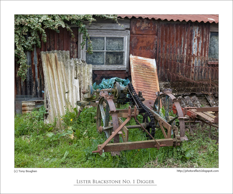
click photo to enlarge
I've never been challenged or queried very much when taking photographs in public places. It
has happened, but it has never led to the sort of significant incident that makes
headlines. The police, private security guards and others are regularly reported exceeding their authority and interfering with the rights that photographers have to pursue their hobby and profession, and we must all strongly
uphold our freedom to photograph in public places in the face of this kind of officiousness. But, what we must not forget is that most people, especially members of the public, are usually very helpful as far as photography goes. For example, people often wait until I've taken my shot before walking in front of me. Others are very generous, telling me about locations where I can get a good photograph. Of course, some people do make a detour to stay out of my shot, not to help me, but because they don't want to be captured on my image, and there's no problem with that. I usually find this happens in smaller places - towns, villages, the countryside - where photography is not an everyday occurrence. In cities and spots frequented by tourists, places where camera-wielding people are common, the locals tend to ignore you much more readily.
The other day I experienced a further example of the goodwill that is often afforded to photographers. I was sizing up a shot down Barn Hill in Stamford, Lincolnshire, when a man stepped out of a building to my left and was about to set off down into the town centre. "Am I going to be in your way?", he said, pausing for a moment. I told him he wouldn't be and he carried on, saying over his shoulder, "I suppose you can always Photoshop me out." I replied, "No, you'll be good foreground interest for me", at which he smiled and strode off, hands behind his back carrying his briefcase.
I've posted two shots of this particular Stamford street before (see
here and
here), a place with a fine selection of interesting buildings. On our recent visit we managed to dodge the rain and the sun made fleeting appearances. For this photograph, however, it had gone, but the sky had sufficient interest, the light was bright, and I managed to get a shot that I like; one that is all the better for the co-operative figure in the yellow jacket in the foreground.
photograph and text (c) T. Boughen
Camera: Canon
Mode: Aperture Priority
Focal Length: 35mm
F No: f7.1
Shutter Speed: 1/320 sec
ISO: 100
Exposure Compensation: -0.67 EV
Image Stabilisation: On


,-Newark,-Nottinghamshire-3.jpg)


