Pages

Monday, May 30, 2011

The Hoffmann Kiln, Langcliffe

click photo to enlarge
Although I was raised in Settle, North Yorkshire, and spent my childhood and youth exploring the mountains, hills and valleys of that area, until the other day I'd never seen the Hoffmann Kiln at Langcliffe. When I lived in the Dales the quarry at Giggleswick was in full production, turning out, as I recall, lime and crushed stone. The quarries of Helwith Bridge and Horton in Ribblesdale were also, as they still are, a major source of stone. Langcliffe Quarry, however, was a spent force, hidden behind its perimeter fences. In fact, to the casual observer it looked something like a massive, crumbling cliff, such was the effect that time, weather and colonising vegetation had wrought on its sheer faces. As a child and youth I was aware that it had a productive past, and I knew that some of the buildings associated with the production of lime still existed below its cliffs, but access to them wasn't possible or encouraged. In recent years this location has been used for refuse disposal and recycling. But, with changing times come changing attitudes to an area's heritage, and today access is allowed to the remains of this once thriving location of production by the Craven Lime Company.

The star attraction at the centre of crumbling buildings, inclined planes, water tunnels, wheel mountings etc. is the massive Hoffmann Kiln. This structure, built in 1873, is where limestone was, over a period of several weeks, reduced to the lime that found uses in "sweetening" acidic soil, paper making, steel manufacture, sugar refining, the making of chocolate and much more. The huge continuous oval, stone on the outside, fire bricks inside, with 22 individual burning chambers, now resembles a Piranesian vision, something that the Romans might have left behind. Inside the kiln is vaulted and its sloping exterior is pierced by arched openings that throw pools of light into the darkness. The tall chimney that allowed the hot gases and smoke to exit the kiln has long gone, but what remains is fascinating, and well worth a visit.

I took several photographs of the kiln. The two I show here best illustrate the structure, with the main image showing the interior of part of one of the long sides of the kiln.

photograph and text (c) T. Boughen

Camera: Canon
Mode: Aperture Priority
Focal Length: 40mm
F No: f7.1
Shutter Speed: 1/8
ISO: 3200
Exposure Compensation:  -1.0 EV
Image Stabilisation: On

Saturday, May 28, 2011

Lenticular cloud over Settle

click photo to enlarge
On a few recent days I swapped the warm, dry flatness of Lincolnshire for the colder, wetter Craven uplands of the place I was raised - Settle in North Yorkshire. And, on a couple of walks with the camera I snapped some of the sights that this area, where Carboniferous Limestone meets Millstone Grit, can offer. I shot a lot of landscapes. However, most of my better images were of other things.

Today's photograph is, I suppose, a landscape, but one with a difference. Take away the lenticular cloud and the shot doesn't offer a great deal. It shows the upland lane that connects Settle with Long Preston, a popular route that was used before the Keighley to Kendal turnpike was created, but which is now a rough track through woods, moorland and pasture. Much of the surface of the old road is composed of quartz sand, the result of attrition by wheels, hooves and boots on the underlying Millstone Grit. In the distance in the photograph is the limestone of Giggleswick Scars, and beyond, the summit of Ingleborough. However, it wasn't the foreground and distant panorama that caused me to take the shot, but rather, the cloud, one of three or four of this type in the sky at that time.

Lenticular clouds have always attracted the gaze of mankind. In recent times they have been called "flying saucer clouds" but "clouds of heaven" is an older name. Wikipedia describes their formation thus: "Where stable moist air flows over a mountain or a range of mountains, a series of large-scale standing waves may form on the downwind side. If the temperature at the crest of the wave drops to the dew point, moisture in the air may condense to form lenticular clouds. As the moist air moves back down into the trough of the wave, the cloud may evaporate back into vapor." In the right conditions a string of them can form. On the day I saw this one the individuals were well separated.

photograph and text (c) T. Boughen

Camera: Canon
Mode: Aperture Priority
Focal Length: 32mm
F No: f8
Shutter Speed: 1/500
ISO: 100
Exposure Compensation:  -0.33 EV
Image Stabilisation: On

Thursday, May 26, 2011

Welsh poppies

click photo to enlarge
A few years ago I asked some primary school children to tell me the names of the flowers that they knew. Collectively they came up with quite a few, both cultivated and wild, but individually they knew fewer than I imagined. One of the flowers that virtually all of the children wrote in their list was the poppy. I think three things make the poppy well-known - the distinctive shape and colour (red), the frequency with which it is used in decorative designs, and the fact that the British Legion sell small, man-made poppies around the time of Remembrance Sunday each November to raise funds. A fourth reason might be the frequency with which they can be seen invading cereal crops and the fact that some farmers now grow whole fields of them.

My garden has large, showy poppies coming into bloom as I write this blog post. They are mostly red/orange in colour, but I know that a dusky pink variety will open soon too. However, it isn't these poppies that I like best in my garden: my favourites are the small, yellow Welsh poppies that have been in bloom for a couple of weeks, their delicate heads bending in the wind, opening in the sun, and closing towards evening. This variety of poppy grows wild in Britain, often favouring damp or rocky places, though it is also grown for use in the garden too. There is an orange variant of the species, and my photographs today show both kinds. When I was growing up in the Yorkshire Dales these poppies were a very common sight, and they remain so in that area today. This is probably because, on the whole, they favour locations that are not intensively farmed.

The yellow poppies above were photographed this year in my garden with the dark backdrop of a conifer helping to emphasise the sun on their petals. I photographed the orange poppies last year when I found them growing in the shelter of Carboniferous limestone cliffs and clints and grykes on Giggleswick Scars, North Yorkshire.

photograph and text (c) T. Boughen

Main Photo
Camera: Canon
Mode: Aperture Priority
Focal Length: 218mm
F No: f5.6
Shutter Speed: 1/500
ISO: 100
Exposure Compensation:  -0.33 EV
Image Stabilisation: On

Tuesday, May 24, 2011

Views with spires

click photo to enlarge
If churches had never required tall bell towers that could ring the call to service across a wide area then the builders of our cities, towns and villages would have had to come up with a tall structure to give settlements the vertical accent that we find so visually satisfying. Later centuries did, of course, have such structures. In the UK the nineteenth century brought slender mill chimneys, gas holders, the clock towers of town halls, etc. But, to my mind, none of these match the aesthetic satisfaction that a well-proportioned spire or tower offers when seen projecting above a ragged roof-line.

The stone-built Lincolnshire town of Stamford has several churches that break its skyline, some of them medieval. Despite the fact that many of the secular buildings are Georgian and Victorian, from several points around the town, especially the fields by the river and St Martin's hill, it is still possible to see the kind of view that A.W.N. Pugin praised and extolled in Contrasts (1836), and which must at one time have characterised many English towns.

Today's photograph was taken looking down St Martin's hill from a point quite near the old church of the same name. The honey-coloured stone of the buildings that date mainly from the C17 to C19 frame a view of the C13 church of St Mary, its broach spire piercing a blue sky flecked with clouds. This image is another plucked from my "rejects and overlooked" collection. It was taken a year ago this month.

photograph and text (c) T. Boughen

Camera: Lumix LX3
Mode: Aperture Priority
Focal Length: 12.8mm (60mm/35mm equiv.)
F No: f5.6
Shutter Speed: 1/1000
ISO:125
Exposure Compensation: -0.66 EV
Image Stabilisation: On

Monday, May 23, 2011

Bokeh, OOF and glass

click photo to enlarge
Sometimes I think that we live in an increasingly casual world. Casual has its upside, certainly, but it can have disadvantages too. Written English is slowly (and in some circles rapidly) casting off the structures and formalities that the twentieth century inherited from the Victorian age. Spoken English is following a similar course. And where language goes dress by and large follows, though in some areas such as weddings the past twenty years has seen the re-appearance of garments last seen during the Edwardian era. But it's the changes in the technical language associated with photography that has exercised me of late.

I can live with the introduction of bokeh, a Japanese word meaning the way a lens renders the out of focus areas of a photograph. It's a single word that describes something that takes several words in English. What I can't manage though is the use of OOF for "out of focus". This word/abbreviation, one that is better kept for the sound of exhaled air that accompanies a punch in the stomach, makes frequent appearances in photography forums. It hasn't yet, as far as I know, made the leap into formal written texts, but it can only be a matter of time. Perhaps it is the pervasiveness of "text speak" that makes it seem acceptable. However, the modern usage that really stirs me up is the word "glass" instead of "lens" or "lenses". I think it's the cliquish familiarity that annoys me most. It shouldn't, I know, but it does!

Today's photograph of a distant Wisbech factory seen through a wire fence that had green netting fixed to it prompted today's reflection. When I looked at it on the compter screen I thought to myself, "I like the OOF bokeh that my choice of glass produced in this image." Or words to that effect.

photograph and text (c) T. Boughen

Camera: Canon
Mode: Aperture Priority
Focal Length: 105mm
F No: f7.1
Shutter Speed: 1/205
ISO: 100
Exposure Compensation:  -0.33 EV
Image Stabilisation: On

Friday, May 20, 2011

Reviewing the rejects

click photo to enlarge
Every now and then I look through my folders of RAW files and give further consideration to those photographs that didn't make it into the blog the first time around. About 85% of the shots that I post come from a first selection. However, the remaining 15% are images that for some reason or other I rejected on the first pass, but which with hindsight seem to make the grade. Very occasionally an overlooked photograph makes me think, "Why on earth didn't I post that one!" That's the case with today's, an image I took a year ago at St Mary's Place in Stamford, Lincolnshire.

My preferred method of selection involves choosing an image for posting, preparing it, then living with for a few days to see if my initial favourable impression is retained when I've looked at it many times. Usually my first judgement is confirmed, though sometimes I decide that I was wrong, the shot doesn't pass the test, and it is rejected. But, occasionally when I'm shooting a lot I post several from my haul and before I've exhausted all the "keepers" I've moved on to the next batch that I've shot. I think that was the case with this image: I moved on to newer photographs and this one got overlooked and left behind.

I like this photograph for the composition, the raking light that gives a sharp edge to the eighteenth century architecture, the deep shadows, the turbulent sky, and the three shoppers turning the corner that give the picture scale. It looks pretty good in colour with its honey-coloured stone and the greys, whites and blues in the sky, and that prompted my usual anguish about which version to post. However, the black and white shot seemed to have greater impact so that's the one I'm showing

photograph and text (c) T. Boughen

Camera: Lumix LX3
Mode: Aperture Priority
Focal Length: 5.1mm (24mm/35mm equiv.)
F No: f5 Shutter Speed: 1/1000
ISO: 80
Exposure Compensation: -0.66 EV
Image Stabilisation: On

Thursday, May 19, 2011

A mouse's-eye view

click photo to enlarge
It's said that 99% of photographs are taken from a height of between 5 feet and 6 feet above the ground; that is to say, eye-level. Moreover, in most of those photographs the camera was level, pointing neither up nor down to any great extent. That being the case, one of the easiest things for anyone to do, anyone that is who wants to make his or her photograph stand out from the crowd, is to get either down low, up high, or point the camera upwards or downwards. Of course many enthusiast and professional photographers do this on a reasonably regular basis, but surprisingly many frequently forget this basic strategy. Including me! Apart from the shot of the swan remants I can't think of any photographs I've taken from a low viewpoint (flowers excepted) in recent months.

So, when I came to take a photograph of my wife in what has become a characteristic pose over the past nine weeks - hosepipe in hand, water sprinkling the flower borders and vegetables - I wondered how to give the shot a "different" character. Then I remembered the low viewpoint: what I call the "mouse's-eye view". I set my compact camera to the 16:9 aspect ratio, positioned it above the hosepipe, and used the latter as the leading line taking the viewer's eye to the main subject: simple and reasonably effective. One day, perhaps, I'll have a camera with a tilting LCD and shots of this kind will be easier to compose. With the LX3 I had to lay prone! Fortunately (though unfortunately for farmers and gardeners) everywhere is dry as a bone and I rose from the lawn with trousers and shirt as clean as when I got down.

click photo to enlarge

Camera: Lumix LX3
Mode: Aperture Priority
Focal Length: 5.1mm (24mm/35mm equiv.)
F No: f3.2
Shutter Speed: 1/500
ISO: 80
Exposure Compensation: 0 EV
Image Stabilisation: On

Tuesday, May 17, 2011

A swan, a wire, a death

click photo to enlarge
In my early teens I was a keen birdwatcher and the fascination with birds has stayed with me since that time. In fact, I consider it to have been a life-enriching activity. It's fair to say that my interest was never as deep in later life as it was in those early years, but I have always been alert to the bird life around me, and I remain so today. As well as recording the number and species of the birds I saw, I plotted nest sites, photographed birds and collected a few artefacts - feathers, the odd wing and skull (including those of a curlew and a heron). The latter activity may sound a touch macabre, but I never considered it so. I used to periodically come across dead birds and they provided the materials for my small collection. Skulls were sometimes clean and bleached white by exposure to the sun: others could be made so by leaving them near an ants' nest! I'd probably been inspired to collect these things by the displays of stuffed birds that seemed to feature in every museum I visited, and by the stories in the Victorian and early twentieth century bird books that I posessed.

On a recent cycle ride I came upon a sight that brought back those early days. The farm track upon which I was travelling was littered with wings, bunches of tail feathers and smaller, downy feathers. All were white, though the wings had a hint of brown too. The death of the bird must have been quite recent because the remaining bone and tissue where the wings had been parted from the body were still quite red with blood. I immediately knew that the bird was a young mute swan (Cygnus olor) and that it had died or been seriously injured when it flew into the wires above the track. This happen all too frequently to swans, and I've come across them before in similar circumstances. What I couldn't deduce from the evidence before me was what had eaten the rest of the bird. Perhaps it was a fox, maybe a stoat, possibly rats or a domestic cat, certainly carrion crows or magpies: probably, however, a few or all of these had a meal or two off it.

Not being one to pass up a photographic opportunity, even one that's a touch grisly, I took out my compact camera, set the aspect ratio to 16:9 and took this "scene of crime" shot.

photograph and text (c) T. Boughen

Camera: Lumix LX3
Mode: Aperture Priority
Focal Length: 5.1mm (24mm/35mm equiv.)
F No: f4
Shutter Speed: 1/640
ISO: 80
Exposure Compensation: 0 EV
Image Stabilisation: On

Monday, May 16, 2011

Murals

click photo to enlarge
I've noted elsewhere in this blog that, on the whole I'm not a great fan of street murals, graffiti and the like, though there are exceptions, often of a less permanent kind, that do appeal to me. Too many murals painted on walls are put there in an effort to "lift" a run-down corner, inject a note of gaiety into a dismal urban setting, or because a fund-granting organisation wanted to spend the last of its yearly quota in a "meaningful" and eye-catching way and threw some money in the direction of a "community artist." Sometimes this works, the quality of the commissioned piece is good, and it serves its purpose until, with age, it starts to degenerate and is painted over. Where that happens I have few objections. But more often than not the quality of the painting is mediocre and it spends more years than it ought slowly peeling, becoming discoloured, stained, and vandalised, degrading its location rather than adding to it in the way that was intended. As far as graffiti goes I share the view of many that if its painted on a wall that belongs to someone else, without their permission, it's vandalism regardless of whether its good or bad art.

When I was in London last November I took this photograph of a mural that adorns the wall of the Design Museum. The museum building, perhaps inevitably and predictably given its purpose, is a white blocky building. So, a mural that consists of black, cartoon-like shapes incorporating faces on one section of the walls, fits in very well with the overall minimalist aesthetic. I took a couple of shots of it, then sought a photograph that included a passer-by. I ended up, also perhaps inevitably and predictably, with a composition that I'd used before and liked.

photograph and text (c) T. Boughen

Camera: Canon
Mode: Aperture Priority
Focal Length: 105mm
F No: f6.3
Shutter Speed: 1/125
ISO: 100
Exposure Compensation:  0 EV
Image Stabilisation: On

Friday, May 13, 2011

Young spiders

click photo to enlarge
Our New Zealand Flax (Phormium) suffered greatly during the recent very cold winter. Two of the four plants died and the other two came close to death. The deceased pair have been removed - a job for shears and an axe - but the others retained living leaves in their centres and have produced more during April and May: I'm hopeful that they'll make a complete recovery.

The discarding of two such large plants has left a big space in one of the borders that has had to be filled with small shrubs and annuals. The remaining two have halved in size due to the drying out of dead leaves and the fact that we've pulled off those that were loose. It was when she was inspecting these that my wife spotted the young spiders. They'd recently hatched and were clustered on a tangle of extremely thin webs stretched between some of the flax leaves. There was nothing elegant or artistic about the web; functionality was the only consideration in its construction. It was probably the low morning light catching the webs that caught her eye and she came into the house to suggest it to me as the subject for a photograph.

I took several shots using the macro lens, with and without the tripod, with the sun at the side and into the sun. The small creatures seemed to prefer to be in a cluster, a group that was about the size of my finger nail. However, when I touched it they spread radially, like a slow-motion expolosion, giving me a couple of different compositions. Out of the three photographs that I've posted I like the dark shot against the light best, though the other two please me as well.

photograph and text (c) T. Boughen

Main Photo
Camera: Canon
Mode: Aperture Priority
Focal Length: 100mm
F No: f8
Shutter Speed: 1/80
ISO: 400
Exposure Compensation:  -0.33 EV
Image Stabilisation: On

Thursday, May 12, 2011

Photographing stained glass windows

click photo to enlarge
The very best photographs of church stained glass come about when the exposure is carefully planned. What is it most important to get right? Well, you have to ensure that the camera is steady using a tripod if necessary, that colour balance is accurate and that your exposure (or stacked multiple exposures) capture the full range of tones from the lightest to the darkest. But in general it's not camera settings that are the most critical factor - any reasonably competent photographer can bracket a few shots and get a decent exposure. No, what usually separates the satisfactory shot from the first class one is the quality of light and the background of the window outside the church. I always find that a shot taken on an overcast but bright day produces the greatest fidelity. Sun and gloom are both difficult to work with, the former being slightly harder than the latter. And, the presence of trees, nearby houses or a part of the church itself as the backdrop to the window is usually intrusive because of the way these elements selectively change the colour and brightness of the glass.

However, if your aim is to take an interesting photograph (as opposed to an accurate one), or if outside conditions cannot be changed, it's perfectly possible to work with the restrictions I note above and achieve an acceptable image. Today's pair of photographs do, I hope, illustrate this. The first shows the triple east windows of Essendine church in Rutand and were taken early on a day in February when the morning sun was streaming through the brightly coloured glass.The reversed image that each window has projected onto the nearby wall is not the sort of effect that you'd want to have in a good stained glass window photograph, but it does make for an interesting shot, the indistinct quality making a nice contrast with the sharpness of the actual glass and lead. The second image was marred by the projecting building behind the leftmost figure - you can see some above and to the left of the head, and this had to be compensated for in post processing. It resulted in the colour of the white draperies of this figure being a different colour from the others; something that I didn't quite manage to correct. Moreover, a single exposure could not capture all the tones and colours because the left side of the window was so much darker than the right. Notice, for example, that some of the small red, blue and green pieces of glass in the border that frames each figure are recorded as black. Despite these shortcomings I think the shot has enough to offer in the form that I present it - though its more subtle colours do look dull by my juxtaposing them with the brighter hues of the more modern glass above!

photograph and text (c) T. Boughen

Main Photo
Camera: Canon
Mode: Aperture Priority
Focal Length: 24mm
F No: f6.3
Shutter Speed: 1/20
ISO: 500
Exposure Compensation: -0.67 EV
Image Stabilisation: On

Wednesday, May 11, 2011

A quick visit to A & E

click photo to enlarge
On a recent brief evening visit to the nearest Accident and Emergency department at Boston's Pilgrim Hospital, I grabbed a quick photograph of the building with my pocket camera. And, as I sat in the waiting area I fell to thinking about the such establishments, especially those built in the 1960s and 1970s.

Pevsner records that the design for Pilgrim Hospital was selected in competition in 1961, the winner being the work of the Building Design Partnership. But he also notes that it was built quite differently because of an enlarged site and revised accommodation requirements. The first phase went up in 1967-70 and the second in 1972-74. A third phase was added in 1985-87. From a distance all one sees across the flat Fens is the dominant slab of the 10-storey ward block, but from close by the expanse of single-storey departments becomes evident. What was it about these decades, I wondered, that resulted in hospitals that look like office blocks or Le Corbusier's Unite d'Habitation? Perhaps it was the wish to depart from the grim Gothic and Italianate edifices of the nineteenth century and the homely "cottage hospital" style of the inter-war years. Maybe the desire was to be forward-looking, modern, scientific and rational. Maybe too, at a psychological level there was the desire to convince the users that here is a building staffed by professionals, another world where all sorts of life-saving and life-enhancing treatments are adminstered, a place where you can put your trust in those who work there. Every profession seeks to amplify the prestige and power that attaches to them, those involved in medicine no less than bankers, and perhaps this too was part of the rationale behind the kind of architecture that can be be seen across the country from Hull to Cardiff to Preston to Ipswich. Or was it simply a following of fashion by the architectural profession?

I took my photograph from the car park. The lighting coming from the remnants of the day and fluorescent bulbs stetched the camera to the limit, resulting in a fairly grainy image. Noise suppression introduced a touch of "water colour effect", but the combination of tree silhouettes, cars, lights and the grid of illuminated windows of the main hospital building produced a shot that doesn't entirely displease me.

photograph and text (c) T. Boughen

Camera: Lumix LX3
Mode: Aperture Priority
Focal Length: 6.3mm (30mm/35mm equiv.)
F No: f2.2
Shutter Speed: 1/8
ISO: 800
Exposure Compensation: 0 EV
Image Stabilisation: On

Tuesday, May 10, 2011

Fenland misconceptions

click photo to enlarge
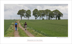
The Fenlands are one of those areas of England about which many people hold misconceptions: that is if they hold any conceptions at all! The first is that the Fens are to be found in Lincolnshire. They are, but they also extend into Cambridgeshire, Norfolk and a small area of Suffolk. Then there is the view that they are flat. That's essentially true, but the area has silt ridges, medieval sea banks, old salterns and small natural undulations that mean it isn't entirely flat. The Fens are a treeless landscape is a view that many hold. This certainly isn't true. There's no doubt that the Fens have fewer trees than most lowland areas, but there is no point where trees cannot be seen, most villages have plenty of them, small stands and individuals are common in open country, and the hedgerows feature quite a few too. There are even areas of new tree planting instigated by government grants.Most people know that the Fens produce prodigious quantities of vegetables and cereals, and often those who are aware of this assert that livestock is absent. In fact sheep, cows, and pigs are present in small but significant quantities - sheep in greater numbers in winter - and an assortment of pet/hobby livestock, from llamas to ponies are found in paddocks being tended by those engaged in "horseyculture". Wildlife enthusiasts consider the area bereft of animals and wild plants. As someone who has lived among the riches of the Yorshire Dales, by the Humber Estuary, and in the region of coast, plain and mountains that is north Lancashire, I can confirm that there are fewer of these than in some other areas, but that any walk in the Fens reveals a good range of birds, animals and plants for anyone who cares to look.

The opinion also exists that walking in the Fens holds few attractions. For those of limited imagination and appreciation this may be true. However, for walkers of wider experience, who know that all landscapes offer interest to the discerning eye and mind, the charms of passing through this region on foot are many and unique. I had such a walk with my wife and a couple of friends the other day. On minor roads, farm tracks, footpaths and the banks of the South Forty Foot we meandered through crops and by waterways under an enormous sky, stopping to watch yellow wagtails, buzzards, reed buntings, sedge warblers and more. As we approached the stand of trees in the photograph we reflecetd on how they were allowed to remain standing, even after the old farmhouse that stood near them was taken down and a new one built nearby. Their presence showed that not all Fenland farmers try to squeeze every last drop of profit out of their land, and that some have a reverence for the landscape and a sense for those things that enhance its special beauty.

click photo to enlarge

Camera: Canon
Mode: Aperture Priority
Focal Length: 105mm
F No: f8
Shutter Speed: 1/200
ISO: 100
Exposure Compensation:  -0.33 EV
Image Stabilisation: On
Monday, May 09, 2011

Harrington church and S.S. Teulon

click photo to enlarge
My interest in church architecture leads me to read a lot about the architects of the Victorian period: the major names of the nineteenth century such as Scott, Pearson, Street, Butterfield etc, but also the second rank of practitioners and the lesser lights too. The other day, following a visit to the church of St Mary at Harrington, Lincolnshire, I was delving into my books to find out more about Samuel Sanders Teulon (1812-1873). I'd always known of him because he was one of Harry Goodhart-Rendel's "rogues" i.e.one of the architects who departed drastically from the mainstream Gothic of the time, and injected their own whim, fancy and personal vision into their country houses and churches. I recall too seeing his estate cottages at Sunk Island, East Yorkshire, and his individualistic churches dotted about in Lincolnshire at places such as New Bolingbroke, Riseholme and Burringham. However, when I read about the extent of his practice and the number of commissions he worked on, I felt as I often do when reviewing the work of these men - exhausted.

It's hard to imagine how the successful Victorian architects juggled their commissions. Yes, they had assistants and trainees, but the sheer weight and range of commissions that came to someone like Teulon is staggering. And that doesn't take into account the amount of church restorations, rebuildings and extensions that many undertook. Harrington church was a rebuild by Teulon of a medieval structure, but such an extensive rebuild that little of the old work remains. So, given his reputation for dazzling polychrome brickwork, weird gables, tall towers, complex silhouettes, a style that some admired and others called "illiterate", what characterises Teulon's work here. The word that comes to my mind is "boring." It is a greenstone church with little to distinguish it from others. Inside the building its painted plasterwork, pulpit, windows and roof are all too typical of a Victorian church. The building disappoints because it displays neither novelty or a respect for the original building. The fact that I'd visited Harrington twice before and could remember nothing of it says it all.

But, from a photographic standpoint, the light on the day of my most recent visit was strong and Teulon's painted walls reflected it around the interior giving it quite a nice glowing quality. So I composed this asymmetrical shot looking down the nave, past the "wine glass" pulpit to the "Geometrical" east window.

photograph and text (c) T. Boughen

Camera: Canon
Mode: Aperture Priority
Focal Length: 24mm
F No: f6.3
Shutter Speed: 1/20
ISO: 500
Exposure Compensation: -0.67 EV
Image Stabilisation: On

Saturday, May 07, 2011

Votes and buoys

click photo to enlarge
For most of my lifetime the majority of the electorate have voted for left of centre candidates in UK elections. And, for most of my lifetime our first past the post voting system has delivered a right of centre government with a parliamentary majority. As a result of yesterday's vote against the proposed AV system for future elections, this state of affairs looks set to continue.

Is this what those voting "No" wanted? Perhaps, but I find it hard to think so. There are several reasons people rejected change including inertia, a preference for "simplicity" over "complexity", a campaign of bile and lies (from both sides), the desire to punish the Lib-Dems, a disillusionment with politics in general and more. But, at the heart of it is, I think, the fact that a large section of the British public are not terribly interested in politics and still collectively leans towards the "they're all the same" point of view when it comes to political parties. This would account not only for the low turnout but also the tendency to vote for the status quo. However, it never was true in the past that all parties are the same (though under New Labour it was sometimes difficult to discern the difference) and it's not true now. We have many political parties in the UK, but the fact is, of those that are well-supported there is only one whose principal aim is to transfer wealth from the poor and the middle classes to business and the wealthy. Don't know which one? Well, today you can identify their leaders by the grin on their faces, a smirk that has appeared because the "No" vote means their core task will be just as easy as it always was.

I've photographed the subject of today's image several times and have never been happy with the outcome. It shows the area where buoys are re-painted on Purfleet Quay on the River Great Ouse at King's Lynn, Norfolk. As well as a few old buoys there are paint marks on the ground and a contraption that, in some way, must be used to aid the painting, though quite how I can't imagine. Given that the subject is colourful, with red, green and yellow buoys and rings of paint, it may seem odd that I've chosen a black and white treatment. But, the truth is that light is usually more important than colour in creating a photograph, and here shooting fairly close to the sun gave me a curved composition, made more of the shapes and delivered a shot that I liked.

photograph and text (c) T. Boughen

Camera: Canon
Mode: Aperture Priority
Focal Length: 28mm
F No: f7.1
Shutter Speed: 1/320
ISO: 100
Exposure Compensation:  -0.67 EV
Image Stabilisation: On

Thursday, May 05, 2011

None of the above

click photo to enlarge
Today I went to cast my vote in the local elections and did something that I've never done before - I spoiled my ballot paper by writing on it "None of the above". That's something that I never imagined I'd do. It's always been my feeling that you should exercise your democratic right even if it only means voting for the least worst option. Today my problem was that there wasn't a least worst option! They were all completely unpalatable.

Should I have voted for the Conservative Party candidate? Well, let's set aside the host of reasons why I won't, and the fact that I'm congenitally incapable of doing so, and simply consider the fact that if it was between the Mafia and the Conservatives I'd vote Mafia because they exhibit less self-interest. Should I have voted for UKIP? Though they protest otherwise they are essentially a single issue, Little England party, and I find their core policies distasteful. Then there is the party that currently holds power locally, the BBI - another single issue party trying to convince us that they have sound policies across the board and the core competencies necessary for local government when all the evidence shows that they don't. And that was my choice. No Labour, Lib-Dem, or Green Party candidates. I'd have voted for any of those as the least worst option (though I would have needed a peg on my nose to vote Lib-Dem). Incidentally, it's something of a sore point with me that my opinion will not be noted and my ballot paper will simply be counted with all the other spoiled examples. I believe that in some political systems "None of the above" is a choice offered for your "X", and we'd do well to offer it here too. For anyone who is wondering, yes, I did cast my vote in the referendum on AV. Mine was a "Yes" for change.

Today's photograph has nothing at all to do with local politics. It's a photograph of a few rhododendron blooms that I took on a short walk at Woodhall Spa recently. I hopped around the bush until I found this composition that quite pleased me. I liked the foreground bloom with its "ruff" or "necklace" of leaves, and the way the other two fill the frame and become less distinct with distance.

photograph and text (c) T. Boughen

Camera: Canon
Mode: Aperture Priority
Focal Length: 60mm
F No: f4
Shutter Speed: 1/50
ISO: 125
Exposure Compensation:  0 EV
Image Stabilisation: On

Wednesday, May 04, 2011

Motion blur and serendipity

click photo to enlarge
Every now and then an accidental photographic exposure produces a result that is more desirable than the ones to which you give careful consideration. This image is a case in point. I was wandering around the garden with the macro lens on the camera, taking a few snaps of flowers, when I noticed a red-tailed bumblebee (Bombus lapidarius) moving from bloom to bloom on the cornflowers. I took several shots of the busy insect, then went inside to have a look at my haul of pictures. Most of them were technically fine, but boring. This one, however, stood out. The bee had just taken off and I'd moved the lens to follow it and snap it in flight. It was a futile task at these kinds of shutter speed, I know, but it was a reflex action prompted by who knows what.

The result pleases me for a number of reasons. Firstly, I like the orange-red of the bee's tail as it buzzes off. Secondly, I like the fact that nothing in the image is sharp and the bee least of all. Thirdly, the overall mix of colours, especially the tones of geen and yellow in the background are pleasing. And finally, without me planning it, I have a further shot in my on-going collection of motion-blurred images!

photograph and text (c) T. Boughen

Camera: Canon
Mode: Aperture Priority
Focal Length: 100mm
F No: f8
Shutter Speed: 1/100
ISO: 100
Exposure Compensation:  0 EV
Image Stabilisation: On

Tuesday, May 03, 2011

Free Trade Wharf, names and ziggurats

click photo to enlarge
There was a time in the 1980s and 1990s when the language of the Conservative government, with its red in tooth and claw capitalism, infected every new industrial estate that sprang up on the edges of our towns and cities. So, the development became an Enterprise Park and its roads and offices sported names such as Endeavour Way and Venture House. There's nothing wrong with these words - they're fine words - but it almost seemed that the builders of these developments naively felt that the right names would engender the right entrepreneurial attitudes in those who set up their businesses there.

On a completely different tack (but with a connection that will be made clear shortly), when I stay in London I look across the Thames at this large, rambling, block of flats. Ever since I first saw it several years ago I've wondered about it. Its plan is clearly designed to give as many of the 208 flats as possible a balcony and river view. The whole effect is somewhat Mediterranean in feel, with a touch of Lego thrown in for good measure. However, it isn't Spain or Italy (or even Denmark) that come most to mind when I look at it, rather it's Mesopotamia and its wonderful ziggurats. It must be the pyramidal shapes, the brick facing and the slightly "tumble-down" appearance that evokes those crumbling structures from the 3rd millennium BC. I was in London last weekend and took the smaller photo then: the larger one was taken in February. When I decided to post these photographs I thought I'd better find out what the flats are called and when they were built. It seems they dates from 1984-1990 and are called Free Trade Wharf. A name very much of its time I thought. But then I thought a little harder, and wondered what had been on the site before the flats. It turns out that a group of several warehouses built in the 1790s sat on, guess what? Free Trade Wharf! So, the name isn't new, but is probably late Georgian or Victorian, and is one that resonates with the capitalistic spirit of those more distant times rather than the end of the millennium..

The fast catamaran ferry in the photograph is one operated by the Thames Clipper company. These boats can be frequently seen whizzing up and down the River Thames between Greenwich and central London.

photograph and text (c) T. Boughen

Main Photo
Camera: Canon
Mode: Aperture Priority
Focal Length: 73mm
F No: f7.1 Shutter Speed: 1/500
ISO: 100
Exposure Compensation:  -0.67 EV
Image Stabilisation: On

Monday, May 02, 2011

To lock or not to lock

click photo to enlarge
As anyone who looks at this blog on a regular or even an intermittent basis can't help but notice, I visit  and photograph quite a few churches. Usually I've determined which ones we'll stop at the day before, but often we simply drop in as we pass by. I say "drop in", but sometimes that's not what we do. Why? Because many churches are now locked. There was a period, that extended into my lifetime, when virtually every village and small town church was open during daylight hours. Those in large towns and cities were more likely to be locked, but quite a few opened, sometimes with an individual from a rota of parishioners in attendance. Today when we arrive at a church I expect one of the following to prevail:

1 - the church is locked and there is no information about where to borrow the key
2 - the church is locked but the phone number of one or more key holders is displayed
3 - the church is locked but the addresses of a one or more keyholders is clearly displayed
4 - the church is open.

From my perspective 4 is good, 3 is acceptable, 2 is less than satisfactory, and 1 is very disappointing. Of course a parish often sees things differently. Fear of theft and damage are the main reasons churches are kept locked, and many incumbents and church council members convince themselves they cannot leave the building open for these reasons. What I find interesting, however, is that it's very difficult for me to predict which church I'll find open and which will be locked. Many parishes and groups of parishes have no problem leaving their churches open, but others, in apparently similar circumstances, come to a different conclusion. The individual experience of theft or vandalism sometimes prompts closure, but in other cases is brushed aside and the building remains open to serve the community, to provide a religious facility for visitors, to offer the main repository of local history to those who are interested, and to raise a small amount of funds from passers-by. I sometimes think it is the fear of what might happen, rather than the actuality that leads to a church being locked.

On a recent journey through Lincolnshire I had two very contrasting experiences. In one area I found a group of churches open, and a sign in each advertising the fact that all welcomed visitors. A few miles south we found most churches in a small area (including Dorrington church shown above) locked, though one was open because it was being cleaned. A church that we always find locked had a service in progress - fair enough - but also had banners strapped to it appealing for funds to repair the chancel roof. We departed reflecting that they'd have had some of the money that was required donated by us over the years had the building ever been unlocked.

photograph and text (c) T. Boughen

Camera: Canon
Mode: Aperture Priority
Focal Length: 17mm
F No: f8
Shutter Speed: 1/600
ISO: 100
Exposure Compensation:  -0.33 EV
Image Stabilisation: On