Pages

Saturday, April 30, 2011

Simplification

click photo to enlarge
Since my translocation from a coastal area with a conurbation to a rural area with fields and villages I've found it harder to simplify my photographs. Perhaps it's because in my present setting I see fewer opportunities for images that emphasise these qualities. Yes there are uniform areas of grass and sky, but there is little open water or sea, no expanses of beach, large buildings with plain walls are few as are expanses of concrete and tarmac. So, simple backdrops are harder to find. And, the range of subjects that I could call upon in the vicinityof  my former home was wider. Consequently, as I go about my photographic business I'm constantly on the look out for any image that exhibits the simple force of just two or three elements. Sometimes I find it by going in close either by physical proximity or using a zoom lens. But opportunities for wider shots that feature this quality are harder to find and see.

However, the other day as we walked across the field of winter wheat around which is the village of Tetford on the Lincolnshire Wolds, one of these simple images presented itself to me. My wife was walking ahead, bum-bag bouncing, map in hand, as we came towards the end of a long morning walk. As she strode along the uniform greenness of the wheat, the long and sinuous path, and her figure suggested a shot. So, I stepped to the side to make the line of the foorpath fill the right of the frame, placed my wife on the left, and took a couple of photographs. This is best one.


For more thoughts on simplifying photographic compositions see here, here, and here. Examples are spread throughout (mainly) the years 2005-2007 of the blog!

photograph and text (c) T. Boughen

Camera: Canon
Mode: Aperture Priority
Focal Length: 271mm
F No: f8
Shutter Speed: 1/320
ISO: 320
Exposure Compensation:  0 EV
Image Stabilisation: On

Friday, April 29, 2011

Weddings then and now

click photo to enlarge
On Wednesday 29th July 1981 we put our two year old son into the seat on the back of our tandem bicycle, and, with panniers full of food, drink, baby sundries, camera and a copy of Pevsner's, "The Buildings of England: Lincolnshire", we set off from our house in the city of Kingston upon Hull to cycle across the Humber Bridge and explore the countryside and medieval churches of North Lincolnshire. That day was not quite like any other day for two reasons: firstly it was an extra Bank Holiday and most people had a day off work, and secondly, in London a wedding was taking place - that of Prince Charles and Lady Diana Spencer. It was with the avoidance of the publicity, euphoria, TV and radio coverage, street parties and the rest of the hoopla associated with that event that two committed republicans (and their son) chose to spend their day in this way.

Today is the day of another royal wedding, but this time I have no all-day excursion by bicycle or any other form of transport planned. That's not because my advancing years have turned me into a monarchist eager to gawp at the TV coverage as I wave my Made in China Union flag. No, this time I'll be tending the garden, doing a few domestic chores and tidying up after having spent a few days away from home.

During my recent trip I stopped briefly in Horncastle. This small Lincolnshire town is generally known for two things: firstly, it was a Roman town, and secondly, today it has more than the average number of antique shops. The latter are a variety of establishments that cater for a wide range of pockets. My photograph shows one in a nineteenth century bulding that looks like it has seen better days. However, the owner had brightened up the faded paintwork and crumbling masonry with a royal wedding display featuring flags, flowers and champagne. The other window showed a few wares for sale and evidence of political allegiance in the form of a poster urging people to vote for an Independent candidate. I took my photograph of the facade and moved on, and as I did so reflected that I hope anyone whose wedding is on 29th April 2011 has a long and happy marriage. And, from my republican standpoint, if the newlyweds happen to be a future king and queen perhaps they'd like to consider the probably beneficial effects of abdication on their marital bliss!

photograph and text (c) T. Boughen

Camera: Canon
Mode: Aperture Priority
Focal Length: 40mm
F No: f8
Shutter Speed: 1/30
ISO: 125
Exposure Compensation:  -0.33 EV
Image Stabilisation: On

Thursday, April 28, 2011

Writers and locations

click photo to enlarge
When I was growing up in the Yorkshire Dales I was always aware of the relative proximity of "Bronte Country", the hills around Haworth where the Bronte sisters and their family lived, worked and wrote. I also noted that in more recent times the northern Dales assumed the title, "Herriot Country" on the back of the popularity of James Herriot's books and their TV adaptations, though I confess to never having read or seen any of his work. This mania for giving areas names based on the works of writers or painters is of relatively long standing, though it does seem to have increased in the past thirty years or so.

Thomas Hardy's books are largely set in Wessex, an old name that describes an area that includes including Dorset, Berkshire, Devon, Somerset and Wiltshire. He gives fictional names to actual towns - Puddletown becomesWeatherbury, Bridport is changed to Port Bredy, Bournemouth to Sandbourne etc - and this has, for tourist authorities and readers, created an area that is now recognised as "Hardy's Wessex". This kind of association is sometimes disputed when more than one artist is connected with a location. Thus, the Lake District in the minds of some is linked with Beatrix Potter, but others see it as closely intertwined with the "Lakes Poets" - Wordsworth, Coleridge, Southey and others.

What has this to do with my photograph of oilseed rape and ash trees? Well, it was taken over the past couple of days when I spent some time walking, cycling and driving in a small part of England that has acquired the title of "Tennyson Country". The rolling hills of the south Lincolnshire Wolds in the vicinity of Somersby, Bag Enderby and Harrington is the area where Alfred (later Lord) Tennyson was born, grew up, and where he wrote much of the early poetry that led to him becoming the most admired poet of Victorian England.

photograph and text (c) T. Boughen

Camera: Canon
Mode: Aperture Priority
Focal Length: 28mm
F No: f8
Shutter Speed: 1/250
ISO: 100
Exposure Compensation:  -0.33 EV
Image Stabilisation: On

Tuesday, April 26, 2011

Regimental colours

click photo to enlarge
In a south aisle in Beverley Minster hang flags of the East Yorkshire Regiment (The Duke of York's Own). How old are they? Some must be many decades old, others much more ancient. Time is slowly decaying their woven cloth and fading their bright colours. Yet still they record the campaigns of this illustrious local regiment - Oudenarde, Malplaquet, Louisberg, Quebec, Ramilles, and others - names from history books, battles fought by local men recruited from towns such as Beverley, Driffield, Bridlington, Hedon and the city of Hull.

Many of our larger churches have such flags, often as in the case above, of regiments long gone in British Army amalgamations, the banners, and associated plaques and memorials remembering their deeds and their local connections. I suppose it's not only the religious aspect of remembrance that makes such a setting seem appropriate for these artefacts: the timeless character of a minster, a cathedral or a big medieval parish church must also promise a location that will endure and ensure that the sacrifice and achievements of these soldiers will not be forgotten.

I photographed these flags on a day when the glow of the sun was penetrating the darkness of the building, making the stained glass and old stone glow, and illuminating the tattered remnants hanging from their poles.

photograph and text (c) T. Boughen

Camera: Canon
Mode: Aperture Priority
Focal Length: 60mm
F No: f7.1
Shutter Speed: 1/60
ISO: 3200
Exposure Compensation: 0 EV
Image Stabilisation: On

Monday, April 25, 2011

Red Mount Chapel, King's Lynn

click photo to enlarge
"...one of the strangest Gothic churches in England."
Nikolaus Pevsner (1902-1983), architectural historian

The Red Mount Chapel in King's Lynn is a small pilgrimage chapel built in 1483-5 by Robert Curraunt for William Spynke, the Benedictine prior of Lynn. It was designed to be a stopping point for people travelling to Walsingham, England's second most important pilgrimage shrine after Canterbury. It provided religious support as well as material comforts for the travellers, and doubtless provided significant sums for the coffers of the priory church of St Margaret.

It is a brick built, octagonal structure with stone dressing, topped by a cruciform stone chapel with fan vaulting and panelled, pointed tunnel vaults. The building has three entrances, the main one giving access to the ground floor chapel. Above that is the priest's room, with the second chapel at the top. Two stairways run in opposite directions in the space between the outer brick walls and the inner rooms. The mound on which it was built may have been a Norman motte, but in later medieval times it was known as "the hylle called the Lady of the Mounte." The life of the chapel was quite short: it ceased to be a place of worship in 1530. In subsequent centuries it was used for water storage, as a study, an observatory and a stable. During the English Civil War it was a gunpodwer store! It's a wonder that it still exists, but the people of the town had it restored by public subscription in 1828, with further work in the 1920s and 1930s. Major repairs were undertaken in 2007 and today it is regularly open to the public. I saw it on a day when the town's medieval South Gate was also open.

When The Walks was created in the eighteenth century, and further extended as a public park in the nineteenth century (see previous post), the designers of this open space had no need to add a ruin, an eyecatcher or any other focal point around which to arrange their trees, water feature, seating and walks because it already existed in the form of this unique medieval chapel.

photograph and text (c) T. Boughen

Main Photo
Camera: Canon
Mode: Aperture Priority
Focal Length: 24mm
F No: f7.1
Shutter Speed: 1/125
ISO: 1250
Exposure Compensation: -0.67 EV
Image Stabilisation: On

Saturday, April 23, 2011

Walking The Walks

click photo to enlarge
"The Walks", a public park in King's Lynn, Norfolk, differs from most English town and city parks. Firstly, it was laid out in the eighteenth century as a single "promenade" or walk for citizens away from the hustle, bustle and grime of the busy town centre. Most of our parks were created from the mid-nineteenth century and later, as was the case with King's Lynn's other park, St James', which dates from 1902-3. Consequently, rather than a series of sinuous or circular routes through the park there is one dominant, axial thoroughfare to which other, later paths have been added. A record of 1714 describes a "handsome lime-planted walk put in the year before". This main path, shown in the photograph was described in 1773 in the following way: '"The new walk or mall, from the bars of the workhouse to Gannock-gates, is about 340 yards long and 11 yards wide between quick hedges; at convenient distances on each side of the walk a recess is left in the hedge in a semicircular form, where benches are fixed, on which twenty people may fit together. Upon a gentle ascent on the right is a plantation and a shrubbery'".

As you can see, the hedges and the recessed seating have gone, but it remains tree-lined, and punctuated by benches. The park also contains two features unusual in such a place. The Gannock Gate was originally a minor entrance to the walled town. What remains is something of a hotch-potch of a reconstruction, possibly with original materials, but it  acts as a useful focal point and eye-catcher on the main walk. Off to the side is a mound topped by a small but fascinating medieval pilgrimage building - Red Mount Chapel (the subject of a post to come). These features, along with the place's early origins and subsequent Victorian additions, led to The Walks being designated a Grade II historic park in 1998.

I visited The Walks on an unseasonally hot April day, and the sight that I saw reminded me of how the park must have looked in the eighteenth and nineteenth centuries when there were fewer forms of leisure available, and a public promenade in the park was seen as a fine way to spend a morning or afternoon. At the point I took this photograph there were relatively few people, but elsewhere The Walks teemed with adults and children soaking up the sunshine, playing soccer, sitting and chatting, eating ice creams and generally having a good time.


photograph and text (c) T. Boughen

Camera: Canon
Mode: Aperture Priority
Focal Length: 81mm
F No: f7.1
Shutter Speed: 1/80
ISO: 125
Exposure Compensation:  -0.67 EV
Image Stabilisation: On

Thursday, April 21, 2011

Reviled buildings and illusions

click photo to enlarge
Are multi-storey car parks the most reviled type of building in our towns and cities? I think there's a strong case for saying that they are lower in the public's estimation than, say, public toilets, petrol stations or burger bars - buildings that are often castigated for their charmless functionality. In fact, it's that utilitarian character that makes multi-storey car parks so unappealing. All that unadorned concrete, oil-stained ramps, battered corners and echoing stairwells seem designed to get you out of the building as quickly as possible once the fat fee has been prised from your pocket.

The examples of awful multi-storeys are almost too numerous for me to mention, but I will cite one that I saw recently in Kingston upon Hull, part of a newish hotel by the river. The car park isn't helped by the architecture of the rest of the building, but the unnecessary curves and grotesque metal grilles are truly bad.


It was that car park (and one in Lincoln that has an exterior theme of pointed arches - a cathedral town, geddit?) that came to mind when I saw the example in the photographs that is in King's Lynn, Norfolk. Here, I thought, is what someone with vision can achieve when tackling a multi-storey car park. The overall shape is fine, but the detailing is excellent, and simple. Walls of terra-cotta like squares, punctured by tall, rectangular openings in groups of three are set against white foil-like vanes mounted at different angles that give a blurred, rippled effect, an illusion of movement and airy lightness. On some days they must seem to merge with the sky. What I especially liked was the sharp detail of the walls against the insubstantiality of the vanes when they were seen from an angle. In fact, bringing a light feel to something like a muti-storey is quite an achievement, and one you don't often see.

I took quite a few detail shots of the building, images that are largely semi-abstract in nature, and I regret not taking a couple of the whole structure. Perhaps next time I'm there I will.

photographs and text (c) T. Boughen

Main Photo
Camera: Canon
Mode: Aperture Priority
Focal Length: 191mm
F No: f7.1
Shutter Speed: 1/320
ISO: 100
Exposure Compensation:  0 EV
Image Stabilisation: On

Wednesday, April 20, 2011

Improving the shot

click photo to enlarge
Photographers are always looking to improve their pictures. Progress is often measured over time and through many different subjects and approaches. But improvement can also be sought by returning to precisely the same subject time and again, aiming to make each image better than the previous one.

I have that sort of relationship with this seventeenth century house near St Andrew's church in Billingborough, Lincolnshire. I've photographed the view looking from the end of the house down the public footpath towards the church several times. Often this has coincided with a visit to the village to have a vehicle serviced, so I haven't planned the shots in any wider sense.

The first image I posted on the blog is OK, but nothing special. The second is an improvement, and I'm quite pleased with it. However, in the accompanying text I say that I should have caught the building when the wisteria was in full flower, and will perhaps do so next year. That was in 2009. I came upon the building recently, two years later, and the wisteria was showing well, so I took my photographs. However, I like the most recent image less than the second one. Why? Well, the light doesn't model the buildings as well - more shadows are needed. I thought this might be the case when I was taking the photographs, and so I looked for a couple of detail shots. This one, of the characteristically (for the seventeenth century) low front door was the best of the bunch. I liked the combination of colours, textures and those shadows.

photograph and text (c) T. Boughen

Main Photo
Camera: Canon
Mode: Aperture Priority
Focal Length: 24mm
F No: f8
Shutter Speed: 1/125
ISO: 100
Exposure Compensation:  -0.33 EV
Image Stabilisation: On

Monday, April 18, 2011

Deceiving the eye

click photos to enlarge
The main photograph in today's entry shows the floor in the choir at Beverley Minster, East Yorkshire. In the smaller image you can see the floor in context*. The three-dimensional effect was achieved by the early eighteenth century restorers using four different colours of marble set in such a way that they suggest cubes. It is hard to imagine anything more different from the small, symmetrically patterned floor tiles that medieval builders favoured for such locations, and which came back into favour during the Victorian period. Yet, one of the marks of the styles in our great churches is that each generation tended to employ that which was fashionable at the time, and the eighteenth century loved this kind of thing.

The Arts and Crafts Movement of the second half of the nineteenth century abhorred such illusionism. They felt that flat surfaces should not be made to appear three-dimensional, that such trickery wasn't being true to either the surface or the materials. I was thinking about this as I photographed the floor, and also when I pointed my camera upwards at the underside of the crossing tower. It's something of a paradox, I thought, that from this point of view the vaulting looks very flat, linear, a touch Rococco even, and the perfectly flat floor looks like it is constructed of angular cubes. Of course, when you position yourself to one side of the crossing, as I did for my earlier photograph, the ceilings' curves, ribs and soaring arches reveal the architecture to be very sculptural. Similarly, a walk down the choir soon reveals the "blockiness" to be smooth, shiny and flawless, a tribute to the workmanship and chosen materials of three hundred years ago.

*Note: choir is used in the architectural sense to mean the place where the choir would sit and services were sung.

photograph and text (c) T. Boughen

Main photo
Camera: Canon
Mode: Aperture Priority
Focal Length: 28mm
F No: f7.1
Shutter Speed: 1/30
ISO: 2500
Exposure Compensation:  0 EV
Image Stabilisation: On

Sunday, April 17, 2011

Mining the seam

click photo to enlarge
"Anything you want - love stories, murders, whatever - can be written in these few streets."
Roddy Doyle (1958-), Irish novelist, dramatist and screenwriter

In a recent Guardian interview the writer Roddy Doyle articulated a truth many artists come to realise - that mining a seam that has close limits, and is well-known, can be more revealing and inspiring than trawling the world for new sensations. He was referring to the suburban area of Kilbarrack on the outskirts of Dublin. For others it has been the landscape around Dedham Vale ( the painter John Constable), the Yorkshire port of Whitby (the photographer Frank Meadow Sutcliffe), or the county of Dorset (the writer Thomas Hardy). But it's not just the limitations of a location that can offer this kind of liberation and focus: the same interest and depth can also be found in restricting oneself to a narrow subject range.

For the painter John Ward of Hull, it was marine subjects, for photographers Bernd and Hilla Becher it was systematic industrial subjects, and for the writer, Isaac Asimov it was the fact and fiction of the future. One of the best known examples of an artist's almost obsessive focus on a single subject is the attention that the painter Claude Monet gave to his garden and particularly his water lilies during the later period of his life. It's the example of Monet that I think of when I approach my modest lily pond each year as the leaves break through the surface of the water once more. The plants, water and reflections are ever changing, with the time of day, season and weather all contriving to bring something different and interesting to the same small area. The other evening it was the bright glow of the sunset that coloured the scene and had me reaching for my camera.

For my other shots of this subject, taken at different times of year, see here, here, here, here and (if you can bear any more!) here.

photograph and text (c) T. Boughen

Camera: Canon
Mode: Aperture Priority
Focal Length: 81mm
F No: f7.1
Shutter Speed: 1/100
ISO: 400
Exposure Compensation:  -0.33 EV
Image Stabilisation: On

Friday, April 15, 2011

One string too many

click photo to enlarge
I've played the guitar for about forty years. I'm not great, but I'm not awful either, and I get a lot of pleasure from the activity. A good few years ago, at the time that I bought my oldest son - a better guitarist than me - a Gibson, I splashed out on a bass guitar, thinking that learning the instrument would be fun. However, I never got very far with it because my son asked if he could borrow the bass when he went off to university, and in a moment of weakness I said yes. The rest, as they say, is history. My bass guitar went out of my ownership, my son became as expert on it as he was on a six-string, and the bands he played in were good enough to feature at a blues festival and to perform elsewhere for hire - an entertaining side-line to the day job.

In time my bass was pensioned off, rather the worse for wear, as it was replaced by better instruments. For the past few years it has languished in our spare room, awaiting a bit of essential surgery, and I've spent my time playing six-strings. So, you can imagine my reaction when my son asked me if I'd like to "look after" his rather fine Fender 5-string Jazz Bass and bass amplifier that, having been replaced by 4-string and 5-string Warwicks and a new amp, resulted in his needed to de-clutter. I said "Yes".

When I got the instrument home I tried it out, and fairly soon, and very sadly, concluded it wasn't for me. It isn't that it's not a good bass, nor is it a lack of will-power on my part. No, the simple fact is that it has one string too many. How is that? Well, as anyone familiar with the 6-string guitar and the much more usual 4-string bass will know, the bottom four strings on each instrument are (lowest to highest) E, A, D, G. Those on the bass are lower in pitch, but the familiarity with these four strings that a lead or rhythm guitarist brings to the bass makes learning it so much easier. However, the 5-string has a low B below the usual four strings. The consequence of this - at least for me - is that you forget where you are on the strings when you're playing: it's hard to remember, by feel, which string is which. So, the 5-string bass in my study has become something of an ornament. All is not lost, however, because the presence of the bass amplifier has motivated me to dig out my old and battered bass and coax it into life. Maybe over the next year or two I'll get somewhere with it.

This morning the "ornamental" bass was illuminated by the low sun shining on my vertical blinds. The slanting light produced rich colours in the wood and metal of the headstock and prompted me to take this photograph. The smaller image is one I took a while ago but never posted.

photograph and text (c) T. Boughen

Main Photo
Camera: Canon
Mode: Aperture Priority
Focal Length: 100mm
F No: f7.1
Shutter Speed: 1/125
ISO: 100
Exposure Compensation:  -0.33 EV
Image Stabilisation: On

Wednesday, April 13, 2011

Sleeping Beauty?

click photo to enlarge

"Here is an English counterpart to the illusionism which occurs at the same time in Italian painting and German sculpture."
Nikolaus Pevsner (1902-1983), architectural historian

In his book, England's Thousand Best Churches, the author, Simon Jenkins, says of this tomb in the church of St Bartholomew, Much Marcle, Herefordshire, "The effigy might be the original for Sleeping Beauty." It isn't, and he knows that it isn't, but such is the character, delicacy and beauty of this fourteenth century figure sculpture, that this would certainly be the one to emulate for that purpose. The quotation from Nikolaus Pevsner at the head of this piece puts the sculpture into a European context, and at the same time draws our attention to the remarkable - for its time - realism of the figure and its clothing.

Blanche Mortimer was Lady Grandison, the wife of Sir Peter Grandison, and the daughter of Roger Mortimer, 1st Earl of March. She died childless, three years before her husband. There is probably no attempt at a likeness in the sculpture of her face, but her clothing, rosary, head dress, and the fall of her gown over the edge of the tomb, are all done with the intention of reproducing the illusion of reality. The tomb would have been painted when new, and the illusion would have been even stronger.

There are many who consider this tomb to be one of England's best from the period. It sits in a church that boasts other fine effigies, including one from the same period as this piece, carved from oak. The Kyrle Chapel has a sumptuously carved tomb from the seventeenth century of Sir John Kyrle and his wife that I made the subject of one of my first blog posts in January 2006.

photographs and text (c) T. Boughen

Main Photo
Camera: Canon
Mode: Aperture Priority
Focal Length: 45mm
F No: f7.1
Shutter Speed: 1/8
ISO: 3200
Exposure Compensation:  0 EV
Image Stabilisation: On

Monday, April 11, 2011

New names for old birds and flowers

click photo to enlarge
Yesterday, on a short pre-prandial Fenland walk with friends, I saw my first barn swallow of the year. What, I hear you ask, is a barn swallow? Is it some kind of rare vagrant, blown off course, fetching up over the flat Lincolnshire landscape in search of flies? It is, of course, no such thing, merely the new name for Hirundo rustica agreed by the British Ornithologists' Union in its revised taxonomy.

The Lincolnshire Bird Club, from which I gleaned this information, began using the new names for wildfowl and gamebirds in its 2008 report. The current volume (2009) extends the revised taxonomy to grebes and passerines. Molecular studies of the past twenty years have prompted the revision as the relationship between birds have become clearer, and a number of ornithological bodies and publications now use the new nomenclature. It is a minority of names that have changed, and then usually by the addition of an extra word. Thus for example, the jackdaw becomes the Western jackdaw, the nuthatch the Eurasian nuthatch, the wheatear the Northern wheatear, and the scaup becomes the greater scaup. I imagine it will be several decades before these revised names become widely used.

What, you might also ask, has this got to do with a photograph of some beautiful bleeding heart flowers in my garden? The answer is that plants have also been undergoing name changes. In the case of bleeding heart (Dicentra spectabilis) the change is to the Latin name, and it is now known as Lamprocapnos spectabilis. Perhaps the reason for the switch is the same one that prompted the re-naming of our birds. I must find out.

Incidentally, to return to the swallow (sorry, barn swallow), my first sighting last year was April 1. That surprises me because the weather has been significantly milder recently, and I'd have expected to see the first bird earlier as a consequence.

photograph and text (c) T. Boughen

Camera: Canon
Mode: Aperture Priority
Focal Length: 100mm
F No: f8
Shutter Speed: 1/80
ISO: 250
Exposure Compensation:  -0.33 EV
Image Stabilisation: On

Sunday, April 10, 2011

Shaking things up

click photo to enlarge
I haven't been especially happy with my recent photographic output. Competent is the best I can come up with to describe it. One or two, maybe, stand a little higher than that, but overall I think I'm on something of a plateau of "very averageness".

I've been here before. Inspiration is lacking, the eye doesn't see in the way that it did, and there is a dearth of shots with which you're very pleased. In fact, my typical output consists of a lot of OK stuff, a few dire shots, and a few that stand out for me. And it's those "stand outs" that keep you clicking, keep you searching for the next one. When you don't get them no amount of OK photographs can compensate. What to do? Well, my usual technique is to snap my way through the drought - keep photographing, and gradually things do pick up again. Something else I've tried is giving myself a challenge. For example, produce a good photograph from a particular subject, or work only in one way - such as, just black and white, only using a macro lens, or using a very shallow depth of field.

It was the last one that I turned to on this occasion, though I also decided to accentuate colour (thinking about the most recent post), and aimed for a semi-abstract effect. The subject I chose was a multicoloured, multi-flowered,  Mothers' Day bouquet that one of my sons bought for my wife. It isn't the greatest shot I've produced, but maybe it will shake things up and help me climb out of my photographic trough.

photograph and text (c) T. Boughen

Camera: Canon
Mode: Aperture Priority
Focal Length: 100mm
F No: f4.5
Shutter Speed: 1/8
ISO: 100
Exposure Compensation:  -0.33 EV
Image Stabilisation: Off

Friday, April 08, 2011

Colour, fishing boats and aspect ratios

click photo to enlarge

"When you look at a colour picture you see the colour before you look at the message."
David Bailey (1938- ), English photographer

The quote above is taken from a recent interview that David Bailey gave to the Daily Telegraph newspaper. Being David Bailey, the interview is full of quotable utterances, some of them insightful, others outrageous and a few that are intended, I'm sure, to "take the mickey". But, sticking with this statement on colour, here it is in context: "...black and white gives you the message immediately. Colour’s a warning thing. Berries are red so that the birds know to eat them. When they’re green they don’t eat them. When you look at a colour picture you see the colour before you look at the message. " I don't agree with Bailey on the first part of this. Black and white can give you the pattern before the message. Moreover, sometimes monochrome overlays the artist's message with meaning that derives from the medium. But, I do think that the last sentence is often true, and I think it is a positive aspect of working in colour. Colours do seduce the eye, and it usually happens immediately, before subject, line, composition, and rest come into play. It happened to me this morning when I decided to photograph these fishing boats on The Haven in Boston, Lincolnshire. The sun was strong, the light was harsh, and there were no clouds in the sky - not my favourite photographic weather. But when I looked at the boats I saw three primary colours in a row - yellow, red and blue - and I thought that this sequence was enough to hang a photograph on, despite the countervailing circumstances.

However, there was one thing I knew I'd have to do wth this subject: change the aspect ratio from 3:2 to 4:3. I find myself doing it reasonably frequently with my current camera. It wasn't something that bothered me too much in the days of 35mm film, but having used a 4/3 digital camera for several years I have come to appreciate the less elongated shape of 4:3.

photograph and text (c) T. Boughen

Camera: Canon
Mode: Aperture Priority
Focal Length: 75mm
F No: f7.1
Shutter Speed: 1/1250
ISO: 100
Exposure Compensation:  -0.33 EV
Image Stabilisation: On

Thursday, April 07, 2011

Magnolia

click photo to enlarge
For about thirty years the houses that we have lived in have had painted walls. Sometimes the paint has been laid on to the plaster; at other times it has been put on lightly textured paper. And for all of that time the principal colour that those walls have been painted is - magnolia. Occasionally we'd have a contrasting wall in green or some other muted, calm colour. But our colour of choice for most locations was magnolia, that shade of cream with an almost imperceptible hint of pink. Why that boring, over-used colour you might ask? Well, it's widely available in all the main finishes and relatively inexpensive. It also goes nicely with white painted woodwork, coving and ceilings. But more than that, it provides a light, neutral background against which stronger colours and patterns - in curtains, pictures, furniture, rugs etc. - show very well. And, being people who like strongly figured furnishings e.g. William Morris print curtains, my wife and I have valued the versatility of the colour.

Of course, it has become a standing joke with friends and family. If we mention that we are going to paint a room the question is invariably asked, "Magnolia?" However, when it came to our most recent house we broke with tradition. Magnolia was rejected. Even "Warm magnolia", a colour spotted by some friends, was deemed unsuitable. No, instead we chose "Caramel Cream". To the untutored, casual eye, this might look like magnolia. But to someone who has the precise hue of magnolia imprinted on their brain, caramel cream is the chalk to magnolia's cheese. It lacks the hint of pink, and instead veers towards cream proper with a touch of yellow/brown. Completely different I would maintain!

I thought about our long-standing infatuation with this paint yesterday when I was photographing our magnolia tree. The relatively mild spring has brought flowers and blossom throughout the garden in profusion. This tree in particular has never had as many blooms or looked so good. Moreover the virtual absence of frost during the time the flowers have been out has resulted in fewer than usual brown-stained petals. As I photographed it against a blue sky dotted with white clouds using the macro lens, I looked at the hint of pink at the base of each white bloom and then reflected on my house that is now, unlike my garden, magnolia free.

photograph and text (c) T. Boughen

Camera: Canon
Mode: Aperture Priority
Focal Length: 100mm
F No: f7.1
Shutter Speed: 1/800
ISO: 100
Exposure Compensation:  -0.33 EV
Image Stabilisation: On

Tuesday, April 05, 2011

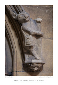
The original white rabbit?

click photo to enlarge
I can't imagine that Charles Dodgson (1832-1898), a mathematics lecturer at Christ Church, Oxford, had an inkling of the fame and notoriety that he would achieve through his books,  Alice's Adventures in Wonderland and Through the Looking Glass. These works, released under his pseudonym, Lewis Carroll, completely eclipsed any public acknowledgement that he received for his accomplishments in his professional and private life.

The larger than life characters that populate these two books have, through the printed word as well as through film and musical adaptations and references, become widely known. Where did Dodgson/Carroll get his inspiration for the Queen of Hearts, the March Hare, the Cheshire Cat and the rest of his cast? Well, in the case of the White Rabbit, there is the suggestion that it may have been in the medieval church of St Mary, in the market town of Beverley in East Yorkshire.

Last week I stood in the church and looked up at the carved stone label stop that terminates a raised hoodmoulding that edges the arch of a door. At the base is a head, facing downwards, which may be a pig, and standing upright on it is a fine rabbit. Around him is a satchel, an item that has caused some to call it the "Pilgrim Rabbit". We don't know the original reason for the medieval mason's decision to depict a man-like rabbit. But what we do know is that for much of the past hundred or so years the tradition has been that this rabbit inspired Lewis Carroll's "White Rabbit", the one that lured Alice down the rabbit-hole into her fantasy world. I don't know if there is any truth in this tale, nor I suppose, does anyone else. However, I think this is a very noteworthy rabbit, and one deserving of a photograph.

photograph and text (c) T. Boughen

Camera: Canon
Mode: Aperture Priority
Focal Length: 90mm
F No: f7.1
Shutter Speed: 1/40
ISO: 3200
Exposure Compensation:  0 EV
Image Stabilisation: N/A

Monday, April 04, 2011

Films, paint and stone

click photo to enlarge
I was re-reading Oliver Rackham's fine book, "The History of the Countryside" the other evening when I came across an aside that registered more strongly with me than it had done the first time I saw it. Talking about the scope of his book in a chapter entitled "Animals and plants: Extinctions and new arrivals", he observes that "The history of cultivated plants and domestic animals is generally well known*.... The asterisk refers to a footnote which says, "But not to producers of historical films: they do not allow Charles I to fly in a plane, but they do let him ride among Corsican pine plantations or Frisian (sic) cattle."

The same could be said of the medieval architecture we see in films of that period. The interiors of churches, cathedrals and castles are invariably shown as they appear today: cut and pointed stone, carved stone, but barely a hint of paint. In fact, the use of paint in such buildings was widespread. Columns, capitals, window and door surrounds, vaulting and many other surfaces were covered with, in the case of ecclesiastical buildings, illustrations of Biblical characters and episodes, or exuberant decoration. Much of this was removed during the centuries following the Reformation, and the Victorians completed the job, at least until people such as William Morris proclaimed "Enough!" During the nineteenth century a number of churches were painted in the medieval manner, but those receiving "the full works" are few and far between. The church of St Michael, Garton on the Wolds, East Yorkshire, is one such example that I've photographed. One of the best original examples at Kempley, Gloucestershire, will the subject of an upcoming post.

I was thinking about this last week as I looked up at the crossing inside Beverley Minster, East Yorkshire. I was trying to imagine what the building would have looked like with painted capitals etc. The bands and rings of dark Purbeck marble of the thirteenth and fourteenth century stonework adds an element of colour, as does the painted vaulting, but other than that it is pretty much devoid of surface decoration. I rather think that I wouldn't like it to be painted, having become used to the unadorned stone!

Anyone who is a regular visitor to this blog will know of my liking for vaulting, and will have seen several examples. Each time I take such a photograph I search for a new approach. This time I stood under the arch between the nave and the crossing and let the receding verticals of the massive compound piers take my eyes upwards.

photograph and text (c) T. Boughen

Camera: Canon
Mode: Aperture Priority
Focal Length: 17mm
F No: f7.1
Shutter Speed: 1/15
ISO: 640
Exposure Compensation:  -0.67 EV
Image Stabilisation: N/A

Sunday, April 03, 2011

The Observatory Cafe

click photo to enlarge
I'd never been into the cafe at "The Deep" aquarium in Kingston upon Hull until a few days ago. Moreover, until we headed up to it I didn't know that it was called "The Observatory Cafe". When I got there the view of the River Humber, the River Hull, the waterside buildings and the distant shore of Lincolnshire, showed that it was well named. However, as I sat and drank my cup of tea, gazing down through the angled windows, and studying my surroundings, it occurred to me that it wasn't as well named as it could have been.

I imagine the architect envisaged diners looking out at the view and pointing out the passing river traffic. But, the days when this scene would always have had a ship or boat heading up or downstream are long past. The focus of shipping in the port of Hull is now downstream (left) of this view. One or two small craft use the River Hull, yachts and launches moored in the marina venture out at reasonably regular intervals, the occasional small vessel from the Port of Goole passes, and the docks that remain open upstream (right) of the view generate the odd craft. But the fish docks that would have sent deep-sea trawlers regularly past this point are virtually silent, and the smaller commercial traffic of the adjacent docks, has almost vanished.

There's nothing wrong with "The Observatory" as a name for this location, but it seemed to me that "The Bridge" (of either a trawler, a liner or some futuristic starship) was more appropriate. Looking at my photograph on the computer screen only reinforced this feeling. I was in two minds whether or not to turn this almost monochrome image into a black and white shot, but the blue/green tinted glass and the muted colours that just about make themselves felt gave it a quality I liked, so I stayed with colour.

photograph and text (c) T. Boughen

Camera: Canon
Mode: Aperture Priority
Focal Length: 35mm
F No: f7.1
Shutter Speed: 1/200
ISO: 100
Exposure Compensation:  -0.67 EV
Image Stabilisation: On

Friday, April 01, 2011

The deep end

click photo to enlarge
I've written about Kingston upon Hull's Terry Farrell designed aquarium, "The Deep", before. On that occasion I had a few thoughts about its purpose and shape, and posted a photograph of its angular steel exterior and colourful windows. That shot shows part of the elevation that faces the River Humber. On my recent visit I noticed that this area of steel has been coated with some kind of dark paint/covering: presumably the original finish has been found wanting in some way. Today's main photograph also shows part that overlooks the Humber, but this time it includes what is probably the most interesting exterior feature of the building - its sharp, glazed prow that encloses "The Observatory" cafe. The gleaming steel, angular shapes, coloured glass cladding and the the thrusting point of the tip invited a semi-abstract approach to my composition.

I also took a more distant, contextual photograph from the old pier, and this shot set me thinking once again about the design of the building. The location, on a triangular promontory, determines the overall shape, but what I wondered as I took my photograph was why the architect treats the elevation at which the visitor arrives so poorly, and applies his art to the less frequently seen elevations that front the Humber and the River Hull. Certainly anyone crossing the latter river and standing near the old pier gets a good view of the building. However, those who see the River Humber elevation is restricted to people on boats and ships. I wondered too about the overall shape as seen in my smaller photograph. It seems animal-like, with a pointed head to the right, a creature about to pounce on its prey with details that can be interpreted (am I being too fanciful?) as feet and an eye. Was that the intention? I left thinking that, firstly, I'd like to have seen that great flat wall recess or protrude in one or two places a bit more than it does, and secondly, that if the slight breaks in the incined roof line were a bit bigger they would have offered more interest. If that sounds like I'm damning what I see, I'm not - there is a lot to like, and a lot to photograph.

photograph and text (c) T. Boughen

Main Photo
Camera: Canon
Mode: Aperture Priority
Focal Length: 24mm
F No: f7.1
Shutter Speed: 1/1600
ISO: 100
Exposure Compensation:  -0.33 EV
Image Stabilisation: On