Pages

Thursday, March 31, 2011

Juxtaposition

click photo to enlarge
Photographic composition can be approached in a number of ways. One that I like, and which I don't use enough since I moved to a rural location - is juxtaposition, the conscious placing of disparate objects in the frame.

This technique is one that comes easily to painters, but is slightly more difficult for photographers. Firstly the juxtaposition has to be seen, then it has to be organised into a composition. Often this will mean excluding objects and the photographer changing position to bring the juxtaposed objects into  "engagement". It is a device that can work well where the objects are figurative, but also where the intention is to construct an image with semi-abstract elements.

The other day, when walking near "The Deep" aquarium in Kingston upon Hull, I noticed a building that I'd seen before but had never looked at. It is a blocky structure, clearly utliitarian, probably connected with its futuristic looking neighbour, and has a mosaic-like decoration on its main facade. It wasn't just the building that caught my eye, however, but the building and the car park arrow on the tarmac in front of me. I framed my shot so that the ranks of parked vehicles to left and right were excluded, and let the juxtaposition of the arrow, the horizontal bands and the colourful grid work together in my composition.

photograph and text (c) T. Boughen

Camera: Canon
Mode: Aperture Priority
Focal Length: 65mm
F No: f7.1
Shutter Speed: 1/640
ISO: 100
Exposure Compensation:  -0.33 EV
Image Stabilisation: On

Wednesday, March 30, 2011

Hull and Humber

click photo to enlarge
I lived in Kingston upon Hull for several years in the 1970s and 1980s. Having been raised in the Yorkshire Dales I found moving from the hills and the drizzle to a port city in drier, brighter Eastern England quite a contrast. Hull has a range of industries along the two rivers on whose banks it stands, and I found a lot of interest and good photographic opportunities in them, as well as in its historic "old town" and docks.

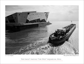
Residents of this Yorkshire city invariably call it by the name that derives from the narrow river on which it was built - the River Hull. The grander version of the name bequeathed in 1299 by King Edward 1, in preference to Wyke or Wyke upon Hull, is favoured by official bodies but eschewed by the locals. On a brief, recent visit to the city I walked around the area at the confluence of the River Hull and the mighty River Humber into which the lesser river flows. The old pier head remains, but the Humber Bridge did for the "Lincoln Castle" paddle steamer that used to be the means of crossing the Humber from Yorkshire to Lincolnshire. At the junction of the rivers, on a point that once was empty of buildings, a large, futuristic looking new aquarium sits. New crossings span the River Hull, and it was as I stood on the pedestrian bridge over the water that the "Rix Eagle", a fuel bunkering lighter, passed under the tidal barrier, then beneath me, and headed out past "The Deep" into the Humber and downstream towards the commercial docks.

I photographed the long, barge-like ship as it passed below the tidal barrier, then turning, took another shot as it headed into the Humber. The latter photograph, with a very bright sky, works better in black and white, but the first shot benefits much more from colour.

photograph and text (c) T. Boughen

Main Photo
Camera: Canon
Mode: Aperture Priority
Focal Length: 24mm
F No: f7.1
Shutter Speed: 1/500
ISO: 100
Exposure Compensation:  -0.33 EV
Image Stabilisation: On
Sunday, March 27, 2011

All Saints, Brockhampton, Herefordshire

click photo to enlarge
Like many people with an interest in church architecture - in fact English architecture in general - I have a high regard for All Saints, Brockhampton in Herefordshire, the 1901-1902 masterwork of William Richard Lethaby. But, as a photographer I've found it a frustrating building because, on the three occasions that I've visited it, the light has been less than satisfactory. In fact, on my most recent visit a week ago it was downright flat and gloomy.

Lethaby was an apprentice to Norman Shaw and became something of a disciple of William Morris. At the time he built Brockhampton church he was principal of the Central School of Arts and Crafts and Professor of Design at the Royal College of Art. Considering his background was relatively humble compared with architects of his day (his father was a gilder and carver) he achieved a great deal. At Brockhampton Lethaby tried to put into practice the principals he espoused. The materials are local - stone, thatch, timber, though with concrete between the striking stone roof arches, and the workmen he engaged were all local. The design takes the vocabulary of traditional buildings and gives it the architect's own interpretation. Thus, whilst the arches are pointed they avoid copying Romanesque or medieval precedents. The tracery echoes the reticulation and cusped forms of Gothic, but are obviously not medieval. Similarly, the stone carving and metalwork draws on the naturalism and stylization of the Arts and Crafts rather than, say, the Decorated period of English Gothic, which also valued these qualities.

Lethaby's church sits well on its sloping site, nestling naturally into its surrounding fields and parkland, at first looking older than its 110 years. The exterior has an engaging domesticity that is repeated when one enters the building. The relatively low, enclosing roof, warm-coloured stone, waxed oak, and glowing lights make it a welcoming building. Christopher Whall's stained glass, some Burne-Jones tapestries and embroidered and appliqued cloth adds a few stronger coloured highlights.

My photographs show the underside of the low crossing tower, a view down the nave and the exterior from the south. The outside image required work to extract anything of value. On my next visit I'll have to order better weather and a different time of day to get some strong, directional light to model the building! Incidentally, this church has received the highest form of flattery, higher even than the words of the architectural historian, Nikolaus Pevsner, who called it "one of the most convincing and most impressive churches of its date in any country." Intrigued? Read here.

photographs and text (c) T. Boughen

Main Photo
Camera: Canon
Mode: Aperture Priority
Focal Length: 35mm
F No: f7.1
Shutter Speed: 1/200
ISO: 100
Exposure Compensation:  -0.67 EV
Image Stabilisation: On 

Wednesday, March 23, 2011

Lungwort

click photo to enlarge
I have written elsewhere in this blog that, whilst I recognise the usefulness of Latin names for plants, I much prefer using the English names for their beauty, descriptiveness and heritage. Leopard's Bane is so much more interesting than Doronicum orientale, and Snapdragon trumps Antirrhinum any day. However, there are one or two English names that conjure up a picture which, to my mind, sit ill with the plants they describe. I was photographing one such today - Lungwort (Pulmonaria).

In my garden there are four varieties of this plant. One has pink flowers, another has blue flowers, there is a white flowered variety, and finally one manages to produce flowers that are both pink and blue. All of them, however, have green leaves with light-green or white spots. They are a useful plant, very hardy, thriving in shade and the open, and producing their flowers in early spring. There is something of the wild flower about them, and there is a species native to Europe, Narrow-leaved Lungwort (Pulmonaria longifolia) known in Britain as Joseph and Mary. It is the plant from which several garden varieties have been bred. But, much as I like the Lungwort, I've never liked its name: it strikes me as a particularly ugly name for such an attractive plant. However, many of its names across Europe derive from the likeness of the spotted leaves to diseased lungs, as of course does its Latin name (pulmo is Latin for lung), and the association has well and truly has stuck. Consequently its many other English colloquial names - Soldiers and Sailors, Spotted Dog, Jerusalem Cowslip and Bethlehem Sage among others - are fast disappearing.

I composed my photograph with the attention on a group of pink Lungwort, and moved so that a blue variety was out of focus in the background.

photograph and text (c) T. Boughen

Camera: Canon
Mode: Manual
Focal Length: 100mm
F No: f6.3
Shutter Speed: 1/100 sec
ISO: 160
Exposure Compensation: 0 EV
Image Stabilisation: Off

Tuesday, March 22, 2011

Oats, colour and chrysanthemums

click photo to enlarge
Colours have always fascinated me: colours I like, colours I dislike, colours that I dislike unless paired with a particular colour, the uses to which colour is put, the science of colour, the art of colour and, the subject of today's reflection, the names of colours.

My first introduction to the interesting names of colours was, I think, courtesy of Scott's Porage Oats. Our breakfast table usually had on it the famous box, adorned with the Highland Games shot putter, so I could read about the famous British Army regiments that, for a while, featured on the back. It was there that I came across the names khaki, olive and lovat. The first two will be familiar to most people, but the latter perhaps not: it is a muted green colour named after an area in Invernesshire, Scotland. An interest in painting introduced me to the wonders of burnt sienna, ultramarine, yellow ochre etc, and a passing interest in heraldry that I picked up on the back of a deeper study of medieval and later tombs, revealed to me the particular nomenclature of that discipline's colours (tinctures) - argent (silver), or (gold), azure (blue), sable (black) etc.

These days an interest in computers, photography and the graphic arts generally, requires knowledge of how VDUs display colours and the way they organise, number and name them. It was from that starting point that I searched for a name to describe the colour of these chrysanthemums that I had photographed. Were they purple, pink, violet, rose, fuchsia, cerise or what? To settle the matter I consulted the List of Colors on Wikipedia and decided that the closest fit (though a rather boring name) was red-violet!

photograph and text (c) T. Boughen

Camera: Canon
Mode: Aperture Priority
Focal Length: 100mm
F No: f2.8
Shutter Speed: 1/80 sec
ISO: 500
Exposure Compensation: -0.33 EV
Image Stabilisation: Off

Saturday, March 19, 2011

New old, old new or just new

click photo to enlarge
When it comes to erecting a new structure alongside old buildings, whether in a village, a town or a city, the architect has to make a decision about style. This is particularly so if the new building is to be in a conservation area where clear guidance exists about what may and what may not be done to the whole fabric, and particularly the building facades, of the designated locality.

There are those who favour building to emulate the old ones nearby to the point that they are almost copies. Such buildings, unless deliberately designed to conceal their novelty, invariably give themselves away through the details and the freshness of the building materials. To my mind this is rarely the right approach, though it can be the best way when repairing, renovating or extending a structure. A step removed from this are those buildings that plunder the details and forms of past styles in an effort to re-create an imagined arcadian past. They are often sufficiently "historic" that they fool the lay person. Poundbury is a notable example of this deluded approach. I think of this as constructing "new old" buildings. Others, however, feel that "fitting in" with older buildings doesn't require slavish copying, but can be achieved by building in a contemporary style that acknowledges and respects what is nearby - perhaps through materials, roof, window, and string course heights, or by the application of forms and details that echo but don't ape those on the more venerable neighbours. It's an approach that I like to see because it can work very well without the sterility that is involved in copying old styles. Moreover, it's a nice intellectual exercise to try and work out the references that the architect has employed. To my mind this is making "old new" buildings. And then there are those who will brook no compromise, and aim to build entirely in the contemporary manner. It's hard to do this in conservation areas in Britain today but occasionally the architect succeeds in getting his or her way, and sometimes in proving they were right. Just as often they show why legislation is necessary!

I came upon this trio of buildings in London on the edge of the City. On the right is the Grade II listed building known as St Botolph's Hall. On the left is a glass curtain-walled office block by Norman Foster whose name I don't know. In the centre is the most recent building, apartments at 20 Bishop's Square by Matthew Lloyd Architects. I was taken by the terracotta-ish horizontal bands of the cladding, the determined rectilinearity, and the way the architect had aimed to accommodate the uncompromising modernity of the towering block on one side without overpowering the older building on the other.

photograph and text (c) T. Boughen

Camera: Canon
Mode: Aperture Priority
Focal Length: 92mm
F No: f8
Shutter Speed: 1/80
ISO: 1000
Exposure Compensation:  0 EV
Image Stabilisation: On

Wednesday, March 16, 2011

Prisons, Victorians and leaks


click photo to enlarge
I'ts often said that you can judge the level of civilization of a society by the way in which it treats animals. There's some truth in this. However, I think how prisoners are treated is a better indicator. One of the difficult things for a democracy to do is achieve an effective balance between deterrence, retribution and rehabilitation. Too often politicians, anxious for re-election, ignore what works and veer towards the populism of harsh retribution. There are cases where this kind of approach is necessary, but when it is used as a broad brush throughout the penal system it invariably fails. Prisoner numbers soar, gaols become schools of crime, re-offending rates are high and the cost of so many locked up people results in early release schemes to keep budgets under control. Supporters of this approach characterise prison education, training and supervision within the community as "soft" and ineffective: it isn't, and should be an integral part of any penal system that aims to keep society safe and reduce offending.

I was thinking about this when I visited the historic old prison in Lincoln Castle recently. This building was begun in 1785. Half of it remains, the rest having been knocked down to make way for a newer block of 1847-8 built on the more costly American "Separate" system with prisoners kept apart in individual cells. Prisoners were confined to their cells for 22 hours a day, working on menial tasks for at least 12 of those. Misbehaviour was punished by having to turn a crank or screw for hours on end, receiving food only when the machine's counter reached the required number of turns. When the prisoners were allowed out of their cells for exercise or to attend chapel they were made to wear a mask so that they couldn't recognise each other. In the chapel each seat had doors at either side so that conversation and sight of those nearby was impossible.

Reading about the harsh, probably illegal, and certainly inhumane treatment of the U.S. soldier who is alleged to have given classified information to Wikileaks it seemed to me that some politicians in our supposedly enlightened democracies (and I include the UK in that group) pine for the systems and treatment that their Victorian predecessors sanctioned. Thankfully, as we saw this week, we still have public officials who are prepared to stand up and describe this latter day barbarism for what it is.

My photograph of the cell shows the spartan nature of the Victorian accomodation (the loudspeakers played a commentary for visitors). The other two images show the chapel: the first was taken from the pulpit where the chaplain would have stood to preach, the second from the prisoners' point of view looking towards the pulpit. In both shots hooded models represent the prisoners.

photographs and text (c) T. Boughen

Photo 1
Camera: Canon
Mode: Aperture Priority
Focal Length: 19mm
F No: f7.1
Shutter Speed: 1/50
ISO: 2500
Exposure Compensation: -0.33 EV
Image Stabilisation: On

Monday, March 14, 2011

Photography by numbers

click photo to enlarge
One of the tips I remember reading decades ago when I started out in photography was this: if you go to a place you've never been before and want to be sure of getting photographs of the "best" sights, go to a shop that sells postcards of the locality, buy some, and let them be your guide as to what to shoot and where to shoot it from. For someone who simply "collects" photographs and places it was good advice. But, if you were interested in making images that were the product of your own eye and mind, photographs where the subject is only part of the point of the shot, then it was very limiting advice, the result of which was not too different from painting by numbers.

Having said that, the shots that are sold as postcards are often taken from obvious and good vantage points, and frequently exhibit fine compositions. They should too, because they are usually the product of someone who makes his or her living from photography. Moreover, you can find yourself taking a shot that you subsequently see on a postcard simply because it presents itself so conspicuously. Such is the case with this photograph of Lincoln Cathedral seen from Castle Hill. The funnel of Georgian, Victorian and medieval buildings that lead to the fourteenth century Exchequer Gate (the arch of which one passes through to enter the cathedral precinct), together with the tall towers of the Norman and thirteenth century west end of the cathedral, make a satisfying composition. I've seen it reproduced in water colour by Peter de Wint, in oils and acrylic by contemporary artists, and in many photographs of the city.

Had I wanted a shot like the much reproduced images that one sees of this location I'd have waited until later in the day and year, when the sun was better illuminating the scene, when there was some blue sky, and there were more people in the foreground. As it was, I came upon it on a fairly dull, cold day in early March when the only person on view was a man giving out leaflets extolling the virtues of the meals at the local pub: he didn't seem to be getting many takers when we passed by.

photograph and text (c) T. Boughen

Camera: Canon
Mode: Aperture Priority
Focal Length: 28mm
F No: f7.1
Shutter Speed: 1/160
ISO: 100
Exposure Compensation: -0.33 EV
Image Stabilisation: On

Sunday, March 13, 2011

Blue glass and anonymity

click photo to enlarge
There's quite a lot to dislike about the building in today's photograph. It is faceless, it tells us nothing about those who inhabit it, and it allows them to look at us but not us at them. It is the sort of building that might feature in George Orwell's 1984 or Fritz Lang's Metropolis, a place of secret policemen, anonymous bureaucrats or super-rich tycoons. In fact, according to my researches, it is the offices of a company that owns a chunk of the British media including the Daily Express, the Daily Star, and Channel 5 TV - the populist end of the market, and in terms of the newspapers, the conservative end.

But, having said that, buildings are inanimate objects, and though they can influence society and contribute to our quality of life, they are not "political" in the sense that we usually understand the term. I seem to recall that

before the building was acquired by its present owners HSBC had offices here. And, whilst I can see things I don't like about the building, there are a couple of things that I do like. The first is the colour. Towers with curtain walls of blue glass are commonplace - More London, near the Assembly building, is a nearby example. This glass, however, is darker than usual, and that gives the building a weight and solidity that lighter coloured glass cannot offer. Moreover, with those qualities comes a greater emphasis on the surface and the blocks that comprise its overall shape. I like the way the architect has put these together, and the way the reflections in the glass repeat the blocky projections adding to the apparent complexity of the structure.

This building stands next to the Thames, and today's photograph was taken from the riverside path that runs past both it and its next door neighbour, Old Billingsgate Market. When you look at it from across the river it stands out from the buildings around it on colour alone. It also offers a fine grid of distorted reflections, and when lit by yellow internal lights at night looks quite stunning. On the day I took this photograph I could see only two lights on in the building. In my photograph they look like the sort under which someone - an overworked editor perhaps! - is getting the "third degree" treatment.

photograph and text (c) T. Boughen

Camera: Canon
Mode: Aperture Priority
Focal Length: 28mm
F No: f8
Shutter Speed: 1/30
ISO: 100
Exposure Compensation: -1.0 EV
Image Stabilisation: On

Saturday, March 12, 2011

Nature and the city

click photo to enlarge
Everything visible in this photograph is man-made except the trees, the river and the sky. The part of London in which it was taken has been extensively redeveloped in recent years. Riverside flats, offices, hotels and a few "service" type buildings - shops, pubs, etc, dominate the area. Concrete, steel, brick and glass are the principal materials of this man-made environment. Much of what has been erected is unremarkable, some is good architecture, and some should never have left the drawing board. Were the buildings all that was to be seen, then it would be a fairly grim place. But, there has been a conscious effort made to incorporate natural planting.

What grows in this part of London's redeveloped Docklands is, by and large, what has been deliberately put there. In the area where I took this photograph the streets are lined with trees, often London Plane, trimmed to keep them down to a manageable size - like the pair in my image. In small corners of paved areas beds with hardy shrubs - eleagnus, cotoneaster, etc - have been inserted. The odd grassed area has been inserted to soften up some of the block-paving. Individual houses display plants of their owners' choosing in the small walled gardens in front, and more extensive private gardens fill the centres of apartment complexes. Balconies often have pots and baskets of shrubs, perennials and annuals. And then there are the larger scale, green, public and semi-public areas. Near to the location of my shot is the Surrey Docks City Farm, a collection of animals and vegetable gardens that seeks to educate local families about food production and animal husbandry. Across Salter Road is Stave Hill Ecological Park, a 5.2 acres linear area of trees, grass, water and carefully nurtured wild planting, that comes as a surprise to a visitor to the area. Walking through it the other weekend I saw woodpeckers!

It seems that mankind has a need for the green randomness and beauty of plants. Architects, of course, value their irregularity as a foil for the straight lines of their buildings. And photographers can also benefit from the juxtaposition of a natural shape and a rectilinear building in creating contrast and tension within a composition.

photograph and text (c) T. Boughen

Camera: Canon
Mode: Aperture Priority
Focal Length: 24mm
F No: f7.1
Shutter Speed: 1/00
ISO: 100
Exposure Compensation: -0.67 EV
Image Stabilisation: On

Friday, March 11, 2011

Lincoln Cathedral

click photo to enlarge
Most medieval English cathedrals are found in towns and small cities where they are still likely to be the biggest building for miles around. Even those that are in our big cities are rarely dwarfed by the large modern buildings around them, though the examples in London are heading that way. That this should be so for structures that were built several hundred years ago is remarkable: cathedrals were massive buildings when they were new, and remain so today when tall and big buildings are commonplace.

I was thinking about this when I was walking around the exterior of Lincoln Cathedral the other day. A circuit takes several minutes, and you risk a cricked neck or a tumble as you invariably spend most of this time looking upwards at the marvellous architectural details that cover its surface. The medieval visitor from a far-flung town, being used to buildings that were usually single storey and rarely exceeded two, must have found the building quite overwhelming.

Later, when I visited Lincoln Castle, and walked along its walls and up its tallest tower for a distant view of the Cathedral it occurred to me that the scale of it is even better comprehended from a high vantage point. From that position you get a fuller appreciation of its size relative to houses and other common buildings. I've taken this view of the Cathedral from "Observatory Tower" several times over the past thirty five or so years, and it is a prospect that is much reproduced in publicity material associated with the area. Usually the photographer chooses a sunny day with the west facade illuminated. I had to take what was available, but I'm not displeased by the bright light with a couple of sunlit areas. Sometimes you find that what you are given is more interesting than what you want!

photograph and text (c) T. Boughen

Camera: Canon
Mode: Aperture Priority
Focal Length: 35mm
F No: f7.1
Shutter Speed: 1/320
ISO: 100
Exposure Compensation: -0.33 EV
Image Stabilisation: On

Wednesday, March 09, 2011

Fire juggler

click photo to enlarge
When you are learning to use a particular camera it is a good idea to try different settings. Moving from a 4/3 sensor to so-called "full frame" I had to re-learn the depth of field lessons that were second nature during the decades that I shot with an OM-1. Why? Because the sub-35mm size of the Olympus DSLR sensor gave a greater depth of field than my old film camera and the current Canon, and, with my style of shooting, I didn't have to think about it too much. Now I'm having to change aperture a little more, and shoot at a smaller aperture than formerly. Fortunately the high ISO capabilities of the Canon help in this respect.

During my recent visit to London I made a conscious effort to take a few shots with Manual exposure rather than my preferred Aperture Priority. Today's image is one such experiment. It hasn't quite worked but it's given me a reference point for future exposures of this sort. We came upon this fire juggler after dark. I don't remember whether he was underneath railway arches (I think he was) or in one of the narrow streets on the South Bank by the Thames. What I did note, however, is that the area had some of the lighting that has enlivened such places in London. Here it was purple, but elsewhere colours often cycle through a variety of hues. It's an inexpensive way of brightening up what can be quite a grim and forbidding night-time location. The blaze of the tumbling torches showed up well against the background and I set the camera on a default Manual setting of ISO 400, 1/6 second and f9 that I was trying out. It did well with the flames, but was a little too slow for the combination of the juggler's movement, the image stabilisation and my hand-holding skills, and the man and the background show a little more blur than I wanted. But the experience gives me information that I can use next time I try this sort of shot.

photograph and text (c) T. Boughen

Camera: Canon
Mode: Manual
Focal Length: 55mm
F No: f9
Shutter Speed: 1/6 sec
ISO: 400
Exposure Compensation: 0 EV
Image Stabilisation: On

Monday, March 07, 2011

Street art and big lips

click photo to enlarge
Not until last weekend did I realise that the area around Brick Lane in London is something of a graffiti hotbed. Many of the streets and much of the waste ground and buildings feature examples of this street "art". Quite a bit is done to a technically high standard, a few pieces are witty or visually interesting and several are all of those things. Much is poorly executed, derivative or lacks interest. I came upon this example just off the main area, on the side of a building that overlooked a small car parking space. The graffiti extends to the left  with the elaborately written green word, "sugar", the last part of which can be seen in my shot. In order to avoid a very elongated crop I photographed only the right hand side showing the jacketed torso and pipe-holding arm surmounted by large pink lips. I suppose the whole piece was called "Sugar Lips". Part of the word "lips" can be seen poking up out of the breast pocket of the jacket. Which sugar lips? I ask because when you put those words into Google you get a multiplicity of different references. Perhaps it's obvious to those who create such works and admire them, but it isn't to someone of my generation.

In the absence of any obvious reference point based on "sugar lips" I focussed on the smoker's pipe, an artefact that is rapidly disappearing from our everyday experience as the pipe-smokers die off. Not as a result of their habit I hasten to say (though some doubtless do), but because it is something that was favoured in the past, is no longer fashionable, and the remaining practitioners are largely older folk. Then I thought of what is possibly the most famous pipe in art - the Rene Magritte painting, Ceci n'est pas une pipe , and the use of lips by the Surrealist Dali, the Pop Artist Tom Wesselmann, and Andy Warhol - just the type of mainstream artists a graffitist might reference.

For more examples of the graffiti in this part of London see here.

photograph and text (c) T. Boughen

Camera: Canon
Mode: Aperture Priority
Focal Length: 67mm
F No: f7.1
Shutter Speed: 1/125
ISO: 100
Exposure Compensation: -0.33 EV
Image Stabilisation: On

Saturday, March 05, 2011

Broadgate Plaza


click photos to enlarge
On thing that I miss with living in the country, and particularly in the country in a rural county such as Lincolnshire, is the opportunity to photograph modern architecture. It's not that there are no buildings where I live - there are - but they are mainly traditional in style, often relatively old, and usually feature bricks, stone, timber, pantiles, slate and occasionally thatch. Buildings made of glass, steel, concrete and other contemporary, man-made materials are found only in the small cities such as Lincoln or, more sporadically, in the bigger towns.

Now I know that there are those who are thinking, "Lucky you, to have such subjects for your camera!", and the fact is I do enjoy photographing old and traditional buildings. But, I enjoy architecture of all periods, and the constructions of today hold just as much interest for me as those of 100, 500 or 1,000 years ago. So, when I visit somewhere such as London I don't ignore the older stuff, but I do photograph rather more of today's offerings.


Today's offering is a cluster of buildings I've never photographed before that goes under the name of the Broadgate Plaza. It is on the edge of the City of London near Liverpool Street Station. The towers were completed in 2009 and are the work of the Chicago firm, Skidmore, Owings and Merrill (SOM). As buildings they feature the blue glass and external diagonal bracing that is increasingly common. What caught my eye, and is more unusual, is the "flying buttresses" between the towers, with the glass canopy above. My first (and I think best) photograph was of one of these inclined stainless steel members with their black, granite-clad anchorage points. I include the smaller images to give the main photograph some context.


photograph and text (c) T. Boughen

Camera: Canon
Mode: Aperture Priority
Focal Length: 24mm
F No: f7.1
Shutter Speed: 1/60
ISO: 100
Exposure Compensation: -0.67 EV
Image Stabilisation: On

Thursday, March 03, 2011

Stairway to the past

click photo to enlarge
Stairways make good photographic subjects. They offer complexity, strong forms to use in a composition, leading lines, visual routes through the image, a stage and frame for people, metaphor and much more.

This photograph was taken in the stair-well that links the floors of a museum. The translucent glass of the windows and below the hand-rail allowed the silhouettes of the people to be seen to good effect. However, as much as I tried to get a shot with people just where I wanted them, they never quite arranged themselves as I would have liked. This is the best of a fairly quickly taken group of photographs.

Thinking back I recall posting another shot taken in a museum stair-well. On this occasion, however, the motivation was the semi- abstract nature of the composition and the shades of grey that a black and white conversion produced.

photograph and text (c) T. Boughen

Camera: Lumix LX3
Mode: Aperture Priority
Focal Length: 5.1mm (24mm/35mm equiv.)
F No: f2
Shutter Speed: 1/30
ISO: 160
Exposure Compensation: 0 EV
Image Stabilisation: On

Wednesday, March 02, 2011

Crocuses


click photo to enlarge
A computer component failure has descended on me again, and though it hasn't severed my connection with the wider electronic world - I'm using my older machine - it does require some attention and a little time. Consequently I'm likely to be somewhat quieter than usual, as far as photographs and reflections go, until I have dealt with the problem. I do have a queue of photographs in waiting so I may post those but without much in the way of accompanying ramblings.

Today's photograph shows a group of crocuses that my wife planted under a cherry tree in the part of our garden that we sometimes call "the jungle". They looked so magnificent in their thrusting brightness that I had to get the macro lens and tripod out, get down on my knees and grab this shot. It is presented just as it came out of the camera with only resizing and sharpening for the web.

photograph and text (c) T. Boughen

Camera: Canon
Mode: Aperture Priority
Focal Length: 100mm
F No: f5.6
Shutter Speed: 1/80 sec
ISO: 250
Exposure Compensation: 0 EV
Image Stabilisation: Off

Tuesday, March 01, 2011

Evening on the River Thames

click photo to enlarge
During the early part of my life the Pool of London was a place of commercial river traffic. Freighters would load and unload into riverside warehouses, barges would to and fro bringing and taking the requirements of a variety of businesses throughout the centre of the capital. The nearby docks at Wapping were bustling centres of activity. But no more. London's "Docklands" is now an area of high-rise offices, high-cost flats, and financial services-derived wealth. The water that once held hard-working commercial craft is now either filled in, remain as scenic ponds, or serve as the base for pleasure craft. Today's freighters are largely restricted to the downstream docks and river around Tilbury, Dartford, Thames Haven etc.

In recent years, when I've stayed in London, my location on the river has allowed me to watch the range of traffic that still uses this essential artery. What I see is mainly tourist craft showing visitors the sights, water taxis ferrying people up and down (and across) the river, and a motley collection of small boats - police launches, small power boats, rowing club sculls etc. The occasional large naval vessel and smaller cruise liner sometimes ventures up as far as Tower Bridge. Commercial traffic in the old sense is largely absent, with one exception: a regular sight is tug boats pulling barges loaded with yellow metal containers. These hold Londoners' domestic waste, and they are essentially river-borne "dustcarts", taking their cargo for disposal. In the past year four new vessels have taken over these duties, and from 2011 they carry sorted refuse to a riverside "energy from waste" electricity generating station at Belvedere, rather than to a landfil site.

Looking out over the river one recent evening a tug and its load came slowly into view on the ebbing tide. Further out into the river a Thames Clipper catamaran ferry roared by. With a bit of quick camera juggling, and bracing myself against the balcony wall, I managed to get this shot of both craft motion-blurred against the backdrop of the Thames, its riverside flats and the distant City.

photograph and text (c) T. Boughen

Camera: Canon
Mode: Aperture Priority
Focal Length: 35mm
F No: f7.1
Shutter Speed: 1/2 sec
ISO: 3200
Exposure Compensation: -0.33 EV
Image Stabilisation: On