click photo to enlarge
The windmill at Moulton in Lincolnshire measures 100 feet to the tip of its ogee cap, making it the tallest in Britain. It was built for Robert King in 1822, and remained in constant use as a working mill for over 170 years, until 1995, when its then owner retired. However, for much of that time it had no sails, and thereby hangs an interesting story.
The tower is made of red brick with an outer skin of yellow brick, and has nine wooden floors and a basement. From the time of its construction the mill ground wheat and other cereals for the local farms. On the wooden stairs, walls and machinery inside the mill one can see the pencil calculations of cost, and quantity relating to the grain that went through it at various times. There are also pencil records of when repair and maintenance was carried out, and the signatures of various visitors. In 1894 a fierce storm wrecked a number of Lincolnshire mills. Moulton lost all its four sails, the windshaft and brake wheel. The following year a steam engine was linked to the mill mechanism and stones, and the milling continued under this form of power until it was superseded by a diesel engine. The mill cap was repaced by a utilitarian corrugated metal roof in 1928, and for most of the twentieth century the mill concentrated on producing animal feed.
In 1998 a local group got together with the aim of restoring the mill to its original working condition. With the help of grants from the Heritage Lottery Fund and other sources the mill was refurbished including the addition of a new cap. A cafe, shop and visitor centre was opened in the ancillary building to attract visitors, and tours of the windmill were made available to the public. Grinding re-started using an electric motor. Recently a new external gallery has been fitted where the old one was fixed, and it is about to be completed with cast metal inserts. But, of course, no windmill can be considered complete without a set of sails that drive the machinery. Fundraising continues to achieve the sum - £135,000 - that is necessary to have these made and fitted. Once that happens the mill will be made to work in the way it did back in 1822. The other day I had a tour of this venerable building and found it fascinating. I was also impressed by the dedication and perseverance of the volunteers who are working tirelessly to achieve their goal of a complete restoration of the mill.
More information about Moulton windmill, including visitor details, can be found here.
photograph & text (c) T. Boughen
Camera: Olympus E510
Mode: Aperture Priority
Focal Length: 14mm (28mm/35mm equiv.)
F No: f5.6
Shutter Speed: 1/1000
ISO: 100
Exposure Compensation: -0.7 EV
Image Stabilisation: On
Pages
▼
Wednesday, March 31, 2010
Tuesday, March 30, 2010
Trinity Bridge, Crowland
click photos to enlarge
The passing traveller, coming upon the Trinity Bridge in Crowland, Lincolnshire, might wonder at the purpose of this three-arched structure with its silent, eroded, king-like figure. This elaborate and massive pile of masonry bridges nothing but a footpath that passes below. Fortunately, a metal plaque fixed to the side of it reveals something of its history.
This medieval footbridge, built entirely of Barnack limestone and rubble, vaulted using semi-circular arches beneath and with steep, stepped and cobbled paths above, dates from about 1375. It was originally constructed as a way of crossing the junction of the rivers Nene and Welland, and is likely to have replaced a wooden triangular bridge that is recorded as having been there in 943. Presumably the name "Trinity" comes from the three routes that meet at its summit, and the three arches that allowed the passage of water below. The rivers that formerly flowed under the bridge were long ago re-routed away from the central streets of the small market town, leaving the the old structure looking somewhat forlorn and purposeless. Its unique design and historic importance has been recognised by its Grade 1 Listing.
What then of the sculpted figure fixed to the wall of the south side of the structure? The conjecture is that it dates from c.1260 (on stylistic grounds), and therefore predates the bridge. It probably represents Christ in kingly pose, with a crown and holding an orb, and is likely to have been brought from the abbey. There is speculation that it was placed on the bridge around 1720 when the abbey's west-front gable was taken down (it had been in disrepair from the time of the Dissoution of the Monasteries in the mid-sixteenth century), and perhaps it was one of the niche or apex figures of that great building. The fact is, nobody knows. However, this figure does give additional interest to Trinity Bridge, and acts like a watcher of all who walk to the top of it to take in the view down the town's broad market place, North Street.
It's very difficult to photograph the Trinity Bridge in a way that visually explains its structure. However, with the magic that is Google Street View it is now possible to almost circumnavigate it and see at a glance that which is difficult to capture in a single shot or put into words. My photograph of the elevation of the bridge is posted simply to give an idea of what I've been talking about. However, the shot of the figure is, to my mind, a better piece of photography. I was particularly pleased with its simplicity and with the way the lines, shadows and scupture work together.
photographs & text (c) T. Boughen
Photo 1 - Figure
Camera: Olympus E510
Mode: Aperture Priority
Focal Length: 15mm (30mm/35mm equiv.)
F No: f5.6
Shutter Speed: 1/1000
ISO: 100
Exposure Compensation: -0.7 EV
Image Stabilisation: On
Photo 2 - Bridge
Camera: Lumix LX3
Mode: Aperture Priority
Focal Length: 5.1mm (24mm/35mm equiv.)
F No: f4
Shutter Speed: 1/640
ISO: 80
Exposure Compensation: -0.33 EV
Image Stabilisation: On
The passing traveller, coming upon the Trinity Bridge in Crowland, Lincolnshire, might wonder at the purpose of this three-arched structure with its silent, eroded, king-like figure. This elaborate and massive pile of masonry bridges nothing but a footpath that passes below. Fortunately, a metal plaque fixed to the side of it reveals something of its history.
This medieval footbridge, built entirely of Barnack limestone and rubble, vaulted using semi-circular arches beneath and with steep, stepped and cobbled paths above, dates from about 1375. It was originally constructed as a way of crossing the junction of the rivers Nene and Welland, and is likely to have replaced a wooden triangular bridge that is recorded as having been there in 943. Presumably the name "Trinity" comes from the three routes that meet at its summit, and the three arches that allowed the passage of water below. The rivers that formerly flowed under the bridge were long ago re-routed away from the central streets of the small market town, leaving the the old structure looking somewhat forlorn and purposeless. Its unique design and historic importance has been recognised by its Grade 1 Listing.
What then of the sculpted figure fixed to the wall of the south side of the structure? The conjecture is that it dates from c.1260 (on stylistic grounds), and therefore predates the bridge. It probably represents Christ in kingly pose, with a crown and holding an orb, and is likely to have been brought from the abbey. There is speculation that it was placed on the bridge around 1720 when the abbey's west-front gable was taken down (it had been in disrepair from the time of the Dissoution of the Monasteries in the mid-sixteenth century), and perhaps it was one of the niche or apex figures of that great building. The fact is, nobody knows. However, this figure does give additional interest to Trinity Bridge, and acts like a watcher of all who walk to the top of it to take in the view down the town's broad market place, North Street.
It's very difficult to photograph the Trinity Bridge in a way that visually explains its structure. However, with the magic that is Google Street View it is now possible to almost circumnavigate it and see at a glance that which is difficult to capture in a single shot or put into words. My photograph of the elevation of the bridge is posted simply to give an idea of what I've been talking about. However, the shot of the figure is, to my mind, a better piece of photography. I was particularly pleased with its simplicity and with the way the lines, shadows and scupture work together.
photographs & text (c) T. Boughen
Photo 1 - Figure
Camera: Olympus E510
Mode: Aperture Priority
Focal Length: 15mm (30mm/35mm equiv.)
F No: f5.6
Shutter Speed: 1/1000
ISO: 100
Exposure Compensation: -0.7 EV
Image Stabilisation: On
Photo 2 - Bridge
Camera: Lumix LX3
Mode: Aperture Priority
Focal Length: 5.1mm (24mm/35mm equiv.)
F No: f4
Shutter Speed: 1/640
ISO: 80
Exposure Compensation: -0.33 EV
Image Stabilisation: On
Monday, March 29, 2010
High visibility flowers
click photo to enlarge
I can't remember the first thing that I saw painted with fluorescent paint, but it may have been part of a military training aircraft. What I do remember is that from the initial orange the palette of achingly bright colours gradually expanded to include yellow, green and pink. Similarly, the uses to which these eye-catching colours were put spread widely to fire engines, safety jackets, warning signs, the tips of barrels on toy guns, and then into everyday lettering, clothing, posters and much else. For a number of years the police have routinely worn high visibility jackets in a very acid yellow colour. Other emergency services, as well as utilility workers, builders and drivers have also adopted jackets in these colours, usually through the belief that being very visible will reduce the risk of injury as they go about their work.
I was wondering recently how widespread the use of fluorescent colours has to become before we cease to notice them. I'm hoping we have some way to go yet because my wife and I frequently wear bright yellow jackets when cycling. I suppose that question is similar to the one about permanent headlights on road vehicles. In some countries it is mandatory to have them on at all times for safety reasons, and proponents of this strategy maintain that it reduces the number of collisions. But, I wonder, does there come a point where the increased visibilty of cars with headlights (or road maintenance workers with fluorescent jackets) is lost as their ubiquity makes them part of the normal scene? And if that is so, is there a case for restricting the use of these colours to those who will clearly benefit from them? I think I'm probably seeing a problem where none exists, but I'd be interested to know if any research has been done into this issue.
We're currently planting up a newly created mixed border, using shrubs and perennials from elsewhere in the garden, along with some plants that we've bought. It was when I was planting a few primulas that the above thought occurred to me. This flower now comes in an amazing variety of colours, including some that verge on the fluorescent, making them "high visibility flowers"! Today's photograph shows the centre of a white primula bloom that has an almost Day Glo orange centre. The colours that we added to the border are, in the main, different from those that we already have, pictures of which I've posted before here and here.
Afterthought Fluorescent must surely be one of the most commonly mispelled words. I've even seen it on paint manufacturers' and distributors' websites written as "flourescent".
photograph & text (c) T. Boughen
Camera: Lumix LX3
Mode: Aperture Priority
Focal Length: 5.1mm (24mm/35mm equiv.)
F No: f4
Shutter Speed: 1/800
ISO: 80
Exposure Compensation: -0.66 EV
Image Stabilisation: On
Sunday, March 28, 2010
Gosberton Clough church
click photo to enlarge
One of the ways we cope with the complexity of our world is by limiting our attention to those things that interest us or that we need to know about. It would be just too much to become absorbed with everything that comes our way. For example, when I'm travelling about the country I am especially aware of the individual buildings, wildlife, landforms and settlements, but have little interest in, for example, vehicles or advertisements.
Furthermore, when we take an interest in a subject we often engage with it by seeing it as a basic theme or idea on which there are variations. I like the blues, a form of music that perfectly exemplifies this idea. But then, so does symphonic music, family history, gardening, or poetry. I often think that this concept of "variations on a theme" is one of the reasons I like to study church architecture. Many Christian churches are constructed with a common set of component parts - an altar, a font, a place for a congregation to sit, somewhere from which the priest can preach, a place for bells, etc - and the variations come from the way these are disposed and the materials used in their construction.
The other day I came across the modest little church of St Gilbert and St Hugh at Gosberton Clough, Lincolnshire. Though its half-timbered, domestic-looking style may suggest it dates from the 1400s, the thinness and regularity of the exposed timbers show that it was built in either the late nineteenth or early twentieth century, and the roof cross and bellcote mark it out immediately as a church. In fact it was erected in 1902-1904 and was designed by the architects Bucknall & Comper. The building presents a very flat elevation to the nearby road, with only the lower roof line of the chancel giving it three-dimensional interest. However, when I walked to the other side of the church, from which I took this photograph, I found a charming little porch and a projecting vestry. Why did the architects choose to build the church with a wooden frame and pebble-dashed infill? It was probably a combination of fashion, cost, and the desire to try their hand at this kind of building. The result is very pleasing. I particularly like the Collyweston slate roof, the deeply coved eaves, and the timber window frames set into the framework of the building. I can imagine that the parishioners were pleased with what the architects produced for them, and enjoyed its different style compared with the churches of nearby settlements.
This was one of those shots that I knew would be better as a black and white image. The dull day meant that the shadows were not particularly deep, but there was some interest in the clouds, and so I looked for a composition that emphasised the shape of the building and gave prominence to the timber framing.
photograph & text (c) T. Boughen
Camera: Olympus E510
Mode: Aperture Priority
Focal Length: 11mm (22mm/35mm equiv.)
F No: f5.6
Shutter Speed: 1/320
ISO: 100
Exposure Compensation: -0.3 EV
Image Stabilisation: On
Friday, March 26, 2010
St Peter & St Paul, Wigtoft
click photo to enlarge
Go into any Lincolnshire churchyard towards the end of March and aspects of the scene above will meet your eyes. There will probably be a medieval church at the end of a path leading from the lych gate, mainly Gothic of the period 1200 to 1500. At Wigtoft, however, significant parts of a Norman building remain. On the west face of the tower is a Norman doorway and an elaborately decorated window, with elsewhere blocked windows and a section of corbel table from the same period.
The gravestones are of the typical mixture to be found in most Lincolnshire churchyards, the oldest dating from the eighteenth century and blending harmoniously with the building, some nineteenth century examples managing this too, but later ones from that century and most from subsequent years sticking out like sore thumbs: note the two snow white ones to the right of the centre of the image. The landscape of the Fens is not known for its woodland, and without the trees of the churchyards the plentiful rooks of this part of the world would have great difficulty finding enough nest sites. As I walked around the church the birds rose from the tops of the trees, and with raucous cries circled around until I was far enough away for them to feel safe to settle down again. When their eggs have hatched they'll sit tight, ignoring anyone walking below.
Then there's the churchyard grass. About now it gets its first cut, and you can see in the foreground that the mower has begun its work. A few yellowish patches reveal the moss that has grown in the grass during the damp of winter. It's a thankless task, steering the grass-cutter around the hundreds of gravestones, keeping "God's acre" tidy, but people continue to volunteer to do it, and it is a job that will be repeated at regular intervals until late October.
The fine skies and photographic withdrawal symptoms took me out to Wigtoft church, and I took a few shots during my visit. This is the best I managed, with the church framed between trees, the graveyard below, the clouds above, and the straight line of the concrete path, as well as the perspective of the lines of gravestones, leading the eye towards the building.
photograph & text (c) T.Boughen
Camera: Olympus E510
Mode: Aperture Priority
Focal Length: 16mm (32mm/35mm equiv.)
F No: f6.3
Shutter Speed: 1/80
ISO: 100
Exposure Compensation: -0.3 EV
Image Stabilisation: On
Thursday, March 25, 2010
Political and architectural revelations
click photo to enlarge
There was great interest, general approval, and the sound of hands rubbing together at the TV networks' headquarters when it was announced that the leaders of the UK's main political parties would engage in three TV debates in the campaign run-up to the general election. From my house came a moan, followed by a groan. It seems to me that TV debates, where the politicians field questions thrown at them by a television pundit, is more akin to bear-baiting than serious politics. The capacity of a prospective prime minister to answer questions in such an arena, his ability to project an "image" that appeals to the public, and the extent to which he fails or succeeds relative to the others, says absolutely nothing about his fitness to hold the highest office in the land.
You can guarantee that a journalist, somewhere, will rate the politicians' TV peformances on the "is he the sort of man you'd like to have a drink with at the pub" scale of 1 to 10. As though that has a bearing on whether or not you should vote for him, or on how he might prepare a programme to take the nation forward over the next five years. Others, regrettably, will cast their vote according to how they come across on TV. Are they authoritative? Are they confident? Do they look the part? Can they speak in language that the man in the street understands? Do I like them? I've heard people say that they want politicians of integrity, dynamism, honesty, etc, and that these debates will help them make that judgement. Rubbish! We delude ourselves if we think that we can judge the character of a person through the distorting lens of television. No, the only thing that we can make a judgement on is the party manifesto - what they say they will do if elected - and then how they perform once in office. My feeling is that many people don't want to engage with politics sufficiently deeply to make a judgement of that sort, and will vote on the basis of "It's time for a change" or "I like him".
What has this to do with a house facade of 1691 in Hallaton, Leicestershire? Well, just as politicians' real motives and character are hidden beneath a veneer that they project to the world, so too are many houses. The first time I saw this building it was under a layer of foliage. However, I later came upon it in March when the thin veil of branches of Virginia creeper(?) only partly masked its simple, symmetrical face, and its true age was revealed . The main elevation is of a time when the seventeenth century had begun to turn towards Georgian. Its windows, in particular the single mullion dividing each into two "lights" betrays its pre-Georgian status, but the absence of transoms hints at a later date. However, the strict symmetry and stone window and door surrounds point to the next century. Beneath the creeper branches is not stone, but a layer of stucco, and under that the construction is brick. Another instance of a building hiding its true character.
What attracted me to this shot was the light reflected across the narrow street from the buildings behind me. It lifted the shade, put colour into the walls, showed the blue sky in the upstairs windows, and allowed me to position myself so I could be seen in the left window of the door.
photograph & text (c) T. Boughen
Camera: Olympus E510
Mode: Aperture Priority
Focal Length: 16mm (32mm/35mm equiv.)
F No: f6.3
Shutter Speed: 1/80
ISO: 100
Exposure Compensation: -0.3 EV
Image Stabilisation: On
Tuesday, March 23, 2010
The angel roof, March
click photo to enlarge
The church of St Wendreda in March, Cambridgeshire, is known to church architecture enthusiasts for its magnificent angel roof. It is probably the best example in England and features 120 winged figures. The church guide book describes some of them as "half life size", a comparison that made me smile. Has anyone measured the size of an angel? Are they the same sort of height as humans? Is angel Gabriel bigger than the rest? So many questions! What can't be denied, however, is that the three tiers of angels, many holding musical instruments, make a marvellous sight peering down from the double hammerbeam roof. Truly a heavenly host!
March's angel roof was probably one of the last medieval examples to be erected. It seems to have been constructed between 1523 and 1526. Written records show that the roof and angels were made by the Rollsbury brothers of Bacton, near Stowmarket, Suffolk. They would have hired sub-contractors in the nearby viilages of Drinkstone and Ixworth to fashion the timbers and figures out of oak. Close examination of the angels reveals no trace of paint or gilding, so it seems that we see them today as they were intended to be seen. Over the years the angels and roof timbers have had to be maintained against the ravages of water ingress, death-watch beetle and rot. Much of the original woodwork remains, some patched, but where new wood was necessary it has been carved in faithful representation of the original. Sir John Betjeman, the late Poet Laureate and lover of churches said, "St Wendreda's church is worth cycling 40 miles in a headwind to see." He was right.
This church has another unique attribute to set alongside its angels: the dedication to St Wendreda is the only one known. Wendreda (also known as Wyndred) was a Saxon princess, possibly a daughter of the seventh century King Anna of the East Angles, who had a palace at Exning in Suffolk. She was known for her healing powers and for helping others. After her parents' and brother's death Wendreda relocated to March and ministered to the people of the Fens. In 1343 her remains were returned to March. It is likely that the pilgrims who came to March in the hope of benefiting from the saint's healing powers, were part of the reason for the building of its remarkable roof.
I used a tripod for this photograph - wooden church roofs tend to be quite dark - and in this image I looked for a balance between a detail of a couple of angels, and a shot of the whole roof.
photograph & text (c) T. Boughen
Camera: Olympus E510
Mode: Aperture Priority
Focal Length: 40mm (80mm/35mm equiv.)
F No: f4
Shutter Speed: 1/8
ISO: 100
Exposure Compensation: -0.7 EV
Image Stabilisation: On
Monday, March 22, 2010
Romanesque capitals, Leominster
click photo to enlarge
It is customary for English Romanesque and Gothic churches to have a west door, which, though it is used much less than the south door (usually entered through a porch), is nonetheless bigger and more ornate. The west door was used much more in medieval times when processions figured larger in the ceremonial of the church. They are used occasionally today, but for the most part they remain closed except where they are still the main entrance, and then the large doors usually have a smaller one that is inset.
West doors are taller and wider than any other door in a church, and the columns, arches and capitals that surround them are often highly decorated. Today's photograph shows the capitals on the north side of the west door of the Priory of St Peter & St Paul at Leominster, Herefordshire. These were carved around 1140, and stylistically are Late Norman (Romanesque). The main carving is above a piece of rope moulding that encircles the column. They show a bird, a man who looks like he is tending plants, and a snake. Each figure is part of an elaborate interlace. The side of each capital that faces south, and which we can't see, has these motifs repeated and affronted. Above these remarkable carvings is an abacus decorated with bead, a sort of flat dogtooth and triangular leaves. The fertility of imagination and the crude liveliness of Norman carving has always held a fascination for me, and I couldn't let my visit to this fine building pass without securing this image.
photograph & text (c) T. Boughen
Camera: Olympus E510
Mode: Aperture Priority
Focal Length: 25mm (50mm/35mm equiv.)
F No: f7.1
Shutter Speed: 1/250
ISO: 100
Exposure Compensation: -0.3 EV
Image Stabilisation: On
Sunday, March 21, 2010
On being a generalist
click photo to enlarge
One of the advantages of not specialising in any particular type of photography is that images come your way much more frequently than they otherwise might. People who specialise in wildlife, motorsports, landscapes, architecture and so on, have to go to different locations in search of their subjects. The hobby or profession becomes as much about travel as it does photography, and the subject assumes as much importance as the way it is captured. We "generalists" - for want of a better description - can find images in the home, the garden, the street, in fact anywhere. For us, the way we depict the subject is often as important, and frequently more important, than the subject itself.
Today's photograph is an example of this, and shows an image that can't be categorised in a defined genre, unless one sees "semi-abstract" in that way. It is a detail of a loose roll of nylon fabric that was on the floor in a dimly lit room. The subject is less important than what it offers by way of the lines, shapes and shading that the circumstances conferred on the material, and that's where my attention was focused. If you don't see anything of visual interest in those aspects of the image it won't be for you: it might appear devoid of attraction or any arresting qualities, a photograph of nothing. If, however, you have an eye for the way light (even dim, flat light) can transform and captivate the eye, then perhaps you'll see something in it.
photograph & text (c) T. Boughen
Camera: Lumix LX3
Mode: Aperture Priority
Focal Length: 12.8mm (60mm/35mm equiv.)
F No: f2.8
Shutter Speed: 1/80
ISO: 400
Exposure Compensation: -0.33 EV
Image Stabilisation: On
Saturday, March 20, 2010
DIY Man and other tales
click photo to enlarge
I think I'm turning into DIY Man, a superhero with a domestic turn of mind, someone who transforms tired, old vinyl floors into sleek, tiled, "show-home" surfaces, and crumbling garden paving and walls into...well, something better. However, I'm definitely one of the reluctant DIYers, and I find our current oudoor project is taking up too much of my time. It's not leaving me opportunities for getting out and about to enjoy the spring, or for grabbing photographs to feed the blog. Consequently, in the past couple of days we've upped the pace of our work in a dash for the finishing line.
But, you can't undertake eight or nine hour days of heavy manual labour without pausing regularly to re-fuel, and you can't re-fuel if the pantry is empty, so shopping trips have to continue. Today's photograph arises from our most recent trip to buy food, sand, cement and other necessities. Unbeknown to me our kitchen cupboards lack glass bowls suitable for serving up summer sweets - sundaes, trifles, meringues, pavlovas - that sort of thing. So, we bought some. And my wife, who over the years has got the hang of the kind of photographs I take, suggested that these bowls, stacked one inside the other, might make a photograph. So, I had a go at them. The first shots of the clear bowls were alright; semi-abstract macro shots, but nothing particularly special. Then I had a thought. I remembered a shot I'd taken a few years ago of a plastic water bottle that I spiced up by putting a bright orange ball behind it. I searched out a few sheets of brightly coloured paper and positioned them strategically behind the bowls. A detail of the ensemble, which was very quickly put together in a beam of sunlight coming through the back door, was even more quickly snapped using the LX3, tilted, and set to macro mode.
photograph & text (c) T. Boughen
Camera: Lumix LX3
Mode: Aperture Priority
Focal Length: 5.1mm (24mm/35mm equiv.)
F No: f4
Shutter Speed: 1/800
ISO: 80
Exposure Compensation: 0 EV
Image Stabilisation: On
Wednesday, March 17, 2010
Manor houses, castles and churches
click photo to enlarge
It's not widely appreciated that the number of different building types was relatively few before the advent of the Industrial Revolution. Houses of various sizes, churches of various kinds, castles, windmills, watermills, inns, almshouses, guildhalls, schools, universities and colleges, barns: once you've run through that list there's not much else to add to the buildings of the period before 1700. The factories, railway stations, offices, power stations, bus depots, garages, law courts, police stations, and the multiplicity of other specialised buildings we see around us are largely a product of the last three hundred years, and particularly the last one hundred and fifty.
I was reflecting on this the other day when I visited South Kyme. At the edge of the village is a trio of buildings that one sees in close proximity in many settlements across Britain - the castle, the church and the manor house. In those three buildings was vested much of the local power and influence of pre-industrial society. The lord of the manor not only owned land and organised agriculture and civil society, he also dispensed justice through the manorial court. The castle was a power base that kept order in the locality, defended the interests of the rich nobleman who lived there, and represented and supported the power of the monarch. The church (in South Kyme, originally a priory) also had legal powers and large land holdings, and its clergy were not only educated perople but a powerful presence in the community.
I have described what is known about Kyme Tower here. On my recent visit it was The Manor that drew my attention. It is a house that dates from the early 1700s and is built on the double range plan. The front range has a symmetrical ashlar facade with a plain tile roof. A nineteenth century porch conceals the original door. The back range, interestingly, is built of brick rather than stone, has a pantile roof, and what appears to be a twentieth century bay at ground and first floor level. Is this the only manor house to be built on this site? I don't know, but I wouldn't be surprised to find that it replaced an earlier building.
photograph & text (c) T. Boughen
Camera: Olympus E510
Mode: Aperture Priority
Focal Length: 17mm (34mm/35mm equiv.)
F No: f5.6
Shutter Speed: 1/640
ISO: 100
Exposure Compensation: -0.3 EV
Image Stabilisation: On
Tuesday, March 16, 2010
Mazes, trampolines and play
click photo to enlarge
A few years ago I was using Google Maps to look at a city that I know quite well when I became aware that many of the back gardens in suburban neighbourhoods featured large blue circles of varying sizes. It took me a moment to realise that they were outdoor trampolines. The number of these pieces of play equipment staggered me, and I looked at a few other towns and cities to see whether this was a local or a national phenomenon. Sure enough, wherever I looked, there they were. It seemed to me a testament to the pester-power of children that so many parents had bought one of these trampolines, particularly since they are known to be a prime cause of broken bones, but more especially because they are also recognised to be something that children quickly tire of. Perhaps they are bought by parents who envisage the exercise they induce being an antidote to the increasing childhood obesity!
However, the sight of so many of these trampolines caused me to reflect further on the deeper reasons why parents fill their gardens with swings, play houses, wooden towers, slides, etc. Clearly it's most obviously a physical expression of affection. It's also, unfortunately, partly due to the guilty feelings they have for not giving enough time to their children due to the long hours they work. There's clearly, too, an element of "keeping up with the Joneses", or at least the Jones's children. Then there's the fear of letting children play unsupervised in the street, the immediate neighbourhood or the local park. I've long been concerned about the retreat from public spaces, and the valuing of private property over that owned by the community.
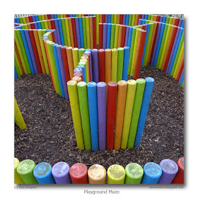
Two thoughts follow from my reflection on garden play equipment. Firstly, children get much more play value and satisfaction from a pile of wooden beams and flat panels than they do from any ready-made equipment supplied by a manufacturer. A home-made kit of this sort, with a few pieces of rope and large nuts and bolts can be made into whatever the child can imagine. And secondly, using the public park rather than the small, inferior one that parents provide offers more than simply exercise: it gives the child social interaction and responsibilty. It also gives them the chance to experience a maze of the sort shown in today's photograph. Of itself this hasn't a great deal of play value. But, there are other pieces of equipment nearby to sample too. And there are other parks elsewhere to try. Much more fun, I think, than being cooped up in the back garden with a circular blue trampoline.
photograph & text (c) T. Boughen
Camera: Lumix LX3
Mode: Aperture Priority
Focal Length: 5.1mm (24mm/35mm equiv.)
F No: f2.2
Shutter Speed: 1/125
ISO: 80
Exposure Compensation: -0.33 EV
Image Stabilisation: On
Monday, March 15, 2010
The first day of spring
click photo to enlarge
Spring arrived in Lincolnshire on Saturday 13th March. The temperature rose to a high of about 12 degrees Celsius, the sun shone, the wind was light, and the countryside glowed with rich colours. True, there's precious little visible by way of leaves on trees, or vigorously growing grass, but the aconites, snowdrops, and crocuses are in full bloom, and the odd daffodil has made an appearance.
After several hours of cutting and re-laying turf I decided that I'd spend the second half of the afternoon looking for a photograph or two, so I went to South Kyme. I've posted a couple of images that I've taken at this location before - the Tower, and the remains of the priory that was adapted as the parish church after the Reformation, and is now known as St Mary & All Saints. Today's photograph from this village on the River Slea is a landscape that features the priory-cum-church. It has been written (by someone from the United States) that England's churches seem to fit so well into the landscape. It's an observation that I agree with, and if I had no interest at all in church architecture, they'd still feature in my landscape photographs. Perhaps the modest size of many of the buildings goes with the modest scale of the terrain, particularly in lowland England. But it's also true that the use of local stone and the planting that enhances most church graveyards also plays its part in making the church nestle into its location.
For my photograph I walked over a small bridge to the other side of the River Slea and included the water to add interest to the foreground. I don't take too many photographs with the sun directly behind me, but on this spring day the slightly yellow tinge of its low light, and the way it was floodlighting the scene, bringing out the richness of the colours that had been masked by cold for so many months, I thought I'd make an exception for this shot.
photograph & text (c) T.Boughen
Camera: Olympus E510
Mode: Aperture Priority
Focal Length: 17mm (34mm/35mm equiv.)
F No: f5.6
Shutter Speed: 1/640
ISO: 100
Exposure Compensation: -0.3 EV
Image Stabilisation: On
Saturday, March 13, 2010
Spring whisk
click photo to enlarge
My culinary skills are of the lowest order. The fact is I have no interest in cooking. However, I must say, lest anyone thinks that I don't do my fair share in the kitchen, that my dishwashing skills and my application of them are second to none! I can be found after most meals, arms plunged up to the elbows in suds, bringing the shine back to the china and the gleam back to the stainless steel. I do involve myself in the preparation of meals, but only in a small and menial way. Setting the table, getting things out ready for the cook (my wife), and the odd bit of food preparation do come my way. As does the occasional dose of tedium. Preparing fruit and vegetables for freezing is one such task. But the worst, by far, is whisking the egg whites when a meringue is being made.
I know that in many households an electric whisk is used for this purpose. In ours, a manual spring whisk is pressed into service, and after it has been used I always end up with an aching forearm. Why don't I automate the procedure? Well, we've applied cost-benefit analysis to the matter and decided that an aching arm is a small cost compared with the benefit of not having to buy, store, get out and put away yet another electric gadget. And, importantly, the manual whisk produces less washing up.
It was when I'd come to the end of the washing up after an evening meal that I noticed the spring whisk lurking in the drawer. The kitchen lights were making the coiled metal throw sharp shadows, and I made a mental note to try and get a photograph out of its interesting shape. When it came to it I got two, both of the bulbous spring, one shot from each direction. They are the latest images in my "kitchen sink" collection.
For anyone with a kitchen sporting the latest in gee-whizz electrical whisking technology, and who has no idea what a spring whisk is, here's what the complete article looks like.
photograph & text (c) T. Boughen
(Photo 1 & 2)
Camera: Lumix LX3
Mode: Aperture Priority
Focal Length: 5.1mm (24mm/35mm equiv.)
F No: f2
Shutter Speed: 1/40
ISO: 80
Exposure Compensation: 0 EV
Image Stabilisation: On
Friday, March 12, 2010
Chrysanthemums
click photo to enlarge
Intermittent rain stopped play today - if wielding a sledge hammer and a crow bar to break up a sheet of concrete can be characterised as such. However, it wasn't sufficiently wet that I couldn't finish the final piece, and move on to marking out the replacement hard area and the adjoining beds for shrubs and flowers. Six mornings of hard labour combined with carting away the debris has broken the back of the work. Fortunately my back hasn't quite broken and I survive intact and ready for the next steps in our landscaping project.
Anyway, by way of a change I decided to have a go at photographing some chrysanthemums that are sitting in a vase on a table in our living room. I usually move flowers around to photograph them, often placing them on a different surface, in strongly directional natural light, and putting a "photographic" background behind them - in my case it's usually a large sheet of card or vinyl. However, this time I thought I'd leave them in situ since the colours seemed to be working well together.
The composition is my usual one - the vase of flowers just off centre with a couple of blooms on the surface nearby, an old painters' trick that adds a little asymmetry and visual interest. One day I mean to really work at a composition involving a vase of flowers, and add a collection of interesting objects to the shot in the manner of the seventeenth century Dutch painters. But, for now, my work is focused elsewhere, so domestic shots and fairly basic still-life images are likely to dominate the blog for the next week or two.
photograph & text (c) T. Boughen
Camera: Olympus E510
Mode: Aperture Priority
Focal Length: 35mm macro, (70mm/35mm equiv.)
F No: f5.6
Shutter Speed: 1/8
ISO: 100
Exposure Compensation: 0 EV
Image Stabilisation: Off
Thursday, March 11, 2010
Soup, condensation and home-cooking
click photo to enlarge
There was a time, during my childhood in the 1950s and 1960s, when I sampled a range of the tinned soups that manufacturers placed before us. Some of them tasted fine, but others were pretty gruesome. I had a liking for pea and ham, and some cream of mushroom soups were quite palatable. Chicken soup was usually pretty dire, I recall, and oxtail soup wasn't far behind. However, the worst was probably tomato soup. The recipe in those days included quite a bit of salt and sugar, and it was this combination hitting the back of your throat that you remembered from a bowl of tomato soup, rather than the flavour of the fruit.
These days the only soup that I eat is prepared at home, and it surpasses shop-bought soups in the way that home-made bread eclipses the industrial flour-based product of the superstores. Quite a few of our soups are made with produce from our vegetable garden. They are prepared in batches, some of which is eaten at the time of preparation, and the rest frozen for future consumption. Yesterday a batch of tomato soup was made using fruit we'd grown that had been frozen. Today's photograph shows the condensation clinging to the underside of a plastic lid resting over the container of that soup as it cooled down before it was closed and placed in the freezer. The rounded shape is a small, shallow dome moulded into the centre of the lid.
I've said elsewhere in this blog that one of the pleasures of macro photography is its capacity to reveal the interest that is all around us and is so frequently overlooked. The condensation on this plastic lid on the work-surface of the kitchen, illuminated by the wall cupboard under-lighters, is not an obvious photographic subject. However, for one such as myself, a fully-paid up member of the "kitchen sink" school of photography it is bread and butter!
For more "kitchen sink" subjects see here, here, and here.
photograph & text (c) T. Boughen
Camera: Olympus E510
Mode: Aperture Priority
Focal Length: 35mm macro, (70mm/35mm equiv.)
F No: f5
Shutter Speed: 1/5
ISO: 100
Exposure Compensation: 0 EV
Image Stabilisation: Off
Wednesday, March 10, 2010
A Georgian farmhouse
click photo to enlarge
I have long been of the opinion that, as far as relatively modest housing goes, eighteenth century architects managed to do more with less than architects of any other period. That's not to say that architects of the Victorian, modern, seventeenth century or any other period couldn't produce good design within cost limitations - they could - but perhaps not as consistently. Georgian buildings often achieve their appeal through the careful management of proportion. This was a feature that became increasingly lost as the nineteenth century progressed. The Victorians too often applied ornament to achieve their effects, and it needed the Arts and Crafts architects, such as Voysey, to show how things such as the relationship of wall to windows and the massing of a building could be used to make appealing structures.
Today's photograph shows a brick building that is essentially of 1772, with earlier parts, and some Victorian additions. It seems to have started life as a Fenland farmhouse - Moneybridge Farm - but is today a residence known as Brownlow House, named after the Georgian family whose cypher can be seen on the stone plaques over the front and back doors. I could have chosen a better example to illustrate my point, but this one has the symmetry typical of the period, with a doorway given prominence by its central position and a wooden case and triangular pediment. The windows have stone surrounds, and brick lintels with an emphasised keystone. Obvious C19 additions are the Westmorland slate roof and the gable chimney stacks: these would have replaced pantiles and similar brick stacks with less detailing. What makes this building particularly interesting is that it forms part of a larger group with brick and pantile outbuildings that date from the same time as the house. Of special note is the tall dovecote with a wooden, white painted turret with two tiers of flight holes.
Brownlow House sits next to a road that follows the River Glen. I took my photograph from a parallel road on the other side of the river, and used the large conifer to balance the composition. The broken clouds that periodically admitted brief shafts of sunlight looked better converted to black and white than they did in colour, so that is how I present the image.
Another eighteenth century Fenland farmhouse can be seen here.
photograph & text (c) T. Boughen
Camera: Lumix LX3
Mode: Aperture Priority
Focal Length: 6.3mm (30mm/35mm equiv.)
F No: f4
Shutter Speed: 1/1000
ISO: 80
Exposure Compensation: -0.66 EV
Image Stabilisation: On
Tuesday, March 09, 2010
Cyclamen flower
click photo to enlarge
Quite a bit of my spare time recently has been in the garden taking up a paved area and some concrete, as well as removing some low walls. There's a couple of weeks hard labour left in substituting some new work, making borders, and planting them. Consequently my time for blogging and taking photographs has been drastically reduced.
Casting around for a snap or two the other day I settled on the indoor plants - see yesterday's post. One of the house plants that we invariably have on display is the cyclamen. In fact there are usually several in a range of colours. I've tried to photograph these interesting plants before, but, from my many attempts I've only posted one shot. I seem to have had a photographic block as far as the cyclamen goes, and I can't really explain why. It has delicate, colourful blooms, with petals that are twisted rather like the blades of a propeller, and the leaves are marked with attractive patterns. It should make an easy subject. However, with past experience in mind I approached the plant with no expectation of achieving anything worthwhile.
But this time I did produce one image that I like. It's a close-up of a single bloom reflected in a mirror. That reflection makes for a subtle symmetry that appeals to me, and also gives greater emphasis to the twist of the petals. But, the thing that improved the shot most, to my mind, was going closer and framing it with the edges of the petals cut off. Unlike yesterday's shot the outline is not something that catches the eye, rather it is the spaces that are left at the edge of the frame.
photograph & text (c) T. Boughen
Camera: Olympus E510
Mode: Aperture Priority
Focal Length: 35mm macro, (70mm/35mm equiv.)
F No: f7.1
Shutter Speed: 1/20
ISO: 100
Exposure Compensation: +1.0 EV
Image Stabilisation: Off
Monday, March 08, 2010
New Guinea Busy Lizzie
click photo to enlarge
According to the Office for National Statistics seven of the 100 most popular names given to girls born in 2007 in the UK are derived from plants. They are (in order of popularity), Olivia, Lily, Holly, Daisy, Poppy, Jasmine and Rose. The number climbs to nine if we include Rosie and Hollie. In the equivalent boys' list there is only one plant-based name - Oliver. If we turn this idea round and consider how many plants are given non-scientific names that refer to male or female first names the pattern is the same: plenty of girls, but hardly any boys.
I was reflecting on this when we were buying some Black-Eyed Susan seeds, and it came to mind again when I was photographing the subject of today's image - a New Guinea Busy Lizzie. In the minds of many, for reasons that escape me, plants - particularly flowers - are seen as part of the feminine domain. Some men, perhaps those who are a little insecure in their masculinity, would no more be seen to have an interest in flowers than they would in embroidery or jam-making. As I pondered this theme I wondered if, one day in the future, there would arise a group of "male interest" boys' names equivalent to the plant names bestowed on girls. Can we look forward to parents calling across the park, "Be careful Turbo!", or "Time to go now Beer"? Will Poppy, Jasmine, Erica, and Hazel have brothers called Anfield, Beamer, Scrum, Torque or Camshaft? On further reflection one can only hope not.
The cold winter, followed by what is proving so far to be a cold spring, has set the garden flowers back a few weeks. Snowdrops and aconites are in fully out, but there's only a sprinkling of crocuses, daffodils and other spring flowers. Consequently I turned my attention to some of our indoor plants in my quest for colour. For today's photograph I laid the orange flower from one of our New Guinea Busy Lizzies on a mirror, the reflection of its underside giving the shape a symmetry of sorts. The cream background is a reflection of the nearby wall. As I studied the shot it reminded me of the sort of painted plant study that Victorian botanists would return home with having travelled the globe in search of new species.
photograph & text (c) T. Boughen
Camera: Olympus E510
Mode: Aperture Priority
Focal Length: 35mm macro, (70mm/35mm equiv.)
F No: f7.1
Shutter Speed: 1/20
ISO: 100
Exposure Compensation: +1.0 EV
Image Stabilisation: Off
Sunday, March 07, 2010
Wyberton churchyard in March
click photo to enlarge
Churchyards are, for the most part, a reflection of the place, time and congregation of a locality. In cities and many towns they are frequently small, containing the tombs of those who could afford to be buried there. Often they have been turned into gardens or small semi-public parks. In these larger settlement big Victorian cemeteries such as that at Highgate in London, or Hull's Western Cemetery, contain the graves and memorials of more ordinary folk.
However, in villages many churches continue to be surrounded by graveyards that are still used, though often they hold the cremated remains of the faithful, rather than the interrred body, a more efficient use of scarce space. Dwindling congregations find it hard tofund the regular upkeep of village churchyards. Consequently, many are "rationalised", the space between gravestones given over to mown turf. Others let the grass grow long over the summer, sometimes for wildlife conservation reasons, frequently for lack of a person or the funds to have it cut regularly. Then there are those that grow a little wild, the result of what looks like benign neglect. Such graveyards can look wonderful, both wildlife oasis and darkly mysterious surroundings to the church. Where this happens it is usually the planting of the Victorians - laurel, yew, laburnum, rhododendrons and similar plants - that take over.
During a recent visit to the church of St Leodegar at Wyberton in Lincolnshire, I surveyed the rather rambling churchyard. On my previous visits parts of it have had something of this "overgrown" character. But no longer. Out of shot, to the right, a thicket of very old laurels has been cut down, the wood of the trunks and piles of leafy branches neatly stacked, awaiting removal. Perhaps the next area to be tackled will be the ivy covered ground and trees on the left of my shot. It's a delicate decision to know how far to go with clearing: too much and it can end up looking sterile, not enough and it needs too much maintenance. On the day of my visit I took the opportunity to record the clumps of snowdrops, the ragged trees, and the equally ragged looking church (it had a central tower that collapsed in 1419 and was rebuilt with a west tower and no transepts using the fallen masonry). The short brick chancel, that looks very out of place, is a further addition of 1760.
photograph & text (c) T. Boughen
Camera: Lumix LX3
Mode: Aperture Priority
Focal Length: 5.4mm (26mm/35mm equiv.)
F No: f3.5
Shutter Speed: 1/500
ISO: 160
Exposure Compensation: -1.3 EV
Image Stabilisation: On
Friday, March 05, 2010
Nevill Holt, Leicestershire
click photo to enlarge
The first time I saw Nevill Holt in Leicestershire was when I'd cycled up out of the Welland Valley from Drayton. I was breezing along cheerily, having left the uphill section behind me when it appeared between a line of mature, roadside trees. What was it? A country house? A private school? A little research showed that it had been both those things, and was also a small village of 28 people (2001 census).
The oldest part of this scenic collection of buildings is the church of St Mary with its Norman font, late C13 transept arch, sedilia and piscina, tower of C15, porch of 1635, and various parts from restorations of 1865 and 1878. However, parts of Nevill Holt Hall, the country house that is physically attached to the church, and constitutes most of the buildings seen in the photograph, also dates from the 1300s (hall and roof), a large bay window is from the 1400s and much else is C16, C17, C18 and C19: this is a place that grew with successive inhabitants -principally the Nevills, and in the C19 the Cunards (of shipping line fame). Incidentally, the large brownstone building on the right with the clock tower was the late C16 stables. Around 1830 the owners Gothicised much of the Hall's main elevation. In 1919 the house was sold and became a school. This closed in 1998, and by 2000 the building was once again in private ownership.
So what of the village? Well, behind this magnificent assemblage of buildings are a few houses, the dwellings of the small number of people who live in this lovely rural location. I took this photograph on a cool March day of blue skies and sharp shadows, when cycling was quite the best way of getting around. I composed my shot with the shadows of the roadside trees filling the grassy foreground, the Hall's facade stretched across the frame, and the blue sky and clouds above.
photograph & text (c) T. Boughen
Camera: Olympus E510
Mode: Aperture Priority
Focal Length: 14mm (28mm/35mm equiv.)
F No: f6.3
Shutter Speed: 1/1000
ISO: 100
Exposure Compensation: -0.3 EV
Image Stabilisation: On
Thursday, March 04, 2010
Remember the Millen(n)ium?
click photo to enlarge
Millennium is the sort of word that crops up only once in a thousand years, but when it does appear it leaves its mark. Do you remember the Millennium? Like many people I was reminded of it with the recent news concerning the Playstation 3 bug whereby the software saw 2010 as a leap year and gave February twenty nine days, causing owners a few small difficulties.
There are three things people tend to remember from the time the twentieth century tipped over into the twenty first. The first is the change in dates and the celebrations and memorials that accompanied it. Secondly, there was the brouhaha surrounding the "millennium bug": the dire consequences that would befall mankind unless the clocks of all the world's computers were made to read the date correctly. It wasn't just a trivial matter of people losing their highest scores in a computer game (one of the consequences, apparently, of the Playstation 3 bug). No, airliners would fall from the sky, stock markets would crash, military equipment would malfunction, and people woudn't be able to play SimCity. In the event, nothing much happened except computer consultants clawed in lots more money than usual.
The third thing many remember from the year 2000 was the spelling problem. Was it "milennium", "millenium", "milenium" or "millennium". People scattered the letters "l" and "n" gamely, and after a while most people got the hang of the correct formulation. Unfortunately, by then the moment had passed, and the ability to spell the word was as useful as being fluent in Dalmatian, Eyak or Slovincian.
For a number of years I've been aware of the Lincolnshire hedge shown in today's photograph. The owner was clearly impressed by the millennium, and sufficiently public spirited to celebrate the event with topiary. Perhaps it's a consequence of a working life mainly spent in education, but when I first saw it the missing "n" jumped out at me, and it continues to do so every time I pass the hedge. However, after some reflection I did consider that it may not be a spelling error. Perhaps the owner got the letter size wrong, then as he got half-way through the word realised it wasn't going to fit in the available space, and therefore deliberately dropped the second "n" to make it do so. What I do know is that if I'd cut that word the mis-spelling would really bug me. I wouldn't leave it there for 10 minutes, never mind 10 years, and I'd clip the lot off. A thought has just occured to me (and you might wish it hadn't) - would that qualify as having the Millen(n)ium bug?
photograph & text (c) T. Boughen
Camera: Lumix LX3
Mode: Aperture Priority
Focal Length: 12.8mm (60mm/35mm equiv.)
F No: f5
Shutter Speed: 1/1000
ISO: 80
Exposure Compensation: -0.66 EV
Image Stabilisation: On
Wednesday, March 03, 2010
Using complementary colours
click photo to enlarge
We've been choosing flower seeds for the garden recently. One of the locations we have to cover is a small section of fence behind which are our refuse and recycling bins. In front of the fence is a small square patch of ground that in recent years has grown squash, tomatoes, and various kinds of flowers. Last year we grew a Chilean Glory Vine up the fence, but this year we are trying something different. We'd never grown that particular plant before, but we both concluded that it was inappropriately named - "Glory" it wasn't! In its place we'll have Thunbergia alata (Black-eyed Susan) and Ipomoea tricolor (Morning Glory - "Heavenly Blue"). We hope to have the complementary colours of yellow/orange and blue on display at the same time.
Complementary colours have figured in the work of many painters. Perhaps the best known in this respect is Van Gogh. In a letter to his brother Theo, speaking of his painting of the "Night Cafe" he says, "I have tried to express the terrible passions of humanity by means of red and green. The room is blood red and dark yellow with a green billiard table in the middle; there are four citron yellow lamps with a glow of orange and green. Everywhere there is a clash and contrast of the most disparate reds and greens...." Red and green are, of course, complementaries, and like all such colour pairings, their juxtaposition makes each appear more vivid and vibrant. Van Gogh is best known for his paintings of sunflowers. He made many studies of vases of these blooms, including some that are orange. Where he paints them this colour he often uses a complementary blue background, as in this example.
Our current living room flowers are orange chrysanthemums, and when I came to photograph them I searched out a piece of blue paper paper for the backdrop. I have a particular liking for the combination of orange and blue, especially a "kingfisher" blue, and have sought it out before in a photograph of cockerel feathers, and used it in an arrangement of Chinese Lanterns (Physalis franchetii).
photograph & text (c) T. Boughen
Camera: Olympus E510
Mode: Aperture Priority
Focal Length: 35mm macro, (70mm/35mm equiv.)
F No: f5.6
Shutter Speed: 1/250
ISO: 100
Exposure Compensation: 0 EV
Image Stabilisation: Off
Tuesday, March 02, 2010
Pass the cruet please
click photo to enlarge
In 1954, Alan Ross, Professor of Linguistics at Birmingham University, published an academic paper called, "Linguistic class indicators in present-day English". In it he looked at class differences in pronunciation, writing style and vocabulary. In the paper he coined the terms "U" (for upper class) and "Non-U" for, essentially, the aspiring middle classes. Ross's idea was that you could differentiate "U" speakers from "Non-U" speakers by how they pronounced words, how they wrote, and particularly by certain elements of the vocabulary that they used. His research was taken up and given wide publicity by the novelist, Nancy Mitford. Other writers and poets contributed to the extensive debate, some in a rather light-hearted way.
There probably was a serious - though not especially important or significant - point to Ross's original paper. And certainly some socially insecure people looked at the subsequent interpretations and became concerned to use the "right" words. However, most people saw it as an amusing irrelevance to their lives and their understanding of society. But, because the whole debate received wide coverage in the press and elsewhere, those of us who grew up in the 1950s and 1960s invariably came across the instances that Ross and others used to illustrate the principle of "U" and Non-U". For those who didn't, or for those for whom this is simply another example of the class-bound society that is/was Britain, here are some examples: Lavatory (U) Toilet (Non-U), What? (U) Pardon (Non-U), Sofa (U) Settee (Non-U), Writing paper (U) Note paper (Non-U), Jam (U) Preserve (Non-U). There are many more!
Perhaps you're wondering what the connection is between what's written above and my photograph of a table top in the first floor cafe of Spalding's "South Holland Centre". Well, the other day we called in for a cup of coffee, and, as we took our seats at the large, part-etched window overlooking the market place, I was struck by the light and reflections. So, I placed my camera on the highly polished table, adjusted the composition and took this slightly surreal and colourful shot. When I came to give it a title I went for the purely descriptive, "Coffee, Flowers and Salt & Pepper". But that sounded too wordy so I considered "Coffee, Flowers and Cruet". But then I remembered what I'd once read concerning "U" and "Non-U": allegedly the two key pieces of vocabulary that distinguished the two categories were napkin (U) serviette (Non-U), and salt and pepper (U) cruet (Non-U). I couldn't possibly commit such a social faux pas I thought - tongue in cheek - so settled on "Coffee, Flowers, Salt & Pepper"!
photograph & text (c) T. Boughen
Camera: Lumix LX3
Mode: Aperture Priority
Focal Length: 5.1mm (24mm/35mm equiv.)
F No: f4
Shutter Speed: 1/640
ISO: 80
Exposure Compensation: -0.66 EV
Image Stabilisation: On
Monday, March 01, 2010
Self-portrait and artists' voices
click photo to enlarge
I recently lamented the reluctance of some artists and photographers to talk about the how and why of image making. When I wrote those words I must have been suffering from amnesia. Either that or I'd forgotten what I'd written in an earlier post about some explanatory texts that accompanied a group of art works that I'd been to see. They combined verbosity, pretentiousness and opaqueness in a way that almost made this viewer overlook any good qualities that the pieces exhibited.
I suppose what I really want is artists to write something intelligible and intelligent about why they do what they do, and why they do it in the way that they do. However, I'm fast coming to the conclusion that only a few are capable of this seemingly straightforward task, and so in retrospect, it's probably better that the majority say nothing. There is, after all, a lot to be said for letting the artwork speak for itself and for the viewer to come to a determination about it uninfluenced by the artist's utterances.
Today's photograph is a self-portrait in an installation by at an exhibition that I visited recently at The Hub in Sleaford, Lincolnshire.
photograph & text (c) T. Boughen
Camera: Lumix LX3
Mode: Aperture Priority
Focal Length: 5.1mm (24mm/35mm equiv.)
F No: f2
Shutter Speed: 1/30
ISO: 125
Exposure Compensation: -0.3 EV
Image Stabilisation: On