Pages

Sunday, January 31, 2010

iPads, schools, books and libraries

click photo to enlarge
The day I took this photograph was the day Apple unveiled the iPad. What's the connection between a medieval school building in Lincolnshire and the latest techno gadget you may be thinking? Well, this school, that was built in 1485, and remained a place of education for about 480 years, a few years after closing its doors to students, was re-opened as the local public library - which it remains to this day. And is it not the case that Steve Jobs' electronic tablet is the most recent in a long line of technological innovations that is predicted to see off the printed word? Aren't we all, in a few years, going to be reading our news, our novels, our non-fiction, etc on an iPad, a Kindle, a Sony Reader, or whatever the next incarnation e-reader is called? And won't the words be delivered electronically to our devices without us having to set foot out of the house? Well, maybe, but perhaps not.

The demise of books has been long foreseen, and certainly predates the rise of the latest generation of substitutes for the printed word. But, the number of books published and sold, so I read (in my wood-pulp based newspaper) is now at an all-time high. It seems that reading matter, in the form devised by Gutenberg about 50 years before the construction of this school, has a long future ahead of it despite the arrival of upstart electronic versions. Or should that be because of them, for it seems that just as computers produced not the paperless-office, but workplaces overflowing with ever more of the stuff, so too does technology feed print and vice versa. Consequently, perhaps the dire warnings about the uncertain future of public libraries is also a touch overstated. They seem to have successfully grasped technology and given it a place alongside their more traditional fare. So, the borrowing of library-books is likely to survive for some time yet. And who wouldn't want to take advantage of the local library if it was a building like the one at Wainfleet?

For another blog photograph of this venerable building see here.

photograph & text (c) T. Boughen

Camera: Lumix LX3
Mode: Aperture Priority
Focal Length: 5.1mm (24mm/35mm equiv.)
F No: f4.5
Shutter Speed: 1/1000
ISO: 80
Exposure Compensation: -1.0 EV
Image Stabilisation: On

Saturday, January 30, 2010

Sleaford sculpture, ancient and modern

click photo to enlarge
Is durability a quality that we require in public sculpture? There are arguments for and against that proposition. If the sculpture is mediocre or bad we might wish for it to be momentary, the sort of thing that soon falls apart and is taken away. If it's high quality and durable we will usually be pleased for it to remain, though if it's good but poorly made we may well find ourselves balking at the cost of restoration. Another consideration is that tastes change over time, and what is lauded when new might be castigated a hundred years later. My view is that sculpture should be made to last: that a society should accept the good, the bad and the indifferent that is bequeathed to us by each generation. Why? Well, such sculpture offers not only an aesthetic experience and a piece of public art, but it is a memorial of past taste, and a small slice of history: as such it offers us something useful even when we don't like it.

I was reflecting on this the other day as I stood in the main street at Sleaford, Lincolnshire. Next to me were some railings-cum-sculpture, and nearby was a prominent Victorian monument that parts the traffic on this busy thoroughfare. I've said elsewhere that public furniture and fixings that try to be artistic and utilitarian at the same time rarely succeed in either function. And that's the case, in my opinion, with the Richard Bett's ship/fishes/wyvern that form the railings of the small garden at this location. This "Sleaford Pride" sculpture of 2001 uses imagery associated with the town, but is too obviously a tricked up barrier, and the sculpture part I find too slight. The Handley Memorial, a Victorian re-working of the Eleanor Cross idea, dates from 1850. The overall design is William Boyle's, and the sculpture of Henry Handley M.P. is by John Thomas. It is a well-made but fairly unexceptional example of a Victorian memorial to a noteworthy man. It has lasted for 110 years so far, and looks like it has a century or two in it still, so it is certainly durable. The modern sculpture is positively new-born by comparison, and even though it is made of steel, is unlikely to have a comparably long future ahead of it.

Standing near these two examples of the sculptor's art I tried to incorporate both in a single shot. The best image I managed is this one with the wyvern's head looking like it is about to take a bite out of the old stone monument.

photograph & text (c) T. Boughen

Camera: Lumix LX3
Mode: Aperture Priority
Focal Length: 8.8mm (41mm/35mm equiv.)
F No: f4
Shutter Speed: 1/640
ISO: 80
Exposure Compensation: -0.66 EV
Image Stabilisation: On

Friday, January 29, 2010

Irby in the Marsh church

click photo to enlarge
The county of Lincolnshire has more than 200 place-names that end with "by" (pronounced "bi" as in bit). It is thought that these derive from the homesteads of small groups of Frisians, Irish vikings and Norwegians who accompanied the Danes when they settled the area. Irby in the Marsh (one of two Irbys in the county) has a particularly descriptive place-name. The "Ir" probably refers to Norwegian vikings from Ireland, the "by" means farm/s or village, and the remainder of the name describes the location.

The Scandinavians arrived in Eastern England in the 9th century, and the settlements around Irby will date from that time. The place-name itself is first recorded c.1115AD as Irebi. When you visit this part of Lincolnshire you are struck by the position of the church on a low rise in the flat landscape. Did the medieval builders displace farmers who would also have been drawn to this drier eminence? The church of All Saints is a picturesque mixture of greenstone, limestone rubble, limestone ashlar and red brick. The principal medieval remains, from the 13th century to the 15th century, are the foundations and lower parts of the wall, remains of aisle arches, a piscina, and the plain octagonal font. Much of the church was renewed in 1770, including the tower with its obelisk pinnacles and arched doorway with datestone, and the nave. This latter has curious alternating bands of greenstone and bricks pierced by characteristic round-arched windows. The building was further renewed and restored in 1886 by the architect, Ewan Christian, who built the chancel.

I took a number of pictures of the exterior of the church, but chose this one to post because it shows its position on the low hill, and for the fine clouds that acquired added drama by my use of a wide angle lens (22mm @ 35mm equivalence).

photograph & text (c) T. Boughen

Camera: Olympus E510
Mode: Aperture Priority
Focal Length: 11mm (22mm/35mm equiv.)
F No: f6.3
Shutter Speed: 1/400
ISO: 100
Exposure Compensation: -0.7 EV
Image Stabilisation: On

Thursday, January 28, 2010

A light, stairs and abstraction

click photo to enlarge
Abstraction in painting involves either taking things from the real world and depicting them in an unreal but recognisable way, or using two dimensional elements such as colour, shape, line, etc non-representationally. If you go to any gallery that includes a reasonably large and wide-ranging selection of post-1900 paintings you are likely to see examples of both these approaches.

In photography it is easy to create images that follow the first method. One can see why, since most photography involves depicting the world around us in one way or another. However, it is (in the main*) not possible to make photographic images the second way because, for the camera, the elements of two dimensional representation, such as pure colour, do not exist independently of objects. They can be introduced using image editing software, but then we have moved into that grey area where digital painting meets photography. As I've said before in this blog, for me the term semi-abstract best describes what photographers do in this sphere.

Today's photograph is my most recent work in the semi-abstract genre. It shows a wall light that illuminates a stairway in a large building. I composed my shot by tilting the camera until I'd got what I considered to be a dynamic but balanced composition of three basic elements - grey wall, black steel support and stairs, and blue sky through glass. My adjustment placed the orange light towards the bottom in the grey wall, and also included its reflection in the black, giving some necessary interest in that region of the photograph. Why do I call this semi-abstract? Because the arrangement of shapes, lines, colours, tones, etc is the primary motivation for the image, and the light, stairs, metal, glass and sky are necessary incidentals.

* deliberate camera flare, and a few other methods can be seen as image making using elements that are not based in the real world

photograph & text (c) T. Boughen

Camera: Lumix LX3
Mode: Aperture Priority
Focal Length: 5.1mm (24mm/35mm equiv.)
F No: f2.2
Shutter Speed: 1/200
ISO: 80
Exposure Compensation: -0.66EV
Image Stabilisation: On

Wednesday, January 27, 2010

Sleaford station

click photo to enlarge
One day I'll count the number of photographs I've posted that have a person as the main subject. Ignoring the occasional self-portrait the total must be less than five out of the 878 on PhotoReflect and 60 on PhotoQuoto. In fact, I'm struggling to remember more than one!

However, I do like to include people in photographs for interest, scale and as strong compositional elements. I regularly post shots that feature people for one or all of those reasons. Moreover, I find that some photographs, and landscapes in particular, benefit from a human figure, though I think many photographers appear to hold the opposite view. I also like, where I can, to take photographs of urban scenes that include people, though my images are never just about the people. One of my own favourite shots of this sort is a very Victorian looking view of Greenwich Park in London. When I say "Victorian-looking" I mean that in terms of its feel rather than the details.

Today's photograph has something of that feel too. It shows passengers waiting on the railway platform at Sleaford. The station in this Lincolnshire town - like most British stations - is a Victorian construction. The oldest Tudor-style stone building dates from 1857, and much of the rest, of brick, from 1882. I stood with this range of buildings behind me to take my shot. The photograph shows the ornate Victorian cast-iron and wood canopies and the more modern information board and monitor displaying train times. However, it wasn't just the architectural details that prompted the shot, it was the four people spread along the platform and the light from the low sun beyond. The brightness added silhouettes, shadows and halos to the scene that appealed to me. Like the image of Greenwich Park this one has a feel of some of the Victorian paintings by minor artists that one sees in regional art galleries - views of the local high street, station or horse racing course. The one thing that is quite different, of course, is the number of people in the image. In the nineteenth century this station would have been packed with waiting passengers, but at the end of a cold January day in 2010 there were only the four.

photograph & text (c) T. Boughen

Camera: Lumix LX3
Mode: Aperture Priority
Focal Length: 10.2mm (48mm/35mm equiv.)
F No: f3.2
Shutter Speed: 1/400
ISO: 80
Exposure Compensation: -0.66 EV
Image Stabilisation: On

Tuesday, January 26, 2010

'mums

click photo to enlarge
There is a mania today for shortening words. Sometimes these contractions become common currency before I hear them. When someone first used the word "Beamer" in my hearing I wondered why a term I associate with bowling in the game of cricket had suddenly appeared in a conversation about cars. It took a bit of work with the context to figure out that the speaker was referring to a BMW. Another example is "Corrie" for Coronation Street. The last time I watched this long-running soap opera it was the 1960s, I was still living at home with my parents, and Elsie Tanner and Ena Sharples were main female characters. And what about "uni". This coinage, which means "university", seems to have come about since many colleges and polytechnics were re-named as universities, and access to this tier of education was greatly widened. There are many other examples of the shortening of words, but I'll restrict myself to just one - " 'mum."

Before I deal with it I'll acknowledge that this is not a new phenomenon. Many words have been shortened down the years. The perambulators used for carrying young children became "prams", the seaside promenade became the "prom", and the omnibus became the "bus". When I was first introduced to the last mentioned shortening I wondered why the apostrophe indicating the elision of the first four letters had been omitted. Further enquiry discovered that when the abbreviation began to be widely written it was often included, but as time passed it was dropped. The same is true of " 'mums", which is short for "chrysanthemums". This truncated version is not yet as widespread as "bus", but it can only be a matter of time. Today you see it, mainly, on market stalls and in garden centres. The former location is, I suppose, understandable given the reputation for bad spelling that market traders enjoy. But it is a ridiculous shortening with or without the leading apostrophe.

Today's photograph shows the chrysanthemums that my wife bought on our last shopping trip. I quickly snapped them, with the LX3 set to macro, before they were unwrapped and transferred to a vase. On this shot I increased the exposure in post processing to the point where I just began to lose detail in the whitest parts of the image.

photograph & text (c) T. Boughen

Camera: Lumix LX3
Mode: Aperture Priority
Focal Length: 5.1mm (24mm/35mm equiv.)
F No: f2.8
Shutter Speed: 1/400
ISO: 80
Exposure Compensation: -0.66 EV
Image Stabilisation: On

Monday, January 25, 2010

Photographing vases of flowers

click photo to enlarge
The subject matter of photography and painting overlap to a very great extent, which isn't surprising given they are both visual arts. (I'll leave for the moment the discussion about whether photography is an art or a craft). The earliest photographers, such as Fox Talbot and Daguerre, drew heavily on the precedents of painting, but as the new medium grew, it did find ways of looking at and recording the world that were its own. But, if you consider most genres of photography, such as portraiture, landscape, travel, sport, wildlife, abstract, semi-abstract, it's true that these are now traditional forms that are shared with painting.

Still life, too, is found in both media. The other day, however, after I'd been browsing the work of photographers ancient and modern, amateur and professional, it struck me that still life pictures of flowers in vases is a mainstay of painting, but is very rare in photography. Why is this, I wonder? It's certainly true that painters use the vase of flowers, bowl of fruit, etc as a technical exercise in light, colour, form, line and the rest. So why don't photographers? Moreover, a vase of flowers is both controllable in terms of composition and lighting, and is an infinitely variable subject too. Perhaps it's that a vase of flowers, as a subject, has become so associated with painting that photographers are reticent about using it. Do they see it as a dull, staid subject, not worthy of a click or two? Or do they not see the possibilities inherent in this simple idea? Whatever the reason, today's post is, if nothing else, a plea to photographers to consider the humble vase of flowers.

I've photographed this subject for a number of years, and quite a few of my efforts have featured in this blog. Today's shot is my, by now seasonal image of carnations, or rather, in this instance a single carnation. My aim with this image was to find a different take on the vase of flowers that owed something to the fact that it is made with a camera. This heavily foreshortened shot from above with the shallow depth of field of my macro lens seemed to fulfill that objective.

For anyone who is wondering what I've done previously with this subject here are six examples.

Chinese lanterns, red tulips, daisies, dead hydrangeas, heliopsis, carnations and verbena.

photograph & text (c) T. Boughen

Camera: Olympus E510
Mode: Aperture Priority
Focal Length: 35mm macro, (70mm/35mm equiv.)
F No: f7.1
Shutter Speed: 1/15
ISO: 400
Exposure Compensation: +1.0 EV
Image Stabilisation: Off

Sunday, January 24, 2010

The poor man's Photoshop No.2

click photo to enlarge
Four years ago* I posted a piece entitled "The poor man's Photoshop". That particular post has always been one that receives a lot of hits, with the visitor invariably arriving through a search engine query. However, most of the people who alight on my page that describes a shot of a book cover taken through "Flemish" frosted glass quickly move on. They've clearly been looking for a cheap or no-cost alternative to Photoshop, the heavyweight photo-processing software of choice of enthusiast and professional photographers. Some stay and look at the image and read the text on my page, but mostly they don't. I suppose I ought to add to the page a link to GIMPshop, a version of GIMP (Gnu Image Manipulation Program) that has been modified by the addition of a Photoshop-like interface. Or perhaps anyone searching for a cheap digital image editing program would benefit from knowing about Gizmo's Freeware, and particularly his page describing and linking to a selection of such programmes - Best Free Digital Image Editor. However, it's not my practice to amend an entry after I've posted it, so today I'm doing the next best thing by giving this post the same title (except designating it number 2), and featuring those useful sources. I hope this proves helpful to someone.

In fact, the subject of today's photograph warrants the title I've given it anyway. It shows me with the LX3 reflected in the textured glass of a door. Outside it is raining, and the door is giving a distorted reflection of not only me, but also the door and room behind. I liked the indistinct nature of this image and the way the colours of my clothes made the feather-like designs in the glass appear as though they formed part of my shape. It certainly has something of the feel of the sort of Photoshoppery that I don't indulge in but that many like, though in this instance there has been no computer manipulation at all.

* The opening sentence of this piece brought me up with a start. Have I really been posting images and rambling on for so long? It's maybe time for a change.

photograph & text (c) T. Boughen

Camera: Lumix LX3
Mode: Aperture Priority
Focal Length: 5.1mm (24mm/35mm equiv.)
F No: f2
Shutter Speed: 1/30
ISO: 400
Exposure Compensation: -0.66EV
Image Stabilisation: On

Friday, January 22, 2010

No cost photographic lighting

click photo to enlarge
I sometimes think I'm a bit of a cheapskate when it comes to lighting. I've looked at photographic lights, reflectors, backgrounds, desktop studios and the like, and invariably my response has been, "I'm not paying that!" It may be that the items I reject are reasonably priced for what they are, though I think that's frequently not the case. However, it isn't the absolute price that I'm considering when I decide to reject the manufacturers' offerings, and the calculation that goes on in my mind has three components. Firstly the kind of use to which I'm likely to put fixed lighting and backdrops, secondly the price being asked, and thirdly the output that I'm already achieving with my no-cost DIY lighting. When I factor those together I always end up carrying on with what I've already got.

Most of my lit photography is still life shots, close-ups and macros. Often there is a semi-abstract angle to the latter two approaches. If I were doing "product" style photography, portraits, etc then my thinking might be different. But, shooting what I do, I'm fairly happy with natural light, a single flashgun, sheets of black and white vinyl for backdrops and reflectors, and for fixed lighting, ordinary domestic light bulbs.

Today's photograph is an example of my minimalist approach to the fixed-light photography of a semi-abstract subject. It shows a macro view into an empty, green glass, apple juice bottle. The "studio" set up was to place it on a sheet of white A4 paper on my desk. This was pulled out of one of the two printers that sit there. Then I adjusted my anglepoise light so that it illuminated the side of the bottle. Finally, I hand-held the LX3, set to macro, at the mouth of the bottle and composed a few shots into the emptiness. It's not the greatest photograph I've ever taken, but it is the one I wanted, having shallow depth of field but with the writing at the bottom sharp, concentric circles with the focal point off centre, areas of dark and light, and a light source that is obviously to one side.

photograph & text (c) T. Boughen

Camera: Lumix LX3
Mode: Aperture Priority
Focal Length: 5.1mm (24mm/35mm equiv.)
F No: f2
Shutter Speed: 1/60
ISO: 80
Exposure Compensation: 0 EV
Image Stabilisation: On

Thursday, January 21, 2010

Tin tabernacles

click photo to enlarge
The name "tin tabernacle" is used to describe the prefabricated, corrugated iron churches that can still be found in out of the way corners of Britain. The style will be recognisable to people in some other countries, particularly Australia, New Zealand and the United States, where such buildings were also erected.

In Britain the rapid expansion of population in the nineteenth century led to the need for buildings that could be quickly erected in areas of new housing, and near expanding mining areas. Churches of many denominations, between about 1860 and 1914, seized on the offerings of manufacturers, and put together buildings from the kits of parts that they advertised. Churches could be large or small, with bell towers and spires, or with simple bell-cotes. Transepts and aisles could be added, as could pointed windows with elementary tracery, porches and prominent crosses. Those who erected these churches saw them as temporary buildings that would be superseded by brick or stone structures in the fullness of time. And in most cases they were. But, temporary buildings are sometimes suprisingly durable and frequently garner affection from their users. Furthermore, the envisaged money for something more substantial isn't always forthcoming. That seems to have happened with the surviving "tin tabernacles" in Britain. They can be found in towns, Welsh valleys, in small rural communities, or in mining areas that have long since ceased production. I have come across a couple of dozen in my travels over the years, often strikingly and brightly painted, and usually exhibiting through their cared-for appearance, the love and devotion of their congregation.

Today's photograph shows one such church that dates from 1893, a modest example, in the small village of Pointon on the edge of the Lincolnshire Fens. It is painted black and white, is severely symmetrical, and on the exterior shows its age. All the details are pretty much as you expect to see in such a building, with the exception of the bargeboards on the main roof and aisles. These have decorative cut-outs on the edge of a sort that look like the bite marks of a hungry Tyrannosaurus rex! They are surely not original. However, peering through the window, I found the inside looks wonderful. It is clean, polished, beautifully cared for, and has details picked out in blue that give it a pleasing brightness. The notices pinned to the door reveal that it is well-used by the village, and doubtless the building has many more years of life left in it. The best shot the church offers the passing photographer is, I think, this symmetrical shot from the west end.

More information about these fascinating relics can be found here, here and here. The largest example of a tin tabernacle church in Britain is at Deepcut.

photograph & text (c) T. Boughen

Camera: Lumix LX3
Mode: Aperture Priority
Focal Length: 7.9mm (37mm/35mm equiv.)
F No: f2.4
Shutter Speed: 1/125
ISO: 125
Exposure Compensation: -0.66 EV
Image Stabilisation: On

Wednesday, January 20, 2010

Beautifying the church organ

click photo to enlarge
What can you do to integrate a thumping great organ into its place in the church. There are two main approaches to this problem. The first is hide it (in an arch, alcove, etc), and the second is beautify it, either by making it complementary to the existing fittings and furnishings, or by making it an eye-catching thing of beauty in its own right.

Many of the first church organs were subject to beautification. The keyboard was encased in an elaborate, decorative, wooden surround, and the pipes were also wrapped around - to a greater or lesser extent - with pierced and carved wood. I've seen wooden organ cases of the most elaborate design, all veneers, inlay and sculpture, carved by the likes of Grinling Gibbons, that display all the decorative details at the disposal of the eighteenth century, from swan-neck pediments to cornucopias and swags. Much the same is true of the nineteenth century attempts to beautify the organ, though using the heavier decoration of those years. However, Victorian designers often deliberately displayed the pipes themselves, in ranks, graduated by size, with painted, stencilled details applied to the metal-work, much as in the example shown from Little Eversden. These designs are often very delicate, and reflect the fashion of the time. Some of the Arts & Crafts stencilling is particularly good.

This style of decoration continued into the twentieth century. However, those years were often times when renovation was the order of the day, and the installation of new pipe organs was something of a rarity. On the whole the restorers maintained and repaired that which was there. But, a few brave vicars employed architects to fashion new cases for their organs. I came across one such, dating from 1972, in Spalding church the other day. The painted wooden screen featuring parallel slats and inverted square pyramids is by G.G.Pace, an architect and designer of church furnishings whose work I have admired in Yorkshire and Lancashire churches. My photograph doesn't display the interest of Pace's design very well - I was looking to create a semi-abstract image - but I may return and take another photograph to show this fine piece of work which is a welcome change from the usual polished wood cases.

photographs & text (c) T. Boughen

Photo 1 (Photo 2)
Camera: Lumix LX3
Mode: Aperture Priority
Focal Length: 5.1mm (24mm/35mm equiv.)
F No: f2
Shutter Speed: 1/24 (1/8)
ISO: 400
Exposure Compensation: -0.66 (-1.0) EV
Image Stabilisation: On

Tuesday, January 19, 2010

In praise of small sensor cameras

click photo to enlarge
Those who use digital SLRs often have no time for small sensor cameras. Not only do they lament the lack of control that compacts offer, they also bemoan their low-light abilities, the image quality and the difficulty in producing out of focus backgrounds - what is today called "bokeh". I use both a DSLR and a compact digital camera, just as for a couple of decades I used a 35mm SLR and a compact rangefinder camera. Why did I then - and why do I now - accept the limitations of a small camera? The answer is simple: convenience, and because usually what it produces is good enough.

Take the LX3 that I use. It has what many see as a woefully short zoom (24mm-60mm in 35mm terms), but that's a range that covers about 80% of my photography. Moreover, the limitation is actually liberating, and interestingly I find myself using 24mm much of the time and ignoring the rest of the zoom. Additionally, with most of my shots I'm aiming to maximise the depth of field, so for me the "disadvantage" of the small sensor becomes an advantage. The maximum aperture of the LX3 is f2. In the days of SLRs that wasn't anything special, with 50mm f1.8 lenses being two a penny, and f1.4 and f1.2 being not too uncommon. Today though, f2 is wider than probably 90% of DSLR lenses. Then there's the image quality, noise, etc. The LX3 output isn't as good as a DSLR: that much is obvious if you view images on screen at 100%. However, that's not the way I look at photographs. At the usual screen size I see no difference, and in prints up to A3+ I struggle to see a difference, so the output, for my purposes, is clearly good enough. Where the LX3 really scores is in its pocketability - it can go everywhere I go with no inconvenience. But there's also the quality of the straight out-of-the-camera JPEGs and the very effective iA (Intelligent Auto) mode. Because it's an enthusiast's compact the user control and the ability to customise the set up are at the level of many DSLRs. All told its a good little camera that is, yes, good enough. Having said that, I couldn't see myself with a wide-angle compact such as this as my only camera: but as camera that is complementary to the DSLR it works well.

Today's shot exemplifies some of its virtues. I set the dial to Intelligent Auto, overrode it only to the extent of dialling in -0.66EV to control the highlights, and, in a church on a dark January day, ended up with this sharp, hand-held image. The background is sufficiently out of focus to emphasise the chandelier above me, but the roof timbers and wooden angels staring down are still discernible, largely because it opened up the lens to the maximum of f2. When I compared this shot to the version I took using Aperture Priority mode it was certainly no worse.

photograph & text (c) T. Boughen

Camera: Lumix LX3
Mode: Intelligent Auto
Focal Length: 5.1mm (24mm/35mm equiv.)
F No: f2
Shutter Speed: 1/30
ISO: 200
Exposure Compensation: -0.66 EV
Image Stabilisation: On

Monday, January 18, 2010

Staircases and status

click photo to enlarge
The staircase in today's photograph isn't the grandest that you will see, but it certainly isn't the meanest. The curved, cantilevered stone steps, the polished hardwood rail ending in a tight volute, and the strong, steel balusters suggest the sort of stairs that might grace a small Georgian or early Victorian house. In fact these particular stairs are in a large house, parts of which date from the 1400s, and the rest from just about every century since. And these are by no means the main stairs: rather, they appear to be the servants' stairs, linking the kitchen and other domestic areas of the house with the very grand first floor rooms.

Staircases have long been used to give a house stature and distinction. The humblest houses usually have a straight flight. Those that wish to appear a step up (pun intended!) from such dwellings usually contrive to have a quarter-turn staircase i.e. with a right-angled turn part way up, sometimes with a quarterpiece (a small landing). Dogleg staircases, where the steps turn sharply back through 180 degrees are often found in slightly bigger houses. However, the dwelling of desire aspires to stairs that curve, and in so doing give a graceful "catwalk" for the owners and their guests. So, quarter winding stairs, geometrical stairs and wreath stairs are popular. The biggest houses with very large entrance halls will often feature a variation of the double return stairs.

What this modestly elegant stairway, for use by the servants of the house, says to anyone who sees it, is that the owners of this house are people of consequence because even the domestic help has stairs of distinction. I took this shot not only for the strong form the handrail gives to the composition, but also for the subsidiary shapes of the balusters and steps, and the fine colours of the pieces of stone, illuminated by winter light through a nearby window.

photograph & text (c) T. Boughen

Camera: Lumix LX3
Mode: Aperture Priority
Focal Length: 12.8mm (60mm/35mm equiv.)
F No: f2.8
Shutter Speed: 1/13
ISO: 400
Exposure Compensation: 0 EV
Image Stabilisation: On
Saturday, January 16, 2010

The camera always lies

click photo to enlarge
"The camera never lies" is a saying that I remember hearing as a child, long before I owned a camera. To my young, growing mind it seemed like a perfectly reasonable statement. After all, cameras were unthinking machines that simply recorded that which the user pointed them at, unlike painting which was always an interpretation of what the artist saw. I think this is a view still held by many - both young and old - though the advent of digital photography and software like Photoshop has certainly raised doubts in the minds of a few more about whether a photograph can be believed. Ironically it's the more obvious manipulations such as the smoothing out of wrinkles around Twiggy's eyes, the removal of a film star's paunch, or the trimming of a starlet's waist that have prompted such thoughts.

It was only after I'd engaged in photography for a number of years that I began to question the wisdom of the statement that "the camera never lies." But by then, the more I thought about it, the more I came to understand that this saying was, in fact, the opposite of the truth: the camera always lies in one way or another. It lies by being more selective than the eye about what it sees, it lies by giving emphasis to things that the brain doesn't, the colours it shows are never accurate, the relative positions of objects are usually not as we see them, and the meaning that we take from a photograph is usually more to do with how we see the subject in the image than the reality that the photographer saw.

Today's photograph is just the sort of image that an opponent of a proposed wind farm or line of pylons might want to use. "Look", they would say, "these monstrosities turn the countryside into an industrial landscape!" But that's not true. At least it's not true as far as these pylons and these wind turbines go. By using a lens that is the 35mm equivalent of 300mm I've foreshortened and compressed this group of pylons and turbines into what looks like a small space, and I've magnified their apparent size. Anyone walking by this scene, or anyone living near it, would not recognise the photograph as the place they knew. It's just me making the camera tell lies for dramatic effect.

photograph & text (c) T. Boughen

Camera: Olympus E510
Mode: Aperture Priority
Focal Length: 150mm (300mm/35mm equiv.)
F No: f7.
Shutter Speed: 1/1250
ISO: 100
Exposure Compensation: -0.3 EV
Image Stabilisation: On

Friday, January 15, 2010

Picturesque pile or wretched wreck?

click photo to enlarge
What word would you use to describe this derelict Fenland cottage? Bucolic? Enchanting? Decrepit? Quaint? Crumbling? Is it a picturesque pile or a wretched wreck? Structures such as this usually provoke very polarised views. There are those who see them as a dangerous eye-sore that, at any moment, may fall on a passer-by, their appearance regarded as a blot on the local landscape, and an affront to surrounding buildings. Others find the dilapidation picturesque, a reminder of times past, a counterpoint to neat lawns, mathematically precise brickwork and gleaming plastic window frames. The fact is, such a building will usually be one or other of those things to most people. But, there are a few who will see it as both those things, getting enjoyment from it whilst regretting its demise, and also recognising the need for it tbe restored or replaced.

Those who see something to admire in decay and dereliction are often infected, to a greater or lesser extent, by Romanticism as that term came to be used in the eighteenth and nineteenth centuries. Frequently they will have an artistic bent, liking poetry, literature, painting, photography, etc. And many will have an appreciation of history and place. Of course, the photographic or painted image often adds its own veneer to a depiction of a ruin, and the selective, edited image frequently betters the reality. My wife suggested today's photograph is an example of that phenomenon, when she remarked as she looked over my shoulder at the image on my computer screen - "That looks more picturesque than it does in real life."

photograph & text (c) T. Boughen

Camera: Lumix LX3
Mode: Aperture Priority
Focal Length: 7.4mm (35mm/35mm equiv.)
F No: f3.5
Shutter Speed: 1/400
ISO: 80
Exposure Compensation: -0.33 EV
Image Stabilisation: On

Thursday, January 14, 2010

Anonymity and cabbages

click photo to enlarge
A few months after I'd begun this blog I had an email from someone. In the course of comments about photography and the images I was posting he remarked that he found it odd that I was using my real name rather than a nom de plume or "handle". My answer was that I didn't write anything that I wouldn't say publicly, or couldn't defend, nor was I gratuitously abusive, and I wouldn't direct any offensive criticism at an individual. Consequently, I said, I see no need to hide behind a pen name.

In recent years I've come to see anonymity on the internet as a greater problem than I initially thought. There are times when it is clearly useful: whistleblowers and the like would be much less likely to surface without the protection it offers. However, the other side of the coin is the enormous amount of abuse and incitement to hatred that arises because of the ability to make anonymous postings. People will say to strangers on websites things that they would never say face-to-face. In fact, the whole tone of some discussions is at best hectoring, and at worse, venomous; a dialogue of the deaf, that is casually spiteful, sneering and strident. Some websites have little else. Other sites, that feature normally civil discourses often find themselves polluted by crude mischief-makers (trolls) or deranged louts. Would we lose more than we gain by removing the opportunity to be anonymous - if that were possible, which it probably isn't? There are times when I think that maybe we wouldn't.

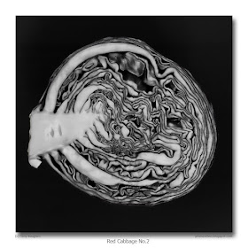
Today's photograph results from the principle of making the most of what you have. When I cut open my red cabbage I felt there was a close up and a whole head shot in the vegetable, and here's my attempt at the latter. I placed the cabbage on black vinyl for the photograph, then converted to black and white to emphasise the patterns of the unfurled, convoluted leaves. Which brings to mind a variation on the old childhood joke:

Q. What's black and white and red all over?
A. A newspaper?
A. A sun-burned zebra?
A. No, a monochrome photograph of a red cabbage.

Bomm! Boom! Aaagh, that's terrible! After making a joke that bad I wish I was anonymous.

photograph & text (c) T. Boughen

Camera: Olympus E510
Mode: Aperture Priority
Focal Length: 35mm macro (70mm/35mm equiv.)
F No: f8
Shutter Speed: 1.3 sec
ISO: 100
Exposure Compensation: 0EV
Image Stabilisation: Off

Wednesday, January 13, 2010

Cabbages and neanderthals

click photo to enlarge
It's good news about the neanderthals, don't you think? The University of Bristol's discovery that they used make-up and fashioned jewellery (of sorts) suggests that there may not have been the gulf between them and homo sapiens that has long been thought to have existed. Their lack of brain power and the consequent inability to compete with early modern man are shown to be judgements that need reviewing in the light of these revelations. Then there's the pejorative connotations of "neanderthal" which these artistic accomplishments undermine. Dictionaries will need revising, and people will have to stop throwing the term at anyone who doesn't measure up to their own intellectual standards.

As I was photographing this section of a red cabbage it occurred to me that it isn't only neanderthals who have had a bad press and need to be re-assessed in light of the evidence. So too do cabbages. And turnips. Why, among all the varieties of vegetables, are they used as synonyms for brainless and stupid? What qualities do they possess that makes them a more suitable term of abuse than, say, a parsnip, a leek or an aubergine? They are just as tasty, and every bit as visually appealing. Looking at today's photograph I'm tempted to ask what vegetable is more brain-like than a cabbage? If I cropped this shot to show the top half, and converted it to black and white, you'd be hard pressed to distinguish it from a section through the average human's grey matter: not that I'm suggesting anyone should do what is necessary to make that photographic comparison. But it is a fact that cabbages have every right to feel aggrieved about the way they are misrepresented. So strongly do I feel about this that I'm tempted to found a movement for the support and re-appraisal of these slighted vegetables. I've even got a snappy palindromic set of initials (acronym if you will) for this organisation, ingeniously crafted so that it wouldn't matter if dyslexic cabbages and turnips (and their supporters) wrote it backwards: Trust Against Cruelty To Cabbages And Turnips (TACTCAT) - I think it's a winner.

photograph & text (c) T. Boughen

Camera: Olympus E510
Mode: Aperture Priority
Focal Length: 35mm macro (70mm/35mm equiv.)
F No: f6.3
Shutter Speed: 1/2
ISO: 100
Exposure Compensation: 0EV
Image Stabilisation: Off

Tuesday, January 12, 2010

Remote times

click photo to enlarge
Many families seem to have their own name for the ubiquitous remote control devices that litter our houses today. I've heard them called the zapper, the clicker, the changer, the flipper, the digitwotsit, and the plain old remote. I was looking at one of mine as I sat at my desk the other evening. It's the smallest I own, about the size of a credit card, and it came with a £20 USB TV tuner that I occasionally use with my computer monitor.

My current reading is David Kynaston's fascinating history of the period 1951-1957, called "Family Britain". It was one of my Christmas presents, and is of great interest to me because I was born during those years. Though I can remember only a little from my earliest years I can recall enough to recognise many of the domestic details that the author discusses. And, of course much of what was common in that specific period carried on into the following years of my later childhood, which I can remember with greater clarity.

What has this to do with a remote control, you might ask. Well, as I sat pondering my blog I was wondering which objects of today the child of the 1950s would find most "futuristic." TV had taken off in those years of course, and computers were under development, though at that time they filled whole buildings. Glancing down at my desk it occured to me that the tiny remote control, so inexpensive that it was casually discarded in a tray of bits and pieces at the base of my anglepoise lamp (a British design of 1932), would be something that "mini-me" would have found fascinating. "Imagine," I might have thought, "all that power to control things from a distance, with the push of a button." That truly would have been something out of Dan Dare and the "Eagle" comic (begun in 1950).

The young me might also have been impressed by the ability of my little camera to capture this macro shot, hand-held, at base ISO, with the surround of the lens resting on the remote control itself to steady the shot. In fact, the me of today is pretty impressed by that!

photograph & text (c) T. Boughen

Camera: Lumix LX3
Mode: Aperture Priority
Focal Length: 5.1mm (24mm/35mm equiv.)
F No: f2
Shutter Speed: 1/50
ISO: 80
Exposure Compensation: -0.33 EV
Image Stabilisation: On

Monday, January 11, 2010

Weather forecasting and entertainment

click photo to enlarge
In an ideal world the mission of any television station is to entertain and to inform. Pretty much every channel thinks it does this, but we know that many are ditching the "inform" bit, and many more are failing with the "entertain" bit even though that, nominally, constitutes most of their output. The BBC has a reputation for achieving this dual focus as well as any broadcaster does, but there are times when I think it simply loses the plot through trying too hard.

Take weather forecasting. You'd think that here the main aim would be to inform the public what the weather was likely to be, both where they lived and elsewhere in the country. I imagine the BBC fondly thinks it does just that. Well, I'm here to tell you and them that it fails miserably in this simple task. Firstly, its presenters not only talk too much so that people stop listening, they also talk gibberish. I swear that my wife will put a plant pot through the screen the next time a presenter talks about "treacherous roads", and I'm likely to burst my lungs screaming at the next mention of "an organised band of showers approaching from the west." Organised by whom? God? The Meteorological Office? And how can a road assume human attributes? Then there's the ridiculous graphics that involves us lurching drunkenly over the British Isles as if in a wayward satellite as the presenter hurriedly tries to make what they are saying correspond with the region in view. In spring they punctuate bulletins with "Spring Watch" and invite viewers to call in with their sightings of the first primroses or swallows. What's that got to do with informing us about the weather? It would make as much sense - maybe more, and could be more entertaining - to invite first viewings of T-shirts, short sleeves, or bikini tops. But what irritates the most is the persistent attempts to make the weather forecasts entertaining. Instead of accepting that weather just is what it is, they seek to magnify it and make it appear a malevolent force. So, we have alerts and warnings about wind, rain, sun, fog and snow, exhortations not to travel unless absolutely necessary, furrowed brows, grimaces and anthropomorphising. They don't appear to be trying to alert us to inclement weather, so much as scare us stiff with their cataclysmic visions of what might be. In recent days the weather forecasters have not only got it wrong, saying that the snow will get worse before it gets better: they've also fomented a clearing of supermarket shelves by viewers who have been panicked into stocking up for the next spell of "white hell". In the event a thaw has started!

My suggestion for remedying this state of affairs is to do away with the Jeremiah forecasters, and replace them with a screen divided into four. This would show the country's weather at the time of the forecast, then six hours later, then 12 hours later and finally 24 hours later. Will such a thing happen? No chance.

Today's shot - my last church image for a while you'll be glad to hear - shows St Swithin* at Bicker after the most recent heavy snow fall. I'm aiming for the definitive snowy photograph of this building, and I'm confident I'm getting closer to it. This one was taken about half an hour after the snow had ceased, and there's nothing nicer than getting out in it before too many footprints have marked the perfect whiteness.

St Swithin*/St Swithun: this church styles itself using both spellings, so I follow its example!

photograph & text (c) T. Boughen

Camera: Lumix LX3
Mode: Aperture Priority
Focal Length: 5.1mm (24mm/35mm equiv.)
F No: f4
Shutter Speed: 1/800
ISO: 80
Exposure Compensation: -0.33 EV
Image Stabilisation: On

Sunday, January 10, 2010

Snowy teasel

click photo to enlarge
The plant known as teasel (Dipsacus fullonum) has one of the most attractive seed heads that manages to retain its shape and interest for most of the winter months. I've photographed them before, here, and blogged about how the needle-like bracts were formerly used to "tease" i.e. pluck or raise, the nap or pile of cloth to give a soft finish. In fact, the variety known as Fuller's or Cultivated Teasel (Dipsacus sativus) was the plant favoured for this purpose.

Since I wrote that piece I've read more about this interesting plant that is commonly found along the edges of Lincolnshire's water-courses. The first part of its Latin name means a little cup for holding water. This derives from the cone-shaped depression at the base of its leaves where rain and dew collects. Long ago it was called the "Venus Basin", and girls would dip their finger in the water gathered there and dab it on their warts, wrinkles and freckles hoping that it would remove these blemishes. Others believed water from the teasel was a remedy for poor eyesight. In the days when teasel growing for the textile industry took place bee keepers would place their hives amongst them to benefit from the distinctive honey that its pollen produced. In such fields the teasel pickers would harvest about 200,000 heads per acre, distinguishing between the biggest "King Teasel" that grew at the top of the main stalk, and the smaller "Queens" found on secondary stalks. The introduction of metal combs has confined the use of teasels for napping to the craft industries, and today we know them mainly as distinctive and attractive wild plants growing in uncultivated margins.

I took this photograph of a "King Teasel" as I enjoyed a snowy walk down a track between fields of wheat and vegetables. The dead seed heads of teasel and yarrow seemed to make up the majority of the tall stalks, and all of them had been plastered with snow by the driving wind. The January midday sun was producing the odd bead of water as it melted the ice. I took this shot with a long lens to throw the snowy background well out of focus, thereby emphasising the detail of the seed head.

photograph & text (c) T. Boughen

Camera: Olympus E510
Mode: Aperture Priority
Focal Length: 150mm (300mm/35mm equiv.)
F No: f5.6
Shutter Speed: 1/800
ISO: 100
Exposure Compensation: 0 EV
Image Stabilisation: On

Saturday, January 09, 2010

Snow-fallen angel

click photo to enlarge
By my calculation this area of Lincolnshire has had only one day since 18th December when snow hasn't covered the ground. Now that may be an inconsequential length of time compared with what can be expected in Canada, Finland and Siberia, but for this corner of England it's both long and unusual. Most years, after a snowfall, the weather warms sufficiently for it to melt away within a day or two. Sometimes it lingers for a week, with the odd top-up falling, usually during the night. However, this year the weather seems to have got stuck in a cycle of easterly and northerly winds, with some heavy or light snow most days recently. The first snow to fall wasn't accompanied by strong winds, so it was relatively pleasant. In recent days the icy blasts have made going out much more of an ordeal. Not that it has stopped this photographer, of course. But my radius of action has shrunk considerably, and the car has made only a few forays down the slippery roads.

Today's photograph shows a churchyard angel that I came across after a recent heavy bout of snow. She usually stands, looking quite imperious, gazing eastward, holding on to her anchor lest the winds or temptation should seek to bring her down from her pedestal. In the snow she looked to me like someone had poured the contents of a bag of icing sugar over her head, which seriously undermined her usual dignity. From memory, I think this is the only large monumental figure sculpture in this churchyard. Some of the eighteenth century graves have small cherubs and relief sculptures, but that's about it. In fact Lincolnshire churchyards contrast strongly with those I've been used to seeing in Lancashire where nouveau riche Victorian businessmen often constructed ostentatious memorials with angels, neo-classical weepers and the like.

For this photograph I was torn between a close-up of the angel's upper body and this contextual view. My final choice was clinched by the "white-out" of the trees behind that allowed the lichen-encrusted green stonework to stand out in a way that it wouldn't in less snowy circumstances.

photograph & text (c) T. Boughen

Camera: Olympus E510
Mode: Aperture Priority
Focal Length: 98mm (196mm/35mm equiv.)
F No: f5.6
Shutter Speed: 1/160
ISO: 100
Exposure Compensation: 0 EV
Image Stabilisation: On

Thursday, January 07, 2010

Celebrity pig wrangling and documentaries

click photo to enlarge
It wasn't my intention to bang on about television again - I had something much more uplifting and positive in mind - but my breakfast table reading gives me no choice. Skimming the TV listings section today I noticed a picture advertising "Jimmy's Global Harvest" on BBC2. It showed a youngish, rather unkempt looking man squatting in a field holding a piece of grass. "Who", I thought, "is Jimmy?" A short synopsis revealed all. Apparently he is Jimmy Doherty, a celebrity pig wrangler, and he's going to discover "how the world's farmers will cope with feeding a growing population." Tonight, in the first of his four programmes he looks at the transformations that have taken place in Brazilian agriculture.

It's amazing how so little writing can provoke so many questions. The first is, "What is a celebrity pig wrangler?", and the second is "Should I care?" Then there's, "Why has Jimmy, out of all the potential agricultural experts, been chosen to present these programmes?" It couldn't be because the target audience knows Jimmy and the people who conceived the series think viewers are such saps that they can't give their attention to anything that isn't fronted by a celebrity? No, that coudn't possibly be the reason. There are more questions that come to mind about the dumbing down of television documentaries, but I'll spare you them, and say that I shan't be tuning in this evening. But then you guessed that didn't you? It's not that the subject isn't sufficiently serious and important. No, I shall give it a miss because for the progamme makers world food production isn't important enough to warrant serious treatment and be introduced by someone who is an expert in the field. Or perhaps I misjudge them: maybe, having watched Jimmy wrangling his pigs in a field, they imagine him an expert in every field of agriculture.

All of which has nothing to do with today's photograph of St Mary and the Holy Rood at Donington, Lincolnshire. On a brief shopping trip I stopped and snapped this late afternoon shot as the sun descended through the churchyard trees. Donington church is one of those that is extremely difficult to photograph from nearby. It suffers - from the photographer's point of view - by having large trees nearby. It also has a tower that acts as a porch and is attached to the south aisle. This is an unusual, but attractive, arrangement that Victorian Gothic architects sometimes copied. However, it makes it quite difficult to achieve a satisfactory photographic composition given the churchyard constraints. On this image I placed the church on the right, a row of trees at the left, and moved so that part of the sun was visible at the edge of the near trunk. I wanted it to add a warm note to a cold scene, and give something of a starburst effect, which it does, more or less.

photograph & text (c) T. Boughen

Camera: Lumix LX3
Mode: Aperture Priority
Focal Length: 6.3mm (30mm/35mm equiv.)
F No: f4
Shutter Speed: 1/800
ISO: 80
Exposure Compensation: -0.33 EV
Image Stabilisation: On

Wednesday, January 06, 2010

Social television and other rubbish

click photo to enlarge
Occasionally I read something that makes my jaw drop so far that it hits the table and rattles my teeth. That happened the other day when my newspaper introduced me to the concept of "social television".

Now you may know all about this up-and-coming trend, but I lead a more sheltered life, consume relatively little television, and so hadn't been introduced to the novel format. Apparently what it involves is watching a programme - factual, fiction, "reality", it matters not what - and at the same time submitting your comments and reading those of other viewers through the magic of Twitter and Facebook. These can appear either on your laptop or phone that you have beside you as you watch television, or on the TV screen itself which is then split between the progamme and the comments.

Perhaps I'm too "last century" but I think that if you are able to give your attention to making or reading comments as you watch a film, a series, a documentary, any programme, then you're probably viewing worthless drivel whose sole function is to generate money for those who conceived it, and is doing no more for you than waste the short time you have between birth and the grave. The fact is, if a TV offering does not fully engage you then it isn't worth watching. Moreover, aren't we, by the very act of viewing rubbish, by reading the comments of other people about that rubbish, and making our own contributions to the puerile dialogue, in danger of self-defining ourselves as vacuous, grasshopper-minded divots? I will admit to never having engaged in this kind of thing, but I have read the email and text comments solicited by TV news programmes, and the comments that online newspapers now invite. Many - probably most - of these remind me of the outpourings of what a UK politician once famously described as "the green ink brigade": that is to say the fevered, bilious letters of the angry and slightly deranged, written in coloured inks designed to catch the reader's eye and make the writer's points more forcibly. It seems to me that the kind of "participation" that "social television" offers is meaningless, does nothing to improve the quality of TV, and is as significant and ephemeral as litter.

Speaking of litter, that's the subject of today's photograph. A few days ago I came across what appeared to be a strip of plastic used in vegetable packing that had escaped its confining warehouse and found a new purpose decorating dead weeds and a piece of metal on some nearby waste ground. Having recently taken down our Christmas tree this wind-shredded plastic strip looked to me like a grim version of the tinsel that I'd help to unwind, and so I took this shot.

photograph & text (c) T. Boughen

Camera: Olympus E510
Mode: Aperture Priority
Focal Length: 150mm (300mm/35mm equiv.)
F No: f6.3
Shutter Speed: 1/500
ISO: 100
Exposure Compensation: -0.3 EV
Image Stabilisation: On

Tuesday, January 05, 2010

A compositional echo

click photo to enlarge
When it comes to photography I sometimes don't know what I'm doing. By that I don't mean that I lose my faculties, or cease to be sentient. No, I mean that I'm not fully aware of what my conscious and unconscious mind is accomplishing.

Take yesterday for example. My wife and I were walking past some old farm buildings that I've stopped and looked at every time we've walked that way. Each time I've framed the group with my camera, and occasionally taken a shot. But, the outcome has never proved to be what I want; it's never the composition that I think is somewhere within the buildings. Well, I stopped again, framed a shot, didn't even press the shutter, and walked on saying, "I still can't see that shot." But then, as we passed the last of the buildings, a wooden structure patched with corrugated metal sheets, I stopped and saw a couple of images. They weren't of the whole ensemble, but were details. The photograph above is the best one of the two I took.

It was only when I got the image back on the computer and cropped it to square - something that had been my original intention - that I realised what I'd done. My photograph of the detail of the shed was yesterday's composition, "Snow, Icicles and Frost" turned anti-clockwise through 90 degrees. It even has the "icicles" though this time it's the pointed shapes (damp?) in the corrugation. Somewhere in my subconscious there is clearly a liking for semi-abstract compositions that have (often three) parallel elements. I've been vaguely aware of that over the years: look at my semi-abstract "Best ofs" and you'll see what I mean. What I wasn't conscious of was the extent to which I could see and photograph the same composition within two very different subjects.

photograph & text (c) T. Boughen

Camera: Olympus E510
Mode: Aperture Priority
Focal Length: 58mm (116mm/35mm equiv.)
F No: f6.3
Shutter Speed: 1/80
ISO: 100
Exposure Compensation: -0.3 EV
Image Stabilisation: On

Monday, January 04, 2010

Thinking about snow

click photo to enlarge
The coldest, snowiest weather that I recall occurred in 1963. I was growing up in the Yorkshire Dales at the time, and the fact of snow laying on the ground from Christmas to early March was something special. It meant "sledging" (i.e. using a small sleigh) whenever we wanted, snowball fights anytime the snow wasn't too powdery, and the ability to make slides on the ice day after day. The River Ribble froze hard enough to walk across it. On the hills Scaleber Force (a waterfall) froze producing icicles longer than a man. High winds made snow drifts several feet deep, and it was great fun to jump off low limestone cliffs into them - except for the occasion when my knee hit a rock hidden below the snow. I don't remember growing tired of the snow during that period, but I'm sure my mother grew tired of the wet footwear, gloves and other clothing that I kept producing.

Over the years I've experienced snow fairly regularly - in East Yorkshire, North Lancashire and now in Lincolnshire. And, as I've grown older, my liking for it has definitely diminished. I still get great pleasure from a day or two (perhaps three) of snow. I enjoy the visual and auditory transformation that it brings. I like walking in it and photographing it. But, after a few days it starts to become an inconvenience: travelling is more difficult, walking locally can be more dangerous, and essential tasks like shopping lose their tedium and instead become fraught as roads and car parks suffer the effects of freeze/thaw. The recent snow that fell before Christmas and lingered for over a week disappeared with some heavy rain. However, light snow and low temperatures have returned, and the weather forecasters are holding out the prospect of some more heavy falls.

Looking through my shots of a few days ago I came across the one above. It shows snow that had slumped down my greenhouse roof as the sun started to melt it, halted by an overnight freeze, and the small icicles that had formed extending down until they start to meet the frost on the glass rising up the panes from below. I quite liked the horizontal layers the subject presented - the blue-tinged snow with a fur-like look that shades to white at the bottom, then the jagged line of icicles against the dark background, and at the bottom the feathery-edged frost.

photograph & text (c) T. Boughen

Camera: Olympus E510
Mode: Aperture Priority
Focal Length: 150mm (300mm/35mm equiv.)
F No: f6.3
Shutter Speed: 1/200
ISO: 100
Exposure Compensation: 0 EV
Image Stabilisation: On

Saturday, January 02, 2010

Reeds at sunrise

click photo to enlarge
Reeds were once one of the dominant plants of the Lincolnshire Fenlands. Around the margins of permanent meres and seasonal pools the Phragmites australis grew tall and lush. Reed and sedge warblers churred their coarse song perched on its stalks; moorhen, water rail, bittern and heron stalked around its roots, eating the plentiful insects, fish, and frogs; and water voles and other small mammals built their homes among them. During the Middle Ages the reeds provided a valuable roofing material, and thatched cottages can still be found so covered, though today they are more likely to use Norfolk reeds or straw.

The draining of the Fens and the turning over of the land to arable agriculture saw a drastic reduction in the acreage of reed beds. Today, with a few exceptions such as wildlife reserves, reeds are most commonly seen lining the natural and artificial streams and dykes that criss-cross the fields. Here, on a more limited scale, they still offer sanctuary to wildlife, and on my walks I regularly see sedge warblers, reed buntings, little egrets and other birds amongst them. In the early evening I can watch barn owls patrolling the grid of reed-lined water-ways, hoping to surprise a water vole, shrew or mouse: occasionally marsh harriers can be observed doing the same during daylight hours.

The character of reeds changes over the year. In spring and summer they are a fine, fresh green, but in autumn they turn a khaki brown. Some - for reasons not known to me - have a quite strong orange colour in October and November. Today's photograph shows reeds by the side of a stream near my house. I photographed them on a cold December morning shortly after the sun had risen, catching their delicate silhouettes against the clouds that were tinged with pink, orange and yellow.

photograph & text (c) T. Boughen

Camera: Lumix LX3
Mode: Aperture Priority
Focal Length: 7.4mm (35mm/35mm equiv.)
F No: f4
Shutter Speed: 1/800
ISO: 80
Exposure Compensation: -0.66 EV
Image Stabilisation: On

Friday, January 01, 2010

Using the horizon

click photo to enlarge
I grew up in an area of hills, mountains and valleys in North Yorkshire. I currently live in a flat area of Lincolnshire. (Note to UK residents who have never been to Lincolnshire - contrary to popular belief much of the county isn't flat!) One of the things you find when you're making landscape photographs in an area of flat land is the importance of the horizon.

In recent weeks I've taken a few photographs that have used the device of a ragged horizon punctuated by a church spire, specifically those of Sutterton, Helpringham and Donington. In the case of Sutterton the main subject is supported by the details of the incoming clouds. The horizon in the Helpringham shot is helped by the colour gradations in the sky and the detail that is still discernible in the foreground fields. In the Donington photograph the foreground offers little interest, but the soft pink/orange of the sky prevents the image being too monochrome, and gives a little warmth. Those three images emphasise something else that you learn photographing flat landscapes: a good sky and finding foreground interest is really important. In hilly areas you can shoot upwards, downwards and across, and can often change your height relative to your subject to give emphasis or to create a composition. In the flatlands you are usually shooting across, and generally raise or lower your camera only to increase the relative importance of sky or foreground.

I was thinking about this the other day when I took another "horizon" shot, also featuring the church of St Mary and the Holy Rood at Donington. Remembering my previous early evening shot I looked for a different composition. The sky wasn't offering much so I positioned myself behind some snow-swept reeds that offered foreground interest. I took a couple of photographs. The first had the church in focus. However, I preferred my second attempt (above) with the reeds in focus and the church out of focus.

photograph & text (c) T. Boughen

Camera: Olympus E510
Mode: Aperture Priority
Focal Length: 110mm (220mm/35mm equiv.)
F No: f6.3
Shutter Speed: 1/1250
ISO: 100
Exposure Compensation: 0 EV
Image Stabilisation: On