Tuesday, March 31, 2009

Late winter jasmine

click photo to enlarge
The garden is full of bright drifts of narcissi, pansies are pointing their petals up to the sky, the pulmonaria is showing blue, pink and white, and primulas are adding their clown colours to the borders. In the rockery the winter-flowering heather is a riot of purple and white, and in the hedge the forsythia is competing with the daffodils for the title of brightest yellow. The crocuses and snowdrops are gone, but the red tulips are in full bud, ready to burst out in a show of colour. Everything (except the occasional hail storm and the cold wind) says it's spring, including the willow trees whose leaves seem to open more with each passing day.

Everything that is, except for the winter jasmine (Jasminum nudiflorum). It seems determined to forget its name, forget the season, and bloom on into April, its little yellow, star-like flowers, contrasting with the thin, straight shoots and nearly non-existent leaves: spots of bright colour on hedges that still have only unfurling honeysuckle leaves, or, here and there, the fresh green of new hawthorn.

So, in recognition of its stamina, its wish to be seen, and even though it's overpowered by the spring colour, I took this photograph of one of the remaining flowers of this delicate winter-flowering shrub.

photograph & text (c) T. Boughen

Camera: Olympus E510
Mode: Aperture Priority
Focal Length: 35mm macro (70mm/35mm equiv.)
F No: f7.1
Shutter Speed: 1/50 seconds
ISO: 200
Exposure Compensation: -0.3 EV
Image Stabilisation: On

Monday, March 30, 2009

Black and white filters

click photo to enlarge
When I got my first camera, way back in the late 1960s, I used to feed it with Agfa film (probably CT18) that I could have developed by the local photographic shop as colour transparency, colour negative or black and white. This was handy for creative purposes, but also because the cost of the final images was different depending on my choice, so I could tailor my photography to the state of my finances.

Later, in the 1970s, when I bought an SLR (a Zenit E followed by an OM1n), I shot all three film formats depending on my mood and the subjects I had in mind to photograph. Interestingly, of all the images I made during those years (and the 1980s and 1990s), it is the black and white prints (Ilford film on Ilford paper) that have stood the test of time best of all. Particularly, I'm proud to say, those that I developed and printed myself. Anyone who hasn't shot, developed and printed black and white film won't understand the special magic associated with that process. Nor will they appreciate the importance of filters in securing forceful images. I had (in fact still have) red, orange yellow and green filters to fit the Zuiko 50mm 1.8, and Cokin equivalents to fit all my lenses. The transformational effect of a red or orange filter on a blue sky with white, fair weather clouds, is sensational: on a stormy sky it is apocalyptic. These simple pieces of coloured glass gave a boost to contrast and added three-dimensional qualities that suited some subjects perfectly.

Every now and again I try the digital equivalent of the red, orange or yellow filter when I do a black and white conversion. I've never yet achieved quite the same effect that you get with glass and film, regardless of whether I use a plug-in or home-brew my own version. Today's image taken on Lincolnshire's Fens is close to what I used to like to achieve: a contrasty finish with black sky, white clouds and enough mid-tones to carry the detail. This tractor and harrow was waiting for the driver of the distant machine. He appeared to be working alone in the empty landscape, using both tractors with different attachments to prepare the soil as he wanted it.

photograph & text (c) T. Boughen

Camera: Olympus E510
Mode: Aperture Priority
Focal Length: 17mm (34mm/35mm equiv.)
F No: f7.1
Shutter Speed: 1/500 seconds
ISO: 100
Exposure Compensation: -0.3 EV
Image Stabilisation: On

Sunday, March 29, 2009

Classic historic Ionic

click photo to enlarge
The three original Greek orders of architecture have always seemed to me the perfect example of mankind's ability to conceive something of beauty, develop it and sustain it for the pleasure and edification of all. It's surmised that the Doric order arose from the woooden architecture that pre-dated the stone buildings that we can still see today. The sturdy, base-less columns and the entablature decorated with triglyphs and metopes, are thought to derive from the posts ( tree trunks?), and carpentry joints of the earlier structures. The Ionic and then Corinthian styles are seen as developments that increased the beauty and elegance of the orders. Subsequent ages and peoples developed the Tuscan and Composite orders from the Greek originals. This system of architecture, that originated before 600BC, has given people pleasure for over 2,000 years.

Today's photograph shows part of an Ionic column at the British Museum in London. It was once exposed to the elements, but is now protected by the glass roof that created the Great Court in 2000. This particular example is part of the museum built in the 1840s in the Greek Revival style by Sir Robert Smirke, and is very closely based on ancient Greek examples. Thus, the decorative features include the characteristic large volutes (scrolls), leaf and dart below the entablature, egg and dart (symbolising life and death) lower down, and bead and reel below that. The proportions of Greek columns are very carefully managed: the height of an Ionic example is usually about nine times the diameter. As with Doric and Corinthian, a slight swelling around the middle (entasis) counteracts an optical illusion that the column narrows at that point. The fluting (vertical grooves) of the Ionic column always number 24. In 1537 Sebastiano Serlio published Regole generali d'architettura ("General Rules of Architecture"). In this and other volumes he set out, in great detail, the proportions and style of the orders drawing on ancient and contemporary examples. Later architects leaned heavily on his research when they designed in the classical manner.

Rather than simply show the lovely detail and symmetry of the top of this column I went for an asymmetrical composition that included just over half of the capital - you can fill in the rest yourself! However, I did look for some "balance" in the layout. The filtered light falling on the subject has given it a certain flatness, and something of the character of a pen and ink-wash drawing of the type that an architect might have produced for a client, or perhaps a student's exercise completed as part of his or her studies. It's a quality that appealed to me.

photograph & text (c) T. Boughen

Camera: Olympus E510
Mode: Aperture Priority
Focal Length: 40mm (80mm/35mm equiv.)
F No: f7.1
Shutter Speed: 1/100 seconds
ISO: 100
Exposure Compensation: -0.3 EV
Image Stabilisation: On

Friday, March 27, 2009

Google Street View bad for photographers?

click photo to enlarge
Today, after I'd rolled into a parking bay whilst out shopping a Google "Street View" car, complete with mast-mounted cameras came and parked next to me. The heavy rain showers had forced the driver to put covers over the cameras, so there's no chance (I think) of me featuring on Google Maps!

Until today I've watched the debate around Street View with a fairly detached interest. Individuals who don't want to be featured, or people who don't want their property to be shown, have kicked up a fuss, and some have succeeded in having their image or that of their house blurred. It seemed to me that the ability to navigate through a town I've never visited, with an all-round view available is a very nice extension of the excellent mapping that is currently available from Google on the web. Until today.

As I walked off to do my shopping a thought came to me about Street View - it's bad news for photographers! Why? Well, anti-terror legislation and fears of paedophiles have led to some photographers having their right to photograph freely in public places restricted, in some cases legally, but often illegally. My concern is that Google Street View cameras posting millions of images of people and places on the web will drive people to assert their right to privacy over such activity regardless of who is taking the photograph. The harmless amateur taking snaps in a town centre will be seen as someone infringing someone else's privacy and liberty, just like Google. It's a wrong conclusion, I think, but unfortunately that may be the turn that the debate takes. I can see that politicians seeking to be "responsive" to the electorate might well choose the route of least resistance and bring in legislation to restrict what is currently a valuable freedom.

If that happens we'll be restricted to taking shots like today's of the Fenland landscape of Lincolnshire. Not a person or house in sight for someone to object about! Which will be fine if you like to photograph empty landscapes with clouds, but is more than a little limiting in the long term.

photograph & text (c) T. Boughen

Camera: Olympus E510
Mode: Aperture Priority
Focal Length: 11mm (22mm/35mm equiv.)
F No: f7.1
Shutter Speed: 1/2000 seconds
ISO: 100
Exposure Compensation: -0.3 EV
Image Stabilisation: On

Thursday, March 26, 2009

Milk, choice and cars

click photo to enlarge
"Any customer can have a car painted any colour he wants, so long as it's black"
said of the Model T by Henry Ford (1863-1947), U.S. industrialist

A supermarket that I shop at sells various kinds of milk. Nothing wrong with that you might think; some prefer full cream and others skimmed. However, it's not that choice that puzzles me, rather it's the choice between two different kinds of semi-skimmed milk in cartons holding the same quantity. What's the difference between them? Well, one is quite a bit cheaper than the other. Now I'm used to being presented with choice in foodstuffs where the quality (and hence, price) is measurably different, but how does that work with milk? The sell-by dates are no different, the colour is the same, and both (presumably) conform to the quantity of fat that should be in this kind of milk. I've puzzled over this one for a while. Are the cows that produce the more expensive milk "a cut above", refined, aloof even, the sort that wouldn't say moo to a goose? Do they feed on only the sweetest grass and hand-picked fodder? Or is it just a crazy extension of the idea of choice into an area where it's plainly ridiculous? Is it a way of getting a few pence more from the pretentious who like to think that their cuppa is laced with milk that's a touch superior to that of the proles?

I think I'm one of many people who has got fed up with being offered too much choice. Do I really want to waste my life agonising over 30 different DSLRs that all take perfectly good photographs? Or compare the merits of one lemonade with the eight other offerings on the shelf? And don't get me started on potato crisps (chips): why do we need a complete aisle devoted to the many incarnations of this fat-laden snack? There are times when I think Henry Ford had it right - one colour for cars would suit me. In fact I've only ever owned red, blue and silver cars. These happen to be the commonest colors in the past few decades, and I read that silver outsells all others by a big margin at the moment. Just how much would we be missing if you could have any colour you wanted so long as it was silver? All your transport needs would still be met. But, I suppose the posing needs of some wouldn't be!

Today's photograph shows the residue of a rain shower on the metallic silver of my car - a colour that I alighted on quite incidentally because it was the only model the dealer had in stock. It looks like a particularly grainy image in need of noise suppression, but the dots are just the flecks in the paint that produce the metallic look.

photograph & text (c) T. Boughen

Camera: Olympus E510
Mode: Aperture Priority
Focal Length: 35mm macro (70mm/35mm equiv.)
F No: f11
Shutter Speed: 1/125 seconds
ISO: 200
Exposure Compensation: 0 EV
Image Stabilisation: On

Wednesday, March 25, 2009

Aspect ratios - to crop or not

click photo to enlarge
There is a school of thought that says the best photographs are achieved by composing within the confines of the viewfinder. Those who hold to this idea often also believe that composition that takes place after the shutter has been pressed, through cropping, lessens the worth of the image. This isn't a maxim to which I subscribe. I have nothing against composing photographs in the viewfinder: I do it all the time. However, I don't believe that it's the only way to compose, or that cropping necessarily makes for poorer images.

Photographic film and digital sensors are rectangular - either squares or oblongs - following the precedent of painting. It's interesting that the circles, ovals and other shapes that painters sometimes employ haven't found their way into photography. Perhaps one day! In some respects the aspect ratio of the oblongs used in photography are arbitrary. The 35mm size, and its so-called "full-frame" digital successor, derives from the shape settled on by the makers of movie film. Like painters before them camera manufacturers also paid some attention to the aspect ratio of the Golden Rectangle. But, the imperial and metric sizes of paper used for printing (which is now a complete mess, a point that no one would have aimed to be at) are also constraints that weighed on the designers' minds. My camera has a 4:3 aspect ratio which perfectly matched the shape of most CRT monitors, but is less of a fit for "widescreen" LCD panels. So, given that photography's different shaped viewfinders arose through the influence of a group of rather odd constraints, and that our subjects vary too in terms of the best way to compose them, why should we always shackle ourselves? Painters didn't do it: why should photographers?

I was reflecting on this as I processed today's photograph, taken during a walk near Grimsthorpe Castle in Lincolnshire. The image is cropped, with some sky and some of the foreground track removed. I took the shot knowing I'd do this, and I think it makes for a better image than the full frame offered. I've also added another shot of the cockerel's feathers that I posted yesterday. I rather wish I'd used this cropped image instead of the version I chose - I think the variety of colour and texture across the cropped "letterbox" frame is definitely superior.

photograph & text (c) T. Boughen

Image 1
Camera: Olympus E510
Mode: Aperture Priority
Focal Length: 83mm (166mm/35mm equiv.)
F No: f7.1
Shutter Speed: 1/250
ISO: 100
Exposure Compensation: -0.3 EV
Image Stabilisation: On

Image 2
Camera: Olympus E510
Mode: Aperture Priority
Focal Length: 100mm (200mm/35mm equiv.)
F No: f7.1
Shutter Speed: 1/320
ISO: 400
Exposure Compensation: -1.0 EV
Image Stabilisation: On

Tuesday, March 24, 2009

Beautiful feathers

click photo to enlarge
I love individual colours, and have favourites that I appreciate whenever I see them. In a recent post I spoke about my liking for blues and greens, and commented that I'm a fairly typical man as far as my general taste goes. However, for me, colours that I wouldn't place amongst my favourites take on a new significance when paired with a suitable companion. In fact, I find that colours often work best in combination, something that artists and designers have known for years.

In that earlier post I spoke about how certain hues of yellow and pink, colours that I don't usually favour, can look great when placed togethre. And, in a post of last year I commented on how Jean-Honore Fragonard's painting called The Swing opened my eyes to the beauty of shades of pink next to turquoise hues. On that occasion I was speaking about Fragonard in the context of my photograph of orange Chinese Lanterns (Physalis franchetti) in a blue/green vase, another colour combination that appeals to me. Today's photograph is a re-working of that theme, but improved by the the blue having an iridescence that includes green and purple, and the orange having a hint of brown making it more of a "burnt orange". I find these rich, lustrous hues absolutely stunning, and think it small wonder that such deeply coloured feathers were once appropriated for women's clothes and hats.

I was glad that the owner of these feathers hadn't had them taken for other purposes, and further delighted by how he stood proudly on a wall near a churchyard, showing them off, allowing me to get this photograph.

photograph & text (c) T. Boughen

Camera: Olympus E510
Mode: Aperture Priority
Focal Length: 150mm (300mm/35mm equiv.)
F No: f7.1
Shutter Speed: 1/250 seconds
ISO: 400
Exposure Compensation: -1.0 EV
Image Stabilisation: On

Monday, March 23, 2009

Please sign this petition

click photo to enlarge
If you are a UK photographer please give serious consideration to signing Simon Taylor's petition at http://petitions.number10.gov.uk/Photorestrict/ .

This simply says: We the undersigned petition the Prime Minister to Remove new restrictions on photography in public places.

Remember, if we do nothing, nothing will change: if we do something, something may change. If you're reading this and are not based in the UK, make sure your government doesn't follow our government's lead in imposing restrictions of this sort!

For more information about how the Counter Terrorism Act 2008 gives the police the power to curtail our democratic freedom to pursue photography in public places, please read the following:

Photography and terrorism PhotoReflect (February 8th 2009)
Counter Terrorism Act 2008 (Para 76 is the relevant section)
Photographers react to British PM's message Amateur Photographer (January 13th 2009)
New Scotland Yard Photocall PhotoRights.org (February 19th 2009)

Today's photograph is one I took in January. The subject of new barbed wire added on top of old seemed to suit today's topic!

photograph & text (c) T. Boughen

Camera: Olympus E510
Mode: Aperture Priority
Focal Length: 22mm (44mm/35mm equiv.)
F No: f7.1
Shutter Speed: 1/60 second
ISO: 100
Exposure Compensation: -0.3 EV
Image Stabilisation: On

Sunday, March 22, 2009

Angels, pins and peacock feathers

click photo to enlarge
"...Angels can contract their whole substance into one part of space, and therefore have not partes extra partes..."
Richard Baxter (1615-1691), English theologian

The question of what exactly an angel is has long taxed Christians and others. Thomas Aquinas and other medieval theologians were lampooned by later writers for enquiring too gravely about their physical, gender (male, female or genderless?) and religious characteristics. The probem of "How many angels can dance on the head of a pin?" is ascribed to such debates, though without much historical authority. As far as the physical appearance of angels goes, the fact is that every age has interpreted them in its own way, based on the few clues contained in the Bible, other early texts, and the depictions of previous generations.

Thus, the earliest angels of the C2 and C3 are without wings. However, by the time of the mosaics at S. Apollinaire Nuovo at Ravenna (c.520) they have halos, wings and toga-like clothes, perhaps derived from Roman murals. In the Book of Kells (c.800) the clothing changes to a mixture of toga-style drapery combined with the edged tunics worn by nobles of that period. The Winchester Psalter (c.1150) shows angels in what look like regal, ermine-trimmed robes, in a style of painting that derives from the Byzantine of Eastern Europe. From Duccio onwards the Italian Renaissance painters settled on flowing, often diaphanous dresses-cum-robes, but the ever-present halos and wings continued. Later Renaissance artists of the C16 and C17 combined the tradition of the Christian angel with the putto of late classical antiquity.

The eighteenth century didn't depart too strongly from these conventions, though William Blake, characteristically, went his own way showing a rebel angel as a naked, anguished man. In the nineteenth century they sought "authenticity" in their depictions. Thus, artists like William Morris looked back at medieval precedents and then updated the basic idea using the aesthetic of the time. Today's photograph of a musician angel is by the stained glass firm of C. E. Kempe & Co. and dates from 1882. It draws on the ideas of Morris and the Pre-Raphaelites, uses pale subtle hues overall, but with bold highlights in primary colours. The drawing is very strong, as is the sense of pattern, but what stands out is the clarity of the conception. The angel has Kempe's characteristic peacock feather wings, and is one of a group of six such musicians (each with a different instrument) that fill a south window in the chancel of St Michael in the village of Hallaton, Leicestershire.

Incidentally, one of the angel's colleagues provided a great Christmas card illustration for me a couple of years ago!

photograph & text (c) T. Boughen

Camera: Olympus E510
Mode: Aperture Priority
Focal Length: 94mm (188mm/35mm equiv.)
F No: f6.3
Shutter Speed: 1/200 seconds
ISO: 100
Exposure Compensation: -2.0 EV
Image Stabilisation: On

Friday, March 20, 2009

Not so typical after all

click photo to enlarge
A typical English rural scene on an overcast March day in Leicestershire - in the foreground sheep and lambs feed on lush, green grass; in the background, a small village (King's Norton) with a huddle of Georgian and later brick houses, in the centre of which stands a Gothic church; whilst in the middleground, on the hillside pasture surrounded by trees and hedges is a herd of alpacas. Alpacas? In England? Well, yes, an increasingly common sight. Not usually this many: more often it's two or three. But gone are days when I was surprised to round a bend and be confronted by these Andean camelids - they are taking up residence in many corners of our fair land.

Seeing a herd of this size prompted me to find out just why the numbers are increasing in England. It seems that many are "hobby" animals in much the same way that horses, goats and exotic pigs are: that is to say, they are kept for their "cute" appeal. Larger herds - perhaps this one - are kept for the wool that they produce which is sought after as a clothing material. Ah well, each to their own I suppose!

But, the alpacas aren't the only un-English feature of this photograph. The church, which looks like a medieval or Victorian Gothic building was actually completed in 1761, an astonishingly early date for an example of Gothic Revival: most churches of that period had classical forms and details. It was designed by the younger John Wing with an eye for historical accuracy that is almost unprecedented at that time. If anything gives away the fact that it's not medieval Gothic, in this view, it is the relatively tall nave, the absence of a break to signify the chancel, and the outline of the tower.

So, not typical at all. In fact a rather unusual rural scene to encounter on a dull March day, but an interesting one I think.

photograph & text (c) T. Boughen

Camera: Olympus E510
Mode: Aperture Priority
Focal Length: 102mm (204mm/35mm equiv.)
F No: f6.3
Shutter Speed: 1/320 seconds
ISO: 100
Exposure Compensation: -0.7 EV
Image Stabilisation: On

Thursday, March 19, 2009

Morning Dew

click photo to enlarge
"Walk me out in the morning dew, my honey,
Walk me out in the morning dew today."
from the song "Morning Dew" by the Canadian singer, Bonnie Dobson (1940- )

The title of today's photograph is the most obvious choice - Morning Dew. However, as soon as I said it, into my head popped the words of that great song. I heard it first in the 1966 version sung by Tim Rose, a fine rendition with a great guitar figure, fine, deep piano and an interesting bass line behind the singer's gravelly voice. Today it's probably better known through successive cover versions by the Grateful Dead. I'm a fan of the Dead, but I don't especially care for them doing this song. The earlier versions are the best, but in the later, live covers the strengths of the song get buried in the many layers that they pour over it. I've heard two exceptional covers by the Jeff Beck Group - the earliest has Rod Stewart on vocals. This one borrows from Rose's version more than the later cover featuring the singing of Beth Hart. In both the singing is great, with the rawness that the song demands, and Beth Hart adds a few nice vibrato touches. However, it's Beck's guitar playing that distinguishes these versions with very effective distortion and some great wah-wah.

Other singers, too many to mention, have had a go at the song, but I have yet to hear the original by its author, Bonnie Dobson. A quick trawl through YouTube will throw up the versions I cite, along with a quite unaffecting endeavour by Robert Plant, and an OTT cover by Long John Baldry.

So, back to the photograph. It was taken before breakfast from the edge of my lawn with me on my belly, shooting into the early morning sun. The macro lens threw the distant dew drops nicely out of focus, and I helped by reducing the aperture to f5.

Incidentally, over forty years after first hearing Morning Dew I still haven't a clue what it's about!

photograph & text (c) T. Boughen

Camera: Olympus E510
Mode: Aperture Priority
Focal Length: 35mm macro (70mm/35mm equiv.)
F No: f5
Shutter Speed: 1/640 seconds
ISO: 100
Exposure Compensation: -0.7 EV
Image Stabilisation: On

Wednesday, March 18, 2009

Primula supernova

click photo to enlarge
I've never been a big fan of primulas. They always seemed too showy, artificial even, forcing themselves on you with their bright hues and improbable colour combinations. They suffered too, in my eyes, from their connection with the primrose, a beautiful, delicately coloured, unassuming flower, a harbinger of spring, against which the primula looked like the brassy, unsubtle cousin. But, just as my taste in colours is changing as I get older, so too is my appreciation of flowers. Where once I wouldn't have seen any virtues in the primula I can now appreciate how they add a glow to a dark corner, or brightness to a window box or planter (though I still don't think they touch the spots that the primrose does.)

Today, after the early morning frost had melted I went into the garden to see if I could get some shots of the daffodils and narcissi that have opened in the past week. I did, but none of them were any better than I've captured before, or offered anything that you haven't seen before. So, I continued my rounds and came upon some burgundy-coloured primulas under a willow tree. Now, considering that I don't particularly like burgundy coloured flowers in general, feeling that they don't supply enough contrast with the soil, and taking into account my feelings towards primulas, it's surprising that I stopped to photograph them. But stop I did, and am quite pleased with the outcome. The beads of water left by the frost help the image, as does the reflected sky in each one. However, what makes the image for me is the colour combination and the overall darkness of the shot - the centre of the flower-head is like a supernova against the duskiness of star-flecked space.

photograph & text (c) T. Boughen

Camera: Olympus E510
Mode: Aperture Priority
Focal Length: 35mm macro (70mm/35mm equiv.)
F No: f4.5
Shutter Speed: 1/125 seconds
ISO: 400
Exposure Compensation: -0.7 EV
Image Stabilisation: On

Tuesday, March 17, 2009

The road to obfuscation

click photo to enlarge
The other day I fitted two bicycle computers to our cycles. One was made by the cycling enthusiasts' favoured manufacturer and must have been quite expensive: the other was bought at a supermarket and cost £3.90! I fitted the cheap one first and found it very straightforward following the written instructions, supplied in several languages including English, that accompanied the clear diagrams. The more expensive computer was more problematic.

It had obviously been designed to be "easy" to install, and proudly advertised the fact that it had only one button (the other had two). Moreover, being sold worldwide, the manufacturer had decided that all the instructions should be in the form of multi-branched flow diagrams - no accompanying text. I found these quite opaque, and the absence of a second button meant that I couldn't use my knowledge of other devices that are programmed with two buttons. It took a lot of "guesstimation" and what seemed an age, before I finally worked out how to fit the wretched thing. The most infuriating aspect of my travails was that after I had completed the installation I was then able to understand the diagrams. This reminded me of the route signs that I often come across in cities that are perfectly rational - as long as you already know where you're going!

Processing today's photograph of an early twentieth century bridge weight-limit sign I photographed at Foxton Locks, Leicestershire, I was reminded that there was a time when instructions veered in the opposite direction to the one I came across with the expensive cycle computer's instruction leaflet. This notice, that was originally next to a canal bridge on the Oxford Canal Navigation, is so wordy that a vehicle must have had to stop to find out whether or not it could legally and safely proceed. However, since it dates from a time when there were few motor vehicles on Britain's roads, and those that there were must have been used to stopping much more often than we do now, perhaps pausing to read a sign wasn't seen as a problem. Interestingly, when you do read it you can have no doubt about what it is telling you - providing, that is, you understand English and you have a reasonable level of education that included clause analysis!

photograph & text (c) T. Boughen

Camera: Olympus E510
Mode: Aperture Priority
Focal Length: 22mm (44mm/35mm equiv.)
F No: f7.1
Shutter Speed: 1/100 seconds
ISO: 100
Exposure Compensation: -0.3 EV
Image Stabilisation: On

Monday, March 16, 2009

Best of PhotoReflect 4


I've updated my Best of PhotoReflect to version 4. The number of images has increased (to 162), and I've added a new category - Motion Blur!

If you find images that don't appear to be in the main PhotoReflect pages it's probably because they appeared in PhotoQuoto, the blog that I started during an interlude when I had less time to devote to the main blog. If you missed that period you can catch up by using the link to PhotoQuoto on the right.

I hope you enjoy this new selection of my photographs.

Go to the new Best of by clicking either the page image above, the link image to the right, or here:

Sunday, March 15, 2009

Tourism, travel and serendipity

click photo to enlarge
Fritz Baedeker and Thomas Cook have a lot to answer for: their travel books and companies were instrumental in starting the mass tourism that blights our planet today. The nineteenth century idea of telling people where the "best" places are, and making it easy to get there, spawned today's queues at the Tower of London, the throngs around the Grand Canyon viewing points, the acres of tourist buses on the Giza plateau, and the trails of litter on the flanks of Kilimanjaro.

Today's publishers, from the "Lonely Planet" and "Rough" guides, to "1000 Places to See Before You Die" continue the early travel organisers' task of directing tourists, but now to the places they've seen in photographs and on television. Countries, places and sights have become, for many, objects on tick lists. I've always felt that travel needs to involve effort and time commensurate with distance, and should involve discovery. The idea of stepping on a plane and a few hours later being deposited in a completely different part of the world is one I find abhorrent. Furthermore, I've never bought into the idea of going to the honeypot locations:for me the interest in travel lies in coming across the unexpected, not looking for what I know is there. I remember reading, many years ago, Daniel Boorstin's 1962 book, The Image: A Guide to Pseudo-events in America, in which he described how tourist authorities across the world were working hard to ensure that visitors to their countries saw the things that they expected to see: that's a phenomenon that has only deepened with time.

On my recent church-visiting break in Leicestershire I was told about Foxton Locks, a section of the Grand Union Canal where barges negotiate an incline using 10 closely spaced locks. On my visit to this fascinating, and still working part of England's industrial heritage I took a lot of photographs. Today I post one that I didn't expect to take, but that just presented itself to me. It shows the metal steps that lead up to a viewing platform on top of an engine shed where there is a panorama of the whole of the site. A wide angle lens and my wife at the bottom in cold-weather wear seemed to be an interesting composition. One that was all the more rewarding for its serendipitousness!

photograph & text (c) T. Boughen

Camera: Olympus E510
Mode: Aperture Priority
Focal Length: 11mm (22mm/35mm equiv.)
F No: f7.1
Shutter Speed: 1/125 seconds
ISO: 100
Exposure Compensation: -0.7 EV
Image Stabilisation: On

Saturday, March 14, 2009

New light through old windows

click photo to enlarge
The other day, as I pedalled my way around the lanes that criss-cross the rolling landscape where the counties of Leicestershire, Northamptonshire and Rutland meet, I kept glancing skyward. The morning sun that had appeared with a sharp frost and dense mist had given way to thick, grey cloud that rolled in from the west. And, though the weather man had said there would be intermittent sun, it looked quite unlikely. But, as my wife, ever the optimist, reminded me - it wasn't raining, so we were enjoying the ride.

Our route was taking in a succession of villages with medieval churches. In that part of the country a cycle ride is a sequence of fast freewheels interspersed with hard climbs either standing up on the pedals or on foot, pushing the bike. As we dismounted at Stockerston to ascend the short, sharp hill on the which the church of St Peter stands, I reflected that I needed some strong, directional light to replace the flat stratus above. My wife went to borrow the church key, and I took a couple of shots of the exterior of the building just as some brightness began to appear - how often doesn't that happen! Unfortunately the filtered sun was coming over my shoulder from the south-east, so was too much of the floodlight and not enough of the spot to model the contours of the ancient building.

However, whilst we were inside the church the gods of photography smiled on me, and for a couple of minutes strong sunlight pierced the leaded lights of the Gothic windows. The medieval glass for which the building is renowned glowed like rubies and sapphires, and I took some photographs of the kneeling nobles and church dignitaries. However, it was these two quite plain windows that caught my photographer's eye because of the shadows that the spring sun was throwing across the old, water-stained stone. The composition suggested itself, but it took a few shots to get the exposure right.

photograph & text (c) T. Boughen

Camera: Olympus E510
Mode: Aperture Priority
Focal Length: 12mm (24mm/35mm equiv.)
F No: f5.0
Shutter Speed: 1/250 seconds
ISO: 400
Exposure Compensation: -2.0 EV
Image Stabilisation: On

Friday, March 13, 2009

Stoke Dry, Rutland

click photo to enlarge
The village of Stoke Dry, on its hillside site overlooking the Eyebrook Reservoir, must be one of the smallest villages in Rutland, England's smallest county. In 2007 it had a population of 39 living in the 14 dwellings that comprise the settlement. My introduction to the village was as I cycled round the edge of the reservoir and saw its narrow church tower piercing the horizon amongst the surrounding rooftops and trees. I was heading for what Pevsner calls "a most lovable church" to see its curious Norman carvings and its C13 and C14 wall paintings. However, I was to find much more to enjoy in this outwardly unprepossessing building. But more of that in subsequent posts.

Today I want to promote the virtues of long focal lengths for landscape photography. The conventional wisdom has it that wider lenses are most suited to this task. My view is that landscape itself dictates the choice of lens, and even a focal length of 300mm or 400mm (35mm equivalent) can deliver the goods in the right circumstances. When I look through my collection of landscapes I find that I've used the entire range that my lens cover i.e. 11mm to 150mm (22mm to 300mm 35mm equivalent). Yes, there's a bias to the wider end, but the longer focal lengths have been heavily employed too. Today's photograph is a case in point. It was taken using the 40-150mm zoom (80 to 300mm 35mm equivalent), set at 132mm (264mm 35mm equivalent). I used it because it was the best (in fact only) way to show the village in its hillside setting amongst trees and small, irregular fields. I've cropped part of the narrow end of the reservoir from the bottom of the image to concentrate the viewer's attention on my main subject. It's a shot that only a longer lens could produce.

photograph & text (c) T. Boughen

Camera: Olympus E510
Mode: Aperture Priority
Focal Length: 132mm (264mm/35mm equiv.)
F No: f76.3
Shutter Speed: 1/400 seconds
ISO: 100
Exposure Compensation: 0 EV
Image Stabilisation: On

Monday, March 09, 2009

In loving memory

click photo to enlarge
You wouldn't think of a church yard as a place to find humour, yet I can't pass a grave stone with the words "fell asleep" (to signify the death of the person commemorated) without a smile appearing on my face. I have this mental picture of the poor man or woman closing their eyes to rest and their wickedly grinning relatives seizing their chance to quickly pop them into their grave. Euphemisms of this sort abound in churchyards, especially on gravestones of the nineteenth and twentieth centuries. "Passed on", "Went to the Lord", "gone before", "gone away", "resting", "taken", and more, are used instead of the word "died". It seems that the longer we live, and the less we are familiar with death, the more we search for a different word or words to describe "our passing".

I find it quite surprising that the Victorians were reticent about giving death its true name: it was a much more familiar part of everyday experience in those days. The eighteenth century and earlier seemed to have less compunction about telling it like it is, and, though they decked their tombstones with symbols - a cherub to represent the departed soul, or a laurel wreath to signify the Christian triumph over death - they also carved skulls and bones, funeral shrouds and cadavers. Of course, many memorials of all periods do use the word "died", though just as many ignore it all together. The tradition I prefer is an inscription that simply records the name and dates of the deceased, with a few personal words from those who lived on - something that gives us a small insight into their life: perhaps an occupation, something of note that the departed was known for, a place of residence, or somesuch. I also find the words, "In loving memory", very appropriate, combining affection and a reminder of the purpose of any memorial, with just the right note of formality and solemnity.

Today's photograph is a detail from a memorial in a Lincolnshire churchyard. It is 12 feet tall, is topped by an angel, and has a large base on which is recorded the name of the deceased "who fell asleep" in 1898, below a wreath of roses (signifying virtue) and those well-used words. I photographed it on a frosty morning after a spider had used the marble sculpture as the site of its web. Seeing the wreath decked out in this way I was prompted to wonder whether the people commemorated there were still part of anyone's memory.

photograph & text (c) T. Boughen

Camera: Olympus E510
Mode: Aperture Priority
Focal Length: 22mm (44mm/35mm equiv.)
F No: f4.5
Shutter Speed: 1/25 seconds
ISO: 100
Exposure Compensation: -0.3 EV
Image Stabilisation: On

Sunday, March 08, 2009

A Norman font


click photo to enlarge
In about 1840 the Victorians decided that church architecture should be based on Gothic forms. This was a style that had originated in northern Europe, one they saw as "Christian", as opposed to the classical styles that were derived from the architecture of ancient Greece and Rome, and hence were "pagan". It was a false argument, of course, but one that persuaded the majority of churchmen and architects, and consequently most churches (and their fittings and furnishings) that were built during the rest of the century were in one or other of the Gothic styles. Thus, at a stroke, the Anglo-Saxon and Norman architecture of England was dismissed. Well, almost, because a few brave and idiosyncratic souls did build churches that used the forms of the twelfth century, but they were a distinct minority, their chosen style was seen as "crude", and it didn't achieve wide acceptance. For some the term "Romanesque", that embraces Anglo-Saxon and Norman architecture in England, became a label of abuse.

A few of these daring architects went so far as to design Norman fonts to complement their Romanesque buildings, though they usually restricted their decorative details to the rounded arches, cushion capitals, chevron moulding and great solidity of this earlier style. I know of no nineteenth century Norman fonts that sought to emulate the crude vigour of the figures of the original fonts, such as is seen in this example at St Mary Magdalene, Eardisley, Herefordshire. This wonderful font, dating from c.1150, exemplifies much that repelled the Victorians, and everything that I find fascinating about this style. The overall form is quite simple - a large bowl sits on a wide, tapered stem - but the surface is extremely complex. Encircling the top is a plaited band and around the base are knot patterns that recall the penwork of illuminated manuscripts as well as the stone preaching crosses of the C7 -C10. Between these abstract elements is a frieze. This depicts two soldiers fighting, one with a lance, the other with a sword, as well as The Harrowing of Hell, a further figure, and a large lion. These dramatic and dynamic figures have a sculptural naivety compared with Gothic work, but their greater animation draws the viewer into the depictions much more effectively than the later works. The men who carved this font revelled in the use of line: their delight in covering the surface in sinuous and interlocking pattern is very evident. In fact, the whole piece is as much a drawing as a sculpture, and tells us a lot about how a culture that worked in wood, that inscribed metal, and that valued the beauty of illuminated works, made the transition into stone sculpture and architecture.

photograph & text (c) T. Boughen

Camera: Olympus E300
Mode: Aperture Priority
Focal Length: 14mm (28mm/35mm equiv.)
F No: f4.5
Shutter Speed: 1/20 seconds
ISO: 100
Exposure Compensation: -0.3 EV
Image Stabilisation: N/A

Friday, March 06, 2009

Thinking about favourite colours

click photo to enlarge
As far as colours go I'm a fairly stereotypical person. When I was a child I preferred a strong blue - royal blue in my case - and this is the colour that most boys name as their favourite. As I grew older my allegiance changed to green, the second most favoured colour amongst boys and men, and one that remains so until they get into their fifties (blue remains top for life!) At that point, in most surveys, green drops off the radar to be replaced by purple. It's here where I step out of the mainstream, because I have a deep dislike of purple, the colour that is usually cited as the third favourite colour for men between the ages of 20 and 50.

As far as disliked colours go, I partially agree with the colour surveys of men - orange and purple would be top of my list of loathed colours, whereas they are usually second and third, after the reviled brown, a colour I am not especially averse to. In my boyhood I always named pink as my least favourite colour (perhaps for its "girly" associations), followed by purple. I had a particular dislike of both of these when they were partnered with yellow. Nowadays my feelings against pink are not as strong (though I am still anti-purple), and I particularly like it next to shades of blue/green. I even find myself seeing some admirable qualities in pink next to yellow, overcoming my "raspberry ripple" associations, though only when they are represented by subtle hues, as in the example above.

I took these carnations out of separate vases and placed them together for a photograph. If I can rid my mind of the thoughts of weddings, Valentines, Mothers' Day, and romantic novels (!) that the image conjures up, I can find qualities to admire in this pairing that would have been completely lost on me in my younger years, so clearly my tastes are changing. Perhaps though, choosing flowers to test ones liking for colours and colour combinations is cheating, because it has been wisely said that as far as colour goes, flowers never clash!

photograph & text (c) T.Boughen

Camera: Olympus E510
Mode: Aperture Priority
Focal Length: 35mm macro (70mm/35mm equiv.)
F No: f11
Shutter Speed: 1/20 seconds
ISO: 100
Exposure Compensation: -0.7 EV
Image Stabilisation: Off

Thursday, March 05, 2009

Landscape at Deeping St James

click photo to enlarge
Last weekend I followed the course of the River Welland from the outskirts of Deeping St James to the centre of Market Deeping. The end of February is a time of year when the first real flush of spring flowers is appearing, the light is noticably brighter, I'm willing spring to get a move on, but the trees still wear their winter dress, and there's an edge to the wind cold enough to keep my hat on my head. All around the landscape has a grey/brown look, except where winter wheat is providing rectangles of fresh green.

That particular walk is an interesting one because the back gardens of houses line the river all the way. It's fun to see how some households embrace the river, setting up summer houses, paved areas with tables and seating, jetties and small boats, whilst others turn their backs on it, erecting fences and hedges to keep it out of sight and mind. Many of the buildings are a couple of hundred years old, and show the accretions of successive generations of owners, whilst others are quite new, sometimes featuring an upstairs balcony to take advantage of the view. A couple of weirs and a three-arched stone packhorse-bridge built in 1651 are also passed on the walk, as is the medieval church of St James at Deeping St James, a former Benedictine priory founded in 1139, with a west tower of 1717.

As I turned a bend on the walk the tower of this church came into view, with its reflection in the river, and a couple of well-placed trees. I took this photograph, meaning to present it in the colours characteristic of the time of year - all greys, whites, greens and browns. However, it looked like it had a composition and subject that would respond to a black and white treatment. I think it does, and even (dare I say) gives the landscape a Dutch/Flemish character - possibly "a touch of the Breughels" - as the punch line of an old joke has it!

photograph & txt (c) T.Boughen

Camera: Olympus E510
Mode: Aperture Priority
Focal Length: 43mm (86mm/35mm equiv.)
F No: f7.1
Shutter Speed: 1/160 seconds
ISO: 100
Exposure Compensation: -0.3 EV
Image Stabilisation: On

Wednesday, March 04, 2009

St Michael, Garton on the Wolds

click photo to enlarge
One of the things that visitors to medieval English churches admire is the stonework of the interiors. Walls usually display cut stone with mortar joints, or in poorer areas, and particularly the north and west, rough stone similarly treated. But it wasn't always so: this "fashion" for stark stone walls on the inside of the building is a reflection of Victorian and later taste.

The interiors of English Romanesque and Gothic churches were always painted to a greater or lesser extent. Columns and capitals were embellished with paint. The stone walls were plastered and "instructive" scenes painted in terracotta with colourful highlights. These decorated the spandrels of the nave arcades, the spaces above the chancel and tower arches, and any other flat area that lent itself to the painters' art. Popular subjects were St Christopher, martyrdoms (St Sebastian, St Catherine, St Lucy, etc), the "Dance of Death", scenes from the Bible, and "Dooms" (depictions of the fires of Hell contrasted with the righteous being saved.) The Reformation led to a removal of images of all sorts, and many of these paintings were white-washed over, to be replaced in in the C17 and C18 by pieces of text on painted scrolls and cartouches. Some of these wall paintings have been uncovered (as at Kempley and Pickering) either in total or in part, and restored, but most are gone for ever.

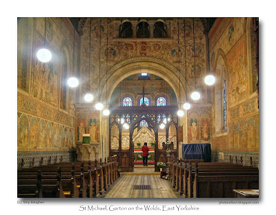
However, at the same time that many Victorian churchmen and architects were scraping plaster off walls to reveal rustic stone, others were painting them, though not in the manner of earlier centuries, but after the fashion of Renaissance Italy. This was particularly true where completely new churches were erected, but also occurred when older churches were restored, as in the example above at Garton on the Wolds, East Yorkshire. This work dates from 1872 when the local landowner, Sir Tatton Sykes, engaged the architect, G. E. Street, to design a decorative scheme for the whole of the Romanesque and Gothic building - the walls, windows, floors and roof! The spirit-fresco wall designs were completed over the period 1873-6 by Clayton & Bell, a prolific firm who specialised in stained glass. Old Testament scenes and the prophets fill the nave, whilst the New Testament is the inspiration in the chancel. In 1972, in the first edition of The Buildings of England - Yorkshire: York and The East Riding, the author, Nikolaus Pevsner urged the preservation of the decaying paintings. This was acomplished in 1986-91, fittingly, by the Pevsner Memorial Trust. The result is magnificent, quite unique in England, and has to be seen.

My photograph was taken a few years ago. It shows the view down the nave towards the chancel (with my wife looking at the reredos designed by Street). I don't know what I did to the camera to make the lights have their ethereal glow, - it must have been a combination of a long exposure, tripod and settings - but I quite like it!

photograph & text (c) T. Boughen

Camera: Olympus E300
Mode: Aperture Priority
Focal Length: 14mm (28mm/35mm equiv.)
F No: f8
Shutter Speed: 1.5 seconds
ISO: 100
Exposure Compensation: -1.0 EV
Image Stabilisation: N/A

Tuesday, March 03, 2009

Reflecting on the River Welland

click photo to enlarge
You're walking through the countryside and your path leads to a bridge over a river or a stream. You walk forward onto the bridge, and then what? Well, if you're like me, and just about everyone I've ever observed doing this, you stop in the middle and turn to look either upstream or downstream. It feels like the natural thing to do. We don't seem to be able to help ourselves. So what is it about bridges over water that make us stop and look, when discretion might be urging us to keep going until we're back with our feet fixed firmly on terra firma?

I suppose it's the pleasure that comes from surveying a stretch of moving water, no matter how small. And the curiosity about what it might contain - the fish, frogs, rocks, weed and the other things that we can see: and the lurking things we can't see, but wonder about, in the dark, still pools. Could it be a relic of our primitive past when a stretch of water offered the chance of fresh food? Or maybe it's an aesthetic urge to trace a river's course with our eye, following the banks, the depths and shallows, the brooding shadows and dancing highlights, the never still ripples and eddies, as they move towards us, under our feet, and away. Then there's the smell of the air above water, fresh clean and sharp from streams that flow quickly over rocky beds, slightly musty and dank from slow flowing waterways as they meander through the lowlands. And finally, there's the sound that varies from the crashing roar of a rocky river in spate, to the gentle swish and occasional plop of a slow moving stream.

The other day I stood on a small footbridge that spans part of the River Welland at Deeping St James. This is a fairly slow moving, quiet river, but at this particular point it was noisy because there was a man-made weir below me. I'd heard it from a distance as I approached the river, and found it, fast-moving, with spray, swirling ripples, and shooting water. I stopped half way across to take a few photographs, closing down the aperture to f22 to slow the shutter speed and blur the moving water. I've taken shots of this kind before, but here I concentrated on where the water tipped over the edge of the small weir and slid down an incline before hitting the pool below. The differing speeds of the water in each part of its journey gave differing effects, and I reflected that making images like this is yet another reason for pausing when your path leads across a bridge over water.

photograph & text (c) T. Boughen

Camera: Olympus E510
Mode: Aperture Priority
Focal Length: 106mm (212mm/35mm equiv.)
F No: f22
Shutter Speed: 1/13 seconds
ISO: 100
Exposure Compensation: -2.0 EV
Image Stabilisation: On

Monday, March 02, 2009

The Green Man

click photo to enlarge
In my church-crawling I frequently come across the Green Man, a mystical face with foliage sprouting from its orifices. Often they peep out from the stone leaves of the fourteenth century capitals on nave columns. Carved wooden misericords often feature his disturbing visage. And occasionally I see him forming the decorative design of a stone or wooden boss that hides the joins of the roof vaulting, as with this example at Croyland Abbey, in the village of Crowland, Lincolnshire.

The origin of the Green Man is obscure. Many feel that he is of pagan origin, representing a fertility figure or a spirit of the trees, that was adopted and adapted by Christians along with symbols such as the yule log, the fir tree and mistletoe. Such figures are known in England from the eleventh century onwards, and they don't look out of place next to the grotesques and gargoyles that are carved on the inside and outside of old churches. This example, probably dating from the 1400s is high above the chancel of the abbey at Crowland. He is of the variety known as disgorging because he spews the foliage from his mouth. Other variants are the foliate head where the head itself is in the shape of a flower or leaves, often with additional vegetation, and the bloodsucker that has foliage coming out of every hole. The Croyland example seems to be sprouting oak leaves, a not unusual tree to find associated with a Green Man. What is unusual, however, is the gold colour: green is more usual where any colour remains or has been restored. However, gold is certainly very common on bosses, so perhaps that accounts for it.

I took my photograph lying on my back, directly below the Green Man, with my camera clamped to my face. On a dull day, in a dark interior, and without my tripod, I took several shots to be sure of getting one that was reasonably sharp.

photograph & text(c) T. Boughen

Camera: Olympus E510
Mode: Aperture Priority
Focal Length: 102mm (204mm/35mm equiv.)
F No: f5.1
Shutter Speed: 1/5
ISO: 800
Exposure Compensation: -1.0 EV
Image Stabilisation: On

Sunday, March 01, 2009

The daffodil pickers

click photo to enlarge
I was raised in the Yorkshire Dales of the north-west of England, an area of hills, mountains and valleys. On these uplands the agriculture consisted mainly of sheep, hay and a few beef or milk cattle. In the valleys the mix was similar, but cattle were more numerous. During the last few decades of the twentieth century, in response to market prices and, perhaps, global warming, some intrepid farmers with better land tried root crops, maize and cereals. However, for the most part, the farming of recent years in that area of Yorkshire hasn't been drastically different from what it was a hundred years earlier. With one exception - the number of agricultural workers was significantly fewer, and those that remained were, on average, much older. Many farms were worked by one, two or at most, three people - often a husband and wife with one of their offspring.

When I moved to Lincolnshire, I found the situation as far as manpower is concerned, to be very similar. A couple of people often run quite large cereal farms. Where vegetables are grown, there may be three or four permanent workers with contract labour brought in as required. In the Dales the number of agricultural workers you see in fields is few all year round, but in Lincolnshire higher numbers are evident when vegetables are planted and harvested. In both areas it is mechanisation that has made the difference: Dales farmers can travel the uplands and transport animals much quicker than formerly, whilst the soil preparation, planting, tending and harvesting in eastern England is now done, to a very great extent, by machine. However, some tasks have remained resistant to mechanisation, and I came across one of them yesterday as I drove along the road at Cowbit near Spalding, Lincolnshire.

Rounding a bend I came upon a field with about seventy people bent double, harvesting daffodils. The regular rows of flowers didn't have a single bloom showing, but many carried buds that would soon open. The workers were selecting suitable stalks, bundling them in tens with elastic bands, and boxing them ready for collection, distribution and sale. I stopped and took a few shots of the activity, and reflected that scenes like this, that have continued down the decades, may one day also succumb to the machine - a device that can judge which flowers to pick, which to leave, that knows how to bundle them, and that doesn't get a bad back in the process or lament the seasonal nature of the work or the level of remuneration.

photograph & text (c) T. Boughen


Camera: Olympus E510
Mode: Aperture Priority
Focal Length: 150mm (300mm/35mm equiv.)
F No: f7.1
Shutter Speed: 1/160 seconds
ISO: 100
Exposure Compensation: -0.3 EV
Image Stabilisation: On