click photo to enlarge
The earliest stone bridges in Britain - the clapper bridges - are simply large pieces of stone that span streams: sometimes just one, and on wider waters two or more with intervening supports. The technology of those early days didn't stretch to anything more elaborate and fashion wasn't a consideration; it was purely function that drove the design.
When arched bridges made of stone examples with semi-circular arches and pointed arches were often built during the medieval period. The Romans introduced the former, and the Gothic builders the latter, so it was these stone bridges were constructed from the C12 to the C15. In theory the pointed arch can span a wider waterway but the disadvantage is that it has to be built quite high to do so. Often a series of rounded arches with intervening piers was chosen instead, though many medieval bridges followed the fashion and have pointed arches. In the sixteenth and seventeenth centuries, with the influence of the Rennaisance, fashion turned to semi-circular, rounded arches, and also to segmental arches which involve a segment of a circle smaller than 180 degrees on vertical piers. However, the technology had not developed to the extent that earlier features could be jettisoned.
Today's photograph shows the Deeping Gate Bridge over the River Welland at Deeping St James. It connects Cambridgeshire (the left bank) with Lincolnshire (the right). This structure was built in 1651, a date that is carved into the stonework on the upstream side, and is typical of its period. Gone are the pointed arches and ribs underneath that allowed stone bridges to be lighter, but the short spans, heavy piers, triangular cutwaters and simple chamfered decoration of the arches remains. Not until the next century would balustrades, niches, panelling, statuary, urns and segmental arches wide enough to span a small river appear.
I have photographed this bridge before, but stopping at it the other day I was tempted into another shot by the reflections, autumnal tints and saturated colours produced by the largely overcast sky. On this occasion I positioned myself downstream on a footbridge.
photograph & text (c) T. Boughen
Camera: Olympus E510
Mode: Aperture Priority
Focal Length: 40mm (80mm/35mm equiv.)
F No: f6.3
Shutter Speed: 1/250
ISO: 100
Exposure Compensation: -1.0 EV
Image Stabilisation: On
Pages
▼
Saturday, October 31, 2009
Friday, October 30, 2009
Painting Heckington windmill
click photo to enlarge
I posted a blog piece about Heckington's famous 8-sail windmill about a year ago, and in that entry discussed a little of English windmills in general and the history of this one in particular. What I didn't touch on, however, is the fact that Heckington is one of the mills that are painted black. These are not uncommon in Eastern England. Skidby Windmill, in East Yorkshire, is another black windmill that I blogged about a few years ago. This dark finish is most often applied to brick-built post-mills, though some timber structures are similarly treated. There are those who don't like to see windmills finished in this way, regarding them as sombre looking, and seeing the paint as hiding the warmth of the underlying brick. Such people prefer to see the bricks as they are on Thaxted mill. However, there's no denying that when it is paired with white sails and fantail, as well as white painted wooden detailing (windows, doors, rails, and an ogee cap) the black paint looks very striking. What I don't know is if any windmills were painted in this way immediately after they were built, or whether the bitumen-based covering was always applied at a later date in response to the penetration of damp.
When I passed Heckington windmill the other day I saw a blue "cherry-picker" and a couple of workmen busy repainting the tower. They'd masked the windows with plastic and were applying the sticky liquid with long handled brushes, the old paint looking dull next to that which they were laying on. The substance they were using certainly had the look of bituminuous paint, but I suppose it could have been one of the newer acrylic products. It was an interesting scene, so I took a few shots of them at their work, and post both the best of my selection and a general view above.
photograph & text (c) T. Boughen
Camera: Olympus E510
Mode: Aperture Priority
Focal Length: 67mm (134mm/35mm equiv.)
F No: f6.3
Shutter Speed: 1/800
ISO: 100
Exposure Compensation: -0.7 EV
Image Stabilisation: On
Thursday, October 29, 2009
St John the Baptist, Great Hale
click photo to enlarge
Anyone approaching the church of St John the Baptist, Great Hale, in Lincolnshire, who has an interest in church architecture, will immediately notice its tower. It is unbuttressed, has no string courses, and its bell openings have twin rounded arches with a single dividing column. All of which says Norman, or possibly Late Saxon, i.e. the eleventh century. This period is a difficult one for architectural historians because not only were Saxon builders working in a Romanesque style not unlike that which the Norman invaders brought after 1066, but many must have continued in employment under the new rulers in subsequent years. The term "Saxo-Norman" is sometimes used to describe work of this time, and it is appropriate in the case of Great Hale.
Most of the rest of the church is Gothic and later. However, the tower has an interesting (Pevsner says "unique") narrow, circular stone stairway built into the thickness of the wall, rather than the wooden stairs or ladders that are more usual at that time. The parapet and pinnacles on the tower are C15. Its nave arcades are Early English (C13 to early C14), as is the south aisle (seen above) with its windows with intersecting tracery, and the south porch doorway. Other windows and details date from the C14 and later re-modellings, particularly that which followed the collapse of the medieval chancel in the mid-C17. The Victorians carried out a major restoration in 1896. A brass plaque records this:"Consequent upon the ravages to the Tower and Roof affected in the gale on Sunday March 24 1885 this church was restored." Part of the "ravages" involved a stone pinnacle falling from the tower top, crashing through the roof and damaging the wooden musicians' gallery. Interestingly, the church was at that time recorded as being in the village of Hale Magna: the English, "Great", was substituted for its Latin equivalent in the twentieth century.
On a recent journey between Folkingham and Heckington I stopped at Great Hale when I noticed the light on the building as I passed by. I've taken a few shots of this church before, none of which has satisfied me. This latest photograph is the best to date for that clear, sharp light, the colour of the trees and sky, and the composition that leads the eye from the foreground tree shadow, to the graves and east end of the church, along the nave, up the tower and into the autumn colours of the leaves.
photograph & text (c) T. Boughen
Camera: Olympus E510
Mode: Aperture Priority
Focal Length: 11mm (22mm/35mm equiv.)
F No: f6.3
Shutter Speed: 1/640
ISO: 100
Exposure Compensation: -0.7 EV
Image Stabilisation: On
Wednesday, October 28, 2009
Changing the clocks
click photo to enlarge
In 1750 the Calendar (New Style) Act brought England's calendar properly into line with that of most Western European countries. The Julian system was replaced by the Gregorian, and the year began on 1st January rather than 25th March. As part of the process of alignment 1751 was a year of 282 days (25 March - 31 December), and in 1752 an adjustment was made that entailed removing 11 days - 2nd September was followed by 14th September. There is a story that the latter device led to protests, unrest, cries of, "Give us back our 11 days", and concern that the government was shortening people's lives. However, this fiction probably arose because historians took a piece of satirical writing and a Hogarth painting too literally.
I was thinking of this piece of folklore when we put the clocks back one hour last weekend, moving from British Summer Time (BST) to Greenwich Mean Time (GMT). The result of this tinkering with time is that we get an hour longer in bed for one night, then mornings are lighter and evenings get darker sooner. The opposite, of course, happens in spring when the clocks are turned forward. Quite a few people disagree with the current practice: some want there to be no change, whilst others favour a two-hour shift of the clocks. No one, however, feels that we, in any way, lose time! One small effect of the change for this photographer is that the sunrises that accompany my rising in mid-October (and find very conveniently timed for snapping) now happen an hour sooner, and the sunsets move to earlier in the evening. Another consequence this weekend was that when my wife opened the curtains and let in the sun (that would barely have risen the previous day) it created a nicely balanced composition of light, shadows and silhouettes that caught my eye.
photograph & text (c) T. Boughen
Camera: Lumix LX3
Mode: Aperture Priority
Focal Length: 5.1mm (24mm/35mm equiv.)
F No: f2.8
Shutter Speed: 1/250
ISO: 125
Exposure Compensation: -0.3 EV
Image Stabilisation: On
Tuesday, October 27, 2009
Tibetan Cherry bark
click photo to enlarge
Recently I noted my liking for the bark of the London Plane Tree, a subject I've photographed on three occasions (1, 2, 3). But it's not just the bark of this particular species that fascinates me; I'm drawn to any that is attractively figured. Other varieties that I've posted in the past are silver birch and eucalyptus.
A couple of days ago I came across a tree that I've wanted to photograph for a while - the Tibetan Cherry (Prunus serrula) - a species with red bark that looks like polished mahogany. Often it is very lightly figured with very few of the raised strips that resemble more "normal" bark. However, the example that I found had quite a few regularly spaced around its trunk, giving it a striated, semi-abstract appearance that appealed to me enormously.
This tree also goes under the names Birch Bark Cherry and Paper Bark Cherry, so the Latin name is useful for pinning down the particular species. Its habit of casting strips of bark as it ages is presumaby one of the reasons these names arose. This is a tree that positively cries out for you to touch it and feel its smooth, highly polished surface, and consequently I was surprised to find it planted in the centre of a flower bed out of reach. I think if I had one it would be grown next to a path so that everyone who passed by could indulge their desire!
photograph & text (c) T. Boughen
Camera: Olympus E510
Mode: Aperture Priority
Focal Length: 102mm (204mm/35mm equiv.)
F No: f5.6
Shutter Speed: 1/160
ISO: 200
Exposure Compensation: -0.3 EV
Image Stabilisation: On
Monday, October 26, 2009
Morning light at Stockerston
click photo to enlarge
The Leicestershire village of Stockerston is no more than a few houses clustered around the junction of a road and a lane, with, a little higher up the hillside, a medieval church and a large house, Stockerston Hall.
My first visit to the village was made last year to see the church of St Peter, the tower of which can be glimpsed through the trees in the top centre of today's photograph. This building is noted for its stained glass of the 1400s and for a selection of good memorials. However, the photograph that I posted from that earlier visit wasn't of anything architecturally significant or historically interesting: rather, it was the morning light slanting down through the old church windows. And, as I post my second image from Stockerston it is, once again, the morning light that is the main feature of the shot.
This view was taken from King's Hill, on the other side of the Eye Brook valley, in Rutland. The small stream that flows into the Eyebrook Reservoir marks the county boundary in this area, so here I was photographing Leicestershire from Rutland. On this October morning the air seemed thick, and the hillside, buildings and autumnal trees were suffused with a faint pink tinge. But, since it wasn't strong enough to affect the nearer grass and trees, the resulting image has a feeling of depth and distance that I find pleasing.
photograph & text (c) T. Boughen
Camera: Olympus E510
Mode: Aperture Priority
Focal Length: 73mm (146mm/35mm equiv.)
F No: f6.3
Shutter Speed: 1/100
ISO: 100
Exposure Compensation: 0 EV
Image Stabilisation: On
Saturday, October 24, 2009
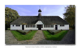
A cricket pavilion and a puzzle
click photo to enlarge
A cricket pavilion in a village or small town often has to fulfill a number of purposes. It is a meeting place for a team and its supporters; a vantage point (often raised) from which to sit and watch the game; a place in which to change into cricket "whites"; somewhere that refreshments can be prepared and served; and often it includes a scoreboard or box in which the progress of the match is recorded, and a clock.
But, whilst the functional aspects are clearly most important attributes of this type of building, cricket pavilions are often designed with aesthetic considerations in mind too. Often they are symmetrical, with centrally placed steps out of which the players issue. Gable ends and decorative barge boards frequently feature in their make-up. So too do clock turrets, bay windows (for a good view) and balustrades. In fact, they sometimes seem to combine the details of a bungalow and a miniature town hall! And then there are the thatched pavilions! Thatch pretty much died out as a first-choice roofing material in the seventeenth century when clay tiles began to be more widely available and affordable. So one wonders why it re-appeared in the early twentieth century on quite a few houses, barns and, yes, cricket pavilions. The answer lies in the Arts and Crafts Movement which sought to revive traditional techniques and materials, but use them in a modern way.
This pavilion at Uppingham, Rutland, even though it was built as late as 1923, shows the influence of Arts and Crafts ideas in the plain white walls, the simple, vertical, closely spaced windows, the half-height glazing to each side of the entrance door, and in that thatched roof with its thatched bell-tower. There are two further interesting aspects to this pavilion. Firstly, most such buildings have a front facing the field of play - as this one does. They also have a definite "back" that is utilitarian in character because it is often close to the field boundary. The location of Uppinham's pavilion, at a corner where two roads meet has led to the architect giving it a second front at the back - the one in my photograph. The second aspect that puzzles me is this. Why, when so much effort has gone into making the facade (and its landscaping) symmetrical, is its perfection broken by the single small window on the left?
photograph & text (c) T. Boughen
Camera: Lumix LX3
Mode: Aperture Priority
Focal Length: 5.1mm (24mm/35mm equiv.)
F No: f4
Shutter Speed: 1/640
ISO: 80
Exposure Compensation: -0.66 EV
Image Stabilisation: On
Friday, October 23, 2009
Yellow leaves, blue sky
click photo to enlarge
Autumn is a time of year when, depending on the turn that the weather takes, you can convince yourself that it's still summer or you find yourself lamenting the onset of winter. As I type this "reflection" the area of Lincolnshire in which I live has had a full day of light rain - the first such day for months - that brought with it thoughts of the darker, colder, shorter days to come.
However, two days earlier, when I took this photograph, the sun was shining on the brightly coloured leaves of the maples. As I looked up into a tree and framed this shot, full of bright yellow, deep blue and clear white it almost seemed like I was looking back into summer: only the slight edge on the wind and the crunch of leaves beneath my feet reminded me that it was definitely autumn.
The yellow/orange with blue of this image shows the power of complementary colours, each deepening the apparent hue of the other, and generating a vibrancy that has appealed to artists, photographers and designers down the centuries.
photograph & text (c) T. Boughen
Camera: Olympus E510
Mode: Aperture Priority
Focal Length: 86mm (172mm/35mm equiv.)
F No: f6.3
Shutter Speed: 1/640
ISO: 100
Exposure Compensation: -0.7 EV
Image Stabilisation: On
Thursday, October 22, 2009
Faded flowers and Charles Rennie Mackintosh
click photo to enlarge
The reputation of Charles Rennie Mackintosh (1868-1928) has never been higher than in recent years. It's difficult to go into a bookshop, a "craft" store, or a jewellers without coming across his name. Books, brooches, posters, mugs, picture frames - it seems that his Art Nouveau designs can adorn just about anything. And yet, this decorative work, as exemplified by the stencil patterns he used in the Willow Tea Rooms, Glasgow, is only a small part of his ouvre.
Mackintosh studied at the Glasgow School of Art, and in the 1890s he painted, did graphic work and metalwork that showed Art Nouveau influences he'd probably picked up from reading The Studio, a publication which began in 1893. However, his name really came to prominence when he won the competition to design a new building for the Glasgow School of Art. His was a thoroughly modern conception that was influenced by Voysey and Scottish baronial architecture. It mixed the sharply rectilinear with the fluid lines of Art Nouveau, and deeply influenced continental, particularly Austrian, architects. Mackintosh went on to design other fine buildings and furniture. However, he was a man who alienated customers and fellow architects alike, and in 1913 he left his Glasgow practice and moved to Walberswick in Suffolk, where he concentrated on his paintings. During his time as an architect he had painted flowers, and in Suffolk he threw himself into this work, producing wonderful images of, principally, wild flowers in a combination of pencil and watercolour. He later went to live in Mediterranean France, and in the final years of his life painted landscapes and cut flowers in vases.
This latter work came to mind a few days ago when I was in a Leicestershire church. On the octagonal font cover, lit by strong light from a nearby window, was a vase of hydrangea flowers. The person who had placed them there had carefully selected a variety of coloured blooms - pink, blue, purple and white. But, the colours were fading fast as the flowers died. Their slow decline from bright, cheeriness to a pale memory of what had been, reminded me of the poignant beauty I once saw in a Mackintosh watercolour of 1905 that depicted faded roses. With that inspiration in mind, I took this photograph.
photograph & text (c) T. Boughen
Camera: Lumix LX3
Mode: Aperture Priority
Focal Length: 6.3mm (30mm/35mm equiv.)
F No: f2.2
Shutter Speed: 1/40
ISO: 320
Exposure Compensation: -1.0 EV
Image Stabilisation: On
Wednesday, October 21, 2009
The Welland Viaduct
click photos to enlarge
The Welland Viaduct (also known as the Harringworth Viaduct and the Seaton Viaduct) is a railway viaduct that crosses the valley of the River Welland. In so doing its brick arches straddle the border of the counties of Northamptonshire and Rutland. It was built between 1876 and 1878, is three-quarters of a mile long, has 82 arches each of which is 40 feet wide (with an average height of 57 feet) and required 20 million bricks, 20,000 cubic yards of concrete and 19,000 cubic yards of stone for its construction.
As was often the case on large engineering projects in the Victorian period, workmen ("navvies") came to the site with their families to secure employment. Here they were housed in two temporary settlements. A curate built a mission hut in one of the camps to serve the religious needs of the 400 migrants! The bricks were made nearby with local clay, those who dug it earning £2 a week. Bricklayers were paid £2 10s weekly, foremen £3.00, labourers £1 5s, and mechanics £1 16s. All could earn overtime pay for working into the night. Part of the labour force comprised 120 horses used for pulling waggons.
The viaduct is the longest such structure in Britain and its unique size and form has resulted in it being designated a Grade II listed structure. For a number of years after the 1960s trains used the viaduct only infrequently. However, a regular service now runs across it (as you can see from my second photograph). I took my images during a bicycle ride that included visits to a number of churches, villages and this monument to the vision of our Victorian forbears. Incidentally, I was really pleased to be able to incorporate the very co-operative horse in my first image: it gave a welcome touch of scale to a subject that is very difficult to photograph.
photographs & text (c) T. Boughen
Photo 1
Camera: Lumix LX3
Mode: Aperture Priority
Focal Length: 5.1mm (24mm/35mm equiv.)
F No: f4.5
Shutter Speed: 1/1000
ISO: 125
Exposure Compensation: -0.66 EV
Image Stabilisation: On
Photo 2
Camera: Olympus E510
Mode: Aperture Priority
Focal Length: 110mm (220mm/35mm equiv.)
F No: f6.3
Shutter Speed: 1/400
ISO: 100
Exposure Compensation: 0 EV
Image Stabilisation: On
Tuesday, October 20, 2009
Autumn landscapes
click photo to enlarge
A few days spent walking, cycling and driving in the area of England where Leicestershire, Rutland and Northamptonshire bump up against each other have given me an opportunity to reflect on the relative merits of each form of travel as a means of securing photographs. It confirmed my instinctive preference for walking with a camera because its slow pace gives more opportunities to see and compose images. More than that, however, if your walking isn't in a known photogenic location, then it presents you with more "ordinary" subjects which you can try to turn into extraordinary images. Furthermore, it places shots before you that are unlikely to have been taken by anyone else - a consideration in our modern world where the yearly output of digital photographs probably outnumbers the grains of sand in a Saharan erg!
Cycling is, for me, the second best way of going about photography. When you're on two wheels you tend to choose the less frequented highways and byeways, places where it's easy to stop and snap, that pass through more interesting areas, and that haven't succumbed to the sanitising effect of the traffic engineer. However, even the speed at which you travel by bicycle means you miss a lot. Photography by car comes last, in my estimation because, by and large, when car-borne we gravitate towards the more obvious locations, or are forced to disembark where we can park, and consequently end up taking the more obvious shots. And, we tend to look less searchingly once there because if we don't find anything of interest it's so easy to move on to the next place. That's not to say, of course that good photographs can't be harvested using each of these modes of travel.
During my few days away I took photographs on a day-long walk, a day-long cycle ride and a couple of drives. The first of the two images in today's post was gathered near the start of our walk from the Leicestershire village of Hallaton, looking back at our departure point in the morning sunlight. It is an image that for many people will represent the quintessential English village, with church spire dominating, roofs of slate, tile, thatch and stone clustered around, trees changing colour as autumn progresses, and green fields beyond the settlement's edge. This particular shot can only be taken if you stretch your legs. The second was taken on the cycle ride (which also started at Hallaton), and was snapped after I'd screeched to a halt on a downhill section of lane, next to a gateway in a hedge. This scene of the Rutland village of Lyddington, when compared with the first shot, is "the same but different": a more distant prospect of a more wooded location. It was the autumn tints in the trees that prompted me to "slam on the hammers" and take this photograph.
photograph & text (c) T. Boughen
Photo1 (Photo 2)
Camera: Olympus E510
Mode: Aperture Priority
Focal Length: 137mm (274mm/35mm equiv.):(70mm (140mm/35mm equiv.))
F No: f6.3
Shutter Speed: 1/200 (1/320)
ISO: 100
Exposure Compensation: 0 EV (-0.3 EV)
Image Stabilisation: On
Monday, October 19, 2009
The Blackstone Oil Engine
click photo to enlarge
A month or so ago I was standing outside the old Pumping Station at Pode Hole near Spalding, Lincolnshire. I'd passed this building a few times and noted that it appeared to have a "a bit of age about it." Pode Hole is a key location in the network of waterways that drain the Fens, standing at the confluence of the Delph Drain, the North Drove Drain, the South Drove Drain and Vernatt's Drain. It therefore comes as no surprise to find a pumping station there. In fact, it is the site of a succession of buildings that have been erected over the past two hundred years to house the pumps necessary to keep the Fenland water flowing out into The Wash and thence into the Norh Sea.
The old pumping station dates from about 1825 - the date on one of the rainwater heads - though it was modified in the late nineteenth and twentieth centuries. It is a single storey, brick building with a front consisting of two large, semi-circular blank arches, cast iron window frames and large doors. Attached to this is an extremely large white board that dates from 1876 on which is written the bye-laws of the Deeping Fen, Spalding and Pinchbeck Drainage Board. At the front there is also a keystone dated 1866. It is incorporated into a mounting block and inscribed "Sharps Bridge Keystone." For a number of years the old pumping station was the museum of the drainage authority.
As we looked at the building from afar we were invited in and were able to see some of the paraphernalia that remained. This included old ditch clearing tools, depth boards and three old engines, no longer used to power pumps, that were standing in a row. One of them caught my eye because of its fine nameplate fixed to its side. The note next to the engine read, "Blackstone Oil* Engine, Serial Number 171318, 45 h.p. at 250 r.p.m. Purchased by the Maxey Drainage Board in 1929 at a cost of £353 to drive the Holmes Turbine Pump which was installed in 1887 for £150 and was previously steam driven. The 4 foot diameter pump with applewood replaceable gear teeth ran until 1947 when it was replaced by a "temporary" Gwynnes pump still driven by the Blackstone engine. In 1955 these were superseded by the present electric station and removed to the museum in 1982."
The style, solidity, and lustre of the brass nameplate on this engine appealed to me, so I made it the subject of a photograph.
* "Oil" means diesel
photograph & text (c) T. Boughen
Camera: Lumix LX3
Mode: Aperture Priority
Focal Length: 8mm (37mm/35mm equiv.)
F No: f2.4
Shutter Speed: 1/30
ISO: 400
Exposure Compensation: -0.66 EV
Image Stabilisation: On
Sunday, October 18, 2009
Cantilevered chairs
click photos to enlarge
It took a bold leap of the imagination to come up with the cantilevered chair. It is, as we say today, counter-intuitive; a shape that looks like it shouldn't work, or should work for only a short time before collapsing under the weight of its user. But, in 1924 the Dutch architect, planner and designer, Mart Stam (1899-1986), saw past these problems of the mind and produced the first example. Between 1926 and 1929, he created his S33 and S34 designs which found a ready market among those who wanted furnishings that reflected the modern spirit. Stam's designs were immediately followed by an example from Marcel Breuer (1902-1981), the Hungarian-American architect and designer, that combined the tubular steel frame with a more traditional seat and back made of wood and woven cane. This led to an action in the German courts with both men claiming to be the inventor of the canilever chair. The outcome of the case favoured Stam, but has left confusion in the minds of many about who originated this design classic.
Other designers, including Mies van der Rohe, Gerrit Rietveld, Vernor Panton, Stefan Wewerka, and Frank Gehry, have subsequently taken the cantilever principle and given it their own twist. The most recent take on this, by now, established form for a chair, is by the German designer, Konstantin Grcic (1965- ). His MYTO chair is made by an Italian company from advanced BASF plastic that allows the strength and flexibility necessary in the cantilever design. It uses the minimum quantity required for the purpose, is recyclable, comes in several colours, and can be stacked up to eight chairs high. An example has been selected for the permanent collection of the Museum of Modern Art, New York.
I came across a single, black example of Grcic's chair at a design exhibition. Placed on a white podium on a dark floor, with a white screen behind, the chair suggested a photograph, so I looked for a single image that displayed the chair to best effect and made an interesting composition within the camera's rectangular frame. I failed! However, I did, I think, achieve my goal with two images. The shot in landscape format makes best use of the chair and background together but fails because it doesn't show the far "leg" of the chair, whilst the portrait format image presents the chair to good effect against a less interesting background. Incidentally, both shots are in colour!
photograph & text (c) T. Boughen
Photo 2 (Photo 1)
Camera: Lumix LX3
Mode: Aperture Priority
Focal Length: 8mm (37mm/35mm equiv.):(5mm (24mm/35mm equiv.))
F No: f2.4 (f2)
Shutter Speed: 1/50 (30)
ISO: 400 (200)
Exposure Compensation: -0.66 EV
Image Stabilisation: On
Saturday, October 17, 2009
Bark pictures
click photo to enlarge
I'm starting to think that I have a thing for the London Plane - the tree that is (Platanus hispanica), not some BA or Virgin aircraft. I've taken more than a few images of its bark, and posted two of them before, here and here. What I like about it is the patterns that you find, as well as the interesting colours and almost infinite variations on its basic theme. I find that I'm unable to pass one of these trees without inspecting the trunk to see if I can capture another example of this attractive surface.
Several days ago, when I was in Sleaford, Lincolnshire, I came across this tree. Its bark was flaking off in rounded pieces. The surfaces that were revealed seemed to get darker the longer they had been exposed to light and air. I took a few shots around the trunk with my pocket compact camera, but then concentrated on this area of bark. Why this piece? Well, framing it in the camera it occurred to me that the shapes looked like a one-eyed cat looking back at me - and that seemed a good enough reason for a photograph. I've no doubt that the patterns of plane tree bark are a little like some wallpapers, and different people will see different things in them. But, for me, with this example, all I see is the cat!
photograph & text (c) T. Boughen
Camera: Lumix LX3
Mode: Aperture Priority
Focal Length: 5.1mm (24mm/35mm equiv.)
F No: f5
Shutter Speed: 1/1000
ISO: 80
Exposure Compensation: -0.66 EV
Image Stabilisation: On
Friday, October 16, 2009
Woodland
click photo to enlarge
It's good that the area of the UK covered in trees is increasing year on year, and has now climbed to 12% of the total land area. Woodland is important as a wildlife habitat, landscape element, recreational resource, carbon sink, and source of fuel and raw materials.
But, whilst the UK has a slightly greater amount of woodland cover than the Netherlands (11%) it has a long way to go to reach the level of our continental neighbours such as France (28.3%) and Germany (31.7%). Moreover it trails the European Union average (37.8%) by a big margin. It's also unfortunate that more than half of the UK's present woods are coniferous plantations whose biodiversity, landscape and recreational potential is substantially less than that of broadleaved woodland.
A while ago I read, "The History of the Countryside", Oliver Rackham's important work on Britain's landscape, flora and fauna. It gave me a more informed insight into the decline of our woodlands and scotched a few myths that still infect debate about this subject - neither the contruction of Britain's navy nor the early iron industry were, it seems, major contributors to the loss of woodland. It also helped me to understand the key difference between traditional, sustainable forms of forestry and the current practice. Modern methods of wood production are likened by Rackham to the growing of vegetables: you plant a sapling, nurture it until it is a size to crop, then cut it down, removing all trace of it from the ground. The older method usually involved a cycle of coppicing, where limbs were harvested from the tree in such a way that it encouraged more growth. Wood was harvested every several years, and the tree continued in production for hundreds of years. More enlightened woodland management is re-discovering the value of coppicing not only in economic terms, but also for biodiversity.
The place where I now live, Lincolnshire, isn't the first English county that one thinks of in terms of woodland. However, it does have a few spots where trees grow in relative plenty. One such, as the name suggests, is Woodhall Spa, where I took this photograph of my wife walking through the sylvan, early autumn landscape.
photograph & text (c) T. Boughen
Camera: Olympus E510
Mode: Aperture Priority
Focal Length: 79mm (158mm/35mm equiv.)
F No: f6.3
Shutter Speed: 1/160
ISO: 200
Exposure Compensation: -1.0 EV
Image Stabilisation: On
Thursday, October 15, 2009
Thaxted windmill
click photo to enlarge
There was a time when it seemed that windmills would all but disappear from Britain, perhaps remembered only by a few restored, museum-like examples or those that were turned into desirable country dwellings. A few struggled on as working buildings into the 1950s, but their time had long passed, new methods of milling superseding the old ways. Being tall structures, erected in exposed positions where they would catch the wind, many soon fell into disrepair once regular maintenance ceased. Gales removed sails, fantails and roofs. Penetrating rain and frost did the rest of the damage, and many were reduced to sad, beheaded stumps. But, as is often the way, just as it seemed that windmills were on their way out people started to realise what was happening, to mourn what was being lost, and in localities up and down the country individuals, groups of civic-minded people and enthusiasts turned their attention to restoring these fascinating relics that are half building, half machine. Today they are a reasonably common sight in central, eastern and southern England, and quite a few have been restored to working condition.
The example shown in today's photograph is at Thaxted in Essex. It is a red brick, tower mill that was built for John Webb in 1804. He was a local landowner and innkeeper whose brickworks supplied the bricks for the building. It stands in a commanding position in a field by the edge of the small town, one of two beacons, with the medieval church, that are immediately visible to the visitor as he approaches this ancient and attractive settlement. Thaxted's mill was one of those that fell into disrepair in the mid-twentieth century. But, in 1972 the process of restoration began, and today it is fully restored with machinery inside, and is open to the public.
My photograph has been converted to black and white with the digital version of a red filter to darken the sky, emphasise the clouds and vapour trails, and make the lighter building stand out more strongly from its background.
photograph & text (c) T. Boughen
Camera: Olympus E510
Mode: Aperture Priority
Focal Length: 25mm (50mm/35mm equiv.)
F No: f7.1
Shutter Speed: 1/1000
ISO: 100
Exposure Compensation: -0.3 EV
Image Stabilisation: On
Wednesday, October 14, 2009
Plumbing the medieval mind
click photo to enlarge
The gargoyles on a medieval church, such as this one at Aswarby in Lincolnshire (see yesterday's post), are pieces of sculpture that form part of the medieval plumbing system. They are designed to carry rainwater off the roof and other coverings, then out from the walls, and deposit it on the ground below. However, despite this rather prosaic purpose it sometimes doesn't pay to look too closely at them. Why? Because amongst the grimacing, devilish faces, weird beasts and elephants you might spot something a little more earthy.
When you've worked out just what today's photograph shows you might wonder, as I did, precisely what was going on in the mind of this particular sculptor, what the priest was thinking of sanctioning the design, and why in the middle ages people thought toilet humour appropriate for the decoration of a church!
photograph & text (c) T. Boughen
Camera: Olympus E510
Mode: Aperture Priority
Focal Length: 110mm (220mm/35mm equiv.)
F No: f6.3
Shutter Speed: 1/800
ISO: 100
Exposure Compensation: -0.7 EV
Image Stabilisation: On
Tuesday, October 13, 2009
Making pictures
click photo to enlarge
I'm not particularly interested in photography! Correction. I'm not particularly interested in photography as it is currently conceived, especially cameras or the technical side of it. Discussions about the relative high ISO performance of different models and brands, the minutiae of Imatest result or, the relative virtues of CMOS versus CCD leave me cold. So too does "pixel peeping", endless debates about the quality of colours produced by each manufacturer's cameras or the problem of photographic "noise." I believe (and so do more than a few of the saner commentators on photography) that every DSLR available today is capable of producing commercial quality images in the sizes demanded by the vast majority of publishers. Moreover, we've now arrived at the point where this is possible with today's better digital compact cameras. So, I'm firmly of the opinion that whilst an intelligent interest in the hardware is fine, agonising over technicalia is a waste of time that could be more profitably spent taking photographs. To anyone who says that they need a camera that produces the highest pixel count and the best possible output for large scale prints or cropping, I say fine, but remember that print is a dying medium, and that the increasingly prevalent display of images on screens and projectors needs fewer rather than more pixels! A new 5 megapixel camera anyone?
So what is it about photography that does interest me? Well, that really begins and ends with the pictures. Having said that, I'm also not wildly interested in the body of "theory" that has grown up about composition and the general business of putting together an image. I'm familiar with it, but, just as my post processing tends towards the "intuitive", rather than a regimented "work flow", so too does this aspect of my picture making. However, I have to say that my image construction does lean very heavily on a lifelong interest in the history of art.
Despite the remarks above, every now and then I take a photograph that illustrates one of the maxims of photographic composition. Today's image of the medieval church of St Denys, Aswarby, in Lincolnshire, will say "leading lines" to many phographers, as they follow the curving contour of the fence from the bottom right corner to the base of the church tower. I took this shot on an early autumn walk, and tried to find a new take on a building I've photographed a couple of times before.
photograph & text (c) T. Boughen
Camera: Olympus E510
Mode: Aperture Priority
Focal Length: 17mm (34mm/35mm equiv.)
F No: f6.3
Shutter Speed: 1/500
ISO: 100
Exposure Compensation: -0.7 EV
Image Stabilisation: On
Monday, October 12, 2009
Horse chestnuts and water babies
click photo to enlarge
When I was a boy autumn was the time of year for gathering the seeds of the horse chestnut tree, known to children throughout Britain as "conkers". Of course part of the fun of childhood is anticipation, and as August turned into September, and the growing, green, spiky shells that held the coveted conkers became visible high in the trees, we could often wait no longer for them to fall to earth. So, armed with short, stout sticks we went to where the favoured trees grew and hurled our pieces of wood, aiming to knock the conkers down, remove them from their shells and carry off our trophies to be hardened, skewered, strung and used in our playground game.
The trouble was, the first conkers we knocked down were often not ready, and instead of being glossy brown were white or skewbald. Those that fell due to the wind or ripeness were invariably the biggest, brownest and best, but that meant waiting until the end of September and often into October - and small boys hate to wait.
The group of trees where we usually gathered our conkers grew in a row by a public footpath, and one of the rites of passage for boys in my Yorkshire Dales market town was to learn to distinguish between the trees that were "good uns" and those that were "water babies" (this name pronounced in Dales-speak with "a" sounded as in cat!) The latter were conkers that were small, remained white, never hardened, and were soft because they were full of a watery liquid. Their shells were a duller green/brown, and they had fewer (often no) prickles, compared with the big, spiky light green shells of the good uns. Another distinguishing feature was the leaves. They had the big "fingers" characteristic of the tree, but these were usually smaller, less vigorous, and as the autumn progressed they coloured in a different way to the favoured trees.
The other day, as I walked near Aswarby in Lincolnshire, I came across a group of horse chestnut trees, and noted with surprise that every one was a water baby. Why, I wondered (temporarily rolling back the years) would anyone want to plant such trees? Near the front of my house is a row of horse chestnut trees by a stream, and, I'm glad to say, each one is a "good un"! So, today I present, for your edification and delectation images of leaves from these locations, with the good un first and the water baby second.
photograph & text (c) T. Boughen
Photo1 (Photo 2)
Camera: Olympus E510
Mode: Aperture Priority
Focal Length: 79mm (158mm/35mm equiv.):(150mm (300mm/35mm equiv.))
F No: f4.7 (f5.6)
Shutter Speed: 1/800 (1/640)
ISO: 100
Exposure Compensation: -0.7 EV
Image Stabilisation: On
Sunday, October 11, 2009
English parkland
click photos to enlarge
Both of today's photographs were taken in the area immediately around the village of Aswarby in Lincolnshire. They are views of the parkland that was created in the eighteenth and nineteenth century around Aswarby Hall, the home of the Tudor Carres and later the Whichcotes.
"Parkland" in this sense is a very English term, meaning not the play and recreation area laid out by municipalities for the enjoyment of an urban population, but rather the landscaped pastures and woodlands in the immediate vicinity of a large country house. It became the fashion, during the period when the English landscape garden was at its peak of popularity to plant formally near to such a house, to have "natural" looking lawns and gardens with lakes, statues, "eyecatchers" and scenic planting beyond this, and for the farmland past the garden boundary to be "enhanced" with solitary trees in pastures, "rides" through wooods and planted avenues, and screens of trees to confound prying eyes: the very vision of pastoral beauty and tranquility. Often, to give the impression of beautiful nature continuing in an unbroken sweep from the gardens through into the parkland there would be a hidden ha-ha (a wall and ditch) to prevent cattle and sheep encroaching on the tended grounds near the house.
Parkland of this sort is still being created today, but more often that which we see dates from this earlier period. It has a quite distinctive appearance, and is often signalled by large, specimen trees in the middle of pastures, or big, non-native, often evergreen, trees in small groups. Near where I took these photographs a former pasture that exhibits both these characteristic tree plantings has been turned into a cereal field. We passed it on our walk, bare soil with enormous trees dotted here and there - an odd sight. Nearby were the expected woods with pheasant rearing pens and feeders, and an adjoining area of maize left for both cover and feed for the "sportsmen's" targets.
photographs & text (c) T.Boughen
Photo 1
Camera: Lumix LX3
Mode: Aperture Priority
Focal Length: 5.1mm (24mm/35mm equiv.)
F No: f4.5
Shutter Speed: 1/1000
ISO: 80
Exposure Compensation: -0.66 EV
Image Stabilisation: On
Photo 2
Camera: Olympus E510
Mode: Aperture Priority
Focal Length: 40mm (80mm/35mm equiv.)
F No: f6.3
Shutter Speed: 1/160
ISO: 100
Exposure Compensation: -0.7 EV
Image Stabilisation: On
Saturday, October 10, 2009
Puzzles and perplexities
click photo to enlarge
I must admit to being puzzled and perplexed by many aspects of the modern world. The other day I was skipping through a mental list of them. Here, for your amusement and edification are just a few from my extensive collection:
However, it's possible to get a photograph out of most situations, and golf is no exception. Today's - only my second golf-related photograph ever (here's my first) - was taken as I walked up the drive (it's also a public footpath) of the National Golf Centre in Woodhall Spa, Lincolnshire. The yellow morning light was filtering and slicing through the trees, burning off a slight frost, and producing areas that glowed warmly, contrasting with the blue hue of the places still in the shade. A recent wind had produced an early fall of leaves that were turning russet on the ground, and a gentler breeze was now dislodging one or two more as we made our way through the golf courses, photographing and noting the wildlife at the start of our walk.
photograph & text (c) T. Boughen
Camera: Olympus E510
Mode: Aperture Priority
Focal Length: 64mm (128mm/35mm equiv.)
F No: f6.3
Shutter Speed: 1/150
ISO: 100
Exposure Compensation: -0.7 EV
Image Stabilisation: On
I must admit to being puzzled and perplexed by many aspects of the modern world. The other day I was skipping through a mental list of them. Here, for your amusement and edification are just a few from my extensive collection:
- "personalised" car number plates: what's that all about, and why would you pay extra to have them?
- upgrading mobile phones: I'm given to understand that some people do this every 12 or 18 months, a fact that leaves my gast completely flabbered
- paying a premium price for clothing that has advertisements on it: surely anyone in their right mind should be asking for a discount on a garment when the word ADIDAS, GAP or MONSOON is emblazoned across it?
- tucking laces into shoes rather than fastening them: who is responsible for that daft idea, what was his IQ, and why did people take any notice?
- why can't I buy shoes with soles made with the same rubber as my car tyres? that way they wouldn't wear out when the uppers are still looking good for several thousand more miles
- women wearing sun glasses on top of their head whatever the weather: have they lost their case, have they lost their marbles, or are they just optimists who always expect the sun to shine on them?
However, it's possible to get a photograph out of most situations, and golf is no exception. Today's - only my second golf-related photograph ever (here's my first) - was taken as I walked up the drive (it's also a public footpath) of the National Golf Centre in Woodhall Spa, Lincolnshire. The yellow morning light was filtering and slicing through the trees, burning off a slight frost, and producing areas that glowed warmly, contrasting with the blue hue of the places still in the shade. A recent wind had produced an early fall of leaves that were turning russet on the ground, and a gentler breeze was now dislodging one or two more as we made our way through the golf courses, photographing and noting the wildlife at the start of our walk.
photograph & text (c) T. Boughen
Camera: Olympus E510
Mode: Aperture Priority
Focal Length: 64mm (128mm/35mm equiv.)
F No: f6.3
Shutter Speed: 1/150
ISO: 100
Exposure Compensation: -0.7 EV
Image Stabilisation: On
Friday, October 09, 2009
I should coco
click photo to enlarge
There may be good reasons for calling a Mexican restaurant Coco, but none immediately spring to mind. I came across this one as I was gathering images in Peterborough. It was at the tapered end of a block of buildings with a road at each side. As I looked up at the stainless steel logo and text reflecting the sky, and took in a second reflection on some glass below, the phrase, "I should coco" came to me. And, with that thought echoing around my head I took my photograph and departed.
"I should coco" is one of those sayings that I'd occasionally heard, but didn't really understand. I recalled it being the title of a pop album, but couldn't remember by which band. I had the impression that when used in a piece of prose it meant something like, "Yeah, right!" uttered in an ironic way. So, as you do, I Googled the phrase, and came up with the name of Supergrass as the band. Then I alighted on a fascinating website called World Wide Words, and found a whole entry on the phrase. It seems that it started life in London in the 1930s, gained in popularity in the 1950s, and was originally spelled, "I should cocoa!". Its meaning is something approximating to "Not on your life!" or "No way!", though the author of the piece, Michael Quinion, suggests that it was originally rhyming slang for, "I should say so!" He further speculates that its spelling changed due to the popularity of Coco the Clown. I was glad to have stumbled upon his website and immediately bookmarked it.
Anyway, back to the photograph. I'm not a fan of brown bricks, especially when they are pointed with matching mortar, so the overall presentation of this building didn't appeal to me. However, the gleaming, stainless steel signs and glass reflecting the sky and clouds did. They made, I think, a reasonably interesting shot. Whether they would work quite as well when the blue sky was obliterated by a dense blanket of stratus is quite another matter!
photograph & text (c) T. Boughen
Camera: Lumix LX3
Mode: Aperture Priority
Focal Length: 7.4mm (35mm/35mm equiv.)
F No: f5
Shutter Speed: 1/800
ISO: 80
Exposure Compensation: -0.66 EV
Image Stabilisation: On
Thursday, October 08, 2009
Faces at the window
click photo to enlarge
My wife said the other day that if "The Hub" (Britain's National Centre for Craft and Design) wasn't at Sleaford we'd visit the town less frequently than we do. She was right. What I like about this building, and what makes me return regularly, is that it introduces me to aspects of art, craft and design that I might otherwise not see - some of it very good, some of it less so.
Our most recent visit was to see the exhibition of winning designs from the annual international competition initiated by the Design Museum and sponsored by Brit Insurance*. The selection on display, some in actual form, others in video, included work as wide ranging as the new Oslo Opera House, the MYTO chair, and the Magno wooden radio from Indonesia. It was an exhibition well worth seeing. We also took in the exhibition entitled, "Home Sweet Home: an exploration into the subversive elements of the domestic by UK graduates in craft & design", a collection described as "innovative, inspiring and daring", which I found immature, facile and depressing. What made this exhibition worse was that every piece was accompanied by a written commentary by the artist, each of which would easily qualify for entry in the Pseuds Corner column of Private Eye.
Connecting the two main display spaces is a tall stairwell with landings. These were showing jewellery by Clare Knox. I was initially ambivalent about this, liking its originality, the fluid forms, and the tactile qualities, but I wondered whether it would work when worn. However, I warmed to it on repeated viewings, and felt that with the right clothes it could be successful. The jewellery is described as being made from "EVA, rubber", and looks like it has been poured or dripped to make the required, quite original designs. She had also created a series of big drawings that hung in front of the windows, using the same technique as she uses for the jewellery. One of these, in my judgement, stood head and shoulders above the others and appealed to me so much I took this photograph of it.
* Brit Insurance. Now there's a company I'd reject solely on the grounds of its name. I hate this recently coined contraction of the word "British".
photograph & text (c) T. Boughen
Camera: Lumix LX3
Mode: Aperture Priority
Focal Length: 8mm (37mm/35mm equiv.)
F No: f3.2
Shutter Speed: 1/400
ISO: 80
Exposure Compensation:-0.66 EV
Image Stabilisation: On
Wednesday, October 07, 2009
Whichcote Memorial, Aswarby
click photo to enlarge
The church of St Denys at Aswarby, Lincolnshire, has this fine memorial on the south wall of its nave. It records the death of Marian, Lady Whichcote, daughter of Henry Beckett Esq., and wife of Sir Thomas Whichcote, Bart. It notes that she was born on 27th April 1820, married on 10th July 1839, and died on 10th May 1849. The inscription ends with a verse from the Od Testament's Book of Micah. Aswarby Hall, the grand house in which she lived her short life is no more: but the Victorian stables remain, and were converted into a house in 1969. Also evident, though perhaps less well tended than in her day, is the park in which the Hall was situated. The small village of Aswarby has a number of stone-built "estate houses" in the Tudor style. They would have been for people who worked on the Hall's large estate, and were under construction around the time of Lady Whichcote's death.
I see a lot of Victorian memorials during my visits to churches. Most are fairly formulaic, some are deliberately innovative (with varying degrees of success), and others are fine compositions, often in expensive materials. And then there is a group that is distinguished by the high quality of its figure sculpture. This piece at Aswarby is such an example. It is by the Scottish sculptor, Thomas Campbell (1790-1858), a man who was apprenticed to a marble cutter in Edinburgh, who went on to study at the Royal Academy Schools in London, and who opened a studio in Rome in 1819. There he made portrait busts of English visitors to that city, as well as of Pope Pius VII. In 1829 he relocated to London producing marble busts and reliefs. His subjects included members of the aristocracy, poets, politicians and others. His relief of the actress Sarah Siddons (d.1831), has similarities with that of Lady Whichcote: the figure is in vaguely classical dress, in a classical pose, below an arch in a pedimented frame.
I've admired the sculpture shown in today's photograph since I first saw it about seven years ago. The pose, the handling of drapery, the composition with stool, book (displaying the Lord's Prayer) and lamp, all work wonderfully well. However, there is one thing that has always puzzled me - the snake. Pevsner says it is there as a symbol of eternity. But I think he is wrong. Where a snake is used for that purpose it invariably has its own tail in its mouth making an endless loop or sinuous shape. Snakes (serpents) usually represent the Devil, but I can't believe that is the case here. A grasped or downtrodden snake symbolises triumph over sin, but isn't applicable here either. Mounted on a staff a snake can be used to represent Christ, and God's authority. This idea comes from Moses saving the Israelites from a plague of snakes by raising a bronze snake on a pole, and is the reason for the use of a snake on a pole to represent healing. It seems to me that these are more likely explanations for its presence, particularly since the flame probably signifies the Holy Spirit.
photograph & text (c) T. Boughen
Camera: Olympus E510
Mode: Aperture Priority
Focal Length: 58mm (116mm/35mm equiv.)
F No: f6.3
Shutter Speed: 1/50
ISO: 200
Exposure Compensation: -0.7 EV
Image Stabilisation: On
Tuesday, October 06, 2009
Re-visiting photographic subjects
click photo to enlarge
I while ago I posted a piece about the value of re-visiting photographic subjects, and talked about the variables that can come into play if you snap something the second (or third, or more) time around. When I visited photographic forums more than I do now (which is very rarely), I found that there were some photographers who knew and appreciated this, and others who seemed to see it as a failure of sorts if they weren't making images of new subjects in new ways. The fact is, it's impossibe to take the same photograph twice (even if we wanted to), and what we are doing is capturing a variation. If we do the job well, that variation will be as good as the previous effort(s) or better. I'm now in my third year of living in Lincolnshire and I find myself (as I did when I lived in the north-west of England) shooting variations on images I've taken before. I'm doing it with buildings, landscapes, flowers, and more.
Today's photograph of a sculpture-cum-seating-cum audio/visual installation called "The Sampler" at The Hub, Sleaford, is a case in point. In September 2008 I photographed it from a balcony at the top of the building. A couple of months ago I photographed it from ground level, at a time when it was in the process of being repainted. Yesterday I noticed the paint job had been completed, and was different from the original, so I thought I'd try another, slightly wider-angle shot, from above. As I began shooting I decided that the inclusion of people improved the image, and I composed variations with them at various points relative to the main, colourful shapes. Then, as I concentrated on my work, a thought occured to me. The repainting had introduced blue and orange as new colours, dispensed with yellow, increased the amount of red, and reduced the quantity of black. I don't know if the designer agreed to the new colour scheme - I doubt it - but I do think it isn't as effective as the original. Smaller amounts of strong colour worked much better when placed with black, and the whole effect is now more garish. Perhaps this is a photographic subject I won't be re-visiting again!
photograph & text (c) T.Boughen
Camera: Lumix LX3
Mode: Aperture Priority
Focal Length: 11mm (52mm/35mm equiv.)
F No: f3.2
Shutter Speed: 1/500
ISO: 80
Exposure Compensation: 0 EV
Image Stabilisation: On
Monday, October 05, 2009
Coronation Fountain, March
click photo to enlarge
I'd never visited March in Cambridgeshire until a couple of weeks ago. I knew of its church, St Wendreda, which has the best medieval "angel roof" in Britain: that's what we'd gone to see. But, as we drove into the town, a typical, flat, Fenland settlement of interesting main streets with buildings spanning three centuries, the first thing that caught my eye was of more recent vintage, and is the subject of today's photograph.
It was a cloudless day, but even without the strong illumination this structure would have positively glowed. It must have been repainted fairly recently, and the bright, shining colours simply drew my eye. As we drove past it I took it for a Victorian edifice, but I was wrong. Inspecting it on foot I saw a panel on it that carried this inscription: "This fountain was erected by the inhabitants of March to commemorate the coronation of his majesty King George V 22nd June 1911." So it was later than I thought, originally a fountain, but was certainly commemorative. Yet, there was no doubt too that it was in the style of so many Victorian iron-work bandstands, fountains, and park "eye-catchers". It can be seen as an example of a tried and tested format continuing to be used in the provinces: had it been erected in London a more up-to-date style would have prevailed. In place of the long-gone water was a striking plant that must have made more of a statement during the summer.
As I circled the structure, taking my photographs, enjoying the filigree metal-work of the dome, smiling at the cast-iron owls inside it at the top of each column, and noting the modern LED lighting that had been woven around the structure to give it impact at night, my wife fell into conversation with a local inhabitant, a sprightly eighty three year old who told us something about the fountain and the town. I reflected that though it was interesting, and I was glad it had survived to the present day, it was a confection that couldn't really be described as a thing of beauty so much as a fascinating historical object. However, what I couldn't deny was that it made the streetscape richer, and certainly grabbed the attention of two travellers with an architectural inclination!
photograph & text (c) T. Boughen
Photo1 (Photo 2)
Camera: Olympus E510
Mode: Aperture Priority
Focal Length: 11mm (22mm/35mm equiv.)
F No: f6.3
Shutter Speed: 1/400 (1/1000)
ISO: 100
Exposure Compensation: -1.0 EV
Image Stabilisation: On
Sunday, October 04, 2009
Shaggy Inkcaps
click photo to enlarge
I've collected and eaten a considerable number of wild mushrooms in my time, though more in the past than in recent years. Field Mushrooms (Agaricus campestris) have been my usual quarry, as these are the most widespread, easily identified, edible species in the UK, and the type that is most often eaten. I remember looking for them in the "fog" with my father - that is the the new growth of grass after a meadow has been cut, rather than the misty, murky variety - and coming away with bags full. It's my impression that there are fewer Field Mushrooms than formerly, perhaps because of the decline in meadows, or maybe as a consequence of the dressings that farmers put on fields these days.
I've also tried the Common Morel (Morchella esculenta) and had a taste of Common Puffball (Lycoperdon perlatum), though I wasn't keen to repeat either experience. It's not that the taste was unpleasant, it was more my having to take on trust what I was told about them being safe. The poisonous mushrooms and toadstools that are quite commonly found, and often difficult to distinguish from similar edible varieties, make it best to leave the eating of more exotic species to those who know what they are doing.
The while ago I came across these Shaggy Inkcap Mushrooms (Coprinus comatus) in a friend's garden. This is an edible species too. But, looking at the unwholesome appearance of these two examples, and particularly the black drips sliding off the larger one, I can't say I'd be thrilled to find them on my dinner plate. In fact, these are Inkcaps that are past the point when they are suitable for eating - the short, dumpy ones in the background are about right - but the pictured examples are suitable for making ink! The English name of this species derives from its former use as a source of black liquid for ink-making. And that's not a fact that encourages me to eat them either!
photograph & text (c) T. Boughen
Camera: Lumix LX3
Mode: Aperture Priority
Focal Length: 5.1mm (24mm/35mm equiv.)
F No: f2.8
Shutter Speed: 1/250
ISO: 80
Exposure Compensation: -1.0 EV
Image Stabilisation: On
Saturday, October 03, 2009
Trompe l'oeil
click photo to enlarge
In a recent post I talked about illusions in photography. The art of painting has, of course, revelled in illusions since the time cave-dwellers' daubs were first committed to stone. The Walker Art Gallery in Liverpool, a place that I visited a few times when I lived in the north-west of England, is currently showing an exhibition of Bridget Riley's art. In her well-known "op art" phase during the 1960s she sought to create optical vibrancy and the illusion of movement through very geometric, repetitive designs. Many other painters as disparate in time, place and style as Arcimboldo, Magritte, and Mantegna, have produced works whose intention was to deceive the eye during that moment of initial viewing.
It was probably the Italian Renaissance's discovery of the rules of perspective that instigated the greatest burst of illusionistic painting. Ceilings representing heaven, painted domes incorporating balustrades intended to look real, arms in portraits that "project" out of the frame towards the viewer, windows painted on walls that (from a specific position) appear to be real and show a view outside, and many other such devices were painted with the intention of surprising and delighting the viewer. The term trompe l'oeil (French for "trick the eye") has come to describe these painterly devices.
On a recent visit to Peterborough I saw such a work, clearly an amateur's endeavour, in the window of a Nepalese restaurant. It uses a subject found on many Italian Renaissance frescos; columns, vaulting and paving receding to a centrally placed vanishing point. The perspective isn't quite right in places, but it achieves the desired effect of suggesting depth, distance and scale, and (importantly) drawing the eye of passers-by. What made me photograph it, however, wasn't the artistic conception but the repair job on the cracked window! I don't know whether the damage resulted from an accidental knock, vandalism, or was a stress crack from a badly fitting pane of glass, but the temporary patch with lines of parcel tape gave it another, interesting dimension; as though there was an attempt to prevent the illusion being completely shattered.
photograph & text (c) T. Boughen
Camera: Lumix LX3
Mode: Aperture Priority
Focal Length: 7.9mm (37mm/35mm equiv.)
F No: f4
Shutter Speed: 1/400
ISO: 80
Exposure Compensation: -0.66 EV
Image Stabilisation: On