Wednesday, January 30, 2008

Working the land

click photo to enlarge
From the front window of my friends' house on the Lincolnshire Fens it's possible to see Brussels. Which, considering that, as the crow flies, it's about 230 miles away, is remarkable! But when you realise that they can also see cabbages, wheat, broccoli, and a host of other vegetables and cereals, perhaps the sight of sprouts isn't so impressive!

Since I moved to Lincolnshire I've noticed a number of things. The drier weather I expected, but it's been pleasant to experience it after living on the wetter west coast for many years. The quieter roads and the easier parking has been very welcome. I've also been mightily impressed by the way the farmers make the land work. It seems that no sooner has a crop been harvested than the soil is ploughed, prepared, and in go the seedlings or seeds. And in their work the farmers call on, not just migrant labour, but a whole host of weird and wonderful machinery. In Lincolnshire the tractors are bigger than any I've ever seen. So too are the ploughs. The combine harvesters, of course, are large, but they are dwarfed by the beet harvester. Tractors with conveyor belts and mini-veg packers roam the roads and fields all year round, harvesting, to keep the flow of food to the country's tables. This is a landscape that doesn't appear to sleep, and you have to worry about the longer-term consequences of that, for the quality of the soil, and for the wildlife whose home it represents.

These tractors were resting towards the end of the day on an almost fully harvested field of brussel sprouts. I took this shot to see if I could make a picture out of this simple subject, and found a spot where I could make a composition that included a near and distant machine.

photograph & text (c) T. Boughen

Camera: Olympus E510
Mode: Aperture Priority
Focal Length: 19mm (38mm/35mm equiv.)
F No: f7.1
Shutter Speed: 1/1000
ISO: 100
Exposure Compensation: -0.7 EV
Image Stabilisation: Off

Tuesday, January 29, 2008

A Boston view

click photo to enlarge
In the Middle Ages the medieval coastline made the town of Boston, Lincolnshire, much closer to the sea. It thrived as a trans-shipment point for goods going up the River Witham to the city of Lincoln. In 1205 the port was second only to London in the levy that it paid, and by 1300 it was paying a third more than the capital. The Hanseatic League had a base there in the fourteenth century, as did the Greyfriars, Blackfriars, Austin Friars and Carmelites. Decline in the sixteenth century was followed by expansion in the 1700s, and steady growth in the 1800s.

Much of Boston's past can be seen in the town today. The medieval street pattern remains, as do timber-framed and stone medieval buildings. A fine collection of eighteenth century houses, an Assembly Rooms, and warehouses can also be seen. By the River Witham are interesting nineteenth century buildings, including the old Public Warehouse (now flats) - the tall white building in this photograph. And, towering over it all, is the the magnificent, mainly fourteenth century, church of St Botolph. The tower, at 272 feet, is the tallest in England (though there are taller spires), and the building, almost of cathedral proportions, is one of the biggest parish churches in the country.

Boston's past, together with its present status as a busy market town and a regional centre of south Lincolnshire, means that the photographer has no difficulty in finding subjects to frame with the camera. This view of the River Witham, taken from the bridge on John Adams Way, shows the back of the High Street to the left, a section of river frontage, and St Botolph's tower in the background. I have photographed it before, but the overcast sky with a little sun breaking through gave a nice contrast to the scene, and this is my best image of this view to date.

photograph & text (c) T. Boughen

Camera: Olympus E510
Mode: Aperture Priority
Focal Length: 42mm (84mm/35mm equiv.)
F No: f7.1
Shutter Speed: 1/320
ISO: 100
Exposure Compensation: -0.3 EV
Image Stabilisation: Off

Monday, January 28, 2008

Symmetry

click photo to enlarge
Photographers don't like symmetry. Nor do painters, graphic artists or sculptors. But architects and designers do, and always have done!

Symmetry in building is a manifestation of the Classical mindset. Greek and Roman architecture is highly symmetrical, and so are the Renaissance styles that took their inspiration from the antique. However, the rise of the Romantic movement pushed all this to one side. The love of the wild, the untamed, the natural, all led to an admiration for architecture and design that eschewed symmetry. Thus, in landscape gardening, out went formal French parterres, and in came "informal" English parkland with its serpentine paths and lakes, and asymmetrically placed "eyecatcher" follies. Out went Palladianism, and in came asymmetrical houses and villas like Nash's Cronkhill House and Philip Webb's Red House. Interestingly Gothic architecture loved both symmetry and asymmetry. Romantic painters favoured asymmetrical compositions, and Modernists continued this love affair. Photography seems to have adopted its position by reference to painting: balanced asymmetry is in, straightforward symmetry is out.

But I like a bit of symmetry now and again! Today's photograph is of Boston Baptist Church, built in 1837, a time when English church architects had dumped Georgian Classicism, and were casting around for a new style. This rather spare Gothic characterises the period before 1840. After that date the writings of A.W.N. Pugin and the Oxford Movement pushed churches towards a Gothic based on archaeolgical principles and the careful study of real medieval buildings. The design above is interesting, but owes nothing to Pugin, and verges more on the hysterical than the historical!

photograph & text (c) T. Boughen

Camera: Olympus E510
Mode: Aperture Priority
Focal Length: 20mm (40mm/35mm equiv.)
F No: f7.1
Shutter Speed: 1/500
ISO: 100
Exposure Compensation: -0.7 EV
Image Stabilisation: Off

Sunday, January 27, 2008

Micro and macro

click photo to enlarge
Do children ask their parents for microscopes these days? At one time in my life it was all I wanted. Perhaps if I were a child today it would be a games console or a replica soccer kit that I craved. But I like to think not! My desire to see the world that only a microscope can reveal was stirred by school biology lessons. The cellular structure of a plant, the teeming life of pond water, and the delicate framework of an insect's wing were unimaginable discoveries, and I wanted to know more.

When a microscope did come my way it was a small, inexpensive model, made mainly of plastic, with a relatively low magnification, probably a maximum of about 50X. But, despite being less impressive looking than those at school, it served me well. And though I longed for higher magnification, I appreciated my good fortune. I realise now that what I had was much more usable. Whether my parents appreciated the way the potted geranium decreased in size as I used a razor blade to take sections of its stem to view the cell structure, I don't know! But, I turned its gaze on anything and everything, and marvelled at the beauty that is beyond our casual gaze. The camera's macro lens doesn't take us quite into the microscopic world, but it does reveal the interest that lays within our wider field of view, and that is, for me, its main attraction.

I remember being told at school about the distinctiveness of of ferns, and looked through my microscope at the spores on the underside of the plentiful Yorkshire Dales bracken . This plant is a known carcinogen, often being implicated in the deaths of farm animals, and responsible for the relatively high incidence of stomach cancer in Japan and Korea where the young stems are eaten as a vegetable. My image of a winter-brown bracken frond from my garden was taken against the light of a window to reveal the detail of the interesting leaves.

photograph & text (c) T. Boughen

Camera: Olympus E510
Mode: Aperture Priority
Focal Length: 35mm macro (70mm/35mm equiv.)
F No: f18
Shutter Speed: 0.5
ISO: 100
Exposure Compensation: -0.7EV
Image Stabilisation: Off

Saturday, January 26, 2008

Maud Foster Windmill

click photo to enlarge
The Maud Foster windmill stands by the Maud Foster Drain in Boston, Lincolnshire. It was built by the Hull millwrights, Norman & Smithson in 1819, and was located here to grind wheat brought to the mill by barge along the drain. When it was erected it was one of a dozen mills in Boston. Today it is the only working mill, and is open to the public, grinding corn most days. The flour is on sale at the mill shop.

Maud Foster has five sails driving iron gearing, and is 80 feet tall to the top of the tower. This is made of bricks, and, unusually in this part of the world, these are not waterproofed with black tar. Three pairs of stones survive from the original installation. The building operated as a mill until 1942. Boston's councillors preserved the building as a landmark in 1953, and in 1988 it was re-opened, after restoration, as a commercial visitor attraction. The seven floors and its balcony are open to visitors, as are the tea-rooms!

Take away the TV aerials and cars, and the view isn't too unlike what Bostonians would have seen in the nineteenth century. This evening image doesn't show off the mill to the best effect - that will doubtless be a future posting! However, it does show it in context, and supplies an attractive focus for the photograph.

photograph & text (c) T. Boughen

Camera: Olympus E510
Mode: Aperture Priority
Focal Length: 42mm (84mm/35mm equiv.)
F No: f7.1
Shutter Speed: 1/125
ISO: 100
Exposure Compensation: -2.0 EV
Image Stabilisation: On

Thursday, January 24, 2008

Gallery-going

click photo to enlarge
Anyone interested in art loves to visit an art gallery. The big London galleries, like Tate Britain, with its Turners, or the National with exceptional pieces from every age, can supply a week's worth of viewing pleasure. But therein lies the problem. A visit to a big gallery can cause visual indigestion! In many respects the smaller, regional galleries, provide a more manageable viewing experience - a limited number of paintings, with a bit of specialism, often around less well-known artists.

Over the years I've visited many galleries in "the provinces". Those that stick in my mind are the Lady Lever Art Gallery at Port Sunlight, with its Pre-Raphaelite collection, the Leeds City Gallery where I enjoyed the Atkinson Grimshaws, the Walker Gallery in Liverpool with some exceptional paintings from the first half of the C20, and the Ferens Art Gallery in Hull, with the marine paintings of John Ward. The other day I visited the Usher Art Gallery in Lincoln. It has collections of paintings by two Lincoln born artists, William Hilton (1786-1839) who has a number of views of the city, and William Logsdail (1859-1944) who is represented by some views of Venice. With the exception of an animal picture by George Stubbs, the best known paintings are by the the Staffordshire-born Peter de Wint (1784-1849). An artist much admired by Ruskin, de Wint visited Lincoln often because is wife came from the city. He painted a number of scenes that include the cathedral. Though none of the three artists are considered among the front rank of British painters, the collection shows that all were capable of high quality.

It may be because of the time I'd spent time looking at the works of these artists, that when I came to process this image of the cathedral seen from the south, I ended up with a photograph that has some of the qualities of a painting! Perhaps it's the darkness of the image that suggests this, or maybe it's the composition, or perhaps the colour and texture of the sky. Whatever the reason, the image was more heavily processed than most of my work, and it turned out like this. I'm not unhappy with the outcome!

photograph & text (c) T. Boughen

Camera: Olympus E510
Mode: Aperture Priority
Focal Length: 96mm (192mm/35mm equiv.)
F No: f7.1
Shutter Speed: 1/160
ISO: 100
Exposure Compensation: 0 EV
Image Stabilisation: On

Wednesday, January 23, 2008

Brayford Pool

click photo to enlarge
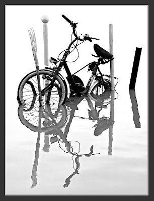
Yesterday, as I walked past the city of Lincoln's Brayford Pool, a natural lake formed where the River Witham widens, it was obvious that the recent spell of heavy rain had raised the water level considerably. Boats were floating higher, an island with a tree was submerged, the trunk sticking up through the water, walkways out to the moored pleasure craft were below the surface of the brown, stirred-up flow, and a couple of bicycles locked to posts were semi-submerged.

The Brayford Pool is an interesting location with a long history of commercial use despite being 40 miles from the sea. The Romans used it as a port nearly 2,000 years ago. They journeyed up and down the Witham between Lincoln and The Wash, and also connected the city to the River Trent with the construction of the Fosse Dyke. The Normans, in the C11 and C12, brought stone up to the Pool to construct the castle and cathedral. In the C18 and C19 the wharves were lined with warehouses, and for a brief moment Lincoln was Britain's fourth most important port. But the commercial use of Brayford Pool declined, it decayed and was largely abandoned. In the 1960s there was a scheme to fill it in and create a large car park! Fortunately that idea was dropped. In recent years a regeneration project has brought pleasure craft, shops, eateries, walks, and wildlife to the Pool, and the location lives once more. Unfortunately this rejuvenation has been bought at the expense of the older buildings: too much was swept away, and consequently continuity and character are largely missing from the area.

I took this photograph of a rather wet bicycle from a Pool-edge path. As it's locked to a jetty it must belong to one of the nearby boats. It will need a good service and the application of grease and oil before it can be returned to use! The bicycle, poles, oar(!) and reflection made a strong shape, and I decided to accentuate this by conversion to black and white, and by increasing the contrast of the image.

photograph and text (c) T. Boughen

Camera: Olympus E510
Mode: Aperture Priority
Focal Length: 100mm (200mm/35mm equiv.)
F No: f7.1
Shutter Speed: 1/125
ISO: 100
Exposure Compensation: -0.3 EV
Image Stabilisation: On

Tuesday, January 22, 2008

In praise of the unique

click photo to enlarge
I'm a fan of good industrial design. Objects like the anglepoise lamp, the Thonet No. 14 bentwood cafe chair, the Braun ET22 calculator, or the Dreyfuss 300 telephone, made attractive and functional design available to everyman (though in some cases it was artful copies that were bought!). There are those who denigrate that which is mass produced in favour of the "designer" label or the "one off". But most people are aware that good design and mass production are frequent bedfellows, and that aesthetic as well as economic benefits flow from this pairing.

But, however good our industrial products are, there is still a place for the hand-made. In fact the perfection and ubiquity of mass produced items seems to make us crave the individual, unique, even flawed products of craftsmen and artists. It may also account for the recent rise in home-based crafts such as collage, card and candle making, etc. There seems to be a fundamental human need to have hand-made things around us, not just out of necessity, but for deeper psychological reasons, perhaps connected with where we have come from as a species.

Today's photograph is a detail from a hand-made glass bowl, one of two recently bought from a gallery exhibition. The irregular pattern and colours of varying depths suggest the sea, and the way the lines swirl around and converge at the bottom of the bowl give a sense of movement - like water going down a plughole! The bowls have a matt finish on the exterior and are glossy inside. I set up some bright lights and reflectors around the bowl to highlight the the attractive design, and used a macro lens to capture a detail from inside.

photograph & text (c) T. Boughen

Camera: Olympus E510
Mode: Aperture Priority
Focal Length: 35mm macro (70mm/35mm equiv.)
F No: f16
Shutter Speed: 1.0
ISO: 100
Exposure Compensation: 0EV
Image Stabilisation: Off

Monday, January 21, 2008

Looking back No. 2

click photo to enlarge
High Dynamic Range (HDR) is one of the current buzz phrases in digital photography. Concisely put, it's a method of combining a number of shots of the same subject into a composite image with an extended range of values between light and dark areas. Usually three images are combined: one "underexposed" (to benefit from the highlight detail), one "overexposed" to use the shadow detail, and one "correctly" exposed (to supply the mid-tones). The resulting image is said to more closely approximate what the eye and the brain "sees".

In the hands of a skilled and thoughtful photographer this is broadly what happens. However, others use it, wittingly and unwittingly, to produce "hyper-realistic" images that have the unreal glow that characterises a certain type of naive painting. These can be interesting, but have become gimmicky, and any interest soon wanes when you've seen a lot of them. And over the last couple of years I've seen many! But a thought occurred to me a while ago, when I did my own HDR shot (above) - the Victorian painters of the Pre-Raphaelite Brotherhood (PRB) would have loved this technique! As I sat back and looked at my completed photograph I was reminded of the finish (not the subject necessarily) of their radiant images that lovingly depict the minutiae of the English countryside; paintings such as "A Study in March" by John William Inchbold (1830-1888), or "Our English Coasts (Strayed Sheep)", by William Holman Hunt (1827 - 1910). In the years since they flourished the PRB have ridden the roller coaster of critical acclaim, with the dips being every bit as extreme as the heights. The interest in HDR shows some signs of having reached its own summit of popularity, and I hope that instead of being dispensed with it will settle down to become a useful, and occasional (!), technique in the photographer's armoury.

My photograph shows the church of St Thomas A Becket, in the village of Aunsby, Lincolnshire, taken last autumn during my break from posting. This building, erected mainly between the 1100s and the 1500s, is one of the many medieval masterpieces that await the visitor to this eastern county. I came upon it part way through a walk that took me to a succession of such village churches. My shot was taken with the camera programmed to record three images simultaneously, each with different levels of exposure.

photograph & text (c) T. Boughen

Camera: Olympus E510
Mode: Aperture Priority
Focal Length: 14mm (28mm/35mm equiv.)
F No: f7.1
Shutter Speed: 1/400
ISO: 100
Exposure Compensation: -1.0, 0, +1.0EV
Image Stabilisation: Off

Sunday, January 20, 2008

Kill or cure!

click photo to enlarge
It's January and Helleborus orientalis, the hellebore, is in full bloom under a large willow tree by the stream in my garden. Now I know that aspirin originally came from a chemical in the bark of the willow, but I only recently discovered that hellebores were once considered a great cure for worms in children. Though since it tended to kill more people than it cured I wonder why its efficacy wasn't challenged sooner!

In fact, hellebore was considered to be a purgative by Hippocrates, so its medicinal use is of long standing. Some believe it caused the death of Alexander the Great when he took it as a medicine. In 585BC the Greeks, in the siege of Kirrha, used hellebore to poison the city's water supply. The defenders weren't killed, but they were so weakened by diarrhoea that they were unable to resist the final onslaught. In medieval times people believed witches used the plant to summon demons, and over the years its ingestion has been thought to cause tinnitus, vertigo, swelling of the tongue and throat, slowing of the pulse and death by cardiac arrest. So this is a plant that requires careful handling, and one that should never pass your lips.

Discovering all this I now look at the subdued flowers of the plant with fresh eyes. I imagine it resting on a Victorian coffin in a glass-sided hearse, pulled by jet black horses with nodding plumes, led by a black clad undertaker in a top hat, under a leaden sky! Or is that a bit fanciful? Whatever the case, the history of the hellebore certainly caused me to use a black background when I photographed it, and I chose the shots made with the natural light of an overcast day rather than the more upbeat versions I took using bounced flash!

photograph & text (c) T. Boughen

Camera: Olympus E510
Mode: Aperture Priority
Focal Length: 35mm macro (70mm/35mm equiv.)
F No: f16
Shutter Speed: 1.0
ISO: 100
Exposure Compensation: 0EV
Image Stabilisation: Off

Saturday, January 19, 2008

Corn Office

click photo to enlarge
The High Street of Boston, Lincolnshire, was once a major town thoroughfare, thronged with riverside businesses, and a desirable residential area. Today it is cut off from the town centre by a dual-carriageway bypass. Consequently it's a bit down-at-heel, the focus of some half-hearted "regeneration". However, for the photographer it's a visual cornucopia, with potential images at every turn.

The buildings along the street record every century from the 1400s to the present day. There are Victorian buildings both dour and lively, eighteenth century survivors displaying faded elegance, and other buildings, like the Artisan-Mannerist, late seventeenth century/early eighteenth century terrace at 124-136 (known locally as "The Barracks") are just plain quirky. However, one of the most striking buildings is a former warehouse dating from the early 1800s. One side faces the street, and the other is on the river. It is a tall structure, only three bays wide by two bays, brick built with rendered infill, stone quoins, and a stone ground floor. It has been sensitively converted into flats, but formerly it was the Public Warehouse, with a winch for loading and unloading from ships moored on the River Witham. During restoration some of the Victorian script on the building was uncovered, and this has been preserved for all to see.

My photograph uses part of that script set amongst the the dressed stonework and rendering of the ground floor. I liked the contrast of materials and, particularly, the way the limited range of colours fitted together. The words "CORN OFFICE" gave it an extra dimension. I aimed for an asymmetrical but balanced composition.

photograph & text (c) T. Boughen

Camera: Olympus E510
Mode: Aperture Priority
Focal Length: 42mm (84mm/35mm equiv.)
F No: f7.1
Shutter Speed: 1/40
ISO: 100
Exposure Compensation: -0.3EV
Image Stabilisation: Off

Friday, January 18, 2008

Industrial semi-abstract

click photo to enlarge
I worry about about modern architecture. Not in a way that keeps me awake at night, but in a way that makes me say, "Is that the best we can do?" That probably sounds arrogant so let me enlarge. In the best architecture of the twentieth century we saw the realisation of the idea that the best buildings are those where the form arises in large measure from a design straightforwardly fulfilling its purpose. Louis Sullivan's much misquoted "form follows function" summarises the approach, and it's one to which I subscribe.

Industrial buildings invariably do this: so too do some commercial buildings. But many do not. Much domestic housing is tricked out in borrowings from historical and vernacular styles - a bit of mock half-timbering here, a bit of Victorian cresting or herringbone brickwork there, the intention being to lay on a veneer that impresses the viewer. And, increasingly, our major cities are being decorated by "iconic buildings", that, in their way, do the same. I listen to the adulation that accompanies the latest Frank Gehry or Zaha Hadid building and often find myself asking, "Why is it that shape?" Am I wrong in thinking that too often the answer is, "Because it can be?" City authorities queue up for the services of such architects, intending to secure a "Gee whiz", landmark building. But it occurs to me that if you want to build well you don't build for effect.

This factory in Boston, Lincolnshire, is a big, shiny, metal-clad box with an interesting, blocky, protrusion. Is it a filter, an intake, or something else? Whatever it is, it is that shape to most efficiently fulfil its purpose: an example of form following function and organically producing something of interest. And providing me with a semi-abstract photograph!

photograph & text (c) T. Boughen


Camera: Olympus E510
Mode: Aperture Priority
Focal Length: 150mm (300mm/35mm equiv.)
F No: f11
Shutter Speed: 1/320
ISO: 100
Exposure Compensation: -0.3 EV
Image Stabilisation: On

Thursday, January 17, 2008

Old sheds

click photo to enlarge
At some time in the future a photographer will stop in front of an old agricultural shed and say to his friend, "Weren't these twenty-first century steel framed buildings, with their green, powder-coated, pressed metal walls and roofs wonderful". They'll be extolling the virtues of a structure that many today see as an abomination, a blight on the countryside.

However, it doesn't take an enormous leap of the imagination to see how an eyesore becomes an icon: how the stone-built Yorkshire Dales barn, the height of modernity in the nineteenth century becomes the ancient listed building of today. Or how the brick-built, terracotta-tiled barn of the eighteenth or nineteenth century in East Yorkshire or Lincolnshire, structures associated with the agricultural "improvers" who dispossessed the poor of their land, becomes the rustic and romantic backdrop to desirable country living.

Whether anyone will "Ooh!" and "Aah!" over this pair of ramshackle sheds is another matter. Yet, they too carry a record of the past in their timber and block construction, as well as a reflection of the neglect and the harsh weather they have experienced. I came upon them among fields of vegetables in the flatness of the Lincolnshire Fens. The rising sun was driving off the morning fog, but enough remained for it to obscure the horizon and isolate the sheds from their background. They were housing some large pieces of new timber, a commodity rare enough in this intensively farmed area, and ragged though they were they were, they were still good enough to provide valuable protection.

photograph & text (c) T. Boughen

Camera: Olympus E510
Mode: Aperture Priority
Focal Length: 11mm (22mm/35mm equiv.)
F No: f7.1
Shutter Speed: 1/125
ISO: 100
Exposure Compensation: 0EV
Image Stabilisation: Off

Tuesday, January 15, 2008

Looking back No. 1

click photo to enlarge
Nostalgia isn't what it used to be - it's much worse!

Two of the principal culprits for the current obsession with looking over our shoulders at the past are multi-channel television and the internet. In theory the more TV channels you have, the more choice you have, and the better quality viewing you experience. In practice the expanded air time is filled with repeats of recent programmes or re-runs of ancient ones, because it costs so much less. The internet, via the likes of YouTube and fan sites, enable the nostalgic to indulge the most obscure tastes in music, comedy or drama. You like Bagpuss - there he is, Mouseorgan and all. The Goon Show - easy to find. Obscure and not-so-obscure 1960s rock groups abound, and on the back of this new exposure polish their Zimmer frames and hit the road again. Not so long deceased pop groups are revived after ever shorter periods out of the public eye - was it only 10 years ago that the Spice Girls and Take That were assaulting our ears with their vacuous ditties, and why are they doing it again? Oh yes, the money!

There is an upside to the ready availability of the past. It means you can find a better alternative to today's offerings! A while ago, when the evening's TV offered little but reality twaddle, I discovered the Pogues' excellent version of the Ewan MacColl song, "Dirty Old Town" on YouTube - a Salford man's piece from 1956, covered by an Irish band in 1985, and introduced to me in 2007! But this recycling of the past also means that the current producers of popular culture don't have to try as hard. If pop songs and TV shows are no longer the disposable fodder that we once thought them to be, then there's no need to make as much new stuff, and it doesn't have to be as good - because it can easily be leavened with sprinklings of yesteryear's output.

All of which leads me to this photograph that I took at the end of September. I was looking back through the images that I took during my absence from blogging and this photograph of St Andrew's church at Sempringham, Lincolnshire, caught my eye. This building is the only above-ground remains of Sempringham Priory, the monastery where, around 1130, St Gilbert started the sole English-founded monastic order, the Gilbertines. The order was unique in admitting both men and women, and, far from ensuring its popularity, this fact may have accounted for its relatively poor acceptance!

photograph & text (c) T. Boughen

Camera: Olympus E510
Mode: Aperture Priority
Focal Length: 11mm (22mm/35mm equiv.)
F No: f7.1
Shutter Speed: 1/500
ISO: 100
Exposure Compensation: -0.3EV
Image Stabilisation: Off

Monday, January 14, 2008

Don't interact

click phot0 to enlarge
"Interactive" has to be one of my least favourite words. So-called "involvement" through "interactivity" seems to be the 21st century's ubiquitous "democratic" bolt-on feature. Everything has to be interactive. Radios want you to call in or text and give your point of view. So do TV stations with their "tickertape" messages from the public. Have you ever read any of those - they must be the new outlet for the green ink brigade. Whole programmes now feature nothing but "real" people "interacting" with each other. Websites everywhere solicit the user's input, sometimes (like Facebook) to the point of being almost "content free", apart from people craving recognition in its most meaningless form from other people. And zoos, museums and galleries have caught the interactive disease too.

A couple of years ago I went to "The Deep", a new aquarium in Hull. It had some great fish in some stunning tanks, and I enjoyed seeing them. But the whole experience was spoiled (and limited) by an interactive section with computers, buttons to push, knobs to spin, headphones to wear, etc. Most adults seemed to be walking straight past all this. Children pushed, prodded, rarely listened, and raced between interactivities so rapidly that any information that was supposed to be conveyed must have gone straight into the ether. Art galleries offer this type of thing too - draw like an Impressionist, do a jigsaw of this famous painting, remove the layers of a painting electronically to see what's underneath, all in a feeble attempt to "involve" the visitor. What I - and I suspect many others - want is a well mounted exhibition, with interpretation by someone who is knowledgeable, that entertains, challenges and informs. The money a gallery saved on interactivity over a year could mount an extra exhibition. So, I was pleased when I heard this week a politician say that Government funding of the arts was to be more focussed on quality, and less on participation and "ticking the boxes". Until I realised that this might just mean even bigger doses of the juvenilia of Damien Hurst, Tracey Emin and co, and less space for new artists!

Today's photograph shows the exterior of "The Haven" gallery in Boston, Lincolnshire. It is currently showing some landscapes by the U.S. photographer Hope Greene, and drawings by David Lloyd Brown. I liked the confusion resulting from the layering of lights, the reflected converted warehouses, the grid of the glass curtain wall, and the passing person.

POSTSCRIPT: "Don't interact" seemed a prescriptive, rather killjoy title, and I was going to change it. Then I read this article about "Facebook" in today's Guardian newspaper. It only deepened my concerns about this type of phenomenon. If only half of the article is true, this post's title is advice worth following.

photograph & text (c) T. Boughen

Camera: Olympus E510
Mode: Aperture Priority
Focal Length: 16mm (32mm/35mm equiv.)
F No: f4
Shutter Speed: 1/100
ISO: 100
Exposure Compensation: -1.0EV
Image Stabilisation: Off

Sunday, January 13, 2008

Today's heraldry

click photo to enlarge
I've always liked heraldic devices. As a child I used to be fascinated by the arrangement of shapes, symbols and colours. I know something of the history of heraldry, and how it has developed, but it's really the graphic design of it that interests me. Heraldry and its devices continue in a small way today, of course, but it's now largely the preserve of large organisations and those who want to feel separate from the masses by associating themselves with these ancient tokens of status.

Today's living heraldry is in fact found in the logotypes that modern businesses use to market themselves. And, like their antecedents, the designs are not immutable. Many logos slowly evolve over the years, adopting the styles that are current, then morphing again when fashions change. It's illuminating to look at the evolution of the logos of, say, Ford, Coca-Cola, BP or Barclays down the decades. The overarching rule is one of complexity being reduced to simplicity over time, though sometimes firms do step back to a more ornate, "older" looking design. Some logos are wonderful pieces of graphic design encapsulating the essence of the organisation they represent with a few strokes of the pen. My particular favourite is that of the now defunct electronics company Plessey, whose logo both spelled out its name and suggested an oscilloscope display!

I took this photograph of the current Royal Mail logo when I came upon one of its new buildings, clad with gleaming, highly reflective metal, surrounded by newly planted trees, in Boston, Lincolnshire. As a logo it's competent without being inspirational, the worst part being the chosen font. However, the splash of red seemed a good focus for the flawless background overlaid with the imperfect lines of the tree and its reflection.

photograph & text (c) T. Boughen

Camera: Olympus E510
Mode: Aperture Priority
Focal Length: 77mm (154mm/35mm equiv.)
F No: f7.1
Shutter Speed: 1/3200
ISO: 100
Exposure Compensation: 0 EV
Image Stabilisation: Off

Saturday, January 12, 2008

Walking and clicking

click photo to enlarge
There are lots of ways to secure good photographs, but recently I've been thinking about two contrasting approaches. The first involves getting on an aeroplane or ship, or into a car and travelling to a distant, preferably foreign location, often with a pack of other photographers, and snapping away for a couple of weeks. I think of this as the "Luminous Landscape" approach to photography because each time I have a look at that website I see images taken on such trips to India, Africa, the Antarctic or some other far flung land. Now it's perfectly possible to get good images in this way, but it's also extremely easy to fill your camera with cliches, as you're seduced by the novelty of what you see.

The other approach is to regularly walk around the area in which you live at different times of day, in different seasons, and in different kinds of weather. Now it's perfectly possible to get bad images this way! But, because you are familiar with the area, and because the subject matter is more limited you have look more closely to find your photographs. And therein, I think, lies the benefit of this second approach - you are more likely to learn the key skill of photography, and you have a better chance of coming up with some original images.

I make no great claims for originality for today's photograph, taken as I walked around Boston, Lincolnshire. I like shadows, and I like positive/negative effects, and this composition appealed to me because it embraces both of these characteristics. The palm is in the garden of the white Regency date house, but its shadow is thrown onto its adjoining brick-faced neighbour (of the same period). I converted the image to black and white to emphasise the qualities I liked.

photograph & text (c) T. Boughen

Camera: Olympus E510
Mode: Aperture Priority
Focal Length: 53mm (106mm/35mm equiv.)
F No: f7.1
Shutter Speed: 1/400
ISO: 100
Exposure Compensation: -1.0EV
Image Stabilisation: Off

Friday, January 11, 2008

The Octagon

click photo to enlarge
The classic English cathedral differs from its continental counterparts in a number of ways. Firstly, it usually has a square east end rather than an apse with chapels. Secondly, in profile, seen from a distance, there is less emphasis on verticality and more on horizontality. Thirdly, inside the nave and chancel the upward thrust of columns, arches and vaulting is more heavily broken by horizontal features. And fourthly, the buildings, by and large, have two west towers and a larger crossing tower. So, typical English cathedrals look like York, Durham, Lincoln or Lichfield, though some dispense with west towers entirely, and a few, like Westminster Abbey, have a very French look. However, one English cathedral doesn't fit into any of these descriptions very well at all - in fact it's a real oddity - and that is Ely.

Like some German cathedrals, Ely has a single west tower, but without the expected spire. Instead it has a castle-like top of embattled turrets. A heavy stone crossing tower is absent, and is replaced by an octagonal structure with a wooden corona (the Octagon) of the oddest profile, that appears to strive for width rather than height. The building's profile from some angles is quite military, and from others, veritably craggy. That Ely was largely complete by 1350 makes all this even odder. In fact it's hard to describe the exterior of Ely as beautiful, though it is undeniably interesting. However, the interior is absolutely wonderful - featuring a massive Norman nave and the underside of that corona.

My photograph was taken during a family visit in winter. I had no tripod, only one lens, and less time than usual to compose my image. So, I was glad for the in-body Image Stabilisation of the camera. That innovation, combined with my body braced against a wall, high ISO, and a wide aperture, allowed me to get this fairly sharp shot of the underside of the Octagon.

photograph & text (c) T. Boughen

Camera: Olympus E510
Mode: Aperture Priority
Focal Length: 11mm (22mm/35mm equiv.)
F No: f2.8
Shutter Speed: 1/6
ISO: 800
Exposure Compensation: -1.3EV
Image Stabilisation: On

Thursday, January 10, 2008

Salons and blown highlights

click photo to enlarge
I've often wondered what visitors to the UK make of the names of our hairdressing salons and men's barbers. When I was young they seemed to be named after the woman or man who ran the place. But gradually, and I guess it started in the 1960s, many adopted punning shop names, some of them quite inventive and many designed to bring a smile to your face. For a number of years I've been keeping a mental note of some of my favourites. Here they are:

Herr Cutz (unlikely to have a German proprietor I think!)
Curl Up 'n' Dye (potentially off-putting!)
The Hair Force (military cuts a speciality?)
The Hair Port (civilian version of the one above?)
A Cut Above (you had to ascend stairs to get to this salon!)
The Head Gardener (lopping and pruning a speciality presumably!)
Ali Barber (no door handle, just say "Open Sesame" to enter)
Prime Cuts (do you leave looking like a dog's dinner?)
Hairs & Graces (someone had used "A Cut Above"!)
Beyond the Fringe (where Alan Bennett gets his hair cut?)
Deb 'n' Hair (Deborah had to dig deep for that one!)
Hair 'n' Now (the fast-food equivalent of hair salons?)
Uppercuts (their styles are a knockout! Ouch!)

But enough of this nonsense: let's talk about blown highlights instead. And I don't mean the sort that are inflicted by one of the establishments above. No, I mean the white (255) that can creep into a photograph in an area of overexposure. Typically it's sky, but it can be white paint, shiny reflections, or any other bright area. Lately, it seems to have become the unforgivable sin of digital photography, and I'm here today saying "lighten up" (pun intended), a bit of blown highlight isn't a problem. It's usually only noticeable by those looking for it. These people are like the audiophiles who spend their time listening for the faults in their equipment rather than the music it's producing. The blown highlight brigade has forgotten the big picture (pun intended again). So in the interests of provocation here's a shot of pylons in morning fog with a massive blown highlight. It also breaks that old photographic rule that says don't let the sun's disc intrude into your image. You don't like it? So criticise me!

photograph & text (c) T. Boughen

Camera: Olympus E510
Mode: Aperture Priority
Focal Length: 35mm (70mm/35mm equiv.)
F No: f7.1
Shutter Speed: 1/4000
ISO: 100
Exposure Compensation: -2.0 EV
Image Stabilisation: Off

Wednesday, January 09, 2008

Feather

click photo to enlarge
"Birdbrain n. colloq. a stupid or flighty person" (Concise Oxford Dictionary).

Anyone with a passing interest or proximity to birds can't help but notice the seeming dim-wittedness of our avian friends. I feed the birds each morning, putting some food on a bird table, and the remainder at various locations around my house. The bird table used to be the domain of a group of about 30 house sparrows that frequent a hedge near my kitchen window. However, for the past few weeks a particularly belligerent female blackbird has taken command of this feeding station, and spends her time hastily swallowing food between attempts to deny any to the sparrows. And she's successful. But, she must use as much or more energy in her displays of aggression as she gets from the food! Furthermore, 30 sparrows acting together should easily be able to dislodge a single blackbird. But they waste their time and energy taking turns to hover around the bird table, out of range of the blackbird's beak, in futile attempts to get the food. Birdbrained indeed.

However, in my experience few of our feathered friends can demonstrate feeble-mindedness as well as the guinea-fowl. A memory of my early teenage years is being sent into the woods by my uncle to find their nests. They were spread over a wide area, were never near their enclosure, with many simply abandoned, forgotten by their owners. My friends' guinea-fowl are equally imbecilic, and can spend literally hours walking back and forth alongside a fence searching for a way through, with no thought that they can simply flap their wings and fly over it.

Today's photograph is a feather from one of those guinea-fowl. What a beautiful object this small thing is, and how much more is revealed by the close inspection that a macro lens allows. I shot the feather (not the guinea-fowl!) in strong, natural side-light, on a dark background of textured plastic to restrict the colour range and accentuate the patterns. Birdbrained though they are, it is easy to forgive birds their mindlessness for the great beauty of their form and song, and for the pleasure that their company brings to our lives.

photograph & text (c) T. Boughen

Camera: Olympus E510
Mode: Aperture Priority
Focal Length: 35mm macro (70mm/35mm equiv.)
F No: f18
Shutter Speed: 1/2
ISO: 100
Exposure Compensation: -0.7EV
Image Stabilisation: Off

Tuesday, January 08, 2008

Conserving the past

click photo to enlarge
The Church of England has about 16,000 parish church buildings, and 43 cathedrals. Over 12,000 of these are "listed", that is to say, recognised and protected by legislation for their historic and/or architectural importance. The highest level of "listing" is Grade 1, and about 45% of all Grade 1 buildings in England are churches.

Many churches are the most ancient building in their locality. The oldest, St Martin's, Canterbury, was in use when St Augustine came to these islands in AD597. Clearly such buildings are worth looking after, not only for their religious purpose, but for the historical record that they carry for their communities. But, here is the problem. Each parish church is maintained largely with funds raised by its congregation. Some money is available from the government for building work, but rarely as much as is needed. And, Church of England congregations throughout the country are in decline, so money is increasingly hard to find. It may be that in the future the state will take over these buildings (as I believe is the case in France). But until that happens, or unless congregations flock back to the church, then maintaining these wonderful old structures is going to be a problem.

Some churches, usually the less architecturally and historically significant find other uses, perhaps as arts or community centres. Occasionally they find tenants for part of their space and become dual use buildings. But others, particularly in rural areas fall out of use and become redundant. The Churches Conservation Trust is a charity that cares for 340 of these buildings, including the one shown in my photograph, St Margaret at Haceby, Lincolnshire. This lovely, unspoiled old building, dating from about 1100AD, is next to a farmyard in the small settlement of a few houses. To step into it is to cast off the twenty first century completely. I took this shot from inside the church looking into the south porch. The aged walls, the shadows of the porch gate, and the collection of leaves blown in by the wind all suggested an evocative photograph. I found it hard to decide how to present the shot - black and white and sepia both work well, but here it is in colour.

photograph & text (c) T. Boughen

Camera: Olympus E510
Mode: Aperture Priority
Focal Length: 13mm (26mm/35mm equiv.)
F No: f7.1
Shutter Speed: 1/60
ISO: 100
Exposure Compensation: -1.7EV
Image Stabilisation: On

Monday, January 07, 2008

Variations on a theme

click photo to enlarge
I've been interested in photography for long enough to know that certain themes get a regular working over in journals, books and on the internet. One such theme is "finding a voice", sometimes called "discovering your own style". This idea is adapted from fine art criticism, and goes something like this. When you start out in photography you take snaps, then as your interest and skill grows you re-create technically sound well-known genres (some would say cliches) of images, and finally, if you make the ultimate leap, you produce artistic original images each including an element of a style that you have created: your work becomes recognisable by your particular "signature". Many enthusiastic amateurs, not a few professionals, and certain eminent photographic societies subscribe to this view of photographic development. And it's essentially rubbish!

It's true that some excellent photographers have trodden this road. But many have produced good images from the outset, others have a body of work that has changed over time, and there are those who have always been eclectic. Ultimately, each photograph must be judged by the content circumscribed by its rectangular perimeter. If it's good it's good, regardless of whether it fits in with a wider body of work. Photography has been in existence for the last 160 years, and like the other arts has been thoroughly worked over by successive generations of practitioners. The extent to which anyone can produce anything startlingly original in photography is limited. But, startlingly good photographic work can be produced in specific locations, or within genres, or by re-working ideas, just as a musician might take the tried and tested sonata form (or the blues) and create something we can all admire.

These thoughts arose when I looked at my photograph of a shopper amongst the market canopies at Newark in Nottinghamshire. Today's Guardian newspaper carries a photograph that uses the same idea of individuality set in repeated uniformity - a child in a red scarf looking round in a mass of black-clad women in Iran. Now, to some this is a well-worn theme (a cliche even), but I think it bears successive iterations because of the subjects to which the idea can be applied. Original? No. Of interest. I think so. But then I like the blues!

photograph & text (c) T. Boughen

Camera: Olympus E510
Mode: Aperture Priority
Focal Length: 150mm (300mm/35mm equiv.)
F No: f6.3
Shutter Speed: 1/500
ISO: 100
Exposure Compensation: -0.3EV
Image Stabilisation: On

Sunday, January 06, 2008

I've got those faded-jeans, knocked-about-a-bit blues

click photo to enlarge
It must have been around 1980 that I stopped buying denim jeans. I went to the shops to buy my preferred make - Wrangler as I recall - and nowhere could I find a pair that hadn't been partly worn-out by some kind of stone-washing. Now call me old-fashioned, or tight-fisted if you prefer, but I like to buy my jeans made of pristine, indigo blue denim that the originators in Nimes might have recognised. Don't get me wrong, I like the faded effect, and that "knocked-about-look", but I want it to be gradually acquired through regular use and the rough-and-tumble of life. A few hours rotation in a drum full of pebbles in a Chinese factory doesn't cut it for me - it's ersatz, not authentic. A bit like - to digress more than somewhat - the famous black and white photograph of James Dean, his collar turned up against the New York rain, cigarette in the corner of his mouth, looking world weary. World weary at 24! If you believe the message of that shot you'll believe in fairies.

But - here comes the confession - last year I bought some partly worn-out, stone-washed, already-faded jeans. After 27 years of holding out I succumbed. I'm not proud of it. They were inexpensive, and I was tempted by the price. They undoubtedly do the job (though it won't be for as long as it might have been). Yet, each time I slip them on I feel that the jeans have got to that "knocked-about-look" under false pretences. Their patina is not of age but artifice. Their paleness isn't from the trials and tribulations of life. What's more their looks aren't as a result of a journey shared - with me.

So, you may be wondering, what has this to do with a photograph of the church of St Margaret at Braceby in Lincolnshire. Well, I like a full-on Gothic-masterpiece of a medieval church as much as (no, probably more than!) the next man. But I also have a soft spot for a knocked-about wreck of a building like St Margaret's. It's had clerestories added, aisles swept away, windows re-positioned, arcades filled and roof-lines altered to the point where it looks a real ugly duckling. But, importantly, it wears its past honestly, with no shame: there is nothing ersatz about St Margaret's. If it was a pair of jeans it would have had no truck with pebbles! So I was very happy to photograph it among the crazily leaning gravestones of its churchyard, as the sun broke through the clouds on a cold January morning.

photograph & text (c) T. Boughen

Camera: Olympus E510
Mode: Aperture Priority
Focal Length: 11mm (22mm/35mm equiv.)
F No: f7.1
Shutter Speed: 1/320
ISO: 100
Exposure Compensation: -0.3EV
Image Stabilisation: Off

I'm back!

It's time to resurrect PhotoReflect, so there'll be no more posts at PhotoQuoto. My blogging silence for the past 6 months is due to my having moved to a different part of England. I've been busy with all those time-consuming, but necessary, jobs associated with moving house. Look out for my regular (though probably not daily as before!) posts and Olympus-made images.

Regards, Tony