click photo to enlarge
Old walls seem so much more appealing than new ones: I've photographed and posted a few recently. I don't think that's simply a natural proclivity: growing up in the Yorkshire Dales exposed me to many fine old walls early in life, and may be responsible for my predilection. When I think about what draws me to them it's surely the interesting textures and materials, the random elements, the greater variety of colours, and the sense that an aged wall has seen and been through a lot, that is at the heart of their attraction.
This part of the Marriott Warehouse on the east side of South Quay, King's Lynn, Norfolk, is a good example of such a wall. It shows the north end of the ground floor of the river-facing elevation of the old warehouse. The lower wall with the large pieces of ashlar dates from the early 1300s when it was first built, perhaps for the Hanseatic League, as a single storey structure. At that time its walls were probably wholly made of stone. It was extended upwards in brick in the 1400s and 1500s. In the 1700s the building was extensively re-modelled with new doors and segmental arched windows (like the one shown) inserted. Further modifications kept the building usable in the 1800s and 1900s. The iron tie-beam, an "S" shaped end of which can be seen in the photograph, probably dates from the Georgian or Victorian period, and the unpainted wood window must date from a restoration around the turn of the Millennium.
This piece of wall appealed to me for the attractive mix of elements, the diversity of the bricks from many ages, the poorly laid courses above the window, and the way it seemed to summarise the trials and tribulations of the building down the centuries. I placed the window on the left of the frame and was grateful for the visual weight of the tie-beam end on the right.
Incidentally, for those who are interested in such things, Marriott's Warehouse is one of the 18,000 Grade II* structures in England and Wales. More details about what that means here.
photograph & text (c) T. Boughen
Camera: Olympus E510
Mode: Aperture Priority
Focal Length: 53mm (106mm/35mm equiv.)
F No: f5.6
Shutter Speed: 1/200
ISO: 100
Exposure Compensation: 0 EV
Image Stabilisation: On
Pages
▼
Saturday, November 29, 2008
The beauty of imperfection
click photo to enlarge
Perfection can be seductive. It can also be very boring. I frequently confuse women actresses and pop singers because so many modify their appearance to conform to a "type" that many men seem to find "perfect". You know the sort - slender, blond, full lips, smooth skin, symmetrical "doll-like" features. And, frankly, I find this look uninteresting.
The same applies to male actors and singers. The androgynous look is widely cultivated and equally dull and confusing. Or how about car styling? The recently revealed 4-seater Porsche seems to have elements of virtually every sports cars designed since the 1960s. In their quest for perfection the stylists have removed all traces of individuality from the body-shape. Quirks, flaws, imperfections, individuality, make - for me - more appealing looks and designs. In an earlier blog post I questioned whether the exterior appearance of Norman Foster's Swiss Re tower (the "Gherkin") in London is too perfect, visually facile, lacking an element that breaks into the simple shape and colours, and whether we'll soon tire of its easy appeal. Architects still make the mistake of excessive simplicity in the search for perfection. Many realised, early in the twentieth century, that introducing the random imperfections of trees and bushes in architectural drawings, and in actuality, improved people's appreciation of their buildings' smooth surfaces, repeated right-angles and shimmering curtain walls.
Similar reasoning can be applied to photographs. It's quite easy to take pictures of flawless subjects, particularly when depicting the man-made world, but the result is often unsatisfying. Today's photograph is a case in point. It shows a wall covered in blemish-free, brushed stainless steel tiles. The orientation of each is such that the wall has a lustrous chequerboard pattern. However, when I came to photograph it I looked for a position that allowed me to incorporate elements (particularly the shadows and reflected ceiling lights) that broke up the perfect surface. The paradox is that including the imperfections gives increased emphasis to the perfect finish, as well as adding interest to the overall composition.
photograph & text (c) T. Boughen
Camera: Olympus E510
Mode: Aperture Priority
Focal Length: 22mm (44mm/35mm equiv.)
F No: f7.1
Shutter Speed: 1/30
ISO: 400
Exposure Compensation: -1.0 EV
Image Stabilisation: On
Friday, November 28, 2008
The quest for immortality
click photo to enlarge
Is the personal quest for immortality through artefacts anything more than simple vanity? I can't see that it is. The idea that you want or need people to remember you after your death seems absurd to me. That family, friends and admirers might wish to remember a person is an entirely different matter, but naming a building after yourself, building your own marble mausoleum, having your statue cast, or writing a book with that purpose in mind, seems to me a rather pathetic act of weakness and vanity. I remember being disappointed when I read that John Keats' poetry was motivated, in large part, by his desire for fame and immortality, and that the drive that leads many to write was only a small part of his motivation. His reason for writing seemed to demean both him and his work.
This thought sometimes comes into my head as I look at the monuments and memorials in churches. Many are erected with gratitude by people who knew the deceased. But others are works commissioned by the person commemorated, and are clearly designed to portray him or her in a flattering light. Those depicting eighteenth century aristocrats in antique Roman costume, exuding classical nobility and learning, accompanied by a tablet of unctuous prose, are the ones I find particularly repugnant.
I don't know whether this fifteenth century knight of the Order of St John in the church of St Botolph, Boston, Lincolnshire, commissioned his own effigy, or whether it was made after his death. It is an interesting alabaster piece, and without sculpture such as this we would know much less about the armour of people of that time. However, as a commemorative piece it has failed, because, unlike many in this type of memorial, we no longer know precisely who is shown. We do know that the Order was active in Boston in the thirteenth century, that it maintained two hospitals and St John's church in the town, and that it was dissolved in 1540, but beyond that we know little. It may be connected with the family of Sir William Weston. Today we can enjoy it as a piece of sculpture, as social history, and as a tangible link to the place's past. But not as this person's stab at immortality.
photograph & text (c) T. Boughen
Camera: Olympus E510
Mode: Aperture Priority
Focal Length: 17mm (34mm/35mm equiv.)
F No: f5.6
Shutter Speed: 1/15
ISO: 400
Exposure Compensation: -1.0 EV
Image Stabilisation: On
Thursday, November 27, 2008
The wind in the reeds
click photo to enlarge
Here's another image in my recently begun quest to capture movement in nature using motion blur. Regular visitors may remember shots of the wind stirring some unripe barley and the waves on a shallow, stony-bottomed river. Today's photograph shows wind passing across a reed bed.
During a recent walk on a bright but quite windy day at Surfleet Seas End in Lincolnshire, I came upon this stand of reeds near the outfall of the River Glen. The low afternoon sun was offering some good contre jour shots of the feathery heads of the common reeds (Phragmites australis). However, the wind had other ideas. Each shot I made of selected heads using a long focal length lens was slightly blurred. So, rather than fight it I thought I may as well co-operate with the inevitable and do some deliberately blurred images. Looking at the wind passing over the reed bed I could see rippled lines being formed in the vegetation so I made these the focus of my efforts. It took about 6 shots to get this, the best of the bunch, with the lens stopped down to its maximum to produce the shutter speed of 1/10 second. I was pleased to get the blurred "waves" and at the same time some leaves and stems that were fairly sharp.
photograph & text (c) T. Boughen
Camera: Olympus E510
Mode: Aperture Priority
Focal Length: 102mm (204mm/35mm equiv.)
F No: f22
Shutter Speed: 1/10
ISO: 100
Exposure Compensation: -0.7 EV
Image Stabilisation: On
Wednesday, November 26, 2008
500th PhotoReflect Post
click photo to enlarge
I'd like to have marked this, the 500th PhotoReflect post, with a stunning image of an interesting subject portrayed in high-impact colour, with an innovative composition - a shot that makes people go, "Wow!" But I've run out of those, so here's a photograph of some cows instead!
I've always felt that if cows liked music then Friesians would be into strong commercial pop - Blondie, the Petshop Boys and the like; that Jerseys and Guernseys would prefer ballads by Shirley Bassey or Dean Martin; and Highland cattle (like those in today's offering) would be fans of early heavy metal. I can just picture the shaggy beasts, heads down, locks swaying, a trance-like look in their fringe-covered eyes, as they get into the groove of Deep Purple's "Smoke on the Water" or Led Zeppelin's "Whole Lotta Love".
Is it coincidence that cattle bred in the Highlands and Islands of western Scotland should have handle-bar horns, long ginger hair and prefer the thundering drums and wailing guitars of rock to the fiddles and accordions of Scottish folk music? Probably not. It's said that dogs and their masters grow to look alike, so why shouldn't a land settled by the Vikings and with more than a hint of ginger in the hair of its population produce red-headed cattle with big horns? It seems perfectly natural to me! What isn't so natural, however, is that I should find these cattle that were bred for the rugged land and cold, wet climate of Scotland on the flat Lincolnshire Fens. But there they were, late in the afternoon, by the River Welland near Surfleet Seas End, and very willing to strike a pose for me. Perhaps beneath my photographer persona they detected a kindred spirit with a partiality for loud electric music!
photograph & text (c) T. Boughen
Camera: Olympus E510
Mode: Aperture Priority
Focal Length: 128mm (256mm/35mm equiv.)
F No: f7.1
Shutter Speed: 1/320
ISO: 100
Exposure Compensation: -1.0 EV
Image Stabilisation: On
Tuesday, November 25, 2008
I still don't photograph birds
click photo to enlarge
Let me re-phrase the heading of this blog entry - "Birds are not a subject that I go looking for". But, if one passes my way I might snap it! A while ago I titled successive blog posts, "I don't photograph birds" and "I DO photograph birds!" The subject of each image was a heron. Over a couple of days they seemed to be lining up to have their photograph taken. However, the second wasn't a typical birdwatcher's bird photograph - more a generalist photographer's image.
When I came to review the photographs that I have taken of birds I found I've done more than I remembered, and not only herons! It seems I've captured the robin, a solo swan, a swan with cygnets and a sleeping swan, a black headed gull, a lesser-black-backed gull, a surrealistic herring gull, a distant carrion crow, a great tit at a nest box, silhouetted mallards, a moorhen on its nest, a pelican feeding its young (though it is in stained glass!), some metal sculptures of cormorants, and the feather of a guinea fowl. So, looking at today's photograph of a great tit at the nut feeder in my garden you might be thinking, "Hang on a minute Tony, you do photograph birds!" But I still feel I don't. It's only done casually, in passing, and often in a decidedly "arty" way. And then only if they are within range of my non-bird photographer's lenses, and if I happen to see them. Not one of them would pass muster in the eyes of a dedicated avian snapper. So, whilst I'm happy to say that I do photograph churches, buildings, landscapes, flora, semi-abstracts and quite a few other subjects, I really don't photograph birds. Honestly!
photograph & text (c) T. Boughen
Camera: Olympus E510
Mode: Aperture Priority
Focal Length: 150mm (300mm/35mm equiv.)
F No: f5.6
Shutter Speed: 1/250
ISO: 200
Exposure Compensation: -1.7 EV
Image Stabilisation: On
Monday, November 24, 2008
The world in a puddle
click photo to enlarge
"...imagine a puddle waking up one morning and thinking, 'This is an interesting world I find myself in, an interesting hole I find myself in, fits me rather neatly, doesn't it? In fact it fits me staggeringly well, must have been made to have me in it!' This is such a powerful idea that as the sun rises in the sky and the air heats up and as, gradually, the puddle gets smaller and smaller, it's still frantically hanging on to the notion that everything's going to be alright, because this world was meant to have him in it, was built to have him in it; so the moment he disappears catches him rather by surprise. I think this may be something we need to be on the watch out for."
Douglas Adams (1952-2001), English author and satirist
If mankind is to disappear from this world perhaps it won't be, as some imagine, a gradual decline with pockets of people hanging on until finally the last Adam and the last Eve expire. Maybe, as Douglas Adams' quote that uses the water in a puddle as a metaphor for mankind suggests, it will be sudden, a surprise, something we don't see coming. However, I don't foresee the earth being destroyed by part of a Vogon constructor fleet making room for a hyperspace bypass, as in Adams' book, The Hitchhiker's Guide to the Galaxy: rapidly accelerating climate change, a pandemic or a meteor impact seem the current favourites!
I came across the above quotation a while ago, quite incidentally, when looking for something else. But it stayed with me, like many of the best quotations, because it offered a different perspective on a familiar idea. The way Adams plays with and extends the metaphor is clever, humorous and thought provoking. It also shows, in a small way, how good prose and fiction can make powerful, perhaps even more telling, contributions to a debate that most think of as the province of science and politics.
But enough of all that doom and gloom, and on to the gloom in which I took this photograph! The blueness comes from the fast-fading light of evening. As I passed the puddle the yellow of the leaves seemed to glow against it, and I grabbed the image. A wide open lens and a touch of negative EV gave me just enough speed to maintain a sharp shot and keep the camera at 100 ISO.
photograph & text (c) T. Boughen
Camera: Olympus E510
Mode: Aperture Priority
Focal Length: 22mm (44mm/35mm equiv.)
F No: f3.5
Shutter Speed: 1/20
ISO: 100
Exposure Compensation: -0.3 EV
Image Stabilisation: On
Sunday, November 23, 2008
Contre jour teasels
click photo to enlarge
The mongrel nature of the English language is shown by the number of words that derive from other languages. French, German, Dutch, Latin, Hindi, Arabic, Spanish - it seems that there isn't a people anywhere in the world that haven't contributed to English.
Some words are absorbed and the meaning is modified, as with the French verb "promenade" meaning to walk or take a walk. Though English speakers still use it in that way, today, in British English, it is more often a noun meaning the main path (and road) next to the sea where people prefer to walk for leisure. Other words have been adopted and the pronunciation Anglicised. The Hindi for a single storey house with a verandah, "bangla", was appropriated by European colonists and turned into "bungalow". Some words are absorbed with no changes to meaning, spelling and pronunciation. The French phrase "contre jour", meaning "against the day" is an example. Though English speakers do describe a photograph such as that above, as "against the light", "contre jour" is also widely used.
Winter is a great time for contre jour shots. The low sun is often behind objects that it would be above at other times of year. In winter, light is at a premium, so it's nice to be able to frame shots that emphasise it in the composition and effects. These teasels (Dipsacus fullonum), interspersed with dead umbellifers, were growing in great profusion by a stretch of water. I came upon them in midday light when each dried head had its own annulus-like halo. I was pleased to be able to include a lot of out-of-focus examples behind the nearer heads that I made the main subject of the image.
See here for more information about teasels, and for another of my contre jour shots of these attractive seed heads.
photograph & text (c) T. Boughen
Camera: Olympus E510
Mode: Aperture Priority
Focal Length: 150mm (300mm/35mm equiv.)
F No: f7.1
Shutter Speed: 1/400
ISO: 100
Exposure Compensation: -1.0 EV
Image Stabilisation: On
Saturday, November 22, 2008
The expanding wine glass
click photo to enlarge
Maybe we didn't look hard enough. Or was it that they don't exist any more? Perhaps there's no demand for them. Whatever the reason, when we bought wine glasses recently we couldn't find any that I think of as "normal" sized, and ended up with some that I see as "large". Being curious I did a bit of research and discovered that the International Standards Organisation (ISO) has specifications for wine tasting glasses. These have capacities of 210, 300 and 410 ml. Looking again at the packaging I noticed that our glasses were described as 250ml. So, I measured them and found that they held 210ml with a space of 1cm at the top. Are these now the smallest size? And if so, what happened to the smaller glasses?
A quick surf around the Web found lots of 250ml glasses, some described as 200ml, many at 6.5 fl.oz., and some at 150ml. There were restaurants listing wines that they served in 175ml and 250ml measures. The impression I got was that the size of wine glasses has been re-standardized at the 250ml mark, and that the smaller glasses I've been familiar with for most of my life are on the way out. Which begs the question, is this due to consumer demand for bigger measures, or bars and restaurants wanting a higher return on each glass sold? Or a mixture of both? Combine this trend with the increased alcohol content of wines (11 or 12 percent has become 13 or 14 percent), and here's one more factor in the rise in alcohol consumption and its attendant problems.
But surely, it can be argued, you don't have to fill the bigger glasses. Well no, but a glass should be made to be filled so that you can know how much you're drinking. There's a small element of difficulty in pouring yourself the same known measure when you have a glass of wine if you're not filling the glass to the same point each time. And when glasses come in different sizes in different eateries the problem is compounded.
Well, after all that, today's photograph shows those "large" glasses after they've been washed. Some are the right way up, some upside down, and a few suds and water linger on their surfaces. I increased the tonal contrast a little to make the most of the reflections each glass has from each other and its surroundings.
photograph & text T. Boughen
Camera: Olympus E510
Mode: Aperture Priority
Focal Length: 35mm macro (70mm/35mm equiv.)
F No: f18
Shutter Speed: 1/80
ISO: 100
Exposure Compensation: -1 EV
Image Stabilisation: Off
Flash: FL36 TTL (bounced)
Friday, November 21, 2008
Ripples and similes
"The foolish are like ripples on water, for whatever they do is quickly effaced; but the righteous are like carvings upon stone, for their smallest act is durable."
Horace (65BC - 8BC), Roman poet
Similes involving ripples in water are amongst the most overworked of their kind. The classic version involves an action from which ripples spread, that affects other things or people. How many times, in recent months, have I read of the ripples that have spread throughout the world banking system from over-enthusiastic sub-prime lending? Too many!
And yet, when the idea of ripples spreading is used a little more creatively, as in the example from Horace, quoted above, it can be illuminating, and serve its purpose of increasing our understanding and deepening our enjoyment of the prose. Scientists have physical laws and mathematical formulae that describe the effect of the spread of ripples in water, and what happens when they meet a fixed or moving object, or other ripples. Yet, as I stood under a bridge and watched drips of water from above falling into the river, creating this complex intersection of concentric ripples, it was very difficult to see how each changed the others. Was the ripple simile built on sand (to murder a metaphor)? But perhaps the effect was so marginal as not to be visible. And that made me wonder how the simile gained such a firm foothold. However, I didn't wonder too long because it made my head hurt! Instead I enjoyed the play of light on water and the patterns that appeared and slowly disappeared as the energy from each originating drip was dissipated.
My photograph has had the contrast and colour adjusted slightly to emphasise the patterns.
photograph & text (c) T. Boughen
Camera: Olympus E510
Mode: Aperture Priority
Focal Length: 22mm (44mm/35mm equiv.)
F No: f6.3
Shutter Speed: 1/160
ISO: 400
Exposure Compensation: -0.3 EV
Image Stabilisation: On
Thursday, November 20, 2008
Reflected branches
click photo to enlarge
It's both a blessing and a curse that the human memory is so fallible. The multitude of events that we want and need to remember - about our early life, episodes when our children were growing up, or what we had for dinner yesterday - somehow get lost amongst the inconsequential things that are stored in our brains. Yet, our memory of an embarrassing incident that happened years ago can be as sharp as when it first happened and still retain the power to make us cringe. I remember someone saying that if the human body had a clear memory of pain women would never have more than one child. So yes, there are advantages and disadvantages in the way that we remember.
I don't know about you, but every year I forget how late it is before all the trees have lost their leaves. Not until the last days of November have most gone, and even then some are hanging on, defying the gales. The ash trees that I look at from my kitchen window are loath to lose their foliage, and bunches of "keys" are still visible in the new year. Willow trees, even though they are one of the first to show leaves in spring, seem particularly reluctant to part with them, and don't lose the last until December, by which time I find I can usually put the leaf rake away.
Today's photograph shows some trees, entirely bereft of leaves, overhanging water. The skeletal branches and spidery reflections that look like a delicate ink drawing, remind me that trees in winter have a different, more austere, but no less beautiful presence than when they are laden with leaves in summer.
photograph & text (c) T. Boughen
Camera: Olympus E510
Mode: Aperture Priority
Focal Length: 14mm (28mm/35mm equiv.)
F No: f6.3
Shutter Speed: 1/30
ISO: 200
Exposure Compensation: -0.3 EV
Image Stabilisation: On
Wednesday, November 19, 2008
Thinking about colours
click photo to enlarge
Photography, particularly the digital variety makes you much more sensitive to colour. The other day I was walking with my wife when I stopped and pointed out how improbably blue the sky looked directly above us. It was the sort of deep, strong blue that, if you saw it in a photograph, you would think had been enhanced in Photoshop. Indicating the sky nearer the horizon my wife remarked on its strong turquoise colour. That too would have looked quite unnatural in a photograph.
Why is it that, sometimes, we can't quite believe our eyes? It's perhaps because, since the second half of the twentieth century, we've been subjected to "colour photography overload". Moreover, most of the still and moving images we see have been processed and moderated by people who make the colour of images gravitate towards the sterotypical. So, a blue sky is summer blue, a tropical sea is blue-green, northern hemisphere grass is towards the yellow end of green, and snow is "snow-white". We've become used to advertisers turning up the colour saturation to give a hyper-real effect, and that's something we still notice. But when a "natural" scene is presented to us we don't see the more insidious tilt of colour towards a notional "norm". Consequently, we're sometimes surprised, as I was the other day, by the real colours of the world.
The photograph above presents colours pretty close to how I saw them as I descended the hills above Slaidburn, Lancashire, at the end of the day. I pointed a long focal length lens fairly close to the point where the sun was disappearing, and captured the graduated colours of the receding lines of hills, framing them between the blackness of the near wall and field below, and the dark, brooding clouds above. It all looks a bit improbable doesn't it!
photograph & text (c) T. Boughen
Camera: Olympus E510
Mode: Aperture Priority
Focal Length: 150mm (300mm/35mm equiv.)
F No: f5.6
Shutter Speed: 1/320
ISO: 100
Exposure Compensation: -0.3 EV
Image Stabilisation: On
Tuesday, November 18, 2008
Sunset copse
click photo to enlarge
Driving through the upper Ribble Valley in North Yorkshire one evening, just as the sun was going down, I came upon this copse on top of a low, rounded hill. The symmetrical silhouette of the trees against the sky and the sun-tinged clouds caused me to stop and take my photograph. This area of Yorkshire is underlaid by limestone, and the area in question has drumlins, so I'm guessing from the outlines and the aforementioned facts that these are beech trees on one of these low hills that were formed during the last glaciation. The regular, parallel undulations emphasised by the low sun suggest that the land was once cultivated by medieval ridge and furrow methods.
Beech is planted in the Pennines as shelter belts for farms and fields, and always seems to do best on limestone. Sometimes, as here, groups are planted as landmark clumps, helping people to orientate themselves, adding beauty to the landscape, and providing a regular supply of firewood from the overcrowded branches that the wind brings down. Looking at this copse one can almost imagine the trees have made a pact with each other. "Let's all grow big branches on the outside", they might have said, "but smaller ones inside. And you lot in the middle don't bother with too many side branches, just grow up taller than the rest of us." Of course the overcrowding of trunks, and the availability of light are responsible for the shape of each tree and for the overall symmetry of the group. However, its nice to think that these stately trees are co-operating on their hill-top site to extend the life of each other, and in so doing prolonging the pleasure that they provide for passing motorists with cameras!
photograph & text (c) T. Boughen
Camera: Olympus E510
Mode: Aperture Priority
Focal Length: 104mm (208mm/35mm equiv.)
F No: f6.3
Shutter Speed: 1/200
ISO: 100
Exposure Compensation: -1.0 EV
Image Stabilisation: On
Monday, November 17, 2008
Just mud and water
click photo to enlarge
"There is nothing ugly; I never saw an ugly thing in my life: for let the form of an object be what it may - light, shade, and perspective will always make it beautiful."
John Constable (1776-1837), English landscape painter
People, in general, have little hesitation in pronouncing things "beautiful" - a person, some flowers, a sunset, an upland landscape - all will readily be awarded the title. Nor too, do people shrink from bestowing the word "ugly" - a graffiti-covered facade, overflowing bins, a weed-strewn urban wasteland, or a dead fox by the side of the road would all invariably be thought so. But John Constable said he'd never seen anything that is ugly. How do we account for this?
It certainly isn't anything to do with today's world compared with Constable's. What we would call ugly certainly existed in his time, possibly more so. No, it's more to do with what we see when we look at the world. The eye of the painter (and the photographer) looks at the world in the same way as everyone else, but often sees it in a different way. One of the principal aims of these people is to see the extraordinary in the ordinary, the marvellous in the mundane, and the beautiful in the "ugly". Sometimes it's difficult to explain why a photograph (or a painting) looks the way it does: to say why, in the eyes of some it is "boring", "simple", "empty" or "nothing". I can see those words being levelled at this photograph. After all, it shows just mud and water. Yet from the moment I saw this particular piece of estuary, revealed by the receding tide, I liked it. I'd hesitate to call my photograph beautiful, but I do think it has a certain attraction. I suppose what I like is the contrast between the "substance" of the flat, glistening mud and the dark, angular shadows of its broken edge, with the smooth, only slightly rippled sheen of the water. I like, too, the ragged line going up the centre of the image, and the way it curves away into almost nothing in the fog. I'm pleased by how the foreground mud and inlet give the composition a base, and I appreciate the tonality across the photograph.
Now, all that sounds a touch pretentious! But then trying to explain in detail what you like about a painting or a photograph sometimes tends to veer in that direction. Yet, it's worth enduring the risible remarks it can provoke because giving voice in this way adds more to our understanding than just applying the over-worked, over-rated, and frequently wrong epithets, "beautiful" and "ugly"!
photograph & text (c) T. Boughen
Camera: Olympus E510
Mode: Aperture Priority
Focal Length: 45mm (90mm/35mm equiv.)
F No: f5.6
Shutter Speed: 1/200
ISO: 200
Exposure Compensation: -0.3 EV
Image Stabilisation: On
Sunday, November 16, 2008
Tower vaults
click photo to enlarge
Anyone who has done the full tour of this blog will know that I have a fondness for tower vaulting (see here and here). I suppose it's because there's something fascinating about the way that medieval builders chose to ornament this inaccessible location - often the highest point inside a church. Was it because it was the place in the building nearest to heaven? Did they expend so much care and craft here, knowing that in its remoteness their work would remain pristine, safe from the knocks and bumps of clumsy priests and careless parishioners? Whatever the reason, tower vaults are often elaborate where other vaulting in chancels, naves and aisles is plainer.
The underside of a tower is usually square, though there are a few octagonal examples to be found. In churches (though not always cathedrals), there is frequently a trapdoor to allow the passage of bells to and from the ringing chamber, and this is usually placed in the centre. Consequently, the rib pattern of tower vaulting tends to be symmetrical. However, each decorative boss that often cover the joins of the ribs are usually carved with different designs - shields, foliage, faces and animals are common. Comparing the vaulting designs to be found in different churches, I am frequently delighted by the fertility of the masons' minds. I have never found two exactly the same, and one senses a conscious desire on the builder's part to come up with something different.
Today's photograph shows the tower vault of St John the Baptist, Morton, Lincolnshire, quite a large village church with a tall crossing tower that dates from the 1300s at the bottom and the 1400s above. The vaulting comprises a central circle (with trapdoor), connected directly and indirectly to three ribs that spring from the corners of the tower. These ribs are moulded into four sets of four cusped daggers, one in each corner. Interestingly there are no bosses masking the points where the ribs meet. The great temptation in photographing tower vaults is to point the camera vertically from directly below the centre, then crop the image to make a symmetrical shot that mirrors the four lines of symmetry on display. I usually do this by laying on my back with the camera clamped to my face! Here I decided to place the centre of the vault towards the top of the frame, giving a single line of symmetry that extends down through the nave roof and tall tower arch.
photograph & text (c) T. Boughen
Camera: Olympus E510
Mode: Aperture Priority
Focal Length: 11mm (22mm/35mm equiv.)
F No: f2.8
Shutter Speed: 1/20
ISO: 800
Exposure Compensation: -1.3 EV
Image Stabilisation: On
Saturday, November 15, 2008
King's Lynn Tide Clock
On each of the two, tall towers of the west front of the medieval church of St Margaret's, in the Norfolk port of King's Lynn, is a clock. One has a conventional face with Roman numerals: the other has 12 letters that appear to be randomly placed. Until, that is, you read them clockwise from the "L", when they spell out the words "Lynn High Tide"!
This clock is a faithful twentieth century reconstruction of the original design of Thomas Tue's 1681 clock made to show the ships in the port the time of the local high tides. The dragon pointer of the clock completes a full rotation every 29.5 days. Letters mark the even hours, and the intervening triangles and red dots the odd hours, of the 24 hours of the day. Thus "L" is noon, and "G" is midnight. If the pointer indicated a high tide at "H" (2 a.m.), then the opposite mark ("Y") would be almost the time (within 25 minutes) of the next high tide. A mechanism also controls the moon that revolves eccentrically behind a hole and indicates, by its position, the lunar phases. The blue inner disc is fixed to the dragon pointer.
Tue's original clock was damaged when the church's spire collapsed in 1741, and was poorly maintained thereafter, eventually falling into disuse. This reconstruction was made under the direction of the architect, Colin Shewring, and is a fascinating reminder of the early technology that sailors used.
photograph & text (c) T. Boughen
Camera: Olympus E510
Mode: Aperture Priority
Focal Length: 150mm (300mm/35mm equiv.)
F No: f6.3
Shutter Speed: 1/200
ISO: 100
Exposure Compensation: -0.7 EV
Image Stabilisation: On
Friday, November 14, 2008
Contrails and cattle
The more we study global warming the more we come to appreciate the multiplicity of contributors to the phenomenon.
According to the UN the CO2 equivalent (methane) produced by cattle rearing exceeds the CO2 produced by transportation. Add in all the other sheep, goats, pigs, etc, that produce methane and the contribution made by livestock farming to global warming is massive. And, since methane is, by most measures, a significantly more harmful greenhouse gas than CO2, the case for reducing the scale of animal agriculture is compelling.
Consider too the vapour trails (contrails) that criss-cross our skies. Not only are they a pain for the photographer, they also increase the amount of high level cirrus in the atmosphere. This kind of cloud reflects less heat than it traps, and so raises the temperature of the earth by a measurable amount. Studies in the U.S. suggest that aircraft-generated clouds contribute an increase of somewhere between 0.36 and 0.54 degrees Fahrenheit per decade. That being the case, those calling for a reduction in flying seem to have a point.
This photograph of cows walking along the sea bank at Frampton Marsh, Lincolnshire, caused the disparate subjects of methane and air travel to come to mind. The silhouettes of the group of cows and the lone straggler, along with the vapour trails that had been "distressed" by high level winds, seemed a promising combination of the distinct and the diaphanous. In this flat landscape this ratio of land to sky suggested itself.
photograph & text (c) T. Boughen
Camera: Olympus E510
Mode: Aperture Priority
Focal Length: 76mm (152mm/35mm equiv.)
F No: f7.1
Shutter Speed: 1/500
ISO: 100
Exposure Compensation: 0 EV
Image Stabilisation: On
Thursday, November 13, 2008
Bassingthorpe Manor House
click photo to enlarge
Legislation dating back to 1947 gives protection to historic buildings in England and Wales. Buildings deemed suitable are added to one of three graded lists, thereby becoming "listed". Grade I applies to buildings of outstanding architectural or historic interest. Grade II* is for particularly significant buildings of more than local interest. Grade II applies to buildings of special architectural or historic interest.
Though it is mainly buildings that are listed, monuments, bridges, piers, milestones and other structures can also receive this designation. England and Wales currently have about 442,000 listed buildings and structures of which 418,000 are Grade II, 18,000 are Grade II* (starred), and 6,000 are Grade I. Examples of the latter, the highest category of listing, are the Palace of Westminster, Buckingham Palace, York Minster, Windsor Castle, Manchester Town Hall, the Natural History Museum, and the building shown in today's photograph, Bassingthorpe Manor House, Lincolnshire.
The reason for this relatively small, provincial building receiving the highest grade is because of the advanced quality of its architectural design for which there are no known parallels. What we see today is a fragment, probably the parlour block, added to an older and larger house. The building carries the date 1568 at the top of its west gable, and positively bristles with architectural details that were to become more widespread only later in the Elizabethan period. It was built for Sir Thomas Cony, a notable wool merchant who, as well as adding this extension to the older property left to him by his father, funded repairs and alterations to the medieval church that stands next to the house.
I took my photograph from the churchyard, and placed a group of thin, slate gravestones in the right foreground as a visual counterweight to the house on the left. A black and white treatment seemed to suit the subject better than the original colour.
photograph & text (c) T. Boughen
Camera: Olympus E510
Mode: Aperture Priority
Focal Length: 13mm (26mm/35mm equiv.)
F No: f7.1
Shutter Speed: 1/400
ISO: 100
Exposure Compensation: -1.0 EV
Image Stabilisation: On
Wednesday, November 12, 2008
The rhododendron tunnel
click photo to enlarge
As a child I used to love the rhodies (as we called the rhododendrons) that grew wild in certain spots on Yorkshire's Craven uplands. Their purple blossom that filled the woods in May simply outshone all the other flowers. Not only was there more of it, but the individual blooms, to an impressionable boy, were just so large. At any time of year they provided dense thickets that were great for dens and hide and seek, and the glossy evergreen leaves even provided pretty good shelter from the rain when you were caught without a coat - as boys often are!
I knew that the bushes grew only on the millstone grit side of the Craven Fault, but at that time didn't appreciate that the soil's acidity there was best for the plants, unlike that on the limestone side. Nor did I know that they weren't native to Britain, but had been in introduced by Conrad Loddiges in the 1760s, and that many cuttings were acquired in the Himalayan foothills. And I certainly didn't know that the luxuriant undergrowth of Rhododendron ponticum that I enjoyed so much was viewed by foresters and naturalists as an invasive weed, and that attempts were being made to control its rapid spread.
When I lived in Lancashire I came across it on the acidic soils of the Forest of Bowland. On more than one occasion its impenetrable mass blocked my way as I walked through woods. On the November day of the photograph above we came across a lot of it, still full of green leaf (and the odd rogue flower bud) where other trees and bushes were bare or brown. This tunnel, near the village of Scorton is mainly composed of arching rhododendron. I asked my wife to walk ahead so I could frame her with the branches and also silhouette her against the light of the lane beyond.
photograph & text (c) T. Boughen
Camera: Olympus E510
Mode: Aperture Priority
Focal Length: 68mm (136mm/35mm equiv.)
F No: f5.6
Shutter Speed: 1/80
ISO: 200
Exposure Compensation: -0.3 EV
Image Stabilisation: On
Tuesday, November 11, 2008
Looking at chairs (again)
click photo to enlarge
Architects and designers can be obsessive. The great American architect, Frank Lloyd Wright (1867-1959), during the time of his "Prairie Houses", took to creating every feature of the building. Once he had laid down the overall form and the layout of the rooms he set to designing the doors, stained glass windows, furniture, rugs, lights - everything. His intention was that the whole experience of living in his house should be one of co-ordinated and complementary design, and to that end he even designed the dresses for the lady of the house!
The influential English architect, C.F.A. Voysey (1857-1941), was equally driven. His favourite "heart" motif was repeated throughout his houses in window shutters, door handles, and stencilled ornament, and his work extended into designs for furniture, wallpaper and other household items.
Today many architects specify the furniture for the houses they build from the catalogues of contemporary designers, rather than design it themselves. Often it is the comfortable modern classics by designers such as Breuer, Eames, Corbusier, Makepeace, Magistretti and Jacobsen that are chosen. Frequently, however, it is the eye-catching designs that are favoured: chairs, tables, lights etc, that look the part but don't necessarily offer the utility that is required for daily living. When I came across the chairs in today's photograph I was smitten by the beautiful, spare design, and the shadows thrown by the display lighting. However, though they would look the essence of modernity in the right setting - part sculpture, part chair - I did wonder how long I might be able to sit in one. They are the work of the Danish furniture designer, Mathias Bengtsson, are made of spun carbon fibre, and each weighs only 800g. In my photograph I tried to make a semi-abstract composition that showed the form of the chair without revealing a whole example (the bottom part of one is at the top and the top part of another at the bottom), whilst also showing the power of their pattern and the attendant shadows. The colour was added in post processing.
photograph & text (c) T. Boughen
Camera: Olympus E510
Mode: Aperture Priority
Focal Length: 39mm (78mm/35mm equiv.)
F No: f7.1
Shutter Speed: 1/25
ISO: 800
Exposure Compensation: -0.3 EV
Image Stabilisation: On
Monday, November 10, 2008
A conglomerate of collective nouns
click photo to enlarge
What has one of the first successful women authors to do with this flock of gulls? More than you might imagine!
Dame Juliana Barnes, sometimes spelt Berners or Bernes, is traditionally supposed to have been the prioress of the nunnery of Sopwell near St Albans. In 1486 her treatise on hunting was published in the "Book of St Albans". Despite the fact that it was printed with worn out type discarded by William Caxton it proved very popular. A later edition that included her "Treatyse on Fysshinge with an Angle" sold even more copies, and the book was in and out of print until the nineteenth century. Included in this work was a long list of collective nouns for animals. Some of them were those used widely at the time: others were Dame Juliana's own poetic, and often very fanciful inventions. Because they appeared in a book that had a wide readership for such a long time all these collective nouns went into general circulation. Consequently, whilst we are likely to know (as the fifteenth century did) a gaggle of geese, a flock of seagulls, and a pack of wolves, now, due to Dame Julianas efforts, we also recognise "a murmuration of starlings", a "charm of goldfinches" and "a murder of crows". Some, such as a "shrewdness of apes" and "a cete of badgers" do, thankfully, seem to have fallen by the wayside. If you look up the collective noun for seagulls you will find, besides "flock", the word "screech". Where did that come from I wonder? Was it one of Dame Juliana's constructions, or did someone invent it at a later date following the principles that she used when coining her own nouns of assembly?
I spotted this flock of gulls following a tractor that was ploughing a field near Bicker in Lincolnshire. Later, as I looked at the photograph on my computer, and reflected on the words we use for groups of animals I wondered if any bright spark had come up with a collective noun for tractors. A quick "Google" found others wondering the same and suggesting "a Massey" and "a traction". Neither will do for me, but I can't come up with anything better. Can you?
photograph & text (c) T. Boughen
Camera: Olympus E510
Mode: Aperture Priority
Focal Length: 150mm (300mm/35mm equiv.)
F No: f7.1
Shutter Speed: 1/100
ISO: 100
Exposure Compensation: -0.3 EV
Image Stabilisation: On
Sunday, November 09, 2008
Remembrance
click photo to enlarge
On the Sunday nearest to Remembrance Day (11th November), an act of commemoration is observed at cenotaphs and churches throughout the United Kingdom. Wreaths are laid, words are spoken, trumpets sound, and a silence is observed as those who paid the ultimate sacrifice are remembered.
Today's photograph shows just a few of the personal tributes to friends and relations at the cenotaph in Ely, Cambridgeshire. The image was taken last year and in its entirety shows part of the war memorial, the wreaths placed by organisations, and individual poppies with names. I cropped this section from the larger image, because the personal details it carries seemed to convey the message of the day so much more effectively.
photograph & text (c) T. Boughen
Camera: Olympus E510
Mode: Aperture Priority
Focal Length: 22mm (44mm/35mm equiv.)
F No: f7.1
Shutter Speed: 1/50
ISO: 100
Exposure Compensation: -0.3 EV
Image Stabilisation: On
Saturday, November 08, 2008
Silver birch bark
click photo to enlarge
There are times when we see words as if for the first time. You know the occasions: you're writing something and you include a word, but it doesn't look right. You stare at it, and think, "I'm sure I've spelt it correctly", but the more you look the more wrong it seems. Then, instead of seeing the form of the whole word you start to see parts and individual letters, and you have to check with a source to see if, in fact, you have spelt the word properly because it looks like a word you've never seen before. This happens with me periodically, and apparently it's a widely experienced phenomenon.
The ability to see things as if for the first time, is a wonderful gift - though not necessarily with words when writing! But, to rediscover the magic of a person's face, an object or a place, and experience the sensations of that first look, can be wonderful. People report this feeling after a near-death experience, after coming through major surgery, or when facing a death sentence. But for some it can happen in the normal course of events. Many artists seem to be able to summon up the experience, and perhaps it can be taught or acquired. I find that it comes upon me in much the same way as I described with words; reasonably regularly, but of its own volition.
The other day I was looking at the bark of a silver birch tree before taking a photograph. The more I looked for a section that offered an interesting composition, the more the bark looked strange, odd, new and fascinating. I've looked at silver birches many times, so there was no good reason for these feelings, but I certainly enjoyed them. I chose the part above because I "saw" three-dimensional structures in the thin, papery bark - stepped, sedimentary cliffs, fractured stone, plains with outcropping rock; and running up to these angular zig-zags that looked like the leading points of an advancing army passing across a desert, seen from high above. Fanciful? Certainly. Fun? Undoubtedly. A bit weird? Probably!!
photograph & text (c) T. Boughen
Camera: Olympus E510
Mode: Aperture Priority
Focal Length: 35mm macro (70mm/35mm equiv.)
F No: f7.1
Shutter Speed: 1/200
ISO: 200
Exposure Compensation: 0 EV
Image Stabilisation: On
Friday, November 07, 2008
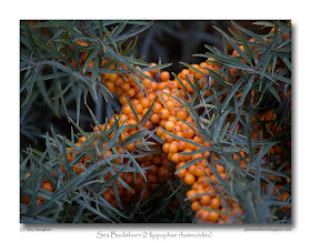
Sea Buckthorn
click photo to enlarge
"Popeye the Sailor Man" must have been on steroids because all those cans of spinach he tipped eagerly down his throat weren't responsible for the repeated thrashings that he handed out to Bluto. It's now fairly common knowledge that a scientist's misplaced decimal point was responsible for the belief that spinach had ten times more iron than other leaf vegetables. The original "superfood" turned out to be more of a 10 stone weakling than a muscle-bound hulk!
Today, food writers, nutritionists, scientists and supermarkets are keen to conscript new superfoods in the battle against obesity and to lure the shoppers' money. I've lost track of which is supposed to be best for you - it's either blueberries or broccoli, I think. However, doing a little research for the piece to accompany today's photograph I've come up with a new candidate - Sea Buckthorn! You'll be searching out the humble Hippophae rhamnoides and demanding that your local store starts stocking it once you've read about all the goodies that are packed into its bright orange berries.
Lets start with vitamin C: it has 695mg per 100g compared with 50mg per 100g in oranges! It's also rich in carotenoids, vitamin E, amino acids, minerals, saturated and unsaturated fats, and other beneficial elements. The berries can be consumed as juice, syrup or pulp, though they need to be flavoured to remove the astringency. The Indian Army provides the juice for its troops stationed in the Himalayas where its freezing point of -22°C makes it very useful. Left-overs from juice making can be used in the preparation of skin creams and liniments! Traditional medicine claims many healing properties for the berries, bark, leaves and flowers. And, if you fancy growing some yourself, its dense habit, tough branches and sharp thorns also make it a good, vandal-proof garden barrier.
Today's photograph is a detail of a bush growing in sand dunes on the Irish Sea coast. I particularly like this combination of orange and blue/green, and the way the lines of clustered berries formed a cross drew my eye and then my camera.
Addendum
Talking about my researches with a friend I discovered that sea buckthorn is not unknown in the world of celebrity chefs. Apparently Hugh Fearnley-Whittingstall (known as Hugh Burnley-Rawtenstall in my house - that's a joke for East Lancashire dwellers) has been known to use it when whipping up a menu based on found and foraged foods.
photograph & text (c) T. Boughen
Camera: Olympus E510
Mode: Aperture Priority
Focal Length: 150mm (300mm/35mm equiv.)
F No: f4.5
Shutter Speed: 1/125
ISO: 100
Exposure Compensation: -0.3 EV
Image Stabilisation: On
Thursday, November 06, 2008
A November landscape
click photo to enlarge
A Victorian writer who knew him, says of the English poet and humourist, Thomas Hood (1799-1845), that "his existence was a long disease rather than a life", plagued as he was by ill health from childhood. However, by the time of his early death at the age of 46 Hood had endeared himself to the British public through his satirical observations on contemporary life published in "Punch" and "Comic Annual". His novels, such as the romance, "Lamia", were bought in respectable numbers, as were his volumes of poetry. Some individual poems such as his "Song of the Shirt", a piece of social commentary about the working conditions of shirt-makers, were highly acclaimed, being translated for European audiences as well as finding wide readership in Britain.
Today Hood is recognised by many but revered by few, his work slipping back into the second tier of Victorian writers. Nonetheless, as I cycled through the Lincolnshire Fens late in the afternoon of an overcast day it was his poem about the month of November that came to mind. I heard it as a schoolboy and enjoyed its simple structure. Back in those days we hadn't heard of SAD (seasonal affective disorder), but as I re-read the poem for the first time in decades I did wonder if it was one of the afflictions that poor Thomas Hood bore along with his other illnesses! But no, it was probably just his reaction to drab, damp, smog-wreathed London in the year's penultimate month.
No!
No sky—no earthly view—
No distance looking blue—
No road—no street—no “t'other side this way”—
No end to any Row—
No indications where the Crescents go—
No top to any steeple—
No recognitions of familiar people—
No courtesies for showing 'em—
No knowing 'em!
No travelling at all—no locomotion—
No inkling of the way—no notion—
“No go” by land or ocean—
No mail—no post—
No news from any foreign coast—
No Park, no Ring, no afternoon gentility—
No company—no nobility—
No warmth, no cheerfulness, no healthful ease,
No comfortable feel in any member—
No shade, no shine, no butterflies, no bees,
No fruits, no flowers, no leaves, no birds—
November!
I was propelling my bicycle homewards, through the winding lanes of the flat landscape, when the sun made a brief appearance over the the village of Gosberton, and I stopped to compose this landscape using the spire of St Peter & St Paul to balance the illuminated clouds.
photograph & text (c) T. Boughen
Camera: Olympus E510
Mode: Aperture Priority
Focal Length: 48mm (96mm/35mm equiv.)
F No: f7.1
Shutter Speed: 1/320
ISO: 200
Exposure Compensation: -0.3 EV
Image Stabilisation: On
A Victorian writer who knew him, says of the English poet and humourist, Thomas Hood (1799-1845), that "his existence was a long disease rather than a life", plagued as he was by ill health from childhood. However, by the time of his early death at the age of 46 Hood had endeared himself to the British public through his satirical observations on contemporary life published in "Punch" and "Comic Annual". His novels, such as the romance, "Lamia", were bought in respectable numbers, as were his volumes of poetry. Some individual poems such as his "Song of the Shirt", a piece of social commentary about the working conditions of shirt-makers, were highly acclaimed, being translated for European audiences as well as finding wide readership in Britain.
Today Hood is recognised by many but revered by few, his work slipping back into the second tier of Victorian writers. Nonetheless, as I cycled through the Lincolnshire Fens late in the afternoon of an overcast day it was his poem about the month of November that came to mind. I heard it as a schoolboy and enjoyed its simple structure. Back in those days we hadn't heard of SAD (seasonal affective disorder), but as I re-read the poem for the first time in decades I did wonder if it was one of the afflictions that poor Thomas Hood bore along with his other illnesses! But no, it was probably just his reaction to drab, damp, smog-wreathed London in the year's penultimate month.
No!
No sun—no moon!
No morn—no noon!
No sky—no earthly view—
No distance looking blue—
No road—no street—no “t'other side this way”—
No end to any Row—
No indications where the Crescents go—
No top to any steeple—
No recognitions of familiar people—
No courtesies for showing 'em—
No knowing 'em!
No travelling at all—no locomotion—
No inkling of the way—no notion—
“No go” by land or ocean—
No mail—no post—
No news from any foreign coast—
No Park, no Ring, no afternoon gentility—
No company—no nobility—
No warmth, no cheerfulness, no healthful ease,
No comfortable feel in any member—
No shade, no shine, no butterflies, no bees,
No fruits, no flowers, no leaves, no birds—
November!
I was propelling my bicycle homewards, through the winding lanes of the flat landscape, when the sun made a brief appearance over the the village of Gosberton, and I stopped to compose this landscape using the spire of St Peter & St Paul to balance the illuminated clouds.
photograph & text (c) T. Boughen
Camera: Olympus E510
Mode: Aperture Priority
Focal Length: 48mm (96mm/35mm equiv.)
F No: f7.1
Shutter Speed: 1/320
ISO: 200
Exposure Compensation: -0.3 EV
Image Stabilisation: On
Wednesday, November 05, 2008
Interiors without a tripod
click photo to enlarge
click HERE for full-size image - 3648 X 2736 pixels (2 Mb file)
Many people make the assumption that because I take a lot of photographs I'm interested in cameras. The fact is I'm not. I'm interested in photographs, and cameras only to the extent that they make securing a good image easier. For my needs four things are important - a reasonable price, the ability to finely control the exposure, a reasonably small size for body and lenses, and low light performance.
Price matters because DSLR development hasn't levelled off yet, so replacement and improvement happens more often than it did with film SLRs (and I've got other things I want to spend my money on)! Control of exposure is important because it is the critical factor in securing the image: DSLRs make this easier than most other types of camera. Small size is really critical for me because I walk and cycle a lot with my camera, and the small camera you have with you always secures better images than the (maybe better) bigger camera you leave at home because of its size! Then there's low light performance. Image stabilization is the most significant development for me in recent years. It has allowed me to capture images, particularly of church interiors, that previously I could get only with a tripod. Now, if Olympus could increase its high ISO performance to somewhere near that of the big two manufacturers, I'd be a very happy man because the tripod would become almost redundant.
Today's image is of the interior of the church of St Nicholas, Walcot, Lincolnshire, bathed in the yellow light of the low November sun. The architecture dates from the the 1200s and 1300s, and is notable for the beautiful fourteenth century east window with its flowing tracery, and the carved fifteenth century bench ends. It's an interior that wasn't "scraped" (see yesterday's post). The shot was hand-held at 1/20 second at f6.3, ISO 200. Is it as sharp as it would have been with the camera on a tripod? No, but it's sharp enough to produce a perfectly acceptable A3 print. I've included a slightly compressed (75%) version of the full-size shot for your perusal. It has a little post processing, some noise suppression, but no sharpening. With my old OM1 I never shot at a speed lower than 1/30, and then it was with 400ISO HP5 with the 50mm fully open at f1.8. These days I risk shots at 1/6 second, and am usually quite happy with those taken at 1/15.
photograph & text (c) T. Boughen
Camera: Olympus E510
Mode: Aperture Priority
Focal Length: 11mm (22mm/35mm equiv.)
F No: f6.3
Shutter Speed: 1/20
ISO: 200
Exposure Compensation: -1.0 EV
Image Stabilisation: On
Tuesday, November 04, 2008
Anti-Scrape
On March 2nd 1877, William Morris, Philip Webb and other members of the Pre-Raphaelite Brotherhood held the inaugural meeting of the Society for the Protection of Ancient Buildings (SPAB) in Queen's Square, Bloomsbury, London. The founding of the Society was prompted by concern that many architects were over-restoring old buildings, particularly churches, and in so doing were literally scraping away history. William Morris, ever one to call a spade a spade, actually referred to the organisation as "Anti-Scrape"!
When we visit old churches today we can often determine the degree of sensitivity that the Victorian restorer applied to his work. In the worst examples we can find original Norman windows substituted by Victorian Gothic, whole aisles replaced in a totally unsuitable style, or any vestiges of the original architecture in windows, doors, towers, etc, replaced by something entirely different that was deemed to be "better". Of course many churches were in a very dilapidated state when the Victorians set about restoring them, and one mustn't forget that many would not be standing today without their intervention. However, through the work of SPAB and the agitation of vocal individuals, architects came to realise the importance of repairing and restoring whilst retaining original fabric, and understood the need to make new additions sensitive to what was already there.
St Mary and All Saints, Swarby, Lincolnshire, shown above, was restored in 1886-7, a time when the influence of the SPAB was being felt across the country. That being so, it's unfortunate that its exterior has that "scraped" look, with everything too sharp, too perfect, too new looking. The south aisle dates from those years in its entirety, so accounts for some of this. But, the chancel wall must have been rebuilt too, and its flat smoothness in no way reflects its origin in the 1200s. Nor does the tower suggest it dates from the 1400s though much of it does. Perhaps it's those fanciful pointed battlements, surely not the original design, that draw the eye away from the older material. There's no doubt that this is an attractive looking building - perhaps a touch too pretty - but its over-restoration, in my view, robs it of character. Fortunately the interior is less "scraped".
photograph & text (c) T. Boughen
Camera: Olympus E510
Mode: Aperture Priority
Focal Length: 11mm (22mm/35mm equiv.)
F No: f7.1
Shutter Speed: 1/200
ISO: 100
Exposure Compensation: -0.7 EV
Image Stabilisation: On
Monday, November 03, 2008
Turn it up to 11
click photo to enlarge
Probably the greatest mockumentary (or is it rockumentary?) was Rob Reiner's, "This Is Spinal Tap", the 1984 spoof film about a fictional English rock group. In a famous scene the character Nigel Tufnel (played by Christopher Guest) is showing off his amplifiers, and on being asked why one of them has control knobs with a highest setting of 11 rather than the usual 10, gives the priceless reply, "It's one louder". Thus was born an idiomatic saying that is used to describe something being exploited to its utmost, or to excess -"Turn it up to 11!"
Today's photograph is an example of such excess, though here I stopped the Saturation slider before it got anywhere near the maximum value of 100. However, unusually for me, I cranked it up well past the point where it displayed anything close to true colours. The image shows part of a pair of circular direction signs in a building. Below the arrow, on the brushed aluminium disc, was written the names of the rooms located in that direction. On the other - a painted sign - was further information. I quite liked the composition I made by selecting these simple elements, but the colour wasn't working for me. So, out of interest, I turned the Saturation "up to 11" and was much happier with the resulting effect.
The final image is a photograph conceived as a semi-abstract composition and given a painterly feel, not by applying a ready-made effect, but by excessive Saturation and strong noise suppression. I find the composition, colours and texture pleasing, but it's probably been taken one click too far for the purist photographer!
photograph & text (c) T. Boughen
Camera: Olympus E510
Mode: Aperture Priority
Focal Length: 23mm (46mm/35mm equiv.)
F No: f7.1
Shutter Speed: 1/160
ISO: 800
Exposure Compensation: -0.3 EV
Image Stabilisation: On
Sunday, November 02, 2008
The Old Smithy, Aswarby
click photo to enlarge
This charming former smithy in the village of Aswarby, Lincolnshire is now a store. There is much less call for the services of a blacksmith today than when the building was erected in 1846. At that time horses powered the rural economy and this building was the "garage" of its day, servicing not only horses but carriages, carts, waggons, and sundry agricultural machines as well as providing a wide range of metal working services.
It was built by Sir Thomas Whichcote of Aswarby Hall, the local landowner and squire, and is constructed of coursed, squared limestone rubble with ashlar quoins and dressings, and is roofed with slate. To the left, out of shot is, a shoeing bay. The decorative style of the building sits well with the Tudor-style cottages that comprise most of the dwellings in Aswarby. Like the smithy these were also built by the Whichcotes for the estate workers, as was the "Tally Ho!" pub, the lodge gatehouses at the entry to the park, and the estate office. Interestingly, all these buildings remain, but Aswarby Hall itself is gone, demolished in 1951. The stables of 1836 remain and have been converted into the main house of the estate. Of the older buildings and landscaping only two Georgian columns with boar's heads stand forlorn in a field.
When I was a child, growing up in Yorkshire, I was told that if you hang a horseshoe on a door or wall for good luck, you must always hang it with the open side upwards. If it's hung the other way (like the stone example in the photograph) all the luck will run out. Perhaps that accounts for the demise of Aswarby Hall!
For more information on the idea of the "lucky" horseshoe see the "Folklore" entry towards the bottom of this page. I felt that sepia was the obvious choice for this image.
photograph & text (c) T. Boughen
Camera: Olympus E510
Mode: Aperture Priority
Focal Length: 15mm (30mm/35mm equiv.)
F No: f7.1
Shutter Speed: 1/100
ISO: 100
Exposure Compensation: -0.7 EV
Image Stabilisation: On
Saturday, November 01, 2008
The corrugated chair
I remember reading, many years ago, about two people who made a very big origami boat out of waxed paper. They placed it on a river, got in, and sailed a good few miles before it succumbed to the effects of the water and collapsed. It was a bit of fun with no real point other than finding out if such a feat was possible. But that didn't stop someone trying it again in Germany last year.
Is a corrugated cardboard chair made for similar reasons? I saw one the other day. It looked marvellous, all curves, layers, and contour-like textures that positively invited you to walk around it, examining the shape from every angle. However, even if sitting on it wasn't forbidden because it was on display, I doubt if I'd have parked my posterior on it because it didn't look particularly inviting. Chairs have long been the focus of experimentation in terms of materials and shape, and fine artists have often tried their hand at designing them, frequently producing visual interest but rarely combining it with comfort. Gerrit Rietveld (1888-1964) produced a striking "Red and Blue Chair" in 1917, but you wouldn't want to sit on it for long. Salvador Dali (1904-1989) collaborated with Edward James to produce his "Mae West's Lips Sofa", another piece that looks like it offers temporary relief rather than long-term repose. The German-American architect, Ludwig Mies van der Rohe (1886-1969), who was responsible for the design of some iconic chairs, got it right when he said "A chair is a very difficult object. A skyscraper is almost easier. That is why Chippendale is famous." Will the corrugated cardboard chair make it from concept to high street store? I doubt it, but what do I know? I'd have said the same about inflatable plastic armchairs and sofas and I've seen those for sale in discount stores and in use in students' flats!
photograph & text (c) T. Boughen
Camera: Olympus E510
Mode: Aperture Priority
Focal Length: 40mm (80mm/35mm equiv.)
F No: f7.1
Shutter Speed: 1/8
ISO: 800
Exposure Compensation: -0.3 EV
Image Stabilisation: On