Pages

Friday, March 31, 2006

The pale rider


click photo to enlarge
"And I looked, and behold a pale horse: and his name that sat on him was Death, and Hell followed with him", from the Bible (King James Version), Revelations, Ch. 6, v. 8

Bird flu, global warming, terrorism, war, water shortage, oil depletion - sometimes it seems that if one doesn't get you then the others will! And it's at times like this - times of fear, strife, pestilence, famine, and destruction, that many remember the verse quoted above, and the verses that precede it in the Bible. Collectively they describe The Four Horsemen of the Apocalypse. The fourth horseman, shown here, rides a pale (or sickly) horse, and symbolises fear sickness, decay and death. The other three horses are white (with the rider carrying a bow, and perhaps representing the AntiChrist), red (the rider with a sword symbolising war), and black (scales are carried by this rider to represent famine and scarcity of food). The four riders are a potent image that has gripped the western imagination since they first became known, because they perfectly represents those dark forces that mankind knows can overwhelm us at any time.

In the stained glass window, of which this photograph is a detail, all four horsemen are represented, surrounding St John who sees them in a vision. The design is by Harry Stammers (d.1969), a York stained glass artist, and the work is in the church of All Saints, at Hovingham, North Yorkshire. It dates from 1962, and fills a large, three-light window in the north aisle. It isn't, in my opinion, one of Stammers' best pieces - and let me say he did some great work throughout the North of England. However, here, the overall composition is disjointed and the colour lacks the sublety that usually characterises this designer. But, the drawing is typically excellent. I have photographed this particular horseman on two occasions, because I think it is the best part of the window. I like the stylisation, the angularity, the shading, and the radiating background colours. However, what really draws me to this mounted figure is the fact that the face is hidden! This simple touch makes the horseman more menacing, more impersonal, more unfeeling. More frightening!

The photograph was taken with the camera mounted on a tripod, and a -1 EV setting. The wide tonal range required quite a bit of post processing to get the colour balance closer to the original.
photograph & text (c) T. Boughen

Thursday, March 30, 2006

Just a perfect day

click photo to enlarge
There isn't such a thing as a perfect day - there can't be - but some days come near to perfection. Here's one of the ways I try to achieve my sort of perfect day.

I get up at about 7.30am in a rural area of England that I haven't visited before. The sky is blue with white clouds, and the wind isn't too strong. Over a breakfast of porridge and tea, my wife and I plan the day ahead. The relevant county volume of Pevsner's "Buildings of England" is open in front of me, and beside it is a copy of the Ordnance Survey 1:50,000 or 1:25,000 local map. I study the map looking for a circular cycle route of about thirty miles or so. Ideally this will incorporate topographical interest - perhaps a valley and hills, a piece of coast, or a river - and have about six or seven churches that are worth visiting. To decide which these will be I look up their entries in Pevsner. From the map I also work out places where I might get some good photographs, and a location suitable for a lunch stop. I talk about the suggested itinerary with my wife, and, after any modifications, we set off, panniers laden with books, camera, tripod and other essentials.

We cycle along at a gentle 10 miles an hour down shady country lanes, gazing across the hedges and fields, stopping to look at anything that catches our eye, and taking photographs. At each church I start my photographs with exterior views, the first one from the south-east corner of the building, then I do the inside shots: that way I know where the photographs for each individual church begin and end, and I don't confuse the locations. My wife reads the gravestones and chancel memorials whilst I'm busy deciphering the architectural history and recording it with my camera. We chat to each other about any interesting finds. If there's a parish-written guidebook on sale in the church we buy it to read in the evening whilst looking at the photographs. Our bicycles are often parked inside the south porch while we are inside, but where this isn't possible they are leaned against the churchyard wall or the building itself. On these days we favour a sandwich lunch which is often eaten in a south porch too, sat on an ancient oak bench, with the parish noticeboard as diverting reading matter. Ideally the day will have a mix of medieval, C17 or C18, and Victorian churches. The former and latter are easy to find, but Georgian churches are thinner on the ground. If I've judged the ride correctly we arrive back having enjoyed the physical exercise, with a crop of good photographs, and a memory and record of some great history and architecture. Simple pleasures are invariably the best, and a day like this leaves us a little wiser, physically refreshed, and glowing! We've repeated this kind of day many times, and I look forward to planning many more.

The photograph above was taken on just such a day at this time last year. It shows my wife silhouetted in the red sandstone arch of the south porch of the Norman (and later) church of St Cuthbert, in the village of Great Salkeld, Cumbria. It's a composed shot with the figure placed left of centre of the framing arch, looking down the receding path. The arch itself is placed slightly left of centre, with a stone stoup giving some visual weight to the lower right of the image. Not an original photograph, certainly, but a good record of a pleasant day. By the way, if you look very carefully you can see part of the wheel of one of our bikes to the right of the churchyard gate!
photograph & text (c) T. Boughen

Wednesday, March 29, 2006

Venus and Cupid

click photo to enlarge
In February Cupid is everywhere - in March he's gone, his bow and arrow packed away for another year! But it wasn't always so. Our modern image of Cupid as an armed and mischievous winged cherub derives from the Roman god of erotic love, who in turn is equated with ancient Greece's Eros. Cupid's parentage is unsure: sometimes Mercury and Diana are cited, often it's Mercury and Venus, and sometimes Mars and Venus. In the classical past the widespread cult of Cupid was closely associated with that of Venus, and both gods were regularly invoked in the name of love.

Artists' depictions of the pair are common. Bronzino's "An Allegory with Venus and Cupid", which shows the son significantly overstepping the bounds of filial affection, is the most controversial Renaissance example. Where he is shown alone, Cupid is often portrayed as an impish boy with a roguish smile, as in Caravaggio's painting, "Amor Vincit Omnia". It is that characterization that card manufacturer's have seized on for Valentine's Day. Interestingly, the artists of the Christian church subverted the image of Cupid in their representation of cherubs!

The photograph above shows a recent sculpture by the Lancaster artist, Shane Johnston. Venus is seated and holds a wingless and outstretched Cupid at arms length. Nothing about the pair, apart from the nearby sign, suggests they are the classical duo - in fact they could be any mother and child. The sculpture was commissioned as a community project, and involved young women from disadvantaged areas of the city. St George's Quay was to have been the original location for the piece, but it was considered too modern for this heritage site. So, in 2005, mother and son found themselves overlooking Morecambe Bay at Scalestones Point, and being dedicated to those lost at sea, including the twenty three Chinese cocklers who drowned nearby the previous year. This tenuous connection with tragedy seems unnecessary, even casual, and I'm quite uncomfortable with it. Furthermore, the wide-open spaces of the shore do nothing for the sculpture. It needs a more enclosed situation for its undoubted qualities to be better appreciated. Here it is lost among the sea, the sky and the nearby traffic's roar.
photograph & text (c) T. Boughen

Tuesday, March 28, 2006

The ubiquitous rectangle

click photo to enlarge
The natural world never ceases to surprise us with the fertility of its designs. Mankind has used these at every opportunity in ways as disparate as adapting the idea of the teasel hook for use in velcro, or the wingtip feathers of condors in the raised wingtip "winglets" of large jets.

However, when we look at the constructions of the modern world we are bound to conclude that one of the commonest forms used - the rectangle - isn't very obvious in nature. We see it in some crystalline forms, and in cell structures, and I'm sure you can think of other examples. However, it cannot be said that its ubiquity in man's world is paralleled in the natural world.

Go through the centre of any city and of all the shapes available to man, the rectangle will be the one used most often. Much of the earliest architecture used the "trabeated" (or post and lintel) method of building, and this naturally produces rectangles. Most subsequent architecture has built (literally and figuratively) on this primitive beginning. This passion for the rectangle spread to many man-made, and particularly machine-made, objects. In the twentieth century some artists celebrated this shape above all others, Piet Mondrian being the best known.

And when we look around our homes and workplaces the rectangle is there at every turn. The photograph above shows CAT 2 office lighting. This is a rectangular array of fluorescent tubes recessed in a grid of polished aluminium cells, and is designed to give light, but not glare, particularly where computers are being used. The calmness, order and stability of this grid appeals to me. If, in architecture, you like the early work of Mies van der Rohe and Philip Johnson, then you will like arrangements such as this. If, on the other hand, you like the work of Mackintosh, Gaudi and Horta, then it's unlikely you'll think it worth anything. I took this shot in my office, laying on my back, with the camera held firmly to my face. Thankfully no one came in at the time!
photograph & text (c) T. Boughen

Monday, March 27, 2006

Edwardian Baroque

click photo to enlarge
The historians of the development of modern architecture between the late nineteenth century and the early twentieth century would have us believe that there is an unbroken thread that runs from the Arts and Crafts Movement, through Art Nouveau, to the Bauhaus and the International Style. And in a sense there is: but only if you ignore most of the architects, and most buildings that were erected during that period! For every Voysey, Wright, Garnier, Gropius, Asplund and Johnson there were dozens of architects building in variations of the "historical" styles. One such architect was John Belcher.

At the age of 63, in 1904, Belcher received a commission that every architect working in the classical style dreamed of getting: a building of no utilitarian purpose whatsoever for which a massive amount of money was available. Lord Ashton who had become a rich Lancaster man through the family linoleum business wanted to build a memorial to his wife on the summit of a hillside park that is father had bequeathed to the town. Belcher's design - the Ashton Memorial - is a magnificent white, columned and domed building, 150 feet high, in the Edwardian Baroque style. It cost £85,000 to build between 1906 and 1909. This striking building, visible for miles around, is one of the last of its type in England.

The photograph shows one of a pair of steep staircases with balustrades that sweep around each side of a pool and fountain at the bottom of a steep slope below the Memorial. These staircases combine higher up and ascend, as one, to the main building. They are made of Cornish granite from Penryn. The attractive linear curve of the steps and balusters, their repetitive rhythm, and the "stop" of the large block at the bottom suggested an attractive composition for my photograph. The monochrome treatment has, I think, emphasised these qualities.
photograph & text (c) T. Boughen

Sunday, March 26, 2006

Benches and posteriors

click photo to enlarge
Why are public benches not as comfortable as they used to be? I'm sure they aren't! It's not just my older backside being more sensitive: those benches are much less forgiving than when I was younger. I can remember happily sitting in comfort, in front of the town hall, on painted wooden slats, supported on ornate cast iron frames, happily watching the world go by. In those days there was never a thought that what you sat on would be anything less than satisfactory. But now, I have to give careful consideration to the act of resting my weary body on a public bench.

There are two groups to blame for this state of affairs - vandals and local councils. Those who carve their names on public benches, or graffiti them, or set fire to them, or pull them apart, or leave unmentionable objects on them, are responsible for councils having to install benches strong enough to survive a direct hit by a small nuclear device! This usually means them being wholly or partly made of either steel or reinforced concrete. Now I don't know about you, but none of the seating I've bought for my home and garden involves me resting my posterior on either of these materials. It's true that wood is sometimes used today, but the pieces are so large they could be used as pit props in a coal mine! Over the winter months my bottom has been offered seating in stainless steel (danger of frostbite), polished granite (danger of frostbite and a cracked skull) and plastic masquerading as wood (why?). And the shapes of those benches! They don't have even a passing acquaintance with the shape of the human body. The designers today love to create something that looks "different", but where's the proper support for bottom and back?

However, modern benches, though pretty awful for sitting on, are often pretty, and consequently of some use to us photographers! This one at Morecambe, Lancashire, in its purpose-built, brick, "C" shaped recess, looks great - all curves and painted metal strips. By crouching down at one end, and using my zoom at its widest (28mm), I was able to exploit the interesting shapes the designer put into it. My shot shows the main structure in the foreground, with the sensuous sweep of the rest of the bench filling the background.
photograph & text (c) T. Boughen

Saturday, March 25, 2006

Modernising the seaside resort

click photo to enlarge
The seaside resorts of Britain first came to life as tourist destinations in the late eighteenth century. But it wasn't until, in the nineteenth century, when the industrial revolution began to put increasing amounts of money into the pockets of the growing working and middle-classes that they really took off. In the north of England each resort pitched itself at different segments of the market. Scarborough and Southport aimed mainly for the middle classes: Blackpool and Morecambe sought to attract the mill workers and clerks from places like Manchester, Blackburn, and Burnley. And all were highly successful in their different ways.

The bigger seaside destinations had rail links to the major urban centres. Every summer holidaymakers poured out of the carriages and into the newly built boarding houses and hotels. They strolled along the promenades, took the sea air on the piers, and spent their money in the amusement arcades and shops. All was well for the towns until, in the second half of the twentieth century, people's horizons were extended by low cost package tours to exotic foreign destinations like Spain. And, from that point, the seaside towns have had to change and adapt. Some have been more successful than others, but all have experienced to a greater or lesser extent, decline, dereliction and decay. Blackpool and Morecambe are fighting back with short-break holidays and projects to lift the appearance of the towns. Both have undertaken major promenade refits, Morecambe's being themed on birds, and Blackpool's featuring art works celebrating the town's proletarian roots. More is being done, and is essential, if the resorts are to continue to flourish in the twenty first century.

This photograph shows a derelict arcade in Morecambe that is ripe for either development or demolition. Boarded up windows, water penetration and graffiti attract no one but the passing photographer! The symmetry, lighting and reflections in this scene appealed to me, and I waited for some people to pass before pressing the shutter. I chose black and white because it seemed to highlight the details and mood of the shot more than the original colour.
photograph & text (c) T. Boughen

Friday, March 24, 2006

Blue railings

click photo to enlarge
Complementary colours produce the greatest chromatic contrast. So, if you take a colour wheel and select any two colours that are opposite each other - say red and green, purple and yellow, or blue and orange - and place them next to one another the pairing will increase the apparent visual intensity of each colour. Isaac Newton, in 1672, was the first to publish a colour wheel illustrating this effect. The theory was very quickly taken up, elaborated and adapted by both scientists and artists. Interestingly the colour wheels of these two groups, whilst similar, are not identical.

People have differing views about this effect of complementary colours. Some really like it, and see it as aesthetically successful. Others can't stand it, and complain about the vibrant brightness it produces. Graphic designers use it both effectively and badly - try reading red print on a green background! In Britain many butchers edge their displays of beef with green plastic leaves, to make it look redder and more succulent.

The railings and coloured playground surface in this photograph illustrate the complementary effect of blue next to orange. A sunny day isn't necessary to make the area look bright, and that's undoubtedly the designer's intention. It's interesting to speculate, however, on the subliminal effect of this colour combination on the children playing here. Is it positive, negative or neutral? I took this photograph because of those vibrant colours, but also because of the interesting complexity of the overlapping railings and shadows.

P.S. If your computer shows the playground surface as closer to pink (like my friend's) then the last paragraph makes a lot less sense!
photograph & text (c) T. Boughen

Thursday, March 23, 2006

Vertical accents

click photo to enlarge
Ever since the building of the first towns and cities man has felt the need to punctuate them with tall buildings. Sometimes these serve a practical purpose, as in office blocks where building upwards maximizes the capacity of expensive land, or TV and radio masts where height is necessary for transmission reach. Often, however, the urge to build high has a different motivation.

The first Christian church towers of the Romanesque period had both a practical and a symbolic purpose. They housed bells which, when raised in a tower, could be heard at a greater distance. The towers were also a visual advertisement over a wide area of the location of the church, and demonstrated the wealth and power of the faith. In the thirteenth century Gothic church builders in Europe developed the spire, an upward extension of the tower that is a purely symbolic embellishment. It is clearly an aspirational structure which elaborates the raison d'etre of the earlier towers, and can be seen as a finger pointing to heaven.

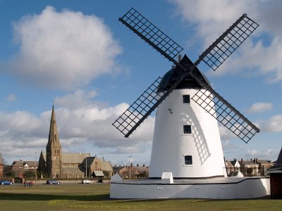
It is a contentious point as to whether cities are enriched by the addition of tall structures, but I have no doubt of their benefit in villages and towns. The vertical accent or punctuation that they provide is visually satisfying. Church towers, in particular add a picturesque quality that many find attractive. Here at Lytham, Lancashire - a flat town by the sea - the windmill of 1805 and St John the Divine of the 1840s-1850s provide two tall structures that give focus to the Green, a public grassed area. What they offer to the scene is best understood by mentally removing them! When we do that we are reminded that sometimes we take for granted the qualities that tall buildings bring to our environment.
photograph & text (c) T. Boughen

Wednesday, March 22, 2006

Photographic weather

click photo to enlarge
What's the worst weather for photography? I guess everyone would say that heavy rain is the killer - a literal and metaphorical dampener. In very wet conditions the range of shots that you can take is necessarily limited. But, in their way, those overcast days where the blanketing clouds are featureless, the shadows lack any depth, and everything looks flat and lifeless are equally bad. Yes, you can shoot close-ups, you can compose pictures without sky, and you can certainly enagage a variety of subjects. But with me the lack of sparkle on those sorts of day is often reflected in a lack of sparkle in my photographs.

So, I reckon that, rain excepted, it is the extremes of weather and any weather that involves sun, that are best for photography. Bright sunlight, sun and cloud, thundery days, snow, frost, and, yes, fog - all are invitations to get out and take photographs. So, what is it about these weather conditions that make them so attractive? Quite simply it's the quality of the light. All of them produce light that a photographer can use to his or her advantage. Some people swear that it's their equipment that allows them to take good photographs. Rarely is it so. Others say that it's the photographer's eye that matters. That's certainly true. And those who have spent a lot of time at photography, and have reflected on their work, know that the capacity to use light is of critical importance.

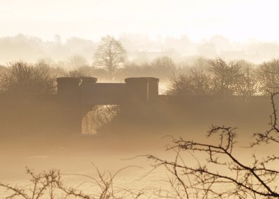
When I looked out of this Lancashire window on a recent morning I saw the fog turning a fairly mundane scene into something a little more interesting. The disused railway bridge, embankment, trees and bushes were transformed by the fog and rising sun into faint, monochrome shapes, and the unusual light was giving the scene a sepia tone. In taking this photograph I decided to put the bridge to the left and include more of the out-of-focus tops of some nearby trees as a visual counterweight on the right: they also give the picture more depth. This isn't the greatest shot I've ever taken in fog, but I think it does show how light and weather have the power to lift a commonplace scene to a slightly higher level.
photograph & text (c) T. Boughen

Tuesday, March 21, 2006

Music and Saint Cecilia

click photo to enlarge
Hands up if you learned to play the recorder at school! There's a fair chance that virtually every British reader will answer yes. And it's this that accounts for it being named the most reviled instrument by school children (and adults)! The poor old recorder is seen by them as "not a real instrument" and "just for children". The pain of trying to learn the fundamentals of music through the recorder, and the failure that it so often engenders, has clearly left its mark.

When the same children were asked which instrument they would most like to learn the boys nominated the drums closely followed by the guitar (no surprises there then!), and the girls named the piano and the flute. Whether their parents were as enthusiastic about these choices is not recorded! However, it's a fact that in Britain curricular pressures have resulted, overall, in the downgrading of music's place in schools. Concerted efforts are being made to increase the number of pupils learning instruments, and the decline has been reversed, but many feel that this has been at the expense of depth, and that what is learned will not be sustained in later life. And that's a real shame. The pleasure and the intellectual stimulation that playing an instrument can bring is life-enhancing, and is something that an individual and a society should value. In the past musicians would pray to Saint Cecilia, their patron saint, for inspiration and to help their music. Today a little political agitation is necessary to ensure that the Gradgrinds in charge of our education system recognise the true value of music's place in the curriculum.

The stained glass above depicts Saint Cecilia, and is in the Roman Catholic church at Westby, Lancashire. This building, designed by E. W. Pugin, son of the co-designer of the Houses of Parliament, A.W.N. Pugin, is unusual in having rose windows down each side of the nave in place of the more common square-headed or pointed windows. This depiction of the saint playing an organ is the best of the series, and particularly noteworthy are the deep green/blue of her dress, and the roses in the "petals" of the window.
photograph & text (c) T. Boughen

Monday, March 20, 2006

The Sunday wash

click photo to enlarge
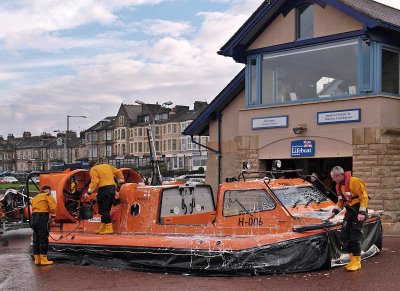
So, it's Sunday morning, I'm out for a bracing winter walk, and I pass some people washing their vehicle. "What's so unusual about that?", you say - "Everybody washes their vehicle on Sunday morning." The thing is, this vehicle is a hovercraft!

But in fact, this isn't an unusual sight if your walk is along the seafront at Morecambe, Lancashire, because there the Royal National Lifeboat Institution (RNLI) rescue vehicle of choice is an 8 metre, 2.4 tonnes hovercraft with a top speed of 30 knots. Morecambe is one of only four RNLI stations in Britain to use a hovercraft alongside a more conventional boat. The shallow waters and treacherous sands of the Bay make it the ideal rescue craft when the tide is out, and often when it is in too.

I suppose it's fair to say that the hovercraft has never quite fulfilled the promise that the British inventor Christopher Cockerell saw for it. As a mainstream form of transport probably its finest hour was in the form of the SRN 4s that competed for many years with the traditional ferries on the English Channel route. But elsewhere it has been a niche vehicle, used as an inshore patrol vessel by various armed forces, as a high-speed but low volume ferry, and for recreational purposes. On over-water routes hydrofoils and jetfoils have largely taken its place, bringing not just lower running costs but, crucially, less noise for passengers and everyone else! Whatever the merits of the hovercraft they are really noisy.

I took this photograph on a dull, cold day, the only brightness around being the orange of the hovercraft and yellow of the crew's clothing. Out of the camera the shot was flat, so I had to do quite a bit of post processing to rescue a barely serviceable image of this very serviceable rescue craft!
photograph & text (c) T. Boughen

Sunday, March 19, 2006

A gnarled hawthorn

click photo to enlarge
"And every shepherd tells his tale, under the hawthorn in the dale", John Milton (1608-1674), English poet

My Yorkshire Dales childhood was full of hawthorn trees, and even today my Fylde garden and the fields behind my house are fringed with them. This pleases me enormously because this hardy tree offers visual delights at every season. In spring its fresh green leaves open early, and are a welcome sign of the warmer, brighter days to come. May sees white hawthorn blossom (appropriately called May blossom) covering the trees like late fallen snow. The red berries and yellowing leaves of autumn lighten the greyest days, and fieldfares and redwings chatter among the hawthorns' branches as they feast on the trees' bounty. But, it is when winter reveals it, that we see the true character of this craggy, knotted tree.

The hawthorn is the commonest small tree in Britain, and is found on hills and mountains and throughout the lowlands. Its use in hedging is partly responsible for its ubiquity. However, the hawthorn figures in much folklore, so it must always have been widespread. Christ's crown of thorns was reputedly made from hawthorn, and it is said that lightning will not strike a hawthorn, or a house near one, because of this sacred association. The trunks and branches of the hawthorn (they can live up to 700 years) are frequently fantastically twisted and gnarled, and have led people to see images and spirits in the trees.

My photograph shows a convoluted hawthorn tree - in fact one of a short row of such trees, near Glasson, Lancashire. The way it seems to have thrown out arms and legs is very Daliesque, and gives the tree the sort of anthropmorphic strangeness that inspired our ancestors' stories. In fact, this tree's deformity is probably due to it having been "layed", that is to say, cut and bent when young, to form part of a hedge. I took this photograph one morning in early spring light which emphasizes the tree's contorted shape. The conversion to black and white was done to highlight these features further.
photograph & text (c) T. Boughen

Saturday, March 18, 2006

Motherhood

click photo to enlarge
One of my earliest memories as a child is walking with my mother from the small hamlet where we lived, into the nearby market town, and on the way being attacked by a large sheep that had got into the lane! I can vividly see my mother putting herself between me and the sheep and beating it with her shopping bag each time it tried to butt us with its head.

Growing up in the Yorkshire Dales meant that sheep were in most fields that I passed by and through, so it's fortunate that my early experience left no lasting scar. In fact seeing the cycle of sheep rearing marked the seasons for me as clearly as the smell of wild thyme or the sharp note of the newly arrived wheatear. Lambing, dipping and shearing were the highpoints, but colour marking and bringing the sheep off "the tops" when snow was in prospect were also noteworthy events. The hardy Swaledale was the breed of choice for the high fells, with heavier breeds sometimes being favoured in the bigger valleys.

My photograph of these sheep reminded me that the duties of motherhood are common to all animal species. This Swaledale ewe is offering her lambs two of the most important things any mother can give her offspring - protection and food. I used a 400mm lens to prevent the sheep taking fright, and chose to make this shot because of the way the back lighting was emphasising the texture of the wool. Perhaps, subconsciously, I also had in mind my childhood encounter, and recognised in this scene a mother doing for her lambs what my mother did for me all those years ago.
photograph & text (c) T. Boughen
Friday, March 17, 2006

Ironbridge and heritage

click photo to enlarge
A couple of weeks ago I visited Ironbridge in Shropshire. It's a fascinating place, well worth seeing, that has been called the birthplace of the industrial revolution. In 1709 Abraham Darby developed the smelting of iron with coke and the rest followed. I saw the Bedlam Furnaces, the wooded gorge, and the world's first iron bridge completed in 1781, spanning the River Severn. I had visited before, many years ago. But, since that time the area has been designated a World Heritage Site (WHS), and this information was boldly proclaimed wherever I went.

I like history, I like to study the past, and I give practical support to preservation and conservation. I think the idea behind World Heritage Site status is well-intentioned. However, I am concerned that designation could accentuate the problem it was designed to address. That is to say, that people will flock to such places, because of this additional title, and in so doing degrade them: that their conferred status will not protect them for the future, but will change them, in some cases for the worse. Now I am sure that those involved with such sites are aware of this danger. But are they ready for operators running tours based on lists of WHS - "10 WHS in a week: see the best the world has to offer!" Or publications based on WHS being used by people as tick lists to be checked as they visit them, in much the same way that the Scottish peaks over 3,000 feet (the so called Munros) are "collected" by hill walkers, regardless of the environmental damage caused. These things will come! Some will say that if we don't designate, then such places will slowly change anyway. Maybe. However, high-profiling with WHS status risks doing it too. There's no easy answer to this problem, and I raise the question without knowing the solution.

It was a heavily overcast day with rain when I made my visit, and the dour aspect the weather gave recreated some of the character that probably prevailed in the eighteenth century. Signage, paint and provision for tourists have already affected Ironbridge's character, so I decided that my photograph needed to be black and white to compensate. I waited for some people to cross the bridge to give top left interest and scale, and then pressed the shutter. Not the greatest picture of this special bridge, but one that does, I think, capture something of the spirit of the place.
photograph & text (c) T. Boughen
Thursday, March 16, 2006

Technology, music and rainbows

click photo to enlarge
"We live in a rainbow of chaos", Paul Cezanne (1839-1906), French painter

78s, 45s, LPs, 8-track, compact cassette, CD and mp3. These formats are only some of the ways in which recorded music has been sold to the public in my lifetime. Manufacturers see this as technological development delivering a better product, and consumers will largely agree. However, the most recent innovation - mp3s - are unique in a way that many don't realise. Yes they are wonderfully portable, can be "delivered" on different "platforms", and can be bought in a way that has never before been possible. But, whilst all the other developments gave an improvement in the quality of sound (I know some die-hard 8-track and vinyl enthusists will disagree), mp3 usually represents a worsening of the listening experience compared with CD! Generally 128kb/sec bit rate is the commonly sold and transmitted quality for mp3 (and DAB radio), whilst twice that is necessary to match CD quality.

Now I guess you're thinking, "Ah, a hifi enthusiast!", but I'm not. In fact I'm a devotee of the "good enough" cult, and my views on music technology are pretty much in line with my views on cameras: once you've bought at a "good enough" level (and, yes, that will vary from person to person) then just concentrate on appreciating the music (or making the images), and don't let the equipment get in the way. So all that makes me think that mp3 is, by and large, OK, despite the drop in quality.

And that brings me to this pile of blank CDs above. I use them less than I did, and whilst I was selecting one for data backup, the stack fell over in my darkened room. The lamps and the computer glare produced coloured highlights and rainbow effects on them, and as soon as I saw this I knew I had to try a close-up shot. A minor adjustment of the discs produced this range of colours and shapes, and the camera on its tripod, followed by a little post processing, did the rest. So, perhaps inadvertently, I've stumbled on the real advantage of CD over mp3 - they make better photographs!
photograph & text (c) T. Boughen

Wednesday, March 15, 2006

The attraction of black and white

click photo to enlarge
In the 1970s, when colour prints had become mass market in the UK, I resolutely stuck with black and white. Was it conservatism on my part? Maybe. Could it have been the association of "serious" photography with monochrome - an association that continues in some minds still? Perhaps. Or was it the poor quality of those colour prints compared with the relatively better quality that came from the commercial printing of black and white? Whatever the reason, whilst I occasionally did have colour prints made, the attraction of black and white was so great that I bought the equipment to do my own processing.

Those who have done it will tell you that there is nothing to compare with developing your own negatives, and making prints with your own enlarger and chemicals. It's certainly a magical process, and writing about it now, I can smell the developer and remember the excitement of watching the image appear in the tray. But I didn't take it to the next stage, colour printing, because the fact is that home processing lost its attraction after a few years, and I moved on to slides. A couple of years later I realised that the problem with slides is the awkwardness involved in projecting them. And that sent me back to colour prints!

When digital came along, at the prompting of a friend, I embraced it reasonably early. And I haven't looked back. Digital has revitalised and deepened my long-standing interest in photography. I won't bore you with the advantages it brings - you probably know them all. However, one big plus for me is the ability to make any photograph black and white! The shot above, of the church at Bowness on Solway, Cumbria, is one that I have converted, using a software version of my favourite red filter, and I have to say that it is much better in black and white! In colour the lighting makes it rather flat and lifeless, but black and white introduces more contrast, accentuates the sky, and makes the most of the main shapes and the lichen covered stonework. Ironic isn't it, that the future has allowed us to go back with ease to monochrome - a format that the twentieth century thought it had consigned to history!
photograph & text (c) T. Boughen
Tuesday, March 14, 2006

The Lower Lighthouse

click photo to enlarge
The Lower Lighthouse at Fleetwood, Lancashire, was designed by the architect, Decimus Burton. Together with its much taller neighbour, the Pharos (see post of January 11th 2006), it began flashing out its warning in 1841. Burton based the Pharos on what was known of the ancient design at Alexandria. However, the design of the Lower Lighthouse was his own invention. He gave the stone building an elegant cap, a balcony at the level of the light, and covered seating all round the base. Many a Fleetwood resident, tourist or fisherman must have sat below the Light and gazed out at the boats as they came back into port.

Some think it odd that the town has two lighthouses, one back among the streets, tall and slender, the other on the promenade, shorter and ornate, but there is a very good reason for this. To get into the River Wyre and Fleetwood docks boats must follow the course of the channel carved by the river as it enters the sea. So, skippers must round the Wyre Light off the coast, then adjust their position so that the two lighthouses are seen one above the other. When that's done they are in the channel, and can safely steer home, guided by the lighthouses, until the final sinuous turn into the river itself.

My photograph shows the Lower Lighthouse at sunset. To the right is the nearby radar training station of the Nautical College, and in the distance, between the promenade railings, Fleetwood Pier can be seen. On the evening I took this photograph everything was right - a variety of textures and colours in the clouds, some blue remaining in the sky, and that magical golden glow as the sun approached the sea. It's hard to take a bad photograph when conditions favour you in this way, so all that was needed was the silhouette of Burton's dignified lighthouse to complete the picture.
photograph & text (c) T. Boughen

Monday, March 13, 2006

Winter's retreat

click photo to enlarge
When summer is upon us, all bright, green, warm and dry, and going out requires little thought about what to wear, it is sometimes hard to imagine how long and cold the winter can be. This year it has seemed even longer than usual because the ice and snow arrived just as we thought spring had almost sprung. Daffodils and crocuses had opened, buds and catkins were noticeable on the trees, and the heads of many black-headed gulls were showing their summer feathers. Then, at least on the Fylde Coast of Lancashire, down came the first real snow of winter. And not the wet, slushy stuff usually associated with our proximity to the sea. No, it was real, powdery, wind-blown snow, accompanied by freezing conditions.

It's fun to walk across the fields and hills in the blinding whiteness of a sunny, snow-covered January day. But it's another story in March when the bulbs, the leaves and the buds are being scorched by the coldness that is thrust upon them. Snow arriving in March steals the thoughts of spring that have been steadily growing with the lengthening days.

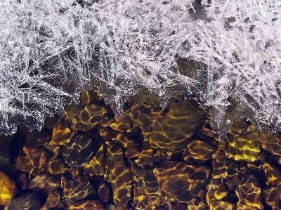
I took the photograph above on a bright day as the sun was asserting its ascendancy over the snow and ice. On this stream near Garstang the surface of the water was moving again, and the ripples were bending the light, throwing bright wavy lines on to the pebbles below. The fringing ice was slowly retreating, its sharp, white, angular patterns becoming soft, clear and rounded as they melted. As a representation of the onset of spring this shot is more characteristic of those northerly climes where the snow settles for months on end. This year it represents Lancashire!
photograph & text (c) T. Boughen

Sunday, March 12, 2006

Light on the past

click photo to enlarge
"The past is a foreign country: they do things differently there"
L. P. Hartley (1895-1972), English novelist

One of the pleasures of living in a small country with a long history is that, wherever you go, you bump into the past. Though Henry Ford ("history is more or less bunk") didn't apparently agree, a knowledge of the past is fundamentally important to people. Paul Gaugin's painting, "Whence come we? What are we? Whither go we?" sums up three of life's most important questions. The present day fascination with genealogy is just a small manifestation of the importance of the first of those questions. So too is the building conservation movement.

This photograph shows the church of St John the Baptist (Old Church), at Pilling, Lancashire, which dates from 1717. It is in the care of the Churches Conservation Trust, having been redundant for many years, following the building of a "new" church in 1887. When this new building was opened permission was given for the demolition of the old church. Thank heavens it didn't happen, because this old building gives us a real insight into the churches in which our ancestors worshipped during the eighteenth and nineteenth centuries.

The interior is light and painted white, as the Georgians liked it. On the east wall hangs a Royal Coat of Arms of George I dated 1719, and on the south wall are two boards of the same date painted with the Ten Commandments, the Creed and the Lord's Prayer. The two-decker pulpit (originally a three-decker), the altar rails and the crudely carved pews must be from 1717. However, the intrusive north gallery on its columns was added in 1813 to accomodate an increasing population. The installation of this feature necessitated raising the height of the walls of the church by over one metre. A few memorials, and a nineteenth century stove complete the picture. Interestingly, the stone paving or "flags" as they are known in Lancashire, were added in the twentieth century. The original church would have been unflagged with rushes laid on the floor, and renewed periodically!

I took this photograph, looking towards the altar, to capture the character of the interior, but also because the quality of the light through the clear glass of the arched windows was absolutely marvellous. The light and shadows, combined with the original fittings and furnishings, gives the church a clean, slightly stark atmosphere that allows us a glimpse of the past.
photograph & text (c) T. Boughen

Saturday, March 11, 2006

Gorse in bloom, as usual

click photo to enlarge
"When gorse is out of bloom, kissing's out of season"
Old country saying

The Common Gorse (Ulex europaeus) is, as its name suggests, common! But only in areas of acidic soil, uplands, or by the sea. On the Lancashire coast and hills it's an everyday sight, but the area of Britain where I have seen most gorse bushes is the Mull of Galloway in Southern Scotland. There, in spring, the hillsides are ablaze with its deep yellow flowers, and the air carries its distinct smell of coconut. In fact, though spring is the period when gorse is most in flower, this plant is almost unique in flowering during every single month of the year (hence the saying quoted above). Even during the iciest, snowiest January, if you look carefully, you'll find its flowers injecting a note of gaiety into the drab, dark days.

When I was a child I always called it by its country name of furze, and I've heard others use the name whin bush. In fact, gorse is a member of the pea family, and if you look carefully in August you'll see the seed pods which will convince you of that fact. Today gorse is rarely used for any practical purpose, but this wasn't always so. In the past the most popular use was for firewood, particularly for bread baking and in lime kilns. But it was also used as a fertiliser, as animal food, in soap making, for hedging, as a perfume, for dye, as a tea-substitute, in herbal remedies, and as a damp-proof course under haystacks!

On the March day that I took this photograph the sun and the clear blue sky said spring was just around the corner, but the bitingly cold wind and the frozen puddles of winter's last blast said otherwise. However, these banks of flowering gorse bushes by the River Wyre near Knott End, Lancashire, where I sat with my wife to eat a banana, were the cheering note that promised warmth would come. To capture this image I screwed an achromatic close-up lens on to my 28-90mm zoom. The virtue of such a device over a dedicated macro lens is that you can always carry it, and so can catch the small details that might otherwise elude your camera.
photographs & text (c) T. Boughen

Friday, March 10, 2006

800 year old craftsmanship

click photo to enlarge
Did the craftsmen who made this door in the early 1200s think about how long it would last? Almost certainly. It is constructed of thick oak planks from a tree hundreds of years old when it was felled, and the size of these is dictated not by lack of skill but by concerns about strength and durability. Overlaying the door is a marvellous scheme of metalwork based on bosses and strips embellished with scrolls. These might look like surface decoration, but in fact they are the craftsmen's elaboration of components essential to the structural integrity and construction of the door - nails, hinges, latches, etc.

Did these people imagine it would still be in use eight hundred years or so after they put it on its hinges? Probably not. Whilst some medieval minds did have a grasp of the sweep of history, workmen such as these probably had a much shorter-term focus. However, they also had their eyes on eternity, and one can't help but feel that this, as much as more temporal concerns, were what led them to expend such effort on the metalwork. The door truly is conceived as an entry to the kingdom of God.

This door can be found at the church of St Andrew (also known as Sempringham Priory), at Sempringham, Lincolnshire. In this small rural settlement the Gilbertine Order was founded. The Gilbertines were the only monastic order to originate in Britain, and uniquely, they embraced both men and women in their establishment. This probably accounts for their limited appeal at the time! The church dates principally from the 1100s and later, but pieces of Anglo-Saxon interlace sculpture suggest an earlier building may have existed.

I decided to photograph a detail of this door, because often a part is more expressive than the whole. It also allows the pitted metal, scrollwork details and the age-ravaged and patched woodwork to be better seen. I moved the door to give a raking light that emphasises these details, and I hope my resulting shot represents, quite well, the character of this timeworn door.
photograph & text (c) T. Boughen

Thursday, March 09, 2006

Wire, wool and snow

click photo to enlarge
A long time ago, when I was about ten or twelve years of age, a friend and I found a big, deep, drift of snow below a small cliff. We decided it would be fun to jump from the top of the cliff into the snow below. It was! When we hit the snow our legs shot down into it, and as the snow compressed below our feet with a crumping sound, our downward drop was halted. Then, out we scrambled, back to the top of the cliff, and, carefully selecting a fresh patch of snow to aim for, we jumped again. And again, and again, and again, enjoying the thrill of each jump.

Until, that is, I selected a patch of snow that, unknown to me, had a large limestone boulder below it! I don't recall how far below the surface of the drift the boulder lay - perhaps I never knew - but I still wince and remember the pain I felt when my right knee hit the rock. There was screaming and tears, and my friend had to support me all the way home. Then off I went to the doctor. The diagnosis was, fortunately, only severe bruising. But I wince in a different way when I think how I might have hit the boulder, and the permanent damage I could have sustained.

It was during a recent walk in the March snow that I recalled that incident. I was out looking for some photographs that captured the way that light is affected by snow. This shot was suggested by my wife. Some barbed wire had clumps and strands of sheep wool on it, and the wind-blown snow had built up only where the wool was caught. An achromatic close-up lens on an 80-300mm zoom allowed this shot to show the detail of the wire, the wool and the snow, and, of course that dazzling brightness. Perhaps not a great shot, but one which does, I think achieve the aim of capturing that unique light.
photograph & text (c) T. Boughen

Wednesday, March 08, 2006

Simple is often best

click photo to enlarge
A bag of modular wooden bricks. Without a doubt that was the best toy I ever bought for my children. They started playing with them at about eighteen months old, used them very regularly up to the age of nine, and could still be found making the odd use of them at twelve or thirteen! Houses, castles, garages, tracks, towers, companion pieces for the wooden Brio trainset - the bricks became anything they needed. And when they finally cast them aside, a little grubbier than when first bought, they were still completely intact, ready to offer pleasure to any child who wanted to play. A few years ago one of my sons asked about the whereabouts of the bricks. He was relieved to know we still had them. Will they see further use in the future!

These thoughts came to mind when I looked at the chalk scribbles and drawings that a group of five and six year olds had made on a school playground. The busy colours and expressive lines told of the fun the children had experienced doing something as simple as chalking on the ground. They seemed to have gone over the existing word "GAMES", and then branched out wherever their fancy took them. Isn't it the case that the simplest toys and games, those requiring the child's active engagement and imagination - like wooden bricks and coloured chalks - are invariably the best and have the longest life?

When I took this photograph some of the youngsters were still busy with their chalks, and the shadow of one child's arm intruded into the image. This shadow makes the shot. It is like the outstretched hand of the circus ring-master inviting the audience's applause for the skill of his artistes!
photograph & text (c) T. Boughen

Tuesday, March 07, 2006

It's about seeing, not buying

click photo to enlarge
The camera doesn't make a bit of difference. All of them can record what you are seeing. But, you have to SEE.
Ernest Haas (1921-1986), Austrian-born "Magnum" photographer

Are cameras male jewellery? You might think so the way some men appear to collect them, wear them and replace them. Perhaps they fulfill the need of certain men (it's rarely women) to fiddle with technical objects. For some it's motorcycles, for others its cars or computers or hifi, and for a particular group it's cameras, lenses, flashguns, etc. It seems to me that many cameras are bought (and replaced) for reasons that have very little to do with taking photographs! The short product cycles and "technological advances" of digital cameras exacerbate this tendency.

What Ernest Haas said in the era of traditional photography remains true in the digital age: the camera isn't that important if what you want to do is produce good photographs - what matters is the eye behind it. Like many amateur photographers I have spent years trying to train my eye to see the possibilities in my surroundings. But sometimes the obvious gets overlooked. The room next to my office had new blinds fitted several months ago, and I've entered the room daily since then. But recently, when the sun was shining through the bare branches of the trees, throwing their shadows and the stronger shadows of the window frame on to the blinds, I saw them as if for the first time. And I took this photograph.

I make no great claims for this simple shot. However, it pleases me for its colour, the strong but irregular zig-zag patterns, the softer transition between the slats, and the diffused shadows cast by the trees. I selected the area to use in the picture, ensuring a dark vertical was one third of the way from the left. This image is a reminder to me that looking more carefully is the key to improving my photography, not buying the next high-tech offering from Canon, Nikon, Olympus or whoever.
photograph & text (c) T. Boughen
Monday, March 06, 2006

The Englishness of the robin

click photo to enlarge
Here's a question. Why do companies queue up to be the "official whatever" of the Olympic Games? You know the sort of thing - the official camera, phone, wrist watch, soft drink, airline, dental floss, toilet paper (alright I exaggerate). I can't imagine anyone buys a product because it has the Olympic branding associated with it for a few months - or do they? The companies must feel they are getting something from the rights that they buy. And where did this idea come from?

Perhaps it's linked with nations associating themselves with plants, creatures and colours. And where does that come from? Does it derive from heraldry? This train of thought popped into my head after an Indian friend of my son's had asked him about England's national bird. My son asked me what it was, and I said, "I don't know, but it should be the robin." I know the United States sees the bald eagle as its national bird, Australia has the emu, and Germany the white stork. But England? So I did some research, but could find no consistent answer. However, what became clear is that the robin is our favourite bird by far!

I took this hand-held photograph of this robin on a snowy March day with a zoom lens set at 300mm. The bird followed my wife and I along a fence by the edge of a wood near Garstang, Lancashire, perhaps hoping to be tossed some morsel, or maybe looking for anything edible that we disturbed with our feet. The physical closeness that robins grant people, particularly in winter, is part of their attraction. The English, being a nation of gardeners, often have the robin as a companion when they are turning the soil. Their song, which can be heard throughout the year, and the soft colours of their plumage are also factors in their appeal. It's not a big, brash, or fierce-looking bird, like so many national birds. No, the robin is friendly, makes a lot of noise for a small bird, seems to be everywhere you go, but can be pugnacious when defending its territory. Perhaps the robin is popular because the English see some of their own characteristics in this little bird!
photograph & text (c) T. Boughen

Sunday, March 05, 2006

Red railings on the quayside

click photo to enlarge
Glasson Dock is a tiny port at the mouth of the River Lune near Lancaster. It was created in 1780 when the increasing size of ships meant that they could no longer make the journey up river to the city. The old village of Glasson grew in size to accomodate the increased activity. However, the real building began when the Glasson spur of the Lancaster Canal was opened in 1821. The port then developed a large canal basin and a dock. This allowed goods brought into Glasson from the sea to be transferred to canal boats and distributed anywhere in Britain on the canal network. Traffic could also, of course, be transhipped in the opposite direction, from barge to ship and exported.

Today the port does a regular trade in animal feedstuffs, grain, flour and other commodities. The day I took this photograph an East European ship arrived to collect a cargo of what appeared to be scrap metal. The canal basin no longer has a commercial function, but is now a marina for both canal boats and sea and river-going cruisers and yachts. The eighteenth and early nineteenth century buildings and quaysides have been developed as an attraction for tourists, as well as continuing to fulfill their purpose for those with business to complete.

I took this photograph of a rather battered ship tied up in the dock, not for the nautical interest it represents, nor because it illustrates the unique qualities of the place. No, it was because of the red railings! On a cold March day, with traces of snow on the ground and ice in the water, these railings positively glowed. The backdrop of the green water and ship, the blue of the sky, and the white of the snow and clouds gave the red of the railings real power in the composition. And, the strong colour and lines lead the eye into the picture. I don't know why these railings are red - all the other metalwork around the dock is painted black and white. But, to whoever used the last dregs of a can of scarlet on these railings - thanks!
photograph & text (c) T. Boughen

Saturday, March 04, 2006

The lure of fishing

click photo to enlarge
Konrad Lorenz (1903-1989), the Austrian zoologist and founder of modern ethology once said, and I'm paraphrasing from memory, that civilized man seems to be afraid to be alone with his own thoughts. As I recall he ascribed the rise of "muzak" and the Walkman to this need to be distracted from thinking. He felt that the human condition and the threats that man sees himself facing - from nuclear weapons downwards - are too much for many to contemplate. What he would have thought of the modern mp3 player and the present day obsession with doomsday thinking - asteroid impact, global warming, bird flu (make your own list) - I can only imagine.

Whether or not one agrees with Lorenz's thinking, it can't be denied that people today seem to crave stimulation and distraction. Constant music through headphones, 24 hour TV, video and the rest, certainly supply it, and it often seems that if you want quiet, and time for reflection, you have to actively seek out a place where this can happen. Which brings me to fishing, and this question. Is the attraction of fishing that it gives you time to think? Let's face it, there has to be something more than the fish! It's often a wet and cold pastime, and if you're a seafisherman night-time fishing and seasickness are also involved. Perhaps the hours that it gives for quiet thought is the real reason that it is so popular. And come to think of it, I've rarely see a fisherman with headphones!

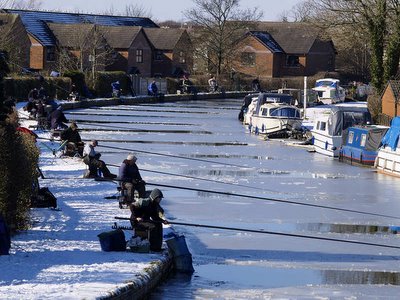
This photograph shows fishermen on the Lancaster Canal at Garstang, Lancashire. Freezing weather has meant that they have had to break the ice to indulge their passion, and the number, and their proximity to each other suggests that a competitive match is taking place. I took this shot from a canal bridge, and liked it for the serpentine line of the canal with the evenly spaced fishermen intently watching their patches of ice-free water.
photograph & text (c) T. Boughen

Friday, March 03, 2006

A jewel in glass

click photo to enlarge
The reputations of the Pre-Raphaelite and Arts & Crafts movements have risen in recent years. During much of the twentieth century artists like Millais, Rosetti and Burne-Jones were looked on as exponents of a somewhat quaint English style that was a side-shoot to the main development of European art in the later nineteenth century. Recent major exhibitions have raised their profile and they have received some of the critical acclaim that they deserve.

This photograph shows the decorative genius that Edward Burne-Jones brought to the stained glass designs that he made for the firm of William Morris & Co. It is a detail of one of a group of five windows in the east wall of the church of St Martin at Brampton in Cumbria. The building is the only church designed by Philip Webb - the architect of Morris's famous home, the Red House, Bexleyheath. All the glass in the church was designed by William Morris and Burne-Jones in 1878-80.

In this detail Burne-Jones shows a pelican feeding its young with drops of blood from its breast. The image is derived from the medieval bestiaries and is a symbol of Christ's sacrifice. The drawing, the red/orange colours and the decorative arrangement of the birds is superb. The lower part of the glass has foliage in darker greens and blues interspersed with jewel-like flowers. Here the juxtaposition of deep and glowing colours is magnificently rich. One of the most interesting aspects of this design is seen in the sinuous lines of the stalks of the plants: these clearly prefigure the forms of Art Nouveau.

I took this photograph using a tripod, on an overcast day around noon. East windows are best shot later in the day to avoid strong light behind the glass. To capture the nuances of stained glass in a photograph is very difficult: it requires careful exposure - slight under-exposure often helps. Then careful post processing is necessary to try and give each tone and colour the luminous quality that the eye saw. In fact this photograph does not fully capture the beauty of this window. However I hope it does enough to show that the best stained glass artists of this period, and Burne-Jones in particular, were capable of marvellous work that bears comparison with the best of any age.
photograph & text (c) T. Boughen

Thursday, March 02, 2006

Years of life left in it!

click photo to enlarge
In 2001 the average lifespan of a car in the UK was 14 years. Looked at a different way, the average age of all the cars actually using the roads is 7 years. I was reminded of these statistics when I looked at this photograph of a "Progress Twin Car" tram that I took in Fleetwood, Lancashire, last summer.

This particular vehicle is one of a number built by English Electric between 1958 and 1962. Aged about 45 years old, this tram is by no means the most senior of Blackpool Corporation Transport's fleet, which dates from the 1930s to the 1980s. Yet, it is still giving sterling service along the Fylde coast and pleasing many with its stylish lines and splendid new paint scheme.

Many enthusiasts have cars as old as this tram, and the sight of a veteran or vintage vehicle on one of its outings often draws admiring glances from passers-by. But, it is interesting to consider whether the undoubted cost and environmental benefits of keeping a tram in active service for 40, 50, 70 or more years would also be achieved by routinely manufacturing cars that lasted for a lot longer. I read the other day that 85% of the energy used in a car's lifetime is accounted for by the fuel to propel it. The remaining energy use relates to manufacture, servicing and disposal. Perhaps the fact that the fuel economy of cars is increasing means that the benefits of long-life cars are less obvious. Which is a shame. I for one would like to feel that I could buy a vehicle that would last my lifetime! Maybe modular design is the answer so that key components can more easily be replaced or upgraded, but I can't see manufacturers opting for that anytime soon.

I only occasionally point my camera at vehicles. When I came to photograph this tram its length was a serious constraint on the choice of shot. But the way the light was falling, the three-quarters view was self-evidently the best option: it shows the front and sides and therefore gives the best overview of this venerable vehicle with many more years of life left in it.
photograph & text (c) T. Boughen

Wednesday, March 01, 2006

A shoreline walk at sunset

click photo to enlarge
"As long as I gaze on Waterloo sunset, I am in Paradise." Ray Davies, English songwriter & singer

The sunset is one of our world's most beautiful sights. And a very democratic sight it is too. No matter where you live, be it the most beautiful sylvan setting or the most god-forsaken urban waste land, you can share its magnificence. For every now and again the sun will descend like a great orange ball, coating the clouds and the sky in colours and tints that make us stop, and stand, and stare.

But there is one privileged group who see sunsets better than the rest of us, and they are the people who live by a west facing coast. Here the glory of the end of the day is multiplied by the reflections off the water. I live near such a coast, and I've often chosen to be by the shore when I've seen a good sunset in prospect. I've never regretted it. It almost seems that each sunset you see has the same effect on you as the very first you ever saw!

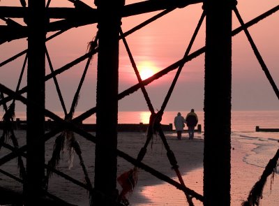
My photograph shows a couple walking along the shoreline during a sunset at Fleetwood, Lancashire. Arm in arm, they make a romantic sight, and the pink, mauve and gold colours of the sunset heighten the effect to such an extent that not even the weed and net bedraggled supports of the rusting pier can detract from it!
photograph & text (c) T. Boughen