click photo to enlarge
Colours have always fascinated me: colours I like, colours I dislike, colours that I dislike unless paired with a particular colour, the uses to which colour is put, the science of colour, the art of colour and, the subject of today's reflection, the names of colours.My first introduction to the interesting names of colours was, I think, courtesy of Scott's Porage Oats. Our breakfast table usually had on it the famous box, adorned with the Highland Games shot putter, so I could read about the famous British Army regiments that, for a while, featured on the back. It was there that I came across the names khaki, olive and lovat. The first two will be familiar to most people, but the latter perhaps not: it is a muted green colour named after an area in Invernesshire, Scotland. An interest in painting introduced me to the wonders of burnt sienna, ultramarine, yellow ochre etc, and a passing interest in heraldry that I picked up on the back of a deeper study of medieval and later tombs, revealed to me the particular nomenclature of that discipline's colours (tinctures) - argent (silver), or (gold), azure (blue), sable (black) etc.
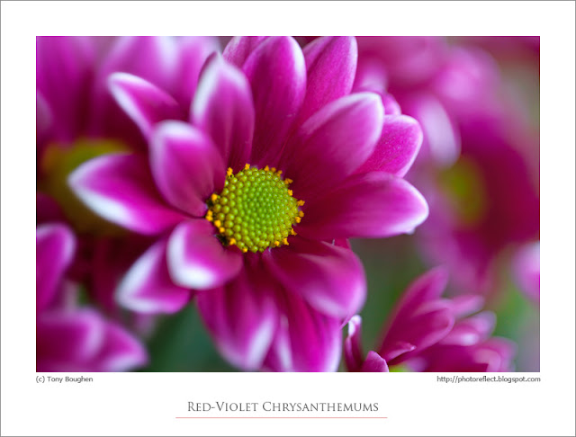
These days an interest in computers, photography and the graphic arts generally, requires knowledge of how VDUs display colours and the way they organise, number and name them. It was from that starting point that I searched for a name to describe the colour of these chrysanthemums that I had photographed. Were they purple, pink, violet, rose, fuchsia, cerise or what? To settle the matter I consulted the List of Colors on Wikipedia and decided that the closest fit (though a rather boring name) was red-violet!
photograph and text (c) T. Boughen
Camera: Canon
Mode: Aperture Priority
Focal Length: 100mm
F No: f2.8
Shutter Speed: 1/80 sec
ISO: 500
Exposure Compensation: -0.33 EV
Image Stabilisation: Off
